INTERACTIVE VISUALISATION TECHNIQUES FOR DATA
MINING OF SATELLITE IMAGERY
Sam Welch2, Arko Lucieer*, and Ray Williams2
* Corresponding author
University of Tasmania, School of Geography and Environmental Studies Centre for Spatial Information Science (CenSIS)
Private Bag 76, Hobart, Tasmania 7001, Australia Phone +61 362262140, Fax: +61 362267628
2
University of Tasmania, School of Computing Private Bag 100, Hobart, Tasmania 7001, Australia
Phone: +61 362262922, Fax: +61 362261824 [email protected]; [email protected]
ABSTRACT
This study presents a new visualisation tool for classification of satellite imagery. Visualisation of feature space allows exploration of patterns in the image data and insight into the classification process and related uncertainty. Visual Data Mining provides added value to image classifications as the user can be involved in the classification process providing increased confidence in and understanding of the results. In this study, we present a prototype visualisation tool for visual data mining (VDM) of satellite imagery. The visualisation tool is showcased in a classification study of high-resolution imagery of Heard Island.
BIOGRAPHY OF PRESENTER
Arko Lucieer is a lecturer in GIS and Remote Sensing at the Centre for Spatial Information Science (CenSIS), School of Geography and Environmental Studies, University of Tasmania. He is a member of the local SSI committee and the national SSI committee on remote sensing and photogrammetry. Arko moved to Tasmania from the Netherlands in 2004. He has a PhD in remote sensing from ITC and Utrecht University in the Netherlands and an MSc in Physical Geography from Utrecht University. Currently his research focus is on extracting information from satellite imagery for environmental mapping and monitoring with a particular interest in the application of pattern recognition algorithms and visualisation to remote sensing.
INTRODUCTION
performed to generalise a complex image into a relatively simple set of classes. A classified map is then used as input into a geographic information system (GIS) for further processing or analysis. Such inference is most often less than perfect and there is always an element of uncertainty in a classification result. As it can affect further processing steps and even decision making, it is important to understand, quantify and visualise the classification process.
Visual Data Mining (VDM) is a powerful tool which is often overlooked in favour of traditional purely non-visual data mining, defined as the process of (semi-)automatically discovering meaningful patterns in data (Witten, 2005). VDM uses visual interaction to allow a human user to visually extract and explore patterns in data. When conducting a non-visual data mining, no matter how unbiased it may seem, the fact is that by simply choosing to carry out an automated analysis a priori assumptions have been made about what form the important results will take before analysis has actually begun (Simoff, 2002). By visually mining the data this prior bias can be removed. Whilst the bias is removed, subjectivity of the analysis is increased as it is based on a user’s perception, a point highlighted by many machine learning purists. However, this increased subjectivity is compensated for by a vastly increased degree of confidence in the analysis (Keim, 2002). VDM not only seeks to allow a human user to visually mine data but also to augment the non-visual data mining process. This augmentation usually takes the form of making the automated process more transparent to the user, hence providing increased confidence.
VDM is not commonly applied in remote sensing applications. A traditional supervised remote sensing classification starts with a selection of training pixels or areas that represent specific land cover classes. The spectral and statistical properties of these pixels are then used to classify all unlabelled pixels in the image with a classification algorithm such as the widely used maximum likelihood classifier (commonly implemented in commercial remote sensing software). The accuracy of the classified map is tested with reference pixels that are not used in the training stage. Accuracy assessment usually takes the form of an error matrix with derived accuracy values such as the overall accuracy and the Kappa statistic. Although the error matrix provides an overall assessment of classification accuracy, it does not provide an indication of the spectral dissimilarity of class clusters, uncertainty related to the attribution of class labels to individual pixels, or the spatial distribution of classification uncertainty. In this study, we argue that VDM is an important tool for visual exploration of the data to improve insight into the classification algorithm and identify sources of spatial and thematic uncertainty.
and their spectral overlap in a 3D feature space plot. The tool helps to identify the location and shape of class clusters (showing spectral variance) and the overlap of these class clusters in 3D feature space to highlight sources of uncertainty in the training data for a spectral image classifier. To showcase the visualisation prototype we present a classification study based on high-resolution IKONOS imagery of Heard Island to assess the value of VDM in semi-automated image classification. This study is limited to a pixel-based classification approach, however, the visualization tool can be used for object-oriented classification as well.
METHODS
Study area and imagery
Heard Island is a pristine sub-Antarctic island south of the Antarctic Polar Frontal Zone (APFZ) and is an emergent portion of a mid-oceanic ridge (Fig. 1). Heard Island is unique in terms of its remoteness, climatic conditions, vegetation communities, geology, volcanic activity, and glacial cover. These characteristics make Heard Island an ideal site to study the regional effects of global climate change (Scott and Bergstrom, 2006). Up-to-date and accurate spatial information is of crucial importance for sustainable management of the island. Because of the island’s remoteness, satellite imagery provides advanced and cost-effective means to map its land cover and to quantify environmental changes.
During previous expeditions to Heard Island in 1986/1987, 1987/1988, 2000/2001 and 2003/2004 terrestrial plant ecology has been studied and vegetation maps have been produced from field samples, GPS locations, and aerial photography (Bergstrom and Chown, 1999; Scott and Ryan, 2004). Because of the remoteness of Heard Island, field surveys are often expensive and labour intensive, and expeditions can potentially be intrusive. Satellite images have been successfully used in vegetation mapping, monitoring, and ecological applications (Aplin, 2005). The recent increase in commercial high resolution satellite imagery provides a valuable and exciting new source of information for remotely sensed vegetation mapping.
coordinate was recorded with DGPS and the percentages of the different land cover types and vegetation types was sampled. For the purpose of this study the vegetation communities were summarised into one vegetation class in order to present a comprehensible case study.
Fig. 1: False colour composite imagery of Heard Island acquired by SPOT and IKONOS (grey box) and the location of Paddick Valley (white box).
[image:4.595.127.472.470.694.2]Operating Environment
The prototype tool has been built in IDL (the Interactive Data Language) as an extension to ENVI (the Environment for Visualising Images) using the iTools (Intelligent Tools) framework (ITTVIS, 2006). ENVI provides various image analysis and manipulation features, such as Regions of Interest (ROI), which are used by the prototype to extract sample pixels from the image. The iTools framework provides the 3D engine for the feature space plots and the user interface for interaction with the 3D objects.
3D feature space plot
When considering a classification problem it is useful to visualise the image data in a 2D or 3D feature space with selected image bands on each of the axes (similar to a scatter plot). This visualisation provides important insight into both the patterns in the image data and the operation of classification algorithms. Most commercial remote sensing software offer the tools to visualize a 2D scatter plot. In this study, we extend these common plots to a 3rd dimension to increase the amount of information (image bands) in the visualization.
To generalise the large amount of image pixels, 3D feature space can be internally represented by a volume allowing for visualisation of the density of class clusters. This volume based representation divides feature space into cubes or voxels. Each voxel is represented by a density value: a count of how many pixels fall in the region of feature space generalised by this voxel. In this way the volume is a 3D frequency histogram with each voxel recording the frequency at which ranges of pixel values occur. The size of the volume, as specified by the user, determines the degree of generalisation and the storage and processing requirements for operations on the volume.
Visualisation of class clusters
In the training stage of a classification the user typically defines reference pixels with the ENVI ROI (Region of Interest) tool. Having defined one or more ROIs on an image the user may invoke the prototype tool to visualise these regions in feature space to explore the similarity of class clusters in 3D feature space and their overlap.
assumptions. Many classifiers struggle to deal appropriately with overlapping training data introducing uncertainty in the classification result. It is important to visualise both of these phenomena prior to supervised classification in order to interpret the results such analyses.
Wegman (2001) highlights the recent trend towards aggressive exploration in EDA: ‘No longer is EDA simply used to verify underlying assumptions, but it is also used to search for unanticipated structures’ This aggressive exploration is catered for in the prototype tool as users may explore the shape and extent of training clusters and the overlap between these clusters.
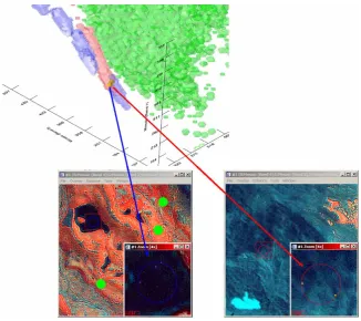
MacEachren and Kraak (2001) highlight the need for linkage between data spaces in visual remote sensing systems. The prototype tool provides a link between feature space and geographic image space in the following way. The user may interactively request the Boolean intersection between two or more volumes (that is, training regions in feature space) to be computed. This operation creates a new volume which may be visualised. The prototype then offers the user the option of linking this intersecting cluster back to geographic space. Using this feature, pixels which have caused overlap can be overlaid with a new ROI. These pixels can then be statistically and visually examined. The tool allows for identification of these pixels within the entire image, or purely within the regions involved in the intersection. The identification of these pixels allows the user to revise their assumptions.
The final key feature of a VDM system is the visualisation of classifier operation. The prototype provides this feature by visualising the decision boundaries or parameters for several classifiers.
RESULTS
To showcase the visualisation prototype we present a classification study based on high-resolution satellite imagery of Heard Island to assess the value of visualisation in semi-automated image classification. The study is a simple 4 class problem with training regions as shown in Fig. 2. A random sample of 200 pixels was extracted from each training area for classification and a further 200 independently, randomly sampled pixels extracted for accuracy assessment. Visualisation of the training regions is performed using all pixels in the regions. Firstly, bands 4, 2 and 1 are selected to be used for classification, and hence visualisation. The tool is configured to display each region as an isosurface. The result is shown in Fig. 3. The shapes are coloured according to the legend in Fig. 2. Fig. 3 shows some possible overlap between the Rock (red) and Water (blue) classes. The tool is used to compute this overlap and display it as a new isosurface. The tool is also used to identify the pixels causing this overlap and highlight their location in image space (Fig. 4). The new volume produced by the intersection operation is shown as a yellow isosurface. The pixels from the Rock class causing this intersection are highlighted with a purple overlay, and those from the Water class with a yellow overlay.
only property of the data used by the minimum distance classifier. Pixels are classified according to the closest mean point in feature space. The visualisation tool shows that some misclassification between the Water and Rock classes may be expected.
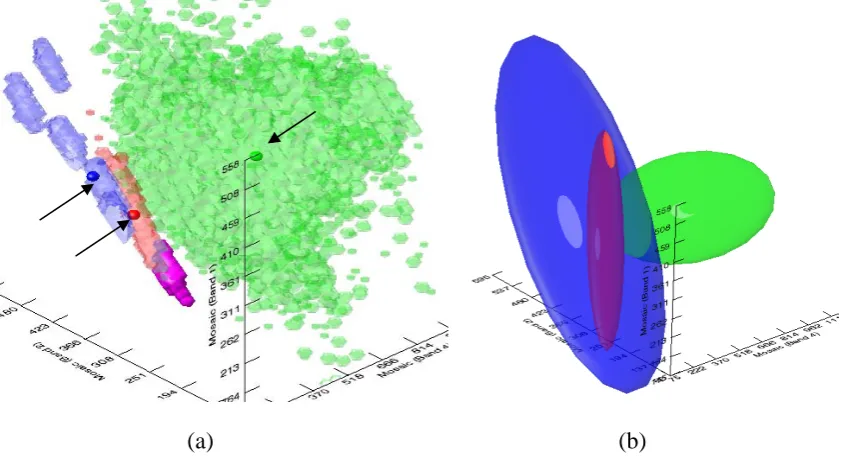
Fig. 3: Feature space plot showing isosurfaces for 3 training regions (X-axis = band4, Y-axis = band 2, Z-axis = band 1)
[image:7.595.134.461.403.693.2]Fig. 6b shows the results of a minimum distance classification of the image subset in Fig. 6a. The lake in the centre left of the image is almost completely misclassified as water. Fig. 3 shows that the Water class is made up of 5 distinct clusters. These clusters are directly linked to the 6 circular reference regions that make up the training set (Fig. 2). Two of these training clusters cover pixels that are spectrally similar so they form only a single cluster in feature space. The training pixels from the misclassified lake make up the Water cluster closest to the origin, highlighted in purple in Fig. 5a. Pixels inside the purple cluster will be misclassified as rock due to the Rock class’ mean lying closer to this cluster than the true Water class mean.
(a) (b)
Fig. 5: (a) Mean points and extent for each region in feature space shown as small opaque spheres with misclassified lake cluster shown in purple; (b) ellipsoids
representing the decision boundary for a maximum likelihood classifier.
(a) (b) (c)
Fig. 6: (a) False colour composite of bands 4,2 and 1 of a subset of the Paddick Valley image; (b) thematic image shown the result of a minimum distance classification; (c)
[image:8.595.99.502.532.689.2]Fig. 5b shows ellipsoids representing the statistical distribution of pixels in the regions. These ellipsoids represent the decision boundaries of a maximum likelihood classifier. The closer a pixel is to the centre of a class ellipsoid the higher the likelihood that it belongs to that class. A pixel has multiple likelihoods associated with it, one for each class. It is classified according to the maximum of these likelihoods. Fig. 5b shows that the Rock and Water classes have much potential for misclassification. The distinct clusters within the Water region cause a high variance which the classifier takes into account. This causes the decision boundary for the Water class to almost completely enclose the Rock class. In this way, pixels falling within the Rock class, but on the left side of the Rock ellipsoid may in fact have a higher likelihood for the Water class. This is reflected in Fig. 6b showing that the lake is correctly classified but much of the rock in the top right of the subset image is incorrectly labelled as water.
DISCUSSION AND CONCLUSIONS
VDM is a useful technology for image classification. This study has showcased the added value that visualisation can provide to analysis of satellite imagery. A novel volume based representation was used as a basis for visualisation using isosurfaces. Isosurfaces and ellipsoids where used to construct 3D feature space plots showing the relationships between training regions and decision boundaries used during classification. Linkage of feature space visualisations and geographic space image views allowed a thorough investigation of patterns in the image data. The prototype visualisation tool:
• provided the opportunity for increased understanding of classification algorithms and the results obtained by using these techniques,
• showed possible revisions to classification hypotheses,
• enabled visual exploration of the image data in a more effective manner than colour composite image views,
• allowed for more insightful analyses than non-visual data mining alone which in turn provides greater confidence in results.
REFERENCES
Aplin, P., 2005. Remote sensing: Ecology. Progress in Physical Geography, 29(1): 104-113.
Bastin, L., Fisher, P.F. and Wood, J., 2002. Visualizing Uncertainty in Multi-Spectral Remotely Sensed Imagery. Computers & Geosciences, 28(3): 337-350. Bergstrom, D.M. and Chown, S.L., 1999. Life at the Front: History, Ecology and
Change on Southern Ocean Islands. Trends in Ecology and Evolution, 14: 472-477.
Blenkinsop, S., Fisher, P.F., Bastin, L. and Wood, J., 2000. Evaluating the Perception of Uncertainty in Alternative Visualization Strategies. Cartographica, 37(1): 1-13. Bloomenthal, J. and Wyvill, B., 1997. Introduction to Implicit Surfaces. Morgan
Kaufmann Publishers Inc., 400 pp.
GeoEye, 2006. GeoEye - IKONOS Imagery. http://www.geoeye.com, Last accessed: December 2006.
ITTVIS, 2006. ITT Visual Information Solutions - IDL-ENVI. http://www.ittvis.com, Last accessed: December 2006.
Keim, D.A., 2002. Information Visualization and Visual Data Mining. IEEE Transactions on Visualization and Computer Graphics, 7(1): 100-107. Lillesand, T.M. and Kiefer, R.W., 2005. Remote Sensing and Image Interpretation.
Wiley and Sons, New York.
Lucieer, A., 2004. Uncertainties in Segmentation and their Visualisation. PhD Thesis, Utrecht University.
Lucieer, A. and Kraak, M.J., 2004. Interactive and Visual Fuzzy Classification of Remotely Sensed Imagery for Exploration of Uncertainty. International Journal of Geographical Information Science, 18(5): 491-512.
MacEachren, A.M. and Kraak, M.J., 2001. Research challenges in geovisualisation. Cartography and Geographic Information Systems, 28(1): 3-12.
Robinson, S., Turnbull, J., Brandner, S. and Fyfe, S., 2006. Can remote sensing be used to map vegetation and monitor community change in Antarctica?, Australian Antarctic Data Centre - CAASM Metadata.
http://aadc-maps.aad.gov.au/aadc/metadata/metadata_redirect.cfm?md=AMD/AU/ASAC_2 392, Last accessed: December 2006.
Scott, J.J. and Bergstrom, D.M., 2006. Vegetation of Heard and McDonald Islands. In: K. Green and E. Woehler (Editors), Heard Island: Sentinel of the South. Surrey Beatty.
Scott, J.J. and Ryan, U., 2004. Heard Island Vegetation Mapping From Orthophotos Derived From Non-Metric Photography, Australian Antarctic Data Centre - SnoWhite Metadata (http://www.aad.gov.au/default.asp?casid=3802).
Simoff, S.J., 2002. VDM@ECML/PKDD2001: the International Workshop on Visual Data Mining at ECML/PKDD 2001. SIGKDD Explor. Newsl., 3(2): 78-81. Tso, B. and Mather, P.M., 2001. Classification Methods for Remotely Sensed Data.
Taylor and Francis.
Wegman, E.J., 2001. Visual Data Mining, Center for Computational Statistics, George Mason University, VA. http://www.galaxy.gmu.edu/stats/syllabi/inft979/-VisualDataMining.pdf, Last accessed: 30 Oct.