City, University of London Institutional Repository
Citation:
Tominski, C., Schumann, H., Andrienko, G. and Andrienko, N. (2012).
Stacking-based visualization of trajectory attribute data. IEEE Transactions on Visualization and
Computer Graphics, 18(12), pp. 2565-2574.
This is the unspecified version of the paper.
This version of the publication may differ from the final published
version.
Permanent repository link:
http://openaccess.city.ac.uk/2854/
Link to published version:
Copyright and reuse: City Research Online aims to make research
outputs of City, University of London available to a wider audience.
Copyright and Moral Rights remain with the author(s) and/or copyright
holders. URLs from City Research Online may be freely distributed and
linked to.
City Research Online:
http://openaccess.city.ac.uk/
[email protected]
Stacking-Based Visualization of Trajectory Attribute Data
[image:2.612.82.539.106.271.2]Christian Tominski, Heidrun Schumann, Gennady Andrienko, and Natalia Andrienko
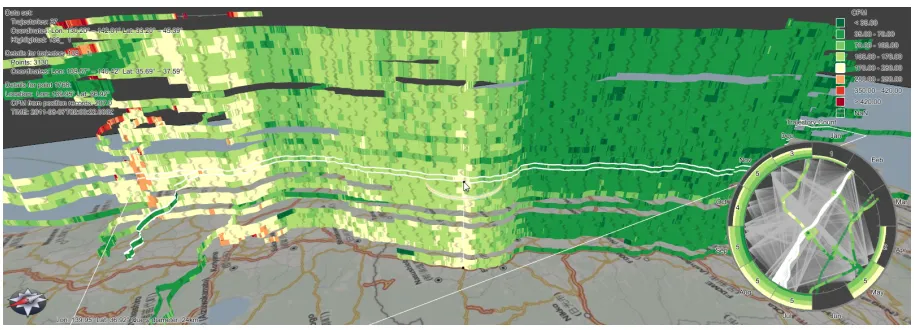
Fig. 1. Visualization of radiation (CPM values) along the Tokio-Fukushima highway.
Abstract—Visualizing trajectory attribute data is challenging because it involves showing the trajectories in their spatio-temporal context as well as the attribute values associated with the individual points of trajectories. Previous work on trajectory visualization addresses selected aspects of this problem, but not all of them. We present a novel approach to visualizing trajectory attribute data. Our solution covers space, time, and attribute values. Based on an analysis of relevant visualization tasks, we designed the visualization solution around the principle of stacking trajectory bands. The core of our approach is a hybrid 2D/3D display. A 2D map serves as a reference for the spatial context, and the trajectories are visualized as stacked 3D trajectory bands along which attribute values are encoded by color. Time is integrated through appropriate ordering of bands and through a dynamic query mechanism that feeds temporally aggregated information to a circular time display. An additional 2D time graph shows temporal information in full detail by stacking 2D trajectory bands. Our solution is equipped with analytical and interactive mechanisms for selecting and ordering of trajectories, and adjusting the color mapping, as well as coordinated highlighting and dedicated 3D navigation. We demonstrate the usefulness of our novel visualization by three examples related to radiation surveillance, traffic analysis, and maritime navigation. User feedback obtained in a small experiment indicates that our hybrid 2D/3D solution can be operated quite well.
Index Terms—Visualization, interaction, exploratory analysis, trajectory attribute data, spatio-temporal data.
1 INTRODUCTION
Exploring trajectories of moving objects is relevant to people in a num-ber of application domains. Examples are traffic planners who need to find bottlenecks in traffic networks, physicists who seek to understand particle movements, or sociologists who analyze the behavior of hu-man individuals. For these scientists, trajectories are valuable sources of information because they encompass spatial and temporal aspects of the movement of objects and additional quantitative and qualita-tive attributes about the movement and the environment or context in which the movement took place.
The three componentsspace,time, andattributeslead to an infor-mation richness that makes analyzing trajectories a profitable task. But understanding spatio-temporal trajectory attributes is also difficult,
be-• Christian Tominski is with the University of Rostock, e-mail: [email protected].
• Heidrun Schumann is with the University of Rostock, e-mail: [email protected].
• Gennady Andrienko is with the Fraunhofer Institute IAIS, e-mail: [email protected].
• Natalia Andrienko is with the Fraunhofer Institute IAIS, e-mail: [email protected].
Manuscript received 31 March 2012; accepted 1 August 2012; posted online 14 October 2012; mailed on 5 October 2012.
For information on obtaining reprints of this article, please send e-mail to: [email protected].
cause it involves a variety of aspects. One needs to assess spatial and temporal dependencies, which need to be set into relation to gain in-sight into the spatio-temporal dynamics of attributes. Trajectory data might contain interesting facts not only at the level of individual tra-jectories, but also at the level of sets of trajectories (e.g., trajectories that cross specific regions in space and/or that cover particular spans in time). For larger data sets it is usually unclear where interesting facts can be found and which trajectories needs to be looked at in detail.
In consequence of the complex interplay of different data aspects and analysis tasks, providing appropriate support for interactive ex-ploration of trajectory attribute data is challenging. Hence, existing visualization methods usually focus on one or two particular aspects, but not all of them. According to our research, none of the existing methods provides sufficient support for investigating individual tra-jectoriesandsets of trajectories with regard to spaceandtimeand attributes.
With this work, we develop a novel solution that covers all facets involved in the analysis of trajectory attribute data. According to the nature of the data and based on a study of relevant analysis tasks, we suggest the following general visualization design: Attribute data of individual trajectories are visualized ascolor-coded bandsand sets of trajectories are visualized bystackingthe bands.
The association to time is established through temporal ordering and through thetime lens, a circular time display that is connected to a dynamic query mechanism. Additionally, the 2Dtime graphshows trajectories as horizontal bands along which the time-dependency of an attribute is encoded by color. All representations are coordinated, enabling analysts to link temporal and spatial aspects in order to make spatio-temporal discoveries.
This basic visualization solution is further equipped with supple-mental components, including construction of meaningful subsets of trajectories based on interactive selection and analytical calculations, interactive adjustment of the color-coding based on statistical proper-ties of the data, and dedicated navigation mechanisms.
In summary, our contribution is a novel approach that (1) integrates space, time, and attributes, (2) considers relevant analysis tasks, and (3) combines visual, analytical, and interactive components to facili-tate trajectory attribute exploration.
We derive our novel approach and describe its individual compo-nents in detail in Section 3. To demonstrate the usefulness of the pro-posed solution, we apply it in Section 4 to visualize several interesting data sets, including the radiation around Fukushima Daiichi nuclear power plant, the taxi traffic at San Francisco airport, and vessel move-ment in the harbor of Brest. The usability of our solution has been evaluated in a small experiment. The generally positive feedback of the participants and their constructive suggestions for improvements are briefly discussed in Section 5. This article ends in Section 6 with a conclusion and ideas for future work.
2 DATA, TASKS,ANDRELATEDWORK
Next, we start with introductory comments on the data we are con-cerned with, study the questions that analysts might ask about such data, and take a look at related work.
2.1 Data
The general goal of our work is to explore dynamic attributes along trajectories in space and time – for individual trajectories as well as across sets of trajectories. Achieving this goal is becoming increas-ingly relevant, because new sensors and data collection infrastructures support the acquisition of contextual attributes of movement better and better.
For example, GPS devices used by runners annotate position records with attributes representing physical conditions such as heart rate or body temperature. Web sites likemovebank.orgprovide the infrastructure for enriching trajectories with environmental attributes reflecting weather, land cover, and other phenomena.
Moreover, attributes can be derived directly from raw trajectory data. Examples are speed, direction, acceleration, turn, sinuosity, and distance to selected places or trajectories. A classification of poten-tially interesting attributes is provided in [4].
Trajectory data Dthat are associated with attributes can be for-mally defined as follows. A trajectoryd∈Dis an ordered set of data pointsd=hd1, . . . ,dldi. Each data pointdk: 1≤k≤ldis of the form dk∈(Sn×T×A1× · · · ×Am), whereSn defines the spatial coordi-nates of the point (e.g., geographical latitude and longitude ifn=2, plus elevation ifn=3),Tdefines time, andAi: 1≤i≤mare the value ranges of quantitative or qualitative attributes. This definition shows the complexity of the problem we face: The data encompass spatial and temporal aspects as well as numerical and/or categorical data.
Here we consider trajectories in 2D space with a moderate number of attributes. The number of trajectories and the number of points per trajectory varies between a few dozens and several thousands, result-ing in data sets with about a million individual measurements. Further-more, we consider domains with hard-constrained (e.g., road traffic or indoor movement of people) or soft-constrained (e.g., seasonal migra-tion of animals or traffic lanes in sea or sky) trajectories. An essential aspect of such constrained trajectory data is that there are large subsets of trajectories with similar geometry. This similar geometry is crucial for our approach.
2.2 Tasks
In exploratory trajectory analysis the analyst aims at understanding the interrelations between the data components, in particular, between the spatial (S), temporal (T), and attributive (A) components in trajecto-ries of moving objects. Based on distinguishing betweenindependent dimensions anddependentattributes, exploratory data analysis can be viewed as analogous to the investigation of thebehaviorof a math-ematical function, i.e., the way in which the values of the dependent variable(s) vary with respect to the independent variable(s) [7]. For trajectory data, the main goal is to understand the functional depen-dencyS×T →A, i.e., thebehaviorof the attributes with respect to space and time.
Depending on the focus of the investigation, the analyst may pursue the following behavior-related objectives:
Behavior characterization Observe the value distribution ofAover the wholeSandT or selected parts ofSandT and characterize, mentally or explicitly, the behavior ofA. It can be characterized as constant or piecewise constant in regions in space or periods in time or as having gradual or abrupt changes, temporal or spatial trends, repetitions in space and time, periodicities in time, local or global outliers, and so forth. An example is to characterize the behavior of the vehicle speed along a highway over a day. Behavior search Detect occurrences of a particular behavior of
in-terest and locate them inSandT. An example is to find out in which parts of the highway and during which times of the day traffic congestions occurred, i.e., low speeds of multiple cars. Behavior comparison Compare the behaviors of Ain different
re-gions ofSor in different intervals ofT or in different subsets of the trajectory dataD. Examples are to compare the behaviors of the vehicle speeds on different highway segments, or on dif-ferent days (e.g., work days vs. weekend), or in the subsets of trajectories going in opposite directions.
Since the investigation of the overall behaviorS×T →Ais a com-plex task, the analyst may decompose it into simpler subtasks. One type of subtask is to focus on selected placess∈Sand consider the corresponding behavior of AoverT: T →Afors=const. An ex-ample is to consider the temporal variation of the speed over the day at a selected crossing. This kind of behavior can be calledlocalwith respect to space.
Another subtask type is to focus on selected timest∈T and con-sider the corresponding behavior ofAoverS:S→Afort=const. An example is to consider the variation of the speed along the highway at around 8AM. This kind of behavior may be calledlocalwith respect to time. In both cases, one of the dimensionsT orSis handled at an elementary level.
After exploring the local behaviors in different places and times, the analysis is lifted to asynoptic level, where the goal is to understand the overall behavior S×T →A. The termsynoptic levelcombines Bertin’s [9] overall and intermediate reading levels (as opposed to the elementary reading level).
Hence, visualization tools for exploring trajectory attribute data should provide appropriate support for the characterization, search, and comparison of local behaviorsT →AandS→Aand overall be-haviorsS×T→Afor the wholeS,T, andDand subsets thereof.
2.3 Related Work
Among the first attempts to visualize attributes of trajectory data are Charles Minard’s maps (see [29] for a review of Minard’s work). A classic example is his famous map of Napoleon’s Russian Campaign. The map depicts the size of the French army by the width of a band on the map, and air temperature by a visually connected time graph.
At present, trajectories are often represented in a space-time cube, which combines time and space in a single display [20, 17]. In prin-ciple, it is possible to show also attributes in this display, but this ap-proach is quite limited in respect to the number of trajectories.
Contemporary works on visualizing trajectory attributes confirm that plotting attributes in geographic space (2D or 3D) is beneficial for their analysis. For instance, Ware et al. [35] developed the GeoZui4D system to display multiple attributes along 3D trajectories of underwa-ter movement of whales using color, texture, and glyphs.
Kraak and Huisman [21] use a combination of time graphs for two attributes (speed and heart rate), a map, and a space-time cube (repre-senting a selected attribute by coloring trajectory segments) for identi-fying interesting events. However, this approach considers only single trajectories and not sets of them.
Spretke et al. [33] apply color-coding to the segments of multiple trajectories on a 2D map for showing different classes of segments based on multiple attributes. This facilitates separating day flights of migratory birds from night flights and from stops, as well as show-ing footprints of different classes on the map. However, overplottshow-ing hinders detecting spatial behavior along individual trajectories.
Crnovrsanin et al. [10] use a time graph together with a trajectory map for displaying the dynamics of distances to selected places (e.g., forest roads or exits from a building). To compensate for overplotting on the map, the authors transformed the geography using so-called proximity PCA. This approach works for multiple trajectories, but overplotting on maps and in time graphs remains a critical issue.
Andrienko et al. [3] also use a combination of a time graph display with a map for multiple trajectories. To resolve overplotting in the time graph, they use a so-called time band display (similar to [18, 24]) with coloring based on class intervals.
The reviewed approaches work well for basic tasks. Depending on the focus of the visualization design,S→AandT→Atasks can be accomplished. Arguably, some approaches (e.g., those based on the space-time cube) can be useful to supportS×T →Atasks, but as described earlier such tasks remain complicated anyway. The idea of splitting this complex analysis task into more focused and easier to accomplish subtasks is not explicitly supported by existing solutions, neither at an elementary level nor at a synoptic level.
As a result of the review of the related work, we can summarize that the distribution and the dynamics of attribute values in space and time remain difficult to analyze, especially, when analysts are interested not only in individual trajectories, but also in collections of trajectories.
3 TRAJECTORYATTRIBUTEVISUALIZATION
In order to support analysts in exploring trajectory attribute data, we have to address the complex data characteristics and the tasks as de-scribed in Sections 2.1 and 2.2. We propose a novel approach that deals with these challenges by combining visual, analytical, and inter-active means.
3.1 Solution Overview
Inspired by Tuan Nhon Dang et al.’s [25] stacking of graphic elements, our solution visualizes attribute values along stacked trajectory bands. Individual color-coded bands support elementary∗ →Atasks and the stack of the bands as a whole supports synoptic∗ →Atasks. The utility of this approach depends on appropriate color-coding, and ap-propriate grouping, selection, and stacking of trajectories, which will be discussed in Section 3.2.
Because time and space differ in their intrinsic properties and also in terms of how humans perceive them and reason about them, the general visualization design needs to be adapted to space and time. The flexibility of trajectory bands and the generality of the stacking concept enables such an adaptation. As a result, we provide two com-plementary displays:
• The hybrid 2D/3Dtrajectory wallfocuses on the spatial behav-iorS→Aby embedding 3D bands into a virtual map space. The temporal information cannot be displayed in full detail in this view. A part of the temporal information, namely, temporal or-dering, can be conveyed through ordering of the bands. Addi-tionally, an integrated dynamic query tool, called thetime lens, allows the analyst to access temporally aggregated information. • The 2Dtime graphfocuses on the temporal behaviorT→Aby
showing attribute values along horizontal 2D bands.
Understanding the spatio-temporal behaviorS×T→Afor individ-ual trajectories and across sets of trajectories requires switching fre-quently between space and time, and between elementary and synoptic tasks. The full potential of our approach lies in applying the provided visual representations, interactive mechanisms, and analytical tools in a linked and coordinated way.
3.2 General Visualization Issues
As indicated before, our approach requires an appropriate color-coding of attribute values and an appropriate selection and ordering of the trajectories to be visualized as stacked trajectory bands.
Color-coding of attribute values Because we use the spatial co-ordinates on the screen for showing the dimensions of time and space, attribute values must be encoded using another visual variable. We rely on color because it is a widely accepted approach, it fits well with the trajectory band design, and it is both selective and associative [9] and therefore can support very well elementary and synoptic tasks.
To make∗ →Abehavior of attribute values easily detectable and in-terpretable, an appropriate mapping of the values to colors is required. There is a long standing discourse in the visualization community about whether to use isomorphic vs. segmented color scales [8]. In cartography, this topic corresponds to the discussion about unclassified vs. classified thematic maps. According to cartographers, classified thematic maps (i.e., maps using segmented color scales) can represent behavior better [23]. However, this requires not only an appropriate color scale, but also an appropriate definition of class intervals used for the mapping of data values to colors.
In terms of the color scale, we rely on the ColorBrewer [14], which provides evaluated color scales for different numbers of classes. We give the user the freedom to choose one of the ColorBrewer scales according to his/her preferences or domain-specific conventions.
The definition of appropriate class intervals is intricate because there is no perfect method that produces a single “best” partition of an attribute’s value range into classes [23]. The partitioning can be based on different criteria [32]. The cartographic literature recom-mends choosing class breaks according to the statistical distribution of the values so that similar data values are placed in the same class and dissimilar in different classes [32].
Our tools support this recommended strategy in two ways. First, the division can be done fully automatically using the algorithm for statistically optimal classification [16, 32]. Second, the user can in-teractively set class breaks according to “natural breaks” in the data, which can be detected visually by means of a dot plot or a cumula-tive curve display [7]. The classification tools also support the divi-sions into equal intervals and by quantiles, which also have certain advantages [32]. Furthermore, the user can arbitrarily set the breaks according to his/her understanding of the data or according to domain-specific standards or conventions.
Irrespectively of the criteria and strategy used for defining class in-tervals, it is reasonable to test the sensitivity of the observed patterns to the class break setting. To do such a testing, the user can move the class breaks interactively by means of sliders, which results in imme-diate updating of all displays where these classes are represented.
Fig. 2. Alternatives for color-coding attribute values along trajectory bands. Top: plain color-coding requires less space; middle: two-tone pseudo-coloring [30] increases precision; bottom: color filtering reduces visual load.
whereas just two or three pixels are enough for plain class-based col-oring (see top bands in Fig. 2). This may have implications when large numbers of trajectories need to be visualized.
To facilitate focusing on value ranges of interest, which may be particularly useful for behavior search and behavior comparison, we allow the user to decrease the visual prominence of selected value in-tervals (see bottom bands in Fig. 2). Thiscolor filteringis activated by clicking on the corresponding rectangles in the color legend. The operation affects the bands in the trajectory wall and the time graph.
Grouping and selecting trajectories Grouping is useful for di-viding a large set of trajectories into manageable portions, which can be analyzed one by one, or for focusing on interesting subsets of tra-jectories (with respect to the analysis goals) and disregarding uninter-esting ones.
For analyzing trajectory attributes in respect to space S→A, we start with identifying groups of trajectories that have similar geome-tries. The analyst can do this by means of spatial queries (e.g., tra-jectories passing a series of user-selected regions), or by means of clustering trajectories by similar origins, destinations, or route simi-larity [28]. When analyzing the temporal behaviorT →A, it makes sense to construct groups based on temporal queries, e.g., selecting evening or weekend trajectories. The results of the spatial and/or tem-poral grouping can be further refined by attribute queries (e.g., select-ing trajectories with median speed higher than 70 km/h).
Stacking trajectories In order to enable analysts to carry out tasks at the synoptic level, an appropriate stacking of trajectory bands is needed. As mentioned earlier, chronological ordering of the tra-jectory bands brings a part of temporal information into the tratra-jectory wall display. The ordering can be done according to the absolute times of the starts or ends of the trajectories (i.e., using the linear time model) or according to their positions within one of the temporal cycles, such as daily, weekly, or seasonal (i.e., using the cyclic time model).
The temporal ordering of trajectories is important for supporting synopticS×T→Atasks. With a temporally ordered stack of trajecto-ries, vertical neighborhood of band segments corresponds totemporal neighborhood of the trajectory points. Similarly, horizontal neighbor-hood of band segments corresponds tospatialneighborhood of the trajectory points.
Due to the associative property of color, neighboring band segments with the same or close colors (representing similar attribute values) are perceptually united into larger spots. Hence, relatively homoge-neously colored spots (perceived by human vision as unities) corre-spond to spatio-temporal regions of constant behavior.
Furthermore, like gradual changes of the color along the horizon-tal dimension signify a spatial trend, gradual changes along the ver-tical dimension signify a temporal trend, and changes in a diagonal direction correspond to a spatio-temporal trend. Hence, owing to the temporal ordering of the trajectory bands, the user can perceive local behaviorsS→AandT→Aand overall behaviorS×T→A.
Additionally, it can be useful to stack trajectory bands accord-ing to other criteria. For example, orderaccord-ing by the average speed supports comparison of faster and slower trajectories and detecting places of major speed differences between them, which may signify re-occurring traffic problems. We allow the user to arrange trajecto-ries based on any attribute or sequence of attributes referring to the whole trajectories, while the temporal ordering is used as default. The generated trajectory sequences are then fetched to the visualization components described next.
3.3 Design of the Visualization Components
To facilitate the decomposition of the analysis into localS→Aand T→Asubtasks, we need to define complementary views that focus on each subtask’s specific character. One view focuses on the spatial as-pectS→Aand another one on the temporal aspectT →A. Moreover, each view must be equipped with facilities to establish a connection to the dimension it is not focusing on.
Because the concept of trajectory bands and their stacking is simple yet flexible by design, it can be easily adapted to the aforementioned requirements. We propose two instantiations: thetrajectory wallwith focus on space (see next section) and thetime graphwith focus on time (see Section 3.3.2).
3.3.1 Visualizing Spatial Attribute Behavior
In order to supportS→Atasks, it is necessary to show trajectory at-tribute values in their spatial context. As we consider 2D trajectories, it appears as if a 2D solution would be fully sufficient. However, this is not true. A 2D solution would quickly suffer from severe overplotting because we deal with trajectories with very similar geometry. It would be difficult to separate individual trajectories and discern attribute val-ues along trajectory paths. A 2D solution would also fall short in terms of maintaining an order of trajectories, which is required for detecting behavior at the synoptic level. Utilizing the third dimension for a 3D stacking of trajectory bands will help us resolve these concerns.
On the other hand, stacking trajectories along the third dimension means detaching them from their 2D reference space. This can make it more difficult for the analyst to understand the trajectory paths through space. Therefore, we need to integrate mechanisms that retain the basic 2D character of trajectories.
According to this thinking, we designed the trajectory wall as a hybrid 2D/3D approach. The spatial context is visualized by a 2D map that resides in a virtual 3D viewing space. The map is con-structed in a straight-forward way by tiling the bounding box of the tra-jectories with appropriately scaled bitmaps from the OpenStreetMap project [26] (or any other tile server).
The virtual 3D viewing space serves as the spatial reference con-tinuum into which the visualization of trajectories and attribute values needs to be embedded. For this purpose, we have to construct trajec-tory paths whose individual segments can be colored using the mech-anisms described in Section 3.2.
Constructing trajectory paths Given a trajectorydone can con-nect its individual pointshd1, . . . ,dldito form a path through space. Then each path segment can be color-coded according to the associ-ated attribute value. There is a subtle detail that needs to be be taken care of: A trajectory dhasld points, but there are onlyld−1 path
segments to be colored. Unfortunately, we cannot simply append an artificial segment to the path, because it would inappropriately alter the spatialcharacteristicsofd. Neither can we rely on color interpolation along the path, because we are using segmented color scales.
Our solution is to insert split points midway between any two con-secutive original trajectory points. Instead of connecting the original points directly, we create segments between the split points and the original points. The color of a segment is chosen so as to correspond to the attribute value of the original trajectory point incident to the segment. Fig. 3 illustrates the mapping for 2D paths. Note that our so-lution requires rendering 2ldsegments, whereas simply appending an
artificial line segment results in paths of lengthld. So, for trajectories
[image:5.612.47.296.49.178.2]Append segment ?
Split segments
Trajectory points
[image:6.612.321.562.47.305.2]Split points
Fig. 3. Mapping trajectory points to form a colored path.
Visualizing trajectories and attribute values The described tra-jectory paths to are used to construct color-coded 3D tratra-jectory bands as illustrated in Fig. 4. The bands are stacked along the z-axis perpen-dicular to the map. This 3D approach provides each trajectory with an exclusive layer on the z-axis. Going into 3D also enables us to indi-cate the directions of trajectories by means of arrows embedded into the bands.
Although our solution allows for ordering by any attribute, ordering by time is the most appropriate for the trajectory wall, because it brings a part of the temporal information (relative order) to the display. In this way the vertical dimension also represents time, but relative time rather than absolute time.
To better preserve the trajectories relation to the 2D map, they are additionally visualized as color-coded 2D paths. The 3D bands and 2D paths are used in a smoothly blended fashion. When the display is rotated to a bird’s eye view, the bands fade out, whereas the paths fade in. When approaching a horizontal perspective, paths fade back out and the bands reappear. The angles at which the fading occurs can be adjusted, including the possibility to allow for an overlap where paths and bands are visible at the same time.
To further facilitate understanding the trajectory bands in connec-tion to the map, we add a highlighting plane for the focused trajectory and project the focused trajectory point onto the map. Optionally, the highlighting plane can show a locally confined duplicate of the map, which is useful when the base map is outside of the current view.
Our hybrid 2D/3D design allows analysts to switch seamlessly be-tween a 2D overview of all trajectory paths and the detailed investiga-tion of attribute behavior in the 3D bands. Fig. 4 illustrates that the 2D paths are useful to assess the spatial characteristics of trajectories and the overall spatial distribution of attribute values, but as already men-tioned, overplotting hinders detailed analysis of individual attribute values along trajectories. The 3D bands make attribute values of indi-vidual trajectories and of groups of trajectories easier to explore thus facilitating elementary and synoptic tasks.
Dealing with the implications of 3D We carefully analyzed the implications of our 3D environment. In particular, we need to address the problems of 3D navigation and occlusion [31, 19, 11].
Our goal is to make zoom, pan, and rotation functions in 3D simple and convenient. One way to achieve this is to consider the fact that the analyst is usually focused on something in particular when carrying out these operations. By adapting the 3D navigation to this focus point, we can reduce the complexity of the interaction. The zoom follows the point under the mouse cursor (e.g., zoom toward a specific segment of a trajectory), and the pan grabs exactly that point allowing the ana-lyst to drag it closer. Rotation in 3D is realized as orbiting around the focus, where a virtual compass is provided to maintain user orienta-tion. A specific requirement of our design is to enable the navigation along the stacking order of the trajectories. Therefore, we give ana-lysts the opportunity to use the so-calledelevator, which corresponds to a smooth navigation along the z-axis. User feedback obtained in a small study (see Section 5) indicates that thefocusedzoom, pan, and orbit and theelevatorare practical in our scenario.
Occlusion can be addressed by two means. One option is to make the wall transparent allowing the user to look through it. Apparently, this option should be used only on demand due to the adverse effects of unintended color blending. An alternative is to use thecolor filtering (see Section 3.2) to narrow the trajectory bands in places where irrel-evant data is shown. The analyst could for example focus on extreme values and narrow the bands for mean values. The filtering has two benefits: occlusion is reduced where bands are narrow and relevant data stand out where bands are of regular width.
Fig. 4. Visualization of trajectories as colored 3D bands and 2D paths.
To further reduce possible interference of the map display and the trajectory visualization, the user can temporarily switch off the map or dim it to retain the spatial context.
The ensemble of visual and interactive components described so far facilitates the exploration of the spatial behavior of attributesS→A. In order to better supportS×T→Atasks, a more direct link to time has to be established, in addition to the temporal ordering of trajectories.
Maintaining the connection to time Integrating time in full de-tail is hardly possible, because the trajectory wall is already visually rich with two dimensions showing the spatial frame of reference and the third dimension being utilized for the stacking. In order to limit the time-related information to a displayable amount, we developed thetime lens(see Fig. 5), which shows temporally aggregated infor-mation for an interactively defined spatial query area. The time lens is a circular display (similar to the trip view in [22]) that consists of two basic components: (1) the lens interior for showing spatial aspects and (2) the lens ring for visualizing temporal aspects.
The interior of the lens shows those trajectory points that match a circular spatial query area. The spatial query is interactively specified directly within the trajectory wall display by means of aquery circle (see Appendix A for details). Moving the query circle allows the user to determine which trajectory points are displayed in the time lens, and
Time bins
Time scale
Value distribution Trajectory points
[image:6.612.57.304.49.95.2]Time links Query circle
[image:6.612.321.568.590.719.2]Fig. 6. The time graph shows the dynamics of attribute values within trajectories by two-tone pseudo-coloring. The alignment of the trajectories has a significant impact on what can be seen in the display (left: alignment by time of the day, right: alignment by start time).
resizing the query circle controls how many of them. Optionally, the user can extend the 2D query circle to a 3D query cylinder to further refine the query to specific trajectories from the stack of trajectories. Trajectory points that match the query are represented as dots whose color correspond to the points’ attribute values. The dots are embedded into the time lens according to their spatial layout (as shown in Fig. 5). The ring of the time lens is segmented intotime binsbased on the data’s time model (see Aigner et al. [1]). Cyclic time is modeled as a set of recurring time primitives as for instance the 4 quarters of the year, 12 months of the year, 7 days of the week, or 12/24 hours of the day. If only linear time is semantically meaningful for the analyzed the data (e.g., eye-movement data), the time bins correspond to a suitable partition of the linear time domain.
The fill levels of the time bins visualize temporally aggregated in-formation about the trajectories that intersect with the query. We pro-vide three alternative aggregates: (1)countcalculates how many tra-jectories intersect with the query area, (2)total durationaccumulates the time spent by all trajectories in the query area, and (3)average du-rationaverages the time spent by individual trajectories in the query area. Additionally, the time bins visualize the distribution of attribute values per time primitive. The time lens in Fig. 5 shows clearly that no trajectories pass on weekends and that the distributions of values are similar for all workdays.
In addition to displaying aggregated information, we can establish a direct connection to time on demand. This is done by means of so-calledtime links, which connect each trajectory point to the time lens’ innertime scale. The inner time scale is chosen so as to represent a sensible subdivision of the time bins (e.g., hours if bins are days).
When the query area is sufficiently small (i.e., only few trajectory points are shown), the time links are useful to directly connect space and time. Even with larger numbers of time links it is possible to reveal temporal patterns. For example, the time links in Fig. 5 accu-mulate mostly at specific points at the time scale. These accumulations indicate that trajectories pass the query area only during specific hours of the day. In order to make such pattern discernible, the overplotting in the lens interior can be resolved interactively by alpha-blending the time links and rotating the outer ring of the lens.
The tight integration of the time lens into the trajectory wall fa-cilitates S×T →A tasks. Fig. 1 on the first page illustrates the time lens for the count of trajectories and the temporal resolution of months applied to trajectories of mobile sensors that measured radi-ation along the Tokio-Fukushima highway. In the particular example from Fig. 1 we can see that the proportion of the medium radiation values (yellowish color in the July and August bins) significantly de-creased in September where lower radiation values (greenish colors in the September bin) became more frequent. Given the query area high-lighted in the center of the figure, we can conclude that the situation improved in this part of the road. Further discoveries that can be made in the radiation data set will be described in Section 4.
Because the time lens depends on restricting the displayed tempo-ral information via dynamic query mechanisms and aggregation, an additional display is needed that focuses entirely on the time aspect.
3.3.2 Focusing on the Temporal Behavior
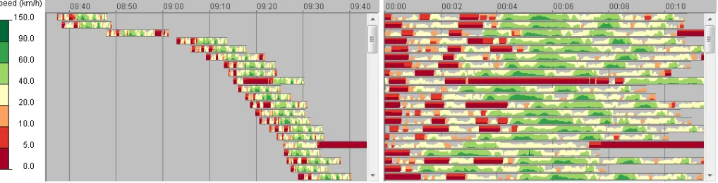
To explore the temporal dimension in full detail (T →Atasks), we propose the complementary time graph display as illustrated in Fig. 6. Following our principal visualization design, this display shows indi-vidual trajectories as stacked horizontal bands. Designed in this way, the time graph provides a synoptic view in respect to time, as over-all temporal behavior can be characterized and be searched for. By sorting the trajectories in the vertical dimension according to different criteria, analysts can conveniently compare the temporal behaviors in individual trajectories and in groups of trajectories.
The number of trajectory bands that can be simultaneously seen in the time graph is limited by the available screen height. Larger sets of trajectories can be explored by means of scrolling or by grouping tra-jectories as discussed in Section 3.2. To enable analysis of long time intervals, the display allows temporal zooming and panning, which can be done either fully interactively or through automated animation. To facilitate comparisons between trajectories that are far apart in time, the display supports two kinds of time transformation [5]: (1) in re-lation to the individual life times of the trajectories (start and/or end times) and (2) in relation to temporal cycles: daily, weekly, monthly, seasonal, or annual. The latter kind of transformation also supports the exploration of how the trajectories and attribute values are distributed with respect to the chosen time cycle, i.e., synopticT→Atasks where T stands for a time cycle.
Fig. 6 shows the impact of time transformation by aligning the start times of the trajectories. This transformation allows us to see that all trajectories have similar patterns of speed dynamics over time: very low - low - very low values in the beginning, followed by rather high speed later, and ending with rather low speed. The display also sup-ports thecolor filteringintroduced in Section 3.2, which enables the user to focus the behavior analysis on particular value ranges (see bot-tom bands in Fig. 2).
To facilitateS×T →Atasks, the time graph is dynamically linked to the map in the trajectory wall. This means that highlighting a tra-jectory segment in the time graph will highlight the same segment, and hence its spatial position, in the trajectory wall. The linking is bi-directional and enables elementary support in respect toS.
3.4 Approach Summary
With the trajectory wall and the time graph, we have described two complementary visualizations that focus onS→AandT→Atasks, respectively. In order to support the analyst in making spatio-temporal findings with regard toS×T→Aat the elementary and synoptic level, time and space must be linked appropriately.
Therefore, both visualizations are integrated into an infrastructure that provides additional user controls and bi-directional coordination between spatial and temporal displays. Our infrastructure enables an-alysts to select trajectories (by clusters or by spatial, temporal, and/or attributive queries) and to order them according to space, time, and at-tributes, and the visualizations react to these operations dynamically. The class intervals and colors are coordinated as well to keep them consistent throughout all displays.
To further facilitate understanding, we provide direct access to at-tribute values and additional textual information by mouse over. An interactive legend highlights the class of the currently focused trajec-tory point, which makes it easier to associate colors with class inter-vals. By clicking the legend the analyst can filter out classes that are less relevant to the task at hand.
So far we have not yet discussed the aspect of multi-attribute analy-sis. To deal with multiple attributes, two approaches are possible. One approach is to visualize and explore each attribute separately. Our in-frastructure allows for multiple instances of the visual displays, each with a distinct spatio-temporal attribute. This way, a few attributes can be investigated simultaneously, for example to compare them.
The other approach to explore the spatio-temporal behavior of multi-attribute value combinations is to cluster these combinations by similarity and represent the cluster membership of the trajectory points again by color-coding. Our infrastructure provides a variety of cluster-ing methods for this purpose, and includes tools to establish the cor-respondence between the clusters and the attribute values (e.g., with color-coded parallel coordinates plots, frequency histograms, maps, or space-time cubes).
Overall, our solution provides a comprehensive set of tools to facil-itate the exploration and analysis of attribute data of several hundred trajectories. The usefulness of our approach will be demonstrated by several examples in the next section.
4 EXAMPLES
In this section we demonstrate how the stacking based visualization approach can be used to gain insight into trajectory attribute data re-lated to radiation surveillance, traffic analysis, and maritime naviga-tion.
4.1 Data Set 1: Radiation measurements in Japan
The Fukushima Daiichi nuclear disaster is a series of equipment failures, nuclear meltdowns, and releases of radioactive materials at the Fukushima-I Nuclear Power Plant, following the earthquake and tsunami on 11 March 2011. A community of volunteers cre-ated a sensor network for collecting and sharing radiation measure-ments to empower people with data about their environment (see
blog.safecast.org/maps/).
While the situation in major cities and around the station is care-fully controlled by the authorities, it is also important to understand how radiation is developing on the neighboring roads. Data for the roads are collected by mobile sensors installed in the cars of the vol-unteers. The result is trajectories with radiation values attached to the position records. A publicly available data set consists of 1,014 tra-jectories including 1,936,261 measurements of so-called counts per minute (CPM).
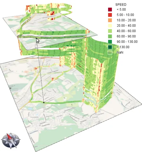
[image:8.612.318.567.50.308.2]The available data allow, in particular, the characterization of the radiation behavior along the major highway connecting Tokyo and Fukushima. After selecting trajectories along the highway using a spa-tial query, the CPM values have been shown in the trajectory wall (see Fig. 1) using the class intervals and color scale suggested by experts. The bands are chronologically ordered from bottom to top. The time lens is organized by months, from April 2011 till January 2012. The view has been rotated for maximum visibility of the trajectory wall.
Fig. 7. The development of a traffic jam in San Francisco.
The following behaviors can be observed. There is a spatial trend of the values increasing as the distance to the station decreases (S→A), which is observed at all times. The values in different places at medium distances from the station (from 25 to 75km) tend to decrease over time (T →A). Closer to the station this temporal trend is less prominent (T →A). In the places that are farther from the station the values are constantly low (T→A). Hence, the overall spatio-temporal behavior (S×T →A) is that the radiation increases with approach-ing the station and decreases over time at medium distances from the station while being constantly low at farther distances and constantly high closely to the station.
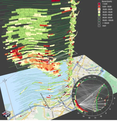
4.2 Data Set 2: Traffic jams in San Francisco
This example demonstrates behavior search. The goal is to detect traf-fic jams on a highway connecting San Francisco downtown with the international airport and locate them in space and time. We use a pub-licly available data set [27] consisting of tracks of 535 taxi cabs during 4 weeks from 2008-05-17 till 2008-06-10 with 10,564,877 position records in total.
Using the controls provided by our infrastructure, the analyst has filtered the trajectories by visited regions (entrance to the highway and airport area) thus extracting 14,646 trajectories. The speed along these trajectories has been displayed in time graph and trajectory wall dis-plays with class breaks at 5, 10, 20, 40, 60, 90, and 130km/h.
The time lens shows that the cars in the selected query area (see circle around the mouse pointer in the center of the figure) used on average 5 minutes to cross the area of about 2km diameter. In a similar way, the other occurrences of the traffic jam behavior can be detected, located in space and time, and characterized in more detail.
Further investigation supported by navigation in the trajectory wall reveals how some taxi drivers tried to bypass traffic jams by taking alternative routes. Most of these attempts had no success. However, one of the drivers (highlighted under the mouse pointer) successfully used an alternative road in South San Francisco.
4.3 Data Set 3: Vessel traffic in the harbor of Brest
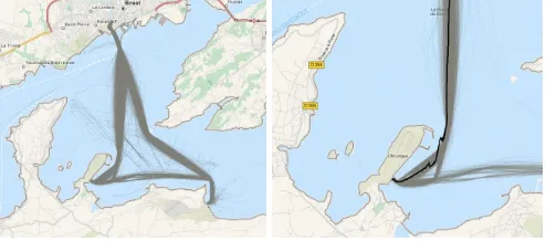
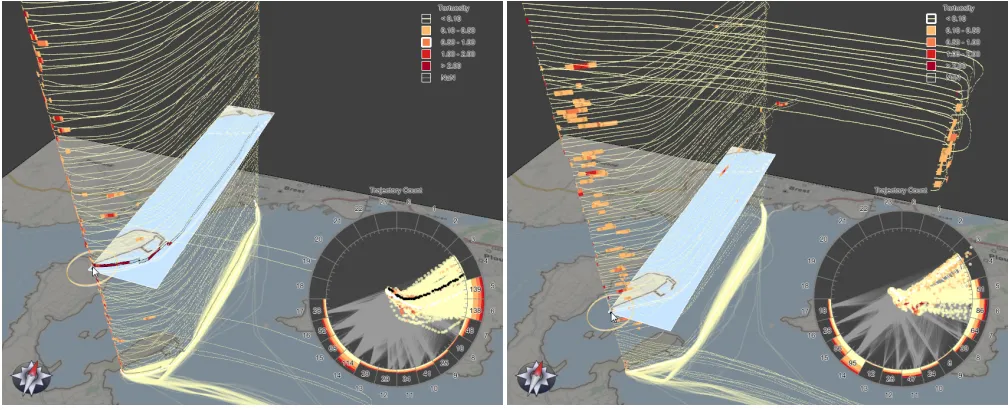
This example is meant to demonstrate behavior comparison. The data set with vessel trajectories in the harbor of Brest (France) has been collected and kindly provided by Dr. C. Ray, Naval Academy Re-search Institute. There are 4,137 trajectories (see Fig. 8) consist-ing of 782,404 position records for the period from 2009-02-11 till 2009-12-20. The analyst is interested in the spatio-temporal behavior of the movement tortuosity. The tortuosity values are computed from the position data using a sliding window of 1 minute. High tortuos-ity means frequent change of the vessel heading. Such situations are unpleasant for the passengers and may indicate dangerous situations.
By observing the trajectory wall for all trajectories, the analyst no-tices that the tortuosity is usually low on the lanes between the ports and high values mostly occur near the ports in small segments of tra-jectories (S→A). However, there are outliers, i.e., trajectories with long segments of high tortuosity. One such trajectory is highlighted on the map (in black in Fig. 8 right). The zigzagged character of the movement is well visible. Possibly, the vessel had some techni-cal problems.
The analyst then focuses separately on each port to investigate the tortuosity in its vicinity and, more specifically, to compare the tortuos-ity behavior in the subsets of incoming and outgoing trajectories. We show the analysis by example of the port on the Ile Longue peninsula (southwest). By filtering the trajectories using a spatial directional query, the analyst selects two subsets: 1,433 incoming and 1,413 out-going trajectories. These subsets are visualized in two different in-stances of the trajectory wall display in Fig. 9.
Since high tortuosity values are of primary interest, the analyst de-creases the visual prominence of the segments with low values by means of color filtering in the legend. The displays clearly show how the spatial behaviors of the tortuosity (S→A) differ for the incoming and outgoing vessels. For the incoming vessels (see Fig. 9 left), high values usually occur closely to the destination point. For the outgo-ing vessels (see Fig. 9 right), high values occur at about 1km distance from the port. The segmented time lenses show us that both patterns are stable in time. However, at some time periods (6AM-8AM, 2PM-4PM) the traffic is more intensive and, respectively, the high tortuosity values are more frequent, especially in the afternoon. We can also see that the connecting lines accumulate at specific minutes at the time scale, which indicates that vessels follow a defined time table.
The examples demonstrate that our visualization design is useful for gaining insight into spatio-temporal behaviors of various kinds of attributes associated with trajectory positions. The interaction capabil-ities support the analyst in exploring the data with respect to different subsets of space, time, and attributes.
Unfortunately, in the available data sets we could not find interest-ing behaviors of combinations of multiple attributes. However, this does not cancel the principal possibility of doing multi-attribute anal-ysis using multiple views or clustering.
5 USERFEEDBACK
[image:9.612.311.558.50.159.2]In order to evaluate the usability of our solution, we conducted a small study. Our main intention was to investigate how easily and conve-niently users can explore the hybrid 2D/3D trajectory wall given the implication of 3D as discussed in Section 3.3.1. Because the other parts of our solution are based on accepted designs we did not inte-grate them in the study as well.
Fig. 8. Traffic in the Brest harbor (left) and in its south-west part (right).
For the study, we recruited 15 participants (2 female, ages 32 and 35; 13 male, ages 27–47) from the computer science department. 5 participants considered themselves experienced in visualization, the others had little or no exposure to this field. All participants were confident with mouse and keyboard interaction, 11 participants were familiar with 3D software (mostly from 3D games). None of the par-ticipants had used our techniques before.
Each session of the study started with an explanation of the trajec-tory wall and a demonstration of our focused zoom, pan, and orbit interaction as well as the elevator interaction, which were also sum-marized on a reference handout. Then the participants were asked to apply the interaction techniques to freely navigate around a trajectory wall showing “speed” of 250 clustered GPS-tracks of daily commut-ing. During the study, one experimenter encouraged the participants to “think-aloud” about what they were doing, why they were doing it, and how they would like to do it. The experimenter took notes of the participants feedback and provided assistance when it was needed. The participants were explicitly asked to include any negative com-ments they might have. At the end of each session, the participants had to answer additional Likert-type questions regarding the ease of use, helpfulness, smoothness, and learnability of the interaction. Indi-vidual sessions took between 15 and 20 minutes.
The feedback of the participants was mostly positive. 13 out of the 15 participants agreed that our focused zoom, pan, and orbit interac-tions made it easy to explore the trajectory wall. The idea of using a focus point for the interaction was immediately clear to the partic-ipants. Several participants highlighted the particular importance of the elevator navigation along the stacked trajectories. Although we had many participants who were used to classic 3D fly-through navi-gation, none of them had difficulties using our solution.
13 participants agreed that the switch between 3D trajectory bands and 2D paths on the map is easy to understand. All acknowledged the usefulness of the highlighting plane with the projection of the focused trajectory point onto the map. When being presented with the option of showing a map duplicate (as shown in Fig. 4), some participants saw this as a useful approach, others were concerned about the occlusion of the wall caused by the additional map.
All participants answered that the interaction was easy to learn; some participant spontaneously said that the interaction “is intuitive and works very much as expected”. The implementation was posi-tively rated by all participants as being smooth and fluid.
The participants also made constructive suggestions for improve-ments. 4 participants commented that the orbit was too sensitive to mouse movement, among them were the two participants who rated the interaction as not being easy. This problem can be corrected by providing user-adjustable interaction speeds. One participant men-tioned that the 3D stacking elevator would be even more useful if it had a design similar to scroll bars. This would make navigation across larger distances easier. As a solution, we could enhance the elevator with an in-situ scrolling widget.
Fig. 9. Comparison of the tortuosity of incoming (left) and outgoing (right) vessels at the Ile Longue peninsula in the Brest harbor.
this locked trajectory. This way he could traverse a path without acci-dentally switching to another trajectory.
Overall we can conclude from the user feedback that the 2D/3D approach can be operated quite well using the provided interaction techniques. Several participants made impromptu comments about the visualization as well, including “I can easily compare the trajectories in the wall.” or “This looks like stop-and-go traffic, maybe there is a traffic light or a construction site.”. We take these comments as an ad-ditional indication that our solution is useful when analyzing trajectory attribute data, as already demonstrated in the previous section.
6 CONCLUSION ANDFUTUREWORK
We presented a novel visualization approach that facilitates gaining in-sight into trajectory attribute data. By integrating spatial and temporal displays, we support exploratory spatio-temporal analysis. Our visu-alization design is based on color-coded trajectory bands, by which we address elementary tasks, and on stacking the bands, by which we address synoptic tasks. The usefulness of our solution has been demonstrated by several examples and usability has been tested in a small experiment. We can conclude that the novel approach is indeed useful and usable.
Yet there is potential for improvement and future research. Our current solution works well with hard- and soft-constrained trajecto-ries with similar geometry. As soon as the tracked movements become less and less constrained or even chaotic (e.g., for particle movements at the cellular level), clustering methods and so our visualization ap-proach will produce worse results. More research is needed to find ways to cope with such data.
An interesting aspect in terms of the visual representation is to in-vestigate further the combination of time and space. So far we use spatially separated views for full-detail time and space. We plan to integrate both views into a single display and use temporal separation instead (i.e., show one after the other). To this end, we could use dy-namic transitions to deform bands smoothly between a spatial layout and a temporal one.
Additional interaction mechanism can be considered to better han-dle larger data sets. We imagine tools that allow analysts to inter-actively collapse and expand groups of trajectories (user-specified or computed), similar to collapsing and expanding nodes in a regular tree view. This idea requires enhancing the data model from a linear stack to an ordered hierarchy of groups, and enhancing the design of bands, because a single band must then be capable of showing the paths of multiple grouped trajectories.
Furthermore, the exploration process deserves more research. So far our solution leaves the decision which parts of the data to analyze
with which visualization entirely to the analyst. To ease the decision making it is worth investigating guiding principles based on a more detailed study of analysis tasks and characteristics of the trajectory data. In combination with the previously mentioned ideas, we could then compute and present “grand tours” through space and time.
Finally, we encourage geo-science researchers and usability experts to use and evaluate our approach to identify and quantify its strengths and weak spots. An interactive prototype is readily available [34].
ACKNOWLEDGMENTS
The authors wish to thank Martin Luboschik for inspiring discussions, the participants of the user study for their constructive feedback, and the anonymous reviewers for their valuable suggestions. This work was supported by the German Research Foundation in the context of the SPP “Scalable Visual Analytics”.
A SOMEDETAILS ON THEDYNAMICSPATIALQUERY
The dynamic query area is defined by two mandatory parameters re-lated to the spatial domainSand two optional parameters related to the stacking order. The mandatory parameterspositionandradiusdefine a query circleS0⊂S. The optional parametersz-indexandheightdefine a query cylinder to select only specific trajectories from the stack.
Testing a trajectory d against S0 is based computing line-circle-intersections for the 2ldpath segments of the trajectory. Fig. 10
il-lustrates the three different cases that need to be handled. For the caseoutside, nothing needs to be done. For the caseinside, the cor-responding trajectory segment is passed to the temporal aggregation. Theintersectcase requires cutting off the part of the path segment that is outside, where the precise intersection point (incl. coordinates, time, and attribute values) is computed by interpolation. Then the situation is a regularinsidecase. Optionally, the number of required line-circle-intersection calculations can be reduced by first checking if the index ofdin the stacking order falls in a rangez-index±height/2, as defined by the query cylinder.
Outside Inside
Intersect
Query Circle
Trajectory Path
[image:10.612.318.565.655.721.2]REFERENCES
[1] W. Aigner, S. Miksch, H. Schumann, and C. Tominski. Visualization of Time-Oriented Data. Springer, 2011.
[2] G. Andrienko, N. Andrienko, P. Bak, D. Keim, S. Kisilevich, and S. Wro-bel. A Conceptual Framework and Taxonomy of Techniques for Analyz-ing Movement. Journal of Visual Languages & Computing, 22(3):213– 232, 2011.
[3] G. Andrienko, N. Andrienko, and M. Heurich. An Event-Based Concep-tual Model for Context-Aware Movement Analysis.International Journal of Geographical Information Science, 25(9):1347–1370, 2011. [4] G. Andrienko, N. Andrienko, C. Hurter, S. Rinzivillo, and S. Wrobel.
From Movement Tracks through Events to Places: Extracting and Char-acterizing Significant Places from Mobility Data. InProceedings of the IEEE Symposium on Visual Analytics Science and Technology (VAST), pages 161–170. IEEE Computer Society, 2011.
[5] G. L. Andrienko and N. V. Andrienko. Poster: Dynamic Time Transfor-mation for Interpreting Clusters of Trajectories with Space-Time Cube. InProceedings of the IEEE Symposium on Visual Analytics Science and Technology (VAST), pages 213–214. IEEE Computer Society, 2010. [6] G. L. Andrienko, N. V. Andrienko, U. Demsar, D. Dransch, J. Dykes,
S. I. Fabrikant, M. Jern, M.-J. Kraak, H. Schumann, and C. Tominski. Space, Time and Visual Analytics.International Journal of Geographical Information Science, 24(10):1577–1600, 2010.
[7] N. Andrienko and G. Andrienko. Exploratory Analysis of Spatial and Temporal Data. Springer, 2006.
[8] L. D. Bergman, B. E. Rogowitz, and L. Treinish. A Rule-Based Tool for Assisting Colormap Selection. InProceedings of the IEEE Visualization Conference (Vis), pages 118–125. IEEE Computer Society, 1995. [9] J. Bertin.Semiology of Graphics: Diagrams, Networks, Maps. University
of Wisconsin Press, 1983. translated by William J. Berg.
[10] T. Crnovrsanin, C. Muelder, C. D. Correa, and K.-L. Ma. Proximity-Based Visualization of Movement Trace Data. InProceedings of the IEEE Symposium on Visual Analytics Science and Technology (VAST), pages 11–18. IEEE Computer Society, 2009.
[11] N. Elmqvist and P. Tsigas. A Taxonomy of 3D Occlusion Management for Visualization. IEEE Transactions on Visualization and Computer Graphics, 14(5):1095–1109, 2008.
[12] F. Giannotti and D. Pedreschi, editors.Mobility, Data Mining and Privacy – Geographic Knowledge Discovery. Springer, 2008.
[13] J. Gudmundsson, P. Laube, and T. Wolle. Computational Movement Analysis. In W. Kresse and D. M. Danko, editors,Springer Handbook of Geographic Information, pages 423–438. Springer, 2012.
[14] M. A. Harrower and C. A. Brewer. ColorBrewer.org: An Online Tool for Selecting Color Schemes for Maps.The Cartographic Journal, 40(1):27– 37, 2003.
[15] J. Heer, N. Kong, and M. Agrawala. Sizing the Horizon: The Effects of Chart Size and Layering on the Graphical Perception of Time Series Visualizations. InProceedings of the SIGCHI Conference on Human Factors in Computing Systems (CHI), pages 1303–1312. ACM, 2009. [16] G. F. Jenks and F. C. Caspall. Error on Choroplethic Maps: Definition,
Measurement, Reduction.Annals of the Association of American Geog-raphers, 61(2):217–244, 1971.
[17] T. Kapler and W. Wright. GeoTime Information Visualization. Informa-tion VisualizaInforma-tion, 4(2):136–146, 2005.
[18] R. Kincaid and H. Lam. Line Graph Explorer: Scalable Display of Line Graphs Using Focus+Context. InProceedings of the Working Conference on Advanced Visual Interfaces (AVI), pages 404–411. ACM, 2006. [19] A. Kjellin, L. W. Pettersson, S. Seipel, and M. Lind. Evaluating 2D and
3D Visualizations of Spatiotemporal Information.ACM Transactions on Applied Perception, 7(3):19:1–19:23, 2008.
[20] M.-J. Kraak. The Space-Time Cube Revisited from a Geovisualization Perspective. InProceedings of the 21st International Cartographic Con-ference (ICC), pages 1988–1995. The International Cartographic Associ-ation (ICA), 2003.
[21] M.-J. Kraak and O. Huisman. Beyond Exploratory Visualization of Space-Time Paths. In H. J. Miller and J. Han, editors,Geographic Data Mining and Knowledge Discovery, pages 431–443. Taylor & Francis, 2nd edition, 2009.
[22] H. Liu, Y. Gao, L. Lu, S. Liu, H. Qu, and L. Ni. Visual Analysis of Route Diversity. InProceedings of the IEEE Symposium on Visual An-alytics Science and Technology (VAST), pages 171–180. IEEE Computer Society, 2011.
[23] A. M. MacEachren. Some Truth With Maps: A Primer on Symbolization and Design. Association of American Geographers, 1994.
[24] K. Matkovi´c, D. Gracanin, Z. Konyha, and H. Hauser. Color Lines View: An Approach to Visualization of Families of Function Graphs. In Pro-ceedings of the International Conference Information Visualisation (IV), pages 59–64. IEEE Computer Society, 2007.
[25] D. T. Nhon, L. Wilkinson, and A. Anand. Stacking Graphic Elements to Avoid Over-Plotting.IEEE Transactions on Visualization and Computer Graphics, 16(6):1044–1052, 2010.
[26] OpenStreetMap Contributors. OpenStreetMap. www.openstreetmap.org, accessed July, 2012.
[27] M. Piorkowski, N. Sarafijanovic-Djukic, and M.
Gross-glauser. CRAWDAD data set epfl/mobility (v. 2009-02-24).
http://crawdad.cs.dartmouth.edu/epfl/mobility. retrieved March, 2012. [28] S. Rinzivillo, D. Pedreschi, M. Nanni, F. Giannotti, N. Andrienko, and
G. Andrienko. Visually Driven Analysis of Movement Data by Progres-sive Clustering.Information Visualization, 7(3-4):225–239, 2008. [29] A. H. Robinson. The Thematic Maps of Charles Joseph Minard. Imago
Mundi, 21:95–108, 1967.
[30] T. Saito, H. N. Miyamura, M. Yamamoto, H. Saito, Y. Hoshiya, and T. Kaseda. Two-Tone Pseudo Coloring: Compact Visualization for One-Dimensional Data. InProceedings of the IEEE Symposium on Infor-mation Visualization (InfoVis), pages 173–180. IEEE Computer Society, 2005.
[31] B. Shneiderman. Why Not Make Interfaces Better Than 3D Reality?
Computer Graphics and Applications, 23(6):12–15, 2003.
[32] T. A. Slocum, R. B. MacMaster, F. C. Kessler, and H. H. Howard. The-matic Cartography and Geovisualization. Pearson Education, 3rd edition, 2009.
[33] D. Spretke, P. Bak, H. Janetzko, B. Kranstauber, F. Mansmann, and S. Davidson. Exploration Through Enrichment: A Visual Analytics Ap-proach for Animal Movement. In I. F. Cruz, D. Agrawal, C. S. Jensen, E. Ofek, and E. Tanin, editors,Proceedings of the ACM SIGSPATIAL In-ternational Symposium on Advances in Geographic Information Systems (ACM GIS), pages 421–424. ACM, 2011.
[34] C. Tominski, H. Schumann, G. Andrienko, and N. Andrienko. Stacking-Based Visualizaion of Trajectory Attribute Data. http://goo.gl/wIC1k, accessed July, 2012.
![Fig. 2.Alternatives for color-coding attribute values along trajectorybands. Top: plain color-coding requires less space; middle: two-tonepseudo-coloring [30] increases precision; bottom: color filtering reducesvisual load.](https://thumb-us.123doks.com/thumbv2/123dok_us/1583022.110946/5.612.47.296.49.178/alternatives-attribute-trajectorybands-tonepseudo-increases-precision-ltering-reducesvisual.webp)