Rochester Institute of Technology
RIT Scholar Works
Theses Thesis/Dissertation Collections
8-1-1987
Effects of chromatic surrounds on the perceived
color balance of reflection prints
David R. Odgers
Follow this and additional works at:http://scholarworks.rit.edu/theses
This Thesis is brought to you for free and open access by the Thesis/Dissertation Collections at RIT Scholar Works. It has been accepted for inclusion in Theses by an authorized administrator of RIT Scholar Works. For more information, please [email protected].
Recommended Citation
EFFECTS OF CHROMATIC SURROUNDS ON
THE PERCEIVED COLOR BALANCE OF
REFLECTION PRINTS
by
David R. Odgers
B.S. Nebr. Wesleyan Univ.
(1982)
A thesis submitted in partial fulfillment of the requirements for the degree of
Master of Science in the Center for Imaging Science in the College of Graphic Arts and Photography of the
Rochester Institute of Technology
by
David R. Odgers
B.S. Nebr. Wesleyan Univ.
(1982)
A thesis submitted in partial fulfillment of the requirements for the degree of
Master of Science in the Center for Imaging Science in the College of Graphic Arts and Photography of the
COLLEGE OF GRAPHIC ARTS .AND PHOTOGRAPHY ROCHESTER INSTITUTE OF TECHNOLOGY
ROCHESTER, NEW YORK
CERTIFICATE OF APPROVAL
M.S. DEGREE THESIS
The M.S. Degree Thesis of David R. Odgers has been examined and approved
by the thesis committee as satisfactory for the thesis requirement for the
Master of Science degree
Edward Granger
Dr. Edward Granger, T~esis Advisor
Paul Roetlina M.S. DEGREE THESIS
The M.S. Degree Thesis of David R. Odgers has been examined and approved
by the thesis committee as satisfactory for the thesis requirement for the
Master of Science degree
Edward Granger
Dr. Edward Granger, T~esis Advisor
EFFECTS OF CHROMATIC SURROUNDS
ON
THE PERCEIVED COLOR BALANCE
OF
REFLECTION PRINTS
by
David R. Odgers
Submitted to the
Center for Imaging Science
in partial fulfillment of the requirements
for the Master of Science degree
at the Rochester Institute of Technology
ABSTRACT
A colored surround, via chromatic adaptation, can affect the
perception of a colored area. Past work done with solid
color areas was extended to include complex scenes, such as
in photographs. The direction and extent of shifts in color balance was determined.
Acknowledgements
In addition to thanking the thesis committee for their
assistance, this thesis would not have been possible without
the help of the following:
Mr. John A. Saunders III, formerly of Saradan, Inc., and
Mr. Floyd Welker-, of Xerox Corporation, who helped write
the necessary computer programs.
Dedication
To my parents, my wife, Maureen, and my daughter, for their
loving support, and to Neal Ziller, my high school mentor, without whom my interest in imaging science would not exist.
Table of Contents
Page Section
iv Abstract
vii Table of Contents
1 Introduction
16 Experimental Method
22 Results
38 Discussion
47 Conclusion
49 References
52 Appendix A
Introduction
Many have pursued an understanding of factors that
affect color perception. One such factor is the viewing
condition under which an observation occurs. For example, the appearance of a color patch is altered by the color and
luminance of the area surrounding it. Even if this
perception is subconscious, it still influences the viewer's judgments. Thus, one expects that the perception of a
complex scene, a photograph, will also be changed by a
colored surround. This paper investigates such an effect, thereby increasing the understanding of color perception.
The analysis of color perception can be examined by two
different approaches. One is the physical, answering the
questions of radiance, spectral distribution, and media interactions
-absorption, reflection, refraction. The psychological method shows similarities, but expresses
itself in different terms
-hue, saturation, lightness.
Tying the two together are years of research leading to
psychophysical concepts.
Colorimetry utilizes principles stated by Grassmann
(1853), derived from experiments in tri-color mixtures:
1. The eye can distinguish only three kinds of difference
or variation (expressible, for example, as variations
in hue, brightness, and saturation.
the color of the mixture steadily changes.
3. Lights of the same color (that is, same hue, same
brightness, and same saturation) produce identical effects in mixtures regardless of their spectral
composition.
All modern colorimetry is based on this principle. It
means that we can deal with stimuli on the basis of
their colors alone, without regard for their spectral
composition.
The spectral reflectance curve of a colored object can be
reduced to the three variations mentioned above by use of
psychophysical functions.
A color can be conveniently described as a vector in a
three dimensional space demarked by three color primaries
(unit vectors). Scalar multipliers, called tristimulus
values, of these vectors fix the color vector in this space.
Tristimulus values (X,Y,Z) can be determined by use of the
following equations:
X = k
I
R(l)S(l)x10(l) A 1 ,Y = k
I
R(l)S(l)y10(l) A 1 ,Z = k
I
R(l)S(l)z10(l) A 1 ,where r(l) is the spectral reflectance of the object, S(l)
A 1 is the spectral distribution of the source irradiating
the object and x,y,z are weights known as color-matching
functions. The normalizing factor k is often chosen as
k = 100/
^
s(l)y(l) Al. If each tristimulus value is dividedby the sum of all three, chromaticity coordinates result:
X = X/X+Y+Z, y =
Psychophysical functions can be defined in several
ways, but have been standardized by the International
Commission on Illumination (in French, CIE) by way of the
1931 two-degree color-matching functions, the 1931
x,y-chromaticity diagram, and the 1964 ten-degree color-matching
functions. In addition, several attempts have been made to
produce a uniform chromaticity scale (UCS) diagram giving
equidistant plots of chromaticities of perceptually equal
difference, one of which is the 1976 L*A*B* space.
The effects of viewing conditions are important in
color perception. The overall illumination level is a
factor, because under extreme conditions, retinal responses
differ dramatically from the norm. Proper judging of colors
requires that the eye has adapted to the prevailing
illumination and color. As defined previously, tristimulus
values are influenced by the spectral distribution of the
illuminating source.
The eye's sensitivity changes to compensate for both
the amount of light incident on the retina and the color.
The latter is the response of interest in this paper. It is
called chromatic adaptation, which is described as
"transient changes in sensitivity, ascribable to photopic
chromatic stimulation, that result in changes in chromatic
sensation and
perception"^
and as "modifications of visual
stimuli, brought about by chromatic conditioning (adapting) stimuli that are surrounding or
pre-exposed."3
This
adaptation is manifested in several ways. Colored objects
when viewed under light sources of different spectral distributions (daylight vs. tungsten, for example) have (to
a great extent) the same color appearence, an effect called
object-color constancy.
Color contrasts also influence perception. A color in juxtaposition to another will alter its appearance, a change
known as simultaneous contrast(see example in ref 4). In
successive contrast, the complementary color and lightness
of a color just seen is added to that currently viewed.
(These perceptionally related effects may, however, be due
to different mechanisms of the visual system, such as
photochemical reactions in the retina vs. neural
interactions on the paths to the brain. '6
Chromatic adaptation occurs rapidly , the major part in
a few seconds and any remaining in minutes if the conditions
stay the same. However, the eyes rarely reach a steady-state condition because they usually shift from one object
to another. For the most part, the changes happen quickly
enough to be unnoticed.
An early model explaining chromatic adaptation, known
as the von Kries coefficient law,' still provides the
tristimulus values of a color viewed under first one
illumination, R',G',B', and then another, R,G,B, the von
Kries law gives their relationships as
R = KpR, G = KpG, B = Kr>B ,
where the K's are proportionality constants for that change
of illuminant.
Much of the work in standardizing colorimetry was done
with the color being judged placed against an achromatic
surround. However, the standard observers (1931 & 1964
color-matching functions) are not intented to predict what
an observer with normal color vision will see. As mentioned
above, chromatic adaptation must be considered. Some of its
effects on the discrimination of color have been
investigated in several studies.
Wright"
asked observers to adjust one-half of a square
bipartite field (2) so that it differed in color from the
other half by a small constant amount. The two halves
started at the same point in color and intensity, then one
was changed some step greater than the just noticeable
difference, his reasoning being that it was easier for the
observer and cut the observation time. Equal intensity was
maintained by adjusting the second half. This was done at
various chromaticities and the results were plotted as
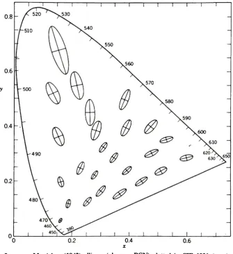
dashes on the 1931 CIE diagram (Fig. 1) The data was also
Figure 1
(from ref.l)
1931 C1E
Chromaticitydiagram
530
0 a^SOm^
J 1
0.8
Fig. 1. 1931 CIE (z,y)-chromaticity diagram. Dashed lines indicate chroma
[image:14.508.102.411.158.470.2]Breckenridge and Schaub.9 The surrounding field was dark.
MacAdam 0 conducted a similar experiment, with a
two-degree circular field divided in half vertically and a 42
degree surround adjustable to any desired adaptation. The
observer had only one control knob, partially because the
system automatically compensated to provide constant
luminance. Changes were made in several directions from each
fixed chromaticity point. Thus, his plots (Fig. 2) show
ellipses rather than dashes. The data indicates that, for
the same observer, the just noticeable color differences are
three times the standard deviations of color matching.
MacAdam's ellipses resulted from these standard deviations.
In another experiment11, his colorimeter had a
binocular system that enabled the observer to sit back a few
feet. The surrounds were made with fluorescent cloths. His
results were plotted in 1931 CIE x,y coordinates as
generally curved lines radiating from a center point. In
his conclusion he states,
"For instance, when color transparencies still or
motion pictures are projected, appreciable distortion
of hue will be produced by the surround if its
chromaticity is appreciably different from that of a
portion of the screen on which the picture or white
object is focused and if its luminance is greater than
about 10% of the luminance of the screen."
In several studies,
Brown1' x
examined the effects of
luminance, field size, and chromatic surrounds on color
Figure 2
(from ref. 3)
i 1 1 1 1 r
[image:16.508.85.421.172.539.2]decreases, generally in a nonlinear fashion. There may also
be a change in the orientation of the ellipsoidal axes. In
comparing two field sizes, it was shown that discrimination
was better and less affected by the surround with the 12
field than with the 2
field.
Brown 5 used the same colorimeter as in the second
MacAdam experiment1
given above, with surrounds of red,
green, blue, white, and black, and binocular matching fields
of red, green, blue, and white. Discrimination in the red
fields was best with the red surround, followed in
decreasing order by black, then green and white about equal,
and ending with blue. With the 2 field, blue also rotated
the ellipse axis toward blue.
For the 2
green field the order was black, green and
white, red, then blue, with the last two rotating the axis
toward their respective chromaticities. However, for the 12
green field, only the red surround had any significant
effect. Little effect by the surrounds was noted for the
blue fields.
White discrimination was quite affected by the
surrounds, the axes being rotated toward that color in each
case, and even more pronouncedly for the 2
field. While the
ratio of field to surround luminances had very little effect
on chromaticity discrimination, it was more difficult for
He states that use of the colorimeter is different than
what people would actually use in observing because
generally are looking at things greater than 2 degrees and surrounds are seldom dark. The objects are probably
chromatic , and lighter or darker than surrounding colors. The principal observer had 8 sessions of 30 color matches
for each combination of field size , color and surround, for
a total of 13,203 color matches. In the footnotes he points
out that a normal Gaussian distribution in three variables is different from a distribution in one variable.
Visual sensitivity was always improved when a large
field was used. When field size is large , color
discrimation is only slightly affected by highly saturated
surrounds. Matching fields at larger sizes would not result
in any important improvement in color discrimation. Large
matching field effect of surrounds was significant only in the case of red matching fields. He compares the
cross-sections of two of his ellipsoids (dark surround - 2
and 12
degree fields with those in different experiments: PGN10, 1 o
and Brown as principal observer in Brown and MacAdam . From
these he concludes that for small matching fields, the
chromaticity of surround is an important factor in color discrimination, that the eye's ability is reduced in the
presence of a surround differing in chromaticity from the
colors compared. When the matching fields and the surround
have the same chromaticity , the sensitivity is slightly
greater than with a white surround; however , this effect is
not great enough to account for the differences between
previously reported results and the set of ellipses
published by Stiles18. Stiles'
work was near the spectrum
locus as opposite to the near-white values. Color
discrimination is much less dependent on the color of the
surround when the field is large. The effect is the same
qualitatively, but smaller and often insignificant. When
comparing the two field sizes there was sometimes a change
in the orientation of the ellipsoids.
Brown ' later gathered 12 observers, instead of the
usual one to three, to get data representing an average
observer. They viewed small color differencs at 22 color
centers distributed thoroughout the chromaticity diagram.
The matching field size was 10 degrees in a binocular,
wide-field device11, with a broad surrounding field. "Binocular
nature of this colorimeter together with its large field
size in the presence of a surrounding field makes its use
very similar to the conditions under which colors are
usually matched and
compared."
The observer had no eyepiece
to look in, so he was free to gaze about the observing booth
in any manner he desired. It was easier for the observers if
luminance of surround was lower than that of the test field.
This experiment had surrounds made with fluorescent paints
sprayed on cardboard with a circular hole cut in it. Their
luminance level was adjusted by putting filters over the UV
source. A diversifed group of observers was selected, all
under 30 years of age, 8 men , 4 women. They were allowed
to take as little or as much time as desired. In his
calculations Brown utilized a weighting factor for the
various observers depending of their level of experience and
expertise.
He stated for future reference that in designing an
experiment one can make many observations with one or two
skilled observers or get the same number of total matches
with larger numbers of less skilled observers, and that less
would be known about the individual observers but the result
is a better average of the population. The second leads to
the possiblity of learning on the part of the unskilled
observers. That is why he used the weighting factors -to
help eliminate the time trends. The skilled observers were
less likely to change in their level of learning than the
unskilled.
In a comparison with MacAdam , he notes similarities: that the experimental technique was identical, except that the earlier was with a monocular apparatus and a dark
surround, while this experiment was binocular with a light
surround. The "principal difference in these results is a
reduction in the ratio between the sizes of the largest and
smallest ellipsoids as a function of chromaticity. ...This
could be expected, since the mean of a group of observers is
unlikely to vary as much from chromaticity to chromaticity
as would a single observer. In addition, the binocular
matching conditions and the white surrounding field may tend
to reduce the color discrimination differences to some
extent.
Wyszecki and Fielder 9' sought to compare previously
produced ellipses and added three sets of their own. They
used a binocular colorimeter designed earlier by Wyszecki.
It contained two adjacent hexagonal fields, each of 3
diameter, with a 40 white surround. The luminance of each
test color was set equal to 12 c/m2, and the surround at 6.
The primaries in one field were fixed to one of 28 test
colors, and in the other hexagon the primaries were adjusted
by the observer to match. Each of the three observers had
normal color vision and extensive experience. The
colorimeter most closely approximates ordinary viewing in
that central vision and both eyes were used, with no strict
fixation (a headrest was used). The 28 resulting ellipsoids
were computed in x,y,l space, with the plane of constant
lluminance determined for comparison with other sets. An
ellipsoid contains 95% of any random set of matches, using
(ds) *
= 7.81, (corresponses to a chi-squared value with 3
degrees of freedom) rather than (ds) = 1 for the constant
standard deviation ellipsoids used in earlier studies. For
each observer the orientation, shape, and size varied with
the location of the center of the ellipse.
The data from the same observer on different occasions
do not show the repeatablity suggested by the statistics.
Some factors may have been missed that influence the visual
mechanism. While the eight sets illustrated show an over-all
similarity, at a given color center there are vast
differences between different observers.
In a comparison with MacAdam , Brown and MacAdam ,
17
and Brown he notes that an average, such as done by Brown
for his 12 observers, does not give an observer intermediate
to a group.
In most of these intercompared studies the observer
operated the three control knobs of a three-primary
colorimeter. On the other hand, observer PGN made color
matches by turning a single control knob so as to vary the
color of one-half of the visual field along a straight line
in the chromaticity diagram. The question arises whether the
use of three fixed primary colors producing color matches
inadvertantly introduces a bias in the distribution of the
color matches for a given test color. They noticed the
tendency of the color-matching ellipse to orient itself
toward the chromaticity point of the nearest primary. The
similarity of the orientation of the ellipses presented by
Wyszecki and Fielder, and those obtained by Brown, and
MacAdam and Brown may be due to the fact that the different
experiments involved primaries of similar chromaticities.
On the other hand, experiments made by observers PGN and WSS
do not involve mixtures of three primaries fixed throughout
the experiments. Obviously further tests are required to
resolve the discrepancy between the two groups of data.
While the different observing conditions of each
experiment from the different researchers was expected to
influence the ellispes, only the effect of a larger field
size to produce better discrimination could be specifically
noted with some certainty. Also, further experiments are
needed to show the effect of the luminances and
chromaticities of the surrounds.
It is shown in the presented body of previous work that
a surround, via chromatic adaptation, can affect the
perception of a colored area. Since much of this work was
done with colorimeters and solid color areas, the effects on
complex scenes, such as exist in a photograph, remained to
be investigated. The purpose of this project was to
determine the direction and extent of possible shifts in
perceived color balance induced by a colored surround for
complex scenes.
Experimental Method
In order to test the hypothesis that colored surrounds
affect the perception of complex scenes as well as solid
colored patches, it was necessary to produce photographs,
make appropriate measurements, and do calculations to
quantify the results. The first was accomplished by making
scene exposures, processing the film, and printing some of
the negatives. The second was done by having observers
judge the prints, and by measuring spectral reflectivities.
In the Results section the calculations are shown.
The remainder of this section gives the details of how
the experiment was conducted
-the equipment and materials
used, the way they were used, and the observer judging.
Many of the resources and procedures are commonly used and
available .
To initiate the experiment suggested above, exposures
of various scenes under different i Huminat ions (bright
sunlight, shade, and indoors with electronic flash) were
made on three separate occasions. Three sheets of 4x5" Kodak
Vericolor film, and two 36 exposure rolls of 35mm Kodacolor
II(Emulsion #5035 398)were used. In both cases the film
speed was ASA 100, the camera lens was of normal focal
length, and no filters were used. A total of 53 useful
frames resulted.
In most of the photographs taken, a subject was holding
a gray card, a white card, a gray scale, and a scale of
color patches which were taped together for ease of
handling. These references were assembled from two Eastman
Kodak products, the first being the Neutral Test Card kit
(Publication No. R-27.- CAT 152 7795) which contains 8 x 10"
cards having 18% reflectance on one side and 90% reflectance
on the other, and the second being Color Separation Guides
and Gray Scale (No. Q-14, CAT 152 7662, 14"
size). The
subject was standing in neutral or natural surroundings. The
three basic colors were represented in flesh tones, grass,
and sky. Some indoor shots were also taken. One exposure was
made of a white & black building against a blue sky, with no
cards or flesh tones.
After all the shooting was completed and the film
processed, four of the negatives were selected for printing,
two with the subject outside, one inside, and the one of the
building with no reference cards or flesh tones. (For an
example of color printing, see ref. 21). Each of these four
negatives were printed in a "ring-around" of six colors
-magenta, red, yellow, green, cyan and blue -at four
filtration levels (CC0 2, 05, 1 0 , 20) fr om that giving a
nominally correct color-balanced print to the experimenter.
This nominal print was balanced by direct comparison of the
original gray card with the card in the print (in the same
type of viewing booth as described later in this section).
The nominal print was labeled "N"
and the other prints were
labeled by numbers according to increasing filtration
differences from the nominal, such as G1,G2,G3,G4. A Durst
L900 enlarger with a CLS450 colorhead (contained dichroic
filters and diffuse illumination), a glassless negative
carrier, and a Rodenstock Rodagon 80mm,f/5. 6 lens was used
in a darkroom equiped with #10 safelight filters. The prints
were made on Kodak Ektacolor 74RC color print paper(Emulsion
#236100-41354M) . The non-specular surface (Kodak
designation "N") was chosen to avoid distracting
reflections. Four prints were made on each 8 x 10" sheet of
paper, with help of a Saunders Repeating Easel. Each print
when trimmed of white borders measured 3 5/8"
x 4 5/8". The
paper was processed shortly after exposure in one of the
School of Photographic Arts and Sciences' automatic color
print processors (manufactured by Kreonite, Inc., and
utilizing the EP-2 process formulated by Kodak).
To define the color of gray card areas in CIE color
space, the spectral reflectivities were determined with a
Beckman DK-2A spectrophotometer configured for reflectance
readings. This was accomplished before observer viewing so
that any minor surface damage would not affect the results.
The scans were done from 350-750nm, at a scanning time of
180 nm/min. Only two sets of the prints, one with the
subject outdoors and the one indoors, had large enough gray
card areas to fill the entrance pupil (3/8" diameter) of the
instrument. The areas were twice the minimum size necessary
in order to insure that only gray patches were measured, not
adjacent colored areas.
For proper results to be obtained from the observa
tions, the viewing conditions were standardized with the use
of a MacBeth Color Print Viewing Booth containing lamps of
5000
color temperature (four General Electric fluorescent
tubes, labeled "Chroma 50", F40-C50). The distance from the
front opening to the back wall was 27". Its interior was
painted a neutral gray from a standard formulation provided
by MacBeth.
The colored areas surrounding the prints were made with
Chartpak Color Paper (Catalog #'s CL001,CL005, CL055, and
CL081 thru CL083). Each sheet of this paper measured 14x17"
after the borders were removed. The prints subtended an 7
viewing angle and the surrounds a 25 angle. These angles
are approximate because the observers were not required to
maintain a particular distance from the print-surround com
bination. Extremes were discouraged. The reflectances of
these sheets were read after the observations were com
pleted. Small enough pieces to fit on the spectrophotometer
had to be cut from the large sheets, thus the wait to read
their reflectances. These readings were done on the Applied
Color Systems, Inc. (ACS) Spectro-Sensor II.
Before the subjects began the observations, their
vision was allowed to adapt to the illumination in the
viewing booth (room lights off) while instructions were
given regarding the testing. (No color-blindness test was
given). They were asked to state if the print had a color
cast, and if so, what color. The example was given of how
sometimes prints returned by a commercial lab have a
peculiar color. They could volunteer their perception of
the extent of the cast. No mention was made of the reference
cards shown in the scene. They did not see the labeling on
the back of the prints. After each print was placed for
viewing (located to compensate for observer height), they
were allowed as much time as needed to reach their
conclusion, but they were exhorted to "keep moving"
so that
the total time for an individual's session was not
excessively long. Most of the 20 subjects completed the
observations in 30-60min. Recording of the responses was
done by the researcher so as not to disturb the adaptation
of the viewer.
Generally only one set of photographs was used, giving
a maximum 175 print-surround combinations (a complete
factorial design, i.e., every print with every surround).
(One of the first observers viewed the set of prints of the
subject taken indoors. After that, it was decided that for
the sake of simplicity and consistency, only one set should
be used.)
The prints were shown in random order. Any possible
biasing of the order by the experimenter was overruled by
the pace of mounting the prints for viewing and recording
the observations (the order was also recorded). Examples of
extreme print casts are shown in Appendix A.
Results
When the experimental work was completed, the data
collected was in two general categories
-spectral
reflectivities and observer responses. Several steps were
taken to calculate and display the results. Computer
programs were written to assist in these steps. Data from
both categories were entered with the help of programs
designed to insure typing the correct number of observer
responses or reflectivities. In the following paragraphs
the steps taken are described, first for the spectral data
and then for the observer data. The goal was to plot
ellipses in chromaticity space, as done in the literature.
The Beckman spectrometer scans produced tracings on
chart paper from which the reflectivities of the gray card
on each print were read & tabulated from 380-750nm in 10nm
increments. The slight occasional horizontal shifts in the
chart registration were accounted for, but the slight
deviation in the 100% reflectance line was ignored. The
scans for the surrounds were done later on the ACS. Its
microcomputer printed the reflectivities in 20nm increments
and the chromaticities. However, since these were for CIE
Illuminants A & Dg5, they were re-calculated for D50 , as
explained next.
Values of several variables were needed to calculate
the chromaticity coordinates
-the acquired spectral
reflectivities from the prints and the surrounds, the
spectral power distribution of the illuminating source (from
CIE tables), and the color-matching functions (ten degree
data). The last was found in reference tables3. The
tristimulus values were found by multiplication and
summation of the above variables, as shown in the
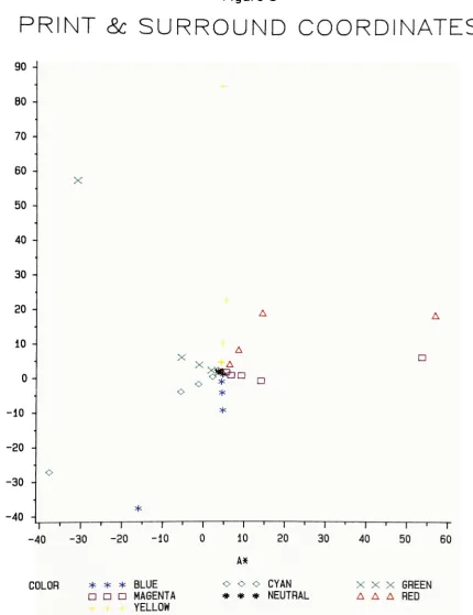
Introduction. Then the chromaticity coordinates (Table 1,
Fig. 3 & 4) were determined using the 1976 CIE L*A*B*
formula, as follows:
L*
= 116(Y/Yn)1/3 - 16
A = 500[(X/Xn)^J
(Y/Yn)^J] X/3
-(Y/Yn)1/3;
B*
= 200[(Y/Yn)1/3
-(Z/Zn)X/3],
provided all fractions are >0.01. This formula was chosen
from those available as providing the best display of the
data by more evenly spacing the coordinates.
Since the goal of this experiment was to see if sur
rounds affect perception, the response count was used to
determine the extent of any shifts. Points were selected
corresponding to prints at the 50% threshold of the group
of observers reporting a color cast, i.e., ten or more of
twenty observers said a print (against a particular sur
round) had a color cast. A point in each color direction
was selected and an ellipse was drawn that roughly connected
the points. This was done for each surround. The points and
ellipses were plotted first by hand and then using computer
graphics.
Table 1
PRINT & SURROUND COORDINATES
LABEL L* A*
N 58.5082 3.955 2.095 Ml 57.1480 5.568 1.771 M2 58.5550 6.771 0.881 M3 54.7410 9.333 0.792 M4 51.6300 14.174 -0.775
Rl 55.6150 4.615 1.964 R2 55.0220 6.475 4.053 R3 54.8730 8.663 8.291 R4 47.9850 14.563 19.033 Yl 57.8520 4.452 4.522 Y2 57.7470 4.333 4.735 Y3 55.1230 4.734 10.251 Y4 53.7260 5.485 22.723 Gl 57.5420 3.741 1.761 G2 58.5200 1.874 2.335 G3 60.6040 -1.115 3.928
G4 63.4410 -5.505 6.093
CI 56.9850 3.580 2.359 C2 59.2610 2.248 0.393 C3 61.8620 -1.209 -1.733
C4 67.3780 -5.576 -3.982
Bl 55.4550 4.818 1.028 B2 56.3050 4.457 -1.041 B3 57.2970 4.601 -4.259
B4 58.4510 4.765 -9.338
MS 60.2020 53.838 6.161 RS 53.1040 57103 18.361 YS 88.0770 4.650 85.112 GS 75.1760 -30.986 57.437
CS 54.3790 -37.656 -27.200
BS 47.0580 -15.902 -37.834
Figure 3
&
SURROUND
COORDINATES
B * 90 -80 -70 -60 -X 50 -40 -30 -20 -A A 10 - 0-A o * o * ? ?
-10 - *
-20
--30 -o
-40
-*
l ' 1 '
1 i i i 1 '
1 j i | i |
-20 -10
COLOR * * * BLUE
D ? ? MAGENTA
YELLOW
10
A*
20 30 40 50
o O o CYAN * * * NEUTRAL
60
XXX GREEN
A A A RED
Figure 4
COORDINATES
30
20
10
0
--10
X
X
o
!A n
* ? ?
-I r I 1 1 1 1 1 1 1 1 " ' ' ' ' 1 1 1 1 ' ' ' 1"
-10
COLOR * * * BLUE
? ? O MAGENTA
YELLOW
10
AX
20
o o o CYAN
* * * NEUTRAL
XXX GREEN
A A A RED
The hand-drawn plots showed that, for each of the
ellipses, the point "Yl" would be outside the ellipse, or
the point "Rl" would be inside the ellipse. Thus one or the
other of these two points, as appropriate, was excluded for
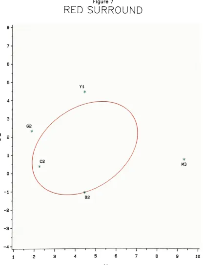
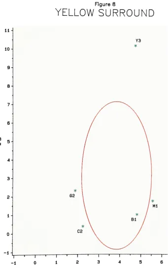
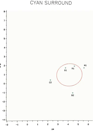
each ellipse. The computer-drawn ellipses (Fig. 5-11) were
done utilizing the results of a principal component
analysis, which gave the mean, standard deviations,
eigenvalues, and eigenvectors. The last two specified the
ellipse axes length ratio and the orientation to the
coordinate system. However, because so few points(5) were
used in the analysis, the ellipses were all oriented at 45
degrees to the axis. (The ellipse for the yellow surround
was forced parallel to the B axis.) The mean of the points
was used as the the ellipse center. A comparison of these
means showed the shift in perception (Table 2, Fig. 12).
The standard deviations were used as the semi-axes lengths.
[image:36.508.42.469.75.443.2]
6-
5-Figure 5
NEUTRAL
SURROUND
3-
2-M2
0--1
-2--3
-4-T"
0 4
A*
[image:37.508.87.426.78.625.2]Figure 7
RED SURROUND
Yi
1--1
M3
-2--3
-4-2
-i r
3 4
~1 r
A*
7 10
[image:39.508.50.467.82.625.2]11
10
9-
B-
7-
6-
5-
4-
2-
0--1
T *"
[image:40.508.86.428.75.624.2]-1
Figure 8
YELLOW
SURROUND
2 4
Y3
l
5
AN
4-
3--4
G3
1 r -2
Figure 9
GREEN
SURROUND
" r
o 6
A
[image:41.508.66.447.80.634.2]
7-
5-
4-
3-
-2--3
-4-Figure 10
CYAN
SURROUND
C2
-| r
0
"> r
*
B2
1 r
-2 -1
AK
[image:42.508.61.451.90.634.2]-5
Figure 1 1
BLUE SURROUND
2-
-2--4 B3
*
2
T 3
AX
Table 2
ELLIPSE CENTER COORDINATES
COLOR A* B*
N 4..70506 1 .59855
M 5,.21750 1.58075
R 4..47282 1 .40021
Y 3 .84814 3..15590 G 3..17014 2 .37134
C 4..12568 0..96974
B 4..39526 0 .14798
[image:44.508.172.341.116.246.2]Figure 12
ELLIPSE CENTER
COORDINATES
A-\
3-B 2
X c
X
* ?
A
i i i i i i i i i | i i i i i i i i | i i i i i i i i i p
3 4 5 6
AX
COLOR * * * BLUE o o o CYAN X X X GREEN
D ? ? MAGENTA * * * NEUTRAL A A A RED YELLOW
Discussion
The purpose of this experiment, as stated previously,
was to test the previous knowledge of colored surround
effects on perceived color such that this knowledge could be
extended to the field of color photography. The desire was
to determine whether results similar to those in the
literature could be obtained from complicated scenes in a
photograph. Results obtained for the photographs were
similar to those published concerning color patches.
The material presented here starts with an overview of
previous work, then compares it with conditions in this
experiment, follows with an elaboration of the results, and
ends with points to consider.
The eye, responding to the influence of its
environment, adjusts for incoming light by changing the
pupil size and the retinal sensitivity. The three ranges of
"7
spectral sensitivity, according to the von Kries law , are
altered in proportion to any differences in color
distribution, whether from the illuminating source or from
the objects viewed. Thus it is expected that a large
colored area in the field of view will affect the color
perception of other objects.
The literature reviewed in the Introduction showed that
when color fields were viewed with colored surrounds, the
ability to match colors was altered. In Brown's work15,
discrimination in the red fields was best with the red
surround, and for green fields was second to the best with
the green surround. White fields were affected by all
surrounds and blue fields by none of the surrounds. In all
cases for white, and in some cases for others, the ellipse
axis was rotated toward the chromaticity of the surround,
meaning that the discrimination of the eye was reduced in
that direction. In general, such a reduction in ability to
perform color matching occured when the surround color was
different from the field. This concurs with the description
in Ref. 2 of color matching against surrounds.
Brown also showed that the size of the field is another
factor. The 12 field was less affected by the surrounds
than the 2 field. In this project, the prints viewed
subtended 7, but certainly the individual color areas in
the photographs were far smaller. (The print size was not
varied.) The surrounds did not, however, fill the entire
field of view as this was not thought necessary. This type
of surround condition is similar to that in many previous
experiments - beyond the finite surround the view was either
dark or otherwise non-chromatic. It would have been too
cumbersome to cover (and frequently change) the entire
inside of the booth with colored paper.
Since the luminances of the different surrounds were
not equal, there might have been a luminance effect
overlaying the chromatic, which was not the desired
examination. MacAdam11 stated that a surround luminance of
at least 10% of that of the field would have an effect.
17
Brown remarked that it is easier for the observers if the
surround is not brighter than the field (although their
discrimination was not affected). The
L*
values for the
prints and the surrounds (see Table 1) were in the same
range, except for the yellow surround.
Brown also offers for consideration the differences
between using a few observers and using many. One of these
differences is that unskilled observers may learn as they
are tested. Perhaps a note should have been made to
distinguish which of the observers in the current work were
skilled and which were unskilled. What effect learning may
have had could be difficult to determine. The 50% threshold
was limited to four discrete points for each of the six
color directions. Since the prints and surrounds were shown
in random orders, the postions on the "learning
curves"
would also be randomized.
No observer repeated viewing sessions. It may have been
useful with some to have done so. However, Wyszecki and
Fielder1^'20
noted greater variations with repeat
observations than expected, pointing out limitations in the
gain from repeated viewing.
Comparisons with the literature may be limited for
[image:48.508.36.468.64.697.2]those experiments whose approach was to match two halves of
a solid field. Detecting a color cast may share only parts
of the same mechanisms. It should be remembered that the
intent of this experiment was to extend the understanding of
adaptation to how it affects the perception of complex
scenes. The experiment was not designed to test
color-matching or discrimination, but rather shifts in perception.
In the current results, a direct comparison of the
plots (Figs. 5-11) shows shifts, and differences in the
shapes, of the ellipses drawn. The ellipse for the neutral
surround is the smallest (best discrimination). For the
magenta surround the ellipse is elongated specifically in
the magenta direction. The ellipse for the red surround
stands out as being dissimilar to the others. Discrimination
is decreased for all colors but red. (The ellipse is drawn
ignoring the red point.) In fact, the perception of a cast
exceeded the 50% threshold for the three
"worst"
red prints
with all surrounds. The yellow and green surrounds reduced
discrimination moderately for prints of their respective
color, but also somewhat for each other and cyan. The cyan
surround reduced discrimination slightly in the cyan & blue
directions. The blue surround also reduced discrimination
for blue and somewhat for cyan and magenta. In summary, the
second most extreme print of that particular cast was the
50% threshold for magenta, yellow, green and blue surrounds.
It is interesting to note that this does not hold for red
and, to some degree, cyan, which are complementaries. None
of these results conflict with those given previously.
Most of the ellipse centers are shifted 0.6
-1.5 units
in the A B diagram (Fig. 12), which is equivalent to Color
Compensating (CC) filters of 02-05 (100 x density). A
single, moderately skilled observer can see a CC05 change in
many colors, and for Caucasian skin even CC02 is detectable.
Therefore, for the means of twenty observers, at 50%
threshold, to shift to these extents is significant. (The
reduction in error is proportional to the square root of
twenty). This result supports the hypothesis that there is
a shift in the perception of complex scenes due to
background. This extension of chromatic adaptation into the
field of photography is the major output of this study.
Red shifts the ellipse center opposite to the expected
direction, due probably to the reduction in discerning color
casts for all other colors. It is also the smallest shift.
The direction of the shifts in four of the six cases is
toward the surround in use. As mentioned, red goes in the
opposite direction. The shift induced by the yellow
surround is skewed in the green direction, but is one of the
greatest in magnitude. Some of the surrounds (Fig. 3) are
in line with the four prints of corresponding color
-cyan,
yellow, and roughly magenta and blue. However, red is
particularly off. If the line through the cyan coordinates
is extend in the red direction, the red prints are on one
side of the line and the red surround on the other.
One unexplained item in the plots is the coordinates of
the nominal print, which in A B space might be expected to
be 0,0. The difference of roughly five units may have
several possible causes, three of which are discussed here.
First, the dyes in the photographic paper are capable of
only a metameric match with the original gray card, not a
spectral one. Secondly, since the D50 source is
approximated by the use of fluorescent tubes, which are
often deficient in red, the spectral power distributions of
the actual source and the CIE standard source are different.
Thus the chromaticities derived would be slightly incorrect
representations of the print coordinates. Finally, the gray
card might not be strictly neutral, although this is
unlikely. Kodak states in the instructions enclosed with
the cards that "Manufacture of the Test Card is controlled
within close limits to produce neutral surfaces of
standardized reflectance
values"
and "may be helpful in
controlling the color balance of reproductions".
There are some topics that were not thought of or
sufficiently considered during the planning and execution
phases of this experiment. One was how to measure or
confirm the validity of the data gathered. In any
scientific pursuit utilizing experimental subjects there is
concern for the effect those subjects may have on the
results acquired. The skill of the observers varied greatly
-from those able to discern only the grossest color
distortion to individuals as familar with the technical
terminology and appearance of "cyan" and "magenta" as they
were with red, green, and blue. A few seemed to learn as the
observations progressed.
Another difficulty may have been the level of alertness
(both for the observer and the experimenter). One person was
so tired that he was there only 15 minutes and ultimately
the results had to be ignored, deleted from the summations.
The spectrophotometr ic data were generally accepted
without regard for possible instrument variation. No scans
were repeated on the same spot of a print gray card area.
However, the nominally balanced print was scanned each time
the four of a particular color cast were done (which would
not have been in precisely the same spot). When the
chromaticity coordinates from these repeated scans were
calculated, they were averaged before plotting. The
standard deviation for
A*
is 0.14 and for B is 0.23.
The statistical design chosen was a method of
categories, rather than a ranking of several prints or a paired comparison. The viewers merely stated if there was,
or was not, a cast.
For example, the number of observers responding
"Yellow"
to Print"Y2"
is as follows:
BACKGROUND
Neutral Magenta Red Yellow Green Cyan Blue
5 5 5 3 3 10 8
It appears in this example and in the other observer
data that a matching color reduces the number of people able
to see the cast and that a complementary color increases it.
As a cautionary note, calculations show that the differences
for this print are not statistically significant at a level
commonly desired. Using a chi-squared test of significance,
X = (0-E)2/E
, where 0 is the observed number and E the
9
expected number, the data for Print"Y2"
gives a X = 7.1.
The value in the tables for six degrees of freedom and a
0.05 level of significance is 12.6. Being greater than the
calculated value, the data shows no difference. On the
other hand, if there were twice as many observers with the
same ratios in responses, the calculated X^ would be 14.3.
Thus there would be a more statistically significant
difference. However, this statistical hypothesis test was
done only for one print. The ellipses and the shifts
thereof are calculated from the points of five prints.
As the data and plots given above shows, there is an
effect on the perception of color due to backgrounds. The
chi-squared test given is only one way of analyzing the
[image:53.508.39.470.52.682.2]data. Much in colorimetry is not done at the 95% confidence
level. Since error is proportional to the square root of
the number of observers, to halve the error would require
four times the number utilized, i.e. 80 observers. For the
set-up used, such a number would have been unmanageable.
Conclusion
The goal of this project was to test the hypothesis
that colored surrounds would influence perception of a color
photograph. The subject was introduced by a survey of the
literature. Then the experimental method and results were
given, followed by a discussion of the preceding steps.
In this section, conclusions are stated and
recommendations given for future investigations. While this
experiment was an advance in this area, extending beyond the
information known about solid areas or colored lights, there
still are steps that need to be taken.
Two statements can be inferred from the results of this
project: l)The appearance of a photograph with poor color
balance can be improved by viewing it against a background
of the same color. 2)A neutral print can be made to have a
cast complementary to its background. This knowledge may be
of use in displaying photographs. A machine-produced print
or an old, faded one may not have the best color balance.
The proper choice of surround would often make the
difference between having a good effect and a poor one. On
the other hand, certain color mounting arrangements for
display may not be suitable for a good print because of the
shift that may be induced in some areas.
If continuations, or modifications of this experiment
are attempted, some items to consider are: l)the print and
surround sizes and number (using more would probably better
determine the location the ellipses), 2)the number (would
need many more for any significant inprovement) , condition,
and skill of the observers, 3)whether or not to fix the
viewing distance, 4)the possibility of learning on the part
of the observers, 5)
simplifying the display of prints and
the recording of responses
-to free the experimenter from
fatigue and possible bias, and to reduce the time needed to
display the next print, 6)using more than one set of prints,
of different scenes or illuminations (this may help solve
the dilemma of the neutral point shift and would examine
effects of memory color).
Many of these suggestions probably define different
experiments than the one just described. Others might give
a firmer foundation to the conclusion reached here
-colored
surrounds affect the perception of color photographic
prints.
References
1. D.B. Judd and G. Wyszecki, Color in Business, Science, a"d Industry, 3rd ed., John Wiley and Sons, Inc., New
York, 1975.
2. The Science of Color, Optical Society of America, Washington, D.C., 1963.
3. G. Wyszecki and W.S. Stiles, Color Science, John Wiley and Sons, Inc., New York, 1982.
4. R.M. Boynton, Human Color Vision, Holt, Rinehart, and
Winston, New York, 1979.
5. T.N. Cornsweet, Visual Perception, Academic Press, Inc. New York, 1970.
6. Vision and Visual Perception, CH. Graham, ed., John
Wiley & Sons, Inc., New York, 1965.
7. D.L. MacAdam, Color Measurement: Theme and Variations, Springer-Verlag, Berlin, Springer Series in Optical Sciences, Vol.27, 1981.
8. W.D. Wright, "The sensitivity of the eye to small colour
differences,"
Proc.Phys.Soc. (London) , 53,93 (1941) .
9. F.C. Breckenridge and W.R. Schaub, "Rectangular Uniform-Chromaticity-Scale Coordinates, J.Opt.Soc.Am., 29,
370-380(1939).
10. D.L. MacAdam, "Visual sensitivities to color differences in daylight,"
J.Opt.Soc.Am., 32,247(1942).
11. D.L. MacAdam, "Loci of constant hue and brightness
determined with various surrounding colors,"
J.Opt.Soc.Am.,40,589(1950) .
12. W.R.J. Brown and D.L. MacAdam, "Visual sensitivities to
combined chromaticity and luminance
differences,"
J.Opt.Soc.Am., 39,808(1949).
13. W.R.J. Brown, "The influence of luminance level on
visual sensitivity to color
differences,"
J.Opt.Soc.Am., 4JL,684(1951) .
14. W.R.J. Brown, "Statistics of color-matching data,"
J.Opt.Soc.Am. ,42,252(1952) .
15. W.R.J. Brown, "The effect of field size and chromatic
surroundings on color discrimination,"
J.Opt.Soc.Am., 42,837(1952).
16. W.R.J. Brown, W.G. Howe, J.E.
Jackson, R.H. Morris, "Multivariate Normality of the
Color-Matching Process,"
J.Opt.Soc.Am., 46,46(1956).
17. W.R.J. Brown, "Color discrimination of twelve
observers,"
J.Opt.Soc.Am., 47, 137(1957).
18. W.S. Stile, Proc.Phys.Soc. (London)
, 58,41(1946).
19. G. Wyszecki and G.H. Fielder, "New Color-Matching Ellipses,"
J.Opt.Soc.Am., 61,1135(1971).
20. G. Wyszecki and G.H. Fielder, J.Opt.Soc.Am., 61,1501(1971).
21. Color, in the series Life Library of Photography,
Time-Life Books, New York, 1970, p.184.
22. F.W. Billmeyer, Jr., and C.J. Murphy, "Sizes of Color Differences Resulting From Change of Illuminant from CIE
C to D6500,"
J.Opt.Soc.Am., 58,1650(1968).
23. Grum, F., and Bartelson, C, eds., Color Measurement,
Optical Radiation Measurements, Vo 1. 2, Academic Press,
New York, 1980.
24. D.L. MacAdam, "Projective Transformations of Color-Mixture Diagrams," J.Opt.Soc.Am., 32,2-6(1942).
25. D.L. MacAdam, "Specification of small chromaticity differences,"
J.Opt.Soc.Am., 33,18 (1943) .
26. Sources o_f Color Science, MacAdam, D.L., ed., The MIT
Press, Cambridge, Mass., 1970.
27. Naud, J.G., "The Visual Evaluation of Reflection Prints
for Color Balance Using Calibrated References," Master's
thesis, RIT, June 1975.
28. M.R. Pointer, "Color discrimination as a function of
observer adaptation,"J.Opt.Soc.Am., 64,750 (1974) .
29. R.M. Rich, F.W. Billmeyer,Jr., and W.G. Howe, "Method
for deriving color-difference-perceptibiltiy ellipses
for surface-color samples,"J.Opt.Soc.Am.,
65,956-9(1975) .
30. L. Silberstein, "Investigations on the intrinsic
properties of the color domain," J.Opt.Soc.Am.,
28,63-85(1938).
31. L. Silberstein, "Investigations on the intrinsic
properties of the color domain.II,"
J.Opt.Soc.Am.,
33,1-10(1943).
32. H. Takasaki, "Von Kries Coefficient Law Applied to
Subjective Color Change Induced by Background Color,"
J.Opt.Soc.Am., 5_9,1370-1376(1969).
33. G. Wyszecki, J.Opt.Soc.Am., 62,117(1972).
Appendix A
lojt-aphic copies of Prints M4 and G4