2017
Bayesian analysis of high-dimensional count data
Ignacio Alvarez-Castro
Iowa State UniversityFollow this and additional works at:
https://lib.dr.iastate.edu/etd
Part of the
Statistics and Probability Commons
This Dissertation is brought to you for free and open access by the Iowa State University Capstones, Theses and Dissertations at Iowa State University Digital Repository. It has been accepted for inclusion in Graduate Theses and Dissertations by an authorized administrator of Iowa State University Digital Repository. For more information, please [email protected].
Recommended Citation
Alvarez-Castro, Ignacio, "Bayesian analysis of high-dimensional count data" (2017).Graduate Theses and Dissertations. 16097.
by
Ignacio Alvarez-Castro
A dissertation submitted to the graduate faculty in partial fulfillment of the requirements for the degree of
DOCTOR OF PHILOSOPHY
Major: Statistics
Program of Study Committee: Jarad Niemi, Major Professor
Alicia Carriquiry Peng Liu Dan Nettleton Dan Nordman
Iowa State University Ames, Iowa
2017
TABLE OF CONTENTS
LIST OF TABLES . . . vi
LIST OF FIGURES . . . vii
CHAPTER 1. GENERAL INTRODUCTION . . . 1
1.1 Hierarchical Bayesian analysis of allele-specific gene expression data . . . 1
1.2 Approximate Bayesian computation for crash frequency models . . . 3
CHAPTER 2. FULLY BAYESIAN ANALYSIS OF ALLELE-SPECIFIC RNA-SEQ DATA USING A COUNT REGRESSION MODEL . . . 4
Abstract . . . 4
2.1 Introduction . . . 5
2.2 Allele-specific expression . . . 7
2.3 Hierarchical overdispersed count regression model . . . 10
2.3.1 Data model . . . 10
2.3.2 Gene-specific layer . . . 11
2.3.3 Allele effect (∆g) . . . 14
2.3.4 Differentially expressed alleles detection . . . 15
2.3.5 Bayesian inference . . . 16
2.4 Simulation Study . . . 17
2.4.1 Model to simulate data . . . 17
2.4.2 Simulation scenarios . . . 18
2.4.3 Simulation results . . . 21
2.5 ASE in maize experiment . . . 28
CHAPTER 3. BAYESIAN HIERARCHICAL MODEL TO ANALYZE
HET-EROSIS AND ALLELIC IMBALANCE RELATIONSHIP . . . 33
Abstract . . . 33
3.1 Introduction . . . 34
3.2 Gene patterns and RNA-seq data . . . 35
3.2.1 Maize experimental data . . . 35
3.2.2 Gene expression patterns . . . 38
3.3 Poisson-lognormal hierarchical model . . . 41
3.3.1 Data model and hierarchical distributions . . . 41
3.3.2 Model matrix parametrization . . . 42
3.3.3 Normalization factors . . . 45
3.3.4 Contrasts . . . 46
3.3.5 Relationship among contrasts . . . 47
3.4 Data analysis . . . 49
3.4.1 Bayesian inference . . . 49
3.4.2 Data analysis results . . . 50
3.5 Discussion . . . 54
CHAPTER 4. CONFOUNDING EFFECTS IN DOUBLE SHRINKAGE HIERARCHICAL MODELS . . . 55
Abstract . . . 55
4.1 Introduction . . . 56
4.1.1 Hierarchical models for variances . . . 56
4.2 An initial model for gene expression data . . . 58
4.3 The confounding problem . . . 62
4.3.1 Simulated data scenarios . . . 62
4.3.2 Initial model results . . . 63
4.4 Phase shift boundary . . . 67
4.4.1 Alternative explanation for signals . . . 67
4.5 Heavy tails to avoid confounding . . . 72
4.6 An appropriate analysis of maize experimental data . . . 75
4.7 Discussion . . . 81
CHAPTER 5. AN APPROXIMATE BAYESIAN ESTIMATION OF A POIS-SON MARKOV RANDOM FIELD MODEL FOR CRASH DATA . . . . 82
Abstract . . . 82
5.1 Introduction . . . 83
5.2 Spatial data . . . 84
5.3 The (Winsorized) Poisson Markov random field model . . . 86
5.3.1 Markov random fields . . . 87
5.3.2 Poisson Markov random fields . . . 87
5.3.3 Winsorization approach . . . 88
5.3.4 Modelling crashes data . . . 89
5.4 Approximate Bayesian Computation (ABC) . . . 90
5.4.1 Introductory ABC examples . . . 91
5.4.2 Kernel density estimation and ABC . . . 96
5.4.3 Specific ABC approach . . . 98
5.5 Simulation Study . . . 99
5.6 Analysis of Iowa crash data . . . 103
5.7 Discussion . . . 105
CHAPTER 6. SUMMARY AND DISCUSSION . . . 108
6.1 Summary . . . 108
6.2 Future work . . . 109
BIBLIOGRAPHY . . . 111
APPENDIX A. SIMULATION STUDY FOR SINGLE HYBRID MODEL . 121 A.1 Simulation study . . . 121
A.1.1 Data scenarios . . . 121
APPENDIX B. SUPPLEMENTARY FIGURES FROM METHODS IN
CHAPTER 5 . . . 129
B.1 Figures from simulation study . . . 129
LIST OF TABLES
Table 2.1 Simulation study design parameter values . . . 19
Table 2.2 Hyperparameter posterior summaries for ASE counts of B73xMo17 data 29 Table 4.1 Simulation scenarios . . . 62
Table 4.2 Shrinkage levels in model (4.2) . . . 67
Table 4.3 Alternative shrinkage effects on simulated data . . . 68
Table 4.4 Combinations of hierarchical distributions for (µg, σg2) . . . 73
Table 5.1 Summary statistics of Iowa crash data . . . 85
Table 5.2 Summary statistics for approximate Bayesian computation. . . 99
LIST OF FIGURES
Figure 2.1 (Left panel) Histogram of the ratio of allele means per gene in logs. Blue line is a normal density curve with mean and variance equal to mean and variance of the ratio across all genes. (Right Panel) Hexagon binning plot of means per gene and allele. Vertical axis is the ratio of allele means per gene in logs while horizontal is the allele-specific mean expression in logs. The red line indicates the overall mean difference expression among the two alleles means. . . 9
Figure 2.2 Quantiles ofIG(ν2,ντ2 ) against τ. Facets correspond to quantiles, color and type of lines corresponds toν value. Black line is they=xline. 13
Figure 2.3 ROC curves for scenarios with reference allele bias present (p = 0.5). Row facets corresponds to overdispersion level (T), while column facets combine signal strength and sparsity (s,w). Line color indicates the hi-erarchical distribution. Hihi-erarchical models are plotted with continuous lines and dashed lines correspond to non-hierarchical models. . . 22
Figure 2.4 Partial area under ROC curve (AUC), over region with false positive rate lower than 10%. Facets represent the hierarchical distribution used in the model, and row facets represent sparsity level. Each line corresponds to a scenario, color and type of the line indicate the overdispersion level (T) . . . 23
Figure 2.5 Partial area under ROC curve (AUC), over region with false positive rate lower than 10%. Facets represent the overdispersion level (T). Each line corresponds to a scenario, color indicates the signal strength and the line type represent the sparsity. . . 25
Figure 2.6 Scatter plot of false discovery rate against proportion of discoveries. Color of points indicates the hierarchical distribution for regression pa-rameters and shape indicates sparsity level. . . 26
Figure 2.7 Scatter plot of θ2 posterior mean against log(p) parameter. Row facets represents sparsity and column facets the overdispersion level. The line corresponds to y=−x
2 line. . . 27 Figure 2.8 Scatter plot of variance of allele effect against variance of regression
coefficient. Facets correspond to the hierarchical distribution and color indicates the overdipersion level. . . 27
Figure 2.9 Allele effects for ASE counts of B73×Mo17 hybrid data. Left: Scatter plot of probability of differential expression against allele effect. Right: 95% credible intervals of allele effect against overall gene expression. In both panels, color indicates if the gene is declared as differentially expressed or not. . . 30
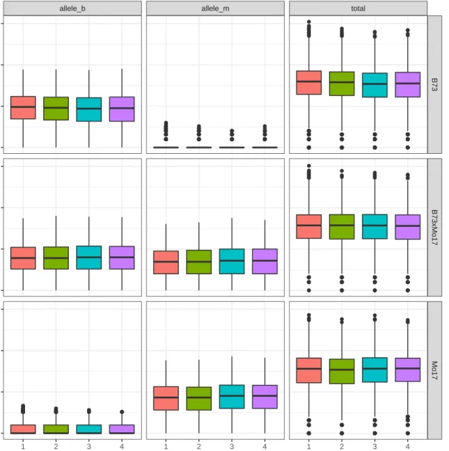
Figure 3.1 Boxplots of observed counts (in log2) in genes with ASE information available. Row facets represent the biological sample variety (B, BM,
M), column facets represent the expression type (b,m,t), and the color represents the replicate. . . 37
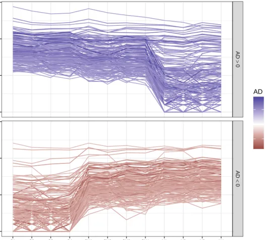
Figure 3.2 Total RNA-seq parallel coordinate plot in genes with large observed allelic difference (AD). The facet and color of the line distinguish genes with allele difference above 99th quantile (left panel, blue lines) or below 1th quantile (right panel, red lines). . . 39
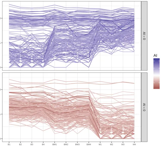
Figure 3.3 Total RNA-seq parallel coordinate plot in genes with large observed allelic imbalance (AI). The facet and color of the line distinguish genes with allele imbalance above 99th quantile (left panel, blue lines) or below 1th quantile (right panel, red lines). . . 40
Figure 3.4 Tile plot of correlation matrices. Correlation among regression coeffi-cient point estimates, fromedgeR, for different parametrizations. Color indicates the direction in the correlation coefficient and color intensity indicates its absolute value. . . 44
Figure 3.5 Gene-specific correlations between mid-parent heterosis and allele diff-ence patterns,ρ(M H, AD), against correlation between mid-parent het-erosis and allelic imbalance, ρ(M H, AI). The left panel is a bivariate histogram, where darker points representing higher counts. Right panel is an hexagonal heatmap where color represents the mid-parent heterosis contrast (M D). . . 51
Figure 3.6 Bivariate histograms of gene-specific correlations and mid-parent het-erosis contrast (M Hg). Left panel shows correlations between
mid-parent heterosis and allele diffence patterns, (ρ(M H, AD), and right panel shows correlation between mid-parent heterosis and allelic imbal-ance, ρ(M H, AI)). . . 52
Figure 3.7 Hexagonal heatmap of probability of allelic difference and probability of allelic imbalance, color represents the average probability of mid-parent heterosis in the hexagon cell (P(M Hg > log(1.25)) . . . 53
Figure 4.1 Bivariate histograms of model results for ASE counts of Paschold et al. (2012) hybrid data, model with normal and inverse gamma hierarchical distributions. Posterior expectation of group mean and group sample mean (top facets), and square root of posterior expectation of group variance and group sample mean (bottom facets). Column facets indi-cates genes has its alleles differentially expressed (DE) or not (non-DE). 61
Figure 4.2 Scatter plot of simulated datasets for selected groups. The color indi-cates if the true mean group is different from zero (red) or not (black). Column facets correspond to signal strength level (m) and row facets correspond to noise level (T) . . . 63
Figure 4.3 ROC curves for Normal-IG model. Column facets represent signal strength and color indicates the noise level. . . 64
Figure 4.4 Results for Normal-IG model in simulated data. Scatter plot ofµg
pos-terior expectation against sample group mean (top panel) and scatter plot ofγg posterior expectation against the group sample mean squared
(bottom panel). Column facets represent signal strength and color in-dicates the noise level. . . 66
Figure 4.5 Results for Normal-IG model in simulations close to the phase shift boundary. ROC curves when 5% have true mean different from zero.
w= 0.95, color is signal strength and facets are noise level (T) . . . . 70
Figure 4.6 Scatter plots oflrstatistic (left panel) and mean-variance ratio statistic,
rt, (right panel) against proportion of scaled sample means lower than 1 (pr). Color indicates the true positive rate (TPF) when the false positive fraction is 10%. . . 71
Figure 4.7 ROC curves for normal-lognormal, Nr-LN, and conjugate normal-inverse gamma (cjNr-IG) models in simulated data. Column facets represent signal strength (m) and row facets correspond to the hierarchical model, line color represents noise level. . . 74
Figure 4.8 ROC curves for Cauchy-lognormal, Ca-LN, and Cauchy-inverse gamma (Ca-IG) models in simulated data. Column facets represent signal strength (m) and row facets correspond to the hierarchical model, line color rep-resents noise level. ROC curves for models using Cauchy distribution for means . . . 75
Figure 4.9 Cauchy - inverse gamma model results for ASE counts of Paschold et al. (2012) hybrid data. Bivariate histograms of posterior expectation of group mean against group sample mean (top facets), and square root of posterior expectation of group variance against group sample mean (bottom facets). Column facets indicates genes has its alleles differen-tially expressed (DE) or not (non-DE). . . 77
Figure 4.10 Parallel coordinate plot of ASE count profile for genes identified as DE using Cauchy hierarchical distribution but non-DE with normal. Color represents the sample mean difference between alleles. . . 78
Figure 4.11 Bivariate histograms of posterior expectation of allele difference and sample allele difference using Poison-lognormal mixture model for Paschold et al. (2012) data. Facets represent a combination of the hierarchical distribution of regression coefficients (normal or Cauchy) and genes con-sider DE or not-DE. . . 80
Figure 5.1 Traffic volume at each intersections in Ankeny, Marshalltown and Tip-ton . . . 85
Figure 5.2 Number of crashes at each intersections in Ankeny, Marshalltown and Tipton . . . 86
Figure 5.3 Left panel: Scatter plot of the simulated parameterθk against the
simu-lated observation,yk. The highlighted points corresponds to simulations
equal to observed data point, y0. Right panel: histogram of θk values
that result in simulated data yk = y0 = 7. The red curve is the true posterior distribution and the dashed line is a kernel estimate. . . 92
Figure 5.4 Results from rejection ABC algorithm in a binomial sample of 15 obser-vations. In each facet panel, the red curve represents the true posterior distribution, and the grey area is the estimated density. Row facets indicate if distance dk is computed between data or between summary
statistic, the column facets represent the tolerance level. . . 94
Figure 5.5 Left panel: relationship between simulated parameter and simulated proportion, red points corresponds to the acceptation region with = 0.1. Right panel: some selected points from the left panel. Vertical line is the observed statistic, vertical dashed line is the rejection region, blue line is the regression line. . . 95
Figure 5.6 Results from rejection ABC algorithm plus a linear model correction, in a binomial sample of 15 observations. In each facet panel, the red curve represents the true posterior distribution, and the grey area is the estimated density. Column facets represent the tolerance level . . . . 96
Figure 5.7 Boxplots of the observed Moran statistic for simulated data. Each panel represent a direction, EW on the right and NS on the left. . . 100
Figure 5.8 Credible intervals forβ0. Facets represent the true values for (β0, ηN S),
the color represents ηEW value, and the shape indicates if the total
traffic is simulated from a negative binomial or is the actual traffic data. 101
Figure 5.9 Credible intervals for β1. Facets correspond to ηN S value, color
corre-sponds toηEW value, the shape indicates if the total traffic is simulated
from a negative binomial or is the actual traffic data, and the line type representsβ0 value. . . 102 Figure 5.10 Credible intervals forηN S.Facets corresponds toηN S value, color
corre-sponds toηEW value, the shape indicates if the total traffic is simulated
from a negative binomial or is the actual traffic data, and the line type representsβ0 value. . . 102 Figure 5.11 Credible intervals forηEW. Facets correspond toηEW value, color
corre-sponds toηN S value, the shape indicates if the total traffic is simulated
from a negative binomial or is the actual traffic data, and the line type representsβ0 value. . . 103 Figure 5.12 Parameter posterior median and posterior credible intervals. Each facet
corresponds to one of the four parameters in the model, the color rep-resent the city. . . 104
Figure 5.13 Posterior predictive expectation . . . 105
Figure 5.14 Intersections of Ankeny, Marshalltown and Tipton. Intersection’s risk is represented by color of the points while intersection total traffic is represented by size of the point. . . 106
Figure A.1 Hexagon binning plot of means per gene and allele, for simulated data sets with no overdispersion nor bias toward reference allele (τ = .01,
p= 1) . . . 123
Figure A.2 ROC curves for false positive rates lower than 0.25 in scenarios with 50% of genes with no allele effect. Facets combine the true signal distribution and the overdispersion level, color represent the hierarchical distribution and line type the reference allele bias. . . 125
Figure A.3 ROC curves for false positive rates lower than 0.25 in scenarios with 95% of genes with no allele effect. Facets combine the true signal distribution and the overdispersion level, color represent the hierarchical distribution and line type the reference allele bias. . . 126
Figure A.4 Non-hierarchical model ROC curves for false positive rates lower than 0.25 in scenarios with 50% of genes with no allele effect. Facets combine the true signal distribution and the overdispersion level, color represent the prior distribution and line type the reference allele bias . . . 127
Figure A.5 Non-hierarchical model ROC curves for false positive rates lower than 0.25 in scenarios with 95% of genes with no allele effect. Facets combine the true signal distribution and the overdispersion level, color represent the prior distribution and line type the reference allele bias . . . 128
Figure B.1 Credible intervals of β0. Column facets correspond to traffic covariate information city, row facets represent the true value of β0 to simulate data, color indicates if the traffic covariate is simulated or not. . . 129
Figure B.2 Credible intervals of β1. Column facets correspond to traffic covariate information city, row facets represent the true value of β0 to simulate data, color indicates if the traffic covariate is simulated or not. . . 130
Figure B.3 Credible intervals forηN S. Columns facets corresponds to the true value
of ηEW, row facets correspond to traffic covariate town, color indicates
Figure B.4 Credible intervals forηEW Columns facets corresponds to the true value
of ηN S, row facets correspond to traffic covariate town, color indicates
the true value ofηEW. . . 132
Figure B.5 Intersection’s risk bynary index . . . 132
Figure B.6 Tipton: Posterior predictive expectation and actual crashes . . . 133
Figure B.7 Marshaltown: Posterior predictive expectation and actual crashes . . 133
ACKNOWLEDGEMENTS
I would like to thank, Jarad for his advice, commitment, patience, and understanding greatly helped me in my first steps into the statistical research.
Also, I feel grateful to Dan Nettleton and Phil Dixon, together with Jarad are the professors with I have shared most of my academic work at ISU, learning something new every time.
Alicia helped me arriving in Ames and to have an excellent beginning in the program. There are many friends and family to thank for the love and support they have sent me locally, nationally and overseas.
I must thanks to Naty, as in any other aspect of my life, she is the energy that kept me moving forward in this project.
CHAPTER 1. GENERAL INTRODUCTION
This thesis describes my research work in past years in the Statistic Department of Iowa State University. There are several key statistical features common to the whole thesis. In the first place, all the statistical methods are developed taking a Bayesian perspective to conduct the statistical inference. A second common feature of the two main parts is that both correspond to high-dimensional problems. In the first case because large amount of information for a few individuals is available, and in the second part due to model space is really large which brings computational intractability issues. Finally, the response variable in all data used here is a positive count, in the first part it is associated with the gene expression while in the second part it represents a number of automobile crashes. Nevertheless, this thesis can be organized in two main parts dealing with different applications.
1.1 Hierarchical Bayesian analysis of allele-specific gene expression data
In recent years, next generation sequencing (NGS) technology has evolved enough to offer a more accurate and cost effective means of studying a variety of genomic signals with a wide range of applications (Datta and Nettleton, 2014). We define the gene’s expression level as the amount of messenger RNA (transcript abundance) produced. For each gene, RNA-sequencing (RNA-seq) is a count positively correlated with the transcript abundance.
Diploid organisms have two copies of each genes (alleles) that can be separately transcribed. The RNA abundance of any particular allele is known as allele-specific expression (ASE). When an mRNA read can be identified to particular allele, ASE can be studied with RNA-seq read count data. Reads counts that can be unambiguously attributed to a specific allele are correlated with allele’s expression. (Sun and Hu, 2014).
In plant breeding, it is common that hybrid lines show improvements in several phenotype traits compared with its parent lines. The effect that a heterozygous hybrid is better com-pared with the average of its homozygous parents is called hybrid vigor orheterosis (Schnable and Springer, 2013). A relationship between heterosis and some gene ASE patterns has been suggested, for instance, Paschold et al. (2012) found the differential allele-specific expression relates to non-additive patterns in total RNAseq expression.
One of the main goals of this research is to build statistical methodologies to identify genes with preferential mRNA expression from one of the two alleles. In order to do this, statistical models for ASE counts from hybrid cross lines are developed. The most important characteris-tics specific to ASE compared to total RNA-seq counts are addressed by the statistical models proposed in this work.
Additionally, this thesis proposes measures for assessing the statistical association of ASE patterns and gene heterotic patterns. These types of measures might help in improve the connections among gene expression patterns at the allele-specific level with patterns indicating hybrid vigor. To achieve this goal, ASE counts and total RNA-seq for inbred lines and it hybryd cross are used.
Chapter 2 presents a modeling strategy for ASE information, in the case of having data from one single hybrid genotype. A hierarchical Poisson-lognormal mixture model is proposed addressing the main characteristics of ASE data. In Chapter3 jointly heterotic patterns and allelic imbalance are modeled jointly, expanding the model from Chapter 2to more genotypes and total RNA-seq as well as ASE gene expression data. Some association measures between them heterotic patterns and allelic imbalance are proposed.
A key aspect of the proposed models is its hierarchical nature. A hierarchical model make use of latent information between the groups that only can be seen when the estimation problem consider all groups together (Efron, 1992). Within a context of high dimensional problems, where there are a large number of groups but only a few observations in each group, sharing information among groups. In particular, in the analysis of gene expression data the information sharing approach has been extremely successful. Most traditional hierarchical models promote the information sharing among one set of parameters. However the models proposed to deal
ASE counts have more than one set of parameters, and the borrowing of information process occurs in each set of parameters simultaneously. Another piece contained in this work consist in an exploration of the interactions between the learning of several sets of group specific parameters distributions.
Chapter 4 deal with hierarchical models for both mean and variances simultaneously in sparse high dimensional context, which is an important aspect of the model used in Chapter
2. Using log-transformed ASE counts, we focus on the effects of variance hierarchical modeling on the mean vector inference.
1.2 Approximate Bayesian computation for crash frequency models
Approximate Bayesian computation (ABC) is a field of Bayesian research that has gained much popularity in recent years (Marin et al., 2012). This constitutes a powerful estimation technique based on simulations, these methods are designed for complex problems where the likelihood is computationally or analytically intractable.
The methods presented in Chapter5can potentially work with areal-referenced count data. The response variable is a discrete variable which is available in a set of locations, while the covariates are continuous variables also available at location level. Spatial dependence is intro-duced through the neighborhood structure, locations might be connected or not, according the neighbor structure.
The modeling of crash frequency data is a field of extensive research. At the national level, motor vehicle fatalities account for approximately 30% of all injury deaths in the United States every year. In Iowa, about 400 lives are lost annually in traffic accidents and crashes represent a total cost of 1 billion dollars per year (McDonald, 2012). Therefore, preventing crashes or at least minimizing the loss of life and major injuries due to crashes is critically important.
Chapter 5 proposes a model crash frequency at the intersection level while introducing spatial correlation among intersections. A Winsorized Poisson Markov random fields (PMRF) is used (Kaiser and Cressie, 1997) for this purpose. However, the model is not computationally tractable, an ABC approach is used in order to obtain Bayesian inference.
CHAPTER 2. FULLY BAYESIAN ANALYSIS OF ALLELE-SPECIFIC RNA-SEQ DATA USING A COUNT REGRESSION MODEL
Abstract
Diploid organisms have two copies of each gene (alleles) that can be separately transcribed. The RNA abundance of any particular allele is known as allele-specific expression (ASE). When two alleles have sequences of polymorphisms in transcribed regions, ASE can be studied with RNA-seq read count data. Reads counts that can be unambiguously attributed to a specific allele are correlated with allele’s expression.
In plant breeding, hybrids are developed to take advantage of the genetic phenomenon known as heterosis or hybrid vigor. Heterosis occurs when hybrid offspring possess superior levels of one or more traits relative to their inbred parents. ASE is relevant for the study of this phenomenon at the molecular level. One possible reason for the occurrence of heterosis are genes where two distinct alleles at a heterozygous locus are differentially expressed.
ASE has some characteristics different from the regular RNA-seq expression: ASE cannot be assessed for every gene, measures of ASE can be biased towards one of the alleles (ref-erence allele), and presents subsampling. We present statistical methods for modeling ASE and detecting genes with differential allele expression. We propose a hierarchical overdispersed Poisson model to deal with ASE counts. The model accommodates gene-specific overdisper-sion, it has an internal measure of the reference allele bias, and use random effects to model the gene-specific regression parameters. Fully Bayesian inference is obtained using fbseqpackage that implements a parallel strategy to make the computational times reasonable.
2.1 Introduction
Over the past decade, RNA-sequencing (RNA-seq) has been replacing the microarray tech-nology as the method used to measure gene expression (Datta and Nettleton, 2014). In a biological sample, the amount of messenger RNA (transcript abundance) produced by a gene is known as the gene’s expression level. For each gene, RNA-seq is a count positively correlated with the transcript abundance. A diploid genome has two sets of chromosomes, one from each parent, so every gene has two copies. One of the advantages of next generation sequencing is that makes possible to measure the expression of each gene copy, we call allele-specific expres-sion (ASE) to refer this measure. ASE can be obtained using single nucleotide polymorphism (SNP) that makes it possible to distinguish the expression of the two alleles (Sun and Hu, 2014).
The study of ASE may provide some explanation for the so-called heterosis effects. In plant breeding, phenotypic heterosis occurs when hybrid lines show improvements in several phenotype traits compared with its inbred parent lines(Schnable and Springer, 2013). Het-erozygous hybrid varieties might take advantage of having two alleles with different genotypes in order to adapt to environmental conditions by promoting the selection of the superior al-lele. The uneven expression of alleles might be related to the superior adaptation of hybrids, so it might be related to the occurrence of gene heterosis (Paschold et al., 2012; Bell et al., 2013). Other biological questions where ASE is relevant may include identifying imprinting or parent-of-origin effects, which occurs in genes where only one parental allele is expressed, the distinction between cis-acting and trans-acting regulation DNA relies on ASE since cis-acting is associated with differentially expressed alleles while trans-acting has effects both alleles (Sun and Hu, 2014).
Given the total ASE, i.e., the sum of counts in both alleles, the reference allele count can be modeled as binomially distributed. Differentially expressed genes can be obtained applying a binomial test for each gene and adjusting p-values to control false discovery rate (FDR) (Bell et al., 2013). Binomial distribution can be combined with a beta distribution for the probability parameter to create a hierarchical model. Pirinen et al. (2014) use a mixture of betas as the
probability parameter prior, with 3 components corresponding to a degree of allelic difference (none, moderate, and strong).
Beta-binomial distribution has also been proposed for modeling the reference allele count (Sun and Hu, 2013), this model includes gene-specific overdispersion. Both, total RNA-seq expression and ASE can be combined to distinguish factors that affect the gene expression in an allele-specific manner (cis-QTL) from factors that affect the gene expression of the two alleles at the same time (trans-QTL). A likelihood ratio test distinguishescis andtrans regulation by combining ASE beta-binomial model with a model for the total RNA-seq counts (Sun and Hu, 2014). The model is extended in Hu et al. (2015) to incorporate isoform-specific information and haplotype modeling. However, the beta-binomial proposed model uses haplotype information (or models it), so it is hard to apply in plant experiments where hybrids varieties are created from inbred lines.
Instead of modeling ASE counts based on a binomial distribution, it is possible to adapt models originally designed for dealing with total RNA-seq transcript abundance counts using Poisson or negative binomial distributions. Lorenz et al. (2014) provide an extensive review of the methods to detect differential expression for total RNA-seq data. A Poisson generalized linear model per gene can be fit, including random terms for experimental unit and overdisper-sion effect, and controlling FDR to determine genes with differential allele expresoverdisper-sion (Paschold et al., 2012). Generalized Poisson distribution (Srivastava and Chen, 2010) has been adapted to analyze ASE (Wei and Wang, 2013)
In this paper, a hierarchical overdispersed count regression model is proposed to study allele-specific expression, in the case where data from a single hybrid genotype are available. A Poisson data model for ASE appropriately treat both allele counts as random variables, while models based on binomial implicitly treat the non-reference allele count as given. At the same time, the Poisson data model is flexible enough to include more alleles, genotypes or even the total RNA-seq count. We describe how the proposed model is able to capture the key features of ASE data and show this is done with a simulation study. In addition, a fully Bayesian analysis of this model is possible using fbseqpackage (Landau and Niemi, 2016).
The next Section describe the main characteristic ASE data different from the total RNA-seq expression, using a maize experiment ASE data set. Section 2.3describes the hierarchical overdispersed count regression model we propose to analyze ASE data. Sections 2.4 and 2.5
presents results from a simulation study and a real ASE data set analysis, respectively. Finally,
2.6 presents a summary of the main findings and comments on the next steps in this line of research.
2.2 Allele-specific expression
RNA-seq counts are obtained mapping short reads to an annotated genome. In the case of ASE counts, a distinction between two genomes is needed, a small difference in the genome sequence called single nucleotide polymorphism (SNP) provides a way to make that distinction. An important issue of ASE data is that when no SNP is discovered for a gene therefore there is no ASE information for that gene. The proportion of genes having ASE information available depends on how similar the two genomes are and with the read length (Sun and Hu, 2014).
Let assume the ASE counts for a single hybrid variety are available, we refer to the hybrid variety with ASE data as BM, and its parents as the varietiesB and M. The dataset is then formed by two transcript abundance counts per gene in the hybridBM, each count positively correlated with the gene expression of allele B and allele M respectively. In plant breeding experiments, is common that the parental varieties,B andM, are inbred lines. Because of this, haplotypes are known and identical to the genotype, in other words there is no information in the haplotype. Then we cannot use models like proposed in Sun and Hu (2013) to analyze this data set.
Letmga be the average gene-expression level of gene g∈ {1, . . . , G}and allelea∈ {B, M},
averaged over all available replicates. Consider two summary measures per gene, a measure of the average ASE abundance (Ag) and a measure of the ASE ratio among the two alleles (Mg).
These summary measures per gene are computed in log-scale and can be written as follows:
Ag = log(mgB+mgM), Mg = log m gB mgM .
Figure2.1illustrates some characteristics usually present in ASE gene transcript abundance data using the summary measuresAg andMg. Some basic details of the specific dataset used
to produce Figure 2.1are described in Section2.5.
Left panel in Figure 2.1 presents a histogram of the gene-specific allele expression ratio,
Mg, the blue line is a Gaussian density with the sample mean and sample variance. The plot
suggests most of the genes present very small differences in the ASE counts within the same gene. The empirical distribution ofMg is more concentrated around 0 and heavier tails than a
normal distribution with the observed mean and variance. This characteristic is not exclusive of ASE counts, differential expression measures in total RNA-seq counts and microarrays are usually sparse effects.
Right panel in Figure 2.1shows a two-dimensional histogram of the pairs (Ag, Mg), where
the color intensity of the cells indicate how frequent is that region in the data. The most frequent cells are close to zero allele difference (Mg = 0) for any level of average ASE (Ag),
suggesting that most of the genes present very small differences in the ASE counts. In addition, right panel in Figure2.1shows all frequent cells seems to be inMg>0 region, and the average
of the difference among all genes (red line) is also positive. This suggests that alleleB present larger ASE counts than allele M, on average across all genes.
While it could be some biological reason to observe one of the alleles consistently more expressed than the other one in every gene, it is known the ASE measurement process results in towards the reference allele. In practice, there is only one genome to compare with the short reads, this is called the reference allele. Reads matching the reference genome are assigned to the reference allele while reads having a mismatch with the reference genome are assigned to the non-reference allele. It is known this procedure implies a bias that favors the reference allele (Panousis et al., 2014). Reference genome is (almost) totally known, and many times is not possible to distinguish mismatches due to errors from genuine mismatches due to the read corresponding to a non-reference genome. Then a read that truly matches the reference genome is more likely to be counted than a read matching the non-reference genome, creating a bias towards reference allele counts. The bias toward reference allele might be alleviated when the ASE data is obtained (Degner et al., 2009; Vijaya Satya et al., 2012; Stevenson et al.,
0.00 0.25 0.50 0.75 1.00 −2.5 0.0 2.5 5.0 −2.5 0.0 2.5 5.0 2 4 6
Allele ratio (log scale) Average ASE (log scale)
density
Allele r
atio (log scale)
50 100 150 200 250 Frequence
Sparsity in allele ratio Bias in allele ratio
Figure 2.1 (Left panel) Histogram of the ratio of allele means per gene in logs. Blue line is a normal density curve with mean and variance equal to mean and variance of the ratio across all genes. (Right Panel) Hexagon binning plot of means per gene and allele. Vertical axis is the ratio of allele means per gene in logs while horizontal is the allele-specific mean expression in logs. The red line indicates the overall mean difference expression among the two alleles means.
2013). But it is not clear how to deal with the bias effect at the modeling stage. A conservative strategy consists in only consider genes with significant allele imbalance against the reference allele (Paschold et al., 2012).
2.3 Hierarchical overdispersed count regression model
We model the RNA-seq count of each allele with an overdispersed hierarchical overdispersed count regression model. The ASE observed count for each allele should be connected with a random variable since there is uncertainty in the expression measurement of both alleles counts. Furthermore, modeling allele counts will it make easier to enlarge the model to include more genotype types, tissue types, to deal with cases with more than two alleles, or to include the total RNA-seq count. Larger models for ASE will allow researchers to approach more com-plex biological questions. The count regression model is composed of two main blocks: a data model setting up a count regression model based on a Poisson-lognormal mixture distribution, and a hierarchical distribution block for gene-specific regression coefficients and overdispersion variance. The hierarchical distributions allow sharing information across all genes, improving the posterior distribution inference of the gene-specific relevant quantities (defined later). As the hierarchical distribution is learned, the amount of shrinkage or shared information is de-termined by the data. The rest of this Section is dedicated to describing in more detail each block of the model.
2.3.1 Data model
Let Ygn be the allele-specific RNA-seq count of geneg, in observationn, there are two
ob-servational sub-samples within each biological sample in the data presented in previous Section. Equation (2.1) describes the Poisson lognormal mixture we use as data model.
Ygn ind ∼ P(ehn+x>nβg+gn) gn ind ∼ N(0, γg) (2.1)
The factor hn represents the log of the library size for sample n, including both alleles counts
Model matrix X is the same for all genes, formed by x>n on its rows. It is a N × p
dimensional matrix, where N represent the numbers of allele-specific subsamples and p the number of covariates or effects included in the model. The columns of the model matrix X
determines the interpretation of the βg parameters. There might be many columns in the
model matrix X specific to particular applications, for instance to represent blocking factors or relevant covariate effects. However, there are 2 columns that should be present in models dealing with ASE counts. We assume the first column corresponds to an intercept term and denote its associated coefficient asβg1. Moreover, we assume the second model matrix column take value 1 for observed counts from the reference allele and the value -1 for observed counts of the non-reference allele. Then, the regression coefficient associated with the second column,
βg2, represents the half difference of gene ASE, genes withβg2 = 0 shows evidence of equally expressed alleles. Lastly, if there are more than one biological replicate (which is usually the case), a third column should be included to represent the grouping effect of the allele-specific sub-sampling. We assume this effect it corresponds to the last column in X, its associated coefficient is βgp.
The third piece, are the overdispersion effects, gn, are normally distributed with a
gene-specific variance,γg. This effect implies quadratic mean-variance relationship that could differ
across genes, and admits the partition of the total gene variability into technical and biological components similar to the Poisson-gamma mixture (Chen et al., 2014).
2.3.2 Gene-specific layer
A second layer in the model hierarchy is composed of distributions for the gene-specific parameters βg andγg.
One feature common to RNA-seq and ASE counts is that in many cases, the effects of interest are only present for a small group of genes, which usually translate in that the gene-specific regression coefficients are concentrated around its mean, we refer this as a sparsity pattern in regression coefficients. For instance, the difference among alleles within each gene presented in left panel of Figure2.1, follows this pattern.
Sparsity pattern can be addressed using shrinkage distributions, i.e., a distribution placing a great mass around its mean together with heavy tails. Equation (2.2) presents alternative shrinkage prior we consider as possible hierarchical distribution of the gene-specific regression parameters, i.e., the components ofβg vector,βgk. All these hierarchical distribution are formed
as normal scale mixture.
Cauchy βgk ind ∼ N(θk, σk2ξgk) ξgk ∼IG(1/2,1/2) Student-t βgk ind ∼ N(θk, σk2ξgk) ξgk ∼IG(3,2) Laplace βgk ind ∼ N(θk, σk2ξgk) ξgk ∼Exp(1) horseshoe βgk ind ∼ N(θk, σk2ξgk) ξgk ∼Ca+(0,1) (2.2)
A scaled t distribution is defined as If Z ∼td(m, v) then for z and m on the real line and
v >0, d >0, its density function is
fZ(z) = Γ((d+ 1)/2) Γ(d/2) 1 √ dπv 1 +1 d( z−m v ) 2 −(d+1)/2 ,
the rest of hierarchical distributions from (2.2) correspond to Laplace distribution (Park and Casella, 2008), horseshoe distribution (Carvalho et al., 2009), and Cauchy distribution i.e. a special case of twith 1 degrees of freedom.
Shrinkage distributions have receive a lot of attention in recent years to use as prior distri-butions, in that context horseshoe distribution is proposed as a default prior to use in sparse scenarios (Hahn and Carvalho, 2015). Usually, these shrinkage distribution contains only a scale parameter, that regulate the global amount of shrinkage in a particular application. How-ever, in the model we propose here, both parameters (scale and mean) of the hierarchical distribution of the gene-specific regression coefficients are learned from data. Then, is not clear which shrinkage distribution might work better in this context. We include the hierarchical distribution as a relevant factor in a simulation study to determine which one to use in the data analysis.
A second set of gene-specific parameters are the overdispersion variances, γg. We model
inde-pendent from the regression coefficientsβg.
γg
ind
∼ IG(ν2,ντ2 ) (2.3)
Overdispersion is controlled by (ν, τ) the two hyperparameters of the distribution of γg.
With the parametrization shown in equation (2.3), mean, variance and coefficient of variation are E(γg) = ν−ν2τ V ar(γg) = ( ν ν−2τ) 2 2 ν−4 CV(γg) = q 2 ν−4
so the parameterνcontrols the amount of shrinkage around the mean. Parameterτ is related to the location of the distribution, there is no close form for the quantiles ofIGdistribution but is possible to compute them numerically. Figure2.2show the relationship betweenτ and selected quantiles, for different values ofν. The plots shows that median value is mostly affected byτ, and the largest effect of ν value occurs in the right tail of the distribution. In summary, τ
● ● ● ● ● ● ● ● ● ● ● ● ● ● ● ● ● ● ● ● ● ● ● ● ● ● ● 0.01 0.5 0.99 0.1 1.0 10.0 0.1 1.0 10.0 0.1 1.0 10.0 1 100 τ Quantile ν ● ● ● 2 4 8
Figure 2.2 Quantiles of IG(ν2,ντ2 ) against τ. Facets correspond to quantiles, color and type of lines corresponds to ν value. Black line is the y=x line.
controls the central location of the overdispersion across all genes, whileν controls the amount of shrinkage aroundτ and the right tail probability. For instance, if all genes would present the same overdispersion level, τ should be close to that value and ν → ∞ (or at least be large) ,
when most gene show no overdispersion but there are few genes with high overdispersion, both
ν andτ should be small.
2.3.3 Allele effect (∆g)
Another important characteristic present in ASE experimental data is common to observe a higher transcription for one of the alleles on average across all genes, due to the positive bias towards the reference allele mentioned in Section 2.2 (see Figure 2.1). These systematic difference among alleles are not of interest as the goal is to identify genes showing differences among allele larger than what is explained by systematic factors.
We define the allele effect to be the difference between alleles that is not due to bias, i.e.,
∆g=βg2−θ2. (2.4)
We consider the overall mean across all genes, θ2, as a measure of the systematic difference among alleles commonly due to bias towards the reference allele.
In order to obtain inference about the gene-specific regression parameters, the posterior mean and variance from the MCMC samples can be used to create a normal approximation of its posterior distribution (Landau et al., 2016). A similar strategy could be used to obtain credible intervals for the allele effect, ∆g, in this case the posterior mean and variance of ∆g
are
E(∆g|y) =E(βg2|y)−E(θ2|y)
V ar(∆g|y) =V ar(βg2|y) +V ar(θ2|y)−2Cov(βg2, θ2|y)
A problem with this approach is that fbseq package provides posterior means and stan-dard deviations for gene-specific parameters and full MCMC samples for all hyperparameters and only a few gene-specific parameters, so there is no information to computeCov(βg2, θ2|y). However, the variability of the hyperparameters is negligible compared to gene-specific param-eters, since the amount of information directly relevant forθ2 is really large. This implies that
V ar(θ2|y)≈0 and Cov(βg2, θ2|y)≈0.
Therefore, is possible to approximateV ar(∆g|y)≈V ar(βg2|y), to obtain a normal approx-imation of the posterior of the allele effect and then compute credible intervals for ∆g. We
2.3.4 Differentially expressed alleles detection
The main goal of the proposed model is to identify genes with differentially expressed alleles (DEA). We approach this goal by using the posterior probability of DEA for each gene. A gene is DEA when one allele show an increase in the expression level,|∆g| ≥c, wherecrepresents a
threshold that must be adapted to specific applications or experiments. Here we follow Lithio and Nettleton (2015) in setting as the DEA threshold a 25% increase in the expression level, i.e., c=log(1.25)/2.
We want to detect genes with high posterior probability of presenting DEA. However, if the posterior distribution for ∆g is too diffuse, for instance because is gene with very overdispersed
counts, then P(|∆g| ≥ c|y) is going be very large even when is no clear that gene is DEA. To
avoid this problem, we first denote as H0g the event that the gene g does not present DEA,
which acts as null hypothesis. Then, we compute the null hypothesis posterior probability as follows
P∗(H0g|y) = min{P(∆g < c), P(∆g >−c)}
where the subscript distinguish for the regular probability and stands for corrected, this cor-rection is proposed by Van De Wiel et al. (2013) and use it in Lithio and Nettleton (2015).
Next, a decision rule based on the posterior probability of DEA is needed to finally de-termine which genes present are flagged as DEA. One alternative is to use a Bayesian FDR, computed as the average of smallest P∗(H0|y) (Ventrucci et al., 2011; Van De Wiel et al., 2013). However, since we use a fully hierarchical Bayesian model and the null hypothesis has a positive probability multiplicity corrections are not needed (Muller et al., 2006; Bar et al., 2014).
Here we follow a more traditional Bayesian approach to derive a decision rule, i.e., choose an optimal rule in the sense that minimizes an expected loss function. Letdg be an indicator
that gene g has DEA feature,hg =P∗(H0g|y), and consider the following expected loss
L(d, y) =qX g dg(1−hg) + X g (1−dg)hg=qF D+F N
where F D and F N are the posterior expected false discoveries total and false negative total respectively, andqis the relative cost associated toF D. M¨uller et al. (2004) shows the optimal rule that minimizeL(d, y) is
dg =I hg≤ 1 q+ 1 .
Setting q = 19 we would declare as DEA every gene with posterior probability of H0g lower
than 5%.
2.3.5 Bayesian inference
Posterior distribution for gene-specific parameters is learned by borrowing information across all genes trough its hyperparameters, since hyperparameters posterior distribution uses complete data set. This fact helps to deal with the small sample size inherent in RNA-seq experiments.
Equation (2.5) shows the prior distributions for the hyperparameters in the model, we use normal distribution for regression means and uniform distribution for regression variances. Parameters controlling overdispersion effect have uniform prior, ν, and gamma prior, τ. The values of the parameters of these priors are set to obtain diffuse distributions. As number of genes is very large, there is lot of information about the hyperparameters in the data and the hyperparameter prior will not have a large impact in the gene-specific parameters (Ghosh et al., 2006) θk ind ∼ N(0, ck) σk ind ∼ Unif(0, sk) ν ∼Unif(0, d) τ ∼Ga(a, b) (2.5)
Uniform priors for variance parameters, as σk2, in hierarchical models have been propose as a good non-informative alternative (Gelman, 2006), a similar argument also applies for a variance related parameter like ν. Normal prior for location parameters θk is widely used
Similarly the gamma prior for a location-related parameterτ represents a good balance between computation convenience and being weakly informative.
Models where gene-specific parameters have fully specified distributions, i.e. non-hierarchical models, can be estimated using MCMC methods (Le´on-Novelo et al., 2014). However, fully Bayesian inference of the hierarchical models is computationally demanding, since the number of groups (or genes) is big. Usually, approximations like empirical Bayes (Niemi et al., 2015) or integrated nested Laplace approximation (Van De Wiel et al., 2013) are used to obtain inference results.
Parallel computing is a way to tackle down the computational intractability of this models, Landau and Niemi (2016) propose to use graphics processing units (GPU) to take advantage of the embarrassingly parallel nature of the MCMC algorithms in conditionally independent hierarchical models. We usefbseqpackage (Landau and Niemi, 2016) to obtain fully Bayesian inference of the proposed model.
2.4 Simulation Study
A simulation study is performed to explore how the model captures several characteristics of interest in the data. In this Section, we describe the data sets simulation scenarios, the analysis of each simulated data, and finally simulation study results are presented.
2.4.1 Model to simulate data
In order to obtain simulated data sets close to the specific data we have, we fit an initial model to use it as base for simulate new data, here we describe this initial model.
The specific dataset we use later in Section4.6 as application example, has 8 allele-specific observations per gene, corresponding to 4 biological replicates of a single hybrid genotype distributed in two blocks. As an initial step we use a negative binomial model,
Ygn
ind
∼ N B(eh∗gn+x>nβg, φ
g),
where h∗gn are normalization factors and φg control the overdispersion. Model matrix X is
independence among regression coefficients, we use a zero-sum parametrization for X, the response and design matrix for one gene gare as follows:
Yg = Yg11 Yg12 Yg13 Yg14 Yg21 Yg22 Yg23 Yg24 X = 1 1 1 1 0 1 −1 1 1 0 1 1 1 −1 0 1 −1 1 −1 0 1 1 −1 0 1 1 −1 −1 0 1 1 1 −1 0 −1 1 −1 −1 0 −1 (2.6)
This particular model matrixXimpliesβg1 corresponds to the intercept andβg2 to the half allele difference, as in the general model presented previously. Here we include a column to capture the difference between the two blocks, associated with coefficientβg3. Also, two columns for block and replicate interaction, (β4g, β5g) are included, which represent the half difference
between replicates within each block, they capture the effect of the common biological sample of each pair of measures. Note that usually the set of effects related with grouping factors as biological samples, share a common variance, while the model proposed here allows σ4 6= σ5 which encompasses the common variance case.
We obtain point estimates of the gene-specific regression coefficients and gene-specific overdispersion parameters using edgeR(Robinson et al., 2010), the program also provide val-ues of normalization factors h∗gn based on the method proposed by Anders and Huber (2010). These point estimates and normalization values are used to obtain the simulated data sets.
2.4.2 Simulation scenarios
A simulation scenario is defined by four simulation design parameters: (w, s, p, T), latin letters are used for these design parameters to differentiate them from the unknown model parameters. We investigate the impact of sparsity (w) and strength (s) of the allele effect, bias toward reference allele (p), and overdispersion effects (T). Table 2.1 shows together all values for the design parameters, in total there are 24 scenarios as a full factorial combination of the
design parameters values. Each scenario represents ASE count for G= 5000 total genes with 8 observations per gene, and is replicated 2 times.
Table 2.1 Simulation study design parameter values Description Sparsity Strength Bias Overdispersion
Parameter w s p T
Values (.5, .95) (1,1.8) (1, .5) (0.25,1,4)
The input for each scenario is formed by the estimates (h∗gn,βˆg1,βˆg2,φˆg), kept from NB
model described above.
The first step to create a simulated dataset constitute a random selection of genes. All genes are split in two groups
S1 :|βˆg2| ≤c S2 :|βˆg2|> c
and a stratified random sample with replacement of model coefficients, withwproportion from
S1 and (1−w) proportion fromS2. Then, design parameterwcontrols the amount of sparsity in the allele effects, two sparsity scenarios are consideredw= (0.5,0.95).
The second step is to compute the gene-specific effects. Allele effects are computed as
sxaβˆg2, where xa takes value 1 for the reference allele and -1 in the non-reference allele. The
design parameter s controls the signal strength, we set s= (1,1.8) as weak and strong signal cases respectively. Meanwhile, overdispersion effects are computed as Tφˆg, we use 3 scenarios
determined by the value ofT = (.25,1,4). Then, for the selected genes and the computed gene specific effects we simulate 8 counts per gene as
Ygn∗ ind∼ N B(e¯h+ ˆβg1+sxaβˆg2, Tφˆ g)
where ¯h is the mean of the computed normalization factors.
Reference allele bias. Finally we induce some bias toward reference allele by setting
Ygn =Ygn∗ ifxa= 1 Ygn ∼Bin(Ygn∗, p) ifxa=−1
this implies that for allele-specific counts from reference allele (xa = 1) we maintain the first
simulation serve as the size parameter in a binomial distribution. Design parameter p is the probability of actually assigning one short read to the non-reference allele, so on average (1−p) non-reference reads are lost. We set two values for the design parameter that control reference allele bias, p = (1, .5), corresponding to the case with no bias and a case where 50% of the non-reference reads are lost on average, respectively. This last step implies the counts from non-reference allele will be smaller on average than reference allele counts, to see this more clearly we can integrate the two final steps together as
Ygnind∼ N B(e¯h+ ˆβg1+sβˆg2, Tφˆg) ifxa= 1 Ygn ind ∼ N B(e¯h+ ˆβg1−sβˆg2+log(p), Tφˆ g) ifxa=−1
this implies that the mean ofβg2coefficients,θ2, should be close to−log(p)/2 sinceβg2captures the gene-specific half difference among the two alleles and log(p) represent the allele between alleles averaging all genes.
We perform 10 analyses on each simulated dataset. First, every data is analyzed using data model 2.1with each of the four shrinkage distributions from equation (2.2) forβg2, and also a normal distribution for both regression parameters. The main reason for this is to assess the impact of the hierarchical distribution of the regression coefficients on the posterior inference. Additionally, for each hierarchical model we also fit its non-hierarchical version, i.e., fixing hyperparameters atθk= 0, σk2= 32,τ =.1,ν = 1.
We run 3 MCMC chains with 40000 iterations for hierarchical models, and set thinning value of 5 in Cauchy and horseshoe cases. Still, horseshoe distribution shows lack of convergence in many scenarios forθkparameters, therefore we do not present horseshoe distribution simulation
results nor consider it for the real data analysis. Hahn and He (2016) have recently pointed out that horseshoe distribution may have poor mixing in high-dimensional problems, and propose to use an elliptical slice sampler to improve it. Non-hierarchical models inference is obtained with 3 MCMC chains with 20000 and no thinning.
All computations are done inR. MCMC results are obtained usingfbseqLandau () package, convergence is assessed using potential scale reduction factor statistic. Other data management
and plots we usedplyrWickham and Francois (2016),ggplotWickham (2009),plotROCSachs (2016),tidyr Wickham (2017).
2.4.3 Simulation results
We construct receiver operating characteristic (ROC) curves for each simulation scenario, in order to describe model performance to detect genes with differential allele expression. The posterior probability of having an allele effect outside the null region, P∗(∆g ≥ c|y), where
c= log(1.25)/2, is used as a continuous score to compute the ROC curves.
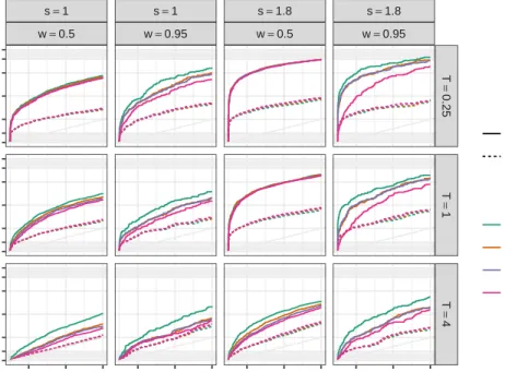
Figure 2.3 presents the ROC curves for simulation scenarios in which reference allele bias is present (p = 0.5). Each panel corresponds to a particular scenario combining the other 3 simulation design parameters, overdispersion (T) is represented in row faces while strength (s) and sparsity (w) of the allele effects determine the column facets. The dashed lines represent the non-hierarchical models and continuous lines represent the hierarchical models. Finally the ROC curve color indicates the hierarchical distribution for the regression coefficients.
There are two effects that applied to every model. As we might expect, increasing the signal strength and decreasing the overdispersion level produce better detection rates. An-other overall effect is the fact that non-hierarchical models fail into correct the bias towards reference allele, and they present worse detection rates in every scenario compared with the hierarchical counterparts. An initial simulation study, included in appendix A, shows similar results, comparing FiguresA.3and A.5is clear that non-hierarchical models are more affected by overdispersion, sparsity and bias. Then, we describe the remaining effects results only for hierarchical models.
Among hierarchical models, Figure 2.3suggests hierarchical distribution for the regression parameters have some effects on model performance in many scenarios. Cauchy distributions shows larger true positive fraction (TPR) than the rest when overdispersion level is high and in the highly sparse scenarios when 95% of the genes does not have DEA. On the other hand, using a normal distribution have the worst results in terms of ROC curves, in this case the more clear negative effect for the normal model is the sparsity level. Performance of Laplace and t distributions appear to be somewhat in the middle, between Cauchy and normal.
s=1 w=0.5 s=1 w=0.95 s=1.8 w=0.5 s=1.8 w=0.95 T = 0.25 T = 1 T = 4 0.05 0.15 0.25 0.05 0.15 0.25 0.05 0.15 0.25 0.05 0.15 0.25 0.00 0.10 0.25 0.50 0.75 0.90 1.00 0.00 0.10 0.25 0.50 0.75 0.90 1.00 0.00 0.10 0.25 0.50 0.75 0.90 1.00
False positive fraction
T rue positiv e fr action Hierarchical non−Hierarchical t1 (Cauchy) Laplace t6 normal
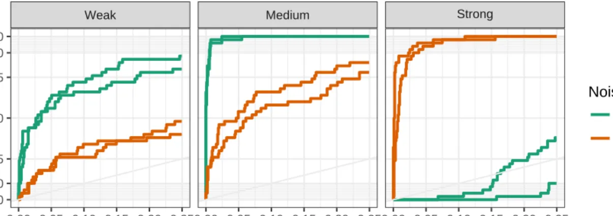
Figure 2.3 ROC curves for scenarios with reference allele bias present (p = 0.5). Row facets corresponds to overdispersion level (T), while column facets combine sig-nal strength and sparsity (s,w). Line color indicates the hierarchical distribution. Hierarchical models are plotted with continuous lines and dashed lines correspond to non-hierarchical models.
ROC curves can be summarize computing the area under the ROC curve (AUC), a perfect detection rate would have AUC value of 1. Typically, only the region with small false positive fraction (FPR) is of interest, we compute a partial AUC as the area under the ROC curve but only over the region where FPR is less than 10%. Partial AUC results are presented in two sep-arate plots, Figure2.4shows the effect of simulation design parameter within each hierarchical distribution, meanwhile Figure 2.5compares partial AUC among hierarchical distribution for the regression model parameters.
normal Laplace t Cauchy
w = 0.5 w = 0.95 s=1 s=1.8 s=1 s=1.8 s=1 s=1.8 s=1 s=1.8 0.02 0.04 0.06 0.08 0.02 0.04 0.06 0.08 Strength P ar tial A UC with FPR < 0.1 Overdispersion T==0.25 T==1 T==4
Figure 2.4 Partial area under ROC curve (AUC), over region with false positive rate lower than 10%. Facets represent the hierarchical distribution used in the model, and row facets represent sparsity level. Each line corresponds to a scenario, color and type of the line indicate the overdispersion level (T)
Figure 2.4 shows partial AUC measure results against signal strength. Column facets cor-responds to hierarchical distributions, row facets corcor-responds to sparsity level, and the color and type of the lines corresponds to overdispersion level.
As it was comment in Figure 2.3 overdispersion level and signal strength have the largest impact on the signal detection performance. Reference allele bias does not seem to have an impact in signal detection within hierarchical models, even when half of the non-reference allele
reads are lost we still be able to identify genes with allele effects correctly. There might be some interaction effects among the simulation design factors, for instance, signal strength gain in performance is larger when overdispersion is low or moderate, also in the normal case, signal strength does not show a big change when sparsity is high in any overdispersion level.
Figure 2.5 shows the partial AUC measure results against hierarchical distributions. The facets combine the signal strength level (columns) and sparsity level (rows), the color and type of the lines indicate the overdispersion level. Each line corresponds to one simulation scenario, we want to compare the βg2 hierarchical distribution effect on the model performance.
In every case, Cauchy present better results than the rest while normal distribution has the poorest results. This is the same result than in Figure 2.3, it is not surprising Cauchy distribution having better performance in this case, Cauchy accommodates a lot of probability mass close to zero and its heavy tails can capture the genes with real effects. Normal distribution has light tails which produce a shrinkage effect on all parameters including the ones that are further apart from 0. Perhaps, the comparison among Cauchy and t distributions is not so common, after all, Cauchy distribution a special case of t, the results suggest the degrees of freedom parameter have an impact on how the model borrows information across genes.
Another relevant aspect of the model performance is the ability to discover the genes that are truly differentially expressed. We declare a gene as having allele differentially expressed when P(|∆g| ≥c|y)<0.05 which correspond to minimize the expected loss 19F D+F N.
Figure 2.6 shows the proportion of false discoveries (F DR) against the proportion of dis-coveries Dp, i.e., the ratio of total discoveries over the total number of differentially expressed genes. Ideally, we would like to discover all differentially expressed genes with no false discov-eries. We only plot scenarios with the same overdispersion level that observed data (T = 1).
Only looking at the right panel, with strong signals, the proportion of discoveries drops from somewhat higher than 40% when no sparsity is present to be close to zero whenw = 0.95 for normal, t and Laplace distributions. Meanwhile, Cauchy maintains the proportion of discoveries around 30% in all cases, and showing small false discovery rates. In the left panel, weak signals, a similar effect of the sparsity is observed, but there are some cases with large FDR when using
s=1 s=1.8 w = 0.5 w = 0.95
normal Laplace t Cauch y
normal Laplace t Cauch y 0.02 0.04 0.06 0.08 0.02 0.04 0.06 Strength P ar tial A UC with FPR < 0.1 Overdispersion T=0.25 T=1 T=4
Figure 2.5 Partial area under ROC curve (AUC), over region with false positive rate lower than 10%. Facets represent the overdispersion level (T). Each line corresponds to a scenario, color indicates the signal strength and the line type represent the sparsity.
Cauchy distribution. It should be kept in mind that in this case the proportion could be variable since its denominator is very small.
● ● ● ● ● ● ● ● ● ● ● ● ● ● ● ● ● ● ● ● ● ● ● ● ● ● ● ● ● ● ● ● s=1 s=1.8 0.000 0.025 0.050 0.075 0.1000.0 0.2 0.4 0.00 0.05 0.10 0.15 Proportion of discoveries F alse disco v er y r ate Sparsity ● w=0.5 w=0.95 ● ● ● ● Cauchy Laplace normal t
Figure 2.6 Scatter plot of false discovery rate against proportion of discoveries. Color of points indicates the hierarchical distribution for regression parameters and shape indicates sparsity level.
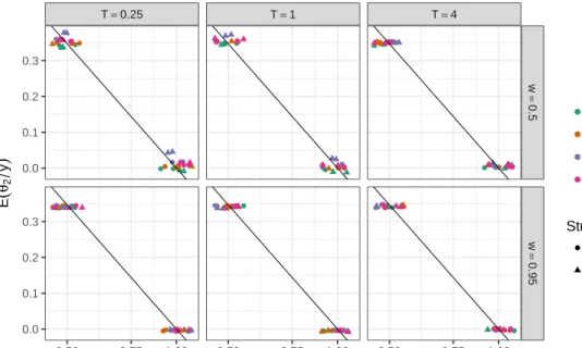
We finish this Section showing how the proposed model captures the bias towards reference allele, and how well the posterior variance of the allele effect, ∆g, is approximated by the
variance of the regression coefficientβg2.
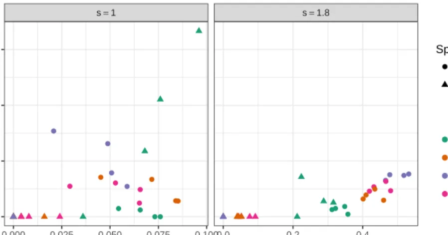
Above we mentioned that parameterθ2 should capture half of the bias in log scale, i.e., we expect i.e. E(θ2|y) ≈ −log(p)/2. Figure 2.7 shows a scatter plot of E(θ2|Y) against log(p). The plot suggests posterior expectation of θ2 captures the bias towards the reference allele, is possible to use it as an estimate of the bias and remove it when making inference about the allele effect.
In Section 2.3 we stated that V ar(∆g|y) ≈ V ar(βg2|y), we can test the approximation from a few genes having the complete MCMC samples. Figure 2.8 presents scatter plots of the variance of the allele effect against the variance of the regression coefficientβg2, the facets represents the hierarchical distribution used in the model and color of points represent the overdispersion level. There is a close relationship among the two plotted variances, suggesting the approximationV ar(∆g|y)≈V ar(βg2|y) is reasonable.