Data Visualization Tools for Litigation -
Practical Uses and Ethical Considerations
Bradley Cross, R.G., P.G., and Eric Rogoff, R.G., P.G., C.E.G.; LFR Levine Fricke
Abstract
Environmental litigation often depends on the use of experts in the fields of geology, engineering, and related specialty fields to communicate opinions regarding complex three-dimensional problems to moderators, arbitrators, judges, and/or juries who often lack similar background or technical sophistication. Furthermore, many of the tools used in developing those opinions, such as risk assessment and contaminant transport modeling, incorporate levels of uncertainty that are not necessarily transparent to the decision makers who are tasked with resolving disputes. Recent advances in computer hardware along with the availability of new software programs traditionally used in other industries have enabled the environmental consulting industry to incorporate data visualization as a tool for communicating complex ideas, based on multi-dimensional data, to various stakeholders and decision-makers.
Data visualization can be a powerful persuasive tool that, when misused, can give a false sense of certainty to data and opinions that in reality are based on a great amount of uncertainty. Prescribed visualizations, such as simple animations, are difficult to ground-truth with the physical data used in developing them. As such, they can be easily challenged or discredited under examination, thus diminishing their value and effectiveness. Data-based visualization software programs allow transparency in the visualization application and are easily “stripped down” to expose the supporting data and potential uncertainty associated with those data. Opinions and conclusions can be supported with multiple visualizations showing variability in parameters and results of sensitivity analysis.
Data visualization is best used as a tool to elevate the level of understanding among all stakeholders so that appropriate decisions can be made. Visualization tools can integrate multiple sources and types of data into one medium for evaluation, thus addressing the multi-dimensional nature (both spatial and temporal) of the data. Such tools allow individual data components to be viewed and assessed within the context of the whole conceptual model, and often provide a mechanism to assess data gaps and other areas of uncertainty within the conceptual model. When used appropriately, data visualization can be a highly useful and convincing tool to support and convey technical opinions with clarity and force.
Introduction
Identification, assessment, and remediation of environmentally affected sites often require an understanding of complex physical settings and issues. Decision making often relies on subjective criteria and involves multiple stakeholders with different levels of understanding, different perspectives, different priorities, and different goals. In most cases, there are
technical, practical, and/or economic limitations to site characterization. Limitations in site characterization are often the result of a lack of sufficient data, uncertainty in the data, or the tools used to analyze those data.
While experts often argue that sufficient data exist to characterize their client’s or stakeholders’ site, and to sufficiently understand the issues in dispute surrounding that site, the uncertainties and differing possible interpretations resulting from data gaps are what generally creates a necessity for experts in the first place. Most environmental cases require an understanding of the physical and chemical interaction of compounds with various Earth media as they occur underground. In subsurface investigations experts rely primarily on sample data collected from soil borings or wells constructed within those borings. Experts must then rely on generally accepted scientific principles regarding stratigraphy, sedimentology, and hydrogeology to infer what likely exists or may be occurring between sampled intervals. Site characterization can be further complicated where the sample data being considered are variable in time. In cases involving litigation or dispute resolution, outcomes often hinge on the ability of the expert to communicate data, interpretations, and opinions in a clear and concise manner that is defensible and understandable to non-technical participants and stakeholders.
Data Uncertainty
One of the most common criticisms of the use of visual imagery and animation is the prejudicial impact it may have. While visual imagery can be very convincing, uncertainty in the underlying data, data interpretation techniques, and assumptions used to develop the animations are not transparent to the viewer. In many cases, visual presentations transcend the boundary between expert opinion and speculation, with little or no distinction between either. Proper use of visualization technologies require that the visualizations be “ground-truthed” to the data used in developing them. For example, an animation that depicts the migration of contaminants from a source to a particular monitor well should stand up to the same calibration standards that are applied to contaminant transport models. Where visualization is used to assist in the understanding of the physical conceptual site model, it is important to distinguish between actual site data and interpretations used to “fill in” the data gaps.
To illustrate the uncertainty that exists in site characterization work, consider how soil and hydrostratigraphic conditions are typically characterized. Continuous coring or geophysical logging of borings can provide the most complete data set for soil and stratigraphic analysis; however, in practice, those techniques are seldom employed. The more practical and cost-effective technique of interval sampling and logging of drill cuttings is generally preferred, yet this results in vertical gaps in geologic and hydrostratigraphic data. For example, if interval sampling is conducted every five feet by driving a sampling device eighteen inches for collection of undisturbed samples, the actual sampled interval represents 30% or less of the total boring interval. All things considered, this represents a relatively dense sample population when compared to the un-sampled soils that exist between borings.
Additional uncertainty is introduced within sampled intervals when considering that geologic and hydrostratigraphic descriptions of Earth media are often subjective and inconsistently applied by the individuals logging the soil. Also, sample locations may not be relevant or fully representative of site conditions, and laboratory analyses of samples may not be appropriate or performed with accuracy or precision. Finally, modeling tools used to integrate site data tend to oversimplify actual site conditions and the conceptual site model, adding uncertainty to the model output.
As such, experts in environmental litigation need tools to help convey complex ideas regarding subsurface conditions in understandable and scientifically defensible ways, while not covering up the inherent uncertainty that exists. Recent advances in computer hardware along with the availability of new software programs traditionally used in other industries have enabled the environmental consulting industry to incorporate data visualization as a tool for communicating complex ideas, based on real multi-dimensional data, to various stakeholders and decision-makers.
Data Visualization Tools
To effectively convey their opinions, experts must be able to assimilate available data into understandable and technically supportable representations of site conditions. Historically, this has been accomplished using maps and geologic cross-sections that depict a snapshot of subsurface conditions in two-dimensional drawings and images. In the past twenty years, the use of animation has become more prevalent to incorporate time-varying data into the conceptual model. Animations can be used to show how contaminants might migrate from a source to a receptor, and do so fairly convincingly; however, the details in developing animations are often based more on speculation and inference than on actual data. Various modeling tools can also be used to simulate site conditions and make predictions of future conditions, such as the distribution of contaminants over time. Numerical models are sophisticated tools that simplify the process of solving multiple mathematical algorithms on large data sets within a prescribed framework used to simulate site conditions. However, modeling codes are generally focused on reading complex input files and solving flow and transport equations, and as such are typically incapable of graphically displaying site-specific input and output at the high level of complexity used to develop the site-specific model. Due to their complexity and limited graphical capabilities, numerical models tend to be viewed as a black box technology to the lay person who must trust the opinion of the expert based on the output of the model. Linking numerical models to state-of-the-art visualization tools allows the graphical limitations of the models to be overcome.
Recent advances in computer hardware and software have provided additional tools for managing and illustrating large amounts of data. Graphic information system (GIS) software serves as a database management tool that allows multiple types of data to be accessed and integrated for both analytical and visual analysis. Database visualization software, such as the Environmental Visualization Software (EVS) developed by C-Tech Development Corporation, further adds a three-dimensional (x,y,z coordinate) component to the data and provides virtual imaging of subsurface data under both static and transient conditions. Data
from multiple sources can be assimilated into the visualization software database for virtual three-dimensional analytical and visual analysis. EVS also incorporates advanced geostatistical methods to calculate and illustrate the uncertainties inherent in analysis of all site characterization data. The geostatiscal methods allow visualizations of maximum and minimum plume extents depending on the ranges of uncertainty. These methods also can be used to calculate volumes and areas for various values of uncertainty, which can be extremely useful in determining when sufficient samples have been collected, where additional characterization efforts should be focused, or the potential ranges in soil volumes which may need to be excavated.
Database visualization tools have progressed significantly over the past decade. Conceptual models no longer need to be explained using “cartoon” artistic renditions or animations which may be confusing to the layperson and are easily challenged or discredited by opposing interests. Use of three-dimensional visualization tools allows complex information to be easily evaluated and understood by both technical and non-technicalinterested parties. Such visualization techniques also prevent misconceptions that often result when using two-dimensional plots to represent the three-two-dimensional subsurface environment. Information from various media (e.g. aerial photographs, USGS topographic maps, USGS digital elevation models) may be combined to represent the ground surface in three dimensions, with the photographs or maps precisely placed on the topographic surface. The three-dimensional models may then incorporate lithologic information from boring logs, as well as analytical results from soil and groundwater samples. The synthesis of this information into an interactive database computer visualization tool allows the distribution of contaminants to be clearly shown within the hydrogeologic framework and can be used to demonstrate how the various media interact in the subsurface.
The discussion above focuses on the ability to present data and information in terms of three dimensions, which are mathematically represented as coordinates relative to X, Y, and Z axes (or length, width, and height). If historical time-series data are available, i.e. groundwater monitoring analytical and water level data, visualizations of data become four dimensional. The four-dimensional data may be visualized by creating animations or by using interactive viewer software. The interactive viewer software approach allows an unparalleled presentation ability for transmitting conceptual models and changes in contaminant distributions or groundwater elevation surfaces through time.
Methodology for Implementing Data Visualization
Regional Setting
Successful site-specific characterization must begin with a solid conceptual understanding of the regional setting. Examples of regional information typically obtained to provide a foundation for site-specific visualizations include topographic features affecting surface and subsurface water flow; location of the site in relation to known or suspected contributors of contamination; and locations of existing or potential receptors. Regional information commonly used includes aerial photographs and topographic maps. Depending on the
purpose of the investigation, other types of maps (e.g., geologic, soil, vegetation, ecological) may also be obtained for development of visualizations.
In the past, hardcopy aerial photographs had to be obtained from local companies or from university libraries. As high-speed Internet access became widely available, many companies developed applications that allow downloading of high-resolution digital aerial photographs and United States Geologic Survey (USGS) topographic maps from virtually anywhere in the United States. Some providers include georeferencing information with the aerial photographs, which is the key to combining aerial photographs in three-dimensional visualizations. Georeferencing information allows GIS software programs to position the photograph at the proper coordinates, determine how many pixels are in the X and Y directions, and the identify length and width of each pixel. The photograph can then be imported into an existing GIS model based on surveyed coordinates. In instances where no georeferencing information exists for photographs or maps, several computer packages can generate the needed information by either inputting survey information for known locations (e.g., wells, benchmarks, lot corners, and distinct topographic features), or visually matching distinctive points on a separate georeferenced map or photo.
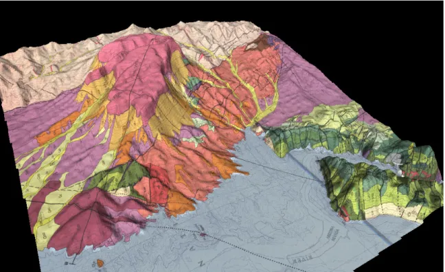
After the aerial photographs and topographic maps have been georeferenced, digital elevation model (DEM) data are downloaded from the USGS. The USGS DEM files provide X, Y, and Z (elevation)data at up to 1-meter resolution, and may be read directly by several GIS programs. After the aerial photographs or maps and the USGS DEM data have been entered, the coordinates and elevations of any desired location can be easily obtained. The photographs and maps can then be “texture mapped” onto the USGS DEM data to develop a 3D visualization (Figures 1 and 2).
Figure 1. 3D Geologic Map of the Hoover Dam Vicinity, Nevada, developed by generating georeferencing information for a 2-dimensional geologic map, then overlaying it on the corresponding USGS DEM data.
Figure 2. 3D topographic map.
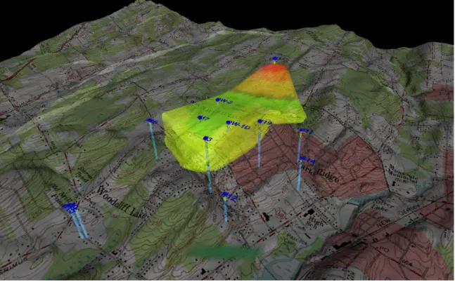
After development of surface texture maps, subsurface information may be added to the visualization, and shown by making the surface partially transparent (Figure 3).
The integration of georeferenced aerial photos and digital elevation data allows measurements of distances and areas to be easily performed using select GIS tools. Areas of excavations or watersheds may easily determined by clicking the mouse at subsequent vertices of the area on the photographs, with the enclosed calculated area showing instantly. These tools are accurate and precise because they are based on standard surveyed coordinate systems. Analysis of the georeferenced information using these measurement tools therefore can provide a credible basis for evaluating the physical attributes of features of interest (e.g., surface area, volume). Figure 4 illustrates an application of these tools to easily measure the perimeter and calculate the enclosed area of a mine tailings pile with an extremely complex shape.
Figure 4 – Area calculation and perimeter measurement for a mine tailings pile.
GIS-based visualization tools may also be linked to database queries of analytical data, making information on selected locations of interest easily accessible. Users can easily locate sample locations as they are plotted precisely over the georeferenced aerial photographs. Simply clicking the mouse on the desired sample point will cause the data to “pop up” in a window, allowing for easy evaluation and comparison of data. GIS programs allow various types of data and information to be placed into a common coordinate system, then exported for three-dimensional analysis in the EVS program for a “virtual” recreation of the site (Figure 5).
Figure 5. This 3D view of the 60-mile long Pinal Creek Copper Mining District in Arizona synthesizes topographic digital elevation data from 4 USGS 7.5 minute quadrangles, 16 high-resolution georeferenced aerial photographs, and nearly 1,600 registered well locations extracted from the Arizona Department of Water Resources database.
Site-Specific Information
EVS is used to integrate GIS information, database queries, geologic information, and computer model output in a single database, and then present data visually for any desired area of a site, at any scale, in any time frame, for any analytical parameter. Lithology, flow, and analytical data may be viewed in three dimensions, with virtually unlimited zoom, rotational, and animation capabilities.
After developing the regional context of the visualization, building of the site-specific model usually involves the addition of subsurface physical property data. This is usually obtained from boring logs collected during site investigations. Input files include the X, Y, and Z coordinates for the top of each boring, the depth to each lithologic interface, and the lithologic classification of materials between the interfaces. The various lithologies can be given distinct colors so that lithologic changes with depth or laterally between borings can be easily observed. Once the boring log information has been entered, lithologies can be further evaluated by generating cross-sections, fence diagrams, and block diagrams. Geostatistical analysis can be used to interpolate between data points based on prescribed confidence levels. Lithologic types may be selectively shown or “hidden” to allow insight into the
depositional setting, and to illustrate lithologic controls on groundwater flow and contaminant distribution. Geologic layers, lenses, and faults are readily illustrated in three dimensions. Figure 6 presents a visualization combining lithologies encountered in soil borings, a cutaway of the geologic block interpolated between borings, the location of a light nonaqueous-phase liquid (LNAPL) plume, and groundwater table elevation contours.
Figure 6. Geologic block cutaway illustrating lithologic distribution, the location of an LNAPL plume (in blue), and groundwater level contours (in white).
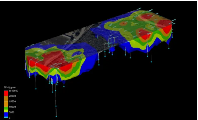
Chemical analytical data are entered as the next step. Soil and groundwater data are plotted at the proper X, Y, and Z locations, and symbols representing the values are typically colored and sized according to data value ranges (Figure 7). EVS may then be used to generate plumes contoured by concentration thresholds as desired (Figure 8). The sample name and data value may also be labeled, allowing the data to be easily shown. If desired, visualization programs can perform mathematical operations on data sets and model coordinates.
Figure 7. Illustration of TPH analytical data from soil borings. The spheres represent sample locations, and are colored according to the ranges shown in the legend.
Drawings generated with AUTOCAD may also be imported into EVS, allowing for straightforward integration of surface feature maps and engineering drawings. Figure 9 illustrates the integration of an extremely detailed AUTOCAD DXF model of a McDonnel-Douglas MD-11 airplane to convey the scale of the investigated region and the extent of the affected soil and groundwater.
Figure 9. Solvent plume from a leaking sump at an airport. The upper region illustrates soil-vapor PCE concentrations (legend to the upper left) and groundwater concentrations (legend to the lower left). An aerial photograph and a 3D-Autocad DXF model of a McDonnel-Douglas MD-11 airplane were added for scale.
The ability to integrate databases including precise survey coordinates, lithology, and analytical results provides an unparalleled tool for evaluating parameter distributions and lithologic controls on migration. Figures 10 and 11 illustrate data from a cone penetrometer/Laser Induced Fluorescence (CPT/LIF) study consisting of 180 CPT borings. Figure 10 presents the raw LIF results as colored disks, and Figure 11 includes fence diagrams of the lithology combined with LIF plumes to illustrate the lithologic control over the contaminant migration. Application of EVS was not only advantageous from a technical standpoint, but significant cost savings were realized compared to the alternative of developing numerous 2D cross-sections by hand using traditional methods.
Figure 10. Raw LIF data from a CPT/LIF investigation. The investigation included 180 CPT borings.
Figure 11. Lithologic fence diagrams and contaminant distribution plumes from the CPT/LIF investigation. Visualization of Model Output
As previously discussed, groundwater fate and transport models do not have graphical capabilities equal to those of EVS. Linking numerical models to state-of-the-art
visualization tools available in EVS, combined with select GIS tools, allows the graphical limitations of the models to be overcome. Figure 12 illustrates modeled groundwater flow paths for a scenario with 7 extraction wells, modeled with a finite element model with over 42,000 cells. The particle tracks were imported into the regional visualization model containing high-resolution aerial photographs, topographic information, and geology.
Figure 12. Modeled Groundwater Flow Paths for a Scenario with Seven Pumping Wells.
Visualization Output Formats
Once completed, visualizations may be output in various standard formats for highly effective yet technologically simple presentations. Complex video sequences of data varying in time or space may be created and output on VHS tapes, CDs, or DVDs. Another option is to use C-Tech’s 4DIM Player, which is the companion viewer for EVS applications. The name 4DIM is an acronym for Four-Dimensional Interactive Model Animations, and was chosen because these models represent a 3D scene changing in time (the fourth dimension). Each frame of the model can be zoomed, panned, and rotated as a static 3D model, or the viewer can interact with the 4DIM animation as it is playing. The 4DIM player allows an astounding degree of flexibility and control to view results from any angle or magnification, making it an outstanding litigation support tool.
Use of Data Visualization in Legal Proceedings
As stated earlier, environmental litigation often requires stakeholders and decision makers to have a reasonable understanding of potentially complex physical settings and issues. The use
of visual aids in the courtroom has long been recognized as a fundamental tool for conveying complicated facts and ideas to the various parties and stakeholders who may be less technically sophisticated. Opinions given in environmental cases are based largely on data interpretations and assumptions made by experts using appropriate theory or technique that is generally accepted in the scientific community. Tools commonly applied by courtroom experts in developing their opinions often include modeling, risk assessment, and, more recently, GIS and database visualization tools. There are many articles and publications available that deal with evidentiary and procedural rules governing experts and their testimony, and what is admissible in legal proceedings. Analytical tools used by experts are not generally challenged in court as long as they are available in the public domain, include adequate documentation so that results can be reproduced, and have been appropriately tested and benchmarked to industry standards (usually by organizations such as the American Society for Testing and Materials [ASTM] or the U.S. Environmental Protection Agency [EPA]). Moreover, uncertainty in data, and in the assumptions and interpretations made by the expert with regard to data input, are typically what is challenged.
A number of GIS and data visualization tools have been tested and benchmarked against standard accepted environmental tools and technologies. For example, the EPA, under the Environmental Technology Verification Program (ETV), has performed verification testing of environmental decision support software, including EVS software developed by C-Tech, to ensure that data of known and adequate quality are generated and that the results are defensible. The advantage of using such verified database visualization software in legal proceedings is clear. Virtual representations of complex physical conditions can be presented using various types of data from multiple sources that have been assimilated into a single database package. Output can be viewed interactively, and visualizations can be directly ground-truthed to the data used in developing them. As such, assumptions and interpretations are completely transparent to the viewer. The interactive nature of the software can allow any stakeholder to query specific data or information and consider those data within the context of the overall conceptual site model.
Summary
In the subsurface, chemicals of concern can migrate through Earth media over very large distances (tens of feet to tens of miles) within small pore spaces of heterogeneous materials. Compounds may exist in various chemical states (liquid phase, dissolved phase, gas phase) and can migrate through various media by means of advection, diffusion, and dispersion. Along the way, compounds can interact with the media they encounter and be transformed, retarded, and/or attenuated by various processes including phase partitioning, adsorption, and/or chemical and biological reactions. Such complexities require the use of tools to help experts conceptualize, and simplify the multitude of interactions occurring in order to characterize the transport and ultimate fate of compounds of concern, and assess potential exposure to environmental receptors.
The value of database visualization in the litigation arena is undeniable. It provides a single database tool that integrates a wide variety of data sources and types for easy access,
analysis, and clear presentation. Database visualization tools elevate the level of understanding among all stakeholders, placing them on the same page conceptually. Database software can addresses the multi-dimensional (spatial/temporal) aspect of data, help to identify data gaps or weaknesses in the conceptual model, and allow individual data components to be viewed and assessed within the context of the complete conceptual model. Visualization can be a powerful persuasive tool that, when misused, can give a false sense of certainty to data and hypotheses that may be based on a great amount of uncertainty. Prescribed visualizations, such as simple animations, can be easily challenged or discredited by opponents. Data-based visualization programs allow transparency in the visualization application and are easily “stripped down” to show all the supporting data and potential uncertainty in that data. Conclusions can be supported with multiple visualizations showing variability in parameters and results of sensitivity analysis. Where modeling and risk assessment software can be manipulated to provide desired outcomes, data-based visualization tools can help expose unethical use of such tools.
Reference
United States Environmental Protection Agency, March 2000, Environmental Technology Verification Report, Environmental Decision Support Software, C Tech Development Corporation, Environmental Visualization System Pro (EVS-PRO):EPA/600/R-00/047. Office of Research and Development. Washington, D.C. 20460.
Biographical Sketches
Bradley Cross, R.G., P.G., Vice President and Principal Hydrogeologist with LFR Levine·Fricke, has over twenty years of experience, including seventeen in the environmental consulting industry as a hydrogeologist. He holds a B.S. Degree in Geology from Colorado State University and an M.S. Degree in Geology from Texas A&M University. He is a Registered Geologist in the states of Arizona and Oregon, and a Professional Geologist in California.
Email: [email protected]
Eric Rogoff, R.G., P.G., C.E.G., Senior Associate Hydrogeologist with LFR Levine·Fricke, has 17 years of experience in environmental consulting. He holds the following degrees: B.S., Geology, University of Kansas; M.Phil., Geology, Yale University; and M.S., Hydrology, University of Arizona. He is a Registered Geologist in Arizona, a Professional Geologist in California, and a Certified Engineering Geologist in California.
Email: [email protected] LFR Levine·Fricke 14201 N. 87th Street, Suite C135 Scottsdale, AZ 85260 tel 480-905-9311 fax 480-905-9353