AN INVESTIGATION INTO VISUALISATION AND FORECASTING OF REAL-TIME ELECTRICAL CONSUMPTION BASED ON SMART GRID DATA
Rodwell Mangisi
A Dissertation submitted to the Faculty of Engineering and the Built Environment, University of the Witwatersrand, in fulfillment of the requirements of the degree of Master of Science in Engineering
i Declaration
I declare that this dissertation is my own, unaided work, other than where specifically acknowledged. It is being submitted for the degree of Master of Science in Engineering in the University of the Witwatersrand, Johannesburg. It has not been submitted before for any degree or examination in any other university.
Signed this
.
day of
2014
.
.
ii Abstract
The smart grid, and in particular smart meters, is a growing world-wide phenomenon which has allowed for the availability of detailed real time usage data to the user in ways that were not possible in the past. South Africa has been slow-moving in adapting smart meters, but in the past two years this has changed and smart meters are becoming the new standard. This has given rise to the need for software applications to help both the South African consumer and local power utilities get the most out of the smart meter data. The purpose of this research is to investigate the possibilities offered by smart grid data obtained from advanced metering infrastructures, with particular emphasis on real time energy usage visualisation and peak load forecasting. Previously, detailed energyusage data has not been available to consumers hence there has not been much research focusing on utilising this data for direct consumer benefit. The focus of most research has mainly been on the power utilities supply side where attention has been on visualising their consumers’ usage and forecasting consumer demand in order to supply them with electricity continuously and efficiently. In this dissertation a benchmarking model for developing smart grid data visualisation dashboards is proposed and this model is used to present and prototype a consumer side dashboard. The prototype implements real time data visualisation techniques, as well as a Multiple Linear Regression model based forecasting algorithm for half hourly peak load forecasting using data collected from the University of the Witwatersrand’s advanced metering infrastructure. In this study the Multiple Linear Regression model is built through a comprehensive analysis of 2 years’ worth of energy usage data from the University of the Witwatersrand and 3 years’ worth of hourly temperature data from the South African Weather Services. The prototype’s performance is evaluated with reference to the proposed benchmark and a user technology acceptance evaluation done by the University’s Property and Infrastructure Management division as well as 10 other independent users. The dashboard is found to be a useful and acceptable tool in energy monitoring at the University. The forecasting model performs well with a mean absolute percentage error of 3.69%. The inclusion of a forecasting functionality within the energy management dashboard is shown to have the ability to help the university reduce its electricity bill by being able to shave their peak loads. The analysis highlights the importance of better data archiving and smart meter monitoring thereby ensuring that the meters are always online and no data goes missing which is vital for accurate forecasting results.
iii
Dedicated to my parents, Miriyemu Mangisi and the late Golden Ray
Mangisi for their selfless sacrifices in giving me the best possible
iv Acknowledgements
I would like to thank my supervisor, Professor Barry Dwolatzky for his guidance; patience and encouragement over the years, for making me understand that “a good dissertation is a completed dissertation”.
I would also like to acknowledge the University of Witwatersrand energy management team led by Prof Cronje and Dr Levitt for allowing me to use their resources and answering my many questions. A big thank you to the South African Weather Services for supplying me with years of historical hourly temperature data for Johannesburg at no cost.
To my employers, OPSI systems; thank you for allowing me to study part time and funding my studies. Special mention to my colleague Colin Phillips for the hours spent getting me to speed with R statistical package and its hidden gems.
My heartfelt gratitude to the ladies in my life; my wife Chenai and daughters: Tawananyasha and Makatendeka. Thank you so much for giving daddy the time and space to lock himself in the study and finish this research. You guys are great and I owe you for all those missed family times.
Finally I would like to thank my Lord and savior Jesus Christ for the ability he has blessed me with and all the opportunities he continues to bring my way.
v Table of Contents Declaration ... i Abstract ... ii Acknowledgements ... iv Table of Contents ... v
List of Tables ... xii
List of Figures ... xiii
List of Abbreviations ... xv
C Chhaapptteerr11::BBaacckkggrroouunndd ... 1
1. Introduction ... 1
1.1 A Brief History on Smart Grids ... 1
1.2 Why the Smart Grid? ... 3
1.3 A Look at the Smart Grid Architecture ... 3
1.3.1 Information Consumers ... 5
1.3.2 Data Management ... 5
1.3.3 Data Standards ... 5
1.3.4 Grid Hardware... 5
1.3.5 Communications Layer ... 6
1.4 University of the Witwatersrand Advanced Metering Infrastructure ... 7
1.5 The Research Report ... 8
C Chhaapptteerr22::SSuurrvveeyyooffLLiitteerraattuurree ... 10
2. Introduction ... 10
2.1 Importance of Smart Grid Data Visualisation ... 10
2.2 The Goal of Data Visualisation ... 12
2.3 Hallmarks of a Good Visualisation Tool ... 13
2.4 The Evolution of Data Visualisation ... 13
2.4.1 Visual Querying ... 14
2.4.2 Dynamic Data Management ... 14
2.4.3 Animated Visualisation ... 14
2.4.4 3D Data Modelling... 15
vi
2.4.6 Intelligent User Interfaces (Personalisation Techniques)... 16
2.4.7 Geographic Information Tools ... 17
2.5 Information dashboards... 17
2.6 Types of Dashboards ... 21
2.7 Load Forecasting Algorithms... 22
2.7.1 Statistical Methods ... 22
2.7.2 Time Series Approach ... 22
2.7.2.1 Multiple Linear Regression ... 23
2.7.3 Artificial Intelligence (AI) ... 24
2.7.3.1 Artificial Neural Networks ... 24
2.7.4 Artificial Intelligence Techniques: Fuzzy Neural Networks... 26
2.8 The State of Smart Grid Data Visualisations Technologies ... 27
2.9 The Business Case for Smart Grid Data Visualisation ... 27
2.9.1 The Other Side of the Business Case for the Smart Grid ... 31
2.10 Key Smart Grid Visualisation Areas ... 32
2.11 The State of the Smart Grid in South Africa ... 32
2.12 Technology Acceptance ... 34 2.13 Similar Research ... 36 C CHHAAPPTTEERR33::RReesseeaarrcchhQQuueessttiioonnaannddMMeetthhooddoollooggyy ... 37 3. Introduction ... 37 3.1 Expected Outcomes ... 38 3.2 Methodology ... 38 C CHHAAPPTTEERR44::TThheeoorreettiiccaallDDeemmaannddSSiiddeeDDaasshhbbooaarrddBBeenncchhmmaarrkkiinnggMMooddeell ... 41 4. Introduction ... 41
4.1 Definition of Demand side dashboard ... 42
4.1.1 Demand Side Dashboard Objectives ... 42
4.2 The Demand Side Dashboard Model ... 42
4.2.1 Basic Remote Control Commands ... 43
4.2.2 Advanced Remote Control Commands ... 44
4.2.3 Device By Device Consumption Data ... 44
4.2.4 Privacy and Security ... 44
4.2.5 Show Time Stamped Energy Data ... 44
vii
4.2.7 Real Time Pricing And Billing ... 45
4.2.8 Customer Preset Settings ... 45
4.2.9 Weather Warning ... 46
4.2.10 Energy Consumption Forecast ... 46
4.2.11 Access via both PC and Mobile Devices ... 46
4.2.12 Customisable User Interface ... 47
4.2.13 Historical Consumption Data ... 47
4.2.14 Show Latest Meter Reading ... 47
4.2.15 Monitor Electric Network Devices ... 48
4.3 Interface Standards ... 49
4.3.1 Interface Consistency ... 49
4.3.2 User Friendly Interfaces ... 51
4.4 Interface Behaviour ... 53
4.5 Recommended Visualisation Techniques ... 54
4.6 Benchmarking Model Overview ... 54
4.7 Conclusion ... 56 C CHHAAPPTTEERR55::FFoorreeccaassttiinnggMMooddeellDDeessiiggnn ... 57 5. Introduction ... 57 5.1 Background ... 57 5.2 Used Data ... 57 5.3 Data Analysis ... 58 5.4 Data Cleanup ... 58
5.4.1 Load and Temperature Data Clean Up ... 58
5.5 Trends Investigation ... 61
5.6 Load Predictability ... 61
5.6.1 Load Time of Day Trend ... 62
5.6.2 Load Dependence on Campus State ... 64
5.6.3 Load Dependence on Temperature ... 65
5.7 Variable Selection ... 67
5.8 Training and Test Data ... 67
5.9 Proposed MLR Models ... 68
5.9.1 Model A ... 68
viii 5.9.3 Model Selection ... 71 5.10 Conclusion ... 72 C CHHAAPPTTEERR66::DDaasshhbbooaarrddSSppeecciiffiiccaattiioonnssaannddDDeessiiggnn ... 73 6. Introduction ... 73 6.1 Problem Domain ... 73 6.2 Requirements ... 73
6.3 System Design Methodology ... 74
6.4 Application Architecture Modelling ... 75
6.4.1 Presentation Layer (User Interface) ... 76
6.4.2 Business Logic Layer ... 78
6.4.3 Data Access Layer (DAL) ... 79
6.4.4 Database Layer ... 79 6.4.5 Algorithm Logic ... 79 6.5 Conclusion ... 81 C CHHAAPPTTEERR77::EEvvaalluuaattiioonnaannddRReessuullttss ... 82 7. Introduction ... 82
7.1 Forecasting Algorithm Results ... 82
7.2 Weekly Forecasting Results ... 83
7.2.1 Forecasting Results Conclusion ... 84
7.3 Dashboard Evaluation ... 85
7.4 User Interface Presentation ... 85
7.4.1 Dashboard Presentation Conclusion ... 90
7.5 Usability Evaluation ... 91
7.6 Usability Feedback ... 91
7.6.1 Test Procedure... 91
7.6.2 Test cases ... 92
7.6.3 Test Environment, Data and Equipment ... 92
7.6.4 Analysis of Usability Test Results ... 93
7.6.5 Task Completion Difficulty ... 93
7.6.6 Screen Organisation ... 94
7.6.7 Adherence to Technology and Information Standards ... 95
7.6.8 Learning Difficulty ... 96
ix
7.6.10 Perceived Usefulness ... 98
7.6.11 Perceived Ease of Use ... 99
7.6.12 Overall Reaction to the Software ... 100
7.6.13 Usability Evaluation Conclusion ... 101
7.7 Technical Recommendations ... 102
7.8 General Recommendations ... 102
... 104
CHAPTER 8: Conclusion References ... 106
Appendix A: Dashboard Proposal to the energy group ... 116
1 Document Control ... 119 2 Business Context ... 120 3 Application Overview ... 121 3.1 System diagram ... 121 3.2 Application Overview ... 121 3.3 Features ... 122
3.4 User Hierarchy & Functions ... 122
3.5 Operating Environment ... 123
3.6 Constraints & Limitations ... 123
3.7 Documentation ... 123
3.8 Dependencies ... 123
4 Application Features ... 124
4.1 Features Introduction ... 124
4.1.1 Real time power readings visualization ... 124
4.1.2 Description & Importance ... 124
4.1.3 Real time energy readings visualization per campus ... 124
4.1.4 Peak consumption approaching warning and alert system... 125
4.1.5 Overall campus consumption comparison ... 125
4.1.6 Web pages on a variety of energy management topics ... 126
5 Interfaces ... 127
5.1 User Interfaces ... 127
5.2 Hardware Interfaces ... 133
5.3 Software Interfaces ... 133
x 6.1 Logging process ... 134 6.1.1 Log data ... 134 6.1.2 File Type/s ... 134 6.1.3 Location ... 134 7 Non-functional Requirements ... 135 7.1 Performance ... 135 7.2 Security ... 135
7.3 Safety and Data Integrity ... 135
7.4 Software Quality ... 135
8 Proposed timeline ... 136
Appendix B: South African Weather Services Disclosure ... 137
DISCLOSURE STATEMENT ... 137
SCHEDULE 1 ... 138
Appendix C: Model A Statistical Analysis using R ... 140
1. Introduction ... 140
2. R input ... 140
3. R Output ... 140
4. Conclusion ... 146
Appendix D: Model B Statistical Analysis ... 147
1. Introduction ... 147
2. R Input Model ... 147
3. R output ... 147
4. Conclusion ... 150
Appendix E: ICONIX Process Report ... 151
5. ICONIX process ... 151
6. Class Diagrams ... 151
1.1 Presentation Classes ... 152
1.2 Data Access and Repository Classes ... 153
1.3 Control and Model Classes ... 154
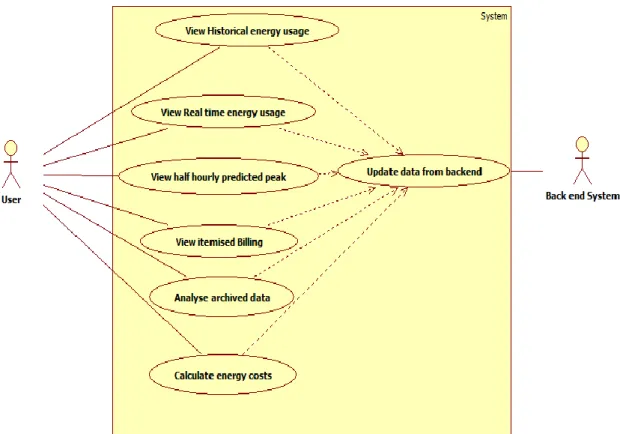
7. Use Case Diagrams ... 155
1.4 Use case descriptions ... 157
1.4.1 System log in use case description ... 157
xi
1.4.3 View GIS information ... 157
1.4.4 View itemised billing ... 158
1.4.5 View hourly predicted Peak ... 158
1.4.6 View historical usage data ... 158
1.4.7 View Real time usage data ... 159
8. Robustness diagrams ... 159
9. Conclusion ... 161
Appendix F: Dashboard Source Code ... 162
Appendix G: User Interface Screenshots ... 163
Appendix H: Usability Questionnaires and Test case feedback forms ... 165
Appendix I: Wits Energy Team Correspondence during design and development of Dashboard ... 167
xii List of Tables
Table 1: Dashboard Properties ... 21
Table 2: Von Neumann Computer versus biological neural system [75] ... 25
Table 3: Research Expected Outcomes ... 38
Table 4: DSD Functional Requirements ... 43
Table 5: Reserved Icons ... 50
Table 6: Reserved Words[134] ... 51
Table 7: Recommended Interface Characteristics ... 52
Table 8: Guidelines for Using Controls ... 53
Table 9: Recommended Interface Behaviour ... 53
Table 10: Hourly Demand Behaviour ... 63
Table 11: Load-temperature analysis ... 66
Table 12: Variable selection ... 67
Table 13: Model A Residuals... 68
Table 14: Model B residuals ... 70
Table 15: Achieved benchmarking model requirements ... 85
Table 16: Test cases ... 92
Table 17: Model A Results ... 145
Table 18: Model B results ... 148
Table 19: Overall reaction to Software ... 165
Table 20: Screen organisation ... 165
Table 21: Terminology and System Information ... 165
Table 22: Learning Difficulty ... 165
Table 23: System capabilities ... 165
Table 24: Perceived Usefulness ... 166
xiii List of Figures
Figure 1: Vision of the Smart Grid [4] ... 2
Figure 2: Smart Grid Architecture ... 4
Figure 3: Medical School Networked Smart Meters... 7
Figure 4: 2D vs. 3D data presentation... 15
Figure 5: User Acceptance Unified View [74] ... 35
Figure 6: Digital Meter Reading (D J du Plessis Building Wits University) ... 48
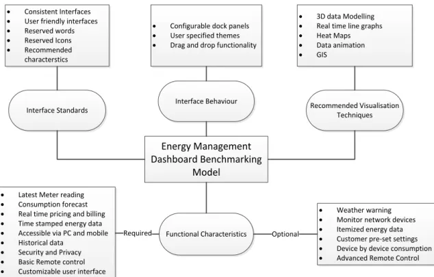
Figure 7: Energy Management Dashboard Benchmarking Model ... 55
Figure 8: Instantaneous power January 2012 -January 2014 ... 58
Figure 9: Johannesburg Hourly Temperature January 2011-January 2014 ... 59
Figure 10: Johannesburg hourly temperature 2011 ... 59
Figure 11: Johannesburg Hourly Temperature 2012 ... 60
Figure 12: Johannesburg Hourly Temperature 2013 ... 60
Figure 13: Raikes Road Incomer Instantaneous Power January 2012 -December 2012 ... 61
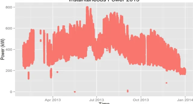
Figure 14: Raikes Road Incomer Instantaneous Power January 2013-December 2013 ... 62
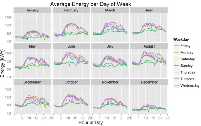
Figure 15: Average Energy per Day of Week ... 62
Figure 16: Average Energy per Day of Week for all months ... 64
Figure 17: Load profile for different campus operational states ... 65
Figure 18: Load – Temperature plot 2012 profile ... 65
Figure 19: Load – Temperature plot 2013 profile ... 66
Figure 20: Model A residuals scatter plot ... 69
Figure 21: Model B residuals scatter plot ... 71
Figure 22: Overall System Use Case ... 75
Figure 23: Applications Multi-Layer Architecture ... 76
Figure 24: Dashboard Home Screen ... 77
Figure 25: Dashboard with multiple screens docked ... 77
Figure 26: Data Analytics Screen ... 78
Figure 27: Peak load forecasting logic flow chart ... 80
Figure 28: Model B residuals on forecast values ... 82
Figure 29: Model B Forecast vs. Actual Values ... 83
Figure 30: April week 1: Actual and forecasted half hour loads ... 84
Figure 31: September week 1: Actual and forecasted half hour loads ... 84
Figure 32: Drag and Drop functionality showing how a user can drag a window to any position ... 86
Figure 33: Current meter instantaneous power and energy readings with a timestamp... 87
Figure 34: GIS component showing weather forecast and current meter location on a Google map ... 88
Figure 35: Itemised energy readings showing estimated cost ... 88
Figure 36: Settings screen ... 89
Figure 37: Estimated usage and cost grouped by day of week ... 89
Figure 38: Graph and Charting Capability for analysing past usage ... 90
Figure 39: Comparative Graph and Charting Capability for analysing past usage ... 90
Figure 40: Task Completion Level of Difficulty ... 94
Figure 41: Screen Organisation feedback ... 95
Figure 42: Adherence to technology and information standards ... 96
xiv
Figure 44: System Capabilities ... 98
Figure 45: Perceived Usefullness ... 99
Figure 46: Perceived Ease of Use ... 100
Figure 47: Overall Reaction to the Software ... 101
Figure 48: Model A Actual vs Forecasted values ... 145
Figure 49: Model A Training residuals ... 146
Figure 50: Model B Actual and fitted values over time ... 148
Figure 51: Model B training data residuals ... 149
Figure 52: Model B residuals vs temperature ... 149
Figure 53: Presentation layer classes ... 152
Figure 54: Data Access Layer and Repository Classes ... 153
Figure 55: Control layer and Model Classes ... 154
Figure 56: User System Use Case ... 155
Figure 57: Expanded View for GIS viewing use case ... 155
Figure 58: Expanded Energy Cost Viewing Use Case... 156
Figure 59: Application Use Case ... 156
Figure 60: User login Robustness Diagram ... 159
Figure 61: Meter selection Robustness Diagram ... 160
Figure 62: View forecasted Peak Load Robustness Diagram ... 160
Figure 63: Easy access buttons ... 163
Figure 64: User Login ... 163
Figure 65: Graph and charting functionality demonstration ... 163
Figure 66: Multi meter live readings viewing ... 164
xv List of Abbreviations
AAM: Advanced Asset Management
ADO: Advanced Distribution Operations
AI: Artificial Intelligence
AMI: Advanced Metering Infrastructure
ANN: Artificial Neural Networks
API: Application programming interface
ATO: Advanced Transmission Operations
DMS: Distribution Management System
DSD: Demand side Dashboard
EMS: Energy management systems
FNN: Fuzzy neural networks
GA: Genetic Algorithm GDR: Generalised Delta rule
GIS: Geographic information system
GPS: Global positioning system
GUI: Graphical User Interface
HEMS: Home Energy Management System
LTLF: Long Term Load Forecasting
MLR: Multiple Linear Regression
MAE: Mean Absolute Error
MAPE: Mean Absolute Percentage Error
MTLF: Medium Term Load Forecasting
NERSA: National Energy Regulator of South Africa
PEOU: Perceived ease-of-use
xvi
PLC: Programmable Logic Controller
PU: Perceived usefulness
ROF: Radio over fibre
RSS: Rich Site Summary
SANEDI: South African National energy Development Institute
SASGI: South African Smart Grid Initiative
SAWS: South African weather service
SCADA: Supervisory Control and Data acquisition
STLF: Short Term Load Forecasting
TOU: Time of use
1
C
C
h
h
a
a
p
p
t
t
e
e
r
r
1
1
:
:
B
B
a
a
c
c
k
k
g
g
r
r
o
o
u
u
n
n
d
d
1.
Introduction
The electrical grid is an interconnected network of devices responsible for the generation, transmission and distribution of power to billions of people across the world. While the traditional electrical grid has evolved and served its purpose well for decades, many factors such as rising costs, environmental effects of electricity generation and rapid improvements in technology mean that these grids are not sustainable for the future and must not stay and operate in their current form. This has led to the introduction of a new kind of electrical grid termed the “Smart Grid”.
A Smart Grid is defined as an electricity network that can intelligently integrate the actions of all users (generators, consumers and those that do both) connected to it in order to efficiently deliver sustainable, economic and secure electricity supplies [1]. Smart grids offer a two way communication system between devices which provides for easy control and automation of the grid.
Many countries including South Africa have already started upgrading their traditional grids by introducing smart technology. The introduction of smart meters and smart devices to make the Smart Grid a reality inevitably means a lot of data will be passed to and from the different interconnected smart devices that make up the smart Grid. Studies in Belgium have shown that an estimated 1.28 Terabytes of data per year can be produced by 3 million smart electricity meters [2]. Scaling this by the billions of households in the world this can easily translate to billions of terabytes of data which need to be stored, analysed and visualised easily such that control measures can be carried out from the resultant analytics. Such amounts of data are not easy to collect, intelligibly visualise and analyse and this poses a very big challenge to smart grid data management and analysis tools.
1.1
A Brief History on Smart Grids
Although the term “Smart grid” is relatively new, the idea of a smart grid is not new. From as long back as 1882 in the days of Thomas Edison research into how to actively and remotely control and monitor the electrical grid had already started but was limited by technological
2
capabilities [3]. This research was mostly driven by utilities who wanted to handle peak loads, monitor usage trends; limit unaccounted for power usage and maximises profits.
As technology has advanced in the past century as well as people becoming more aware of the environmental impacts of power generation, a need for more consumer control and the need to produce affordable, reliable and a sustainable electricity supply, governments across the globe have started funding research and the implementation of smart transmission grids. Fangxing Li et al [4] describes in a well detailed diagram shown below the driving forces behind the evolution of the traditional grid into a smart grid as well as the framework for the modern day transmission grid.
3
It must be noted that the driving forces and the stages in the development of the smart grid might differ from country to country.
1.2
Why the Smart Grid?
The move to the smart grid has been due to the seemingly infinite world of possibilities and benefits that it brings. Some of the benefits are listed but not limited to the ones below [4]– [10] :
Improve reliability of power quality and transmission;
Increased power distribution efficiency and conservation ;
Reduced costs for electric utilities;
Reduced expenditures on electricity by households and businesses;
Lower Greenhouse Gas(GHG) and other gas emissions;
Enable active participation by consumers;
Accommodate all generation and storage options;
Enable new products, services, and markets;
Provide power quality for the range of needs in a digital economy;
Optimise asset utilisation and operating efficiency;
Anticipate and respond to system disturbances in a self-healing manner;
Operate resiliently against physical and cyber-attack and natural disasters;
More efficient transmission of electricity;
Quicker restoration of electricity after power disturbances;
Reduced operations and management costs for utilities, and ultimately lower power costs for consumers;
Reduced peak demand, which will also help lower electricity rates;
Increased integration of large-scale renewable energy systems; and
Better integration of customer-owner power generation systems, including renewable energy systems.
1.3
A Look at the Smart Grid Architecture
The smart grid architecture includes most of the components of the traditional grid with the addition of smart meters, smart devices and an intelligent bidirectional communication
4
network. It can be broken down into 4 major technology categories proposed by the United States department of energy [11] as follows:
Advanced Metering Infrastructure (AMI) ;
Advanced Distribution Operations (ADO);
Advanced Transmission Operations (ATO); and
Advanced Asset Management (AAM)
Figure 2 below shows a conceptual overview of the smart grid [6][12][13]. All of the components shown are vital to the smart grid delivering its objectives of providing improved user control and home efficiency as well as sustainable, reliable and efficient power generation, transmission and distribution. The sections following the diagram briefly describe what each of these layers represent.
Information Consumers
Distribution Management System/Demand Response
management system
Data Management
Storage Routing/Integration Analytics and computation
Data Standards
Common Information Models
(CIM)for Utilities Multi-Speak
Communications Layer
Integrated Networks Wireless communications
technologies Wired communications technologies Grid Hardware Smart meters(Advanced metering systems) Control systems
Switch Gear Smart Devices e.g
smart washing machines,electric
cars Load Management system
Geographic Information system
Customer Energy Management System
Operator(Generation,
Transmission) Display system Billing System
Visualisation
Generation ,Transmission and Distribution Sensors and
Actuators Security
IEC 61968 IEC 61970
5 1.3.1 Information Consumers
The information consumers’ layer of the architecture represents the consumers of the data produced by the smart grid. These are namely the end users and the different management systems of all the entities making up the grid. An example of these entities is a household consumer and they are be able to get real time billing information, real time power cost as well as information regarding their power usage from the smart grid. Other entities like distribution and generation control centres are able to get demand and forecast information as well as the grids general health information. This information helps them to manage national grid systems.
1.3.2 Data Management
As more and more utilities around the world transform their grids into smart grids the amount of data produced by these smart devices will continue to grow exponentially [13][14]. The Data management layer is responsible for handling all the operations pertaining to the management of this large amount of data. Operations such as securing, analysing, visualizing and storage of data are represented by this layer.
1.3.3 Data Standards
The smart grid will see the interconnectivity of millions of devices offering two-way flow of data. There has to be a standard for these devices to communicate and exchange data securely and effectively [15]. The Data standards layer represents some of the common standards used in the grid such as Multi-speak and CIM. Other standards like IEC 61968 which enables inter-application information exchanges among distributed software application systems supporting the management of utility electrical distribution networks within a utility’s enterprise systems environment are still being developed [15].
1.3.4 Grid Hardware
The IEEE describes the smart grid as a complex system of systems [15]. These interrelated systems are made up of the hardware represented by this layer. The system consists of but is not limited to sensors, smart devices, electric vehicles, advanced metering infrastructure, monitors, switch gear, control gear and data storage devices. Typical smart grid components are as summarised below [16]:
6
Intelligent appliances: Appliances that use pre-set customer preferences to decide when to consume power. This can allow the consumer to shave their peak loads which has a major impact on electricity generation costs – alleviating the need for new power plants and cutting down on damaging greenhouse emissions. The consumer also benefits from a lower energy bill.
Smart power meters: meters that offer two-way communications between
consumers and power providers. This gives the ability to automate billing data collection, detect outages and dispatch repair crews to the correct location faster.
Smart substations: substations that can monitor and control critical and non-critical operational data such as power factor performance, breaker, transformer and battery status, security, etc.
Smart distribution: distribution that is healing, balancing and self-optimizing, including superconducting cables for long distance transmission, and automated monitoring and analysis tools capable of detecting or even predicting cable failure and failures based on real-time data about weather, outage history, etc.
Smart generation: generation that is capable of ‘learning’ the unique behaviour of power generation resources to optimise energy production, and to automatically maintain voltage, frequency and power factor standards based on feedback from multiple points in the grid.
1.3.5 Communications Layer
In any infrastructure or network, the communications system is the glue that binds everything together. This is particularly true in the smart grid network. Since this is a highly intelligent network of integrated smart devices and control systems, there needs to be an equally adaptable, secure, reliable, high quality and intelligent communication system. This is what this layer represents. The smart grid consists of sophisticated wired and wireless communication networks .Some of the new communications technologies used in the smart grid network are the broadband over power line, radio over fibre (ROF), 4th generation mobile networks [17][18] etc.
7
1.4
University of the Witwatersrand Advanced Metering Infrastructure
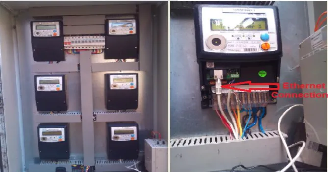
An Advanced Metering Infrastructure (AMI) is a network of automated two way communication between a smart meter with an IP address and a utility company or home energy management system. The goal of such an infrastructure is to provide utility companies or private customers with real time and profile data about energy consumption and allow customers to make informed decisions on energy usage [19].The Wits School of Electrical and Information Engineering Energy Group in collaboration with the Wits Property and Infrastructure Management Division (PIMD) set up an AMI network across all the universities campuses. There are over 150 smart meters across all the campuses and more meters continue to be added. Figure 3 below shows some of the Strike Enermax smart meters that have been placed on the campuses [20].
Figure 3: Medical School Networked Smart Meters
As can be seen from the pictures these meters are connected to a computer network via the Ethernet cables shown. This infrastructure has enabled the university to operate a smart grid data management system. After analysing the capabilities of these meters from the user manuals [20][21], it can be deduced that the infrastructure has the potential to:
8
Automate meter reading;
Implement time of use (TOU) metering;
Provide user/PIMD with usage information via a user interface;
Allow for management of non-essential appliances in peak periods and hence manage the university’s power peaks via the building management system;
Monitor and manage meter level malfunctions, tampers and outages;
Accurately estimate the university’s energy bill and compare it to the one provided by the power utility( City Power Johannesburg);
Remotely connect and disconnect specific buildings; and
Detect and reduce energy theft.
Although the infrastructure has a lot of potential, unfortunately at the present moment the potential has not been fully realised. This system just has a backend which collects the data but it does not have a user interface nor does it have any intelligent visual analytics to make use of this data. This is where this research becomes useful. The author has made a proposal to the energy group to design and implement a dashboard to help the PIMD use this infrastructure to its full potential and to also realise savings on their electricity bill using this data. The proposal shown in its entirety in Appendix Aand has been made part of the energy group Google® document library [22]. This dashboard forms the test prototype for the research presented in this dissertation.
1.5
The Research Report
The purpose of the research question presented in this dissertation is to critically evaluate the suitability and role of visualisation techniques, graphical user interfaces and short term load forecasting in the decision support tools that grid operators, managers and consumers use. It is the goal of this research to investigate advanced data visualisation and forecasting techniques that will give dynamic, interactive, real time and predictive graphics. This is done through a literature survey as well as an investigation into advanced data visualisation. An implementation, testing and evaluation of an energy monitoring prototype tool based on these techniques is carried out. This research falls under the data management layer of the smart grid architecture in Figure 2 above. The contents of this dissertation are presented as follows.
9
Chapter 2: Literature survey of visualisation techniques, the state of these techniques, load forecasting and motivation why research must be done in this area;
Chapter 3: Research questions being addressed, expected outcomes and the methodology followed;
Chapter 4: Modelling of a conceptual Consumer/Demand Side Dashboard benchmark model; Chapter 5: Multiple linear regression (MLR) load forecasting model;
Chapter 6: Requirements, specifications and design of the prototype developed; Chapter 7: Evaluation and results of forecasting model and dashboard usability; and Chapter 8: Conclusion and recommendations.
Appendix A: Dashboard Proposal
Appendix B: South African Weather Services none disclosure forms Appendix C: Model A Statistical analysis using R®
Appendix D: Model B Statistical analysis using R® Appendix E: ICONIX Process
Appendix F: Dashboard Source Code Appendix G: User interface Screenshots
Appendix H: Usability Questionnaires and test case feedback forms
Appendix I: Wits Energy Team correspondence during design and development
Appendix J: Conference Paper (Pan African International Conference on Information Science, Computing and Telecommunications (2014))
10
C
C
h
h
a
a
p
p
t
t
e
e
r
r
2
2
:
:
S
S
u
u
r
r
v
v
e
e
y
y
o
o
f
f
L
L
i
i
t
t
e
e
r
r
a
a
t
t
u
u
r
r
e
e
2.
Introduction
The literature review carried out in this research can be broken down into two parts which are the data visualisation aspect of the research as well as the load forecasting algorithms component. This chapter discusses the importance, goals and business case of data visualisation in power management systems. It looks at the state of visualisation techniques and approaches used in the current power grid management systems. It also looks at the available load forecasting algorithms as well as current research in the field of visualisation and load forecasting techniques within the smart grid data visualisation context.
2.1
Importance of Smart Grid Data Visualisation
The old adage “A picture is worth a thousand words” holds true to this day. Pictures are still the most effective way to describe, analyse and summarise a large dataset. This is because human beings are extremely well built for visual analysis and tend to make quicker and better decisions if data is presented to them in pictures, graphs or charts compared to text or any other form of data presentation [23]. This has meant that almost all data analysis tools are highly graphical and use advanced visualisation techniques.
Francis Anscombe, a world renowned statistician in his 1973 paper [24] demonstrated and argued the case of the power of graphs to accurately analyse and visualise data. He successfully demonstrated how four seemingly statistically identical (same mean, variance, correlation and regression) data sets actually portray vastly different information when they are viewed as graphs. His conclusion was that a computer should make both calculations and graphs. Graphs help to perceive and appreciate some broad features of data and a lot of thought and ingenuity must be devoted to devising good visualisation tools.
The American National Energy Technology laboratory in their presentation to the U.S Department of Energy [17] on the key components of improved interfaces and decision support for grid operators, noted that data visualisation was one of the key components. They argued that with the advent of the smart grid, large amounts of data will be available to
11
operators but the amount of time available to them to make crucial control decisions has now shortened from hours to minutes and sometimes even down to seconds. The same publication also points to the unavailability of data visualisation tools in power systems management making it more and more difficult for operators and other users to gain an intuitive understanding of the actual real time operations and control of the grid. This means visualisation techniques that present this enormous information in a quickly-grasped visual format to support operator actions and decisions are crucial to the success of the smart grid. The goal of such techniques is to remedy the problem of a lack of operator situational awareness by giving operators a real time view of the power system and its parameters quickly, efficiently, accurately and in a way that enhances their ability to assess the situation and respond appropriately and rapidly to challenges [25]. According to the US-Canada power system outage task force set up after the August 2003 blackout that left more than 50 million people without power, the situation could have been avoided or effects reduced if the following recommendations had been in place [10]:
Communications systems and displays that give operators immediate information on changes in the status of major components in their own and neighbouring systems had been present;
In the control centre, use a dynamic line loading and outage display board to provide operating personnel with rapid and comprehensive information about the facilities available and the operating condition of each facility in service; and
Give control centres the capability to display to system operators computer-generated alternative actions specific to the immediate situation, together with expected results of each action.
It can be seen that the key component in each of these recommendations is effective information display. As the power grid has evolved and smart devices become ubiquitous there is a growing need for visualisation techniques to keep up with the growing volume of data collected. Data visualisation techniques are important in that they will help prevent information overload which could prevent operators to identify problems quickly. If enormous amounts of data are presented in traditional tabular reports, charts and spreadsheets it becomes extremely difficult to quickly find patterns, trends and irregularities. Such traditional methods applied to large datasets can even lead to operators coming to the wrong
12
deduction. This exposes the importance of improved and advanced data visualisation techniques.
2.2
The Goal of Data Visualisation
After the September 11 attacks in the United States the Department of Homeland Security established the National Visualisation and Analytics Centre (NVAC) with the mission to inspire next generation technologies and talents to reduce the risk of terrorism by advancing the state of the visualisation and analytics science to enable analysts to detect the expected and discover the unexpected from massive and dynamic information streams. The panel defined visual analytics as the “science of analytical reasoning supported by interactive visual interfaces” and along with the visualisation research community defined some of the minimum deliverables for visual analytics tools [26]–[29] which are applicable to any data intensive field. In summary they recommended that visual analytics tools must:
Facilitate understanding of massive and continually growing collections of data of multiple types;
Enhance recognition of patterns;
Provide frameworks for analysing spatial and temporal data;
Reduce search time;
Support the understanding of uncertain, incomplete, and often misleading information;
Provide user and task adaptable guided representations that enable full situation awareness while supporting development of detailed actions;
Support multiple levels of data and information abstraction, including integration of different types of information into a single representation;
Facilitate understanding historical and current situations, as well as the trends and events leading to current conditions;
Facilitate identification of possible alternative future scenarios and the signs that one or another of these scenarios is coming to pass;
Monitoring current events to identify both expected and unexpected events;
Support the decision maker in times of crisis;
Provide a manipulatable medium; and
13
2.3
Hallmarks of a Good Visualisation Tool
Edward Tufte a pioneer in the field of data visualisation provides an excellent checklist for excellent graphics and data presentation. He argues the following minimum criteria for data visualisation in his book [30]. He says graphical displays that communicate complex ideas with clarity, precision and efficiency should:
Show data;
Induce the viewer to think about the substance rather than about the methodology, graphic design, the technology of graphic production;
Avoid distorting what the data has to say;
Make large data sets coherent;
Encourage the eye to compare different pieces of data;
Reveal the data at several levels of detail from a broad overview to the fine structure;
Serve a reasonably clear purpose, description, tabulation or decoration; and
Be closely integrated with the statistical and verbal descriptions of a data set [30].
The conceptual model developed and proposed in this research applies this checklist in the energy data presentation and visualisation.
2.4
The Evolution of Data Visualisation
As technology has evolved at a rapid rate and the Internet has become pervasive, enormous amounts of data have inevitably been produced. This data in its raw form is useless to many users and visualisation techniques to keep up with this data production must be developed. Although data visualisation techniques are not a new field of study and have been there for decades it is important that the techniques evolve with the evolving data and technology. Fortunately the study of data visualisation has not stood still and has itself undergone major developments in a number of fields. These developments include investigating ways of applying visualisation techniques and systems for more efficient manipulation, interpretation and presentation of data [31]. Although not specific to power management systems these developments can be applied to this field. The following sections detail the new developments in data visualisation techniques. These are an improvement to the traditional spread-sheets, static graphs and charts which cannot effectively cater for the enormous and dynamic data generated by the smart grid. An overview of many of these new developments
14
is presented in [32] and the following section summarises the notable ones. Although many of these techniques are already being used in organisations for business intelligence they have not yet made their way into power management tools which still use traditional visualisation techniques. It has been noted in previous research that power operators do not prefer moving to new techniques due to their familiarity with traditional methods [33] e.g. the use of 2D one line diagrams which do not have a representation of time instead of new 3D techniques that have a time representation allowing for time variation display in contingency severity visualisation [34]. It was one of the goals of the research described in this dissertation to change the attitude of power operators by including them in the design and development of these new tools.
2.4.1 Visual Querying
Visual querying is the ability to return data that matches set criteria by manipulating visual portions of graphs or charts [32]. By clicking on certain controls of the graphical interface users can drill down to specific filtered details that one would normally get by writing a complex database script. This technique works by translating the user interactions into database queries which then retrieve the data from the backend without the user being aware of it. This means users can at the click of a button ask for a very complex data filter query without needing to know how to actually formulate one. With the improved connectivity speeds and computer processing power the extraction of data from local or remote databases is now almost instantaneous and the user experience when using tools which implement visual querying is seamless. This technique allows the systems users to be able to easily analyse complex datasets.
2.4.2 Dynamic Data Management
Dynamic data management takes advantage of the fact that live data is always being updated and changing. In visualisation the graphical controls will be linked to this live data and as data is updated the controls also update to reflect these changes. This allows operators to always be aware of the current state of the environment they are monitoring.
2.4.3 Animated Visualisation
Animated visualisation is the technique of helping a user work through the logic behind an idea by showing the intermediate steps and transitions, or show how data collected over time
15
changes [35]. It is a more vivid display of data. Animation is basically data storytelling and can sometimes effectively and efficiently reveal data relationships that other techniques cannot reveal. Although very powerful, the use of animation can be confusing if misused. Animation should always be used within context and with a clear and concise purpose.
2.4.4 3D Data Modelling
This technique involves modelling and presenting data in a multidimensional format specifically 3D instead of the traditional 2D modelling. In particular, 3D data representation often provides a more enhanced and intuitive approach than a two dimensional approach [36]. 3D visualisation also has the potential to include information of more dimensions within a display without creating excessive display clutter and confusion [37].
Figure 4 below shows a comparison of data, 2D and 3D representation, showing exactly the same data. 3D data presentation allows the user to manipulate the data and see it from a variety of angles. According to studies by Hubona et al [38] this improves the users understanding of the data.
Figure 4: 2D vs. 3D data presentation
In the entertainment, meteorology and business world this technique has really taken off and is used by leading visualisation tools [39]–[42]. As recommended by Overbye et al [34], it is
16
about time that the electricity generation, transmission, distribution and power consumer world adopted this technique.
2.4.5 Direct Manipulation of Interfaces (Haptic Interfaces)
Golbeck [43] defines direct manipulation as the ability for system users to physically interact with the operating system instead of typing commands and allowing the operating system to act as an intermediary. It allows the user to interact directly with file icons and widgets [43]. Although this technology has been there for a number of years [44] it has now taken a different direction with the introduction and improvements in touch screen technology. Direct manipulation has now evolved in such a way that it allows a user to use gestures, manipulations and interactions with the actual user interface elements. Users can do this via touch interactions drag, pinch, stretch, zoom, pan, rotate and scroll [45]. This ability can prove valuable in power control rooms if operators could have this kind of interactions as they work with multiple dashboards on multiple terminals.
Shneiderman [44] elegantly describes direct manipulation systems as “offering the satisfying experience of operation on visible objects and making the computer transparent such that users can concentrate on their tasks”. This description was written in 1983 but applies more so now due to the way we interact with computers today.
2.4.6 Intelligent User Interfaces (Personalisation Techniques)
As the amount of data available to a user increases it is important to be able to filter and classify information based on the person using it. The techniques used by intelligent user interfaces to personalise information are called personalisation techniques and they help users who would normally be overloaded with information to efficiently locate specific information. GUI personalisation can be broken down into categories such as content, context and role based personalisation [46].
The goal of personalisation according to [47] is for a system to adapt its services to each individual user’s preference. It is to filter, classify and then present information to a user based on their preferences. If you think about it for a moment, it is like your very own desktop where you know exactly where everything is as well as everything being exactly where you personally want it to be. This means you can easily get the information you want
17
quickly and effortlessly. Everyone has their own preference in terms of arrangement so it does not make sense anymore in this day and age to have a “one size fits all” attitude in interface design. Jiming et al [48] says the design and complexity of a software system’s user interface largely determines the ease with which users can efficiently operate the system. Making user interfaces more intelligent and personalised is a step in the right direction in terms of visual tools becoming more user friendly. Interaction with a poorly organised GUI decreases the ease of navigating the system as well as reduces the usefulness of the system at the same time frustrating users [49].
2.4.7 Geographic Information Tools
Great strides have been taken in the field of geographic information system (GIS) technology. Technology and data that used to be reserved only for the military is now available in the public domain [50] and accessible across all fields for free or at a minimum cost. This means that smart grid management tools can take advantage of this technology together with the ubiquitous global positioning system technology (GPS) to improve on the geographic visualisation of the grid. For example if a specific meter or substation has a problem ,using that device’s geo-coordinates one can now get unique visual effects on maps or satellite images to see exactly where that meter is located as well as the surrounding areas. This means if there is a problem, operators can easily and quickly at a glance see affected areas and the best strategies to apply in order to contain or solve the problem. This technology has been in the energy industry for a while now but not at the level of sophistication available now. This means that the utilities can now receive much more detailed and accurate geographic information about the power grid than previously available [51].
2.5
Information dashboards
Information dashboards are user interfaces that show a visual representation of the current as well as historical state of a system. Bose [52] described dashboards more eloquently as “a software application that provides a single screen display of relevant and critical business metrics and analytics to enable faster and more effective decision making”.
Dashboards are used by their operators to make quick, but well-informed decisions. Using information from a variety of sources [53]–[56] as well as the authors own observations information dashboards help their operators to:
18
Get information quickly and clearly;
Get current status(snapshot);
Get historical trends of key performance indicators;
Generate detailed reports; and
Query system for specific information.
Energy control centres rely heavily on dashboards and without them the grid system operators cannot function optimally and effectively. With the introduction of new visualisation techniques as discussed in section 2.4 above, it is a partial goal of this research to propose and implement a framework for a modern enhanced dashboard for both the energy consumer and supplier. Using the author’s own observations, it can be summarised that information dashboards are used as the graphical user interface for energy management systems (EMSs) and helps operators to:
Maintain sufficient primary frequency response resources;
Assess current system state at a glance;
View real time power consumption and production;
Determine dispatch and commitment schedules;
View consumer usage(this is useful to both supplier and consumer);
Act as an interface used by control room operators for remote monitoring and controlling of the grid;
Maintain grid security and integrity by quickly detecting and mitigating threats against it [57]; and
Maintain sufficient online and offline generation reserves [58].
From a customer point of view a dashboard or home energy management system would help the customer to:
View current and historical energy usage [59];
Access to real time billing information [60];
19
View utility billing information especially for areas with dynamic pricing [60]; and
Compare and query their own readings with those provided by the local utility.
Information dashboards are not easy to design properly and a lot of times software designers get it wrong. The need to compress and squeeze a large amount of information into a small finite amount of space resulting in a display of information that is easily and immediately understandable is no menial task. Stephen [53] put it excellently when he argued that although dashboards are potentially powerful, this potential is rarely realised and preoccupation with superficial and functionally distracting visual characteristics of dashboards has led to a rash of visual design problems that undermine their usefulness. He presented the following thirteen common mistakes in dashboard design [53]:
Exceeding the boundaries of a single screen;
Supplying inadequate context for the data;
Displaying excessive detail or precision;
Choosing a deficient measure;
Choosing inappropriate display media;
Introducing meaningless variety;
Using poorly designed display media;
Encoding quantitative data inaccurately;
Arranging the data poorly;
Highlighting important data ineffectively or not at all;
Cluttering the display with useless decoration;
Misusing or overusing color; and
Designing an unattractive visual display.
The arguments brought forward by Stephen [53] on the above points are excellent and have a solid scientific basis. The proposed framework in this research adheres to this advice in a bid to propose and implement a world-class dashboard. It also adheres to Jakob Nielsen’s 10 heuristics points for user interface design [61] which he explained as follows:
20
Visibility of system status: The system should always keep users informed about what is going on, through appropriate feedback within reasonable time;
Match between system and the real world: The system should speak the users' language, with words, phrases and concepts familiar to the user, rather than system-oriented terms. Follow real-world conventions, making information appear in a natural and logical order;
User control and freedom: Users often choose system functions by mistake and will
need a clearly marked "emergency exit" to leave the unwanted state without having to go through an extended dialogue. Support undo and redo;
Consistency and standards: Users should not have to wonder whether different words, situations, or actions mean the same thing. Follow platform conventions;
Error prevention: Even better than good error messages is a careful design which prevents a problem from occurring in the first place. Either eliminate error-prone conditions or check for them and present users with a confirmation option before they commit to the action;
Recognition rather than recall: Minimise the user's memory load by making objects, actions, and options visible. The user should not have to remember information from one part of the dialogue to another. Instructions for use of the system should be visible or easily retrievable whenever appropriate;
Flexibility and efficiency of use Accelerators, unseen by the novice user, may often speed up the interaction for the expert user such that the system can cater to both inexperienced and experienced users. Allow users to tailor frequent actions;
Aesthetic and minimalist design: Dialogues should not contain information which is irrelevant or rarely needed. Every extra unit of information in a dialogue competes with the relevant units of information and diminishes their relative visibility;
Help users recognise, diagnose, and recover from errors: Error messages should be expressed in plain language (no codes), precisely indicate the problem, and constructively suggest a solution; and
Help and documentation: Even though it is better if the system can be used without documentation, it may be necessary to provide help and documentation. Any such information should be easy to search, focused on the user's task, list concrete steps to be carried out, and not be too large.
21
In following the above standards proposed by Stephen [53] and Nielsen [61], it is possible to come up with a well-founded dashboard design benchmarking model.
2.6
Types of Dashboards
Many types of dashboards exist and there are many schools of thought on the exact definition of a dashboard. It is thus important for one to know exactly the type of dashboard that one wants to implement. The team at Juice Analytics [55] gave the following overview of the different types of dashboards as summarised in Table 1 below.
Table 1: Dashboard Properties
Dashboard Properties
Option Description
Scope Broad Displaying information about the entire organization Scope Specific Focusing on a specific
function, process, product, etc.
Business role Strategic Provides a high-level, broad, and long-term view of performance
Business role Operational Provides a focused, near-term, and tactical view of performance
Time Horizon Historical Looking backwards to track trends Time Horizon Real time Monitoring activity as it happens
Time Horizon Snapshot Showing performance at a single point in time Time Horizon Predictive Using past performance to predict future
performance
Customisation Customisable Functionality to let users create a view that reflects their needs
Customisation One Size fits all
Presented as a single view for all users
Point of view Prescriptive The dashboard explicitly tells the user what the data means and what to do about it
Point of view Exploratory User has latitude to interpret the results as they see fit Level of
detail
High Presenting only the most critical top-level numbers Level of
detail
Drillable Providing the ability to drill down to detailed numbers to gain more context
Using this checklist it can be seen that a control room dashboard would fall under all the options of the time horizon section as well as all of the options in Level of detail and Point of view sections of the above diagram. The other options are higher level and geared towards management and not control room operators.
22
2.7
Load Forecasting Algorithms
For commercial and large scale consumers of energy such as the University of Witwatersrand it is important to be able to control their peak loads (Peak shaving). This is because utilities will charge penalties for certain peaks and as is the case with City Power Johannesburg, when charging the University of the Witwatersrand; they average the bill on the highest cycle peak reached in that day. In these scenarios it becomes paramount that these kinds of consumers be able to control their usage especially their peaks to avoid large bills or being charged penalties [62]. In order for these large energy consumers to shave or control their peak loads one of the things they can do is to implement short term load forecasting (STLF). Load forecasting is the estimation of future load demand. Load forecasting is not an easy task as the nature of a load profile is complex and depends directly or indirectly on a variety of mostly uncontrollable and uncertain factors such as the season (weather elements like temperature, humidity, wind speed etc.), day of the week, hour of the day, weekend or no weekend, holiday or no holiday and historical load profiles. To carry out this complex task forecasters use a number of algorithms implemented using various techniques notably classical statistics and Artificial Intelligence (AI) based techniques [63]–[65]. In this section we take a brief review at these two load forecasting techniques.
2.7.1 Statistical Methods
Traditional statistical methods have been used in load forecasting for a very long time dating back to the early sixties [66]. The common methods are based on regression and time series approaches. These approaches are based on relating load profiles to the other variables (temperature, time of day, previous load) through a mathematical model. The sections below detail the common statistical methods.
2.7.2 Time Series Approach
A time series is a collection of data recorded over a period of time using a determined interval e.g. hourly, daily, monthly etc. This keeps a record of historical data and based on the notion and assumption that history normally repeats itself (in some seasonal pattern) this data is used for forecasting. The time series approach is based on the idea that reliable predictions can be achieved by modelling patterns in a time series plot and then extrapolating these patterns to the future [67].
23
Hagan and Behr [66] showed in their study that the time series approach in particular using Box and Jenkins models is suited for load forecasting. In their study, data from the Southwestern power utility Oklahoma was used. Hourly system load profiles and temperature readings for 2 years were used to develop the models for each season of the year. They showed that because the Box and Jenkins transfer function model is a linear model it does not accurately reflect the load/temperature relationship which is a big disadvantage of this approach and introduces errors. In order to counteract this they applied a nonlinear transformation to the temperature data before using it in the transfer function model and this greatly improved the results. The average error for the summer forecasts using their non-linearizing of temperature was 3.55% compared to 4.17% when using only the Box and Jenkins models.
2.7.2.1 Multiple Linear Regression
Multiple linear regression (MLR) is one of the oldest and widely used statistical technique in electrical load forecasting [68]. MLR is a statistical method used to model the linear relationship between a dependent variable and one or more independent variables. The goal of MLR is to identify a function or mathematical model that best approximates the relationships of these variables so that the value of the dependent variables can be predicted using a range of these independent at variables. Amral et al [69] designed, implemented and analysed an hourly STLF system on the Sulewesi Island – Indonesia Power System, using MLR with good results. In modelling the system they divided the year into 2 seasons, rainy season and dry season. They also divided a 24 hour day based on known user behaviour into 3 intervals (01:00 to 06:00, 07:00 to 17:00 and 18:00 to 00:00). These 3 intervals were then modelled separately. In all the mathematical models the relationship between load, temperature and time of observation was not modelled linearly but in a polynomial form since it is not a linear relationship. The general form of the equations is:
24
( ) ( ( ) ( ( ))) ( ( ) ( ( ))) (1 )
Where:
( )= Predicted load at hour t in the interval of the day α = Regression parameters
( )=Temperature (0C) at time in the interval = Time of observation
Their study yielded a mean average percentage error (MAPE) of 3.52% in the dry season and 4.34% in the rainy season. The error values were attributed to things like load shedding and inaccuracies in the forecast temperature data used. They also concluded that for this particular area where the dominant portion of the load is residential lighting, daylight (brightness) of the day should be considered hence they split the day into intervals.
2.7.3 Artificial Intelligence (AI)
Artificial intelligence in load forecasting is a broad category that includes systems using AI approaches such as expert systems [64], fuzzy logic [70], neural networks [71], support vector machines [72], genetic algorithms (GAs) [73] and wavelet networks [74]. This subsection deals with the 2 most popular approaches which are neural networks and fuzzy logic based systems.
2.7.3.1 Artificial Neural Networks
Artificial neural networks (ANN) are inspired by animal biological nervous systems. Animals can adapt to changes and various stimuli in their external and internal environments, they can learn from their environment and use very low energy in the process [75] hence the basic idea behind ANNs is to try and simulate the animals’ nervous system and achieve similar responses in artificial systems. At the heart of the biological nervous system is a basic unit called the neuron and the nervous system is made up of a complex network of billions of these units. Similarly artificial neural networks can involve multiple interconnected elements to make up a massive computing network. Dr Robert Hecht-Nielsen the inventor of one of the first neuro-computer defined a neural network as “...a computing system made up of a number of simple, highly interconnected processing elements, which process information by
Figure
![Figure 1: Vision of the Smart Grid [4]](https://thumb-us.123doks.com/thumbv2/123dok_us/1078673.2643578/19.892.113.784.442.1078/figure-vision-smart-grid.webp)
![Figure 2 below shows a conceptual overview of the smart grid [6][12][13]. All of the components shown are vital to the smart grid delivering its objectives of providing improved user control and home efficiency as well as sustainabl](https://thumb-us.123doks.com/thumbv2/123dok_us/1078673.2643578/21.892.127.765.576.1105/conceptual-overview-components-delivering-objectives-providing-efficiency-sustainabl.webp)


Related documents
51 17/05/2008 National Grid NTS to raise a draft pricing proposal for Flat Exit Capacity. Carried
Reducing gender differences by promoting spatial ability in children With the link between spatial ability and development of mathematics and science skills, a number
In Schedule I of the Bio-medical Waste (Management and Handling) Rules, 1998 (Annexure II) Hospital waste refers to all waste generated, discarded and not intended
Box II: Usage Growth, harvest and preparation of algae Feed production Product cleaning and packaging Box I:Production Production of Magnesium sulfate Transport Production of Sodium
Case Study Report: Business Case for implementing battery-powered tools for direct-bury line workers at an electric power utility.
Would need to be accompanied by strategic instruments to reduce journey lengths and improve facilities and infrastructure for other modes. Note:- 1) These instruments would
The report outlines the main developments in the fi eld of product safety in 2010, in particular the continuous improvement of cooperation between the Member States and the
The development of high-speed rail (HSR) has had a notable impact on modal market shares on the routes on which its services have been implemented. We
