Scholarship@Western
Scholarship@Western
Electronic Thesis and Dissertation Repository
4-17-2014 12:00 AM
Optimizing the Analysis of Electroencephalographic Data by
Optimizing the Analysis of Electroencephalographic Data by
Dynamic Graphs
Dynamic Graphs
Mehrsasadat Golestaneh
The University of Western Ontario
Supervisor
Mark Joseph Daley
The University of Western Ontario Graduate Program in Computer Science
A thesis submitted in partial fulfillment of the requirements for the degree in Master of Science © Mehrsasadat Golestaneh 2014
Follow this and additional works at: https://ir.lib.uwo.ca/etd
Part of the Computational Neuroscience Commons, Dynamic Systems Commons, Other Applied Mathematics Commons, Other Computer Sciences Commons, Other Mathematics Commons, and the Theory and Algorithms Commons
Recommended Citation Recommended Citation
Golestaneh, Mehrsasadat, "Optimizing the Analysis of Electroencephalographic Data by Dynamic Graphs" (2014). Electronic Thesis and Dissertation Repository. 1996.
https://ir.lib.uwo.ca/etd/1996
This Dissertation/Thesis is brought to you for free and open access by Scholarship@Western. It has been accepted for inclusion in Electronic Thesis and Dissertation Repository by an authorized administrator of
(Thesis format: Monograph)
by
Mehrsasadat Golestaneh
Graduate Program in Computer Science
A thesis submitted in partial fulfillment
of the requirements for the degree of
Master of Science
The School of Graduate and Postdoctoral Studies
The University of Western Ontario
London, Ontario, Canada
c
The brain’s underlying functional connectivity has been recently studied using tools offered
by graph theory and network theory. Although the primary research focus in this area has so
far been mostly on static graphs, the complex and dynamic nature of the brain’s underlying
mechanism has initiated the usage of dynamic graphs, providing groundwork for time
sensi-tive and finer investigations.
Studying the topological reconfiguration of these dynamic graphs is done by exploiting a pool
of graph metrics, which describe the network’s characteristics at different scales. However,
considering the vast amount of data generated by neuroimaging tools, heavy computation load
and limited amount of time and resources, it is vital to refine this pool of metrics to avoid using
non-informative and redundant ones.
In this study, we use electroencephalographic (EEG) brain signals, taken from recordings in
5 different experimental conditions, to generate the dynamic graphs by moving a sliding
win-dow over the time series. Dynamic graphs are produced under various conditions that are a
combination of different window sizes, different numbers of shared time points and various
frequency bands. Based on each set of these dynamic graphs, time series of 25 graph metrics,
and then their pairwise correlation values are computed. This is done to investigate the metric
correlations under various circumstances, and to detect the ones that are always present.
We conclude by suggesting a set of uniquely informative and orthogonal metrics that is
conve-nient to use for further analysis of brain’s functional connectivity.
Keywords: Dynamic graphs, Orthogonal metrics, Functional connectivity, EEG
First, I thank my supervisor, Mark Daley, for his mentorship and support, without which I would be lost in no time. I also thank my mom, dad, Sara, and Roozbeh, for their love and support, which kept me hopeful and determined all the time.
Abstract ii
List of Figures vii
List of Tables ix
List of Appendices ix
1 Introduction and Background 1
1.1 Overview and Contributions . . . 3
1.2 Background . . . 5
1.2.1 A brief review of graph theory . . . 5
1.2.2 Electroencephalography (EEG) . . . 10
1.2.3 Related pioneering works . . . 11
2 From EEG signals to dynamic graph metrics 14 2.1 General information about the data-set . . . 15
2.1.1 The experiment . . . 15
2.1.2 Sampling rate . . . 16
2.1.3 Epoching . . . 16
2.1.4 High pass and low pass analog filters . . . 17
2.1.5 Dealing with power line interference . . . 17
2.2 Further preprocessing of EEG recordings . . . 17
2.2.1 Extracting certain frequencies . . . 18
2.2.2 Averaging . . . 19
2.3 Building the brain graphs . . . 19
2.3.1 The concept of dynamic graphs . . . 20
2.3.2 Phase lag index (PLI) . . . 20
2.3.3 Thresholding Methods . . . 22
S thresholding method . . . 22
False discovery rate (FDR) thresholding method . . . 23
Random matrix theory (RMT) thresholding method . . . 25
2.4 Graph metrics . . . 26
2.4.1 Micro scale metrics . . . 28
Node degree . . . 28
Average nearest neighbor degree . . . 28
Eigenvector centrality . . . 29
PageRank . . . 29
Kleinbergs Hub and Authority Scores . . . 30
Core number . . . 30
Closeness Vitality . . . 30
2.4.2 Macro scale metrics . . . 31
Diameter . . . 31
Average path length . . . 31
Average clustering coefficient . . . 31
Number of isolated nodes . . . 32
Edge connectivity . . . 32
Assortativity . . . 32
Number of maximal cliques . . . 32
Graph clique number . . . 32
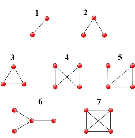
2.4.3 Motifs . . . 33
2.5 Pearson correlation coefficient . . . 33
2.6 A summary of the pipeline . . . 35
2.6.1 Technical details . . . 37
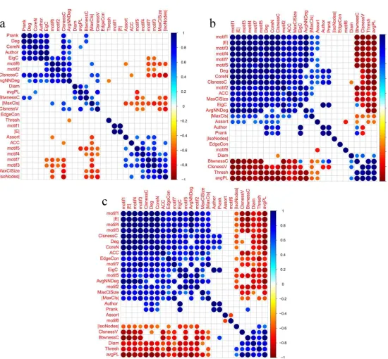
3 Metric correlations across different thresholding methods 39 3.1 Trial type: 1 . . . 41
3.2 Trial type: 2 . . . 45
3.3 Trial type: 3 . . . 47
3.4 Trial type: 4 . . . 49
3.5 Trial type: 5 . . . 53
3.6 Discussion . . . 54
4 Metric correlations across different circumstances 56 4.1 Changing the window size . . . 57
4.1.1 Trial type 1 . . . 57
4.1.2 Trial type 2 . . . 61
4.1.3 Trial type 3 . . . 63
4.1.4 Trial type 4 . . . 65
4.1.5 Trial type 5 . . . 65
4.1.6 Recurrent dependencies . . . 68
4.2 Changing the step size . . . 69
4.2.1 Trial type 1 . . . 71
4.2.2 Trial type 2 . . . 74
4.2.3 Trial type 3 . . . 76
4.2.4 Trial type 4 . . . 78
4.2.5 Trial type 5 . . . 80
4.2.6 Recurrent dependencies . . . 80
4.3 Changing the frequency band . . . 83
4.3.3 Trial type 3 . . . 88
4.3.4 Trial type 4 . . . 88
4.3.5 Trial type 5 . . . 91
4.3.6 Recurrent dependencies . . . 93
4.4 Discussion . . . 93
5 Summary and suggestions for future work 99
Bibliography 102
A Glossary of graph metrics 108
Curriculum Vitae 110
1.1 Different states of a moving subject in time. . . 4
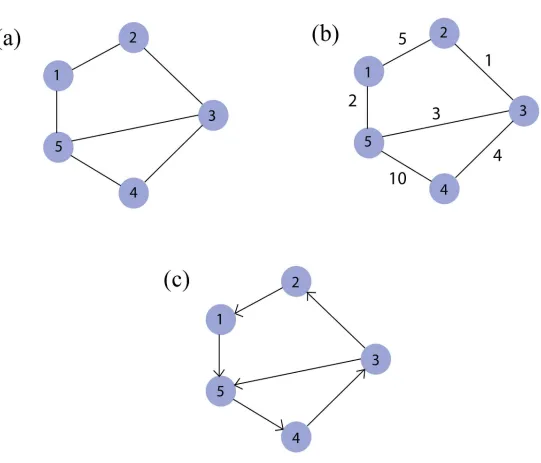
1.2 An example of Un-weighted (a), Weighted (b) and Directed (c) graphs . . . 7
1.3 An example of regular, small-world and random networks[60] . . . 9
2.1 Seven equivalence classes of motifs with up to 4 nodes. . . 34
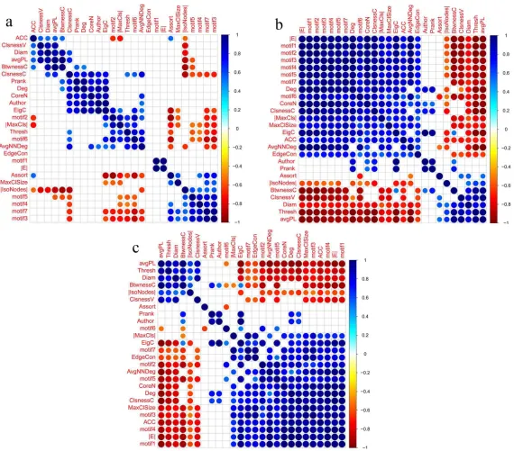
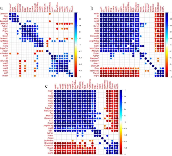
3.1 Metric correlations obtained based on trial type 1, and using window size = 800, step size=25 and thresholding methods: (a)S, (b)FDR and (c)RMT. . . . 42
3.2 Metric correlations obtained based on trial type 2, and using window size = 800, step size=25 and thresholding methods: (a)S, (b)FDR and (c)RMT. . . . 46
3.3 Metric correlations obtained based on trial type 3, and using window size = 800, step size=25 and thresholding methods: (a)S, (b)FDR and (c)RMT. . . . 48
3.4 Metric correlations obtained based on trial type 4, and using window size = 800, step size=25 and thresholding methods: (a)S, (b)FDR and (c)RMT. . . . 50
3.5 Metric correlations obtained based on trial type 5, and using window size = 800, step size=25 and thresholding methods: (a)S, (b)FDR and (c)RMT. . . . 52
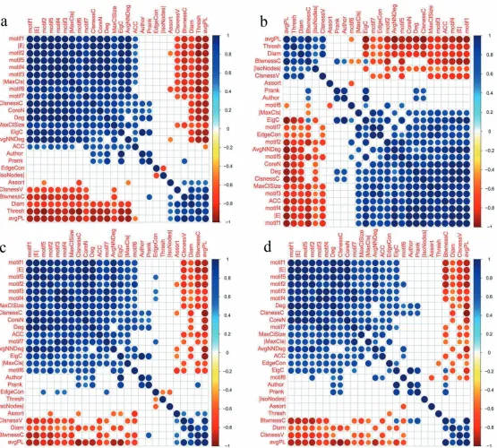
4.1 Metric correlations obtained based on trial type 1, in beta frequency band, and using step size = 25, window sizes: (a)1100, (b)800 and (c)500 and (d)200, and RMT thresholding method. . . 58
4.2 Metric correlations obtained based on trial type 2, in beta frequency band, and using step size = 25, window sizes: (a)1100, (b)800 and (c)500 and (d)200, and RMT thresholding method. . . 62
4.3 Metric correlations obtained based on trial type 3, in beta frequency band, and using step size = 25, window sizes: (a)1100, (b)800 and (c)500 and (d)200, and RMT thresholding method. . . 64
4.4 Metric correlations obtained based on trial type 4, in beta frequency band, and using step size = 25, window sizes: (a)1100, (b)800 and (c)500 and (d)200, and RMT thresholding method. . . 66
4.5 Metric correlations obtained based on trial type 5, in beta frequency band, and using step size = 25, window sizes: (a)1100, (b)800 and (c)500 and (d)200, and RMT thresholding method. . . 67
4.6 Recurrent metric correlations which were seen for all trial types and window sizes. . . 70
4.7 Metric correlations obtained based on trial type 1, in beta frequency band, and using step sizes = (a)5, (b)25, (c)50 and (d)100, window size:100 and RMT thresholding method. . . 72
thresholding method. . . 75 4.9 Metric correlations obtained based on trial type 3, in beta frequency band, and
using step sizes = (a)5, (b)25, (c)50 and (d)100, window size:100 and RMT thresholding method. . . 77 4.10 Metric correlations obtained based on trial type 4, in beta frequency band, and
using step sizes = (a)5, (b)25, (c)50 and (d)100, window size:100 and RMT thresholding method. . . 79 4.11 Metric correlations obtained based on trial type 5, in beta frequency band, and
using step sizes = (a)5, (b)25, (c)50 and (d)100, window size:100 and RMT thresholding method. . . 81 4.12 Recurrent metric correlations which were seen for all trial types and step sizes. . 82 4.13 Metric correlations obtained based on trial type 1, in frequency bands: (a)alpha,
(b)beta and (c)gamma, and using step size=25, window size=800 and RMT thresholding method. . . 84 4.14 Metric correlations obtained based on trial type 2, in frequency bands: (a)alpha,
(b)beta and (c)gamma, and using step size=25, window size=800 and RMT thresholding method. . . 87 4.15 Metric correlations obtained based on trial type 3, in frequency bands: (a)alpha,
(b)beta and (c)gamma, and using step size=25, window size=800 and RMT thresholding method. . . 89 4.16 Metric correlations obtained based on trial type 4, in frequency bands: (a)alpha,
(b)beta and (c)gamma, and using step size=25, window size=800 and RMT thresholding method. . . 90 4.17 Metric correlations obtained based on trial type 5, in frequency bands: (a)alpha,
(b)beta and (c)gamma, and using step size=25, window size=800 and RMT thresholding method. . . 92 4.18 Recurrent metric correlations seen for all frequency bands and trial types. . . . 94 4.19 Recurrent metric correaltions seen for all combinations of frequency bands,
step sizes, windows sizes and trial types. . . 95
A.1 Glossary of graph metrics . . . 109
Introduction and Background
The brain is a highly dynamic and complex system, and the very first step towards improving,
maintaining and repairing any system is having a comprehensive, clear understanding of its
underlying mechanisms. For this purpose, the brain has been studied on many different scales,
from studying the genetic factors affecting the formation of its neuronal connections to
analyz-ing different levels of connections between its anatomical areas.
With the emergence of the disconnection syndromes concept in the late nineteen century,
sci-entific attention was drawn to the notion of networks in neurology [3]. Thereafter, many works
have provided evidence for the brain being a highly complex network, which segregates and
integrates information in a cost effective and dynamic manner by making use of its highly
modular structure. Considering this complexity and dynamicity, network theory can serve as
a powerful tool, providing scale invariant metrics, adjusting quickly to the behavioral changes
in the brain. Furthermore, it has been proven that structural and functional network metrics
are heritable, and that they change with aging [3], making graph metric analysis even more
worthwhile.
Since the realization of the benefits of using network theory and graph theory in neuroscience,
many studies, such as [36] and [19], have been done by mapping neuroimaging-derived data
to graphs, and analyzing the functional or structural connections by the help of informative
graph metrics. Despite the evidently dynamic nature of the brain, most of the work in this area
focuses on using static graphs, leaving dynamic graphs out of the center of attention they truly
deserve. Only recently, the first steps towards the use of dynamic graphs have been taken by
[30] and [38], in which they compared network topologies across a small set of time points,
leaving the need of further investigations of the topological evolution of graphs in time at a
much finer scale.
Despite the huge role of graph metrics in describing behaviors of the networks under study,
using non-informative and repetitive metrics can only lead to duplicated results and waste of
time and other limited resources. Putting time and effort to find unique and meaningful metrics
is a matter of significant importance, especially considering the possibility of using them as
features for training machine learning algorithms, aimed at diagnosing mental disorders (see
[25] and [33] ). It is worth mentioning that using a lot of redundant or highly correlated metrics
can seriously decrease the accuracy of classification[28].
In this project, we have chosen to focus our attention on analysis of dynamic graphs, created
using brain signals that are recorded by Electroencephalography(EEG), which is a
neuroimag-ing technique that will be explained later in this chapter. The graphs are obtained in various
conditions, such as different window sizes, time epochs, thresholds and bands. Based on these
dynamic graphs, series of metrics, reflecting the changes in the brain’s functional network over
time, are compared with each other to grasp a better understanding of the brain’s behavior in
different conditions, with the goal of reconnoitering the most informative and unique metrics
1.1
Overview and Contributions
As mentioned before, this study focuses on the analysis of the topological properties of
dy-namic EEG-derived graphs representing the neural patterns of brain functional connectivity.
EEG signals of 5 types of trials are obtained, pre-processed and filtered into different
fre-quency bands. For each trial type-band combination, we move a sliding window over the data
and use phase lag index (PLI) to obtain a correlation matrix for each time-window. PLI is a
technique that helps with the detection of true synchronization between two time series, and
is explained in detail in Chapter 2. The similarity matrix obtained based on PLI reflects the
strength of relations between different EEG channels. It is then thresholded using a Random
Matrix Theory based approach [16], resulting in a binary adjacency matrix, in which the value
of 1 means that activities of the corresponding channels are synchronized, and 0 means there
is not enough synchronization.
Following this approach, a series of graphs is obtained, in which each graph captures the
be-havior of the network in a specific time interval. It is like putting a camera on burst mode and
taking successive pictures of a moving subject, so that each picture captures the state of the
subject at a certain time (See Figure 1.1). Having these graphs, we compute graph metrics
of three distinguished categories: 1- Macro scale metrics (whole graph metrics), describing
the state of network based on the whole graph characteristics. 2- Micro scale metrics (node
metrics), describing the state of network based on the node properties. 3- Graph motifs.
For each metric belonging to one of these categories, a series of values is obtained, in which
each value belongs to one of the captured graphs in time. By comparing these series to each
other we can gather information on the metric’s uniqueness. Also, since each trial’s data was
obtained based on a special brain task, we may be able to identify the metrics that reflect these
Our overall contributions in this project are as follows:
1- Comparing and analyzing metric correlations of dynamic graphs obtained based on three
different thresholding methods, which resulted in an evaluation of using these thresholding
methods in this project.
2- Reducing a pool of 25 metrics to a set of 10 uniquely informative metrics, which are
conve-nient to use for further functional network analysis based on dynamic graphs.
1.2
Background
The usage of network theory concepts has expedited the progress in various fields (e.g. [8], [66]
and [40]), and since the brain is a highly complex modular network, it comes as no surprise
that there is a vast and diverse usage of network theory in neuroscience as well. Furthermore,
its applicability to any scale makes methodological cross validation and comparing structural
and functional properties of different brain scales possible. As mentioned before, in this project
we only focus on the analysis of the dynamic EEG-derived graphs, thus, it is beneficial to give
a very brief background on EEG and some basic concepts of graph theory (being the basis
for network theory). Afterwards we will briefly cover some of the most important progress in
relation to our current study.
1.2.1
A brief review of graph theory
Graph theory is the study of relations between entities. Considering a popular social network
like Facebook, every person who has an account in this network can be called a node
(be-longing to a set of nodes or V) and two people (nodes) are linked to each other by an edge
(belonging to a set of edges or E) only if they are friends. Simple as that, one can build a graph
brain networks, each node represents an area in the brain and edges are statistical measures of
association.
Depending on the needs of analyzing a particular network, graphs can be built as weighted or
un-weighted. In weighted graphs (Figure 1.2 b), a value is assigned to each edge. This value
can show the cost, degree of importance or any other aspect of the relationship between two
nodes. If there is no value assigned to edges, the graph is called un-weighted (Figure 1.2 a).
Brain networks have been studied based on both weighted and un-weighted graphs.
A graph is called directed if the directions of relationships between its nodes are annotated with
arrows on its edges (Figure 1.2 c), otherwise it is undirected. Considering current
methodologi-cal tools, it is often more convenient to use undirected graphs to study structural and functional
brain connectivity since estimating directionality is harder than determining whether a
connec-tion exists or not [47].
Since a graph is a complex representation, it is necessary to summarize its characteristics by
some means. For this purpose, various graph metrics have been defined in the field of graph
theory. Back to the Facebook example, to compute the number of friends for each person,
one must count the edges that connect that person to other people. The result is called node
degree. Path length metric answers the question of ”what is the minimum number of people
that connect two non-friend Facebook users to each other?”, while the clustering coefficient is
a measure of the extent to which nodes tend to cluster together.
Graphs can be classified based on their topological properties. A graph is called random if
edges are randomly assigned to its nodes. The Erdos−Renyi graph is a well-known random
graph in which all edges have the same probability of occurrence. Random networks are proven
ing a random graph there is always the chance of choosing long distance edges connecting two
distant nodes, and thus, reducing the average path length in the graph.
On the other hand, if all the nodes in a graph have the same degree, the graph is called regular.
Regular networks (regular lattices) are known to have high clustering coefficient and high
av-erage path length [60].
In other words, considering the range of all possible variations of graphs, random and
reg-ular graphs are located at two ends of this range, representing the most unordered and the most
ordered graphs respectively. Based on experimental observations, networks in real life, such
as social, biological and neural networks, are usually neither completely random nor utterly
ordered. The termsmall-worldwas first introduced by Watts et. al (1998) [60] to describe the
common properties of these intermediate networks. Starting from a regular graph,
reconnect-ing each edge with the probability of 0 < P < 1, results in a graph with two main properties:
high clustering coefficient (in comparison with random graphs) and relatively short path length
(comparing to regular graphs). A good example of such small-world networks is again a social
network, in which people belong to a cluster of friends. In this network most people are not
directly friends, but are connected via a series of mutual friendships. An example of regular,
random and small-world networks, as depicted in [60], can be seen in figure 1.3.
Many studies have shown that brain functional networks have small-world properties, and these
network properties are the key factors making the segregation and integration of the
informa-tion possible [10]. A high clustering coefficient helps segregation and as a result increases the
local efficiency of information transfer. On the other hand, low average path length provides
long distance links to distant areas of the brain and thus supports integration, which results in
1.2.2
Electroencephalography (EEG)
Synchronizing groups of cortical neurons in the brain generates a significant amount of
elec-tricity, which is caused by voltage fluctuations resulting from ionic current flows within them.
EEG electrodes, placed on the scalp in multiple locations, capture this electrical activity over a
wide range of frequencies ( 1 to 100 Hz). In this study we have chosen EEG as the
physiolog-ical methodology since it provides a good enough time resolution (milliseconds) to reflect the
dynamics of graph topology.
On the other hand, working with EEG data has a downside regarding the spatial accuracy that
should be dealt with. The easiest way to map the EEG data to a brain graph is to define each
EEG source as a node. While this is convenient for preserving between-node covariance
infor-mation, nodes which represent anatomically nearby EEG sources might mistakenly show high
correlations with each other due to an effect called volume conduction. Volume conduction is
defined as the fast transmission of electric signals through brain tissue between neighboring
sensors. Another similar problem in EEG is caused by an active reference electrode which
contributes similar components to signals recorded at different electrodes (for more detail on
volume conduction and reference electrode see [39]). Stam et. al (2007) [51] calls these two
phenomena the problem of common sources. The problem of common sources can be
dis-tinguished from real neural synchronization by making use of methods that take the amount
of phase delay into account, such as phase lag index (PLI), knowing that volume conduction
happens with near zero phase lag and that the synchronous activity of neural groups does not
happen as fast as the transmission of electric fields through tissue (happening approximately at
the speed of light) and is accompanied by a non-zero phase delay.
anatomical sources are defined and considered as the graph nodes. On the downside,
cur-rent available source reconstruction methods cause the loss of covariance information between
nodes, which is due to the fact that a given electric potential recorded at the scalp can be
ex-plained by the activity of infinite different configurations of EEG channels [35].
Considering these options, it seems more convenient to map EEG channels to nodes. Though
this approach sacrifices spatial accuracy, it is a good choice for studying dynamic graphs since
it keeps the statistical properties of the data as intact as possible. It is worth mentioning that
each node represents the activity of a particular region in the brain.
1.2.3
Related pioneering works
The idea of the brain being a network was brought to the scientific community’s attention by
Norman Geschwind ([23]) in 1965. His investigations on disconnection syndromes (the
discon-nection of different brain areas in animals and humans) was the onset of many further studies
proving that the brain is in fact a complex network, having functionally specialized connected
parts that work together to perform certain tasks. Emergence of brain-imaging techniques such
as PET, EEG, MEG, MRI and fMRI provided the scientific community with vast amounts of
data, increasing the need for usage of proper mathematical tools such as signal processing and
correlation estimation methods and more importantly, network theory.
As mentioned before, Strogatz and Watts [60] introduced collective dynamics of a special
cat-egory of graphs under the name of small-world networks. Benefiting from their work, Sporns
et. al (2000) [48] was one of the first studies that took the small-world characteristics into
account for investigating the relation between functional and structural networks, proposing
the existence of complex brain dynamics that adapt to different task demands. Concurrently,
Stephan et. al (2000) [52] also benefited from the small-world properties for analysis of the
been conducted to further shed light on the underlying network properties of different
cogni-tive and motor control tasks (e.g. [63],[4], [24]), and to investigate the underlying functional
network properties of disordered brains (e.g. [50] ), using various physiological methodologies.
While good temporal resolution of EEG and its relatively low cost makes it a popular
neuro-imaging technique, the problem of volume conduction has lead to the usage of various methods
such as phase coherence (PC) and imaginary component of coherency (IC), for neat
identifica-tion of statistical dependencies between physiological time series. Stam et. al (2007) [51] have
introduced PLI as an approach to deal with the problem of volume conduction when
quanti-fying phase synchronization. Their results show better performance of PLI comparing to the
well known methods of PC and IC.
Though the majority of the work on the brain network topology is based on static graphs,
dynamic graph analysis has recently started to attract the neuroscience community’s attention,
resulting in pioneering works such as [20] that observed the cortical network dynamics during
foot movements over several time points, or [2] that took the dynamic time scales into account
for studying the modular structures of brain functional networks. Moreover, a more recent
study ([30]) investigated the workspace configuration of brain functional network, benefiting
from dynamic graph metrics obtained in two different trials of response generation state and
working memory stage, while Nichol et. al (2011) [38] observed and analyzed the
reconfigura-tion of brain funcreconfigura-tional network during an auditory task, using dynamic MEG-derived graphs
obtained from different time windows.
This project follows a similar approach to the ones in [30] and [38].
We explain the materials and methods used in this project in detail in Chapter 2, alongside
Chap-ter 3, we compare 3 different thresholding methods. Metric comparisons are demonstrated
in Chapter 4, and Chapter 5 provides the reader with a summary of the project and our final
From EEG signals to dynamic graph
metrics
Various steps are taken for obtaining network metric correlations from raw EEG signals. We
start by filtering the EEG data-set so that only desired frequencies are kept for future
anal-ysis. After that, the signals undergo a process of averaging, so that the signal/noise ratio is
increased. Then, the process of building dynamic brain graphs takes place. For building a
graph representing the activities of the brain in a certain time window, first a similarity matrix
is computed, which demonstrates the strength of synchronization between EEG channels. For
building this matrix we use a method called phase lag index (PLI), which takes the problem
of common sources (explained in Chapter 1) into account. Afterwards, based on the obtained
similarity matrix, we use a thresholding method to create an adjacency matrix, which is a
bi-nary representation of the relationships between EEG channels. Having this adjacency matrix,
we can then map it to a brain graph in which the vertices represent the channels, and each
edge between two vertices is an indicator of an existing synchronization between the two
cor-responding channels. The above steps are done for consecutive time intervals in EEG signals,
and thus result in a series of dynamic graphs. By having this temporal series of brain graphs,
we can then compute various metric values and thus obtain time series of these metric values.
These time series are then compared with each other using the Pearson correlation method.
In this chapter we describe all these steps along side other important information and
de-tails regarding graph metrics and the underlying structure of algorithms used in this project. We
start by introducing our EEG data-set, moving towards explaining the process of filtering and
averaging. Then, we focus on the concept of dynamic graphs, PLI method and different types
of thresholding methods that are used in this project. Afterwards, we switch to a graph
theo-retical point of view, introducing the set of metrics exploited for the purpose of our analysis.
Finally, after describing the Pearson correlation method, we end this chapter by summarizing
the pipeline implemented in this project, which results in a correlation matrix for a set of 25
graph metrics.
2.1
General information about the data-set
In this section, we introduce the data-set used in this project and explain all the necessary
con-cepts for understanding the properties of this data-set.
2.1.1
The experiment
The data set used in this project is obtained via EEG. The experiment based on which this data
set was obtained contains 5 trial types:
1- Presenting nothing (the resting state).
2- Presenting non-living auditory stimuli.
3- Presenting non-living visual stimuli.
5- Presenting living visual stimuli.
It is worth mentioning that the stimuli used for these experiments were either written or
spo-ken words. Meaning that the name of non-living objects, or living beings, were either shown
to the subjects as written words (visual stimulus), or were read to them (auditory stimulus).
2.1.2
Sampling rate
Continuous analog signals obtained via EEG are digitized and recorded by computers. This
process is called sampling, in which the channels of analog signals are repeatedly sampled at a
fixed time interval. The sampling rate is defined as the number of samples recorded per second
[55]. The data-set used in this project has the sampling rate of 600 Hz. Also the Nyquist
frequency, which is defined as 12 of the sampling rate, is 300 Hz.
2.1.3
Epoching
When presenting a subject with a particular stimulus, the brain processes this stimulus, which
can be seen as oscillatory potentials in neuronal groups. This evoked neural activity can
be detected in EEG recordings as significant voltage fluctuations or event-related potentials
(ERP)[46]. For capturing these important milestones in EEG recordings, the data is cut into
several chunks related to the stimuli presentations [55]. This process is called epoching. The
epochs of the data-set used in this project contain data from 1 second before representing the
2.1.4
High pass and low pass analog filters
In the process of recording EEG signals, an analog high-pass filter is used to discard very
low frequencies originating from bio-electric flowing potentials such as breathing. Also, an
analog low-pass filter is used to make the signal band limited, and to discard frequencies that
are higher than one half of the sampling rate. The analog signal is digitized and stored in the
computer after passing through these analog filters [55]. For the EEG recordings used in this
project, cutoffs for the low-pass and high-pass analog filters are respectively 0.5 Hz and 150
Hz.
2.1.5
Dealing with power line interference
EEG signals are often contaminated by a narrow band harmonic signal, with a narrow
fre-quency range around 60 Hz [64] [14]. This unwanted signal can be filtered out using a notch
filter. The EEG data-set used in this project is filtered using a 60 Hz notch filter.
2.2
Further preprocessing of EEG recordings
As it was mentioned in Chapter 1, EEG captures rhythmic neuronal activity of the brain in
the form of electrical signals. This rhythmic activity is a combination of different frequency
bands, which can be categorized in the following ranges: Delta(1-4 Hz), Theta(4.5-7.5 Hz),
Alpha(8-16 Hz), Beta(16-32 Hz), Gamma(32-63 Hz) and high Gamma(63-125 Hz).
Depend-ing on the state of the brain and type of the task that it is engaged in, neural oscillations can
happen in any of these bands, for example, the beta wave is common in normal awake adults
while the presence of the delta wave in alert adults is not expected and can be a sign of mental
disorders [37]. On the other hand, not all the electrical activities recorded by EEG reflect the
should be eliminated.
In this section we talk about using digital filters for obtaining certain frequency bands, and also
removing unwanted noise by making an averaged signal for each of the trial types.
2.2.1
Extracting certain frequencies
A digital band-pass filter takes a signal containing a wide range of frequencies and only passes
frequencies within a certain range as out put. For filtering a signal, one way is to convert it
from the time domain to the frequency domain, then multiply it by the desired band-pass filter
to omit all the unwanted frequencies and finally convert it back to the time domain. On the
other hand, based on the convolution theorem, we know that point-wise multiplication in the
frequency domain equals convolution in the time domain. Thus, another way of doing this is
to convolve our sampled signal by a function representing the fourier transform of the desired
filter response. Implementing this convolution can be achieved by a finite impulse response
(FIR) filter which is linear, simple and stable. The following equation represents the structure
of the FIR filter:
y(n)=
N
X
i=0
bix(n−i) (2.1)
In which x(n) are the filter input samples, y(n) are the filter output samples andbi are
co-efficients of FIR filter frequency response. In other words, the output signal is obtained via
convolving the input signal with its impulse response. There are various methods for
comput-ing the coefficients of a finite impulse response filter. In this project the window method is used
due to the simplicity of its design process.
There are ready made functions in the Python’s Scipy.signal library for both calculating the
coefficients based on the window method (scipy.signal.firwin) and performing the filtering
2.2.2
Averaging
The averaging process is defined as calculating the mean value for time-points across all
record-ing periods (epochs), aimrecord-ing to increase the signal/noise ratio (assuming that noise is
dis-tributed randomly). This process is absolutely necessary for capturing ERPs from EEG signals
since their amplitudes are much smaller than the spontaneous background fluctuations and thus
they are not noticeable in raw EEG signals. After averaging the signal over trials of the same
type, the spontaneous background fluctuations are averaged out and omitted since they are
ran-domly distributed over the signal. Thus, the remaining activities are in fact ERPs evoked by a
stimuli onset, reflecting the patterns of neuronal activity [55].
In this project, averaging is done by using a ready made function in Numpy’s library (Numpy.average),
which computes the weighted average of the input data.
2.3
Building the brain graphs
As explained in Chapter 1, the goal of this project is to analyze metric correlations obtained
based on dynamic graphs. In this way, we can detect possible differences in metric correlations
that happen as a result of changing the circumstances under which we observe the functional
brain network across time. Thus, it is important to explain the notion of dynamic graphs in a
detailed manner.
Furthermore, we explain two key steps that should be taken for obtaining a brain functional
network: First, dealing with the problem of common sources (described in Chapter 1), and
2.3.1
The concept of dynamic graphs
For observing the changes of a network in time, we use a concept called the time window. The
time window with a certain size is slid over the EEG time series, capturing only the activity
of the brain in that particular time frame. Thus, we can obtain a set of graphs, in which each
graph represents the functional network of the brain based on a certain period of time.
It is important to note that the time windows are not necessarily separate and that they can
share time steps. For adjusting the number of time units shared by adjacent time windows,
we use a measure called step size. Step size represents the distance between a time window
and its neighbor. As the step size increases, fewer time units are shared by neighboring time
windows. Thus, by changing the window size and the step size, we can obtain dynamic graphs
under various circumstances.
2.3.2
Phase lag index (PLI)
As mentioned in Chapter 1, when building a similarity matrix representing phase
synchroniza-tions between time series of different channels in EEG, we might get fake similarities due to
the effects caused by the problem of common sources. There are several methods for
address-ing this problem. One of these methods, which was introduced by [51], is called phase lag
index (PLI). PLI is a measure that helps assessing similarities between time series by reflecting
the amount of phase lag between them. The idea behind this index is that if the dependency
between two time series is caused by the problem of common sources, the phase difference
be-tween these two time series would center around 0 modπ. This is acceptable because electric
fields travel through brain tissue almost at the speed of light, thus, in this case, the
synchroniza-tion between two time series is expected to take place without any delay. As it was mensynchroniza-tioned
thus PLI is a suitable choice for tackling the problem of common sources. The PLI index is
computed as follows:
PLI= |hsign[∆Φ(tk)]i| k= 1,2, ...,N (2.2)
in which 0 ≤ PLI ≤ 1 and∆Φ(tk) is the time series of phase differences. PLI=0 means that
there is no real synchronization between two time series, while PLI= 1 assures us of a true
coupling between two time series, which is not caused by the effect of common sources. This
means that the more PLI is close to 1, the more significant the coupling is and vice versa.
The time series of phase differences is computed as follows:
First we obtain the Hilbert transforms of the two desired time series:
xa1 =H(x1)(t) (2.3)
xa2 =H(x2)(t) (2.4)
xa1and xa2 represent the time series andH is the Hilbert transform function. After obtaining
the Hilbert transforms of the time series, we can compute their phase for each time point, thus
obtaining a time series of phases for each of them:
Φ1(tk)=arctan(
Im(xa1(tk)
x1(tk)
) k= 1,2, ...,N (2.5)
Φ2(tk)=arctan(
Im(xa2(tk)
x2(tk)
) k= 1,2, ...,N (2.6)
parts of the signals at time pointt andx1(tk) and x2(tk) are the real parts of the signals at time
pointt.
Thus the time series of phase differences is computed as follows:
∆Φ(tk)= Φ2(tk)−Φ1(tk) k=1,2, ...,N (2.7)
By obtaining the PLI score for each pair of time series, a similarity matrix is created and
its values reflect the strength of the similarities between all possible pairs of EEG channels.
Having this similarity matrix, we need to apply an appropriate threshold value to reject all the
non-significant similarities, which results in an adjacency matrix, having only binary values,
representing the brain’s functional network.
2.3.3
Thresholding Methods
Here we explain the three thresholding methods used in this project: The S thresholding
method, the false discovery rate (FDR) thresholding method and the random matrix theory
(RMT) thresholding method.
S thresholding method
This thresholding method was first introduced and used by [54], for building fMRI networks.
This method suggests a threshold based on a ratio calledS computed as follows:
S = log(N)
log(K) (2.8)
in which,N is the number of nodes (vertices) in the network andKis the average node degree.
As stated in [61], this ratio (S) is in fact the average path length of a small-world network.
Thus, having the similarity matrix and the desired S value, the following steps are taken to
1- All values of the matrix are sorted in an ascending order.
2- Having the S value and number of vertices (N), the desired average node degree (K) is
com-puted.
3- The number of edges (|E|) for a graph with this K value is computed considering that
|E|= (N×K)/2.
4- The |E|th value is picked from the previously sorted similarity matrix so that |E| pairs of
nodes with strongest similarity values are chosen as the edges of the graph.
False discovery rate (FDR) thresholding method
The FDR thresholding method was first introduced by [22], for the purpose of analyzing fMRI
imaging data. They suggested a thresholding method based on FDR controlling procedures,
which means that the suggested threshold ensures that, on average, the rate of false discoveries
will be no more than a specified q(0 < q < 1). Here, a false discovery is defined as a falsely
detected synchronization between two EEG channels. The detailed procedure of this method
is as follows:
1- A desiredqis chosen.
2- Having a similarity matrix filled with r− values (measures of similarities between EEG
channels), we now compute the corresponding p−value (which shows the statistical
signifi-cance for the observed similarities) for each member of this correlation matrix. We know that
p−valuescan be computed based on:
p(t< T)=I d f d f+t2
(d f 2 ,
1
2) (2.9)
know that the sampling distribution of Pearson’s correlation coefficient follows Student’s
t-distribution with degrees of freedomn−2, and that
t2 =r2× 1d f−r2.
I represents theincomplete beta function, which is defined as follows:
Ix(a,b)=
B(x;a,b)
B(a,b) (2.10)
in which
B(x;a,b)=
Z x
0
ta−1(1−t)b−1dt (2.11)
and
B(a,b)= Γ(x)Γ(y)
Γ(x+y) (2.12)
considering that
Γ(x)=
Z ∞
0
yxe−ydy
x (2.13)
3- After computing the p−values, they are sorted from smallest to largest:
P(1) 6P(2) 6... 6 P(V) (2.14)
WithV being the number of members of the similarity matrix.
4- Ifvi is a member of the similarity matrix corresponding toPi, and m is the largestifor
which
P(i) 6
i
Then, the similarity valuevmis chosen as the desired threshold value.
Random matrix theory (RMT) thresholding method
Based on the theory of random matrices, proposed by Wigner [62] and Dyson [18], if we sort
the eigenvalues of a random matrix in ascending order, compute the spacings sbetween
adja-cent eigenvalues and obtain the distribution P(s) of the spacings, this distribution conforms to
the Gaussian Orthogonal Ensemble (GOE).
In the case of similarity matrices obtained in this project, if these spacings follow a GOE
dis-tribution, we can conclude that the similarity matrix is full of false similarities. On the other
hand, if this distribution follows Poisson statistics, the similarity matrix has strong similarities
mostly on its diagonal, and such a matrix is indicative of a very modular system.
Based on this, and considering the fact that brain networks are highly modular organizations
[34], [16] proposed a random matrix theory (RMT) thresholding method that is designed to
find a threshold at which the resulted eigenvalue spacings distribution goes from following the
GOE distribution (P(d) ≈ 12πde
−πd2
4 ) to following the Poisson (P(d) ≈ e−d) statistics. In other words, at this threshold the resulting network goes from being highly dominated by noise to
being modular. Having a similarity matrix of order n, and a range of candidate threshold
val-ues, the following procedures are taken to obtain the best possible threshold value:
1- We first threshold the matrix with the candidate value.
2- Obtain the ascending ordered list of its eigenvalues (E1, ...,En).
3- Perform a spectral unfolding procedure to obtain a distribution with constant eigenvalue
density (e1, ...,en).
4- Calculate the pair-wise differences between adjacent transformed eigenvalues (d =ei+1−ei).
5- Obtain the probability density P(d) of these spacings.
6- Using the Anderson-Darling test, we evaluate the extent that this distribution follows the
7- If all the thresholds in the proposed range are investigated, we choose the one whose
result-ing spacresult-ing distribution fits the Poission distribution best. Otherwise, we increase the threshold
(one step) and go to step 1.
In summary, we start from the lowest threshold value in the suggested range of thresholds, and
do the above steps until we find the first threshold value that leads to a Poisson distribution.
It is obvious that as we lessen the linear steps between thresholds, and thus, investigate more
threshold values in our desired range, the probability of finding the exact transition threshold
value, as well as the computation load, increases.
2.4
Graph metrics
After obtaining the adjacency matrices using a thresholding method, we can now map each
matrix to a graph. This is done as follows: each EEG channel is considered a node in this
graph, and there is an edge between two nodes if and only if the corresponding value in the
adjacency matrix is 1.
In this way, a graph is built for each adjacency matrix, yielding a set of dynamic graphs.
This set represents the consecutive states of the brain functional network through time, which
facilitates the analysis of its changes by the means of graph metrics.
The set of metrics used in this project is composed of 25 metrics, which we found
interest-ing, based on their usage in the related network analysis literature such as [27], [17], [30] and
In this section we introduce and explain these metrics, putting them in one of the following
groups:
1- Micro scale metrics
2- Macro scale metrics
3- Motifs
It should be noted that the main goal of comparing time series of these metrics is finding a
set of orthogonal and uniquely informative metrics, so that further brain network analysis can
be done more efficiently. One of the most important factors that should be considered when
choosing this set, is the time necessary for computing each of these metrics. Therefore, in this
section we also talk about the notion of time complexity.
Before we start to group and define the graph metrics used in this project, it is necessary to
fix the following definitions for future reference:
|V|: The number of nodes in the graph.
|E|: The number of edges of the graph (which is also a macro scale metric).
d: The average node degree of the graph.dcan be computed as follows:
d = 1
|V|·2|E| (2.16)
As mentioned before, the main purpose of comparing time series of graph metrics in this
project is to find anoptimalset of graph metrics. When choosing the members of this optimal
set from a pool of candidate metrics, the computation time plays an important role in choosing
a metric over other metrics in the same dependency group. Thus, in addition to defining each
metric, we also provide its computational time complexity as an abstract function of the input
2.4.1
Micro scale metrics
As mentioned in Chapter 1, these metrics describe the state of the network based on the
prop-erties of its nodes.
Node degree
The degree of a node is the number of edges that are connected to that node. The time required
for computing the node degree for a whole graph isO(|E|) [15].
Average nearest neighbor degree
The set of nearest neighbors of a node contains all the nodes that are adjacent to this node.
Considering this definition, the average nearest neighbor degree of a node is the mean of the
degrees of all the members in this set. The computation time for this metric isO(|V|+|E|) [15].
Closeness centrality
The closeness centrality for a node is defined as the inverse of the mean length of the shortest
paths between that node and all other nodes in the graph. This metric gives us an estimate
of how close a particular node is to all other nodes in the graph. Closeness centrality can be
computed for the whole graph in timeO(|V| · |E|) [15].
Betweenness centrality
Betweenness centrality of a node is the number of shortest paths that pass through that node.
This means that if a node with a high betweenness value is removed, a lot of shortest paths in
the graph would become longer. Betweenness centrality can be computed for the whole graph
Eigenvector centrality
Eigenvector centrality (also called Bonacich’s centrality) is a measure for centrality that takes
the importance of the neighbors of a node into account. In other words, the importance of each
node is calculated based on the importance of its neighbors. Consider the nodenifor which we
want to compute the eigenvector centrality. This is done as follows:
ci =
1
λ
n
X
j=1
Ai jcj (2.17)
in whichciis the centrality of the nodeni,Ais the adjacency matrix of the graph andλis a
constant.
If we define the centralities of the graph as a vector→−c = [c1,c2, ...], we can rewrite the
above sum as a matrix equation:
λ→−c =A·→−c (2.18)
By solving this equation we can obtain the centrality. It is clear that in the above equation
− →
c is an eigenvector ofAandλis the corresponding eigenvalue, and thatAis optimized when
λis maximized. The approximate computation time for this metric isO(|V|) [15], but since the
process of finding the best (largest)λis iterative, it can vary depending on the input graph.
It is also worth mentioning that using this centrality is advantageous from the computation
point of view since it can be computed using simple linear algebraic operations, which
pro-vides the possibility of a fast parallel computation.
PageRank
PageRank is in fact a variation of the eigenvector centrality and it was first introduced by Page
its connections.
Kleinbergs Hub and Authority Scores
Kleinbergs Hub and Authority scores were originally defined by Kleinberg et. al (1999) [31]
for directed graphs, which have both incoming and outgoing edges. Authorities score gives
each node a value based on the number of incoming edges, while hubs score calculates this
value based on the number of outgoing edges. In the case of undirected graphs, such as the
graphs in this project, these two scores become the same [11]. Thus, we only consider one of
them (authorities) in this project.
Also, it is worth mentioning that while PageRank and Kleinberg’s scores are very similar in
definition, comparing to the PageRank, hub and authority scores are based more on the
neigh-borhood graph of a node than the whole graph [12].
These scores are usually computable in timeO(|V|) [15].
Core number
Considering that a k-core is a maximal subgraph that all of its nodes have degreek or more,
the core number of a node is defined as the largest kof a k-core, which the node belongs to.
In this project, the core number is obtained using an algorithm suggested by [5], which needs
timeO(max(|E|,|V|)) to compute the core number for all nodes of the graph.
Closeness Vitality
Closeness vitality of a node is the change in the sum of shortest path lengths between all nodes
after omitting that node from the graph. In other words, it describes the vitality of a node for
2.4.2
Macro scale metrics
These metrics are graph-level metrics, meaning that they describe the state of network based
on the whole graph characteristics.
Diameter
If we sort all the shortest path lengths between all nodes of a graph, the largest value is called
the diameter of the graph and it can be computed in timeO(|V| · |E|) [15].
Average path length
The average path length of a graph is obtained via averaging over all the shortest path lengths
(between all pairs of nodes) of that graph. The computation time for this metric isO(|V| · |E|)
[15].
Average clustering coefficient
If nodevhasAvneighbors, then the maximum number of edges that can exist between them is
Av(An−1)/2. Thuscvis defined as the fraction of these possible edges that exist betweenvand
it neighbors. Considering this, the average (global) clustering coefficient of a graph is defined
as follows:
ACC = 1
n X
vG
cv (2.19)
Wherenis the number of nodes in the graphG.
Number of isolated nodes
An isolated node is a node that has no connections with other nodes (degree=0). The
compu-tation time for this metric isO(|E|) [15].
Edge connectivity
The edge connectivity of a graph is the minimum number of edges that should be removed to
make the graph disconnected, and can be computed in timeO(log(|v|)· |V|2) [15].
Assortativity
Assortativity is a measure that describes a node’s tendency to connect to other nodes with
similar degree. This metric is computed using Pearson correlation coefficient. The value of
this correlation r lies in the range of [−1,1]. As the network becomes more assortative, the
value ofrbecomes closer to 1.
Number of maximal cliques
A clique is defined as a subset of a graph’s nodes that are all connected to each other. Thus, a
maximal clique is the largest clique found in the graph, which is not extendable by adding an
adjacent node to it. In other words, a maximal clique is not a subset of a larger clique.
Finding all the maximal cliques in a graph can take upto timeO(3|V|/3) [56].
Graph clique number
Graph clique number is the size of the largest clique found in the graph. The computation time
2.4.3
Motifs
When representing the brain functional network as a graph, one of the best ways of
investigat-ing its underlyinvestigat-ing mechanisms is to look for recurrent and statistically significant connectivity
subgraphs, called motifs. These subgraphs, which are particular patterns of connections
be-tween vertices, may be efficient ways of performing atomic tasks in the brain. Thus, it is
interesting to investigate the frequency of their occurrence in the brain graphs.
In this project, we study the number of occurrences for seven classes of motifs with up to
4 nodes (See figure 2.1). Each of these types is considered as a network metric, and its time
series is compared with all other metrics.
The reason for investigating limited types of motifs in this project is that motif detection is
a computationally heavy task. It is also worth mentioning that many related works, such as
[27], have also chosen to analyze motifs of size four and three as interesting network patterns.
2.5
Pearson correlation coe
ffi
cient
The Pearson correlation coefficient, developed by [42], measures the extent of linear
depen-dence between two variables (samples). Pearson correlation coefficient for two variablesXand
Y is denoted byrXY and is computed as follows:
rXY =
Pn
i=1(Xi −X)(Yi−Y)
q Pn
i=1(Xi−X)2
q Pn
i=1(Yi−Y)2
(2.20)
Where, Xi is the ith element in the time series andX is the mean of the time series. It is
worth mentioning thatris a value in range [−1,1], where 1 means the two variables have total
tion respectively.
The strength of the relationship between two variables is assessed not only by the
correla-tion coefficient but also by considering the size of the variables (number of the pairs in data).
If the correlation coefficient is computed based on a few number of pairs, then the r value
should be very close to +1 (or -1) for the correlation to be considered as statistically
signif-icant. p−value, which is used for analyzing this level of significance, is the probability of
obtaining the r value if the correlation did not exist in the first place. Thus, for the r value
to be accepted as statistically significant, the computed p−value should be less than a
cer-tain value, which is often chosen as 0.05 or 0.01. The calculation of p−valueis based on a
number of assumptions that are beyond the scope of this project, but one can refer to standard
statistical tables for obtaining thep−valuesrelevant to the computedrand the sample size [21].
In this project, the Pearson correlation coefficients and their corresponding p−valuesfor time
series of metrics are computed by thepearsonrfunction provided in the scipy.stats library.
It should be noted that though there is no exact guideline for choosing a proper r value as
a threshold for accepting or denying the correlation between two variables, it is common to
considerr= 0.5 indicative of an existing correlation. Also, the p−valueused in this project is
0.01.
2.6
A summary of the pipeline
In summary, the following steps are performed by the implemented pipeline to generate the
correlation matrix:
recordings for each trial type.
2. Apply the digital band-pass filter (FIR filter). This is done to extract the desired
frequen-cies from the whole data-set.
3. For each trial type (extracted from the data-set):
(a) Perform the averaging process, to increase the signal to noise ratio.
(b) Choose a desired window size and step size.
(c) Do the following for each time window (the number of time points used = the
window size):
i. Create the similarity matrix using PLI. This matrix contains similarity values
for each pair of channels.
ii. Threshold the obtained similarity matrix using a thresholding method. In this
step we use one of the three thresholding methods introduced in this chapter
(S, FDR and RMT).
iii. Use the adjacency matrix obtained from the previous step to build a graph.
Each channel represents a node, and there is an edge between two nodes, only
if the value between their corresponding channels in the adjacency matrix is 1.
iv. Add the obtained graph to the temporal series of graphs.
v. Move forward in the time-series so that the distance with the next time window
=the desired step size.
vi. If it is still possible to have a time window with the desired size, go back to
stepi.
(d) Having the time-series of graphs, do the following for each graph in this series:
i. Define 25 time-series for 25 metrics. Compute each of the 25 metrics for this
(e) Having 25 time-series for graph metrics, compute the Pearson correlation coeffi
-cient for each pair of these 25 time-series. In this way, we can obtain the
relation-ship between all possible pairs of 25 metrics, and see whether or not their pattern
of changes over time is correlated with each other.
(f) To plot the relationship between metrics: keep the values that are greater than 0.5
or smaller than −0.5, with a r − value smaller than 0.01. Otherwise there is no
significant correlation between two metrics. Thus, a 25×25 correlation matrix is
created, reflecting the correlation between metrics.
Note that we keep the nodes that do not have any connections with other nodes, because
we want to count the number of isolated nodes as a graph metric. Thus, we only consider the
number of edges dynamic.
2.6.1
Technical details
The whole implementation of this pipeline was done in Python. The generation of all graphs
and graph metrics (except motifs) used in this project was done using the Python’s NetworkX
package [26], which has been used in many scientific articles such as [7]. For computing the
motifs, we have used a Python-based package named graph motif model (GMM), implemented
and introduced by [13].
The correlation matrices were plotted using R’s corrplot package.
The calculation of motif counts was made possible using the facilities of the Shared
Hierar-chical Academic Research Computing Network (SHARCNET), while other analysis was done
on a personal computer with the following technical specifications:
• Intel(R) Core(TM)i7-3520M CPU @ 2.90 GHz.
Metric correlations across di
ff
erent
thresholding methods
Choosing an appropriate threshold is a critical step in generating brain connectivity graphs. A
very low threshold can result in a very dense graph, with the high possibility of representing
false synchronizations. On the other hand, choosing a very high threshold value could easily
result in the loss of physiologically relevant connections.
There are various thresholding methods that can be used for generating brain graphs, thus,
it would be interesting to compare the graph metrics correlations based on different
thresh-olding methods to see the extent of the changes in the behavior of these graphs across these
different methods.
In this chapter, we analyze the metric correlations of dynamic graphs obtained from three
different thresholding methods, with a fixed window size, step size and frequency band for
clearer observation of any possible differences solely caused by changing the thresholding
method. We do these analyses separately for each trial type. After detecting the mutual
met-ric correlations that can be seen in the results of all thresholding methods, we suggest metmet-ric
dependency groups for each trial type. Also, we talk about interesting contradictions of some
metric correlations that are results of using different thresholding methods. Finally, we suggest
metric dependencies that happen for all trial types, using all three thresholding methods.
All graphs in this section are generated under the following circumstances: window size =
800, step size = 25, frequency band= beta, and using one of three thresholding methods (S,
FDR, RMT) described in Chapter 2. Note that the chosen combination of window size=800
and step size=25 is chosen because it generates a smooth transition between dynamic graphs.
We chose beta band as the default frequency band, since the related literature, such as [30],
has shown that using this band results in greater statistical significance for task-related effects
in EEG-derived brain graphs.
For S thresholding method, the S value is set to 2, since it is a liberal threshold that results
in dense graphs [54].
The alpha value for FDR thresholding method is set to 0.01, which is a common value used in
the related literature (such as [41]), for assessing the statistical significance of the results.
Finally, for RMT thresholding method, the min-threshold value is set to the minimum
(non-zero) value in the correlation matrix and the max-threshold value is set to the maximum value
that when used as threshold does not generate a singular matrix. It is worth mentioning that the
RMT function uses 100 values between the min and the max value to threshold the correlation
matrix with, and chooses the best value in terms of yielding the best Anderson-Darling score,
as the final threshold value.
cor-relation is greater than 0.5 or less than -0.5. Thus, only the corcor-relation values in this range have
been plotted.
Note that the definitions of all the abbreviations used in the plots of this chapter and
Chap-ter 4 can be found in the appendix.
The position of clusters in the plots depicted in this chapter and Chapter 4 is not informative
nor important.
3.1
Trial type: 1
By looking at Figure 3.1, we can see that a cluster of positive correlations is seen in the
re-sults of all three thresholding methods. This cluster contains pagerank, eigenvector centrality,
authorities, closeness centrality and degree. These correlations are expected, considering their
mathematical definition and that they are all influenced by degree. Note that closeness
central-ity and degree are also correlated with core number. In addition to this cluster, there is also
a recurrent gathering of diameter, average path length (AvgPL) and betweenness centrality.
While the reason for correlation of diameter and AvgPL is obvious (based on their definitions),
betweenness centrality’s relationship with these metrics is interesting and can be explained as
follows: an increase in the AvgPL means that there are more nodes participating in traveling
routes between every two nodes in the graph, thus, the average betweenness centrality of the
graph rises. Closeness vitality is also correlated with AvgPL and diameter. This relationship
can also be explained based on the same reasoning used for betweenness centrality’s
correla-tion.
Other interesting gatherings mostly concern different motif types. Motif types 3,4 and 7 are
3 and 7 are also correlated with graph clique number. Motif types 2 and 6 are correlated with
each other and eigenvector centrality. Other interesting recurrent correlations are: motif type
1 with number of edges, average nearest neighbor degree (AvgNNDeg) with motif type 2 and
core number, and finally, betweenness centrality with pagerank. Note that although pagerank
and eigenvector centrality are both based on the same mathematical reasoning, the correlation
of betweenness centrality and eigenvector centrality is not captured in S thresholding results.
After outlining positive correlations, recurrent negative correlations are also of interest. It
can be seen that number of isolated nodes is negatively correlated with average clustering
co-efficient (ACC), closeness centrality and AvgNNDeg, which is expected since as more nodes
depart from the connected graph, degree related metrics would decrease in value.
Note that motif type 5 is negatively correlated with AvgPL and betweenness centrality, while
motif type 6 is negatively correlated with assortativity. While the negative correlation of motif
type 5 and AvgPL is intuitively understandable, the reason behind the negative correlation of
assortativity and motif type 6 is not clear. Nevertheless, we offer a possible explanation for
this repeated correlation as follows: We know that motif type 6 is relevant to the presence of
hubs in the network (See Figure 2.1). A hub is defined as a high-degree node, which, is in
fact one of the properties of networks with small-world characteristics [10]. On the other hand,
assortatiivty is also expected to be seen in networks with high clustering coefficient, since the
high degree nodes tend to connect to each other. Considering this, the negative correlation of
assortativity with motif type 6 in functional brain networks seems odd and unexpected. But this
observation can be justified by referring to the definition of the rich-club phenomenon. This
phenomenon happens when nodes of higher degree (hubs), are more connected to each other
than the less significant, lower degree nodes. This causes an increase in the local assortativity,
while the global assortativity decreases. It has been observed that the brain functional network

![Figure 1.3: An example of regular, small-world and random networks[60]](https://thumb-us.123doks.com/thumbv2/123dok_us/7773521.1280939/19.612.105.515.248.457/figure-example-regular-small-world-random-networks.webp)