Scholarship@Western
Scholarship@Western
Electronic Thesis and Dissertation Repository
9-1-2017 10:30 AM
The Design of Interactive Visualizations and Analytics for Public
The Design of Interactive Visualizations and Analytics for Public
Health Data
Health Data
Oluwakemi Ola
The University of Western Ontario
Supervisor Dr. Kamran Sedig
The University of Western Ontario Graduate Program in Computer Science
A thesis submitted in partial fulfillment of the requirements for the degree in Doctor of Philosophy
© Oluwakemi Ola 2017
Follow this and additional works at: https://ir.lib.uwo.ca/etd
Part of the Graphics and Human Computer Interfaces Commons
Recommended Citation Recommended Citation
Ola, Oluwakemi, "The Design of Interactive Visualizations and Analytics for Public Health Data" (2017). Electronic Thesis and Dissertation Repository. 4953.
https://ir.lib.uwo.ca/etd/4953
This Dissertation/Thesis is brought to you for free and open access by Scholarship@Western. It has been accepted for inclusion in Electronic Thesis and Dissertation Repository by an authorized administrator of
i
Public health data plays a critical role in ensuring the health of the populace. Professionals
use data as they engage in efforts to improve and protect the health of communities. For the
public, data influences their ability to make health-related decisions. Health literacy, which is
the ability of an individual to access, understand, and apply health data, is a key determinant
of health. At present, people seeking to use public health data are confronted with a myriad
of challenges some of which relate to the nature and structure of the data. Interactive
visualizations are a category of computational tools that can support individuals as they seek
to use public health data. With interactive visualizations, individuals can access underlying
data, change how data is represented, manipulate various visual elements, and in certain tools
control and perform analytic tasks. That being said, currently, in public health, simple
visualizations, which fail to effectively support the exploration of large sets of data, are
predominantly used. The goal of this dissertation is to demonstrate the benefit of
sophisticated interactive visualizations and analytics. As improperly designed visualizations
can negatively impact users’ discourse with data, there is a need for frameworks to help
designers think systematically about design issues. Furthermore, there is a need to
demonstrate how such frameworks can be utilized. This dissertation includes a process by
which designers can create health visualizations. Using this process, five novel visualizations
were designed to facilitate making sense of public health data. Three studies were conducted
with the visualizations. The first study explores how computational models can be used to
make sense of the discourse of health on a social media platform. The second study
investigates the use of instructional materials to improve visualization literacy. Visualization
literacy is important because even when visualizations are designed properly, there still exists
a gap between how a tool works and users’ perceptions of how the tool should work. The last
study examines the efficacy of visualizations to improve health literacy. Overall then, this
dissertation provides designers with a deeper understanding of how to systematically design
ii
Keywords
Visualization; Health-Related Tasks; Human-Data Interaction; Sensemaking; Visualization
Literacy; Health Literacy; Interaction; Visual Representation; Analytics; Public Health
iii
Co-Authorship Statement
Chapter 1 is my own original work in introducing the dissertation and explaining
connections between chapters. Chapters 2, 3, 4, 6, and 7 were a collaborative effort with my
supervisor, Kamran Sedig. Chapter 5, which focuses on the design of a visualization for
vector-borne diseases, was a collaborative effort with my supervisor, but it also included the
help of a colleague, Olha Buchel, who worked on the implementation of the tool and assisted
in the conceptualization of the case study. Chapter 8 was written by me, to summarize the
dissertation and outline future areas of research.
With the exception of the tool described in Chapter 5, I was primarily responsible for the
conceptualization, design, and implementation of the visualizations presented in this
dissertation. The data for the visual analytic study presented in Chapter 6 was collected by
another graduate student working under the supervision of Dr. Sedig. For this chapter, I was
responsible for the design of the study, the analysis of the data, and the implementation of the
computational models. For the studies presented in Chapter 7, I designed them and collected
iv
Acknowledgments
I would like to thank my supervisor, Dr. K. for having faith in my ability to learn. For your
patience, guidance, and mentorship, I am truly grateful.
I would also like to thank the past and present members of INSIGHT lab. The crew: Doc,
Robert, Didandeh, Olha, “The laughters”, Demelody, Viet, and Anthony. Thank you all for
the brainstorming sessions, reviews, comments, and suggestions. I would also like to thank
the ladies in the office, Dianne, Janice, Cheryl, and Laura (by extension). Thanks for always
answering my questions and being a constant support. My appreciation goes out to Jeff and
Art, the systems crew, for supplying the computational support for me to run the studies.
I would also like to thank my Canadian family. Mommy Gwen, Joe, Nellyfield, Joyetti,
Chadleyy, J, JJ, Isabelle, Mateo, Trevor, Vanessa, Sister Hortensiii, and Brother Neville.
Thank you for your love, food, support, rides, prayers, jokes, and advice. Shout out to my
Indy family as well, Pastor T., Aunty Dr. Folu, ToluwaniTiny, and DamilareDaviddd. I
couldn’t have done this without your support. I love you all so very much. The skills I
learned in Indy on how to persevere have been invaluable during this process. My North
London church family, thank you for being present. To all my friends over the years and
members of my extended family who have played a role, thank you very much.
I am who am I because of my parents who have travelled this road before me. My father, my
father, the only father I have, I love you Paps, thanks for loving and believing in your
daughters. My mother, who is an angel, thanks for your consistency in praying me through
this work and your endurance at Andrews. To my sisters, Oluwatostos, Oluwabusbus, and
Oluwajojo, thanks for living life without fear and encouraging me to do the same.
Nyasha Mudzengi, the love of my life, thanks for always being sunshine and a reflection of
God’s love.
v
Table of Contents
Abstract ... i
Co-Authorship Statement... iii
Acknowledgments... iv
Table of Contents ... v
List of Tables ... x
List of Figures ... xi
List of Appendices ... xvi
Chapter 1 ... 1
1 Introduction ... 1
1.1 Motivation ... 1
1.2 Structure of this dissertation ... 4
Chapter 2 ... 6
2 The Challenge of Big Data in Public Health: An Opportunity for Visual Analytics ... 6
2.1 Introduction ... 6
2.2 Background ... 9
2.2.1 PH Stakeholders ... 9
2.2.2 PH Data and Information ... 10
2.2.3 PH Activities ... 10
2.2.4 Analytical Reasoning ... 11
2.2.5 Visual Representations... 13
2.2.6 Human-Information Interaction ... 14
2.3 Visual Analytic Tools ... 15
2.3.1 Components of VA Tools ... 16
vi
2.3.3 Interactive Visualization Engine ... 18
2.3.4 Discourse Mediation by VA Tools ... 18
2.3.5 Factors Affecting Quality of Discourse ... 20
2.4 Benefits of Visual Analytic Tools in Public Health... 22
2.4.1 Utility of VA Tools in Addressing Challenges of Big Data in PH ... 22
2.4.2 Data Volume ... 23
2.4.3 Data Variety and Velocity ... 23
2.4.4 Data Veracity ... 24
2.5 Current Application of Visual Analytic Tools in Public Health ... 24
2.5.1 Health Assessment ... 25
2.5.2 Policy Development ... 25
2.5.3 Assurance ... 26
2.6 Hypothetical Scenario ... 27
2.7 Summary and Conclusion ... 30
2.8 Limitations ... 31
Chapter 3 ... 33
3 Beyond Simple Charts: Design of Visualizations for Big Health Data ... 33
3.1 Introduction ... 33
3.2 Background ... 36
3.2.1 Big Data in Public Health ... 36
3.2.2 Public Health Tasks ... 37
3.2.3 Visualizations for Big Data Tasks ... 38
3.3 Pattern Language ... 40
3.3.1 Descriptions of Patterns ... 40
3.3.2 Pattern Blending and Syntax ... 42
vii
3.4.1 Demography Visualization ... 45
3.4.2 Chronology Visualization ... 53
3.4.3 Geography Visualization ... 57
3.4.4 Overview Visualization ... 65
3.5 Conclusion ... 69
3.6 Limitations ... 71
Chapter 4 ... 72
4 Discourse with Health Data: Design of Human-Data Interaction ... 72
4.1 Introduction ... 72
4.2 Background ... 74
4.2.1 Data-driven Tasks ... 74
4.2.2 Visualization Tools ... 75
4.2.3 Interaction ... 76
4.3 Elements of Theoretical Framework ... 78
4.3.1 Conceptualization of the Human-Data Discourse ... 78
4.3.2 Quality of Interaction ... 80
4.4 Systematic Design of Interactions ... 82
4.4.1 Design Process ... 82
4.4.2 Illustration ... 84
4.5 Scenarios ... 91
4.5.1 Demography Visualization ... 91
4.5.2 Geography Visualization ... 93
4.5.3 Chronology Visualization ... 100
4.6 Conclusion ... 104
viii
5 Exploring the Spread of Zika: Using Interactive Visualizations to Control
Vector-Borne Diseases ... 105
5.1 Introduction ... 105
5.2 Interactive Visualization Tools ... 107
5.2.1 Visual Representations... 107
5.2.2 Interaction ... 108
5.2.3 Facilitating Decision-Making Tasks ... 110
5.2.4 Diverse Functionality of Visualization Tools ... 111
5.3 The Role of Interactive Visualization Tools in Addressing Challenges Facing Stakeholders ... 112
5.3.1 Multifaceted Data... 113
5.3.2 Human-Environment Interactions ... 115
5.3.3 Changing Disease Dynamics ... 116
5.4 Case Study: Zika Outbreak in Brazil ... 118
5.4.1 Visualization Description... 121
5.4.2 Scenario... 123
5.5 Summary ... 127
Chapter 6 ... 130
6 Understanding the Discussion of Health Issues on Twitter: A Visual Analytic Study ... 130
6.1 Introduction ... 130
6.2 Research Methods ... 133
6.2.1 Data Collection ... 133
6.2.2 Analysis... 134
6.3 Results ... 140
6.4 Discussion and Conclusion ... 148
ix
7 Health literacy for the General Public: Making a Case for Non-trivial Visualizations
... 151
7.1 Introduction and Rationale ... 151
7.2 Background ... 153
7.2.1 Health Literacy... 153
7.2.2 Visualizations for Health Literacy ... 154
7.2.3 Visualization Literacy ... 155
7.3 HealthConfection ... 157
7.4 Visualization Literacy Study... 162
7.4.1 Research Methodology ... 162
7.4.2 Results ... 165
7.5 Health Literacy Study ... 173
7.5.1 Research Methodology ... 173
7.5.2 Results ... 176
7.6 Discussion and Conclusion ... 181
Chapter 8 ... 184
8 Conclusion ... 184
8.1 Dissertation Summary ... 184
8.2 General Contributions ... 185
8.3 Future Work ... 187
References ... 188
Appendices ... 209
x
List of Tables
Table 4-1: Some of the epistemic actions from (Sedig & Parsons, 2013) ... 80
Table 6-1: Sample of AlchemyAPI sentiment analysis ... 135
Table 6-2: Categorization of tweets by user and content ... 137
Table 6-3: Accuracy rate for user category model construction ... 139
Table 6-4: Accuracy rate for tweet theme model construction ... 139
Table 6-5: Frequency for sentiment, theme, and user categories ... 140
Table 7-1: Summary of participant demographics for visualization literacy study1 ... 165
Table 7-2: Overall descriptive statistical summary for the visualization literacy study ... 167
Table 7-3: One-way variance analysis test for the visualization literacy study ... 168
Table 7-4: Descriptive statistical summary by visualization ... 168
Table 7-5: One-way variance analysis test by visualization ... 169
Table 7-6: Sample tasks for health literacy study ... 175
Table 7-7: Summary of participant demographics for health literacy study ... 177
xi
List of Figures
Figure 2-1: The analytics engine component of VA tools ... 17
Figure 2-2: Interactive visualization engine component in VA tools ... 18
Figure 2-3: The hierarchical structure of analytical reasoning emerging from lower level
processes, adapted from (Sedig & Parsons, 2013). Where visual representations are depicted
as VRs, perceptions as Px, and reactions as Rx (where x stands for 1, 2, 3, and n-1) ... 20
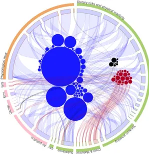
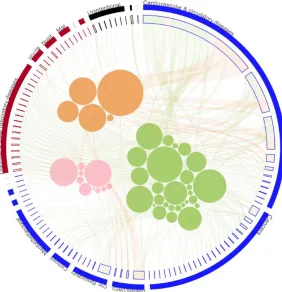
Figure 2-4: Image plots of WNV cases for the 3 selected cities from 2008 – 2013 ... 29
Figure 2-5: Visual representation depicting spatial relationships between most frequent words
in tweets and local bodies of water in Lumcard ... 30
Figure 3-1: (a) Grouped bar chart (b) Alternative visualization for making sense of tweets . 43
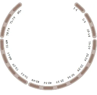
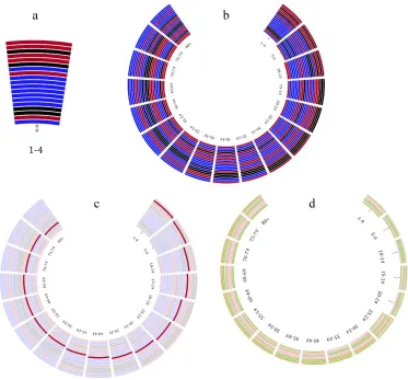
Figure 3-2: Demography sub-visualization for age groups ... 47
Figure 3-3: (a) visualization of cause-clusters for children 1-4 years old (b) cause-clusters
ranking sub-visualization for all age groups (c) cause-clusters sub-visualization with the
neglected tropical diseases and malaria cluster emphasized (d) risk clusters sub-visualizations
for all age groups ... 49
Figure 3-4: (a) [Token•List•Coordinate]-based bar charts for age groups 15-19 and 75-79 (b)
demography sub-visualization for locations ... 50
Figure 3-5: (a) Coordinate axes for cause, risk, and location clusters (b) Demography
sub-visualization for relationships between cause, risk, and location clusters for individuals
between the age of 5 and 14 ... 51
Figure 3-6: (a) Enlarged partial view of the first four sub-visualizations for demography (b)
Overall visualization for demography based on
xii
Figure 3-7: (a) [Token•Coordinate]-based representation for years (b) hierarchical
visualization for cardiovascular diseases and HIV/AIDS & tuberculosis clusters (c) top
portion of cluster-specific mortality ranking (d) Chronology sub-visualization for cause
cluster-specific mortality ... 54
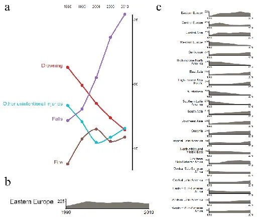
Figure 3-8: (a) Portion of chronology sub-visualization for cause proportion (b) Area chart
for Eastern Europe for the cancer cluster (c) Region cluster-specific mortality for
cardiovascular disease cluster ... 55
Figure 3-9: Overall [Fusion•Coordinate•Token•Hierarchy•Cell•Link•Group]-based
visualization for chronology ... 57
Figure 3-10: (a) Hierarchical structure of the physiological risk cluster (b) Representation of
non-communicable disease group by individual causes (c) Diet low in fruit risk visual
element (d) High fasting plasma glucose visual element ... 58
Figure 3-11: Geography sub-visualization for cause-risk relationships at a global level from a
cause-centric point of view ... 60
Figure 3-12: Geography sub-visualization for cause-risk relationships at a global level from a
risk-centric point of view ... 61
Figure 3-13: First three geography sub-visualizations, the impact of chronic obstructive
pulmonary disease is depicted in the map-based visualization ... 62
Figure 3-14 (a) Cause-risk cluster level relationships sub-visualization (b) Visualization of
cardiovascular diseases for central European countries (c) Fourth major sub-visualization for
geography which combines cause-risk cluster level relationships and risk/cause specific
distribution for central Europe ... 63
Figure 3-15: Geography sub-visualization for a country cluster ... 64
Figure 3-16: Overall [Branch•Token•Coordinate•List•Group•Spectrum•Area•Cell]-based
xiii
Figure 3-17: (a) Legends for overview visualization (b) Mortality by age group
sub-visualization (c) [Stack•Token]-based representations for year-based mortality ... 67
Figure 3-18: (a) [Branch•Token•Group]-based sub-visualization that shows the prevalent
cause-risk cluster relationships at a global level in 2010 for all age groups (b) Physiological
risks hierarchy and prevalence sub-visualization (c) Overview sub-visualization for cluster
relationships and inter-cluster hierarchy ... 68
Figure 3-19: Overall overview [Branch•Token•Group•Cell•Hierarchy•Stack]-based
visualization ... 69
Figure 4-1: Conceptualization of the human-data discourse ... 79
Figure 4-2: Interaction design process for visualizations ... 83
Figure 4-3: (a) Overall visualization for demography (b) Enlarged partial demography
visualization ... 86
Figure 4-4: (a) Risk track emphasized (b) Nutritional deficiencies cluster emphasized in the
cause track ... 88
Figure 4-5: (a-c) Different states of the demography visualization with complexity adjusted
... 89
Figure 4-6: (a) Collapsed location and risk tracks (b) Collapsed cause track (c) Collapsed risk
track... 90
Figure 4-7: (a-e) Screenshots of the demography visualization ... 93
Figure 4-8: Geography visualization with hypertensive heart disease and the Caribbean
selected ... 95
Figure 4-9: (a-b) Screenshots of geography visualization with alcohol use and eastern Europe
selected ... 97
xiv
Figure 4-11: Chronology visualization ... 101
Figure 4-12: (a-d) Chronology visualization screenshots ... 103
Figure 5-1: Depicting how the user and tool interact, where VRi represents visual
representation and VRi+1 represents the altered representation ... 109
Figure 5-2: Default screenshot of the visualization tool ... 122
Figure 5-3: The GM means representation shows that incidents of ZIKV vary not only across
administrative boundaries but also within ... 124
Figure 5-4: The GW standard deviation representation for ZIKV shows that the clusters near
Petrofina, PE, and Salvador, BA, have high standard deviations and the annotated area may
be a transitional zone ... 125
Figure 5-5: The GW coefficient of variation representation for microcephaly ... 126
Figure 5-6: (a) ZIKV standard devotional ellipse; (b) Microcephaly standard deviational
ellipse ... 127
Figure 6-1: Default configuration of the sentiment visualization ... 142
Figure 6-2: Screenshot of sentiment visualization with promotional theme selected ... 143
Figure 6-3: Screenshot of sentiment visualization with the celebrities user category selected
... 144
Figure 6-4: Screenshot of sentiment visualization with the cardiovascular & circulatory
diseases cluster selected ... 145
Figure 6-5: (a-b) Screenshots of sentiment visualization with the HIV/AIDS & TB cluster
selected ... 146
Figure 6-6: (a-b) Screenshots of sentiment visualization with the mental & behavioral cluster
and the neglected tropical diseases cluster selected ... 148
xv
Figure 7-2: (a) Demography visualization; (b) Geography visualization; (c) Chronology
visualization; (d) Sentiment visualization ... 160
Figure 7-3: Box plot of the overall achievement scores for the control and treatment groups
... 167
Figure 7-4: Box plot quiz scores for the treatment and control groups ... 178
xvi
List of Appendices
Appendix 1: List of search terms for visual analytic study ... 209
Appendix 2: Ethics approval for visualization literacy study ... 211
Chapter 1
1
Introduction
1.1
Motivation
Public health data plays a critical role in ensuring the health of the populace. For health
professionals, data influences every aspect of their mandate (O’Carroll, 2003). From an
assessment standpoint, data is needed to investigate and analyze the causation of health
issues. From a policy development perspective, data plays the crucial role of helping
professionals prioritize and determine which issues need to be addressed. From an
assurance viewpoint, timely data is required for the management of resources and for
educating the public. For the general public, health data influences their ability to make
sound decisions. An individual’s ability to access, read, and understand health
information is a public health imperative (Gazmararian, Curran, Parker, Bernhardt, &
DeBuono, 2005; Kickbusch, Pelikan, Apfel, & Tsouros, 2013; Sørensen et al., 2012).
This ability has been termed “health literacy” and is a key determinant of an individual’s
health. According to the American Medical Association, health literacy is a stronger
predictor of a person’s health than age, income, employment status, education level, and
race (“Health literacy: report of the Council on Scientific Affairs. Ad Hoc Committee on
Health Literacy for the Council on Scientific Affairs, American Medical Association.,”
1999).
While the role of public health data is indisputable, laypeople and professionals seeking
to use the data are confronted with a myriad of challenges some of which relate to the
nature and structure of the data. Public health data originates from a wide variety of
sources, is encoded in different formats, and is aggregated at different levels (Gotz &
Borland, 2016; Herland, Khoshgoftaar, & Wald, 2014; E. Liu, Zhao, Wei, Roumeliotis,
& Kaldoudi, 2016; Ola & Sedig, 2014; Shneiderman, Plaisant, & Hesse, 2013). The
public health informatics community recognizes the need for data to be presented in ways
in which individuals can work with it effectively (Higgins et al., 2011; Keough, 2002;
2008). For centuries, visualizations have been used to facilitate public health tasks
involving data. For instance, in 1792, Finke produced a world map of diseases and six
years later Seaman used spot maps to trace yellow fever cases in New York (Barrett,
2000; Stevenson, 1965). In the mid-19th century, John Snow challenged the theory of
cholera being an airborne disease by plotting the spread of the disease as it relates to the
Broad Street water pump (Snow, 1855). Around the same time, Florence Nightingale
used the coxcomb representation to visualize patient data and educate the Crown on
sanitation-related deaths of soldiers during the Crimean War (B. Cohen, 1984). From
outbreak detection to health promotion, these examples highlight the varied use of static
visualizations.
However, the rate at which data is currently being generated has reduced the
effectiveness of past visualization approaches to support the tasks in which individuals
engage (Cybulski, Keller, Nguyen, & Saundage, 2013; L. Zhang et al., 2012). On the one
hand, simple visualizations (e.g., bar charts, line plots), which only encode one or two
attributes of data items, limit the ability of users to analyze non-explicit and unknown
relationships (Cybulski et al., 2013; Endert, Hossain, et al., 2014). There is a need for
visualizations that encode multiple aspects of the data at the same time. On the other
hand, static visualizations, which require that all data items be encoded at once can
overwhelm the cognitive resources of individuals (Kirsh, 2013; Pike, Stasko, Chang, &
O′Connell, 2009; Tominski, 2015). Making a visualization interactive, facilitates the
gradual disclosure of data and allows users to control how data is shown and in what
quantities. When dealing with large sets of data, which is typically the case in public
health, interaction has been shown to be effective in aiding analysts to explore and
understand large, multivariate datasets (Torres, Eicher-Miller, Boushey, Ebert, &
Maciejewski, 2012).
In certain situations, providing users with elaborate and interactive visualizations is still
not sufficient to support their tasks. For example, an epidemiologist may need to perform
statistical analysis to understand the spread of Chikungunya across the Caribbean.
Allowing the epidemiologist to visualize summary statistics is beneficial as research
without aid (Robert Spence, 2007). This coupling of analytics with visualization is the
focus of the nascent field of visual analytics. Visual analytics is the science of analytical
reasoning facilitated by interactive visual interfaces (Thomas & Cook, 2005). Visual
analytics tools are comprised of the analytics engine which stores, transforms, and
performs computational analysis of the data and interactive visualizations which encode
the data in a visual format that the user can then work with (Ola & Sedig, 2014).
Before we can effectively design visual analytics tools for public health, there is a need to
have a deeper understanding of the individual components and how best to develop them.
Researchers have called for the development of visualization tools that allow users to
access underlying data, change how data is represented, identify patterns and trends,
analyze data, and perform a wide variety of tasks (Bhowmick, Griffin, MacEachren,
Kluhsman, & Lengerich, 2008; Cybulski et al., 2013; Endert, Ribarsky, Turkay, Wong, &
Nabney, 2017; Fisher, DeLine, Czerwinski, & Drucker, 2012; Gotz & Borland, 2016;
Katsis, Koulouris, Papakonstantinou, & Patrick, 2017; Pretorius, Khan, & Errington,
2016; L. Zhang et al., 2012). The design of such visualizations is a non-trivial endeavor
that requires designers to take into consideration the structure of the data, users’ tasks,
and human factors. Part of the challenge of developing visualizations is determining how
to organize and encode data items and how best to support users’ tasks. Currently, there
is confusion and lack of direction over how to create effective health visualizations
(Carroll et al., 2014; Folorunso & Ogunseye, 2008; Turner et al., 2008).
As improperly designed visualizations can end up negatively impacting users’ discourse
with data (Kirsh, 2009) there is a need for frameworks to help designers think
systematically about design issues (Purchase, Andrienko, Jankun-Kelly, & Ward, 2008;
Sedig, Parsons, Dittmer, & Haworth, 2013; Thomas & Cook, 2005). Furthermore, there is
a need to demonstrate how such frameworks can be utilized. Even when visualizations
are designed properly, there still exists a gap between how the tool was designed and
users’ perceptions of how the tool should work (Norman, 2013). This is particularly the
case with novel interactive visualizations. Borner et al. highlight the need for instruction
so that individuals are better equipped to understand novel visualizations (Borner,
visualizations and analytics can be designed for public health, explore how instructional
materials can help individuals to learn to use visualizations, and demonstrate how
visualizations can impact health literacy efforts.
1.2
Structure of this dissertation
The rest of this dissertation is broken into 7 chapters as follows:
In Chapter 2, we present the data-based challenges in public health and make a case for
the use of visual analytics tools. This chapter also provides background for the
dissertation and briefly discusses the field of public health and the components of visual
analytics tools.
In Chapter 3, we describe the use of visualizations in public health and discuss the need
for visualizations that effectively model the complexity of the data. In this chapter, we
also describe a framework that can aid in the design of elaborate visualizations, and apply
the framework to the design of four novel visualizations that are part of a tool for making
sense of public health data.
In Chapter 4, we discuss interaction and its role in improving the discourse between
users and public health data. We also present a process for designing interaction that is
based on users’ task and use three scenarios to highlight the efficacy of our approach.
In Chapter 5, we demonstrate how interactive visualizations can support public health
stakeholders’ decision-making tasks. In particular, we present a visualization tool we
created that can support control efforts related to the recent Zika outbreak in Brazil. This
chapter also demonstrates how complex statistical measures can be incorporated into
visualization tools.
In Chapter 6, we present a visual analytic study that explores the discourse of health
issues on Twitter. We describe how computational models can be used to assess the
In Chapter 7, we present the results of two studies we conducted with the visualizations
we designed. The first study explores visualization literacy and how individuals learn to
use unfamiliar and non-typical visualizations. We also investigate the effect of
instructional materials on improving an individual’s ability to learn how data is encoded
and how to interact with the visualization. In the second study, we examine the ability of
visualizations to improve health literacy.
In Chapter 8, we draw some conclusions from the research reported in the preceding
chapters, discuss the contributions of this research to the wider scientific community, and
highlight some areas of future research.
Finally, readers should keep in mind that the chapters of this dissertation can be read
sequentially or individually. Chapters 2, 3, and 5 have been published; chapter 7 has been
accepted; and chapters 4 and 6 will soon be submitted. The dissertation is written in an
Chapter 2
2
The Challenge of Big Data in Public Health: An
Opportunity for Visual Analytics
This chapter has been published as O. Ola and K. Sedig, “The challenge of big data in
public health: an opportunity for visual analytics.,” Online J. Public Health Inform., vol.
5, no. 3, pp. 1-21, Jan. 2014.
Please note that the format has been changed to match the format of the dissertation.
Figure numbers mentioned herein are relative to the chapter number. For instance,
“Figure 1” corresponds to Figure 2-1. Additionally, when the term “paper” or “article” is
used, it refers to this particular chapter.
2.1
Introduction
Data and information are both currency and product within the field of public health (PH)
(O’Carroll, 2003). PH data is often highly complex because of its high volume, its
various sources, its velocity of generation, and sometimes the low degree of veracity of
the sources from which it originates. PH data is gathered from heterogeneous sources
(Revere et al., 2007), may be unreliable, encoded in a variety of formats (Rambo, 2000;
Turner, Liddy, Bradley, & Wheatley, 2005), and can be volatile (i.e., changing, and
available only for a limited amount of time) (O’Carroll, Cahn, Auston, & Selden, 1998),
all characteristics attributed to big data. These characteristics of PH data pose a challenge
to the PH workforce in terms of whether and how effectively the data is used.
The PH workforce is comprised of people trained in a variety of disciplines with daily
duties necessitating the extraction of information and construction of knowledge from the
mass of available data. In this paper, we refer to any individual seeking to use PH data in
a professional capacity as a stakeholder. As stakeholders interact with data, they engage
in various cognitive activities such as analytical reasoning, interpreting, decision-making,
planning, and problem solving (Sedig, Parsons, Dittmer, & Ola, 2012). Performing these
the unaided mind. Thus, computer-based information systems and tools may be needed to
support the activities in which PH stakeholders engage.
In the context of PH, access to data does not necessarily guarantee that the data will be
used well—i.e., that cognitive activities will be performed in an effective manner (see
(Sedig, Parsons, Dittmer, et al., 2012) for more discussion of this issue). Additionally, the
PH community acknowledges that decisions and policies are often made in an ad hoc
fashion devoid of evidence (Baltussen & Niessen, 2006; Brownson, Fielding, &
Maylahn, 2009; Brownson, Gurney, & Land, 1999). The efficient and effective use of
data determines the extent to which PH stakeholders can sufficiently address the health
concerns of the community (O’Carroll, 2003; Reeder, Revere, Hills, Baseman, & Lober,
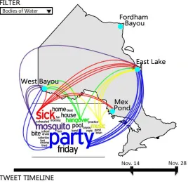
2012). Consider the following scenario in the fictional town of Lumcard, Louisiana,
which demonstrates the critical role of data in addressing public health issues.
The day before Thanksgiving, the director of Lumcard’s health department receives an
alert showing an unusually high incidence of complaints of diarrhea, vomiting, high
fever, and sore throat. Discussions with area doctors reveal that local hospitals have
confirmed the diagnosis of West Nile Virus (WNV) in a high number of patients; this
helps the director dismiss his first assumption that a food poisoning outbreak exists in
Lumcard. The regional epidemiologist is made aware of the situation and immediately
begins to investigate this unseasonable occurrence. The epidemiologist not only needs to
be able to access data, but also must compare health records, filter out irrelevant data,
examine environmental influences, and identify relationships among various factors. In
addition, she will need to develop, test, and discard hypotheses about the cause of WNV
and collaborate with other PH stakeholders in order to determine how best to ensure the
health of the citizens of Lumcard. While having access to data is critical, the Lumcard
PH team’s success in addressing the potential health hazard is largely dependent on their
ability to effectively use the available data in their reasoning, sensemaking,
decision-making, and planning activities.
Under different time constraints, PH stakeholders must perform a myriad of activities,
community (Goddard et al., 2004). Furthermore, as stakeholders interact with data they
encounter a number of obstacles relating to its volume, variety, velocity, and veracity (B.
B. Cohen, Franklin, & West, 2006; Higgins et al., 2011; Keough, 2002; Kiefer et al.,
2005; LaPelle et al., 2006; O’Carroll et al., 1998; Rambo, 1998, 2000; Revere et al.,
2007; Turner et al., 2008, 2005). Over the course of the last 20 years, computational tools
and systems have been developed to support the work activities of PH stakeholders.
Current tools include data analytics tools such as Stata (StataCorp, 2009), and interactive
visualization tools such as Malaria Atlas Project (Guerra et al., 2007). While these types
of tools are beneficial in addressing certain work activities of PH stakeholders, they fall
short in supporting cognitive activities that involve the use and working with large,
heterogeneous, and complex bodies of data (Keim, Mansmann, & Thomas, 2009).
Public health tends to lag behind other sectors in the adoption of new technology (for
examples, see England et al.’s (England, Stewart, & Walker, 2000) examination of PH’s
slow rate of information technology adoption, and Shortliffe’s (Shortliffe, 2005)
comparison of healthcare with other sectors). The recent emergence of a category of
computational tools known as visual analytics (VA) tools is no exception. These tools are
intended to alleviate some of the shortcomings of the aforementioned tools with regard to
the complexity of data and support of the visuo-analytical reasoning of their human
users1. VA tools combine interactive visual representations with advanced analytics
techniques to synthesize, analyze, and facilitate visuo-analytical reasoning and other
high-level cognitive activities involving data (Keim, Kohlhammer, Ellis, & Mansmann,
2010; Thomas & Cook, 2005). This is beneficial for data-intensive fields (Keim et al.,
2010) such as PH, finance, insurance, sales, and climatology, to name a few. While
many fields, such as finance and sales (Schlegel, Sallam, Daniel, & Tapadinhas, 2013),
have seen widespread adoption of VA tools, PH has not. In this paper, we discuss the role
that VA tools can play in assisting PH stakeholders to perform cognitive activities
involving big data. We focus on analytical reasoning as an activity that plays an
important role in many other activities. Through a synthesis of research across multiple
fields including cognitive science, data mining, human-computer interaction, and
informatics, we explicate the benefits of VA tools in addressing the challenge that big
data poses to PH practice.
The rest of this paper is organized as follows. Section 2 discusses foundational
concepts—i.e., PH data and information, analytical reasoning, visual representations, and
human-information interaction. Section 3 describes VA tools, their components, and how
they facilitate analytical reasoning. Section 4 discusses the benefits and role of VA tools
in PH and highlights current tools in use. Through the use of a hypothetical scenario,
Section 5 further explicates the usefulness of VA tools. Finally, Section 6 provides a
summary and briefly outlines limitations and some future areas of investigation.
2.2
Background
This section presents necessary background concepts and terminology used in this paper.
In order to address the health concerns of the community, PH stakeholders interact with
data to perform a variety of work activities. We depict the needs that VA tools must
address for PH stakeholders, by describing the data they interact with, the nature of their
work activities, and the analytical reasoning tasks in which they engage. Furthermore, a
VA tool’s interface influences the stakeholder’s ability to access data and perform
visuo-analytical reasoning. Therefore, we explain two major components of the interface —
namely: visual representations and interactions.
2.2.1
PH Stakeholders
The workforce charged with safeguarding and improving the health of the community
through a population focus, characterized in this paper as PH stakeholders, is highly
varied. As discussed by O’Carroll et al. (O’Carroll et al., 1998), the PH workforce may
be more diverse than any other group of health professionals. PH stakeholders come from
a diverse set of backgrounds and are trained in a myriad of disciplines (Committee on
Educating Public Health Professionals for the 21st Century, 2003). Irrespective of their
area of expertise and sub-field of application, stakeholders must interact with data to
2.2.2
PH Data and Information
To frame our discussion, we characterize data as digitally stored, sensed changes in the
environment, and information as processed, organized, and/or analyzed data that depicts
its relationships2. PH data can be described by its high volume (Higgins et al., 2011;
Keough, 2002; LaPelle et al., 2006; Turner et al., 2008), great variety (B. B. Cohen et al.,
2006; Rambo, 1998; Revere et al., 2007), high velocity (O’Carroll et al., 1998), and low
veracity (Kiefer et al., 2005; LaPelle et al., 2006; Reeder et al., 2012). These four features
of PH data are typical characteristics of big data. As a result, PH data is big data. While
synthesis of and access to PH data has been a focus of the PH informatics literature
(Sedig, Parsons, Dittmer, et al., 2012), the use of data by stakeholders to create
information, particularly as mediated by computational tools, presents a growing
challenge. Computationally-mediated reasoning requires not only the ability to access
relevant data, but the ability to control how data is structured, combined, displayed, and
interacted with (Sedig & Parsons, 2013). In addition, stakeholders must be presented with
representations that accurately communicate what is known or unknown, the impact of
actions, relationships that exist, and extent of uncertainty and risk that are involved
during analysis (Berner & Moss, 2005; Keough, 2002). The seamless incorporation of
user-guided analysis techniques into computational tools is crucial in facilitating the
systematic use of data.
2.2.3
PH Activities
PH stakeholders engage in a variety of work activities in an effort to improve and ensure
the health of the community (Committee on Educating Public Health Professionals for
the 21st Century, 2003; O’Carroll et al., 1998; Rambo, 1998). These activities vary by
work group (e.g., epidemiologist or nutritionist), by level within a work group (e.g., state,
local, federal), and by function (Rambo et al., 2001). In the United States, these work
activities have been grouped by the Institute of Medicine (IOM) into three core
functions—namely: 1) Assessment, which includes investigating and analyzing the
2 For an in-depth discussion on the differences between data and information see (Sedig, Parsons, &
occurrence and causation of health problems and hazards; 2) Policy Development, which
includes priority setting, advocacy, and development of policies; and 3) Assurance, which
includes managing resources and informing and educating the public about health issues
and services (National Research Council, 1988). In this paper, we use the IOM core
functions classification to group PH work activities. Regardless of the core function with
which the PH stakeholder is tasked, PH work activities are a form of knowledge work
(Sedig, Parsons, Dittmer, et al., 2012). In other words, at a basic level, PH stakeholders
are knowledge workers—that is, most of their work is performing information-dependent
cognitive activities. Knowledge work activities are non-routine and require a combination
of convergent, divergent, and creative thinking in order to be completed (Reinhardt,
Schmidt, Sloep, & Drachsler, 2011). As knowledge workers, PH stakeholders engage in a
myriad of cognitive activities including analytical reasoning, decision-making,
sensemaking, and problem solving.
2.2.4
Analytical Reasoning
While a comprehensive discussion of high-level cognitive activities is beyond the scope
of this paper, to fully appreciate the utility of VA tools, we examine PH stakeholders’
cognitive processes as they work with data. To this end, we focus on analytical reasoning
and discuss some of its characteristics, explain how it facilitates other high-level
cognitive activities, and briefly highlight its impact on PH work activities.
Analytical reasoning is based on a rational, logical analysis and evaluation of data and
information and encompasses different kinds of reasoning such as inductive, deductive,
and analogical reasoning (Sedig & Parsons, 2013). An inference or conclusion is reached
based on the systematic analysis of data. As an activity, analytical reasoning emerges
from the completion of lower-level tasks. Some of the tasks include, but are not limited
to, identifying relationships among pieces of data, asserting and testing key assumptions,
testing biases, assessing alternatives, developing hypotheses, and supporting conclusions
with adequate evidence (Heuer, 1999; Thomas & Cook, 2005). Although analytical
reasoning is a structured and disciplined process, the aforementioned tasks typically
order in which low-level tasks occur is not fixed, but varies according to the cognitive
needs and overall goals of the stakeholder.
Analytical reasoning seldom occurs in a vacuum, but instead may occur concurrently
with other cognitive activities. In particular, analytical reasoning facilitates problem
solving and decision-making (Green & Maciejewski, 2013; Leighton, 2004). Analytical
reasoning can be viewed as a transformative process in which new information,
knowledge, and insight are derived from given data (Gilhooly, 2004; Sedig & Parsons,
2013). In some situations, this new information, knowledge, or insight serves as the basis
for decision-making and problem solving (Leighton, 2004). To illustrate the
interconnectedness of analytical reasoning, decision-making, and problem solving,
consider further the situation in Lumcard: the epidemiologist, engaged in analytical
reasoning, concludes that there is a direct correlation between temperature and incidences
of WNV in the city. In addition, from her analysis, she is able to narrow down the list of
possible mosquito breeding sites to two local bodies of water. Subsequently, the
epidemiologist and health director make the decision to restrict access of the residents to
local bodies of water, and also send out an environmental health scientist to collect
samples to determine the mosquito infestation levels at the shortlisted locations.
Due to the complex, dynamic, and interdependent nature of public health issues, a faulty
decision or policy can have a negative impact that may not be immediately recognizable.
Analytical reasoning provides the basis for decisions, plans, and policies and should,
therefore, not be overlooked. While the PH community recognizes that information
should be used to inform policy-making and program development (Kiefer et al., 2005;
Mowat & Hockin, 2002), the reality is that decisions and policies are often made in an ad
hoc fashion, mostly based on gut feelings, short-term goals, and/or information satisficing
(Baltussen & Niessen, 2006; Brownson et al., 1999; National Research Council, 1988).
For this reason, there has been a push to move stakeholders closer to adopting
evidence-based approaches in PH practice. This approach advocates the systematic use of
information and application of scientific reasoning principles in a contextualized manner
The success of this approach is contingent on PH stakeholders being able to effectively
interact with and use data (Keough, 2002).
2.2.5
Visual Representations
When reasoning is mediated by VA tools, data is made accessible to the user of the tool
through external visualizations—i.e., visual representations. Therefore, it is necessary to
discuss the benefits of visual representations and their effect on stakeholders’ activities.
Visual representations encode data items using visual marks (e.g., lines, dots, shapes) and
combine and integrate these into more complex structural forms (e.g., scatter plots, heat
maps, bar charts) (Sedig, Parsons, Dittmer, et al., 2012). These representations seek to
capitalize on the human visuoperceptual system, which is specifically suited to rapid
processing of data and recognition of visual patterns. The benefits of such representations
have been discussed by researchers including Larkin and Simon (Larkin & Simon, 1987),
Glenberg and Langston (Glenberg & Langston, 1992), and Card et al. (Card, Mackinlay,
& Shneiderman, 1999). According to Card et al., visual representations can amplify
cognition by increasing the memory and processing resources available to users, reducing
the search for information, enhancing the detection of patterns, enabling perceptual
inference operations, and encoding information in a manipulable medium (Card et al.,
1999). The manipulability of a medium is an important factor. While static
representations have been historically used by PH stakeholders, from John Snow’s use of
a map to reason about a cholera outbreak in 1850 (Snow, 1855), to the recent use of
atlases for mapping the risk of malaria in Africa (Le Sueur et al., 1997), they put the
brunt of the information-processing load (i.e., analytical reasoning and decision-making)
on the cognitive resources of users (Sedig & Parsons, 2013; Sedig, Parsons, Dittmer, et
al., 2012), hence negatively affecting their usability.
Computers, on the other hand, allow visual representations to be interactive and
dynamically manipulable. This allows information processing to be shared between the
user and the tool (Sedig & Parsons, 2013), reducing, and possibly bridging, the gap
between the internal (mental) representations of the user and the external (visual)
representations of the tool (Parsons & Sedig, 2013a; Sedig & Parsons, 2013; Sedig,
support convergent and divergent thinking, and accommodate the users’ perceptual and
cognitive needs (Sedig & Parsons, 2013; Thomas & Cook, 2005). Furthermore,
interactive representations allow stakeholders to control which subset of data is visually
displayed while still having access to data latent in the system (Sedig, 2009; Sedig &
Parsons, 2013). This is important for fields like PH where large amounts of data cannot
be visualized all at once. In addition, interactive visual representations allow stakeholders
to choose how things are represented (Sedig, 2009; Sedig & Parsons, 2013), which has an
effect on the reasoning tasks in which stakeholders engage. Researchers in cognitive
science have demonstrated that different representational forms can impact how cognitive
activities are performed (Larkin & Simon, 1987; J. Zhang & Norman, 1994), and even
constrain and limit stakeholders as they engage in a particular task(Parsons & Sedig,
2013a; J. Zhang, 2001; J. Zhang & Norman, 1994). Therefore, PH stakeholders stand to
benefit from tools that allow users to manipulate visual representations, a capability made
possible through interaction.
2.2.6
Human-Information Interaction
Through interaction, the user of a VA tool is able to control, not only the form or content
of the visual representation, but also the entire dialogue with information (Parsons &
Sedig, 2013a; Sedig & Parsons, 2013). Interaction moderates the discourse between
information and the user and can be conceptualized at different levels. In this paper, we
describe interaction in terms of the actions the user performs on the interface of the tool,
the consequent changes and reactions in the visual representations, and the user’s
perceptions of changes to the representations (Sedig & Parsons, 2013). In the context of
VA tools, by performing actions on the visual representations, the user is able to reach
into the database and operate upon data. Examples of such actions include filtering,
annotating, drilling, selecting, and comparing (Sedig & Parsons, 2013). In response, the
reactions visible through changes in the visual representations (i.e., on the interface)
ensure that the discourse is not one-sided. Equally important are the reactions that are not
visually perceptible that occur within the VA tool (Sedig, Parsons, & Babanski, 2012).
The user’s perceptions of changes to visual representations complete the interaction loop.
between the user and the represented information. The sequence in which actions are
performed is sometimes at the discretion of the user. This is beneficial in fields such as
PH where software designers are not privy to how various subsets of data will be used in
analysis by the stakeholder. The user-guided sequencing of actions and discourse with
information is critical in VA tools that function to facilitate PH stakeholders’ analytical
reasoning tasks.
2.3
Visual Analytic Tools
VA is sometimes defined as the “science of analytical reasoning facilitated by interactive
visual interfaces” (Thomas & Cook, 2005). VA tools combine data analytics and
interactive visualizations to support users’ reasoning, and create an environment in which
users engage in a more involved discourse with data and information (Keim et al., 2010;
Thomas & Cook, 2005). Prior to the development of VA, various groups of
computational tools sought to address the information-based needs of professionals. In
PH, two groups are data analytics and interactive visualization tools. This section
highlights the limitations of these two groups of tools, describes the components of VA
tools, and explains how analytical reasoning can be performed using VA tools.
Data analysis or analytics tools incorporate techniques and algorithms from a variety of
fields including statistics (e.g., mean and correlation), data mining (e.g., classification and
clustering), and machine learning (e.g., artificial neural network and support vector
machines) to facilitate the discovery and understanding of patterns in data (Han, Kamber,
& Pei, 2011). Current data analytics tools that assist PH stakeholders in analyzing data
include Stata (StataCorp, 2009) and EpiInfo (Centers for Disease Control and Prevention,
2012). While the aforementioned standalone data analytics tools are capable of
processing massive amounts of data, they neither deal with noisy and highly
heterogeneous data efficiently, nor are capable of handling ill-defined problems that
require human judgment (Keim et al., 2009). Because these tools take over the analysis
process and mostly hide the intermediary steps, stakeholders can only be minimally in
Complementing data analytics tools, interactive visualization tools represent data in a
visual form, allow users to control the flow of data, and let them customize
representations to cater to their cognitive and contextual needs. Some interactive
visualization tools focus on visualizing abstract, nonphysical data such as text and
statistical data (Card et al., 1999), while others portray physical data such as the human
body and molecules (Mackinlay, 2000). Current PH interactive visualization tools include
Malaria Atlas Project (Guerra et al., 2007) and Spatio-Temporal Epidemiological
Modeller (Ford, Kaufman, & Eiron, 2006). While beneficial, these types of tools prove
inadequate when faced with problems requiring advanced computational analysis and big
data (Keim et al., 2009).
2.3.1
Components of VA Tools
While data analytics tools with advanced automated analysis and interactive visualization
tools aided by human judgment are advantageous in certain situations, their respective
limitations create a void, and it is only through VA tools that some of today’s most
pressing data analysis problems can be addressed (Keim et al., 2009). VA tools fuse the
strengths of both sets of tools to create an environment in which the user engages in a
more involved discourse with data. This process is not simply an internal automated
analysis with an external visual representation displayed at its completion. Instead, it is
an integrated human-information dialogue in which data processing is distributed
between the user and the main components of the tool—described in this paper as the
analytics engine and interactive visualization engine (Sedig, Parsons, & Babanski, 2012),
which are described below.
2.3.2
Analytics Engine
Human cognition displays several limitations when confronted with mental tasks that are
data-intensive (i.e., they involve the use of bodies of data that are too large or too
complex), and as a result computational tools can be used to support such tasks. The
analytics engine in VA tools is intended for this purpose. It stores, transforms, and
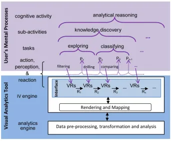
performs computational analysis on data. This process, as shown in Figure 1, is
data analysis. In the pre-processing stage, data retrieved from a variety of sources is
automatically processed. Common tasks in this stage include data cleaning, integration,
fusion, and synthesis (Han et al., 2011). In the data transformation stage, the
pre-processed data is converted into a form that is more conducive to data analysis. This stage
includes tasks such as data normalization and aggregation (Han et al., 2011).
Figure 2-1: The analytics engine component of VA tools
Finally, the data analysis stage involves the discovery of patterns and allows for the
extraction of valuable information. While historically computational tools have focused
on the analysis of one form of data, VA tools overcome this limitation and can analyze
and discover patterns in multiple forms of data (e.g., text, video, geo-spatial, etc.)
together in order to create information. This is done by drawing on the tasks and
techniques that originate from a myriad of fields including statistics (e.g., standard
deviation, correlation analysis), machine learning (e.g., classification, clustering,
dimension reduction), textual analysis (e.g., document summarization, concept
extraction), image analysis (e.g., image segmentation, object recognition), video analysis
(e.g., motion detection), and geo-spatial analysis (e.g., surface analysis, locational
analysis) (Alpaydin, 2009; Fairclough, 2003; Smith, Goodchild, & Longley, 2006; Soille,
2003; Weisi et al., 2011). In some VA tools, computational analysis is not a
system-controlled process but a user-system-controlled one. The blue arrows in Figure 1 are indicative of
the extent of the user’s involvement in the analysis process. This process is a
analysis of data. The interactive visualization engine allows the user to access and control
the flow and analysis of data.
2.3.3
Interactive Visualization Engine
In VA tools, the interactive visualization engine is composed of the rendering and
mapping component that takes analyzed data and creates interactive visual
representations (i.e., information). Interactive visual representations allow the user to
access, restructure, analyze, and modify amount and form of displayed information
(Keim et al., 2010; Thomas & Cook, 2005). The user’s actions can impact the discourse
in many ways, three of which are shown in Figure 2. Firstly, as shown by blue arrow 1,
the user can change how the visualized information is encoded, as, for instance, by
replacing a pie chart with a bar graph. Secondly, as depicted by blue arrow 2, the user can
change the subset of information displayed.Thirdly, as depicted by blue arrow 3, the user
has the ability to guide the analysis process by selecting and ordering how data analysis
tasks occur. This in turn sets off a chain of internal reactions resulting in the execution of
additional data processing tasks previously shown in Figure 1.
Figure 2-2: Interactive visualization engine component in VA tools
2.3.4
Discourse Mediation by VA Tools
In order to understand how the application of VA tools facilitates analytical reasoning in
PH contexts, it is necessary to explicate the human-information discourse that occurs
collaboration between the user and the tool (Sedig & Parsons, 2013). Consequently, the
internal cognitive processes of the user and the components of the analytics and
interactive visualization engines are all involved in the predominantly user-controlled
dialogue with information (Hollan, Hutchins, & Kirsh, 2000; Parsons & Sedig, 2013b).
As shown in Figure 3, as the user performs actions on the interface, the VA tool’s visible
reactions are communicated by changes in the representations, which the user can
perceive.
Analytical reasoning can be conceptualized as the top level of a hierarchical structure of
processes. When mediated by VA tools, analytical reasoning can be broken down into
sub-activities (e.g., knowledge discovery, sensemaking), which emerge from tasks (i.e.,
goal-oriented behaviors such as exploring, organizing). These tasks can also be broken
down into sub-tasks, which in turn emerge from the completion of lower level actions
performed on the tool (e.g., filtering, annotating) (Sedig & Parsons, 2013). For instance,
as shown in Figure 3, the epidemiologist engaged in analytical reasoning about the origin
of WNV might first need to discover new knowledge about the situation in Lumcard. In
order to do this, she might first need to complete the task of exploring the redacted health
records of confirmed cases. At this point, it is possible she might choose to filter out
unconfirmed cases, drill down into the demographic characteristics of confirmed cases,
and then compare the attributes (e.g., age, ethnicity, gender etc.) to determine if a
correlation exists. Thus, analytical reasoning emerges over time through a back-and-forth
Figure 2-3: The hierarchical structure of analytical reasoning emerging from lower
level processes, adapted from (Sedig & Parsons, 2013). Where visual representations
are depicted as VRs, perceptions as Px, and reactions as Rx (where x stands for 1, 2,
3, and n-1)
2.3.5
Factors Affecting Quality of Discourse
Recent theories of cognition suggest that cognitive processes do not take place solely
within an individual’s head, but are distributed across social relationships, the material
environment, and time (Hollan et al., 2000; Sedig & Parsons, 2013; J. Zhang & Norman,
1994). In other words, analytical reasoning, formerly conceived as a cognitive activity
that occurs exclusively in the brain of the PH stakeholder, can in fact be distributed
across computational tools and other PH stakeholders. As a result, in the context of VA
tools, a joint cognitive system is formed between the user and the tool (Sedig & Parsons,
2013; Sedig et al., 2013). VA tools therefore play an important role in—and depending
on their design can either enhance or impede—the human-information discourse. Some
factors affecting the quality of the discourse are: how information is encoded in visual
representations and the tool’s external visual representations, and how information
processing is distributed between the components of the joint cognitive system (i.e., user,
analytics engine, and interactive visualizations).
In VA tools, external representations not only convey information, but also guide,
constrain, and even determine cognitive behavior of the user (J Zhang, 2001). The
manner in which interactive visual representations are designed is an important
consideration as research has shown that external representations should be appropriate
for the task in which the user is engaged (for an in-depth discussion see (Parsons &
Sedig, 2014)). As users perform analytical reasoning tasks, they seek to harmonize and
coordinate their internal representations and the tool’s external representations (Z. Liu &
Stasko, 2010; J. Zhang, 2001). When processing data in such a dynamic manner, a
cognitive coupling is formed between the user and the tool (Brey, 2005; Sedig & Parsons,
2013). The strength of the coupling between the user’s internal representations and the
tool’s external representations is dependent upon a number of factors, including what
actions are made available to the user and the quality of these actions (Sedig & Parsons,
2013). In most situations, interactions should allow the user to select which subset of
information to display, to manipulate external representations, and to choose which
analysis techniques to perform so that s/he is able to complete the task at hand (for an
in-depth discussion see (Sedig & Parsons, 2013)). Another consideration relating to the
discourse is the quality of interaction (i.e., interactivity) that emerges through the use of
VA tools. This consideration is important because research suggests that the quality of
interactions has important cognitive effects (for an in-depth discussion see (Sedig,
Parsons, & Babanski, 2012; Sedig et al., 2013)). As information processing is distributed
across the joint cognitive system, properly designed VA tools must take into
consideration the strengths and limitations of the components of the system when
distributing the requisite load of information processing in any given context (for an
in-depth discussion see (Parsons & Sedig, 2013b)). These three considerations, among
others, affect the ability of tools to facilitate reasoning and as a result VA tools must not
be viewed as a silver bullet to alleviate all the problems facing stakeholders, as the
efficacy of the human-information discourse in these tools depends on how well and
2.4
Benefits of Visual Analytic Tools in Public Health
VA tools are advantageous to numerous fields, including PH, because they combine the
benefits of both data analytics and interactive visualization tools. In PH, conclusions or
inferences drawn may need to be conveyed to different groups of stakeholders including
legislators, hospital directors, or community group leaders who were not involved in the
analysis process (O’Carroll et al., 1998). Information, therefore, must be conveyed in a
manner commensurate with the cognitive and contextual needs of the PH workforce.
Because VA tools allow users to participate in the data analysis process, and give them
partial control over the system’s behavior, these tools can provide the flexibility to
accommodate the needs of this diverse workforce. This is beneficial to PH in a number of
ways, four of which are described. Firstly, through interactive visual representations,
stakeholders are able to select the most appropriate visual form from a pre-defined set to
perform the task at hand. Secondly, through interaction, stakeholders are able to control
their dialogue with information. This process as previously discussed is not a linear one,
and VA tools support the unstructured, non-linear process of thinking and data
exploration in which PH stakeholders typically engage. Thirdly, VA tools can
automatically generate tailored reports for different groups of stakeholders. Finally, VA
tools can also adjust and scaffold tasks in order to accommodate the cognitive needs of
novice and learned stakeholders alike. The rest of this section is divided into two parts;
the first describes how VA tools can address the challenge of big data in PH, while the
second highlights current VA tools that can support PH stakeholders’ analytical
reasoning tasks.
2.4.1
Utility of VA Tools in Addressing Challenges of Big Data in
PH
While interacting with PH data, stakeholders encounter challenges relating to the volume,
variety, velocity, and veracity of data. VA tools have accounted for and are addressing
2.4.2
Data Volume
PH stakeholders are overwhelmed with massive amounts of data on a regular basis, and
the PH informatics community has yet to sufficiently address the need for data to be
presented in a more tractable form (Higgins et al., 2011; Keough, 2002; LaPelle et al.,
2006; Turner et al., 2008). Because of this deficiency, stakeholders find themselves
spending more time wading through data, and less time actually addressing the health
concerns of their community. As discussed in (Revere et al., 2007), “data set
‘overload’—the consequence of increasingly large data sets generated by surveys and
other data collection tools—has forced many epidemiologists to become data managers,
making it more difficult to analyze data from a variety of sources in order to detect
disease outbreaks at an early stage.” The user-controlled environment that VA tools
provide allows the stakeholder to guide the analytics engine on how to manage and
analyze data. As a result, the user is still cognizant of the characteristics of the data but
cedes its processing to the tool.Through the division of information processing labor, VA
tools relieve stakeholders of the tedious task of managing and analyzing obscure and
intractable patterns in data. Additionally, through interaction, the user is able to control
the flow of data and access latent data as needed.
2.4.3
Data Variety and Velocity
The great variety and high velocity of PH data can impede stakeholders’ reasoning. In
regards to its variety, PH data is stored in different formats such as numerical, textual,
geospatial, and multimedia (Rambo, 2000) and ranges from structured (e.g., health
indicators survey data), to unstructured, which in its original state can only be
meaningfully interpreted by the human mind (e.g., free-form paragraph in a policy brief
or tweets about medical symptoms) (Guerra et al., 2007; Turner et al., 2005). In terms of
its velocity, PH data is updated at varying time frames and in some situations is made
available for a transient period of time (O’Carroll et al., 1998). VA tools do not merely
synthesize federated data originating from a variety of sources. Through the analytics
engine, stakeholders can also process various forms and structures of data, and with the
interactive visualization engine, these different forms of data can be presented in a
![Figure 3-4: (a) [Token•List•Coordinate]-based bar charts for age groups 15-19 and](https://thumb-us.123doks.com/thumbv2/123dok_us/1973733.1260552/67.612.127.511.335.590/figure-token-list-coordinate-based-bar-charts-groups.webp)
![Figure 3-7: (a) [Token•Coordinate]-based representation for years (b) hierarchical visualization for cardiovascular diseases and HIV/AIDS & tuberculosis clusters (c)](https://thumb-us.123doks.com/thumbv2/123dok_us/1973733.1260552/71.612.129.524.75.331/coordinate-representation-hierarchical-visualization-cardiovascular-diseases-tuberculosis-clusters.webp)
![Figure 3-9: Overall [Fusion•Coordinate•Token•Hierarchy•Cell•Link•Group]-based](https://thumb-us.123doks.com/thumbv2/123dok_us/1973733.1260552/74.612.119.530.210.477/figure-overall-fusion-coordinate-token-hierarchy-cell-group.webp)