Haoyang Yan. Patterns of Emoji Use for Individual Twitter Users: An Exploratory Analysis. A Master’s Paper for the M.S. in I.S degree. July, 2016. 60pages.Advisor: Ryan Shaw
This paper provides a new perspective of looking at emoji: Users. On 100 Twitter users represented by emojis from 200 tweets, an exploratory analysis is conducted to find patterns of emoji use for individual users. We use k-means clustering, principal component analysis and hierarchical clustering on different distance measures, with special focus on outlying users with unique using patterns. Our findings could give insights of how the ways people use emoji converge and diverge, show hidden
connections between emojis, and help people better understand this novel language in the digital era.
Headings:
Digital communications
PATTERNS OF EMOJI USE FOR INDIVIDUAL TWITTER USERS: AN EXPLORATORY ANALYSIS
by Haoyang Yan
A Master’s paper submitted to the faculty of the School of Information and Library Science of the University of North Carolina at Chapel Hill
in partial fulfillment of the requirements for the degree of Master of Science in
Information Science.
Chapel Hill, North Carolina
July 2016
Approved by
_______________________________________
Table of Contents
Introduction ... 2
About Emoji ... 2
User as a New Perspective ... 4
Literature review ... 6
Data ... 6
User Representation ... 7
Profile Construction ... 8
Methods... 11
Data Collection and Transformation ... 11
Glitches ... 12
Analysis Tools ... 14
Analysis... 16
Global Summary ... 16
K-Means Clustering and Principal Component Analysis ... 20
Analysis of Outliers: Mini Case Studies ... 24
Analysis of Outliers and Insiders: Gradual Elimination (“Unwrapping”) ... 31
Hierarchical Clustering: Comparing Distance Measures ... 36
Discussions ... 42
Bibliography ... 45
Introduction
For the first time ever, the Oxford Dictionaries Word of the Year is not a word
consisting of English letters – it’s a word made of Unicode and represented as a picture:
😂, which can be identified either by its codepoint as U+1F602 or its official name as
“FACE WITH TEARS OF JOY”, that “best reflected the ethos, mood, and
preoccupations of 2015”1.
This probably is the best indicator of the popularity of emoji, the pictograms that
have ruled the world of digital communications. This paper tries to look at this new group
of “letters” from users’ perspective: to find patterns in the use of emoji across tweets by
individual users, a way of modeling twitter users with respect to their emoji use.
About Emoji
The revolution of the modern pictograms starts from emoticon, the elder sibling
of emoji, which is a short sequence of characters, typically punctuation symbols. The use
of emoticons in the digital era dates back to 1982, where a professor at Carnegie Mellon
University proposed to use :-) and :-( to distinguish jokes from more serious posts on
their computer-science message board. Within a few months, the use of emoticons had
spread, and the set of emoticons was extended with hugs and kisses, by using characters
found on a typical keyboard. A few decades later, emoticons have found their way into
everyday digital communications. They allow authors to express their feelings, moods
and emotions, augmenting a written message with non-verbal elements. They help to
draw the reader’s attention, enhancing and improving the understanding of the message
(Hogenboom et al., 2015).
Emoji, the younger sibling, is a step further, developed with modern
communication technologies that facilitate more expressive messages. It is a graphic
symbol that represents not only facial expressions, but also animals and plants, food and
drink, vehicles and buildings, and concepts and ideas. Literally translated as “picture
character” in Japanese, emoji were first provided in Japan by the three major mobile
carriers (NTT DoCoMo, KDDI au and Softbank) at the end of the 20th century to
facilitate digital communication. However, Apple’s support for emojis on the iPhone, in
2010, led to global popularity (Novak, Smailović, Sluban, & Mozetič, 2015). Emoji were
first standardized in Unicode 6.0 consisting of 722 characters. As of August 2015,
Unicode 8.0 defines a list of 1281 single- or double-character emoji symbols2.
These pictograms have grown to be an indispensable non-verbal part in what used
to be considered as pure-verbal communications, providing what used to be exclusive for
face-to-face communications. And the step from emoticons to emoji is not only the
change of the way of expression, but also the establishment of a global convention.
Unlike emoticons that can be arbitrarily “spelled” by users, emoji have standards
regardless of users and regardless of culture. They are a common set of meaningful
symbols shared by all human kind.
Their prevalence and popularity gain attention not only from the dictionaries, but
applications like emojitracker3, emojipedia4 and emoji translate5, and we saw emoji being
scrutinized by linguists, psychologists and computer scientists. One particular favorite
context for these studies is the social media. Facebook, Twitter and Instagram all have
introduced (and enjoyed popularity of) emoji to their system, where tons of data can be
retrieved by the public. Since different platforms have different features and factors, this
study is focused on the emoji use on Twitter due to its high accessibility and more
structured/normalized text content.
User as a New Perspective
Both Twitter and Instagram have been used as corpora for analysis of emoji use.
However, these studies have treated their data merely as giant collection of text without
much metadata, and the analysis has been limited to single tweets/Instagram posts. But
social media is a far more fertile ground than traditional corpora and there are the most
important metadata – the contents are generated by its users. Tweets expressing different
ideas, talking about different topics and having different tones can be associated by their
common creator, thus possibly exposing certain patterns. In such way the relatively novel
world of emoji can be linked to the areas of stylistics and user modeling on social media.
Stylistics is the study and interpretation of texts in regard to their linguistic and
tonal style. Sources of study in stylistics may range from canonical works of writing to
popular texts, and non-literary texts may be of just as much interest as literary ones6.
Stylistics as a conceptual discipline may attempt to establish principles capable of
explaining particular choices made by individuals and social groups in their use of
The idea of user modeling on social media comes from the need for
personalization inspired by the widespread of social media websites where a huge
number of users generate infinite number of contents. As one of the major issues in
personalization, building users’ profiles has been a challenging yet attractive subject for
researchers. Researchers aim to provide solid user models which can be used by
applications to enhance user experiences in social media websites (Abdel-Hafez & Xu,
2013). In this way the traditional area of stylistics is applied to the textual analysis of
digital contents generated by users.
This study intends to incorporate ideas from both the pioneering studies on emoji
and the more developed areas of stylistics and user modeling on social media, conducting
an exploratory analysis on users represented by the emojis they used in their Twitter
feeds. What to be found could give some insights of how the ways people use emoji
converge or diverge, show “hidden” connections between emojis, and help people better
understand this novel language in the digital era.
2http://www.unicode.org/versions/Unicode8.0.0/ 3http://www.emojitracker.com/
4http://emojipedia.org/ 5http://emojitranslate.com/
Literature review
The key purpose of user modeling is to build a user profile “by acquiring,
extracting and representing the features of users” (Zhou et al, 2012). The profile can be
used for presenting more relevant content to each user. It usually contains the user’s basic
information (age, gender, country etc.), keywords representing his/her interest, as well as
more sophisticated information such as that of the user’s behavior like sequence of clicks
and time spent on pages (Kim, Ha, Lee, Jo, & El-Saddik, 2011). Moreover, the user’s
social information, such as connections with other users, social behaviors like likes and
shares, may also be used for building the profile. This kind of information can be used to
enhance the performance of many predictive applications (Yu, Pan, & Li, 2011).
Data
Data collection depends on the nature of the social media and the target application.
These data can be classified into explicit, implicit and social ones. Explicit data are given
directly by the user, such as demographic information, comments, posts, queries, and
ratings. Researchers extract keywords from users’ comments and posts and use them to
represent their interests (Lu, Lam, & Zhang, 2012). Tags are also commonly used as
keywords of interest directly when they are attached by users to some web content
(Hannon, Mccarthy, O’mahony, & Smyth, 2012). Meanwhile, implicit data are those
and transactions. For example, when a user opens a webpage by clicking link, the page
title can be extracted as his/her interest, or keywords can be extracted from the page’s
content if the user dewell on it for time larger than some pre-defined threshold (Das,
Datar, Garg, & Rajaram, 2007). Finally, social data represents relationships and
interactions between users. These relationships can be bidirectional, requiring acceptance
of both users connected, or unidirectional without such acceptance. Classic cases of these
two types are friending on Facebook and following/followers on Twitter. Such social
network data can be represented as undirected and directed graph, where we can use
graph analysis to detect communities in the network. Researchers (Ma, Zhou, Liu, Lyu, &
King, 2011) used social network graphs to find “trusted communities”, or in other words
“like-minded groups” for a user. It may also be used simultaneously with, or replace, the
nearest neighbor method that finds like-minded users using similarities between users.
User Representation
A user is usually represented by a vector based on keywords. It’s simple and
common to represent a user as pairs of concepts and related weights. The concepts
correspond to the user’s interests and the weights correspond to the degree of interest.
The weights can be binary (0 or 1) numbers or integers such as items’ ratings or term
frequency (Tf) (Barla, 2011). They can also be real numbers which can be calculated
using several methods such as term frequency multiplied by inverse document frequency
(Tf-Idf). Here Tf is the frequency of the concept, while Idf is the total number of
Other representations for users’ profiles include graph-based and hierarchy-based
profiles. These two kinds of profiles consist of nodes and edges. The nodes usually
represent the keywords and the edges represent the relationships between these nodes. In
some cases it was proposed that these edges be associated with weights, representing the
strength of the relationship between any two nodes (Abdel-Hafez & Xu, 2013).
Profile Construction
A simple method to generate keywords for representing a user is traditional Bag of
Words (BOW), which is typically used in cases of explicit data. BOW is a collection of
words used in the user’s text, ignoring their order, weighted by their frequency or the
more complex Tf-Idf weighting. Hannon et al. (2012) used this method to represent
Twitter users’ profiles. Similarly, Chen et al. (2010) did the same to construct profiles
using Tf-Idf weighting, but also built a followee profile by collecting words from
followees’ tweets, using terms with the highest 20% Tf values and excluding words
occurring in one followee’s profile only. Words resulted from this filtering are termed
high-interest words. They also modeled URLs by the words used to describe them in
users’ tweets, and determined whether a URL is of the user’s interest or not using cosine
similarity.
Some social media websites enable its users to use social tagging to annotate items
with chosen tags. These annotations can be modeled as quadruples of
user-tag-resource-relations. Hannon et al. (2012) used a category database which maintain twitter curated
lists, hand-annotated by users with topical tags, to extract a set of tags representing all the
collects tags from various social tagging services and maps them to each other, thus
converting system-specific vocabularies to a common vocabulary. To connect different
user accounts from different websites, they used Google social graph for users linking
their accounts through their Google profiles.
Some researchers use concepts extracted from users’ data to construct user profiles.
Wikipedia was used by Lu et al. (2012) as a rich external source of data for extracting
concepts from users’ tweets. They used Explicit Semantic Analysis (ESA) to compute
semantic relatedness between a Wikipedia concept and a tweet, both vectorized as pairs
of terms and Tf-Idf weights. In addition, they vectorized each users’ social connections as
pairs of other users and corresponding “affinity scores” computed based on replies,
retweets and mentions between them. Kim et al. (2011) used a text mining method
consisting of three steps: term extraction, frequent pattern mining, and pattern pruning. In
the first step, they extract terms from implicit data such as clicks, views and bookmarks.
Then they weight these terms using Tf-Idf values and find frequent patterns. Finally, they
pruned the patterns by removing unnecessary terms from frequent patterns.
Topic modeling is another way to represent user interest, which represents it as
topics rather than keywords. Ahmed et al. (2011) modeled users’ interests as latent topics
based on Latent Dirichlet Allocation (LDA), with two distributions: users’ distributions
over topics and topics’ distributions over terms. User queries were used to collect words
of interest for the user for advertising targeting. They presented a fixed-dimensional
hierarchical model of user actions divided into epochs. They indicated that previously
expressed interests are more likely to be expressed. They assumed external effects were
model, proposed by Zhong et al. (2012), transfers user’s behavior over composite social
networks. A Users’ distribution over networks was introduced to indicate how much a
user is influenced by a given network. They draw a network for each user from a
Dirichlet distribution, and then a social network from a Multinomial distribution for
every interaction of a given user. Based on their similarities to others, each user adopts
Methods
In this exploratory study, we used the explicit data of emoji occurring in one’s
twitter feed, in a Bag-of-Emoji approach, to represent each user as a vector of emojis
weighted by Tf-Idf value, and performed analysis started from k-means clustering,
hierarchical clustering and principal component analysis. The data collection and
transformation part was done with Python while the analysis part was done with R.
Data Collection and Transformation
The data we conducted analysis on is from the 200 most recent tweets containing
emojis from each of the 100 sampled users. Thus in total there are 20,000 “emoji tweets”
published by 100 users.
The reference data for this study is the Emoji Sentiment Ranking table7 made
available online by the Sentiment of Emojis study (Novak, Smailović, Sluban, &
Mozetič, 2015), having 969 emojis ranked by total occurrence in their collection of
tweets. The top 60 emojis were used by us as keywords to catch live tweet streams, using
Tweepy, a python library to access the Twitter API. Retweets were excluded in this
process. In this way we can get sampled Twitter users that mentions the most popular
emojis in real time.
Next we use Tweepy to access the timeline of the users retrieved in the previous
step. Starting from each user’s most recent tweets, we tried to find 200 tweets (again
retweets were excluded) that contained any emojis from our reference table, until the
user’s tweets were exhausted. Those who had at least 200 “valid tweets” were “valid”
users to be included in our sample. It took 141 users retrieved from the first step to reach
our proposed size of 100 users.
During the previous step we also parsed the valid tweets and kept counts of each
emoji. In such way, after reaching 100 valid users we also got the count of each emoji for
each user, also known as the “term frequency” (tf), and the number of users who used
each emoji, treated as the “document frequency” (df) in our Tf-Idf weighting. Then using
these two quantities we computed the Tf-Idf value of each emoji for each user, using the
formula:
𝑇𝑓. 𝐼𝑑𝑓 = 1 + tf ∙ ln𝑑𝑓𝑁.
Here N is the number of documents which is 100, the number of users in our case,
and add-one smoothing is used to separate low weighted terms from never-used ones.
As a result, now each user in our sample is a vector of Tf-Idf values for 969 emojis,
or a point in a space of 969 dimensions.
Glitches
There are a few glitches during the data collection and transformation process.
First, for retweet exclusion, some say the “retweeted” Boolean field in a status (tweet)
object indicates whether it’s a retweet or not, and conditioning on it could eliminate
retweets, which turns out to be a myth. We tried on it by experimenting with our own
button on each tweet when viewed in a Twitter feed, between “Reply” and “Like”, whose
“on” status indicates it has been retweeted by the viewing account. In the case of
Tweepy, it means whether the tweet has been retweeted by the account that’s authorized
to use the API. Two viable ways to identify a retweet would be to test if it starts with “RT
” (two capital letters followed by a space) and if the embedded “retweeted status” field is
empty, although in both cases some non-retweets (manually adding “RT ” at the
beginning or quoting other tweets with one’s own words) might be misjudged. But since
we need only non-retweets, both can give a guarantee. The latter is used in our study.
Second, Twitter has limits on the volume of information accessed in certain
timeframe by each user through its API, which led to a deny of access after about 20
users’ timelines were scanned in our data collection. Thus a sleep of the program after a
while was needed to enable full access to all the sampled users.
The third one is a little bit silly, but still worth reporting. When looking at some of
the summary information after the first round of computation, we found many emojis
having a Tf-Idf value of 1, implying their 𝑑𝑓 = 𝑁, i.e. they were used by all the users.
But it was not the case, although those emojis were fairly popular ones. This turned out to
be due to a very basic rule in most programming languages: arithmetic calculations on
integers result in integers, including division. Thus any emojis that were used by more
than half of the users would have ln𝑑𝑓𝑁 = ln 1 = 0. A simple floating number conversion
Analysis Tools
In our exploratory study we will use K-Means Clustering, Hierarchical Clustering
and Principal Component Analysis as our major analysis tools.
To cluster vectorized samples in to K clusters, K-means starts from K initially,
sometimes randomly assigned “means” and assign each point to its nearest mean, thus
partitioning the data into K clusters. Then it computes the centroid of points in each of
the clusters as an updated mean. With K new means it reassign data to their nearest
means. It iterates between these two steps until the difference between the new and the
old means are relatively small, or a pre-defined number of iterations is reached.
Hierarchical Clustering tries to build a hierarchy of clusters in either a bottom-up or
a top-down approach. In this study we used the bottom up approach, where each data
point is in its own singleton cluster at the bottom and the pair of clusters that are closest
to each other is merged as we move up the hierarchy. Here “closest” can be subject to
two choices of measures: it depends on the distance metric specified for comparing data
points, which we will further explore in one of the analysis sections; it also depends on
the way the distances between clusters are calculated based on distances between points
in the clusters, where single linkage, complete linkage and average linkage, among many
others, can be used. We started with Euclidean Distance which is the most widely used
distance measure, defined by:
We used complete linkage in this study, which uses the maximum distances
between points in one cluster and points in the other as the distance between the two
clusters. The results of hierarchical clustering will be visualized in dendrograms.
Principle Component Analysis tries to find “directions” that best separates the data
points. It transforms the data into a set of orthogonal directions, called principal
components (PCs) in an order such that the projections of data points on each PC have
the greatest variance among PCs excluding the previous ones. In fact, the principal
components are the orthonormal eigenvectors of the covariance matrix of the data,
ordered by their corresponding eigenvalues, so these two terms will be used
Analysis
Global Summary
Before conducting more complex analysis on user vectors, we first made a global
summary of our data of emoji counts, regardless of differences among users. We started
with three charts of the top emojis, by different measures of popularity:
Table 1: Top Emojis by Total Count
## Unicode.name Count ## 1 FACE WITH TEARS OF JOY 7780 ## 4 SMILING FACE WITH HEART-SHAPED EYES 2538 ## 5 LOUDLY CRYING FACE 2531 ## 2 HEAVY BLACK HEART 2053 ## 15 WEARY FACE 815 ## 7 SMILING FACE WITH SMILING EYES 715 ## 24 UNAMUSED FACE 713 ## 36 SPARKLES 712 ## 6 FACE THROWING A KISS 670 ## 9 TWO HEARTS 660
Table 2: Top Emojis by User Count
## Unicode.name User.count
## 1 FACE WITH TEARS OF JOY 92
## 4 SMILING FACE WITH HEART-SHAPED EYES 91
## 5 LOUDLY CRYING FACE 77
## 2 HEAVY BLACK HEART 76
## 6 FACE THROWING A KISS 74
## 24 UNAMUSED FACE 70
## 7 SMILING FACE WITH SMILING EYES 69
## 18 SMIRKING FACE 67
## 8 OK HAND SIGN 61
## 11 GRINNING FACE WITH SMILING EYES 59
Table 3: Top Emojis by Tweet Count ## Unicode.name Tweet.count ## 1 FACE WITH TEARS OF JOY 3632
## 4 SMILING FACE WITH HEART-SHAPED EYES 1505
## 2 HEAVY BLACK HEART 1485
## 5 LOUDLY CRYING FACE 1244
## 15 WEARY FACE 585
## 16 PERSON WITH FOLDED HANDS 507
## 9 TWO HEARTS 492
## 8 OK HAND SIGN 488
## 7 SMILING FACE WITH SMILING EYES 479
Not surprisingly FACE WITH TEARS OF JOY is leading in number of total occurrences, number of users and number of tweets. But unlike being far ahead in number of total occurrences and tweets, it edges SMILING FACE WITH HEART-SHAPED EYES by only one in number of users, which will be directly used by our Tf-Idf weighting as the document frequency. The difference also extends to the leading group: despite forming a “Big 4” (or indeed “3+1”) in total counts and tweet counts, LOUDLY CRYING FACE and HEAVY BLACK HEART fail to catch up with the leading duo in number of users and has a slim lead over others. With these three quantities we can make division to get the following charts: Table 4: Top Emojis by Count per User (Unfiltered) ## Unicode.name Count.per.user User.count ## 1 FACE WITH TEARS OF JOY 84.565 92
## 573 LEFTWARDS BLACK ARROW 74.000 1
## 563 WHITE DOWN-POINTING TRIANGLE 55.500 2
## 934 CLOCK FACE SIX OCLOCK 36.000 1
## 5 LOUDLY CRYING FACE 32.870 77
## 906 REGIONAL INDICATOR SYMBOL LETTER K 31.000 1
## 13 WHITE HEART SUIT 30.455 11
## 385 HEAVY PLUS SIGN 30.000 1
## 634 ENVELOPE 30.000 1
## 769 CLOCKWISE DOWNWARDS AND UPWARDS OPEN CIRCLE ARROWS 30.000 1
Table 5: Top Emojis by Count per Tweet (Unfiltered) ## Unicode.name Count.per.tweet Tweet.count ## 634 ENVELOPE 30.0000 1
## 472 SQUARED COOL 7.0000 8
## 799 GLOBE WITH MERIDIANS 5.5000 2
## 934 CLOCK FACE SIX OCLOCK 5.1429 7
## 729 PEACE SYMBOL 5.0000 2
## 180 BLACK RIGHT-POINTING TRIANGLE 4.0000 1
## 100 WHITE STAR 3.5000 2
## 814 LADY BEETLE 3.5000 2
## 650 CHEERING MEGAPHONE 3.3333 3
With the denominators of each division listed here, we can see that the leading
emojis in terms of per-user and per-tweet counts are mostly rare ones, which encouraged
us to filter the emojis.
We picked 20 for number of users and 50 for number of tweets as the non-inclusive
threshold, resulting in 86 and 98 “popular” emojis respectively.
Table 6: Top Emojis by Count per User (Filtered)
## Unicode.name Count.per.user User.count
## 1 FACE WITH TEARS OF JOY 84.565 92
## 5 LOUDLY CRYING FACE 32.870 77
## 4 SMILING FACE WITH HEART-SHAPED EYES 27.890 91
## 2 HEAVY BLACK HEART 27.013 76
## 67 SKULL 21.833 24
## 36 SPARKLES 20.941 34
## 53 HUNDRED POINTS SYMBOL 14.500 30
## 15 WEARY FACE 14.052 58
## 9 TWO HEARTS 11.786 56
## 49 MULTIPLE MUSICAL NOTES 11.409 44
Now these two charts show popular emojis that are most repeatedly used, by individual users and in individual tweets. In the count-per-user chart, again, we see the “Big 4” - their huge lead in total count is not cancelled too much by division. Their popularity could be illustrated this way: lots of people use them; people using them do it frequently. Probably more blatant is the “Big One” - if we need a classification of emojis based on popularity, the best could be dichotomous: FACE WITH TEARS OF JOY, and the rest. Table 7: Top Emojis by Count per Tweet (Filtered) ## Unicode.name Count.per.tweet Tweet.count ## 108 FEARFUL FACE 2.8261 69
## 67 SKULL 2.5314 207
## 1 FACE WITH TEARS OF JOY 2.1421 3632
## 42 POUTING FACE 2.1099 91
## 52 FIRE 2.0792 101
## 5 LOUDLY CRYING FACE 2.0346 1244
## 36 SPARKLES 1.8351 388
## 76 WAVING HAND SIGN 1.7593 54
## 44 CRYING FACE 1.7446 184
Things are a little different when tweet count goes to the denominator. The Big
Four’s dominance is over and only two of them make it into the top ten. Interestingly it
seems that faces with a negative sentiment are more repeated in tweets.
Another interesting fact is the presence of SKULL and SPARKLES. They make it
into both charts and even form a “second tier” just behind the Big Four. They are neither
too popular nor too unpopular, having user counts in the 20s and 30s. But their
medium-sized fanbase seem to be crazy about them - they use them frequently and repeatedly.
We can do yet another division to compute the number of tweets containing each
emoji per user, filtered with the same threshold, getting 79 users. This time we get the
familiar squad of a Big 4, or “Big 1+3”:
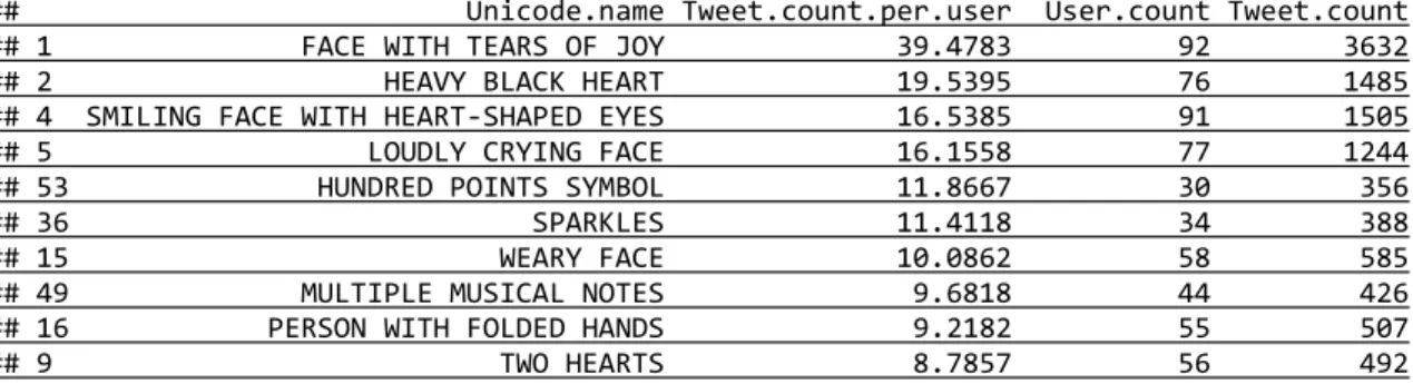
Table 8: Top Emojis by Tweet Count per User (Filtered)
## Unicode.name Tweet.count.per.user User.count Tweet.count ## 1 FACE WITH TEARS OF JOY 39.4783 92 3632 ## 2 HEAVY BLACK HEART 19.5395 76 1485 ## 4 SMILING FACE WITH HEART-SHAPED EYES 16.5385 91 1505 ## 5 LOUDLY CRYING FACE 16.1558 77 1244 ## 53 HUNDRED POINTS SYMBOL 11.8667 30 356 ## 36 SPARKLES 11.4118 34 388 ## 15 WEARY FACE 10.0862 58 585 ## 49 MULTIPLE MUSICAL NOTES 9.6818 44 426 ## 16 PERSON WITH FOLDED HANDS 9.2182 55 507 ## 9 TWO HEARTS 8.7857 56 492
Next we moved to Tf-Idf weighting. We looked at the “top emoji” for each user,
the one with the highest Tf-Idf value. Out of the 100 top emojis, there are 80 distinct
ones. Then we looked at those emojis that are at the top for multiple users, with SKULL
at the “top of the top”:
Table 9: Emojis atop Multiple Users
## 10 THUMBS UP SIGN 2 ## 18 SPARKLES 2 ## 19 GROWING HEART 2 ## 20 POUTING FACE 2 ## 25 REVOLVING HEARTS 2 ## 26 HUNDRED POINTS SYMBOL 2 ## 48 SLEEPING SYMBOL 2 ## 62 PEDESTRIAN 2
With these findings we are ready to move to the next step of our analysis, on users
each represented by a vector of Tf-Idf values of emojis.
K-Means Clustering and Principal Component Analysis
We started clustering using the k-means clustering method, with arbitrarily picked
values of k. But then we found some very weird pattern, shown with the following bar
plot of the sizes of the clusters with respect to k:
Figure 1: Sizes of Clusters over K
In most cases there is a giant cluster accompanied by several mini clusters, mostly
reference to k-means clustering, getting the following dendrogram (larger and clearer
dendrograms will be included in the appendix):
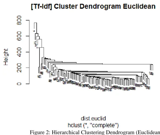
Figure 2: Hierarchical Clustering Dendrogram (Euclidean)
For convenience, we labeled the users with the order in which they were retrieved,
instead of their irrelevant screen names. We can identify 4 wildly outlying users from this
dendrogram: user 4, 75, 78, and 7. So naturally we expected a 5-means clustering
algorithm would yield a giant cluster and 4 singletons. But what we actually got is <95, 2,
1, 1, 1>. It turned out instead of getting No.7, the 4th outlier, it found the pair of No.45
and No.51, which can be seen in the dendrogram lying on the left, one level deeper than
No.7 but still quite far from the giant. Then when we tried 6-means, as expected we got a
suggesting it’s quite stable. This choice of number can also be supported by the following
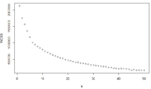
plot of within cluster sum of squares (WCSS) across K from 1 to 50:
Figure 3: Within Cluster Sum of Squares across K
This shows that 6 is likely the best choice for K: the improvement of WCSS has a
significant drop beyond k=6. Next we turned to Principal Component Analysis:
Based on the screeplot above (most variance is explained by the first 5 PCs) we
looked at the paired plot among PC1 to PC5. With the users labeled by their cluster
number, we can see a giant cluster 6, a pair of 5s extracted by PC3, and singletons 3, 1, 4
and 2 extracted by PC1, PC2, PC4 and PC5 respectively:
Figure 5: Pair-wise Plot of the First 5 PCs
At this point we are tempted to take a deeper look at these outliers. For each of
them, their leading emojis (with highest Tf-Idf values) will be listed, together with
leading emojis in each PC, i.e. those with largest/smallest values in the corresponding
eigenvector (this can be interpreted as the emojis having largest “weights” in defining the
direction, as the eigenvectors are normalized), and some interesting findings from their
Analysis of Outliers: Mini Case Studies
Outlier along PC1: Aunty White Heart (User.4)
According to the plots of PC1, most people are squeezed at 0, with a lone ranger
hanging around 600. It’s User.4, who, for the reason we’ll see, are nicknamed Aunty
White Heart. We wrote a function in R to show all emojis used by a designated user,
sorted by Tf-Idf value and for each emoji, its actual count (Tf), tweet count (which we
termed Twf), and user count, and run it with 4 as input :
Table 10: Leading Emojis of Aunty White Heart
## Tf-Idf Tf Twf Users ## WHITE HEART SUIT 616.83 279 200 11
That “s” should be scratched since as we see above, User.4 only used one emoji –
“WHITE HEART SUIT”, for a total of 279 times over all the 200 tweets retrieved, while
only 11 users in our sample used it, resulting in a bursting Tf-Idf of 616.8.
Unsurprisingly, when we look at the emojis with largest values in the eigenvector
for PC1, we can see below “WHITE HEART SUIT” is absolutely dominating.
Table 11: Leading Emojis along PC1
## Loading ## WHITE HEART SUIT 0.9977202 ## WHITE DOWN-POINTING TRIANGLE 0.0265481 ## WHITE STAR 0.0026388
The easier, and probably better way to know about this user might be to just look at
the actual timeline page. As far as we can tell, this middle-aged lady (according to the
profile picture) appears to be a quite average user, with the exception that she might not
be a fan of emoji: “WHITE HEART SUIT” actually looks more like a plain-text
character (♡) than a colorful image (e.g. “HEAVY BLACK HEART”: ), as most
Compared to others, as we will see later, this lady is the only “true outlier”, since
she’s the only one that perhaps should not be in our sample of “emoji users”. Its impact is
huge: the most significant PC is dedicated to her and doesn’t really separate our points as
it should do. In this sense however, Aunty White Heart, the lone ranger, is not alone.
Outlier along PC2: Devout Lefty (User.75)
According to the plots, there is a lone ranger along almost every significant PC,
whose impacts are not too different from each other. The second one, nicknamed Devout
Lefty, is User.75.
Table 12: (Top 7) Leading Emojis of Devout Lefty
## Tf-Idf Tf Twf Users ## LEFTWARDS BLACK ARROW 341.7826 74 74 1 ## CLOCK FACE SIX OCLOCK 166.7861 36 7 1 ## THOUGHT BALLOON 136.8525 59 44 10 ## ELECTRIC LIGHT BULB 106.1967 30 10 3 ## BOUQUET 90.8720 30 3 5 ## CHERRY BLOSSOM 85.8105 40 30 12 ## HERB 63.9104 21 12 5
Unlike Aunty White Heart this user has a pretty long list of used emoji, and only
the top 7 are listed here. Yet we can still identify the distinguishing factor: the first four
emojis all have a Tf-Idf value over 100, with the leading one, "LEFTWARDS BLACK
ARROW", being 341.8.
What Aunty could find resonance in is this lefty’s domination in PC2. As shown
with the listing of the top 10 emojis in the second eigenvector below, they are exactly the
same as the top-10-TfIdf emojis, with “LEFTWARDS BLACK ARROW” leading the
way:
Table 13: Leading Emojis along PC2
## HERB 0.13425 ## YELLOW HEART 0.12324 ## SEEDLING 0.12014 ## BLACK UNIVERSAL RECYCLING SYMBOL 0.10082
This user’s use of left arrow, spread over 74 tweets, is partly easy to interpret, when
we look at his/her account and those tweets: s/he appears to be a devout Muslim who
tweets mostly about his/her religious belief (according to what Twitter translated, of
course), in Arabic, which is written from right to left. In fact, the left arrow seems to
appear only in tweets from du3a.org, “an application for Twitter accounts that public
automatically time tweets in hour by hour with blessings (in Arabic) of Allah”.
The perplexing part, however, is that the application doesn’t automatically add left
arrows to its tweets, suggesting they’re manually added by this devout guy. Further,
according to the chart above, s/he is the only one in our sample that uses this emoji,
which is the reason for the huge Tf-Idf value. Language cannot well explain it here,
considering there’re others in our sample who tweets in right-to-left scripts. And it’s even
harder for our little knowledge (and Twitter’s translation capability) of Arabic and Islam
to explain the use of the other three leading emojis - a clock, a balloon and a bulb.
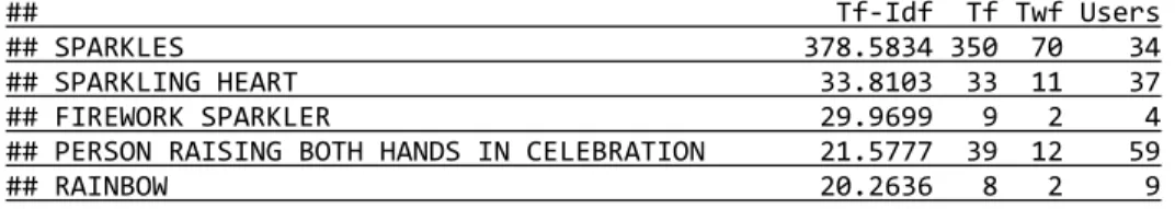
Outliers along PC3: the Sparkling Duet (User.51 & User.45)
Along PC3, there are a pair of outliers: user 51 and 45.
In order to find what makes them far from the others and what makes them linked
early in hierarchical clustering and constantly got clustered together in K-means, again,
we need to look at their leading emojis, and the eigenvector for PC3:
Table 14: (Top 5) Leading Emojis of User.51
Table 15: Leading Emojis of User.45
## Tf-Idf Tf Twf Users ## SPARKLES 216.76 200 200 34 ## HEAVY BLACK HEART 110.77 400 200 76
Table 16: Leading Emojis along PC3
## Loading ## SPARKLES -0.871082 ## WHITE DOWN-POINTING TRIANGLE -0.230698 ## LEFTWARDS BLACK ARROW -0.166068 ## HEAVY BLACK HEART -0.111753 ## CLOCK FACE SIX OCLOCK -0.081039 ## FEARFUL FACE -0.078951 ## THOUGHT BALLOON -0.065032 ## SPARKLING HEART -0.050885 ## ELECTRIC LIGHT BULB -0.050770 ## FIREWORK SPARKLER -0.049761
The lists of the duet don't have many items in common. In fact, User.45 only used 2
emojis. But they both have a leading "SPARKLES" with a huge Tf-Idf. Despite having as
many as 34 users, it was used 350 and 200 times respectively.
We also see some suspicious number: the emoji was used 350 times over 70 tweets
by User.51 and 200 times over 200 tweets by User.45. Plus the only other emoji from
User.45 was used 400 times over 200 tweets. It is very likely that each of his/her sampled
tweets contains exactly one “SPARKLES” and two “HEAVY BLACK HEART”.
In fact, like what we learned from Devout Lefty, both cases are indication of "the
inhuman".
User.51 is the more human one, as s/he used many of the popular emojis. The
SPARKLES tweets seem to be auto-generated by an application called Statusbrew, which
publishes a welcome tweets, with a “SPARKLES”, to each of his/her new friends.
User.45, however, is probably a robot. This account tweets super frequently the
HEARTs, and directions on how to watch porn videos, accompanied by different short
porn clips.
Outlier along PC4: Hanryu Hama (User.78)
User.78, the outlier along PC4, is self-introduced to be an addicted Japanese fan of
a Korean pop star and tweeted mostly about her idol, among other Korean entertainment
topics. We nickname her Hanryu Hama (in Japanese, Korean Wave Addict, literally).
Her leading emojis, along with the ones in the eigenvector for PC4, are a little
surprising:
Table 17: Leading Emojis of Hanryu Hama
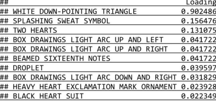
## Tf-Idf Tf Twf Users ## WHITE DOWN-POINTING TRIANGLE 423.4985 108 99 2 ## SPLASHING SWEAT SYMBOL 65.8817 33 25 14 ## TWO HEARTS 61.8809 105 76 56 ## BOX DRAWINGS LIGHT ARC UP AND LEFT 19.4207 4 3 1 ## BOX DRAWINGS LIGHT ARC UP AND RIGHT 19.4207 4 3 1 ## BEAMED SIXTEENTH NOTES 19.4207 4 3 1 ## HEAVY BLACK HEART 19.1128 66 55 76 ## WHITE HEART SUIT 18.6582 8 7 11 ## DROPLET 18.5328 5 5 3 ## BOX DRAWINGS LIGHT ARC DOWN AND RIGHT 14.8155 3 3 1 ## HEAVY HEART EXCLAMATION MARK ORNAMENT 12.0364 5 3 11 ## WHITE LEFT POINTING INDEX 10.2103 2 1 1 ## BLACK HEART SUIT 9.5740 5 3 18 ## EIGHTH NOTE 6.9915 2 1 5 ## WHITE FOUR POINTED STAR 5.6052 1 1 1 ## BOX DRAWINGS LIGHT HORIZONTAL 5.6052 1 1 1 ## BOX DRAWINGS LIGHT DOWN AND LEFT 5.6052 1 1 1 ## BOX DRAWINGS LIGHT DOWN AND RIGHT 5.6052 1 1 1 ## WHITE STAR 4.9120 1 1 2
Table 18: Leading Emojis along PC4
The easy part is those hearts which she used for her idol, and the splashing sweat
which, according to the actual tweets, was used to show greeting/regards (typically
followed by "otsukaresama deshita") to her hard-working idol when she tweeted about
him shooting for TV shows.
But when it comes to the down-pointing triangle with a stunning 423 Tf-Idf, and
those weird box drawings which she is the only user of, things are not that easy. We
won't know from their Unicode names, but when looking at what those symbols actually
are and her tweets, we realized they indicate trouble: they are actually part of emoji's
fraternal twin - kaomoji, which is as popular in Japan. The downing-pointing triangle is
used as an open mouth in any smiling faces, while those box drawing arcs and lines are
arms swinging in different directions, sometimes followed by musical notes to show
happiness (for example, ( ´▽ ` )ノ♬).
So while Hanryu Hama did use emojis, her use of kaomojis, along with the
inclusion of those symbols in our emoji set, makes her another outlier and costs PC4.
By the way, the only other user in our sample that used WHITE
DOWN-POINTING TRIANGLE is User.51, the “Sparkler” (whose top 3 emojis are all sparkles)
along PC3 (only three times in one tweet, preventing it from thriving in PC4). The
interesting part is, tweeting in Russian, s/he is also a fan of some Korean idols. Actually,
some kaomojis can also be found in his/her tweets – it could possibly be something
spread with fandom.
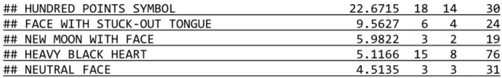
Outlier along PC5: Skull Girl (and the Gang) (User.7)
Table 19: (Top 7) Leading Emojis of Skull Girl
## HUNDRED POINTS SYMBOL 22.6715 18 14 30 ## FACE WITH STUCK-OUT TONGUE 9.5627 6 4 24 ## NEW MOON WITH FACE 5.9822 3 2 19 ## HEAVY BLACK HEART 5.1166 15 8 76 ## NEUTRAL FACE 4.5135 3 3 31
Table 20: Leading Emojis along PC5
## Loading ## SKULL -0.920427 ## WHITE DOWN-POINTING TRIANGLE -0.249340 ## SPARKLES -0.215568 ## LEFTWARDS BLACK ARROW -0.108319 ## LOUDLY CRYING FACE -0.070818 ## CLOCK FACE SIX OCLOCK -0.052858 ## THOUGHT BALLOON -0.042930 ## HUNDRED POINTS SYMBOL -0.038891 ## SPLASHING SWEAT SYMBOL -0.033834 ## ELECTRIC LIGHT BULB -0.033079
Similar to User.51, this girl (according to her profile picture) appears to be an
average user, whose emojis are all quite popular ones. But she still gets the certificate to
our club: a striking Tf-Idf of 407.7, for SKULL. It’s not a particularly rare emoji, but the
fact that Skull Girl used it 285 times over 74 tweets (so almost 4 times per tweet) is
definitely “outlying”.
This reminds us of the earlier section showing that 4 users have SKULL as their top
emoji. Thus we then looked at "the Gang": user 5, 59, and 98. But their lists of leadig
emojis won’t be here, not only because they are too long but more importantly, they
appears to be irrelevant. Although all are crowned with SKULL, the tf-idf values of those
skulls are far from the lead. This is also supported by their projections along PC5:
Table 21: Projections of Users Topped by SKULL
## 7 5 59 98 ## -369.8622 -8.0044 -24.8582 -77.0860
Then we tried to measure the similarity/distance within this likely subgroup. We
used the Euclidean distance, which is implicitly used in K-means and PCA, because of
the involvement of sum of squares in both cases, and explicitly used in our first run of
Table 22: Euclidean Distances between Users Topped by SKULL
## 7 5 59 ## 5 391.588 / / ## 59 375.274 52.748 / ## 98 325.221 104.973 96.524
The first column above shows how distant Skull Girl (User.7) is from her Gang,
which also corresponds to the heights in the cluster.
But this part actually prompted a later section: although here the Gang don't seem
to belong to their leader at all, it's only in the case of Euclidean distance. In exploring
this, we will try other distance measures, in one of which they do belong.
Now as our lengthy accounting of outliers finished, we can make a naive
summarization: we found that each of them have at least one emoji with an extremely
large Tf-Idf value. On the other hand, in the sense of picking outliers, it's not the end.
What we just listed are merely "more significant" outliers. But if we kick them out of our
party, the underbosses will seize power. That is what we will do in the next section.
Analysis of Outliers and Insiders: Gradual Elimination (“Unwrapping”)
To get a look at more outliers more quickly, we wrote a function to eliminate the
most outlying user along the first PC (which is assumed to be the extreme point along
PC1 that is farther from the median), i.e. “unwrap” the outermost “layer”, book-keep
information of the eliminated outlier, then run PCA on the remaining data, and plot the
first 2 PCs of the new sample.
Then in a brute-force manner, we run it repeatedly to gradually eliminate outliers
and printed the plot of each “layer”, from the original data all the way down. There was
are multiple outlying points, they never appear to be in a common cluster compared to the
huddle. The plots of the first two PCs from with all the users to without 19 outlying users
are placed in the appendix for reference due to its length. Below is the final plot, with 20
users eliminated:
Figure 6: Plot of the First 2 PCs with 20 Users Eliminated
This plot looks a lot better than the earlier ones. Nevertheless, it’s still hard to
detect any specific subgroup here, except for the trio on the right.
Before looking at the trio, we first checked our book-kept list of outliers (indexed
by layer). The list also include the “most influential” emoji of the most significant PC
along the direction each outlier is heading, its loading in the eigenvector, its Tf-Idf value
Table 23: Eliminated Outliers and Leading Emojis at PC1
## Layer User Leading.Emoji.PC Loading TfIdf Rank Max.TfIdf ## 0 4 WHITE HEART SUIT 0.99772 616.830 1 616.830 ## 1 75 LEFTWARDS BLACK ARROW 0.71849 341.783 1 341.783 ## 2 51 SPARKLES 0.89940 378.583 1 378.583 ## 3 78 WHITE DOWN-POINTING TRIANGLE 0.91731 423.498 1 423.498 ## 4 7 SKULL 0.98987 407.728 1 407.728 ## 5 26 HUNDRED POINTS SYMBOL 0.61021 127.417 2 143.760 ## 6 45 SPARKLES -0.81811 216.762 1 216.762 ## 7 80 BLACK HEART SUIT -0.73327 174.195 1 174.195 ## 8 47 PENGUIN 0.47952 127.236 1 127.236 ## 9 70 HEAVY PLUS SIGN -0.57969 139.155 1 139.155 ## 10 6 HEAVY MULTIPLICATION X -0.54281 126.536 1 126.536 ## 11 34 FEARFUL FACE 0.63356 174.819 1 174.819 ## 12 66 HUNDRED POINTS SYMBOL -0.63232 129.825 1 129.825 ## 13 97 MUSICAL NOTE 0.64900 149.844 1 149.844 ## 14 21 CROWN 0.39902 86.107 1 86.107 ## 15 19 BLACK HEART SUIT 0.47973 124.465 1 124.465 ## 16 42 SQUARED COOL 0.70948 158.795 1 158.795 ## 17 46 ENVELOPE -0.72427 139.155 1 139.155 ## 18 44 REGIONAL INDICATOR SYMBOL LETTER S 0.35293 83.152 2 83.893 ## 19 8 THUMBS UP SIGN 0.78843 144.172 1 144.172
We see some familiar user numbers here, along with their featured emojis: Aunty
White Heart (4) at Layer 0, Devout Lefty (75) at Layer 1, the Sparkling Duet (51 & 45) at
Layer 2 and 6, Hanryu Hama (78) with her triangle mouth at Layer 3, and Skull Girl at
Layer 4, interrupted by an uninvited guest User.26, whom, soon we will see in the next
section, rises from the concrete jungle of Manhattan (distance).
There are 19 different leading emojis for the first PCs of the 20 layers (the only
exception goes to the two layers where the duet is outlying). Yet what stays constant is
their domination along almost each layer, large Tf-Idf values and high rank. Even the two
emojis ranked 2nd (at layer 5 and 18) for their corresponding users is quite close to the
leader. Again, this shows how a large Tf-Idf could cause the outlying.
What it really means is here: the first PC is the “direction” that best separates the
samples; thus the emoji leading the way the outlier is heading should best differentiate it
and remoteness of a Tf-Idf is inherently related: this can be illustrated by the following
contour plot of the formula we used (𝑇𝑓. 𝐼𝑑𝑓 = 1 + tf ∙ ln𝑑𝑓𝑁, where 𝑁 = 100):
Figure 7: Contour Plot of Tf-Idf
As shown by the contour lines, for a value to be as large as 100, even an emoji with
a 200 term frequency needs have a document frequency as small as 60, meaning 40 of the
users have a value of 0. Thus a large Tf-Idf itself would suggest remoteness.
This can also be supported by looking at the “insiders”, who remain in the sample
Figure 8: Contour Plot of Tf-Idf
Now back to the PCA plot of the insiders. We saw there is a trio traveling to the far
east. This can be illustrated by their projection along PC1 (for comparison, that of the 4th
guy is also included):
Table 24: Projection of Users along PC1
## 63 17 98 54 ## 65.274 61.885 58.630 28.367
So all the three (63, 17, 98) have a projection around 60 while the closest
“westerner” (54) from them is merely 28.
Then the following two tables were made to show the loadings and the Tf-Idf
values for the four (the trio + the first westerner) of the top 10 leading emojis on both
sides of PC1:
Table 25: Emojis Leading the Positive Side of PC1
## TONGUE 0.12255 6.7085 20.9796 0.0000 39.5321 ## FIRE 0.12163 13.5979 27.2456 0.0000 0.0000
Table 26: Emojis Leading the Negative Side of PC1
## 63 17 98 54 ## NEW MOON WITH FACE -0.218521 0.0000 0 0 2.6607 ## PERSON WITH FOLDED HANDS -0.181126 4.5870 0 0 0.0000 ## MUSICAL NOTE -0.169683 0.0000 0 0 0.0000 ## PEDESTRIAN -0.167152 0.0000 0 0 0.0000 ## MULTIPLE MUSICAL NOTES -0.135252 0.0000 0 0 0.0000 ## SLEEPING SYMBOL -0.123894 0.0000 0 0 6.7085 ## RAISED HAND -0.112195 0.0000 0 0 0.0000 ## WHITE DOWN POINTING BACKHAND INDEX -0.110983 0.0000 0 0 0.0000 ## CLAPPING HANDS SIGN -0.099583 0.0000 0 0 1.5798 ## TWO HEARTS -0.094689 3.3193 0 0 1.5798
A few things can be learned from these tables. First, no single emoji could explain
the ordering and distance of the four listed users; in fact, it’s not even clear how a
combination (with loadings considered) of “featured” emojis could explain it. Second,
there’s not a clear-cut separation between the two directions: even the most “positve”
user (63) has a non-zero entry in one of the leading emojis at the negative side. Besides,
we may also infer a possible inverse relation between emojis at different ends (e.g.
SKULL & NEW MOON WITH FACE). This could lead to another direction of
exploration: Transpose the data frame and analyze on emojis as vectors of users.
Hierarchical Clustering: Comparing Distance Measures
In earlier sections we tried K-means Clustering, Principle Component Analysis
and Hierarchical Clustering on Euclidean distance. Although the former two methods do
not explicitly use Euclidean distance, the fact that both cases involve sum of squares –
K-means uses it to calculate the centroids and measure distance of points to them, and PCA
finds the direction that maximize the variance which is a sum of squares (in fact it is
implicitly used. As a result, we’ve already seen connections between results of these
three methods.
But there are other distance and similarity measures, and these measures may
sometimes yield different results. Thus we turned to try hierarchical clustering with some
of them and had some interesting findings.
Cosine Similarity and Angular Distance
We start from cosine similarity, which is often used along with Tf-Idf weighting
in Information Retrieval to measure similarity of the query with documents and thus
compare candidate documents. Since we don’t have a query here and what we are going
to do is clustering, we need to convert it to a distance metric. The more intuitive way,
𝐷𝑖𝑠𝑡 = 1 − 𝑆𝑖𝑚 would yield an improper distance metric that does not satisfy the
triangular inequality property. To maintain the property while keeping the ordering, we
use Angular Distance defined by:
𝐴𝑛𝑔. 𝐷𝑖𝑠𝑡 = 2∙cos−1𝜋(𝑆𝑖𝑚).
Here 𝑆𝑖𝑚 is the original cosine similarity. In this way we computed cosine
similarity and transformed it to angular distance in R, and then conducted hierarchical
Figure 9: Hierarchical Clustering Dendrogram (Angular)
This is a very different dendrogram. The distance is “normalized”: it’s the ratio of
the angle between the two vectors to 𝜋
2. Thus the “length” or norm of the vector doesn’t
matter. Two vectors that are superposed over each other but vary a lot in length now have
a distance of 0. The fact that it takes value in [0, 1] also has the effect that the distances
are bounded: as shown in the dendrogram more users are linked together as the height
approaches 1.
Therefore, what we can learn from this dendrogram is also very different: we won’t
find outliers as we did with Euclidean, but instead we can do quite the opposite: we can
find small groups of users that are close to each other, at the lower height levels. We have
met some of them before: the Sparkling Duet (45 & 51) are actually the closest pair;
Manhattan Distance
Next we turn to Manhattan Distance, which is another widely used distance
measure that is often compared to Euclidean. It is defined by:
𝐷𝑖𝑠𝑡(𝑎, 𝑏) = ∑𝑛𝑖=1|𝑎𝑖− 𝑏𝑖|.
Sometimes both generate similar results in clustering when there is a clear
partition, but that’s not the case here. And the case here turns out to be a good example to
show the difference between them:
Figure 10: Hierarchical Clustering Dendrogram (Angular)
In some way this is similar to the Euclidean one: a few outliers hanging in the
highland with the hoi polloi floundering at lower levels (and the Sparkling Duet are still
together). But in most sense it’s different: we got different outliers.
We know one of them, Devout Lefty (75), who’s also in the highland in Euclidean
Distance, but the other one, User.26 seems strange. This user, who also interrupted the
the one who used the most number of distinct emojis in the 200 sampled tweets, notching
126 different emojis.
And this actually shows the difference between Euclidean and Manhattan: the
former encourages “professionals” – a user having one emoji with very large Tf-Idf value
would be distant from others and become an outlier, while the latter encourages
“generalists” – one who have more high-Tf-Idf emojis is more likely to be an outlier.
This is supported not only by the all-rounder, User.26, but also by Devout Lefty, who
have three emojis with Tf-Idf over 100.
Binary Distance
Finally, we went on a very different approach: ignoring the Tf-Idf weights and
term frequencies, we convert the vectors to binary ones and cluster based on binary
distance, defined as:
𝐷𝑖𝑠𝑡(𝑎, 𝑏) = ∑𝑛𝑖=1𝕀{𝑎𝑖=1 ⋀ 𝑏𝑖=1} ∑𝑛𝑖=1𝕀{𝑎𝑖=1 ⋁ 𝑏𝑖=1}.
So the distance is also normalized: it’s the ratio of the number of emojis two users
Figure 10: Hierarchical Clustering Dendrogram (Angular)
Similar to the case of angular distance, another normalized distance, more users
are linked near the top. But unlike the previous analysis this one is done without
considering how much a user uses each emoji: it only cares about whether someone uses
an emoji or not. This seems to be the reason that, unlike what we’ve found so far but like
what we were expecting when doing clustering, there do appear to be a few number of
clusters of “reasonable” sizes at certain height levels. Further exploration would be
Discussions
This exploratory study has been filled with surprising findings, resulting in a
somewhat disorganized analysis part. But this is what exploration could lead to, and
motivates us to make further exploration in the future.
Started with clustering, we were expecting an ideal result: the whole user sample
is partitioned to several groups of similar sizes, with group members exposing similar
patterns of emoji use – similarly high frequency of certain emojis, typically – and
easy-to-distinguish patterns from groups to groups. But instead of groups we ended up
spending most of our time on individuals: every outlier is outlying in its own, weird but
fascinating way. Some of them don’t intend to use emojis; some of them are results of
auto-tweeting applications; some of them just uses too much different emojis. Despite
only looking at some of them, we believe each of the remaining has a unique and as
interesting reason to be outlying.
Even the groups we actually found are not really similar to each other as
expected. We didn’t expect a Russian fan of Korean idols would be closely paired with a
porn robot, constantly, in Euclidean, Manhattan and Angular distances, not to say why
and how SPARKLERS are used to welcome new friends in one case but to promote porn
videos in the other, as the only tie between the pair.
We didn’t expect the most widely used, sometimes default Euclidean distance that
data. As explained in the previous section, it gets greater when the difference is
concentrated, meaning that one “outlying” emoji could single-handedly push a user to be
an outlier. On the other hand, Manhattan distance which encourages difference to be
spread over multiple dimensions, is able to pick out outliers not as easily identified: it is
usually easier to recognize high frequency and uniqueness (the two factors of Tf-Idf) of a
certain emoji than differences accumulated across emojis. In such way, this distance
measure is more tolerant if someone has special craving for a certain emoji but also use
ones that are common to others. Angular distance, which might not be appropriate for
finding large clusters due to its normality, is also useful because of its normality. It is able
to find groups whose members’ emojis are similar in proportions but vary in “volume”,
or frequency. This is particularly useful in the case of Tf-Idf weighting, as those emojis
used by few users (small df, thus large idf) would have large difference even when their
actual term frequencies vary a little. We do found the Gang of Skulls who all love skulls
but have different frequencies using this distance measure.
There are also unexpected findings from the global summary, such as that
SMILING FACE WITH HEART-SHAPED EYES is almost as ubiquitous as FACE
WITH TEARS OF JOY, that FEARY FACE is most repeated in single tweets among
popular emojis, and that SKULL is the most widely “featured” emoji among our sample
of users.
These unexpected findings prompts us to expect more: this is the end of the paper
but really, like most exploratory analysis, is just a start.
The setting of our study is fairly simple compared to what we had reviewed from
200 tweets as a “Bag of Emojis”, and represent s/he as a vector of emojis’ Tf-Idf values.
We could certainly try more from what we’ve learned from previous studies on user
modeling, such as using social interaction data like retweets, replies, likes and lists where
emojis are involved, representing sample of users as a graph having edges as their
emoji-involved relationship, extracting concepts from emojis, and inferring distributions of
emojis in topic modeling.
Throughout this process we also found many new directions of exploration, such
as using text data as context/background of emoji occurrences, weighting emojis on
different metrics like binary (which we already tried in hierarchical clustering), term
frequency (i.e. ignoring number of users/document frequency), “Twf” (termed for “tweet
frequency” i.e. number of tweets containing each emoji by each user) and “Twf-Idf” with
a new unit, introducing categories, including Unicode blocks, faces/shapes/items and
sentiments (from the reference table we used) of emojis, and transpose the data frame and
conduct analysis on emojis vectorized by users.
After all, we will continue to work on this fun topic and post updates on a
blogsite8. We also encourage those who get a chance to read this paper try with their own
ideas, probably more advanced technical skills and larger and more scientifically sampled
data.
Bibliography
Abdel-Hafez, A., & Xu, Y. (2013). A survey of user modelling in social media
websites. Computer and Information Science, 6(4), 59.
Abel, F., Gao, Q., Houben, G. J., & Tao, K. (2011). Cross-system user modeling and
personalization on the social web. User Modeling and User-Adapted Interaction
(UMUAI), Special Issue on Personalization in Social Web Systems, 22(3), 1-42.
Ahmed, A., Low, Y., Aly, M., Josifovski, V., & Smola, A. J. (2011). Scalable distributed
inference of dynamic user interests for behavioral targeting. Paper presented at
the ACM Conference on Knowledeg Discovery and Data Mining (KDD) (pp.
373-382).
Barla, M. (2011). Towards social-based user modeling and personalization. Information
Sciences and Technologies Bulletin of the ACM Slovakia, 3(1), 52-60.
Chen, J., Nairn, R., Nelson, L., Bernstein, M., & Chi, E. H. (2010). Short and tweet:
experiments on recommending content from information streams. Paper
presented at the Proceedings of the 28th international conference on Human
factors in computing systems (pp. 1185-1194).
Das, A. S., Datar, M., Garg, A., & Rajaram, S. (2007). Google news personalization:
scalable online collaborative filtering. Paper presented at the 16th International
Hannon, J., Mccarthy, K., O’mahony, M. P., & Smyth, B. (2012). A multifaceted user
model for twitter. User Modeling, Adaptation, and Personalization, 303-309.
Hogenboom, A., Bal, D., Frasincar, F., Bal, M., De Jong, F., & Kaymak, U. (2015).
Exploiting Emoticons in Polarity Classification of Text. J. Web Eng.,14(1&2),
22-40.
Kim, H. N., Ha, I., Lee, K. S., Jo, G. S., & El-Saddik, A. (2011). Collaborative user
modeling for enhanced content filtering in recommender systems. Decision
Support Systems, 51(4), 772-781.
Lu, C., Lam, W., & Zhang, Y. (2012). Twitter User Modeling and Tweets
Recommendation Based on Wikipedia Concept Graph. Paper presented at the
Twenty-Sixth Conference on Artificial Intelligence Workshops (AAAI).
Ma, H., Zhou, D., Liu, C., Lyu, M. R., & King, I. (2011). Recommender systems with
social regularization. Paper presented at the Fourth ACM International
Conference on Web Search and Data Mining (pp. 287-296).
Novak, P. K., Smailović, J., Sluban, B., & Mozetič, I. (2015). Sentiment of emojis. PloS
one, 10(12), e0144296.
Yu, L., Pan, R., & Li, Z. (2011). Adaptive social similarities for recommender systems.
Paper presented at the Proceedings of the fifth ACM conference on Recommender
systems, Chicago, Illinois, USA.
Zhong, E., Fan, W., Wang, J., Xiao, L., & Li, Y. (2012). ComSoc: adaptive transfer of
user behaviors over composite social network. Paper presented at the 18th ACM
International Conference on KnowledgeDiscovery and Data Mining
Zhou, X., Xu, Y., Li, Y., Jøsang, A., & Cox, C. (2012). The state-of-the-art in
personalized recommender systems for social networking. Artif. Intell. Rev.,
Appendix
Sample Python Code for Data Collection and Transformation
emoji_sent_table = pd.read_csv('Emoji_Sentiment.csv', encoding='utf-8',
index_col=0)
emoji_track_list = emoji_sent_table[0:59].index.tolist() #60 most popular
emojis
users_names = set() N_streamed_users = 50
class MyStreamListener(tweepy.StreamListener):
def on_status(self, tweet):
if len(users_names) < N_streamed_users:
if not tweet.text.startswith("RT "):
print tweet.user.screen_name
users_names.add(tweet.user.screen_name)
return True
else:
return False
def on_error(self, status):
print status
if status == 420:
return False
def main():
auth = tweepy.OAuthHandler(consumer_key, consumer_secret) auth.set_access_token(access_token, access_token_secret)
myStream = tweepy.Stream(auth, MyStreamListener()) myStream.filter(track=emoji_track_list)
with open('users_names_6.txt','w') as f:
for name in users_names:
f.write(name+'\n')
def computeAverageCount():
emoji_table["count_per_user"] =
emoji_table["count"]/emoji_table["users_count"]
emoji_table.to_csv('Emoji_Count.csv', encoding='utf-8')
return
def computeTwtAverageCount():
emoji_table["count_per_tweet"] =