Master Thesis
Learning from visualizations: Learning potential
of knowledge representations based on design rationale from
collaborative decision-making meetings
Monique Oosterwegel University of Twente, May 2018
Faculty of Behavioural, Management and Social Sciences (BMS) Department of Cognitive Psychology and Ergonomics
Abstract
The aim of this study was to broaden our understanding of the potential of visualizations to induce learning by testing participants’ memory on two knowledge representations. These knowledge representations were visualized textually and by two different visualizations: a table and a map. Their content was derived from annotation of the design rationale of two transcribed design related Collaborative Decision-Making (CDM) meetings. These two meetings were each translated into a knowledge representation and visualized by the three formats. Each participant in the study saw a textual baseline and one of the two visualizations. These two representations differed on design rationale with regard to their subject-matter, which was derived from the CDM meetings. After inspection of each representation, Multiple-Choice and True/False items tested participants’ memory. These test items were constructed to measure participants’ learning on two different aspects of
knowledge: factual- and relational knowledge. So, it was investigated if visualizations could be used for the knowledge representations to foster learning, how the representations were initially retained in memory and in what way they could foster learning.
Results provided evidence for the suitability of visualizing a knowledge representation of design rationale for learning. It seemed that not every type of representation was suited to foster learning to the same degree. However, visualizations did bring different advantages over a textual baseline. In some cases, memory accuracy was better and specific aspects of knowledge recalled was nearly significantly better, and response latency was nearly
significantly faster without decreasing performance on the memory test compared to textual baselines.
Future research should investigate if the value of using “classic” visualizations (table and map) remains the same regardless of; using other content, expanding the time period between inspection and memory test, using other (experimental) settings and if new design decisions will be influenced in a qualitative way. This study gave a start in identifying these visualizations’ learning potential or actual knowledge acquisition during a learning process.
1. Introduction ... 4
1.1 General Background ... 4
1.2 Context & Research Question ... 5
1.3 Study’s Outline ... 6
2. A Review of Visualization ... 7
2.1 Defining Visualization ... 7
2.2 The Cognitive System ... 7
2.2.1 Data processing components. ... 8
2.2.2 Visualization. ... 9
2.2.3 Human components. ... 9
2.3 Visualization of CDM Meetings ... 11
3. Design of study ... 12
3.1 Recap: Context & Research Question ... 12
3.2 Hypotheses ... 12
3.3 Measuring Learning ... 13
3.4 Knowledge Representation ... 14
3.5 Diagram Study ... 14
3.6 Pilot Study. ... 15
4. Method ... 16
4.1 Participants ... 16
4.1.1 Pilot study. ... 16
4.1.2 Study. ... 16
4.2 Materials ... 17
4.2.1 Pilot study. ... 17
4.2.2 Study. ... 17
4.3 Procedure ... 19
4.4 Data Analysis ... 21
4.4.1 Data preparations. ... 21
4.4.2 Data validation & reliability. ... 23
4.4.3 From data to outcomes. ... 23
4.4.4 Ancillary analyses. ... 24
4.4.5 Summary. ... 24
5. Results ... 25
Data validation & Reliability ... 25
5.1 Normal Distribution Overall Score ... 25
5.2 Item Difficulty ... 26
5.2.1 Proportion correct items. ... 26
5.2.2 Distractor evaluation. ... 26
5.2.3 Guessing. ... 27
5.3 Interitem Reliability ... 28
5.3.1 Kuder-Richardson formula 20. ... 28
5.3.2 Correlation coefficients. ... 28
5.4 Content & Construct Validity ... 29
5.4.1 Construct validity test 1. ... 29
5.4.1 Construct validity test 2. ... 30
From Data to Outcomes ... 32
5.5. Hypothesis ... 32
5.5.1 Hypothesis 1. ... 32
5.5.2 Hypothesis 2. ... 32
Ancillary Analyses ... 36
5.6 Interaction Effects ... 36
5.7 Relation Overall Score/Inspection Time .. 36
5.8 Relation Overall Score/Opinion ... 37
Summary ... 39
6. Discussion ... 40
6.1 Aim of Study ... 40
6.2 Usefulness Results ... 41
6.3 Study’s Limitations ... 41
6.4 Study’s Strengths ... 42
6.5 Future Research ... 42
7. Conclusions ... 43
References ... 44
Appendix A ... 49
Appendix B ... 50
Appendix C ... 58
Appendix D ... 64
Appendix E ... 65
Appendix F ... 67
Appendix G ... 68
Appendix H ... 71
1. Introduction
1.1 General Background
Probably most of us have learned the process of how to read a data table in elementary school. You glance over the rows and columns and try to find the information that suits your goal best. The data table is one of many visualization techniques that seems to help us structure raw data, and make reasoning or “thinking” easier. In other words, this cognitive tool can make use more cognitively empowered than without it (Ware, 2013). If you think about it, tools we are using to support “thinking” can been found ubiquitously in our everyday life. After all, ““thinking” occurs through interaction between individuals, using cognitive tools and operating within social networks” (Ware, 2013, p. 2).
Over the past couple of decades, these cognitive tools are increasingly computer-based technologies as use of information- and communication technologies (ICT) has taken a major role in our lives. Moreover, quantities of information have been growing and can be stored due to these ICT (Keller, Gerjets, Scheiter, & Garsoffky, 2006). As more information can be stored and easily be displayed using ICT, we seem to take in a growing amount of information everyday. The question of how to present this quantity of information has become important – maybe now even more than ever.
As most information we perceive is through vision (Ware, 2013) and we use it for information understanding (Ward, Grinstein, & Keim, 2010), it is not surprising information (as in data or concepts) has been graphically represented (Ware, 2013). Moreover,
interpretation of graphical representations operates faster than interpretation of texts and graphical representations can be independent of language (Ward et al., 2010). Hence, graphical representations or so called visualizations seem an obvious choice for presenting information.
Although visualizations seem the perfect fit, there are some concerns. Two main concerns are: “How can we be sure that our visual representations are not interpreted
differently by different viewers? How can we be sure that the data we present is understood?” (Ward et al., 2010, p. 73). After all, our perception is biased by our experience, current
context and our goals (Johnson, 2014). Furthermore, translating information into a
Coventry, 2016). It can be interactive and non-interactive presented. Also, current research argues that there is not one optimal type of visualization. Moreover, the research’s focus seems to lie on “effective” information retrieval in stead of knowledge acquisition or in stead of assessing the usefulness of visualizations during a learning process (Fekete, van Wijk, Stasko, & North, 2008; Klerkx, Verbert, & Duval, 2014). Hence, a lot of questions arise when we want to use visualizations to present information.
1.2 Context & Research Question
The aim of this study was to broaden our understanding of the potential of
visualizations to induce learning. The term learning is in this study synonymously used for “knowledge acquisition” (Gleitman, Gross, & Reisberg, 2011). Besides the fact that learning from visualizations is of added value to current research, it is also an important theme within the research project “Living Smart Campus” (LSC) of the University of Twente (UT). This study was conducted under this project.
The “LSC” project aims to use technology to enhance campus life quality (University of Twente, 2017a). One of their products is an Application which records and streamlines design related Collaborative Decision-Making (CDM) meetings (University of Twente, 2017a). This Application is a cognitive tool and able to make “thinking” easier. The
Application records the design rationale – “reasons behind design decisions” (Dai & van der Velde, 2017, p. 338) - of these CDM meetings. Its functioning is in line with existing CDM research, where capturing the design rationale during meetings in a visualization and information retrieval is main focus (Karacapilidis & Papadias, 2001; Li, Qin, Gao, & Liu, 2014). However, it sheds less light on utilizing the design rationale for learning – as in presenting it as a knowledge representation.
It is a pity that the design rationale of meetings is often not utilized further, because sharing the design rationale as knowledge representation can be beneficial for new design projects (as cited in Dai & van der Velde, 2017). In this context, the following research question arose:
1.3 Study’s Outline
In order to answer the research question, it was hypothesized that visualizations would be the way for presenting the information. Visualizations were expected to be better retained in memory than a textual baseline due to their workings on our human cognition (for more details see next chapter). So, the research question lent itself to broaden our understanding of the potential of visualizations to induce learning. Identification of this visualizations’ learning potential was also expected to contribute to the development of visualizations as learning materials. Two hypotheses were formulated. First, memory accuracy was expected to be higher for visualizations than for a textual baseline. Second, memory response latency was expected to vary along the fit between a representation and type of test item: testing on factual- or relational knowledge.
This study focused on transcriptions of different design related CDM meetings from an earlier study. This earlier study investigated the applicability of the Application from the “LSC” project (Oberhagemann, 2017). The design rationale of the CDM meetings from the earlier study was analyzed on behalf of this study by two raters: Dai and Oosterwegel. They annotated the transcriptions of the meetings in terms of the Issue-Based Information System (Kunz & Rittel, 1970). This is the same concept which the Application uses to let you streamline meetings. Eventually, two CDM meetings were translated from annotation into a knowledge representation and visualized textually, by a table and a map.
Each participant in the study saw a textual baseline and one of the two visualizations. These two representations differed on design rationale with regard to their subject-matter, which was derived from the two CDM meetings. After inspection of each representation, Multiple-Choice (MC)- and True/False (T/F) items tested participants’ memory. These test items were constructed to measure participants’ learning on two different aspects of
knowledge: factual- and relational knowledge. This way of investigating the hypotheses would indirectly answer the stated questions below and, therefore, the research question.
2. A Review of Visualization
2.1 Defining Visualization
Different terms are used to refer to visualizations: (interactive) data visualizations (Steed, 2017), scientific data visualizations (Ward et al., 2010), information- and knowledge visualizations (Eppler & Burkhard, 2004). According to Eppler and Burkhard (2004), an information visualization lacks the potential of transferring knowledge as appose to a knowledge visualization. So, visualizations might facilitate knowledge gain in stead of only information retrieval and – exploration. They also might help create new knowledge (Eppler & Burkhard, 2004). This knowledge gain or insight is knowledge “not explicitly stored within the data set but are inferred through visual pattern recognition” (North, 2012, p. 1210). So, it seems that defining visualization is not trivial (Yi, Kang, Stasko, & Jacko, 2008). However, in essence, visualizations make use of graphical symbols or glyphs (Steed, 2017); they abstract, schematize, add and distort information from reality by filtering, leveling, sharpening, categorizing and transforming it onto a page or screen (Tversky, 2011).
2.2 The Cognitive System
Cognitive tools, such as visualizations, are increasingly computer-based technologies e.g. powerful interactive analytic tools (Ware, 2013). These (interactive) visualizations positioned in-between computer- and human components can be viewed as the cognitive system (Ware, 2013). In this system, the computer has computational power and many information resources and the human component entails the visual- and cognitive processing (Ware, 2013). This visual- and cognitive processing or human cognition could be defined as: “The mental action or process of acquiring knowledge and understanding through thought, experience, and the senses” (University of Oxford, Oxford University Press, n.d.). Interaction seems an important factor here, as ““thinking” occurs through interaction between
individuals, using cognitive tools and operating within social networks” (Ware, 2013, p. 2). Thus, visualizations can be seen as having a mediating role in the interaction of humans with data (the cognitive system). Therefore, these three components (i.e. data processing,
2.2.1 Data processing components.
According to Tversky (2011), assigning meaning follows a reduction process since “the space of possible meanings is greater than the space of ways to express” it (p. 503). So, expressing meaning entails categorization (Tversky, 2011). This reduction process can be found in different models on processing data into a visualization. Two examples of models are the pipeline of Card, Mackinlay, and Shneiderman (1999) and the Knowledge Visualization Model of Burkhard (2005).
The pipeline of Card et al. (1999) generates methodologically graphics out of raw data (Steed, 2017). The data attributes or types are converted into a visual
representation or encoding (Klerkx et al., 2014) resulting in ‘views’ (Card et al., 1999) or glyphs with some visual properties (North, 2012). This conversion can be guided by data type taxonomies (Klerkx et al., 2014; Steed, 2017) and by taxonomies for
interaction (Klerkx et al., 2014) and tasks (Schneiderman, 1996) (Steed, 2017) to reveal data meaning (Klerkx et al., 2014). In the end, human cognition should decode the underlying information (Steed, 2017).
The Knowledge Visualization Model of Burkhard (2005) helps identify key issues for knowledge transfer. The Model tries to prevent information overload and increase motivation by following the sequence of attention, context, overview, and options to act. It is based on the fact that knowledge cannot be transferred directly to another person (Meyer, 2010) and takes human cognition more into account as appose to the pipeline of Card et al. (1999).
2.2.2 Visualization.
There are eight ways how visualizations can encode information. These are orientation (tied to pre-attentive vision), color, position (spatial arrangement is start of reading a visualization), shape, size, brightness, texture, and motion (Ward et al., 2010). Based on these encodings, there are lot of different visualizations possible. Nonetheless, seven general visual representations or visualizations (Meyer, 2010) can be distinguished as suggested by Burkhard (2005). These are “sketches, diagrams, plans, images, models, interactive visualizations, and stories” (Burkhard, 2005, p.55). They can be a non- as well as a computer-based tool (see Appendix A) and each one can have different ways of encoding.
Visualizations will be hybrid, meaning that some aspects of the visualization harness our visual processing power and other aspects are learned like writing and can be culture dependent (Ware, 2013). The first (sensory) aspects tend to be stable across individuals, cultures, and time e.g. Muller-Lyer illusion and segmentation (Ware, 2013). Related to this, is the concept of “image schemas” applied in interface design which are “very abstract representations of basic recurring sensorimotor experiences in the world” (Hurtienne, 2017, p. 3). They provide an approach on how an interactive visualization could be encoded, because they are regarded as the first building blocks in life that allow us to understand and reason about the world. However, to conclude, at first sight visualizations will be equally effective for different viewers (Ware, 2013).
2.2.3 Human components.
The functioning of human cognition is often described by a schematic representation of information processing stages. Although these stages somewhat differ across literature, they generally seem to reflect “the flow of information as a human performs tasks” (Wickens, Hollands, Banbury, & Parasuraman, 2016, p. 4). Therefore, a perceived visualization more or less flows via the processing stages of perception, attention, working memory, long-term memory and decision making.
Different theories and studies exist which combine these stages in one
it seems that - as suggested by Tversky (2011) - reduction of information is key within this process as it is in the first place in processing data into a visualization. And so, visualization sensemaking seems to depend on at least “content and context, Gestalt or mathematical properties of marks in space, place of the marks on the page” (or
computer screen), “as well as the information processing capacities and proclivities of the mind” (Tversky, 2011, p. 503). It is a complex interplay of bottom-up and top-down processes (Johnson, 2014; Patterson et al., 2014).
Though, an important process for our processing capacity and learning should be noted. It is also related to reduction of information and called “recoding”. This is the process found in learning and reorganizes information into fewer chunks (i.e. grouped objects remembered as unit), with more bits of information per chunk (Ward et al., 2010). This process helps harness our short-term- or working memory capacity, which represents the beginning of thinking (Ward et al., 2010). Unfortunately, we differ on how we recode and, thus, learn most effectively (Ward et al., 2010).
Despite the different perspectives on the “sensemaking process”, it seems that we are guided through the information processing stages by our experience, goals and the current context (Johnson, 2014). Support for this can be found in different
disciplines: controlled semantic cognition (CSC) framework (Ralph, Jefferies,
Patterson, & Rogers, 2017), the Active User Paradox (AUP) (Van der Meij & Carroll, 1995) and the concept of directed thinking (Gleitman et al., 2011).
al., 2011). The latter might be better in uncertain situations to be a less orderly process and rely on free association - spreading activation (as cited in Gleitman et al., 2011, p. 373). This free association in uncertain situations is more likely to be productive when the problem solver has a lot of domain knowledge and if that knowledge is richly interconnected (Gleitman et al., 2011).
2.3 Visualization of CDM Meetings
Numerous representations could be used for presenting the design rationale of design related CDM meetings: a node-link diagram (Klerkx et al., 2014), tag cloud, Wordle,
WordTree (Ward et al., 2010) or dynagrams (Eppler & Kernbach, 2016). A node-link
3. Design of study
3.1 Recap: Context & Research Question
Current visualizations’ research seems to mainly focus on “effective” information retrieval, augmenting our human cognition and the visualization sensemaking process in stead of actual learning from visualizations. So, the latter became the aim of this study. Moreover, not only was researching learning from visualizations of added value to current research, it was in line with the Application produced under the “LSC” project of the UT. The same project to which this study belongs to.
As aforementioned, this Application captures and streamlines design rationale of design related CDM meetings. However, it is a pity not to share the design rationale as knowledge representation because it can be beneficial for new design projects (as cited in Dai & van der Velde, 2017). Therefore, the following research question arose and aimed to broaden our understanding of visualizations’ potential to induce learning:
“How to present the design rationale of design related CDM meetings as knowledge representation in such a way that it could foster learning?”
3.2Hypotheses
Based on previous chapter and in order to answer the research question, it was hypothesized that visualizations would be better retained in memory – and therefore foster learning - than a textual baseline due to their workings on our human cognition. Identification of this visualizations’ learning potential was expected to contribute to the development of visualizations as learning materials. Therefore, two hypotheses were formulated which followed this theory and tried to answer the research question.
Hypothesis 1. Memory accuracy is higher for the visualizations than for the textual baseline.
The first hypothesis seemed plausible, because visualizations are expected to augment our human cognition using diverse mechanisms, such as chunking (Gleitman et al., 2011) or usage of glyphs to support our association mechanism (Gleitman et al., 2011). Therefore, harnessing our memory processing capacity (Ward et al., 2010). The answer to this hypothesis would reflect directly if visualizations can be used for the knowledge representations to foster learning.
The second hypothesis seemed plausible, because it is thought that specific encoding operations determine what is stored in memory, “and what is stored determines what retrieval cues are effective in providing access to what is stored” (Morris, Brandsford, & Franks, 1977; Tulving & Thomson, 1973, p. 369). Thus, there could be differences in the aspects of
knowledge recalled. Therefore, this study measured on two different aspects of knowledge: factual- and relational knowledge. These two aspects were chosen because having domain knowledge and rich connections within that knowledge is presumably crucial for creative thinking (Gleitman et al., 2011) - as is needed in new design projects. Memory response latency was included in the hypothesis, because our interpretation of graphical representations operates faster than interpretation of texts (Ward et al., 2010). So, we might have faster recognition too of specific test items when a visualization is seen in stead of a textual baseline or vice versa with or without effecting performance. Thus, response latency might be a third variable. So, this hypothesis would answer how the representations are initially retained in memory and in what way they could foster learning.
3.3 Measuring Learning
In order to answer the research question and investigate the hypotheses participants’ memory was tested regarding different types of representations. Memory was tested because sustaining information in short-term memory is one of the key aspects in the processes of learning (Weiss, 2000), as “learning is the making of memory” (Weiss, 2000, p. 46).
based on recognition cancels out variation in answers as is seen in free recall. This makes comparing different representations more substantiated than in the case of free recall.
3.4 Knowledge Representation
The content for the knowledge representations was derived from annotation of the design rationale of design related CDM meetings from an earlier study. This earlier study
investigated the applicability of the Application from the “LSC” project (Oberhagemann, 2017). The transcriptions of the meetings were annotated in terms of the Issue-Based Information System (Kunz & Rittel, 1970) by two raters: Dai and Oosterwegel. This is the same concept which the Application uses to let you streamline meetings. Eventually, two CDM meetings were translated from annotation into a knowledge representation and visualized textually, by a table and a map.
These “classic” representations were chosen to contrast other studies (e.g. in complexity of visual elements) and to contribute to literature in being more generalizable (i.e. control variables as much as possible). Also, two-dimensional visualizations - such as the table and map - are thought to be no less than three-dimensional visualizations or thought to be even better for information retrieval (Keller et al., 2006). In practical sense, usage of classic representations would have multiple advantages in real life production; low cost, not
(necessarily) time consuming, can be computer- or human generated and not needing expert computers skills to generate them.
3.5 Diagram Study
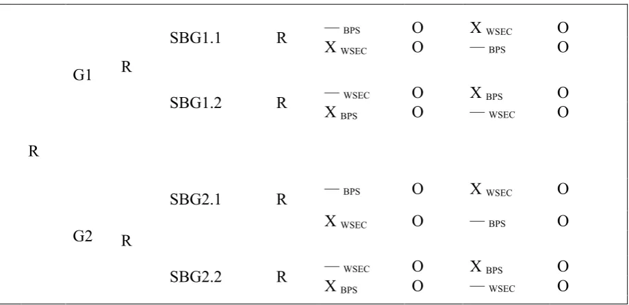
Figure 1 provides a schematic representation of this study. As can be seen, participants were randomly assigned to two main groups: G1 and G2. Within each main group participants were exposed to a textual baseline and one of two visualizations (experimental variable). One main group was exposed to the table: G1, and the other to the map: G2.
Each main group had two subgroups: SBG. Within these subgroups, the baseline and the experimental variable shown to participants differed on subject-matter - as in a design
the experimental variable, participants answered 10 test items: O. The order of inspecting the baseline and the experimental variable was inverted for half of the subgroups’ participants (see the two lines of information within each subgroup in Figure 1).
Dependent variables were performance measures related to learning, as in the inspection time of the representations (i.e. amount of seconds before the participant clicks the Next button), the correctness of the answers, response time to the items (same type of measurement as inspection time) and participants’ subjective opinion with regard to which representation they remembered best. The timing variables (inspection- and response time) were included to assess how “good” the performance was on the baselines’ test compared to the visualizations’ test. As aforementioned, these timing variables could act as third variables.
R
G1
SBG1.1 R — BPS X WSEC O O X WSEC — BPS O O R
SBG1.2 R — X BPS WSEC O O X BPS — WSEC O O
G2
SBG2.1 R — BPS O X WSEC O
X WSEC O — BPS O
R
[image:15.595.73.533.330.553.2]SBG2.2 R — WSEC X BPS O O X BPS — WSEC O O
Figure 1. Diagram study. R = Randomization; G1 = Main Group 1; G2 = Main Group 2; SBG1.1 = Subgroup 1.1; SBG1.2 = Subgroup 1.2; SBG2.1 = Subgroup 2.1; SBG2.2 = Subgroup 2.2; O = 10 Test items; — = Textual baseline; X = Experimental variable; WSEC = Design rationale of a website for student and employee communication; BPS = Design rationale of a bicycle parking system for the UT.
3.6 Pilot Study.
4. Method
4.1 Participants
4.1.1 Pilot study.
4 Participants (all female) were recruited online for the pilot study on the 4th of January 2018 using the Test Subject Pool system SONA (University of Twente, 2017b). Demographic information was obtained via three questions on the
participants’ age, gender and type of study, see Appendix D. The students had a mean age of 20.25 (SD = 1.26, range =19-22) years and were enrolled at the BMS faculty at the University of Twente. They studied Psychology or Communication Science. Prior to administration of the questionnaire, all participants provided informed consent. Inclusion criteria consisted of age ranging from 18 until 30 and having access to SONA. The participants were rewarded for their participation by 0.5 SONA credits.
4.1.2 Study.
56 Participants (46 female, 10 male) were recruited online from 17th of January until 26th of January 2018 using the Test Subject Pool system SONA (University of Twente, 2017b). Demographic information was obtained via the same three questions as in the pilot study. The students had a mean age of 20.04 (SD = 1.87, range = 18-27) years and were enrolled at the BMS faculty at the University of Twente. Prior to administration of the questionnaire, all participants provided informed consent. 39 Participants (69.60 percent) studied Psychology and 17 participants studied Communication Science (30.40 percent). Inclusion criteria and the reward for participation were the same as in the pilot study.
Participants were randomly assigned to one of four subgroups (see Figure 1) to avoid systematic differences (De Veaux, Velleman, & Bock, 2016; Dooley, 2009). This resulted in an unequal distribution (see Table 1). Nonetheless, none of the
Table 1
Participants Distribution across Subgroups
Subgroups
Distribution
Total Female Male
1.1 B_BPS à TABLE_WSEC 6 2 15
TABLE_WSEC à B_BPS 7 0
1.2 B_WSEC à TABLE_BPS 5 2 13
TABLE_BPS à B_WSEC 5 1
2.1 B_BPS à MAP_WSEC 5 2 14
MAP_WSEC à B_BPS 6 1
2.2 B_WSEC à MAP_BPS 5 2 14
MAP_BPS à B_WSEC 7 0
Total 56
Note. B_BPS = Baseline BPS. B_WSEC = Baseline WSEC.
4.2 Materials
4.2.1 Pilot study.
Based on the results of the pilot study, it became clear that some confusion could arise among participants during the first half of the study. This confusion would be about what the participant should “inspect” of the representations in order to answer the test items. Nonetheless, no specific tasks were given to the participants in order to see if they got the same general idea of the representations. Also, the design was set up in such a way to overcome these kinds of order effects (see Figure 1). Thus, the data collection materials were not changed, only the item asking for comments was left out.
4.2.2 Study.
4.2.2.1 Content of the knowledge representations.
discussed the design of WSEC, the other the design of BPS. The original study of Oberhagemann (2017) transcribed eight CDM meetings in total, which were all annotated by two raters: Dai and Oosterwegel.
The Issue-Based Information System (Kunz & Rittel, 1970) was used to extract explicit knowledge or the design rationale from these meetings. Thus, this meant annotating the meetings’ transcriptions in terms of issue, proposition (position) and argument (Dai & van der Velde, 2017). The labels of counter argument, doubting argument and decision were added in the beginning of annotation to fully capture the counterplay of questioning in the meetings.
After two rounds of annotation the interrater-agreement ratio was satisfying (above 70 percent in general). Then, the raters agreed that explicit knowledge could be extracted from two out of eight meetings with a Cohen’s Kappa above .70. Three annotated meetings scored below a Kappa score of .70 on the annotation label decision and one on doubting argument. See Appendix E for all inter-rater agreement
coefficients and a brief explanation why and which two specific meetings were chosen.
4.2.2.2 Visualization of the knowledge representations.
Eventually, two meetings were translated from annotation into a knowledge representation and visualized textually, by a table and a map (see Appendix B). The three representations per CDM meeting contained the same explicit knowledge and the following elements of information: issue, proposition, argument, counter argument, doubting argument, and decisions. In total, there were 14 number of elements of information in each WSEC representation and 15 in each BPS representation (see Appendix F). They differed in the use of amount of words conveying the knowledge (WSEC = 257, BPS = 186).
which argument belongs to which proposition). This can be seen in the height of the cells in the table visualization and the arrows in the map visualization. Both
visualizations are classic ones and the map especially suited the argumentative structure of the meetings design rationale.
4.2.2.3 Test items.
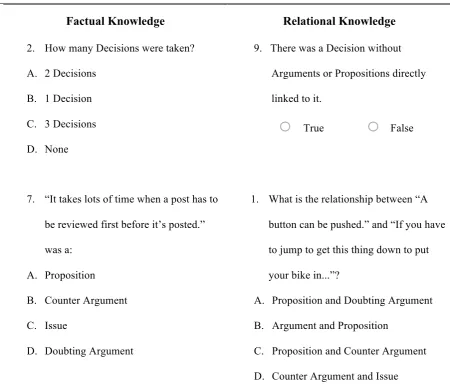
The test items assessed recognition on two different aspects of knowledge: factual- and relational knowledge (see Figure 2). Five items required participants to recall content or a value of a single information element or to recall the information element that fit the given content (factual knowledge). The remaining five items required participants to recall relations among content of multiple information elements or to recall relations among multiple information elements (relational knowledge). These two aspects were chosen because having domain knowledge and rich connections within that knowledge is presumably crucial for creative thinking (Gleitman et al., 2011). Thus, in total there were ten items asked per representation (see Appendix C). Eight test items were MC items with four response items (one correct answer and three distractors) listed in random order and two items were T/F items. These two different formats were used to overcome guessing and response styles (Dooley, 2009). Moreover, the data collection process (e.g. instructions and 10-items per representation) was standardized as much as possible to reduce random errors (Dooley, 2009).
4.3 Procedure
The participants signed up for the study via the Test Subject Pool system SONA (University of Twente, 2017b). After signing up, they received the Qualtrics’ questionnaire link. Prior to administration of the representations and the belonging items, participants were informed on the purpose and duration of the study (see Appendix G, G1). When informed consent (see Appendix G, G2). was asked and given, participants started with the study.
Figure 2). The instructions asked him or her to inspect the representation and that is was expected to try and grasp the idea the representation discussed. It was noted that he or she could take as long as needed to inspect the representation. After completing the 10-test items, the second representation’s instructions followed.
The second part of the study showed, depending on the first representation, the textual baseline or a visualization. It had the same sequence of components as the first representation: instructions, the representation and the 10-test items. Lastly, the participant was asked for his or her subjective opinion on which representation he or she remembered best. In the pilot study, the participant was also asked to feed back his or her thoughts on the study. After filling in all items, the participant was thanked for his or her time, contact information was repeated, and was assured that his or her response had been recorded (Appendix I).
Factual Knowledge Relational Knowledge
2. How many Decisions were taken? A. 2 Decisions
B. 1 Decision C. 3 Decisions D. None
9. There was a Decision without Arguments or Propositions directly linked to it.
True False
7. “It takes lots of time when a post has to be reviewed first before it’s posted.” was a:
A. Proposition B. Counter Argument C. Issue
D. Doubting Argument
1. What is the relationship between “A button can be pushed.” and “If you have to jump to get this thing down to put your bike in...”?
A. Proposition and Doubting Argument B. Argument and Proposition
[image:20.595.68.519.350.738.2]4.4 Data Analysis
4.4.1 Data preparations.
Data preparations were made using version 23 of the IBM SPSS Statistics program. Insignificant data automatically added by Qualtrics (e.g. measurement of time passed until first click) was removed from the data set. Then, different variables were computed which were to be used in the data analysis (see Table 2). Lastly, the data set was split into four smaller data sets corresponding to the subgroups of Figure 1 (i.e. subgroup 1.1/1.2/2.1/2.2).
Table 2
Computed Variables for Data Analysis
Variables Values
Overall Score Correct answers across all items
Multiple-Choice (MC) Score " " MC items (i.e. 1, 2, 3, 4, 6, 7, 8 and 10) True/False (T/F) Score " " T/F items (i.e. 5 and 9)
Overall Baseline Score Correct answers across all Baselines Baseline BPS Score " " Baseline BPS items
Baseline WSEC Score " " Baseline WSEC items
Overall Visualization Score Correct answers across all Visualizations Visualization BPS Score " " Visualization BPS items
Visualization WSEC Score " " Visualization WSEC items
Overall Score BPS Correct answers across all BPS items
Overall Score WSEC Correct answers across all WSEC items
BPS representation format Label on BPS baseline1/2/table/map WSEC representation format Label on WSEC baseline1/2/table/map Overall Baseline-Relational Score Correct answers across all Baselines and
Relational items (i.e. 1, 5, 6, 8 and 9) Baseline-Relational BPS Score " " Baseline-Relational BPS items Baseline-Relational WSEC Score " " Baseline and Relational WSEC items
Baseline Subject-Matter Label on BPS- or WSEC baseline
Baseline Format Label on baseline Group 1 or Group 2
Visualization Subject-Matter Label on BPS- or WSEC visualization
Visualization Format Label on table or map
Variables Values
Overall Visualization-Relational Score Correct answers across all Visualizations and Relational items (i.e. 1, 5, 6, 8 and 9) Visualization-Relational BPS Score " " Visualization-Relational BPS items Visualization-Relational WSEC Score " " Visualization-Relational WSEC items Overall Relational Score Overall Baseline-Relational Score +
Overall Visualization-Relational Score
Overall Baseline-Factual Score Correct answers across all Baselines and Factual items (i.e. 2, 3, 4, 7 and 10) Baseline-Factual BPS Score " " Baseline-Factual BPS items Baseline-Factual WSEC Score " " Baseline-Factual WSEC items
Overall Visualization-Factual Score Correct answers across all Visualizations and Factual items (i.e. 2, 3, 4, 7 and 10) Visualization-Factual BPS Score " " Baseline-Factual BPS items
Visualization-Factual WSEC Score " " Baseline-Factual WSEC items
Overall Factual Score Overall Baseline-Factual Score + Overall Visualization-Factual Score
BPS representation format general Label on BPS baseline or visualization WSEC representation format general Label on WSEC baseline or visualization Overall Time Baseline-Relational Average response time to Relational items
across the baseline Baseline-Relational BPS Time " " for the BPS baseline Baseline-Relational WSEC Time " " for the WSEC baseline
Overall Time Visualization-Relational Average response time to Relational items across visualizations
Visualization-Relational BPS Time " " for the BPS visualizations Visualization-Relational WSEC Time " " for the WSEC visualizations
Overall Time Baseline-Factual Average response time to Factual items across the baseline
Baseline-Factual BPS Time " " for the BPS baseline Baseline-Factual WSEC Time " " for the WSEC baseline
Overall Time Visualization-Factual Average response time to Factual items across visualizations
4.4.2 Data validation & reliability.
After the data preparations were made, it was assessed if the data from the study could be used to answer the hypotheses and research question. The analysis began with assessing normality of the data using histogram graphs and Q-Q plots. Secondly, the item difficulty was assessed by computing the proportion correct items, evaluating the distractors of items and analyzing the amount of correct answers per subgroup for guessing using a one sample Wilcoxon Signed Rank Test. The third step of analysis was, computing the interitem reliability using the Kuder-Richardson formula 20 (KR-20) and computing the (Point-Biserial) correlation coefficients. Then, the content and construct validity was assessed. The latter was assessed by two
hypothesis tests using different statistical tests; the paired sample t-test, the Wilcoxon Signed Rank Test and the Mann-Whitney U test.
4.4.3 From data to outcomes.
The data outcomes were evaluated and, thus, the hypotheses were answered. For the first hypothesis the Overall Score for all baselines and all visualizations were compared using a paired sample t-test. Then, the two different main groups (see Figure 1) were analyzed to compare the baseline with the different kinds of visualizations (i.e. table and map) using the Wilcoxon Signed Rank Test. The Mann-Whitney U test was used to compare all Overall Scores for WSEC- and BPS representations. For the second hypothesis, the Overall Score on relational- and factual knowledge was computed. Then, the paired sample t-test was used to compare the baselines with the visualizations. The Wilcoxon Signed Rank Test was used for the two main groups to compare the baseline with the different visualizations (i.e. table and map). Also, the mean response time spent per relational- and factual knowledge test item was
4.4.4 Ancillary analyses.
Besides assessing data reliability, data validation and investigating the hypotheses ancillary analyses were made. These analyses were made to see if there were additional findings generating new hypotheses around the research question. First, it was investigated if there were differences in Overall Score between the different subject-matters and different kinds of representation on the baseline and experimental variable. For this, two Two-Way-ANOVA’s (one for the baseline and one for the experimental variable) were executed and it was investigated if there was an interaction effect between subject-matter and type of representation regarding the Overall Score. Second, multiple linear regression was used to see if inspection time of representations could be used to make predictions about the Overall Score. Lastly, the frequency of participants’ subjective opinion with regard to which representation they remembered best was analyzed to see if this were in line with the results found.
4.4.5 Summary.
5. Results
Data validation & Reliability
5.1 Normal Distribution Overall Score
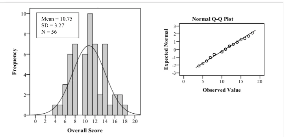
[image:25.595.69.525.349.569.2]The first step of analysis was, assessing normality of the data. Therefore, the Overall Score was analysed using a histogram graph and a Q-Q plot (see Figure 3). The Overall Score (correct answers across all items) distribution was analyzed for all 56 participants. Each correct item counted as one point and, therefore, the maximum score per participant was 20 points. The distribution showed no obvious outliers, floor- or ceiling effects. So, the items appeared to be normally distributed (Shapiro-Wilk test p = .25).
Figure 3. Histogram and Normal Q-Q Plot of Overall Score distribution.
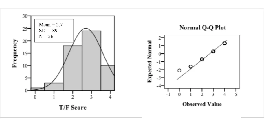
At item type level, however, it did seem that there was a ceiling effect for the T/F items (see Figure 4). The Q-Q plot could have indicated normal distribution, but the Shapiro-Wilk test showed a significant deviation from normality (p = .00). This kind of deviation at T/F item type level was also significantly found in SBG1.1, SBG2.1 and SBG2.2 (p < .05).
Figure 4. Histogram and Normal Q-Q Plot of T/F Score distribution.
5.2 Item Difficulty
The second step of the analysis was, assessing item difficulty by computing the proportion correct items, evaluating the distractors of items and analyzing the amount of correct answers per subgroup whether guessing was likely to have occurred.
5.2.1 Proportion correct items.
The proportion correct items were computed for all 56 participants. No item had a proportion correct value of < .20 or > .80 supporting the fact that the items were not too difficult or too easy. The items’ average difficulty level across all subgroups was .54 (MC items = .50; T/F items = .67), which is quite optimal for discriminating between high- and low achievers (Measurement and Evaluation Center, 2003).
5.2.2 Distractor evaluation.
Just like Compton, Hankerson-Dyson, and Broussard (2011) and as advised by Measurement and Evaluation Center (2003), the distractors of the items were analysed to see if participants deemed them a plausible answer. According to the Measurement and Evaluation Center (2003), the quality of the distractors influences the score on a test item and low scorers should be appealed by distractors. In case of the MC items, which had four response choices (one correct answer and three distractors), the
response choices were analysed if they broke the “2% rule”. This meant that if a test item had more than one distractor selected by less than 2% of the sample, the test item would be deemed implausible. The T/F items only had two response choices and, therefore, the “2% rule” for these items was adjusted from ‘more than one distractor’ to ‘one distractor’. Nonetheless, no item on the whole data set broke the “2% rule”.
5.2.3 Guessing.
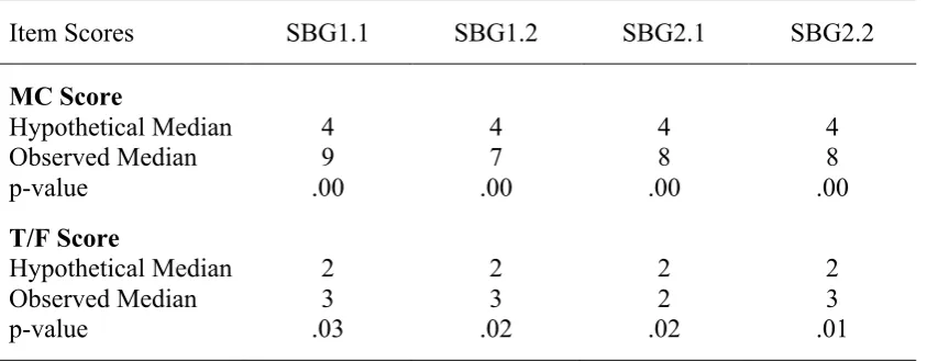
[image:27.595.108.530.497.662.2]The Overall Score per subgroup was analysed whether guessing was likely to have occurred. It was expected that in the case of guessing, participants would “guess” four MC items and two T/F items right. These possible “guess scores” were computed with the following formula; Guess Score = Number of Items x Chance of Guessing the right Answer (ICLON, 2012). The one sample Wilcoxon signed rank test showed that, all subgroups had statistical evidence that the median of the MC- and T/F Score were significantly higher than these “guess scores” (see Table 3). Thus, participants seemed to make an effort to participate seriously.
Table 3
MC- and T/F Scores per Subgroup in relation to Guessing
Item Scores SBG1.1 SBG1.2 SBG2.1 SBG2.2
MC Score
Hypothetical Median 4 4 4 4
Observed Median 9 7 8 8
p-value .00 .00 .00 .00
T/F Score
Hypothetical Median 2 2 2 2
Observed Median 3 3 2 3
p-value .03 .02 .02 .01
5.3 Interitem Reliability
The third step of the analysis was, computing the interitem reliability using the Kuder-Richardson formula 20 (KR-20) and computing the Point-Biserial correlation (PBC)
coefficient of the test items with the Overall Score.
5.3.1 Kuder-Richardson formula 20.
The internal reliability of the items was assessed using the KR-20 on the whole data set. The resulting coefficient of .59 suggested somewhat low reliability. However, the MC- and T/F items make it harder to reach a high reliability coefficient due to their different chance level at scoring points compared to e.g. a 5-point Likert scale.
Besides, the test items were expected to vary in difficulty per subgroup which was supported by the different reliability coefficients of the subgroups (see Table 4). The items’ error varied across the subgroups (Dooley, 2009). Thus, the reliability
coefficient was not expected to be the generally preferred .70 or more.
5.3.2 Correlation coefficients.
Table 4
Original KR-20 Coefficients per Subgroup and Coefficients when Items are removed
Subgroups KR-20 Items’ PBC < .19
Current New WSEC BPS
1.1 B_BPS à TABLE_WSEC .53 .68 - 6/9
TABLE_WSEC à B_BPS
1.2 B_WSEC à TABLE_BPS .59 .73 3/8/9 9
TABLE_BPS à B_WSEC
2.1 B_BPS à MAP_WSEC .62 .73 9 1/5/6
MAP_WSEC à B_BPS
2.2 B_WSEC à MAP_BPS .64 .79 2/6/8/10 7/9
MAP_BPS à B_WSEC
Note. B_BPS = Baseline BPS. B_WSEC = Baseline WSEC.
5.4 Content & Construct Validity
In the pilot study, no indicators were given to the comment item that the test items were not representative of the content. Also, item difficulty was not too high or too low and, thus, seemed to indicate that the questionnaire had sufficient content validity. So, the fourth step of analysis was, assessing construct validity by looking at how well the results conformed to theory (Dooley, 2009). Two hypotheses from theory were tested.
5.4.1 Construct validity test 1.
The first hypothesis to which the results should conform was, visualizations are suitable for knowledge acquisition (Keller et al., 2006). So, results should indicate that visualizations are at least equally good or better for knowledge acquisition
compared to a textual baseline. After comparing the Overall Score of the visualizations and the textual baseline, it turned out that no statistical differences were found.
statistically equal between the visualizations and the textual baseline. And in some cases visualizations were more suited for learning, supporting the construct validity.
5.4.1 Construct validity test 2.
Across literature, it is generally accepted that not all types of representations are suited for fostering learning to the same degree (Keller et al., 2006). Therefore, the Overall Score for all baselines and all visualizations were compared using a paired sample t-test. Then, the two different main groups (see Figure 1) were analyzed to compare the baseline with the different kinds of visualizations (i.e. table and map) using the Wilcoxon Signed Rank Test.
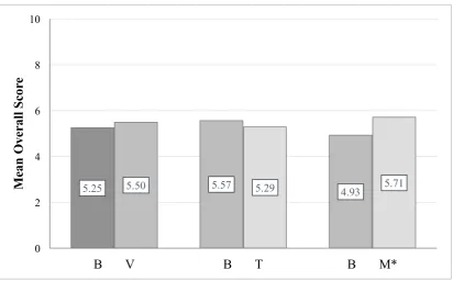
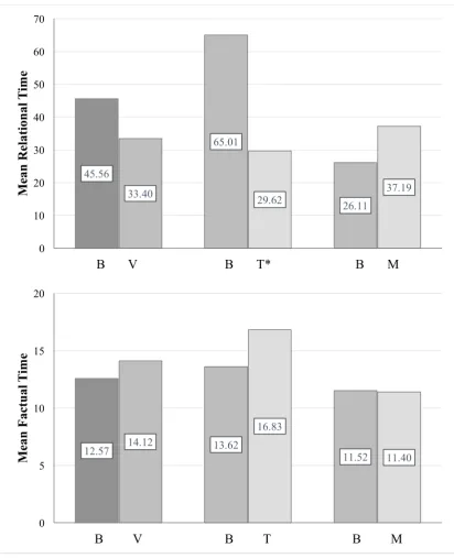
[image:30.595.112.525.447.703.2]Proportionally the visualizations’ Overall Score was higher than the baselines (see Figure 5). The tables scored lower than the baselines of Main Group 1 (G1) and the maps scored higher than the baselines of Main Group 2 (G2). Moreover, there was statistical evidence that the participants remembered the maps better than the baselines of G2 (Wilcoxon Signed Rank Test p = .04).
Figure 5. Mean of Overall Score according to type of representation. (Left) B = Baselines (baseline BPS and baseline WSEC of G1 and G2). V = Visualizations (table BPS, table WSEC, map BPS, and map WSEC). (Middle) B = Baselines (baseline BPS and baseline WSEC of G1). T = Tables (table BPS and table WSEC). (Right) B = Baselines (baseline BPS and baseline WSEC of G2). M = Maps (map BPS and map WSEC). * p < .05.
5.25 5.50 5.57 5.29 4.93 5.71
0 2 4 6 8 10
B V B T B M*
M
ean
O
ve
ral
l S
cor
Also, variation on type of representation and its subject-matter (i.e. BPS or WSEC) was inspected (see Figure 6). For this, the Mann-Whitney U test was used. It showed that participants systematically remembered the baseline BPS better than the table BPS (Mann-Whitney U test p = .04). Thus, this supported the construct validity.
Figure 6. Mean of Overall Score according to type of representation and subject-matter. (Left) B = Baselines (baselines of G1 and G2). V = Visualizations (tables and maps). (Middle) B = Baselines (baselines of G1).* p < .05. T = Tables (tables). (Right) B = Baselines (baselines of G2). M = Maps (maps). The bars are specific to the subject-matter on the y-axis.
5.19 5.93 5.15 5.67 5.21 6.21
0 2 4 6 8 10
B V B T B M
M ean O ve ral l S cor e WS E C 5.31 5.93 4.64
5.04 4.85 5.21
0 2 4 6 8 10
B V B* T B M
[image:31.595.110.529.206.705.2]From Data to Outcomes
5.5. Hypothesis
In the beginning of the study, two hypotheses were formulated based on the research question. Hence, the fifth step of analysis was testing these hypotheses:
Hypothesis 1. Memory accuracy is higher for the visualizations than for the textual baseline.
Hypothesis 2. Memory response latency varies along the fit between representation and type of test item: testing on factual- or relational knowledge.
5.5.1 Hypothesis 1.
Based on the first hypothesis, the Overall Score was expected to be higher for the visualizations than the textual baseline. Proportionally this seemed correct (see Figure 5). However, the only statistical evidence found was the significant difference between the maps and the baselines of G2 (Wilcoxon Signed Rank Test p = .04). The table did not support the hypothesis. Scores on the BPS table were even significantly lower than the BPS textual baseline (see Figure 6) (Mann-Whitney U test p = .04).
5.5.2 Hypothesis 2.
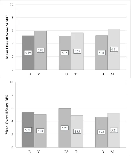
It seemed plausible that differences would be seen in Overall Score across the representations on aspects of knowledge recalled: factual and relational. So, the paired sample t-test was used to compare the visualizations with the baselines’ Overall Score on these aspects. The Wilcoxon Signed Rank Test was used for G1 and G2.
Figure 7. Mean of Relational- and Factual Score according to type of representation. (Left) B = Baselines (baseline BPS and baseline WSEC of G1 and G2). V = Visualizations (table BPS, table WSEC, map BPS, and map WSEC). (Middle) B = Baselines (baseline BPS and baseline WSEC of G1). T = Tables (table BPS and table WSEC). (Right) B = Baselines (baseline BPS and baseline WSEC of G2). M = Maps (map BPS and map WSEC). * p < .10. The bars are specific to the test items testing the aspect of knowledge displayed on the y-axis.
Differences were seen in Overall Score across the representations on aspects of knowledge recalled: factual and relational. Therefore, memory response latency was analyzed to see if it effected the results. To inspect this, the mean response time spent
2.70 2.82 2.86 2.61 2.54 3.04
0 1 2 3 4 5
B V B T B M*
M ean F ac tu al S cor e
2.55 2.68 2.71 2.68 2.39 2.68
0 1 2 3 4 5
B V B T B M
per relational- and factual knowledge item was analysed (see Figure 8). Therefore, a paired sample t-test and a Wilcoxon Signed Rank Test per main group were used.
The analysis for computing the mean response time on the relational test items was done twice: with- and without outliers. After the analysis with outliers (see Figure 8), boxplots were used to search for outliers. By example, the “Overall Time Baseline-Relational” variable (see Table 2) was displayed in a boxplot. Then, a data point deviating more than three interquartile ranges was removed for second analysis. These analyses showed that the means were effected by outliers. However, removing the outliers from the data did not effect the significance- or the direction of the data. Both analysis resulted in a near significance difference between the baselines and the tables (with outliers p = .06, without outliers p = .05), meaning the response on relational items was almost significantly faster after inspecting the tables than the baselines.
Figure 8. Mean Latency Time with Outliers to Relational- and Factual Test Items. (Left) B = Baselines (baseline BPS and baseline WSEC of G1 and G2). V = Visualizations (table BPS, table WSEC, map BPS, and map WSEC). (Middle) B = Baselines (baseline BPS and baseline WSEC of G1). T = Tables (table BPS and table WSEC). (Right) B = Baselines (baseline BPS and baseline WSEC of G2). M = Maps (map BPS and map WSEC). The figures are specific to the test items testing the aspect of knowledge displayed on the y-axis. The direction of data changed for the “Mean Factual Time” figure (lower figure) for B-V and B-M when the analysis was done without outliers. * p < .10.
45.56
65.01
26.11
33.40 29.62 37.19
0 10 20 30 40 50 60 70
B V B T* B M
M ean R el at ion al T im e
12.57 14.12 13.62 11.52
16.83 11.40 0 5 10 15 20
B V B T B M
Ancillary Analyses
5.6 Interaction Effects
In order to investigate how the design rationale of design related CDM meetings should be presented as knowledge representation, different representations and different subject-matters were used in the design. Therefore, it was of interest to investigate if there were any differences in Overall Score between the different kinds of subject-matter and different kinds of representation on the baseline and experimental variable. For this, two Two-Way-ANOVA were executed and possible interaction effects between subject-matter and type of representation regarding the Overall Score were analyzed (see Figure 9).
Results showed that there were no main effects of type of Subject-Matter and type of Format regarding the Overall Baseline Score as well as the Overall Visualization Score. Also, there was no interaction effect between Subject-Matter and Format regarding the Overall Baseline Score as well as the Overall Visualization Score.
Two-Way ANOVA baseline Two-Way ANOVA experimental
Dependent variable: Overall Baseline
Score Dependent variable: Overall Visualization Score
Factors: Baseline Subject-Matter, Baseline Format
Factors: Visualization Subject-Matter, Visualization Format
Subject-Matter Format
BPS Baseline of G1
WSEC Baseline of G2
Subject-Matter Format
BPS Table
WSEC Map
Figure 9. Overview of the two Two-Way-ANOVA’s.
5.7 Relation Overall Score/Inspection Time
5.8 Relation Overall Score/Opinion
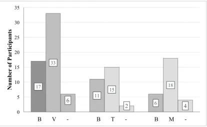
[image:37.595.74.489.251.505.2]Most participants indicated to remember the visualizations better than the baselines (see Figure 10). Especially, the map visualization was indicated to be remembered best – which is in line with the statistical evidence that the participants remembered the map visualization better than the baselines. With regard to the representations’ subject-matter, participants indicated to remember the BPS representations best (see Figure 11).
Figure 10. Frequency of Participants’ Opinion across which representation they remembered best. (Left) B = Baselines (baseline BPS and baseline WSEC of G1 and G2). V = Visualizations (table BPS, table WSEC, map BPS, and map WSEC). (Middle) B = Baselines (baseline BPS and baseline WSEC of G1). T = Tables (table BPS and table WSEC). (Right) B = Baselines (baseline BPS and baseline WSEC of G2). M = Maps (map BPS and map WSEC). - = No difference in memory.
17
11
6 33
15 18
6
2 4
0 5 10 15 20 25 30 35
B V - B T - B M
-N
u
m
b
er
of
P
ar
ti
ci
p
an
Figure 11. Frequency of Participants’ Opinion across which representation they remembered best split into subject-matter. (Left) B = Baselines (baseline of G1 and G2). V = Visualizations (table and map). (Middle) B = Baselines (baselines of G1). T = Tables (tables). (Right) B = Baselines (baselines of G2). M = Maps (maps). - = No difference in memory (same value is displayed across subject-matters, because the value can not be divided over the different subject-matters). The bars are specific to the subject-matter displayed on the y-axis.
5 3 2 15 7 8 6 2 4 0 5 10 15 20
B V - B T - B M
-N u m b er of P ar ti ci p an ts WS E C 12 8 4 18 8 10 6 2 4 0 5 10 15 20
B V - B T - B M
Summary
The results provided evidence for the suitability of presenting design rationale based on the Issue-Based Information System as knowledge representation for learning. It seemed that not every type of representation was suited to foster learning to the same degree.
However, visualizations - in this study the tables and the maps - did bring advantages over a textual baseline. Maps seem to be favored over textual baselines and resulted in better memory scores (Wilcoxon Signed Rank Test p = .04). They are also almost significantly better remembered on factual knowledge compared to textual baselines. Tables are slightly favored over a textual baseline, but result in lower scores on the BPS subject-matter (Mann-Whitney U test p = .04). The relational items were nearly significantly faster answered for tables than the textual baselines, whereas the Relational Score on these items were not significantly different from the Relational Score on the textual baselines.
6. Discussion
6.1 Aim of Study
Visualizations seem an obvious choice for presenting information. However, our perception of them is biased by our experience, current context and our goals (Johnson, 2014). Therefore, a lot of research has been conducted on how to translate information into a
visualization augmenting our human cognitionor facilitating the sensemaking process (Elwyn et al., 2013; Harold et al., 2016; Lee et al., 2016; Patterson et al., 2014). However, the actual knowledge acquisition from or usefulness of visualizations during a learning process remains often unclear (Fekete et al., 2008; Klerkx et al., 2014). Identification of this visualizations’ learning potential was expected to contribute to the development of visualizations as learning materials.
Therefore, this study tested two hypotheses in order to broaden our understanding of the potential of visualizations to induce learning. First, memory accuracy was expected to be higher for visualizations than for a textual baseline (Hypothesis 1). Second, memory response latency was expected to vary along the fit between representation and type of test items: testing on factual- or relational knowledge (Hypothesis 2). The study was performed in context of the “LSC” project of the UT and, therefore, focused on design rationale from CDM meetings. Through testing participants’ memory on two knowledge representations of design rationale differing on subject-matter and differing on type of representation (i.e. textual, table or map), we provided evidence for the suitability of presenting design rationale as knowledge representation based on the Issue-Based Information System for promoting learning.
Moreover, we identified what kind of aspects of knowledge are initially retained in memory. And so, in what way different representations could foster learning.
6.2 Usefulness Results
Maps were favored over a textual baseline and resulted in higher memory accuracy. They were also almost significantly better remembered on factual knowledge compared to textual baselines. Tables were slightly favored over a textual baseline, but resulted in lower scores on specific subject-matter. The relational items were nearly significantly faster answered for tables than the textual baseline, whereas the Relational Score on these items were not significantly different from the Relational Score on the textual baselines. So, visualizations can bring different advantages over a textual baseline (Fekete et al., 2008). Some visualizations will be better for memory accuracy or recalling specific aspects of knowledge, whereas others will have faster response latency without decreasing learning performance. Thus, the results found in this study were in line with the two hypotheses and current literature. However, they were not always statistically significant and more research should be done to affirm these results.
The results do shed light on the actual knowledge acquisition or usefulness of
presenting design rationale as representation to promote learning. It shows that not every type of representation is suited to foster learning to the same degree (Keller et al., 2006), but also reveals that different aspects of knowledge could be retained better differing on type or representation. The latter result is not necessarily a novel contribution to current literature. However, it is a step further in making the value or usefulness of visualizations during the process of learning more concrete. In stead of understanding why visualizations work, like most current research, an attempt with this study is made to measure visualizations’ profit (Fekete et al., 2008). This means finding out what the increase in knowledge per
representation is and the possible costs made to obtain this, as in inspection- or response time. Also, our results might influence decisions on using specific visualizations as learning
material. So, identification of this representations’ learning potential should be future investigated.
6.3 Study’s Limitations
project teams. Also, this study did not measure memory over time or with a concrete period of delay which can be seen as a limitation. The study does give us an idea of the first impression visualizations make on the viewers’ initial memory. In time, however, the performance on the memory test will presumably decay. Hence, future research should inspect if the latter is the case and in what way this effects the usefulness of visualizations.
6.4 Study’s Strengths
Unlike the very context-dependent visualizations’ research that has been done so far, the use of “classic” visualizations strengthen this study. These do not only bring practical advantages, as aforementioned in the design of this study, but we should also not overestimate people’s familiarity with the use of complex visualizations to show information (Fekete et al., 2008). Thus, these “classic” visualizations are suitable for the general public.
Moreover, the design and data collection materials used to investigate the learning potential offer an approach which supports internal validity. Multiple precautions were taken for excluding threats and rival explanations. In contrast to most visualizations’ research, we did not only tested differences between type of representation on one specific subject-matter. We investigated multiple subject-matters and did this in one session to prevent time threats. Also, inverting the sequence of presenting the representations to half of the participants was put in place to overcome order effects. The data collection process was standardized as much as possible and the instructions did not specifically asked participants to remember the representations. Of course, random assignment was used to make the groups equivalent and avoid group threats. Another difference with most visualizations’ research was, adding the inspection time of the representations and response time to the items to prevent a rival explanation from intruding.
6.5 Future Research
conducted to investigate how to share design rationale with new design projects for the better. Future research should build upon these study’s results to move towards this goal.
7. Conclusions
References
Burkhard, R. A. (2005). Knowledge Visualization: The use of complementary visual representations for the transfer of knowledge. A model, a framework, and four new approaches (Doctoral dissertation, Swiss Federal Institute of Technology Zurich). Retrieved from https://www.alexandria.unisg.ch/20993/1/burkhard_knowledge_visuali zation_dissertation_remo_burkhard.pdf
Card, S. K., Mackinlay, J. D., & Shneiderman, B. (1999). Readings in information
visualization: using vision to think. Retrieved from https://www.researchgate.net/publi cation/220691172
Carroll, J. M., & Rosson, M. B. (1987). Paradox of the active user. In J. M. Carroll (Ed.), Interfacing Thought: Cognitive Aspects of Human-Computer Interaction (pp. 80-111). Cambridge, MA: MIT Press
Compton, M. T., Hankerson-Dyson, D., & Broussard, B. (2011). Development, item analysis, and initial reliability and validity of a multiple-choice knowledge of mental illnesses test for lay samples. Psychiatry Research, 189(1), 141-148. doi:10.1016/j.psychres. 2011.05.041
Dai, X., & van der Velde, F. (2017). How explicit are we in a design meeting: investigation on meeting knowledge structuring with design rationale. In: Proceedings of the 21st International Conference on Engineering Design (ICED17), Vol. 6: Design
Information and Knowledge, Vancouver, Canada, 21.-25.08.2017.
De Veaux, R. D., Velleman, P. F., & Bock, D. E. (2016). Stats: Data and Models. Harlow, England: Pearson Education Limited.
Dooley, D. (2009). Social Research Methods. Harlow, England: Pearson Education Limited. Elwyn, G., Lloyd, A., Joseph-Williams, N., Cording, E., Thomson, R., Durand, M-A., &
Edwards, A. (2013). Option grids: Shared decision making made easier. Patient Education and Counseling, 90(2), 207-212. doi:10.1016/j.pec.2012.06.036