1353
Volume 64 151 Number 4, 2016
http://dx.doi.org/10.11118/actaun201664041353
NEW TOOL FOR VISUALIZATION OF TIME
SERIES AND ANOMALIES IN STREAMING
DATA
Marek Otáhal
1, Olga Štěpánková
11 Department of Cybernetics, Faculty of Electrical Engineering , Czech Technical University, Karlovo namesti 13, 121 35 Prague 2, Czech Republic
Abstract
OTÁHAL MAREK, ŠTĚPÁNKOVÁ OLGA. 2016. New Tool for Visualization of Time Series and Anomalies in Streaming Data. Acta Universitatis Agriculturae et Silviculturae Mendelianae Brunensis, 64(4): 1353–1364.
A new software tool for simultaneous visualization of multiple time dependent signals, featuring a novel and highly useful combination of capabilities, and published as an open source solution is presented in this paper. The tool is designed to meet the needs of its users who expect lightweight, interactive & intuitive use and ease of deployment in current setups, including live monitoring systems with anomaly detection, highlighting and streaming data processing abilities. The functionality and motivation for our system is derived from various signal analysis applications, our research activities related to design and evaluation of neural network models, and from systems for continuous monitoring and anomaly detection (e.g. in IT or medical domains), which is demonstrated on simple use case examples.
Keywords: visualization, online monitoring, time-series, anomaly detection, interactive graph scaling
INTRODUCTION
The problem of the modern age is not the lack of information, but the lack of power to process it.
With the omnipresent smart-sensors, advanced technological applications in every possible industry, big-data warehouses collecting terabytes of information and graphs forming in social networks, we live in the age of information boom. Various machine-learning techniques are successfully used to crystallize the valuable knowledge from the vast amounts of data. We need to present the data and results to those who can benefit from it, be it general public, management or experts who need to understand complex processes corresponding to presented data coming from multiple sources. There are fields, where the use of computers for processing is less common or socially accepted, and all the work with the data is personally attended by a human expert, a demanding (and costly) process. To aid all of these people we wish to present the information in the most suitable and accessible form – this is typically visual representation.
A change from the past is in the form of information, former data-houses were full of raw
pieces of static data. But recently the industries are increasingly dealing with complex structural data and with sequentially ordered information in time (signals of sensors, connection graphs, neural pathways, ship routes, financial markets, power consumption in data centers, ECG signals, etc.) All that data can be represented as time-series and typical operations include prediction, classification or (sub)sequence matching. One of the popular tasks that has been attracting attention recently is anomaly detection (KUMAR V. et al., 2009; LANE, T., BRODLEY, C., 1999): identification of unexpected situations, outliers, in sequential streaming data, ideally performed by an online learning model.
Another situation which has changed is an increased requirement for (global) interaction during our jobs-sharing, collaboration, need for presentation of intermediate results and communication with teams of people spread world-wide are quite common, especially in larger companies or in academics and (esp. open-source) software development.
that are shared among people over the Internet. All over these partners may run diff erent systems and utilize diff erent sets of tools they need to visualize their data to advance their specifi c use-cases and then also to present, explain and share their results with someone with diff erent expertise and mindset. We are not the fi rst to raise such requirements, so we off er an overview of the current state of the art and evaluate suitability for our needs.
The paper describes the design and development of a customized visualization solution “NuPIC Visualizer” suited for research and industrial application domains: evaluation of the use-cases, common data formats, requirements on the visualizations, overview of the existing technologies and some details of implementation in our designed solution.
The paper is divided into 3 sections. The fi rst section provides use-cases illustrating features that the intended solution should cover. The second section reviews the current state of the art charting applications and visualization frameworks and compares their abilities to requirements indicated earlier to justify the list of core features for an interactive and easy to use visualization and monitoring system. This comprehensive review is one of the main theoretical contributions of this paper. The fi nal section with results describes the most important practical contribution of this paper, namely the actual visualization solution developed and contributed for public use. Special attention is devoted to its implementation and to the choice of the core implemented features. The concluding discussion off ers an example where our soft ware is applied to build an online monitoring system which supports anomaly detection.
MATERIALS AND METHODS
This chapter provides a summary of the existing methods for time-series visualization and an overview of available solutions (both front-end and back-end) which were considered before the implementation. A list of example use-cases helps to defi ne target audience and focus our features, distinguishing this work from other solutions and off ering additional functionality and comfort for work within the declared bounds.
Example use-cases and the data
Let us review possible use-cases and their work-fl ows in context of anomaly detection, neural network development, biological data processing and system monitoring. Common scenarios help us identify important functionalities that are lacking in current systems and set requirements for the intended new tool. The choice of cases is based on our research interests, users’ responses and on the recently published usability study (CAVACO, 2014).
Data preview
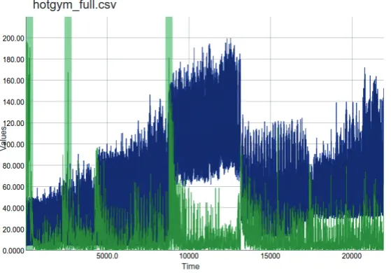
Oft en, we want to start from quick insight into the considered data obtained as a results/ input data fi le. That is why we need a tool that can handle generic CSV format and display the series conveniently, allowing the users to zoom in/out, pan in the graph or hide select variables. An example of data insight is shown at Fig. 1, where we see an hourly recorded graph of power consumption of a gym, processed by a model that added additional predictions, anomaly score and metrics fi elds.
Functionality relevant for this task includes: parsing of fl exible header format, plotting
1: Anomaly results data of building’s hourly power consumption measurements viewed in the designed visualization tool.
non-numeric data columns, interactive graph (zooming, panning, ability to show/hide select columns).
Data pre-processing, annotations
Inspiration for these features came from subtitle creation software, the idea is to allow online collaboration or information sharing of some extra background knowledge of the data by allowing the users to view, edit and create annotations that can be attached to certain subsections of the graph. Annotations are common in some medical software, but rarely seen in other data processing/ visualizing tools. This feature could be used for simple annotations, comments, or the users would be able to define their own “format” (for example using only categories “critical”, “OK”, “unknown”, …). Additional useful ideas include also: exporting the selected parts of data as a CSV, ability to make quick screen shots, and functionality for manual anomaly annotation.
Network development and Parameter tuning
This use case is focused on a developer evaluating how changes to the code affected the overall performance, or an advanced user who is validating the obtained parameter optimization results. Examples and results of this type can be found in our public GitHub repository “ML.benchmarks” (Otahal, M., Najman, M., 2015) where we aim to categorize anomalies and find those anomaly detection frameworks (including NuPIC) that are able to detect them successfully, and how the parameters and potential code-improvements affect the quality.
The evaluation scenario tries to evaluate how these changes affect the system performance by comparing the results on the same data (graphs). Therefore, we would prefer to plot 2 (or more) CSV results files (with the same header format) over each other in a color-coded way. This behavior could further be improved by highlighting areas where paired values (prediction.1, prediction.2) show a significant difference.
Evaluation of Anomaly detection on annotated datasets
An important property of the new tool is the ability to present detected anomalies to the users. We assume the anomaly detection methods provide an “anomaly score” (i.e. a real number in the range [0; 1]). An anomaly is considered to be significant whenever its score is above some threshold value (>= 0.9, for example) - that is useful to highlight the corresponding section on the graph (with a small surrounding area to make point anomalies also visible). With the new tool correctness of anomaly detection will be color-coded (eg. true-positives green, false-positive red, etc.) for quick orientation. Additionally statistics is automatically computed
and offers accuracy, precision, recall and F-measure values.
Streaming data and live monitoring
A popular use-case for anomaly detection, for example in medicine, is online live-monitoring of sensor data, or some other streaming source. To support that functionality in the visualization tool, we need to be able to continuously check for updates in source file. Possible implementations include “shrinking” (appending new data to the end), or a classic sliding-window. Another issue to address is polling, a notification mechanism for changes in the source data.
Large datasets
Experience from working on biological signals data, for example ECG, or especially EEG and long-term monitoring data obtained from wearable sensors brings problems related to large datasets, or big-data (in our sense). Such problems occurred when working with a dataset of 200 thousand samples, but in the considered scenarios it is common to work with datasets with well over a few millions data points, or even with possibly “infinite” series (i.e. the streaming data).
The first problem with such data was purely practical and is tied to the implementation and the processing/rendering speed. Another problem is cluttering, which occurs in visualization of data with a suboptimal scale - where the samples in signal are too close together for the representation and the signal becomes unreadable and “merged together”. Solutions to this problem are: data pruning or aggregation techniques (for example binning, as used in histograms etc.); or reducing the size to a certain limit enforced by a sliding window, as is currently used in our implementation.
Exotic data types
By “exotic” it is meant non-numeric data types, as time-series graphs typically plot only values with real numbers. Some users are interested in working and visualization of the following non-trivial data types: strings (with infinite range, we might want to define some “closeness” value, for example by a semantic meaning), categories (strings with limited range; mapping to natural numbers can be assigned manually), audio/image data, positional data (GPS), …
The goal of representing such data can be tightly related to the anomaly detection models we are using (e.g. neural networks) as these also require some input vector, typically in a numeric form. We can thus use the “encoders” from the model to get numeric representations of all kinds of our data and then plot such representations.
NuPIC user
neural network model based on neuro-scientific observations of the human neocortex. An implementation of HTM is publicly developed as an open-source project named “NuPIC”1. The HTM
models produced by NuPIC generate their results in a specific type of CSV file - OPF2 format. To
support NuPIC users it is necessary to offer smooth integration of the visualizer into their work-flow by a convenience enhancement allowing to parse this specific CSV file format.
The intended functionality is to ensure parsing OPF (NuPIC specific) CSV header/format.
State of the art
This chapter offers a review of the latest research, data, formats and available solutions for back-end or end-user tools for specialists. It mentions a specialized EDF+ format for physiological data and describes a related tool SignalPlant (Plesinger et al., 2015). Finally, there is briefly mentioned background of our research dedicated to neural models based on HTM.
Data formats
As the purpose of the intended application is to present various time-dependent data, it is natural to consider basic properties of the input data (how it looks like and which formats are commonly used in relevant applications). Fortunately, in most applications (IT, logs, sensory data, medical, etc.), the used formats are simple and most frequently one can expect either old CSV, or JSON in more modern, web-based approaches. These formats are text based and relevant parsers are available for almost any language; even in bigger applications, where custom format or data storage is used, typically for performance reasons (e.g. MySQL database, MAT files) there are conversion utilities that allow exporting to CSV.
For medical applications there is the European Data Format(+) (EDF+) (Kemp, B., Olivan, J., 2003) which is used e.g. as the standard for EEG, PSG (sleep) recordings. The “+” (plus) version introduced support for interrupted recordings, standardized most of the labels and added the possibility to annotate the selected parts of the recordings, while keeping backwards compatibility with the EDF format. The authors of EDF+ claim that “EDF+ can save most EEG, PSG, ECG, EMG, and Evoked Potential data that cannot be saved into common hospital information systems.” Their document also mentions a comprehensive list of applications and companies working with EDF+ format, serving us as a great resource for review and inspiration in this field.
Another specialized format that already has support within the tool is the OPF format, used in HTM/NuPIC models.
Color perception theory
The color perception theory (GREEN-ARMYTAGE, 2010) states that during evolution of the human vision, sensitivity to certain colors adapted to our ways of life (red-color sensitivity to tell ripe fruits, etc.). As a result, automated generation of a set of distinct colors does not have a trivial solution – the problem cannot be approached by dividing the color palette evenly and sampling the colors. High contrast color sets are used in many visualization solutions, where color-coding could help to distinguish among many values. Interestingly, in many charting libraries no sophisticated means of distinct color generation are present. As a result we aim to implement such functionality to an open-source library focused on color generation, a combination of two approaches is suggested: for small sets it seems preferable to use man-made color palettes designed and evaluated for good color perception, such as (GREEN-ARMYTAGE, 2010; BOYTON, 1989). For an arbitrary size, specific algorithms have been designed (CAMPADELLI, P., POSENATO, R. and SCHETTINI, 1999).
Methods of visualization
Studies on time-series visualization (Keogh et. al, 2004, Aggarwal, 2007) describe visualizations for anomaly detection and problems related to large-scale datasets. A great resource is the dissertation (Cavaco, 2014) where the author mentions many use-cases for visualization and supports them with a usability study, although the approach presented here is more specifically focused on charting and anomaly detection, some of the mentioned ideas inspired our requirements and the study provides a good resource of techniques and frameworks.
Review of charting frameworks (Wikipedia, 2015) and design & development sites (Sitepoint, 2015) suggest that JavaScript (JS) based solution offers the richest set of features, what seems to be also one of the reasons for their increased popularity.
As the next step, there were reviewed the most well-known charting/plotting/graph/visualization back-ends/frameworks, their features, maturity, ease of use, compatibility and other factors, allowing us to further set our requirements and select proper frameworks. The list of considered frameworks consisted of (not limited to): Vega, D3.js, DyGraphs, pyplot/matplotlib, Matlab, Weka;
1 We are currently doing research on HTM, therefore our motivation for a visualization solution suited for NuPIC models.
Review of current solutions
This section gives an overview of the main systems that can be used for signal visualization and their properties. Here, our main interest is focused towards available implementations. We try to highlight advantages and drawbacks from the point of potential usage in our design.
Spreadsheet
Classical spreadsheet software is part of most modern OS and its implementation is widespread. Typical representatives are some well-known products including MS Excel, LibreOffice Calc, etc. Advantages are common accessibility on most modern OS and zero requirement of coding to obtain results. Disadvantages are lack of interactive graph browsing support, lack of available customization beyond that already present. Often there appear minor disadvantages as problematic multi-platform support in some cases or need to install a rather large piece of software.
Scientific
This category is represented by tools such as Matlab, Weka, R, which are specialized data-science tools providing vast amount of functionality and customization. Clear advantages are its specialization on data-processing and visualization and great level of possible customization. Problematic may be availability (some commercially licensed, nontrivial installation), not so great “ease of use” where the steps to setup graphs to be presented the desired way, or missing some user experience features (such as interactive graphs) are not present to the level of our preference.
Libraries (low-level)
For example pyplot, matplotlib (“Python based libraries offering plotting functionality”) share a clear advantage resulting from the high level of customization and targeted functionality as data presentation libraries. Unfortunately, we encountered many multi-platform compatibility issues that were not easy to resolve.
Online services
Examples of web-based charting services are plot. ly, Google charts, etc. Most often described as “Ready plotting solutions that run online (typically based on JS)”. Their advantages are a great multi-platform support, almost none compatibility problems (just requires JS-enabled browser) and minimum coding required. Unfortunately, these platforms don’t provide API to allow implementation of additional required features. As a consequence, the user is provided with the service as-is most often. This lack of extensions is a significant disadvantage for development of any more specialized or complex system.
Specialized software: SignalPlant, Tableau Tableau (Tableau, 2015) is a professional, commercial platform for visualization. It is considered a state of the art solution, although its focus is much wider: with abilities to plot all sorts of data and aim on business intelligence customers, typically used e.g. in finance, etc. The product is well researched and carefully designed for the best possible user experience, so we can take inspiration how the user-interface is designed or what techniques for time-series visualization are considered.
SignalPlant (Plesinger, F. et al., 2015) is a signal processing and visualization software developed by our colleagues at the university in Brno. From the project description “SignalPlant is free software tool for signal examination, scoring and post-processing. It has been developed by “Medical Signals” group of Institute of Scientific Instruments of CAS http://isibrno.cz for projects concerning ECG and EEG signals. Although it is aimed to biological signals, it contains tools useful for any other area of signal processing.” It’s main strength is the number of pre-processing plug-ins and targeted ECG/EEG signal visualization. Basic functionalities of this tool are reviewed in the table at Fig. 4.
Data sources
Earlier, there were reviewed requirements on the data and information about interesting possible sources of data for experiments and suitable for use with our visualization. Our current requirement is data in CSV format, although a specific parsing functionality is present for NuPIC’s OPF format and a similar solution is considered for other formats (EDF+) later.
“RiverView” online streaming data sources
A great resource of streaming data (for anomaly detection, suitable for NuPIC) is RiverView (Numenta, RiverView, 2015), created by Numenta: “River View is a Public Temporal Streaming Data Service Framework. It provides an interface for users to expose temporal data streams in a time-boxed format that is easily query-able. It was built to provide a longer-lasting historical window for public data sources that provide only real-time data snapshots, especially for sensor data from public government services like weather, traffic, and geological data.”
Air pollution data example
As an example, let us show a source of data from RiverView concerning air-pollution in US cities, an “Airnow” stream:
“The AQI is an index for reporting daily air quality. It tells you how clean or polluted your air is, and what associated health eff ects might be a concern for you. The AQI focuses on health eff ects you may experience within a few hours or days aft er breathing polluted air. EPA calculates the AQI for fi ve major air pollutants regulated by the Clean Air Act: ground-level ozone, particle pollution (also known as particulate matter), carbon monoxide, sulfur dioxide, and nitrogen dioxide. For each of these pollutants, EPA has established national air quality standards to protect public health .Ground-level ozone and airborne particles are the two pollutants that pose the greatest threat to human health in this country.” [Source: data.numenta.org]
The data consists of particle pollutions (nano-scale of 2.5 microns and micro-(nano-scale of 10 microns) and ozone levels and location fi elds, measured by EPA in major US cities. Fig. 2 & 3 compares the visualization of the same dataset with the new tool. Fig. 2 shows 600 latest values collected (here approx. 1 month, measured hourly). Note that the highlighted regions are not anomalies, as in our use-cases, but weekends. Fig. 3 presents the same stream (similar data) viewed from our tool.
Anomaly detector by Hierarchical Temporal Memory
One of the prominent use-cases for the visualizations is highlighting of anomalies in an online stream of data, what we call a “monitoring mode”. It is important to clarify that the process of anomaly detection itself is a very complex task with an active research pursued around it. We do 2: Air pollution data from RiverView as shown in their preview program providing two independent graphs for both signals.
Source: data.numenta.org
3: An alternative view for Fig. 2: The same source of data (500 samples in a zoom, that offers much more precise values in the vertical axis) displayed in nupic.visualizer. Even on a simple dataset consisting of 2 series only we can notice the advantage of visualizing all series combined together, with the ability to interactively zoom in for specific details where needed, or to hide some series.
not aim to offer the anomaly detection as a part of the tool, leaving it to any third party system the user chooses to use. Our only assumption is that for the considered signal there is present an extra field highlighting an “anomaly score”. This field is expected to characterize a degree of anomaly in the sequential input and map it monotonically to a predefined number range, so that a threshold can be set to classify significant anomalies (and show them in the data visualizations). Here we introduce HTM as one possible system for anomaly detection.
We are currently pursuing research on Hierarchical Temporal Memory – HTM (Hawkins J., 2011), and its official public implementation NuPIC (Numenta, 2015). HTM can be described as a biologically inspired model of a neural network, which is performing unsupervised learning on streaming data and performs continuous predictions and anomaly detection. An example of anomaly detection performed by a HTM model is in Fig. 4.
The research interest of NuPIC is focused on applications of HTM to real-world problems/ datasets, evaluations of the suggested improvements to the core of HTM itself, and specifically applications to medical, bio-signal processing and monitoring.
As NuPIC gathers a well established, international community (mailing list, public research, development, conference calls and organized events by Numenta.org) there is a requirement to share and present results conveniently and clearly, in order to improve discussion.
RESULTS
Based on the defined use-cases and information obtained in the previous Materials and Methods section, we were able to set our own “main” use-cases and extract from them a list of requirements and constraints for our project and accordingly develop a desired solution. This section further explains these points and provides an example of working with the designed tool.
Defined design requirements to the solution
The common features from the scenarios above can be summarized to a priority list of desired
functionalities:
1. Availability: this includes the ease of installation - the application must be multi platform, ideally run on many devices (PC, smart phones), requiring minimum dependencies. The optimal solution would offer functionality for hosting a version publicly online, in the cloud, so anyone could seamlessly try out the application right away right away. Considered is also licensing (free, open-source).
2. Interactive work with the graph and user-friendly and intuitive use even for first time users. Such as zooming, panning, hiding or highlighting certain series. An advantage is if the graphs look-and-feel is also modern and representative.
3. Support for large scale & streaming data (even remote files over the network), keeping the responsiveness and allowing to transform (aggregate) the view of data.
4: A dataset with a signal measured once per hour (energy consumption of a building, blue) and anomaly score detected by the system (green). For visibility the anomaly score (normally in range [0, 1]) can be rescaled by our system to the mean value of the signal, allowing users to see both series at the same time, otherwise anomaly score would be unnoticeable at the bottom. We can see significant anomalies highlighted by the visualization tool (at times 80, 2000 and 9000 approximately). The analysis of anomaly score is useful not only for monitoring for significant anomalies (highlighted) but can also be used for evaluation of the model’s capabilities (as indicated by spikes of lower anomalies caused by model imperfection and noise in the data).
4. Highlighting: Functionality to visually highlight when a significant anomaly has been detected in the signal or if a series passes a defined threshold. 5. Live monitoring for incoming updates, allowing us
to design online monitoring systems.
6. Modularity - support for an increasing number of specific feature requests from our users. That includes optional support for:
• Built-in anomaly detection module (e.g. with
NuPIC) is commonly requested functionality
• User annotations (for communication, sharing)
and data preprocessing
• Custom data formats (identified as interesting
formats are OPF, EDF+, etc.)
• Simple statistics (mean, min/max, std, …)
computed on select series and/or range.
7. Embeddable solution: Some minimal user-interface should be in a self-contained block which would be easily integrated with other applications wishing to use our tool as a plug-in component. For example in RiverView stream previews.
8. Customization: As developers we want a certain level of available customization in the underlying frameworks so we can modify the result for the desired functionality. That is also tied with the licensing: The tool should be generally accessible to anyone, therefore we are looking for a free solution with an open-source license.
The table in Fig 5 shows a compressed review of the described existing technologies and their
compatibility with the desired features.
From the required features we can also create a list of minimal constraints:
1. a (modern) web-browser with JavaScript support 2. files are in CSV format
3. all series are equally sampled (or have to be re-sampled)
Implementation
From the above requirements we could proceed to development of an application that suits perfectly
our needs and the result is publicly shared as the “Nupic.Visualizer” project
(https://github.com/nupic-community/nupic. visualizations/), or users can immediately try an online
version (https://nupic-visualizations.firebaseapp. com/), the interface can be seen on Fig. 1.
Working with the application
Users wishing to test or use our software should head to the project’s GitHub repository located at
https://github.com/nupic - community/nupic. visualizations (OTAHAL, FOHL, 2015) where the most up-to-date information is available. Currently, users can choose to use the online version from https://nupic - visualizations.firebaseapp.com/ or run an instance locally (detailed instructions on the project’s README).
For testing purposes, the example data (shown at Fig. 1) can be downloaded from (https://raw. githubusercontent.com/nupic-community/nupic. visualizations/master/examples/OPF/DefaultTask. TemporalAnomaly.predictionLog.csv). Additional example data files can be found after the project checkout in the examples/ directory.
Technologies used
Based on the available technologies in Materials & Methods and our refined requirements, the libraries used in the proposed application are: PapaParse: very fast CSV parsing library for JS, responsible for data preprocessing and features the remote streaming on CORS-enabled servers. AngularJS is a framework for HTML/JavaScript/CSS integration and used to create our web application. DyGraphs is a charting library, with sufficient functionality and level of customization. Instead of DyGraphs an alternative could probably be used and may be considered in the future, one factor for using DyGraphs was existing code which we based off at the beginnings.
Features
NuPIC Visualizer currently offers following features (this can be compared with fig. 5):
• Produces nice, convenient & easy to use interactive graph visualizations.
• Runs seamlessly everywhere (in web-browser, or
cloud).
• Multiple file formats are supported (generic CSV, NuPIC OPF data format, EDF+ physiology format (planned)).
• Users can analyze the graph interactively, e.g. they can
• show/hide, highlight a series, get current value
under cursor
• select the range to zoom in/out the graph or to
pan
• quickly export specified subsection of the graph
as a PNG image or CSV data (planned)
• manually annotate selected section with text
data (planned).
• Offers specific functionalities that are useful for anomaly detection, namely
• auto-highlight series over/under a threshold (or
other condition)
• rescaling some series to be easily visible with the
reference series
• evaluation of precision, recall, F-measure
(planned) for annotated anomalies.
• Work with quite large data sources (million points) thanks to
• support for real-time streaming data sources
(planned)
• ability to process and visualize remote data
sources (URIs)
DISCUSSION
Let us show an example work flow for creating an anomaly detection system to attract the targeted audience and discuss novelty as well as planned improvements of the current solution. The section is concluded by a brief review of some ideas about intended future development.
Example of anomaly detection model creation
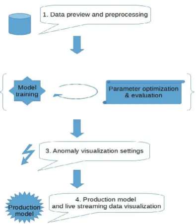
For the sake of the example, we assume all of the designed features are already implemented and show possible work-flow of the final application. The diagram in Fig. 6 shows a high-level process of designing an anomaly detection system and we will show how the visualization tool can support each stage of the process.
Data acquisition and preprocessing
The developer can preview the data, verify if it is correct (meets his/her expectations), focus on some interesting/problematic parts, mention his/ her comments in annotations for sharing with colleagues, remove unneeded or too noisy series
and use the export-section feature to create training (clean, non-anomalous) and validation datasets.
Training the model and parameter optimization A repeated process of parameter optimization, model training and evaluation. During this phase the developer is interested in observing the model’s predictions and iteratively adapts
parameters accordingly – learning rate, precision, sensitivity, robustness, …
Anomaly settings
Having the model fine-tuned, we seek to set ideal parameters for anomaly detection (Fig. 7) and for the visualization thereof. This means determining sliding window size or thresholds to smooth out false-positive anomalies and strengthen true-positives and accuracy. The visual tool is used to plot (different) anomaly scores along with data and validate the quality of the detections. If we have annotated anomaly labels, we use them to highlight the correct detections
and type-I & II errors, or to compute some statistics (precision, recall, F-measure).
Production and streaming visualizations Now, a complete model can be deployed and run on real-world streaming data, the visualization
tool can act as a self-contained web application and be placed to your site for monitoring purposes. Fig. 4 shows Visualizations setup highlighting
significant anomalies using the model that is online processed by HTM. This model provides the anomaly score and it is streamed to a CSV file which the application is monitoring in parallel to the original signal continuously.
Targeted audience
Although the tool is written to be as generic as possible, the design use-cases or our intentions indicate few assumptions about potential users for whom the tool may be suited best.
Presentation and consulting for experts from other applied fields.
A nice and convenient tool for experts from other fields who would like to present, validate or help to consult results of the anomaly detections, but are not interested in the inner details of how the detection system and how it works.
A come-by users for preview.
Here, we have in mind the first time users who just appear on your project (HTM or ML.benchmark) site and want to see what “the data” actually is and how the results look like.These people consider as very important the ability to instantly view the data – therefore the cloud and plug-in version of the visual tool.
Neural networks developers.
These people want to see how the changes affect the predictions/detections, ideally at real-time, or compare several versions to each other – they will benefit from the streaming visualizations showing performance on a currently running model, or from comparison of multiple combined graphs (e.g. runs of diverse models on the same data, different parameters merged to a same graph) or from the possibility to see in parallel annotations and labeled anomaly evaluations.
Streaming anomaly detection monitoring. Users of the online anomaly detection on streaming data, for example monitoring a factory-process security by live data from multiple industrial sensors, or IT server monitoring (a commercial example is Grok), or medical personnel, continuously monitoring and assessing patient’s state from ECG, etc. Here the interesting features are: streaming mode, anomaly highlighting and the plug-in component.
Novelty and open problems
Most of the features found important for our projects are already known from some other tools, however, our contribution is the unique combination of the selected (not too broadly generic, nor specific) functionalities to provide useful and simple to use visualization tool for anomaly detection in streaming data, and data editing. With regards to the Fig. 5 and Materials & methods, the list of distinguishing functionalities includes: • streaming remote files directly to the visualization • online monitoring mode (polling)
• designed for anomaly highlighting
• Sharing: easy to use online tool with annotations features and data editing.
• Improvements to color perception
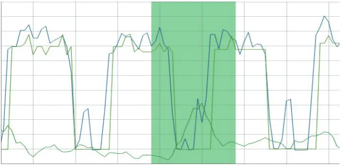
Figure 7 demonstrates how problematic the automated color selection can be. When we need to focus only on figures that were unfortunately assigned similar colors on the color wheel (there are other series in the graph, with more distinguishable colors but we are not interested in them, so those series are hidden). The section on “generating distinct colors” in the state of the art methods offers some solutions which we are looking forward to test, hoping to resolve this issue.
A short confirmation for our ideas noticed from the review of the state of the art tools (SignalPlant and Tableau; described in Materials & Methods):
It is interesting to note that the “SignalPlant” project is very recent (late 2015, the paper is not yet published), confirming our hypothesis that there is a space for improvement in the data visualization field for medical/signal applications.
Another confirmation we draw from the Tableau software, which is a well funded, commercial product and we could assume a lot of resources has been put into the research and design of the user-interface (Tang et. al., 2004) and visualization techniques – Tableau highlights interactive graphs and ease of use as it’s main advantages, these values are the core ideas for our software as well.
Feedback
We are actively looking for users’ feedback, so far the praised functionality is especially ease of use and simple installation (almost none). Often voiced requests are interested in some additional out-of-the-box functionalities – mainly more statistics (mean/min/max/…; scatter plots for studying correlation of several series; built-in anomaly detection system). We are tracking the requests in our Github repository (see OTAHAL, FOHL, 2015) and will target them in the future releases.
Future development
The mentioned planned features and other development steps are well tracked in the official issue tracker on the project’s site, the current priority is to finish support for streaming data monitoring (continuous polling), data annotation feature and modifying the app to act as a plug-able component.
The next steps would be extending support for non-numeric data types or specific file format support, such as EDF+ and working on scenario-specific features as the users report (statistics,…).
One thing that is getting complicated as more users with different scenario start to use our application is how to design a clean and simple user-interface and how the work-flow of loading, preprocessing data, setting up required functionalities (thresholds, which statistics, etc.) and to the final presentation of the graph should be managed. For this we wish to consider some experience and suggestions from more literature (Atkinson et al., 2013; Tang et al., 2004).
All the development is done publicly, on GitHub, mostly in JavaScript, PapaParse, DyGraphs technologies. The project is open-source, licensed under MIT license and contributions and ideas from developers, users and testers are welcome.
CONCLUSION
After reviewing the literature for methodology and the most common use-cases in visualization of time-series (for anomaly detection), investigation of the existing tools and frameworks, and discussion with potential users – medical or IT community, etc. – we were able to define typical usage scenarios for our application.
Taking inspiration from the existing technologies we naturally wanted to reuse as much as possible from the available libraries, however none proved to fit all of our requirements sufficiently, therefore we have created a new application “nupic.visualizations” which is publicly available at https://github. com/nupic-community/nupic.visualizations. The current version is already applicable to many existing problems and used in other projects.
The feedback confirmed that ease of installation and interactive graph mode are the most important features, followed by specific anomaly highlighting functionality and planned support for live monitoring.
There is also an extended version of the article available at (Otahal, M., Stepankova O., 2015), which includes more detailed comments to the scenarios and more illustrations (about 30 pages).
Acknowledgment
The work has been supported from the grants SGS14/144/OHK3/2T/13 and SGS16/231/OH3/3T/13 at CTU/FEE.
REFERENCES
AGGARWAL, C. C. 2007. Data streams: models and algorithms. New York: Springer Science & Business Media.
ATKINSON, M. et al. 2013. The Data Bonanza: Improving Knowledge Discovery in Science,
Engineering, and Business. Wiley-IEEE Computer Society Press.
BOYTON, R. M.. 1989. Eleven Colors That Are Almost Never Confused. In: Proceedings of SPIE #1077 – Human Vision, Visual Processing, and Digital Display. Bellingham, WA, 1989. SPIE, 322–332. CAVACO, C. 2014. New Visualization Model for
Large Scale Biosignals Analysis. Master Thesis. The Universidade Nova de Lisboa. Available at: https://run.unl.pt/bitstream/10362/13834/1/ Cavaco_2014.pdf.
CAMPADELLI, P., POSENATO, R. and SCHETTINI, R. 1999. An algorithm for the selection of highcontrast color sets. Color Res. Appl., 24: 132 – 138. doi: 10.1002/(SICI)1520– 6378(199904)24:2<132::AID-COL8>3.0.CO;2-B. GREEN-ARMYTAGE, P. 2010. A Colour Alphabet
and the Limits of Colour Coding. Colour: Design & Creativity. 5(10): 1–23. Available at: http://www. colour-journal.org/2010/5/10/.
HAWKINS, J., AHMAD, S., DUBINSKY, D. 2011. Hierarchical temporal memory, including HTM cortical learning algorithms. V0.2.1. Sept. 12, 2011. Available at: http://numenta.org/resources/HTM_ CorticalLearningAlgorithms.pdf.
LANE, T., BRODLEY, C. 1999. Temporal sequence learning and data reduction for anomaly detection. ACM Transactions on Information and System Security (TISSEC), 2(3): 295–331. DOI: 10.1145/322510.322526.
KEOGH, E., LIN, J., NYSTROM, D. et al. 2004. Visually Mining and Monitoring Massive Time Series. In: Proceedings of the tenth ACM SIGKDD international conference on Knowledge discovery and data mining. New York: ACM, 460–469.
KUMAR, V., BANERJEE, A., CHANDOLA, V. 2009. Anomaly detection: A survey. ACM Computing Surveys (CSUR), 41(3): 15:1–15:58. DOI: 10.1145/1541880.1541882.
KEMP, B., OLIVAN, J. European data format ‘plus’ (EDF+), an EDF alike standard format for the exchange of physiological data. Clinical Neurophysiology, 114: 1755–1761.
NUMENTA. 2015. NuPIC. [Online]. Available at: https://github.com/numenta/nupic. [Accessed: 2015, December 25].
NUMENTA, RIVERVIEW. 2015. RiverView. [Online]. Available at: http://data.numenta.org/. [Accessed: 2015, December 20].
OTAHAL, M., MAJMAN, M. 2015. Machine-learning benchmarks and synthetic anomaly datasets. [Online]. Available at: https://github.com/breznak/neural. benchmark . [Accessed: 2015, December 25]. OTAHAL, M., FOHL, J. 2015. Nupic.Visualizations.
[Online]. Available at: https://github.com/ nupiccommunity/nupic.visualizations [Accessed: 2015, December 25].
OTAHAL, M., STEPANKOVA, O. 2015. New tool for visualization of time-series and anomalies in streaming data – extended version. [Online]. Available at: https:// www.researchgate.net/publication/291147736_ NEW_TOOL_FOR_VISUALIZATION_OF_TIME-SERIES_AND_ANOMALIES_IN_STREAMING_ DATA [Accessed: 2015, December 25].
PLESINGER, F., JURCO, J., HALAMEK, J., JURAK, P. 2015. Real time; Signal processing; Visualization. [Online] Available at: https://signalplant. codeplex.com. [Accessed: 2015, December 25]. SITEPOINT. 2015. Best JavaScript charting frameworks.
Available at: http://www.sitepoint.com/15-best-javascript-charting-libraries/. [Accessed: 2015, December 20].
TABLEAU. 2015. Tableau: Data visualization software. [Online]. Available at:
h t t p s : / / w w w. tabl e au . c o m / s o l u t i o n s / d ata -visualization. [Accessed: 2015, December 25]. TANG, D., STOLTE, C., BOSCH, R. 2004. Design
Choices when Architecting Visualizations. Information Visualization, 3(2): 65-79. doi: 10.1057/ palgrave.ivs.9500067.
WIKIPEDIA. 2015. Comparison of JavaScript charting frameworks. Available at:
https://en.wikipedia.org/wiki/Comparison_of_ JavaScript_charting_frameworks. [Accessed: 2015, December 20].
Contact information Marek Otáhal: [email protected]