Studen
t
Profile
for
Enhancing
T
utoring
Engineering
INTELLECTUAL
OUTPUT
Student Profilefor EnhancingEngineering Tutoring ERASMUS + KA2 / KA203
Data Mining Tool for Academic Data Exploitation
Graphical Data analysis and VisualizationM.A. Prada (Coordinator), M. Domínguez, A. Morán, R. Vilanova, J. Lopez Vicario, M.J. Varanda, P. Alves, M. Podpora, M. Barbu and A. Torrebruno, U. Spagnolini, A. Paganoni
October 2018
Data Mining Tool for Academic Data
Exploitation
Graphical Data analysis and Visualization
M.A. Prada (Coordinator), M. Domínguez, A. Morán
Dept. de Ingeniería Eléctrica y de Sistemas y Automática
Escuela de Ingenierías Industrial, Informática y Aeroespacial, Universidad de León León, Spain
R. Vilanova, J. Lopez Vicario
Dept. de Telecomunicacio i Enginyeria de Sistemes Escola d’Enginyeria, UAB
Carrer de es Sitges 08193 Bellaterra Barcelona, Spain
M.J. Varanda, P. Alves
Escola Superior de Tecnologia e Gestao Instituto Politecnico de Braganca Braganca, Portugal
M. Podpora
Faculty of Electrical Engineering, Automatic Control and Informatics Opole University of Technology
Opole, Poland
M. Barbu
Automatic Control and Electrical Engineering Department "Dunarea de Jos" University of Galati
Domneasca 47, 800008 Galati, Romania
A. Torrebruno, U. Spagnolini, A. Paganoni
Scuole di Ingegneria Politecnico di Milano Milano, Italy
Approved for public release; distribution is unlimited. ERASMUS + KA2/KA203
Prepared for SPEET Intellectual Output #3
Under 2016-1-ES01-KA203-025452
Disclaimer: The European Commission support for the production of this publication does not constitute an endorsement of the contents which reflects the views only of the authors, and the Commission cannot be held responsible for any use which may be made of the information contained therein.
Table of Contents
1 Executive Summary ... 1
2 Academic Data... 3
2.1 Terms and definitions... 3
2.2 Core Data Set ... 4
2.3 Database format and pre-processing... 5
3 Visual data exploration ... 8
3.1 From information visualization to interactive visual analytics ... 8
3.2 Visual exploration of academic data ... 10
4 Proposed methods for visual data analysis ... 12
4.1 Materials and methods ... 12
4.1.1 Data hypercube for coordinated views of data ... 12
4.1.2 Dimensionality reduction ... 12 4.2 Implemented algorithms ... 15 4.2.1 Coordinated histograms ... 15 4.2.2 t-SNE ... 16 5 Toolbox implementation ... 19 5.1 Toolbox design ... 19 5.2 Technologies ... 20 5.2.1 Server-side technologies ... 21 5.2.2 Client-side technologies... 21 5.3 Implementations ... 22 5.4 Code availability ... 24
5.5 Short User Guide ... 27
5.5.1 Coordinated histograms ... 27
5.5.2 Projection of students’ data... 27
1
Executive Summary
The vast amount of data collected by higher education institutions and the growing availability of analytic tools, makes it increasingly interesting to ap-ply data mining in order to support educational or managerial goals. The SPEET (Student Profile for Enhancing Engineering Tutoring) project aims to determine and categorize the different profiles for engineering students across Europe, in order to improve tutoring actions so that they help students to achieve better results and to complete the degree successfully. For that pur-pose, it is proposed to perform an analysis of student record data, obtained from the academic offices of the Engineering Schools/Faculties of the institu-tions.
The application of machine learning techniques to provide an automatic analysis of academic data is a common approach in the fields of Educational Data Mining (EDM) and Learning Analytics (LA). Nevertheless, it is often interesting to involve the human analyst in the task of knowledge discovery. Visual analytics, understood as a blend of information visualization and ad-vanced computational methods, is useful for the analysis and understanding of complex processes, especially when data are nonhomogeneous or noisy. The reason is that taking advantage of the ability of humans to detect structure in complex visual presentations, as well as their flexibility and ability to ap-ply prior knowledge, facilitates the process aimed to understand the data, to identify their nature, and to create hypotheses.
For that purpose, visual analytics uses several strategies, such as pre-attentive processing and visual recall, that reduce cognitive load. But a key feature is the interactive manipulation of resources, which is used to drive a semi-automated analytical process that enables a dialog between the human and the tool. During this human-in-the-loop process, analysts iteratively up-date their understanding of data, to meet the evidence discovered through exploration.
This report documents the steps conducted to design and develop an IT Tool for Graphical Data Analysis Visualization within the SPEET1
ERAS-MUS+ project. The proposed goals are aligned with those of the project, i.e., to provide insight into student behaviors, to identify patterns and relevant
factors of academic success, to facilitate the discovery and understanding of profiles of engineering students, and to analyze the differences across European institutions. And the intended use of the tool is to provide support to tutor-ing. For that purpose, the concepts and methods used for the visual analysis of educational data are reviewed and a tool is proposed, which implements approaches based on interaction and the integration of machine learning.
For the implementation details and validation of the tool, a data set has been proposed. It only includes variables present in a typical student record, such as the details of the student (age, geographical information, previous studies and family background), school, degree, courses undertaken, scores, etc. Although the scope of this data set is limited, similar data structures have recently been used in developments oriented to the prediction of performance and detection of drop-outs or students at risk.
In the third chapter, the report presents, describes and structures the aca-demic data set which is used as a basis for the visual analysis. Chapter 4 reviews the concepts, goals and applications of visual data exploration, specif-ically of interactive visual analytics in the framework of educational data min-ing. Chapter 5 discusses visual analysis methods that are interesting for the proposed goals, which include providing insights of behaviors, patterns and factors of success, both locally and across European institutions. The pro-posed methods are initially presented and, later, applied to subject of study. The last chapter describes the tool implementation. For that purpose, the design and the technologies used for its implementation are presented, the availability of the tool is discussed, and a short user guide is included.
2
Academic Data
2.1
Terms and definitions
Higher education institutions generate and collect vast amounts of data each day. The growing availability of analytic tools, makes it increasingly easy to apply a data mining methodology to pursue educational and managerial goals. It must be remarked that the final aim of this project is to determine and cate-gorize the different profiles for engineering students across Europe, in order to improve tutoring actions. Therefore, under the assumption that students’ per-formance can be classified according to their behavior while conducting their studies, it ultimately aims to improve student results and reduce dropouts.
According to the classification of available data in higher institutions, pre-sented in the first report of this project ?, the data sets that will be used as the object of analysis for the tools presented in this report essentially comprise student record data. Those academic records have been obtained from the aca-demic offices of the Engineering Schools/Faculties of the institutions involved in the project. Thus, although data from admissions, online educational envi-ronments and alumni might also be useful for the proposed aims, the proposed data set only includes variables present in a typical student record, such as the details of the student (age, geographical information, previous studies and family background), school, degree, courses undertaken, scores, etc. Indeed, similar structures of the data set have already been used in recent develop-ments oriented to the prediction of performance and detection of drop-outs or students at risk ? ?.
The available academic data can be linked together, structured and ana-lyzed to provide insights into student behaviors and identify patterns, in order to potentially predict future outcomes and, as a result, help tutors to bet-ter understand their students and improve counseling actions. The academic success depends on different factors, internal and external ?. Although the data provided by universities only cover these factors in part, since it includes indicators about the socio-economic and educational environment or about previous performance, the hypothesis is that these indicators are enough to identify, in a first instance, the students at risk. The aim is that they draw the attention of tutors, who will probably complete the student profile with further information, e.g., from questionnaires or interviews. Another characteristic of
the proposed approach is its transnational nature, since the fact of obtaining (or not) the same student classifications and profiles will help to identify the common characteristics on engineers coming from different EU institutions. The differences on a country/institution basis will also be exposed and might lead to deeper analysis.
The analysis of the academic data with regard to performance and dropout prediction will be performed through data science techniques. In the task described by this report, the analysis focuses on information visualization, which can be useful to integrate the human experts in the exploratory analysis. These techniques will require certain data structures and preprocessing steps to be applied successfully. Throughout this document, these details will be explained in depth.
Besides, data processing needs to take into account privacy and data pro-tection considerations. Personal data propro-tection is regulated in the EU to ensure privacy rights and establish the way personal data can be collected, accessed and used. Some important EU legal instruments are the 1995 Direc-tive 95/46/EC, on the protection of individuals with regard to the processing of personal data and on the free movement of such data (DPD, Data Pro-tection Directive), and the General Data ProPro-tection Regulation (GDPR or Regulation), approved on April 2016 and set to go into effect in May 2018. Nevertheless, this regulation might not be sufficiently equipped to deal with the pitfalls of big data in education ?. The measures taken for privacy and data protection have been, in the context of this project, the anonymization of the information that might enable the identification of individuals, as well as a data agreement between the institutions of the consortium. The intention of the first measure is to avoid processing personal data, so that the provisions of the DPD no longer apply, whereas the data agreement establishes the use and limitations of the shared data.
2.2
Core Data Set
This section reviews and extends the description of the data set that can be found in ?. Figure ?? shows the initial, minimum core data set, proposed to perform the analysis. As discussed also in that report, it is possible to augment the data set with other potentially useful additional data sources, such as the regional socio-economic indicators provided by Eurostat. Furthermore, the preliminary analysis of the data set let us understand better the availability and usefulness of certain variables.
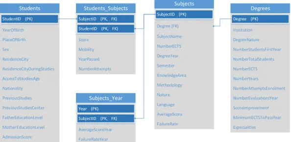
Subjects
Students Students_Subjects Degrees
Subjects_Year Degree (FK) NumberECTS DegreeYear Semester KnowledgeArea Methodology FailureRate AverageScore Language Nature YearOfBirth PlaceOfBirth Sex ResidenceCity ResidenceCityDuringStudies AccessToStudiesAge Nationality PreviousStudies AdmissionScore MotherEducationLevel FatherEducationLevel PreviousStudiesCenter (PK) StudentID (PK, FK) StudentID (PK, FK) SubjectID SubjectID (PK) Institution DegreeNature NumberStudentsFirstYear NumberTotalStudents NumberECTS NumberYears NumberAttemptsEnrolment Especialities MinimumECTSToPassYear ScoreImprovement NumberEvaluationsYear (PK) Degree Score Mobility YearPassed NumberAttempts (PK) Year (PK, FK) SubjectID AverageScoreYear FailureRateYear SubjectName
Figure 1. Proposed core data set. Source: ?
The variables that the core data set comprises can be classified using dif-ferent criteria. From the point of view of its type, there are numerical (discrete and continuous) and categorical data (and, in particular, spatial data), whereas from an interpretation perspective, variables can be defined as explanatory or performance-related. Table ?? describes data with regard to these criteria.
2.3
Database format and pre-processing
Although the academic data is almost universally preserved in a relational database structure and the interesting information can be found in certain tables and the relations between them, it is generally easier for the data pro-cessing and machine learning algorithms to deal with a flattened file. Common formats are CSV (comma-separated values) and JSON (JavaScript Object No-tation) files.
Data have to be reorganized to be aligned with the aims of each visu-alization and its associated algorithms. That affects the way variables are organized and interpreted. It also needs to be noted that some of the vari-ables will be omitted in the proposed visualization tools, for different reasons. In some cases, because preliminary experiments corroborated the low interest that experts predicted, whereas, in other cases, there is a majority of missing values.
In any case, data pre-processing is also necessary to deal with missing data and inconsistencies and to provide additional labelling or computed values whenever necessary. For instance, several problems were found in the data sets provided by the SPEET project partners that hindered the direct
appli-Variable Variable type Variable class
Student ID Index Index
Subject ID Index Index
Institution Categorical Explanatory
Degree Categorical Explanatory
Sex Categorical Explanatory
ResidenceCity Categorical Explanatory ResidenceCityDuringStudies Categorical Explanatory Nationality Categorical Explanatory PreviousStudies Categorical Explanatory FatherEducationLevel Categorical Explanatory MotherEducationLevel Categorical Explanatory DegreeNature Categorical Explanatory Languages Categorical Explanatory ScoreImprovement Categorical Explanatory
Mobility Categorical Explanatory
SubjectMethodology Categorical Explanatory SubjectNature Categorical Explanatory PlaceOfBirth Categorical Explanatory PreviousStudiesCenter Categorical Explanatory SubjectKnowledgeArea Categorical Explanatory SubjectLanguage Categorical Explanatory YearOfBirth Numerical Explanatory AccessToStudiesAge Numerical Explanatory AdmissionScore Numerical Explanatory NumberStudentsFirstYear Numerical Explanatory NumberTotalStudents Numerical Explanatory
NumberECTS Numerical Explanatory
NumberYears Numerical Explanatory NumberAttemptsToEnroleSubject Numerical Explanatory NumberAttemptsToBeEvaluatedOneYear Numerical Explanatory MinimumECTSToPassYear Numerical Explanatory Especialities Numerical Explanatory YearsToFinishDegree Numerical Explanatory SubjectNumberECTS Numerical Explanatory SubjectYear Numerical Explanatory SubjectSemester Numerical Explanatory SubjectWeekHours Numerical Explanatory
Score Numerical Performance
SubjectNumberAttemps Numerical Performance SubjectAverageScore Numerical Performance SubjectFailureRate Numerical Performance SubjectAverageScoreLastYear Numerical Performance SubjectFailureRateLastYear Numerical Performance
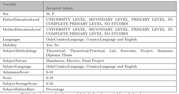
Variable
Accepted values
Sex M, F
FatherEducationLevel UNIVERSITY LEVEL, SECONDARY LEVEL, PRIMARY LEVEL, IN-COMPLETE PRIMARY LEVEL, NO STUDIES
MotherEducationLevel UNIVERSITY LEVEL, SECONDARY LEVEL, PRIMARY LEVEL, IN-COMPLETE PRIMARY LEVEL, NO STUDIES
Languages OnlyCountryLanguage, CountryLanguage and English Mobility Yes, No
SubjectMethodology Theoretical, Theoretical-Practical, Lab, Exercises, Project, Seminars, Diploma Thesis
SubjectNature Mandatory, Elective, Final Project
SubjectLanguage OnlyCountryLanguage, CountryLanguage and English AdmissionScore 0-10
Score 0-10
SubjectAverageScore 0-10 SubjectFailureRate Percentage
Table 2. Accepted values and labels for the variables of the data set.
cation of the algorithms. Among them, we can underline: inconsistencies in the variable names, different labelling for the categorical variables, unreliable manual labelling, missing explanatory variables or different scoring systems. For that reason, some accepted labels or values have been enforced for certain variables (see Table ??). Therefore, potential users should perform the neces-sary preprocessing in order to accommodate the data to the ranges and values shown in Table ??.
3
Visual data exploration
The aim of this chapter is to introduce some of the general purposes and techniques for visual data exploration, which enable building interactive visual interfaces for gaining knowledge and insight from data.
3.1
From information visualization to interactive visual analytics
Information visualization has emerged as a useful alternative to analyze and understand data, because it takes advantage of the ability of humans to de-tect structure in complex visual presentations, as well as their flexibility and ability to apply prior knowledge. Information visualization takes advantage of the human eye’s broad bandwidth pathway to facilitate the exploration and understanding of large data sets ?. For that purpose, it uses several strategies, such as pre-attentive processing and visual recall, to reduce cognitive load ?.
It is especially useful to acquire a qualitative understanding of the nature of data, using a hypothesis generation process ?. This is generally the target of the exploratory analysis stage. In fact, the exploratory analysis is essentially an abductive process, where the aim is to understand the data, identifying the nature, gaps and changes and creating hypotheses that can be later examined through deduction ?.
The use of data graphics has been used for a long time, at least since the late 18th century ?. For that purpose, different visualization techniques have been proposed, such as standard 2D/3D displays (bar charts and x-y plots), stacked displays, etc. ?. Since this approach uses the idea of visual query, it needs to make the visual search efficient. For that purpose, the appearance of the graphical elements or marks in an image is controlled by a visual channel ?. The changes in a particular feature channel, such as position, color, or ori-entation, need to be distinct enough to pop out. Equivalent requirements can be found for changes in the whole large-scale graphic structure ?. In any case, since each graphical code has associated semantics or natural interpretations, it is necessary to follow some guidelines to reveal coherently the substance without distorting the information that the data conveys ??. Eventually, the quality of the visualization can be determined practically, through the eval-uation of the effectiveness, usefulness and usability of the visualization with
regard to its goals. The quality criteria can be stated in terms of perception, support for understanding, support for analysis and accessibility ?.
A further step is the blend of information visualization and advanced com-putational methods, which is useful for the analysis and understanding of complex processes, especially when data are nonhomogeneous or noisy ?. For that purpose, visual analytics combines the strengths of human and automatic analysis to provide a semi-automated analytical process, driven by interaction, which joins their distinct capabilities aiming to be more effective ?.
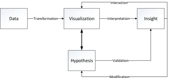
A more complete approach to the target of knowledge discovery is the joint use of information visualization, machine learning and interaction ? ? ?. The main aim of interaction in this case is to seamlessly and naturally support in-formation discovery. In this sense, interactive manipulation of resources must become part of the reasoning process, so that the human and the interactive tool establish a dialogical inquiry ?. As a result, information visualization be-comes a human-in-the-loop process where the aim is sense-making and knowl-edge discovery ?, i.e., that analysts achieve a better understanding of data, by updating their internal frames to meet the evidence discovered through ex-ploration. The frameworks proposed for visual analytics assign different tasks and roles to models and users ?. But, in general, the role of machine learn-ing algorithms is either to transform data into a more meanlearn-ingful form for knowledge discovery or to guide the analysis by itself. Users will, on the other hand, be able to manipulate the parameters of the visualization and the model to achieve their high-level visualization intents. That ultimately results in a feedback loop where the user steers the analysis on the basis of the knowledge acquired in previous iterations (see Fig. ??) ?.
Although advanced semantic interaction is currently a field of research, the kind of interaction techniques that are generally allowed in interactive visual analytics setups is constrained to simple transformations, such as zooming, displacement, rotating, filtering, etc. ?. Indeed, in the literature, interactions can be categorized at a low level, i.e., the primitive tasks allowed by the software (such as retrieving, filtering, finding or sorting values) or at a high level, i.e., the intents of the user (such as selecting, exploring or reconfiguring information) ?.
The interfaces that enable interactive visual analytics must include at least two components: a visualization and a graphical user interface (GUI) ?. An appropriate interface will enable the usual exploration process, which is to begin by an overview and to continue analyzing the data through zooms, filter, and on-demand details ?. Visualizations are generally jointly displayed in
Data Transformation Visualization Interpretation Insight
Hypothesis Validation Interaction
Modification
Figure 2. The process of interactive visual analytics
a dashboard and it is interesting to connect the visualizations, so that the changes made in one of them are updated automatically in the others. This interconnection can be achieved through methods such as linking and brushing ?.
3.2
Visual exploration of academic data
The ability of visual analytics to support the active search of patterns might facilitate obtaining insight from dynamic data, discover patterns that have gone unnoticed, and provide or communicate understandable assessments in the fields of Educational Data Mining (EDM) and Learning Analytics (LA) ? ?. As well as other applications of these fields, the proposed methods for visual data analysis are oriented to discover patterns and derive knowledge from edu-cational data. Indeed, information visualization techniques have already been used to analyze multi-dimensional data extracted from online educational envi-ronments, including information about performance in exams and assignments, collaboration ?, patterns of user behavior, access to resources, tutor-student interaction, etc. ?. They have also been used to analyze student performance in online courses, obtained from the achievements and the course statistics of an online course management system, with the aim to study whether there is a significant difference with traditional courses ?. This study revealed the strong influence of student participation in course scores, a bimodal distribution of scores in some courses and the potential of graphs and real-time data dash-boards for data representation in this context. Visualization can also be used to increase motivation of learners, through personal informatics dashboards that track students’ progress and goals and provide them with awareness of their own behavior ?.
In the context of this project, visual data exploration can help with tu-toring, e.g. identifying students at risk of dropping out or monitoring their learning process to obtain performance improvements ?. The visual data ex-ploration is aimed to be interesting not just for the identification and inter-pretation of patterns in existing clusters, but also to visually locate a specific student within the data structure of the current institution. This visual infor-mation may help tutoring, as the student may belong to a specific profile or show a trend, making therefore easier to conduct tutoring actions and change the student performance.
4
Proposed methods for visual data analysis
4.1
Materials and methods
This section describes two interesting methods to achieve the proposed goals, i.e., to provide insight into student behaviors, to identify patterns and relevant factors of academic success, to facilitate the discovery and understanding of profiles of engineering students, and to analyze the similarities and differences across European institutions. In one case, the proposed method relies strongly on interaction, whereas the other one is an example of the natural integration of machine learning in the visual analytics process.
4.1.1 Data hypercube for coordinated views of data
This approach is based on the connection of visualizations and their coor-dination, in order to provide a global view of the data set that facilitates the exploration of correlations between variables.
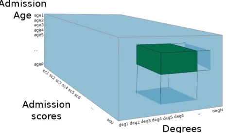
The view of the data set that is used for this approach is a multi-dimensional array where each variable is a dimension. Therefore, it might be interpreted as a data (hyper-)cube ? (see Fig. ??), an abstraction that resembles that of on-line analytical processing (OLAP) ?. This approach of business intelli-gence enables the interactive analysis of multidimensional data by means of four basic analytical operations: roll-up (aggregation), drill-down (disaggrega-tion), slicing (selection in one dimension) and dicing (selection in more than one dimension).
From this setup, it is possible to build a visualization based on coordinated histograms or bar charts. If the visualization is interactive and fluid, the users can explore the distributions of the variables and establish links between them ?. Furthermore, since the visualization works with the original data instead of a model based on certain assumptions, a higher reliability of the insight acquired with this approach is expected.
4.1.2 Dimensionality reduction
The approach of dimensionality reduction is a common technique in mul-tivariate data visualization ?. Dimensionality reduction aims at representing
Figure 3. Data cube with a dicing operation.
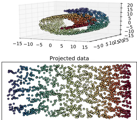
high-dimensional data in low-dimensional spaces, while preserving most of its structure. It takes advantage of the fact that it is generally possible to ap-proximate data using a fewer number of features while preserving most of the variability of data, because high-dimensional data tend to lie on an embedded low-dimensional manifold. This reduction might be useful as a previous step to other machine learning techniques to avoid the generalization problems com-monly found when the number of features is high (curse of dimensionality). However, for visualization purposes, the aim is to project data onto a 2- or 3-dimensional space, that can be visualized by means of, e.g., a scatter plot (see Figure ??).
There are several algorithms oriented to perform those transformations that can be grouped under the general term of dimensionality reduction al-gorithms. Most of the proposed methods preserve distances (Euclidean or geodesic ones, the latter approximated by graph distances) or topology, and use techniques ranging from linear transformations to sophisticated spectral or stochastic gradient-descent methods ?. Well-known examples are:
• PCA (Principal Component Analysis), which is a statistical procedure that transforms linearly the data to preserve the latent variables that present the largest variances.
• SOM (Self-Organizing Map), a neural network that performs a nonlinear projection into a low-dimensional space (generally 2D) while discretizing the data, becoming as a result a useful technique for clustering or visual-ization.
15 10 5 0 5 10 15 50 51015
2025
15
10
5
0
5
10
15
20
Projected data
Figure 4. Example of dimensionality reduction of an artificial ’swiss roll’ data set.
• Manifold Learning algorithms, which are a family of algorithms that per-form nonlinear projections of the data into a low-dimensional space by preserving distances or divergences ?.
The low-dimensional projection is generally visualized as a two-dimensional scatterplot, where the two synthetic dimensions are encoded with the vertical and horizontal spatial position channels. With these visualization is easy to find large-scale cluster structure in the low-dimensional space, but it is nec-essary to keep in mind that only relative distances are interpretable ?. The assumption that closeness in the representation can be assimilated to high similarity in the original space, which has been called ’spatialization princi-ple’ ?, is highly intuitive and might help the users recognize salient patterns ?, such as groups or outliers. Through this assimilation of the similarities in both spaces, the users might discover structures in the data in agreement or contrast with their beliefs.
The interactive adaptation of dimensionality reduction techniques is also useful for exploratory analysis in visual analytics systems ? ?. Indeed, the dimensionality reduction pipeline might be controlled through interaction, by selecting or emphasizing subsets of data records/features, including additional information (such as class or cluster labels), implicitly or explicitly tuning the parameters or defining constraints. Therefore, analysts might specify filters,
investigate different scenarios and adjust the visualizations to their notion of dissimilarity, so that they can interpret the information by means of the resulting visual layouts and transitions. The interaction scenario can be im-plemented with different technologies ranging from command line interface to direct manipulation, being the use of visual controls (such as sliders, buttons or drop-down menus) the most common one ?. Another interesting interaction is the ability to view information from the high-dimensional sample whenever a user selects a point of the scatterplot, which is useful for the users to check their hypotheses ?.
4.2
Implemented algorithms
In this section, the specific application of the proposed methods is discussed. That involves the algorithmic and visualization details as well as the data structure.
4.2.1 Coordinated histograms
The visualization of coordinated histograms that can be interactively fil-tered by one or more variables is very useful for the proposed application, because it allows, in real time, to validate or reject the hypotheses an expert might develop about a set of students. With the appropriate filtering and ag-gregation operations, it would be possible to visualize the average distribution of a performance-oriented variable grouped by an explanatory one, or to ana-lyze the distribution of all variables when we only consider a restricted group of values for one or several allegedly interesting dimensions.
The histograms are used to display the distribution of items from a con-tinuous variable, which is previously partitioned into groups/bins ?. From a visual point of view, they use an encoding with aligned bars ordered by bins, but instead of using the original data to determine the size of the rect-angles along the other axis, they use a count aggregation by bin. A similar bar chart representation can be used for categorical variables, but in this case each group would be defined by a category. Although its usefulness to discover the distribution of a certain variable is obvious, its value for the analysis of a whole multi-dimensional data set is improved when the histograms for differ-ent variables are juxtaposed and coordinated and when interactive filtering is performed through a fluid selection of ranges.
Although roll-up and drill-down operations might potentially be used to work with a certain variable with a different level of aggregation, it seems that there is not any intuitive application for the student data set. On the contrary,
other user-defined aggregations of a performance-related variable with respect to (i.e., grouped by) an explanatory variable would be more informative. On the other hand, the selection of subsets of groups in variables is, in any case, very interesting for exploration. These selections are often called dicing (when the groups cover more than one variable) and slicing (when the groups are selected from a single variable) ?.
Since the application of this approach does not require further process-ing than the sortprocess-ing, groupprocess-ing and reducprocess-ing needed to recompute the his-tograms, the main factor to consider is that its implementation should be efficient enough to allow fluid filtering. Efficiency can be achieved through the used of sorted indexes and incremental updates ?. With regard to the data set that needs to be considered in this visualization, any variable is a priori interesting, as long as its potential information value is high enough to compensate the data overload that would mean its addition to the dashboard. Visualization of count/frequency of each interval/category in the histograms or bar charts is generally interesting. On the other hand, grouping between two variables seems more useful when the aggregated variable is the ’score’ and the variable by which it is grouped is explanatory.
4.2.2 t-SNE
Once the usefulness of the dimensionality reduction approach has been de-termined, it is necessary to select the most appropriate algorithm. Methods such as PCA rely on an assumption of linearity, which might be too strong for the data at hand. On the other hand, although most nonlinear techniques are powerful algorithms with strong performance in many data sets, sometimes they fail to retain the local and global structure of real data, due to some weaknesses that might hamper performance, such as curse of dimensionality for the construction of the neighborhood graph and overfitting on the manifold in the spectral methods, difficult selection of the kernel in kernel-based meth-ods, or the presence of local optima in techniques with non-convex objective functions ?.
In the literature?, the comparison among these nonlinear dimensionality reduction algorithms has shown that t-SNE (t-Distributed Stochastic Neigh-bor Embedding) produces, in general, better visualizations. The technique is a variation of Stochastic Neighbor Embedding (SNE) ?, an algorithm that com-putes conditional probabilities (representing similarities) from the pairwise high-dimensional and low-dimensional Euclidean distances and aims to find the data projection that minimizes the mismatch between these probabilities. For this purpose, it minimizes the sum of Kullback-Leibler divergences (equal
to the cross-entropies up to an additive constant) through gradient descent, which results in a special focus on local structure preservation.
The t-SNE technique aims to alleviate some problems of SNE by using a symmetric version of the SNE cost function with simpler gradients and a Student-t distribution to compute similarities in the low-dimensional space ?. As a result, t-SNE is easier to optimize, do not accumulate data points in the center of the visualization and it is able to revel structure at different scales. For that reason, t-SNE is selected as the dimensionality reduction al-gorithm for the visualizations described in this report. For its training, a PCA (Principal Component Analysis) initialization is performed. The perplexity hyper-parameter is chosen heuristically.
There are at least two interesting visualizations that might be obtained by means of the dimensionality reduction approach:
• The projection of a common data set of students, represented by their descriptive variables and the average score for each academic year, in order to analyze data from a global perspective, that aims at understanding common characteristics of the institutions.
• The projection of several data sets (for each degree/institution) of stu-dents, represented by their descriptive variables and the scores of all the subjects, with potentially missing data. The usefulness of this visualization resides in the analysis of the groups found for each degree. Specifically, it would be interesting to determine if clearly separated groups of students can be found, if they gather students with different performance (high/low scores or graduated/dropout), if they are in agreement with the results obtained by the clustering tools presented in intellectual output 2 of this series ?, and whether the explanatory variables not considered in the pro-jection can provide some interpretation of the groups. In this case, for the training of t-SNE, a custom metric is used, which is essentially a pairwise Euclidean distance where missing components (i.e., scores of subjects that have not been taken by both students) are ignored.
In both cases, the low-dimensional projections are visualized as a two-dimensional scatterplots, in the framework of a complete dashboard that adds both the information necessary to support the exploratory analysis and the visual controls needed to provide interaction. Apart from the spatial position channels used to convey information about the data structure, additional visual channels can be used to show values of other variables from the original high-dimensional data. In fact, the radius, shape and color of the points are useful
for this purpose because their changes are easily perceived. For that reason, they need to be included in the proposed tool to ease the detection of salient patterns. On the other hand, it is appropriate to enable customization of charts and interaction with data, in terms of the selection of a data sample to obtain further details and the modification of weights. The customization of charts can be driven by usual visual control such as sliders, whereas interaction is more easily understood if it is embedded in the visualization.
5
Toolbox implementation
This chapter describes the structure and features of the practical toolbox for the application of visual analytics to the available academic data. The aim of this toolbox, as stated in the project application, is to develop comple-mentary functionalities for the IT tool developed for student data analysis. These complementary functionalities will be oriented to visual inspection of multidimensional data, with the aim to provide meaningful insight.
5.1
Toolbox design
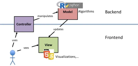
First of all, the software architecture needed to deploy the tutoring support tools has to be described. It needs to be noted that the benefits with regard to accessibility, interoperability and easier maintenance lead us to deploy the IT tools as web applications. For that reason, it seems that an appropriate architectural pattern would be the Model-View-Controller (MVC) pattern ?, which divides an application into three interconnected parts in order to sepa-rate internal representations of information from the ways that information is presented to and accepted from the user.
In the MVC pattern, the models represent the knowledge, i.e., in one case, they include the multi-dimensional data set and, in the other, the model built by the dimensionality reduction algorithm along with the additional informa-tion. They are, in both cases, managed by the server. On the other hand, the view is the visual representation of the model that highlights certain attributes of the model while suppressing others. Thus, the different visualizations that have been proposed can be framed as views in our architecture. It will be part of the client and it is attached to the corresponding model. Therefore, it ob-tains its data by querying the model (in this case, through the use of dynamic web pages). Coordination is needed for an easy integration of the models and views corresponding to the tools of this intellectual output and those corre-sponding to the second one (tools for automatic student data processing).
Finally, the controller is the part that provides a link between user and system, managing the interaction and views. The controller involves develop-ment in client and server side. For the sake of simplicity and scalability, it would be interesting to follow a Representational State Transfer (REST) style for its development. This common approach to web services treats everything
View Controller Model
Backend
Frontend
sees uses manipulates updates Algorithms Visualizations,…Figure 5. Subsystems of the visualization toolbox.
as a resource that can be managed through a uniform interface of stateless operations, which correspond to the common HTTP methods (GET, PUT, POST and DELETE). Nevertheless, its full development is a task of the intel-lectual output 5, where the IT tools developed in intelintel-lectual output 2 (tools for student data processing ?) and 3 (the tools for graphical data analysis visu-alization described in this report) will be integrated. The integration of those tools by means of RESTful services would enable an easier development of a functional interactive web-based environment, allowing for data set updates, integration of the results provided by IO2 and IO3 models, etc. As a result, for the development of intellectual output 3, the controller only provides the simplest functionality to guarantee an effective communication between client and server.
The development process followed for this implementation has started with the creation of basic visualization tools, based on the agreed SPEET database format and the first data analysis conducted. These basic tools, resulting in different formats of two-dimensional visualization of the corresponding mul-tidimensional data, have been developed in Python (model) and JavaScript (view). Following this stage, feedback has been gathered from partners, in order to delimit the specific needs for the tools to be developed, and visual-ization aims have been refined, resulting in an iterative improvement. Finally, the development of the implementations presented in this report has been performed, using a toolbox organization where the result is a set of small ap-plications with specific functionalities that enables fast prototyping and quick evaluation of visual information. Figure ?? describes the subsystems involved in the toolbox and their interactions.
5.2
Technologies
5.2.1 Server-side technologies
From an implementation perspective, a suitable technology for the server-side components is Python, because of its simplicity, the availability of widely-supported open-source libraries for data analysis (Pandas, Scikit-learn, Ten-sorFlow, etc.) and web frameworks (Django, Flask, etc.) and the easy inte-gration with other technologies. Specifically, for the application described in this document, the use of Pandas ?, Scikit-learn ? and Flask ? are suitable.
Pandas is a library that provides rich data structures and functions to per-form common data manipulation, working as a foundation for a Python-based data science stack. It aims to provide the data manipulation functionality that is present in programming languages such as R or in statistical computing plat-forms. It can be used for all the data loading, preprocessing and structuring steps. Although the use of a relational database interface directly or through an object-relational mapping has been considered for the development of the integrated interactive tool, Pandas uses flat data files in CSV format.
Scikit-learn, on the other hand, is a library that implements many state-of-the-art machine learning algorithms. It provides a consistent and task-oriented application programming interface (API) with extensive documentation and community-driven implementations of algorithms, based on Numpy, Scipy and Cython. Although it focuses on ease of use, it is enough computationally efficient to solve medium-scale problems. Its usefulness for the development of the toolbox comes from the fact that most of the functionality required to implement the dimensionality reduction of student data is already available in this library.
Flask is web micro framework that uses a simple core that enables easy development of web applications, although more complex functionality such as database abstraction layer, form validation or authentication can be imple-mented with extensions. For that reason, Flask seems a good choice for the implementation of the server-side controller functionality.
5.2.2 Client-side technologies
Interactivity and visualization in the client-side can be provided by JavaScript libraries, such as D3.js ?, and the specific libraries based on it, or Processing.js ?, that take advantage of the features supported by HTML 5, CSS 3 or SVG. The aim, in any case, is that the rich Internet applications, developed to
provide tutoring support, use web standards. The target is that, with this client-side technologies, the user interface can be easily run by opening an HTML5 page in any modern browser.
Data Driven Documents (D3.js) is an open source JavaScript library that allows visualization of data using web standards, such as SVG, HTML and CSS. Its efficient manipulation of data-driven documents, its capabilities for declarative manipulation of the Document Object Model (DOM), and its func-tional style enables the development of complex and fast interactive data vi-sualizations ?.
D3.js acts as the basis of two JavaScript libraries for the charting and efficient exploration of large multivariate datasets in the browser: Crossfilter ? and dc.js ?. Crossfilter is an open-source JavaScript library oriented to provide high-performance interaction with coordinated visualizations, even for large data sets. For that purpose, it uses sorted indexes that enable incremental filtering and reduction. Dc.js is an open-source JavaScript charting library that works natively with Crossfilter and uses d3.js for rendering visualizations of multi-dimensional data. The combination of both JavaScript libraries enables efficient exploration on large multi-dimensional datasets, using visualizations such as coordinated live histograms that are data-driven and reactive, allowing users to filter values, and slice and dice their data. The existence of those libraries and the position of de facto standard of D3.js makes it very useful for the implementation of the coordinated views visualization.
On the other hand, Processing.js ? is a JavaScript library that ports Pro-cessing ? to render the content on the HTML canvas element, so that it can be used in a web browser. Processing is an open-source programming language oriented to generate visual and interactive content easily, so that coding is ac-cessible for visual artists and designers. For that purpose, it uses a simplified syntax based on Java language. For that reason it is easier to develop full graphics user interfaces and, therefore, it has been chosen for the development of the screen layout for the dimensionality reduction visualization.
Beyond them, other alternative programmatic data visualization tools ex-ist, aimed at presenting data visually on the web and building interactive dashboards, such as Chart.js, Raw or the Google Visualization API. These tools, also based on web standards, offer similar functionality to the afore-mentioned libraries, but are less frequently used in the context of visual data analysis.
5.3
Implementations
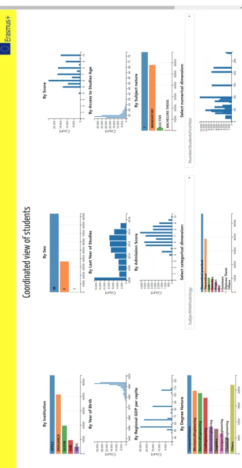
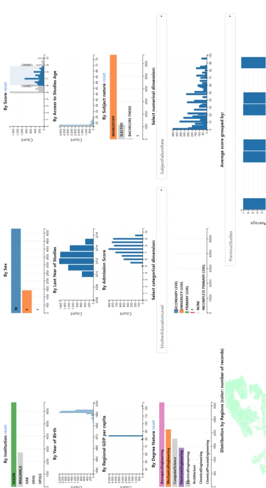
The proposed implementations have been developed and organized as a tool-box. The first visualization tool is a set of coordinated histograms where a user can filter by one or more variables, causing that the rest of the charts are updated accordingly. The filters are applied by means of a range selection for the numeric variables and by means of a one-click selection for the categorical ones. A subset of variables have been selected according to their assumed relevance. The fixed charts associated to these variables generally show the count of student-subject records binned by intervals. In the charts of the cat-egorical variables, the groups are distributed along the vertical axis, whereas in the numerical variables the bins are represented along the horizontal axis. Nevertheless, it is also possible to visualize other variables in a customizable chart associated to a dropdown menu. Additionally, a histogram of the score grouped by another explanatory variable is included. Finally, for the ’Resi-denceCity’ variable, which is geographic, a choropleth map of the European Union has been used. The level of aggregation used in this case are the NUTS2 regions (i.e., states). Figure ?? shows an example of the results provided by this tool.
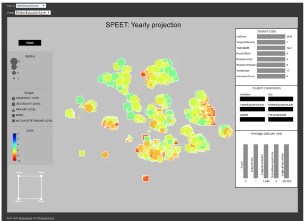
The second visualization tool is an interactive dimensionality reduction of the students’ data, where data are projected onto a 2D scatterplot and some parameters of the projection can be interactively adjusted. The aim is to provide an easy way to find and interpret groups of data, as well as the influence of certain variables in the performances, through the visual proximity of the points and their changes due to user interaction. Two visualizations have been developed following this idea:
• In the first case, data has been organized by year, so that each point rep-resents a student and its graphical properties (color, shape, size) are linked to the value of a certain variable, which can be customized. The data pro-jected (using the t-SNE technique) results in a visualization where the po-sition of the points is not interpretable, but their distances with each other try to preserve the original distances in the n-dimensional space (where n
is the number of variables). An example of this kind of visualization can be seen in Figure ??.
• In the second case, a different visualization is provided for each degree-institution combination, as seen in Figure ??. The projected data is es-sentially constituted by the scores of every course for each student. Since the courses taken by any pair of students may not necessarily be the same, it is necessary that the pairwise distance measure used to perform the
dimensionality reduction deals with missing values. For that reason, the Euclidean distance is only computed with respect to the coinciding courses. This would also allow to project data from current students and dropouts, potentially enabling the exploration of the effect of explanatory variables in the risk of dropping out.
5.4
Code availability
With regard to the implementation details, the toolbox is structured as follows: • The visualization tools, developed as client-side scripts in JavaScript and
Processing:
1. app/static/lib/cvDataCube.js: It implements the coordinated views
visualization. It requires some JavaScript libraries: D3.js, Crossfilter, DC.js, Bootstrap and jQuery.
2. app/static/lib/dr_degree.js: It implements the dimensionality
re-duction organized by degree. It requires the Processing.js JavaScript library.
3. app/static/lib/dr_year.js: It implements the dimensionality
reduc-tion organized by year. It requires the Processing.js JavaScript library. • The web server since, for the deployment of the toolbox, it is necessary
to set up the web server.
1. app/routes.py: A readily available example is included, based on
Python Flask, so that a user can run the tools in a modern browser. Nevertheless, Flask will generally run behind a widely-used general-purpose web server, such as Apache or nginx.
• Auxiliary scripts: Some scripts for processing data files with a structure such as that explained in Section 3 have been provided as an example. How-ever, they cannot be considered reliable scripts for automatic processing of arbitrary student data, which would be a product of Intellectual Output 5, since they lack generality and are heavily influenced by the features and limitations of the data provided by the partners.
In agreement with the regulations of the Erasmus+ program, the produced resources are available under an open license that allows the public to use, adapt, reproduce and share the work. Since the use of well-known existing
Figure 7. Screenshot of the ’yearly projection’ visualization tool.
licenses is strongly encouraged, the applied license for the source code would be the GNU General Public License Version 3 (GPLv3), which is a copyleft license published by the Free Software Foundation that guarantees end users the freedom to run, study, share and modify the software, while it forces to distribute derivative work under the same license terms. The toolbox is
available at https://bitbucket.org/SPEET_PROJECT/speet_code
5.5
Short User Guide
5.5.1 Coordinated histograms
The use of this tool is quite straightforward. The charts are displayed in a grid-like disposition and are labeled to easily associate each chart with a variable. Filtering is possible for all variables/charts, causing a fluid and coordinated update of the results. Filtering in the categorical charts is accom-plished by clicking in the horizontal bars. For the numerical ones, filtering is performed by brushing, i.e., dragging the mouse to select a range of vertical bins. In the choropleth associated with the residence city, each region is de-limited by an area mark with is own geometry and the count of records by region is encoded by color. As well as for the case of the histograms, a user can filter by regions, because the area marks are clickable. For all the cases, the resulting filter is computed during these actions, so that the results driven by the user actions can be immediately perceived. Each chart has a ’Reset’ link to remove the current filter. It is also possible to reset them all. An example of filtering is shown in Figure ??.
5.5.2 Projection of students’ data
These visualization tools display a more complex dashboard. The low-dimensional scatterplot is shown in the central panel. Each point will display three visual channels (radius, color and shape), associated to the values of different variables for each point. In the visualization of the common data set, color is always associated with the average score, whereas the variables linked radius and shape can be customized by means of two dropdown menus on top of the visualization. For the case of the data per degree/institution visualization, shape is always linked to student status, i.e., whether the student has graduated, dropped out or keeps enrolled. The other channels can be chosen to represent a certain variable. A legend on the left shows further information about these visual channels.
Furthermore, when a user hovers a certain point, the value of important explanatory and average performance variables is shown in a table in the right
Figure 9. Example of interaction with the purpose of filtering in the ’coordinated views’ visualization tool.
Figure 10. Example of interaction with the purpose of student comparison in the ’yearly projection’ visualization tool.
side. A certain point can also be fixed as a reference for comparison with the other ones by clicking on it (and released by means of the reset button). It needs to be noted that some explanatory variables, such as the degree or the institution, were not involved in the computation of the low-dimensional projection and are only included to facilitate hypothesis generation. The vi-sualization of the common data set of students displays an additional square in the bottom left side that allows users to select the weight of each year in the projection. For the visualization of the data per degree/institution, an additional menu to select them is provided.
It needs to be noted again that, whereas the relative distances among points are assumed to preserve information about their similarity in the original high-dimensional space, their absolute position does not convey any information. Figures ?? and ?? show examples of the utilization of this dashboards, display-ing additional information for the selected point.
Figure 11. Example of interaction with the purpose of student comparison in the ’projection by degree’ visualization tool.
6
Summary
The vast amount of data collected by higher education institutions and the growing availability of analytic tools has persuaded the SPEET2(Student
Pro-file for Enhancing Engineering Tutoring) ERASMUS+ Project to attempt to determine and categorize engineering students’ profiles across Europe, in order to improve tutoring actions. For that purpose, an analysis of student record data, obtained from the academic offices of the Engineering Schools/Faculties of the institutions, has been proposed.
The application of machine learning techniques for this purpose is a com-mon approach in the fields of Educational Data Mining (EDM) and Learning Analytics (LA), but it is often interesting to also involve the human analyst in the task of knowledge discovery. Visual analytics, as a blend of information visualization and advanced computational methods, is useful for the analysis and understanding of complex processes, because it takes advantage of the ability of humans to detect structure in complex visual presentations, as well as of their flexibility and ability to apply prior knowledge. Indeed, information visualization techniques have already been used to analyze multi-dimensional data extracted from online educational environments, including information about performance in exams and assignments, collaboration, patterns of user behavior, access to resources, tutor-student interaction, etc.
A complete approach uses interaction along with information visualization and machine learning, in order to naturally support information discovery. As a result, information visualization becomes a human-in-the-loop process where the aim is sense-making and knowledge discovery and, therefore, it facilitates the generation of hypotheses. The interfaces that enable interactive visual analytics must include a graphical user interface (GUI) that generally allows simple interactions such as zooming, displacement, rotating, filtering, etc.
This report documents the steps conducted to design and develop an IT Tool for Graphical Data Analysis Visualization within the SPEET project, with the intended use of tutoring support. The proposed goals are aligned with those of the project, i.e., to provide insight into student behaviors, to identify patterns and relevant factors of academic success, to facilitate the dis-covery and understanding of profiles of engineering students, and to analyze
the similarities and differences across European institutions. Although the academic data provided by universities only covers in part the factors of aca-demic success, the hypothesis is that these indicators are enough to identify, in a first instance, the students at risk. Among the possible approaches, two methods have been identified as interesting for the proposed goals:
1. The coordination of visualizations, in order to provide a global view of the data set that facilitates the exploration of correlations between variables. It uses a multi-dimensional array where each variable is a dimension, which can be interpreted as a data (hyper-)cube. From this setup, it is possible to build a visualization based on coordinated histograms or bar charts. If the visualization is interactive and fluid, the users can explore the distri-butions of the variables and establish links between them. The interactive filtering by one or more variables is very useful because it allows, in real time, to validate or reject hypotheses about a set of students. User-defined aggregations of a performance-related variable grouped by an explanatory variable are also informative.
2. Dimensionality reduction, an approach that aims at representing high-dimensional data in low-high-dimensional spaces, while preserving most of its structure. The low-dimensional projection can be visualized as a two-dimensional scatterplot, where the relative distances between points are interpretable assuming that closeness in the representation can be assimi-lated to high similarity in the original space. Manifold learning algorithms are one type of dimensionality reduction algorithms that perform nonlinear projections of data onto a low-dimensional space by preserving distances or divergences. Among them, a technique that is known to provide good visualization results in real data is the t-SNE (t-Distributed Stochastic Neighbor Embedding)?, which aims to find the data projection that mini-mizes the mismatch between the probabilities computed from the pairwise high-dimensional and low-dimensional distances. The scatterplots can be displayed in a complete dashboard that includes additional visual channels (radius, shape, and color) to show values from the original variables, and interaction with data, to obtain further details or modify weights. With this approach, two interesting visualizations can be proposed.
• The projection of a common data set of students, represented by their descriptive variables and the average score for each academic year, in order to understand common characteristics in institutions.
• The projection of several data sets (for each degree/institution) of students, represented by their descriptive variables and the scores of all the subjects, with potentially missing data.
Basic tools, based on the aforementioned methods, have been developed as web applications, due to the benefits they provide with regard to accessibil-ity, interoperability and easier maintenance. For that reason,the architectural pattern is the Model-View-Controller (MVC) pattern, which divides an appli-cation into three interconnected parts (model, view and controller) in order to separate internal representations of information from the ways that informa-tion is presented to and accepted from the user. The proposed implementainforma-tions have been developed and organized as a toolbox.
The web applications have been developed using Python and JavaScript. Specifically, the Python Pandas and Scikit-learn libraries are used, respec-tively, for preprocessing and the implementation of the dimensionality reduc-tion algorithms. On the other hand, the JavaScript libraries that provide interactivity and visualization in the client-side are Crossfilter and dc.js (both of them based on D3.js), for the coordinated views, and Processing.js, for the dimensionality reduction visualizations. All of them use web standards such HTML 5, CSS 3 or SVG. For the deployment of the tools, a web server is necessary. Python Flask has been used for this purpose, although the devel-opment of a full interface is not a task of the intellectual output described in this document. In agreement with the regulations of the Erasmus+ program, the produced resources are to be available under an open license, the GNU General Public License Version 3 (GPLv3).
The first visualization tool is a set of coordinated histograms where a user can filter by one or more variables, causing that the rest of the charts to update accordingly. The filters are applied by means of a range selection for the numeric variables and by means of a one-click selection for the categorical ones. The charts are fixed or customizable and show the count of student-subject records binned by interval/category. Additionally, a histogram of the score grouped by another explanatory variable and a choropleth map are included. The second visualization tool is an interactive dimensionality reduction of the students’ data, where data are projected onto a 2D scatterplot and some parameters of the projection can be interactively adjusted. Two visualizations have been developed following this idea. In the first case, data has been organized by year, so that each point represents a student and its graphical properties (color, shape, size) are linked to the value of a certain variable. In the second case, a different visualization is provided for each degree-institution combination. The projected data is essentially constituted by the scores of every course for each student.