Abstract
KOCHERLAKOTA, SARAT MOHAN. Interactive Visual Summarization for Visualizing Large Multidimensional Datasets. (Under the direction of Christopher G. Healey.)
Because of its ability to help users analyze and explore data from a diverse set of domains,
visualization is becoming integral to the knowledge discovery process. However, existing
vi-sualization techniques for displaying large, multidimensional datasets often produce detailed,
cluttered images that overwhelm the user’s ability to effectively absorb the underlying data.
To visualize such datasets effectively we have developed a visual summarization framework
that intelligently summarizes datasets by extracting its important and relevant characteristics
prior to visualization. The summaries are then visualized both in place of the original data, or
along with the original data. Our approach performs this summarization in three broad steps.
First, size and dimensionality of the data are reduced meaningfully. Next, patterns and
de-pendencies in the form of association rules, along with outliers are extracted from the reduced
data. Finally, these summary characteristics are visualized using techniques that are aimed at
enhancing the comprehension of the data. Summary characteristics, as well as summarization
steps are also recorded.
Our framework is designed to harness the benefits of both visual and non-visual methods
to intuitively guide users to produce relevant data summaries. Initial results in applying our
approach to practical datasets suggest that our approach could be used to generate effective
visual summaries of large, multidimensional datasets from a wide variety of domains and
INTERACTIVE VISUAL SUMMARIZATION
FOR VISUALIZING LARGE
MULTIDIMENSIONAL DATASETS
by
SARAT M. KOCHERLAKOTA
A dissertation submitted to the Graduate Faculty of North Carolina State University
in partial fulfillment of the requirements for the Degree of
Doctor of Philosophy
COMPUTER SCIENCE
Raleigh, North Carolina
2006
APPROVED BY:
BIOGRAPHY
Sarat Mohan Kocherlakota was born to Mohan Kocherlakota and Girija Kocherlakota, in
Bom-bay (now Mumbai), India. He received a Bachelor of Engineering degree in Computer Science
and Engineering from the Mahatma Gandhi Mission’s College of Engineering and Technology,
Kamothe, India after which he worked for a few months with Larsen and Toubro, Bombay,
In-dia, and later also worked for a few months with an animation and special effects studio, The
Fix, Bombay, India. Sarat joined the computer science masters program at North Carolina
State University in the spring of 2000. He received his M.S. in computer science in the fall of
2002 and since the spring of 2003 has been enrolled in the computer science doctoral program
ACKNOWLEDGMENTS
I have been looking forward to this moment when I can say “thank you” to all those people
who have contributed to my progress thus far. I also realize that it is perhaps impossible to
acknowledge each and every one of those very important people in my life while also ensuring
that I don’t leave anyone out. But I will plow on nevertheless.
I would like to thank, first and foremost, Dr. Christopher Healey without whose guidance
and support none of this would have been possible. Even though I never thought I would be
saying this, I know that I truly will miss working for him. I will never be able to thank him
enough for all that he’s done for me.
Dr. Thomas Honeycutt has been a pillar of support, inspiration and guidance to me during
my stay at NC State. I would like to especially thank him for motivating me to stay on for the
Ph.D. program on completion of my M.S. degree.
I would also like to thank Dr. Xiaosong Ma and Dr. Rada Chirkova for agreeing to be in
my advisory committee. Their queries and valuable comments have been extremely useful in
guiding my Ph.D. research in the right direction.
I would like to thank my parents Mohan and Girija for all the things great, responsible
parents do for thankless children like me. They’ve always supported me selflessly and
uncon-ditionally and have always encouraged me to pursue my dreams. I would also like to thank my
sister Mamata and her husband Prabhakar for having supported me in so many ways during my
entire stay at North Carolina State University. Also, I would like to thank them for bringing
these past five years.
I cannot thank Prasad and Kumari Vanguri enough for providing me support, and for always
ensuring that I never miss home too much during my time here in Raleigh, North Carolina.
You cannot go too far in life without the support of good friends. I must be truly blessed
because I have several. My lab-mates, especially Brent, Laura, Amit, Thomas, Lloyd and
Ping-Lin, among several others, have helped me immeasurably in getting thus far. Over the years
Subhayu and Ravi have been a great source of support to me, as indeed have Raoul, Micah and
Alex.
Sibin, Dhruba, Meeta, Nikola, Salil, Radha, Saurabh, Ajit, Surendra, and all the other
regulars at Cup-A-Joe, have over the last couple of years given me a reason to look forward to
spending my evenings in the company of great friends. Their support has helped make all of
this possible.
I am also a very lucky person for the friendship and support of old friends, especially that
of Pranav Mehta. I cannot imagine how boring life would have been without him around,
as indeed without the presence of wonderful friends such as Brijesh, Gurmeet, Venky, Lalit,
Shaibal, Meghna, Soumya and Dipti, among several others.
My lovely wife Sally Chopra has made life so much more richer, wonderful, interesting and
meaningful over the past several years that we have been together. She has been my staunch
companion, especially through the toughest of journeys that I have undertaken in these last few
years. Her unflinching love and support has provided me great strength and has made
my life.
I am also thankful for the opportunity and privilege of studying at North Carolina State
University. I would especially like to thank the tremendous faculty and staff of the department
of computer science at NC State. In particular, I would like to thank Dr. David Thuente and
Margery Page, for their help and guidance over these past several years.
I know there are several others that I have left out here. It is to them and all the others
Contents
List of Figures ix
1 Introduction 1
1.1 Motivation . . . 3
1.1.1 Size and Dimensionality Issues . . . 5
1.2 Summarization . . . 7
1.2.1 Automated Analysis Techniques . . . 8
1.3 Research Objectives / Goals . . . 10
1.4 Visual Summarization . . . 11
1.4.1 Data Reduction . . . 12
1.4.2 Behavior Characterization . . . 13
1.4.3 Summary Visualization . . . 14
1.4.4 Summary Management . . . 15
1.5 Contributions of Our Research . . . 15
1.6 Organization . . . 16
2 Related Work 17 2.1 Pattern Detection . . . 18
2.1.1 Association Rule Mining . . . 20
2.1.2 Drawbacks . . . 24
2.1.3 Template based mining . . . 25
2.1.4 Frequent Pattern Growth . . . 26
2.2 Pattern Visualization . . . 26
2.3 Clustering . . . 28
2.3.1 k-means Clustering . . . 29
2.3.2 Visual Cluster Detection . . . 30
2.4 Outlier Detection . . . 38
2.4.1 Densities of Local Neighborhoods . . . 39
2.5 Identifying Relevant Dimensions . . . 41
2.5.1 Dimension Ordering . . . 42
2.5.2 Principal Component Analysis . . . 43
2.5.3 Value and Relation Display . . . 44
2.6.1 RuleViz . . . 46
3 Data Reduction 50 3.1 Size Reduction . . . 51
3.1.1 Attribute Viz . . . 53
3.1.2 Parameters for Interaction . . . 56
3.2 Attribute Partitioning . . . 58
3.2.1 ScalingViz . . . 59
3.2.2 Computing Pair-wise correlation Measures . . . 60
3.2.3 Determining and Visualizing Relative Proximity . . . 61
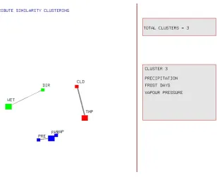
3.2.4 Attribute Clustering . . . 62
3.3 Significance of Data Reduction . . . 64
3.3.1 Determining Relevant Attribute Clusters . . . 65
3.3.2 Efficient Association Rule Mining . . . 65
3.3.3 Efficient Outlier Detection . . . 66
4 Behavior Characterization 67 4.1 Pattern Detection . . . 68
4.1.1 Association Rule Mining . . . 68
4.1.2 Pattern Visualization . . . 72
4.2 Outlier Detection . . . 75
4.2.1 Modified Local Neighborhood Density Method . . . 76
4.2.2 Visualizing Outliers . . . 78
5 Summary Visualization and Management 81 5.1 Summary Visualization . . . 81
5.1.1 Attribute Cluster Visualization . . . 83
5.1.2 Rule Information Display . . . 89
5.2 Summary Management . . . 91
5.2.1 Data Reduction Operators . . . 91
5.2.2 Behavior Characterization Operators . . . 92
6 Applications 94 6.1 Weather Dataset . . . 95
6.1.1 Data Reduction . . . 96
6.1.2 Attribute Partitioning . . . 96
6.1.3 Behavior Characterization . . . 102
6.1.4 Summary Visualization . . . 108
6.2 E-Commerce Dataset . . . 111
6.2.1 Data Reduction . . . 115
6.2.2 Behavior Characterization . . . 118
7 Conclusions and Future Study 125
7.1 Future Work . . . 127
List of Figures
1.1 Multidimensional Visualization Example . . . 4
1.2 Multidimensional Visualization Example . . . 5
2.1 Parallel coordinates visualization example . . . 31
2.2 Star Coordinates element layout example . . . 33
2.3 Self Organizing Maps example . . . 34
2.4 Design Gallery layout example . . . 37
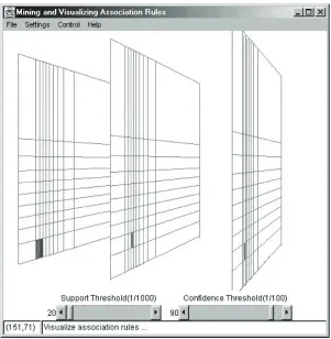
2.5 A RuleViz visualization of association rules . . . 46
3.1 Attribute Viz Display . . . 54
3.2 Initial Layout . . . 59
3.3 Final Layout . . . 62
3.4 Attribute Cluster Display . . . 63
4.1 Attribute Viz Display . . . 72
4.2 Outlier Detection Results . . . 79
5.1 Summary View Display . . . 84
5.2 Summary View Display . . . 86
5.3 Summary View Display . . . 88
6.1 Temperature . . . 97
6.2 Precipitation . . . 97
6.3 frost days . . . 98
6.4 Vapor Pressure . . . 98
6.5 Cloud Cover . . . 99
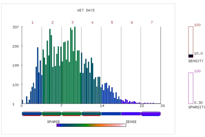
6.6 wet days . . . 99
6.7 Diurnal Range . . . 100
6.8 Weather Dataset Scaling Viz Display . . . 101
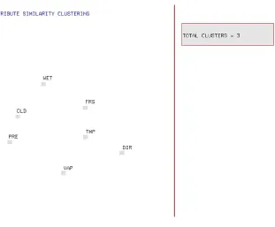
6.9 Weather Dataset Attribute Partitions Display . . . 103
6.10 Cluster 1 RuleView . . . 105
6.11 Cluster 2 and 3 RuleView . . . 106
6.12 Precipitation Outlier Values . . . 107
6.13 Cluster 1 Summary View Display . . . 109
6.15 Cluster 1 Summary View 3D Display . . . 111
6.16 Auction ID . . . 116
6.17 User ID . . . 116
6.18 Price . . . 117
6.19 Scaling Viz . . . 117
6.20 Rule View 1 . . . 119
6.21 Auction ID Outlier . . . 121
6.22 Cluster 1 Summary View 3D . . . 122
Chapter 1
Introduction
Visualization is the area of computer science that primarily deals with the representation of
data in the form of images. These images provide users the ability to analyze and explore
information contained in large, complex datasets. An effective visualization aids in the rapid
and accurate identification of important data aspects such as patterns, relationships,
dependen-cies, boundaries, gaps, anomalies and other characteristics embedded within the underlying
data [16]. Studies in interactive data analysis and exploration have supported the notion that
visualization helps in increased cognition and understanding [5, 9, 22, 37]. These
capabili-ties of visualization systems have contributed greatly towards the growing interest in the area.
Visualization is regarded as an integral part of the knowledge discovery process [6].
The widespread use of visualization has made it ubiquitous in our daily lives. Daily weather
reports broadcast by various television stations rely on visualizations to convey weather related
commu-nity in analyzing and presenting their data. More and more visualization techniques are being
utilized to assist humans analyze and explore datasets from a wide variety of applications
and domains. Some of these include such varied areas as meteorology, medical diagnosis,
e-commerce applications, network monitoring and intrusion detection, among several others.
Visualization has become an invaluable aid in our quest for managing and comprehending the
large volumes of information that are being generated on a daily basis in today’s information
age.
However, the ever-increasing sizes and dimensionalities of real-world datasets are placing
current visualization techniques under more and more duress [16, 37, 41]. Current techniques
largely tackle the size and dimensionality issue by increasing the amount of information
dis-played within the images. The visual detail contained within these images however can often
overwhelm the user’s ability to accurately comprehend the underlying information. These
im-ages also suffer from cluttering, occlusion and visual interference problems, all of which
dimin-ish the user’s ability to meaningfully absorb the underlying information. Furthermore,
process-ing and renderprocess-ing these large, multi-dimensional datasets requires tremendous computational
effort. Current techniques are thus finding it increasingly difficult to produce visualizations
of large, multi-dimensional datasets that remain coherent, meaningful, relevant, and accurate,
while simultaneously ensuring that the viewers’ cognitive abilities are not overwhelmed.
To address this problem we have proposed and developed a visual summarization approach
aimed at handling such large, multi-dimensional datasets more effectively. Our approach
abstrac-tions of the original data; abstracabstrac-tions that include only its important characteristics while
excluding extraneous information. Visualizing these summaries could then help reduce the
amount of visual detail displayed to users while also highlighting the underlying
characteris-tics of the dataset. Such an approach could potentially lead to more effective comprehension
of the data.
1.1
Motivation
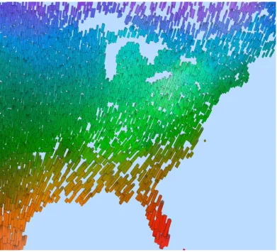
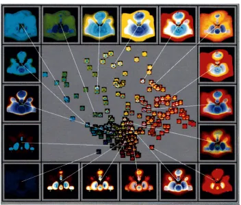
Figure 1.1 illustrates an example of visualizing a multidimensional dataset from the
Intergov-ernmental Panel on Climate Change (IPCC). It comprises of average monthly weather
condi-tions recorded over the years 1961 to 1990. This visualization is an instance of a glyph based
visualization technique in which individual data elements (i.e. weather readings) are
visual-ized using small 2D glyphs. The features of the glyphs such as color, size and texture, and
their individual properties are used to represent different data attributes and their values. In the
image, hue is used to represent temperature; hot temperatures are displayed using red glyphs,
and cold temperatures are shown using blue glyphs. Size represents pressure; large glyphs
rep-resent high pressure areas, and small glyphs show low pressure. Luminance is used to display
cloud coverage; dark glyphs denote low cloud coverage and bright glyphs denote high
cover-age areas. Orientation is used to display precipitation values; vertical glyphs represent little or
no rainfall, and horizontal glyphs denote high rainfall areas. Finally, wind speed is shown using
the density of the glyphs; high numbers of glyphs packed together denote high wind speed, and
Figure 1.1: A visualization of a weather dataset using perceptual texture elements with cloud coverage→ lumi-nance, temperature→hue, pressure→size, precipitation→orientation, and wind speed→density
Visualizations such as these harness the ability of the low level human visual system to
absorb large quantities of visual information rapidly and effectively thereby aiding in the
ef-fective comprehension of the underlying data. However, exploratory data analysis of large,
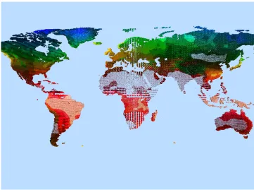
Figure 1.2: A visualization of a weather dataset of the entire earth
1.1.1
Size and Dimensionality Issues
Current multi-dimensional visualization techniques, including glyph-based techniques,
pixel-based techniques, parallel coordinates visualization, scatter-plot matrices among others, are
designed to visualize up to only a few million data elements and a handful of attributes at a
time [41]. Real-world datasets generated from across a wide variety of applications and
do-mains frequently contain millions (if not billions) of elements where each element can have
several hundred attributes. Directly visualizing such large datasets by displaying each and
ev-ery individual element generally results in highly detailed images that can seem vev-ery cluttered.
can also occlude one another [11]. An example of the problems associated with directly
visu-alizing a large dataset, particularly cluttering and overcrowding, is illustrated in the figure 1.2.
The figure represents a visualization of the weather dataset of the entire globe within a single
image.
In addition to the problem posed by large sizes of datasets, effectively handling
multi-dimensionality can also be a difficult task. Glyph-based techniques such as the one shown in
figure 1.1 for instance display multi-dimensional datasets by assigning data attributes to visual
features such as color, texture, motion and flicker among others. This approach is effective
when visualizing a low-dimensional dataset. However, visualizing a high-dimensional dataset
within a single image would involve assigning additional visual features and their properties
to represent the large number of attributes. This could lead to visual interference which occurs
when one visual feature interferes with the user’s cognition of the properties of another visual
feature and thereby negatively impacts the comprehension of the underlying attribute values.
Cluttering, occlusion and visual interference are all problems that could hamper the
compre-hension of the underlying data. Additionally, the computational effort required in displaying
large, high-dimensional datasets can put a strain on the processing and rendering abilities of
visualization systems. Ideally, visualizations must be free from these problems in order to be
effective.
Hence, the basic problem that we attempt to address using our summarization approach can
be stated as: “How do we coherently and effectively display large, high-dimensional datasets
Visualization studies generally address the problem of large sizes and high dimensionality
in two ways. The first approach is aimed at enhancing the graphical or rendering abilities of
current techniques to try and display more and more data within the images. These approaches
do not adequately focus on effective data preparation prior to visualizing the data. The second
approach focuses more on the data preparation or pre-processing performed prior to displaying
the data. Effective data pre-processing could involve meaningfully transforming the data that
is to be visualized to ease the burden posed by large, multi-dimensional datasets on current
visualization systems. Such an approach has not been adequately addressed in visualization
studies.
1.2
Summarization
In our visual summarization approach, we focus on investigating methods for effective
pre-processing of the data prior to visualization. Specifically, we are interested in generating
sum-maries of the datasets which can then be used to comprehend the original data more effectively
and efficiently.
A summary can be described as a concise representation of a body of information. In our
pre-processing approach we focus on meaningfully abstracting the important aspects of the
data within a summary form prior to generating a final visualization of the dataset. One of
the main objectives of our approach is to produce a summary that contains only the important
characteristics of the original data and excludes extraneous information. Generating a
data. Once the summaries are generated they can be visualized in place of the original data or
visualized along with the original data.
Generating summaries of a dataset prior to visualizing it has two possible advantages:
1. Reduce the amount of data to be visualized:
In our approach visual summaries are generated by reducing both the size and the
di-mensionality of the original data. The reduction also involves preventing extraneous and
irrelevant details from being incorporated within the summary. Such a reduction could
potentially reduce the number of data elements as well as attributes that are visualized.
This in turn could potentially minimize the effects of cluttering, occlusion and visual
interference.
2. Highlight important data characteristics:
Our summarization involves extracting high level characteristics of the original dataset.
Some of these characteristics include high-relevance attributes, patterns and
relation-ships, and outliers. Visualizing these summary characteristics could help users analyze
the underlying data more effectively and efficiently when compared to direct
visualiza-tion techniques.
1.2.1
Automated Analysis Techniques
In order to generate summaries we are interested in extracting important data characteristics
such as high-relevance elements and attributes subsets, patterns and relationships, and outliers.
the techniques that we are interested in include multi-dimensional scaling,k-means clustering,
association rule mining and outlier detection. However, directly applying these techniques to
the datasets may not be the best approach for the following reasons:
1. Unsuited to high-dimensional datasets: Automated methods are often better suited to
low-dimensional datasets. The algorithmic complexities associated with handling
high-dimensional datasets can make these techniques computationally inefficient for handling
such datasets.
2. Lack of user involvement: Automated techniques generally function as “black boxes”:
the data analysis performed is not visible and only final results are displayed to users.
Additionally, these techniques do not provide users with the ability to participate in or
interact with the analysis process. The inability to display intermediate steps and their
results could make it difficult for users to understand the analysis process. Also if the
user is unsatisfied with the results, any modifications made to the algorithms are not
apparent until the whole process is repeated and the final results are re-displayed. The
techniques themselves could seem complicated to most users.
Clearly, using these techniques directly for summarization purposes may not be the most
ef-fective approach. A more meaningful approach is required whereby complementary analysis
techniques are chained together as a sequence of analysis steps and augmented by the use of
interactive visualization techniques. One possible approach to making the pre-processing more
the intermediate steps of the process. This could help users understand the summarization
pro-cess as well as the data itself more clearly. User interaction with the individual steps of the
process could help guide the process towards results that are relevant to users.
1.3
Research Objectives / Goals
Our primary objective in designing a visual summarization approach is to present large,
multi-dimensional datasets to users in a meaningful fashion without overwhelming the user’s ability
to comprehend the information. Specifically we are interested in the following objectives:
1. Effective data pre-processing focused on meaningfully reducing datasets:
For effective data pre-processing purposes, we investigate the use of automated
analy-sis techniques to extract important data characteristics such as high relevance attributes,
patterns, relationships and outliers from the original data. These extracted
characteris-tics can then be used to generate summaries of the data, which can then eventually be
visualized in place of the original data.
2. Integrating automated non-visual algorithms with visualization techniques:
Since automated techniques tend to be non-intuitive and complicated for most users, our
approach is focused more on making the summarization process intuitive by combining
both visual and non-visual techniques in a complementary fashion. Using interactive
visualization techniques, we aim to provide users the ability to interact with and view the
3. Visualizing the generated summaries:
Once the summary features are extracted, we investigate methods by which the
sum-maries can be visualized coherently. The generated sumsum-maries could be used both in
place of the original dataset or to augment the original data. Visualizing the summaries
in place of the original dataset is aimed at reducing the visual detail presented to the
user while ensuring that the important aspects are presented to the user. Visualizing the
summary along with the original data is aimed at utilizing the summary information to
highlight important characteristics of the underlying data.
4. Managing summaries and summary operators:
We are also interested in storing the summaries, as well as the sequence of summarization
steps applied for possible use with other similar datasets.
In the next section, we briefly discuss our visual summarization approach aimed at achieving
the aforementioned objectives.
1.4
Visual Summarization
Our summarization approach is focused on the pre-processing phase of the visualization
pro-cess. To make the pre-processing more intuitive and interactive, our visual summarization
approach combines the use of both automated analysis techniques and interactive visualization
techniques. The automated techniques are used to extract important data characteristics which
display intermediate results to users and also to allow users to modify individual parameters
of the summarization steps. Displaying results of the intermediate summarization steps could
provide useful insight into the dataset as well as the summarization process itself without
hav-ing to wait for final results of the analysis. Combinhav-ing both visual and non-visual analysis
techniques is thus aimed at harnessing the advantages of both techniques to produce relevant
summaries.
1.4.1
Data Reduction
We begin our visual summarization by reducing the size and dimensionality of the dataset to
manageable proportions. This reduction is conducted in a serial fashion with size reduction
performed first followed by attribute partitioning.
In the size reduction step attribute values for each attribute are discretized into a
user-defined set of ranges. Ranges are then categorized as dense or sparse based on the number
of data elements that fall into these ranges. User-specified thresholds are used to define
den-sity and sparden-sity of individual ranges. This information is visualized to provide users with a
better understanding of the size reduction steps and the effects of interacting with this step
of the summarization process. Elements belonging to at least one dense range or one sparse
range for any attribute are retained and the remaining elements not satisfying this condition are
discarded. Our purpose for retaining dense elements (identified by dense value ranges) is that
they are more likely to combine with other dense ranges from other attributes to produce strong
of association mining. Sparse elements (identified by sparse value ranges) are retained as they
are more likely to be identified as outliers with respect to the other elements.
In the attribute partitioning phase, we focus on partitioning the set of attributes into smaller
attribute subsets or clusters in which the attributes belonging to a particular cluster exhibit
sim-ilar behavior. Each of these clusters can be seen as a reduced view of the dataset. To determine
similarities between the attributes they are first compared in a pair-wise fashion. The pair-wise
correlation measures are then used to construct a spatial layout in which individual attributes
are represented by points in a 2D space. The purpose behind generating such a layout is to find
an optimal arrangement of the points such that the proximity of these points in this space
re-sembles, as closely as possible, the degree of correlation between the corresponding attributes.
Multidimensional scaling is utilized for this purpose to generate a layout representing
similari-ties between a set of attributes. Partitions are then generated by applying clustering algorithms
to this layout.
1.4.2
Behavior Characterization
Once the strongly correlated attribute clusters are defined, the clusters are then examined
sep-arately. For each of the clusters, both strong relationships in the form of association rules, as
well as outliers are identified.
For discovering association rules we utilize an Apriori-based association rule mining
algo-rithm. Association rule mining is a powerful technique for extracting relationships and patterns
both its efficiency and effectiveness are reduced. Our approach attempts to counter this
prob-lem in two ways. First, the discretization of the attribute values in the previous phase helps
reduce the number of individual attribute values that the algorithm needs to track. Second,
ap-plying the association mining technique to the lower-dimensional attribute clusters separately
reduces the complexity of the technique and potentially improves its efficiency as opposed to
applying it to the entire set of attributes.
To detect outliers we use a “densities of local neighborhoods” technique [7]. In our
ap-proach we apply this technique to only those elements that were identified as very sparse in the
first phase. These sparse elements are also referred to as “potential outliers”. We then verify if
the potential outliers are truly outlying with respect to their distances from their neighbors. If
the potential outlier is found to be much farther away from its neighbors when compared to the
distance of its neighbors from one another, the potential outlier is then classified as an actual
outlier.
1.4.3
Summary Visualization
In the summary visualization phase we display each attribute cluster separately to allow users
to assimilate information relevant to each cluster independently. We visualize the summary of
the dataset in two ways. In the first method we only visualize the generated summary instead
of visualizing the entire dataset. For each attribute cluster, both strong patterns represented
by association rules, as well as the outliers that were detected, are displayed using
with the original data. Here, in order to reduce the amount of visual detail displayed we only
visualize the most important relationships and outliers for each attribute cluster.
1.4.4
Summary Management
The summary management phase essentially involves storing the summary information
ex-tracted from the dataset. This involves storing information relevant to the individual attributes,
as well as information associated with each attribute cluster. Attribute cluster information
in-cludes both association rules as well as outliers. Additionally, we also store the summary steps
or “operators” applied during the summarization process and the order in which they were
applied.
1.5
Contributions of Our Research
Using our visual summarization research, we hope to make the following contributions to the
area of visualization:
1. A new method for summarizing large, multi-dimensional datasets. Our emphasis is on
generating summaries at a greater level of detail compared to existing techniques. The
detailed summaries contain information such as high relevance attribute and attribute
values, patterns and relationships, and outliers.
2. A summarization technique combining both automated, mathematical analysis methods
fashion.
3. Techniques for visualizing both extracted data characteristics as well as the individual
steps of the summarization process using current visualization techniques.
4. A method to store the summaries generated as well as summary operators applied during
the summarization process.
1.6
Organization
The following chapters in this thesis are organized as follows. The next chapter (Chapter 2)
deals with related work. Chapters 3 to 5 deal with the individual phases of our summarization
approach. Chapter 3 describes our data reduction phase. The behavior characterization phase is
discussed in Chapter 4. The summary visualization phase and the summary management phase
are dealt with in Chapter 5. In Chapter 6, we discuss a few examples of applying our visual
summarization approach to practical datasets. Finally, in Chapter 7 we discuss the conclusions
Chapter 2
Related Work
As stated earlier our basic premise is that large, high-dimensional datasets could potentially be
visualized more meaningfully and coherently using summaries generated from these datasets.
An important goal of our summarization approach is to ensure that the summaries generated are
relevant to the user. In order to achieve this objective we are interested in the use of both visual
and non-visual techniques for extracting and displaying summary information in an intuitive
and efficient fashion.
Summaries can be described as concise representations of data consisting of their most
important and relevant aspects or features. A quick summary of a dataset could be generated
by computing simple statistical measures such as the mean, median, variance and standard
deviation values. The advantages of using these simple measures to summarize data is that
they are widely understood and can be computed efficiently for small datasets. To summarize
in-depth description of the dataset and its features is required. Some of the features or aspects
that are vital to summarizing the data could include high relevance attributes, patterns and
relationships, and outliers, among others.
In this chapter we will discuss some of the related techniques that can be used for data
summarization purposes. Specifically we discuss techniques for pattern detection and
visu-alization, clustering, outlier detection and relevant attribute identification. We also discuss
techniques focused on effective data pre-processing.
2.1
Pattern Detection
Patterns play an important part in describing the behavior of a dataset. They represent
rela-tionships between data elements and attributes and provide useful insight to users about their
data.
Decision tree-based techniques, such as ID3 and C4.5 [35] have traditionally been
em-ployed for data classification purposes. The basic purpose behind these techniques involves
learning patterns from a training set using heuristic methods and then applying the patterns (or
classification rules as they are more popularly referred to as) to predict the class of previously
unclassified data elements. The training setT is usually a small subset of the original dataset
Dwith one important difference: inT, the class value for each element is known in advance.
The resulting rules are then used to predict the class of unclassified elements fromD. The
per-formance of such classification algorithms is indicated by their classification accuracy, which
The process of generating classification rules involves the following broad steps:
1. Generating decision trees: Decision trees are a special kind of tree structures in which
each of the non-leaf nodes (also referred to as the decision nodes) represent an
attribute-value pair and the leaf nodes are represented by classes or categories assigned to the
elements in the training set T. All decision nodes at the same tree-depth belong to the
same attribute. The process of generating a decision tree involves recursively
partition-ingT into smaller and smaller disjoint subsets using a single attribute at a time. At each
step, the attribute Ai ∈ T that has the highest probability of distributing T evenly is
chosen and each of its distinct values or value ranges are used to form a separate node.
Each node represents a subset of the data and is connected to the child nodes that
poten-tially partition its subset evenly. In this way, each attribute is utilized only once for the
partitioning. The partitioning is continued until all attributes have been utilized and the
leaf nodes of the decision tree represent data classes or categories.
2. Generating rules:
Rules can be generated by traversing all individual paths within the tree. These rules
are generally of the form X ⇒ Y, whereX denotes a single attribute-value pair or a
combination of such pairs andY denotes a category or class value.
The above method learns patterns existing within a test dataset T, which can then be used
for predicting the class of unclassified elements in the complete dataset D. Increasing the
coverage of the decision tree by using a larger subset of D could potentially produce more
Decision tree-based methods have their drawbacks however. One major drawback is they
are more suited to low-dimensional datasets. When trying to learn rules from large,
high-dimensional datasets, they can generate very large decision trees which could in turn result
in a very high number of rules being generated. Effectively partitioning attributes with
con-tinuous attribute values could also become difficult. Furthermore, generating and traversing
the decision trees could become computationally intensive thus affecting the efficiency of the
technique. Evaluating the “interestingness” of the many rules derived from large decision trees
can be time consuming. Missing values in the data could also cause the technique to generate
inaccurate patterns or rules [31]. Finally, these techniques may not be widely understood as
they are largely automated and non-intuitive.
2.1.1
Association Rule Mining
Association rule mining, also referred to as frequent pattern mining, is another popularly used
technique in the field of knowledge discovery for extracting patterns in the form of association
rules from a dataset [2]. An association rule is an expression of the form X ⇒ Y, where
X and Y are sets of items. An item could denote a specific attribute value or a range of
values, andXandY could denote combinations of such values. For a multidimensional dataset
D, representing n data attributes A = {A1, ..., An}, where each data element ei ∈ D is a
combination of n individual data values, one for each attribute Ai, the expression X ⇒ Y
signifies that, ifei containsX thenei probably also contains Y. X is also referred to as the
Association rule mining algorithms utilize two measures: support and confidence to
gener-ate rules. For a set of itemsX, its support denoted bysupp(X)is given as the fraction of data
elements inDwhich contain X. For a ruleX ⇒ Y, its support denoted bysupp(X ⇒Y)is
given by the fraction of elements inD containing the conjunctionX ∪Y. The confidence of
X ⇒Y denoted byconf(X ⇒Y)is given by the fraction of data elements inDthat contain
X, and which also contain Y [2]. This can be expressed mathematically as: supp(X ⇒ Y)
=supp(X∪Y), and conf(X ⇒Y) =supp(X∪Y)/supp(X)[18].
The main task of association rule mining algorithms is to find all association rules withinD
satisfying user defined thresholds for minimum support i.e. min-supp and minimum confidence
min-conf [2]. The approach followed by these techniques generally involves two broad steps.
In the first step, the support of all possible combinations of items (i.e. attribute value pairs)
also called itemsets is calculated. In the second step itemsets found to be frequent, i.e. having
support ≥ min-supp, are then combined into all possible rules of the form X ⇒ Y. Rules
with confidence ≥ min-conf, are referred to as association rules. Modifying min-supp and
min-conf could produce significantly different results depending on the nature of the dataset.
Traditionally, the Apriori technique and Apriori-based techniques have been utilized for mining
association rules [18].
Apriori
Apriori is an association rule mining algorithm introduced by Agrawal et al. [3]. Before we
describe the algorithm, we will discuss the terminologies relevant to the algorithm. A set ofk
as a largek-itemset. The set of all largek-itemsets is denoted by Lk. A candidatek-itemset
or ak-candidate itemset is used to denote a potentially largek-itemset, and the set of all such
k-candidate itemsets is denoted byCk.
Apriori works in the following manner. It first counts the number of occurrences of each
individual item in D to find all large 1-itemsets L1. Each subsequent pass k involves two
phases. In the first phase Lk−1, the set of (k −1)-itemsets found large in the previous pass
is used to generate a set of k-candidate itemsets Ck. In the second phase, D is scanned to
compute the support of each of thek-candidate itemsets inCk. Those that are found large (i.e.
those that have support greater than or equal to min-supp) are used to formLk, the set of large
k-itemsets.
Thek-candidate itemsets inCkare generated fromLk−1through two steps. In the first step,
referred to as the join step,k-candidate itemsets are generated by merging all(k−1)-itemsets
X, Y ∈ Lk−1, which share their first(k − 2) items, i.e. X.item1 = Y.item1, X.item2 =
Y.item2, ..., X.itemk−2 = Y.itemk−2, X.itemk−1 6= Y.itemk−1 [3]. In the second step,
referred to as the prune step, all itemsetsc∈ Ckfor which some(k−1)subset ofcis not in
Lk−1are deleted.
To illustrate the algorithm let us consider an example [3]. Let L1, the set of all large 1
-itemsets in a datasetDgenerated during the first phase of the algorithm, contain the individual
items { {1}, {2}, {3}, {5} }. To construct C2 from L1, all 2-itemset combinations of items
fromL1 are generated, producingC2 = { {1 2}, {1 3}, {1 5}, {2 3}, {2 5}, {3 5}, }. In the
they were found to have low support inD. The remaining itemsets defineL2={ {1 2},{1 3},
{2 3},{2 5} }. In the first phase of the passk = 3,L2is used to generatedC3. During the join
step, {1 2}is merged with {1 3}to generate the itemset {1 2 3}. Likewise, {2 3}is merged
with{2 5}to generate{2 3 5}. C3 now contains { {1 2 3}, {2 3 5} }. During the prune step,
there are threek−1 = 2-itemsets for candidate{2 3 5}: {2 3},{2 5}and{3 5}. Although{2
3}and{2 5}are contained inLk−1, {3 5}is not. So the candidate itemset{2 3 5}is removed
fromC3. The candidate itemset{ {1 2 3} } is accepted since{1 2}, {2 3}and{1 3} are all
inLk−1. C3 now contains only{ {1 2 3} }. The remaining itemset inC3, if found large in the
second phase of the current pass, becomesL3.
Once combinations of items that satisfy min-supp in D are identified, they are used to
generate association rules. For each large itemsetZ, all rules having the formX ⇒ (Z −X)
are generated, whereX is any subset of Z andsupp(Z)/supp(X)≥min-conf . Initially, for
every large itemsetZ, all rules having only one item on the right hand side of the expression
X ⇒(Z−X)are generated and tested. Rules that satisfy the minimum confidence requirement
are further expanded to build additional rules.
Another algorithm introduced in [3] called AprioriTID extends the Apriori-based approach.
In this algorithm the entire datasetDis not used for counting support at the end of each pass.
Instead, AprioriTID uses only those items that were found large from the previous pass in an
effort to improve the efficiency.
Research on association rule mining was initially targeted at transaction databases.
applications and datasets. Visualizing the patterns, rules and dependencies discovered using
as-sociation rule mining could simultaneously highlight the important characteristics of the data,
as well as help reduce the amount of information to be displayed.
2.1.2
Drawbacks
Association rule mining algorithms, in particular Apriori-based techniques, however have
cer-tain drawbacks, such as:
1. Algorithmic complexity: Increase in size and dimensionality of the data reduces the
ef-ficiency of the algorithm. This means that the algorithm may be unsuited to very large
multidimensional datasets [18].
2. Determining usefulness of generated rules: Association rule mining of large
multidimen-sional datasets could result in the generation of thousands of association rules.
Evaluat-ing the relevance and utility of these rules can be a complex task by itself. In some cases,
the rules could also correspond to knowledge that was already known previously, or to
redundant knowledge present in other rules [25]
3. Counting infrequent items: Association rule mining algorithms scan the entire dataset to
discover itemsets that satisfy minimum (user-specified) support and confidence
thresh-olds. This process also includes counting support for itemsets that have low support
within the dataset. This could limit the efficiency of association rule mining techniques
4. Handling continuous datasets: Techniques for association rule mining were designed
to discover relationships in transaction data in which attributes assume binary values,
i.e. either 0 or 1. In general however data attributes assume values that cover a broad,
continuous range of real numbers [39]. Counting the support of each individual attribute
value can pose serious problems to association rule mining algorithms.
Some of the problems associated with association mining algorithms are addressed in
re-lated techniques such as the template based mining and FP-growth techniques.
2.1.3
Template based mining
The template based approach proposed by Klemittinen et al. is focused towards intelligently
pruning the number of rules generated by association rule mining to retain only interesting
and relevant rules [25]. This is made possible by encoding user knowledge within rule
tem-plates which are of the form A1, A2, ..., Ak ⇒ Ak+1. Each Ai in the template represents an
individual data attribute, or a user-defined attribute class. Templates can be used to explicitly
define classes or rules that are interesting (referred to as inclusive templates) and those that are
irrelevant (referred to as restrictive templates). Both kinds of templates are then used to prune
the rules that are generated; rules matching inclusive templates are retained while those
match-ing restrictive templates are discarded. While such an approach may be useful in guidmatch-ing the
mining process in a more relevant fashion, it may not prove to be of any significant advantage
2.1.4
Frequent Pattern Growth
The Frequent Pattern growth (FP-growth) technique [14] is targeted towards improving the
efficiency of association rule mining. The basic approach behind this technique involves first
generating a compact structure called the frequent pattern tree, or FP-tree, to store all frequent
items present within D. These frequent items are represented by nodes in the tree, whereby
each node represents a unique item, i.e. an attribute-value pair present in D. A path in the
tree linking the nodes together represents a combination of items that occur together within an
ei ∈D. Multiple occurrences of the same combination of items is represented using the same
path, which helps reduce redundancy or repetition of nodes or paths. Once the tree is ready,
rules are generated from the FP-tree by traversing individual paths within the tree.
While FP-growth reduces Dto a compact tree structure containing all important patterns
present withinD, it may not be useful for very large datasets. For such datasets, constructing
the FP-tree could mean a significant computational overhead, since it requires two complete
scans ofD. Also, traversing such trees could become inefficient.
So far we discussed some automated techniques that could be used for generating
associa-tion rules from a dataset. In the next secassocia-tion we discuss some of the significant techniques used
to display or visualize these rules or patterns.
2.2
Pattern Visualization
Pattern visualization techniques are used to display patterns or rules generated by pattern
visu-alization techniques include Mineset [8], mosaic plots [19], and parallel coordinates technique
[12]. Mineset, introduced by Brunk et al., supports the use of various display techniques to
vi-sualize the results generated by association mining [8]. However, this technique only vivi-sualizes
a very limited number of rules.
In mosaic plots, data attributes and their values are used to partition a rectangle into
sub-regions of various sizes that are proportional to the support value of combinations of various
attributes and their value ranges [19]. The resulting rectangular mosaic helps distinguish
im-portant relationships between the attributes and properties of these relationships. However, this
technique is limited to allowing at most three attributes to be displayed at a time. Also, as the
number of individual attribute values to be displayed increases, the number of partitions also
increases, which could make it difficult for users to perceive individual sub-regions accurately.
Additionally, both Mineset and mosaic plots do not provide means to visualize or guide the
rule generation process itself.
The parallel coordinates visualization technique has been utilized by Jian et al. [12] as well
as by Yang et al. [42] to visualize association rules. In the parallel coordinates technique,
par-allel axes in the visualization space are used to represent individual data attributes. Rules are
represented by polylines such that the axes connected by the polylines represent combinations
of items present within the same association rule. However, parallel coordinate techniques are
not suitable for visualizing lengthy rules, i.e. rules containing a large number of items.
Over-lapping polylines is another issue when trying to interpret parallel-coordinates visualization.
from the consequent of a rule and vice-versa could become more and more difficult.
Paral-lel coordinates can also be used to visualize individual data elements in a multidimensional
dataset. We discuss this aspect in the next section.
2.3
Clustering
A cluster is a collection of data elements in which elements belonging to the same cluster are
more similar to each other when compared to elements from different clusters. Clusters are
useful as they provide insight into the behavior of datasets, including characteristics such as
the distribution of the data, as well as, similarities and differences existing within a dataset.
Clusters are also useful for generalizing data elements for classification purposes [21]. They
can be identified using both automated and interactive visual clustering techniques.
Given a datasetDcontainingmdata elements, clustering algorithms divideDinto groups
or clusters where data elements belonging to the same cluster are similar to one another
rel-ative to elements in different clusters [10]. Automated clustering techniques can broadly be
classified as either hierarchical clustering or partitional clustering techniques.
Hierarchical clustering techniques subdivide datasets into clusters, by either subdividing
large clusters into smaller clusters, or merging small clusters of elements into larger clusters
wherever possible. The subdivision hierarchy is represented using a tree structure or
den-drogram [20]. These denden-drograms can be visualized using tools, such as for instance, the
hierarchical clustering explorer (HCE) [36, 37].
without producing a nested hierarchy (as in hierarchical clustering) [20]. The most popular
partitional clustering algorithm is thek-means technique [33].
2.3.1
k
-means Clustering
In k-means clustering (KMC), D is subdivided into k clusters. The process involves first
choosingkcluster centersg1, ..., gkfrom among the elements inD, and then assigning each of
the remainingei ∈Dto their closest cluster centergc(ei), wherec(ei)is the index of the center
closest to ei. The goal of the k-means algorithm is to minimize the mean-squared distance
between eachei and its nearest cluster centergc(ei). This distance is also sometimes referred to
as distortion error [23], and is computed as [24]:
Ek =
X
i∈D
kei−gc(ei)k
2
Once alleiare assigned to their nearest cluster centers, the centers for each of thekclusters
are recomputed. This is done by finding the element within each cluster that is closest to the
other elements of the same cluster. Once the new cluster centers are determined, the remaining
eiare once again reassigned to the new centers. This process is repeated several times, with the
cluster centers determined at the end of each iteration converging to the actual cluster centers
of D. The algorithm terminates when convergence is achieved, i.e. the distortion error does
not improve significantly. This technique is also sometimes referred to as the centroid-based
clustering technique or thek-mediods based technique.
the cluster centers can affect the efficiency of convergence to the true cluster centers. Selecting
an appropriate value forkis also critical to the performance of the algorithm. Ideally,kshould
be as close as possible to the actual number of clusters present within the dataset. Recomputing
centers during each iteration of the algorithm affects the efficiency of the technique, especially
for large datasets of high dimensionality. Also, before clustering algorithms can be applied to
large multidimensional data, analyzing whether the data exhibits a tendency to cluster in the
first place is also important.
While hierarchical clustering algorithms are more informative than partitional algorithms
in describing the underlying structure within the datasets, constructing dendrograms for very
large, multidimensional datasets can be computationally expensive. By contrast, partitional
algorithms, such ask-means, inspite of their drawbacks have proved to be much more efficient
in generating clusters for very large collections of samples, and are hence more useful when
dealing with large datasets [20].
2.3.2
Visual Cluster Detection
Visual clustering techniques allow users the ability to directly display their datasets using
mul-tidimensional visualization techniques and visually detect clusters and groupings in the
infor-mation space. For this purpose, the multidimensional data elements are projected onto a
low-dimensional display space. Parallel coordinates, star coordinates technique, self-organizing
maps and multidimensional scaling are some of the techniques that generate layouts that can
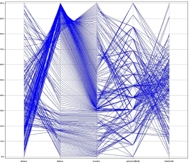
Figure 2.1: A visualization of financial data using parallel coordinates visualization. The visualization shows attributes names and the ranges of values of each attribute.
Parallel Coordinates Visualization
In parallel coordinates, data attributes are represented using parallel axes such that each data
attribute is assigned to a single axis, and each data element is represented by a polyline
con-necting the axes at locations that correspond to the value of the element for each attribute. The
axes could be organized vertically (as shown in figure 2.1) or horizontally. Areas in which the
polylines seem to be concentrated very close to one another could represent clusters within the
As the number of elements increase, the degree to which the polylines begin to overlap one
another also increases. For very large datasets, this overlapping could make it very difficult
for users to distinguish individual polylines and the corresponding data elements and their
in-dividual attribute values. Also, for a high-dimensional dataset, fitting a very large number of
attribute axes (either horizontally or vertically) within a limited screen space could produce
ineffective visualizations.
Star Coordinates Visualization
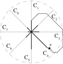
In star coordinates data attributes are mapped to axes arranged within a circle on a
two-dimensional plane such that the axes share a common origin [22]. Data elements from a
mul-tidimensional dataset are projected onto the star-coordinates space by computing summations
of the products of individual attribute values and the direction vectors of their corresponding
axes. The computation of the position of an individual point in the star-coordinates space is
shown in figure 2.2. The resulting layout of elements helps users visually detect clusters, if
any, that are present in the original datasetD. Additionally, users can also manipulate the
visu-alization by scaling and rotating individual axes, thereby altering the contribution of the axes
to the position of the data elements in the layout. This helps in effectively separating clusters
in multidimensional space.
However, while this technique may be useful in producing visualizations that help users
visually identify clusters in a multidimensional space more easily, the visualizations produced
could make it difficult to identify individual properties (for e.g., attribute values) associated
Figure 2.2: An example of how the location of an element in 8-dimensional star coordinates space is calculated.
incorporated within the circular star-coordinates space would be very high. This could cause
the visualizations to become less meaningful to users.
Self Organizing Maps
The self organizing map (SOM) technique first introduced by Kohonen, is used to organize
unstructured data similar to the k-means clustering technique by projecting elements from a
multidimensional space to a two-dimensional space [27]. The technique utilizes the principle
of competitive learning, which is an adaptive process by which neurons in a neural network
become more and more sensitive to different input elements or categories.
A two-dimensional grid of neurons is used for organizing the data elements inD. Initially
the neurons or reference vectors on the grid are assigned random values. When an elementei
is introduced to this grid, it is assigned to the reference vector that is closest in value to theei.
This vector is also referred to as the “winning vector” and its value is then updated to represent
the value ofeimore closely. The values of the reference vectors around the winning vector also
vector. The closer the reference vectors are to the winning value the more they resemble the
winning vector. These steps are applied to allei ∈ D. The process is repeated several times
until the positions of the reference vectors on the grid do not change significantly. The resulting
layout is a topographical arrangement of the elements wherein similar elements tend to cluster
close to one another [28]. Such a technique not only helps identify similar elements within
a multidimensional dataset, but also helps in reducing dimensionality since data is projected
from a multidimensional space onto a two-dimensional plane.
However, SOM techniques tend to produce different maps each time they are applied to a
dataset. This happens due to the initial random assignment of values to reference vectors. To
select a map that is most appropriate, users would have to generate several different maps.
Ad-ditionally, very large, high-dimensional datasets also increase the computational costs involved
in generating these maps.
Multidimensional Scaling
Multidimensional scaling (MDS) [29] is another technique used for projecting elements
be-longing to a high-dimensional dataset onto a low-dimensional visualization space. For this
purpose pair-wise similarity or correlation measures between all pairs of elements are utilized.
These pair-wise correlation measures are then converted into a distance or dissimilarity
mea-sure, which in turn is used to create a distance matrixC. An entryCi,jin this matrix represents
the distance or dissimilarity between an element pairi, j. Elements are represented as points
in the visualization space.
The basic purpose of the technique is to position points in this space such that their distances
in the visualization space resemble as closely as possible their actual dissimilarity measures in
C. This is done in the following manner:
1. Initially, points are randomly positioned in the visualization space.
2. Then for each pointi, its new position is computed based on the pair-wise distances
be-tweeniand every other elementj. To compute this new position the Euclidean distance
betweeni andj, i.e. d(i, j)is compared to the dissimilarity between the two elements
given byCi,j. The contribution ofj to the computation of a new position foridepends
on the difference between the two measures:
d0(i, j) = d(i, j)−Ci,j (2.1)
dissimilarity between the elements, theniis positioned closer toj along the line passing
through both points. Alternately, if d0(i, j) < 0, i.e. the actual dissimilarity between
the two points is greater than the layout distance,iis positioned away fromj along the
line that passes both points. The distanceiis moved towards or away fromj is a small
fraction of thekd0(i, j)kvalue.
3. In this fashion, all otherj are compared withiand new positions foriare computed after
each comparison.
4. The process of computing a new position for i(i.e. steps 2 and 3) is repeated with all
other elementsjone after the other. At the end of one iteration all points are assigned new
positions that better resemble the actual similarities between them. The whole process is
repeated several times until the points do not move significantly closer or farther away
from one another i.e. the configuration stabilizes. In the resulting layout similar elements
tend to cluster closer to one another and those that are dissimilar tend to be placed farther
away from each other.
One application of the MDS technique is the Galaxies Visualization system by Wise et al.,
in which MDS is used to cluster documents from a database based on their similarity to one
another [40]. Visualizing the layout generated by MDS in which documents are represented
by two-dimensional glyphs helps users understand the similarities and relationships that exist
between documents in the database. For very large datasets, however, calculating inter-element
similarity measures for all elements and using these measures to determine the layout of
Figure 2.4: A visualization of image similarities in the Design Galleries technique. The glyphs represent thumb-nails of output images and the visual properties of the glyphs represent properties of the images.
Another application utilizing MDS techniques to visualize similarities contained within
large information sets is the Design Galleries browser developed by Marks, et al [32]. In
this application various output images generated from multidimensional datasets supplied as
input are compared at the pixel level to generate correlation or similarity measures between the
images. The MDS algorithm is then applied to display the global similarities existing between
the various images. Figure 2.4 shows a typical layout generated by the application. Rectangular
glyphs in the central area of the visualization space represent thumbnails of the various output
consist of the detailed images for each of the thumbnails. In the display, lines are used to link
thumbnails to their corresponding detailed images in the gallery view. Thumbnails that are
closely packed represent images that are relatively similar to one another allowing users to
visually identify similar image clusters.
The MDS technique can also be used to visualize inter-attribute similarities as in the Value
and Relation (VaR) display technique [41]. We will discuss this technique in a later section
that deals with techniques used to identify relevant attributes within a dataset.
One of the main drawbacks associated with MDS algorithms is that, since the algorithms
are heuristic in nature, they may not always produce an optimal layout that accurately
repre-sents the actual similarities existing within the underlying dataset. Also, the algorithms may
not always produce similar layouts every time. In such instances multiple layouts would have
to be generated to verify the technique.
2.4
Outlier Detection
Outliers are primarily data elements which deviate from other elements by so much that they
arouse suspicion of being generated by a mechanism other than that which generated the other
elements [15]. The can also be described as data elements which differ from other elements by
some measure [1].
In the distance based outlier detection approach by Knorr and Ng, outliers are detected
using a distance metric between data elements in a multidimensional information space [26].
λfromei[1, 26]. Bothkandλare user-defined parameters and the technique heavily depends
on these parameters in order to be accurate and effective. Choosing appropriate values for these
parameters is hence critical to the performance of the distance-based technique. Additionally,
this technique assumes that all elements in D cluster with similar clustering densities, and
would fail to detect outliers in datasets which contain clusters of varying densities [7].
2.4.1
Densities of Local Neighborhoods
The densities of local neighborhoods of elements approach proposed by Breunig et al. is
designed to find outliers in datasets with varying densities [7]. The basic premise behind this
approach is: an elementei is classified as an outlier, if it lies farther away from its neighbors,
when compared to its set of neighborsNei. Such elements, which are found to be “outlying”
relative to their local neighborhoods are also referred to as local outliers [7].
The process of finding local outliers begins with identifying the set ofk nearest neighbors
for each element ei denoted by Nk(ei). If an element ej ∈ Nk(ei) is within a user-defined
distanceλ fromei, thenej is said to lie in the local neighborhood of ei, and the reachability
distance ofei with respect toej, denoted byd(ei, ej), is set toλ. Ifej lies at a distance greater
than λ, then d(ei, ej) is set to the actual distance betweenei and ej. The local reachability
density ofei, denoted byδlocal(ei)is calculated as the inverse of the average ofd(ei, ej)for all
ej ∈Nk(ei), that is:
δlocal(ei) =
1
k
X
∀ej∈Nk(ei)
1
d(ei, ej)
(2.2)