ABSTRACT
SAWANT, AMIT PRAKASH. Dynamic Visualization of the Relationship Between Multi-ple Representations of an Abstract Information Space. (Under the direction of Dr. Christopher G. Healey)
Information visualization is the graphical presentation of large numbers of multidimen-sional elements. Effectively representing abstract collections of information and the relation-ships they contain presents a difficult challenge. Visualization is one solution to enable users to visually analyze and discover patterns within their data. Our objective is to design techniques to show how queries into an underlying dataset might be related. We use animation to represent the relationships between these multiple independent perspectives into the data.
BIOGRAPHY
ACKNOWLEDGMENTS
My thesis advisor, thesis committee members, family, many friends and colleagues have contributed significantly towards the quality of this thesis. I thank all of you for your help, mo-tivation, and constructive criticism. North Carolina State University’s Knowledge Discovery Laboratory provided an ideal working environment.
Dr. Christopher Healey, my advisor and committee chair, whose guidance, support, time, and energy have been instrumental towards my success in this project. His determination, dedication, high standards, and critical reviews made sure my work was of outstanding quality. It has been a pleasure working with Dr. Christopher Healey in the development of this thesis and I cannot thank him enough.
I am grateful to Dr. Jon Doyle for his time, and detailed perspective comments about my work. I would also like to thank Dr. Peter Wurman for his good advice, insightful comments and valuable feedback.
Reshma, thanks for helping me in debugging the errors in my code and for your support. Sarat, I am grateful to you for your insightful knowledge, technical support and constant motivation. Vivek, I would like to thank you for your help, valuable suggestions and sharing the experience of writing a thesis and defending it with me.
The love, patience, encouragement, and blessings of my family made this thesis possible. I am truly indebted to my Mom and Dad (Priti Sawant and Prakash Sawant) for the sacrifices they made for me to attain higher education in the United States of America. I sincerely thank my brother and sister (Vinit Sawant and Vrushali Sawant) for their good wishes and moral support. I affectionately dedicate this thesis to them. Thank you.
Amit Prakash Sawant
Contents
List of Figures vii
1 Introduction 1
1.1 Visualization . . . 1
1.2 Need for Visualization . . . 2
1.3 Problems in Visualization . . . 3
1.4 Research Goals . . . 3
1.5 Project Design . . . 4
1.6 Paper Organization . . . 5
2 Visualization 6 2.1 Types of Visualization . . . 6
2.2 Information Visualization . . . 8
2.3 Guidelines for Visualization . . . 9
2.4 Advantages of Visualization . . . 10
2.5 Information Visualization Techniques . . . 10
2.5.1 Tree-maps . . . 11
2.5.2 Fisheye Lens . . . 13
2.5.3 Hyperbolic Browser . . . 15
2.5.4 Cone Trees . . . 16
2.5.5 Visual Information Seeking Technique (VIS) . . . 16
2.5.6 Spiral Visualization Technique . . . 19
2.5.7 Interactive Visualization of Multiple Query Results . . . 23
3 Perception 26 3.1 Perceptual Visualization . . . 26
3.1.1 Cognitive Vision . . . 26
3.1.2 Preattentive Processing . . . 28
3.2 Color . . . 32
4 Animation 36
4.1 Need for Animation . . . 37
4.2 Visualizing Time-Series Data on Spirals . . . 38
4.3 Animated Exploration of Graphs . . . 40
5 Implementation Design 44 5.1 Mapping Data Attributes to Visual Features . . . 44
5.2 Visualization of Query Results . . . 45
5.3 Linear Clustering Algorithm . . . 49
5.4 Animation Between Pair of User Query Results . . . 53
6 Practical Application 58 6.1 Collection of Data . . . 58
6.2 Data Feature Mappings . . . 60
6.3 Visualization of MovieLens Query Results . . . 63
6.4 Animation of the Query Results . . . 63
7 Conclusions and Future Work 73
List of Figures
2.1 Scientific Visualization Example . . . 8
2.2 Tree-Map Example . . . 12
2.3 Three Level Filesystem Hierarchy . . . 13
2.4 Fisheye Lens Example . . . 14
2.5 Hyperbolic Browser Example . . . 15
2.6 Cone Tree Example . . . 16
2.7 FilmFinder Overview . . . 18
2.8 FilmFinder Zoom . . . 19
2.9 FilmFinder Information Card . . . 20
2.10 Archimedean Spiral . . . 21
2.11 Movie Data on an Archimedean Spiral . . . 22
2.12 Sparkler Query Representation . . . 23
2.13 Sparkler Zoom . . . 24
3.1 Structure of the Eye . . . 27
3.2 Preattentive Target Detection . . . 29
3.3 Feature Hierarchy . . . 30
3.4 Perceptual Texture Elements . . . 34
3.5 MovieLens Visualization of Comedy Movies . . . 35
4.1 Visualizing Time-Series Data . . . 38
4.2 Visualizing Multiple Time-Series Data . . . 39
4.3 Radial Layout Technique . . . 40
4.4 Rectangular Versus Polar Interpolation . . . 41
4.5 Animated Graph Exploration . . . 42
5.1 MovieLens Visualization With Height Variation . . . 46
5.2 MovieLens Visualization With Luminance Variation . . . 47
5.3 MovieLens Visualization of Comedy Movies . . . 48
5.4 JPG Image Segmentation . . . 50
5.5 Visualization of First Query . . . 56
5.6 Visualization of First Query’s Common Elements . . . 56
5.7 Visualization of Second Query’s Common Elements . . . 57
6.1 MovieLens Visualization With MappingM1 . . . 61
6.2 MovieLens Visualization With MappingM2 . . . 62
6.3 MovieLens Visualization: Phase One . . . 65
6.4 MovieLens Visualization: Animating Clusters 1 and 2 . . . 66
6.5 MovieLens Visualization: Animating Cluster 3 . . . 67
6.6 MovieLens Visualization: Animating Cluster 5 . . . 68
6.7 MovieLens Visualization: Animating Cluster 6 . . . 69
6.8 MovieLens Visualization: Animating Cluster 9 . . . 70
6.9 MovieLens Visualization: Animating Cluster 10 . . . 71
Chapter 1
Introduction
1.1
Visualization
Visualization is an area of computer graphics that presents information in a visual form to facilitate rapid, effective, and meaningful analysis and interpretation.
Various researchers have defined visualization as follows:
1. “Visualization is the use of computer-supported, interactive, visual representations of data to amplify cognition” [CMS99].
2. “Visualization is a powerful link between the two most powerful information processing systems: the human mind and the modern computer” [Eic95].
3. “Visualization simply means presenting information in pictorial form” [Eic95].
human perceptual system while maintaining the integrity of the information” [HM90].
5. “Visualization is the use of computer imaging technology as a tool for comprehending data obtained by simulation or physical measurement” [HM90].
Visualization is used in the areas of geographic information systems, land and satellite weather information, scientific simulations, aerospace research, molecular biology, defense, medicine, and fluid flows. Visualization also supports more abstract domains, for example, program visualization, data mining, and network security.
1.2
Need for Visualization
In situations like medical diagnosis and weather forecasting where time is a critical factor, visualization enables people to analyze and interpret vast amounts of information and make important decisions. The desire to extract knowledge rapidly and efficiently from large, com-plex datasets motivates the need for effective visualization systems.
1.3
Problems in Visualization
One critical characteristic of a dataset that must be considered during visualization is its size: the number of elements or sample points stored in the dataset, the number of attributes or dimensions represented within the dataset, and the range or domain of values possible for each attribute.
The following problems relating to dataset size arose as we worked towards creating our visualizations.
• How can we represent multiple independent data attributes or dimensions in a single display and how many attributes can be simultaneously displayed within the same image?
• Which visual features should we use to display each data attribute and is there visual interference between certain choices of visual features?
• How can we integrate human perception into the visualization system?
• How can we effectively view data with a ranking attribute?
• How can we view correspondence between multiple perspectives or queries into a com-mon underlying database?
1.4
Research Goals
1. Design an effective and efficient visualization system to represent collections of abstract data from multiple different perspectives.
2. Build a graphical “glyph” that supports flexibility in its placement, and in its ability to represent multidimensional data elements by varying its visual appearance via modifica-tions to its fundamental color and texture properties.
3. Represent similarities and differences between multiple user-selected queries using ani-mation.
1.5
Project Design
The basic design of our visualization algorithm consists of two stages:
1. Selecting effective visualizations for individual, static query results.
2. Visualizing correspondence between query results.
We visualize results from an individual query by building a data attribute to visual feature mappings using glyphs to represent elements of the dataset. Each glyph varies its color and texture properties to display the attribute value embedded in its corresponding data elements. A scalar “ranking” attribute controls the position of the glyphs along a spiral embedded in a plane such that the value of the ranking attribute decreases as we move away from the center of the spiral.
animation to morph between pairs of query results. This allows a viewer to see both the sim-ilarities and the differences between two different query results. It also highlights spatially neighboring elements that maintain their relative ranking with one another (this is critical since ranking is assumed to be an attribute of significant importance to the user).
Query results from the MovieLens Database1 were used as a practical testbed for our
tech-niques. Graduate students were asked to rate movies that they have seen. Based on this infor-mation, MovieLens tries to match their ratings with those of other users in the database who share the same interests in movies (both likes and dislikes). MovieLens uses this profile to recommend movies that the students have not seen, but would probably like. The recommen-dations are tailored specifically to each student. We use these recommenrecommen-dations, together with a variety of other information about each movie, as input to our system.
1.6
Paper Organization
The remainder of the thesis proceeds as follows. In Chapter 2, we survey related works in Information Visualization. Chapter 3 reviews human perception. Chapter 4 elaborates on relevant research in computer animation. Chapter 5 describes the implementation design of our animated information visualization system. Chapter 6 focuses on the application of the system to the MovieLens queries. Finally, Chapter 7 discusses conclusions and future work.
Chapter 2
Visualization
2.1
Types of Visualization
Visualization techniques are loosely divided into two broad categories: scientific visualiza-tion and informavisualiza-tion visualizavisualiza-tion. Scientific visualizavisualiza-tion deals with the display of physically based data that possesses some inherent geometry, while information visualization deals with the display of abstract data. For example, a weather dataset with the attributes: latitude,
longi-tude, temperature, pressure, precipitation, windspeed, frost, cloud coverage, radiation and wet
day frequency is a scientific dataset. A movie database with the attributes: movie title, genre,
length, year of release and user rating is an information dataset. It is possible to remove the
sys-tem is determined by the task and the format of the dataset. At its core, visualization is the conversion of numbers and strings into images that allow visual exploration and analysis.
Consider a dataset D = {e1, .., en} containingn sample points, or data elements, ei. A multidimensional dataset represents two or more data attributes, A = {A1, ..., Am}, m > 1. The data elements encode values for each attribute: ei = {ai,1, ..., ai,m}, ai,j ∈ Aj. A data-feature mapping converts the raw data into images that can be presented to a viewer. Such a mapping is denoted by M = (V,Φ), where V = {V1, ..., Vm} is a set of m visual features
Vj selected to represent each attributeAj, andΦj : Aj → Vj maps the domain of Aj to the
range of displayable values inVj. Visualization is thus the selection of M and the analysis of
a viewer’s ability to comprehend the images generated byM. An effective M must produce images that support rapid, accurate and effortless exploration and analysis [Hea01].
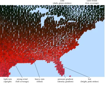
Figure 2.1 demonstrates the visualization of a weather dataset. The data are visualized using small glyphs that vary their color and texture properties. Color represents temperature; bright pink and red strokes for hot temperatures to dark green and blue strokes for cold tem-peratures. Coverage represents wind speed; tightly packed strokes with little or no background showing through for strong winds to sparsely packed areas for weak winds. Density represents
pressure; more strokes displayed in a fixed area of screen space for increasing pressure.
Figure 2.1: Visualization of a weather dataset using perceptual texture elements with temperature→color, wind
speed→coverage, pressure→density, and precipitation→orientation
2.2
Information Visualization
patterns [DKR97].
The basic components in visualizing information are:
• Conversion of raw data to a data table, which can then be mapped to a visual structure.
• Application of view transformations to increase the amount of information that can be visualized.
• Human interaction with these visual structures and the parameters of the mappings to create an information workspace for visual sense making [CMS99].
As with all types of visualization, the hope is that the human visual system can be used to rapidly filter and explore using visual properties such as shape, color, motion, and depth [FD01].
2.3
Guidelines for Visualization
Eick developed many special-purpose visualization systems for non-geometric datasets. He proposed guidelines to provide a foundation for designing visualizations [Eic95]. We adopted the following guidelines in our visualization system.
• Ensure that the visualization is focused on the user’s needs by understanding the data analysis task.
• Encode data using color and other visual characteristics.
• Show the evolution of temporally oriented data using animation.
2.4
Advantages of Visualization
The potential advantage of visualization techniques over other techniques from statistics, ma-chine learning, and artificial intelligence is that visualization allows direct interaction by the user and provides immediate feedback as well as user steering, which is difficult to achieve in other non-visual techniques [ABK98]. Graphical presentations allow query-by-attention, that is, answering questions by controlling visual attention (and reviewing immediate feed-back) rather than manipulating a data query interface and waiting for a server to return results [FD01].
2.5
Information Visualization Techniques
There are a number of well-known techniques for visualizing non-spatial datasets. These tech-niques can be roughly classified as geometric projection, iconic display, hierarchical, graph-based, pixel-oriented and dynamic (and combinations thereof) [Kei96].
algorithms [DH02]. The algorithms differ in the methods they use to represent both the global structure and local details of a dataset.
Overview + detail techniques represent multiple views in separate windows. This maintains
the original spatial relationships without any distortion. Overview reduces search, allows the detection of high-level patterns, and helps the user in deciding how to proceed with their anal-ysis [CMS99]. The users may also need detailed information about local areas of the dataset. Multiple views can be presented to the user in two ways: one at a time (time multiplexing) or together in a single display in different regions of the screen (space multiplexing) [CMS99].
Focus + context techniques provide users with a global overview as well as local detail
information. Focus + context techniques present both types of information to the user based on the assumption that the user needs to view both global and local information simultaneously. The content of information of each type needed by the user may not be the same, however this leads to a selective reduction of information from certain parts of the display in order to allocate more resources to correspond to the user’s interest.
Of the many visualization and interaction and distortion techniques, only a few are ex-plained here. These are the techniques that are most relevant to the remainder of this thesis.
2.5.1
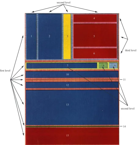
Tree-maps
second level
third level
second level first level
1 2 3
4
5
6
7 8 9
10
12
13
15
11
14
Figure 2.3: A tree representation of the three level filesystem hierarchy shown in Figure 2.2
into regions of interest. Later revisions to the tree-map allow users to select individual regions. This expands the region to fill the screen and show a higher level of detail, but at the expense of maintaining a view of the region’s location and context within the dataset.
Figure 2.2 shows the use of a tree-map to view the contents of a file system. The tree-map visualizes a filesystem with 15 files at three levels. The map is initially segmented into eight blocks (horizontal partitions). The top two blocks of the first level are divided again into four and three partitions respectively (vertical partitions), producing a new level. The dark red block located in the upper-right corner of the map is partitioned again (horizontal partition) to form the third level. Figure 2.3 shows the three level hierarchy.
2.5.2
Fisheye Lens
Figure 2.4: Fisheye lens view of the subway system in Washington, D.C.
level-of-detail display of the data directly beneath the lens [Fur86]. The fisheye technique is a
distorted-view approach that supports multiple focus points (via multiple fisheyes), enhances continuity through a smooth transition between overview and detail, and maintains location constraints to reduce a user’s sense of spatial disorientation. This technique provides a balance between local detail and global context. It consists of two steps: global allocation of space to rectangular sections of the display based on scale factors and a Degree-Of-Interest adjustment around the focus point to determine which “nearby” elements are brought into greater focus [BHD+95].
(a) (b)
Figure 2.5: (a) a hyperbolic browser representing a family’s genealogy; (b) the old root node (in red) is moved out of focus and a new root brought into focus (in green)
the periphery are displayed with very little detail, but still provide a hint at the global structure.
2.5.3
Hyperbolic Browser
Figure 2.6: A cone tree with shadows added to assist a viewer in understanding its structure.
2.5.4
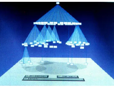
Cone Trees
A cone tree visualizes a hierarchical information space using depth and perspective projection. It visualizes hierarchical data as a tree of semi-transparent 3D cones, one for each category in the hierarchy with the root of the category placed at the apex of the cone. Sub-elements within a category are located around the base of the cone [RMJ+91, DH02]. The cones’ heights are uniform across a particular level. The radius of the cones’ bases decrease as we move down the hierarchy. The cones are semi-transparent to allow visualization of information that would otherwise be occluded (Figure 2.6). Cone trees also support interactive controls that allow the user to zoom in or zoom out over particular regions.
2.5.5
Visual Information Seeking Technique (VIS)
are used to rapidly adjust the query parameters with interactive interface controls like sliders and buttons. The filters can quickly reduce the number of items to be displayed. A second critical component is tight coupling, which allows the output from one query to be used as the input to another query. The interaction between the visualization engine and the query mech-anism is important, because it creates an environment where information can be explored in a rapid, incremental, reversible, safe, and comprehensible manner [AWS92].
Features of dynamic queries are as follows:
• Represent the query graphically.
• Provide visible limits on the query range.
• Provide a graphical representation of the database and the query result.
• Give immediate feedback of the result during every query adjustment.
• Allow novice users to begin working with little training, but still provide expert users with powerful features [WS92].
• A large set of search results can be narrowed by augmenting the query with additional search terms after the initial search [ACS+00].
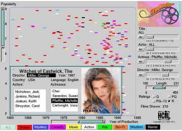
Figure 2.7: A FilmFinder overview of all movies that match the user’s current interactive query parameters
ranges; users can fine-tune their search easily; actions are incremental and reversible, and; trends and content of the database are easily inferred.
FilmFinder represents an example of a VIS system. FilmFinder’s dynamic query filters include a double box range selector to specify film length, buttons for ratings (G, PG, PG-13, R), large color coded buttons for film categories (drama, action, comedy, etc.), and Alphasliders for film titles, actors, actresses, and directors. The query results in FilmFinder are dynamically updated in a starfield display (Figure 2.7). A starfield display is a two-dimensional scatterplot with two attributes of the elements of the query results representing the axes. It structures result sets, supports selection, and allows zooming to reduce clutter. In the FilmFinder example, the
x-axis represents time and the y-axis represents popularity.
Figure 2.8: A user zooms the FilmFinder focus by choosing a particular actor (Sean Connery); as the number of films that match the query reduces, more spatial area is available for each film, and more information about the film is displayed
zoom in the colored spots representing films grow larger, giving the impression of flying in closer to the films. The labels on the axes are also automatically updated as zooming occurs. When fewer than 25 films are visible, their titles are automatically displayed. Users can click on an element to obtain more information (Figure 2.9). A card providing details such as actors, actresses, director and language is displayed.
2.5.6
Spiral Visualization Technique
Figure 2.9: A user selects a particular film to display additional information, such as actor list, language, director, and so on
Figure 2.10, shows an Archimedean spiral, represented in its polar form as:
r=αΘ (2.1)
where,
α is a constant x = r cosΘ
y = r sinΘ
(2.2)
Figure 2.10: An Archimedean spiral
The spiral visualization technique offers a number of advantages:
• The degree of clustering is higher [Kei96].
• It visualizes large datasets and supports much better identification of periodic structures in the data [WAM01].
• It supports comparison of values in a neighborhood and also supports the effective com-parison of several cycles in a dataset.
• It allows for comparison of multiple datasets, including the identification of offsets in their periodic behavior [WAM01].
(a) (b)
Figure 2.11: (a) displays movie data by release date (1930-1996, release date increases as we move farther from the center of the spiral), with color representing movie type and with each turn subdivided into twelve separate months; (b) restricts the display to horror movies (purple blots) to show that a disproportionate number of releases occurred just before Halloween
movie popularity and the square blocks represent five-year intervals radiating outward from the center of the spiral.
From the Figures 2.11a and 2.11b we conclude:
• Very few movies have been released in the month of December (the wedge representing December has very few blots).
• After 1985 there was a significant increase in the number of movie releases in the month of July (more blots occur in the outer region of the wedge representing the month of July).
Figure 2.12: Document icons are plotted in relation to the query icon: (a) multiple results at the same position on the query line plot on top of one another; (b) multiple results at the same position on the query line are spread radially to show their distribution
of the purple blots occur in October) [CK98].
2.5.7
Interactive Visualization of Multiple Query Results
The Sparkler method allows the user to visually compare multiple query results, explore differ-ent combinations of query results and iddiffer-entify the “best” matches for combinations of multiple independent queries. Sparkler is designed to use a vector space model to represent both the query results (documents) and the query statements. For each part of a multi-query, the vector representation of the query is compared to the vector representation of each document in the collection [HHP+01].
com-Figure 2.13: A zoomed view showing two result profiles for two separate queries (one in green, one in pink); query lines radiate from the center of the visualization (where the six triangular query icons are shown) through each query profile
puted by a search engine that ranks the query results. The ranking results in the most relevant documents listed first and the least relevant documents listed last.
In Figure 2.12b, icons of documents with similar relevance values are positioned at the same distance from the query icon but spread along an arc centered on the line in a variation of a simple histogram (for example, multiple documents with the same relevance are spread along an arc of constant radius from the query icon).
in position and shape. The pink Profile’s (Profile 1) innermost icon is closer to its query icon than green Profile’s (Profile 2). However, the bulk of the green Profile (Profile 2) is closer to its query icon than the pink Profile (Profile 1). The shorter distance between the inner and outer document icons in the green Profile (Profile 2) indicate less variation in relevance. When a document icon is selected within a profile, corresponding document icons in other profiles are highlighted in white. Circular grid lines are used to help viewers compare distance to the query icon.
Chapter 3
Perception
3.1
Perceptual Visualization
The objective of visualization is to present data in a graphical form that is informative and meaningful. This allows a viewer to rapidly and accurately analyze that data. Rapid develop-ment in computer systems has increased the amount of information flow tremendously. This has accelerated the need for effective visualization of information. One result is an increasing interest in the field of perceptual visualization.
3.1.1
Cognitive Vision
Figure 3.1: The internal structure of a human eye
3.1.2
Preattentive Processing
Certain visual tasks can be performed on complex displays very rapidly and accurately, usually in 250 milliseconds or less. This ability was initially termed “preattentive”, since task com-pletion appeared to precede focused attention in the visual system. Although we now know that attention has a significant impact on what our low-level visual system “sees”, the term preattentive is still useful to convey the speed with which these operations occur. In addition to being fast, preattentive tasks are normally independent of display size, that is, the time required to complete a given task is independent of the number of elements shown in the display. This suggests that partial information in the display is processed in parallel by the low-level visual system [Tre82, Tre85, Tre91]. Examples of visual features that can be used for preattentive tasks include luminance, hue, orientation, intensity, size, shape, curvature and line length.
Some examples of preattentive tasks are as shown in Figure 3.2. Viewers were asked to detect the presence or absence of a red circle target. In Figure 3.2a and 3.2b a red circle in a background of blue circles can be easily detected. In Figure 3.2c and 3.2d a red circle in a background of red squares can also be easily detected. However, in Figure 3.2e and 3.2f a red circle in a combined background of blue circles and red squares cannot be easily detected [HBE95]. In these displays the target contains no unique visual feature (since both red and circular distractors are shown in the background). Viewers must resort to a time-consuming serial search of the display to determine when the target is present or absent. This demonstrates one type of visual interference we must avoid to ensure an effective visualization design.
(a) (b)
(c) (d)
(e) (f)
(a) (b) (c)
(d) (e) (f)
result in visual interference in cases where a high-priority visual feature “masks” information a viewer tries to obtain about a lower-priority feature. Figure 3.3 shows an example of hue on orientation interference. In Figures 3.3a-c, the upper three images display constant background orientation, while the lower three images vary orientation randomly from stroke to stroke. The viewer has no difficulty in identifying a target group defined by color (green targets in the middle images, and brown targets in the left and right images). In Figures 3.3d-f the mapping is reversed, with orientation acting as the target and color displayed in the background. The background color is held constant in the upper three images and varied randomly in the lower three images. The targets are rotated 60 degrees counterclockwise from the x-axis in the middle images, and 45 degrees in the left and right images. Experimental results confirm it is much harder to locate the target group when color is varied randomly then when the color is held constant. This demonstrates the asymmetric hue on orientation effect: random orientation has no impact on hue detection, but random hue masks our ability to identify differences in orientation.
These results suggest that the most important attributes should be mapped to the most salient features and secondary data should never be visualized in a way that would lead to visual interference. The order of importance for visual features is luminance, hue, and then various texture properties.
3.2
Color
Color has two aspects: physical and perceptual. The physical aspect deals with the spectral properties of light. Light is electro-magnetic energy in the 400 nm to 700 nm wavelength range and includes violet, indigo, blue, green, yellow, orange and red. The amount of energy present at each wavelength is represented as a spectral distribution function which is characterized by three properties: dominant wavelength, excitation purity and luminance. The perceptual aspect deals with what an observer “sees” and is represented by the corresponding perceptual properties hue, saturation and brightness [CSC562, Fol97].
Color is widely used in many visualization techniques. Simple color schemes include the rainbow spectrum, red-blue or red-green ramps, and the grey-red saturation scale, whereas more complex techniques attempt to control the perceived difference between different colors. This leads to perceptual balance in the color scale to produce uniform difference in color, distinguishability between colors, and flexibility in selecting the color from any part of the color spectrum.
Comparison of different color models based on perceived color difference is as follows:
1. Monitor RGB is not a balanced color model.
2. More sophisticated theoretical color models like CIE LUV and CIE Lab are perceptually balanced over small distances of the color spectrum. In these models Euclidean distance roughly corresponds to perceived color difference.
cate-gory can be combined to produce color balance over larger distances in the color spec-trum. Linear separation is the ability to linearly separate each target color from all the background colors with a line or a plane in the color model being used. Color category represents the named color regions occupied by both the target and non-target [Hea96].
4. Simultaneous contrast error can also be controlled by ensuring a monotonically increas-ing luminance across the color scale.
We use a combination of rules 2, 3, and 4 to guarantee control over the colors we display in our visualizations.
3.3
Texture
pre-Figure 3.4: Visualization of a weather dataset using perceptual texture elements (pexels): temperature→color,
precipitation→orientation, pressure→spatial density, and wind speed→size
cipitation is mapped to orientation, pressure is mapped to density, and wind speed is mapped
to size.
Figure 3.5: Visualization of ‘Comedy’ movies using glyphs: user rating → position on the spiral and user
rating→ height, length→ luminance, year→color of the sphere at the bottom of the glyph, and genre → shape of the geometric objects wrapped around the glyph
user rating of the movie and luminance represents the length of the movie. The position of
Chapter 4
Animation
“Animation is a sequence of frames played in order at sufficient speed to present a smooth moving image like a film or video. An animation can be digitized video, computer-generated graphics, or a combination” [Ani03].
“Computer animation is a computational theoretical basis and technology for aiding the animator on specifying and depicting the ‘change function’ which when applied to a frame results in its successor frame.” The main goal of computer animation is to synthesize the desired motion effect and blend human perception and imagination that results in a visual aesthetic manner [HPT89].
be displayed, and the intermediate states to be highlighted in each animation step [SO01]. Introducing time into scientific visualization can change its meaning.
Animation is increasingly used as visual momentum to provide smooth transitions between views and to visualize temporal aspects [Bar97, WAM01].
4.1
Need for Animation
Static visualizations of dynamic information are sometimes ineffective because they do not convey motion. Animated displays can enhance understanding if the user can interactively control the animation or use it in conjunction with other types of displays.
Figure 4.1: Visualization of time-series data, time is represented by position along the spiral
4.2
Visualizing Time-Series Data on Spirals
Time-series data is analyzed in order to discover underlying processes, to identify trends and to predict future developments. Weber et. al., utilized the ability of the visual system to discover periodic behaviors, structures, and underlying cyclic processes using Spiral Graph.
Spiral Graph has the following features:
1. Provides a single visualization technique for nominal, ordinal, and quantitative data.
2. Supports visualization of large datasets.
3. Supports comparison and analysis of a dataset.
Figure 4.2: A multi-spiral with two separate time-series tracks shown with different colors representing stock prices for Sun Microsystems (red) and Microsoft (yellow); one turn along the spiral represents one year
In Spiral Graph time-dependent data is visualized along an Archimedean spiral. The attributes of the time-series data are mapped to visual features such as color, texture, and thickness of the arc of the spiral.
Figure 4.1 shows nominal time-series data visualized on a spiral. Visualization on a spiral helps in understanding the periodic behavior of the underlying process.
Figure 4.3: A radial layout technique for graph-based data
4.3
Animated Exploration of Graphs
Information visualization can be used to understand network structure. Animated exploration
of graphs is a technique for animating the transitions from one view to another, in a smooth
and appealing manner which can yield new insights into the data.
This technique visualizes a connected graph consisting of one connected component that dynamically changes over time with the insertion or deletion of nodes. The viewer can navigate the graph by selecting visible nodes to become the focus node.
Figure 4.4: Interpolation in rectangular coordinates (left) leads to a confusing animation; interpolation in polar coordinates (right) is more appropriate for radial layouts
the ring corresponding to its shortest network distance from the focus. The angular position of a node on its ring is determined by the sector of the ring it receives. A node is allocated an arc within its parent’s sector, with size proportional to the angular width of the node’s subtree. For example, in Figure 4.3 Node A is the focus node, so it is allocated all 360 degrees to distribute among its children. Node B has many children of its own, and hence it is given a larger arc then its siblings.
A user can explore a graph by selecting a visible node as the new focus. Rearranging the graph from the perspective of the new focus simply by switching to the new view can result in a highly disorienting rearrangement. To reduce this disorientation, Yee et. al., used animation to perform a smooth transition, and also enforced constraints on the new layout in order to keep it as similar as possible to the current layout [YFD+01]. This makes the transition easier to follow.
(a)
(b)
avoid collisions as the nodes move. A node that stays on a ring follows the circumference of the ring, while a node that changes rings spirals smoothly from one ring to another [YFD+01]. Yee et. al., devised two constraints to maintain the best possible consistency between the old and new layouts. First, they choose an orientation for the new layout that reduces rotational movement. In Figure 4.5a, node B is the focus node and node A is a child of node B. The viewer has asked for node A to become the new focus node. The resulting layout is oriented such that the direction of the edge BA joining the new focus and its parent remains constant. Second, since the graph is not necessarily a tree, a node’s new children might currently be non-tree neighbors. In Figure 4.5b, node A, currently residing on ring 1, is selected to become the new focus. Before the transition, edges 1 through 8 are edges to node B’s children, and edges 9 and 10 are non-tree edges. During the transition, node B moves to ring 1 while its neighbors (except for node A) move to ring 2, with edges 1 through 10 maintaining their relative order [YFD+01].
Chapter 5
Implementation Design
This chapter describes the implementation details of our animated information visualization system. As discussed in chapter 1 our implementation design consists of two basic steps:
1. Selecting effective visualizations for individual, static query results.
2. Visualizing correspondence between query results.
In the next section we discuss how we chose to map data attributes to visual features.
5.1
Mapping Data Attributes to Visual Features
specific values of the visual features to display.
Different visual features are best suited for different types of data and analysis tasks. For example, variations in luminance are appropriate for displaying high spatial frequency data. Hue is better suited for categorical data. Another critical factor that must be considered is the number of elements that must cluster together in order for different features to be salient.
Texture-based properties like height and density can also be used to represent information. For example, in the MovieLens dataset, height encodes the user rating of a movie. Spatial density represents the similarity in user-chosen ranking attribute between different elements in a query result. The length of the movie is represented by variations in luminance. Hue represents the time span (in twenty year increments) in which the movie was released. Finally, the shape of objects wrapped around the glyph represents the genre of the movie. Figures 5.1 and 5.2 show variations in height and luminance, respectively.
5.2
Visualization of Query Results
We use a user-chosen ranking attribute to position glyphs along a spiral embedded in a plane such that the value of the ranking attribute decreases as we move away from the center of the spiral. The equation of the spiral is as follows:
Figure 5.1: Visualization of ‘All’ movies using glyphs that vary their height to represent different values of movie
length (in minutes)
where
• R is a constant representing the maximum distance of a point on the spiral from the center of the spiral,
• t, a parametric variable varies from 0 to 1, and
• turnsis a constant representing the number of turns in the spiral.
We positioned the glyphs along a spiral because:
1. It supports better identification of periodic structures in a dataset.
2. It supports comparative reading of the query result.
Figure 5.2: Visualization of ‘All’ movies using glyphs that vary their luminance to represent different values of movie length (in minutes)
4. It allows efficient use of the screen space.
5. As discussed in the following sections, in the animation phase when the glyphs are mov-ing from their positions in the first query result to their positions in the second query result, it helps to avoid collisions between glyphs.
In Figure 5.3, we visualized ‘Comedy’ movies from a MovieLens query result using our glyphs. The attributes for each data element are title, genre, year the movie was released, length in minutes, and user rating for all users in MovieLens and IMDB who ranked this movie (on a scale of 0 to 50).
The data feature mapping for the above visualization is as follows:
Figure 5.3: Visualization of ‘Comedy’ movies using glyphs: user rating → position on the spiral and user
rating→ height, length→ luminance, year→color of the sphere at the bottom of the glyph, and genre → shape of the geometric objects wrapped around the glyph
• year is represented by a colored sphere at the bottom of the glyph ∈ [red for 1921 to 1940, green for 1941 to 1960, blue for 1961 to 1980, aqua for 1981 to 2000, and white for movies released after 2000].
• user rating of the movie is represented by height.
• genre of the movie is represented by different shaped objects wrapped around the glyphs
at different heights (note it’s possible for a movie to be associated with multiple genres, thus the need to support multiple different shapes simultaneously).
movie was released between 1941 and 1960, and the icosahedron wrapped around the glyph represents the genre of the movie (Comedy).
5.3
Linear Clustering Algorithm
We use a simple variation of a 2D color image segmentation algorithm developed in our labo-ratory to partition a query result into clusters based on a user-chosen ranking attribute. All the elements in a cluster have a ranking that is “similar” in value. Two elements in a cluster are said to be “similar” if the difference between the ranking attribute of the elements is less than or equal to a user-chosen error limitε[CIS03].
Given ranking attributej, our linear clustering algorithm proceeds as follows:
1. Array the elementsei along the spiral based on their ranking attribute valuesei,j.
2. Choose the first element of the query resulteithat is not part of any cluster.
3. Set the median valuemedfor the new cluster toe1,j.
4. Choose the next non-clustered elementei that is closest on the spiral toe1.
If|ei,j−med| ≤εfor some user-chosen thresholdε, addeito the cluster and update the
cluster’s median.
5. Continue until no more elements can be added to the cluster.
(a) (b) (c) (d)
(e) (f) (g) (h)
Figure 5.4: Examples of different segmentation algorithms applied to an RGB image of a golden poppy; (a,b,c,d) segments in grey with a fixed, running average, weighted average withr= 1, and weighted average withr=78, respectively; (e,f,g,h) segments overlaid on the original RGB image
The algorithm grows each cluster around a starting element. A new elementei is accepted if its ranking value ei,j is “close enough” to the cluster’s median value. The clustering process
stops when no new elements can be added to the cluster. If there still exist elements that do not belong to any cluster, the algorithm grows another cluster in the same manner. The condition for an element to be added to a cluster is:
|ei,j−med| ≤ε (5.3)
whereei,j is the user-chosen ranking attribute value of the new element under consideration, medis the cluster’s median value, andεis a user-defined threshold. εis fixed whereasmedis updated as new elements are added.
update methods. JPG files consist of pixels that encode three data values: red, green, and blue. In this example all three colors had to be withinε of a cluster’s median to allow a new element to be added to the cluster. Figure 5.4 shows the results of applying several different methods for updating the median. The large image of poppy petals on the left was the basis for these segmentations. The top row of smaller images shows the results of four different median update methods. In Figures 5.4a through 5.4d, the grey areas represent segments. The bottom row of images shows these segments overlaid on the original image.
In Figure 5.4a, a fixed median is used, that is, the median is initialized, but not updated. Since the median is initialized to the starting element’s RGB values, the cluster that results depends heavily on the initial element. Figures 5.4a and 5.4d show a low-detail cluster being produced, suggesting this method is too sensitive to the initial starting conditions.
In Figure 5.4b each new element averages its values with the current median:
med= med2+ei,j (5.4)
With this method, the new element has a large effect on the median. This results in a very coarse segmentation. Figures 5.4b and 5.4f show the results of using this method on the poppy JPG.
a variabler. When thekthelement is being added, the median is updated as follows:
med= Pk−11
x=0rx[r 0e
1,j+r1e2,j+...+rk−1ek,j] (5.5)
whereei,j is the value of the jth attribute of theith member of the segment. Dividing by the geometric series,Pkx−=01rx, ensures thatmedlies within the range of the data (that is,minj ≤ med≤maxj).
Based on the above results, we decided to use the fourth median update method:
med= Pk−11
x=0rx[r 0e
1,j+r1e2,j+...+rk−1ek,j] (5.6)
wherej is the user-chosen ranking attribute andr = 0.875.
5.4
Animation Between Pair of User Query Results
We use animation to morph between pairs of query results to allow the viewer to see their similarities and the differences. This also highlights neighbors that maintain their relative position (that is, relative ranking with one another) along the spiral. The animation consists of three phases. In the first phase, we display results from the first user query, then gradually remove glyphs that are not present in the second query. In the second phase, glyphs that are common to both queries move to their new positions based on the results of the second query. Clusters of glyphs that maintain their neighborhood with one another across both queries move first, followed by individual glyphs that are not part of any shared cluster. During this phase the height of the glyphs will change to represent any change in ranking. In the third phase, glyphs that are present only in the second query gradually appear.
clustering in its glyphs. Position on the spiral is controlled entirely by the underlying user
rating values (i.e. the clusters do not exist because the visualization system has artificially
repositioned the glyphs to form spatial clusters). We believe this is due to the discrete nature of the MovieLens recommendation rankings, which range from one to five on a half-point scale (i.e. 1, 1.5, . . ., 5 for a total of 10 separate rankings). The IMDB average user rating appears to be highly correlated with the MovieLens rankings, that is, a strong recommendation for a movie normally implies a high IMDB average user rating. Because of this, even with the inclusion of the IMDB user ratings, movies still tend to cluster close to one another when they have the same MovieLens ranking. Thus, we see up to ten clusters, exactly as shown in Figure 5.5.
Once the initial display is built, we slowly remove glyphs that are not present in the second user query by gradually making them transparent. This produces a display of the glyphs com-mon to both query results. The positions of the glyphs at this point are still based on the first query’s results. Figure 5.6 shows the fifteen glyphs common to both the user queries with two glyphs in cluster 1, one glyph in cluster 2, two glyphs in cluster 3, one glyph in cluster 5, three glyphs in cluster 6, four glyphs in cluster 9, and two glyphs in cluster 10.
1. cluster 1 (containing two glyphs)→cluster 1 (maintains its position)
2. cluster 2 (containing one glyph)→cluster 2
3. cluster 3 (containing two glyphs)→cluster 2
4. cluster 5 (containing one glyph)→cluster 2
5. cluster 6 (containing three glyph)→cluster 3 (cluster-to-cluster movement)
6. cluster 9 (containing four glyphs)→cluster 4 (three glyphs) + cluster 5 (one glyph)
7. cluster 10 (containing two glyphs)→cluster 5 (one glyph) + cluster 6 (one glyph)
At any given point in time only the glyphs belonging to one cluster are moving from their original position to their new position. As the animation unfolds the glyphs in a cluster move closer to their target positions. The other glyphs remain stationary and wait for their turn to move. The second phase ends when all the common glyphs are moved to their new positions based on rankings in the second query.
In the third phase, the glyphs that are new to the second query start to gradually appear. At the end of this phase, the visualization system is displaying results from the second user query in their entirety.
Figure 5.5: Visualization of the first query result
Figure 5.7: Visualization of the common elements from the two queries, with position based on the second query
Chapter 6
Practical Application
This chapter describes an application of our visualization tool to display results from Movie-Lens queries. We built a collection of MovieMovie-Lens recommendations to test our animated visu-alization system. MovieLens data includes attributes such as movie title, genre, year the movie was released, length in minutes, and user rating, that are commonly used in day-to-day life. Thus it is relatively simple to understand the visualizations and to evaluate the results.
6.1
Collection of Data
The way MovieLens works is as follows: A user tells MovieLens the movies he/she has already seen, and rates how much he/she liked each movie on a scale of 1 to 5, where 1 means the user did not like the movie at all, and 5 mean the user liked the movie a lot. Once this information is entered in the database, MovieLens matches against the user’s profile to identify other users who share the same interests in movies. Once it finds similar users, MovieLens recommends movies that those users have seen and liked, but that the current user has not seen. This results in recommendations that are tailored specifically to the personal tastes of the user. Graduate students from our department volunteered to rate movies that they have seen. We used this data to produce multiple recommendations from MovieLens. Since MovieLens provides only a movie’s title, its genre and an average user rating, we augmented its data with information taken from the Internet Movie Database (IMDB, http://www.imdb.com): the year the movie was released, length of the movie in minutes, and IMDB rating of the movie.
Unfortunately, MovieLens uses a discrete movie rating from 1 to 5 in 12 point steps (i.e., ten unique ratings). To convert this into a more continuous scale, we multiplied each MovieLens rating by the movie’s corresponding IMDB rating (a 100 point scale on the range 1 to 10).
It produced a final user rating of:
user rating=MovieLens rating×IMDB rating, (6.1)
6.2
Data Feature Mappings
The query results used as input for our visualization system have the following attributes: movie title, genre of the movie, year the movie was released, length in minutes, and user
rating.
The initial data feature mappingM1used to visualize each query was as follows:
• The user rating of the movie is represented by variations in luminance ∈[light red,...., dark red].
• The year the movie was released is represented by a colored sphere at the bottom of the glyph. A red colored sphere indicates the movie was released between 1921 and 1940, a green colored sphere indicates between 1941 and 1960, a blue colored sphere indicates between 1961 and 1980, an aqua colored sphere indicates between 1981 and 2000, and a white colored sphere indicates after 2000.
• Different shaped objects wrapped around the glyph at different heights represent the
genre of the movie. A torus wrapped around the glyph indicates the movie is an Action
movie, an icosahedron indicates a Comedy, an octahedron indicates a Drama, and a tetrahedron indicates a Romance movie.
• The length of the movie is represented by height.
The user rating was also used as the ranking attribute to position glyphs along the spiral. High
Figure 6.1: Visualization of a MovieLens query using mappingM1
glyph near the boundary. A high spatial density of glyphs represents areas of similar user
rating among elements in a query.
Figure 6.1 shows an example of a visualization generated by our system usingM1.
Mapping user rating to both spatial position and luminance was done to emphasize the ranking attribute. However, luminance variations were not always easy to identify, especially in the presence of computer-generated lighting. Because of this, we decided to switch to a new mappingM2:
• Now, the user rating of the movie is represented by height.
Figure 6.2: Visualization of a MovieLens query using mappingM2
1980, an aqua colored sphere indicates between 1981 and 2000, and a white colored sphere indicates after 2000.
• Different shaped objects wrapped around the glyphs at different heights represent the
genre of the movie. A torus wrapped around the glyph indicates the movie is an Action
movie, an icosahedron indicates a Comedy, an octahedron indicates a Drama, and a tetrahedron indicates a Romance movie.
• The length of the movie is represented by variations in luminance∈[light red,...., dark red].
6.3
Visualization of MovieLens Query Results
We use a user-chosen ranking attribute to position glyphs along an embedded spiral such that the value of the user-chosen ranking attribute decreases as we move away from the center of the spiral (for example, user rating in Figures 6.1, and 6.2). We use the same user-chosen ranking attribute to group the query result into clusters that are “similar” to one another. Two elements in a cluster are said to be “similar” if the difference between the user-chosen ranking attribute is less than or equal to a user-chosen error limit. In our visualization example, the glyphs can be positioned along the spiral based on movie title, year of release, length in minutes, and user
rating. In the following example, the user selected user rating to position the glyphs along
the spiral and to group the movies into clusters. Each query result contains 40 recommended movies for the particular query made by the user.
6.4
Animation of the Query Results
(a) (b)
(c) (d)
(e) (f)
(a) (b)
(c) (d)
(e) (f)
(a) (b)
(c) (d)
(e) (f)
(a) (b)
(c) (d)
(e) (f)
(a) (b)
(c) (d)
(e) (f)
(a) (b)
(c) (d)
(e) (f)
(a) (b)
(c) (d)
(e) (f)
(a) (b)
(c) (d)
(e) (f)
Chapter 7
Conclusions and Future Work
Information visualization often involves the display of a large number of multidimensional data elements with no inherent geometry. Effective visualization techniques can help users to understand complex collections of data in a rapid, accurate, effective, and effortless manner. Due to the growing interest in information visualization, there is significant research being conducted in this area. To date, however, few techniques have been proposed that use animation to show the relationships between multiple perspectives on an information space.
their color, placement, and texture properties to encode the element’s attribute values. The result is a display that allows viewers to rapidly and accurately explore and discover within their data.
Animation is used to highlight the similarities and differences between pairs of query re-sults. First, a linear clustering algorithm is applied to identify clusters of elements common to both queries. We then use an animation step to morph between the two results. This shows where clusters of common elements are positioned within each query. In this way, our system provides an effective visual description of results within a query, and any correspondence that may exist between the queries.
We used query results from the MovieLens database along with a variety of other infor-mation about each movie from the IMDB database as a practical testbed for our visualization system. We were able to apply our techniques to build perceptually salient visualizations and animations of relationships between different movie recommendations.
Bibliography
[ABK98] Ankerst, M., S. Berchtold, and D. A. Keim (1998). Similarity Clustering of Di-mensions for an Enhanced Visualization of Multidimensional Data.
Proceed-ings IEEE Symposium on Information Visualization, InfoVis ’98, p.52-60.
[ACS+00] Au P., M. Carey, S. Sewraz, Y. Guo, and S. M. Ruger (2000). New Paradigms in Information Visualization.
[Ado02] Adobe Products (2002). Color Models. Adobe Technical Guides retrieved from http://www.adobe.com/support/techguides/color/colormodels/ on [01/05/03]. [Ani03] Scala, Inc. -Glossary of Terms (2003). Retrieved from
http://www.scala.com/definition/animation.html on [01/28/03].
[AKK96] Ankerst, M., D. A. Keim, and H. P. Kriegel (1996). ‘Circle Segments’: A Tech-nique for Visually Exploring Large Multidimensional Data Sets. Proceedings
Visualization ’96.
[AS94] Ahlberg, C., and B. Shneiderman (1994). Visual Information Seeking: Tight Coupling of Dynamic Query Filters with Startfield Displays. Proceedings of
ACM Conference on Human Factors in Software, CHI ’94, p.313-317.
[AWS92] Ahlberg, C., C. Williamson, and B. Shneiderman (1992). Dynamic Queries for Information Exploration: An Implementation and Evaluation. Proceedings
ACM Conf. Human Factors in Computer Systems, CHI ’94.
[Bar97] L. Bartram (1997). Perceptual and Interpretative Properties of Motion for In-formation Visualization. Technical Report CMPT-TR: 1997-15.
[BHD+95] Bartram, L., A. Ho, J. Dill, and F. Henigman (1995). The Continuous Zoom: A Constrained Fisheye Technique for Viewing and Navigating Large Information Spaces. Proceedings of ACM UIST ’95 (November 14-17, Pittsburgh, USA),
[BL99] Bares, W. H., and J. C. Lester (1999). Intelligent Multi-Shot Visualization In-terfaces for Dynamic 3D Worlds. IUI ’99.
[Buc] N. Buckner. Visualization Techniques for Hierarchical Information Structures. [CIS03] Healey, C. G., and L. Tateosian (2003). Color Image Segmentation. Retrieved
from http://www4.ncsu.edu/ lgtateos/thesis.pdf on [01/10/03].
[CK95] Carriere, J. and R. Kazman (1995). Interacting with Huge Hierarchies: Beyond Cone Trees.
[CK98] Carlis, J. V., and J. A. Konstan (1998). Interactive Visualization of Serial Peri-odic Data. ACM Symposium on User Interface Software and Technology, p.29-38.
[CMS99] Card, S. K., J. D. Mackinlay, and B. Shneiderman (1999). Reading In Infor-mation Visualization Using Vision To Think.
[CSC562] C. G. Healey. Graduate Computer Graphics course notes (CSC 562) [Spring 02].
[DH02] Dennis, B., and C. G. Healey (2002). Assisted Navigation for Large Informa-tion Spaces. IEEE VisualizaInforma-tion Proceedings of the conference on VisualizaInforma-tion
’02. p.419-426.
[DKR97] Derthick, M., J. Kolojejchickm and S. F. Roth (1997). An Interactive Visual-ization Environment for Data Exploration. American Association for Artificial
Intelligence.
[Eic95] S. G. Eick. (1995). Engineering Perceptually Effective Visualizations for Ab-stract Data.
[FD01] Foltz, M. A., and R. Davis (2001). Query By Attention: Visually Searchable Information Maps. Proceedings of Fifth International Conference on
Informa-tion VisualisaInforma-tion.
[FLC+02] Freitas, C. M, P. R. Luzzardi, R. A. Cava, M. Winckler, M. S. Pimenta, and L. P. Nedel (2002). On Evaluating Information Visualization Techniques. Advanced
Visual Interfaces, Trento, Italy.
[Fol97] Foley, J. D., A. van Dam, S. K. Feiner, and J. F. Hughes (1997). Computer
Graphics Principles and Practice, Addison-Wesley Publishing Company.
[Fur86] G. W. Furnas (1986). Generalized fisheye views. Proceedings CHI ’86 (Boston,
[GSF97] Gross, M. H., T. C. Sprenger, and J. Finger (1997). Visualizing Information on a Sphere. IEEE Symposium on Information Visualization (InfoVis ’97).
[HBE95] C. G. Healey, K. S. Booth and J. T. Enns (1995). Visualizing Real-Time Mul-tivariate Data Using Preattentive Processing. ACM 1995.
[HE96] C. G. Healey and J. T. Enns (1996). A Perceptual Color Segmentation Algo-rithm. UBC CS Technical Report TR-96-09.
[Hea96] C. G. Healey (1996). Choosing effective colors for data visualization.
Proceed-ing Visualization ’96, p.263-270.
[Hea98] C. G. Healey (1998). Perceptual Colors and Textures for Scientific Visualiza-tion.
[HE98] Healey, C. G., and J. T. Enns (1998). Building Perceptual Textures to Visualize Multidimensional Datasets. IEEE Visualization ’98, Research Triangle Park, North Carolina.
[HE99] Healey, C. G., and J. T. Enns (1999). Large Datasets at a Glance: Combining textures and colors in scientific visualization. IEEE Transactions on
Visualiza-tion and Computer Graphics 5, 2 (1999), p.145-167.
[Hea01] C. G. Healey (2001).Formalizing Artistic Techniques and Scientific Visualiza-tion for Painted RenderiVisualiza-tions for Complex InformaVisualiza-tion Spaces. Proceedings
IJCA ’01.
[HPP03] C. G. Healey. Preattentive Processing. Retrieved from http://www.csc.ncsu.edu/faculty/healey/PP/ on [01/05/03].
[HHP+01] Harve, S., E. Hetzler, K. Perrine, E. Jurrus, and N. Miller (2001). Interactive Visualization of Multiple Query Results.
[HM90] R. B. Haber and D. A. McNabb (1990). Visualization Idioms: A conceptual model for scientific visualization and perception of textures. Visualization in
Scientific Computing. IEEE Computer Society Press.
[HMM00] Herman, I., G. Melancon, and M. S. Marshall (2000). Graph Visualization and Navigation in Information Visualization: a Survey.
[HPT89] Hegron, G., P. Palamidese, and D. Thalmann (1989). Motion Control In Ani-mation, Simulation, And Visualization. EUROGRAPHICS Working Group on
Simulation and Animation, Battelle Memorial Institute, Geneva.
[HSD73] Haralick, R. M., Shanmugam K., and Dinstein I (1973). Textural features for image classification. IEEE Transactions on System, Man, and