I
n t u i t i v e
V
i s u a l i s a t i o n
o f
M
u l t i
-V
a r i a t e
d a t a
s e t s
u s i n g
t h e
E
m p a t h i c
V
i s u a l i s a t i o n
A
l g o r i t h m
(EVA)
Andreas Loizides
A dissertation submitted in partial fulfillment of the requirements for the degree of
Doctor of Philosophy
of the
University of London.
Department of Computer Science University College London
ProQuest Number: U643378
All rights reserved
INFORMATION TO ALL USERS
The quality of this reproduction is dependent upon the quality of the copy submitted.
In the unlikely event that the author did not send a complete manuscript and there are missing pages, these will be noted. Also, if material had to be removed,
a note will indicate the deletion.
uest.
ProQuest U643378
Published by ProQuest LLC(2016). Copyright of the Dissertation is held by the Author.
All rights reserved.
This work is protected against unauthorized copying under Title 17, United States Code. Microform Edition © ProQuest LLC.
ProQuest LLC
789 East Eisenhower Parkway P.O. Box 1346
Abstract
The central thesis of this research is that there exists an algorithm that can produce a naturalistic
visual structure (such as a human face) that represents a multivariate data set that can be utilised to discover hidden features in the data.
Research in this thesis lies in the area of Information Visualisation and is concerned with techniques for visualising large scale multivariate data sets in order to help in understanding and exploration. Examples include hnancial data, business information and results from exper iments. A visualisation method maps such data ideally into intuitive visual structures, however, in most cases there is no obvious mapping from the data to the visual structure.
This thesis explores the use of naturalistic visual structures (for example, human faces) as representations of such multivariate data sets. An automatic mapping from the data to the visual structure is constructed through the use of the empathic visualisation algorithm (EVA)
implemented for this purpose. EVA, is a fundamental extension of the type of data visualisation hrst introduced by Chemofl, who exploited the idea that people are hardwired to understand faces and therefore can quickly interpret information encoded into facial features. We use faces as our paradigmatic example, but the method is not limited to this case only.
Given an n, x k data matrix of n, observations on k variables, the original Chemoff method assigns each variable to correspond to a particular facial feature like shape of the nose, or shape of the eyes. The mapping from data to visual structure is arbitrary, and the resulting faces have no correspondence to the underlying semantics of the data. Such faces are good for understanding pattern, but any individual face seen in isolation does not readily convey anything about the data without knowledge of the specihc mapping used.
EVA provides an automatic mapping from semantically important features of the data to emotionally or perceptually signihcant features of the corresponding visual structure, such as a human face. In other words a single glance at the visual structure informs the observer on
A b s t r a c t ii
visual structure are then available through knowledge of the relationships between semantically important features of the data and emotionally significant aspects of the visual structure.
EVA uses a Genetic Program (OF) to map the quantitative measurements from the multidi mensional data set to the qualitative measurements of the visual structure. The genetic program typically converges after about 75 generations. The experimental data supports the main thesis
Acknowledgements
The work presented in this thesis would not have been possible without the inspiration of my supervisor Prof Mel Slater. I owe special thanks to Mel Slater for his creative guidance in what turned out to be a fruitful area of Information Visualisation. His assistance, support and pa tience have been invaluable throughout my years as a Phd student. Moreover, he was willingly subjected to several early, very rough, versions of this thesis and his productive comments and suggestions have undoubtedly improved things.
I am extremely indebted to many of my colleagues and friends who have read and provided feedback on this thesis. Many special thanks go to Evelina Georgiades for spending long hours reading and suggesting changes to my thesis. She has been a true angel. There are no words to thank her enough. I am also very grateful to Dr Celine Loscos and Dr Yiorgos Chrysanthou for giving me the permission to use and abuse their office for several months and especially Celine for lending me her laptop to work with. I would also like to thank Dr Peter Bentley, Dr Anthony Steed, Dr Bill Langdon and Prof Bernard Buxton for their positive comments and feedback.
Special thanks goes to NCR Financial Services, and more specifically, to the Knowledge Lab of NCR for awarding me a fellowship that funded a significant portion of my graduate
education.
I am very grateful to Prof Bob Spence of Imperial College London, for willingly agreeing to read my thesis despite his busy time. Also I am grateful to Prof Ben Shneiderman, Prof Alf Inselberger, Prof Rao Ramana and Prof Steve Feiner for granting me permission to use images from earlier research work they performed in the field of Information Visualisation. The images
have been used as examples in the literature review.
I am also grateful to my friends who have been there for me whenever I needed them.
They accepted my sometimes moody behaviour, that were not used to, and my long spells of going missing. I will avoid mentioning names in case I forget someone. I am sure they know who they are. Special gratitude also goes to someone special. I wish things would have been different.
A c k n o w l e d g e m e n t s iv
‘Graphical Excellence is that which gives the viewer the greatest number of ideas in the
Contents
Introduction 2
1,1 Thesis Term inology... 3
1.2 M otivation... 1.3 The Goals of this Thesis 1.4 Scope of this Thesis . . 1.5 C ontributions... 1.6 Thesis O utline... 2 Background 10 2.1 Information Visualisation... 2.1.1 O v erv iew ... 2.1.2 How Visualisation Amplifies Cognition? ... 2.1.3 H is to r y ... 2.1.4 Definitions and Classification ... 2.2 Multivariate Information V isualisation... .. 2.2.1 Abstract Visual Structures - Arbitrary Mapping . , 2.2.2 Abstract Visual Structures - Automatic mapping 2.2.3 Naturalistic Visual Structures - Arbitrary mapping 2.3 Discussion... 11 11 12 13 14 19 20 29 31 35 3 EVA Methodology 36 3.1 Statement of the P ro b le m ... 36
3.2 F undam entals... 38
3.3 Assumptions and N o ta tio n ... 40
3.3.1 Assumptions and Notation by E x a m p le ... 41
3.3.2 Using Genetic Programming ( G P ) ... 43
C o n t e n t s v ü
3.4 O v e rv ie w ... 44
3.5 Discussion... 45
4 Using Human Faces and Measuring Human Emotions 47 4.1 Parameterised vs Muscle Face M o d e ls ... 47
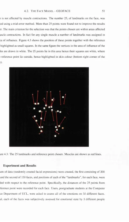
4.2 The Face Model - GEOFACE... 48
4.2.1 Generating Facial E xpressions... 48
4.2.2 The Need to Measure Facial Expressions In d e p e n d e n tly ... 50
4.2.3 Measuring Emotional E xpressions... 50
4.2.4 Experiment and Results ... 51
4.2.4.1 Training data - GP configuration ... 52
4.2.4.2 R e su lts... 56
4.2.5 Using Principal Component Analysis to Improve this M e t h o d 56 4.2.5.1 Results after P C A ... 61
4.3 C onclusions... 61
5 Genetic Programming Review 62 5.1 Why are we Using GP ... 62
5.2 Introduction... 63
5.3 Evolutionary C o m p u tatio n ... 64
5.4 Search Techniques ... 64
5.5 Genetic Algorithms ( G A ) ... 67
5.6 Genetic Programming ( G P ) ... 69
5.6.1 Emergent Intelligence ... 69
5.6.2 Structures Undergoing Adaptation - A lg o rith m ... 69
5.6.3 Functions and T e rm in als... 70
5.6.4 Initial Structures - First Population... 71
5.6.5 Fitness ... 72
5.6.6 State of the S y s te m ... 73
5.6.7 Termination Criterion... 73
5.6.8 Different Representations ... 74
5.6.9 Different Selection M echanism s... 74
5.6.10 Different GP Systems Based on S y n t a x ... 75
5.6.11 Primary Genetic O p e ra tio n s ... 75
C o n t e n t s viii
5.6.13 Improving the Speed of GP With Parallélisation... 77
5.6.14 Induction of Hierarchically Organised S tru c tu re s ... 78
5.6.15 Effect Of Primary Control P aram eters... 78
5.6.16 C o n c lu sio n ... 79
5.7 Discussion... 80
6 Experim entation and Results 82 6.1 First Experiment - Set of C ir c le s ... 82
6.1.1 Setting Up of the Experiment ... 82
6.1.1.1 Step 1 ... 83
6.1.1.2 Step 2 ... 83
6.1.1.3 Step 3 ... 84
6.1.1.4 Step 4 ... 85
6.1.1.5 Step 5 ... 86
6.1.2 Details of the Experiment ... 87
6.1.3 R e s u l ts ... 89
6.1.4 Discussion ... 92
6.2 Second Experiment - F a c e s ... 94
6.2.1 Setting Up of the Experiment ... 95
6.2.2 Details of the G P ... 96
6.2.2.1 Step 1 ... 96
6.2.2.2 Step 2 ... 97
6.2.2.3 Step 3 ... 98
6.2.2.4 Step 4 ... 98
6.2.2.5 Step 5 ... 99
6.2.3 Details of the Second E x p e rim e n t...100
6.2.4 R e s u l t s ... 101
6.2.5 D is c u s s io n ... 104
6.3 Third Experiment - Fear of Public S p e a k in g ... 104
6.3.1 Setting Up of the Experiment ... 105
6.3.2 Details of the G P ...108
6.3.2.1 Step 1 ... 108
6.3.22 Step 2 ... 108
C o n t e n t s ix
63.2.4 Step 4 ...109
6.3.2.S Step 5 ...109
6.3.3 Statistical A n a ly sis... 109
6.3.3.1 Conclusion...112
6.3.4 Results from Using EVA on this Data S e t ... 112
6.4 Conclusions from Experimental D a ta ... 112
7 Conclusions and Future Work 117 7.1 Review of C o n trib u tio n s...118
7.2 Critical Review of E V A ...119
7.3 Guidance for Future W o r k ...120
A Spreadsheet Analysis for Financial Data Set 122 B GEOFACE and GEOFACE 2 129 B .l The original G e o f a c e ... 129
B.1.1 Linear M u s c le s ... 131
B.2 Extensions to Geoface ... 132
C Chemoff Facial Features 134
List of Figures
1.1 Information Visualisation vs Scientific Visualisation... 3
1.2 Placement of different terms used in this thesis... 4
1.3 Placement of EVA in research interest terms... 7
2.1 Human versus Computer Abilities [Kei97]... 12
2.2 Information Reference Model [used by permission of Ben Shneiderman, HCIL]... 17
2.3 Classification of Data Visualisation... 18
2.4 Collection of Raw Data... 19
2.5 TableLens [used by permission of R. Rao, Xerox P a r c ] ... 22
2.6 Homefinder [used by permission of Ben Shneiderman, HCIL] ... 23
2.7 Attribute Explorer [used by permission of Bob Spence, Imperial College] . . . 24
2.8 Stick Figures... 25
2.9 Starplot technique... 26
2.10 Parallel Coordinates technique [used by permission of Alfred Inselberg] . . . . 27
2.11 Ranking of perceptual tasks. The tasks shown in the boxes are not relevant to these type of data... 30
2.12 An example of a Chemoff face... 32
2.13 Further examples of Chemoff faces... 32
3.1 Sample of data for a single company... 37
3.2 Classification of EVA... 38
3.3 Different stages and transformations of EVA ... 41
3.4 Examples of triangles ... 42
3.5 Overview of the method... 45
L i s t o f F i g u r e s xi
4.2 From top left, “happy”, “sad”, “fear”, “angry”, “disgust” and “surprise” faces,
generated using the improved Geoface model used in this study... 49
4.3 The 25 landmarks and reference point chosen. Muscles are shown as red lines. 51 4.4 The corresponding measurements for degree of happiness (H), degree of anger (A) and degree of fear (F) for the 2 faces, for the best individual in generation 1, 20, 50 and 70 (last generation) are presented... 53
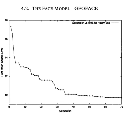
4.5 The evolution of RMS error of best-of-generation individual against the number of generations for the Happiness-Sadness scale... 54
4.6 The evolution of RMS error of best-of-generation individual against the number of generations for the Angry-Calm scale... 55
4.7 The evolution of RMS error of best-of-generation individual against the number of generations for the Fear-Relax scale... 55
4.8 The mean user measurement of happiness-sadness scale plotted against the value produced by the symbolic regression for the evaluation data set of 150 faces. The two sets of values are highly correlated, = 0.85... 57
4.9 Mean user measurement of angry-calm scale plotted against the value produced by the symbolic regression for the evaluation data set of 150 faces. The two sets of values are highly correlated, = 0.75... 57
4.10 Mean user measurement of fear-relax scale plotted against the value produced by the symbolic regression for the evaluation data set of 150 faces. The two sets of values are highly correlated, = 0.67... 58
4.11 A plot showing the A, the eigenvalues of our data set... 60
5.1 Search Techniques [LQ95]... 65
5.2 Example of different crossover mechanisms... 68
5.3 Example of GP programs expressed as trees... 71
5.4 A typically automatically defined function definition... 79
5.5 An example of an ADF program tree... 80
6.1 Picture of a “healthy” company. ... 83
6.2 Picture of an “ill” company. ... 83
6.3 Fitness curves for one run of the G P . ... 87
6.4 Ten Examples of sets of circles produced by the method... 89
6.5 An example of actual data vs user responses from second test... 90
L i s t o f F i g u r e s xH
6.7 An example of actual data vs user responses from the third test... 93
6.8 An example of actual data vs user responses as a histogram... 94
6.9 Sample faces produced by the method... 95
6.10 Fitness curves for one run of the G P . ... 99
6.11 Faces with mixed emotions produced by the method... 101
6.12 Faces produced by the method during the 2nd experiment. The last two faces in the last row are shown, the first in a toggle-muscle (see Appendix B) mode and the second in a line display model...102
6.13 An example of actual data vs user responses from second test... 103
6.14 An example of actual data vs user responses as a histogram...104
6.15 An example of actual data vs user responses from the third test...105
6.16 An example of actual data vs user responses as a histogram...106
6.17 An environment with an audience of virtual people (avatars)...107
6.18 Fitness curves for one run of the G P ... 110
6.19 Sample of confident subjects without audience...113
6.20 Sample of confident subjects with audience... 114
6.21 Sample of phobic subjects without audience... 115
6.22 Sample of phobic subjects with audience... 116
A.1 Current Ratio for Each Company... 122
A.2 Profit over Total Assets Ratio for Each Company... 123
A.3 Gearing Ratio for Each Company...123
A.4 Current Ratio against Profit over Total Assets for Each Company... 127
A.5 Current Ratio against Gearing Ratio for Each Company...127
A.6 Profit over Total Assets against Gearing Ratio for Each Company... 128
A.7 All Three Ratios for Each Company... 128
B .l The original Geoface model...130
B.2 Frontal view of facial muscles [PW96]... 131
B.3 A linear muscle with a contraction value of 1.0 [PW96]... 132
B.4 A linear muscle with an expansion value of 1.0 [PW96]... 132
List of Tables
2.1 Definitions/Concepts related to information visualisation... 16
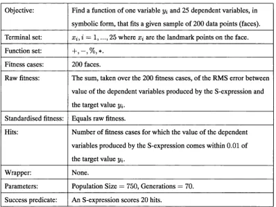
4.1 Genetic Programming symbolic regression details... 52
4.2 Tabulated t... 56
4.3 Tabulated t after PCA... 61
6.1 Example of the simulated data set... 84
6.2 Division of subjects into categories ... 106
6.3 Mean (SD) for M P R C S ... I l l 6.4 Parameter Estimates and Standard Errors for the logistic ANOVA model with MPRCS the dependent variable...I l l 6.5 Mean (SD) for Self R a tin g... I l l 6.6 Mean (SD) for Som atic... I l l 6.7 Logistic Regression R esults... I l l A.1 Data sa m p le ... 124
A.2 Good Overall P erform ance... 125
A.3 Moderate Overall Perform ance... 125
A.4 Bad Overall Perform ance...125
A.5 Slightly worse than good overall p erform ance... 126
A.6 Slightly better than moderate overall performace... 126
Chapter 1
Introduction
The central thesis of this research is that there exists an algorithm that can produce a naturalis tic visual structure that represents a multivariate data set that can be utilised to discover hidden features in the data. The precise meaning of the terms used here will be set out in the remainder of this chapter. Suffice it to say that a naturalistic visual structure is one that needs no special knowledge or skill to interpret - for example, the emotions expressed in a human face. Fol lowing this example, the user can understand features of the data by interpreting the emotional expressions in the face, and relating these emotions to the user’s own value system or set of meanings attributed to aspects of the underlying data.
Advances in science and commerce have often been characterised by inventions that allow people to see old things in new ways. Computers allow these inventions to be presented in a visual medium, resulting in the emerging field of information visualisation. By taking advan tage of the processing speed and graphical capabilities of computers, information visualisation enables users to interpret large amounts of information to reveal structure, extract meaning, and navigate large and complex information worlds.
Visualisation can be split into a number of stages starting from the collection and storage of data itself. This can be followed by the preprocessing step, designed to transform the data into something meaningful. Continuing is the display hardware and the graphic algorithms that pro duce an image on the screen, to finally, the observer and more specifically, the human perceptual and cognitive system. Moreover, visualisation can be approached in many ways [WarOO]. It can be studied from the artistic perspective of graphic design, within computer graphics for the cre ation of novel algorithms to display data, as part of semiotics and the constructivist approach to symbol systems or as a scientific approach based on perception.
1 .1 . T h e s i s T e r m i n o l o g y 3
shape). Also the issue of presentation, since usually the number of elements to be displayed from the data naturally takes a larger space than the area of the screen. Moreover, there is the issue of the scale and dimensionality, and more importantly, how scale influences the design of the visualisation tool and what techniques are available for handling high dimensionality. In addition to the above, there is the issue of externalisation, the visual presentation the user sees which is crucial to the success of visualisation, the issue of trying to understand and assist
the creation of the internal model in the mind of the observer, and finally the invention of new techniques using experience and skill.
This project describes research that investigates the use of naturalistic visual structures for representation of multivariate data sets with the aim of allowing better and faster understanding of data sets. It is a new algorithm that is part of the preprocessing stage that transforms the data into something users can understand. Additionally, the Empathic Visualisation Algorithm (EVA), the visualisation method that is the result of this thesis, addresses the problems of scale and dimensionality, as well as the problem of externalisation.
1.1 Thesis Terminology
There are a number of fundamental terms, used throughout this thesis. These terms are defined in a number of ways in the data visualisation literature, hence, this section is concerned with explaining them. Most of these terms are inherited from the literature, adjusted to serve the purposes of this research work.
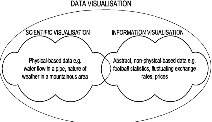
DATA VISUALISATION
SCIENTIFIC VISUALISATION
Physical-based data e.g. water flow in a pipe, nature of weather in a mountainous area
Abstract, non-physical-based data e.g. football statistics, fluctuating exchange
rates, prices
1 .1 . Th e s is Te r m in o l o g y
Figure 1.1, shows the placement of both Information Visualisation and Scientific Visuali sation with regards to the broader area of Data Visualisation (the term Visualisation is used in
this thesis as a synonym to Data Visualisation). Scientific Visualisation tends to represent vi sually aspects of the natural world that have a “physical” representation e.g. natural phenomena and the flow of water in a pipe, whereas. Information Visualisation tends to deal with ab stract quantities such as financial data and baseball scores. These abstract quantities, although they are also associated with real physical things, are far more important than their view. For example, water flow in a pipe is usually best displayed in the immediate context of the pipe itself whereas the view of a football provides little benefit when visualising football statistics and therefore does not have a natural spatial mapping. From the same figure, it is obvious that the two sub-areas of Data Visualisation overlap. However, this thesis concentrates solely on the area of Information "Visualisation. Formal definitions of the above terms are given in the background Chapter 2.
Naturalistic Visual Structure Arbitrary
Mapping
R aw
Data D ata Tables
Automatic Mapping
Abstract Visual Structure
Figure 1.2: Placement of different terms used in this thesis.
Additional terms used throughout this thesis, are shown in Figure 1.2. The Figure shows their placement in regard to the visualisation stage each of the term belongs.
To begin with. Raw Data is a collection of abstract quantities. It is usually the product of research, but, the representation in this form is not in an adequate form for communication.
To have informational value it must be organised, transformed and presented in a way that gives it informational meaning. It is important here to be able to distinguish between data and information. Data are numbers or other methods of recording quantifiable properties in a form that can be assessed by a human or (especially) become input to a computer. Information on the other hand, is the derivation of understanding or insight from the data that is not apparent, and we attempt to facilitate this by means of visualisation tools.
1 .2 . Mo t iv a t io n 5
like Long Term Liabilities and Profit after Tax.
In Visualisation, Data Tables are then transformed into visual form, a process that is called
mapping. The mapping can be either abritrary or automatic. Arbitrary mappings, are hand crafted transformations constructed manually by a designer or a user using appropriate tools.
Automatic mappings on the other hand, are transformations composed on the fly by the under lying system according to a set of pre-supplied layout rules and components.
These transformations whether arbitrary or automatic, lead to a pictorial medium of rep resentation called the visual structure. These visual structures can be seen as graphical marks, which are visible things that occur in a space and usually have these four elementary types: Points (OD), Lines (ID), Areas (2D) and Volumes (3D). As with the mapping above, the visual structures can also be subdivided further into abstract and naturalistic visual structures. Ab stract visual structures include colour, position, size, shape and glyphs whereas Naturalistic
representations are based on entities encountered in everyday life that need no special knowl edge for understanding by a normal human observer. An example of such visual structure is the human face. Everyone is an expert in interpreting this kind of entity.
The visual structure is the tool for communication in Information Visualisation. It is used for understanding compact representations of information. This understanding can un fold through View TVansformations, which is the ability to interactively modify and augment visual structures, turning them from static presentations into interactive visualisations. These transformations can be achieved using viewing controls such as zoom, pan or distortion which is commonly known as focus plus context technique in the Information Visualisation literature.
Finally, there is the end user, whether expert or non expert. This is the observer interested at interpreting the data and consequently interested in what information the visualisation can convey for scientific or business purposes, or whatever the domain of the raw data.
Having defined the thesis terminology, the following section explains what led to research
in Information Visualisation and more specifically the visualisation of Data Tables in the form of multivariate data sets.
1.2 Motivation
1 .3 . Th e Go a l s o f t h is Th e s i s 6
Here we consider cases of data where even the questions to be posed on the data are not fully formulated. A classic example, is that of financial stock exchange data over a number of years - the movement of share prices, for example. Here the question might be “What determines the changes in share prices?” Such a vague question is not yet ready for statistical analysis - there are a huge number of potential variables (economic indicators, social conditions, the interrelationships of world stock exchange movement) and the amount of data itself is large (over how many years?).
In such situations, information visualisation helps in “understanding” a set of data, which may be dynamically unfolding in time, by allowing users to visualise representations of the data, thus using vision to build “understanding”, and allowing the formation of hypothesis for later statistical analysis.
There are two main problems involved in this. Firstly, it is the choice of a suitable mapping from the data to the chosen visual representation, specifically the difference between arbitrary and automatic mapping. Investigating the possibilities of automatic mapping that take into ac count the impact of the visualisation on users’ emotions, is at the heart of this thesis. Secondly, it is the choice of a suitable paradigm for the representation of the data (in the stock exchange example: portray shares as wheat, the height of the wheat as the price, the wind as the “eco nomic climate”, and so on). In other words, the choice of a suitable paradigm, whether abstract, or more realistic. The possibilities of naturalistic (realistic) representations as a standalone application and also used together with different representations is also the focus of this thesis.
1.3 The Goals of this Thesis
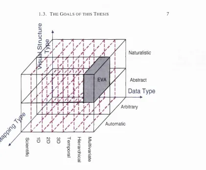
The investigation of an automatic mapping paradigm leading to a naturalistic visual representa tion is the problem tackled in this thesis through the “Empathic Visualisation Algorithm (EVA) ”. Figure 1.3 shows the placement of EVA in visualisation terms. The x-axis specifies the interest at multivariate data sets, the y-axis the interest at naturalistic visual structures and finally, the z-axis specifies interest at automating the mapping from data to the visual presentation.
Instead of processing individual details in the data set and having numbers and text as output, we examine the use of the visual system to process visual structures holistically and, thus, obtain an overall global view of a data set. Information is gained from an overall view of qualitative measurements. It allows the examination of the important features of the visual structures and the noticing of abnormalities very quickly. It can be viewed as the process of “using vision to think”, or the “mind’s eye” [CMS99] to gain insight into what are often complex
1 . 3 . T h e G o a l s OF T HI S T h e s i s
0
Naturalistic
EVA Abstract
Data Type
Arbitrary
Automatic
Figure 1.3: P lacem ent o f EVA in research interest term s.
T he m ethod autom atically m aps data to visual structures using genetic program m ing te ch niques [Koz92], [Sla99], [LSO l]. It is called, E m p ath ic V isu alisation A lgorith m (EVA) since the im pact o f the visual structure on the u se r’s em otions, is taken into consideration. T h e o b jectiv e o f EVA is, given a data set and an observer, to construct a v isualisation such that salient features o f the data can be intuitively recognised by the observer. In o ther w ords, hum ans can detect patterns that reveal the underlying structure in the data m ore readily than a direct analysis o f the num bers w ould. In ord er to achieve this we use visual structures that are natura listic in the sense that no special know ledge for interpretation is required, and also the m apping from data to the visual structure is autom ated. T he m apping should be such that the “ im portant” features o f the data set are m apped to features o f the visual structure that are “ im portant” and significant to hum an perception or hum an em otions.
EVA, the m ethod introduced here to visualise com plex data sets, can be thought o f as the initial step in establishing a clearer pictorial representation o f a problem . It is by no m eans an alternative to statistical analysis, but a com plem entary one. It can be seen as the first step in unveiling understanding o f the data.
1 .4 . S c o p e OF THIS T h e s i s 8
this in an experimental setting. The system should be such that it can be used with as many different data sets as possible - i.e. that is a generic rather than tied to a particular type of data.
1.4 Scope of this Thesis
For this thesis we are interested in abstract data that has the following attributes: the amount of data is large, multidimensional, of non-physical nature and has hidden information, often in the form of complex relationships among the data variables. Msualisations from abstractions of physical nature (earth, molecules) can also be derived, but since such data is inherently geometrical, appropriate visualisations are ready to hand.
Furthermore, the data must be able to be expressed as Data Tables, and the user is able to itemise interesting functions over the data variables. Examples include, financial data, business information, results from experiments and other abstract conceptions. Such information has no obvious spatial mapping.
On the other hand, the generated visual structure should be naturalistic. A human face was chosen as an example of such naturalistic visual structure and is used throughout this thesis. It is something encountered in everyday life and something that needs no special knowledge for interpretation by a normal human observer. However, it is the only one example and the method is not limited to this.
Moreover, meaningful mappings from data to visual structure that are automated, are of central importance to this thesis. Arbitrary mappings however, are believed to be the barrier to a generalisable system and are not included in the aims of this thesis. Firstly, arbitrary mapping widens the gap between experts and non-expert users of the visualisation, due to the learning time needed. Secondly and more importantly, we believe that, presentations from such types form a barrier to “holistic understanding” of the data set.
EVA, the method used throughout this thesis, requires a search technique to find an appro priate mapping from data to visual structure. We have chosen to use genetic programming (GP)
but we do not carry out research in the GP domain. However, since the validity of the method depends upon the validity of this search technique for this problem, an investigation of the GP literature will be considered in detail in Chapter 5.
1.5 Contributions
The overall contribution of the thesis can be summarised as follows: that a meaningful, auto mated mapping, from multi-dimensional abstract data to naturalistic visual structures is achiev
1 .6 . Th e s is Ou t l i n e
are;
1. A comprehensive survey of information visualisation research to date.
2. The formalisation and implementation of a technique to automate mapping from data to visual structures, using genetic programming.
3. The use of naturalistic visual cues as the representation of this data in this automated mapping. The emotional expressions presented as part of this visual structure could cor respond to the emotions of the users if they analysed the data themselves and knew the results.
4. A method to automatically quantify emotional expressions of a specific facial model based on movements of a number of “landmarks” on the face and users’ subjective mea surements.
5. Proof of concept through experimental data. A series of experiments were carried out using EVA upon known simulated data, real data and already statistically analysed data
providing evidence of the utility of the method.
1.6 Thesis Outline
In Chapter 2 a critical review of previous related work in the field of Information Visualisation is presented, focusing on multi-dimensional visualisation. Advantages and disadvantages of previous systems are discussed. Discussion leads us to argue that a certain sub-area in multi dimensional visualisation is unexplored.
Chapter 3 presents the methodology. It is a formal description of EVA, presenting the fundamentals of the algorithm.
Chapter 4 is concerned with human facial expressions. A face is considered as the epitome of naturalistic visual structures for the purposes of this thesis. A brief description of the facial model used is followed by a user experiment that results in a novel technique to automate the quantification of facial expressions.
In Chapter 5 a brief literature survey on genetic programs (GP) is presented, a technique that is fundamental to the method used in this research work.
Chapter 6 presents a series of experiments performed on the method. A detail explanation of the results achieved is given in this chapter.
Chapter 2
Background
Information Visualisation is all about gaining insight into data by observing a visual presenta tion of it. Existing Information Visualisation tools are used for drug discovery by pharmaceuti cal researchers and credit card fraud detection by financial analysts [CBWB97]. This visual data exploration compliments the algorithmic approaches for exploring worlds of data. Surprising patterns that appear in data sets can sometimes be found by algorithms, but visual presentations can lead to deeper understanding and novel hypotheses. The more common applications of information visualisation are for decision making. These might be for personal tasks such as finding a house [WS92] or choosing a film [AS94b], or for business decisions such as finding a stock in which to invest [MB93]. Information visualisation also serves to explain processes in ways that may lead to better predictions or to more informative insights, which can become a basis for action. For example, visualisation of data access patterns on the World Wide Web may explain why congestion occurs in the early afternoon at a given server [HDWB95].
It is important to distinguish between information visualisation that represents the core of this thesis and data mining which complements this research work. Data mining, is an analysis technique based on statistics and machine learning. Researchers in this field, believe
that statistical algorithms and machine learning can be relied on to find interesting patterns, while information visualisation researchers believe in the importance of giving users a visual
overview and insight into data distributions. "Visual presentations can give users a richer “sense” of what is happening in the data and suggest possible directions for further (statistical) analysis and exploration.
2 .1 . In f o r m a t io n Vi s u a l i s a t i o n 11
the existing, different methods are described. It is always important to overview previous work, hence work related to Information Visualisation and especially visualisation of multivariate data sets will be discussed in detail.
2.1 Information Visualisation
Information Visualisation is a relatively new research area that focuses on the use of visualisa tion techniques to help people understand and analyse data. Spence [SpeOl], regards Informa tion Visualisation as about the following: “You are the owner of some numerical data you feel is hiding some fundamental relation which you can exploit to your advantage. You then glance at some visual presentation and exclaim: A ha! Now I understand”. Information Visualisation can be defined as the process of transforming data, information and knowledge, into visual form making use of the human natural visual capabilities [GEC98]. Research in decision analysis, cognitive psychology and computer graphics [HE99], [RPR96] conclude that the human mind assimilates information more efficiently in a pictorial form than in raw data form, i.e., in nu meric and alphanumeric form. Apparently, the human brain possesses a “narrow bandwidth” for processing raw numbers as opposed to a surprisingly “wide bandwidth” for processing visual data.
Jern [Jer99] explains the role of visualisation as being the interface between what machines are good at (data, information) and what humans are good at (knowledge, experience). Figure 2.1, provides a graphical description of human versus computer abilities. Visualisation can be seen as a powerful link between these two influential information processing systems. Ham ming [Ham73] correctly identified that “the purpose of computation is insight, not numbers.” Likewise, for visualisation, “the purpose is insight, not pictures” [CMS99].
2.1.1 O verview
2 .1 . In f o r m a t io n Vis u a l is a t io n 12
w G)
<
0
Q. E o O
Data Storage
Numerical Computations Searching
Planning Logic Diagnosis
Predictions
Perception
Creativity
Générai Knowiedge
Human Abilities
Figure 2.1: Human versus Computer Abilities [Kei97].
thought and reasoning? By the invention of external aids: It is things that make us smart.” Infor mation Visualisation is just about that - exploiting the dynamic, interactive, inexpensive medium of graphical computers to devise new external aids enhancing cognitive abilities. These visual artifacts have profound effects on peoples’ abilities to gather information, compute it, under stand it and create new knowledge.
2.1.2 How Visualisation Amplifies Cognition?
Card, Mackinlay and Schneiderman [CMS99] stress that Information Visualisation has, from its definition, three goals: to aid discovery, assist exploration and help with decision making. In other words. Information Visualisation aids in Explorative analysis. Confirmative analysis and
Presentation. Exploratory analysis for which EVA is most suited, begins with no preconceived hypotheses about the data, and progresses to the process of searching and analysing the data to find implicit, but potentially useful information. Confirmative analysis begins with some hypotheses about the underlying data. The process involves examination of the hypotheses, and hence, their confirmation or rejection. Finally in Presentation, facts to be presented are fixed in advance. The outcome is a high quality visualisation of the data presenting the facts.
So, what are the tools that help humans discover, explore and make decisions? How does information visualisation amplify cognition in the users/observers?
2 .1 . I n f o r m a t i o n V i s u a l i s a t i o n 13
is avoided, leading to reductions in search and working memory. Finally, the visual representa tion automatically supports a large number of perceptual inferences that are extremely easy for humans to comprehend. For example, with a diagram, geometric elements like interior angles
can be immediately and obviously recognised.
Importantly, in order to understand the effectiveness of information visualisation, we need to understand what it does to the cost structure of a task. In addition to Larkin and Simon
mentioned above. Card, Mackinlay and Schneiderman [CMS99] proposed a number of ways in which visualisation can amplify cognition.
To begin with, visualisation can be thought of as increasing the memory and processing resources available to the users. This is achieved by offloading cognitive work to the human visual perception system. Furthermore, visualisation can help to reduce the search for informa tion. The visual representation enhances the detection of patterns. Additionally, visualisation can further assist cognition by enabling perceptual inference operations and by using perceptual attention mechanisms for monitoring. Finally, they acknowledged that, the encoding of infor mation in a manipulable medium helps understanding, usually unfolding through interaction.
It can be concluded that Information Visualisation has a lot of potential to alter the way in which we interact with the multitude of information around us. It has already delivered important benefits in certain application domains. It is important, however, not to overestimate it; instead users should recognise it as an aid. Like numerous software and technological tools, it is not a solution to all information overload and complex problems. Rather, it is a new medium, which when properly and effectively used can augment our cognitive abilities.
A brief historical perspective in visualisation is presented next, before defining the field in a more formal way.
2 .1 3 H istory
\fisualising data, and especially scientific data, is not a new concept. The idea of representing data visually has been around for much longer than computer based visualisation. Legend has it that Archimedes was slain while drawing geometrical figures in the sand. Astronomical charts were produced in the Middle Ages in which there were arrow plots of prevailing winds over the oceans and magnetic charts that included isolines.
2 .1 . I n f o r m a t i o n V i s u a l i s a t i o n 14
paper to construct three dimensional models of these geometries in an attempt to make it easier to communicate information [Tuf90]. In the seventeenth century, Galileo used visual reasoning to support his conclusions about the solar system. Quoting Tufte (1990, p. 19) “His argument [Galileo’s] unfolds the raw data (what the eye of the forehead registers) into a luminous ex planation of mechanism (what the eye of the mind envisions)”. What is common in the above cases is that the information visualised has the property of naturally existing on spatial axes, so its visual mapping is straightforward.
The challenge of Information Visualisation however, is the understanding of non-physical information through visualisation. Such data, usually, does not have a natural mapping to spatial axes. Ground breaking advances related to this area occurred in the nineteenth century with the linking of the spread of cholera to water supply in central London. During the 1853-54 cholera outbreak in London, Dr John Snow, a physician, identified a large grouping in the Soho area. He went on to plot the homes of the 500 victims who died in the first 10 days of September 1854 on a map of the area, from abstract data such as name, age and addresses of the victims. This simple representation of the data he had collected showed that the grouping of cholera sufferers in this area was centered around a particular water pump. Investigation of this water pump established that it had been contaminated by a leaking cesspool.
In addition to the above example, there are a number of cases where visualisation was used to enhance understanding, well before Information Visualisation was established as a scientific field. Namely, Minard’s map of Napoleon’s march to and the subsequent retreat from Moscow [Tuf83], Florence Nightingale’s diagram showing dramatic reduction of the death rates in a British Army hospital in Grimea, Sir Edward Playfair’s circles showing gross national product and tax gathered for certain empires, and Harry Beck’s London Underground map [SpeOI]. Through these examples, it is evident that the role of visual perception in data understanding, has been long understood.
2.1.4 Definitions and Classification
Computer visualisation has been with us almost since the first digital computers. The 1980s however saw fundamental changes, due to the need for more complex visualisation algorithms
and tools to cope with the large amounts of data that sensors and supercomputers supplied. Scientific Visualisation’s birth as a discipline is generally placed with the publication of the 1987 Report of the National Science Foundation’s (NSF) Advisory Panel on Graphics, Image Processing, and Workstations. The report used the term “Visualisation in Scientific Computing”
2 .1 . I n f o r m a t i o n V i s u a l i s a t i o n 15
in this context is preferred to the more general term “data visualisation” (see Figure 1.1), due to the fact that the latter has coimotations of statistical methods that were outside the scope at that time. Since then, scientific visualisation has experienced vast growth and emerged as a recognised discipline. Visualisations from this discipline show abstractions, but the abstractions are based on physical space. What is seen primarily relates to and represents something that is visually “physical”. The data is scientific and the use of visual images for such information has great benefits in enhancing cognition, given that the data maps naturally to the spatial axes.
Information visualisation on the other hand, uses graphic images to represent abstract, non physical data. Examples of such data include financial data, business information, collections of documents, traffic flows through the internet, statements in a computer program, purchasers at a grocery store, and other abstract conceptions. In certain cases of the above data, graph theory [BM76] has a significant role. The applicability of graph visualisation can be understood better when considering the following question: “is there an inherent relation among the data elements to be visualised?”. If the answer to the above question is “yes”, then data is “structured” and can be represented by the nodes of a graph, with the edges representing relations. Visualisation of structured data sets is relatively straight forward. However, this thesis is concerned with “un structured” data elements where the goal of information visualisation is to aid in the discovery of the relations among data variables through visual means. For such data there is no built-in relation between the data elements, and hence, the answer to the above question is negative.
Visually presenting this kind of information poses great challenges, since there is no natu ral mapping to the spatial axes and, thus, no right or wrong metaphor for representing it. There is a great deal of such abstract information in the contemporary world and its mass and com plexity are a problem, motivating attempts to extend visualisation into the realm of the abstract [CRM91]. A more detailed description of the difference between scientific and information
visualisation can be found in a discussion by Gershon and Eick [GE97].
Card, Mackinlay and Schneiderman [CMS99], define information visualisation as: “The
use o f computer-supported, interactive visual representations o f abstract data to amplify cogni
tio n ” Figure 2.2 shows the Information Reference Model presented in their book. The different stages and transformations presented in their model, have already been discussed in the context of this thesis, in Section 1.1.
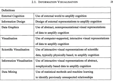
Table 2.1 shows a number of definitions, most of which are also adopted from Card’s book, that clarify the relationships among concepts related to information visualisation. Some of these terms have already been explained, although here are formally defined.
pro-2 .1 . In f o r m a t io n Vis u a l i s a t i o n 16
Definitions
External Cognition Use of external world to amplify cognition
Information Design Design of external representations to amplify cognition
Data Graphics Use of abstract, nonrepresentational visual representations of data to amplify cognition
Visualisation Use of computer-supported, interactive visual representations of data to amplify cognition
Scientific Visualisation Use of interactive visual representations of scientific data, typically physically based, to amplify cognition
Information Visualisation Use of interactive visual representations of abstract, nonphysically based data to amplify cognition
Data Mining Use of statistical methods and machine learning to identify previously unsuspected relationships
Table 2.1: Definitions/Concepts related to information visualisation.
cesses across the internal/external bounder in order to support thinking. Information design is the explicit attempt to design external representations to better acquire or use the knowledge.
Data graphics is the design of visual but abstract representations of data for this purpose. Visu alisation uses the computer for data graphics. Scientific Visualisation is visualisation applied to scientific data and Information Visualisation is visualisation applied to abstract data. Fi nally, Data Mining is concerned with the use of statistical methods and machine learning to help in exploration, analysis and decision making.
It is important to note that while emphasising visualisation, the general term is perceptu-alisation. It is possible to design systems for information sonification or tactilisation of data and there are advantages in doing so [CMS99]. However, the visual system is a pattern seeker of enormous power and subtlery. The eye and the visual cortex of the brain form a powerful processor with by far the largest bandwidth [WarOO] (in fact half of the neurons in the human brain are dedicated to vision). Therefore visualisation is an obvious place to start.
To put Information Visualisation into context, the different types of research that are per
formed in this area will be classified. Information Visualisation research can be categorised by data type and by techniques used. Most classification attempts so far have been data centric. This is very useful because implementers can quickly identify various techniques that can be applied to their domain of interest. A very common taxonomy is that first proposed by Schnei
2.1. I n f o r m a t i o n V i s u a l i s a t i o n
DATA VISUAL FORM
17
Task
View Transformation Data
Transformations
Visual Mapping
Raw Data Visual
Structures Views
Data Tables
Figure 2.2: Information Reference Model [used by permission of Ben Shneiderman, HCIL].
and multi-dimensional data, tree and network data and seven tasks: overview, zoom, filter, details-on-demand, relate, history and extract. Young [You96] proposed a different taxonomy based on visualisation techniques: surface plots, city scapes, fish-eye views, benediktine space, perspective walls, cone trees and cam trees, sphere visualisation, rooms, emotional icons, self- organising graphs, spatial arrangement of data and the information cube. Card and Mackinlay proposed an expanded data-oriented taxonomy [CMS99], which divides the field of visualisa tion into the following subcategories: Scientific Visualisation, GIS, Multi-dimensional Plots, Multi-dimensional Tables, Information Landscapes and Spaces, Node and Link, Trees and Text Transforms. The most comprehensive taxonomy to date, is the one proposed by Ed Chi [ChiOO] using the Data State Model [CR98]. Information Visualisation techniques are broken down, not only based on their data type, but also by their processing operating steps.
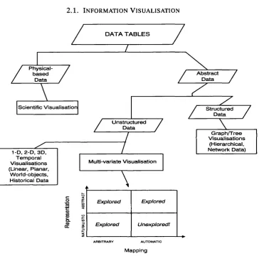
Figure 2.3 shows a taxonomy adjusted for the purposes of this thesis, influenced by the above related work. Starting from the actual data, its type, whether physically based or not, classifies the visualisation as either Scientific (the left hand branch of the Figure) or Informa tion Visualisation (the right hand branch). In the latter case. Information Visualisation can be subdivided further according to whether the data is structured or unstructured. This thesis is primarily concerned with the visualisation of unstructured, non-physical data, and more specif ically with the area of multivariate visualisation. However, a brief description of each of the sub-areas of Information Visualisation divided by data type, will be given below. This way, it is likely to give a better overview of the whole field.
2 .1 . In f o r m a t io n Vi s u a l i s a t i o n 18
DATA T A B L E S
/
Physical-b a se d
D ata
I
\
Scientific V isualisation
1- D, 2-D, 3D, Tem poral V isualisations (Linear, Planar,
W orld-objects, Historical D ata
z
A bstract D ata7
Z
U nstructuredD ata
7
Multl-varlate Visualisation
V
A R B IT R A R Y A U T O M A T IC
Mapping
Z
stru ctu red D ataX
7
G raph/T ree V isualisations
(Hierarchical, Network Data)
Explored Explored
Explored UnexploredI
Figure 2.3: Classification of Data Visualisation.
elements.
Planar or Map data (2D) include geographic maps, floorplans, or newspaper layouts. The users’ tasks include finding adjacent items, containment of one item by another, paths between items, and the basic tasks of counting, filtering and obtaining details on-demand.
Real world visualisation (3D) is used to view real world objects such as the human body, buildings, or molecules for the purpose of extracting information. Volume visualisation is the form most widely used in world Visualisation and has significant impact in medicine.
The use of temporal information visualisation has a fundamental quality that separates it from 1-dimensional data. The distinction in temporal data is that items have a start and finish time and that items may overlap. Frequent tasks include viewing and creating historical overviews of events or data, and viewing events or data in sequence.
2 .2 . Mu l t iv a r ia t e In f o r m a t io n Vis u a l i s a t i o n 19
Multi-dimensional information visualisation represents data that is not primarily spatial. The number of attributes of a given item in the collection is more than three. Tasks include understanding, or getting an overview of the whole or a part of the n-dimensional data. For example, finding patterns, relationships, clusters, gaps and outliers in the data. Other tasks
include finding a specific item in the data. For example, zooming, filtering and selecting a group or a single item from the data. As Multi-dimensional information visualisation is the focus of this thesis a more detailed background review on this area follows.
2.2 Multivariate Information Visualisation
The challenge of visualising multivariate data is ongoing, motivated by many situations in which
the interrelationships between many variables are of vital interest. For some examples, an exper iment is run and feedback for two-three variables is obtained and analysed, using spreadsheets and graphs. For such problems, these kind of visualisations are very effective indeed. But, what about cases where there are 5,10, 20, 70 variables?
More than three dimensions requires the more difficult problem of multidimensional visu alisations, where data tables have so many variables that an orthogonal Visual Structure is not sufficient. This is the case for most visualisations and they are the most interesting. They start with multivariate data sets that have too many variables to be encoded directly using 1-, 2- or 3-dimensional visual structures. For data like this, graphs and charts lose their effectiveness.
Variables/attributes of such multivariate data sets can be divided into three basic types as shown in Figure 2.4.
Ordinal (obey <
relation)
Quantitative (perform
arithmetic) Nominal
(obey = or
!= relation)
Data Tables
(mixture of
above)
Figure 2.4: Collection of Raw Data.
A nominal variable N is an unordered set, such as car models (BMW, FIAT, HONDA).
2 .2 . Mu l t iv a r ia t e In f o r m a t io n Vis u a l i s a t i o n 20
the type of axis that should be used to represent them, in a visual structure.
The thesis mainly concentrates on quantitative variables of multivariate data sets. Of course, simple rules could be provided that would take Nominal and Ordinal variables and quan tify them but this is not relevant to this research. For the purposes of this thesis their existence is assumed and concentration is drawn on data tables of quantifiable variables, irrespectively of the variables’ initial types.
Furthermore, there are a number of techniques in statistics, such as Principal Component Analysis (PCA), Factor Analysis, Subsetting, Segmentation, Aggregation etc, that are used prior
to analysis, as a form of data reduction. Despite the fact that these techniques are sometimes very useful, they are beyond the scope of the research area in this thesis and therefore will be discussed no further here.
For the purposes of this thesis, research carried out in the visualisation of multivariate data sets is divided into classes, according to the mapping that was used, whether arbitrary or au tomatic and, according to the visual structure used to represent the data, whether abstract or naturalistic. As already mentioned in Section 1.1, arbitrary, handcrafted visualisations are con structed manually by a designer or end-user, whereas automatic visualisations are composed on the fly by a system according to a set of pre-supplied layout rules and components. Abstract visual structures include colour, position, size, shape and glyphs whereas naturalistic represen tations are based on entities encountered in everyday life that need no special knowledge for understanding by an average human observer.
Both of these decisions, mapping type and visual structure type, lie at the heart of EVA, the method proposed for the purposes of this thesis. These distinctions resulted in four subfields of multivariate information visualisation, as shown at the bottom of Figure 2.3, and will be looked at in more detail.
2.2.1 A bstract Visual Structures - A rbitrary M apping
There are a number of issues that this area attempts to address. How does scale influence the
design of the visualisation tool? How many features can be incorporated in the abstract visual structure? What techniques are available for handling high dimensionality?
Presented below, are numerous techniques and tools that are widely used today, that solve, or attempt to solve, some of the problems of visualisating multidimensional data sets.
The very first technique to be described, is that of multiple views. The idea is to give each variable its own display. So, if we have n dimensions, n variables, we could have n bar
2 .2 . Mu l t iv a r ia t e In f o r m a t io n Vis u a l is a t io n 21
components, that can be visualised in 1-dimension. For some data, multiple view analysis may be utilised, but for others it has a major drawback. Unfortunately, is easy to get lost in the details and hard, if not impossible, to find multivariate trends in the data as well as interrelationships such as correlations.
Consider financial information systems which are multivariate and hence multidimen sional. The data components are correlated and their values (or range) affect each other with respect to the decision analysis process. Smith and Taffler [ST96] define that, for such corre lated data: “their assessment depends on the simultaneous effect of several variables in different spheres of activity”. As an example, the turnover of a firm is, usually, highly correlated with the sales level. When viewing the whole information system and analysing it with respect to another variable, capital expenditure, the former figures introduce a new dimension. From the above, it can be argued that financial information systems are complex. In fact Lux [Lux97] presents the argument that financial information can be, figuratively speaking, described as an iceberg. One can see the tip of the iceberg but its sheer mass is hidden under underwater. Fi nancial information systems are not the only ones that can be described as an iceberg; there are data warehouses, business information, library databases, documents and others that could be described in the same way. Therefore, their highly correlated variables makes multiple views unsuitable for these kind of data.
Bertin believed in two choices for the ‘problem’ of multiple variables: construction of several images and sacrifice of the overall relationship, or construction of a matrix and dis covery of relationships through permutations. He developed a direct technique for creating multidimensional visual structures from multivariate data tables which he called permutation matrices [BerSl]. The technique that was developed before computers were used to support visual thinking, involves representing rows of data as bar charts and sorting them. Graphical icons of data values were placed on cards and permuted with metal rods. The goal of the per mutations is to form patterns, typically to place the large values on the diagonal of the matrix, thereby clustering similar cases with their representative variables.
When computers became available, permutation matrices became an example of informa tion visualisation. An example is the TableLens [RC95], which is a data analysis application intended to give non-experts the ability to visually spot trends and correlations in the data set. An example of TableLens can be find in Figure 2.5.
2 . 2 . Mu l t i v a r i a t e In f o r m a t i o n Vi s u a l i s a t i o n 2 2
- (Z«d<.*a7249m tall [ £ k l«Mti QfiÊOm Window
a : ■■ It ^ m # * I#
TKke, Nam* LTO*i
154 AOL *«£P|.L*0NL»J£
«00-JR C lOAR KÎLLÛOO
KCwSJiCORF
1) - NIL e
U »-8M l-BK*.** 'TC'Pf
p i x e l » b o u n d a r y g r i d
c o l o r b a r s
c o lu m n h e a d i n g
to o l t i p
fo c u s ar ea
Figure 2.5: TableLens [used by perm ission o f R. Rao, X erox Parc]
num erical and categorical data. For quantitative variables, a graphical bar is used to represent the values. T he bars are aligned to the left edge, that m ay represent a m inim um value, zero or a low er boundary. The length o f the bar indicates the relative size o f the represented value. This visualisation provides a scale advantage, since bars can be scaled to one pixel w ide w ithout perturbing relative com parisons, and also an exploration advantage, since large num bers o f tiny bars can be scanned m uch m ore quickly than a bunch o f textually represented num bers.
T here are a w ide range o f m anipulators one can use to discover trends in the data set w ithout affecting the underlying data. O ne can sort any colum n, break dow n the display by categories, focus on any o f the row s, o r colum ns, o r even spotlight row s i.e. change th eir colour. M oreover, one can filter categories and create a new colum n com puted using a form ula based on other colum ns. U sing these m anipulators it is possible to search for patterns and outliers in a m ultivariate data set. For exam ple, sorting can be seen as the first step o f looking for correlations am ong variables. A fter a variable has been sorted, if another variable is correlated with it, then its values will also appear sorted.
2 . 2 . Mu l t i v a r i a t e In f o r m a t i o n Vi s u a l i s a t i o n 2 3
that can be perform ed on the data. In particular, after the data is loaded, a user can invoke a “brush tool” , com m only know n as a scatterplot m atrix w hich displays a m atrix o f all pairw ise scatter plots. O ptionally, a histogram o f each variable could be placed at the base o f each colum n o f scatterplots associated with that variable. A series o f other m anipulators is used in the tool to help understand m ore about the data.
T here are a num ber o f key problem s associated w ith this m ethod, that are sim ilar to those o f TableLens. First o f all, as the dim ensionality increases, the com plexity o f these system s in creases as well, show ing a heavy load o f inform ation on the screen. In addition to the above, considerable user learning tim e is required to understand and enable m anipulation o f these in teractive m edium s effectively. A lso, it is very hard to visualise relationships o f variables beyond second order that involves m ore than tw o o f them . W hat if the relationship is a m ultidim en sional one; one that encom passes m any or even all o f the variables in the data set? Finally, as a conclusion to the previous problem , there are no m eans to get a good holistic overview o f such a d ata set.
Dynamic HomeFlnder R # * # t Q u i t
% # v * P r i n t
D i » t to A:
D i » t to B;
BodrooTM»:
C o s t :
Ttvs v i low d o t s sktou* a r s h o m e s in the D C e r e a for s a l e V o u m a y yet m o r e i n f o r m a t i o n o n a h o m e b y s e l e c t iny it. V o u m a y d r a y the 'A* a n d ' B' d i s t a n c e m a r k e r s to y o u r o f f i c e o r a n y o t h e r locat ion y o u w a n t to H u e near. S e l e c t d i s t a n c e s , b e d r o o m s , a n d c o s t r a n y e s b y d r a y y i n y the c o r r e s p o n d iny s l i d e r b o x e s o n the riyht. S e l e c t s p e c i f i c h o m e t y p e s a n d s e r v i c e s b y p r e s s I n y t h e l a b e l e d tMjttons o n th e riyht.
Look al: H s e T H e n d
Features; Q r y Fp l
C A C N e w
Figure 2.6: H om efinder [used by perm ission o f Ben S hneiderm an, HCIL]
![Figure 2.1: Human versus Computer Abilities [Kei97].](https://thumb-us.123doks.com/thumbv2/123dok_us/8288681.1377315/27.599.80.410.115.340/figure-human-versus-computer-abilities-kei.webp)