University of Stuttgart Universitätsstraße 38 D–70569 Stuttgart
Masterarbeit
Master Annotator: Enhancing
Distant Supervision through Visual
Interfaces
Zheren Luo
Course of Study: Softwaretechnik
Examiner: Prof. Dr. Thomas Ertl Supervisor: Dr. Dennis Thom,
Dipl.-Phys. Qi Han
Commenced: October 10, 2017
The rise of social networking sites and applications such as Twitter, Facebook, Instagram, Weibo in couple years provides new ways of information sharing on the Internet. Twitter is one of the most popular micro-blogging services. Recently, tweet classification has received much attention. In tweet classification, there is a demand for massive labeled training examples. However, the labeling cost can be high since the resources regarding available time, domain expert annotators are often limited. Distant supervision is a feasible solution but has some shortages such as noisy data, skewed annotations, and the challenge to generate negative training examples. This thesis tries to overcome these difficulties and shortages by combining visual analytics. Based on the distant supervision theorem, information such as keywords, hashtags, user_mentions, and URLs existing in tweets can be used as annotators to generate training examples. Through an interactive visual interface, the generated training examples can be checked and modified, which enhances the distant supervision. An iterative analytical loop is established using the interactive visual interface and the enhanced distant supervision. It allows users to make deep exploration of tweet data. Users can get tweets according to their needs, find potential topics, label or relabel tweets, train classifiers. A software is implemented to achieve the analytical loop. A case study is conducted to demonstrate the performance and usage of the approach and the software.
1 Introduction 13 1.1 Movtivation . . . 13 1.2 Goal . . . 14 1.3 Overview . . . 14 2 Background 15 2.1 Basic . . . 15 2.2 Related Works . . . 22 3 Approach 25 3.1 Requirements . . . 25 3.2 Specification . . . 26
3.3 Corpus Selection & Preprocessing . . . 26
3.4 Corpus Query . . . 29
3.5 Tree Generation . . . 30
3.6 Data Visualization . . . 31
3.7 Data Exploreation and Labeling . . . 36
3.8 Classifier Training . . . 37
4 Implementation 41 4.1 Data Index and Query . . . 42
4.2 User Interface . . . 43
4.3 Basic Exploration Tools . . . 48
4.4 Libraries . . . 49
5 Case Study 53 5.1 Session Report . . . 53
5.2 Discussion . . . 59
6 Conclusion and Outlook 61
2.1 Process model of visual analytics . . . 16
2.2 Example of an ordinary tree . . . 18
2.3 Example of a specific tree . . . 18
2.4 Example of slice and dice treemap . . . 19
3.1 Analytical loop of the approach . . . 27
3.2 Search view in the user interface . . . 31
3.3 UML diagram of the generated tree structure . . . 32
3.4 Main view in the user interface . . . 32
3.5 Example of a complete binary tree . . . 33
3.6 Treemap Generation Process . . . 33
3.7 Example of a treemap that has been split many times . . . 34
3.8 Example of a treemap withtweet points . . . 35
3.9 Example ofTag CloudandContent Lens . . . 36
3.10 Example of the treemap after classification . . . 40
4.1 Search view of the software UI . . . 44
4.2 Main view of the software UI . . . 44
4.3 Example of t-SNE . . . 46
4.4 Example of using post date coordinate . . . 47
4.5 Exmaple oftweet nodesafter classification . . . 47
4.6 Example ofTag CloudandContent Lens . . . 49
4.7 Example ofNode Detail Report. . . 50
5.1 Lucene Index . . . 54
5.2 Initial query result of the case study . . . 55
5.3 Result of using post date coordinate . . . 56
5.4 Result of classification . . . 57
5.5 Screeshot of the main view after pressingExplore . . . 57
5.6 Screenshot of the main view after using t-SNE coordinates . . . 58
5.7 Result of "building OR house" query and classification . . . 58
3.1 Original Tweet Structure . . . 26
3.2 Preprocessed Tweet Structure . . . 29
3.3 A Tweet Instance . . . 38
1.1 Movtivation
The rise of social networking sites and applications such as Twitter, Facebook, Instagram, Weibo in couple years provides new ways of information sharing on the Internet. Among those social networking services, Twitter1is one of the most popular micro-blogging services. According to the statistics2, until January 2018, Twitter has 330 million active users. Twitter users post status messages which are called "tweets" to discuss current hot events and news, make comments on products, and express their thoughts and feelings. Hundreds of millions of tweets are posted on Twitter every day, and a wide range of topics are discussed. However, it is not easy to extract tweets on specific topics from the massive volume of tweets.
Tweet classification which is a subcategory of text classification has received much attention recently. It is a process of classifying tweets into one or more predefined categories. Same as other text classification problems, a high number of labeled training documents are always needed to properly cover the feature space. However, the labeling cost can be high since the resources in terms of available time, domain expert annotators, or historic ground-truth data are often limited.
Distant supervision[MBSJ09] is a feasible method to overcome the limitation. The core idea of distant supervision is to facilitate an already existing data source that exists in the public Internet, such as social networks, traffic sensors, or microblog platforms, as a basis to generate large volumes of necessary training data. To this end, the contained information in tweets such as hashtags, user_mentions, URLs, geographic locations and post dates can be used to automatically derive most likely annotations in larger numbers. However, previous approaches in automated distant supervision have often suffered from noisy data, skewed annotations, and the challenge to generate negative training examples.
This work tries to overcome the difficulty of generating a large number of training examples and the shortages of distance supervision. It looks into the feasibility of combining the idea of visual analytics.
Visual analytics[KMS+08] is an effective method that combines automated analysis techniques with interactive visualizations. Visual analytics methods adopt machines to facilitate methods like knowledge discovery in databases, mathematics, and statistics to do automatic analysis while human decision makers can receive, understand data, define data relationship, and make conclusions or decisions.
1https://twitter.com/
1.2 Goal
This work investigates how the distant supervision can be enhanced by combining the idea of visual analytics and helps users to make in-depth explorations of tweet data. For this purpose, an iterative analytical loop of extracting tweet data, visualization, labeling tweets, doing tweet classification, and evaluating labeling and classification performance is established. This approach contains a data preprocessing function for users to organize collected tweet data, power filtering functions for users to get tweets according to their specific needs, and a classifier training function for users to train classifiers. Most importantly, this approach provides a visual interface which employ a highly interactive treemap. The treemap visualizes results of user operations including making queries, labeling or relabeling tweets, and training classifiers. This approach also has several tools that help users understand and operate tweets. Users can train classifiers with labeled tweets. A software application is implemented to evaluate this approach, and a case study is conducted to demonstrate the performance and usage of the approach and the software.
1.3 Overview
This thesis consists of six chapters and is organized in following way:
1. Chapter 2 - BackgroundThis chapter introduces required fundamentals, cited works and recently published related works.
2. Chapter 3 - Approach This chapter presents the approach introduced in this thesis, including its design requirements and specification.
3. Chapter 4 - Implementation This chapter describes implementation details of the software which is implemented to achieve the approach.
4. Chapter 5 - Case Study A case study is conducted to evaluate the performance of the approach and the software. This chapter introduces the process and results of the case study. 5. Chapter 6 - Conclusion and Outlook This chapter concludes this work and discusses
This chapter introduces the background of this work. It has two sections: basics and related works. The basics section introduces the theoretical knowledge used in this work, which is also the preconditions to understand this thesis. In the second section, research that has been referred or has similar research directions as this work are presented.
2.1 Basic
2.1.1 Visual Analytics
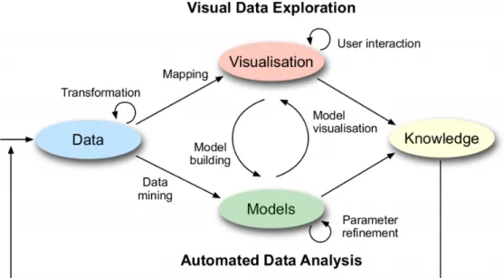
The rapid development of information techniques brings human the ability to collect vast amount data. Meanwhile, large data size is usually accompanied by high complexity and variety. Dealing with such large size data is a challenge. Visual analytics is a possible and efficient solution to this problem. Its main idea is to improve analytical reasoning through interactive visual interfaces, in other words, combine the strength of human and machine. In 2004, Pak Chung Wong and J. Thomas[WT09] introduced the concept of visual analytics. Visual analytics is an effective method that combines the art of human intuition and the science of mathematical deduction. Another more detailed definition is a provided by D.A.Keim et al.[KMS+08], visual analytics can be seen as an iterative process that relates to information collection, data preprocessing, knowledge representation, interaction and decision making. Visual analytics methods adopt machines to facilitate methods like knowledge discovery in databases, mathematics, and statistics to do automatic analysis while human decision makers can receive, understand data, define data relationship, and make conclusions or decisions.
Figure 2.1 shows the process model of visual analytics. Visual analytics is different from information visualization. Information visualization aims at change how analysts work with data, and it helps them respond to problems faster. It recognizes trends, patterns, and contexts that are usually difficult to recognize in text-based data and provides interaction techniques to help users answer their questions about data. There is a certain amount of overlapping between information visualization and visual analytics as they both represent data in an easily understandable way through visual interfaces. The difference is that visual analytics combines automated analysis techniques such as data mining with interactive visualizations.
2.1.2 Distant Supervision
Distant supervision is a relation extraction method first proposed by Mintz[MBSJ09]. Distant supervision holds the view that any sentence that has two terms that appear in a known Freebase relation is likely to express that relation somehow. Distant supervision is widely used for generating
Figure 2.1:Process model of visual analytics1
training sets for machine learning. The traditional method of producing training sets is to use human annotators to label the given corpus. When the size of the corpus is large, the labeling process is costly and time-consuming. The usage of distant supervision in this work slightly different from the usage of Mintz. In this work, distant supervision is defined as a method to facilitate an already existing data source that exists in the public Internet, such as social networks, traffic sensors, or microblog platforms, as a basis to generate large volumes of necessary training data. To this end, associated metadata, such as folksonomies, user comments, or network relationships, can be used to automatically derive most likely annotations in larger numbers. In 2009, Go, Bhayani, and Huang[GBH09] used the Twitter messages with emoticons as the training data, the emoticons occurring in tweets indicate the messages are positive or negative. This work uses a similar method with theirs.
2.1.3 Machine Learning
Machine learning is a field of computer science that involves probability theory, statistics, convex analysis, approximation theory, and many other disciplines. It specializes in how computers simulate or realize human learning behaviors to acquire new knowledge or skills and to reorganize existing knowledge structures to continuously improve their performance. Machine learning is the core of artificial intelligence, which is to make the computer have the fundamental way of intelligence. Its applications are throughout all areas of artificial intelligence. Traditionally, computers accept a
bunch of instructions and execute the instructions line by line. In contrast to the traditional way, machine learning does not accept the instructions. Instead, it accepts only the entered data. That is, it has a sense of human ability to handle things.
According to the different training methods, machine learning can be divided into different categories:
1. Supervised learning: It does training with the known examples of correct answers, that is, with labeled data. It can be further separated into regression and classification problems. This work deals with the classification problem.
2. Unsupervised learning: It uses unlabeled data as input, which means a machine does not know how the output data corresponds to the input data. Unsupervised machine learning reads the data and finds their own data models and rules. Typical supervised machine learning problems are clustering(similar data grouped together) and anomaly detection.
There is also semi-supervised learning. It is not related to this work and is not discussed here.
2.1.4 TF-IDF
TF-IDF (term frequency-inverse document frequency) is a commonly used weighting technique in information retrieval and data mining. It measures the importance of a word to a document in a collection. The importance increases proportionally to the number of times a word appears in the document and decrease proportionally to the number of documents contain the word in the collection. In this work, TF-IDF is used as the term weight for training classifier and generating t-SNE coordinates.
Obviously, TF-IDF consists of two parts. The first part Term Frequency(TF) is the number of times a word appears in a document, divided by the total number of words in the document. The second part Inverse Document Frequency(IDF) is the logarithm of the number of documents in the collection divided by the number of documents contain the word. There are different weighting schemes, the one used in this work is given in the following:
tfidf(t,d,D)=tf(t,d) ·idf(t,D)= ft,d Í t′∈d ft′,d ∗logN nt
Term Frequency(TF): measures how often a term appears in a document. A term may appear much more time in a longer document than a shorter document. In order to get rid of possible effect, adjustments are often used. The number of a term in a document is divided by the document length(the total number of terms in the document).
T F(t)= Number o f times term t appear s in a document
T otal number o f terms in t he document
Inverse document frequency(IDF): measures the importance of a term. Terms such as "the", "I" may frequently appear in any documents. They are assigned with high term frequencies although they contain little information. The inverse document frequency decreases the weights of terms that appear very frequently in the documents while increasing the weights of terms that appear hardly.
I DF(t)=loge
T otal number o f documents
2.1.5 TreeMap
A tree is a collection of nodes. This collection can be empty, when it is not empty, it contains a root noderand zero or more non-empty subtreesT1,T2, ...,Tk. The root of each subtree is connected by a directional edge from the rootr.
root
T1 T2 T3 ... Tk
Figure 2.2:Example of an ordinary tree
The root of each subtree is the child of the rootr andr is the parent of all subtree roots. A tree has N nodes and N - 1 edges, one of the nodes is the root. Each edge connects a node to its parent. Apart from the root, every node has a parent.
root
a1 a2
b1 b2
a3
Figure 2.3:Example of a specific tree
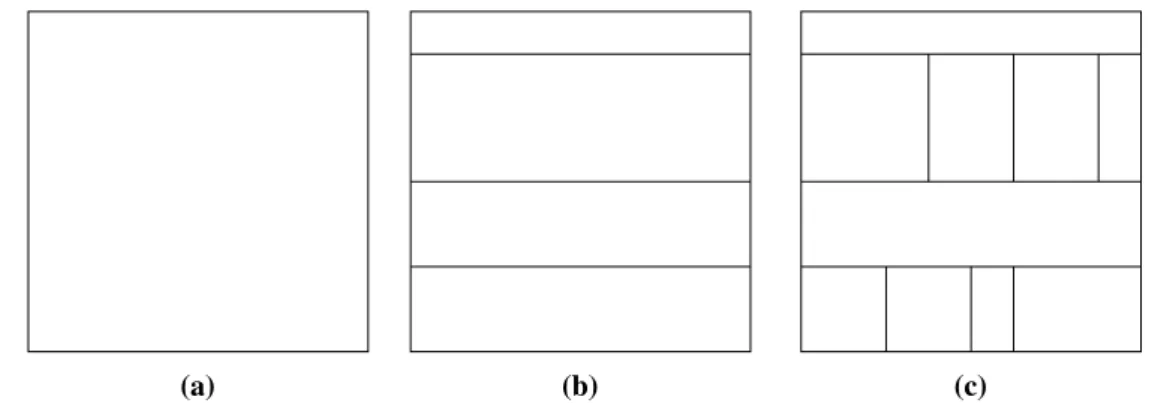
The tree structure used in this work is the complete binary tree, it is a particular kind of tree that each node has and only two children. The tree structure can be visually represented in different ways such as node-link(which is used in Figure 2.2 and Figure 2.3), stacking, nesting, and indentation. In 1991, Johnson and Schneiderman proposed a visualization technique called Treemap[JS91]. It is a method which makes full use of available display space, mapping the full hierarchy onto a rectangle in a space-filling manner. Several different types of treemap are proposed in their work. This work uses the simpleslice and dicelayout mentioned in it.
A slice and dice treemap is generated as follows:
1. use parallel lines to divided a rectangle representing an item into smaller rectangles repre-senting its children.
2. each child is allocated a space whose area size is proportional to some property and can be additionally encoded by color.
(a) (b) (c)
Figure 2.4:Example of slice and dice treemap - Generation of a slice and dice treemap for the tree shown in Figure 2.3. (a) A rectangle represents the tree root. (b) Horizontal splitting for representing tree nodes with depth one. (c) Vertical splitting for representing tree nodes with depth two.
2.1.6 Dimension Reduction
Dimension reduction belongs to unsupervised machine learning. Users may wish to reduce the number of dimensions to decrease the size of data-held memory, speed up algorithm operations, visualize data, and more. In many fields of research and applications, it is often necessary to conduct a large number of observations on many variables that reflect things and collect large amounts of data for analysis to find potential rules. A large number of multivariate samples undoubtedly provides abundant information for research and applications, but also increases the workload of data collection to a certain degree. More importantly, in most cases, there may be some correlation between many variables, which increases the complexity and inconvenience of analysis. If users analyze each variable separately, the analysis is isolated rather than synthetic. Blindly reducing the variables loses a lot of information and leads to wrong conclusions.
Therefore, there is a need to find a reasonable way to reduce the loss of information contained in the original variables while reducing the number of variables so as to achieve the purpose of conducting a comprehensive analysis of the data collected. Due to the existence of certain correlations among the variables, it is possible to synthesize various types of information that exist in the variables with a small number of synthetic variables. Principal component analysis belongs to this kind of dimension reduction methods.
PCA
Principal Component Analysis(PCA)[KPF01] is a statistical method. Through orthogonal trans-formation, a set of variables that may have correlations are transformed into a new set of linearly uncorrelated variables. The resulted variables are called principal components.
The principal component analysis tries to recombine the original variables into a new set of independent synthetic variables, and take out several synthetic variables to reflect as much information of the original variables as possible according to the actual needs. It tries to replace a large number of related variables (such as P variables ) with a set of new unrelated synthetic variables. The usual mathematical treatment is to linearly combine the original P variables as several
new synthetic variables. The most classic way is to use F1 (the first selected linear combination which is also the first synthetic variable) variance, that is, Var(F1). The greater Var(F1) is, the more information F1 contains. In all selected linear combinations, F1 should have the largest variance, and it is called the first principal component. If the first principal component is not enough to represent the information of the original P variables, select a second linear combination F2. The existed information in F1 should not appear again in F2. In mathematics, the expression is Cov (F1, F2) = 0, F2 is called the second principal component, and so on can construct the third, fourth, ..., the Pth principal component. The algorithm is given in the following:
Algorithm 2.1PCA algorithm
Input: Dataset D with dimension K:D= x(1), x(2), x(3), ..., x(m) 1. Normalize all samples: x(ji) ←
x(ji)−µj sj 2. Calculate covariance: Í= m1 Íim=1(xi)(xi)T V ector iz ation → sigma = 1 m∗X ′∗X
3. Decompose the singular value of covariance: U, S, V = svd(Sigma)
4. Take the k eigenvectors corresponding to first k eigenvalues: u(1),u(2),u(3), ...,u(k)V ector iz ation→ Ur educe=U(:,1 :k)
5. Z =Ur educe′ ∗x, where x is a n-dimensional column vector, excludingx0= 1.
Output: Projection matrix:U= u(1), u(2), u(3), ..., u(k)
t-SNE
t-SNE(t-Distributed Stochastic Neighbor Embedding)[MH08] is an algorithm derived from SNE(Stochastic Neighbor Embedding)[HR03] which was first proposed in 2002. SNE tries to map a list high dimensional samples into a list of lower dimensional samples while keeping the similarity of samples. In other algorithms, the similarity is usually measured by Euclidean distance. SNE transforms the similarity into conditional probability. It considers the distribution of samples in both high dimensional and low dimensional spaces as Gaussian distribution.
Given high dimensional data X and low dimensional data Y,xiis the i-th sample. The distribution probability matrix P in high dimensional space can be defined as follows:
pj|i =
ex p(− ∥ xi−xj ∥2/2σi2)
Í
k,iex p(− ∥ xi−xk ∥2/2σi2)
pj|idenotes the conditional probability ofxiselectsxjas its neighbor. σi represents the variance of Gaussian distribution centered onxi. Since only the similarity of different pair of samples are calculated,pi|i= 0.
yi and yj are mapping samples of xi and xj. The variances of Gaussian distribution in both dimension spaces are set to 1/
√
2. The distribution probability matrix Q in low dimensional space is calculated as follows:
qj|i =
ex p(− ∥ yi−yj ∥2)
Í
k,iex p(− ∥ yi−yk ∥2)
qj|i denotes the conditional probability of yi selects yj as its neighbor. qi|i = 0. If yi and yj truly reflect the relationship between high dimensionalxiandyj, the conditional probabilitiespj|i andqj|ishould be exactly equal. Up to now, only the conditional probability between xiand xj are considered. If the conditional probabilities betweenxi and all other samples are taken into consideration, a conditional probability distributionPi in high dimension space can be formed. Similarly, there exists a conditional probability distributionQiin low dimensional space and should be consistent withPi. Then, KL-distance( Kullback-Leibler Divergence) is used to measure the similarity betweenPiandQi, which is also the objective(cost) function:
C=Õ i K L(Pi ∥Qi)= Õ i Õ j Pj|ilog Pj|i Qj|i
The final objective of SNE is to minimize the KL-distance for all samples, which can be solved by gradient descent algorithm:
δC
δyi =2
Õ
j
(pj|i−qj|i+pi|j−qi|j)(yi−yj)
In SNE,pi|j is not equal to pj|i in high dimensional space, and qi|j is not equal to qj|i in low dimensional space. Symmetric SNE uses a more general and reasonable joint probability distribution. It constructs joint probability distribution matrices P and Q in high and low dimensional spaces respectively, the matrices are symmetric and can be easily operated. For any i and j, there arepi j= pjiandqi j=qji. Thus, the definition ofpi j,qi jand cost function can be changed into:
pi j = ex p(− ∥ xi−xj ∥2/2σi2) Í k,iex p(− ∥ xi−xk ∥2/2σi2) qi j = ex p(− ∥ yi−yj ∥2) Í k,iex p(− ∥ yi−yk ∥2) δC δyi =4 Õ j (pi j−qi j)(yi−yj)
Compared to the formula of SNE, this gradient is more simplified and computationally efficient. SNE has a set of limitations. One of them is the crowding problem. In the visualization of SNE, different types of clusters crowd together and can not be distinguished, which is due to the difference between the distribution of high and low dimensional spatial distances. Symmetric SNE solves the asymmetry problem in SNE and generates a simpler gradient formula, but it can not solve the crowding problem.
t-SNE uses a symmetric SNE for the distributions in high dimensional. The distribution in low dimensional space uses a more general t-distribution which is also symmetric. The benefit of using t-distribution is to make the distance between the clusters wider, thus solving the congestion problem. Theqi jand gradient of t-SNE are given in the following:
qi j = (1+ ∥ yi−yj ∥2)−1 Í k,l(1+ ∥yk−yl ∥2) −1 δC δyi =4 Õ j (pi j−qi j)(yi−yj)(1+ ∥ yi−yj ∥2)−1
2.2 Related Works
2.2.1 Distant SupervisionIn 2009, Go, Bhayani and Huang[GBH09] first adopted distant supervision in tweet sentiment classification. They used the Twitter messages with emoticons as the training data. The emoticons occurring in tweets indicate the messages are positive or negative. Their approach reminds us that other information contained in tweets can also be used as annotators, such as hashtags, URLs, user_mentions, and geolocation.
Magdy et al.[MSES15] introduced an approach of using the labels of YouTube videos as the labels of tweets that link to these videos. A Zubiaga and H Ji[ZJ13] used human-edited web page directories to deduce categories of URLs contained in tweets. The categories of URLs can be used as annotators to label a large number of tweets. Both of this two approaches achieved good performances. In this work, the URLs in the tweets are also used as annotators for labeling. The above research shows that it is feasible to obtain training samples through the distance supervision and good results can be obtained. However, some research shows the shortages of distant supervision. Hoffmann et al.[HZW10] conducted a study of generating training data using distant supervision. They pointed out that the generated data of distant supervision is noisy and sparse, but they did not provide solutions for this problem. Takamatsu et al. [TSN12] proposed a method to reduce the number of wrong labels in distant supervision. A generative model which models the heuristic labeling process of distant supervision directly was presented and a negative pattern list was built to remove wrong labels. Since distant supervision is a feasible way to generate training data, it is meaningful to study how to overcome the drawbacks.
2.2.2 Visual Analytics
Heimerl et al.[HKBE12] designed software calledVisual Classifier Building Toolthat enhanced information retrieval by the interactive creation of binary classifiers. In their approach, documents were visualized in a visual interface. Users can explore the document contents, label documents, and train classifiers. The approach discussed in this work has a similar classifier training process with them.
H. Bosch and D. Thom[BTH+13] proposed an approachScatterBlogs2. It was a system for microblog analysis with an interactive visual interface. UsingScatterBlogs2, an analyst can monitor and analyze microblog message by building task-tailored message filters. In their approach, tweets were visualized on a world map, LDA topic extraction was is implemented to find potential events and monitor the ongoing events. They also combined classifier training into their method.
In 2010, Diakopoulos et al.[DNK10] designed a visual analytic tool calledVox Civitasto help journalists, and media experts extract news from large-scale aggregations of social media content around broadcast events. Kraft et al.[KWD+13] designed a tool calledGTAC(Geo and Temporal
Association Creator) that created a near real-time analysis environment for identifying event structures. Their tool extracted structured representations of events from the Twitter stream and supported event-level investigative analysis of social media data by interactively visualizing the event indicators.
2.2.3 Tweet Classification
Thom Dennis and Ertl Thomas[TE15] proposed an approach to tackle the shortages of searching engine for microblog entries such as Tweet Search and the challenge of explorative query optimization. They designed an analysis loop for microdocument retrieval. Their method employed hierarchical clustering and a highly interactive treemap to represent summarized clusters. This work is developed based their approach.
Another approach that provided interactive discovery of emergent theme in tweets was proposed by Hoeber et al.[HHE+16]. They combined automatic data processing and machine learning methods with an interactive software called Vista(Visual Twitter Analytics). Their software visualized the temporally changing sentiment and showing the top words, hashtags, user_mentions. This work has a similar idea with their approach.
There are massive studies related to distant supervision, visual analytics, and tweet classification. However, few studies that involve enhancing distant supervision with visual analytics are found. This work tries to verify the feasibility of enhancing distant supervision with visual analytics.
The objective of this work is to enhance distant supervision with visual interfaces and help users to make in-depth explorations of tweet data. For this purpose, an approach which combines the ideas of distant supervision and visual analytics is built. Human ability is included in the approach, a visual interface and a set of back-end data processing methods are provided for users to analyze and operate tweet data. This chapter first outlines the requirements of the approach, then introduces the approach in detail.
3.1 Requirements
To achieve the objective, a set of requirements are defined for the approach: 1. Users can process a large number of tweets and build local tweet database.
2. Users can get tweets using the information existing in tweets from the local tweet database. 3. It provides visual interfaces to show the effect of each user operation.
4. Users can observe and label the acquired tweets.
5. Users can discover the potential topics in tweets and do further exploration. 6. Users can watch the content of each single tweet.
7. Users can label one or more tweets at a time.
8. If there are mislabeled tweets, users can relabel them. 9. It can show the relationship or similarity between tweets. 10. Users can do tweet classification.
11. Users can train classifiers with labeled tweets. 12. Users can evaluate the performance of classifiers.
13. Users can save the trained classifiers locally for future use. 14. Users can use the trained classifier to get more required tweets.
3.2 Specification
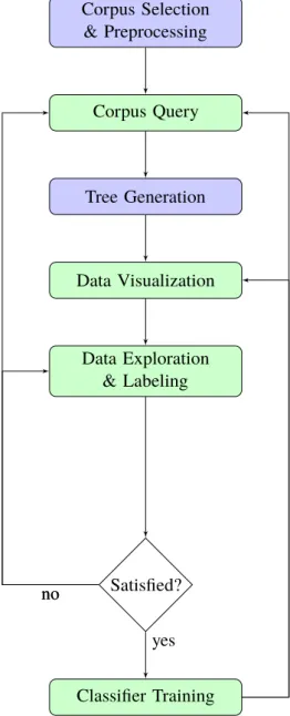
According to above requirements, the approach is designed. It is composed of five primary functions: Corpus Selection & Preprocessing, Corpus Query, Tree Generation, Data Exploration & Labeling, and Classifier Training. These five functions form an analytical loop that allows users to explore and process tweet data iteratively. The flow chart in Figure 3.1 indicates the workflow of this analytical loop. The following sections introduce these functions in detail.
3.3 Corpus Selection & Preprocessing
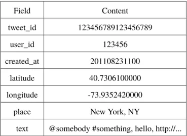
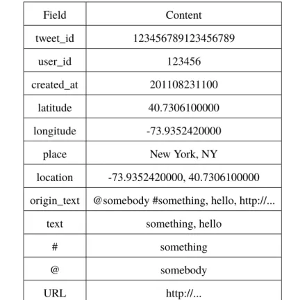
3.3.1 Corpus SelectionSame as other text classification problems, the first step is corpus collection. It is necessary to collect a large number of tweets in order to cover all possible features. This work selects about two million tweets. The original structure of the selected tweets is given in Table 3.1.
Field Content tweet_id 123456789123456789 user_id 123456 created_at 201108231100 latitude 40.7306100000 longitude -73.9352420000
place New York, NY
text @somebody #something, hello, http://...
Table 3.1:Original Tweet Structure - The structure of the tweets collected by Institut für Visual-isierung und Interaktive Systeme (VIS) of Universität Stuttgart and were stored as CSV files. Each tweet has seven fields: tweet_id, user_id, created_at, latitude, longitude, place and text.
3.3.2 Preprocessing
The original structure of the collected tweets has to be transformed into a proper structure for further processing. Tweets are preprocessed for three reasons. Firstly, to facilitate distant supervision, different information existing in tweets including keywords, hashtags, user_mentions, and URLs and so on is used as annotators. Thus, this information needs to be stored separately, in order to be queried and got easily. Secondly, the original tweet texts cannot be used to train classifiers directly. The input of classifier training is feature vectors that are a set of words weighted by frequency
Corpus Selection & Preprocessing Corpus Query Tree Generation Data Visualization Data Exploration & Labeling Satisfied? Classifier Training yes no no
Figure 3.1:Analytical loop of the approach - Interactive elements are in green, data extraction and processing elements are in blue. After selecting, preprocessing, and storing a certain amount of tweets, users can query the tweets hierarchically. The query structure and results are visualized as a treemap in the visual interface. Based on the visualization, users can explore potential topics and subevents. Then, they can label training examples for a specific topic or subevent. The accuracy of labels can be checked through the visual interface. When users feel satisfied with the labeling accuracy, they can train a classifier. If not, they can relabel the tweets or make further queries. The effect of the classifier is also visualized in the visual interface. Users can save the classifier locally or make new queries based on the classification result. If the effect is dissatisfying, users can relabel the tweets and train a new classifier. The consequent of new queries or classifiers can then again be visualized and evaluated.
information. Therefore, the tweet texts have to be split into single words. Besides, these features are also used in PCA and t-SNE. At last, this approach implements several exploration tools that need separately stored keywords, URLs, hashtags, and user_mentions.
Above all, it is important to notice that tweets have some characteristics that are different from other texts. First, Twitter messages are text-based and can be downloaded from Twitter API. Thus, it is straightforward to collect millions of tweets. Second, Twitter restricts the maximum length of tweets. In September 2017, Twitter began a test of doubling the maximum tweet length to 280 characters. Before that, the maximum length was 140. Third, tweets vary in length. Some tweets even only have one sentence or short phase. Fourth, Twitter users post tweets from different media, such as cellphones and web pages. Therefore, the tweet texts are more colloquial and contain more abbreviations, misspelling, slang and Internet languages, which is very different from formal literature. Lastly, there is always a variety of topics discussed by Twitter users simultaneously rather than a specific one.
Several steps are taken for tweet preprocessing. To start with, hashtags, user_mentions, and URLs are extracted from the tweet texts. For example, there is a tweet text: "@somebody, did you watch the new #movie? http://.... ", "@somebody", "#movie" and " http://... " are extracted from the tweet text and put into separate fields. Next, the user_mentions and the URL are removed from the tweet text. The tweet text is converted to "did you watch the new #movie?". Notice that the hashtag is kept. The preprocessed tweet texts are the foundation for later processing such as training classifiers and performing t-SNE. Thus, it has to be further cleaned. The cleaning rules introduced in the paper[VGC17] is adopted in this work.
1. Transform all Unicode symbols into ASCII. Part of accents and brackets were removed. 2. Remove all whitespace characters, apart from spaces, so that newline, tabs, etc. are excluded. 3. Remove retweets that contain the keyword "RT".
4. Transform the tweet text into lowercase.
5. Remove all non-english characters other than alphanumerics and spaces. 6. Transform appearance of multiple spaces into a single space.
7. Replace the appearance of two or more characters in succession with the character itself. For Instance, “I am so huuuungry. . . ” is converted to “i am hungry.”
8. Remove whitespace at the start and end of tweets. 9. Remove stopwords.
10. Perform lemmatization. 11. Tokenize the rest text.
After these steps, a relatively clean tweet set was generated. An original tweet is separated into 12 fields. The cleaned tweet text is stored in fieldtext. The original tweet text is stored in the field
origin_text, the extracted hashtags, user_mentions, and URLs are stored in corresponding fields.
At last, the preprocessed tweets are stored for later use. Table 3.2 gives the preprocessed tweet structure.
Field Content tweet_id 123456789123456789 user_id 123456 created_at 201108231100 latitude 40.7306100000 longitude -73.9352420000
place New York, NY
location -73.9352420000, 40.7306100000 origin_text @somebody #something, hello, http://...
text something, hello
# something
@ somebody
URL http://...
Table 3.2:Preprocessed Tweet Structure - After preprocessing, each tweet has twelve fields: tweet_id, user_id, created_at, latitude, longitude, place, location, origin_text, text, #, @, and URL.
3.4 Corpus Query
After the preprocessing stage, it is possible to make queries for different information in different fields. This approach provides six kinds of basic queries:Keyword Query, Geographic Query,
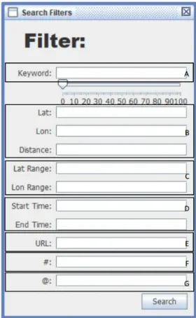
Time Range Query,URL Query,Hashtag Query, andUser_mention Query. In addition, several basic queries can be combined to form a multi-condition query. Each query returns two results, relevant and irrelevant results. The relevant one contains tweets those match the current query condition, and irrelevant one is the non-matching part. Users can make queries hierarchically. The hierarchical query detail is discussed in next section. Users can define the automated annotation rules by building their own set of queries. A search view in the user interface(Figure 3.2) is provided for users to make queries.
1. Keyword Query: The keyword query works on thetextfield. Users can query the tweet set with one or more keywords. Since the stopwords are removed from tweet texts, the input keywords should not be stopwords. Boolean operations are possible in keyword query, which means users can input multiple keywords at a time and define their relationships. For instance, the input keywords are "Earthquake AND Shake OR quake NOT 5.8 ", the returned relevant tweets must contain "earthquake" and "shake", may contain quake, and do not contain 5.8.
2. Geographic Query: The geographic query works on thelocationfield. There are two types of geographic query: rectangular query and radius query. The rectangular query has four input parameters, the minimum and maximum latitude and longitude. These four parameters form a geographic rectangle, tweets whose latitudes and longitudes are inside this rectangle are returned as relevant result. For radius query, three parameters are required: the latitude and longitude of a center point and a radius. Tweets have distances from the center point shorter than the radius are returned as relevant result. Generally speaking, rectangle queries are more precise.
3. Time Range Query: The time range query works on thecreated_atfield. It looks for tweets whosecreated_atfield values are within the input start and end time.
4. URL Query: The URL query works on theURLfield. The tweets contain the input URL are returned as relevant result.
5. Hashtag Query: The hashtag query works on the#field. This query returns tweets contain the input hashtag. As is mentioned before, hashtags are not removed from tweet texts. Users can use the keyword query in replace of the hashtag query. Twitter suggests users to use only one hashtag and one user_mention in a single tweet. Thus, hashtag query does not support multiple inputs as the keyword query.
6. User_mention Query: The user_mention query works on the@field. It gives back tweets that mention the specified user. It does not support multiple inputs for the same reason as the hashtag query.
If users enter several query conditions at a time in the search view, these query conditions are performed using logical AND operations. Out of the first query, all queries are made based on the previous results. In an iterative process, users are helped to continuously improve their understanding of the tweet set, find relevant discussions and subevents, and build textual queries that fit their specific information needs.
3.5 Tree Generation
The previous section mentions that queries are made in a hierarchical way. To be more precise, they can be made in a tree structure. There is an initial query which is executed first to fetch an initial tweet set and generate a tree root node. Usually, the initial query is aTime Range Queryor a
Geographic Queryor a combination of them. Except for the initial query, each query is executed on the tweet set in a specified node and returns relevant and irrelevant results. The relevant result is the tweets inside the specified node that match the current query condition, and the irrelevant result is the non-matching tweets. Then the returned results are inserted into the tree as child nodes of the specified node. A complete binary tree is suitable for describing this kind of structure. Figure 3.3 shows the structure of the tree. A generated tree contains a set of nodes, and each node contains a set of tweets. The following steps are taken to generate a tree:
1. Execute an initial query. If the result is not empty, set a tree root and insert the returned tweets into the root. Then set the root as the selected node.
Figure 3.2:Search view in the user interface - It allows users to enter different query conditions A) Keyword Query, B) Geographic Rectangular Query, C) Geographic Radius Query, D) Time Range Query, E) URL Query, F) Hashtag Query, G) User_mention Query
.
2. Execute the second query. When any of the two results is not empty, insert the relevant result as the right child node and the irrelevant result as the left child node of the root into the tree. The right child node is set as the selected node by default.
3. Select a node as the selected node or use the default one.
4. Make a new query, insert the results as the child nodes of the selected node when there is any non-empty result.
5. Repeat step 3-4.
3.6 Data Visualization
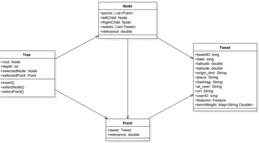
Data visualization helps human to extract implication of data easily and quickly. The tree generation process is introduced in last section. The generated tree is visualized using a treemap in the visual interfaces given in Figure 3.4. The data visualization of this work consists of 7 parts: (a) Treemap (b) Tweet Table (c) Progress Bar (d) Node Information Report (e) Minimap (f)Node Detail Report
Figure 3.3:UML diagram of the generated tree structure
(g) Operation Buttons. The visual interface is interactive. Through the visual interface, users can check the content of each tweet, find the potential topics in the tweets, label or relabel tweets, which enhances the distant supervision and helps users to understand the tweet data.
Figure 3.4:Main view in the visual interface - It contains 7 parts: A)Treemap B)Tweet Ta-ble C)Progress Bar D)Node Information Report E)Minimap F)Node Detail Report G)Operation Buttons.
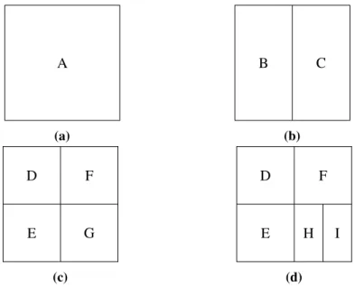
Treemap is a method for displaying hierarchical(tree-structured) data using nested rectangles. The detailed introduction of the treemap is given in Section 2.1.5. To generate a treemap, it needs to start from the tree root node and traverse the tree depth-first. At first, a rectangle is assigned to the root. Each time a node contains child nodes, its assigned rectangle is split by a line that alternates in a vertical or horizontal fashion to represent its children. The splitting process stops when it reaches leaf nodes. Figure 3.5 shows a tree which matches the tree structure of this approach. Figure 3.6 shows how to generate a treemap for Figure 3.5.
A B D E C F G H I
Figure 3.5:Example of a complete binary tree - The tree structure used this approach. It is a complete binary tree, each node has and only has two child nodes except leaf nodes.
A (a) B C (b) E D F G (c) E D F H I (d)
Figure 3.6:Treemap Generation Process - Generation of a treemap for the tree given in Figure 3.5.
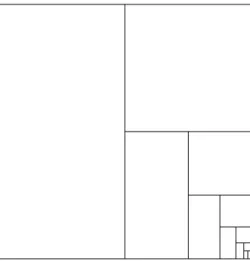
A problem occurs when the number of splitting times becomes large. The assigned rectangles for the nodes with greater depth become small and unrecognizable, see Figure 3.7. To solve this problem, this work defines a threshold. When the rectangle of a node has any side length shorter than the threshold, the node is treated as a leaf node, which means its rectangle will not be not further split. In this work, it is called "display node".
Figure 3.7:Example of a treemap that has been split many times - After eleven times of splitting, the rectangles representing the last two generated nodes become extremely small.
The generated treemap has a series of rectangles of different sizes. Each rectangle represents a node in the tree. Users can select a node by clicking on its rectangle. As mentioned above, when a node is a display node, its subtrees are not shown in the treemap. Also, when the rectangle has been split for many times, the rectangle of a deep node becomes very small, operating such node is difficult. Therefore, a "zoom in" function is provided. Selecting a node and zooming in it, the selected node is set as a new tree root. The treemap is repainted based on the new tree root. A "zoom out" function is also provided correspondingly. After zooming in a node, the treemap does not show the original tree structure anymore. A minimap is given in the main view to show the original tree structure. The rectangle of the selected node is marked by a specified color in the minimap.
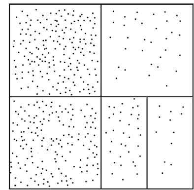
Each node contains a set of tweets. If a node is a display or leaf node, the tweets that it contains are represented by points in the treemap. In this work, the rectangles and points in the treemap are calledtweet nodesandtweet points. Up to this point, the treemap looks like Figure 3.8. Through this treemap, the tree structure of queries and the returned amount of tweets of each query can be seen easily. However, none information about the contents of the tweets is given. Tweet contents need to be known in order to define labels of the tweets. In this approach, several methods are implemented to help users check the contents of the tweets in each node.
1. Tweet Table: A tweet table is implemented to show the tweet contents including post date, place, tweet text, hashtag, user_mention, and url. Other information like latitude, longitude, and user_id is not provided because it is difficult to summarize useful information directly from it.
2. Coordinates: Proper coordinates can help users understand data and find potential informa-tion. This approach uses four types of coordinates for eachtweet node: random, post date, decision value and t-SNE.
• Random: In the default mode, the x(horizontal) and y(vertical) coordinates of thetweet
Figure 3.8:Example of a treemap withtweet points- The look of the treemap after adding points representing tweets to Figure 3.6.d.
• Post Date: As discussed above, the splitting line separates the rectangles in horizontal and vertical directions alternatively. It is a reference to set coordinates. When the post date is used as the coordinate, the coordinate which is opposite to the splitting line is the post date. The post date coordinate sometimes gives beneficial information. For example, when users search for tweets with the keyword "earthquake" and use post date as the coordinate, there is a clear dividing line in thetweet node, whose value is very close to the time of occurrence of the earthquake. However, at other times, the effect of the post date coordinate is not obvious.
• Decision Value: The coordinate parallel to the splitting line represents the decision value. A larger decision value means the classification result of this tweet is more likely to be correct. The distance betweentweet pointand the splitting line is determined the decision value. Thence, users can check thetweet pointsthat located very close to the splitting line. If most of these tweets are classified correctly, the quality of the classifier is good. Otherwise, users can relabel these tweets and start a new round of training. • t-SNE: The coordinates of thetweet points are generated by the t-SNE algorithm.
Tweets contain more same words are placed closer in thetweet node. This characteristic helps users to find potential relationships between tweets. However, computing t-SNE coordinates need large running memory and long running time. It is not recommended to be used when there are more than 1000 tweets.
In the decision value and post date mode, the undefined coordinate can be random or each other.
3. Tag Cloud: The tag cloud allows users to quickly recognize the most prominent words in tweets. These words promote potential discussed topics. An example of the tag could is given in Figure 3.9.
4. Content Lens: Similar to the tag cloud, the content lens also allows users to recognize potential topics. The content lens moves on the treemap and generates a smaller tag cloud around it. It can find topics that are not shown in the tag cloud. An example of content lens is given in Figure 3.9.
Figure 3.9:Example ofTag Cloud and Content Lens - The figure shows how Tag Cloud and
Content Lenslook like after executing aTime Range Query. It indicates "earthquake" and "shake" appear most times, and a possible subevent is fire.
5. Node Detail Report: A text area that shows the most frequently appeared hashtags, user_mentions, URLs.
3.7 Data Exploreation and Labeling
After the query results are visualized, users can explore the contents of the tweets with the methods introduced in Section 3.6. They can useTweet Tableto check the detailed content of each tweet. They can quickly find popular discussions using theTag Cloud,Content Lens, andNode Detail
According to distant supervision, the information existing in tweets can be used as annotators to label tweets as training examples. The tweets contain specific keywords, hashtags, user_mentions, or URLs can be labeled as positive training examples. Others can be labeled as negative training examples. To get more precise training examples, users can make queries to filter these labeled training examples.
In order to do tweet classification, a large number of training examples are demanded. It is time-consuming to label tweets one by one. In this work, each node contains tweets that match some query conditions. If the tweets in a node are considered as positive training examples, the tweets contained in the sibling node are considered as negative training examples. This approach allows users to label all tweets in a node at a time. The node contains positive training examples is labeled as the relevant node, and the node contains negative training examples is labeled as the irrelevant node. The tweets inside them are labeled as relevant and irrelevant tweets respectively. The training examples generated by distant supervision suffers from noisy data, skew annotation and challenge of generating negative training examples. Labeling all tweets in a node at a time may wrongly label some tweets. To solve these problems and improve the labeling accuracy, users can check the contents of the tweets and relabel the tweets one by one or set query conditions to filter the tweets.
3.8 Classifier Training
After users label a set of tweets and are satisfied with the labeling quality, they can train a classifier. This work is doing tweet classification which belongs to text classification. Many studies have shown that linear classification has as good performance as non-linear classification in text classification problems. Thus, this work chooses the linear support vector machine(Linear SVM) as the training algorithm. After a classifier is trained, it classifies the input samples. This work focuses on binary classification. The tweets are classified into relevant and irrelevant. The classification result is visualized in the treemap. Users can check the correctness of the classification. If the correctness meets the user requirements, the classifier can be saved locally for future use. Users can make further operations based on the current classification result. If the classification result is not satisfying, users can relabel the training samples(tweets) and train a new classifier. This chapter introduces the training examples preparation, classifier selection, and classification visualization.
3.8.1 Preprocessing
An essential premise of using machine learning to do text classification is that the content of a document is necessarily related to the words contained in it. There is always a set of common words between the documents of similar subjects, and documents of different subjects contain very different words. Furthermore, It is important that not only what words are contained, but also how many times these words appear. This premise makes the vector space model(VSM) into a document representation model suitable for text classification. In this model, a text is considered as a collection of features. These features are weighted by word frequency information, and the weighted features are used to construct a vector to represent the text.
Most of the preprocessing steps have been described in Section 3.3.2, including the tweet cleaning rules and the conversion of the original tweet structure into the processed tweet structure. After the preprocessing steps, thetextfield of each tweet contains a set of words which are the features for classification. A tweet instance for classification can be represented as Table 3.3.
label feature 1 feature 2 feature 3 ... feature n
Table 3.3:A Tweet Instance
Bag of wordsmodel is used to represent a tweet, which considers each word as a feature and its
TF-IDF as its weight. Assuming there are two tweets TW1 and TW2, an example of converting these two tweets into feature vectors is given in the following:
TW1 = This is the first tweet. TW2 = This is the second tweet.
TW1 and TW2 can be represented by following vectors:
V1 = (This:1, is:1, the:1, first:1, tweet:1) V2 = (This:1, is:1, the:1, second:1, tweet:1)
The pair "word: number" indicates the number of times the word appears in a tweet. Other tweets can also be represented in this way. Through observing V1 and V2, an easier way can be found to represent them. Extracting all the words existing in all tweets to form a dictionary. The dictionary is also a vector. The dictionary D for TW1 and TW2 is given in the following:
D = (This, is, the, first, second, tweet)
Based on this dictionary, TW1 and TW2 are represented as:
V1 = (1, 1, 1, 1, 0, 1) V2 = (1, 1, 1, 0, 1, 1)
Each number in the vector represents the number of occurrences of the word that has the same index in the dictionary vector. However, using the number of occurrences as feature weight has some shortages. In this work, TF-IDF is used as the feature weight. The detailed introduction of TF-IDF can be found in Section 2.1.4. At last, V1 and V2 are like following:
V1 = (0, 0, 0, 0.0602, 0, 0) V2 = (0, 0, 0, 0, 0.0602, 0).
3.8.2 Feature Selection
However, the introduced conversion process has a problem. The dictionary contains all words from all tweets in the tweet set, which means the dictionary size is huge. In this work, a dictionary usually consists of hundreds of thousands of words. A tweet used in this work includes at most 140 characters. It is wasteful to represent a tweet with a vector that has hundreds of thousands of dimensions. The solution is feature selection, which is sometimes called dimension reduction. A fact is that words like "this", "is", "the" appear very often in any tweet and have little contribution to the subject of a tweet. These kinds of words are called stopwords. Removing the stopwords helps to reduce the dimensions. The cleaning rules also help to reduce the dimensions. After calculating the TF-IDF of the words, the tweet text can be transformed to feature vectors that can be used for classifier training.
3.8.3 Classifier selection
Feature vectors are the input of the classifier training. Users have labeled a number of tweets as training examples. These training examples are first transformed into feature vectors. The computer accepts these training examples, and it considers these labels are correct. It observes the features of these training examples to guess a possible classification rule. Once this classification rule meets some requirements, this rule is considered to be approximately correct and good enough to become the classifier. When there is a new tweet that has not seen before, this classifier can determine its class.
There are some classification algorithms for doing text classification such as Naive Bayes, Decision Tree, Rocchio, and Support Vector Machine. This work employs the linear support vector machine(Linear SVM) as the training algorithm. it solve the following unconstrained optimization problem with different loss functionsξ(w;xi,yi):
min w 1 2w Tw+C l Õ i=1 ξ(w;xi,yi))
where C > 0 is the penalty parameter. w is the normal vector to the hyperplane. For Linear SVM, the two common loss functions are max(0) andmax(0)2. In the testing phase, a data pointx is classified as positive ifwTx > 0, and negative otherwise. wTxis the decision value.
When using aKeyword Queryor aHashtag Query, every returned tweet in the relevant result contains the input words. If a classifier is trained with such tweets, it may give very high weights to the input words and does not learn other features. In addition, learning and testing on the same data can cause a mistake: the trained classifier only repeats the labels of the training examples and fails to predict the data that has not been seen yet. This problem is called overfitting. To solve this problem, this approach introduces a percentage. Users can set a percentage, the set percentage of tweets keep the input words while other tweets remove the input words.
To check the performance of the classifier, k-fold cross-validation (CV) is employed. The k-fold cross validation randomly splits training examples into k parts. It uses k-1 parts as the training data to train the classifier and use the left one part as the test data. Each part is used as a test data once, and the other parts are used as training data at the same time.
3.8.4 Classification Visualization
The trained classifier classifies the input tweets as relevant or irrelevant to the query conditions of the selected relevant node. Users can collect the relevant tweets and put them into a selected node. After that, they can make queries on the tweets in this node.
In order to check the performance of the classification, the result is visualized in the treemap. As mentioned in Section 3.6, after doing classification,tweet nodesuse decision values as coordinates, the treemap after classification is given in Figure 3.10:
Figure 3.10:Example of the treemap after classification - Relevanttweet points are in orange and irrelevanttweet pointsare in blue. The tweets that have different labels from classification results are marked with round shape. The coordinate parallel to the splitting line is determined by decision value. Tweets with smaller decision values are placed closer to splitting line.
A software is developed to achieve the approach discussed in this thesis and evaluate the overall performance of the approach. It is completely developed in Java, and the used integrated development environment(IDE) is Eclipse1. It deploys Apache Lucene2 as a search engine, Java Swing3 for visualization, Standford CoreNPL4for NLP preprocessing, Weka5and T-SNE-Java6for generating
tweet pointcoordinates and LIBLINEAR7 for classifier training. More detailed introduction of these dependencies is given in Section 4.4.
The software has two views: the main view and the search view. It can be used to preprocesses selected tweets and creates local tweet database. It offers robust search operations to obtain required tweets. A tweet contains information including text content, post date, geographic location, hashtag, user_mention, URL, etc. According to the distant supervision theorem, this information can be used as annotator to generate labels. For example, a tweet that contains the keyword "earthquake" has very high possibility that its content is discussing an earthquake. This software has different types of queries to search for different information. Users can define a set of queries to get tweets according to their requirements. The queries can be done in a hierarchical way, which means a new query can be made based on the results of previous queries. Users can enter the query conditions in the search view, and the query results are shown in the main view. Through designing a set of queries, users can define their own rules for generating positive or negative training examples. The generated training examples might suffer from noisy data, skewed annotations, and the challenge to generate negative training examples. Thus, users can use the main view to check the contents and labels of the tweets. If a tweet is wrongly labeled, it can be modified. Through the main view, a user can also get a sense of the accuracy of the labels. This work focuses on binary classification. Therefore, the generated labels are only relevant and irrelevant. When users are satisfied with the labeled tweets, they can use the labeled tweets to train a classifier. The generated classifier classifies the tweets existing in the relevant and irrelevanttweet nodes. The result is shown in the main view. Users can check its performance. If the performance is not satisfying, they can relabel the tweets and train a new classifier. If satisfying, they can save the generated classifier locally or use it for further training examples generation.
The following sections give an overview the user interface, the basic exploration tools, and the used libraries. Local tweet database generation, query creation, treemap generation, and classifier training techniques are introduced as well.
1https://www.eclipse.org/ 2http://lucene.apache.org/core/ 3https://docs.oracle.com/javase/9/docs/api/javax/swing/ 4https://stanfordnlp.github.io/CoreNLP/ 5https://www.cs.waikato.ac.nz/~ml/weka/ 6https://github.com/lejon/T-SNE-Java 7https://docs.oracle.com/javase/9/docs/api/javax/swing/
4.1 Data Index and Query
Tweet classification needs a large number of labeled training examples. In order to generate these training examples, an even larger tweet data source is need as well as powerful query operations. In particular, fast query response is essential for this approach. The information contained in tweets are used as annotators for generating training examples, including tweet_id, user_ id, post date, text, geolocation, user_mention, URL, and hashtag. This information has different data types and needs to be stored separately in order to be easier queried. Apache Lucene can achieve fast search response and offers storage and query functions for various types of data. Thus, it is adopted as the search engine. As mentioned in Section 3.3.2, the collected tweets are firstly preprocessed and the information is extracted. The preprocessed tweets are stored as Lucene index. Table 4.1 shows the mapping between the designed and the Lucene fields and queries. Besides, Lucene also calculates word frequency information, which can be used to generate TF-IDF. A more detail introduction of Lucene is given in Section 4.4.1.
Design Field Lucene Field Design Query Type Lucene Query Type
tweet_id LongPoint Set Query
user_id LongPoint
created_at LongPoint Time Range Query Range Query latitude DoublePoint
longitude DoublePoint place TextField
# TextField Hashtag Query Term Query
@ TextField User_Mention Query Term Query
origin_text StringField
url StringField URL Query Term Query
location StoredField Geographic Query Strategy Query
text Field Keyword Query Query
Table 4.1:Queries and Fields - The correspondence between the queries and fields designed by this approach and the Lucene query syntax.
4.2 User Interface
The look of the user interface is given in Figure 4.1 and Figure 4.2. It consists of a main view and a search view. The search view is provided for users to enter query conditions and the main view is used for visualizing and operating the tweets.
4.2.1 Search View
The search view can be seen in Figure 4.1. It consists of a set of text input boxes(Figure 4.1.A), a
Searchbutton(Figure 4.1.B) and a slider(Figure 4.1.C). The search view is opened and closed by
the buttonSearchin the main view.
Users can input the query conditions through the text input boxes. A single condition or multiple-condition query is supported. When there are more than one query multiple-conditions at a time, these queries are performed in an AND manner. This software supports six query types: keyword, hashtag, URL, user_mention, geolocation, and time range query. Each type of the queries has one text input box except forGeographic Queryand Time Range Query. Geographic Queryhas two subtypes,Rectangular Query andRadius Query. Rectangular Queryhas two input text boxes, users need to input (minimum latitude, maximum latitude) inLat Rangeand (minimum longitude, maximum longitude) inLon Range. Radius Queryhas three text input boxes, the latitude and longitude of the center point have to be input inLatandLonrespectively, and the radius has to be input inDistance. For Time Range Query, the start time and end time has to be input inStart Time andEnd Timeusing the formatyyyy-MM-dd HH:mm.
The slider(Figure 4.1.C) is designed for solving the overfitting problem that exists in classifier training. Users can set a percentage by the slider, the set percentage of return tweets keeps the words that are same as the input words ofKeyword QueryandHashtag Query, other tweets remove these words. The default percentage is 0%.
After inputting the query conditions and setting the slider, users can press the buttonSearchto start the query process.
4.2.2 Main View
The main view of the software can be seen in Figure 4.2. It is a highly interactive visual interface that shows the results of user operations and helps users to achieve a better understanding of tweet data and manipulate it. The main view consists of 7 parts: treemap, tweet table, progress bar, minimap, node information report, node detail report and operation buttons.
The treemap(Figure 4.2.A) is the core of the main view. It shows the query tree structure based on binary space partitioning. Every rectangle in the treemap represents a node in the query tree. The points inside the rectangle represent the tweets inside the node. A node can contain at most 100,000 tweets even when there are more tweets meeting the query conditions, in order to make sure the points in the rectangle are not crowd.
Figure 4.1:Search view of the software UI - It consists of A) text input boxes for query conditions B)a search button C) a keyword retention ratio
Figure 4.2:Main view of the software UI - It contains 7 parts: A)Treemap B)Tweet Table C)Progress Bar D)Node Information Report E)Minimap F)Node Detail Report G)Operation Buttons.