AN OFFSHORE WIND RESOURCE ASSESSMENT AND A LOOK INTO MODEL ERRORS IN WIND FORECASTS
MATTHEW B. CORKUM
A DISSERTATION SUBMITTED TO THE FACULTY OF GRADUATE STUDIES
IN PARTIAL FULFILMENT OF THE REQUIREMENTS FOR THE DEGREE OF
DOCTOR OF PHILOSOPHY
GRADUATE PROGRAM IN EARTH AND SPACE SCIENCE YORK UNIVERSITY
TORONTO, ONTARIO SEPTEMBER 2013 c
Abstract
This dissertation will look at 3 related, but different topics. The first, is a VHF wind profiler network in Southern Ontario and Quebec, the OQnet that provides real time wind measurements from 500m - 12000m. This study will look at ways of validating the data from these profilers and comparing them to forecast models such as the Canadian GEM model in Chapter 2.
The second part of this thesis will look at offshore wind resource assessment. Wind energy is a clean and viable alternative to burning fossil fuels for energy and is being expanded all over the world. Europe is a global leader when it comes to wind energy and they have expanded this industry to include many offshore wind farms. As Canada looks to accelerate their wind energy production, companies have begun to study the offshore wind resource in the Great Lakes. In 2010, Toronto Hydro started a 2 year wind resource campaign. The lidar installed by Toronto Hydro measured wind speed and direction up to hub height over a 2 year period but there were many gaps in the record. Other instruments, installed by the York
University team measured platform level winds and other weather variables. Using a combination of lidar extrapolation and platform level winds a continuous series of hub height winds has been generated which is discussed in Chapter 3.
Chapter 4 looks at using these data to look at Measure, Correlate, Predict (MCP) estimations of long term wind speed. Chapter 5 looks at Annual Energy Production (AEP) estimates for two potential wind farm designs for the Toronto Hydro site. Finally in Chapter 6, this dissertation looks at issues related to wind forecasting for these wind farms and what kind of errors are associated with wind energy forecasts.
Dedication
I would like to dedicate this thesis to my grandfather, Robert Hebb. As a life long farmer, he taught me how important the weather is to farming and got me interested in weather forecating. It is his interest, knowledge and love of weather that has inspired me to complete a PhD in Atmospheric Science. Thank You Gampy for all your love and support you continue to provide.
Acknowledgements
I would like to thank my supervisor Dr. Peter Taylor for his support, guidance of and countless hours during my entire PhD. My PhD committee and entire ex-amining committee deserve thanks for their helpful insight, comments and time. I would to acknowledge Dr. Wayne Hocking for his help with the wind profiler work and Jack Simpson for his insight into the Toronto Hydro lidar work.
Also I would like to thank NSERC, CFCAS, and Toronto Hydro for their funding support. In addition, thank you to Zephr North Canada Limited and Dynasty Power for the use of computing resources and commercial software use.
Finally, I’d like to thank my friends and family for their support and encouragement through my entire degree.
Table of Contents
Abstract i
Acknowledgements iv
Table of Contents v
List of Tables viii
List of Figures x
1 Introduction 1
1.1 Upper Air Wind Measurements . . . 2 1.2 Offshore Wind Energy and Wind Resource Assessment . . . 4 1.3 Wind Forecasting . . . 13
2 Analysis of Differences Between GEM Model Predictions and
2.1 The Network . . . 16
2.2 Quality Control . . . 24
2.3 Comparing with Models . . . 32
2.4 Results . . . 35
2.5 Comparing Data to Radiosonde . . . 46
2.6 OQ-net Summary . . . 52
3 Investigating a Possible Wind Energy Site in Lake Ontario 55 3.1 The Site . . . 55
3.2 Filling in Missing Data . . . 70
3.3 Monthly Averages . . . 76
4 Estimating Energy at the Toronto Hydro Site 79 4.1 MCP Statistics for Toronto Hydro Platform based on 1989-2011 . . 79
4.2 Wind Characteristics . . . 97
5 Wind farm design 104 6 Wind Forecasting with Wind Energy Applications 117 6.1 Accuracy of Current Weather Models . . . 119
6.1.1 Wind Speed and Direction Comparisons with GEM . . . 120
6.1.3 Time Series . . . 133 6.2 Energy Forecasting Errors . . . 136
List of Tables
3.1 Percentage of raw measured data at 120 m as well as data after the
filtering process described has been executed . . . 62
3.2 Methods of filling in data is defined . . . 76
3.3 Monthly wind speed averages in m/s at the Toronto Hydro platform at 7 m and 90 m . . . 77
4.1 The location of the reference site and changes in the Toronto Island location since 1987. . . 81
4.2 Regression constants for the linear regression MCP method . . . 83
4.3 Statistics for the VRM MCP method . . . 87
4.4 Statistics for the all direction MCP method . . . 88
4.5 Short term monthly wind speed averages (m/s) using the five MCP methods outlined in this study . . . 89
4.6 Long Term monthly wind speed averages (m/s) using the 5 MCP methods outlined in this study . . . 92
4.7 10 m monthly average wind speed (m/s) at Toronto Island from 1989 through 2012. . . 93 4.8 Regression constants for the linear regression MCP method using
VORTEX as the reference site . . . 95 4.9 Statistics for the all direction MCP method at 120 m for the Toronto
Hydro platform (target site) and VORTEX data at 100 m. . . 96 4.10 The annual wind speed averages (m/s) using the VORTEX MCP
analysis . . . 96
5.1 The annual energy for the single array and double array wind farm design in GWH . . . 115
6.1 The approximate percentages of total wind turbine output that a Siemens 3.5 MW machine would be producing at each wind speed. 137
List of Figures
1.1 Annual and cumulative growth in offshore wind energy in the EU . 5 1.2 Wind energy capacity in Canada . . . 11 1.3 Approximate wind energy penetration . . . 14
2.1 Names and locations of the entire OQnet. . . 17 2.2 Schematic of radio waves transmitted and received in the OQnet . . 18 2.3 A picture of the Egbert wind profiler . . . 20 2.4 Vectors of wind for a 3 day period at Egbert . . . 22 2.5 Transmitter antenna (blue) as a single antenna and the three
receiv-ing antennas (black) in spaced antenna method . . . 23 2.6 A probability distribution of wind speeds at the Harrow profiler. . . 26 2.7 A probability distribution of wind directions at the Harrow profiler 27 2.8 A picture of the Harrow profiler from Google Earth . . . 28 2.9 Directional distribution of Doppler data at Harrow . . . 29 2.10 Wind speed distribution of spaced antenna data at Harrow. . . 30
2.11 Wind direction distribution of spaced antenna data at Harrow. . . 31 2.12 A schematic of a model grid cell . . . 33 2.13 The return rates for five profilers for the 12 month period . . . 36 2.14 The mean absolute error (MAE) in wind speed between the profiler
data and GEM model data . . . 38 2.15 The mean absolute error (MAE) between the profiler data and GEM
model data as a percentage of wind speed . . . 40 2.16 The wind speed bias in the GEM model compared to each of the
wind profilers . . . 42 2.17 The MAE in wind direction for each of the five profilers compared
with GEM model . . . 44 2.18 The bias in wind direction for each of the five profilers compared
with GEM model . . . 45 2.19 Vertical profiles of wind speed for the Harrow wind profiler, GEM
00Z analysis and the Detroit Radiosonde . . . 47 2.20 Vertical profiles of wind direction for the Harrow wind profiler, GEM
00Z analysis and the Detroit Radiosonde . . . 49 2.21 Vertical profilers of wind speed for the Aumond wind profiler, GEM
2.22 Vertical profilers of wind speed for the Aumond wind profiler, GEM 00Z analysis and the Maniwaki Radiosonde . . . 51 2.23 Summary statistics of differences between winds measured at the
Aumond wind profiler and radiosonde profiles from Maniwaki. May 2012- April 2013. This Figure is from work by Zheng Qi Wang et al. in [25] . . . 53
3.1 A map of the 50 m mean wind speed for all of Canada . . . 56 3.2 Location of the study area for a potential wind farm proposed by
Toronto Hydro . . . 57 3.3 The Toronto Hydro platform in location denoted in Figure 3.2 . . . 59 3.4 A time series of the 10 minute wind speed for December 27, 2010 at
120 m lidar level. . . 61 3.5 The ratio’s of the 90 m wind speed to the 7 m met. station wind
speed by 22.5 degree wind direction sectors including all wind speeds 65 3.6 The ratio’s of the 90 m wind speed to the 7 m met. station wind
speed by 22.5 degree wind direction sectors for 7 m wind speeds greater than 1 m/s . . . 66
3.7 This figure shows the ratio’s of the 90 m wind speed to the 7 m met. station wind speed by wind speed sectors for 14 months of data from June 2010 to July 2011. The error bars show 1 standard deviation above and below the mean ratio. . . 68 3.8 The ratio’s of the 90 m wind speed to the 7 m platform level wind
speed by wind speed and wind direction sectors . . . 69 3.9 A case when all the wind speed levels have been measured (in blue)
and the boundary layer is neutrally stratified . . . 71 3.10 A case when all the wind speed levels have been measured (in blue)
and the boundary layer is unstable . . . 72 3.11 A case when all the wind speed levels are missing except the 7 m
and 17 m levels . . . 74 3.12 A case when the lower 5 levels are present with 90 m and 120 m
missing . . . 75
4.1 The 90 m lidar and 10 m Toronto Island (YTZ) monthly wind speed averages . . . 90 4.2 Location of the Toronto Hydro platform with onshore and offshore
4.3 Wind rose showing frequency of wind direction and wind speed for June 2010 - May 2011. The colour coded legend shows wind speed ranges in m/s. . . 99 4.4 Average wind profile at the Toronto Hydro platform for a long over
water fetch and short over water fetch . . . 100 4.5 Average wind profile at the Toronto Hydro platform for a long over
water fetch and short over water fetch with a log scale . . . 102
5.1 The power curve for a 3 MW Siemans wind turbine. . . 105 5.2 A potential single array wind farm design created in the program
Wind Farm. . . 106 5.3 A potential double array wind farm design created in the program
Wind Farm. . . 108 5.4 4 panel figure comparing energy estimations for the single array
de-sign and double array dede-sign . . . 109 5.5 3 panel figure comparing energy estimations for individual wind
tur-bines within the wind farm design . . . 112
6.1 The fuel types and percentages used to feed Ontario energy demand in 2012 [15]. . . 118
6.2 The MAE in wind speed between the Toronto Hydro 6 lidar levels compared with the GEM analysis and forecasts for one year. . . 121 6.3 The errors in wind direction between the Toronto Hydro 6 lidar levels
compared with the GEM analysis and 3 - 48 hours forecasts for one year. . . 123 6.4 The errors in wind speed between the Toronto Hydro 6 lidar levels
compared with the GEM analysis and 3 - 48 hours forecasts for one month. . . 125 6.5 The errors in wind direction between the Toronto Hydro 6 lidar levels
compared with the GEM analysis and 3 - 48 hours forecasts for one month. . . 126 6.6 The non-nested WRF domain in blue and the Toronto Hydro
plat-form location is marked with the pink dot and number 1. . . 129 6.7 The errors (observation - model) in wind speed between the Toronto
Hydro highest 5 lidar levels and the the WRF 24 hours forecasts. . 131 6.8 The errors in wind direction between the Toronto Hydro highest 5
lidar levels and the the WRF 24 hours forecasts . . . 132 6.9 A 24 hour time series of wind speed on July 6, 2010 for the 90m lidar
6.10 A 24 hour time series of wind direction on July 6, 2010 for the 90m lidar measurements, the WRF model and the GEM model. . . 135 6.11 A power curve for one of the most popular wind turbines in use
today; the Siemens 3.5 MW machine curves. [22] . . . 136 6.12 A 24 hour time series of energy output using a Siemens 3.5 MW on
July 6, 2010 for the 90m lidar measurements, the WRF model and the GEM model. . . 139
1
Introduction
This dissertation addresses three somewhat separate but related topics. The first relates to improved monitoring of tropospheric and lower stratospheric winds using VHF windprofilers and differences between windprofiler measurements and numer-ical weather prediction (NWP) model analyses and forecasts. The main section describes an analysis of lidar windprofiler measurements of winds in the lowest 120 m of the atmosphere from a platform in Lake Ontario plus the use of those measurements to estimate potential Annual Energy Production from a hypotheti-cal wind farm 5km offshore from the Scarborough Bluffs near Toronto. With the assimilation of additional upper level wind measurements from the VHF profilers into NWP models there is a potential to improve the performance of the models in forecasting winds at this and other wind farm locations which is the third topic of wind forecasting relating to wind energy.
1.1
Upper Air Wind Measurements
In atmospheric science and meteorology, upper air observations are often hard to find with good temporal and spatial (both vertical and horizontal) resolutions. This type of data can be obtained from the release of radiosondes which collect wind measurements along with temperature and other weather variables, but current radiosonde programs only release every 12 hours and spatial resolution is often too coarse to grasp the overall weather picture. Another source of wind measurements through the atmosphere is AMDAR data that are collected by air planes mostly as they are taking off and landing. This data is again useful, but mostly limited to the area around airports or at cruising altitudes.
As models improve, they can often be used to help fill in gaps in observations to gain knowledge of what is going on at both a meso scale and synoptic scale in the atmosphere. In an effort to improve the resolution of observations both temporally and spatially, a Very High Frequency (VHF) wind profiler network has been constructed in southern Ontario and Quebec. This wind profiler network can measure wind speed and direction from about 400 up to 12000 m or more at very high temporal resolution. Chapter 2 will look at ways of quality controlling the data as well as comparing the data to GEM model forecasts. One issue with a wind profiler network such as the OQ-Net is quality control of the data with so few
existing upper air measurements to compare to. This study will look at ways of using selected data and climatology to quality control and validate the data. The data are already being used for data assimilation into some of the worlds best weather models (ECMWF and UKMET) and tested in others with the ultimate goal of improving model forecasts.
The operational GEM 15 km regional NWP model uses 80 vertical levels which allows the introduction of a sponge layer to prevent unwanted wave energy reflection from the rigid top of the model [2]. Of these 80 levels, only about 10 levels are located in the lowest 1000 m and about 34 levels below 12 km which is the top height of the profilers that will be investigated in this study. This model uses a two time step implicit semi Lagrangian grid point method and uses a staggered C-grid in the horizontal and un-staggered grid in the vertical. This model uses the MoisTKE Boundary Layer Cloud parameterization while Kuo Transient shallow convection scheme and Kain-Fritsch scheme are used for deep convection[2]. The quality control of the OQ-net data in this study will improve overall the data and data return of the profiles through looking at probability distributions and comparing with radiosonde data from nearby launch sites. As well through com-paring wind profiler measurements to the GEM model, considerable differences will be noted between the two which will help motivate more work of data assimilation into models to improve forecasts.
1.2
Offshore Wind Energy and Wind Resource Assessment
The amount of wind energy is growing very quickly as onshore wind farms con-tinue to multiply. With regulations in place to have wind turbines set back from residences and power grid limitations, many of the possible and profitable onshore locations have already been developed, at least in Ontario and Europe. Develop-ers are now looking at offshore wind energy projects as an alternative to further expand the wind energy industry. The idea of putting wind turbines offshore was first considered in 1937 when it was suggested placing turbines offshore on pylons. The idea never got off the ground but lead to an MIT professor, Dr. William E. Heronemus proposing the idea of floating wind turbine platforms about 40 years later [1]. It wasn‘t until 1990, a company actually constructed floating wind tur-bines in the Baltic Sea, off northern Sweden. Offshore wind projects slowly began to be constructed after this first offshore wind project in the European Union but really began to take off around the year 2001 in the EU [1]. In 2002, the largest offshore wind farm for many years, Horns Rev was built to produce 160 MW of power.
Figure 1.1 shows that the cumulative growth in offshore wind energy has grown from under 1000 MW in 2006 to nearly 4000 MW in 2011.
Figure 1.1: Annual (left axis) and cumulative(right axis) growth in offshore wind energy in the EU [6].
notable differences. Marine turbines often have access to the nacelle for helicopters to perform maintenance and small cranes are attached to them to aid the replace-ment of parts. Helicopter access is referring to having personal lowered from above without actually having a helipad. Wind turbines sometimes are chosen to be de-signed without a gearbox to make the machine simpler and avoid costly repair or maintenance. In these cases, the generators are run directly at the speed of the ro-tor hub. Although offshore wind turbines are designed to withstand harsh weather conditions, in terms of the wind characteristics, the wind offshore is generally much smoother with much less turbulence. This can significantly decrease the wear and tear on the turbine itself making for a longer life and cheaper maintenance costs [13].
Most offshore wind turbines use tubular steel monopile foundations that are usually 4 - 6 metres in diameter and are put 22 - 24 metres beneath the sea bed. These foundations only work in conditions with water depths up to about 30 m beyond which the foundations need to be significantly strengthened which increases costs substantially. The steel tower itself usually comes in 20 - 30 m sections and are connected to the transition piece (a section that is connected to the foundation extending to the water surface) of the foundation with concrete grout or bolts. A small platform is usually built on the transition piece to allow for the docking of boats. In many colder locations ice protection may be included in the form of a
sloped collar at the base of the water line to encourage ice to break apart. Ladders or elevators extend inside the tower to access the nacelle from the base [13]. Power and communication is run from the foundation through an under water trench to a transformer station for the wind farm where the voltage is increased and moves to land via an underwater cable which is then connected to a high voltage transmission grid. Internet communication flows along the same underwater cables and often each turbine is assigned its own internet address which allows for monitoring from onshore. On top of all these considerations, engineers have given a lot of thought to ways to limit ongoing maintenance which can be very costly given the offshore locations. Steel components are triple coated with paint while the tower and nacelle are sealed to avoid intrusion of salt (in oceans) and moisture. Different from air cooled machines on land, offshore turbines use heaters to maintain the difference between inside and outside environments while dehumidifiers maintain a relative humidity below the level where corrosion will take place. The electrical components like the generator and control system sometimes have stand-by heating systems to prevent condensation when the temperature fluctuates quickly [13].
Offshore wind farms are just now beginning to be assessed and built in North America and other parts of the world. The first planned in North America seems to be a 130 turbine wind farm on Horseshoe Shoal in Nantucket Sound, off shore of New York. This project has been in the works for many years and has been greatly
slowed by public opposition. It now appears to have past most of the approvals and is well on its way to being constructed [13]. In Ontario, there have been a couple of wind monitoring campaigns happening offshore in the Great Lakes in hopes of future wind farm developments in the lakes. This process has been slowed by a moratorium imposed on all offshore wind farms in the Great Lakes by the government of Ontario [7]. The moratorium on the Great Lakes is unfortunate for the Canadian offshore wind energy industry, particularly since the Great Lakes have a similar wind resource to the near shore wind resource on the Atlantic coast but are far less vulnerable to extreme weather events. The eastern seaboard of North America, while having a good to excellent wind resource is very susceptible to large winter storms and hurricanes. Wind turbines placed in these regions of near shore Atlantic Ocean must be built to withstand such harsh wind conditions and wave heights of several tens of metres which are not uncommon in hurricanes and tropical storms. In the Great Lakes, conditions are not as harsh on a regular basis and synoptic scale storms tend to be less intensive due to the lack of moisture feed from the ocean.
Offshore wind projects, despite being more expensive, have many advantages over onshore wind farms. Wind speed is often stronger and more stable over large bodies of water resulting in higher production per unit installed. As well, many large power customers are often close to large bodies of water, so electricity from large offshore
wind farms can be transported easily and over relatively short distances. If wind farms are far enough offshore the issues of noise and being a visual eye sore to some are nearly eliminated [1]. There are also advantages to the actual installation of offshore wind turbines. As wind turbine size increases, transportation of multi-megawatt projects is becoming more of a problem as onshore wind farms move to small rural communities where the only road in may be a gravel two lane road. These roads not only have weight restrictions on during certain months of the year, they are narrow with low hanging electrical wires. Offshore transportation allows for the transportation to be done by large ships with weight and size restrictions only put in place by the size of the ship itself. This allows for larger wind turbines to be placed offshore for the maximum amount of power extraction [1]. Offshore wind farms do have their disadvantages which are mostly related to cost of installation and maintenance of the wind turbines as well as transmission lines to shore. Cost of building and operation of offshore wind farms is not the focus of this study, but few costs from Wind Energy The Facts [5] will are quoted as a reference. Installed cost of offshore wind projects was $2.9 million CAD/MW in 2006 and that was expected to rise to $3.4 million CAD/MW in 2011 but decrease to 2.5 millIon CAD/MW by 2015 as technology and installation methods advance. In contrast, onshore wind energy projects installation cost is about $1.3 - 1.7 million CAD/MW [5]. On the other hand, production costs for offshore wind projects are
given as variable but about $93 CAD/MWh while onshore production costs are about $67 - 80 CAD /MWh. These production costs are averaged over a 20 year life time of the wind farm and include all costs, including financing, and is in 2006 Euros (converted using 2013 CAD exchange rates, 1 Euro = $1.38) [5]. In this case production costs refer the cost of everyday operation of the wind farm once it goes into operation. In these costs, the installation of offshore projects is roughly twice that of onshore while production costs are similar, meaning once a wind turbine is installed, it can produce energy at similar costs whether it is installed onshore or offshore.
In Canada, CanWEA developed wind vision 2025 which argues the wind energy can satisfy 20 percent of Canadas electricity demand by 2025[3]. Figure 1.2 shows the installed wind energy capacity in Canada by province as of June 2013.
The installed 6578 MW in Canada shown in Figure 1.2 represents about 3 % of the total installed energy capacity; a 17 % deficit of the 2025 wind vision goal. It’s worth noting here that installed capacity is the capacity if all wind turbines are running at 100 %, but in practice the capacity factor(the actual energy output over a period of time compared to its potential output) of a wind farm is much less than 100 %. As wind energy grows in Canada, one problem that is arising is that many of the favourable onshore wind farms are already developed and those that aren’t yet developed face a lot of public opposition for various reasons. For this reason,
Figure 1.2: The current installed wind energy capacity in Canada as of June 2013 by province [3].
the wind energy sector has started to explore offshore wind energy opportunities. Toronto Hydro launched an offshore wind resource assessment in June 2010 that lasted for just over 2 years. Although the project had some equipment issues, valuable data have been obtained to help decide whether an offshore wind farm in the area makes sense. Missing data is an issue in all types of wind resource assessment, but offshore assessments often have more missing data due to more difficult access for maintenance. Chapter 3 will look at the details of the project, discussing the data and looking at ways to estimate missing data during times when equipment was out of service with the goal of provided a full data set for the length of the wind resource assessment.
Chapter 4 uses the measured data and estimated data (from Chapter 3) to do longterm estimates of wind speed using a nearby station with longterm data for correlation. These methods are used in many onshore projects but not often used in offshore projects. This study uses the same methods employed for onshore wind resource assessment to see if they produce reasonable results for Toronto Hydro’s offshore project.
Chapter 5 will look at possible designs for an offshore wind farm in the area of this resource assessment by Toronto Hydro. It will also look at annual energy estimations and capacity factors these designs will produce.
the lidar and platform level anemometers to estimate missing data to create a full data set. Using a nearby reference site at Toronto Island, MCP methods will be used to determine if the wind measurements made over the two year wind resource campaign are representative of the long term wind regime in the area. These MCP methods are often used for onshore wind resource assessment, but this is one of the first times the methods have been applied to offshore in North America. Finally, using the full data set, two wind farm designs will be presented using the program WindFarm and annual energy estimations will be done for each wind farm design.
1.3
Wind Forecasting
An important issue once a wind farm is built is wind forecasting. As wind energy projects continue to increase, so do wind penetration rates. The wind penetration rate is the percentage of energy produced by wind energy compared to the total energy amount of energy produced by all sources. As this wind penetration rate grows, system operators face the challenge to manage a non-dispatchable power source; non-dispatchable meaning it can not be turned on and off as needed. Figure 1.3 shows the top 20 countries by their wind penetration rates or total installed capacity and how the rate has grown from 2006 through 2011[24].
In Figure 1.3, the top country by penetration rate is Denmark with nearly 30 % of its energy comes from wind energy. Also notable in Figure 1.3 is USA with about
Figure 1.3: Approximate wind energy penetration or production in the twenty countries with the greatest installed wind energy capacity[24].
3 % and Canada with nearly 2 %. Even the countries with relatively low wind penetration rates can have problems with high penetration rates within areas of the country.
For example within the USA, a country with about 3 % wind penetration, Texas provided about 6.9 % of it electricity from wind energy with a capacity of 10,394 MW by the end of 2011[24]. Although other states provide larger percentages of total electricity from wind power, Texas provided by far the most megawatts of wind energy. The Texas grid is run by Electric Reliability Council of Texas (ERCOT) and has to manage all this wind power while running a cost effective and efficient power grid. In order manage a grid properly, wind forecasts are issued so that
ERCOT can properly plan to have enough energy, but not too much so that they can run a efficient grid. Although Texas is being used as an example, this type of scenario occurs to some extent in every power pool that has wind energy as a part of its available energy sources. Chapter 6 will look at what type of errors in wind speeds are seen in typical model forecasts at the wind energy level. These errors in wind speed will then converted to approximate errors in wind power using a popular wind turbine curve.
By comparing wind energy model forecasts to what actual wind turbines would output, significant differences will be shown between the two. Increasing model resolution does not always increase accuracy which will help motivate the industry to look at other methods of wind forecasting to improve wind energy forecasts so that system operators can better manage large amounts of wind energy.
2
Analysis of Differences Between GEM Model
Predictions and Measured Wind Data from the
OQ-Network
2.1
The Network
The Ontario-Quebec VHF wind profiler radar network (OQnet) consists of 10 wind profilers in Ontario and Quebec as shown in Figure 2.1. The first profiler to be constructed was at Harrow in 2008 and the others have been gradually constructed ever since with the last one at Fraserdale in 2012. These units use frequencies in the range 40 to 55 MHz corresponding to wave lengths of 7.50 to 5.45 m. These profilers use two different techniques to measure wind speeds and other related parameters in the range of 400 m through to about 15 km [9]. The profilers are set up to make wind measurements at 500 m vertical resolution and this resolution is limited by bandwidth allocation of 250 kHz. The Doppler method is most reliable above 1000 m and works on the theory of the Doppler effect.. This is mostly thought of with
Figure 2.1: Names and locations of all 10 wind profilers in the OQnet. ( Credit to Nimalan Swarnalingam, Western University .)
sound waves but also works on radio waves. Radio waves are transmitted by a radar and when they strike a target( or encounter variations in atmospheric properties caused by turbulence) with a moving component radially towards or away from the radar. The reflected or backscatterd radio waves will have a slightly different frequency to the transmitted waves. This difference in frequency can be quite small, as small as 0.1 Hz or less. Despite the small shift, however, many radars (especially windprofiler radars) can not only detect this small shift, but also measure it quite accurately. The Doppler method works best when the radar beam is quite narrow in the polar diagram in Figure 2.2.
Figure 2.2: A schematic of how radio waves of are transmitted and received in the Doppler method used by the radars in the OQnet[9]. The 4 blue patches as areas of turbulence or other scatters that the radio waves will reflect off of.
In Figure 2.2, the radar beam is assumed to be pointing up and to the right, illumi-nating a small region indicated by the cylinder. Turbulence may exist everywhere in the atmosphere, but only that portion which falls in the path of the radar ”beam” will receive significant radiation. This schematic shows the incident waves with more oscillations per unit length that reflect off of while in reality the change in frequency would be much less. The change in frequency of the radar signal is di-rectly related to the speed of the scatterers away from the radar. The speed of these scatterers approximate the speed of the wind since the radar cannot measure the total wind vector with a single measurement like this. The wind profilers in the OQ-net are arrays of radio antenna covering about 100 m by 100 m area as shown in Figure 2.3.
The large array of antenna in Figure 2.3 are the antenna used in the doppler method and the all antenna act as transmitting and receiving antenna. They generate 5 beams, one pointing about 15 degrees east, west, north and south of vertical while the final one points to the vertical, but these could be shifted due to land constraints. As an example, if the radar first measures the radial component of the wind using a beam pointing towards the east, then measures the radial component of the wind with a radar beam pointing to the north and finally measures the vertical wind speed of the wind with a radar beam pointing vertically, an algorithm can combine all this information to determine the horizontal wind speed of the air around the
Figure 2.3: A picture of the Egbert wind profiler and the area taken up by the antenna.
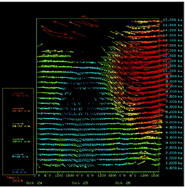
radar. With 5 beams there is some redundancy. Using this method, wind speed can be calculated at a range height which the radar can measure to help build a detailed picture of the profile of the wind through the lower atmosphere. If the radar operates for an extended period of time (many hours or days), a time series of these profiles can be combined to see how the winds evolve with time. These vectors can than be displayed in a form like in Figure 2.4.
A second method to measure wind speeds with theses radars is the spaced antenna method (also known as correlation analysis method) which works best at the lower levels from about 400 m to 2000 m. This method can be thought of as measuring the speed of a cloud by watching its shadow as it moves across the ground. The correlation analysis method is based on a similar principle that tends to be applied more often when using broad, vertically directed radar beams. When radio waves encounter a scattering phenomena such as variations in temperature or humidity, the radio waves scatter off in all directions and form a diffraction pattern of the cloud on the ground. As the turbulent eddies in this patch move and are blown by the wind, the diffraction pattern changes and moves along. Since the transmitter and receiver antenna are at similar distances from the cloud, the ”shadow” moves at twice the speed of the scatterers because of the distance from the ground and both can be thought of as ”point objects” shown in Figure 2.5.
Figure 2.4: Vectors of wind for a 3 day period at Egbert. The orienta-tion shows the horizontal wind direcorienta-tion and the color code shows the magni-tude of the wind. These figures are available continuously for all profilers at http://www.yorku.ca/oqnet/.
Figure 2.5: The transmitter antenna (blue) as a single antenna and the three re-ceiving antennas (black) are also highlighted. These three rere-ceiving antennas are spaced at different points on the ground [9].
are spread out over a certain area. The various broken lines indicate just a few of the many ray paths which transmitted radio waves may take. Each radio wave may scatter in any direction with different strengths and these different ray paths return to different points on the ground. At the ground interface, they interfere with each other to produce electric and magnetic fields which vary as a function of position and time. It is this time and space-varying field which creates the diffraction pattern. These diffraction patterns differ for each height at which we obtain radar scatter and the radar can use range-determination processes to separate out these different ”shadows” and decide which one corresponds to which height. Each of the
three receiving antennae a record the electric and magnetic field strengths at its own location. When the diffraction pattern is drifting along as shown in Figure 2.5, the signal that is received by the receiver antenna shown to the left in Figure 2.5 is received by the receiver shown at the front figure a short time later. Comparing these signals on all three receivers and seeking the maximum correlation, it is possible to calculate the time delays between periods when similar signals move over each antenna. Using this information, the wind speed and direction at the height of scatter can be calculated at all heights from which a signal is received, allowing a wind profile to be developed, similar to the Figure 2.4 but over a lower range.
By mid 2013, the entire network is expected to be fully operational which will make it a valuable tool for forecasters predicting severe weather. The data are also being assimilated into a research model at CMC, and by the operational ECMWF and UK meteorological office. They are also being sent to NOAA for evaluation and potential use in the US forecast models.
2.2
Quality Control
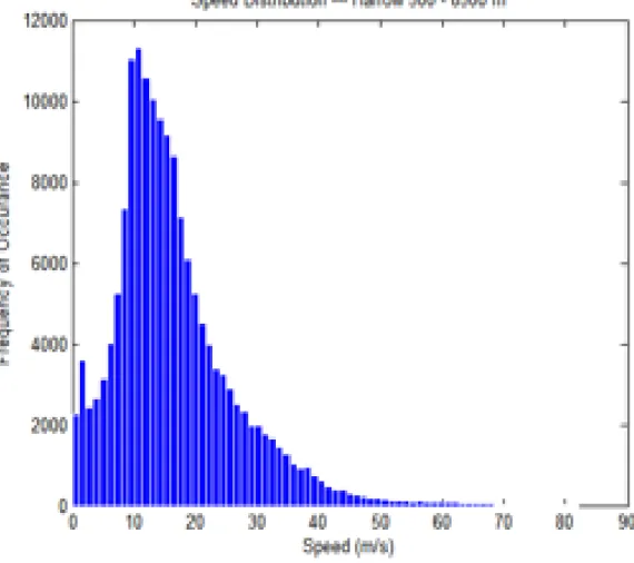
For quality control purposes, a starting point was a study of the probability dis-tributions generated for both wind speed and direction for both Doppler data and spaced antenna data. Figure 2.6 shows a speed distribution for the Doppler data
of wind speed data from Harrow for the 11 months of 2010, rather than the entire year due to the availability of data at the time of the study.
Figure 2.6 shows the distribution of wind speed is similar to classic Weibull distri-bution which is typical of wind speed distridistri-butions of this region suggesting that there are no major problems in the wind speed measurements and the algorithm which processes those data. Next we look at the distribution for wind direction of Doppler data at the Harrow site at the same period.
In Figure 2.7, immediately something seems odd with the 4 minima highlighted with red asterisks. In southern Ontario, the high frequency of wind directions between 250 and 300 degrees is expected, but the gaps centred at 49, 139, 229 and 319 degrees are not expected. These correspond exactly to the orientations of the antenna at Harrow as seen in Figure 2.8.
After working with the manufacturer it was discovered that these minima were caused by the sensitivity of the program that filters out interference. The problem is that if the wind is perpendicular to one of the beams, the Doppler shift due to the wind is zero, so the wind signal could be misinterpreted as ground echoes (which should have near zero Doppler shift by definition). When these signals get mixed together, they cannot be separated and therefore do not have 2 components of the wind. As long as the wind is not perpendicular to either beam, we can make a wind direction measurement easily. Through experimentation with the filtering software,
Figure 2.6: A probability distribution of wind speeds at the Harrow profiler for 7 months in 2010 for all 500 m increments between 500 m and 8500 m.
Figure 2.7: A probability distribution of wind directions at the Harrow profiler for 7 months in 2010 for all 500 m increments between 500 m and 8500 m. The red asterisks show the orientation of the antenna arrays .
Figure 2.8: A picture of the Harrow profiler from Google Earth and the orientation of the antenna is highlighted in red.
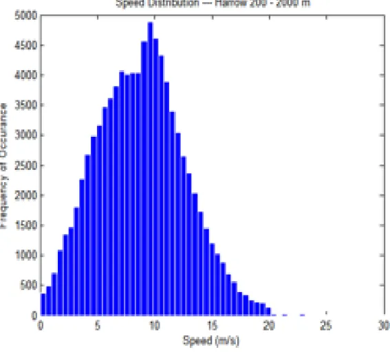
the sensitivity was decreased to create the direction distribution in Figure 2.9. In the directional distribution in Figure 2.9 the minima in the frequency no longer occur at the location of the antenna and the shape of the directional distribution is what is expected. Comparing this figure to Figure 2.7 one will notice much more data which is a result of the new method recovering more data. Figure 2.9 has about 94 % of possible hourly data while Figure 2.7 has about 65 % of possible hourly data which demonstrates how much data the old method was missing. Next, consider the distributions of the spaced antenna data at Harrow. Figure 2.10 shows the speed distribution of the spaced antenna data for 7 months of 2010 at Harrow.
Figure 2.9: Directional distribution of Doppler data for 7 months of 2010 at Harrow showing the four orientation of the radar antenna in red asterisks.
Figure 2.10: The wind speed distribution for 7 months of data using the space antenna method at Harrow in 2010.
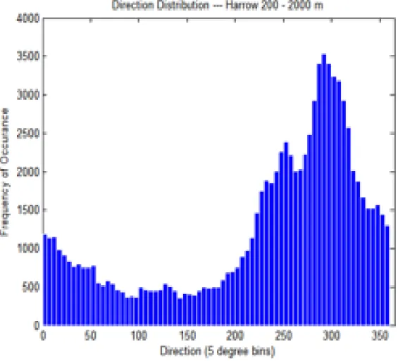
This speed distribution looks typical of a wind speed distribution in southern On-tario and is similar to the shape of the Doppler speed distribution with the exception of the absence of higher speeds in the Doppler data due to the higher measurement elevation. For the spaced antenna directional distribution similar distribution to the Doppler directional distribution shape in the Figure 2.11.
Figure 2.11: Wind direction distribution for 7 months of data using the spaced antenna method at Harrow in 2010.
In Figure 2.11 there is a slightly less predominate westerly component than in the doppler data. This is expected since the spaced antenna method only includes the low levels and west winds are less dominate in the lower atmosphere.
2.3
Comparing with Models
Some of the data from all the operational wind profilers have been obtained by CMC for potential data assimilation in a research version of the GEM regional model but no decision has been made to assimilate this data into the operational GEM model yet. To see how the current operational model is doing against the profiler data, wind speed and wind directional data will be compared against forecast data from the operational Canadian GEM regional model with 15 km horizontal resolution. These forecasts are 48 hour forecasts that are output every 3 hours. In order to compare wind profiler data with the model forecasts, the model forecasts need to be interpolated to the location of the profiler. First a inverse linear distance weighted interpolation is done between the four model grid points surrounding the location of the profiler as in the Figure 2.12.
Figure 2.12: A schematic of a model grid cell in the solid lines with a U wind speed at each corner. The black dot shows location of the profiler and the broken lines show distances from each corner needed to interpolate the model forecast to the location of the profiler location.
In this figure, the Us are the four nearest model grid location to the profiler and the Ds are the distances between the model grid point and the profiler. Given this diagram in Figure 2.12, the model estimate (UM odel) at the profiler is given by
UM odel = Ui,j 1 D1 +Ui,j−1 1 D2 +Ui+1,j−1 1 D3 +Ui+1,j 1 D4 1 D1 + 1 D2 + 1 D3 + 1 D4 . (2.1)
Equation 2.1 can be used directly for wind speed but for direction the sine and cosine components need to be considered. Inverse weighting has been used instead of bilinear interpolation because the GEM model runs on an irregular grid making bilinear interpolation unsuitable as a interpolation method. In the vertical, a linear interpolation is done between the nearest two model geopotential levels to each
pre-determined wind profiler level. The vertical interpolation is given by U(H) = (1−w)•Um(k) +w•Um(k+ 1)
w= Z(kH+1)−Z−(kZ)(k) (2.2)
whereHis the height of a particular profiler level,UK is the model estimation below H, Uk+1 is the model estimation above H, ZKis the the height of UMk and Zk+1
is the height of UMk+1. Once the model estimates have been interpolated to the exact location and height of the profiler measurement, the model estimates can be directly compared to the measurements from the profiler. To assess the differences between the model and profiler measurements the mean absolute error (MAE) and mean bias will be calculated. In comparing the wind between model estimates and profiler measurements, it will assumed the profiler measurements are perfect, even though the profilers have small errors associated with their measurements. The MAE is given by M AE = n P i=1 |(p(i)−m(i))| n (2.3)
where p(i) is the wind measurement and m(i) is the model estimate of the wind. In this equation n is taken to be the number of 3 hour outputs of the model in the 48 hour forecast (n=16). The mean bias is given by
Bias= n P i=1 (p(i)−m(i)) n (2.4)
where p(i), m(i) and n are as defined above.
2.4
Results
In this study, model forecasts will be compared for 5 different profilers; Harrow, Egbert, Gananoque, Negro Creek and Walsingham. Most weather models including the GEM model are set up to ingest observations to form initial conditions at the 0 forecast hour, or analysis. From this initial state, the model moves forward in time by solving equations simulating the atmosphere to create forecasts. In comparing the profiler measurements to the GEM model output, data can only be compared every 3 hours since that is the frequency of the GEM model output that is archived. In Figure 2.14, the profiler measurements are compared to the GEM model 3-48 hour forecasts and analysis. The profiler measurements will be compared to the analysis and 3 - 48 hour forecasts (17 three hour forecasts) for the GEM model initialized at 00 UTC for a 12 month period from April 2011 through March 2012. This period was chosen due to the longest consecutive period when the 5 chosen profilers were running and model data were available. In Figure 2.13 are the return rates at 500 m intervals from 1000 m up to 12000 m for all 5 profilers for the period being investigated. These profilers do measure winds at 500 m however, this level is considered a research level and the quality is sometimes questionable and therefore left of this analysis.
Figure 2.13: The return rates for five profilers for the 12 month period. In cases when an entire month of profiler data is missing, it is omitted in the return rates but when less than a consecutive month is missing, it has been included in the return rates.
In Figure 2.13 the return rates of data are shown for each of the 5 different profilers being investigated in this study. The return rates are generally constant up to 8 km but gradually decrease above about 8 km due to wireless frequency constraints leading to reduced frequency to noise ratios. These constraints are set by the spectrum allocation division of Industry Canada, which defines the frequencies on a case-by-case basis. The current frequency of the profilers is the highest that could be allocated for this project. In some cases the profilers have operational issues that cause lower return rates, and in the case of Harrow, the significant air traffic heading to and from the Detroit airport cause major interference and data loss at the upper levels. In this figure, all profilers show a local minima in data at 8km which is expected in order to achieve optimum signal. The profiles use a variety of modes; for example at lower heights monopulses are used while at upper heights complementary codes are used and the transition level is 8 km. Making the transition smooth is always difficult because the upper method can’t really get below about 8 km due to the nature of pulse-coding while the lower signal drops off significantly between 5-7 km which explains the drop is data at 8km.
The errors or differences between profiler measurements and model predictions were investigated for each 3 hour interval and no large differences were found between the 3 hour forecast and 48 hour forecasts even though one would expect forecast error to increase with time. One theory for the cause of little growth in errors
Figure 2.14: The mean absolute error (MAE) in wind speed between the profiler data and GEM model data. The solid line are the MAE between profiler measure-ments and 3-48 hour GEM forecasts while the broken lines are the MAE between the profiler measurements and the GEM analysis..
with forecast time is that often large outliers account for much of the error and these outliers seem to occur at similar frequency for all forecast hours. For these reasons, errors for between measurements and model will be shown with all forecast hours lumped together. In Figure 2.14, the mean absolute error (MAE) between profiler measurements and GEM model forecasts are shown. The analysis MAE is shown in broken lines and is fairly consistent for all the profiler sites and generally lower than the MAE for the 3-48 hour forecasts which are shown as solid lines. It is not surprising that the MAE is less for the analysis than the 48 hour forecasts since the analysis is when the model ingests observations to initialize the forecast. The MAE increases with height for the 3-48 hour forecasts but one should into account that wind speeds increase significantly as shown in Figure 2.15. The error increases significantly at Harrow and Walsingham with height, likely a result of a couple of factors. Referring to Figure 2.13 the return rates drop off significantly with increasing height at these two locations so there are fewer measurements to go into the MAE so that outliers are more likely to skew the data. As well, from Figure 2.13 the low return rates of data could suggest that the data present may be of lower quality than if there were high return rates. At the other three sites MAE is significantly lower especially above 4000 m which appears to be proportional to the higher return rates in Figure 2.13 .
Figure 2.15: The mean absolute error (MAE) between the profiler data and GEM model data in wind speed as a percentage of the average measured wind speed at each level.
for 3-48 hour forecasts as a percentage of the measured wind speed at each level. For each profiler but Walsingham, the percentage error is relatively constant except for slight increases at the low and high levels. Walsingham has much higher percentage error in wind speed at the mid and upper levels which may be a result of the profiler being near the Lake Erie shore and in ability of models to predict wind speeds as well near bodies of water.
In Figure 2.16, the bias between the model analysis and profiler measurements are shown in broken lines while the solid lines represent the bias between the model forecasts and the profiler measurements. Generally the bias in the analysis and 48 hour forecasts show similar results but the analysis seems to have more bias overall. This is likely a result of comparing only one measurement to one model data point so there is much less data averaging than in the 48 hour forecasts. Egbert and Gananoque have very little bias up to about 8 km. Harrow and Walsingham have a positive bias which suggests that the model is over predicting wind speed at these two sites, while a negative bias below 8 km suggests the model is under predicting the wind speeds at NegroCreek. Between 8 km and 10 km the bias is negative for all profilers suggesting the model is over predicting the winds at these levels. This is not surprising since this is the locale of the jet stream and models are known to have a hard time predicting its exact location and speed. Above 10 km, the model under predicts the wind speed at all five profiler locations which may be a result
Figure 2.16: The wind speed bias (as defined in Equation 2.4) in the GEM model compared to each of the wind profilers. The broken lines are the model analysis and the solid lines are the model 3 - 48 hour forecasts.
of the model estimating the jet stream at the wrong altitude assuming the OQ-net data are correct. Now that the MAE and Bias have been investigated for wind speed at the five different wind profilers, the same can be done for wind direction. The mean absolute error of wind direction between the GEM model and each of the 5 profilers is shown is in Figure 2.17.
In Figure 2.17 there are only slight deviations in the direction error between the analysis and the forecasts and similar trends between the two. A trend that is notable with all the data is the error decreases with height which makes sense since winds are far less variable at higher attitudes meaning wind direction is more constant and easier to forecast. In Figure 2.17, Egbert, Walsingham, Harrow and Gananoque all have similar errors while NegroCreek has about a 10 to 15 degree larger error from about 1000 m right up to 12 000 m. One possible reason for this larger error is the location of NegroCreek, situated somewhat between Lake Huron and Georgian Bay. A location between two bodies of water like this would make for large swings in wind direction something that is difficult to forecast. Another possible reason for larger errors at NegroCreek is that it is further away from flight paths from which wind data are assimilated in the models to increase the accuracy. This provides additional motivation to use profiler data in the models to increase their accuracy.
Figure 2.17: The MAE in wind direction for each of the five profilers compared with GEM model analysis in broken lines and 48 hour forecasts in solid lines.
Figure 2.18: The bias in wind direction between the GEM model analysis and the 48 hour forecasts compared with each of 5 profilers.
In Figure 2.18, the in wind direction bias is shown between the GEM model and data from the 5 profilers. The bias in the GEM model analysis relative to data at each of the 5 profilers seems to follow the bias in the 48 hour GEM forecasts pretty well with a few exceptions. The GEM model shows similar and fairly low bias at
Egbert, Harrow and Gananoque compared with the measured wind profiler data. The bias at NegroCreek is negative closer to the surface and changes to a positive bias at 4000 m up to 8000 mbefore moving to very little bias at the upper levels. In the context of wind direction and the way bias has been defined in Equation 2.4, a negative bias suggests the model is backing the winds too much while a positive bias suggests the model is veering the winds too much. In the case of wind direction at Walsingham, the bias is negative through the entire column from 1000 m through 12000 m which is likely a result of being so close to the lake shore of Lake Erie and the model having a bias of over water wind direction assuming the OQ-net measurements are correct.
2.5
Comparing Data to Radiosonde
Finally, in the analysis of the wind profiler data, the data at Harrow can be com-pared with radiosondes from Detroit airport to help validate the data. In Figure 2.19 is a vertical profile of wind speed at Harrow from the profiler, the GEM model and the Detroit radiosonde.
In Figure 2.19, the wind speed profiles are shown from the Detroit radiosonde in blue, the Harrow profiler in green and the GEM 00 Z analysis in red on November 14, 2009 at 00Z. The measured wind speed profile at the Harrow profiler matches the measured profile at the Detroit radiosonde which is located about 50 km south west
Figure 2.19: Vertical profiles of wind speed for the Harrow wind profiler, GEM 00Z analysis and the Detroit Radiosonde on November 14, 2009 at 00Z.
of the profiler site. The GEM model is on the other hand lower by about 10 m/s which shows large the difference between model and measurements. Although this may be an extreme case, several examples were examined at and these differences are not uncommon. Given these large differences such as in Figure 2.19, between the Harrow profiler and the GEM model, the large MAE is not surprising in Figure 2.17.
In Figure 2.20, the direction profiles are shown from the Detroit radiosonde in blue, the Harrow profiler in green and the GEM 00 Z analysis in red on November 14, 2009 at 00Z. The Harrow profile differs very little from the Detroit radiosonde but both differ significantly from the profile generated from the GEM 00 Z analysis. The GEM model differs from the other profiles by up 100 degree at some points in the profile showing how much the model can differ from the measurements and help explain the large direction MAE in Figure 2.17.
As another validation site, the Maniwaki radiosonde is about 12 km southwest of the Aumond wind profiler. Figure 2.21 shows a vertical profile of wind speeds of the Aumond wind profiler, GEM analysis and the Maniwaki Radiosonde on September 4, 2010 at 00Z.
The Aumond wind profiler, GEM analysis and the Maniwaki Radiosonde all match fairly well and each show the low level wind jet although each vary it in height. The model profile matches the radiosonde quite closely compared to the Detroit
Figure 2.20: Vertical profilers of wind direction for the Harrow wind profiler, GEM 00Z analysis and the Detroit Radiosonde on November 14, 2009 at 00Z.
Figure 2.21: Vertical profilers of wind speed for the Aumond wind profiler, GEM 00Z analysis and the Maniwaki Radiosonde on September 4, 2010 at 00Z.
case but may be a result of being further from the a large body of water. Although the vertical profile of the Aumond profiler is slightly further from the Maniwaki profile, it can still be considered accurate taking into account the distance between the two and the difference between the hourly average and a single sample for the radiosonde.
Figure 2.22: Vertical profilers of wind direction for the Aumond wind profiler, GEM 00Z analysis and the Maniwaki Radiosonde on September 4, 2010 at 00Z.
In Figure 2.22, the directional profile of the Aumond wind profiler, GEM 00Z analysis and the Maniwaki Radiosonde are very similar except that the Aumond profiler shows about 50 - 100 degree difference at the surface. It does show the sharp change in direction at 2500 m. The lowest level of these wind profilers is still a research level and may help explain the large deviation in wind direction.
Figures 2.19 through 2.22 show an initial snap shot into profiler and radiosondie comparisons but the work by Zheng Qi Wang et al. in [25] shows a year’s worth of radiosonde and profiler comparisons. Figure 2.23 compares wind speed and direction from the Aumond wind profiler and radiosonde profiles Maniwaki for the period of May 2012- April 2013. The differences in wind speed in the top panel and wind direction in the lower panel are comparable to the differences in the individual profiles shown above. A similar comparison was done for Harrow and the Detroit radiosonde by Zheng Qi Wang et al. showing similar results
2.6
OQ-net Summary
Although there are some deviations between the radiosonde and the wind profilers, overall the agreement is quite good, showing the accuracy of the wind profilers can be trusted. The OQ-net is a powerful resource to help understand the meteorology of Southern Ontario and help improve the forecasts. The large differences shown in this investigation, especially in the GEM model analysis help make a strong case
Figure 2.23: Summary statistics of differences between winds measured at the Au-mond wind profiler and radiosonde profiles from Maniwaki. May 2012- April 2013. This Figure is from work by Zheng Qi Wang et al. in [25]
to continue work to use data from the OQ-net in the data assimilation process for the GEM model to help correct these errors. Other work is being done to use the data from the OQ-net as an entire network to help predict severe weather in the region.
3
Investigating a Possible Wind Energy Site in
Lake Ontario
3.1
The Site
Looking at the Canadian wind energy atlas produced by CMC, the Great Lakes hold an excellent wind energy resource as shown in Figure 3.1 [4]. Figure 3.1 is a map of the 50 m mean wind speed for all of Canada run at 5 km resolution. This map clearly shows the high wind speeds throughout the Great Lakes. This wind resource is untapped and up until the past few years was largely un-explored. Although the entire Great Lakes have a great wind energy potential, the Canadian side of the lakes statistically will have the best wind resource because the prevailing wind direction is south - south west which allows the winds to ramp up, taking advantage of the long over-water fetch. Toronto Hydro decided to study the wind resource near the northern shore of Lake Ontario just east of the city of Toronto as shown in Figure 3.2.
Figure 3.1: A map of the 50 m mean wind speed for all of Canada run at 5 km resolution by CMC [4].
Figure 3.2: Location of the study area for a potential wind farm proposed by Toronto Hydro and the darkened cell is the location chosen for the Lidar and Anemometer platform.
They chose to use a lidar to make wind measurements at 6 levels above a platform, as well as allowing York University to install platform level anemometers, humidity, temperature and pressure sensors. The lidar that was chosen is the ZephIR with range of 10 m through 150 m. The platform shown in Figure 3.3. It used a cell phone for communication of the data while small wind turbines and solar panels were used to power the lidar and communications. The lidar was programmed to measure wind speed and direction at 17, 30, 45, 60, 90 and 120 m above the water surface. The platform sits about 7 m above the lake surface. The in-situ wind, air temperature, pressure and relative humidity measurements are approximately at 7 m above the water surface.
The lidar makes a measurement every 3 seconds for one of the levels and does this continuously for 10 minute intervals from which it computes a 10 minute average for each level using all available measurements during that period. Each level can have up to 33 measurements in 10 minutes but weather conditions along with other problems often decrease the number of measurements significantly. The software computes a 10 minute average so long as there is at least one measurement. Prob-lems can arise though when there are low numbers of measurements and a 10 min wind speed average that is inaccurate can occur. For this reason further quality control is needed to ensure the each 10 minute average is reliable. The method that has been developed here looks at probability distributions of the ratio of
consecu-Figure 3.3: The Toronto Hydro platform in location denoted in Figure 3.2. The #1 shows the small wind turbines for power, #2 is an anemometer, # 3 is the Lidar and #4 is the solar panels for power.
tive points in time at each level. This method looked both at the point before and after each measurement in time. Through careful analysis and looking at different cases, it has been determined that the top 1% of ratios of consecutive points in time at each level are likely inaccurate and these data will be filtered out.
Measurements started in June 2010 but the lidar was removed in July 2011 for repair and due to many delays was not operational again until May 2012. Using all available lidar data for 14 months from June 2010 through July 2011, probability distributions of consecutive 10 minute wind speed averages show that for levels 120, 90, 60, and 45, 99 % of the data has a ratio of less then 1.6 or greater than 1/1.6 while this ratio is 1.7 for the levels 30 m and 17 m. The first 14 months were chosen to obtain these ratios because that was when there was best data recovery. Although this may filter out the occasional accurate 10 minute wind average during severe weather or a fontal passage this is considered minimal. The plot in Figure 3.4 shows a one day time series at 120 m of the filtered and non filtered data. In Figure 3.4 the red points are unfiltered while the green are the data after they have been run through the process described above. In this case, there are 2 points which have been filtered out and it is clear why these points have been removed.
Table 3.1 shows the % of missing data for each of the 25 months (although for 9 months there are no measured lidar data) for the raw data and filtered data at the 120 m level. The other levels are similar. The 120 m level is chosen to show the
Figure 3.4: A time series of the 10 minute wind speed for December 27, 2010 at 120 m lidar level. The green series is the filtered data and the red series is the unfiltered data.
Month Raw Data Filtered Data June 2010 97.55 96.55 July 2010 99.00 98.05 August 2010 95.63 95.30 September 2010 90.12 89.75 October 2010 94.67 94.20 November 2010 92.85 92.18 December 2010 96.06 95.79 January 2011* 36.42 36.35 February 2011* 64.59 62.24 March 2011 67.75 64.26 April 2011 48.85 41.61 May 2011 78.72 78.01 June 2011 93.45 92.82 July 2011* 29.84 29.73 August 2011 0 0 September 2011 0 0 October 2011 0 0 November 2011 0 0 December 2011 0 0 January 2012 0 0 February 2012 0 0 March 2012 0 0 April 2012 0 0 May 2012 76.89 75.14 June 2012* 61.42 61.21
Table 3.1: Percentage of raw measured data at 120 m as well as data after the filtering process described has been executed. The * shows months where the lidar was down for part of the month.
return rates because this is the highest lidar level and has the lowest data return, so return rates increase slightly at lower levels. The filtered percentage of data return is on average about one percent less than the raw data return rate. This is expected based how the filtering is defined. Some months the data are worse than others such as April 2011 when about 7 percent of the data ha have been filtered out as inaccurate data. This is not surprising because there the wind shield wiper to keep the lidar lens free of rain was stuck in the middle of the lens during this month. In this quality control process, any wind speeds that have been rejected for being inaccurate by the process described above also have the corresponding wind direction with the same time stamp rejected.
Monthly averages of the 90 m winds initially computed by Toronto Hydro Lidar software seemed to not recognize missing data and the software appears to take these missing measurements as zero wind speeds when calculating monthly averages. For months like July 2010 when data return was near 100%, this mis-calculation has little effect, but for months like April 2011 when data return was under 50 %, the average initially calculated by the Toronto Hydro software was much lower than the available measurements show.
In an effort to provide a full data set to provide the best possible estimation of monthly averages and power estimations, missing data from the 90 m lidar level are being estimated using 2 combined methods. The first method looks to see if
four or more measurement levels ( from the 6 lidar levels + 7 m met station) are available at a given time in which case a power law fit and a log fit are done for the available data and error is calculated for each fit. The fit with the least error is then used to estimate wind speed at 90 m. If less than 4 measurements are available, the 90 m wind speed is estimated using the 7 m data from the met station at platform level. This estimation is done by calculating the ratio of 90 m to 7 m measured wind speeds for each time when both the data are available. For any times when the 90 m wind speed is missing, it can be estimated using the 7 m wind speed and this ratio. This ratio of 90 m to 7 m wind speed is calculated 4 different ways, the first using 22.5 degree wind direction sectors and shown in Figure 3.5.
For onshore directions (112.5 - 225 degrees) the profile has adjusted to be almost in equilibrium with the underlying surface. In contrast, offshore flow the low level winds (7 m) have started to accelerate over the smoother water surface and the 90 m level shows less acceleration and the wind speeds are more characteristic of over land values. As a result, Ulidar
Umet is slightly lower for offshore flows. This is what
is shown in Figure 3.5. The data used in Figure 3.5 are all 10 minute averages for 14 months from June 2010 to July 2011 when both the 90 m lidar and 7 m anemometer wind speeds are available. The error bars show 1 standard deviation around the average ratio and the error bars that show negative are to be consistent when in reality no ratio can be negative. The large ratios are caused mainly by
Figure 3.5: The ratio’s of the 90 m wind speed to the 7 m met. station wind speed by 22.5 degree wind direction sectors for 14 months of data from June 2010 to July 2011. The error bars show 1 standard deviation above and below the mean ratio.
Figure 3.6: The ratio’s of the 90 m wind speed to the 7 m met. station wind speed by 22.5 degree wind direction sectors for 14 months of data from June 2010 to July 2011. In this figure all times when the met wind speed is less than 1m/s are excluded. The error bars show 1 standard deviation above and below the mean ratio
very low 7 m wind speeds which cause large errors. For example one instance was found when the 7 m wind speed was 0.1 m/s and 90 m wind speed was 4 m/s giving a ratio of 40. Arguably the anemometer cannot measure wind speeds less than 1 m/s accurately. Figure 3.6 shows the ratio between 7 and 90 m wind speeds for all 10 minute averages between June 2010 to July 2011 excluding 10 minute intervals
![Figure 1.1: Annual (left axis) and cumulative(right axis) growth in offshore wind energy in the EU [6].](https://thumb-us.123doks.com/thumbv2/123dok_us/11101977.2997724/22.918.178.814.335.852/figure-annual-left-cumulative-right-growth-offshore-energy.webp)
![Figure 1.2: The current installed wind energy capacity in Canada as of June 2013 by province [3].](https://thumb-us.123doks.com/thumbv2/123dok_us/11101977.2997724/28.918.175.823.265.907/figure-current-installed-energy-capacity-canada-june-province.webp)
![Figure 1.3: Approximate wind energy penetration or production in the twenty countries with the greatest installed wind energy capacity[24].](https://thumb-us.123doks.com/thumbv2/123dok_us/11101977.2997724/31.918.215.724.224.516/figure-approximate-penetration-production-countries-greatest-installed-capacity.webp)