Understanding Urban Land Use through the Visualization of Points of
Interest
Evgheni Polisciuc CISUC Departement of Informatics Engineering
University of Coimbra Coimbra, Portugal
Ana Alves CISUC, DEI University of Coimbra & Polytechnic Institute
of Coimbra Coimbra, Portugal
Penousal Machado CISUC Departement of Informatics Engineering
University of Coimbra Coimbra, Portugal
Abstract
Semantic data regarding points of interest in urban areas are hard to visualize. Due to the high number of points and categories they belong, as well as the associated tex-tual information, maps become heavily cluttered and hard to read. Using tradi-tional visualization techniques (e.g. dot distribution maps, typographic maps) par-tially solve this problem. Although, these techniques address different issues of the problem, their combination is hard and typically results in an efficient visualiza-tion. In our approach, we present a method to represent clusters of points of interest as shapes, which is based on vacuum pack-age metaphor. The calculated shapes char-acterize sets of points and allow their use as containers for textual information. Ad-ditionally, we present a strategy for plac-ing text onto polygons. The suggested method can be used in interactive visual exploration of semantic data distributed in space, and for creating maps with simi-lar characteristics of dot distribution maps, but using shapes instead of points.
1 Introduction
Understanding the urban land use is one of the central pillars of urban planning and management. Traditionally this analysis relies on census surveys having limitations in terms of spatial and temporal scale. However, with the advent, and wide deploy-ment of pervasive computing devices (e.g. cell phones, GPS devices, smart cards and digital cam-eras) some of these limitations may be overcome. For instance, collecting and analyzing information of how people use urban space may be done dy-namically and in more precise way.
By using services of modern web platforms (e.g. Facebook, Foursquare, etc.), a user leaves
“digital footprints”. These are precise data in terms of temporal (when) and spatial locations (where), and in general, can be captured without human intervention. The information about hu-man activity (what) if not explicitly introduced by humans may be inferred by other ways. One of which is about to retrieve the information about visited place. This place, denominatedPoint of In-terest(POI), offers a range of services and has spe-cial utility. Such information is not always avail-able. Hence, it is necessary toenrich semantically
the information about the visited places, in order to understand what was done there. Collecting infor-mation of how people use urban space has become a very important task on creating the city image from the perspective of its inhabitants, since places are often associated by meaning, i.e. relationship between people and places.
Most smart devices integrate contextual pro-cessing. However, it is difficult to enable context-awareness without semantic information. Al-though, semantic information has been available for years, the Internet, in most cases, abandons such information. In a recent work Alves (2012) presented various perspectives on semantic enrich-ment of places and extraction of such information from the Internet.
That said, there is a necessity of proper visual-ization that depicts large amounts of point-based data along with textual information. Geovisual-ization field provides techniques to visualize geo-referenced data, known as thematic maps. One of the well known techniques to represent point-based data is a dot distribution map. However, this kind of maps is limited to representation of points on the map, additionally using color to distinguish points that belong to different groups. On the other hand, typographic maps are used to represent textual information on the map regarding natural and artificial features of urban space (e.g. street names, rivers, places, etc.). But, in order to
alize both textual and point-based information one cannot simply overlay two maps. In this case the visualization becomes highly cluttered and illegi-ble. Moreover, it would be difficult to reveal spa-tial patterns in such hard-overlapped maps. There-fore, from these observations we propose a method to represent this kind of information in a visual-ization with low degree of visual clutter retaining the possibility to both reveal high-level informa-tion and detailed explorainforma-tion of the map.
Our approach consists in creating visual ele-ments that convey spatial distribution of POIs of same type (a cluster), as well as the distribution of clusters in urban area. More precisely, our al-gorithm generates a shape for each group of POIs revealing its unique visual form in regard to their geographic distribution. Additionally, textual in-formation – clusters tags and POI names – are drawn using different typeface weights and scaled according to the relevance of each cluster.
With that said, in this paper we present a method for visualizing clusters of POIs and the associated semantic information. The dataset is detailed in section 3. The shape of each cluster is calculated using a vacuum package metaphor (see details in section 4). Additionally, this paper presents an interactive web-based application that allows ex-ploring the data with varying degree of details (see section 5).
2 Background and Related Work
Our approach touches on diverse methods and techniques of visualization of spatial information. In this work we consider dot distribution maps. This type of maps are especially efficient in visual-ization of distribution and densities of point-based data. Regarding the visualization of textual infor-mation our approach relies on typographic maps. This particular type of subjective maps efficiently communicates textual information prioritizing ty-pographic hierarchy depending on the relevance of information.
Dot distribution maps, often referred to as density map, they represent spatial distribution of geo-referenced data using basic graphical element – a point (Slocum, 2009). Each point on the map is used to represent either one datum with known geo-location, or aggregation of values. Addition-ally, dot distribution maps are used to depict densi-ties in corresponding geographic areas, rather than specific locations.
A historical example of the use of a dot dis-tribution map is the disease map produced by John Snow (Tufte and Graves-Morris, 1983). This map depicts the distribution of cholera in London. Deaths are represented by dots and eleven water pumps are represented by crosses. The observa-tion led Snow to discover that cholera occurred in the areas near the Broad Street water pump. This map helped understand the issue of the cholera by revealing disease patterns in spatial context.
One of a more recent example of density map is theRacial Dot Mapby Cable (2013). This visu-alization depicts geographical distribution, popu-lation density and racial diversity of people living in USA. Each dot represents one individual person at smaller zoom levels and aggregation of dots at national or regional levels. The color encodes race and ethnicity of inhabitants.
Typographic maps may be seen as an “artis-tic” representation of textual information, rather than an accurate mapping of spatial data. Often, the information being represented by these maps is a description of the relationship of the place and its meaning, which depends of many human, cul-tural, political, social or historical factors. There-fore, these kind of maps are considered subjective maps (Chen, 2011).
In typographic maps, as the name indicates, textual information is represented using typogra-phy. For instance, the maps drawn by Paula Scher are mainly typographical, representing the world, its continents, countries, islands, etc. through typography (Scher, 1990 2010). Likewise, the maps produced by Axis Maps, depict the infor-mation about locations and space using text (Axis Maps, nd). Moreover, the geometry of each word is curved along a path, mimicking the shape of the object being represented (e.g. streets, parks, rivers, etc.). This typographic maps were com-posed with auxiliary of software-based tools (e.g. Adobe Illustrator) and represent information us-ing digital typography. Finally, the graphical el-ements are placed over OpenStreetMap. These works, the maps by Scher and axisMaps, are good examples of intelligent usage of typographical hi-erarchy, which makes these maps efficient in the communication of subjective and imprecise infor-mation, even with high degree of visual overload.
(Afzal et al., 2012). Given a vector map the al-gorithm places textual labels in space along the polylines and polygons in accordance with defined visual attributes and constrains. Additionally, the authors describe a method to represent regions as text by filling its interior and repeating the text as necessary. Likewise, our approach uses principles of this technique to align textual labels to a path.
Finally, the work of Cranshaw et al. (2012) is tightly related to our approach, especially in what concerns portraying a city using methods to visu-alize point-based data and their clusters. The au-thors introduce a method that consists of a clus-tering model for mapping a city regarding collec-tive behaviors of its inhabitants and further visu-alization on the map. This map depicts dynam-ics, structure and portrayal of a city using clus-ters, so calledLivehoods, of geospatial data from Foursquare check-ins. Given geospatial social data generated by hundreds of thousands of peo-ple the visualization represents distinct areas of the city regarding activity patterns. The resulting ag-gregated clusters of check-ins represent so called mental map of the city, the vision of urban space from the perspective of its inhabitants. This en-ables the study of the structure and composition of a city based on social media its residents generate.
3 Data Description and Design Requirements
Our dataset consists of points of interest (POIs) from the greater metropolitan area of Boston, Massachusetts, USA. POIs contain associated se-mantic information and are aggregated in mean-ingful groups (e.g. restaurants, colleges, indus-try, etc.). More precisely, POIs were tagged with semantic information retrieved from diverse web sources (e.g. Foursquare, Upcoming Yahoo, etc.) (Oliveirinha et al., 2010), and aggregated in clusters using methods proposed by Alves et al. (2011). The dataset comprises 751 clusters of POIs with the following attributes: tag and id of each cluster, geographic coordinates of their cen-troids, and relevance of a cluster. Additionally, each POI in the dataset is characterized by ge-ographic location (latitude and longitude), name and id. Ultimately, the data types are categorical – POI names and cluster tags – and quantitative – relative relevance of each cluster.
In order to guide the design of our visualization, we established the following design requirements,
that define the boundaries for the project:
• The visualization should create a digital layer of urban space.
• It should use a simple and clear visual lan-guage, establishing a strong relationship be-tween urban space and POIs.
• In order to reflect geographic nature of data the information should be visualized on a map.
• It should be interactive and run in real-time, supporting the process of data exploration and high-level information acquisition.
• The interactive application should follow the so calledVisual Information-Seeking Mantra, introduced by Shneiderman (1996), which consists of overview first, zoom and filter, then details-on-demand.
• Finally, the visualization should be easy-to-understand by a general user with no ana-lytic background, therefore presenting a good balance between aesthetics and functionality, without visual overload of display.
4 Representation of POI Clusters
This section covers the process for determining the shapes that describe POI clusters. More precisely, first the concept of vacuum package metaphor is introduced. Then we proceed with the description of an algorithm for polygon calculation given a set of points. Then, we present a method for smooth-ing the corners of generated polygons. Finally, we discuss the strategy for using typeface weight as visual variable and text placing.
4.1 Concept
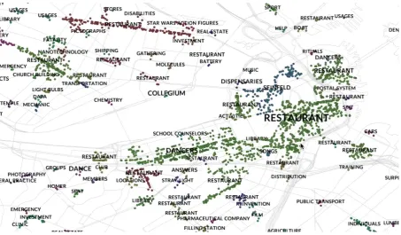
Figure 1: Direct representation of data – names of categories and POIs represented as colored points. Points of equal color belong to the same cluster.
We found this idea particularly interesting and im-plemented a method that allows us to character-ize sets of POIs through their shapes. This ap-proach allows us to eliminate color from represen-tation reducing visual overload. Ultimately, due to amount and diversity of categorical data the use of color is inefficient.
The shape that characterizes a given set of points is known as convex hull, i.e. the polygon that encompasses a set of points. This is, the min-imal convex set of points containing the entire set. One of the many algorithms to compute convex hull was proposed by Andrew (1979), which is based on the rubber band metaphor. The con-vex hull can be visualized as a rubber band that is stretched so that it surrounds all the points and then released enclosing all the points.
For certain applications the convex hull does not represent well the boundaries of a set of points. For instance, a convex hull for a set of points that form a C letter would have a shape close to ellipse. In other words, the region that is defined by convex hull does not represent the region that is formed by the points.
This problem has already been addressed by many researches, and is know as computation of non-convex or concave hull (see e.g. Moreira and Santos (2007) and Duckham et al. (2008)). One
of the methods to compute shape of a set of points was introduced by Edelsbrunner et al. (1983), and is know as two-dimensional alpha-shapes. As mentioned by Edelsbrunner, an alpha shape can be imagined as a huge mass of ice-cream con-taining pieces of chocolate; then using a sphere-formed ice-cream spoon we carve all the parts of ice-cream without bumping into chocolate pieces; if we now straighten all the ”round” faces we will get an intuitive description of what is called the alpha-shape. Although, the alpha-shape is a stan-dardized formal description of a set of points this method assumes multi-polygon reconstruction of the geometry, and often produces polygons that contain holes, which is not desirable in our visual-ization.
4.2 Algorithm
This section describes an algorithm for the calcu-lation of a concave hull based on the vacuum pack-age metaphor. The calculation of a polygon is an iterative process with the maximum number of it-erations defined by an user. The process passes through the calculation of convex hull, which de-fines an initial set of edges. Each edge is char-acterized by starting and ending points in ordered array, and by stretchiness, which models a behav-ior of an elastic band. Finally, the shape of each set of points is calculated independently.
Considering the set of pointsSto be our input, the algorithm proceeds as follows:
1. LetLbe an initially empty list that will con-tain the points that define the polygon.
2. Calculate the convex hull, and store the set of points inLin clock-wise order.
3. For each iteration and for each edge – i.e., for each pair of consecutive points in L, which we designate byAandB:
• If the length of the edge is bigger than predefined minimum length, then con-tinue to the next step. Otherwise, skip.
• The edge AB is divided by half at the center, defining an isosceles triangle
4ABC, whereAandBare the starting and ending points inL, respectively, and Cis the central point.
• C is pushed inside the polygon by a force vector ~f, which is perpendicular to the edgeAB.
• The magnitude of the force ~fvaries pro-portionally to the stretchiness of AB edge, which is a function of its length, and the distance of C from its original location, sayM. i.e. shorter edges have smaller ~f.
• If one of the points, sayP, in the setS is inside the triangle, then the P is ap-pended to the L in the order AP and P B, consequently, creating two new edges.
• The process is repeated until the maxi-mum number of iterations is reached or all the edges have their lengths smaller than defined minimum length.
Determining if a point P is inside the triangle
4ABC is done by calculating cross products of vectorsAP~ ×AB~ ,BP~ ×BC~ , andCP~ ×CA~ . If all the values are negative, then the point is inside the triangle. Otherwise, the point is outside. Finally, at a simulation instance there might be two points inside the triangle. In this case considered only the one that is closest to theM point – middle point that dividesABby half.
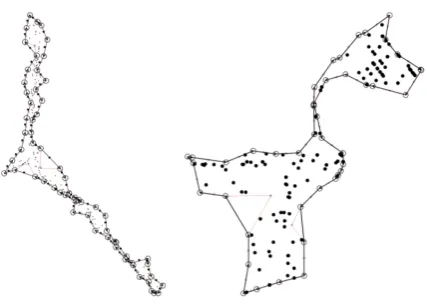
[image:5.595.310.524.337.489.2]Figure 2 displays two shapes of clusters that were calculated by the algorithm given two sets of points from our dataset. Also, this figure schemat-ically illustrates the described algorithm at a sim-ulation instance – the points that compose a poly-gon are marked with circles, the edges are repre-sented with black line, and the lines that makeup the triangles are painted in red. As can be ob-served in Figure 2, image on the right, even com-plex shapes are well defined.
Figure 2: Calculated shape of clusters for ”Trad-ing”, image on the left, and ”Seinfeld” categories, image on the right. Circles represent points that compose a hull, with the arrows inside that indi-cate the order of points.
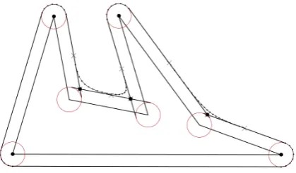
4.3 Visual Refinement and Label Placing Having calculated all the polygons we proceed to smooth their corners, which gives an organic rep-resentation of a shape. Also, this facilitates the process of placing textual labels onto polygons.
new polygon. This is done by translating perpen-dicularly each edge to a certain distance, say d, placing them outside the original polygon. Then we proceed by calculating the S corners, simply connecting two consecutive translated segments with an arc that is centered at the corner point and with the radius equal to d. The arc is then fragmented with small segments, the number of which is dictated by defined minimum length. The G corners, on the other hand, are computed us-ing Bezier equation (Farin et al., 2002). The two control points have the same location, which is the point of intersection of the two edges that makeup the corner. The end points are the middle point of each of two translated edges. Finally, the curve is partitioned with small segments. The Figure 3 is a schematic representation of the smoothing of polygons.
Figure 3: Schematic construction of round cor-ners.
The second part of visual refinement consists of placing textual information onto polygons. As was mentioned earlier, our data consist of two types of text data – most relevant tag for each cluster, and names of each individual POI. In order to repre-sent this data two different strategies were used. In the first case, the cluster tags were positioned on center of the polygon being represented using typeface weights to represent their weights. In the second case, the names of POIs were placed onto the polygon and curved along the contour of the shape.
As mentioned above, we used typographic weight as a visual variable to represent relevance of each category of POIs. According to Lupton (2014), in typography, all typefaces are organized into families . Within a family typefaces are di-vided and ordered according their weights (e.g. regular, bold, etc.). In modern typography there are families that contain up to nine weights
[image:6.595.77.287.321.444.2]classi-fied as fallowing – thin, extra light, light, regular, medium, semi-bold, bold, black and heavy. So, we used these to encode the relevance of each cat-egory, by dividing all values in eight ranges and assigning each range to a typographic weight. Due to ordered nature of data the typographic weights were assigned starting with thin up to heavy type-faces (see Figure 4).
Figure 4: Close-up of an area with categories that have different relevance encoded with typographic weight and font size.
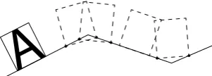
For the second type of textual information we used an approach inspired in typographic maps. The name of POIs are placed onto polygon and the words are curved along with the shape. One of the problems of curved words is the fact that they visually distort the word when placed on the path junctions. This is, the words are visually breaking apart creating discontinuous reading. One of the solutions to address this problem is to distort the characters, like in maps by Paula Scher. However, in digital typography these manipulations are un-desirable and are considered a bad practice (Lup-ton, 2014). So, our solution consisted in: draw-ing the letters perpendicularly to the path they are placed onto; when a letter appears on a junction of two segments we use a weighted angle depend-ing on the percentage of occupied space on each of segments. In other words, the imaginable rect-angle that holds a character always keeps its base corners on top of each segment (see Figure 5). Fi-nally, the tracking – space between characters – is increased, when the letters are placed onG cor-ners, and decreased, when the letters are placed on S corners. This diminishes the visual discontinu-ities in reading.
A
Figure 5: Placing characters onto segment and segment joint.
the visualization become less cluttered in compar-ison with dot map representation. The clusters of POIs are characterized by an organic shape, which facilitates the placement and continuous reading of textual information. Text labels, on the other hand, try to mimic the contour without substantial visual distortion. Also, it is easy to understand that this approach is less efficient when small clusters are considered, due to limited space to display all the textual information.
5 Application and Limitations
This section presents an application of the de-scribed techniques combined into one visualiza-tion model. First, an interactive web-based appli-cation, which uses the described methods applied on another dataset with a similar nature of infor-mation, is discussed. Then, we enumerate the lim-itations of presented approach.
The interactive web-based application fol-lows the principles of Visual Seeking Mantra – overview first, zoom and filter, then details-on-demand. In the first screen the user can find a gen-eral view of the map. In this view the visualization depicts only the shapes of clusters, which gives a first impression about the data and its distribution in space. It is important to note that in the second dataset POIs have multiple associated tags, i.e. a POI may belong to different categories. Conse-quently, POI clusters may overlap, which means that overlapping areas provide multiple services. For instance the area of restaurants might coin-cide with the area of shopping. That said, the user can easily identify these cases in general view (see Figure 7, image on the left).
Filtering and zoom-and-pan are also important functionalities of the application. Using the panel on the left the user can select individual categories to display and filter the visualization by average weight of the relevance, by the number of POIs in cluster, among others. Selecting the categories also reveals their names and places them as
de-scribed in previous sections, although using only one typographic weight. To navigate on the map the user can use zoom-and-pan. The visualiza-tion dynamically updates details of the shapes and presents different levels of cluster aggregation ac-cording to zoom level (see Figure 7, image in the middle).
Finally, the application provides additional de-tails on demand. This is done by directly select-ing clusters on the map. In this case the panel on the left updates and displays more detailed infor-mation about the selected cluster (e.g. a list of POIs in the group, impact of each category the cluster belongs to, number of POIs). Additionally, the clusters that share the same category are also highlighted on the map, such that the distribution of clusters within similar category is revealed (see Figure 7, image on the right).
As can be observed in the web-application the labels are not shown, due to high amount of textual information, which makes the visualization run slow in a web browser. Nevertheless, this func-tionality is implemented in offline visualization. As it can be observed, there are overlapping areas. As such, the shapes are painted with transparent color, in order to highlight highly overlapped areas on the map. Allowing the user to perceive urban areas that provide multiple services can be easily found on the map. Thus, providing higher-level information that would be difficult to visualize by other means.
6 Conclusion
In this article, we presented a method to represent clusters of POIs along with their semantic infor-mation. This method integrates visual characteri-zation of a set of points and the methods to repre-sent textual information. Given clusters of POIs the presented method creates a visual layer that characterizes urban space in accordance with the meanings of places, which derives from the dig-ital footprints that the inhabitants leave. For this reason, we presented a novel approach that cal-culates a concave hull of a set of points. This method enables the creation of a unique integral polygon, which is calculated using vacuum pack-age metaphor. Ultimately, each polygon character-izes a set of points with a unique organic looking shape.
poly-Figure 6: A zoom-in of downtown area of Boston. The final visualization combines all the presented methods: shapes of clusters; rounded corners; label placing.
Figure 7: Screenshots of interactive application. General view, image on the left; filter and zoom, middle; and details-on-demand, image on the right.
gon. In the proposed strategy the characters were placed perpendicularly to the segment they be-long, and using a weighted angle when placed on the corners. Additionally, we introduced a visual variable to encode the relevance of a category – the typographic weight. The data variable’s values are divided in equal ranges, and then each bin is associated with a typographic weight in the order from thin to heavy.
Finally, this visualization was implemented as web-based application and applied on another dataset. The interactive web application gives an
overview of data at general zoom level. Then the user can zoom-in and obtain a detailed view of the visualization. Additionally, using the filter panel the user can choose individual category and filter the visualization by different parameters. Finally, more details, such as cluster impact or the list of POIs in cluster, are given on demand.
Acknowledgements
[image:8.595.74.527.420.540.2]References
Shehzad Afzal, Ross Maciejewski, Yun Jang, Niklas Elmqvist, and David S Ebert. 2012. Spatial text visualization using automatic typographic maps.
IEEE Transactions on Visualization & Computer Graphics, (12):2556–2564.
Ana O Alves, Filipe Rodrigues, and Francisco C Pereira. 2011. Tagging space from information ex-traction and popularity of points of interest. In Am-bient Intelligence, pages 115–125. Springer. Ana Cristina da Costa Oliveira Alves. 2012. Semantic
enrichment of places. understanding the meaning of public places from natural language texts.
Alex M Andrew. 1979. Another efficient algorithm for convex hulls in two dimensions. Information Pro-cessing Letters, 9(5):216–219.
Axis Maps. n.d. Typographic maps. http://
store.axismaps.co.uk/. Accessed:
2015-06-10.
Dustin Cable. 2013. Racial dot map. Weldon Cooper Center for Public Service, University of Virginia. Xiaoji Chen. 2011. Seeing differently: cartography
for subjective maps based on dynamic urban data. Ph.D. thesis, Massachusetts Institute of Technology.
Justin Cranshaw, Raz Schwartz, Jason I Hong, and Norman M Sadeh. 2012. The livehoods project: Utilizing social media to understand the dynamics of a city. InICWSM.
Matt Duckham, Lars Kulik, Mike Worboys, and Antony Galton. 2008. Efficient generation of simple polygons for characterizing the shape of a set of points in the plane. Pattern Recognition, 41(10):3224–3236.
Herbert Edelsbrunner, David G Kirkpatrick, and Raimund Seidel. 1983. On the shape of a set of points in the plane. Information Theory, IEEE Transactions on, 29(4):551–559.
Gerald E Farin, Josef Hoschek, and Myung-Soo Kim. 2002. Handbook of computer aided geometric de-sign. Elsevier.
Ellen Lupton. 2014. Thinking with type. Chronicle Books.
Adriano Moreira and Maribel Yasmina Santos. 2007. Concave hull: A k-nearest neighbours approach for the computation of the region occupied by a set of points.
Jo˜ao Oliveirinha, Francisco Pereira, and Ana Alves. 2010. Acquiring semantic context for events from online resources. InProceedings of the 3rd Interna-tional Workshop on Location and the Web, page 8. ACM.
Paula Scher. 1990–2010. Typographic maps. http:
//paulaschermaps.com/. Accessed:
2015-06-18.
Ben Shneiderman. 1996. The eyes have it: A task by data type taxonomy for information visualiza-tions. In Visual Languages, 1996. Proceedings., IEEE Symposium on, pages 336–343. IEEE. Terry A Slocum. 2009. Thematic cartography and
geovisualization. Prentice hall.