OverFlow: An Overview Visualization for Network Analysis
Joel Glanfield Dalhousie University Halifax, NS, Canada [email protected] Stephen Brooks Dalhousie University Halifax, NS, Canada [email protected] Teryl Taylor Dalhousie University Halifax, NS, Canada [email protected] Diana Paterson Dalhousie University Halifax, NS, Canada [email protected] Christopher Smith Dalhousie University Halifax, NS, Canada [email protected] Carrie Gates CA Labs New York, NY, USA [email protected] John McHugh Dalhousie University Halifax, NS, Canada [email protected] ABSTRACTMany network visualizations make the assumption that an adminis-trator has previously determined the subset of data that should be vi-sualized. Yet the problem remains that if the visualization provides no insight into the network events that warrant further considera-tion, then the administrator must go back to the data to determine what should be visualized next. This is a critical issue given the amount of network data under consideration, only a small portion of which can be examined at any one time. In this paper we present a visualization that provides context for alternate visualizations by providing a high-level view of network events. Our visualization not only provides a starting point for network visualization, but also reduces the cognitive burden of the analyst by providing a visual paradigm for both the filtering of network data and the selection of network data to drill into and visualize with alternate represen-tations. We demonstrate, through the use of a case study, that our visualization can provide motivation for further investigation into anomalous network activity.
Keywords: network, security, information visualization.
Index Terms: C.2 [Computer-Communication Networks]: General—Security and Protection; H.5 [Information Interfaces and Presentation]: General
1 INTRODUCTION
The volume of data that a security analyst has to investigate for security events is increasing. Yet there are limitations to the effec-tiveness of automated analysis of the data. For example, signature-based systems cannot detect new forms of security events and at-tacks, while anomaly detection systems generally suffer from high levels of false positives [4]; the effectiveness of these approaches is related to the granularity of the data begin analyzed. Visualization of data for the purpose of security analysis has emerged as another approach for finding new security events given large volumes of data [2].
While many visualization systems have been developed, none of the papers on the topic have discussed how an analyst mightstartto look at network traffic with the goal of performing a security analy-sis. For example, given a large volume of network data, should the analyst begin by importing all of the data into a single visualiza-tion? Should some form of filtering be performed first? In speaking with security analysts, we identified a need for a high-level visual-ization that can assist the analyst in determining those subnets that are most likely to contain security events of interest.
In this paper we have addressed this need through a visualiza-tion that focuses on presenting the interacvisualiza-tions between and within subnets. We cater to those analysts who are responsible for large networks containing multiple entities (e.g., departments, organiza-tions, subnets). We do not make any assumptions about the under-lying structure of the analyst’s organization or network, but have provided a visualization that allows an analyst to define any type of subnets.
We start by describing related research in Section 2. We set our visualization in the context of a larger system, the FloVis frame-work, which is briefly described in Section 3, along with our moti-vation for developing an overview or starter visualization for secu-rity analysts. We present our visualization in Section 4, providing an overview of the visualization itself, along with details on the data representation that we use. We demonstrate the usefulness of our approach in Section 5 with a case study using one week of network traffic. Future directions are provided in Section 6 and we conclude in Section 7.
2 RELATEDWORK
Within the context of the FloVis framework, OverFlow employs a
Focus+Contextapproach by providing the context of what an ana-lyst is responsible for monitoring, while allowing the existing plug-ins within the framework to provide the focus. Since the framework allows multiple plug-in instances to be displayed within tabs and multiple windows, both the focus and context are simultaneously visible.
Much of the literature regarding the Focus+Context approach in network visualization involves allowing an analyst tofocuson nec-essary aspects of a visualization while keeping thecontext, or the overall picture, in mind. Such approaches lend themselves to pro-vidingsituational awareness, which is important to analysts who are required to make decisions regarding network security. Situa-tional awareness has been given a broad definition that includes a “comprehension of the current situation” and “projection of future status” [8]. Our current approach is more organizational, i.e., we are interested in organizing groups of information as a starting point for an analysis and that provide situational awareness or context for further drill down.
One approach towards providing situational awareness is the de-velopment of the Time-Based Network Traffic Visualizer (TNV) [6] application. The motivation behind TNV is to provide a visualiza-tion of traffic patterns over time, while allowing the user to zoom in and view interesting patterns in greater detail. While displaying such detail, the overall context remains visible since time-based in-formation preceding and succeeding the event of interest is shown. In addition, the main interface is divided such that the underlying data is viewable at the lower portion of the display. This allows the analyst to drill into, or focus on, the raw data that constitutes the flows being visualized while retaining the visual representation.
One assumption inherent in this type of work is that the analyst has already selected the network data to visualize. Thus, if the analyst fails to detect patterns of interest using TNV, then a subsequent task would involve selecting another set of data to be visualized, requir-ing the analyst to shift between textual and visual paradigms before even using the tool for its intended purpose.
Other approaches exist that attempt to provide some notion of situational awareness (e.g., [13, 1]). Again, with these approaches the assumption remains regarding an analyst’s selection of those subsets of network data that are to be visualized. For example, with respect to the VisFlowConnect application [13], the termoverview
is appropriately used within the context of an entire network. Simi-larly, NVisionIP [1] takes the approach of visualizing an entire net-work on a single screen. Neither of these approaches deal with the problem of selecting the data to be visualized. Although it is impor-tant to provide situational awareness within a known network, we continue to consider approaches that provide a sense of awareness or visual context to network hierarchies before looking for patterns in the data.
Although mostly concerned with server-status, Flodar [11] is an application that offers a high-level view of servers within a net-work. Combining animation with a radial-diagrammatic approach, those servers not experiencing traffic are gradually pushed towards the center of the diagram. A secondary view takes advantage of a geo-locational approach where servers are drawn in their respec-tive geographical location. This view adds another dimension by mapping a server (represented by a sphere) to its location via a pin-like representation, where the length of the pin corresponds to the time a server has been idle. Although this approach is geared to-wards monitoring overall network status, it is a visualization that provides an abstraction of network data. It may be possible for this type of visualization to be considered as a starting point for an ana-lyst, i.e., the diagrams may provide insight into the network traffic that should be investigated. If the analyst were to then drill into the data even further (by launching additional visualizations), then these types of diagrams may serve ascontextfor those visualiza-tions responsible for displaying the details of network data.
Livnatet al.[8] provide a system for situational awareness, but is geared towards providing alerts within an IDS. However, the au-thors’ aim is to provide techniques that can be used across different applications requiring situational awareness. Some of their tech-niques demonstrate how one may attach a view of organizations to a set of alerts. For instance, an example of alerting an analyst to network incidents involves displaying a collection of organizations as circles, while connecting each circle to appropriate alert-labels that surround the circumference of the entire diagram. In addition, indicators are used to denote the severity of each incident. The au-thors deem the diagram useful for correlation between analysts of different tiers. From our perspective, however, the possibility exists to apply this approach to network analysis by providing an organi-zational overview to a first-tier analyst who may be responsible for a local network. In other words, providing a visual of user-defined groupings and connecting them to other useful visualizations may reduce the cognitive load of the analyst. The authors also take the approach of presenting different visualizations for different types of threats (e.g., network attacks, biological attacks, etc.); we take a similar approach with OverFlow by displaying multiple visual-izations of the same scenario, which correlate to provide different perspectives of a network hierarchy. For more discussion regarding the benefits of providing different views simultaneously, see [12, pages 333-337].
Mansmannet al.[9] present an approach for visualizing large changes of traffic over time. Part of their approach involves im-plementing a Tree-Map [7] to visualize failed attempts to connect to a university gateway. Connections are aggregated at the coun-try level, where color is used to denote increase/decrease of traffic
within a given time frame. Since attention is drawn to areas where the greatest increase in traffic is visualized, an analyst may benefit from using such an approach as a starting point for a given analy-sis. As mentioned previously, analysts may wish to define groups of IPs that are considered interesting. If we consider the Tree-Map ap-proach, this visualization could be applied to a previously defined grouping of IPs, where the analyst could use color and cell size to represent desired attributes. Since OverFlow allows an analyst to define network hierarchies, and since a Tree-Map is inherently hierarchical in structure, a Tree-Map would provide a visual break-down of a network hierarchy. This approach may have the potential to address the need to reduce cognitive load when determining the network data to drill into for further visualization, since cells in a Tree-Map may draw the attention of the analyst towards network entities that may require investigation.
The work done by D’Amicoet al.[3] is most similar to our ap-proach. In a previous paper, it was determined that the first stage of Cognitive Data Fusion and Situational Awareness involves the first steps of data inspection and the perception involved in become fa-miliar with one’s environment, with the goal of detecting interesting network events [4]. This goal is complicated by the efforts involved in processing massive amounts of network data. D’Amicoet al.[4] also determine the need to identify suspicious traffic from “Hot IP Lists”. Their approach to meeting these analyst needs employs mul-tiple visualizations to aid an analyst in the search for anomalous net-work activity by providing situational awareness for large amounts of network data [3]. We note that although the literature includes many examples of providing situational awareness to network an-alysts, we have yet to find an example that acts as a starting point for network visualization by providing overall network context for all additional visualizations in a framework, while simultaneously providing a visual paradigm from which an analyst may both define network hierarchies (e.g., that may be as simple as a “Hot IP List”) and select alternate network data to visualize.
3 BACKGROUND
3.1 The FloVis Framework
The FloVis framework [blind ref] is designed to promote exten-sibility and integration for researchers developing security visual-izations for the investigation of network traffic. It allows analysts to create a custom analysis-environment by viewing desired visu-alizations that are plug-ins to the framework. The intent of this approach is to aid network analysts both in the process of sifting through large amounts of raw network data and detecting anoma-lous network events through the simultaneous use of multiple visu-alizations.
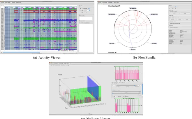
There are three existing visualizations that have been developed as plug-ins to the framework, namely, Activity Viewer [blind ref], FlowBundle [blind ref], and NetBytes Viewer [blind ref]. As is described by Tayloret al.[blind ref]:
[Activity Viewer] captures some aspect of the tempo-ral behavior of an arbitrary group of individual hosts as a time series of color coded blocks, one series per host. The second, [FlowBundle], captures interactions between hosts or subnets, allowing the analyst to see re-lated ows grouped into bundles. The third, [NetBytes Viewer], allows detailed inspection of the behavior of an individual host over time, making it easy to detect and understand changes in behavior that manifest as unusual port usage or traffic volume.
Screen captures for each of these plug-ins are shown in Figure 1. The current plug-ins to the FloVis system assume NetFlow1or NetFlow-like (hereafter, “flow”) data as the raw input data. More
1See http://www.cisco.com/en/US/products/ps6601/products ios protocol group home.html
(a) Activity Viewer. (b) FlowBundle.
(c) NetBytes Viewer.
Figure 1: Screen captures of the existing FloVis plug-ins.
specifically, the current implementation of these plug-ins use the command-line functionality of the SiLK (System for Internet-Level Knowledge2) toolkit [5]. The SiLK tools provide the ability to generate aggregates (i.e.,bags) of volume-related data [10]. The plug-ins use the aggregation and scripting capabilities of SiLK to filter and summarize raw flow data to provide information appro-priate for visualization. (For use within FloVis, a plug-in may use data that has been processed with tools other than SiLK.)
3.2 Motivation
At the FloCon 2009 conference3, security analysts were given demonstrations of the FloVis framework for network visualization, including all three plug-ins. During this demonstration, they iden-tified a need for highly abstracted visualizations of network struc-tures and related communications that would assist the user with determining those subnets/hosts that should be visualized with the existing plug-ins. For instance, network analysts may be responsi-ble for monitoring several departments and may be aware of outside networks, subnets, and/or individual host Internet Protocol (IP) ad-dresses that pose a threat to the security of the departments. Thus, it would be beneficial to provide a high-level visualization of the relationship between these “organizations” before deciding what to visualize at a lower level.
4 OVERFLOW
OverFlow provides multiple views of network hierarchies while de-noting communication between various organizations, and offers the ability to group network addresses in a flexible manner. The SiLK tools are used to generate aggregates of network data at var-ious time intervals, which are visualized with the plug-in. The aim 2Details about the current version of the SiLK tools can be found at http://tools.netsa.cert.org/silk/
3See [URL of blinded conference]
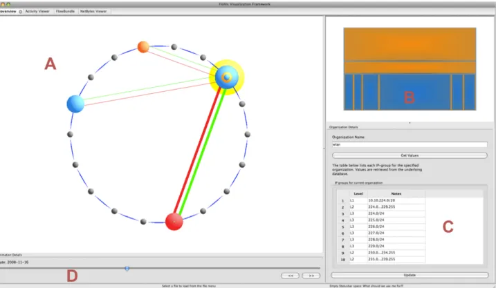
of the visualization is two-fold: namely, to provide a starting point for network visualization while providing context for additional vi-sualizations that may be launched within FloVis, and to reduce the cognitive burden of the analyst by providing a visualization that allows the analyst to select and filter network data for further inves-tigation without having to switch to a textual paradigm. A screen capture of the interface for OverFlow is shown in Figure 2. 4.1 OverFlow: Data Representations
We define anetwork hierarchyto be a structured grouping of IP addresses that represents a singleorganization. We begin by con-sidering the arbitrary network hierarchy represented in Figure 3. Consider each element of the hierarchy as agroupof IPs, or IP-group. The depth of the hierarchy can be extended until a trivial IP-group is reached, i.e., a single host (e.g., 192.168.2.1), and the breadth of each level of the hierarchy can be extended to include an arbitrary number of IP-groups with the condition that each group is a subgroup of the parent. Also, the root of the hierarchy need not be a singleton, although we expect that this would generally be the case.
Since network hierarchies are tree-like in structure, we can represent them in tabular format. If we were writing a hierarchy on paper, one could describe the hierarchy from Figure 3 as follows:
•192.168.0.0/16
•192.168.2.0/24 •192.168.5.0/24
Note that the hierarchy from Figure 3 has three IP-groups and two levels within the hierarchy.
A relational database is used to store the data for each hierarchy. Therefore, it would be inefficient to store such information in the database in a manner that corresponds to indenting records repre-senting subgroups since space would be wasted. We make use of
Figure 2: The OverFlow interface. The main view, labeledA, contains sets of concentric circles where each set represents a network hierarchy. Lines between hierarchies denote communication. The upper-right view, labeledB, contains a Tree-Map display of the selected hierarchy from the main view, i.e., the hierarchy highlighted in yellow. The lower-right section, labeledC, contains the IP-groups of the currently selected hierarchy. The lower-left panel, labeledD, provides controls that allow the user to view transitions within the visualization over a time period.
Figure 3: A sample network hierarchy. The rectangular outline sur-rounds a single branch with the hierarchy.
an identifier to describe thedepthof each entry in a table. For ex-ample, an entry at level one would have the identifierL1. Again, considering the hierarchy from Figure 3, we would now write it as follows:
•L1192.168.0.0/16 •L2192.168.2.0/24 •L2192.168.5.0/24
Additional information must be stored at each level to allow the visualization to be rendered. In addition to the IP information that describe the IP-groups, we also need to store volume information. For this paper the information is extracted from a SiLK repository
containing flow information from one week for a /17 network4. The SiLK tools are used to perform the data extraction. In particular, we generated SiLK bags containing protocol and flow information for each day of the data. These bags were subsequently transferred to a MySQL database to be used by OverFlow. Although protocol bags contain information for various network protocols (e.g., TCP, UDP, ICMP, etc.), the current version of OverFlow only displays TCP data. In addition to volume and protocol information, the date that describes when the flow data was recorded is also stored.
The table in Figure 4 shows how an example hierarchy is stored in the database. The intended meaning of each column entry is as follows:
• org name: the name of the organization (or hierarchy) for which the remainder of the record contains data
• level name: the level of the organization for which the re-mainder of the record contains data
• group name: the IP-group (e.g., a subnet) for which the re-mainder of the record contains data
• proto: the network protocol (e.g., 6=TCP)
• flow count: the number of flows
• notes: miscellaneous notes
• day: the date on which the data was recorded
4For confidentiality purposes, the network will not be identified. Any IP addresses that are used in this report have been anonymized.
org name level name group name proto flow count notes day
Admin L1 G1 1 1907 admin subnets YYYY-MM-DD
Admin L1 G1 6 8190 admin subnets YYYY-MM-DD
Admin L2 G1 1 74180 non empty dhcp pool YYYY-MM-DD
Admin L2 G1 6 13 non empty dhcp pool YYYY-MM-DD
Admin L2 G2 1 976 empty dhcp pool YYYY-MM-DD
Admin L2 G2 6 976 empty dhcp pool YYYY-MM-DD
Figure 4: This table demonstrates how a network hierarchy is stored in the database.
Figure 5: The initial set of empty hierarchies (or organizations). The user right-clicks a black circle in order to edit the selected hierarchy.
4.2 Visualizing Network Hierarchies
Concentric circles are located within the main view of OverFlow and are used as the default representation of a network hierarchy. Their use is not an attempt to portray all elements of a hierarchy; rather, they are used to describe the depth of a singlebranch(or path) of a hierarchy (see the rectangular outline in Figure 3), as well as describing the relative difference in traffic volume at each level of the branch.
We make use of concentric circles to display a single branch for several reasons. First, they provide a compact representation of a path in a network hierarchy that can be displayed within the main view of OverFlow without occluding other hierarchies. Second, only the IP-groups that have the greatest flow volume at each level are displayed by default; this provides the user with some notion as to where the greatest amount of traffic occurs within the entire hierarchy. Third, the user is not distracted by other branches in the network hierarchy that have less traffic since only one branch is dis-played. However, other branches may still be viewed, as discussed below.
Before constructing a network hierarchy, the user is presented with a set of small circles representing empty hierarchies (see Fig-ure 5). The user may right-click on any of these to add information to the hierarchy. If the user selectsEdit organizationfrom the con-text menu that appears, then a dialog box is displayed that allows the user to specify the name of the hierarchy (see Figure 6). Upon pressing theGet Valuesbutton on the dialog, if the name of the or-ganization is found in the database, then the associated values are displayed in the grid. From Figure 6 one can see that data is stored as mentioned in Section 4.1. The network hierarchy is then repre-sented by a set of concentric circles (see Figure 7).
If the user hovers over the hierarchy with the mouse cursor a tool-tip appears that gives certain details about the hierarchy,
in-Figure 6: A dialog that allows the user to specify the name of an orga-nization. The data grid displays information about the network hier-archy with the specified input name, as retrieved from the database.
cluding the hierarchy’s name, the number of levels in the hierarchy, the number of flows collected for the hierarchy, and the number of flows collected for the level of the hierarchy that is hovered by the mouse cursor.
Since the concentric circles only display one branch of the hi-erarchy, the IP-groups that constitute the visible branch are con-sidered to beactive. If the user desires to view a separate branch, then this is accomplished by selecting an alternate IP-group at any level of the hierarchy (if one exists) by selecting the level with the right mouse button and specifying the active IP-group on theActive groupsubmenu.
The color scheme for a hierarchy may be selected by the user. This is done by selectingEdit color schemefrom the context menu. This allows the user to represent different hierarchies with different color schemes as desired.
One benefit of the main view of OverFlow is that it allows data filtering. For example, if the user constructs several hierarchies and determines that one does not warrant investigation, then that hierar-chy may be removed from the view, thus allowing the user to focus on information that is deemed interesting.
4.3 Intra-Hierarchy Visualization with Tree-Maps Although the concentric circles provide a convenient way to gen-erate and provide an overview of an entire hierarchy, they do not display every entity within the hierarchy. It is therefore important to consider a secondary visualization of a network hierarchy. Since a hierarchy (as described in Section 4.1) is represented by anN-ary tree, we used a Tree-Map [7] as an alternate representation. We
Figure 7: The concentric circles on the left represent a network hi-erarchy. The Tree-Map on the right represents the same hihi-erarchy. The outermost yellow highlight surrounding the circles suggests that the hierarchy has been selected with the mouse.
note that our goals for future work include the substitution of other visualizations for the Tree-Map.
The top right portion of the OverFlow display contains the Tree-Map view of any hierarchy that is either selected or hovered by the mouse within the main display (see Figure 7).
The Tree-Map is implemented using a simple recursive proce-dure that draws each level of the hierarchy in a slice-and-dice man-ner, i.e., the topmost level of the hierarchy is drawn horizontally, the next level vertically, the next horizontally, etc. Each entry in the Tree-Map corresponds to a single IP-group within the associ-ated network hierarchy, allowing every IP-group can be represented within the map. Each entry in the map has a small border whose color is that of the entry’s parent. As levels within the circular di-agram are hovered by the mouse cursor (recall that each level on the circular diagram corresponds to a single IP-group), the respec-tive section of the Tree-Map is also highlighted (in yellow). The user may also hover over the Tree-Map with the mouse and thus highlight IP-groups that are not visible on the circular diagram. 4.4 Communication Between Organizations
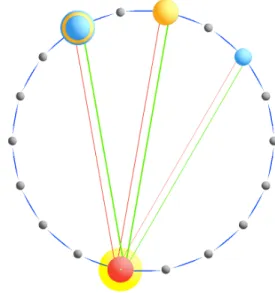
Communication between network hierarchies is represented within the main view of the interface. Red and green lines are drawn be-tween organizations where network traffic occurs (the user may se-lect alternate colors to represent communication). The lines appear when a hierarchy is either selected or hovered with the mouse cur-sor. Green (red) lines represent flowsfrom(to) the selected hier-archy. If a selected hierarchy is communicating with more than one other hierarchy, then the thickness of the red (green) lines is proportional to the total number of flows to (from) the selected or-ganization.
Consider the communications displayed in Figure 8. The red and green lines between the bottom red hierarchy and the rightmost blue hierarchy are somewhat thinner than those between the other two hierarchies. Also, the screen capture shown in Figure 2 shows traffic flowingtothe selected hierarchy from two different organiza-tions, but only trafficfromthe selected organization to one of those from which it is receiving traffic.
4.5 Transitioning Over Time
The interface for OverFlow also provides the ability to display changes in a configuration of network hierarchies over a time pe-riod. For instance, since network data may be captured over a period of hours/days/weeks/etc., it may be desirable to show the change in communication between hierarchies over the time period within which the data was captured.
Currently, the plug-in allows the user to view transitions in the visualization over single days by moving a slider across the bottom portion of the interface (see labelDin Figure 2).
Figure 8: A screen capture of communication between four network hierarchies. Traffic is relative to the bottom red hierarchy, since it is the currently selected hierarchy.
5 CASESTUDY
We now present an example that demonstrates the use of OverFlow to draw attention to network events that should be investigated fur-ther. The data used for this example was collected from a /17 net-work during the period of one week in late 2008. This netnet-work contained an administration subnet, a security subnet, and a “pub-lic” subnet for all other activity. The majority of its users are on the public subnet. The administration subnet supported (network) ad-ministration functions, while the security subnet supported security functions. Flow data was collected from the border of the network with the internet, as well as at four internal locations.
We grouped the subnets as follows: Administration, Security, Public (wlan), and Web (IPs outside of the network). Figure 9(a) shows a screen capture of OverFlow that displays each of the groups mentioned and communication during the first day for the data set. During this day there was communication between all of the differ-ent subnets except for (1) the Security subnet only communicated with the Web subnet, and neither of the other two subnets, and (2) the Administration and PUblic subnets.
Figure 9(b) displays a screen capture for the second day of data. Again, there is no communication between Security and Adminis-tration or Public. The only notable differences on this diagram is that there is now communication between the Administration and Public subnet, and that a larger proportion of incoming flows are from the Web than from the Administration subnets.
Figure 9(c) displays a screen capture for the third day of the data. Here we notice that communication has occurred between the Pub-lic and Security subnets, which has not occurred previously. Since this activity is anomalous, it would now be interesting to consider the nature of the communication between these groups. This could be done by launching another plug-in within FloVis. For example, the administrator might be interested in determining what range of IPs may be communicating with the Security subnets. Since the Tree-Map (in Figure 9(c)) shows the relative volume information for each level of the Public hierarchy, we notice that the largest blue rectangle contains the largest proportion of traffic within the bottommost level of the hierarchy. The administrator might wish to investigate the traffic between this subgrouping of IPs and those subnets within the Security hierarchy. At this point, another plug-in would be launched; this possibility is described in the next section.
(a) The first day.
(b) The second day.
(c) The third day.
(d) The fourth day.
Figure 9: A screen capture of four network hierarchies from the /17 network mentioned in Section 4.1. The leftmost hierarchy represents the Administration subnets. The topmost hierarchy represents the Security subnets. The next hierarchy (traveling clockwise around the diagram) represents the Public (wlan) subnets, and it is followed by the Web subnets. Notice the presence of communication between the Security and Public hierarchies on the third day, and the absence of communication between the same hierarchies on the fourth day.
We also include a screen capture for the fourth day of the data (Figure 9(d)), since it demonstrates that there is no longer any com-munication between the Public and Security hierarchies. This re-mains true for the remaining days of the data, but is not displayed. This suggests that anomalous communication occurred during one day of the week, which would definitely be of interest to the admin-istrator of the network5.
In fact, further investigation revealed that the Security subnet, which was responsible for network security, should only be ac-cessing the internet and the five security monitors described above. Upon examining the raw flow data it was found that one of the secu-rity hosts had performed an unauthorized (according to the network administrator) scan of one of the subnets in the Public network.
This case study provides a simple example that illustrates the power of providing an overview of communication patterns be-tween analyst-defined subnets. While we denoted all IP addresses outside of the monitored network as “Web”, we could have also added other subnets, regardless of their relation to the existing sub-nets. For example, if an analyst had a set of black-listed IP ad-dresses representing known bad actors, this could represent a sep-arate subnet, even though these IPs are also contained within the Web subnet. In this case, we would not observe any traffic between “Bad” and Web (since we have not deployed sensors in locations that would detect such communication); however, any communi-cation between Bad and anything on the monitored network might motivate further investigation.
6 FUTUREWORK
OverFlow could benefit from many possible updates and exten-sions. We mention some of these in no particular order:
• Launch other FloVis plug-ins from the OverFlow interface.
• Represent additional network protocols (e.g., UDP, ICMP, etc.).
• Exchange concentric circles with other types of visualizations (e.g., radial layouts of network hierarchy and traffic).
• Update communication lines for every level of the hierarchy that is hovered by the mouse cursor.
• Include the ability to update the underlying data from within the interface.
We now elaborate upon some of the above points.
One of the motivations behind the development of OverFlow is to provide a plug-in that gives more context to other plug-ins within the FloVis framework. For this to be realized it will be necessary to add functionality that allows OverFlow to launch additional ins. Figure 10 shows a diagram of OverFlow with two other plug-ins currently part of FloVis, namely Activity Viewer [blind ref] and FlowBundle [blind ref]. Activity Viewer displays specific entity-based activity over time, while FlowBundle display connections between subnet and/or hosts. OverFlow could provide context to both of these plug-ins, since, for example, the entities whose ac-tivity should be analyzed in further detail may not be known be-forehand, and to sift through the data to determine this information would increase cognitive load.
It may be desirable to consider the concentric circle diagram as the default visualization, and perhaps other visualizations could 5After making this discovery, the analyst could use OverFlow to filter out undesirable data, since the data of interest was recorded within a 24-hour time period. The remaining days could simply be removed from the visualization; this is left to future work.
Figure 10: A diagram of OverFlow along with two existing plug-ins from FloVis. The top-right plug-in is Activity Viewer, and the bottom-right plug-in is FlowBundle, both of which may require further context provided by OverFlow.
Figure 11: An example of using an alternate visualization in place of the concentric circle diagram. In this case, a radial diagram is used.
beswapped in and out as deemed appropriate. For example, an-other plug-in under development within FloVis generates radial vi-sualization to display IP, port, and volume information. Figure 11 shows an example of how using such a visualization within Over-Flow may appear.
Also, when updating communication lines, it may be desirable to visualize the traffic from each level of a hierarchy to other or-ganizations. At its current state, OverFlow simply displays traffic information for an organization as a whole.
As is mentioned in Section 4.1, the SiLK tools are used to pre-pare network data for use within OverFlow. It is not currently pos-sible to use the SiLK tools filter the underlying raw data from the OverFlow interface. It would be beneficial to allow the user to spec-ify data ranges, animation granularity, network protocols, and hier-archies from the interface itself. This will be taken into considera-tion as the plug-in becomes less dependent upon the SiLK tools.
Although future work remains, the development of OverFlow is moving in the direction of accomplishing the goals that were set out for it. An informal user study should be performed to deter-mine whether analysts agree, which we plan to execute within the near future. OverFlow requires additional functionality in order to determine whether analysts will use the visualization as context for other plug-ins within FloVis. The case study presented in Section 5 shows how OverFlow draws attention to unusual network commu-nication and give hints as to where an analyst may begin an anal-ysis. This is accomplished by drawing the analyst’s attention to unexpected or unusual communication, and then drawing attention to large volume proportions displayed on the Tree-Map, which may in turn suggest those IP-groups that need to be considered for anal-ysis. However, we continue to explore the possibility of applying this visualization to other data sets.
7 CONCLUSIONS
In this paper we contribute an “overview” visualization, called OverFlow. The goal of this visualization is to provide a starter visu-alization for analysts working with network traffic data aggregated at the flow level. The purpose of the starter visualization is to pro-vide analysts with an overview of the traffic between subnets of interest, in order to guide them in determining where to focus their attention for more detailed visualization and analysis.
We achieve this goal by allowing analysts to define arbitrary sub-nets (“organizations”) that can form logical groupings. For exam-ple, one organization could be a department that is being moni-tored, including all of the subnets within that department. A second organization might be all IP addresses outside of the monitored net-work, while a third organization might contain a list of IP addresses known to be bad actors. Note that our system provides an analyst with the flexibility of defining their own network hierarchies and organizations.
The visualization itself then provides the analyst with the abil-ity of quickly determining if there is traffic between organizations that should not exist, or if the characteristics of that traffic (e.g., volume) have changed. Additionally, the analyst can determine the traffic volumes being observedwithinan organization. This allows an analyst to quickly determine where he should focus his attention, drilling down further to determine if there were any security events. ACKNOWLEDGEMENTS
This material is based upon work supported by the Department of Homeland Security under Contract No. N66001-08-C-2032. We also wish to acknowledge the support of Ron McLeod of TARA, CA Labs, and NSERC in this research initiative. Any opinions, findings and conclusions or recommendations expressed in this ma-terial are those of the authors and do not necessarily reflect the views of the Department of Homeland Security.
REFERENCES
[1] R. Bearavolu, K. Lakkaraju, W. Yurcik, and H. Raje. A Visualiza-tion Tool for SituaVisualiza-tional Awareness of Tactical and Strategic Security Events on Large and Complex Computer Networks.Military Commu-nications Conference, 2003. MILCOM 2003. IEEE, 2:850–855 Vol.2, Oct. 2003.
[2] G. Conti.Security Data Visualization. No Starch Press, San Francisco, CA, USA, 2007.
[3] A. D. D’Amico, J. R. Goodall, D. R. Tesone, and J. K. Kopylec. Vi-sual Discovery in Computer Network Defense.IEEE Comput. Graph. Appl., 27(5):20–27, 2007.
[4] A. D. D’Amico, K. Whitley, D. Tesone, B. O’Brien, and E. Roth. Achieving Cyber Defense Situational Awareness: A Cognitive Task Analysis of Information Assurance Analysts. InProceedings of the Human Factors and Ergonomics Society 49th Annual Meeting, pages 229–233, 2005.
[5] C. Gates, M. Collins, M. Duggan, A. Kompanek, and M. Thomas. More NetFlow Tools for Performance and Security. InLISA ’04: Pro-ceedings of the 18th USENIX conference on System administration, pages 121–132, Berkeley, CA, USA, 2004. USENIX Association. [6] J. R. Goodall, W. G. Lutters, P. Rheingans, and A. Komlodi. Focusing
on Context in Network Traffic Analysis. IEEE Computer Graphics and Applications, 26(2):72–80, 2006.
[7] B. Johnson and B. Shneiderman. Tree-Maps: A Space-Filling Ap-proach to the Visualization of Hierarchical Information Structures. InVIS ’91: Proceedings of the 2nd conference on Visualization ’91, pages 284–291, Los Alamitos, CA, USA, 1991. IEEE Computer So-ciety Press.
[8] Y. Livnat, J. Agutter, S. Moon, and S. Foresti. Visual Correlation for Situational awareness. InINFOVIS ’05: Proceedings of the 2005 IEEE Symposium on Information Visualization, page 13, Washington, DC, USA, 2005. IEEE Computer Society.
[9] F. Mansmann, D. A. Keim, S. C. North, B. Rexroad, and D. Sheleheda. Visual Analysis of Network Traffic for Resource Planning, Interactive
Monitoring, and Interpretation of Security Threats.IEEE Transactions on Visualization and Computer Graphics, 13(6):1105–1112, 2007. [10] J. McHugh. Sets, Bags and Rock and Roll. InProceedings of the
Ninth European Symposium on Research in Computer Security, pages 407–422, September 13-15, 2004.
[11] E. Swing. Flodar: Flow Visualization of Network Traffic.Computer Graphics and Applications, IEEE, 18(5):6–8, Sep/Oct 1998. [12] C. Ware.Information Visualization: Perception for Design. Morgan
Kaufmann Publishers Inc., San Francisco, CA, USA, 2004. [13] X. Yin, W. Yurcik, Y. Li, K. Lakkaraju, and C. Abad.
VisFlowCon-nect: Providing Security Situational Awareness by Visualizing Net-work Traffic Flows. Performance, Computing, and Communications, 2004 IEEE International Conference on, pages 601–607, 2004.