Department of Science and Technology Institutionen för teknik och naturvetenskap
Linköpings Universitet Linköpings Universitet
SE-601 74 Norrköping, Sweden 601 74 Norrköping
Examensarbete
LITH-ITN-MT-EX--04/040--SE
Colour proof quality verification
Johanna Sundell
LITH-ITN-MT-EX--04/040--SE
Colour proof quality
verification
Examensarbete utfört i Medieteknik
vid Linköpings Tekniska Högskola, Campus
Norrköping
Johanna Sundell
Handledare: Linus Lehnberg, Peter Dahlén
Examinator: Björn Kruse
Rapporttyp Report category Examensarbete B-uppsats C-uppsats D-uppsats _ ________________ Språk Language Svenska/Swedish Engelska/English _ ________________ Titel
Colour proof quality verification Verifiering av färgprovskvalitet
Författare
Johanna Sundell
Abstract BACKGROUND
When a customer delivers a colour proof to a printer, they expect the final print to look similar to that proof. Today it is impossible to control if a match between proof and print is technically possible to reach at all. This is mainly due to the fact that no information regarding the production circumstances of the proof is provided, for instance the printer does not know which proofer, RIP or ICC-profile that was used.
Situations where similarity between proof and print cannot be reached and the press has to be stopped are both costly and time consuming and are therefore wished to be avoided.
PURPOSE
The purpose of this thesis was to investigate the possibility to form a method with the ability control if a proof is of such good quality that it is likely to produce a print that is similar to it.
METHOD
The basic assumption was that the quality of a proof could be decided by spectrally measuring known colour patches and compare those values to reference values representing the same patches printed at optimal press conditions.
To decide which and how many patches that are required, literature and reports were studied, then a test printing and a comparison between proofing systems were performed. To be able to analyse the measurement data in an effective way a tool that analyses the difference between reference and measurement data was developed using MATLAB.
RESULT
The result was a suggestion for a colour proof quality verification method that consists two parts that are supposed to complement each other. The first one was called Colour proofing system evaluation and is supposed to evaluate entire proofing systems. It consists of a test page containing colour patches, grey balance fields, gradations and photographs. The second part is called Colour proof control and consists of a smaller set of colour patches that is supposed to be attached to each proof.
CONCLUSIONS
The method is not complete since more research regarding the difference between measurement results and visual impression is needed. To be able to obtain realistic tolerance levels for differences between measurement- and reference data, the method must be tested in every-day production. If this is done the method is thought to provide a good way of controlling the quality of colour proofs.
ISBN
_____________________________________________________ ISRN LITH-ITN-MT-EX--04/040--SE
_________________________________________________________________
Serietitel och serienummer ISSN
Title of series, numbering ___________________________________
Nyckelord
Colour control, Colour, Color, offset, print, proofing, proof, colour proof, quality, medieteknik, grafisk teknik, Sörmlands Grafiska. Datum Date
2004-04-27
URL för elektronisk version
http://www.ep.liu.se/exjobb/itn/2004/MT/04 0/
Avdelning, Institution Division, Department
Institutionen för teknik och naturvetenskap Department of Science and Technology
COLOUR PROOF QUALITY VERIFICATION
JOHANNA SUNDELL
MASTER THESIS IN MEDIA TECHNOLOGY 2004
Linköping institute of technology Campus Norrköping
ABSTRACT
BACKGROUND
When a customer delivers a colour proof to a printer, they expect the final print to look similar to that proof. Today it is impossible to control if a match between proof and print is technically possible to reach at all. This is mainly due to the fact that no information regarding the
production circumstances of the proof is provided, for instance the printer does not know which proofer, RIP or ICC-profile that was used.
Situations where similarity between proof and print cannot be reached and the press has to be stopped are both costly and time consuming and are therefore wished to be avoided.
PURPOSE
The purpose of this thesis was to investigate the possibility to form a method with the ability control if a proof is of such good quality that it is likely to produce a print that is similar to it.
METHOD
The basic assumption was that the quality of a proof could be decided by spectrally measuring known colour patches and compare those values to reference values representing the same patches printed at optimal press conditions.
To decide which and how many patches that are required, literature and reports were studied, then a test printing and a comparison between proofing systems were performed. To be able to analyse the measurement data in an effective way a tool that analyses the difference between reference and measurement data was developed using MATLAB.
RESULT
The result was a suggestion for a colour proof quality verification method that consists two parts that are supposed to complement each other. The first one was called Colour proofing system
evaluation and is supposed to evaluate entire proofing systems. It consists of a test page containing colour patches, grey balance fields, gradations and photographs. The second part is called Colour proof control and consists of a smaller set of colour patches that is supposed to be attached to each proof.
CONCLUSIONS
The method is not complete since more research regarding the difference between measurement results and visual impression is needed. To be able to obtain realistic tolerance levels for
differences between measurement- and reference data, the method must be tested in every-day production. If this is done the method is thought to provide a good way of controlling the quality of colour proofs.
PREFACE
This thesis was performed as a final project to complete a Master of Science degree in Media technology at Linköping University, Campus Norrköping. The project was initiated by Sörmlands Grafiska Quebecor AB.
I would like to express my gratitude to:
My supervisors Linus Lehnberg and Peter Dahlén, and to the people working at Sörmlands Grafiska for taking time answering questions and helping me with various things.
My examiner Professor Björn Kruse.
The Nordic Association of Heatset Printers (NAHP), for giving me the opportunity to participate at the annual meeting.
Magnus Brolin at Altamont Media for providing me with additional proofs.
Johanna Sundell
INDEX
1. INTRODUCTION 1 1.1. PROBLEM 1 1.2. AIM 1 1.3. METHOD 1 1.4. LIMITATIONS 1 1.5. THE STRUCTURE OF THE REPORT 2 1.6. TECHNICAL EQUIPMENT 2 2. THEORY 32.1. COLOUR VISION AND
PERCEPTION 3 2.2. COLOUR SPACES AND
COLOUR SYSTEMS 9 2.3. MEASURING COLOUR 15 2.4. OFFSET PRINTING 16 2.5. COLOUR MANAGEMENT AND ICC-PROFILES 21 2.6. PROOFING 28 2.7. SUMMARY 30 3. PRODUCTION AT SÖRMLANDS GRAFISKA QUEBECOR AB 31 3.1. SÖRMLANDS GRAFISKA QUEBECOR AB 31 3.2. THE PRODUCTION PROCESS 31 3.3. COLOUR PROOFS AT SGQAB 32 3.4. QUALITY CONTROL 34 3.5. CHAPTER SUMMARY AND
DISCUSSION 35 4. COLOUR PROOF QUALITY 36 4.1. FORMING A SUGGESTION 36 4.2. CHAPTER SUMMARY AND DISCUSSION 53 5. TESTING 55 5.1. INTRODUCTION 55 5.2. TEST PRINTING 55 5.3. EVALUATION OF THREE PROOFING SYSTEMS 60 5.4. EVALUATION OF THE SMALL CHART 65 5.5. TOLERANCE LEVELS 67 5.6. CHAPTER SUMMARY AND
DISCUSSION 69
6. RESULT 70
6.1. FINAL SUGGESTION FOR COLOUR PROOF QUALITY VERIFICATION - THE PROOF
VERIFICATION METHOD 70 6.2. REQUIREMENTS BEFORE
IMPLEMENTATION 75 6.3. ADDITIONAL USAGE 79 6.4. SUMMARY AND DISCUSSION 79 6.5. RECOMMENDATIONS 80 6.6. CONCLUDING WORDS 80
7. BIBLIOGRAPHY 82
7.1. LITERATURE 82 7.2. ARTICLES AND PUBLICATIONS 82 7.3. INTERNET RESOURCES 83 7.4. VERBAL REFERENCES 84 8. APPENDIX 85 8.1. TEST PRINTING 85 8.2. COMPARISON OF PROOFING SYSTEMS 110 8.3. EVALUATION OF THE SMALL CHART 128 8.4. TOLERANCE LEVELS 146 8.5. USER MANUAL 152 8.6. FILE STRUCTURES 153
1
-1.
INTRODUCTION
1.1.
PROBLEM
When a customer delivers a colour proof to a printer that proof is seen as a contract for the final visual appearance of the print. The printer requires no information regarding the circumstances of the proof production process; no knowledge about which proofer, RIP or profile that was used is available. This means that it is impossible to judge if the proof provides such a good simulation of the intended press that it is possible to produce a print that is similar to it.
The technical background to this problem is that the proofer and the press have different ability to reproduce colours. They have differently shaped and sized gamuts and the task of the proofer is to use ICC-profiles to adjust its gamut to resemble the gamut of the press. This is done in various ways and with different quality depending on the proofer.
A situation where similarity between proof and print cannot be obtained is costly and time consuming. It is also possible that the customer will be unsatisfied with the result and this may cause complaints.
1.2.
AIM
The aim with this thesis is to investigate the possibilities of finding a method with the ability to verify if a proof provides such a good print simulation that it is possible to produce a print that is visually similar to it.
It is desirable that the resulting method should have the possibility to decide if this is
possible prior to the plate production and printing is started. This would not only save the printer time and money, but would also result in more satisfied customers.
1.3.
METHOD
The starting point for forming a method is the assumption that it is possible to decide the quality of a proof by spectrally measuring a number of colour patches placed in the page. The
measurement data should then be compared to some ideal reference data and their difference should be analysed. This analysis should serve as a foundation of forming an opinion regarding the likelihood of producing a print that is similar to the proof.
This involves selecting which colours to test, finding suitable reference data and good analysis methods.
1.4.
LIMITATIONS
The reader of this report is assumed to have basic knowledge regarding printing technology and colour management.
The study has been limited to proofs produced at Sörmlands Grafiska Quebecor AB, except for one proof produced by an outside consultant. The ability to test proofs produced by customers would have revealed more about the quality of the final method, since that would have subjected it to real problems. The proofs that were tested were already of reasonably good
2
-The measurements are also limited by the fact that they are obtained from single sheets only. If more time had been available averages could have been formed by collecting data during longer periods of time.
1.5.
THE STRUCTURE OF THE REPORT
The report is divided into five main parts. The first one, Theory (chapter 2), presents the
theoretical background that is needed to understand the discussion regarding colour management and printing.
The second part is called Production at Sörmlands Grafiska Quebecor AB (chapter 3) and presents the production process at the company, in particular the way colour management and proofing is handled.
Then follows chapter 4, Colour proof quality with a definition of good quality in a colour proof context and suggestions how to select, measure and analyse the colour patches attached to the proofs.
The fourth part is called Testing (chapter 5) and presents the tests performed in order to justify the design of the test charts and the formulation of the method suggestion.
Finally the method is summarised and presented in the fifth part, Result (chapter 6). In this chapter recommendations to Sörmlands Grafiska Quebecor AB is also presented.
Some words and expressions that is used frequently and may need some explaining is presented below.
The words Proof and Colour proof both refer to the same thing; a colour simulation of the printed appearance of a page.
Sörmlands Grafiska Quebecor AB is referred to as SGQAB.
A patch or a colour patch is a rectangular area having a certain colour.
A bar is composed of a line of patches and is often used to measure colour or density.
A chart or a colour chart is several colour patches that is arranged in a matrix structure and is often used to measure colour.
1.6.
TECHNICAL EQUIPMENT
To produce the pages of the test printing and the proofing test forms Macromedia Quark Express, Adobe Illustrator and Adobe PhotoShop were used. The test printing was performed using the sheet fed offset press KBA Rapida 105 and the proofs were produced at the proofers Fuji PictroProof, Epson 10600 and Canon W2200.
The analysis tool was programmed using MATLAB and the spectral measurements was performed using a Gretag McBeth SpectroScan and the software Measure Tool. The software Profile viewer and Colour Tune Pro were also used.
3
-2.
THEORY
2.1.
COLOUR VISION AND PERCEPTION
2.1.1.
COLOUR
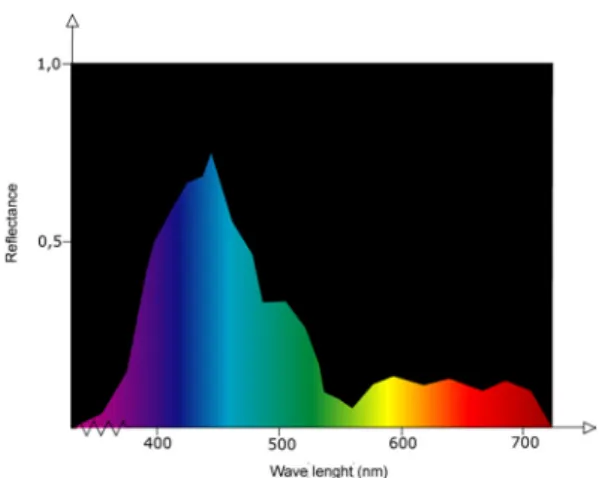
Colour consists of electromagnetic radiation with wavelengths ranging from 380 nm to 780 nm. A specific colour can be described by its spectral distribution. A spectral distribution reveals how a coloured object reflects visible light. Large reflection values means that a large amount of the light is reflected and hence that the specific wavelength will have a big influence on the total colour the object will appear to have. Small values on the other hand means that most of the light is absorbed and that the colour of the wavelength will not contribute much to the final colour of the object. This means that each colour will have a unique spectral distribution that serves as its “fingerprint”.
Each wavelength corresponds to a different colour and white light is achieved when the same amount of all wavelengths in the spectrum are mixed.
Figure 1: The spectral distribution of a bluish colour.
2.1.2.
THE EYE
When electromagnetic waves within the visible range hit the cornea of the eye, it is transmitted via the lens to the retina where the photoreceptors are located. There are two types of
photoreceptors, rods that react to light variations and cones that react to colour.
The cones occur in three different types L, M and S cones. The names refer to long wavelength, middle wavelength and short wavelength. Accordingly, L-cones are sensitive to radiation with longer wavelengths, hence radiation with bluish colour. M-cones react to radiation in the green area and S-cones to radiation in the red area.
When photoreceptors are hit by electromagnetic waves in the range where it is sensitive, it passes the signal on to the brain via the optic nerve. The brain then interprets the signals and combines them to form different colours. This means that the brain perceives colour by combining three coordinates, one representing red, one green and one blue.
4
-Figure 2: The eye.
The light capturing mechanism of the cones can be described mathematically by combining the sensitivity function of each cone with the spectral distribution function describing the incoming light and then integrate over the entire visible spectrum. The resulting values are called tristimulus values.
( ) ( )
∫
⋅ ∂ = λI λ s λ λ S( ) ( )
∫
⋅ ∂ = λI λ mλ λ M( ) ( )
∫
⋅ ∂ = λI λ l λ λ L( )
λs , m
( )
λ and l( )
λ are the sensitivity functions of the cones and I( )
λ is the spectral distribution function of the incoming light.Figure 3: The spectral sensitivity curves of the cones [31]
As becomes very clear in the figure above the curves of the cone response overlap. In addition to this the different cones are not evenly spread across the retina, they are present in a ratio of 40:20:1 for the red, green and blue ones. The cones are also having different sensitivities. The green ones are most sensitive and the blue ones the least. As a result of this we are more able to discriminate between colours in the red-yellow-green-cyan areas of the spectrum than in the blue area.
Since there are more rods than cones, we also have a better ability to notice changes in lightness than in colour. But despite this, a change in colour is most often perceived as more objectionable than an equally large change in lightness.
5
-2.1.3.
COLOUR AND IMAGE PERCEPTION
THE IMAGE PROCESSING SYSTEM OF THE BRAIN
Since the brain receives signals from all three types of cones, the resulting colour has to be calculated by combining the red, green and blue values in a proper way. This method equals the way a scanner or a digital camera works and reproduces colour. It is therefore easy to explain the way the human vision works by describing it as the colour capture system of a scanner. This is a good start but one has to take into account that the visual information will be worked at by the advanced image processing system of the human brain. It will continuously search for patterns and objects and try to match them with images recalled from memory, therefore much of the available information of the visual field will be discarded. Only what is regarded as important will be considered.
Due to this it can be difficult to relate measurements made using spectrophotometry or densitometry to visual impression.
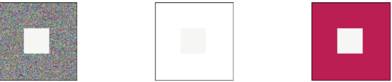
The image processing system of the brain has been created throughout the evolution and has developed to help the human race survive. The ability to recognise objects is crucial to both survival and reproduction, and it is not enough to have the ability to figure out and remember shapes, the colour of the objects also needs to be recognised in a variety of lighting conditions. To be able to do this the brain will always maximise the differences in colour and intensity within an image. This phenomenon is referred to as Chromatic adaptation and means that the colour perception will be adjusted to the surroundings of the observed object. If the surroundings are changed the colour of the object will probably also change. It also has the effect that near-white colours will be perceived as white and colour casts will not be noticed unless in comparison with other neutral colours.
The fact that colour appearance and lighting are closely related makes the visual appearance of printed colours and images strongly dependent of viewing conditions such as lighting and surrounding colours.
Figure 4: The middle square has the same colour in all three pictures but it appears to be different because of the chromatic adaptation.
METAMERISM
Each unique spectral combination of light represents one unique colour, but the brain cannot distinguish between all possible combinations, therefore two colours can appear to be identical even though they differ in spectral distribution.
If the light source, illuminating two colours that look identical but have these
characteristics is changed, the colours can suddenly look different. This phenomenon is called metamerism and is often the cause of problems regarding colour matching.
When the light source is changed, the spectral distribution of the incoming light will be different. This means that the properties of the reflected light also will change. Depending on the
6
-combination of incoming spectral distribution and surface properties, the colours of the objects may differ in resemblance.
All printed photographs are metameric since they are composed of cyan, magenta, yellow and black halftone dots and the original is composed of several more colours. Due to this it is important to have standardised viewing conditions when comparing colours, for instance when judging the similarity between a colour proof and a print.
COLORIMETRIC DESCRIPTION
When describing colour in terms of combinations of red, green and blue it is difficult to predict how a certain change will affect the colour appearance. It is for instance hard to tell, in terms of changes in red, green and blue, how to make a colour a bit more orange and slightly lighter. It is then more suitable to describe colour with the more intuitive colorimetric variables, hue, saturation and value.
Hue represents the colour and will be the variable that names it, such as yellow, red or green. Saturation reveals the pureness of a colour. If a colour is completely free of both black and white it is considered to be pure. If the amount of black and/or white is increased the saturation of the colour is decreased.
Value describes the intensity of the image and reaches from completely white to completely black. The value of a colour can either be described by its brightness, which describes the total amount of light that is reflected from an object, or by its lightness that describes the relative lightness related to an equally lit object that is perceived as white.
Figure 5: Different hues. Figure 6: Saturation change. Figure 7: Value change.
2.1.4.
REPRODUCING COLOURS
Since continuous tones cannot be reproduced in print, images have to be halftoned before they can be printed. Halftoning means transforming the continuous tones into tiny dots. This has to be done since the press only has the ability to either transfer or not transfer ink to the substrate. Small ink dots of the four primary colours printed next to, or on-top-of each other form an illusion of an extensible number of different colours. This means that each image has to be transformed into four different separations, one for each type of ink.
The halftoning is done by a RIP (Raster Image Processor). The RIP can be implemented either as software or hardware and there are several techniques to form the dots. A dot in
traditional halftoning looks like the way we intuitively figure a dot to look like, whereas a dot in
stochastic halftoning is composed of many small dots. Each dot is assigned an area and the more space it fills the darker the resulting colour will be.
7
-Due to the way the eye and the brain function a halftone image will look continuous to the human eye when it is viewed on a long enough distance. The required length of the viewing distance is depending on the resolution of the halftone dots.
As mentioned previously three primary colours have to be used to produce colour halftones. In printing black ink is also used. The colour mixing techniques makes three primary colours combine in different ways to produce a large number of other colours. There are two types of colour mixing, additive and subtractive.
ADDITIVE COLOUR MIXING
In additive colour reproduction the primary colours are red, green and blue. When two of them overlap they form the secondary colours, cyan, magenta and yellow. When all three are combined the resulting colour is white.
Additive colour mixing is used in colour television and computer monitors that have the ability to emit light.
SUBTRACTIVE COLOUR MIXING
In subtractive colour mixing the primary colours are cyan, magenta and yellow. The more colours that are printed on top of each other, the more light is absorbed and if all three primaries are combined the resulting colour will be black. The secondary colours are red, green and blue and are formed by printing two of the primary colours on top of each other.
Subtractive colour mixing is used in printing but with the addition of black ink. This reduces the costs since there will be less ink usage if black ink is used to replace a mixture of all the other three. Black ink is also cheaper than coloured ink, and using black ink also makes it easier to withhold a high quality since problems with misregistration is reduced when less colours needs to be printed on top of each other.
Figure 9: Subtractive colour mixing Figure 10: Additive colour mixing
2.1.5.
REPRODUCING COLOUR IMAGES
A photographic image is supposed to reproduce a real scene as accurate as possible. It is not feasible to reproduce all visible colours, not even in photography. Still the aim must be to keep the image as similar to the original scene as possible. There are several factors that have
importance when it comes to image quality and they should all be taken into account when reproducing an image, on screen as well as in print.
TONAL GRADATION
A photographic image has a large number of tones, or grey levels between its darkest and lightest tone. In the process of reproducing an image the tonal values of the original needs to be
transferred to the reproduction as accurate as possible. No printing method can reproduce all tones in a photograph, but the aim should be to transfer the tones in the best achievable way. The tonal gradation describes how the tones of the original are mapped to the reproduction.
8
-To achieve high image quality the size of the tonal gradation should be as large as possible, which means that the difference in density (read more about density in chapter 2.3) between the end points, the darkest and lightest tones, should be as large as possible. A large tonal gradation implies that the image will have high contrast. The tones in between the end points should be adjusted to suit the reproduction method and the characteristics of the visual sense.
This is accomplished by assigning the lightest tones the smallest dot size (read more about dot size and printing in chapter 2.4). Paper white is used to create catchlights, which are areas in the image that emit light, such as light bouncing off metallic surfaces or light bulbs. The darkest tones should be assigned the largest printable dot size. To adjust the tones between the end points a tonal gradation curve, which is adjusted to the way the human visual system detects difference in tone should be used. The most commonly used tonal gradation curve is the gamma curve.
Figure 11: Gamma curve for camera and monitor. [23]
GREY BALANCE
The neutral colours of the original must be reproduced as neutral to obtain a similar
reproduction. If the neutrals are reproduced correctly it is likely that the other colours also will be correct. The main problem when reproducing neutrals is to keep a good grey balance. That means to find the right combination of cyan, magenta and yellow ink to achieve a colour that appears to be neutral. The amounts of each colour that should be used are different depending on a combination of the paper quality, ink and printing method that is used. One combination adjusted for coated paper [4] is shown in the figure below.
Figure 12: Grey balance fields.
RESOLUTION
The resolution of an image is a measure that defines the area of the original that should be equivalent to one pixel in the reproduction. The smaller the area the higher the resolution and the
9
-more pixels are needed to reproduce the image. Image resolution is often measured in pixels per inch (ppi). If the resolution is not high enough, the sharpness and definition of the original will be lost in the reproduction.
Other resolutions that play an important part in producing high quality reproductions are the resolution of the halftone screen given in lines per inch (lpi) and the resolution of the output device, given in dots per inch (dpi).
COLOUR DEPTH
The colour depth of an image decides how many different colours the system can produce and is dependent on how many bits available to store each pixel. The more bits, the more colours can be reproduced. For each pixel there are one value for red, one for green and one for blue. This means that if the colour depth is 8 bits each pixel will have a size of 24 bits (assuming that the images is stored in RGB-mode) and the number of reproducible colours will be 224 , which is 16,8
million.
The colour depth that should be used is depending on how many colours the file format of the image supports. Other factors that influence the choice of colour depth is storage space and the type of production the image is intended for. An original image should preferably be saved with higher colour depth than 8 bits, even though that is most common when saving a processed image. If the original is saved with high colour depth and high resolution it can easily be adjusted to different outputs.
If the colour depth is not large enough the phenomenon shown in the figure below, known as banding effect can become visible.
Figure 13: Banding effect
NON-REPRODUCIBLE COLOURS
Since subtractive colour mixing only can reproduce a limited amount of colours, some of the original pixels will not be possible to reproduce accurately. This has to be handled in some way that affect the appearance of the image as little as possible. Several methods have been developed to solve the problem. Some of them compress all colours uniformly whereas others map only the ones that cannot be reproduced to the most similar reproducible colour.
A lot of research is being done in this area at the moment and new, better ways of handling non-reproducible colours is currently being developed.
2.2.
COLOUR SPACES AND COLOUR SYSTEMS
To be able to describe and communicate colour, several colour systems have been developed. A colour system has a colour space that describes all reproducible colours within that particular system. The reproducible colours of a colour system are often referred to as the gamut of the colour space.
Colour spaces can be divided into device dependent and device independent. A colour described in a device dependent colour space may look different if it is viewed on or interpreted by different devices. For instance, a printer and a monitor will not produce exactly the same colour as output even though they are accessing the same material. Examples of device dependent colour spaces are RGB and CMYK
10
-If a colour on the other hand is described in a device independent colour space it will have the same visual appearance independent of the device interpreting it. A device independent colour system is CIE L*a*b*.
The colour systems all have colour spaces with gamuts of different size, but none of them are capable of reproducing all perceivable colours. Some colour spaces are designed to fit a particular area or media whereas some are trying to be as general as possible. CMYK and RGB are described by combinations of three numbers, NCS is based on a large colour atlas and CIE L*a*b* is a colour space that is defined using results from colour matching experiments.
There are of course several other colours systems that are designed in other ways or to suit other areas than the ones discussed in this chapter.
2.2.1.
CMY
CMY is a subtractive colour system that is used in print. The CMY colour space is formed by combinations of the three colours Cyan, Magenta and Yellow.
The CMY-colour space is visualized by a cube that is formed when C is represented by the coordinates(1, 0, 0), M by (0, 1, 0), Y by (0, 0, 1) K (black) by (1, 1, 1), and W (white) (0, 0, 0), The neutral axis will become the line crossing the cube, formed between the black and the white coordinate.
Figure 14: CMY Colour space
2.2.2.
RGB
RGB is an additive colour system and by combining the colours Red Green and Blue all reproducible colours are formed. The RGB-colour space is visualized by a cube with R on the coordinate (1, 0, 0), G on (0, 1, 0), B on (0, 0, 1), W on (1, 1, 1) and B on (0, 0, 0). The neutral axis will become the line crossing the cube, formed between the the black and the white coordinate.
11
-2.2.3.
CIE COLOUR SPACES
CIE stands for Commission Internationale de I’Eclairage (the International Commission on Illumination) and is an international organisation that works with developing standards for colorimetry.
CIE has developed the CIE XYZ colour space which is based on colour matching experiments performed by letting several test persons looking at a white screen, partly lit by a reference lamp and partly lit by a source composed by monochromatic red, green and blue light. The task of the test person was to adjust the amounts of red, green and blue light until they regarded the colour matched the reference colour. The procedure was repeated with the same intensities and test persons but with different reference lights. The experiment resulted in the CIE Colour matching functions, describing how a standard observer perceives colour.
CIE XYZ
The colour matching functions are used to calculate the CIE XYZ values, which are also referred to as the tristimulus values. The values are normalised for the current lighting, and the result is that a completely white surface always will have Y = 100.
( ) ( ) ( )
λ λ λ λ λ ⋅ ⋅ ∂ =k∫
R I x X( ) ( ) ( )
λ λ λ λ λ ⋅ ⋅ ∂ =k∫
R I y Y( ) ( ) ( )
λ λ λ λ λ ⋅ ⋅ ∂ =k∫
R I z Z( ) ( )
∫
⋅ ∂ = λI λ y λ λ k 100( )
λx , y
( )
λ and z( )
λ are the colour matching functions of the standard observer and I( )
λ is the spectral distribution function of the incoming light. R( )
λ is the spectral distribution function describing the reflectance characteristics of the viewed object.CIE L*a*b*
The CIE XYZ is a non-uniform system. This means that the Euclidian distance between two colours is not uniformly related to their visual difference. One Euclidian difference in the green area may not represent the same visual difference as an Euclidian difference of the same size in the yellow area.
The CIE L*a*b* was developed to be uniform, which means that the same Euclidian difference in the gamut will represent equal visual difference in colour, independent of location. It is designed to suite human colour perception and is represented by three coordinates. The L* axis represents the lightness, the a*-axis has red colours on its positive half and green colours on its negative half. The b*-axis has yellow colours on its positive half and blue on its negative.
12
-Figure 16: L*a*b* Colour space
The CIE-L*a*b* space is not entirely uniform though. Experiments have shown that a standard observer is most sensitive to differences in hue and then in chroma. The variable least sensitive is lightness. This is illustrated by the figure below. The plot is of the a*b* plane and the ellipsoids represent the areas in which a standard observer considers the colour to be constant. If the human visual system were equally sensitive to all three parameter the areas would have been circles of equal size.
Figure 17: Ellipsoids in the a*b*-plane [20]
The transformation between CIE XYZ and CIE L*a*b* is given by the following equations.
− ⋅ = , 3 . 903 , 16 116 * 3 1 n n Y Y Y Y L 0088565 . 0 0088565 . 0 ≤ > n n Y Y Y Y − ⋅ = n n Y Y f X X f a* 500
13 - − ⋅ = n n Z Z f Y Y f b* 200
( )
+ ⋅ = , 116 16 787 . 7 , 3 1 x x x f 008856 . 0 008856 . 0 ≤ > x x NX , YN, and ZN are the tristimulus values of an appropriately chosen reference white. Other important colorimetric properties such as saturation and chroma can also be calculated.
Hue (h) is defined as the angle between the colour vector and the positive a* axis.
= * * arctan a b h
Saturation/Chroma (c) is defined as the distance between the midpoint of the colour space and the location of the colour.
( ) ( )
(
2 2)
12 * * b a c= +The difference, ∆E between two colours can be calculated using the formula of the Euclidian distance.
(
) (
) (
)
(
2 2 2)
12 * * * a b L E = ∆ + ∆ + ∆ ∆Other distance measurements that try to compensate for the irregularities in the CIE L*a*b* space and the characteristics of the eye, has been developed. One of them is the CIE94-distance,
∆E94. 2 1 2 2 2 1 1 * 94 ⋅ ∆ + ⋅ ∆ + ⋅ ∆ = ∆ h h ab c c ab ab S k H S k c S k L E where . s ab
c _ is the chroma value of the standard colour. kx is a weighting function that usually is set to
one. The parameters is supposed to be adjusted to obtain better visual matching.
s ab h s ab c l c S c S S _ _ 015 . 0 1 045 . 0 1 1 ⋅ + = ⋅ + = =
14
-2.2.4.
NCS
NCS is a Swedish colour system that mainly focuses on categorising colour for the paint- and textile industry. The colours are defined in a colour atlas that is based on human perception. Its foundation is six basic colours red, green, yellow, blue, white and black. These form the three-dimensional colour space that fits all other colours of the NCS-system.
Figure 18: The NCS Colour space [25]
A colour in the NCS-system is described by its nuance, its chromaticness and its hue.
“S 2030-Y90R”
S - The sample is from the second edition of the system.
2030 - The nuance, which means the degree of resemblance to black.. In this case the nuance is 20% blackness and 30 % chromaticness.
Y90R - The hue, which indicates the percentage resemblance to two of the elementary colours. In this case the hue composed of yellow (Y) and 90% redness (R).
The first image below shows a vertical slice of the colour space, the nuance (2030) for the colour whit code “S 2030-Y90R” is marked. The second image shows the location of the hues and the hue for “S 2030-Y90R” (Y90R) is found next to the pure red (R) in the top right quadrant. Together, the hue and the nuance define the position of colour “S 2030-Y90R” in the colour space.
Figure 19: NCS nuance [25] Figure 20: NCS hue [25]
15
-Neutral colours have no hue value and are coded with a nuance value followed by –N, that stands for natural.
0500-N is white and is followed by 1000-N, 1500-N and so on for grey colours. 9000-N is black. [25]
2.3.
MEASURING COLOUR
There are several tools that give the possibility to describe and communicate colour information, but to be able to use the tools colours need to be measured. By measuring a colour it is assigned a numeric representation. This gives the ability to visualise or transform colours between different colour spaces.
Today there are different colour measuring methods functioning in the graphic industry. The densitometer is traditionally used, but it does not measure actual colour. To do that spectrophotometers and colorimeters are required.
DENSITOMETRY
As mentioned above, a densitometer does not measure colour. It measures reflectance and then calculates the optical density. Optical density is defined as the ability of a material to absorb light. The more light that is absorbed, the higher the density will be. In the graphic industry the density is calculated using a logarithmic scale. This gives values that correspond well with visual
appearance.
There are two possible ways of measuring density, reflection density and transmission density. The first is used when measuring opaque materials such as paper and the latter when measuring transparent materials such as film.
The density is calculated using the following formulas:
Reflection density: Transmission density:
= R Dr log 1 i r L L R= i L = Incoming light r L = Reflected light = T Dt log 1 i t L L T = i L = Incoming light t L = Transmitted light
Densitometric measurement is used to control stability during the press run. Solid patches of the primaries are measured and the press is adjusted to maintain specific target values. A
densitometer can also measure dot gain (Read more about dot gain in chapter 2.4 in the section press control.).
COLORIMETRY
A colorimeter breaks down the light to its R, G and B components in the same manner as the human eye. To simulate the eye the light is filtered through a red, a green and a blue filter. The resulting numeric value is given in CIE XYZ or CIE L*a*b* coordinates.
When comparing colorimetric values it is important to make sure that the devices used when measuring had the same structure and the same illumination source.
16
-SPECTROPHOTOMETRY
A spectrophotometer measures the amount of light reflected from a surface. The result will be a dataset of reflectance values that represent the spectral distribution of the light reflected from the point of the measurement. This means that the starting point will be at 380 nm, the
spectrophotometer then controls how much of the particular wavelength that is reflected. The result will be a percentage value. This procedure is then repeated for the entire spectrum and the resulting dataset can be visualised as a spectral curve. The visible spectrum is normally considered to range from 380 nm to 780 nm and most spectrophotometers sample it every 10th nm. These data are of course general and can vary depending on the device being used.
When comparing data, it is as important as in colorimetry, to consider the structure of the device as well as the illumination source.
A spectrophotometer is the most accurate instrument to use when it comes to colour measurement. The spectral distribution curve can also be used to calculate densitometric and colorimetric values.
2.4.
OFFSET PRINTING
Offset printing is the most common method used when producing printed matters on paper, such as magazines, newspapers and brochures. The quality is high as well as the speed, which is why offset printing has been the dominating method of paper printing for several years.
In the process of printing the plate is never in contact with the paper. The colour is instead transferred to the paper via a cylinder covered with a layer of rubber, hence the name offset. This chapter gives a short review of the lithographic offset printing process; its technical details are discussed as well as the parameters influencing quality that can be adjusted during a pressrun.
THE LITHOGRAPHIC PRINCIPLE
Offset printing is based on the lithographic principle, which means that the ink is made to attach to the printing parts of the plate by altering its surface properties. The ink bearing parts of the surface are covered with a polymer layer that is hydrophobic, which means that it repels water but attracts the oil-based ink. The water repellent ink will then attach to the polymer surfaces. The non-printing parts of the plate are hydrophilic, which means that they attract water and hence will be covered with a thin layer of water.
It is possible to print offset without using water and that process is called waterfree offset. Instead of covering the ink bearing areas with an ink attracting substance, the non-printing areas are covered with silicon that repels the ink. The ink then ends up attaching to the printing areas, as it should. In water free offset thicker ink has to be used in order to make the ink attach to the plate. This enables higher maximum densities, sharper dots and higher resolution of the halftone screen. Still this method is not particularly widespread today. That is probably due to the
requirement of temperature control systems in the presses. This is a necessity since there is no water present to cool the process down. This makes the presses more expensive to acquire. The water free presses also have a problem with cylinder dust removal when no water is present to wash unwanted particles of the cylinder.
PLATEMAKING
When the prepress work is finished the digital files have to be transferred to the plate. The first step is to describe the digital document in a page description language such as PostScript. Today the PostScript based format PDF (Portable Document Format) is most commonly used. Once the pages have been formed and placed on the sheet the digital files have to be halftoned. This is done by the RIP (Raster Image Processor). The halftoned pages are then transferred to
17
-the plate ei-ther via film that is exposed on -the plate or by direct exposure using CTP (Computer to plate) technology.
Independent of which method is used the aim is to attain the same tonal value on the plate as in the digital file. This can sometimes be difficult. When using film, some dot gain is
introduced in the exposure process. Problems are also present with CTP technology where transfer curves are used.
THE PRESS
Offset printing can be divided into three groups depending on how the ink is settled and dried. If the ink settles because of the loss of solvent the process is called coldset offset. In this process the ink never really dries. This makes the life cycle of such a product short and the method is therefore mostly used for printing newspapers.
If the ink settles partly due to the loss of solvent and partly to the addition of energy, for instance warm air, the process is called heatset offset.
In oxidative offset the ink dries as a result of a combination of chemical oxidation and loss of solvent.
There are two other ways to group offset printing and that is based on the way the paper is fed to the press, sheet offset and web offset. The sheet fed press prints on individual sheets and is used to produce high quality products such as magazine covers, posters and brochures or products of non-standard format. The sheets can be finished in various ways after the printing.
The web offset press is fed by roll and is used for larger editions. The quality is slightly lower than what is attained with sheet offset and finishing is in most cases not a possiblity. Web offset is most often used for printing newspapers and magazines.
To be able to print all four colours, and sometimes even one or two more, the press needs to have at least four printing units, which can be arranged in various ways.
Figure 21: Different printing unit arrangements.
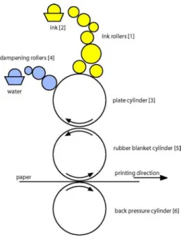
The printing unit has five main parts, all shown in figure 22. The ink rollers (1) are a complicated system of cylinders that transfer ink from the ink fountain (2) to the plate cylinder (3). The dampening rollers (4) are also in contact with the plate cylinder and provide it with dampening water. The plate cylinder transfers the ink to the rubber blanket cylinder (5), which in its turn is in contact with the substrate. The back pressure cylinder (6) presses against the rubber cylinder to produce an appropriate pressure to make the ink attach properly to the substrate.
The amount of ink that is transferred to the ink fountain roller is controlled by the ink keys. The ink keys each control an equal length fraction of the ink fountain and are operated with buttons on the control board. There is one button for each ink key and the regulation is done via the automatic control system of the press. Each key controls the amount of ink that is attached to the ink fountain roller in its area. This gives the opportunity to vary the amount of ink applied across the sheet.
18
-Figure 22: Sketch of an offset printing unit.
MAKE-READY
The make-ready includes all preparations and settings that need to be done in the press before the first approved sheet is produced. This process is crucial and needs to be performed as fast, and with as little discarded prints as possible, but it must still be long enough to enable the printer to achieve the quality requirements.
The first part of the make-ready process is to prepare the press. The plates must be fitted and the press adjusted to the current circumstances.
The next step is to pre-set the ink keys; this can either be done mechanically or automatically depending on the press control system. Since it takes some time for an ink key change to come through in the print it is important to start with a good setting that is well
adjusted to the sheet that is to be printed. To figure out appropriate starting values the amount of ink in each key zone is measured, either by looking at the digital file or by examining the plates. These values then serve as the base when settings are calculated.
The press run is then started and the first thing to do is to make sure that the balance between ink and dampening water is correct, both too little and too much water will result in lowering the quality. Then the register is adjusted. This involves making sure that all colours end up on top of each other as precise as possible. To do this the register marks placed on the sheet are controlled.
Figure 23: To the left, a register mark with perfect register. To the right one with misregister.
In the final part of the make-ready process the density is adjusted. Too much ink will cause smearing effects, problems with drying and loss of image contrast. Too little ink will cause the images to look diluted. To obtain optimal ink coverage the densities of patches with 100% coverage of the primary colours are measured and adjusted to target values. If there are colour
19
-proofs available, a final fine-tune of the settings is made to achieve resemblance between the proof and the print.
When these steps have been completed the make-ready process is finished and the press produces approved prints.
PRESS CONTROL
When for instance a magazine is produced it is important that all copies look as similar as possible. To be able to achieve this, the quality of the prints must be kept as even as possible all through the press run.
To have the ability to perform the measurements needed to enable control of the process, a test bar has to be placed on the sheet. The test bar can look somewhat different depending on who constructed it but it always contains patches with 100% ink coverage of the primary colours. Other common components are patches with 40% and 80% coverage of the primaries and the 100% overprints (two of the primaries printed on top of each other), which will result in red green and blue patches.
Figure 24: Press control bar.
As mentioned above the density of the primary colours are measured and maintained at an optimal level. Today most presses have control systems that can be used to control the ink keys to
maintain particular full tone density values.
The values that represent an optimal print depend on different circumstances, one important factor is the paper. The optimal density values are best found by performing tests. A suggestion for target density values for coated papers are; C: 1,6, M: 1,5, Y: 1,3 and K: 1,9.
It is also common to measure the dot gain. Dot gain means that the dot alters its size during the plate making and printing processes. There is also an optical phenomenon that makes the dots appear larger than they really are. This kind of dot gain is referred to as optical dot gain. The dot gain caused by the press when the ink is pressed against the paper by the rubber cylinder and the back pressure cylinder is called mechanical dot gain. Dot gain causes the prints to become darker than intended and must therefore be compensated for during the prepress stage. To be able to compensate correctly the dot gain must be known in advance and since the material has been adjusted to a particular dot gain it is crucial to control that the process maintains that value. The dot gain is usually determined by measuring patches with 40% and 80% ink coverage.
Another factor that can be controlled is the grey balance. It can be judged visually by printing two patches next to each other. One containing a neutral tone and the other containing the corresponding tone printed with only black ink. When the two look similar the grey balance is good.
20
-It is also common to measure trapping, that is the ability of the differently coloured inks to stick on top of each other. When a 100% tone of one colour is printed on top of another 100% colour all ink of the second colour will not attach when printing wet-in-wet, hence the coverage will not be 200% as expected. By comparing the densities of the full tone patches with the overprints the trapping can be determined. If it is attempted to print too many colours of too high density on top of each other smearing will occur since all of the ink will not attach.
The last control parameter that will be discussed in this chapter is contrast. Since high densities in the 100% tones increase the gamut it is sought to use as much ink as possible. But it has to be done without loosing contrast in the dark tones. The optimal contrast is reached when the difference between the density at 80% coverage and 100% coverage is as large as possible. This is obtained when the density at 100% is as large as possible without a dot gain that is too large.
This is a sample of some common parameters that can be measured during the press run. There are of course other kinds of test bars, designed to measure other parameters that can be obtained from various manufacturers.
COLOUR MIXING PROBLEMS
Once the plates have been made and the printing has started, the only parameter that influences the colour, which can be easily adjusted is the ink supplies in each key zone, hence the full tone densities of cyan, magenta, yellow and black. It is important to remember that density is closely related to dot gain and changing the full tone densities will also affect the dot gain.
Since every colour is a combination of some of the primary colours a density change in one of them will affect many other colours, perhaps not only the ones intended. Some of the effects that changing the full tone densities might have on the total colour impression of an image will now be discussed.
This section also hopes to illustrate the fact that when many of the colours are depending on each other difficulties can easily be introduced when trying to achieve similarity between a colour proof and a print.
In a perfect world the colour proof would simulate the optimal print perfectly and little or no adjustments would have to be done in the press to achieve similarity between the proof and the print. Unfortunately the world is not perfect and some colour proofs are simply produced using the wrong methods or printed on a proofing system that is unable to simulate a print accurately.
If the density of cyan is increased while the other densities are kept the same the green and the blue colours will be affected. The blue will become less red and the green less yellow, an entire image would probably appear colder. The opposite would happen if the density of cyan was decreased while the others were kept the same.
Figure 26: Impact on red, green and blue caused by a density increase of cyan.
If the density of magenta is increased while the other are kept the same the red and the blue colours will be affected. The blue will become less green and the red less yellow, an entire image
21
-would probably appear warmer. The opposite -would happen if the density of magenta was decreased while the others were kept the same.
Figure 27: Impact on red, green and blue caused by a density increase of magenta.
If the density of yellow is increased while the other are kept the same the red and the green colours will be affected. The red will become less blue and the green will also become less blue, an entire image would probably appear warmer. The opposite would happen if the density of magenta was decreased while the others were kept the same.
Figure 28: Impact on red, green and blue caused by a density increase of yellow.
How the changes affect the total impression of an image is really hard to tell since it strongly depends on the colours it consists of. If it already is a bit too orange in the red areas a decrease in yellow may not be harmful. As long as it does not make the green colours appear bluish. Perhaps there are no green colours in the image? Perhaps there are lots of green colours? In these
examples only one of the primaries was changed at a time. What happens if two of them are changed simultaneously? There are of course several more questions that could be asked, but this hopefully gives an introduction to the reasons why colour matching in print is such a difficult task.
2.5.
COLOUR MANAGEMENT AND ICC-PROFILES
Since all devices used in graphical production have different abilities to reproduce colour it is very difficult to maintain colour control throughout the production process. Scanners and digital cameras all have their own way of capturing scenes and converting them to digital data. Then the monitors have other ways of showing the colours, ways that probably will not result in the same appearane as a print of the same image.
All devices have differently sized and shaped gamuts and that is what causes the difference in colour reproduction ability. A monitor can for instance reproduce quite a small amount of all visible colours, but it is still more than four-colour printing can achieve.
22
-Figure 29: XY-gamut of the spectrum with an RGB and a CMYK-gamut marked.
To overcome this problem the graphic industry has developed colour management systems in order to help capturing, viewing and printing colour as accurate as possible.
What it really is all about is to communicate colour information between devices using one language all participating units can understand and translate into their own languages.
2.5.1.
COLOUR MANAGEMENT SYSTEMS
The purpose of a colour management system is to describe the colour reproduction
characteristics of the different devices used in a graphic production flow. The description should be device independent and is used to assure that the colours are kept constant throughout the production process. This means that the colours should look similar regardless of the output device. The appearance of the colours at the monitor should be the same as the print. It also means that colour data should be communicated in a device independent way.
The advantage of using a device independent system is that only one transform per device is required. The colours of the device can then be converted to the device independent colour space and then be converted to any of the other devices using their internal transforms. If a device independent space was not used there would have to be one transform for every couple of devices that needs to communicate.
23
-2.5.2.
CALIBRATION
When implementing a colour management system the first step is to calibrate the devices. This means that the settings of the device are changed to a position where its characteristics are known. How this is done depends on the device and the vendor provides information on how it is done.
2.5.3.
CHARACTERISATION
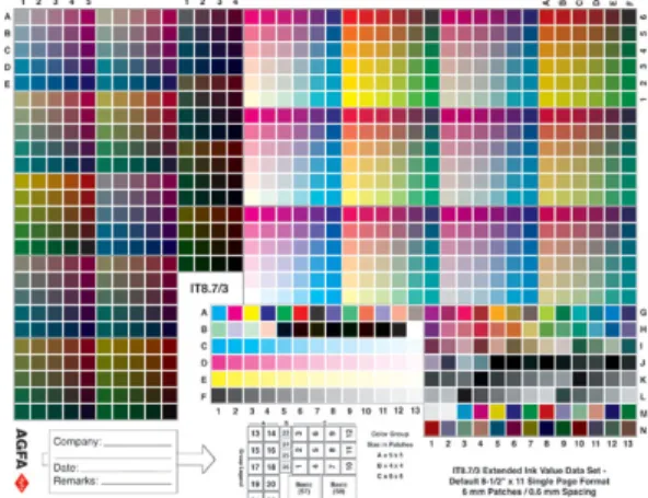
Once the device has been calibrated, its colour reproduction ability can be surveyed. This process is called characterisation and is performed by measuring certain reference colours, printed, captured or displayed by the device. By comparing the values a relationship between the device independent and the device colour space can be established and hence a profile created. The first step is to print, display or capture a testform. The design of most testforms are determined by the ISO standard IT.8 even though some manufacturers have added other colours.
Figure 32: IT8.7/3 test chart.
The colours are measured with a spectrophotometer and the profile is created using some kind of software. There are several commercial tools for creating profiles available for purchasing.
Profiles that describe how colours looked in the original scene are called input profiles. They perform transformations from the colour space of a device to the PCS. Display profiles are used when showing colours on displays. They describe how to recreate the colours of the original scene using the colour space of the display. Then there are output profiles. They describe how a colour should be reproduced and are used by printers and proofers.
2.5.4.
GAMUT MAPPING
When profiles are used to convert colours between the colour space of one device to the colour space of another, gamut mapping needs to be performed. This is due to the fact that the gamuts of the different devices have different shape and size. This means that some of the colours in the input gamut might end up outside the output gamut. This is dealt with using two types of gamut mapping algorithms. One that compresses all colours of the gamut (Compressive algorithms) until all fit within the gamut of the output device and one that projects the out of gamut colours to the nearest point on the surface of the output gamut (Clipping algorithms).
24
-IMPORTANT FACTORS
Even though there are several ways of developing gamut mapping algorithms, some factors are relevant and taken into account by all. The following should be taken into account if the wish is to make a conversion and still maintain the visual impression of the initial image.
The grey axis should always be maintained. This means that the colours of the grey axis should be converted with as small deviation as possible.
The contrast of the converted image should be as large as possible.
The conversion should result in an image where all colours fit within the target gamut
Hue shifts should be minimized.
GAMUT MAPPING PROBLEMS
There are some problems that can occur when gamut mapping is performed.
Sometimes the really bright and the really dark colours can loose their difference, which means that the number of tones is reduced. Sometimes disturbing colour differences occur when colours have to be moved. Colours that are located close to the gamut boundaries can lose difference in nuance. This can cause a loss of detail if such a colour covers a large area.
2.5.5.
ICC COLOUR MANAGEMENT
ICC stands for International Colour Consortium and was formed in 1993 by the leading companies in the prepress industry. Its purpose is to create an open, vendor and platform independent standard for colour management. Today the standard includes a specification for how the system should work, and a standardised file format for the profiles that describe the colour properties of a device. The ICC-system can be divided into three parts the PCS, the CMM and the profile file format.
PCS
PCS stands for Profile Connection Space and is the device independent colour space used for transferring information. The ICC-standard requires that CIE XYZ or CIE L*a*b* with D50 illuminant is used as PCS. Since the PCS is device independent and based on visual experiments it can be thought of as the part that remembers the visual appearance of colour.
CMM
CMM stands for Colour Management Module and uses profiles to convert colour data between device space and PCS and vice versa.
The profile is specified by a limited number of colours and therefore other colours must be interpolated by using the closest surrounding colours.
There are several CMM:s available. Apple’s CMM is called Colorsync and is integrated in the Macintosh operating system and the CMM used by Windows is called ICM. Other
manufacturers, for instance Kodak, Adobe and AGFA have also developed their own CMM:s.
FILE FORMAT
The profile provides the CMM with information on how to convert the colours between device space and PCS. The standard defines seven different types of profiles:
Input device - characterizes for instance scanners and digital cameras.
Display - characterizes for instance monitors and projectors
25
-Named colour - characterizes colour atlas based colour spaces for instance Pantone and NCS.
Device Link - characterizes for instance CIE L*a*b* and CIE XYZ
Abstract - characterizes PCS to PCS.
The ICC-profile can exist as a separate file that is used by applications automatically or when a user requests it. Profiles can also be embedded in image files, such as TIFF (Tag Image File Format) or EPS(Encapsulated PostScript), then the colour transformations are performed automatically as the image is transferred between devices.
The file structure can be divided into three parts, the header, the tag table and the tagged element data. The header has a fixed size of 128 bytes and contains information about the profile, for example; rendering intent, illuminant, PCS, creation platform and creation date.
The tag table defines the tags. It tells which tags are in the profile, some are required and others are eligible. It is also possible to define own tags. The tag table only states which tags that exist, no other data is stored there. Instead the tag table units point to the position in the tagged element data where the information of that tag is stored. The tag table can hence be seen as a table of contents for the tagged element data.
To convert between colour spaces, perform mapping between two gamuts, the ICC profiles use the shaper/matrix model or the shaper/multifunctional table. To convert RGB and grayscale input and display profiles to PCS the shaper/matrix model is used. First the individual R, G and B components are converted by a one-dimensional lookup table. This is a linearization using gamma tables. Then all three values are transformed by a 3x3-matrix that converts the RGB-values into PCS-values and also does a white point scaling.
Figure 33: Shaper/matrix model.
The shaper/multifunctional (MFT) table is used for complex RGB and CMYK input, RGB, CMYK and n-colorants output and for abstract profiles. If the PCS is CIE XYZ the conversion starts with a 3x3 matrix that converts the data to the PCS whitepoint. The following step involves one dimensional lookup tables that linearize the values. Then the values are passed to the three-dimensional interpolation table where the conversion to the output colour space is made. In the final stage the values are transformed by a set of one-dimensional lookup tables.
Figure 34: Shaper/MFT.
The lookup tables are saved in tags, one for device to PCS and another for PCS to device. There are two such lookup tables for each rendering intent (Read more in the next section about ICC-Gamut mapping). This means that a profile contains information how to covert between device and PCS for each possible rendering intent.
26
-ICC-GAMUT MAPPING
When performing gamut mapping using ICC-profiles a rendering intent must be specified. There are four choices and they differ in the way they handle colours that does not fit within the gamut of the target device.
Perceptual rendering uses a compressive algorithm when converting colours. This means that the relative distances between the colours are kept while the entire gamut is compressed or expanded to fit the gamut of the target device. Perceptual rendering is mostly used when separating images and is designed to suit reproduction of photographs. This type of rendering affect all colours of the gamut, also the ones already reproducible.
Relative colorimetric rendering uses a clipping algorithm. All colours that end up within the gamut stay the same whereas the ones outside are mapped to the closest point of the target gamut. The mapping is performed with the wish to preserve the lightness of the colour.
Relative rendering is suitable for use on flat objects of a single colour since it can cause blocking effects when it is used on photos. Areas that have colours located outside the gamut will be mapped to similar in-gamut colours. This may cause a loss of detail when the previously more saturated colours could end up having the same colour as their surroundings.
Absolute colorimetric rendering also uses a clipping algorithm. The out-of-gamut colours are moved in while the others remain the same. It does not take the whitepoint of the media into account and this means that differences between the whitepoint of the media and the white point of the reference media will be transferred to the reproduction. If an image has a red cast the reproduction will also show the same cast. This makes the colour reproduction as accurate as possible and the method is therefore suitable for digital proofing.
Saturation rendering aims at maintaining the saturation of the colours. The relative distances between the colours are changed and the chroma, which represents the saturation, is kept on account of the hue and lightness components.
2.5.6.
A COLOUR MANAGEMENT EXAMPLE
An example of how colour management could be used in the graphic industry will now be described. The working process of creating a printed matter starts with the scanning of images, then separating and viewing them using a monitor and finally printing proofs, simulating the prints. The process involves the following devices, a scanner, a monitor, a proofing system and a press.
SCANNING
At first a photo is scanned and the input profile of the scanner is used to capture the appearance of the photo. Since the colours recorded by the scanner might not be visually similar to the colours of the image, the ICC-profile of the scanner is used to compensate for this.
This means that the profile knows how the colours recorded by the scanner should be converted to look as similar to the visual impression of the original image as possible.
27
-RGB, CMYK OR L*a*b*?
When an image has been digitised it has to be represented in some format. The most scanners and digital cameras represent images with R, G and B coordinates. Some of them can use L*a*b* but since few file formats and applications can handle it, it is not commonly used.
If the RGB-data should be printed it has to be converted into CMYK-values. Some RIP:s accept RGB-data and separates the images in the halftoning process. It is then possible to keep the images stored using RGB-values. Otherwise the images have to be separated (read more about separations i
![Figure 3: The spectral sensitivity curves of the cones [31]](https://thumb-us.123doks.com/thumbv2/123dok_us/48665.2506070/11.892.107.316.152.297/figure-spectral-sensitivity-curves-cones.webp)
![Figure 11: Gamma curve for camera and monitor. [23]](https://thumb-us.123doks.com/thumbv2/123dok_us/48665.2506070/15.892.113.424.431.747/figure-gamma-curve-camera-monitor.webp)
![Figure 17: Ellipsoids in the a*b*-plane [20]](https://thumb-us.123doks.com/thumbv2/123dok_us/48665.2506070/19.892.104.299.152.362/figure-ellipsoids-in-the-a-b-plane.webp)