Mobile VR Platforms
Kyriaki Christaki
School of Science
Thesis submitted for examination for the degree of Master of Science in Technology.
Espoo, 13th November 2018
Supervisor
Professor Petri Vuorimaa
Abstract of the master’s thesis
Author Kyriaki Christaki
Title Abstract Data Visualisation in Mobile VR Platforms
Department Computer Science
Professorship Digital Media Technology Professorship code SCI3023
Supervisor Professor Petri Vuorimaa
Advisor
Date 13th November 2018 Number of pages 43+2 Language English
Abstract
Data visualisation, as a key tool in data understanding, is widely used in science and everyday life. In order data visualisation to be effective, perceptual factors and the characteristics of the display interface play a crucial role. Virtual Reality is nowadays accepted as a valid medium for scientific visualisation, because of its inherent characteristics of real-world emulation and intuitive interaction. However, the use of VR in abstract data visualisation is still limited.
In this research, I investigate the use and suitability of mobile phone-based Virtual Reality as a medium for abstract data visualisation. I develop a prototype VR An-droid application and visualise data using the Scatterplot and Parallel Coordinates methods. After that, I conduct a user study to compare the effectiveness of the mobile VR application compared to a similar screen-based one by implementing some data exploration scenarios. The study results, while not being statistically significant, show improved accuracy and speed in the mobile VR visualisation application. The main conclusions are two-fold: Virtual Reality is beneficial for abstract data visualisation, even in the case of limited processing power and display resolution. Mobile VR, an affordable alternative to expensive desktop VR set-ups can be utilized as a data visualisation platform.
Keywords Virtual Reality, Data Visualisation, Mobile Virtual Reality, Information Visualisation , Visual Data Mining
Acknowledgements
I would like to express my gratitude to the people who helped me and encouraged me during this master thesis project:
– Professor Petri Vuorimaa, for his support, guidance, and valuable feedback.
– All the volunteers, who participated in the user study.
– Mohamed Soliman, for his constant support and encouragement.
– My parents, and my brother, for the unconditional support during my studies.
Espoo, 13.11.2018
Contents
Abstract iii
Acknowledgements iv
Contents v
1 Introduction 1
1.1 Data Visualisation today . . . 1
1.2 Virtual Reality . . . 1
1.3 Democratize VR with Mobile Virtual Reality . . . 2
1.4 Mobile Virtual Reality and Data Visualisation . . . 3
2 Theory and Background Work 4 2.1 VR - Cognition and Perceptual Factors related to Data Visualisation 4 2.1.1 Stereopsis . . . 4
2.1.2 Self-Motion Cues . . . 5
2.1.3 Intuitive Methods of Interaction . . . 6
2.1.4 Immersion and Presence . . . 7
2.2 Scientific Visualisation in Virtual Reality . . . 7
2.3 Abstract Data Visualisation in Virtual Reality . . . 8
2.4 Designing data Visualisations for VR . . . 10
3 Application Design and Implementation 13 3.1 Software and apparatus used . . . 13
3.2 Visualisation Techniques . . . 14
3.3 Application Datasets . . . 15
3.4 Interaction Methods . . . 18
4 Evaluation 20 4.1 User Study . . . 20
4.2 Hypotheses and subjective assessment . . . 20
4.3 Experiment Design . . . 21
4.3.1 The Screen Monitor Application . . . 21
4.3.2 Experimental Procedure . . . 22
4.3.3 Experiment study cases . . . 25
4.3.4 User study subjects and demographics . . . 25
4.4 Data Exploration Tasks . . . 26
4.5 Post Study Questionnaire . . . 27
4.6 Data Collection and Processing . . . 27
5 Experimental Results 29 5.1 Accuracy and Time . . . 29
5.2 Subjective Metrics . . . 33
6 Conclusions 37
6.1 Limitations . . . 37
6.2 Discussion and Conclusions . . . 37
6.3 Future Work . . . 38
References 39
List of Figures
1 Daydream headset and controller . . . 13
2 Auto MPG dataset visualisation . . . 16
3 Blood Transfusion dataset visualisation . . . 16
4 Synthetic dataset visualisation . . . 17
5 Zooming effect. . . 18
6 Hovering effect in the Parallel Coordinates visualisation . . . 19
7 Hovering effect in the 3D Scatter Plot visualisation . . . 19
8 Screen shot from the screen monitor application. Sample scene visual-ising the Iris dataset in a 3D scatter plot . . . 22
9 Comparison of the same scenes in the screen monitor app (left) and the mobile VR app (right) application. . . 23
10 User study phase. A study subject while using the mobile VR appli-cation and completing the data exploration tasks. . . 24
11 Overall Accuracy Results. Higher accuracy is observed in the mobile VR application. . . 29
12 Overall task completion time (correct answers). . . 30
13 Accuracy performance in mobile VR and Screen Monitor mode for the Parallel Coordinates visualisation . . . 30
14 Average task completion time in mobile VR and Screen Monitor mode for the Parallel Coordinates visualisation . . . 31
15 Average Time per Task for the Parallel Coordinates visualisation . . . 31
16 Accuracy performance in Screen Monitor and mobile VR mode for the 3D Scatter Plot visualisation . . . 32
17 Average task completion time in Screen Monitor and mobile VR mode for the 3D Scatter Plot visualisation. . . 33
18 Average Time per Task for the 3D Scatter Plot visualisation . . . 33
Due to its inherent characteristics, Virtual Reality (VR) is considered an appropriate visualisation medium for scientific information, and it is widely used in scientific applications from academics and companies. However, the use of mobile VR, a more affordable, but with limited capabilities solution, has not been suggested so far and thus it is an open field for research. In this thesis, I explore the potential of VR in information visualisation on mobile phones. The main research questions are: Are mobile VR platforms suitable for abstract data visualisation? More crucially, does abstract data visualisation in mobile VR provide in advantages, regarding performance in data understanding, compared with visualisation in typical screen monitors? In order to answer these research questions, an interactive, immersive mobile application was developed for visualising multi-dimensional datasets. The efficiency of such an application was investigated during a user study where the performance on completing data exploration tasks using the developed mobile VR application was tested against a similar screen-based 3D application.
1.1
Data Visualisation today
Experiencing the age of “big data”, massive volumes of information are extracted daily and play a crucial role in the scientific, business and social sector and almost every aspect of daily life. Understanding the collected data and identifying patterns and trends is a crucial part of data science and leads to conclusions and decision making. This is where data visualisation comes into play as a key tool for data exploration and perception. Humans are exceptionally good at pattern recognition and understand concepts easier when they are visually presented. Therefore, visual analytics is one of the most straightforward ways of gaining insights into large (or smaller) datasets and recognizing interesting patterns or anomalies. Subsequently, data visualisation is a common practice in any data involving process.
Data visualisation constitutes a challenging research field that combines technology and human cognition factors (Tory & Möller 2004). Whether a visualisation is effective on facilitating data exploration and understanding depends in different aspects such as the chosen visualisation method, the displaying medium, the inter-action methods and of course the complexity and the nature itself of the data to be visualised. Different data types require different approaches for obtaining better visualisation results. Advances in technology are increasing the available displaying choices and offer more advanced and intuitive interaction methods. Utilizing these technological advances, we are now able to visualise more complex data and more importantly visualise them more effectively.
1.2
Virtual Reality
Rizzo et al.(1997) describe Virtual Reality as "an advanced form of computer-interface that allows the user to "interact" and become "immersed" in a computer-generated
environment". This broad, yet accurate definition can successfully describe all the immersive/synthetic/artificial reality solutions appeared since the early days of VR development. According toBurdea & Coiffet (1994), the key features of VR tech-nologies are presence and immersion, 3D representation (virtual world) and real-time interaction. This sense of presence and immersion into a non-physical environment, make VR a very engaging medium with numerous and diverse applications in science, military, education, medicine, entertainment, and gaming.
Modern VR solutions are typically consisted of three key components: a Head Mounted Display (HMD), a display system that can be mounted on the viewer’s head, a processing module, in order to render the VR environment a unit with significant processing power is necessary, and an input Device, such as joysticks, controllers, gloves that provide the users with a form of interaction.
1.3
Democratize VR with Mobile Virtual Reality
For years Virtual Reality was considered an “exotic” technology. Immersive surround facilities such as CAVE Automatic Virtual Environment (Cruz-Neira et al. 1993) were available since 1992, but due to their complexity and high cost, they were within reach of very specific groups such as research institutes and companies’ R&D departments. In the recent years, with the advent of HMD solutions such as Oculus Rift and HTC Vive to the consumer market, Virtual Reality became a more approachable technology and caught the attention of the entertainment industry. However, such products are still considered a pricey solution especially taking into account the requirement of high-end PC hardware in order to offer a decent virtual reality experience. A more affordable alternative is Mobile Virtual Reality platforms such as Samsung’s Gear VR1, Google Daydream View 2, and Google Cardboard 3, with the first two being solutions recently introduced into the market. These solutions consisted of a headset and a compatible mobile phone mounted in the headset, taking the role of the displaying medium. Smartphone-based VR solutions are more accessible by the average consumer and "democratize" the VR field. VR is now an experience available with an affordable hardware setup requirement (Minocha et al. 2017). In the same spirit, standalone headsets are lately introduced in the market4. I consider these solutions to be in the same category with mobile phone headset systems, in the context of this discussion, as they share some key characteristics, affordability, mobility, and limited processing power.
Towards the democratization of VR, modern software solutions also play a cru-cial role as they facilitate the development of VR applications/games and decrease the cost. Popular game engines such as Unity3D accelerate the development of VR applications by simplifying the development process. The developer can focus on
1http://www.samsung.com/global/galaxy/gear-vr/ 2https://vr.google.com/daydream/smartphonevr/ 3https://vr.google.com/cardboard/
the application/game design and high-level functionality (scenario, application logic, aesthetics, interaction, etc.) while core functionalities such as rendering, physics engine, and networking are handled by the game engine. In addition, building for the desired platform is done with the use of vendor made tools/plugins. This way the VR app developer does not need to have platform-specific experience.
1.4
Mobile Virtual Reality and Data Visualisation
In the first examples of mobile VR solutions, the interaction capabilities were very limited. However, the next editions included controllers with robust tracking systems that allowed more advanced interaction in VR. The introduction of these interaction devices (controllers) made Mobile VR a suitable platform for interactive data explo-ration. To my surprise, looking in the existing literature and consumers’ market, I was not able to find any mobile VR applications oriented towards visualisation of abstract data. The available applications of this kind build for CAVE or desktop-HMD based solutions are already sparse, but for mobile VR solutions are non-existent. The idea of exploring the benefits of Virtual Reality for data visualisation combined with the capabilities of modern smartphones on building interactive graphics applications alongside the lack of such a solution inspired the realization of this thesis.
This work is organized as follows. Firstly, in Section 2, I discuss some key fea-tures of Virtual Reality and present existing works related to data visualisation in VR. In Section 3, I describe the developed application and the implementation details. The conducted user study for evaluating the application’s performance is presented in Section 4. The study results and analysis are presented in Section 5. Finally, in Section 6, I conclude by discussing the main findings of this study, highlight some limitations, and elaborate on the possible extensions of the developed application.
2
Theory and Background Work
Virtual Reality is widely used for scientific data visualisation due to the inherent attributes described in the following Section2.1. Various studies suggest that those attributes are also beneficial in the case of abstract data visualisation. Studies and applications related to VR visualisation, scientific and abstract, are presented in Sections 2.2, 2.3 while design and HCI related issues are discussed in 2.4.
2.1
VR - Cognition and Perceptual Factors related to Data
Visualisation
Since data visualisation is closely related to human cognition, perceptual factors in VR environments, due to the medium characteristics, play a crucial role in effective data exploration and understanding. Laha et al.(2012), in their user study, concluded that the three main characteristics of VR (High Field of Regard (HFR), head tracking, and stereoscopic rendering) have beneficial effects on data exploration tasks in volumetric data. Each characteristic having a different effect on different types of tasks.
2.1.1 Stereopsis
Humans, living and interacting in a three-dimensional environment are naturally attuned to perceive the surrounding world in three dimensions. However, nowadays we are spending a big part of our day in front of screen monitors looking into textual or synthetic 2D content or 3D images projected onto a 3D surface. In the case of 3D content, that can potentially lead to missing or distorted depth and spatial information and therefore to perception errors. Monocular cues can provide some indirect information about depth in 2D representations. Interposition, relative and absolute size, texture gradient, shading, and lighting are all cues that facilitate the mental reconstruction of a 3D representation (Cutting & Vishton 1995).
Monocular cues are most of the times adequate for depth perception when viewing a natural image, as cognitive factors and familiarity cues facilitate understanding. How-ever, in the case of synthetic content, that does not directly or indirectly, represent any real-world object or environment, the use of monocular cues cannot be enough for the accurate 3D reconstruction of the viewing content by the brain. Abstract information visualisation, can often belong to this category; familiarity cues may not be available as the visualisation may not resemble a realistic scene, lighting and shading conditions are not realistic, data points in scatter plots may vary in size, colour mapping in 3D isosurface visualisations can be arbitrary and in the case of big datasets visual clutter does not allow the exploitation of monocular cues such as interposition. 2D images fail to capture binocular disparity, a visual cue resulted by the two distinctive images captured by the human optical system. Binocular disparity refers to the positional difference of an object as seen by the two eyes due to their horizontal separation (parallax) (Qian 1997) resulting in the effect of stereopsis. Stereopsis plays an important role in the perception of depth, distance
and in general on understanding the spatial structure of the world and can have beneficial cognitive effects on the visualisation of synthetic scenes. This hypothesis has investigated and validated in numerous works. Gaggioli & Breining (2001), in their study conclude that the use of stereopsis improves the accuracy of depth estimation of 3D objects while according toAitsiselmi & Holliman(2009), the extra depth information, provided by stereopsis, facilitates spatial ability related tasks such as mental rotation of a 3D shape. Stereoscopic viewing facilitates the understanding of node-link diagrams according toWare & Franck (1996). In a later study (Ware & Mitchell 2005), the same authors concluded that the performance improvement effect of stereoscopic viewing is amplified in the case of ultra-high resolution stereoscopic displays. McIntire & Liggett(2014), in an aggregating study, are reviewing numerous works on performance comparison of stereoscopic 3D and 2D viewing conditions. The authors reach to some high-level conclusions: In tasks related to spatial compre-hension and understanding, spatial localization of objects, complex imagery analysis, and manual interaction with data and virtual information (spatial manipulations), stereoscopic 3D showed a clear benefit. However, no clear benefit was noticed in cases where no depth information is needed (i.e., non multi-dimensional tasks) and when the tasks are too simple or the viewer is very familiar with it. More on that,
Greffard et al.(2015) in their study on the impact of stereoscopy on graph analytics, conducted a comparative study concluding that stereoscopic 3D outperforms 2D and monoscopic-3D visualisation approaches on graph analytics.
2.1.2 Self-Motion Cues
Head and motion tracking is an inherent attribute of modern VR technologies and contributes to the overall desired effect of user immersion in the virtual environment. Additionally, it contributes to better spatial perception and depth estimation as it provides “self-motion parallax” cues (McIntire & Liggett 2014). Motion parallax is a monocular depth cue that results from the observer motion. As the observer moves, his/her viewing position changes and additional information about distance and object structure become available (de la Malla et al. 2016) resulting in improved depth understanding and spatial cognition. In information visualisation, motion parallax cues such as head-tracking can conduce to overcoming well-known issues: narrow visual angle and occlusion issues in a dense visualisation might be overcome by changes in the viewpoint or viewing angle. Head tracking also offers a wide field of regard making it possible to visualise bigger or denser datasets in a single visualisation and solves the scaling problem (Olshannikova et al. 2015) for various visualisation types such as architecture and CAD designs.
In the information visualisation area, user studies have shown the benefits of head and motion tracking. Raja et al. (2004), in a user study related to data visualisation in immersive environments, reported that the use of head tracking results in higher efficiency, faster completion times and less disorientation. Ware and Franck, in two comparative studies (Ware & Franck 1996, Ware & Mitchell 2005) conclude that motion cues, such as “head-coupling” results in increased performance in the
exploration of node-link diagrams. Additionally, the authors in their earlier study make an interesting observation: depending on the task and the application, some motion cues such as rotation of the visualisation can be harmful as the selection of moving objects can be challenging. However, this is not the case with head tracking and self-parallax motion cues as the interaction methods are coupled with the head motion.
2.1.3 Intuitive Methods of Interaction
As humans are attuned to interact in a 3D world, an inferred assumption is that the interaction in a synthetic stereoscopic 3D environment, such as a VR environment, can potentially be more natural than the interaction in a typical 2D display. Rosen-baum et al.(2011), state that the use of immersive environments can overcome the interaction problems present when interacting with 3D data.
Waterworth (1996), highlights the importance and power of spatial interaction in order to take advantage of human space perception and navigation capabilities. According to the author, the main advantages of spatial interaction are: i) acting naturally, ii) behaving automatically - the use of automatic non conscious interac-tion behaviours, iii) space semantics - the mapping of spatial dimensions with the location or dimensions of virtual objects arranged in space iv) space mnemonics -the association of worth remembered systems with -their locations in -the 3D virtual environment. Special consideration should be taken to the proper utilisation of these attributes as non-sensible use can be disorienting and harmful. Sherman and Craig (Sherman & Craig 2003, pp.10), highlight real-time sensory feedback as an important element of virtual reality. Sensory feedback refers to the user receiving feedback related to their physical position. Indeed, various interaction mediums in VR resemble in a great extent the interaction in the real world utilising human spatial perception abilities and providing sensory feedback. The most prominent example is the change of perspective with head tracking. Head tracking and head based rendering is a form of visual sensory feedback and is designed to directly mimic the real world reaction. Hand-held controllers is another example. Moving real-life objects such as hand-held controllers and seeing their 3D model moving in the virtual space takes advantage of the inherent hand-eye coordination skills of humans. According to Waterworth (1996), these skills are becoming automated and require no conscious control resulting in more effortless interaction. This way the users can focus on the reason for interacting, their exploration goal, instead of consuming mental effort on the interaction itself. According toWidjojo et al. (2017), selecting objects in immersive environments using hand held controllers resembles pointing to objects in the real world. Finally, more advanced interaction mediums, such as gloves, that provide haptic feedback when touching virtual objects, constitute interaction technologies that more completely resemble real life conditions and utilize human sensory capabilities. This type of technologies is not yet available in affordable VR solutions such as mobile VR systems, which are the study case of this thesis. However, they are mentioned as an example of VR interaction capabilities and might
be available in the future in commercial VR solutions.
2.1.4 Immersion and Presence
VR can offer the feeling of presence and immersion to the user. According to Sanchez-Vives & Slater(2005), immersion is the ability of the used medium to provide the user with an environment that looks convincing and with which he can interact. When immersion is successful the feeling of presence occurs. When the user feels present in the virtual environment, he responds to virtual stimuli, like computer-generated visual data, as if they existed in the real world. Raja et al.(2004), in an early study, are investigating the benefits of immersion in information visualisation by conducting comparative user studies in a CAVE VR environment. Their experiments show that using immersion can have beneficial effects when visualising large datasets.
VR and the 2D/3D Debate
In the research community, there is currently no consensus regarding the suitability of 3D techniques on the visualisation of non-spatial data. In this ongoing 2D vs 3D debate supporters of 2D argue that information retrieval in 3D can be mentally demanding (Huk 2006, Sebrechts et al. 1999), visually cluttering, and less efficient (Cockburn & McKenzie 2002). However, the majority of studies against 3D visuali-sation are referring to monoscopic displays without stereoscopic and head-tracking capabilities. Recent studies (Cliquet et al. 2017, Greffard et al. 2015, Saenz et al. 2017), suggest that the “2D vs 3D debate” should be re-examined while taking into account stereoscopic displaying technologies that facilitate depth perception and self-motion parallax cues (with head tracking) to facilitate enhanced depth perception and spatial understanding.
2.2
Scientific Visualisation in Virtual Reality
The term scientific visualisation refers to visualisation of data with an “inherent physical component” (Tory & Möller 2004). Because of the above mentioned in-herent attributes of Virtual Reality and stereoscopic imaging in general, VR seems suitable for the visualisation of 3D models and spatial data as it provides improved spatial and depth perception. Indeed, VR is widely used in scientific visualisa-tion applicavisualisa-tions today. Scientific fields such as medicine, engineering, archaeology, physics and many more have benefited from the use of immersive scientific visu-alisation and advanced commercial applications in these fields are nowadays available.
Riva (2003) presents the applications of VR visualisation in the medical fields of virtual endoscopy, medical education and surgical simulation. Simulation software for the reconstruction of human structures, to facilitate better understanding of human physiology (Abiri et al. 2018) and laparoscopic simulation set-ups (Huber et al. 2018) in virtual environments are proposed.
Archaeology is another research field where VR visualisation is applied. A col-laborative, immersive virtual environment for rendering 3D reconstructed models of objects with archaeological interest is developed by Kurillo & Forte(2012). The proposed software facilitates collaboration and aims to assist the research process on the field of archaeology. Smith et al. (2013), created an immersive platform for managing and studying archaeological data rendered in a stereoscopic environment. Archaeologists are able to re-experience and examine excavation sites and discover patterns and loci information as if there were located in the site of interest and collaborate with other researchers.
In the engineering field, Marks et al. (2014), propose a VR platform with con-sumer headsets for the visualisation of engineering and CAD data, while Sampaio & Martins(2014), demonstrate a VR platform for the education and training in design and construction studies, andMoran et al.(2015), show an application on geospatial data visualisation. In graphics area,Kageyama et al. (2000), developed a software solution for the visualisation of 3D vector fields in a virtual environment.
These are only some representative examples of the numerous applications of VR in scientific visualisation among various scientific fields. The plethora of similar applications highlight the potentials of VR as a platform for scientific visualisation.
2.3
Abstract Data Visualisation in Virtual Reality
In contrast with the extensive research and work available about VR scientific data visualisation, in the field of VR Abstract Data Visualisation (or Information Visual-isation), there is a considerable lag in the development, and available commercial application examples are sparse. The majority of available examples are limited to artistically influenced visualisations that use real-world analogies to create aestheti-cally pleasing results that can affect empathy and be memorable. Some characteristic examples are Google Labs "Will the UK ’Brexit’?" 5, "Is the Nasdaq in Another Bubble?" 6 by Roger Keny and Ana Asnes Becker. Visualisations of such type are eye-catching and impressive but they focus more on creating engaging data visualisa-tion experiences than on taking advantage of stereoscopy and immersion to visualise complex multidimensional datasets.
On this topic, the available literature seems not mature and the existing research so far mainly focused on investigating whether VR is suitable for abstract data visualisa-tion of such type. Study works that present soluvisualisa-tions for specific applicavisualisa-tion domains are very limited. One exception is the field of graph visualisation where available works can be found in the literature (Férey et al. 2005,Osawa et al. 2000). However, due to the advances in displaying technologies and human-computer interaction, immersive abstract data visualisation is becoming an emerging research field during the recent years and researchers are exploring the potential applications and benefits
5http://news-lab-brexit.appspot.com 6http://graphics.wsj.com/3d-nasdaq/
of visual data mining in immersive environments.
Chandler et al. (2015), introduce a now widely accepted term, Immersive Ana-lytics that is related to interaction and display technologies that can be used for immersive data analysis and exploration. Although the term is not limited to VR, VR immersive mediums are one of the most prominent tools on realizing such a concept. The authors are focusing on high level usability issues and highlight the user interaction and design concerns on creating an effective user experience and a systematic approach on creating immersive data analysis tools. In the same con-text, Hackathorn & Margolis (2017), in they work discuss the objectives and design possibilities in developing immersive analytics worlds.
Comparative Studies
Wagner Filho et al. (2017), used Head Mounted Displays (HMD) to visualise di-mensionally reduced data in 3D scatter plots in their own user study. The authors noticed an improved accuracy in classification tasks in the immersive approach when compared to desktop 2D or 3D approaches. Cordeil et al. (2017), performed a comparative performance study where they investigate which immersive display technology, CAVE or HMD, is more effective in analysing network connectivity in a collaborative framework. According to their results, HMD and CAVE systems gave similar accuracy scores but HMD outperformed CAVE system in task completion time. Their work presents a detailed and systematic approach to a user study re-lated to visualisation and VR systems. Bayyari & Tudoreanu (2006) in their study, attempt to evaluate the impact of immersion on information visualisation. For that purpose, they conduct an experiment to compare users’ performance in the simple task of counting data targets in traditional monitors and different configurations of immersive CAVE installations. According to their results, immersive displays outperformed desktop visualisations despite the later ones being able to produce more clear images. Authors suggest that immersive environment aid to the better understanding and comprehension of the visualised information and thus resulting in improved performance on visualisation tasks.
Novel VR Visualisation Approaches
Some novel visualisation concepts that take advantage of immersion and make the user part of the data visualisation for better perception and more intuitive interaction are suggested byRosenbaum et al. (2011). Their suggested approaches, Immersive Scatter Plot and Immersive Parallel Coordinates, are only feasible inside an immersive environment. Nagel et al. (2008), in their suggested approach of visual data mining, combined audio and visual inputs in an immersive environment for data visualisation.
García-Hernández et al. (2016), describe some complex visualisation approaches, integration of 2D plots into 3D objects, 3D parallel coordinates and complex graph visualisation schemes that they believe are the more promising in the field of VR data visualisation and they suggest some possible applications in the aerospace domain.
Gray (2016), focuses on the interaction methods and navigation inside an immersive visualisation environment. In his work, he suggests three types of navigation, rotation, scale, and alignment, that can be used to discover data structures in an immersive 3D scatter plot.
Collaborative Immersive Analytics
Donalek et al. (2014), presented a proof of concept application where VR can be used as a general purpose visualisation platform for multidimensional data. They suggest an immersive 3D scatter plot, in which different data parameters are mapped to the scatter plot’s XYZ coordinates, colour, shape, and size of the data points in order to visualise many dimensions of the dataset. At the same time, they suggest another feature: collaboration inside VR visualisation platforms. Scientists and researches can interact with the data and with each other for more effective data mining. The possibilities of collaboration in immersive analytics are investigated by other researchers as well (Cordeil et al. 2017) as it is suggested that, this concept, can facilitate the understanding of complex data.
2.4
Designing data Visualisations for VR
VR abstract data analytics is a new and relatively unexplored area. Due to the lack of successful and widely adopted paradigms, the visualisation designer is facing additional challenges during the design and implementation process as standardised procedures and general guidelines are not available. He/she has to take into account various HCI and design aspects, differentiated procedures and pick among tools, software and software libraries that are not explicitly designed for the purpose of VR visualisation. This section presents and discusses the design and HCI related considerations and the need for a high-level framework for the implementation of immersive data visualisation experiences.
HCI Considerations
As already discussed, the objective of data visualisation is not the visualisation of data itself, but leveraging the human ability to gain insight about the data. While certain attributes of VR, such as stereopsis and immersion have already been proven to have positive effects in visualisation, medium-specific HCI considerations and effective interaction approaches need to be investigated and applied in order to utilise the full potential of VR as a medium for data visualisation and exploration.
Some of the HCI considerations that have to been taken into account when de-signing VR analytics are:
– Effective interaction patterns
The importance of proper interaction methods has been highlighted in HCI related studies.Widjojo et al. (2017), re-interpret the term Human-Data
In-teraction (HDI) as “the direct interface between the human and a visual representation of data” and discuss the need for VR-specific HDI systems.
– Creating highly engaging experiences
Creating attracting and engaging experiences that catch user attention and enable data exploration is a key factor for successful visualisations. Engagement can be achieved by creating visually pleasing virtual environments, using effec-tive interaction methods, enabling collaboration features, and using storytelling visualisation techniques. It should be mentioned that in VR, visualisation designers are favoured in engagement as the medium itself is engaging due to its novelty.
– VR medium constraints and drawbacks
VR specific tricks and constraints can turn the visualisation application to a challenging or even intolerable experience. Low resolution in HMDs does not allow the displaying of very small details. User motion and position changes shall be designed in a way that is not causing VR sickness. Reading text in VR can be challenging (Kurbatov 2017); thus the use of easily read fonts, bigger font sizes and careful text positioning is advised.
– Appropriate visualisation methods depending on the dataset nature and domain
The nature of the visualised dataset plays a crucial role in the selection of the visualisation technique. This is a fundamental principle of data visualisation and it applies to all visualisation mediums. However, in VR visualisation, special considerations regarding the medium characteristics have to be taken into account. What are the VR attributes that support better understanding of the dataset and how they are utilised is an important factor in VR visualisation
– Will the use of VR provide any benefit?
The use of VR for visualisation purposes should be considered when there are possible benefits of the use of this medium (McIntire & Liggett 2014). In the case of multi-dimensional data (three or more dimensions), the potential advantages are thoroughly discussed in the previous section. However, in the case of 2D visualisation, the use of VR visualisation should be justified in order to counterbalance medium specific challenges such as VR fatigue, unfamiliarity and special equipment requirement.
Design and Implementation Process
For the adoption of VR visual analytics, a structured, systematic design methodology that facilitates efficient and successful creation is required. The purpose of such an approach is to stimulate the development of VR visualisation by providing develop-ment cycle guidelines, suggesting impledevelop-mentation tools, and taking into account HCI factors. However, the ideal methodology should be not strict so it will not limit the designer creativity and introduction of new approaches.
Fry (2008, pp.1-15), defines the seven steps of data visualisation process: Acquire -obtain the data,Parse - provide some structure to data, order and categorise,Filter -remove all unnecessary data, Mine - process to identify patterns in data, Represent -choose a visualisation technique,Refine- improve the visualisation, make it engaging,
Interact - add interaction methods for data manipulation. These high-level stages are describing the general visualisation pipeline independently of the visualisation medium. However, in the case of computer-based visual analytics, phases of the software development life-cycle are intermingled with the data visualisation process suggested. Requirements engineering, design considerations and software deployment performed using an agile and iterative methodology are therefore necessary. Espe-cially in the case of VR visualisation, where no standardised tools and procedures are available, iterative design is particularly important because of the too many unknowns (Jerald 2016, pp.453).
Identifying this lack of standardised guidelines, I describe the procedure, in distinctive high-level modules, followed during the development of a VR data visualisation for the purposes of this thesis:
1. Data acquisition and cleaning.
2. Conceptualise, designing taking into account HCI and perceptual considerations.
3. Defining the developing software and environment.
4. Development of the application.
5. Testing on the display device.
6. Evaluation of the produced visualisation and interaction techniques.
As suggested by the software development life-cycle and also dictated by the novelty of the application the various phases are not separate but rather interleaved resulting in an incremental development and iterative design.
3
Application Design and Implementation
In this thesis work, I propose a novel approach for visualising multidimensional datasets. In order to assist that, an Android application was developed for visualisa-tion in a mobile VR immersive environment.
3.1
Software and apparatus used
Hardware
For the development of the mobile VR application a MacBook Pro with the following specifications was used: MacBook Pro 13-inch with a 2.6 GHz Intel Core i5 processor, 8 GB 1600 MHz DDR3 memory and Intel Iris 1536 MB graphics card.
A Google Pixel XL smartphone used as the virtual reality medium together with the compatible Daydream HMD with Controller.
Google Pixel XL specifications: Android operating system, Chipset Qualcomm Snapdragon 821 CPU Quad-core (2x2.15 GHz Kryo & 2x1.6 GHz Kryo), GPU Adreno 530 and Screen resolution 1440 x 2560 pixels.
Daydream Specifications: Optical Lens with 90-degree FOV, Accelerator, Gyrometer and Proximity sensors, Motion Controller.
Figure 1: Daydream headset and controller 7
Software
Unity3D8 was used as the development platform with Android Studio software for
building for Android. Google VR SDK plugin for Unity3D was used for the interaction and communication with the compatible VR displaying hardware (Daydream HMD and Controller).
3.2
Visualisation Techniques
For this application, the use of various visualisation techniques was investigated, but two were chosen, because of the good visual outcome they provided and their suitability for use in an immersive 3D environment:
3D Scatter plot
The typical scatter plot visualisation technique was extended and used in a 3D immersive environment for visualisation of multidimensional data. Every instance of the dataset is represented by a 3D point inside a Cartesian 3D coordinate system defined in the immersive environment. The three perpendicular Axes (X, Y, Z) are each one representing one of the chosen numerical attributes of the dataset. The location of every point in the 3D scatter plot space is the visual outcome of these attributes values, same as in a 2D scatter plot. Additionally, in some cases, colour coding was used to display some classification attributes. The 3D points are having different colours depending on the class they belong. Some other techniques like shape coding for classification attributes were investigated, but not used in the end.
Parallel Coordinates
Parallel Coordinates is a visualisation technique used widely in the case of multi-dimensional data as it can be used to visualise comprehensively a larger number of dimensions. According to Johansson & Forsell (2016), parallel coordinates are helpful when comparing different data items and different attributes of the data items. The technique consists of parallel axes each one representing a different dimension/ attribute of the visualised dataset. Each data instance is plotted as point values mapped on the axes and all the points are connected with lines.
In the developed immersive application, the parallel axes were placed in an ellipsoidal set-up around the user position giving the sense of a more immersive visualisation comparing with positioning the axes in a straight line set-up. This way the difference at the viewing distance of the axes was minimised. A cyclical set-up (where the viewing distance would be the same for every axis) was not used because, in that case, the viewer would not be able to inspect all the axes at the same time.
Although, there is some level of immersion the visualisation could be characterised
more 2D-like as data attributes were mapped to data axes and there was not ex-tended use of the spatial features of the immersive environment. Therefore, the use of stereoscopy is not considered to play a crucial role. In this visualisation, the investigated question was the effect of virtual reality in situations with visual clutter. A common phenomenon in Parallel Coordinates visualisations when the dataset is large (Sansen et al. 2017).
3.3
Application Datasets
For demonstration, I used some well know datasets suitable for the application purposes. The datasets were high dimensional (5 or more dimensions) and contained mostly numerical data. For the selection of the datasets, I considered the data content an important factor. As the application was not designed for visualisations restricted to a specific scientific area, the original users will have different educational backgrounds. Therefore, the context of the visualised dataset should be easy to understand and not contain domain specific attributes that a non-related user would not be able to understand. I intended to use mainly real-world datasets as this way the application and the produced visualisation would represent a real-life situation. Additionally, I believe that such a choice would be far more engaging for the subjects of the following user study.
Auto MPG Data Set
Auto MPG (Miles per Gallon) dataset is obtained from the StatLib library of Carnegie Mellon University 9 (Figure 2). The dataset are collected by Ernesto Ramos and David Donoho. In the app, I used a modified version of the datased by Quinlan
(1993), available in the Machine Learning Repository10were data instances containing
unknown values were removed. The data concern city-cycle fuel consumption (in miles per gallon). There are 398 data instances and 8 attributes. This dataset was visualised using the Parallel Coordinates technique.
Blood Transfusion Service Center Data Set
A dataset byYeh et al. (2009) that contains data from the donor database of Blood Transfusion Service Center in Hsin-Chu City in Taiwan (Figure 3). There are 748 data instances and 5 attributes representing Recency (months since last donation), Frequency (total number of donation), Monetary (total blood donated in c.c.), Time (months since first donation) and a binary attribute representing if the donor donated blood during a specific donation session. This dataset was visualised using the 3D Scatter Plot technique and the chosen attributes were Recency, Frequency and Time.
9http://lib.stat.cmu.edu/datasets/cars.data
Figure 2: Auto MPG dataset visualised using Parallel Coordinates. The image is a screen shot from the implemented application described in following sections
Figure 3: Blood Transfusion dataset visualised using 3D scatter plot technique. The image is a screen shot from the implemented desktop application described in following sections.
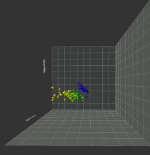
Synthetic dataset
In order to test specific data exploration tasks, such as cluster detection and data distribution, a synthetic dataset was generated (Figure4) using MATLAB11software. There are 1144 data instances and three attributes. The majority of the data instances were following a normal distribution around a central point in the 3 dimensional space while some data clusters diverging from the main distribution were also present. This dataset was as well visualised using the 3D scatter plot technique.
Figure 4: Synthetic dataset visualised using 3D scatter plot technique. The image is a screen shot from the implemented application described in following sections.
Iris dataset
Iris dataset byFisher(1936) is considered a classic in the data visualisation community and it is one of the most well known datasets. The data concern the classification of Iris plant in three subclasses depending on sepal length, sepal width, petal length and petal width variables. There are 150 data instances and 4 attributes. This dataset was visualised using the 3D scatter plot technique. Due to its simplicity (small number of instances) it was used only for demonstration and familiarizing
purposes and not in any data exploratory tasks.
3.4
Interaction Methods
The two interaction mediums available in the application is the hand-held Daydream controller and the head tracking capabilities of the VR system.
Head tracking is used in order to visualise the virtual world as it would be seen from a different view point depending on the user’s head movement. Head tracking is an inherent feature of the VR system and no further functionality was developed for this application.
Interaction Controller
Rotating graph around Y axis Touchpad pressed and drag Tooltip with point variables Controller lazer hover Towards the graph Touchpad touching up Moving away the graph Touchpad touching down Reset view App button
Table 1: Controller Interaction
Hand-held controller is used to offer a more dynamic form of interaction with the visualised data. Part of the interaction was already provided by Google VR SDK plugin and part of it was programmed by the developer of the application. By pointing to a specific data point with the controller the data point is highlighted (Figure 6) and in the case of the 3D scatter plot a tooltip containing the point’s variables appears (Figure 7). Additionally, in the scatter plot visualisation, lines, parallel with the axes, and crossing the projected onto the 3D planes data instances were displayed (Figure 7). The controller’s trackpad was used for zooming in and out on the dataset (Figure5). As observed during the user study, described in the next Section, this interaction was very engaging for the users. They mentioned that it was giving the impression they could "dive" in the data and explore from another point of view. By clicking on the touchpad the user can select/press virtual buttons. Finally by keeping the trackpad pressed and at the same time moving the controller the user can rotate the dataset across the vertical (Y) axis.
Figure 5: Screen shots taken from the mobile VR application. Zooming effect in the 3D Scatter Plot visualisation
Figure 6: Screen shot taken from the mobile VR application. Hovering effect in the Parallel Coordinates visualisation. When hovering on the parallel axes, the data instances containing the corresponding value on this axis are highlighted.
Figure 7: Screen shot taken from the mobile VR application. Hovering effect in the 3D Scatter Plot visualisation. When hovering on a data point, the point is highlighted, a tooltip (with the points coordinates into the 3D visualisation space) is displayed and projection lines onto the 3D planes appear.
4
Evaluation
The purpose of information visualisation is gaining insight and knowledge about the data. And the purpose of visualisation evaluation is to examine to what degree this is achieved (North 2006). In this chapter, a user study conducted in order to evaluate the effectiveness and usability of the developed application is described.
4.1
User Study
The purpose of this user study was to explore if the developed mobile VR application is suitable for data visualisation and to evaluate the effectiveness of such an app by comparing the developed VR visualisations with the same 3D visualisations displayed in a typical display without the use of stereoscopy and immersion. From now on these are mentioned as the two study modes: mobile VR app and Screen Monitor app. For this purpose, the same visualisation application was built for a desktop/laptop environment as part of the user study. Some original hypotheses were formulated, and specific data exploration tasks were decided. The study subjects were tested both on the VR visualisation and on the display visualisation, but in a different visualisation technique for each study mode (as described in 4.3.2). Their accuracy performance and the completion time on the given tasks were measured. In order to avoid any fatigue or VR sickness related issues, the study sessions were short in duration. Additionally, after the data exploration part, users were asked to fulfil a questionnaire related to the mobile VR application in order to assess their subjective evaluation.
4.2
Hypotheses and subjective assessment
Hypotheses
For the evaluation of the implemented platform some original hypotheses, related to the objective metrics, were formulated that I attempted to address during the user study.
1. Accuracy in task completion is higher in mobile VR than in the screen display platform.
Success and errors in task completion were recorded and used to compare the effectiveness of the visualisation in mobile VR app and screen monitor app.
2. Users are able to finish the tasks in a shorter time in mobile VR.
Quite commonly in data exploration experiments, the task completion accuracy is quite high, and the results cannot lead to any statistically valuable conclusions. Therefore, another important performance metric is the completion time. The completion time for each successful task was recorded and compared for both visualisation modes.
Subjective Assessment
Additionally, I wanted to extract some insights about users’ impression, regarding the use of VR for data exploration, that I could not measure using some objective metric. Therefore, I formulated two general subjective questions that I attempted to answer based on users comments and answers in the post-study questionnaire.
1. Do users believe that Mobile VR is suitable for abstract data visu-alisation?
After experiencing the mobile VR application subjects are asked if they believe their immersive experience was suitable for abstract data visualisation and if it was easy and pleasant to complete the tasks in the immersive environment.
2. Is interaction with the data and the visualisation more intuitive in an immersive environment?
Study subjects were asked whether the interaction methods felt more intuitive and natural in the mobile VR app comparing with the screen monitor app.
Since not being able to use an objective metric, I am not able to give a definite answer to these questions. Despite that, I feel that from users’ insights, some useful conclusions can be driven.
4.3
Experiment Design
Experiment Challenges
During the formulation of the user study, a particular concern was whether the comparison between the immersive visualisation and the regular screen monitor visualisation could be scientifically valid. The inherent difficulty in such an attempt is that some of the experiment parameters such as the display medium and the interaction techniques are by their nature different in the two compared cases. Therefore, it is empirically not possible to know if these parameters played any crucial role in the outcome of the experiment. However, following the example of other user studies in the same field, I continued to the experiment design while trying to provide as similar as possible conditions in both visualisation modes.
4.3.1 The Screen Monitor Application
For the purposes of the user study, a laptop 3D visualisation application was developed in order to compare the effectiveness of the mobile VR application. The laptop application was similar to the mobile app but lacking stereoscopic and immersive features (Figure9). Visualisation methods (3D scatter plot and parallel coordinates) and visualised datasets where the same in both cases. Interaction methods were similar to the ones in the mobile VR application, but the interaction medium was different. While in mobile VR app the hand-held controller was used as the interaction device, in the laptop-based application controls were implemented using the mouse.
Figure 8: Screen shot from the screen monitor application. Sample scene visualising the Iris dataset in a 3D scatter plot
In Table2, the implemented interaction methods in the screen monitor app and the corresponding interactions in the mobile VR app are mentioned.
Mobile VR app Screen monitor app Highlight/
Display Tooltip
Hover data with controller’s pointer
Hover data with mouse
Visualisation Rotation
Click touch pad + move controller
Left click + Mouse drag Zoom in/out Scroll on touch pad Scroll on mouse
Table 2: Interaction methods
The screen monitor application was developed also in Unity3D. In fact, the same code, except the interaction related code and the platform specific modules, was used for both applications.
4.3.2 Experimental Procedure
There were two visualisation techniques in the experiment scenario, 3D Scatter Plot visualisation and Parallel Coordinates visualisation. Details about the study cases are described in the next section.
Figure 9: Comparison of the same scenes in the screen monitor app (left) and mobile VR app (right). The visualisations are almost identical in the two mediums. Differences in viewing points and distance are mostly related to the projection of the stereoscopic view onto a 2D display for the purposes of creating the figure.
was explaining the study purposes, the used visualisation techniques and the study procedure. Since most of the subjects did not have any immersive experience, a short introductory session preceded the actual user study phase. During this familiarizing session, the users were introduced to the immersive visualisation environment and could see a sample visualisation and try the interaction methods. No exploration tasks were taking place during this phase. Since the 3D Scatterplot visualisation had more complex interactions (zooming, hover, rotate), for this introductory phase, this visualisation technique was chosen. The Iris dataset that contains fewer data instances was used. In order to avoid any bias, a similar introductory session was available for the screen monitor visualisation mode.
ex-periment subjects were tested in both visualisation modes (mobile VR and screen monitor app).
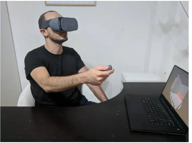
Figure 10: User study phase. A study subject while using the mobile VR application and completing the data exploration tasks.
In the first phase of the experiment, the subjects were tested in the screen monitor app and on one of the two visualisation techniques. For this study phase, I used a Dell XPS 9550 laptop (Intel i7 - 6700 HQ @ 2.6 GHz, NVIDIA GeForce GTX 960M, 1920x1080 px) as the experiment apparatus. In order to avoid any erroneous results, every subject was tested in every visualisation technique (3D Scatter Plot visualisation and Parallel Coordinates) only one time either in mobile VR or screen monitor app. Being tested in the same study case using the same dataset twice would introduce false results as the users would be already familiar with the visualisation and the dataset during the second time, and therefore they would produce more accurate results and would show faster completion times. In the second phase of the experiment, the subjects were tested in the mobile VR mode and on the other study case.
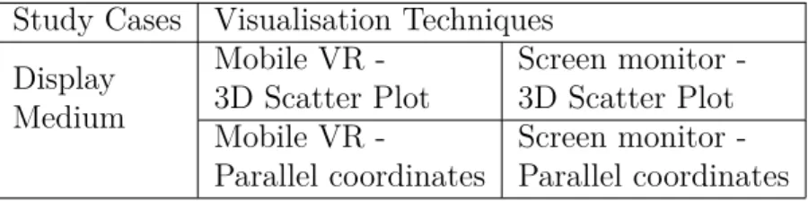
As a result, four different study cases were produced: mobile VR - 3D scatter plot, screen monitor - 3D Scatterplot, mobile VR - Parallel coordinates, screen monitor - Parallel coordinates with each of the experiment subjects being tested
in two study cases. The experiment was designed in such a way so that an equal number of results to be produced for the 4 experiment study cases. The metrics collected from the experiment were used to validate the user study hypotheses.
Study Cases Visualisation Techniques Display Medium Mobile VR -3D Scatter Plot Screen monitor -3D Scatter Plot Mobile VR -Parallel coordinates Screen monitor -Parallel coordinates
Table 3: Experiment Trials
After the experimental phase, the test users filled a questionnaire in order to collect their opinions on the visualisation experience. The questionnaire data consti-tuted the subjective metrics of the user study and used to perform the subjective assessment of the study.
The average duration of the study, including mobile VR mode, screen monitor mode and study questionnaire, was 30 minutes.
4.3.3 Experiment study cases 3D Scatter Plot
For this visualisation, two different datasets were used. For pattern determination, find extremum and single point detection tasks the Blood Transfusion dataset was used. For communities detection tasks I considered that an artificial dataset with a defined number of clusters would be more suitable. For that purpose, I used the Synthetic dataset described in Section 3.3.
Parallel Coordinates
For this visualisation the Auto Mpg dataset was used.
4.3.4 User study subjects and demographics
For the user study, the chosen subjects had to be relatively familiar with the concept of 3D abstract data visualisation and have at least one experience on this field, such as having seen or used any type of 3D chart before. Additionally, they also needed to have some relative experience with modern interaction devices, apart from a computer mouse, and be familiar with interacting within a graphical environment. For example, having used any game console controller or joystick. To fulfil those criteria limitations most of the subjects belonged to the scientific sector with the majority of them coming from a computer science or electrical engineering background.
There were no criteria related to familiarity with VR and immersive environments. Most of the user had very limited or none VR experience.
In total, 8 subjects participated in the user study. 4 male and 4 female users with age range between 26 and 38 years old.
4.4
Data Exploration Tasks
For the testing purposes, some typical data exploration tasks were decided following the methodologies used in previous works (Raja et al. 2004, Wagner Filho et al. 2017) on evaluating immersive visualisation experiences and on works on general data visualisation evaluation Saket et al.(2017). The tasks were appearing with the use of text inside the visualisation session in the form of multiple-choice questions. All the tasks were designed so to have one correct answer and the task completion time was recorded.
1. Find Extremum (one axis distance)
In this task, the user is asked to identify the data instance in the scatter plot with the highest value among one of the three axes (X,Y,Z) or the data instance in the parallel coordinates plot with the highest value in one of the parallel axes and answering questions about it.
– How many times has donated the donor with the more months since his/her last donation?
2. Pattern determination
Pattern determination task is a high-level task, during which the user is required to obtain a general sense of the data distribution.
– Is there a correlation between the total amount of donations and the number of months since last donation?
– Does Economy (miles per gallon) have any relation with Horsepower?
3. Communities detection
In this task, the subjects were required to identify clusters (groups of data instances with similar values among all data attributes) and name them or count them.
– How many clusters diverging form the main distribution can you spot?
4. Single point detection
In these tasks, participants had to search and spot the single data instance with the specific attribute values.
– The donor who has donated 16 times and has 21 months since last donation how many months has since his first donation?
5. Multiple points detection
In these tasks, participants had to search and spot the multiple data instances with the specific attribute values.
– How many donors have 98 months since their first donation?
– How many cars with horsepower 0-20 hp have 4 cylinders?
6. Characterise distribution
Another high-level task that required from the user to obtain a general sense of the data layout. The participants were asked questions related with an attribute of the dataset.
– The majority of donors have 40 or more months since their first donation. Right or wrong?
– What is the approximate centre of the main distribution?
4.5
Post Study Questionnaire
A post-study questionnaire was used in order to gain insights about the overall Quality of Experience (QoE) of the subjects and to collect information about the subjective metrics. Following the approach and conclusions of Hung & Parsons
(2017) on user engagement evaluation in visualisation, and using their suggested questionnaire, VisEngage, as an example I created a questionnaire adjusted to our user study case. The questions are related to the effectiveness the VR data visu-alisation application, the novelty of such an approach, the user engagement and the quality of experience. A full script of the questionnaire is provided in AppendixA.
4.6
Data Collection and Processing
Data collection was happening in two ways:
– Questionnaire after the end of the experiment session.
A hard copy of the questionnaire was answered by the study subjects after the finish of the user study.
– Directly though the app (mobile VR and lap-top based).
For this purpose Unity Analytics 12, an integrated Unity tool for tracking
user behaviour was initially utilised. Unity Analytics is a tool created for collecting data related to user behaviour during a game or another form of interactive application created with the use of Unity3D software. Thus, I considered it appropriate for collecting the required data during our user study. This Unity3D tool allows the developer to define custom events messages that will be emitted when the desired events are happening. In my app, custom messages were emitted when a user was answering each one of the tasks. Mes-sage parameters were the selected answer and the task completion time.
While Unity3D’s offered analytics platform seemed to be the ideal solution for the study needs, I faced some critical challenges. Unity Analytics is giving to free users only access to the aggregated data and only for one parameter at a time. In order to be able to do my own statistical analysis, it was necessary to have the raw data generated during the user study. Thus, I implemented my own data collecting solution, and during the user study, all the results were saved in a text file (CSV format).
5
Experimental Results
After the completion of the user study, the obtained performance data were statis-tically analysed in order to compare the performance of the mobile VR, and the screen monitor application. The primary metrics I investigated are accuracy, how many right and wrong answers as a percentage of the whole answers count, and task completion time. Separate results for the two different visualisation techniques are also presented. Additionally, some interesting findings regarding specific data exploration tasks are also investigated in more detail.
5.1
Accuracy and Time
Overall Results
Regarding accuracy, significant improvement is noticed in the mobile VR mode. In particular, in the mobile VR mode the users answered correct 82.5% of the time, while in regular screen monitor mode the users answered correct 72.5% of the time (See fig11).
Mobile VR also outperformed regular screen monitor app regarding the task com-pletion time. As seen in figure 12the average completion time in VR was 66.8 sec while in screen mode was 72.7 sec. The average completion time is calculated only by the correctly answered questions.
Figure 11: Overall Accuracy Results. Higher accuracy is observed in the mobile VR application.
These generals results are in need of further investigation. In particular, I want to check the results for the two visualisation techniques separately.
Figure 12: Overall task completion time (correct answers).
Parallel Coordinates
In parallel coordinates visualisation, task completion time in mobile VR was signifi-cantly lower than in screen monitor mode (Fig 14). At the same time accuracy is higher in the mobile VR mode following the overall trend (Fig 13).
Figure 13: Accuracy performance in mobile VR and Screen Monitor mode for the Parallel Coordinates visualisation
Completion time was lower in VR mode in all but two tasks (Fig 15). This visualisation was designed to study the effect of VR and higher Field of Regard in
Figure 14: Average task completion time in mobile VR and Screen Monitor mode for the Parallel Coordinates visualisation
Figure 15: Average Time per Task for the Parallel Coordinates visualisation
dense graphs where the effect of visual clutter is present. The clear out-performance of mobile VR might indicate that VR can have a positive effect on this phenomenon.
3D Scatterplot
In scatter plot visualisation, the task completion time was in general higher (Fig. 17) comparing to the average completion time in the Parallel Coordinates visualisation while the accuracy percentage is practically the same with the overall result (Fig 16). A potential indicator that this visualisation was more challenging compared to the parallel coordinates visualisation.
Comparing the two visualisation modes, task completion time in VR was on
Figure 16: Accuracy performance in Screen Monitor and mobile VR mode for the 3D Scatter Plot visualisation
average slightly higher (by 4%) than in screen monitor (Fig. 17) In a more detailed investigation, time per task analysis (Fig. 18), task completion time in mobile VR was significantly higher in tasks related to specifying general trends such as the general correlation between the data dimensions (Task 1, 6, 9). During the study session, some of the users mentioned that they have some difficulty to read the axes labels due to the text position related to the viewer. This, combined with the fact that some of the tasks were more demanding to perceive might result in these higher completion times. In contrast, in tasks related to locating specific data instances or counting data points with specific attributes the task completion time was the same or slightly lower in mobile VR. This might indicate, as also noticed in parallel coordinates visualisation, that VR might be helpful in overcoming up to a degree the effect of visual clutter. Worth noticing is the significantly higher completion time of the first task in mobile VR. Users commented that they had some moments of disorientation and an initial difficulty handling the plot with the controller despite the preceded familiarising phase. On tasks related to visual clutter spotting specific data points the completion times were lower in mobile VR most of the times. One possible explanation on that is that the wider Field of Regard and the head tracking allowed the users to inspect faster and easier the individual data points.
Figure 17: Average task completion time in Screen Monitor and mobile VR mode for the 3D Scatter Plot visualisation
Figure 18: Average Time per Task for the 3D Scatter Plot visualisation
5.2
Subjective Metrics
Regarding the subjective metrics, the results obtained from the post-study ques-tionnaire are rather positive. Users had a positive opinion and interest in data visualisation in VR. Most of them find the application novel and believe that the use
of VR as a medium for data visualisation can be beneficial (See chart19a,19c, 19d).
The majority of users did not witness any special difficulty in interacting with the VR graphs (See19b) although some of them did not find navigation and spatial perception in the VR environment straightforward (See 19e, 19f).
Question 7. (See 19g), regarding how physically demanding is to use the mo-bile VR visualisation app gathered diverse responses. Remarkably, most of the users did not find using the VR app more demanding than viewing a conventional screen visualisation. That comes in contrast to the writer’s observations. During the study sessions, the users were eyed to rotate their head, looking up and down, rotate their chair and make big horizontal and vertical movements with the hand holding the controller. A state quite different compared with the static position when using the screen based visualisation app. Despite that, only one user reported that the VR app might be physically more demanding than the screen based one.
The non-mandatory comments field (Question 8) showed a positive impression about the concept of using mobile VR as a visualisation platform. At the same time, some users highlighted that they are not familiar with VR data visualisations. A rather interesting comment from a user was that she would like to observe the visualisation together with other participants inside the VR environment and discuss/work on it as a team, a spontaneous statement pointing towards the use of VR as a visualisation and collaboration platform. Some example comments are:
– Very intuitive and interesting way to view complex visualisations from a per-spective that cannot be supported from traditional visualisation methods.
– We are not familiar with data visualisation in VR. Novel field!
– It would be nice if many users could watch the scatter plot in VR at the same time and discuss about it.
(a) After using this data visualisation app I would be interested to see more data visu-alisation applications in immersive virtual environments.
(b) The features and interaction methods of the data visualisation app felt intuitive to me.
Figure


Related documents
The results of this study indicated that a 15-week resistance training program using a BP model promoted a greater increase in strength and power expression in bench press
When there is a maximum pumping rate less than about 300 gpm during a step test for a dewatering well, the drawdown in water levels is observed for a period of 30 to 60 minutes
49 Presentation Sources: IPEDS, 2016 IPEDS Workshop Presentation,
In order to determine the recommended spectral, radiometric and spatial charac- teristics of a dedicated multispectral nighttime visible and near-infrared sensor, a spectral library
The best experimental results have been obtained using hourly historical weather measures (radiation and temperature) and PV production as training inputs and weather
Matching algorithm that will be used as pattern matching method to verify a person’s identity based on the iris code is Support Vector Machine and Mul.. 2.2
meliloti RpoH regulon; sufT contributes to Fe/S protein metabolism and effective symbiosis under intrinsic iron limitation exerted by RirA, a global iron regulator.. Our study
Ask your local authority about what is available where you live and what type of help they can offer people with dementia and their next of kin.. Examples of support offered
