ABSTRACT
TATEOSIAN, LAURA GRAY. Investigating Aesthetic Visualizations. (Under the direction of Christopher G. Healey.)
Visualizations enable scientists to inspect, interpret, and analyze large multi-dimensional data sets. Effective visualizations are designed to both orient and engage viewers by directing attention in response to a visual stimulus, and then encouraging a viewer’s vision to linger at a given image location. Research into human visual perception provides information about how to orient viewers, using salient visual features, such as color, orientation, and flicker. Less is known about how to build engaging visualizations. Increasing the aesthetic merit of visualiza-tions is a promising approach to increasing engagement. Intuition suggests that visualizavisualiza-tions with a more aesthetic presentation style will be judged as more artistic, but this is an open problem. In this thesis, we explored an important question pertaining to creating aesthetic visualizations: Is it possible to affect the perceived artistic merit of a scientific visualization?
pre-sentation styles. This provides strong evidence that our aesthetic techniques can increase the perceived artistic merit of a visualization, possibly leading to a significant improvement in the visualizations’s ability to engage its viewers.
INVESTIGATING AESTHETIC VISUALIZATIONS
by
LAURA G. TATEOSIAN
A dissertation submitted to the Graduate Faculty of North Carolina State University
in partial fulfillment of the requirements for the Degree of
Doctor of Philosophy
COMPUTER SCIENCE
Raleigh, North Carolina 2006
APPROVED BY:
Dr. Edward W. Davis Dr. Thomas L. Honeycutt
BIOGRAPHY
AKNOWLEDGEMENTS
Contents
List of Figures vii
1 Introduction 1
1.1 Thesis Organization . . . 6
2 The Psychology of Aesthetics 8
2.1 Characterization of Beauty . . . 10
3 Aesthetic Computer Graphics 15
3.1 Simulation . . . 15 3.2 Visualization . . . 19
4 Visualizations Designed for Study 25
4.1 Introducing Interpretational Complexity . . . 25 4.2 Introducing Indication and Detail . . . 27 4.3 Introducing Visual Complexity . . . 29
5.1 Detail Preserving Mesh Simplification . . . 32
5.2 Voronoi Diagrams . . . 36
6 Visualization Algorithms 43 6.1 The IC Algorithm . . . 46
6.2 The ID Algorithm . . . 47
6.3 The VC Algorithm . . . 51
7 Aesthetics Studies 67 7.1 Interpretational Complexity Experiment . . . 69
7.1.1 IC Experiment Results . . . 73
7.1.2 IC Experiment Analysis . . . 75
7.2 Indication and Detail Experiment . . . 76
7.2.1 ID Experiment Results . . . 77
7.2.2 ID Experiment Analysis . . . 78
7.3 Visual Complexity Experiment . . . 80
7.3.1 VC Experiment Results . . . 81
7.3.2 VC Experiment Analysis . . . 82
7.4 Comparing IC, ID, and VC Experiment Results . . . 83
7.5 Interpreting IC, ID, and VC Experiment Results . . . 85
7.6 Multiple Technique Experiment . . . 87
7.6.1 Multiple Technique Experiment Results . . . 88
7.6.3 Multiple Technique Experiment Interpretation . . . 91
8 Practical Applications 93
8.1 Supernova Application . . . 93 8.2 Validation . . . 97 8.3 Weather Application . . . 99
9 Conclusions 103
List of Figures
1.1 Glyph-based Supernova Visualization . . . 3
2.1 Birkhoff’s Aesthetic Polygon Ranking . . . 10
2.2 Aesthetic and Emotional Models . . . 12
2.3 Summary of Aesthetic Judgement Characteristics . . . 14
3.1 Example of Indication and Detail . . . 16
3.2 Aesthetic Diffusion Tensor Visualization . . . 20
3.3 Aesthetic Flow Visualization . . . 21
3.4 Natural Texture Visualization . . . 21
3.5 Stippled Volume Visualization . . . 22
3.6 Abdominal CT Scan Visualization . . . 23
3.7 Painterly Weather Data Visualization . . . 24
5.1 Mesh Simplification . . . 35
5.2 Voronoi Diagram . . . 42
6.2 IC Visualization Process . . . 47
6.3 Mucha Tapestry with Indication and Detail . . . 48
6.4 ID Stroke Textures . . . 49
6.5 ID Visualization Process . . . 51
6.6 Van Gogh Paintings . . . 52
6.7 VC Visual Components . . . 53
6.8 Curved Strokes . . . 55
6.9 Fast Paint Texture . . . 57
6.10 Contrast Strokes . . . 66
7.1 Experiment Image Categories . . . 69
7.2 IC Visualization and Nonphotorealistic Rendering . . . 72
7.3 IC Means . . . 73
7.4 ID Visualization and Nonphotorealistic Rendering . . . 77
7.5 ID Means . . . 78
7.6 VC Visualization and Nonphotorealistic Rendering . . . 81
7.7 VC Means . . . 82
7.8 Comparing IC, ID, and VC Experiment Means . . . 84
7.9 Multiple Technique Experiment Means . . . 89
8.1 IC Supernova Visualization . . . 94
8.2 ID Supernova Visualization . . . 95
8.4 VC Supernova Angular Velocity Visualization . . . 98
8.5 IC African Weather Visualization . . . 99
8.6 ID South American Weather Visualization . . . 100
Chapter 1
Introduction
Visualizations, graphical representations of data, can provide valuable insights into the data sets they represent. Advances in technology have allowed society to generate and store vast volumes of data. Applications in meteorology, astrophysics, genetics, networking, medical imaging, marketing, and many other areas rely on collecting and analyzing large data sets. For raw data to be useful, it must be organized and presented in a format that facilitates analysis and interpretation. Numerical formats of massive data sets are clearly difficult to interpret. Statistical analysis alone may not yield as many insights as visualization. Visualizations can facilitate rapid exploration of such data. It can also allow for open-ended exploration of the data. Sometimes unexpected discoveries are made when data is presented in a visual format.
Thus, in the resulting data set an element represents a buoy and each element has more than six attributes. To visualize anm-dimensional data set of n elements, a set of visual features, V ={V1, ..., Vm}can be chosen to represent the data’s set of attributes,A={A1, ..., Am}.
Ex-amples of visual features include luminance, hue, texture, flicker, size, orientation, curvature, coverage, density, and regularity.
A good approach to visualizing large multidimensional data sets is glyph-based visual-ization [HE98]. Glyphs are small visual elements, whose individual visual properties (color, shape, size, etc.) can be varied separately to represent the variations in the data attributes. Since glyphs can display several visual features at once, they can convey information about several attributes simultaneously. Studying human perception provides insights into how to use glyphs to best harness the human visual system. Human vision operates in two distinct modes [Jul84]. First, preattentive vision is instantaneous and independent of the number of elements in the dis-play and covers a large visual field. Second, attentive vision searches serially by focal attention and is limited to a small aperture. Preattentive vision corresponds to the psychology concept called orienting. Orienting refers to a reflexive direction of attention in response to a visual stimulus, such as the sudden appearance of a new object [CWE03]. Attentive vision requires
engagement. Engagement holds a viewer’s attention.
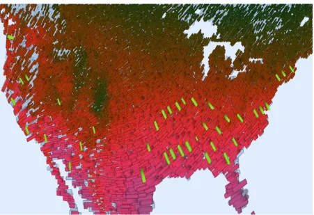
atten-Figure 1.1: A glyph-based visualization of supernova data. The color, orientation, and size of the strokes represent data attributes. The data attribute to visual feature mapping is: magnitude→color (dark blue to bright pink for low to high), flow orientation→stroke orientation, and pressure→stroke size.
tion. The magnitude of the flow is mapped to color with a perceptually balanced color ramp (dark blue to bright pink for low to high). The direction of flow is mapped to the orientation of the strokes. Pressure is mapped to the size of the strokes. A painterly visualization technique was used to attempt to add aesthetic appeal to engage attention. Though little is known about designing engaging visualizations, increasing the aesthetic merit of the visualizations shows promise as a reasonable approach to increasing engagement.
our visualizations after these characteristics [Tat02][HTER04]. However, to our knowledge, no experiments have been conducted to study how these efforts affect the observer’s aesthetic judgement of the visualizations, nor has previous research addressed whether it is possible to affect the artistic merit of a visualization.
This thesis focuses on evaluating the artistic merit of three new artistic visualizations tech-niques we created to test whether we can affect the artistic merit of visualizations. Our three painterly techniques were designed to vary visual features that have been shown to be related to aesthetics in human vision and psychophysics literature. The first technique, interpretational complexity (IC), is built in two layers, an underpainting to display broad trends, and a second layer that uses wet brush strokes to display local detail. The second technique, indication and detail (ID), transitions from high detail in areas of rapid change in the underlying data set to in-dication, or low detail, in homogeneous regions. The third technique, visual complexity (VC), varies the visual features of the individual brush strokes, like curvature, color, size, and texture (Figure 1.1 is painted in this style).
We conducted three controlled experiments to test each of our three rendering styles. Each study asked observers to rank 28 images from four categories on five dimensions: artistic merit,
pleasure, arousal, meaningfulness, and complexity. The four image categories were
ren-derings were included to provide computer-generated images with realistic content. Finally, since the visualizations were abstract, we included Abstractionist artwork.
Statistical analysis across content (real vs. abstract) and artist (Master vs. computer) re-vealed significant variations. Generally, observers preferred realist content over abstract con-tent. In some cases computer-generated images were ranked higher than Master Abstractionist artwork. For example, viewers rated computer renderings higher than Master Abstractionist artwork and viewers rated IC visualization as artistic as and more pleasing than Master Ab-stractionist artwork.
Interestingly, these three experiments showed that VC visualizations ranked lower than Master artwork in all cases. Statistical comparison across the three studies showed that VC visualization, a fairly sophisticated technique, was rated significantly lower for artistic merit and complexity than IC and ID. Including the same Master artwork in each of the three studies was meant to anchor the observers’ judgements to enable comparison across the studies. Either the viewers’ were not being consistently anchored by the Master paintings and therefore our comparison of the rendering types was being skewed by the different viewers involved in each experiment, or viewers really preferred IC and ID images over VC images.
significantly more artistic than all other image types and ID visualizations were rate signifi-cantly lower than all others. The VC visualizations were rated signifisignifi-cantly more artistic and meaningful than the ID visualizations. This variation in the rankings supports the hypothesis that the artistic merit of a visualization can be varied and possibly used to increase engagement. Four all four experiments, meaning was a strong predictor of artistic merit.
We also saw that meaning had a strong relationship with artistic merit rankings, as in our other studies. This seems a promising trend for scientific visualizations, since the expertise of the scientists making use of the visualizations presumably enhances meaning. We applied our new visualization techniques to real meteorological data and supernova data and evaluated the supernova data visualization by consulting a domain expert. We asked an astrophysicist to look at visualizations of the supernova data generated with the three new visualization techniques. His anecdotal feedback supported the meaning-aesthetics relationship. He preferred the VC technique representation because he could most effectively interpret the particle flow with this one. He also found this VC visualization to be the most aesthetically pleasing. This consulta-tion along with our four aesthetics studies strengthened our convicconsulta-tion that giving attenconsulta-tion to the aesthetic appeal of visualizations can benefit the scientific community.
1.1
Thesis Organization
Chapter 2
The Psychology of Aesthetics
Above individual taste, there is a higher judgment in man, which sustains what has general validity and overrules mere sentimental prejudice.–Color Theorist, Johannes Itten [Itt70]
Is beauty in the eye of the beholder? Philosophers discuss this question in terms of aesthetic realism versus non-realism. Aesthetic realists believe that objects possess mind-independent aesthetic properties [Zan03]. They are not arguing that personal tastes do not differ, but rather that the judgements must have realistic representational content; otherwise, how can some aesthetic judgements be better or worse than others?
removed these variations, would the judgements vary randomly, based on each subject’s pref-erences? Factor analysis of the results revealed one underlying factor. In other words, people differ from each other along a dimension of aesthetic sensitivity, which Eysenck called “good taste.”
Eysenck’s thesis is still a subject of debate. In [MCCM+03], 100 subjects were asked to rate 96 reproductions of art on four qualities: beautiful, pleasant, interesting, and original. Half of the reproductions were “High Art” (master artwork with the signature removed) and half were “Popular Art” (icons and illustrations used for industrial design). Half of each type were representational and half abstract. Results supported Eysenck’s theory of a general underlying factor.
In [Jac04] 34 students were asked to judge 49 cards with simple stimuli. Each card con-tained symmetrical patterns of one to forty-nine consistently sized black square outlines. By using simplistic stimuli, Jacobsen was attempting to avoid irrelevant associations. The number of elements on the cards and the squareness of the pattern or lack thereof were the strongest predictors for a group model. Although his group model accounts for half of the participants, Jacobsen believes that, contrary to Eysenck’s theory, individual models of his subjects’ re-sponses give a more precise account.
2.1
Characterization of Beauty
An early attempt to model beauty precisely with mathematical equations focused on two properties: order (O) and complexity (C) [Bir32]. Birkhoff proposed an aesthetic measure, M = O/C, arguing that attending to complexities induces feelings of discomfort. He applied
his theory to several classes of objects, including polygons, tiles and ornaments, vases, poetry, and melodies. He ranked objects within a class based on a unique formulation forO andCfor each class of objects. Ois the linear combination of several structural variables andCdepends on the slopes of the sides:
O = vertical symmetry + equilibrium + rotational symmetry + relation to a horizontal/vertical network - unsatisfactory form
C = the number of distinct lines containing at least one side of the polygon
3.97 4.27 4.52 6.10 6.11 9.40 8.42 3.47 5.64 2.94 3.97 4.27 4.52 6.10 6.11 9.40 8.42 3.47 5.64 2.94
Figure 2.1: 10 of Birkhoff’s 90 polygons ordered by his aesthetic measure,M. The square was ranked the most aesthetic, the heptagon tenth, the hexagon twentieth, and so forth. The red numbers below the line are weighted average rankings from Davis’s study. Davis asked 162 observers to rank these 10 polygons on preference 10(most preferred) to 1(least preferred).
system. The numbers in red are the weighted average rankings from Davis’s study. Psychobi-ologist Berlyne suggests that aesthetic value is curvilinearly related to Birkhoff’sM, peaking whenM is neither too large nor too small [Ber71]. The results of Davis’s study are in keeping with this idea.
Though Birkhoff’s model does include important components of aesthetics, it does not provide for emotional reactions from interpretation. Birkhoff himself made reference to this, when he pointed out that certain polygons might have associations not accounted for in M that could influence judgement. For example, a cross-shaped polygon may have “positive connotative associations1.” Later, Berlyne incorporated meaning, as well as complexity and order (or the related property, balance) in the model described next.
Berlyne modeled aesthetic judgement as an emotional experience [Ber71]. Viewing beau-tiful images generally evokes a feeling of pleasure. The image provides an activating stimulus and the arousal (or activation) induces pleasure. Thus, artistic value is identified with pleasure. In Figure 2.2a Berlyne’s model shows pleasure as a function of arousal. Psychologists use the term arousal to describe an activation of the brain stem and an alertness leading to increased heart rate. In this model, as arousal increases, pleasure increases until it peaks and begins to drop. A zero pleasure value corresponds to indifference and a negative pleasure value to displeasure. This model advocates moderation. Extremely high arousal leads to displeasure. Too much activity in an image could lead to an unpleasant emotional response; too little, to boredom.
1A reputed anti-Semite, Birkhoff also gave the swastika as an example of a polygon with positive connotative
Pleasure (aesthetic merit) Arousal (Activation) (a) ACTIVATION DEACTIVATION PLEASANT UNPLEASANT alert excited elated happy contented serene relaxed calm tense nervous stressed upset sad depressed lethargic fatigued (b)
Figure 2.2: Aesthetic and emotional models. a) Berlyne’s aesthetic model. Aesthetics stimulate arousal and pleasure is a function of arousal. b) Barrett and Russell’s affective model. Emotions vary on bipolar scales, activation and pleasure.
Arousal is affected by ecological, psychophysical, and collative properties of the stimuli [Ber71]. Content can elicit ecological responses by association with conditions conducive or threatening to survival. Since visualizations are predominantly abstract in content, the chophysical and collative properties are more promising for our purposes. The visual psy-chophysical variables, luminance, hue, size, and balance of visual form can be used to influence arousal. Collative properties are structural properties. A viewer must collate or compare in-formation within the stimulus or from more than one stimulus to judge these features. Berlyne lists the following collative properties:
• Arousal-increasing devices: complexity, novelty, conflict, expectations, ambiguity and multiple meaning, and instability.
Research on human emotion has produced the emotional circumplex in Figure 2.2b [BR99]. The axes are the same as those used in Berlyne’s model. Here, however, no dependence is im-plied. The affective model offers a tool for specifying a wide variety of emotional states. Though the relationship between Berlyne’s model and the emotional circumplex imply that aesthetic judgement is strictly emotionally-based, research by psychologists Baltissen and Os-termann points to the importance of cognitive components as well [BO98]. In their study, 120 subjects were asked to evaluate twenty-four slides of paintings and twenty-three slides of emo-tionally provocative photographs on nine scales: simple-complex, uninteresting-interesting, emotional-unemotional, unpleasant-pleasant, unfamiliar-familiar, not at all meaningful-very meaningful, warm-cold, dominant-submissive, arousing-calm.
BIRKHOFF BERLYNE BALTISSEN & OSTERMANN Complexity Order symmetry balance . . . Ecological Psychophysical hue luminance size
balance of visual form Collative Arousal-increasing devices complexity novelty conflict expectations Arousal-moderating devices familiarity dominance grouping & pattern
Congnitve simple-complex uninteresting-interesting
not at all meaningful-very meaningful unfamiliar-familiar Emotional emotional-nonemotional unpleasant-pleasant warm-cold dominant-submissive arousing-calm ambiguity & multiple meaning instability expectations exemption from inhibition & exertion
Figure 2.3: A summary of the characteristics of aesthetic judgement, according to Birkhoff, Berlyne, Baltissen and Ostermann.
Chapter 3
Aesthetic Computer Graphics
Interest in aesthetics in computer graphics has manifested itself in an area called nonphotore-alistic rendering (NPR). Relaxing the constraints of photorealism can produce more informa-tive images. NPR uses artistic techniques to emphasize features, expose subtleties, and omit distracting extraneous information. Graphics such as architectural drawings and medical illus-trations are sometimes better expressed with sketches than with photorealistic images. NPR provides ideas for artistic techniques to apply to visual features.
3.1
Simulation
was desired. The level of detail drawn was then reduced as the distance from the line seg-ments increased. Figure 3.1 shows a house drawn with full detail in the upper left corner. The detail segments drawn by the user are shown in the lower left corner. Finally, the resulting indication/detail effect house is drawn on the right.
Figure 3.1: An example of the indication/detail technique drawn with [WS94]. The house is drawn with full detail in the upper left corner. In the house on the lower left corner, line segments drawn by a user show where the most detail was desired. The final sketch on the right has varied levels of detail.
differently according to their complexity.
Other systems model different media, such as [TFN99], which describes a colored pencil drawing system. Their volume graphics approach models the interaction between the pencil lead and the paper. The pencil sketching program in [SB00] models the hardness and shape of the pencil tip, the paper texture, and interaction with erasers and blenders. Mosaicing was treated as a packing problem in [KP02]. Flatly colored containers were used to specify the major shapes for the desired mosaic. Then, an image database was used to fill each container with small images of colors closely matching the container color. [CPE92] modeled oil paint particles and a canvas as a set of cells, like an ice tray, where paint could flow between cells. [HS93] used texture maps creatively to simulate various brush stroke styles, such as spray paint. [CAS+97] impressively modeled water-color painting with a three-layer system (under, on, and above the surface of the paper). As water and pigment were moved, the layers modeled the movement of the liquid and the transfer of the pigment to paper. [HJO+01] created images by analogy. Given images A, A’, and B it produces image B’ such that A is to A’ as B is to B’. Image A might be a graphical model of a scene and A’ a watercolorization of A. B could be a photograph. The system could be trained with input like A and A’ to create B’, a watercolorization of B.
allowed expert users to paint stunning Sumi-e artwork, a Japanese style that uses a few black strokes on a light colored paper. The system modeled bristles, strokes, dip (amount of ink on the brush), and paper objects, interpolating position and stroke width between control points on spline-based strokes drawn with anti-aliased quadrilaterals. [Pha91] facilitated Sumi-e strokes with a more intuitive interface.
3.2
Visualization
Scientists in visualization are using ideas from NPR to inspire new visualization techniques. Artistic techniques, such as using abstraction to eliminate unimportant distractions, and sharp-ening details to draw attention to important areas, can help to convey information more effec-tively. Also, application of artistic techniques may create more aesthetically pleasing images which may engage the viewer’s attention and encourage extended exploration. One strong influence on the nonphotorealistic visualization work in our lab is David Laidlaw’s work [LAK+98] [KML99] [Lai01]. Examples are shown in Figures 3.2 and 3.3 and described below.
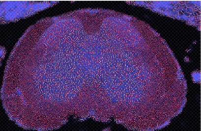
Figure 3.2 is the visualization of a mouse spinal cord [LAK+98]. The butterfly shape, the gray brain matter, is surrounded by the white matter. The elliptical shapes have a striped texture, a feature mapped to the rate of diffusion. To scientists studying the effects of En-cephalomyelitis, a disease which attacks the white matter, the differentiation between white and gray matter is important and the visualization of multiple tensor image attributes in the same image can help them understand the relationship between these factors and the progress of the disease. The authors use the analogy of underpainting and brush strokes. The under-painting is a luminance image showing the overall structure of the anatomy. The brush strokes are “painted” on top of this and the visual features such as shape, color, transparency, orien-tation, and texture vary, just as in NPR painting programs. But here the visual features are representing the diffusion tensor data.
Figure 3.2: Diffusion tensor data from a healthy mouse spinal cord visualization from Laidlaw et al., visualizing anatomical image (underpainting lightness), ratio of largest to smallest eigenvalue (stroke length and width and transparency), principle direction in the horizontal plane (stroke direction), principle direction in the vertical plane (stroke red saturation), and magnitude diffusion rate (stroke texture frequency).
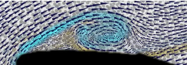
Figure 3.3: Experimental flow past an airfoil visualization from Kirby et al. visualizing velocity ( arrow direction), speed (arrow area), vorticity (underpainting/ellipse color (blue=cw, yellow=ccw) and ellipse texture contrast), diffusion rate (log(ellipse radii)), divergence (ellipse area), and shear (ellipse eccentricity).
Interrante noted that the innate appeal of natural textures, such as weaving, honey combs, and woven cloth, lends them well to displaying multiple attributes [Int00]. Other advantages include their intrinsic variety and how humans receive them with less stress than other more traditional texture visualization patterns. Figure 3.4 visualizes US agricultural data with a weaving texture, a pebble texture, and color.
Figure 3.4: Interrante’s agricultural map shows farms as a percentage of land (weaving texture), percent change in number of farms (pebble texture), and average age of farm operators (color).
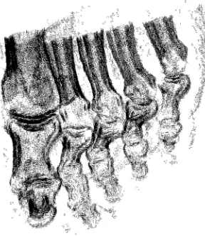
Figure 3.5: Stippled volume visualization with interior enhancement and silhouette curves created by Lu et al.
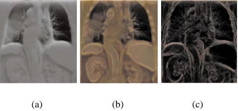
surface of growing tumors [GR02]. This property is important for cancer researchers to see, since the growth of tumors is not well understood. Sparsely placed points create visual fuzzi-ness, conveying uncertainty intuitively. Lu et al. stipple-renders volumes, as well, using the more traditional black pen-and-ink stippling. Stipples are placed and sized to control the local and overall tone [LME+02]. Figure 3.5 shows a stippled foot volume rendered by this system. Rheingans and Ebert demonstrated another application of NPR to volume visualization. In their work they applied artistic techniques to volume visualization so that various aspects could be discerned more readily in different renditions [ER00] [RE01]. Figure 3.6a shows the standard mapping of a CT scan of an abdomen. Silhouette and boundary enhancements achieved by varying opacity depending on gradient magnitude, as in Figure 3.6b reveal the internal structure of the organs. Figure 3.6c, an outline sketch of the structure, was created by decreasing the opacity of features that were oriented towards the viewer.
(a) (b) (c)
Figure 3.6: Abdominal CT scans: (a) standard CT visualization; (b) silhouette and boundary enhancements; (c) colored outline sketch techniques;
appearance to represent the elements’ attribute values. The result is a nonphotorealistic visual-ization of information stored in the dataset.
In Figure 3.7, a large multi-dimensional weather dataset is visualized with this system. In this image, temperature is mapped to color (dark blue to bright pink for cold to hot), wind speed is mapped to coverage (low to high coverage for weak to strong), pressure is mapped to stroke size (small to large for low to high), wet day frequency is mapped to orientation (flat to upright for light to heavy), and precipitation is mapped to bright highlight strokes on a top layer.
Chapter 4
Visualizations Designed for Study
The models of aesthetic judgement suggest a number of choices of visual features that could be varied for our studies. We chose ones that made use of some existing computer graphics techniques and lent themselves well to visualization. The three visual qualities we are calling interpretational complexity (IC), indication and detail (ID), and visual complexity (VC), each extend our basic painterly visualization technique in distinct fashions. This chapter explains what we mean by these terms and discusses our hypotheses about the aesthetic properties they could affect. We reserve the implementation details of the preprocessing and the visualization algorithms for Chapters 5 and 6.
4.1
Introducing Interpretational Complexity
what we are calling interpretational complexity, since the information provided by additional layers requires interpretation. Observers with some formal training in art theory commented that our original NPV images were not very complex, because they were not built up in lay-ers like paintings. According to Berlyne’s model, the level of complexity affects arousal and arousal affects pleasure (see Figure 2.2a). Since complexity is believed to play this role in aesthetic judgement, the first quality we chose to investigate was interpretational complexity, a layering approach.
Several nonphotorealistic visualization applications have made use of underpainting lay-ers. In [LAK+98], the luminance of the underpainting defined anatomical boundaries in the mouse spinal cord. The color of the underpainting in [KML99] reinforced the vorticity of flow also shown by ellipse sheer. In [Tat02] the underpainting provided glyph orientation and size information where the coverage was low in the top layer. Several nonphotorealistic painting applications have painted strokes in layers creating and sorting a list of strokes, then painting the largest strokes first, so that the top layer held the smallest strokes [Her98, SY00, Her02].
We wanted our underpainting to contrast in display style and level of detail from the top layer, since extracting contrast reinforces attention [Ram00]. Dissimilar juxtaposed stimuli arouse conflict, an arousal-increasing property [Ber71]. This explains its link to attention in terms of Berlyne’s model. We wondered if the contrast would increase the perception of com-plexity and conflict and therefore the arousal, or perhaps the simplifying influence of abstrac-tion of detail would be stronger. We were also interested to see if more than one layer would imply multiple layers of meaning, giving the visualizations more meaningfulness.
in [Tat02] also had three layers, differentiable by color, but not by style. The IC layers are designed to convey a different level of detail, similar to the layers of paint in real oil paintings. The underpainting provides a lower level of detail than the highly detailed top level. The underpainting is a colored canvas, like that of an oil painting, with sparse faint strokes. The data was filtered to detect regions of rapid change. The filtering process is explained in Chapter 5. Then distinct strokes were laid on a second layer to provide detail in rapid change areas, but not elsewhere so that the underpainting is not fully covered.
4.2
Introducing Indication and Detail
An artistic technique called indication provides more details in areas of interest and less details in homogeneous areas and a gradual transition between the two, as demonstrated in the final sketch in Figure 3.1. Note the refined detail on objects of highly varying texture and normal vector orientation, such as the windows and doors. The detail gradually decreases on the surrounds, leaving spaces of unmarked paper to implicitly represent the continuation of bricks. The front face of the house does not require as much detail to be accurately interpreted as a plane of consistent material. This combination of detail and abstraction can be used to direct attention to areas of importance in the image and reduce extraneous distractions. Research in human vision has used devices to track eye movements of people viewing paintings [Woo02, HVSC04]. Results show viewers fixating on areas of high detail, such as faces in paintings.
areas will allow other areas to be visually dominant, resolving the conflict created by compet-ing stimuli. Second, familiarity, in this sense corresponds roughly to the artistic concept of “unity-in-variety.” Short-term familiarity develops when a visual element appears, disappears, and reappears in an image after a short hiatus. Overly repetitive visual displays may be too simplistic to be engaging. But variation, repeating patterns that are alike in one respect and varying in another, is a powerful aesthetic device, according to Berlyne. Would dominance and familiarity act as arousal-moderating properties or would the inherent variety from one detail area to the next and within the detailed areas themselves counteract this? Would suppressing detail with abstraction reduce the complexity of the image or would adding variation in the amount of detail increase the complexity?
4.3
Introducing Visual Complexity
The close inspection of a painting by a master Impressionist artist reveals a great deal of vari-ation amongst the individual brush strokes. There is often varivari-ation in the color and thickness of paint even within one brush stroke. Different brushes produce a different footprint. Some strokes are straight, while others are curved. Differences such as these contribute to the com-plexity of the painting. This comcom-plexity differs from the interpretational comcom-plexity described in Section 4.1, in that it entails local visual variations, as opposed to a global trend. Psy-chologists consistently cite complexity as one of the components affecting the judgement of aesthetics. In two patterns with the same number of visual elements, the one with the most similarity among its elements will be considered less visually complex [Ber71]. Thus, we decided to study visual complexity, as well as interpretational complexity.
Since it is believed that complexity affects arousal, which, in turn, affects pleasure, we won-dered if the added complexity would increase the reported pleasure or if it would become too complex, making pleasure decrease. We also wondered if the changes might affect the mean-ingfulness of the visualizations. Simulating stroke variations, the strokes might appear more like real paint being applied to a canvas. The complex strokes might appear more expressive than less variable strokes.
To inject visual complexity, we introduced new stroke properties that correspond to observ-able characteristics of brush strokes in master Impressionist paintings:
2. Curvature. We used Bezier-curves to allow up to two curves in a stroke.
3. Stroke shape. We introduced some new texture maps to give the strokes different foot-prints.
4. Luminance and orientation contrast. We varied the luminance and orientation of some strokes to contrast with the surrounding ones.
5. Aspect ratio. We varied at width to length ratio of some strokes, as opposed to maintain-ing the same ratio across different sizes.
6. Color variegation. We added variegated margins to vary the color within a stroke.
Chapter 5
Data Preprocessing
The data preprocessing for our visualization techniques has two main components. They are designed to distinguish regions of rapid change from homogenous regions. Visualizing these regions is the central idea of the ID and IC styles. They are identified using mesh simplifica-tion followed by spatial analysis with Voronoi regions. This chapter discusses the algorithms involved in the preprocessing.
such as RGB triples, surface normals, and texture coordinates. A multidimensional data set can be thought of as a mesh where each element is a vertex, and an element’s attributes are surface properties at that vertex. From this point of view, the feature preserving mesh simplifi-cation can be applied to the data set [WH01]. After simplifisimplifi-cation, the homogeneous regions, like the plateaus of our example, are then characterized by sparse mesh vertices, while in re-gions of rapid change (craggy mountain) mesh vertices are dense. It remains to measure the denseness of the mesh vertices. This problem can be solved with a nearest point Voronoi dia-gram. A (nearest point) Voronoi diagram is a partitioning of space around a set,S, ofn sites, S =p1, ..., pn, intonregions, such that each point inside regioni[1, n]is closer to sitepithan
any of the other n−1sites. Thus, since the size of the Voronoi region decreases as density increases, the Voronoi diagram of our reduced mesh identifies regions of rapid change. The following sections describe how these algorithms work.
5.1
Detail Preserving Mesh Simplification
Qs-lim uses iterative vertex contraction that assigns contraction cost with a quadric error metric. Studies by [PMS98] and [WH01], showed good accuracy and efficiency for this method. Also, it handles handles surface properties beyond geometry (RGB values, texture coordinates, and surface normals) so that it can be used for multidimensional data sets. In fact, work by Wal-ter and Healey showed that it could be extended to even more dimensions by using principal component analysis [WH01].
This algorithm contracts vertices, while minimizing a quadric error metric. Each vi in the
mesh is coincident with a set of triangles. In this schema, the planes in which these triangles lie are associated with vi. A pair of vertices, v1 and v2, that either form an edge v1v2 or
whose distance apart is less than some constant, > 0, is contracted by replacing them with one vertex, v0. The error assigned to this contraction is calculated as the sum of the squared distances from each plane associated withv1andv2 tov0. The formula for the squared distance from a point to a plane can be written as an expression with three terms, so that the coefficients of these terms are sufficient to calculate the squared distance to a given point. These triplets are summed to calculate the error. Specifically, if the equation of a plane in R
3 is written as
nTv +d = 0, wheren= [a, b, c]T is the unit normal vector,v = [x, y, z]T anddis a constant, then the square distance from a pointv0 = [x0, y0, z0]T to the plane is:1
D2(v0) = (nTv0+d)2 = (ax0+by0+cz0+d)2 (5.1)
1When surface color, normals, and texture coordinates are included, the mesh vertices are given as ordered
n-tuples withn >3, then the square of the point to plane distances are calculated inR
SincenTv0 =v0Tn, Equation 5.1 can be rewritten as:
D2(v0) = v0TAv0+ 2(dn)Tv0 +d2 (5.2)
whereA=nnT is the outer product matrix:
nnT =
a2 ab ac
ab b2 bc ac bc c2
The triplet (A, dn, d2) from Equation 5.2 is the one used to calculated the error. A quadric function,Qi(v), is defined as the sum of the distances fromv to each of the planes associated
with vertexvi.
Qi(v) = D2i(v) =
X
j
(Aj, djnj, dj2), (5.3)
wherej varies over all indices of planes associated withvi.Now, we can say that the quadric
error metric, the cost of contracting edgev1, v2to pointv0, is written asQ(v0)where
Q(v0) =Q1(v0) +Q2(v0) (5.4)
Q(v0)can be minimized by setting the partial derivatives to zero and solving for(x, y, z), the optimal position forv0. Finally, qslim’s overall algorithm is as follows:
2. Order the pairs on cost.
3. Repeat until the desired approximation is found:
(a) Contract the least cost pair,(vi, vj), replacing all instances ofvi andvjwithvi0, and
all faces that no longer have three edges. (b) Update the costs of all pairs associated withv0i.
To use qslim, we triangulated our data sets, set the surface properties to data attributes, and chose a desired face count. Figure 5.1a shows triangulated data points of a weather data set from southern Asia used as input to qslim. In the output (Figure 5.1b) the face count is reduced to about 3% of the original face count. The data attributes, radiation, wet day frequency, and
diurnal temperature range were set as surface properties, and used to determine the quadric
error along with thexandycoordinate information.
(a) (b)
5.2
Voronoi Diagrams
Once the mesh has been reduced, we want to find the Voronoi regions of the resulting mesh vertices. Finding Voronoi regions is sometimes referred to as the Post Office Problem. If each site is a post office, assuming residents use the post office closest to home, a Voronoi diagram of local post offices sites carves a map into customer service zones. Anyone who lives in region iwill use post office sitepi. Voronoi diagrams have many practical applications, such as cluster
analysis, scheduling record access, robot collision detection for stationary objects, modeling crystal growth, and image processing to locate medial axes [Aur91]. Voronoi diagrams can solve our problem because, denser sites result in smaller Voronoi regions, so the area of a region gives a good measure of the local variability of the underlying data.
Since a Voronoi region is the intersection of all of the half-planes formed by then−1lines dividing sitepi from the othern−1sites, the Post Office Problem can be solved by computing
this intersection for each site. Much more efficient solutions exist, such as Fortune’s sweep line method and Quick Hull. Both build the diagram in O(nlogn)[For87, dBvKOS00, BDH93]. We used the latter, but we’ll first describe the former since it provides some useful terms for discussing the diagrams.
there is a parabola associated with each site. The sweep line method keeps track of the beach line, each point of which is on the lowest such parabola at that x-coordinate. So the beach line is a sequence of parabolic arcs.
p’s parabola changes shape as the directrix shifts down, and so, aslsweeps, the beach line’s shape changes too. On the beach line, the intersection of a pair of parabolas generated by sites pi andpj is equidistant from pi and pj, so it is on a Voronoi region edge. As the beach line
changes, this meeting point traces out a Voronoi edge. Eventually, a parabola arc, α, formed bypα may disappear from the beach line, squeezed out by its left and right neighboring arcs,
α0 andα00. The point,q, at whichα0andα00meet is a Voronoi vertex, one of the corners ofpα’s
polygonal Voronoi region. Now,pα’s region is completely formed. This is called a circle event,
since there is a circle centered atq, passing throughpαand it’s two former beach line neighbor
sites, pα0 and pα00, which is tangent to the sweep line and contains none of the other n −3
sites inS. The existence of such a circle (passing through three sites, and empty otherwise) is another way of characterizing a Voronoi vertex. The sweep line continues moving down, with a new parabola being added to the line each time a new site surpasses the line, until the line passes below all the sites.
which contains all the points, and then it derives a Voronoi diagram ofSfrom this convex hull. Quick Hull efficiently finds a convex hull by recursively subdividing the space. We used an excellent available implementation of Quick Hull/Brown, called qhull, found at the University of Minnesota’s Geometry Center, to find our Voronoi diagrams [BDH93, BDH96, Bro79].
Quick Hull, presented by Barber et al., partitions the space with a triangle to rapidly elimi-nate many of the points from consideration, recursively applying this technique to the remain-ing subsets of points.2 InR
2 the convex hull is a convex polygon. The Quick Hull algorithm
for finding the set of edges,conv, that make up the convex hull of a set of points in a plane is adapted from pseudocode by Pham as follows [Pha01]:
1. Find the right most point, A, and left most point, B, (points known to be part of the convex hull), and addAB toconv.
2. QHULL(P OIN T SET1,A,B), whereP OIN T SET1 is the set of points to the right of oriented line segmentAB. A pointp= (x, y)is said to be to the right of oriented line segmentp0p1, wherep0 = (x0, y0)andp1 = (x1, y1), if(y−y0)(x1−x0)−(x−x0)(y1− y0)>0, a test derived from the determinant formulation of the area of a triangle.
3. QHULL(P OIN T SET2,B,A), whereP OIN T SET2 is the set of points to the right of oriented line segmentBA.
where QHULL(P OIN T SET,E,F ) does the following:
1. IfP OIN T SET is empty, edgeEF belongs inconv. Do nothing. Else, do steps 2-6
2This algorithm can be applied to points in R
n for anyn≥2. For simplicity it’s described here forn = 2.
2. RemoveEF fromconv
3. Find the point,CP OIN T SET, farthest fromEF, and addECandCF toconv.
4. Partition the remaining points inP OIN T SET into three subsets,S0,S1, andS2:
(a) S0: points inside the triangle. (The points inS0can be discarded immediately, since they are interior toEF C and thus, clearly not part ofconv.)
(b) S1: points to the right of the oriented line segmentEC (c) S2: points to the right of oriented line segmentCF.
5. QHULL(S1,E,C).
6. QHULL(S2,C,F).
So, Quick Hull finds a convex hull. Now we can use a convex hull to find a Voronoi diagram. Brown’s algorithm relies on an inversion transform from the input set of n planar points, S, to a set of points, S0 on a sphere [Bro79]. Inversion is then performed again to determine the Voronoi points and the edges connecting them. The inversion transform of a polar coordinate, p = (R, θ,Φ) with inversion circle of radius one centered at the origin is defined as(R, θ,Φ) →(1/R, θ,Φ). This algorithm can find the nearest point Voronoi diagram or the farthest point Voronoi diagram, which is also a subdivision of space into regions, but each point in regioni is further frompi than any other point in S. However, our application
only requires the nearest point Voronoi diagram.
center of inversion and vice versa. Second, the interior of the sphere transforms to one of the spaces determined by that plane and the exterior of the sphere transforms to the other half-space. Third, application of inversion twice yields the same point. Brown gives the following Voronoi algorithm for a setS ofnpoints in the planez = 0:
1. Choose a point,p, not in the planez = 0and choose a radius of inversion,r > 0, and then invert thenpoints ofS with respect to the pointpand radiusr. The result is a new set ofnpoints,S0.
2. SinceS is a planar set and pis not in the plane z = 0, S0 are all mapped to a sphere. Construct the convex hull of the points inS0(Every point inS0will be part of the convex hull).
3. Each triangular face,Fi, of the convex hull lies in a plane. If the half-space,Hi, formed
by this plane and containing the convex hull also contains p, this face corresponds to a nearest point Voronoi vertex (Whereas, a half-space, Hj, formed by a face’s plane,
4. The edges of the convex hull inS0 map to the Voronoi edges. Each edge between a pair of faces Fi andFj of the convex hull ofS0, mapped to a pair of nearest point Voronoi
vertices, corresponds to an edge of the Voronoi diagram of the points inS. This follows from the fact that the circles associated withFi andFj both pass through the same two
points inS, a characterization of an edge in a Voronoi diagram. An edge between a face, Fi, that maps to a nearest point Voronoi vertex and a face, Fj, that maps to a farthest
point Voronoi vertex is a ray in the Voronoi diagram.
So qhull uses the Quick Hull/Brown method to determine the nearest Voronoi diagram of a set of points. Recall that our purpose of finding the Voronoi diagram was to locate dense and sparse areas in the mesh simplified data using the areas of the Voronoi regions. Each Voronoi regions defined as a set of line segments, is a convex polygons, so given themcounterclockwise ordered Voronoi vertices of a region,(x1, y1),(x2, y2), ...,(xm, ym), its area can be calculated
using a determinant:
Area= 1/2∗
x1 y1
x2 y2 ... ...
xm ym
x1 y1
(5.5)
with evenly spaced dummy points and adding these sites to the input set finds a reasonable approximation of these boundary regions.
To use qhull on our data we used the results from qslim as input sites. Our mesh simplified Asian weather example is pictured again in Figure 5.2a to demonstrate how the associated Voronoi region sizes, shown in Figure 5.2b, are correlated with the density of the input mesh. Because the input attributes, radiation, wet day frequency, and diurnal temperature range, vary rapidly in the Himalayas, the Voronoi regions are much smaller in these mountainous areas.
(a) (b)
Chapter 6
Visualization Algorithms
Our three visualization techniques all have painted regions with strokes varying in color, size, and orientation based on underlying data values. Also, texture mapping is used for all. This chapter discusses these common algorithms first, followed by an exposition of each technique. IC, ID, and VC use the same painting algorithm used in [Tat02] and [HTER04] to lay strokes in a random manner while controlling coverage. As regionSk is being painted,
cover-age is controlled by keeping track of the current covercover-age, c, a percentage of the total area of Sk. A stroke is centered at a randomly chosen unpainted position withinSk. It is transformed
and scan converted, and then placed there or rejected based on whether there is too much un-desired overlap. Unun-desired overlap occurs when too much of a stroke falls outside Sk or too
met. The output is a list of the accepted strokes and their properties. The algorithm for creating a stroke list with coverageVkof regionSkis:
whilec < Vkdo
Randomly pick an unpainted positionpwithinSk
Identify data elementeiassociated withp
Set size and orientation of a new stroke,s, based onei
Centersatpand scan convert
Compute amount ofsoutside ofSk,outside
Compute amount ofsoverlapping existing strokes,overlap ifoutsideoroverlapare too large then
Shrinksuntil it fits or it cannot be shrunk end if
ifsfits then
add to stroke list and updatec end if
end while
Each stroke in the list is drawn as a textured rectangle. The rectangle is textured by clamp-ing each corner of a rectangular texture to correspondclamp-ing corners of the stroke and modulatclamp-ing the stroke’s color with the texture’s color. Our applications specify colors as RGBA where R, G, and B are the red, green, and blue components of the RGB color cube and A, alpha, controls the transparency (0 to 1 for transparent to opaque). We specify a uniform color,(Rr, Gr, Br, Ar),
for each stroke rectangle, r. A texture map, t, specifies a color, (Rit, Git, Bit, Ait), at each
point,pi, of the texture. When texture, t, is mapped tor, the resulting color,(Ri, Gi, Bi, Ai),
at each point,pi, of the textured stroke is computed as:
Ri = RrRit
Bi = BrBit
Ai = ArAit
We generated stroke texture maps by using Corel Painter, a commercial software. It simulated paint well, though it is somewhat limited, not providing enough variety for our purposes, so we also tried scanning and photographing acrylic painted strokes and strokes drawn with marker. Scanned strokes on canvas paper gave good results. In fact, we used JPEG files generated from both of these approaches, processing them as follows:
1. Crop, resize, and convert to greyscale (Rit = Git = Bit for every point,pi). By setting
the RGB components to grey, the modulation affects the brightness, but not the hue. Areas with values close to white, (1,1,1), remain close to the original color, while those close to black, (0,0,0), are darker.
2. Color the background green, so that the stroke can be easily extracted from the back-ground. Texture maps are rectangular, but perfectly rectangular strokes would look un-natural. There is generally a margin of background around the stroke after it is cropped.
3. Copy the JPEG file to a texture map file as a list of (Rit, Git, Bit, Ait)values for each
point,pi. Let Ait = 1, unless the color is green, in which case we setAit = 0, to make
the background points transparent.
6.1
The IC Algorithm
(a) (b) (c)
Figure 6.1: IC stroke texture examples: a) hand-painted dry-brush acrylic paint strokes, b) hand-painted wet-brush acrylic paint strokes, and c) wet-brush strokes generated by Corel Painter.
For interpretational complexity (IC), we wanted to build two layers, each with a distinct style. Master artists often use an underpainting to broadly define forms. The underpainting sometimes peeks through higher detailed layers, varying in color. The strokes in the under-painting are difficult to discern and these patches of underunder-painting appear where there is not a great deal of change or detail in the image. We used the Voronoi regions to determine where the underpainting should show and painted the layers as follows:
1. Use the Voronoi regions to partition the data into setsS0 andS1. If Voronoi region area exceeds threshold, a percentage of the largest Voronoi region area, place inS0, else, place inS1.
2. TileS0 with colored canvas texture to establish the broad color changes of the under-painting. The tiles are smooth shaded with a data sample determining the color at each corner.
4. Texture strokes inS0 with a somewhat dry brush. These strokes will be faint since some of the canvas will show through (Figure 6.1a).
5. PaintS1 with our painting algorithm as one (possibly disconnected) set with coverage, V1 = 1.
6. Texture strokes inS1 with strokes like those in Figures 6.1b and 6.1c, where the brush was freshly dipped in wet paint to contrast with the dryer strokes inS0.
Figure 6.2 demonstrates the IC process.
(a) (b) (c)
Figure 6.2: The process of creating layers for IC: a) Partition the space into setsS0(dark) andS1(light) based on Voronoi region size b) Paint layerS0, thenS1(shown with Voronoi regions overlaid) c) Render the results.
6.2
The ID Algorithm
Figure 6.3: This tapestry design by Alphonse Mucha demonstrates the use of indication and detail. Watercolor and colored pencil copy by Laura Tateosian.
variable regions, to cover homogenous regions with matte colors and sparse subtle strokes, and to use partial strokes to transition between the two kinds of regions. To implement this plan, two initial questions needed to be addressed:
1. What could be perceived as a “partial” or “subtle” stroke? How could our basic painterly visualization technique be used to express these linguistic nuances?
2. How could the three types of regions be made coherent, given the matte style for the low detail regions? How could the strokes transition smoothly into these textureless regions?
colors and outlines to define objects. Outlines are useful for our first problem, because they can define a level of completeness; they can be a closed or open curves, or they can be missing altogether. These distinctions could provide an intuitive hierarchy for full, partial, and subtle strokes. The texture of the leaves and flowers in Figure 6.3 is altered from the natural texture; i.e., the leaves appear as smooth blocks of solid color. Stylization such as this could help with the second problem. If the strokes are solid blocks of color, the transition from strokes to matte regions could appear less jarring. To steer our basic style in this direction, stylized, outlined strokes were used. We drew stroke shapes outlined with a Sharpie marker, scanned them, and computed stroke-shaped texture maps like those used in Figure 6.4.
(a) (b) (c) (d)
Figure 6.4: ID stroke textures examples: a) no outline, b) partial outline, c) monotone with full outlines, and d) variegated with full outlines and a center vein.
To create our stylized visualizations, we use Voronoi regions to partition the space and then paint the regions. Here is our algorithm:
1. Place each Voronoi region in setS0, S1, orS2 based onthreshold, a percentage of the largest Voronoi region as follows:
(a) S0: regions with area at leastthreshold
(c) S2: regions with area less thanthresholdwith no neighboring regions inS0
2. Render each Voronoi region inS0 with smooth shading, setting the color at each Voronoi vertex based on the underlying data at that point.
3. PaintS0with one stroke at the middle of each region and one at each vertex.
4. Texture strokes inS0 with texture maps that have no outline (Figure 6.4a).
5. PaintS1 andS2 with our painting algorithm, setting coverage ofS1 toV1 and coverage ofS2 toV2, with0V1 <1andV2 = 1.
6. Texture strokes inS1 with texture maps that have partial outlines (Figure 6.4b).
7. For strokes inS2, check the local variability of the attribute mapped to color to further partitionS2 as follows:
(a) Rotate the stroke based on the value of the underlying data sample mapped to ori-entation.
(b) Sample the data 14w from the center of the stroke of widthw to get flank colors,
(R1, G1, B1)and(R2, G2, B2).
With this design, the stroke count increases fromS0toS1and again fromS1toS2. The shift in the outline of the stroke textures reinforces this gradual increase in level of detail. Figure 6.5 shows an example.
(a) (b) (c)
Figure 6.5: Generating the gradual increase in detail for the ID algorithm: a) Partition the space into setsS0,S1, andS2(dark to light) b) Paint each region (shown with Voronoi regions overlaid) c) Render the results.
6.3
The VC Algorithm
(a) (b)
Figure 6.6: Van Gogh paintings that suggested visual properties to vary in our VC technique: a) Wheatfield with Crows, July 1890; b) Another Van Gogh in the wheatfield series (Wheatfield, June 1888)
1. A variety of brushes may have been used, producing different stroke shapes.
2. The paint color often varies within one stroke.
3. Some strokes have curvature.
4. The paint thickness varies, sometimes dramatically within the same stroke, depending on how the brush pushed the paint.
5. Some strokes are a great deal longer than the rest, like those in the foreground in Fig-ure 6.6b.
This discussion was useful in confirming some approaches we had been considering and it also yielded some new ideas. Each of the properties we implemented corresponds to one of the above points. The components are introduced in Figure 6.7. Our VC algorithm puts every valid data element in region S0 and uses our painting algorithm with coverage, V0 = 1, to create a list of strokes, varying the stroke properties as the list is created. The details of the VC components are described below.
1. Varied stroke contours 2. Variegation 3. Curved strokes
4. Embossed strokes 5. Varied aspect ratio 6. Contrast strokes
Figure 6.7: This image created with our VC algorithm, shows examples of each of the new visual features we implemented.
1. Varied stroke contours. As discussed above, we hand painted and scanned strokes to make the texture maps, which introduced more variability to the footprint of the stroke, which previously had been essentially rectangular. For example some of the strokes have a rounded end, while others are angular (Figure 6.7.
(a) Sample the data at the center of the stroke(x, y) to choose primary stroke color, C = (R, G, B)and dimensions, length,l, by width,w.
(b) Choose widths,w1 andw2, randomly such that0≤w1, w2 < 18w(small relative to the desired overall stroke width).
(c) Choose the color components ofC1andC2, (R1,G1,B1,R2,G2, andB2) randomly such that they are in a small interval around the corresponding components ofC. (d) Drawqcentered on(x, y)with length,l, widthw−(w1+w2), and colorC. (e) Drawq1 next toqwith lengthl, widthw1, and colorC1.
(f) Drawq2 on the other side ofqwith lengthl, widthw2, and colorC2.
This simulates different paint colors getting pushed to the margins of a stroke as often occurs when the brush has residual paint from a previous dip. Initially, we implemented this by choosing colors based on data samples near the margins (as we did for our two-tone ID strokes), but we found that this did not reliably increase the complexity of the strokes. Only a very small percentage of the data may vary rapidly enough to result in a perceptible variegation; whereas, the random color assignment provides a reliable variation.
initial goal was more like the B-spline curved strokes Hertzmann used in [Her98] to cre-ate painterly renderings of source images. His strokes were anchored at a control point and colored based on a sample at this point. Then the angle of the luminance gradient and a constant dependent on the stroke size were used to place the rest of the (often more than three other) control points. Our approach is similar, though our basic curve is a B´ezier and we limit our control point count to four, yielding at most two concavities. The configuration of a curve is controlled by the data attribute mapped to orientation. We find the data values at three sample points,s0,s1, ands2, and compute the associated orientations. These orientation values dictate the control point positions. Specifically, we place control points,A, B, C, and D, based on the three data samples, as described here: s0 (a) s1 s2 θ0 (b) θ1 θ0 θ22 (c) A B D C d1 d2 d (d)
Figure 6.8: Placing the four B´ezier control points: a) Get data sample at center point,s0. b) Rotate stroke byθ0 and get sample points,s1ands2. c) Place control points,A,B,C, andDso that the orientation ofBCisθ0, the orientation ofABisθ1, and the orientation ofCDisθ2. d) IfM AX{d1, d2}is large, draw the stroke as a curve.
(a) Sample the orientation,θ0, at the center of the stroke,s0 (Figures 6.8a).
This seemed a good choice, since it is consistent with how the rectangular strokes are colored and size, and though the stroke may not pass through this sample point, both the curve and s0 will be in the convex hull of the control points, so the curve will either pass throughs0 or reasonably close tos0.
(c) Rotate the stroke byθ0.
(d) Take samples at, s1 and s2, 14l from the ends of the stroke of length l, yielding orientationsθ1 andθ2, respectively (Figure 6.8b).
(e) PlaceB andCso that line segmentBC has orientationθ0.
(f) Place Aso that AB has orientation θ1 andD so thatCD has orientationθ2 (Fig-ure 6.8c). Since B´ezier curves are approximating, not interpolating, the curve may not pass throughBandC, but will be pulled in their direction.
In the Master paintings we observed, neither were all strokes straight, nor were they all curved. Similarly, not all of our strokes are curved. Curved strokes are drawn only where the underlying data attribute mapped to orientation is varying quickly. Letd1and d2, be the distances from the line throughBCtoAandD, respectively (Figure 6.8d). If M AX{d1, d2} < t, for some constant thresholdt > 0, the stroke is simply drawn as a rectangle with orientationθ0, as in (Figure 6.8b).


![Figure 3.1: An example of the indication/detail technique drawn with [WS94]. The house is drawn with full detailin the upper left corner](https://thumb-us.123doks.com/thumbv2/123dok_us/1528570.1187429/27.612.104.533.201.361/figure-example-indication-technique-drawn-house-detailin-corner.webp)