GOOD HANDOUT DESIGN
:
HOW TO MAKE SURE YOUR
STUDENTS ARE ACTUALLY LEARNING FROM YOUR LECTURE NOTES
ANNA JOHNSON – FACULTY LIBRARIAN – MT HOOD COMMUNITY COLLEGEDoes this sound like your experience with instructional handouts?
My students expect me to upload my PowerPoint slides to the Web, so I do, but I
hope they’re not really printing all 50 slides every week. What a waste of paper!
While it’s tempting to assume that this tech-savvy generation of Digital Natives doesn’t want to take notes, we know that our students are still asking us for our lecture notes. At the same time, we’ve conditioned them to expect that our presentation materials (like slides and overheads) will be digitized and posted online for them to download. When we’re being asked for digital copies of both our slides and our notes, it’s so easy to just upload the slides to a webpage and call it good. But are those slides really helping our students learn? If we’re honest with ourselves, we know they’re not. But there’s hope! Armed with a few basic principles of good document design, you can adapt your lecture notes into content-rich, information-packed handouts that your students can download instead of those not-too-useful slides.CONTACT ANNA: Office phone 503.491.7686 Email [email protected]
EDWARD TUFTE: DOCUMENT DESIGN GURU
This document introduces a simple workflow to create instructional handouts using Word and a Web browser. These handouts are designed to be printed documents, but they work equally well as digital files. The document design principles discussed here are inspired by the work of data visualization expert Edward Tufte.
Tufte is the author-designer of four books about the visual display of information, the most recent of which is Beautiful Evidence (Graphics Press, 2006). A copy of each book
is included with registration for his one-day course “Presenting Data and Information.” www.edwardtufte.com
Renowned for his attacks on PowerPoint, Tufte lectures and writes about the benefits of paper as a content-rich, high-resolution delivery method for presenting information. CONTENT, NOT CLUTTER: BASIC DOCUMENT DESIGN PRINCIPLES
You don’t need to be a graphic artist to understand the basics of good document design. Think about documents you see all the time, like menus and résumés – you never notice the design when it’s good, but when it’s bad it hurts your eyes!
THREE TUFTE TIDBITS: “Design should be invisible.” “Content counts most of all.” Lecture notes from Tufte’s course: “Presenting Data and Information,” attended in Portland, OR: 16 July 2008.
“Maximize users’ content-reasoning time; minimize their format-figuring-out time.”
Good document design means not wasting students’ time by filling up space with non-essential stuff -- I’m talking to you, clip art! -- and not abusing students’ eyes by drawing thick black boxes and arrows and lines around the “important stuff”- these types of embellishments only draw the eye to the box itself, not to the information inside it. To check your handout for bad design, hold a printed copy at arms’ length, about 3 feet from your eyes. Something will jump out at you - what is it? An image? A box? A line? This is what Tufte calls the “most optically active point.”
Everything on your handout should impart information – if it’s not content, it’s clutter. DESIGN QUIZ: WHICH BOX DELIVERS CONTENT? WHICH DELIVERS CLUTTER? On the Library homepage,
look for the link that says Databases.
Library homepage Databases
ANSWER: Hold this paper at arm’s length to see why the box on the right is lots of clutter and little content. Click
SENTENCES v. BULLETS
Tufte’s principles guiding the visual display of content-rich information are useful for designing instructional materials because they allow us to create documents that maximize paper’s capacity for information-density.
Unlike slides, content-rich handouts at the lecture level are documents that students can actually learn from, later, on their own. The following examples are from a Biology class at MHCC; the instructor, Dr Walter Shriner, lectures from Power Point, but he gives students a detailed handout for each lecture in lieu of printed slides.
HANDOUT:
SLIDES:
Thanks to Dr Walter Shriner, MHCC Biology instructor, for his permission to include these examples.
MAKING HANDOUTS: A FIVE STEP PROCESS
The following process yields a printable handout that maximizes the high-resolution properties of paper while also allowing users to interact with the document online. The handout is designed using the ubiquitous Microsoft Word (as opposed to a more advanced desktop publishing program) for ease of editing handouts from any computer. A key component of the process is the conversion of the Word file to a PDF. Adobe’s PDF has long been an industry-standard file type for preparing documents to print, because this format locks the document’s text and graphics in place; your students don’t need an editable file, they want to print the handout as the instructor designed it. PDFs are viewed with Adobe’s free Acrobat Reader software, and are also viewable in web browsers, making the PDF an excellent method for posting handouts online. An optional final phase of the process involves making photocopies of the handout, preferably as an 11x17 booklet; on a copier with a Booklet feature, a four-page handout can be copied as a double-sided sheet of 11x17 paper that can be folded in half.
More about Acrobat and the PDF at
http://www.adobe.com/products/acrobat/
1) CREATE A WORD DOCUMENT:
Create a template for consistent “branding” across all of your handouts. Design the document in tables to align text with relevant graphics and notes. If you’re explaining a concept or a resource, write in complete sentences. Activate hyperlinks so they’ll be live links in the online PDF (see below). Be discriminating in your use of boxes and arrows; use thin, gray lines.
Edit the content to fit an even number of pages, preferably 2 or 4. Odd # = empty side of paper, and empty paper = wasted real estate! Include content-relevant graphics such as screenshots of web resources.
Use color judiciously; remember that the end product is printed in Black & White. Don’t be afraid of narrow margins; ½” margins work with most printers and copiers.
FireShot is a free ad-on extension for editing screenshots in Firefox. More at https://addons.mozilla.org
EXAMPLE OF A WORD FILE CREATED USING THESE PRINCIPLES:
Handouts created for MHCC Library instruction are customized for specific classes but share this basic template. 2) CONVERT THE WORD FILE TO A PDF:
In Word 2007, Save As to create a PDF:
(In older versions of Word, print to PDF by selecting Adobe PDF as a printer).
Acrobat PDFMaker is a free add-in for MS Office. More at
http://microsoft.com/downloads
The PDFMaker add-in is included on your workshop CD as a file called
SaveAsPDFandXPS.exe
Acrobat Reader is free, but the full version (Acrobat Professional) is worth it. Ask your “computer guys” is your institution has a site license.
3) POST THE PDF TO YOUR COURSE WEB SPACE:
Acrobat Reader is a free download, so all users can easily access PDF files. Download Adobe Reader for free at http://get.adobe.com/reader
If possible, show students how to access the PDF for on-demand (re)printing:
MHCC librarians keep two years of instruction handouts online at:
https://my.mhcc.edu/ics/Student_ Services/Student_Support_Services/ Library/Library_Instruction.jnz
Users can open the PDF in any Web browser, to read online or to (re)print:
In the web-accessible PDF, all of the hyperlinks are active and link directly to related resources.
4) OPTIONAL- PRINT ONE COPY OF THE PDF:
If your file contains colors, make sure your content is still legible in grayscale. 4) OPTIONAL - MAKE PHOTOCOPIES FROM THE PRINTED COPY: To make 11x17 handouts, look for your copier’s Booklet feature.
EXAMPLE OF BOOKLET SETTING ON A
CANON COPIER: Four faces of 8.5x11 paper (an 11x17 handout) carries as much information as 150 PowerPoint slides - Tufte
If you can’t make booklets, make stapled sets of double-sided copies.
When you use these design principles to create content-rich instructional handouts for your classes, you can stop thinking of your handout as a summary of your presentation, and start thinking of your presentation as a summary of your handout. Have fun!
ABOUT THE PRESENTER:
Anna Johnson is a member of the full-time faculty at Mt Hood Community College. She coordinates MHCC’s Library Instruction program and teaches more than 100 course-integrated information literacy classes every year, each with its own customized handout. A document designer long before she was a librarian, at one time Anna could recognize more than 500 typefaces by sight, which made watching movie credits really fun and driving past billboards really distracting. The best way to reach Anna is by email at [email protected] PCC Cascade TLC – 10 March 2010
DOCUMENT DESIGN SUGGESTIONS
FOR
MICROSOFT WORD
Try these document design suggestions when creating handouts in Word (instructions are given for both 2007 and 2003 versions).
Margins: A narrow ½” margin maximizes page space while leaving plenty of edge room for printers & copiers.
Word 2007:
Page Layout tab > Page Setup group > Margins
Word 2003:
File menu > Page Setup > Margins tab
Tables: There are many advantages to designing your document in tables, especially when you want to align
screenshots/ images with related text. You can split and merge cells to adapt your tables as you go. Word 2007:
Insert tab > Table group > Tables
Word 2003:
Table tab > Insert > Table
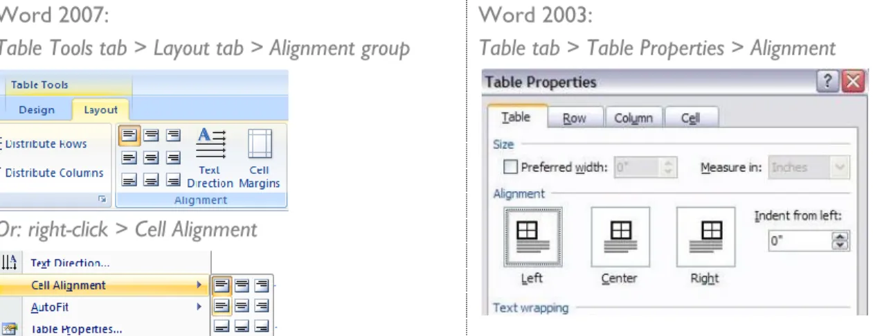
Cell
alignment: When you design in tables, you want to make sure that your text is logically positioned in the table cell. Use the cell alignment commands to adjust horizontal & vertical alignment within a table cell.
Word 2007:
Table Tools tab > Layout tab > Alignment group
Or: right-click > Cell Alignment
Word 2003:
Table tab > Table Properties > Alignment
Picture
crop tool: When you click on a picture in Word you activate the Picture Tools menu. Click the Crop tool to remove unwanted parts of an image by dragging from its sides or typing Height and Width in inches.
Word 2007:
Format tab > Picture Tools > Size group > Crop
Word 2003:
INSTALLING
&
USING THE FREE FIREFOX ADD-ON
FIRESHOT
FireShot (Windows only) is a free add-on to the Firefox web browser to take, edit, and annotate screenshots from any Web page.
Launch the Firefox web browser (Free download at http://firefox.com) Go to the Firefox Add-ons page at https://addons.mozilla.org
Search for FireShot, then click the Add to Firefox button:
Install FireShot then close and re-launch Firefox. FireShot will have installed a button at the top right corner of the browser:
When you want to capture a web page image, click the FireShot button to take a picture (listen for the click!) FireShot will open your image in a new window. Play with the tools to crop, edit, and annotate your screenshot:
FireShot gives you several options for your completed image: The Copy button puts the image in your clipboard so you can paste it into Word.
Use the Save button to download the image so you can send an annotated screenshot as an email attachment.
You can also activate FireShot from the down-pointing arrow next to the FireShot button.