Text in Visualization: Extending the Visualization Design Space Richard Brath
Revision 1.42 September 3, 2018
This page inserted for electronic version so that 2up page display has facing pages. Delete or skip this page when printing.
TEXT IN VISUALIZATION –ii
Text
in
Visualization
Extending the
Visualization Design Space
Richard Brath
ORCID: 0000-0001-6006-2092
A thesis submitted in partial fulfillment of the
requirements of London South Bank University for
the degree of Doctor of Philosophy by Publication
This research programme was carried out in part
in collaboration with Uncharted Software Inc.
September 2018
TEXT IN VISUALIZATION –iii Backside of title page
TEXT IN VISUALIZATION –iv
Abstract
This thesis is a systematic exploration and expansion of the design space of data visualization specifically with regards to text. A critical analysis of text in data visualizations reveals gaps in existing frameworks and the use of text in practice. A cross-disciplinary review across fields such as typography, cartography and technical applications yields typographic techniques to encode data into text and provides the scope for the expanded design space. Mapping new attributes, techniques and considerations back to well understood visualization principles organizes the design space of text in visualization. This design space includes: 1) text as a primary data type literally encoded into alphanumeric glyphs, 2) typographic attributes, such as bold and italic, capable of encoding additional data onto literal text, 3) scope of mark, ranging from individual glyphs, syllables and words; to sentences, paragraphs and documents, and 4) layout of these text elements applicable most known visualization techniques and text specific techniques such as tables. This is the primary contribution of this thesis (Part A and B).
Then, this design space is used to facilitate the design, implementation and evaluation of new types of visualization techniques, ranging from enhancements of existing techniques, such as, extending scatterplots and graphs with literal marks, stem & leaf plots with multivariate glyphs and broader scope, and microtext line charts; to new visualization techniques, such as, multivariate typographic thematic maps; text formatted to facilitate skimming; and proportionally encoding quantitative values in running text – all of which are new contributions to the field (Part C).
Finally, a broad evaluation across the framework and the sample visualizations with cross-discipline expert critiques and a metrics based approach reveals some concerns and many opportunities pointing towards a breadth of future research work now possible with this new framework. (Part D and E).
TEXT IN VISUALIZATION –v
T
EXT IN
V
ISUALIZATION
has not been well defined.The EXISTING DESIGN SPACE OF VISUALIZATION (PART APAGES 1-23)can be described as a pipeline transforming Structured Data into Visual Attributes drawn as Marks and plotted in a Layout (columns in diagram below). In the existing design space (indicated in grey in the diagram below), text is typically preprocessed into structured data such as categories and quantities, represented as simple text words and tends to use simple layouts such as labels and word clouds. Gaps in the framework imply poor definition for text in visualization.
The DESIGN SPACE FOR TEXT IN VISUALIZATION (PART B23-108) is
1.Informed by CROSS-DISCIPLINARY RESEARCH24,including TYPOGRAPHY24, CARTOGRAPHY33, TECHNICAL
APPLICATIONS40, VISUALIZATION46and UI GUIDELINES50.
2.These suggest four UNIQUE TEXT-SPECIFIC EXTENSIONS52(red columns in the above pipeline diagram): LITERAL ENCODING52,TYPE ATTRIBUTES58,TEXT MARKS59,and UNIQUE LAYOUTS61.
3.Text has UNIQUE PERCEPTUAL CONSIDERATIONS63, including PREATTENTION & GESTALT63, LEGIBILITY &
READABILITY66, TYPE COLOR67, ATTENTION69, TEXT SEMANTICS69, TYPOGRAPHIC SEMANTICS70, LANGUAGE71 and
INTERACTION73. 4.Each TYPOGRAPHIC ATTRIBUTE75 is characterized: ALPHANUMERICS75, SYMBOLS76, WEIGHT77, ITALICS80, CASE82, UNDERLINE84, TYPEFACE86, WIDTH90, BASELINE92, DELIMITERS93, LOW-
LEVEL DESIGN94 and NON
-TEXT SPECIFIC99. These are summarized into best encodings
All the above defines the key contribution of the thesis: theTYPOGRAPHIC VISUALIZATION DESIGN SPACE102, summarized by the red extensions in the pipeline diagram104.
Given a vast design space, Mark scope and Data type (right) can frame potential applications. These are explored in the second half of the thesis.
TEXT IN VISUALIZATION –vi
This extended design space is APPLIED TO NEW TYPOGRAPHIC VISUALIZATIONS (PART C108-205), and evaluated, in the second half of this thesis. Bertin illustrated the flexibility of his original visualization framework using a sample dataset (left), to design many charts and maps (middle). In turn, using the same dataset, many new typographic visualizations illustrate the flexibility of the extended design space (right).
Next, specific new text visualization applications of with different Data encodings and Mark types are created. These address known shortfalls in current visualization techniques and most include a lightweight evaluation:
LW:LITERAL LABELS111 replace legends and interactions onBARS &
SCATTERPLOTS aiding
faster identification.
LS:MICROTEXT LINE
CHARTS124 facilitate tracking more than ten lines. More experts are able to complete tasks.
LX:TYPOGRAPHIC
STEM &LEAF PLOTS137 extend the technique to glyphs, words and phrases.
CD:CATEGORIC SETS144use text with type attributes to show set membership in VENN,MOSAICS,
&GRAPHS, with efficient
representations of quantities.
OW:TYPOGRAPHIC
CARTOGRAMS164 address shortfalls of choropleth maps and outperform 2.2x.
OP:TEXT SKIMMING176 is aided by scaling word formats to inverse word frequency. Positive user feedback. OG:PROSODY & PRONUNCIATION190 explores glyph and syllable encodings. QS:QUANTITATIVE SENTENCES193 indicate magnitude by applying formats to a sentence subset. More items are readable with lower margin of error in size estimation. A BROAD EVALUATION across the DESIGN SPACE and APPLICATIONS (PART D.205-248) uses:
CROSS-DISCIPLINARY CRITIQUES206:CRITIQUES IN VISUALIZATION206 are a new contribution. Critiques are applied to the thesis, yielding frequent concerns such as MULTIPLE ENCODINGS213,LABEL LENGTH BIAS216, BERTIN’S TYPE ATTRIBUTES218,NUMBER OF DIMENSIONS222,and additional DOMAIN SPECIFIC CRITIQUES225.
NOVEL METRICS232:FIDELITY234andLOSSINESS238indicate greater information density using text.
The RESULTS of this work are (PART E.248-254) aNEW FRAMEWORK FOR TEXT VISUALIZATION,248aBREADTH
OF NEW RESEARCH QUESTIONS,249and aSHIFT TO MULTI-LAYERED,POST MODERN VISUALIZATION253.
The Appendix254-269 lists FONTS RECOMMENDATIONS,254 acknowledges EXPERTS,254 identifies SOCIAL MEDIA
RESPONSE,256lists SUPPLEMENTAL MATERIALS (including surveys),257 and provides aBIBLIOGRAPHY.269+
TEXT IN VISUALIZATION –vii
Table of Contents
Introduction: Extending Visualization Design Spaces ... 1
Rationale, Outline and Key Contributions ... 2
Missed Opportunity: 500 years of separation ... 5
Missed Opportunity: Text preprocessing ... 9
Text Visualization Skeptics ... 11
A:4.1. Text is not preattentive: therefore not a visualization attribute ... 12
A:4.2. Many text visualizations already exist ... 13
Design Spaces and Visualization ... 15
A:5.1. What is a Design Space... 15
A:5.2. A Method to Expand a Design Space... 16
A:5.3. Identifying Gaps ... 17
A:5.4. Gap in Visual Attributes ... 18
The Value of Text Visualization ... 21
Conclusion ... 22
The Design Space of Text in Visualization ... 23
Cross-Disciplinary Research and Relation to Visualization ... 24
B:1.1. Historic Examples from Typography ... 24
B:1.2. Historic Cartographic Examples ... 33
B:1.3. Technical Applications ... 40
B:1.4. Text in Visualization ... 46
B:1.5. User Interface Typography Guidelines ... 50
Text Extensions to Visualization ... 52
B:2.1. Literal Encoding ... 52
B:2.2. Typographic Visual Attributes... 58
B:2.3. Mark Types and Scope of Text ... 59
B:2.4. Unique Layouts ... 61
Considerations for Visual Perception of Text ... 63
B:3.1. Immediate Perception: Preattention and Gestalt ... 63
TEXT IN VISUALIZATION –viii
B:3.3. Typographic Color ... 67
B:3.4. Directed Attention and Reasoning ... 69
B:3.5. Text Semantics ... 69
B:3.6. Semantic Typography ... 70
B:3.7. Language... 71
B:3.8. Text, Visualization and Interaction ... 73
B:3.9. Future Work: Extended Evaluation Techniques ... 74
Characterization of Type Attributes ... 75
B:4.1. Alphanumeric Glyphs ... 75
B:4.2. Symbols and Punctuation ... 76
B:4.3. Bold and Font Weight ... 77
B:4.4. Italics and Obliques ... 80
B:4.5. Case: Upper, Lower, Smallcaps, Proper and CamelCase ... 82
B:4.6. Underline ... 84
B:4.7. Typeface ... 86
B:4.8. Width: Stretch, Condensed/Expanded and Spacing ... 90
B:4.9. Baseline shifts, superscript, subscript and text on path ... 92
B:4.10. Symmetric-Delimiters and Paired-Delimiters ... 93
B:4.11. Font Design: X-Height, Contrast, Stress, Serifs, Etc. ... 94
B:4.12. Size, Color, Shadows, Outline and other Visual Attributes ... 99
B:4.13. Font-Attribute Summary and Application to Visualization ... 102
Synthesis of Text in Visualization Design Space ... 104
Applications of Typographic Visualizations ... 108
Ideating New Kinds of Visualization (following Bertin) ... 109
LW: Literal Words: labels as point marks ... 111
C:1.1. Alphanumeric codes instead of Point Marks ... 111
C:1.2. Labels are fast and specific ... 112
C:1.3. Labels offer local context ... 112
C:1.4. Text vs. Glyphs ... 114
C:1.5. Occlusion and Spatial Separation ... 115
TEXT IN VISUALIZATION –ix
C:1.7. Hierarchical Labels ... 118
C:1.8. Cognitive Model ... 119
C:1.9. Label Conclusions... 123
LS: Literal Sentences – lines as microtext ... 124
C:2.1. Twitter Retweets ... 124
C:2.2. Historic precedence of text on paths ... 125
C:2.3. Timeseries Chart Books and Chart Libraries ... 126
C:2.4. Line Labeling Alternatives ... 128
C:2.5. Literal Sentences for Congested Line Charts ... 129
C:2.6. Evaluation of Lines as Microtext ... 132
C:2.7. Microlines Applied to Other Layouts... 135
C:2.8. Lines as Microtext Summary ... 136
Lx: Literal Stem & Leaf Plots ... 137
C:3.1. Font Attributes for Statistics in Stem & Leaf ... 137
C:3.2. Glyph Stem & Leaf: Bigrams and State Statistics ... 138
C:3.3. Word Stem & Leaf: Character Traits and Death Rates ... 139
C:3.4. Phrase Stem & Leaf: Financial Performance and Psalms ... 141
C:3.5. Literal Stem & Leaf Conclusions ... 143
CD: Categoric Document – labels to create areas for Venn, mosaic, bar, graphs and maps ... 144
C:4.1. Review of Set Element Representations ... 145
C:4.2. Using Glyphs to Represent High Number of Dimensions ... 146
C:4.3. Typographic Venn and Euler Diagrams ... 149
C:4.4. Typographic Mosaic Plot of Titanic Survivorship ... 154
C:4.5. Typographic Stacked Bar of 3000 companies ... 157
C:4.6. Typographic Graph of Word-Emotion Association Lexicon ... 159
C:4.7. Typographic Cartogram of Country Risks ... 161
C:4.8. Observations ... 162
C:4.9. Typographic Set Diagrams Conclusion ... 163
OW: Ordered Words - typographic cartograms ... 164
C:5.1. Problems with Thematic Maps ... 164
TEXT IN VISUALIZATION –x
C:5.3. Thematic Maps Using Text ... 167
C:5.4. Equal Area Cartograms ... 167
C:5.5. Typographic Multi-variate Cartograms ... 168
C:5.6. Scaling to Thousands of Labels ... 169
C:5.7. Scaling to Long Labels ... 170
C:5.8. Positionally- and Proportionally-Encoded Labels ... 171
C:5.9. Typographic Cartogram Layouts ... 172
C:5.10. Evaluation of Typographic Cartograms ... 173
C:5.11. Beyond Simple Label Cartograms ... 174
C:5.12. Conclusions for Typographic Cartograms... 175
OP: Ordered Paragraphs - skim formatting ... 176
C:6.1. Historic Precedents ... 176
C:6.2. Automating Skim Formatting ... 181
C:6.3. Evaluation and Other Considerations ... 183
C:6.4. Skim Format Conclusions ... 189
CG+OG: Glyphs for pronunciation & prosody ... 190
QS: Quantitative Sentences - proportional and positional encoding ... 193
C:8.1. Proportions along short strings (headlines, tweets, etc.) ... 193
C:8.2. Evaluation of Proportional Encoding ... 200
C:8.3. Positional Encoding ... 202
C:8.4. Discussion ... 203
C:8.5. Proportional and Positional Encoding Conclusion ... 204
Evaluation of Typographic Visualization Design Space ... 205
Critique ... 206
D:1.1. The Need for Critique ... 206
D:1.2. Common Themes across Critiques ... 213
D:1.3. Domain-Specific Critiques of Text Visualization ... 225
D:1.4. Critique Summary ... 231
Fidelity and Lossiness Metrics ... 232
D:2.1. One Dimensional Fidelity ... 234
TEXT IN VISUALIZATION –xi
D:2.3. Overall Lossiness ... 238
D:2.4. Generalized Fidelity and Lossiness... 239
D:2.5. Post Hoc Lossiness Analysis Example ... 241
D:2.6. Lossiness in Text and Font Attribute visualizations ... 244
D:2.7. Generating Lossiness Scores without Datasets ... 245
D:2.8. Limitations of Lossiness Metrics and Future Work ... 245
Conclusions and Future Work ... 248
Framework for Text in Visualization ... 248
Open Questions and Future Work ... 249
A Call to Action: Post-Modern Visualization ... 253
Appendix: Fonts, Acknowledgements, Supplemental Materials, etc. ... 254
Fonts Used and Font Recommendations ... 254
Acknowledgements ... 255
Social Media Response to PhD topics ... 256
Supplemental Materials ... 257
F:4.1. Use of Visual Attributes on Text in 249 Text Visualizations ... 257
F:4.2. Analysis of Text in Knowledge Visualizations at Scimaps.org ... 261
F:4.3. Online survey of Text Visualization Techniques ... 264
F:4.4. Choropleth map vs. ISO Code map Tasks ... 268
TEXT IN VISUALIZATION: PART A – 1
Introduction: Extending
Visualization Design Spaces
D
ESCRIPTION OF
P
ART
A
The objective of the overall thesis is to vastly expand the potential opportunities to utilize text in visualization. An initial overview provides the RATIONALE, OUTLINE AND KEY CONTRIBUTIONS of the thesis. PAGE 2
Why text is so poorly utilized in visualization needs to be understood first:
WORD AND IMAGE SEPARATION: 700 year old manuscripts deeply integrate text and visualization – but charts and modern visualizations tend not to mix text and visualization.PAGE 4
TEXT SEPARATE FROM VISUALIZATION
PROCESSING:Many researchers conceptualize the creation of visualization as a pipeline –
but text is simply pre-pended to the process to generate data.9
TEXT IS NOT PREATTENTIVE.Visualization is about easy visual perception of patterns, but text needs to read to be understood –
however, text attributes, such as bold, are easily perceived.12
MANY TEXT VISUALIZATIONS EXIST – but some make errors in encoding data into text for perception.13
Instead a design space of text in visualization is needed:
A DESIGN SPACEis adefinition of design parameters used to construction solutions.15
A METHOD to expand the design space is outlined.16
1. Identify gaps. 2. Research background. 3. Identify unique considerations 4. Identify new applications. 5. Evaluate.
GAPS exist throughout the visualization pipeline.17
GAPS IN VISUAL ATTRIBUTES in particular show text is not well defined.18
VALUE OF TEXT IN VISUALIZATIONis potentially vast, with uses in computer science research, new kinds of applications, new kinds of collaboration, and the potential for billions of dollars of economic value.21
TEXT IN VISUALIZATION: PART A – 2
Rationale, Outline and Key Contributions
In data visualization, abstract data elements (such as quantities and categories) are encoded into visualattributes of geometry (such as colors, sizes and shapes) and depicted on an interactive computer screen or paper. This visual representation acts as an external memory aid to the human viewer to facilitate perceptual inferences (such as spotting outliers, estimating trends and comparing sizes) and higher level tasks (such as generating hypotheses and disseminating findings).1,2,3 However, there is a big gap in current theoretic frameworks that
define the design space of visualization: the role of text in visualization is undefined. This gap is the focus of this thesis.
The primary contribution of this thesis is a methodological expansion of the design space of visualization specifically with regards to text.
In PART A. Introduction, a critical analysis of text in data visualization reveals gaps in existing frameworks and the use of text in practice. This gap may be due to historic limitations (A:2), which in turn leads to separation of text analytics from text visualization (A:3), to the point where some visualization experts are skeptical about the use of text in visualization (A:4). The existing design space of visualization is reviewed (A:5.1), a method to probe and expand the design space outlined (A:5.2) and text gaps identified based on a review across researchers and use (A:5.3 and D). The opportunity for text in visualization is relevant to research (e.g. natural language processing), new kinds of human-computer interaction applications (e.g. search, reading), economic value and collaboration with other communities (A:6). The contribution of this section is the framing of the design space and the identification of gaps in text.
PART B. The Design Space of Text in Visualizationp52 starts with a primary research across multiple disciplines reviewing hundreds of examples of existing text visualizations across 1000 years (B:1P24). The method is similar to Bertin’s analysis of many example visualizations to define and illustrate his framework in Semiology of Graphics.4 This analysis identifies multiple extensions to the existing visualization framework and characterizes
them – literal encodings, typographic visual attributes, textual mark types and unique layouts (B:2P52). Text has unique considerations for visualization, such as readability, type color and semantics (B:3P63). The result of all the above defines the design space of text in visualization (B:5P104), the key contribution of this thesis and summarized by the red text in Figure 110P104.
PART C. Applications of Typographic VisualizationsP108uses this design space to facilitate the design,
implementation and evaluation of new types of visualization techniques with text. First, similar to Bertin (p.100-138), many different new text-oriented visualizations are created, all using the same dataset as Bertin. This shows the flexibility of the design space to express many different representations of the same data (0P109). Then,
1 Robert Kosara, “What is Visualization? A Definition,” EagerEyes.com, last modified July 24, 2008,
https://eagereyes.org/criticism/definition-of-visualization, accessed: April 15, 2016.
2 Tamara Munzner, Visualization Analysis and Design, (Boca Raton, FL: CRC Press, 2015), 1-19.
3 Min Chen and Luciano Floridi, “An analysis of information visualization”, Synthese, 190, no. 16 (2013): 3425-3426. 4 Jacques Bertin, Semiology of Graphics, trans. William Berg(Madison, WI: University of Wisconsin Press, 1983).
TEXT IN VISUALIZATION: PART A – 3
many new or extended visualizations are presented, typically starting with known limitations of an existing representation, followed with the development of novel text-based approaches, and an evaluation and/or discussion comparing the existing approach to the new approach. The method is similar to the design,
development and evaluation of new peer-reviewed visualizations: primary research includes the development of the novel visualization and associated evaluation and/or discussion. The new visualizations include:
Literal encodings, where dots in scatterplots and graphs are extended with labels (C:1P111); linecharts enhanced with microtext (C:2P124) and stem & leaf plots extended to broader scopes of text (C:3P137).
Categoric encodings focus on the use of multiple text attributes to indicate set membership in Euler diagrams, mosaic plots, graphs and maps (C:4P144).
Ordered encodings introduces typographic cartograms to deal with limitations of choropleth maps (C:5P164); formatted words paragraphs to facilitate text skimming (C:6P176); and manipulated glyphs in words to indicate prosody and pronunciation (C:7P190).
Quantitative encodings introduce positional and proportional encoding techniques whereby a subset of a line or paragraph of text indicates a quantity by its formatting (C:8P193).
Each of these above novel visualizations is an important contribution to the field of data visualization, as well as the associated lightweight evaluations, including cognitive modelingP119, measurement of information
densityP200,P232, measurement of encoding accuracyP154, measurement task performanceP173; user feedbackP183; task observationsP132; and user surveysP183,P200 (see also Supplemental MaterialsP257 in the Appendix).
PART D. Evaluation of Typographic Visualization Design SpaceP205is a novel approach to evaluate all the above work: the design space and the many new visualizations. A cross-disciplinary critique solicits feedback from experts across visualization, cartography and typography, revealing critical aspects, some of which have been incorporated into the thesis (D:1P206). Fidelity and lossiness are a new metrics-based evaluation approach (D:2P232). Both of these evaluation techniques are contributions to the visualization domain.
PART E. Conclusions and Future WorkP248summarizes the framework, contributions, the wide breadth of future research and finishes with a call to action for a new approach to visualization leveraging text with implied changes in how visualizations are developed, used and interpreted.
This thesis is the result of significant primary research, including:
The review and analysis of thousands of historic and modern visualizations from many conferences, collections and libraries. See AcknowledgementsP255 in Appendix and Bibliography for list of resources utilizedP269.
The design and development of eight new or extended visualization approaches and the associated evaluations (Part CP108).
Critiques and discussions with more than two dozen experts from information visualization,
typography, cartography and human computer interaction. See Part DP205 and AcknowledgementsP255 in Appendix.
TEXT IN VISUALIZATION: PART A – 4
This research has resulted in the contribution of 13 accepted peer reviewed publications (listed chronologically): 1. “The Design Space of Typeface,” at VisWeek, 2014 (Paris 2014).
This poster contributes an itemization of typographic attributes to preattentively encode data. 2 pages. Link. 2. “Using Font Attributes in Knowledge Maps and Information Retrieval,” at First Workshop on Knowledge
Maps and Information Retrieval, 2014 (London 2014).
This paper contributes three new visualization techniques based on typographic attributes relevant to knowledge maps. 8 pages. Link.
3. “Evaluating Lossiness and Fidelity in Information Visualization” at SPIE 2015 (San Francisco 2015). Contribution is a quantitative scoring model for comparing information loss across visualization alternatives. 14 pages. Link.
4. “Using Text in Visualizations for Micro/Macro Readings” at TextVis Workshop 2015 (Atlanta 2015). Contribution is notion of literal encoding as separate from other preattentive encodings enabling micro and macro readings of text visualizations and novel word-based stem-and-leaf plot. 8 pages. Link.
5. “Using Type to Add Data to Data Visualizations” at TypeCon 2015, (Denver 2015).
Contribution is a historic review of the font attribute design space with several applications including one novel glyph-based technique. 4 pages. Link.
6. “Font Attributes enrich Knowledge Maps and Information Retrieval” in International Journal on Digital Libraries, 2016.
This journal article reviews font attributes and applies them to tasks relevant to knowledge maps
(document overviews) and information retrieval (search), including text analytic tasks (i.e. natural language processing) such as skimming, opinion analysis, character analysis, topic modeling and sentiment analysis. 20 pages. Link.
7. “Using Typography to Expand the Design Space of Data Visualization.” in She Ji: The Journal of Design, Economics, and Innovation vol. 2, no. 1 (Spring 2016): 59–87.
This journal article summarizes the authors’ cross-disciplinary research approach engaging visualization researchers, cartographers and typographers to 1) identify the gaps in visualization theory, 2) review adjacent fields to comprehensively assess techniques, 3) extend an common existing visualization framework with separation between type attributes, typographic scope and data type, 4) illustrate many potential applications from this framework, and 5) broad evaluation including critiques across domain. 29 pages. Link. (Note this paper is a template for the entire thesis)
8. “Typographic Sets: Labelled Set Elements with Font Attributes,” at International Workshop on Set Visualization and Reasoning 2016 (Philadelphia 2016).
This paper shows how many visualization techniques indicating members in sets can be extended using typographic attributes, with unique contributes including identification of membership in up to ten sets and scalability to thousands of elements. 15 pages. Link.
9. “Evaluation of Visualization by Critiques” at Beyond Time and Errors: Novel Evaluation Methods for Visualization (BELIV) (Baltimore 2016).
This position paper extends design critiques as a form of evaluation, different than pre-existing “evaluation by inspection” techniques, uniquely providing broader scope and context. 8 pages. Link.
10. “Multivariate Label-based Thematic Maps” in International Journal of Cartography, 23 Mar 2017. This journal article focuses on thematic maps where traditionally colored shapes are used to indicate data instead use labels, which can indicate more than one or two variables; and provides solutions to issues of representation of strings of differing lengths and label occlusion. 16 pages. Link.
11. “Stem & Leaf Plots Extended for Text Visualizations” at 14th International Conference Computer Graphics, Imaging and Visualization (CGiV) 2017. (Marrakech, 2017).
This short paper extends the visualization technique of “stem and leaf plots” using font attributes and tokens of different scope (single character, word, phrase). 6 pages. Link.
12. “Microtext Line Charts” at Information Visualization 2017 (IV2017). (London 2017).
This paper brings together microtext and path dependent cartographic text to embed text directly into lines on line charts, making it easier to identify lines and enabling additional data to be displayed. 8 pages. Link. 13. “Bertin’s Forgotten Typographic Variables and New Typographic Visualization” to be published in
Computer and Geographic Information Systems (CaGIS) Journal late 2018. Approximately 21 pages. This article, for the 50th anniversary of Semiology of Graphics, extends Bertin’s initial type work and
TEXT IN VISUALIZATION: PART A – 5
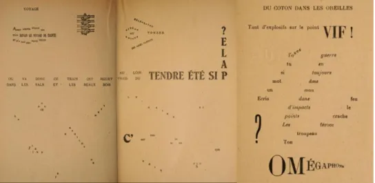
Missd Opportunity: 500 years of separation
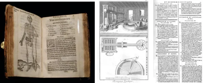
Typography and data visualization have been closely related for hundreds of years. 700 year old medieval manuscripts show early visualizations such as genealogical trees5, radial charts6, and tables7 of data as shown inFigure 1. Text is tightly integrated, surrounding the diagrams, filling in regions of the diagrams, and enriching specific text labels within the visualizations, for example, with colored labels (in the genealogical tree), illuminated initials (in the radial diagram) or variation in case (in the table). Similar examples can be found in other cultures (e.g. Figure 64P71).
Figure 1. Medieval visualizations. Left: a genealogical tree with nodes varying in type color. Center: a radial diagram with
illuminated initials. Right: a table with variation in type color, illuminated initials and case. All images © Bodleian Library, University of
Oxford, permission for non-commercial use: digital.bodleian.ox.ac.uk/terms.html
In 1439, the introduction of the printing press by Gutenberg changes the technical feasibility of mixing type and imagery. Movable type is not easily combined with woodblock prints: text and image are separated. Although early use of the printing press attempted to retain old techniques such as rubrication (i.e. colored text), a wide variety of ligatures, and illuminated text (text enhanced with imagery), these were difficult to produce and disappeared from common use. Figure 2 left shows facing pages from a text from 1573 with a woodblock print facing text on the opposite page.8
5 Peter of Poitiers, Compendium historiae in genealogia Christi. Mid-13th century. Shelf MS. Laud Misc. 151 fol. 001r.
http://bodley30.bodley.ox.ac.uk:8180/luna/servlet/detail/ODLodl~1~1~3554~103738 Accessed August 20, 2016.
6 Socrates the King, The Prognostics. Mid-13th century. Shelf MS. Ashmole 304 fol. 033a verso.
http://bodley30.bodley.ox.ac.uk:8180/luna/servlet/s/7l98th Accessed August 20, 2016.
7 Author unknown, Breviary of Chertsey Abbey, fragments of the temporale and sanctorale. Early 14th century. Shelf MS. Lat. liturg. e. 6 fol.
005v http://bodley30.bodley.ox.ac.uk:8180/luna/servlet/detail/ODLodl~1~1~46209~120705 Aug. 20, 2016.
8 William Bullein, A dialogue bothe pleasaunte and pietifull, wherein is a goodly regimente against the fever pestilence with a consolacion
TEXT IN VISUALIZATION: PART A – 6
Figure 2. Left: Image separate from text. from William Bullein’s A Dialogue Against the Fever Pestilence from 1593. Right:
Beautiful engravings from Diderot’s Encyclopédie 1751-1772: images have minimal text requiring the viewer to
cross-reference the text. Left: Author photo. Right: http://encyclopedie.uchicago.edu/
By the age of the Enlightenment, high quality engraving and high quality typesetting had completely separated text from image as shown by the pair of pages from Diderot’s Encyclopédie9 in Figure 2 right: images have
single character labels requiring the viewer to cross-reference the text for explanations. As noted by Albert Biderman, charts and graphics became segregated from text and often produced by a commercial artist who may not have a background in scientific analysis.10
By the early 20th century, charts have largely relegated the role of type to simple labels, ticks and titles at the
perimeter of the chart, as shown in the examples in Figure 3 left.11 Note that thesis does not review this marginal
use of text around the periphery of visualizations such as legends, axis labels and chart titles as this topic is already addressed in references such as Wallgren et al’s Graphing Statistics and Data,12 Wong’s The Wall Street
Journal Guide to Information Graphics,13 or Brewer’s Designing Better Maps.14 This thesis is concerned with
larger questions regarding text inside visualizations.
9 Encyclopédie, ou dictionnaire raisonné des sciences, des arts et des métiers, etc., eds. Denis Diderot and Jean le Rond d'Alembert.
University of Chicago: ARTFL Encyclopédie Project (Spring 2016 Edition), Robert Morrissey and Glenn Roe (eds), http://encyclopedie.uchicago.edu/.
10 Albert D. Biderman. The graph as a victim of adverse discrimination and segregation, Information Design Journal, Volume 1, Issue 4,
1980.
11 Willard C Brinton. Graphic Methods for Presenting Facts. The Engineering Magazine, New York 1919.
https://archive.org/details/methodsfo00bringraphicrich Accessed August 26, 2016.
12 Anders Wallgren et al. Graphing Statistics & Data: Creating Better Charts. Sage, 1996.
13 Dona M. Wong, The Wall Street Journal Guide to Information Graphics: The Dos and Don’ts of Presenting Data, Facts and Figures.
W.W. Norton & Company, 2010.
TEXT IN VISUALIZATION: PART A – 7
Figure 3. Left: Charts from 1919 – text largely is relegated to the periphery of the chart. Right: Interactive infographic from NY Times: variation in type is used to differential textual components such as titles, paragraphs, call-outs, axis labels, etc.
Left image public domain: Right image © 2012 The New York Times (nytimes.com/elections/2012/campaign-finance.html).
With computer-based visualization, text is no longer technically constrained to the margins. However, 500 years of practice means that the convention for separation of type from visualization persists. Infographics in newspapers and magazines do use a variety of annotations around and within a chart, including variation in type size, weight and color, such as the example shown in Figure 3 right.15 The current use of typography in
infographics largely follows from the principles of graphic design to create a typographic hierarchy:
differentiating text components such as the title, lead paragraph, data source, axis labels, call-outs and so forth. As such, the typographic elements are aiding the organization of the information on the page, but are not explicitly representing data. This thesis does not address traditional use of type in graphic design as there are many excellent type design and resources such as, Lupton’s Thinking with Type,16 or Bringhurst’s The Elements
of Typographic Style.17 This thesis is concerned with larger questions regarding text inside visualizations.
In interactive visualization, text may be hidden and revealed on interactions such as tooltips or zoom. However, not all visualization media are interactive (e.g. print) or not interactive for the full audience (e.g. presentations, videos, etc). Further, some experienced media outlets recognize users do not interact, e.g. Archie Tse of The New York Times explains: “If you make a tooltip or rollover, assume no one will ever see it. If content is important for readers to see, don’t hide it.”18 This thesis is focused on making text directly visible in visualizations, not hidden
in interactions.
Text visualization is a very recent area of research effort that focuses on the analysis and visual representation of text as data visualizations. Perhaps the most famous text visualization is the tag cloud (also known as the word cloud) as shown in Figure 4. Tag clouds do not show much data: they show words and typically only one
15 Jeremy Ashkenas, Matthew Ericson, Alicia Parlapiano And Derek Willis The 2012 Money Race: Compare the Candidates. 2012.
http://elections.nytimes.com/2012/campaign-finance Accessed 2016/07/24
16 Ellen Lupton, Thinking with Type: A Critical Guide for Designers, Writers, Editors and Students. (Princeton Architectural Press, 2010). 17 Robert Bringhurst, The Elements of Typographic Style. (Hartley & Marks. 2013).
18 Archie Tse. “Why we are doing fewer interactives.” Malofiej 2016.
TEXT IN VISUALIZATION: PART A – 8
more data point represented by the text size. Note that color is random, location is random and the size is ambiguous – it is not obvious whether the area of the text indicates the quantity or the font size. Tag clouds are considered a poor visualization by many visualization researchers: they may perform well for keyword collection and identification,19 but lose relational information, 20 are poor for navigation, suspect as a tool for abstract
understanding, and primarily useful visceral user engagement.21 Tag clouds have many broader criticisms, such
as Jakob Nielsen’s: “A one-paragraph summary [of each report] would probably be more enlightening, be faster to scan, and would take up much less screen space, allowing for more items to be summarized on any given page [than tag clouds].”22
Figure 4. A tag cloud is one of the most popular text visualization techniques. Word size represents data – such
as word frequency in a document. Word location and color are often random.23 Image created by author. (via wordle.net).
This thesis does focus on text visualization and more broadly the use of text in any visualization to show data. Text analytics are covered lightly, as, the key focus of this thesis is to provide a framework that can be used to synthesize many new types of visualizations using text based on the use of typographic attributes.
19 Anna W. Rivadeneira, Daniel M. Gruen, Michael J. Muller, and David R. Millen. "Getting our head in the clouds: toward evaluation
studies of tagclouds." In Proceedings of the SIGCHI conference on Human factors in computing systems, pp. 995-998. ACM, 2007.
20 Byron YL Kuo, Thomas Hentrich, Benjamin M. Good, and Mark D. Wilkinson. "Tag clouds for summarizing web search results." In
Proceedings of the 16th international conference on World Wide Web, pp. 1203-1204. ACM, 2007.
21 Marti A. Hearst and Daniela Rosner. "Tag clouds: Data analysis tool or social signaller?." In Hawaii International Conference on System
Sciences, Proceedings of the 41st Annual, pp. 160-160. IEEE, 2008.
22 Jakob Nielsen, “Tag Cloud Examples,” Nielsen Norman Group, last modified March 24, 2009.
https://www.nngroup.com/articles/tag-cloud-examples/
23 Tag cloud created on http://wordle.net on June 6, 2015 using text of Lewis Carroll’s Alice’s Adventures in Wonderland, from http://www.gutenberg.org/files/11/11-h/11-h.htm
TEXT IN VISUALIZATION: PART A – 9
Missed Opportunity: Text preprocessing
Interactive data visualization has become a broad area of research in the last 25 years largely centered on computer science (e.g. conferences such as VisWeek, EuroVis and PacificVis) with focus on different visualization techniques, interactive techniques, related data analysis, evaluations and applications. In visualization, a key step is visual encoding: the transformation of data into a visual representation. Earlyresearchers such as Bertin24, Card25, organized the design space of visual encoding more or less into a) data types
(nominal, ordered and quantitative), b) visual attributes (e.g. location, size, color), c) marks (i.e. point, line, area), and d) composition of those marks into a layout. This can also be thought of as an encoding pipeline which transforms data into a visualization as shown in Figure 5.
Figure 5. The visualization encoding pipeline: source data of different data types are mapped to different visual attributes
which are then represented as different types of marks and composed into a layout. Image created by author.
This framework of data types, visual attributes, marks and layout, is powerful at explaining the construction of visualizations, such as some well-known visualization techniques shown in Figure 6. For example, the bubble plot (left) encodes quantitative data as x location, y location, and size; categoric data as hue; and renders these as point markers in a Cartesian layout. The treemap (Figure 6 right) represents quantities as size and hue; and renders the data as areas laid out with a space filling algorithm. The tag cloud (previously in Figure 4) encodes word frequencies as size; and in this particular example applies random hues; then renders the words at randomly placed points. The framework continues to aid the education and creation of new visualization techniques, such as introductory textbooks as well as formal declarative grammars (such as Wilkinson’s Grammar of Graphics26
or Wickham’s ggplot2).27
24 Jacques Bertin, Semiology of Graphics, trans. William Berg(Madison, WI: University of Wisconsin Press, 1983), 42–97.
25 Stuart K. Card, and Jock Mackinlay, “The structure of the information visualization design space,” Proceedings of IEEE Symposium on
Information Visualization 1997, (IEEE, 1997), 92–99.
26 Leland Wilkinson, The Grammar Of Graphics, 2nd ed. Springer Science & Business Media, 2005. 27 Hadley Wickham, ggplot2: Elegant Graphics for Data Analysis, Springer, New York, 2009.
TEXT IN VISUALIZATION: PART A – 10
Figure 6. Popular visualizations as framed by visualization design space. Left: A bubble plot uses x location, y location, size
and hue28. Right: A treemap uses size and hue29. Images copyright © 2006 TED Conferences LLC; copyright © 2016 MarketWatch, Inc.
Visualization of text can be added into this framework. The common approach is to simply preprocess text into the one of the forms of data handled by the remaining visualization pipeline, as shown in Figure 7. While this approach does work to create text-based visualizations, it has issues. First, many Natural Language Processing (NLP) tasks operate at the level of words: tokenization, stemming, lemmatization, part-of-speech tagging, removing stop words and punctuation, counting, frequencies, entity extraction; and some sentiment, emotion and topic modeling techniques are word-centric — thereby losing information contained in the original context. NLP is an active field of research because the meaning of text is much more complex than collections of words. While some NLP techniques operate across words (e.g. parse trees, dependencies, referents and summarization), corresponding visualizations may use grids, trees and lines but with plain text (e.g. Annis).30
Secondly, the approach assumes that the same data, attributes, marks and layouts are to be used for
visualization (e.g. a tag cloud treats each word as a category, with size based on word frequency, point marks of the actual words and set into a random layout, alphabetic layout or semantic layout). There may be many other possibilities. These assumptions – a focus largely on words, using words as separate unique categories, represented with traditional attributes such as size and color, drawn point marks of words – need to be reconsidered and this is a primary objective of the thesis.
Figure 7. The visualization encoding pipeline, extended for text visualization (compare to Figure 110). Image created by author.
28 “Hans Rosling: The best stats you’ve ever seen,” TED2006, filmed by TED Conferences LLC, February 2006,
https://www.ted.com/talks/hans_rosling_shows_the_best_stats_you_ve_ever_seen?language=en .
29 Martin Wattenberg, “Map of the Market,” Martin Wattenberg - Data Visualization: Art, Media, Science (personal website), last modified:
Sept. 13, 2012, http://www.bewitched.com/marketmap.html
30 Thomas Krause and Amir Zeldes: “ANNIS3: A new architecture for generic corpus query and visualization.” in: Digital Scholarship in the
TEXT IN VISUALIZATION: PART A – 11
Very rarely do modern text visualizations venture into the un-researched typographic attributes of fonts, such as bold and italic which are not expressed in the traditional visualization encoding pipeline. One finds little discussion of literal encoding as a type of encoding data and the implications. There are few examples of visualization manipulation beyond a sentence length or manipulation of individual characters in words. If one ventures outside of visualization community, however, beautiful historic examples with rich
typography can be found in other domains. For example, in Carey and Lavoisne’s genealogical tree from 1820 (portion shown in Figure 8), bold indicates major branches, all caps indicate regions, small caps indicate sovereign rulers, italics represent spouses and symbols add other information, e.g. + indicates death. Text ranges from individual words to phrases to even two embedded sentences near the top. This one historic example hints that the pipeline shown in Figure 7 is deficient. This thesis will provide many more historic examples as a means to aid in the definition of the design space of text in visualization based on real-world uses.
Figure 8. Portion from one of many family trees in Carey and Laviosne’s A Complete Genealogical, Historical,
Chronological, And Geographical Atlas (1820) using bold, italics, small caps and all caps to encode additional information.
Copyright © 2015 David Rumsey (www.davidrumsey.com), used with permission. Mathew Carey, Spain from 1000 to 1814. 1820. Philadelphia. Accessed June 6, 2015.
Text Visualization Skeptics
As discussed earlier in A:2: Missd Opportunity: 500 years of separationP5, there is a 500 year bias against mixing text and visuals. Most visualizations experts have no formal typographic training, and the separation of type from image has been reinforced from an early age through the thousands to millions of examples that they have seen throughout their career, such as easy readers with the text printed below the image, through textbooks where equations are plotted separately from the explanatory text to research papers where figures are neatly separated for associated text.
TEXT IN VISUALIZATION: PART A – 12
A:4.1.
Text is not preattentive: therefore not a visualization attribute
Text, to be understood, must be read. Reading is a slow linear process. Perception of visual differences in hue or size, however, can be extremely fast and appear to visually “pop-out” from their surroundings. This property is described as being preattentive, that is, it is known that visual attributes such as size, hue, orientation can be perceived almost immediately, with a fixed response time regardless of the number of items in the display. Some examples of known preattentive attributes are shown in Figure 9.
Figure 9. Illustration of some known preattentive visual attributes. The outlier in each square is fast and easy to perceive.
Image by author.
Text may require linear reading of each word as opposed to rapid parallel perceptual processing across a number of simultaneous visual markers. However, visual attributes can be applied to text, thereby making the outlier quick to perceive. This allows attention to focus on reading a singular item bypassing the need to cognitively process all the other items. As can be seen in Figure 10, the one differently formatted name in each block is easily identified, whether the attribute is a traditional commonly understood preattentive visual attribute, such as color or size (top left), or typograph attributes such as bold, italic, font family, capitalization, and so on. Note that the degree of preattention varies based on the degree of difference between the target and the other items.31 For example, a red target will be easier to detect than a dark blue target among black items. Prior
research on orientation shows that a difference of two degrees is noticeable, but a difference of 15 degrees is needed for effective preattention,32 thus a steeply sloped italic will be easier to detect than an italic with very
little slope among an otherwise plain (roman) font.
Figure 10. Different visual attributes are used to draw attention to a name: both well-researched visual attributes can be used
(such as color and size); or typographic attributes such as bold, italics, font family, etc. Image by author.
This text differentiation is already in search interfaces and associated techniques such as keyword in context, even if not used in visualization. There are other benefits to text that will also be covered, such as identification, scaling to categories with high cardinality; serendipitous discovery; and so forth.
31 Jeremy M. Wolfe, "Visual search." Attention 1 (1998): 13-73.
32 David H. Foster and Patrick A. Ward. "Asymmetries in oriented-line detection indicate two orthogonal filters in early vision." Proc. R. Soc.
TEXT IN VISUALIZATION: PART A – 13
A:4.2.
Many text visualizations already exist
There are already hundreds of existing peer-reviewed text visualization techniques. The online Text Visualization Browser (http://textvis.lnu.se/) is a non-exhaustive survey of many peer-reviewed text visualization techniques, with 249 examples logged from 1976-2015, excluding the authors’ contributions (as of Jan 22, 2016). As per the left list in Table 1, 40 of these have no text, 103 have simple plain text (such as axis labels, node labels,
document titles or tweet content) and only 106 (only 43%) use some form of visually encoding additional data into text. When text does encode additional data, the middle list in Table 1 shows which combinations of visual attributes were used - size and hue together occur most frequently (such as text size used to indicate magnitude and text color to indicate category). In many cases, two or more visual attributes are used to encode data. The right list shows the count of visual attributes used. Size is used most frequently, closely followed by hue. (See Appendix: Supplemental MaterialsP257 for detailed analysis).
Table 1. Table summarizing use of text in 249 peer-reviewed text visualizations from 1976-2015 on Text Visualization
Browser (http://textvis.lnu.se/). See text for description of each list. Use of
Text Visualizations Number of
No Text 40
Plain Text 103
Text encoding data 106
TOTAL 249
How Text
Encodes Data Visualizations Number of
Size + Hue 36
Size 23
Hue 16
Size, Hue + Orientation 5
Size + Intensity 3
Size, Hue + Intensity 3 Size, Hue + Underline 3
Bold 3 Orientation 2 Intensity 2 Hue + Underline 2 Hue + Case 2 Size + Orientation 1
Size, Hue, Orientation + Bold 1
Size, Hue + Bold 1
Hue + Orientation 1
Hue, Intensity + Bold 1
Italics + Underline 1
TOTAL 106
Text
Attributes Visualizations Number of
Size 76 Hue 71 Orientation 10 Intensity 9 Bold 6 Underline 6 Case 2 Italics 1
Size: Of the 106 visualizations with text encodings with additional attributes, 76 change text size to encode data. Size is highly preattentive (meaning that it can be perceived almost instantaneously). However, having some large words reduce the number of words that can be displayed overall thereby reducing data density. Size variation also interrupts readability for longer passages of text.33 As noted by Bertin, size cannot be used for
associative perception, e.g. estimating counts of items by area, feasible when each item has similar area.
33 Thomas Sanocki and Mary C. Dyson. "Letter processing and font information during reading: Beyond distinctiveness, where vision meets
TEXT IN VISUALIZATION: PART A – 14
Hue: While hue is popular, there can be difficulties using hue. Text legibility depends on contrast between text and the background34. For example, it can be difficult to read colored text over varied backgrounds as shown in
the stem and leaf plot in Figure 11 where red text may occur over an orange bar.
Tag clouds: Out of 106 visualizations, we counted 39 tag clouds. That is, 37% of peer reviewed text
visualizations encoding data into text are variants on tag clouds. As mentioned earlier, (Figure 4P8) tag clouds have many known problems making them less than ideal for text visualization.
Figure 11. A stem and leaf plot of a railway timetable. Information is added to the leaves via foreground color, background color, background shape, added dot and added outline. Attempting to add a lot of information constrained to a few attributes can result in difficult to perceive combinations such as the difficult to read red text over an orange line.
Creative commons license CC BY-SA 3.0 commons.wikimedia.org/wiki/File:Stem-and-leaf_time_tables_in_Japanese_train_stations.jpg
Font attributes are rarely used: Only 14 of 249 examples in the Browser use any kind of font attribute to encode data. In some cases, the use of these font attributes is fairly simple, for example, to indicate a selection highlight. Interestingly, some of these text visualization systems mix and match software components including list boxes, email lists or search result components and these components do use attributes such as bold or underline for example to differentiate a title or indicate a link – while the visualization component immediately beside uses text without using any font attributes! This suggests that visualization developers rarely consider these attributes, even when in plain sight. Perhaps they do not have the requisite design knowledge to apply font attributes; or perhaps the existing design spaces constrain their abilities to notice the opportunities. Regardless, the design space of visualization needs to be re-examined.
TEXT IN VISUALIZATION: PART A – 15
Design Spaces and Visualization
Visualization researchers recognize that there is a significant design component to the creation of visualization systems.35 As a first step, one needs to consider the scope of the design space in visualization.
A:5.1.
What is a Design Space
Visualization researchers use the term design space. The term is used in many domains including semiconductors, pharmaceuticals and human-computer interaction. Some definitions:
[A design space is] The set of possible designs and design parameters that meet a specific product requirement. Exploring design space means evaluating the various design options possible with a given technology and optimizing with respect to specific constraints like power or cost.36
[A design space is] The multidimensional combination and interaction of input variables (e.g., material attributes) and process parameters that have been demonstrated to provide assurance of quality.37 Design Space Analysis creates an explicit representation of a structured space of design alternatives and
considerations for choosing among them. Different choices in the design space result in different possible artifacts.38
A design space defines a range of design parameters which can be used to construct possible solutions. It can be a powerful aid as it frames the exploration of many potential design alternatives. However, a design space may also be limiting, as the designer may not search outside the boundaries implied by the design space.
Furthermore, designing data visualizations is difficult because there are many trade-offs between design alternatives and a small design space will result in a higher probability of missing a good design. Figure 12, adapted from Munzner39, illustrates a design exploration through a design space. First, there are many possible
design solutions, some of which are poor and some of which are better, as Munzner explains:
“The vast majority of the possibilities in the design space will be ineffective for any specific usage context.”
The novice visualization designer (left image), unaware of the visualization framework, will be limited to a small portion of possible solutions. In the middle image, the established design space uses the accepted visualization framework. This is a broader design space than the novice’s and can yield better results. However, the designer that can use an expanded design space (right image) has more potential solutions, including new techniques not feasible under the previous conception of the design space.
35 C. L. Paul, R. Rohrer and B. Nebesh. “A Design First Approach to Visualization Innovation,” in IEEE Computer Graphics and
Applications, (1), 12-18.
36 The National Technology Roadmap for Semiconductors. (SIA Semiconductor Industry Association, 1994), page C-4, last modified Sept.
11, 1998, accessed Jan. 31, 2016. http://www.rennes.supelec.fr/ren/perso/gtourneu/enseignement/roadmap94.pdf .
37 ICH Harmonised Tripartite Guideline, Pharmaceutical Development Q8(R2), page 7, in association with International Conference on
Harmonisation of Technical Requirements for Registration of Pharmaceuticals for Human Use, published August 2009, accessed Jan 17, 2016, http://www.ich.org/fileadmin/Public_Web_Site/ICH_Products/Guidelines/Quality/Q8_R1/Step4/Q8_R2_Guideline.pdf
38 Allan MacLean, Richard M. Young, Victoria ME Bellotti, and Thomas P. Moran. “Questions, options, and criteria: Elements of design
space analysis,” in Human–computer interaction 6, no. 3-4 (Taylor & Francis: 1991), 201–250.
TEXT IN VISUALIZATION: PART A – 16
Figure 12. Design as a search through a design space. The expanded design space (right) has more alternatives and potentially
better solutions than the narrower design spaces. Image created by author, redrawn and extended based on a drawing by Munzner.
The middle image representing established design approaches and current best practices indicates a potential constraint on design exploration. Communication theorist Marshall McLuhan said: “We shape our tools and then our tools shape us.”40 Therefore, to go beyond the existing framework, it is desirable to explore and characterize
a broader design space. To effectively assess the use of text in visualization, it is necessary to first define the expanded design space.
A:5.2.
A Method to Expand a Design Space
Many project oriented approaches to design do not focus on the design space. For example, user-centered design techniques are focused on user perceptions, behaviors, needs and experiences. The user-centered approach is focused on the problem space, that is, characterizing the problem to help direct the design approach and find an optimal solution. While user-centered design may result in a single unique solution that goes beyond an established design space, it does not seek to frame the larger design space.
The goal of this thesis is expand the design space for text in visualization by defining the design space then using the design space to create new applications. The steps to systematically explore and expand are:
A. Identify gaps in the existing domain’s parameter space, with emphasis on areas with greatest potential. B. Research background across a wide variety of disciplines to identify the new parameters and
characterize those parameters both in terms of their originating disciplines and relating them to well researched parameters in the target domain.
C. Identify new unique considerations for the new parameters that may impact effectiveness and evaluation.
D. Identify new application areas, then design, implement and evaluate new kinds of solutions based on these new parameters.
E. Evaluate the overall results via broad evaluation techniques of critique and metrics, which can span across many visualization instances.
These steps are similar to the methods of other researchers that attempt to define and illustrate design spaces. Bertin, for example, starts with a decomposition of information graphics and maps (A); itemizes the constituent components and characterizes each of them (B,C). Bertin’s popularity is due in part to the many illustrations
40 Marshall McLuhan, Heritage Minutes: Marshall McLuhan, last modified Feb. 17, 2016.
TEXT IN VISUALIZATION: PART A – 17
showing applicability of the framework to many types of visualizations; the use to create new visualizations; and the use for different kinds of analysis (D).
Similarly, Edward Tufte in The Visual Display of Quantitative Information,41 extensively researches primary
documents (B), identifies problems with some approaches (A), and extracts themes and guidelines common across document to define specific approaches for effective visualizations (C). These approaches are then illustrated with revised examples of existing visualizations (D).
Outside of visualization, Le Corbusier in Towards a New Architecture,42 criticizes the limitations of
architecture (A) and extends the design space by borrowing from engineering (ocean liners, automobiles, grain elevators, etc) (B,C) and proceeds to create new designs for architecture and urban planning (D).
The approach has limits: Tufte’s data dense non-interactive visualizations are not necessarily accepted as effective for analytical visualization. For example, Stuart Card at a panel at VisWeek 2017 indicated that information visualizations must be interactive and William Wright on the same panel claims that visualization “has to move”. Le Corbusier is criticized for failed urban renewal and failed public housing, which results in part from factors beyond Le Corbusier’s framework (e.g. socioeconomics). To address this potential shortcoming, evaluations of individual techniques are included in the new applications. More importantly, broad evaluation across the entire framework and all applications is explicitly attempted in the overall evaluation (E) by creating metrics and by engaging in broad cross-disciplinary critiques. Furthermore, it should be noted that the method is not strictly linear: feedback from later steps, such as failures in the development of new applications (D) or the expert opinions from critiques (5) are used to refine the criteria and characteristics of the framework (B,C). This should create for a more robust result, although some aspects such as interaction have been left for future work.
A:5.3.
Identifying Gaps
While data visualization as a research field is more than 25 years old (e.g. see early work by Jacques Bertin, William Cleveland and Jock Mackinlay), there are many gaps and underexplored areas, such as novel visual attributes, encodings, interactions and evaluations.
At a high level, interactive data visualization transforms data into a visual representations (such as sizes, shapes and colors) perceived and decoded by a viewer. This sequence can be represented by a more
comprehensive pipeline than previously shown in Figure 5P9 which focused only on visualization creation. Figure 13 illustrates the broad interactive visualization pipeline. It starts with encoding on the left side (i.e. data is mapped to visual attributes drawn as marks and plotted on a layout). This, in turn, leads into steps in human comprehension on the right side (wherein the visual patterns are instantly perceived, inspected with directed attention and more complex relations reasoned about). This process is supported (in interactive visualizations) with an interaction feedback loop. (Diagram based on Chen and Floridi,43 Ware44 and Proctor and Vu.45)
41 Edward Tufte The Visual Display of Quantitative Information. Graphics Press, 1983.
42 Le Corbusier. Towards a New Architecture. (trans. by Frederick Etchells) London: J. Rodker, 1931. New York: Dover Publications, 1985. 43 Min Chen and Luciano Floridi, “An analysis of information visualization”, Synthese, 190, no. 16 (2013): fig. 1, pg. 3422.
44 Colin Ware Information Visualization: Perception for Design, (Waltham, MA: Morgan Kaufmann, 2013).
45 Robert Proctor and Kim-Phoung Vu: “Human Information Processing: An Overview for Human Computer Interaction,” in The Human
TEXT IN VISUALIZATION: PART A – 18
Figure 13. Visualization pipeline from data to comprehension. Visual encoding is a step unique to data visualization.
Simplified from a diagram by Chen and Floridi. Image created by author.
Each step in the visualization pipeline can enhance the data or introduce unintentional noise and error. As each stage builds on the prior stage, error accumulates. There will be a gap between reality and perception due to incomplete data, design choices, limitations in perception and comprehension, and so on. This gap will always exist and can be identified at different stages as well as in the overall structure. Therefore, a reexamination of the overall design and each stage of the interactive visualization pipeline can identify gaps. For example, low-level gaps at individual stages may exist due to assumptions in the original concepts, such as no consideration of text as a data type. Those assumptions may have been based on technical limitations in those times, a narrower scope of uses, or other factors. More broadly, sometimes entire steps are not considered: for example, evaluations such as time and error studies may overly focus only on perception, thereby missing the target goal of comprehension. Within this thesis regarding text and visualization, the focus is primarily on the encoding side of the pipeline (in green), with less emphasis on comprehension (orange) and interaction (below) – there is much future work to be done in these areas.
A:5.4.
Gap in Visual Attributes
The visual encoding step is unique to data visualization, as opposed to tabular reports, summary statistics or analytics. Most visualizations today primarily rely on encoding data into the visual attributes of position, size and color, and these attributes have been well researched. Beyond these attributes, the list of visual attributes can vary considerably depending on the compilation of research.
Table 2 shows a compilation of visual attributes as identified by various researchers in different domains over the last few decades.46 Different researchers may group attributes in various ways - the groupings shown here
are the authors.
46 Ber83: J. Bertin, Semiology of Graphics, University of Wisconsin, 1983. Cle85:, W. Cleveland & R. McGill. "Graphical perception:
Theory, experimentation, and application to the development of graphical methods." Journal American Statistical Assoc. 79, no. 387 (1984): 531-554.Mac86: J. MacKinlay. “Automating the design of graphical presentations of relational information.” ACM Trans. on Graphics, 5(2), 110-141, 1986. Wil99: L. Wilkinson, The Grammar Of Graphics, Springer 2005. War00: C. Ware. Information Visualization: Perception for Design, Morgan Kaufmann, 2000. Maz09: R. Mazza. Introduction to Information Visualization. Springer 2009. Bra10: R. Brath. “Multiple Shape Attributes in Information Visualization” IEEE Information Visualization. 2010. Ili12: N. Iliinsky. “Properties and Best Uses of Visual Encodings.” Complexdiagrams.com, 2012. CF13: M. Chen & L. Floridi. “An analysis of information in visualization.” Synthese, 2013.
Mun15: T. Munzner, Visualization Analysis and Design, CRC Press, 2015. Bör15: K Börner. Atlas of knowledge: anyone can map. MIT Press. 2015. HE12: C. Healey, & J. Enns. “Attention and Visual Memory in Visualization and Computer Graphics.” in IEEE Transactions on Visualization and Computer Graphics, Vol. 18, No. 7, 2012. Mac95: Alan MacEachren, How Maps Work: Representation, Visualization, and Design. Guildford, 1996. Tyn10: J. Tyner, Principles of Map Design. Guildford Press, 2010.
TEXT IN VISUALIZATION: PART A – 19
Table 2. Table of Visual Attributes. Visual attributes for encoding data as defined by various information visualization
researchers and preattentive vision research up to early 2015 (including authors’ prior research on shapes).
Table of Visual Attributes
Information VisualizationResearchers Vision Research Cartog-raphy
Visual Group Visual Attribute
Be rti n 83 Cl ev eland 85 M ac Ki nl ay 8 6 W ilk inso n 99 W ar e 00 M az za 09 Br ath 10 Ili insk y 12 Che n & Flo rid i 1 3 M un zn er 15 Bö rn er 15 Pr eatten tiv e Pe rcep ti on M ac Eac hr en 95 Ty ne r 10 Transform Position X X X X X X X X X X X X Length X X X X X X X X X Size (Area) X X X X X X X X X X X X X Orientation X X X X X X X X X X X X Volume X X X X X X Shape Shape X X X X X X X X X X X X Angle X X X X X X Curvature X X X X Line Ending X X X X X Closure X X X X Edge Type X X X Corner Type X X
Icon, glyph, etc. X X
Color Brightness X X X X X X X X X X X X Hue X X X X X X X X X X X X X Saturation X X X X X X X X X X Texture Granularity X X X X X X X X X X X Pattern X X X X X X Orientation X X X X Relation Connection X X X X X Containment X X X X Optics Blur X X X X X Transparency X X X X X Stereo Depth X X Concave/Shade X X Light Direction X X Shadow X X Partial occlusion X Movement Flicker X X X X Speed X X X X Direction X X X Miscellaneous Numerosity X Spatial Grouping X X Arrangement X X Resolution X X Artistic Effects X
Text Text Labels X X X X X
Font Family X
Oblique X
Note: For Preattentive Perception see Healey & Enns 12. Tyner 10 summarizes earlier cartographic research work.
TEXT IN VISUALIZATION: PART A – 20
The column labelled vision research is a list of attributes tha