Statistical Methods for Analysis of Genetic Data
Christopher R. Cabanski
A dissertation submitted to the faculty of the University of North Carolina at Chapel Hill in partial fulfillment of the requirements for the degree of Doctor of Philosophy in the Depart-ment of Statistics and Operations Research.
Chapel Hill 2012
Approved by:
Dr. J.S. Marron, Advisor
Dr. D. Neil Hayes, Advisor
Dr. Nilay Argon, Reader
Dr. Yufeng Liu, Reader
c
2012
Abstract
CHRISTOPHER R. CABANSKI: Statistical Methods for Analysis of Genetic Data (Under the direction of Dr. J.S. Marron and Dr. D. Neil Hayes.)
Genetic studies of gene expression typically aim to identify a set of genes that are associated with
a disease, such as a specific cancer type. A single microarray or next generation sequencing
exper-iment can simultaneously measure gene expression for tens of thousands of genes. When analyzing
high-dimensional gene expression data, clusters in the data often represent biological quantities of
interest, such as tumor subtypes. In this dissertation, we describe Standardized WithIn Class Sum of
Squares (SWISS), a statistical tool that quantifies how well a high-dimensional data set clusters into
predefined classes. We show SWISS to be very useful in genetic studies for comparing two different
processing methods on the same data set by indicating which processing method yields better relative
separation between classes. Additionally, we investigate the asymptotic behavior of SWISS in the
High Dimension Low Sample Size setting, where the sample size is fixed and the dimension grows.
Next generation sequencing is rapidly becoming the technology of choice for genomic studies.
This technology allows millions of fragments of DNA to be simultaneously sequenced.
Unfortu-nately, this technology is not error-free and occasionally will call an incorrect base. When a base is
sequenced, a quality score is also provided which corresponds to the probability that the base called
is incorrect. In the second half of this dissertation, we show that these quality scores do not
accu-rately represent the probability of a sequencing error. We describe a method that recalibrates these
quality scores and show that these recalibrated scores are more accurate and better at discriminating
Table of Contents
List of Tables . . . vi
List of Figures . . . vii
1 Introduction . . . 1
2 SWISS: Standardized WithIn Class Sum of Squares . . . 3
2.1 Motivation . . . 3
2.2 Methods . . . 4
2.2.1 Standardized WithIn class Sum of Squares (SWISS) . . . 5
2.2.2 One-sample SWISS Permutation Test . . . 12
2.2.3 Two-sample SWISS Permutation Test . . . 15
2.3 Multiclass SWISS . . . 19
2.4 Comparison with Competing Methods . . . 21
2.5 Applications . . . 23
2.5.1 Comparing Affymetrix Pre-processing Methods . . . 23
2.5.2 Comparing Microarray Experimental Designs . . . 25
2.6 Other Considerations . . . 28
3 High-dimensional Asymptotic Behavior of SWISS . . . 30
3.1 Geometric Representation of High-dimensional Data . . . 31
3.2 SWISS Score of HDLSS Data . . . 38
3.3 SWISS Score of HDMSS Data . . . 44
3.4 Future Research Directions . . . 45
4 Recalibrating Quality Scores from Sequencing Data . . . 46
4.1 Second-generation Sequencing . . . 47
4.2 Method . . . 50
4.2.1 Input . . . 50
4.2.2 Algorithm . . . 50
4.2.3 Output and Visualizations . . . 53
4.2.4 Availability . . . 53
4.4 Comparison with Competing Methods . . . 58
4.5 Acknowledgments . . . 60
List of Tables
2.1 Comparison of the SWISS score and Davies-Bouldin index (DBI) for
the three toy example datasets visualized in Figure 2.8. . . 23
4.1 Raw base calling accuracies of four different second-generation
sequenc-ing platforms (Zhanget al., 2011). . . 49
4.2 Comparison of Frequency-Weighted Squared Error (FWSE) for three cell line replicates before and after recalibrating quality scores with Re-QON. FWSE is calculated for the training set (chr 10) and an inde-pendent testing set (chr 20). ReQON does not overfit the model to the training set, shown by the roughly equivalent FWSE values for both the
training and testing sets after recalibration. . . 56
4.3 Comparison of the area under the ROC curve (AUC) for three cell line replicates recalibrated with ReQON and GATK. Bases from chromo-some 20 that do not match the reference sequence are separated as be-longing to positions in dbSNP132 or not. Overall, GATK does a slightly better job than ReQON of distinguishing sequencing errors from non-errors, and both recalibration methods outperform the original quality
scores. . . 57
4.4 Comparison of Frequency-Weighted Squared Error (FWSE) for three cell line replicates recalibrated with ReQON and GATK. FWSE is cal-culated for chromosomes 10 and 20. ReQON outperforms GATK in all
List of Figures
2.1 Two gene toy example demonstrating distances used in calculating SWISS scores. The red x’s and blue o’s represent the two classes. The colored lines in plot A show the distance between each point and its respective class mean (red and blue squares). The black lines in plot B show the
distance between each point and the overall mean (black square). . . 6
2.2 Sequence of 1D scatter plots with jittered heights. The data have been split into two classes, denoted by different colors. The red and blue curves are smooth histograms of the red and blue points, respectively. The means of the two classes are fixed and the standard deviations are varied. The SWISS scores are reported at the top of each plot. As the
standard deviation increases, the SWISS score also increases. . . 8
2.3 Sequence of 1D scatter plots with jittered heights. The data have been split into two classes, denoted by different colors. The red and blue curves are smooth histograms of the red and blue points, respectively. The standard deviations of the two classes are fixed and the distance between the means is varied. The SWISS scores are reported at the top
of each plot. As the class means converge, the SWISS score increases. . . 10
2.4 Sequence of 1D scatter plots with jittered heights. The data have been split into two classes, denoted by different colors. The red and blue curves are smooth histograms of the red and blue points, respectively. The standard deviations and means of the two classes are fixed and the proportion of points in each class is varied. The SWISS scores are re-ported at the top of each plot. As the proportion of points in each class
becomes more unbalanced, the SWISS score increases. . . 11
2.5 Two-dimensional toy examples with the same axes in plots A-D. The two classes are distinguished by different colors and symbols. Data that are clustered better (A) have a lower SWISS score than data where there is less separation between the classes (B; 0.25 vs. 0.91). SWISS scores can be compared even when the data are on different scales (A vs. C). Plot D is a simple shift of the data in C towards the overall mean. This
small shift can have a large effect on the SWISS score (0.25 vs. 0.46). . . 13
2.6 SWISS permutation test results for data shown in plot B of Figure 2.5. Each point corresponds to the SWISS score after a random permutation of the class labels. The black curve is a smooth histogram of the per-muted SWISS scores. The red line shows the original SWISS score, at 0.91. The p-value is 0.18, corresponding to the proportion of permuted SWISS scores less than 0.91. Because the p-value is greater than 0.05, there is not sufficient evidence to conclude that the SWISS score is
2.7 SWISS permutation test results testing for a significant difference in SWISS scores between the toy examples shown in plots A and D of Figure 2.5. This plot shows the distribution of the permuted SWISS scores (dots), summarized by a smooth histogram (black curve), along with the SWISS scores of Method A (red vertical line) and Method B (blue vertical line). The SWISS scores and corresponding empirical p-values are also reported. Because the sum of the p-p-values are greater than 0.05, conclude that there is no significant difference between the
SWISS scores of Methods A and B. . . 18
2.8 Two dimensional toy example showing the need for a multiclass correc-tion of SWISS. Plot A shows the data split into two classes, denoted by different colors and symbols. Plot B shows the same data as in plot A; however, the data have now been split into three classes. Plot C shows a modified version of the data in plot B where the green +’s have been shifted up and to the left. The colored lines show the distance between each point and its class mean. The original SWISS score is reported at the top of each plot, and is the same for all three plots, although plots A and C clearly have more distinct clusters than plot B. The plots also report the average pairwise SWISS scores, which are much lower for
plots A and C compared to plot B. . . 20
2.9 SWISS scores for the reference design (solid red) with reference de-sign gene filtering and single channel dede-sign (dashed blue) with single channel design gene filtering along with corresponding 90% confidence intervals (black bars) calculated from the SWISS permutation test are shown. The reference design is always significantly better than the sin-gle channel design because the black bars are always inside the blue and
red curves. Figure reproduced from Cabanskiet al.(2010). . . 27
2.10 The SWISS scores for the reference design (solid red) and single chan-nel design (dashed blue) along with corresponding 90% confidence in-tervals (black bars) calculated from the SWISS permutation test are shown. The genes for both designs in plot A are filtered according to variance across all arrays in the single channel design, and the genes in plot B are filtered according to variance across all arrays in the reference
design. Figure reproduced from Cabanskiet al.(2010). . . 27
3.1 Two class toy example showing the geometric representation in the HDLSS setting. There are three points in theX class (m=3), denoted by solid circles, and one point in theY class (n=1), denoted by a solid triangle. Each point in theX class is a fixed distance apart from each other (solid
lines) and a fixed distance from theY point (dashed lines). . . 35
3.2 Geometrical structure of HDLSS data. (A)Xi,YjandCX are the vertices
of a right triangle, where the hypotenuse is designated by a dashed line. (B)Xi,CX andCX∪Yare the vertices of one right triangle andYj,CY and CX∪Y are the vertices of another right triangle, where the hypotenuses
3.3 The relationship between the signal-to-noise ratioµ2/ σ2+τ2and the
SWISS score in the HDLSS setting for a variety of sample sizes. The solid line shows the relationship in the HDMSS setting(m=n→∞). As the signal-to-noise ratio increases, the SWISS score decreases. Addi-tionally, for a fixed signal-to-noise ratio, a smaller sample size achieves
a smaller SWISS score than a larger sample size. . . 43
4.1 Recalibration of U87 cell line replicate 1 with ReQON. Plot A shows the distribution of errors by read position. Plot B shows frequency dis-tributions of quality scores before (solid blue) and after (dashed red) recalibration. Reported quality scores versus empirical quality scores are shown before recalibration (plot C) and after ReQON (plot D). Plots
C and D also report FWSE, a measure of quality score accuracy. . . 54
4.2 Relative frequency distributions of quality scores for bases not matching the reference sequence in chromosome 20 of cell line replicate 3 (trained on chr 10). The non-reference bases are separated as belonging to posi-tions in dbSNP132 (red curve) vs. other posiposi-tions (blue curve). Plot A shows the distribution of quality scores before ReQON and plot B shows the distribution after ReQON. The area under the ROC curve (AUC) is also reported, which increases after recalibration. This demonstrates that the recalibrated quality scores do a better job of distinguishing
Chapter 1
Introduction
Over the past several decades, there has been an increased interest in understanding diseases at the
genetic level. The end goal is to translate the results learned from genetic studies into targeted
ther-apies. This increased interest has coincided with the invention of several technologies to measure
genetic quantities of interest, such as gene expression. Within the past decade, sequencing the human
genome of multiple patients has become feasible, resulting in an influx of new data yet to be mined
for interesting biological properties. As the genetic technologies have rapidly developed, there has
been an increased need for new statistical analyses that account for and manage the many sources of
bias and error present in these technologies. This dissertation describes two different statistical tools,
SWISS and ReQON, which were developed to analyze genetic data.
Contemporary high dimensional gene expression assays, such as mRNA expression microarrays,
regularly involve multiple data processing steps, such as experimental processing, computational
pro-cessing, sample selection, or feature selection (i.e., gene selection), prior to deriving any biological
conclusions. These steps can dramatically change the interpretation of an experiment. Evaluation
of processing steps has received limited attention in the literature. It is not straightforward to
eval-uate different processing methods and investigators are often unsure of the best method. Chapter 2
describes Standardized WithIn class Sum of Squares (SWISS), a simple statistical tool based on
clas-sical ANOVA techniques that gives a quantitative comparison of alternate data processing methods in
terms of quality of clustering into predefined biological classes. This chapter also presents two
per-mutation tests for assessing significance of a SWISS score. We also apply SWISS to evaluate different
In Chapter 3, we investigate mathematical statistical properties of SWISS. Because SWISS has
proven itself useful in comparing different data processing methods on high-dimensional datasets,
we will explore the high-dimensional asymptotic behavior of SWISS. Specifically, we describe the
asymptotic behavior of SWISS in the High Dimension Low Sample Size setting, where the sample
size is fixed and the dimension grows. We show that the SWISS score has a useful asymptotic
repre-sentation in this setting. Additionally, we extend the results to the High Dimension Moderate Sample
Size setting, where the sample size grows slowly along with the dimension.
Genetic studies where a sample’s entire genome is sequenced are becoming increasingly common.
For example, sequencing tumor genomes has provided new insight to cancer biology. The amount
of sequencing data is rapidly growing by the day. However, statistical and computational tools to
analyze this data are not keeping pace. Part of the challenge of analyzing sequencing data is the
presence of many different types of error. For example, a sequencer machine will occasionally call
an incorrect base, which is referred to as a sequencing error. Chapter 4 describes ReQON, a tool
which aims to accurately predict the probability that a base is a sequencing error. Incorporating these
probabilities in downstream analyses by more accurately accounting for errors present in the data will
Chapter 2
SWISS: Standardized WithIn Class Sum of Squares
This chapter describes Standardized WithIn class Sum of Squares (SWISS), a tool used to evaluate
how well data cluster into predefined classes. SWISS is often used to compare alternate data
process-ing methods on the same dataset. SWISS was first described by Cabanskiet al.(2010).
This chapter is laid out as follows. Section 2.1 describes the motivation behind SWISS. Section
2.2 describes how to calculate SWISS scores and also how to perform two different permutation tests
to assess significance of a SWISS score. Section 2.3 extends SWISS to the multiclass setting. Section
2.4 compares SWISS to other competing methods in the literature. Section 2.5 describes two different
applications of SWISS using gene expression data that show the simplicity and usefulness of SWISS.
We address possible limitations and biases of SWISS in Section 2.6.
2.1
Motivation
Suppose there is a gene expression dataset (Fan and Ren, 2006) with two or more biological
pheno-types (classes), such as tumor/normal or tumor subpheno-types. The SWISS method assumes that the
bio-logical classes are predefined with at least two data points in each class. Frequently, there is interest in
comparing different processing methods, such as normalization techniques or gene filterings. There
is also interest in comparing differing experimental designs, such as different protocols, microarray
platforms, or technologies.
Many problems can arise when trying to evaluate two processing methods or compare different
• The best way to compare methods/platforms is not always clear when the data are on different
scales or have been normalized in different ways.
• It is important to select the optimal method in an unbiased way. For example, bias could arise
from choosing a normalization or other processing method based on which method calls the
largest number of significant genes.
• A simple hypothesis may be difficult to formulate. For example, the answer to “Which
microar-ray platform is preferred?” may depend on the normalization method chosen and the amount
and type of filtering on the gene set. A more appropriate question is, “Given that the data have
been normalized and filtered in a specific manner, which platform is preferred?”.
Motivated by these problems, one goal is to develop a more generic approach to comparing processing
methods. We propose a new method, Standardized WithIn class Sum of Squares (SWISS), defined
in Subsection 2.2.1 on the following page, that uses Euclidean distance to measure which
process-ing method under investigation gives a more effective clusterprocess-ing of data into biological phenotypes.
SWISS takes a multivariate approach to determining the best processing method. SWISS tends to be
driven by differentially expressed genes (genes with large variation between the classes) and tends to
ignore noise genes (genes with little variation across all data points).
We have developed a permutation test based on SWISS (Subsection 2.2.2) to determine if the data
are better clustered than expected by random chance. Additionally, we developed a second
permuta-tion test (Subsecpermuta-tion 2.2.3) for comparing two SWISS scores, possibly from different data processing
methods on the same dataset, to determine whether their difference is statistically significant.
2.2
Methods
This section describes how to calculate the SWISS score (Subsection 2.2.1) and two corresponding
permutation tests (Subsections 2.2.2 and 2.2.3). A variety of toy examples are presented in this section
to show the full range of possible SWISS scores and also to demonstrate the need for the permutation
2.2.1 Standardized WithIn class Sum of Squares (SWISS)
The goal of this chapter is to develop a statistic that quantifies how clustered the data are. The proposed
statistic should jointly consider two aspects of the data. First, it should measure how tight the clusters
are. Second, this statistic should also measure the separation between clusters. In general, if a dataset
is strongly clustered, the clusters should be tight and spread far apart. The proposed statistic should
also have the additional property that it allows for easy comparison across datasets, even when the data
are on different scales. This subsection describes the SWISS statistic and explains how it satisfies all
of the criteria just described.
For simplicity of presentation, assume that the data consist of two classes,
X(d) ={X1(d), . . . ,Xm(d)}and Y(d) ={Y1(d), . . . ,Yn(d)}, where Xi(d) =
Xi(1), . . . ,Xi(d)
T
and
Yj(d) =
Yj(1), . . . ,Yj(d)Tared-dimensional data vectors. The setting where there are more than two classes is discussed in Section 2.3. LetN =m+n be the total sample size,W the d-dimensional
overall mean vector of allN data points, and X andY the mean vector of class X(d) andY(d),
respectively. Following classical analysis of variance (ANOVA) ideas, the Total WithIn class Sum of
Squares (TWISS) is defined to be
TWISS= m
∑
i=1 d∑
p=1 nXi(p)−X(p)o2+ n
∑
j=1 d∑
p=1 nYj(p)−Y(p)o2
and the the Total Sum of Squares (TSS) is
TSS= m
∑
i=1 d∑
p=1 nXi(p)−W(p)o2+ n
∑
j=1 d∑
p=1 nYj(p)−W(p)o2.
The Standardized WithIn Class Sum of Squares (SWISS), which is the proportion of variation
unex-plained by clustering, is defined as
SWISS=TWISS
TSS .
The SWISS score will always be between zero and one. This is because (1) TWISS and TSS are both
non-negative and (2) TSS is at least as large as TWISS.
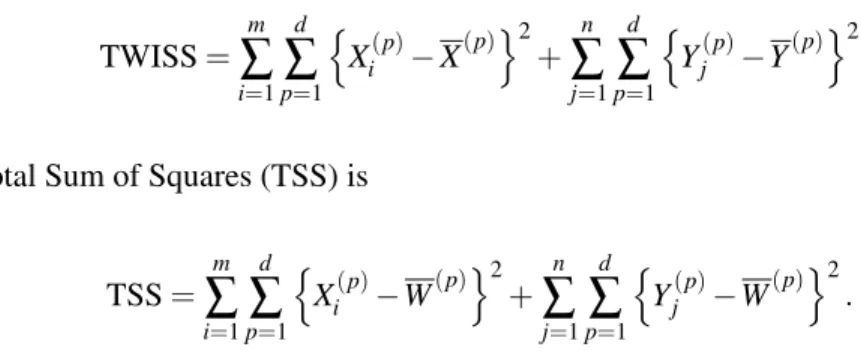
Figure 2.1 shows a two gene toy example where the two classes are denoted by red x’s and blue
Figure 2.1: Two gene toy example demonstrating distances used in calculating SWISS scores. The red x’s and blue o’s represent the two classes. The colored lines in plot A show the distance between each point and its respective class mean (red and blue squares). The black lines in plot B show the distance between each point and the overall mean (black square).
and blue squares. TWISS, the numerator of SWISS, is calculated by taking the distance between each
point and the class mean (denoted by colored lines), squaring this distance, then summing the squared
distances over all points. TWISS measures the amount of spread in the clusters. Plot B shows the
distances used in calculating TSS, the denominator of SWISS. The overall mean is represented by
a black square. TSS is calculated by taking the distance between each point and the overall mean
(denoted by black lines), squaring this distance, then summing the squared distances over all points.
TSS is a measure of the overall amount of variation, or energy, present in the data. TSS is affected by
the spread between the two classes, and as the separation between the classes increases, TSS will also
increase. Normalizing TWISS by TSS allows for comparison between multiple SWISS scores, even
when the data are on different scales. For the data shown in Figure 2.1, TWISS is 151.9 and TSS is
640.4. Thus, the SWISS score of this data is151640..94 =0.24.
SWISS has the following properties:
• Unit free. SWISS does not have any units and is comparable between datasets that are on
different scales. This is because SWISS is normalized by dividing by TSS.
• Shift invariant. Shifting the data by a fixed amount does not change SWISS because the
• Scale invariant. Multiplying the data by a common factor, say c, does not change SWISS.
TWISS and TSS will both change by a factor ofc2, which will cancel out when taking the ratio
to calculate SWISS.
• Rotation invariant. SWISS is unchanged when the data are arbitrarily rotated around a fixed
point for the same reason that SWISS is shift invariant.
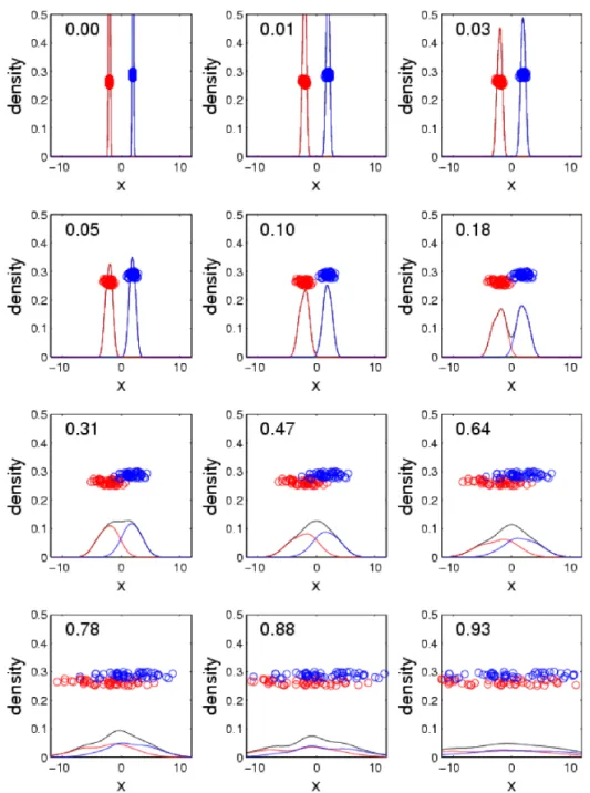
One-dimensional Toy Examples Demonstrating the Range of SWISS
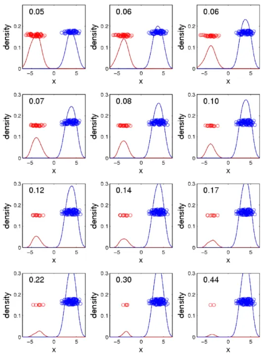
Figures 2.2 through 2.4 show how changes in the class means, class standard deviations and proportion
of points in each class, respectively, are reflected in the SWISS score. Each figure shows a sequence of
one-dimensional (1D) distribution plots. Each dataset was generated from a mixture of two Gaussian
distributions. The data have been colored according to mixture component (class) and the heights
have been jittered to provide visual separation of the points. The red and blue curves are smooth
histograms of the red and blue points, respectively, and the black curves are smooth histograms of the
entire population. SWISS scores are reported at the top of each plot.
Figure 2.2 shows how changing the standard deviation of the classes while keeping the class
means constant drives SWISS scores. The first plot shows the data when the standard deviations are
both zero, and this results in a SWISS score of zero. The SWISS score will always be zero when both
of the class standard deviations are zero because the distance between each point and its class mean is
zero and, hence, TWISS is zero. Then, as the standard deviations of the classes increase, the SWISS
score also increases. This makes sense because as the standard deviations increase, TWISS increases
at a faster rate than TSS, which results in a larger SWISS score. Notice that for the first plot in the
third row, the black curve no longer dips between the red and blue curves. This means that there is no
longer a clear separation between the two classes and this corresponds to a SWISS score of 0.31. In
the final plot, there is no distinction between the the two classes and, therefore, the SWISS score is
very close to one.
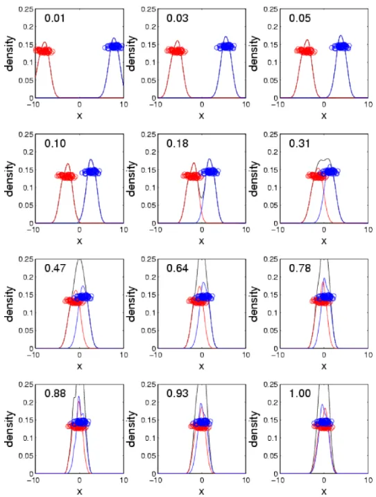
Figure 2.3 shows how changing the distance between class means, while keeping the standard
deviation constant, is captured by the SWISS score. The first plot shows the data when class means
very close to zero. Then, as the distance between class means decreases, the SWISS score increases
because TSS decreases while TWISS remains constant. The last plot shows the data when the class
means are equal, and this results in a SWISS score of one. This makes sense because the overall mean
is the same as the class means. Therefore, TWISS is equal to TSS, and hence, the SWISS score equals
one.
Figure 2.4 shows how changing the proportion of points in each class, while keeping the class
means and standard deviations constant, is quantified by the SWISS score. Each plot has a total of
100 points. The first plot shows the data when there are an equal number of points in the two classes
and, for this example, the SWISS score is very close to zero. Then, as the number of points in each
class becomes more uneven, the SWISS score increases. However, the SWISS score may not increase
all the way to one, as seen in the final plot. This plot shows the data when there are only 2 red points
and 98 blue points, and the SWISS score is 0.44. This increase in the SWISS score makes sense
because, as the proportion of points in each class becomes more unbalanced, the overall mean will
move towards the larger class. This will decrease TSS which results in a larger SWISS score.
Two-dimensional Toy Example
Suppose there is an interest in comparing two different datasets, or one dataset that has been processed
using two different methods, such as different normalizations. A smaller SWISS score reflects that
the data have either: (1) tighter clusters (smaller TWISS) and/or (2) clusters that are spread further
apart (larger TSS). Thus, one processing method, say Method A, isbetterin the sense of SWISS than
another processing method, say Method B, if Method A has a smaller SWISS score than Method B
(Cabanski et al., 2010). In this sense, Method A gives a more effective clustering of data into the
predefined classes than Method B.
Figure 2.5 illustrates a variety of possible SWISS scores on a two-dimensional toy example. These
plots confirm that data that are better clustered, in the sense that the two classes have better separation
and tighter clusters (plot A, SWISS = 0.25), have a lower SWISS score than data where there is less
separation between the classes (plot B, SWISS = 0.91). Notice that the axes are the same for all
plots. When comparing the clustering of the data shown in plots A and C, it is unclear by visual
the datasets appear to be on different scales. However, once TWISS is standardized, the SWISS scores
have the same scale and are directly comparable. The data visualized in plots A and C have equivalent
clustering performance because both datasets have a SWISS score of 0.25. The data shown in plot
D are a simple shift of the data in plot C, with the two classes shifted toward each other. Although
TWISS is constant between plots C and D, this small shift still has a large effect on the SWISS score
(0.25 vs. 0.46).
One may wonder whether the SWISS score in plot B is significantly lower than one. That is, is
the clustering performance better than random chance? Subsection 2.2.2 describes a permutation test
based on SWISS, where the null hypothesis is that SWISS equals one. In that subsection, we will
show that this permutation test is equivalent to testing for a difference in class means.
Suppose that the data visualized in plots A and D come from the same dataset that has been
processed using two different processing methods, which we will refer to as Method A and Method
D, respectively. Because the SWISS score of Method A is lower than the SWISS score of Method D
(0.25 vs. 0.46), Method A is preferred over Method D. However, suppose there is a preference for
using Method D. For example, Method D may be easier to implement or may be more cost effective.
To answer the question of whether the difference between the SWISS scores of Methods A and D
is statistically significant, a permutation test based on SWISS is developed and described in detail in
Subsection 2.2.3.
2.2.2 One-sample SWISS Permutation Test
This section describes a permutation test to determine if the clustering performance based on
prede-fined class labels is better than random chance. For this test, the null and alternative hypotheses are
H0: SWISS=1 vs. H1: SWISS<1. To perform this permutation test, first decide on the number of
permutations,nperm. Settingnperm to be at least 1000 is suggested. For each permutation, randomly
permute the class labels and recalculate the SWISS score. The p-value is the proportion of permuted
SWISS scores that are less than the original SWISS score. If the p-value is small, reject the null
hypothesis and conclude that the SWISS score is significantly less than 1.
Let us return to the toy example shown in plot B of Figure 2.5. The SWISS score of this data
Figure 2.6: SWISS permutation test results for data shown in plot B of Figure 2.5. Each point corresponds to the SWISS score after a random permutation of the class labels. The black curve is a smooth histogram of the permuted SWISS scores. The red line shows the original SWISS score, at 0.91. The p-value is 0.18, corresponding to the proportion of permuted SWISS scores less than 0.91. Because the p-value is greater than 0.05, there is not sufficient evidence to conclude that the SWISS score is different from one.
shows the results from the permutation test, withnperm=1000. The x-axis shows the range of SWISS
scores based upon the permuted data. Each point corresponds to the SWISS score after a random
relabeling of the classes, with heights randomly jittered for visual separation. The black curve is a
smooth histogram of the permuted SWISS scores. The red line at 0.91 corresponds to the original
SWISS score with the true class labels. Eighteen percent of the permuted SWISS scores are smaller
than the original SWISS score of 0.91, resulting in an empirical p-value of 0.18. This large p-value
suggests that the SWISS score is not significantly less than one. Therefore, the clustering performance
visualized in plot B of Figure 2.5 may be explained by random chance.
This permutation test is equivalent to testing for a difference between the two class means, as
shown below:
SWISS=1 ⇔ TWISS
TSS =1
⇔ TWISS=TSS
Thus, the null hypothesis will be rejected if there is sufficient evidence that the class means are not
equal. In many standard settings, it is preferable to use an exact difference of means test. For example,
using the two samplet-test whend=1 and each class follows a Gaussian distribution, or Hotelling’s
T2whend>1 and each class follows a multivariate Gaussian distribution (Section 6.3 in Muirhead,
2005). However, it is not always practical to use these exact tests. For example, the data components
may not follow a Gaussian distribution. Additionally, when dealing with genetic data, it is common
that the dimension is much larger than the sample size. In this setting, calculating the inverse sample
covariance matrix is challenging. As an alternative, SWISS provides a computationally easier method
with no distributional assumptions to test for a difference between class means.
2.2.3 Two-sample SWISS Permutation Test
Suppose two different processing methods, say A and B, are applied to the sameN data points. A
permutation test for the SWISS method was developed by Cabanskiet al. (2010) to test whether
the difference in SWISS scores between Methods A and B is statistically significant. The null and
alternative hypotheses areH0: SWISSA=SWISSB vs.H1: SWISSA6=SWISSB.
We introduce a slight change in notation for this subsection only. Specifically, let Ai j be a d1
-dimensional vector of covariates of the jthobservation (j=1,2, . . .ni) from theithclass (i=1,2) from
Method A. Relating to earlier notation,
A= [A11, . . . ,A1n1,A21, . . . ,A2n2] = [X1(d), . . . ,Xm(d),Y1(d), . . . ,Yn(d)],
where Ais the d1×N matrix of the Ai j’s, Ai j =
A(1)i , . . . ,A(d1)
i
T
, N=n1+n2 =m+n, and the
Xi’s andYj’s have been processed using Method A. Similarly, letBi j be ad2-dimensional vector of
covariates of the jthobservation from theithclass from Method B andBthed2×Nmatrix of theBi j’s.
LetCbe theN-dimensional vector of class labels corresponding to the columns ofAandB. The first
n1elements ofCwill have entry 1 and the remainingn2elements will have entry 2. LetWAandWB
be thed1- andd2-dimensional overall mean vectors, and ¯Aiand ¯Bibe the mean vectors of classiofA
andB, respectively.
1. Form the 2 xN sum of squared deviation matricesDA andDB. Each column of the squared
deviation matrix is the squared deviation of the corresponding data point to its respective class mean
(row 1) and overall mean (row 2). Specifically, for each data point, indexed byj=1,2, . . .N, calculate
DAandDBas
DA(1,j) = d1
∑
p=1 n
A(jp)−AC(p()j)
o2
DB(1,j) = d2
∑
p=1 n
B(jp)−BC(p()j)
o2
DA(2,j) = d1
∑
p=1 n
A(jp)−W(Ap)
o2
DB(2,j) = d2
∑
p=1 n
B(jp)−W(Bp)
o2
The distances that are used to formDA andDBare best visualized by Figure 2.1 on page 6. Suppose
that the data shown in Figure 2.1 have been processed using Method A. ThenDA(1,1)is the squared
distance between the first data point and its respective class mean (i.e., squaring the distance shown
by the corresponding colored line in plot A). This squared distance is similarly calculated for the
remaining data points, and these values are recorded in the first row ofDA. Note that summing over
the first row ofDA gives TWISS.DA(2,1) is the squared distance between the first data point and
the overall mean (i.e., squaring the distance shown by the corresponding black line in plot B). This
squared distance is similarly calculated for the remaining data points, and these values are recorded in
the second row ofDA. Note that summing over the second row ofDAgives TSS. Similar calculations
are performed on the data that have been processed using Method B to obtainDB.
2. Standardize each element inDA andDB by dividing by the corresponding TSS. That is, for l∈ {A,B},
Dl=
1
∑Nm=1Dl(2,m)
Dl.
3.Calculate the SWISS scores, the ratio of TWISS over TSS, for Methods A and B. Forl∈ {A,B},
SWISSl=∑ N
m=1Dl(1,m) ∑Nm=1Dl(2,m)
= N
∑
m=1
4. Calculate SWISS scores based upon the permuted data as follows. Letnpermbe the number of
permutations. Settingnpermto be at least 1000 is suggested.
(a) Generate an nperm×N matrix R of Bernoulli random variables, assigning 0 or 1 each with
probability12.
(b)Calculate thenperm-dimensional vectorPof permuted SWISS scores. For each data point in
each permutation, we randomly choose which within class and overall sum of squared deviations to
use (Method A or Method B). Specifically, for permutationi=1,2, . . .nperm, let theithentry ofPbe
P(i) =∑ N
m=1[R(i,m)∗DA(1,m) + (1−R(i,m))∗DB(1,m)] ∑Nm=1[R(i,m)∗DA(2,m) + (1−R(i,m))∗DB(2,m)]
Note that for each permutation, neither the mean vectors nor the sum of squared deviations are
recal-culated. Thus, it is possible to have a permutation where TSS is actually smaller than TWISS, and
hence, the permuted ratio is larger than 1.
5. Finally, calculate the empirical p-values. Two p-values are reported to indicate the behavior
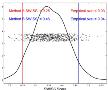
on each side of this naturally two-sided test. Figure 2.7 demonstrates how the empirical p-values
are calculated. This figure shows the permutation test output when comparing the data visualized in
plots A and D of Figure 2.5. We will assume that this data come from one dataset processed by two
different methods, Method A and Method B, respectively. The SWISS scores are 0.25 and 0.46, and
are reported in the upper left corner of the plot. The x-axis shows the range of SWISS scores based
upon the permuted data. The red and blue lines represent the SWISS scores of the two methods. The
dots show the distribution of the permuted SWISS scores (with jittered heights), which range from
0.20 to 0.55. The black line shows a smooth histogram of these dots. To calculate the empirical
p-values, take the proportion of dots outside the red and blue lines. That is, forl∈ {A,B},
p-valuel=min
# ofP(i)<SWISSl nperm
,1−# ofP(i)<SWISSl
nperm
.
The lower p-value is 0.03 because 3% of all SWISS scores from the permuted data is less than the
lower SWISS score of 0.25. Similarly, the upper p-value is 0.04, corresponding to the 4% of permuted
Figure 2.7: SWISS permutation test results testing for a significant difference in SWISS scores between the toy examples shown in plots A and D of Figure 2.5. This plot shows the distribution of the permuted SWISS scores (dots), summarized by a smooth histogram (black curve), along with the SWISS scores of Method A (red vertical line) and Method B (blue vertical line). The SWISS scores and corresponding empirical p-values are also reported. Because the sum of the p-values are greater than 0.05, conclude that there is no significant difference between the SWISS scores of Methods A and B.
the upper right corner of the plot.
Reject the null hypothesis that the two SWISS scores are equal at significance levelαif the sum of
the upper and lower p-values is less thanα. Otherwise, there is not sufficient evidence to conclude a
difference between the SWISS scores of Method A and Method B. For the toy example results shown
in Figure 2.7, we conclude, at the 5% level of significance, that the difference between the SWISS
scores of Methods A and B (0.25 and 0.46, respectively) may be due to random chance because the
sum of the p-values is 0.07.
This permutation test can also be performed as a one-sided test. In this case, the hypotheses are
H0: SWISSA=SWISSB vs. H1: SWISSA<SWISSB. If the proportion of points less than Method
A’s SWISS score is less thanα, we conclude that the SWISS score of Method A is significantly less
than the SWISS score of Method B, and, hence, significantly better at clustering the data into the
predefined classes than Method B. For the toy example results shown in Figure 2.7, the corresponding
one-sided p-value is 0.03. Therefore, the SWISS score of Method A is significantly less than the
2.3
Multiclass SWISS
So far, we have only considered the case where the data consist of two classes. This section will
extend the SWISS method to the multiclass setting.
When Cabanski et al. (2010) proposed SWISS, they dealt with the multiclass case in the same
manner as the two class case. That is, TSS is calculated by summing the squared distance between
each point and the overall mean, and TWISS is calculated by summing the squared distances between
each point and its class mean. We will refer to the SWISS score calculated in this manner as the
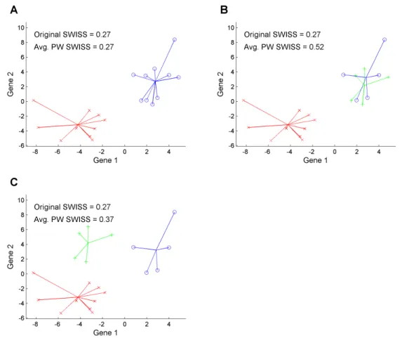
“original SWISS score”. Figure 2.8 shows a two dimensional toy example that motivates the need for
a multiclass correction. Plot A shows the data split into two classes, denoted by red x’s and blue o’s.
The colored lines show the distance between each point and its class mean. The original SWISS score
of this dataset (shown at the top of the plot) is 0.27, which reflects the good clustering of this dataset.
Plot B shows the same data as in plot A. However, the blue o’s have now been divided into two
classes, blue o’s and green +’s. The TSS (the sum of squares in the denominator of SWISS) has not
changed since the points did not move, only the class labels were changed. The TWISS of plot B is
slightly smaller than the TWISS of plot A. The original SWISS score of the data in plot B is also 0.27;
however, this clustering is of distinctly lower quality because the blue and green classes overlap.
Plot C shows a modification of the data in plot B, where all of the green +’s have been shifted up
and to the left by the same amount. Now there is clear separation between all of the classes. TWISS
did not change from plot B to plot C since each point is still the same distance from its class mean.
TSS is different in plots B and C, though this difference is very small. Thus, the original SWISS score
of this dataset is also 0.27. This is not an appealing property of SWISS because the clusters in plot
C are clearly more distinct than in plot B. SWISS feels the amount of variation within clusters and
distances from the overall mean, but it does not take into account the distances between classes. Thus,
the SWISS score can be substantially improved when dealing with multiclass data.
We have extended the SWISS method discussed in Subsection 2.2.1 to the multiclass setting by
calculating the original SWISS score for each pair of classes, then taking theaverage of all pairwise
SWISS scores. The plots in Figure 2.8 also report the average pairwise SWISS scores. The original
comparing the average pairwise SWISS scores of plots B and C, we see that plot C has a lower SWISS
score than plot B (0.37 vs. 0.52). This average pairwise correction seems appropriate because the data
with clear separation between the classes (plot C) now have a lower SWISS score than the data with
overlapping classes (plot B).
For the remainder of this chapter, when calculating the SWISS score, we will use the original
SWISS score described in Subsection 2.2.1 when the data consist of two classes and the average
pairwise SWISS score when the data consist of more than two classes.
2.4
Comparison with Competing Methods
As mentioned in Subsection 2.2.1, there are several useful properties of SWISS. Because SWISS is
unit free, it can be used to compare methods that are on different scales. For example, different scales
can arise from differing normalization methods or when comparing different microarray platforms.
SWISS is also shift, scale and rotation invariant. Additionally, because it is based only on Euclidean
distance and normalized by TSS, SWISS can be used to compare methods that have different
dimen-sions. This can be useful when comparing the same biological samples, but using two different gene
sets. Finally, because the permutation test reports a p-value, investigators are able to decide which
processing method is preferred, or learn if there is no statistically significant difference between the
two methods, without relying on subjective evaluation.
Using the within class sum of squares to compare how well data are clustered has previously
appeared in the literature. For instance, Kaufman and Rousseeuw (1990) use within class sum of
squares (which they refer to as WCSS) as a tool to aid in the decision of the number of clusters that
should be used fork-means clustering. Giancarloet al.(2008) show WCSS can provide the basis of a
reasonable method for choosingk. However, because WCSS is not standardized, it can only be used
to compare the effectiveness of clustering methods when the total sum of squares is constant. Thus,
WCSS is not able to compare the effectiveness of clustering on two different processing methods
when the processed data given by those methods are on different scales (i.e., have different TSS).
Dudoitet al.(2002) propose a statistic, the BW ratio, as a gene filtering tool. The BW ratio is the
TSS=TWISS+BCSS, we can rewrite the BW ratio as
BW=TSS−TWISS
TWISS = TSS
TWISS−1= 1
SWISS−1.
This shows that a large SWISS score corresponds to a small BW ratio, and vice versa. Unlike
SWISS, the BW ratio is not bound between zero and one. Dudoitet al. filter out genes with near
constant expression levels by selecting the genes with the largest BW ratio (i.e., smallest SWISS).
The authors did not apply the BW ratio to other settings beyond gene filtering.
Davies and Bouldin (1979) propose a metric, called the Davies-Bouldin index (DBI), for
evaluat-ing clusterevaluat-ing algorithms that is very similar to SWISS. Usevaluat-ing the same notation as SWISS, defined in
Subsection 2.2.1, they defineR=√TWISS/M, whereM=
r
∑dp=1 n
X(p)−Y(p)
o2
is the Euclidean
distance between the class centroids. In the two class setting, DBI=R, which appears similar to the
square root of SWISS with a different normalization factor. Instead of normalizing by TSS, Davies
and Bouldin choose to normalize TWISS by the squared distance between the class centroids. Unlike
SWISS, which is bounded by[0,1], DBI is unbounded above. Similar to SWISS, DBI is unit free
and shift, scale and rotation invariant. In the multiclass setting, DBI is calculated in a very different
manner than the multiclass SWISS score. We will indexRasRi j whenRis calculated between a pair
of classes,iand j. They defineDi=maxj:i6=jRi j and DBI=K−1∑Ki=1Di, whereKis the total number
of classes. For each class,Di equalsRi j for the most similar class j, which is similar to choosing
the “worst case scenario”. This is very different from the multiclass SWISS, which is calculated by
taking the average of all pairwise SWISS scores. Although calculated differently from SWISS, DBI
has the same interpretation that the smaller the value, the better the clustering of the data. DBI has
been applied in deciding the value ofkin thek-means clustering algorithm when the true value ofkis
unknown.
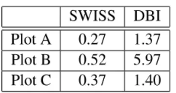
Table 2.1 shows both the SWISS score and Davies-Bouldin index for the toy examples considered
in Figure 2.8. Notice that while SWISS is bound by zero and one, DBI achieves values larger than
one. Both SWISS and DBI assign a large value to the data in plot B, which reflects poor clustering of
the data. Both methods assign the lowest value to the data in plot A, with the data in plot C receiving
SWISS DBI Plot A 0.27 1.37 Plot B 0.52 5.97 Plot C 0.37 1.40
Table 2.1: Comparison of the SWISS score and Davies-Bouldin index (DBI) for the three toy example datasets visualized in Figure 2.8.
aspects of the data.
To our knowledge, there are no methods currently in the literature, including WCSS, the BW
ratio and DBI, that have been applied to address the variety of problems that SWISS can tackle.
However, there are methods that can be compared to SWISS when addressing specific problems. As
an example, in Subsection 2.5.1, we perform a SWISS analysis comparing two different Affymetrix
microarray platform pre-processing methods. In that subsection, we will also compare our SWISS
method with other methods used in evaluating Affymetrix pre-processing and normalization methods.
2.5
Applications
The usefulness of SWISS will be demonstrated by two different applications. The first application,
in Subsection 2.5.1, compares two different pre-processing methods on the Affymetrix microarray
platform. The second application, discussed in Subsection 2.5.2, compares two different microarray
experimental designs using SWISS.
2.5.1 Comparing Affymetrix Pre-processing Methods
An important step in processing microarray data is to produce a single value for the gene expression
level of an RNA transcript using one of a growing number of statistical methods. In this application,
we use SWISS to compare two different Affymetrix pre-processing methods: RMA (Irizarryet al.,
2003) and the Affymetrix Micro Array Suite 5.0 (MAS 5.0; Affymetrix White Paper, 2002). The data
contain 5 replicates of 4 different samples, for a total of 20 data points. Each sample will be considered
a class, resulting in 4 classes with 5 points in each class. For a further description of the dataset, see
see section “Microarray Experiments, Data Collection and Processing: Experimental Application II”
The SWISS scores of RMA and MAS 5.0 are 0.125 and 0.613, respectively. The two-sample
permutation test gives a p-value of 0.04. At the 5% level of significance, there is sufficient evidence
to conclude that the two SWISS scores are not equal. Therefore, RMA is preferred over MAS 5.0
because its SWISS score is significantly lower. Because each class consists of multiple replicates
of the same experimental sample, this SWISS analysis shows that RMA gives the most reproducible
results.
Millenaar et al. (2006) compare six different pre-processing algorithms used to generate gene
expression levels for the Affymetrix microarray platform, including RMA and MAS 5.0. The authors
make their comparison using five different analyses:
1. Differential expression comparison. A two-sample t-test was performed to detect genes with
differential expression between two classes. The authors analyzed the number of significantly
called genes for each method and the amount of overlap between all methods.
2. Spike-in comparison. A commonly used RNA spike-in experiment from Affymetrix was used
to test which method produced the most accurate results. For this comparison, spike-in dilution
series data are needed. Fit the linear model log2E=β0+β1log2c+ε whereE is a vector of
expression measures andcis a vector of concentrations. If the method is unbiased, the slope
(value ofβ1) should be near 1.
3. Reproducibility. The coefficient of variation (CV), defined as standard deviationaverage ×100%, is a
mea-sure of reproducibility which is independent of the mean. CV should be calculated for all genes
across all arrays. Methods that produce many gene expression estimates with low CV give more
reproducible results.
4. Biological relevance. Compare the genes called as being differentially expressed to genes
known to vary across conditions.
5. Comparison with Real Time RT-PCR data. To further test which method calculates microarray
gene expression most accurately, the results of the methods can be compared with Real Time
RT-PCR (Provenzano and Mocellin, 2007) on a subset of genes which are predicted by all the
Similar to SWISS, Millenaaret al.conclude that RMA gives the most reproducible results. However,
there are drawbacks to using their above comparisons. First, some of the comparisons, such as the
spike-in and Real Time RT-PCR comparisons, require additional experiments to be performed.
Sec-ond, in order to assess biological relevance, a fair amount of previous knowledge about the dataset is
required. Not only does this comparison rely on similar datasets having already been analyzed, but it
may also be very time consuming. Third, most of the above comparisons are qualitative rather than
quantitative. Additionally, hypothesis tests are not performed on the few analyses that are
quantita-tive. As previously mentioned, SWISS does not require additional experiments to be performed, is
quantitative rather than qualitative and a permutation test based on SWISS helps to identify whether
one method should be preferred over another.
2.5.2 Comparing Microarray Experimental Designs
Two-color gene expression microarray assays are among the most common genomic profiling tools
currently in use (Churchill, 2002; Vinciottiet al., 2005). Two-color array technologies rely on labeling
two samples (such as tumor vs. normal or experimental vs. reference) with different fluorochromes
followed by co-hybridization to the same chip-based assay (Meyerson and Hayes, 2005).
Consid-ering relative fluorescence (such as a log-ratio), particularly to a common reference such as a cell
line reference hybridized on the same array, provides a robust normalization technique to control for
manufacturing variability (Novoradovskayaet al., 2004). A two-color array with a common reference
such as a cell line will be referred to as areference design. A one-color array or a two-color array
using only one signal channel will be referred to as asingle-channel design.
The reference design, while powerful, has its disadvantages (Churchill, 2002); notably, 50% of
the measurements in a reference design experiment are solely for normalization purposes,
represent-ing both significant financial and opportunity costs. Additionally, there is an effective doublrepresent-ing in
measurement error by the reference design because every log2ratio of experimental channel intensity
over reference channel intensity includes error contributions from both channels (Churchill, 2002;
Vinciottiet al., 2005). Furthermore, genes that are biologically absent or expressed at very low levels
in the reference sample are sometimes excluded from consideration even if present at high levels in
con-trast to the two-color arrays, one-color arrays do not rely on experimental normalization such as that
described for the reference design. Instead, computational techniques are used to normalize
fluores-cence intensities across arrays. Historically, the distinction between the one and two-color platforms
has been viewed primarily in terms of the technology underlying the manufacturing and experimental
protocols of the array platform (Meyerson and Hayes, 2005).
SWISS is used to compare the reference design to the single channel design using 39 breast cancer
samples (Sorlieet al., 2001) assayed on spotted cDNA arrays, a relatively old microarray platform.
Data representing both the reference design and single channel design were obtained for these 39
samples, followed by a normalization step (for specifics, see section “Microarray Experiments, Data
Collection and Processing: Experimental Application I” of Cabanskiet al., 2010). The two classes
for this analysis are estrogen receptor positive and negative phenotypes.
Rather than only comparing SWISS scores for a fixed number of genes, the number of genes in
the analysis is varied and SWISS scores are calculated. For each experimental design, the gene set is
filtered by keeping the genes with the largest variances across all arrays. Note that the gene lists of
the reference and single channel designs are decided independently, and thus the gene sets may not be
identical. SWISS scores are calculated starting with only 16 genes and ending with all genes included
(approximately 8,000). Figure 2.9 shows the results, along with the 90% confidence intervals (black
bars) from the SWISS permutation test. This shows that the reference design always has a lower
SWISS score and, because the red and blue curves always lie outside of the 90% confidence interval,
that the reference design is always statistically better than the single channel design.
Figure 2.9 compares the SWISS scores of the reference and single channel designs when we filter
by gene variance across all arrays. As previously noted, different gene sets may have been compared
because the most variable genes in the reference design did not necessarily coincide with the most
variable single channel design genes. Next, the reference and single channel designs are compared
using the same gene sets. Figure 2.10 shows this comparison, along with the corresponding 90%
confidence intervals from the permutation test. Plot A compares the two designs using the most
variable genes from the single channel design, and plot B uses the most variable genes from the
reference design. Note that the blue dashed line (single channel design) from plot A and the solid red
Figure 2.9: SWISS scores for the reference design (solid red) with reference design gene filtering and single channel design (dashed blue) with single channel design gene filtering along with corresponding 90% confidence intervals (black bars) calculated from the SWISS permutation test are shown. The reference design is always significantly better than the single channel design because the black bars are always inside the blue and red curves. Figure reproduced from Cabanskiet al.(2010).
Remember that in Figure 2.9, the reference design was always significantly better than the single
channel design. However, in plots A and B of Figure 2.10, neither gene filtering exhibits a uniformly
significant difference between the two designs. This is especially apparent in plot B, where there is no
significant difference between the reference and single channel designs until at least 1000 genes are
included. Note that both the red and blue curves in plots A and B have similar shapes, as opposed to
Figure 2.9 where the curves had different shapes. This suggests that for two different gene filterings,
the SWISS curves may have different shapes (as in Figure 2.9). However, when the same gene set is
used on both curves, the SWISS curves seem to have similar shapes (as in Figure 2.10).
When comparing plots A and B of Figure 2.10, notice that the SWISS scores in plot B are always
less than or equal to the SWISS scores in plot A. This implies that the filtering method determined
by choosing the most variable genes in the reference design is superior to choosing the most variable
genes in the single channel design. Furthermore, single channel filtering leads to higher SWISS scores,
suggesting that the most variable single channel genes contain more noise and less signal. Therefore,
for spotted cDNA arrays, the reference design seems best for filtering genes by variation across arrays.
However, once the gene set has been selected, the single channel design is not statistically worse than
the reference design in terms of clustering performance for up to 1000 genes.
2.6
Other Considerations
While stressing the broad applicability of SWISS to a range of analytical problems and the ease of
its use, it is important to understand the limitations as well (Cabanski et al., 2010). First,
high-dimensional data such as microarray experiments are the product of complex protocols and depend
on the quality of reagents and samples. Any change in upstream elements, such as a lab protocol or
normalization method, might influence the resulting SWISS score dramatically. Additionally, SWISS
scores may not represent the only criterion on which one method is preferred. For example, we
showed in Subsection 2.5.1 that RMA gives more reproducible results than MAS 5.0. However, some
investigators may prefer using MAS 5.0 because it is more conservative, gives positive output values,
down-weights outliers and minimizes bias (Affymetrix Technical Note, 2005).
there are likely cases where more dedicated methods would provide more nuanced insights. For
example, SWISS should not be the only tool used when the investigator is interested in performing an
in-depth analysis of competing methods or platforms, such as comparing a new normalization method
with other established normalization methods.
We also acknowledge that the examples we have provided in Section 2.5 should be viewed with
caution in terms of the potential to introduce bias. Decisions such as gene filtering and cross-platform
gene annotation may influence the interpretation of the results, as documented in Figures 2.9 and 2.10.
Depending on which set of filtered genes is used, an investigator may reach different conclusions
about the superiority of a platform. More troubling, the set of assumptions, such as filtering, may be
based on the performance of those genes in one platform over the genes that might have been chosen
by the other, ultimately biasing the analysis to favor a potentially spurious result. We have shown
in Subsection 2.5.2 examples in which one might be tempted to select what appears to be optimal
gene sets based on SWISS scores. This is not the intention of the examples but rather to demonstrate
the opposite: to document the impact on SWISS scores by varying gene lists. While SWISS does
not necessarily account for the full range of potential biases, it does allow for decisions about data
transformations such as gene filtering to be made independently for each data source.
When approached with these cautions in mind, we feel that the concerns raised in this section are
Chapter 3
High-dimensional Asymptotic Behavior of SWISS
As discussed in Chapter 2, Standardized WithIn class Sum of Squares (SWISS, defined in Subsection
2.2.1) has proven itself to be useful in evaluating different processing methods of high-dimensional
genetic data in terms of their clustering performance on predefined classes, such as tumor subtypes.
This motivates this study of the high-dimensional asymptotic behavior of SWISS. We will explore an
asymptotic representation of the SWISS score of two class data as the dimensiondgrows. Specifically,
if we denotemandnas the sample size of each class andN=m+nas the total sample size, we will
describe the asymptotic behavior of the SWISS score as Nd →∞. This asymptotic domain contains
two different settings, both of which will receive attention.
The first setting, known as High Dimension Low Sample Size (HDLSS), occurs whend→∞and
Nis fixed. The first paper to consider this asymptotic domain was Casella and Hwang (1982). Hall
et al. (2005) describe a geometric representation of HDLSS data whered tends to infinity while the
sample sizeNis fixed. In particular, under certain assumptions, the data tend to lie deterministically at
the vertices of a regular simplex with all of the randomness appearing in the rotation of this simplex.
This geometric representation provides the insight needed to understand the behavior of the SWISS
score in that high-dimensional setting.
The second setting, which we will refer to as High Dimension Moderate Sample Size (HDMSS),
allows N to also grow, but at a much slower rate than d so that Nd →∞. This setting has received
attention in the literature, but often as specific cases rather than as a general setting. For example, Fan
and Lv (2008) study asymptotics whereN→∞andd∼eN. In contrast, we choose to letd→∞and
is a sharp contrast to classical mathematical statistics, it feels more natural and allows for a more
transparent relationship to the HDLSS setting. Yata and Aoshima (2012) show that, under certain
conditions, the same geometric representation of HDLSS data still remains when N→ ∞. Under
these same conditions, we are able to extend the results of the behavior of SWISS in the HDLSS
setting to the HDMSS setting. In fact, the asymptotic behavior of SWISS is easier to interpret in this
setting as the results now depend on two fewer parameters becausemandndisappear in the limit.
This chapter is laid out as follows. In Section 3.1, the geometric representation of HDLSS data,
first described by Hallet al. (2005), is summarized. Section 3.2 gives a precise and detailed
descrip-tion of the asymptotic behavior of the SWISS score in the HDLSS setting. Because the asymptotic
representation of the SWISS score is a function of multiple parameters, Section 3.2 will also give
in-sight to the SWISS score by studying important special cases. Section 3.3 will describe and interpret
the asymptotic behavior of the SWISS score in the HDMSS setting. Finally, Section 3.4 describes
future research problems related to the high-dimensional asymptotic behavior of the SWISS score.
3.1
Geometric Representation of High-dimensional Data
This section starts with a summary of the work of Hall et al. (2005) who describe, under some
assumptions, a geometric representation of data where the dimensiond tends to infinity while the
sample size is fixed. They find that there is a tendency for the data to lie deterministically at the
vertices of a regular simplex, where essentially all of the randomness in the data appears only as a
rotation of this simplex. However, the results in Hallet al. require the entries of the data vector to be
nearly independent, in the sense that when they are viewed as a time series, these entries must satisfy
aρ-mixing condition (Kolmogorov and Rozanov, 1960). Ahnet al.(2007), Jung and Marron (2009),
Qiaoet al. (2010) and Yata and Aoshima (2012) give much milder conditions for the results of Hall
et al. to represent one HDLSS sample using asymptotic properties of the sample covariance matrix
and its eigenvalues. Yata and Aoshima also extend these results and show that, under some additional
assumptions, the same geometric representation of the data holds in the HDMSS setting. This section
reports the results from the aforementioned papers that will be useful in determining the asymptotic
The notation that follows will be used throughout the rest of this chapter. Assume that the data
consist of two classes,X(d) ={X1(d), . . . ,Xm(d)}andY(d) ={Y1(d), . . . ,Yn(d)}, where the data
vectorsXi(d) =
Xi(1), . . . ,Xi(d)
T
andYj(d) =
Yj(1), . . . ,Yj(d)
T
are independent and identically
dis-tributed from a d-dimensional multivariate distribution with positive definite covariance matrixΣXd
andΣYd, respectively. Without loss of generality, assume that eachXi(d)andYj(d)has zero mean.
Denote thed×dsample covariance matrix ofXd= [X1(d), . . . ,Xm(d)]asSXd =m−1XdXTd and the m×mdual sample covariance covariance matrix asSXD,d =m−1XTdXd. An advantage of considering
the dual covariance matrix is thatSX d andS
X
D,d share non-zero eigenvalues. The eigenvalue
decom-position ofΣXd isΣXd =VdΛXdVdT, whereΛXd =diag
λ1X, . . . ,λdX is the eigenvalue diagonal matrix. Define the average of the eigenvalues asσd2=d−1∑di=1λiX.
Write Xd =Vd ΛXd
1/2
Zd, where Zd = ΛXd
−1/2
VdTXd is a d×m sphered data matrix from
a distribution with zero mean and identity covariance matrix. We will represent the elements of
Zd= [z1, . . . ,zd] T
aszi= (zi1, . . . ,zim) T
,i=1, . . . ,d. Defineφi j =Cov
z2i −1,z2j−1
.
Let us also writeDk= ∑di=1λiX
−1
∑di=1λiXzikas a diagonal element ofm ∑di=1λiX
−1
SD,d. Note
thatDk=kXk(d)k2/tr ΣXd
andE(Dk) =1 (Yata and Aoshima, 2012).
We assume the following:
A1. Each column ofXdhas zero mean and covariance matrixΣXd. A2. The fourth moments of each column ofZare uniformly bounded.
A3. The eigenvalues ofΣXd are sufficiently diffused, in the sense that
εdX =
∑di=1 λiX
2
∑di=1λiX
2 →0 asd→∞.
The statisticεdX can be viewed as a measure of the sphericity of the data matrix. This is related to the statisticε = dεdX−1, which was proposed by John (1972) as the basis of a hypothesis test for equality of eigenvalues.
A4. The sum of the eigenvalues ofΣXd is the same order asd, i.e.,
σd2=d −1
d
∑
i=1