Abstract
CREAGER, JAMES H. Understanding the Findability and Perceived Clickability of Shaded and Flat Objects in Almost-flat Interfaces. (Under the direction of Dr. Douglas Gillan).
Prior usability studies have suggested that shading gradients may improve the
findability and perceived clickability of objects in almost-flat graphical user interfaces. The
present research investigates these claims with multiple types of shading gradients. A
traditional visual search paradigm was implemented to examine the rate at which shaded and
flat objects could be found in almost-flat environments, and perceived depth ratings were
collected to examine the magnitude and direction of depth emergent from those objects.
With respect to search, convex objects with medium and high contrast gradients had high
findability and were not distracting when searching for a flat object in the display. Concave
objects and convex objects with low contrast gradients had high findability, but made search
difficult for flat objects. With respect to depth ratings, convex objects with medium and high
contrast shading gradients were consistently perceived with a raised three-dimensional shape,
while perceptions were mixed for concave objects and convex objects with low contrast
gradients. Findings advocate the use of almost-flat design with medium and high contrast
convex shading gradients. Design guidelines are provided and theoretical implications are
© Copyright 2017 James H Creager
Understanding the Findability and Perceived Clickability of Shaded and Flat Objects in Almost-flat Interfaces
by
James H Creager
A thesis submitted to the Graduate Faculty of North Carolina State University
in partial fulfillment of the requirements for the degree of
Master of Science
Psychology
Raleigh, North Carolina 2017
APPROVED BY:
Dedication
Biography
James (Jim) Creager holds a B.S. in Computer Science from North Carolina State
University. His research examines user behavior in software interfaces, integrates human
Acknowledgements
I would like to thank my advisor, committee, professors, and all department staff who
helped get this thesis to completion. It takes a lot of work to run a graduate program. Your
investment into my education, research, and career is greatly appreciated. This project would
Table of Contents
List of Tables ... vii
List of Figures ... viii
Introduction ... 1
Visual Search Theory ... 3
Features in Almost-flat Environments ... 6
Perception of Three-dimensional Shape ... 9
Research Questions ... 10
Experiment 1 ... 12
Method ... 12
Participants. ... 12
Setup and materials. ... 13
Stimuli and displays. ... 13
Procedure. ... 14
Results and Discussion... 16
Experiment 2 ... 21
Method ... 22
Participants. ... 22
Setup and materials. ... 23
Stimuli and displays. ... 23
Procedure. ... 24
Results and Discussion... 25
Visual search... 25
Depth ratings. ... 28
General Discussion ... 31
List of Tables
Table 1. Experiment 1 response time slopes. ... 17
Table 2. Experiment 1 frequency and depth of perceived shape. ... 20
Table 3. Experiment 2 response time slopes. ... 27
List of Figures
Figure 1. Flat and shaded interface elements. ... 7
Figure 2. Illustrative activation matrices. ... 8
Figure 3. Experiment 1 stimuli. ... 14
Figure 4. Experiment 1 example displays. ... 14
Figure 5. Experiment 1 response time graphs. ... 16
Figure 6. Experiment 1 depth rating graph. ... 19
Figure 7. Experiment 2 stimuli. ... 24
Figure 8. Experiment 2 response time graphs. ... 26
Introduction
In software interfaces, findability (the ease with which users can locate an object or
feature they know exists) and perceived clickability (the degree to which actionable elements
appear to be clickable) are fundamental components of usable systems. Efficiency,
effectiveness, and satisfaction all suffer when interface elements necessary for task
completion are difficult to locate and activate (Rogers & Preston, 2009; Rosenbaum,
Glenton, & Cracknell, 2008).
Findability and perceived clickability are influenced by visual design because users
must visually search through displays and choose to interact with interface elements that
appear relevant to their task goals (Findlater & McGrenere, 2007; Morville, 2005). For
example, the degree to which a registration button stands out from its surroundings and looks
clickable determines the likelihood of someone directing their attention to that area of the
screen and deciding to click that button when they are trying to get to a registration form.
Almost-flat design is a new style of visual design that aims to make key interface
elements findable and clearly clickable by emphasizing them with depth cues, such as
shading gradients, amidst an otherwise flat environment (Page, 2014). This style is an
amalgamation of its predecessors, realistic and flat design, which embodied the extremes of
completely three-dimensional and two-dimensional appearances, respectively. Almost-flat
the lack of clickability cues (Burmistrov, Zlokazova, Izmalkova, & Leonova, 2015; Page,
2014). Many consumer products, such as Google web apps and Android applications, have
already adopted almost-flat design as their standard visual style based on these ideas.
Designers and usability practitioners have both advocated the superior usability of
almost-flat design (Debus, 2013; Loranger, 2015; Meyer, 2015; Moore, 2013; Sanchez,
2012), but only a handful of published research studies provide support for this claim. Most
notably, usability studies have suggested that a raised appearance from shading gradients
helps users find important items in an interface and thereby increases performance on
navigation tasks, while a flat appearance often causes users to disregard actionable elements
resulting in decreased performance (Nielsen, 1995, 2012; Usabilla, 2013).
The aforementioned findings indicate the presence of an interesting phenomenon but
leave many questions unanswered about its exact nature. Those studies did not separate the
task of finding something on a page from the decision to click, nor did they verify that
observed differences in performance were attributable to psychological differences in
perception of shaded items. In particular, the studied interfaces lacked the control necessary
to sufficiently demonstrate that shading gradients explained performance differences, rather
than other aspects of modern design that often accompany almost-flat design, such as a more
spacious page layout, fewer elements on a page, and larger page elements (Burmistrov et al.,
The present research begins the process of validating the benefits of almost-flat
design identified in previous usability studies through the use of more tightly controlled
shaded stimuli and connections to established psychological theory. The present research
also begins to investigate some of the potential consequences from overusing shading
gradients and applying insufficient contrast to shading gradients in almost-flat environments.
The hope is that through a detailed understanding of the instrumental perceptual processes
involved in the use of almost-flat interfaces, design guidelines will be formed and guidance
will be provided for future theoretical and computational modeling in almost-flat contexts.
Visual Search Theory
When a user tries to find a particular interface item (the target), they engage in a
process of visual search. Guided Search Theory (GST) – one of the most widely accepted
psychological models of visual search – describes the process as a progression between two
phases (Wolfe, 1994, 2007; Wolfe, Cave, & Franzel, 1989; Wolfe, Horowitz, Palmer,
Michod, & Van Wert, 2010; Wolfe & Gancarz, 1997). In the first phase, low-level visual
features, such as colors and shapes, are parsed out of the environment rapidly and in parallel.
In the second phase, guidance processes use a combination of top-down and bottom-up
information, including known target characteristics and feature salience, to generate
activation matrices, designate locations of interest (LOIs) , and serially deploy focused
attention binds features together and sends them to object recognition processes so objects
can be compared to the target.
Search efficiency, measured as search time per object in the environment, is
dependent on the detection of LOIs and the amount of activation at each LOI. If no LOIs are
detected, then a target can be deemed absent without having to deploy attention, so search
terminates very efficiently. If LOIs are detected, then attention must deploy to the LOIs, one
at a time, until either the target is found or the target is deemed absent due to a quitting rule
such as searching all LOIs. In the most efficient case, the LOI with the highest activation is
at the target’s location; attention deploys to that location first; and the target can be deemed
present without having to examine other objects (distractors) in the environment. In the least
efficient case, the LOI with the lowest activation is at the target’s location, and attention
deploys to the target last. Between lies an efficiency continuum depending on how many
LOIs are examined before the target is found or can be deemed absent.
From an interface design perspective, the effectiveness of guidance is determined by
the visual features of the target, relative to the visual features of distractors in the surrounding
interface. A designer can craft a pro-search environment by emphasizing important objects
with a unique visual feature while balancing salience across the environment (Treisman,
1977; Treisman & Souther, 1985; Wolfe, 2007). Then, when a targeted object is present,
top-down guidance processes will detect the target’s unique feature resulting in high
distributed salience resulting in balanced activation across the scene; and attention will be
deployed to target’s location first due to its large aggregated activation. When the target is
absent, few (if any) LOIs will be detected, and the target’s absence will be detected quickly,
since the target’s unique feature is missing and salience is evenly distributed.
Unfortunately, feature selection is not always straightforward, and multiple
considerations must be taken into account. First, not all visual features provide guidance
during the second phase of search (Treisman & Gelade, 1980; Wolfe & Horowitz, 2004).
Volumetric geons and line intersections are examples (Brown, Weisstein, & May, 1992;
Pilon & Friedman, 1998; Wolfe & DiMase, 2003). Second, features that do provide
guidance must be discriminable from features in the surrounding environment, because
search efficiency decreases as similarity between the target and distractors increases (Duncan
& Humphreys, 1989; Nagy & Sanchez, 1992; Treisman & Gormican, 1988). Third, many of
the features that provide guidance exist on dimensions that inevitably vary in salience (Nagy
& Sanchez, 1992; Treisman & Gormican, 1988; Wolfe, 2007). Variance in salience can
create imbalance across the environment and be detrimental to search, because search
efficiency decreases as the environment becomes more salient than the target. This is
especially relevant to interface design, because users may search for an object which has not
been emphasized. If the feature used for emphasis is highly salient, it will make search for
The best way to know how a set of features influence guidance is to empirically test
the features in relevant, controlled contexts (Treisman & Gelade, 1980; Wolfe, 2007). This
warrants a systematic analysis of the visual features in almost-flat interfaces and subsequent
controlled experiments to assess the guidance provided by those features in visual search.
Features in Almost-flat Environments
Almost-flat design permits a large number of visual features (e.g. colors, shapes, etc.),
but the present research focuses on pictorial depth cues – specifically, shading gradients and
flat luminance – which distinguish almost-flat design from its predecessor styles and have yet
to be studied in a shared environment.
First, shading gradients are comprised of a vertical luminance gradient – the direction
of which determines an implied three-dimensional shape (Figure 1). When the gradient
transitions from light at the top to dark at the bottom, a convex (raised) appearance is
implied, as if a light source shines from above. When the gradient transitions from dark at
the top to light at the bottom, a concave (depressed) appearance is implied. Previous
research has demonstrated that a concave target can be found efficiently among convex
distractors due to its emergent depth, but the reverse search (a convex target among concave
distractors) is inefficient (Aks & Enns, 1992; Kleffner & Ramachandran, 1992). These
disparate findings evidence the need for context-specific empirical testing with regard to
Second, flat luminance refers to a consistent luminance value applied across the entire
surface of an object (Figure 1). In a three-dimensional world, a consistent luminance implies
a flattened shape that does not rise above or sink below the background. Previous research
has shown that unique flat luminance values can be found efficiently among other flat
luminance values, but only when guidance processes are able to discriminate the difference
in luminance between target and distractors (Cavanagh, Arguin, & Treisman, 1990; Nagy &
Sanchez, 1992; Treisman, 1982; Treisman & Gormican, 1988). These findings evidence the
need for context-specific empirical testing with regard to contrast.
Figure 1. Flat and shaded interface elements. Example interface elements with different implied three-dimensional shapes: a button (convex), a toggle widget (concave), and an alert icon (flat) from left to right.
Shaded and flat objects form an interesting and unstudied combination of visual
features. From a top-down perspective, convex, concave, and flat objects each have a unique
three-dimensional shape that could stand out from the others during top-down guidance.
From a bottom-up perspective, however, shaded objects are likely to be more salient than flat
objects, because they have more depth (Ramachandran, 1988a; Treisman & Gormican, 1988;
Treisman & Souther, 1985). In combination, top-down and bottom-up processes are likely to
locations when searching for a flat target, which could make search inefficient. This is
illustrated in Figure 2 with simple objects.
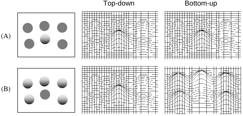
Figure 2. Illustrative activation matrices. Two displays are shown to the left: one containing a single shaded object among multiple flat objects (A) and another display containing a single flat object among multiple shaded objects (B). Illustrative top-down and bottom-up activation matrices are shown to the right of each display. Top-down matrices assume the target of search is the shaded object in (A) and the flat object in (B). In search for a shaded target among flat distractors (A), both top-down and bottom-up processes produce high activation at the location of the target and low activation at the locations of the
distractors resulting in a single LOI. In search for a flat target among shaded distractors (B), top-down processes produce high activation at the location of the target and low activation at the location of the distractors, but bottom-up processes produce high activation at the
location of distractors and low activation at the location of the target. When both top-down and bottom-up activations are taken into account, an LOI exists near every object in the display.
The influence of shading gradient contrast is also interesting and unstudied. As
contrast decreases, three-dimensional shape becomes flatter with lower salience. Thus, when
searching for a shaded target among flat distractors, both top-down and bottom-up processes
Top-down Bottom-up
(A)
will likely produce less activation at the target’s location as the contrast across the target’s
shading gradient decreases. This could make search inefficient at lower contrasts.
Conversely, when searching for a flat target among low contrast gradients, top-down
processes will activate distractors more, because they are more similar to the target, but
bottom-up processes will activate distractors less, because they are less salient. This could
make search more or less efficient, depending on the relative contribution of top-down and
bottom-up processes.
In summary, predicting search efficiency in an almost-flat environment is not a trivial
task. One type of process (top-down or bottom-up) could play a dominant role in guidance,
or the processes could interact. Moreover, the contributions could vary when different
gradient contrasts are involved. An empirical investigation is necessary to determine (a) the
conditions in which shaded and flat objects are findable and (b) the conditions in which they
are not findable, so design guidelines can be created.
Perception of Three-dimensional Shape
Following the need for findability is the need for perceived clickability. Once users
find an interface element that seems like it might take them to a piece of helpful content, they
assess the element for clickability. If the element does not appear actionable, users are likely
to disregard it and subsequently search for an alternative path to their desired content
The exact nature of clickability cues has not been widely studied, perhaps because
many of the cues are a product of convention and experience, such as blue underlined text
indicating a hyperlink, rather than physical metaphors. However, there is general theoretical
agreement that a raised three-dimensional appearance offers affordances to clickability which
should be perceived by both novice and expert users (Gaver, 1991; Norman, 2013).
Previous research has demonstrated that vertical luminance gradients can be effective
cues to three-dimensional shape during deliberate processing and decision making.
Specifically, people tend to perceive a convex (raised) shape when an object has a gradient
that transitions from light at the top to dark at the bottom, as if a light source were shining
from above (Ramachandran, 1988a, 1988b). But when the gradient is reversed (dark at the
top to light at the bottom) perceptions become less consistent. Some people perceive a
concave (depressed) shape while others perceive a convex shape (Liu & Todd, 2004).
Unfortunately, these aforementioned studies focused on either highly unusual objects
or hyper-realistic shading, so it is unclear whether the aforementioned findings will hold for
simple shading gradients on objects commonly used in almost-flat design.
Research Questions
The following research questions emerged for search and shape perception in
almost-flat environments:
RQ1 How efficiently are shaded objects found among flat objects? And how
addresses the search benefits from emphasizing a key interface element with
shading, and the latter addresses consequences against search for non-emphasized
items.
RQ2 What search efficiency patterns emerge across the aforementioned search
conditions? And what do the patterns reveal about the influence of features on
guidance processes? These questions address the relative contribution of
top-down and bottom-up processes underlying search.
RQ3 How are shaded and non-shaded objects perceived in depth? And how
consistent are those perceptions between people? These questions address the
quality of clickability signifiers provided by different objects.
RQ4 How does the level of contrast across a shading gradient influence findability
and shape perception? This addresses the discrimination capabilities of guidance
processes in search and changes in clickability signifiers between different
degrees of shading.
The present research addressed these questions through two experiments. Experiment
1 investigated RQ1, RQ2, and RQ3 with high contrast shaded stimuli. This experiment was
previously published in a proceedings article (Creager & Gillan, 2016) but is reported again
to reframe the results into Guided Search Theory and expand on its theoretical impact in lieu
Together, these experiments yielded new theoretical insights and new design guidelines for
almost-flat design. The subsequent sections of this paper report the details, results, and a
brief discussion of each experiment followed by an integrated discussion and conclusion.
Experiment 1
Experiment 1 investigated the search efficiency and perceived depth of convex,
concave, and flat objects in a traditional visual search task and a traditional depth rating task.
With respect to visual search, it was hypothesized that both convex and concave targets
(present or absent) would be found efficiently among flat distractors, because shaded objects
would have a unique and highly salient depth, relative to flat objects. It was also
hypothesized that flat targets (present or absent) would be processed inefficiently among
shaded distractors, because shaded objects would be highly salient and distracting. With
respect to depth, it was hypothesized that there would be a significant difference in perceived
depth between each stimulus type.
Method
Participants. Seventeen undergraduate students (6 female) participated in a single 30-minute session for course credit. All participants self-reported either normal (11) or
corrected-normal (6) vision. All participants completed every trial of the experiment, and 16
participants finished the visual search task with a mean accuracy above 90%. The remaining
participant, who responded correctly to only 78% of the trials, was not included in
Setup and materials. Participants were seated approximately 0.7 meters away from an eye-level, 17-inch computer monitor and were asked to maintain a consistent posture and
viewing angle throughout the experiment. Tasks were completed in a local PsychoPy
application designed with hardware acceleration for precise response time measurements
(Peirce, 2007).
Stimuli and displays. Three types of target and distractor stimuli were used (Figure 3), each a circle subtending 1° of visual angle (assuming a 0.7m viewing distance). A
convex stimulus was formed by a vertical luminance gradient ranging from 147 cd/m2 (very
light grey) at the top to 12 cd/m2 (very dark grey) at the bottom. A concave stimulus was
formed by rotating the convex stimulus 180°. And a flat stimulus was formed by an evenly
distributed luminance value of 68 cd/m2 (medium grey), which was the averageluminance of
the shading gradients. Notably, high contrast gradients were used to ensure discriminability
between flat and shaded stimuli.
Stimuli were grouped into four target-distractor pairs (convex-flat, flat-convex,
concave-flat, flat-concave) and stimuli from each pair were arranged on a white background
(159 cd/m2)to form different displays. Displays were generated with one of three numbers
of items: 1, 6, and 12, with items placed randomly in a 7° x 7° region without overlap. In
half of the displays, one of the items was a target and the remaining items were homogenous
whereas larger display sizes required more complex search processing. Examples of the two
target presence conditions (present, absent) are shown in Figure 4.
Figure 3. Experiment 1 stimuli. The three types of target and distractor stimuli: flat, convex, and concave from left to right.
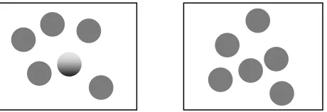
Figure 4. Experiment 1 example displays. An example target present display (left) and target absent display (right) for the convex-flat target-distractor pair.
Procedure. All participants completed the visual search task first, followed by the depth rating task.
Visual search task. Participants first completed the visual search task. Each trial
began with a fixation symbol displayed in the center of the screen for one second. This was
followed by a stimulus display to which the participant would respond either target present
(left Ctrl key) or target absent (right Ctrl key). The stimulus display was visible until either
the participant responded or three seconds elapsed, and then a feedback message of “correct”
received within three seconds, the trial was marked incorrect. Response time and accuracy
were recorded.
Trials were blocked by the four target-distractor pairs (convex-flat, flat-convex,
concave-flat, flat-concave), and blocks were presented in random order within-subject.
Within each block, displays were presented in random order without replacement until every
combination of display size (1, 6, 12) and target presence (present, absent) had been seen.
This was repeated 15 times in each block for a total of 90 trials per block (3 display sizes x 2
target presence x 15 repetitions) for 360 trials over all four target-distractor pairs.
At the beginning of each block, participants were shown the upcoming target and
distractor stimuli and given six practice trials, one for each combination of display size and
target presence for the block. Participants were instructed to look at the fixation symbol and
respond as quickly and accurately as possible once the stimulus display appeared.
Depth ratings. After completing the visual search task, participants were shown each
of the convex, concave, and flat stimuli – one at a time – and asked to rate the apparent depth
of each stimulus on a scale of -10 to 10. Participants were instructed that a negative value
indicated the stimulus appeared depressed into the screen, a value of zero indicated the
stimulus appeared flat, and a positive value indicated the stimulus appeared raised out of the
Results and Discussion
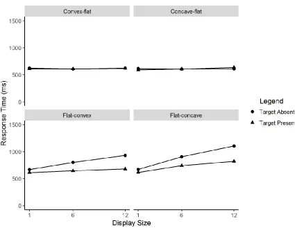
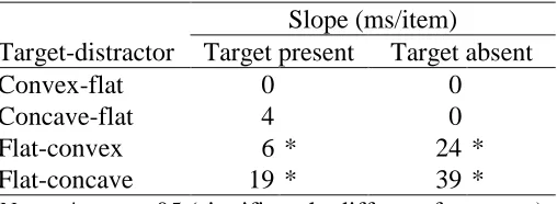
Visual search. Mean response times for correct trials in each display condition are shown in Figure 5, and the corresponding slopes (computed via method of least squares) are
shown in Table 1. Significant departures of slope from zero are indicated by asterisks, as
determined by a one sample t-test.
Table 1. Experiment 1 response time slopes.
Slope (ms/item)
Target-distractor Target present Target absent
Convex-flat 0 0
Concave-flat 4 0
Flat-convex 6 * 24 *
Flat-concave 19 * 39 *
Note. * = p < .05 (significantly different from zero)
A two-way repeated measures ANOVA was performed to examine the effects of
target-distractor pair and target presence on the slope of reaction time over display size.
There were significant main effects of target-distractor pair, F(3, 45) = 32.26, p < .001, η2 =
.47, and target presence, F(1, 15) = 14.81, p < .001, η2 = .10. There was also a significant
two-way interaction of target-distractor pair and target presence, F(3, 45) = 17.30, p < .001,
η2 = .17.
Bonferroni post hoc tests revealed the slopes of target present and target absent
searches were significantly different when searching for a flat target among convex
distractors (p = .003) and when searching for a flat target among concave distractors (p <
.001). However, the slopes of target present and target absent searches showed
non-significant differences when searching for a convex target among flat distractors (p = 1.00)
and a concave target among flat distractors (p = 1.00).
could be used to increase the findability of key elements in an almost-flat interface. When
the target was flat, however, efficiency varied by distractor type. Results supported the
hypothesis that flat targets would be processed inefficiently among concave distractors, but
they did not support the hypothesis that flat targets would be processed inefficiently among
convex distractors, because target present search was efficient. This suggested concave
shading had the consequence of preventing attention from deploying to flat targets
efficiently, but convex shading seemed to avoid those consequences in the target present
condition. Thus, the findability of non-emphasized, flat elements was better in an
environment with convex objects, compared to concave objects.
Depth ratings. Mean depth ratings for each stimulus are shown in Figure 6. The impact of stimulus type on depth ratings was analyzed with a one-way repeated measures
ANOVA. Overall, stimulus type had a significant impact on depth ratings, F(2, 30) = 10.45,
p < .001, η2 = .37. Bonferroni post hoc tests revealed depth ratings for the convex stimulus
were significantly different from both the flat stimulus (p < .001) and the concave stimulus (p
= .01). However, the difference in depth ratings between the concave stimulus and flat
stimulus was non-significant (p = .52).
These results partially supported the hypothesis that perceived depth would
significantly different between each stimulus type, but indicated the concave stimulus was
perceived more similar to the flat stimulus than expected. Given that the concave stimulus
concave stimulus were expected to be approximately the inverse of the convex stimuli. One
potential explanation for the unexpected result was that some people could have perceived a
concave shape while others perceived a convex shape (similar to Liu & Todd, 2004). This
would produce a mix of positive and negative depth ratings that would average to a value
closer to zero.
Figure 6. Experiment 1 depth rating graph. Mean depth ratings are shown for each stimulus type.
To examine this possibility, depth ratings were categorized by the perceived shape
specified in the depth rating task instructions. Stimuli given a zero depth rating were
categorized as flat. Stimuli given a positive depth rating were categorized as convex. And
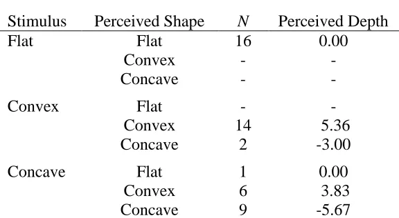
Counts and mean depth ratings for each combination of stimulus and perceived shape
are shown in Table 2. All participants perceived the flat stimulus to be flat in shape, and all
but two participants perceived the convex stimulus as convex. However, the concave
stimulus was not consistently perceived as concave. A large number of convex perceptions
brought the overall mean for the concave stimulus closer to zero.
Table 2. Experiment 1 frequency and depth of perceived shape.
Stimulus Perceived Shape N Perceived Depth
Flat Flat 16 0.00
Convex - -
Concave - -
Convex Flat - -
Convex 14 5.36
Concave 2 -3.00
Concave Flat 1 0.00
Convex 6 3.83
Concave 9 -5.67
Note. A dash indicates no participants were in that group.
In summary, participants tended to perceive convex and concave stimuli as having
depth, relative to the background, and flat stimuli as having no depth. This confirmed an
emergent sense of depth differentiated concave and convex stimuli from flat stimuli.
However, a large number of participants interpreted the depth of the concave stimulus
affordances and perceived clickability due to a consistent interpretation of a raised
three-dimensional shape.
Experiment 2
Based on the combined results of the visual search and depth rating tasks in
Experiment 1, convex shading proved to be an effective visual treatment for improving the
findability and perceived clickability of an object in an almost-flat interface. However, the
convex stimulus used in Experiment 1 had a high contrast to maximize apparent depth, which
was not representative of the wide array of shading gradients used in common practice,
particularly those that are more subtle.
Since the appearance of a convex object approaches that of a flat object as gradient
contrast decreases, a convex target with a subtle gradient would likely have less salience, be
more similar to flat distractors, and have fewer affordances to clickability. If contrast were
low enough, activation levels could become indiscriminable between target and distractors
during guidance, and efficient searches documented in Experiment 1 could become
inefficient. Similarly, clickability signifiers could be lost at lower contrasts due to decreased
depth perception and/or inconsistent perception of three-dimensional shape.
To investigate the impact of gradient contrast on findability and perceived
clickability, Experiment 2 used the same tasks from Experiment 1 with new convex stimuli
target present and target absent conditions (similar to Experiment 1), but search for low
contrast convex targets would be inefficient due to poor discriminability during guidance.
Also, it was hypothesized that search for a flat target among medium and high contrast
convex distractors would follow a mixed search pattern wherein the target present search
would be efficient and the target absent search would be inefficient (similar to Experiment
1), but search among low contrast convex distractors would be inefficient due to poor
discriminability during guidance.
With respect to perceived depth, it was hypothesized that all stimuli (flat, low
contrast, medium contrast, and high contrast) would differ significantly in depth. With
respect to perceived shape, it was hypothesized that there would be a significant difference in
the number of people who would perceive the low, medium, and high contrast stimuli as
convex such that the low contrast stimulus would be perceived as non-convex more than the
medium and high contrast stimuli.
Method
Participants. 28 undergraduate students (13 female) were recruited from an introductory psychology course and were compensated with course credit. All participants
(12 with corrective lenses) had at least 20/20 visual acuity as measured by a Snellen test and
had normal contrast sensitivity as measured by a Pelli-Robson test (Pelli, Robson, & Wilkins,
1988). Two participants showed signs of color deficiency (one with mild tritanopia; the
(Ng, Self, Vanston, Nguyen, & Crognale, 2015; Rings, Picken, & Waggoner, 2014). All
participants completed all of the experimental tasks, but two participants, one of whom
showed the aforementioned signs of tritanopia, had an accuracy below 90% and were
removed from subsequent analyses. The participant with signs of protanopia and
deuteranopia had results similar to normal color vision participants, so all of the remaining
participants were analyzed together.
Setup and materials. Setup and materials were the same as Experiment 1.
Stimuli and displays. Four types of target and distractor stimuli were used (Figure 7), each a circle subtending 1° of visual angle as in Experiment 1: flat stimuli had an evenly
distributed luminance value of 80 cd/m2 (medium grey); low contrast stimuli were formed by
a vertical convex luminance gradient ranging from 104 cd/m2 (slightly light grey) at the top
to 56 cd/m2 (slightly dark grey) at the bottom; medium contrast stimuli were formed by a
vertical convex luminance gradient ranging from 128 cd/m2 (light grey) at the top to 32 cd/m2
(dark grey) at the bottom; and high contrast stimuli were formed by a vertical convex
luminance gradient ranging from 152 cd/m2 (very light grey) at the top to 8 cd/m2 (very dark
grey) at the bottom. Notably, the difference in luminance across each gradient increased by a
consistent 48 cd/m2 between each level of contrast; the average luminance of all stimuli was
80 cd/m2 - the luminance of the flat stimuli; and flat and high contrast stimuli were the same
Stimuli were grouped into six distractor display conditions based on
target-distractor type (convex-flat or flat-convex) and contrast of the convex stimuli (low, medium,
or high): low-flat, medium-flat, high-flat, flat-low, flat-medium, and flat-high. Distractors
were homogeneous and displays were generated in the same way as Experiment 1. Notably,
the high-flat and flat-high conditions replicated the convex-flat and flat-convex conditions in
Experiment 1.
Figure 7. Experiment 2 stimuli. Flat, low contrast convex, medium contrast convex, and high contrast convex from left to right. The flat and high contrast convex stimuli were the same as the flat and convex stimuli in Experiment 1.
Procedure. Participants completed vision testing, the visual search task, and the depth rating task during a single 30-minute session. Vision testing always came first, and the
order of visual search and depth rating tasks was counterbalanced.
Visual search task. The visual search task followed the same procedure as
Experiment 1 with the exceptions that conditions were added for the new stimuli and each
trial type was repeated ten times, instead of fifteen. With two target types (convex, flat),
three contrasts (low, medium, high), three display sizes (1, 6, 12), target presence (present,
Depth rating task. The depth rating task followed the same procedure as Experiment
1 with the exceptions that the new stimuli were used and each stimulus was presented three
times, instead of one, for a total of (4 x 3) 12 trials. Trials were blocked by occurrence, and
stimuli were presented in random order within blocks.
Results and Discussion
Visual search. Mean response times for correct trials in each display condition are shown in Figure 8, and the corresponding slopes (computed via method of least squares) are
shown in Table 3. Significant departures of slope from zero are indicated by asterisks, as
determined by a one sample t-test.
A three-way Repeated Measures ANOVA (α = .05) with Greenhouse-Geisser
corrections was performed to examine the effects of target type (flat, convex), contrast (low,
med, high), and target presence (present, absent) on the slope of reaction time over display
size. There were significant main effects of target type, F(1, 25) = 60.98, p < .001, η2 = .32,
contrast, F(1.36, 33.92) = 34.85, p < .001, η2 = .15, and target presence, F(1, 25) = 34.12, p <
.001, η2 = .10. There were also significant two-way interactions of target type by contrast,
F(2, 50) = 14.55, p < .001, η2 = .04 and target type by target presence, F(1, 25) = 40.10, p <
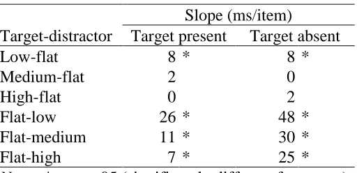
Table 3. Experiment 2 response time slopes.
Slope (ms/item)
Target-distractor Target present Target absent
Low-flat 8 * 8 *
Medium-flat 2 0
High-flat 0 2
Flat-low 26 * 48 *
Flat-medium 11 * 30 *
Flat-high 7 * 25 *
Note. * = p < .05 (significantly different from zero)
With respect to the target type by contrast interaction, planned contrasts with
Bonferroni corrections revealed that when searching for convex target among flat distractors,
differences in search slopes were significant between low and medium contrast targets (p <
.001) and low and high contrast targets (p < .001), but differences between medium and high
contrast targets were non-significant (p = 1.00). This is visualized along the top row of
Figure 8. When searching for a flat target among convex distractors, differences in search
slopes were significant between low and medium contrast distractors (p = .02) and low and
high contrast distractors (p < .001), but differences were non-significant between medium
and high contrast distractors (p = 1.00). This is visualized along the bottom row of Figure 8.
With respect to the target type by target presence interaction, planned contrasts with
Bonferroni corrections revealed that the difference in search slopes between convex target
bottom row of Figure 8. All crosses of target presence between flat and convex targets were
significant (all p < .001).
In summary, search for convex targets among flat distractors was efficient and robust
to contrast and target presence effects – replicating and extending the findings of Experiment
1. Search slopes for low contrast targets were, on average, slightly steeper than medium and
high contrast targets but still very efficient. These results supported the hypothesis that
search for medium and high contrast convex targets among flat distractors would be efficient
but contradicted the hypothesis that low contrast targets would be found inefficiently due to
efficient search in the low-flat condition. Although the latter result was unexpected, high
findability for all convex target contrasts was positive from an application standpoint.
In regard to flat target search, results supported the hypotheses that search would be
inefficient among low contrast distractors and follow a mixed pattern (i.e. efficient when
target present and inefficient when target absent) among medium and high contrast
distractors. This indicated that medium and high contrast gradients resulted in similar visual
search performance, but low contrast gradients reduced findability, relative to higher contrast
gradients.
Depth ratings. Mean depth ratings for each stimulus are shown in Figure 9. The impact of stimulus type on depth ratings was analyzed with a one-way repeated measures
ANOVA. Overall, stimulus type had a significant impact on depth ratings F(1.62, 40.43) =
stimulus had significantly lower ratings than the low (p = .02), medium (p < .001), and high
(p < .011) contrast stimuli. The low contrast stimulus had significantly lower ratings than the
medium (p = .006) and high (p < .001) contrast stimuli. However, the difference between
medium and high contrast stimuli was non-significant (p = .25).
Figure 9. Experiment 2 depth rating graph. Mean depth ratings are shown for each stimulus type.
As shown in Experiment 1, a user’s perception of three-dimensional shape may match
a designer’s intentions (congruent) or may not (incongruent). To examine the impact of
contrast on congruent convex shape perception, ratings of shaded stimuli were categorized as
either convex (a positive depth rating) or not (a zero or negative depth rating), and
There was a significant difference in the proportion of shape perception between low and
medium contrast stimuli, χ² (1) = 7.00, p = .008, and between low and high contrast stimuli,
χ² (1) = 6.40, p = .01, such that low contrast stimuli were more frequently perceived as
non-convex (incongruently). However, the difference between medium and high contrast stimuli
was non-significant, χ² (1) = 0.33, p = .56. Frequencies are shown in Table 4.
Table 4. Experiment 2 frequency of perceived convexity.
Perceived Shape Contrast Convex Non-convex
Low 15 11
Medium 22 4
High 23 3
In summary, depth ratings were generally higher and more consistent when stimulus
contrast was higher with the exception of the non-significant difference between medium and
high contrast gradients. This result partially supported the hypothesis that all stimuli would
differ significantly in depth. A non-significant difference between medium and high contrast
stimuli, while unexpected, was positive from an application standpoint, because it suggested
both types of stimuli could provide effective clickability signifiers. In addition, results
strongly supported the hypothesis that incongruent perceptions would be more common
contrast stimuli would be a poor choice for a designer trying to convey clickability signifiers,
due to their inconsistent interpretation.
General Discussion
Results from Experiments 1 and 2 revealed that shaded objects had the benefit of high
findability in almost-flat environments. Search was very efficient for all types of shaded
targets among flat distractors, even when the target’s gradient contrast was low and the target
was absent. From a theoretical perspective, these results indicated activation from a present
shaded target was large enough to reliably attract attention early in the search process,
allowing quick identification. Moreover, activation at flat distractor locations was low
enough to not attract attention, allowing an absent target to be detected quickly. This agreed
with similar findings documented in prior research that studied target objects with a unique
feature and high salience, relative to other objects in the environment (Treisman, 1977, 1985;
Treisman & Souther, 1985).
Based on this “feature search” pattern, wherein both target present and target absent
searches were efficient, three conclusions were drawn about guidance provided by the
stimuli. First, shaded objects had a visual feature (depth) that influenced guidance. The
individual contributions of depth to top-down and bottom-up activation of shaded targets
were not separable in this experimental design, but their combination was sufficient for
in target absent conditions. Third, low contrast shaded objects yielded slightly less guidance
than higher contrast gradients, as evidenced by slightly steeper search slopes. This could
have been due to increased similarity with distractors (top-down), a decrease in salience
(bottom-up), or both.
Results from Experiments 1 and 2 also revealed that shaded objects had three notable
consequences for flat object findability in almost-flat environments. First, all flat target
absent searches were inefficient, regardless of distractor shading type and contrast. This
indicated all shaded objects had a noteworthy salience yielding enough bottom-up activation
to attract attention, even when shaded objects were not the target. Similar salience problems
have been documented in prior research with a variety of other visual features (Treisman,
1977, 1985; Treisman & Souther, 1985).
Second, flat target present search was inefficient when distractors had concave
shading. This indicated concave objects were very salient and yielded enough bottom-up
activation to distract guidance from the combined top-down and bottom-up activation of a
present flat target. Comparing flat target present searches between high contrast concave
distractors (inefficient) and high contrast convex distractors (efficient) revealed that convex
distractors were less salient and distracting than concave distractors. This could be explained
by the “familiarity effect” which claims distractor salience is lower when distractor features
are more familiar to the viewer (Shen & Reingold, 2001; Wang, Cavanagh, & Green, 1994;
shading is ubiquitous in the real world and much more common than concave shading, which
would likely make convex gradients more familiar and less salient to bottom-up guidance
processes.
A third consequence of shading emerged from flat target present search among low
contrast convex gradients, which was inefficient. Comparing flat target present searches
between low contrast distractors (inefficient) and medium and high contrast distractors
(efficient) revealed that top-down discrimination was less effective when similarity between
the target and distractors was higher. Bottom-up processes were ruled out, because the
paragraphs above established flat objects had negligible salience and bottom-up activation.
This explanation agreed with prior literature which reported search efficiency decreased as
target-distractor similarity increased (Duncan & Humphreys, 1989). Fortunately, medium
and high contrast convex distractors avoided negative consequences in the target present
condition, because top-down activation from the flat target was large enough to outmatch
bottom-up activation from the salient distractors.
Finally, depth ratings in Experiments 1 and 2 revealed some types of shading had the
benefit of conveying consistent clickability signifiers, while other types of shading had the
consequence of conveying inconsistent clickability signifiers. Medium and high contrast
convex gradients consistently conveyed a sense of depth and a raised three-dimensional
convex gradients, on the other hand, were interpreted inconsistently and often opposite the
intended direction of depth, which resulted in mixed clickability signifiers.
In conclusion, these findings indicated medium and high contrast convex shading
gradients have design utility for improving findability and perceived clickability in
almost-flat environments. The moderate salience of medium and high contrast convex objects
balanced well with the low salience of flat objects in visual search, and the raised appearance
of medium and high contrast convex objects mimicked appearance of a physical button
waiting to be pressed. In addition, these findings indicated that, when possible, medium and
high contrast convex gradients should be used instead of concave and low contrast convex
gradients to prevent distraction during search and misinterpretation of clickability signifiers.
However, this study’s limitations must be taken into account when applying these
findings. First, ecological validity was limited because this study intentionally used simple
displays. Tight experimental control was necessary for assessing the guidance provided by
shaded objects, but in practice, guidance would also be influenced by many other features
that typically appear in software interfaces. Future research could investigate competing
guidance and facilitation effects in an ecological almost-flat environment. Second, the search
aspect of this study focused on findability (how easily users can locate objects they know
exist) and only indirectly addressed discoverability (how easily users can encounter content
of which they were previously unaware), which is also an important quality in software
encountered and attended to. Future research could investigate the degree to which shading
gradients are capable of bottom-up attentional capture and increasing the likelihood of a user
References
Aks, D. J., & Enns, J. T. (1992). Visual search for direction of shading is influenced by apparent depth. Perception & Psychophysics, 52, 63–74.
Brown, J. M., Weisstein, N., & May, J. G. (1992). Visual search for simple volumetric shapes. Perception & Psychophysics, 51, 40–48.
Burmistrov, I., Zlokazova, T., Izmalkova, A., & Leonova, A. (2015). Flat design vs
traditional design: Comparative experimental study. In J. Abascal, S. Barbosa, M. Fetter, T. Gross, P. Palanque, M. Winckler (Eds.), Lecture Notes in Computer Science: Vol. 9297. Human-Computer Interaction -- INTERACT 2015: 15th IFIP TC 13 International Conference, Bamberg, Germany, September 14-18, 2015, Proceedings, Part II (pp. 106– 114). Springer Cham.
Cavanagh, P., Arguin, M., & Treisman, A. (1990). Effect of surface medium on visual search for orientation and size features. Journal of Experimental Psychology: Human Perception and Performance, 16, 479–491.
Creager, J. H., & Gillan, D. J. (2016). Toward understanding the findability and
discoverability of shading gradients in almost-flat design. Proceedings of the Human Factors and Ergonomics Society Annual Meeting 60, 339–343.
Debus, R. (2013, November 4). When flat design falls flat [Web log message]. Retrieved from http://sixrevisions.com/user-interface/when-flat-design-falls-flat/
Duncan, J., & Humphreys, G. W. (1989). Visual search and stimulus similarity.
Psychological Review, 96, 433–58.
Findlater, L., & McGrenere, J. (2007). Evaluating reduced-functionality interfaces according to feature findability and awareness. In C. Baranauskas, P. Palanque, J. Abascal, S. D. J. Barbosa (Eds.). Lecture Notes in Computer Science: Vol. 4662. Human-Computer
Interaction – INTERACT 2007: 11th IFIP TC 13 International Conference, Rio de Janeiro, Brazil, September 10-14, 2007, Proceedings, Part I (pp. 592-605). Springer Berlin
Heidelberg.
Gaver, W. W. (1991). Technology affordances. In Proceedings of the SIGCHI conference on Human factors in computing systems, 79–84.
Liu, B., & Todd, J. T. (2004). Perceptual biases in the interpretation of 3D shape from shading. Vision Research, 44, 2135–2145.
Loranger, H. (2015, March 8). Beyond Blue Links: Making Clickable Elements Recognizable [Web log message]. Retrieved from
http://www.nngroup.com/articles/clickable-elements/
Meyer, K. (2015, November 8). Long-Term Exposure to Flat Design: How the Trend Slowly Decreases User Efficiency [Web log message]. Retrieved from
www.nngroup.com/articles/flat-design-long-exposure/
Moore, M. (2013, January 23). Almost Flat Design [Web log message]. Retrieved from http://www.matthewmooredesign.com/almost-flat-design/
Morville, P. (2005). Ambient findability: What we find changes who we become. Sebastopol, CA: O’Reilly Media.
Nagy, A. L., & Sanchez, R. R. (1992). Chromaticity and luminance as coding dimensions in visual search. Human Factors, 34, 601–614.
Ng, J. S., Self, E., Vanston, J. E., Nguyen, A. L., & Crognale, M. A. (2015). Evaluation of the waggoner computerized color vision test. Optometry & Vision Science, 92, 480–486.
Nielsen, J. (1995, May 25). Usability Testing for the 1995 Sun Microsystems’ Website [Web log message]. Retrieved from http://www.nngroup.com/articles/usability-testing-1995-sun-microsystems-website/
Nielsen, J. (2012, November 19). Windows 8—disappointing usability for both novice and power users [Web log message]. Retrieved from http://www.nngroup.com/articles/windows-8-disappointing-usability/
Norman, D. A. (2013). The design of everyday things: Revised and expanded edition. New York, NY: Basic books.
Page, T. (2014). Skeuomorphism or flat design: future directions in mobile device User Interface (UI) design education. International Journal of Mobile Learning and Organisation,
8, 130–142.
Pelli, D. G., Robson, J. G., & others. (1988). The design of a new letter chart for measuring contrast sensitivity. Clinical Vision Sciences, 2, 187–199.
Pilon, D. J., & Friedman, A. (1998). Grouping and detecting vertices in 2-D, 3-D, and quasi-3-D objects. Canadian Journal of Experimental Psychology, 52, 114.
Ramachandran, V. S. (1988a). Perceiving shape from shading. Scientific American, 259, 76– 83.
Ramachandran, V. S. (1988b). Perception of shape from shading. Nature, 331, 163–166.
Rings, M., Picken, D., & Waggoner, T. (2014). Validation of a Computerized Color Vision Test [PowerPoint slides]. Retrieved from
https://www.researchgate.net/publication/294088318_Validation_of_a_Computerized_Color _Vision_Test
Rogers, R., & Preston, H. (2009). Usability analysis for redesign of a Caribbean academic library web site: a case study. OCLC Systems & Services: International Digital Library Perspectives, 25, 200–211.
Rosenbaum, S. E., Glenton, C., & Cracknell, J. (2008). User experiences of evidence-based online resources for health professionals: User testing of The Cochrane Library. BMC Medical Informatics and Decision Making, 8, 34.
Sanchez, E. (2012, October 15). Skeuominimalism - The Best of Both Worlds [Web log message]. Retrieved from http://edwardsanchez.me/blog/13568587
Shen, J., & Reingold, E. M. (2001). Visual search asymmetry: The influence of stimulus familiarity and low-level features. Perception & Psychophysics, 63, 464–475.
Treisman, A. (1977). Focused attention in the perception and retrieval of multidimensional stimuli. Perception & Psychophysics, 22, 1–11.
Treisman, A. (1982). Perceptual grouping and attention in visual search for features and for objects. Journal of Experimental Psychology: Human Perception and Performance, 8, 194– 214.
Treisman, A. (1985). Preattentive processing in vision. Computer Vision, Graphics, and Image Processing, 31, 156–177.
Treisman, A. M., & Gelade, G. (1980). A feature-integration theory of attention. Cognitive Psychology, 12, 97–136.
Treisman, A., & Souther, J. (1985). Search asymmetry: a diagnostic for preattentive processing of separable features. Journal of Experimental Psychology: General, 114, 285.
Usabilla. (2013). User experience report: Flat web design is here to stay. Retrieved from http://cache.usabilla.com/press/2013_06_Usabilla_UX_Report_Flat_Design.pdf.
Wang, Q., Cavanagh, P., & Green, M. (1994). Familiarity and pop-out in visual search.
Perception & Psychophysics, 56, 495–500.
Wolfe, J. M. (1994). Guided Search 2.0 A revised model of visual search. Psychonomic Bulletin & Review, 1, 202–238.
Wolfe, J. M. (2007). Guided Search 4.0 Current Progress With a Model of Visual Search.
Journal of Vision, 1, 99–119.
Wolfe, J. M., Cave, K. R., & Franzel, S. L. (1989). Guided search: an alternative to the feature integration model for visual search. Journal of Experimental Psychology: Human Perception and Performance, 15, 419.
Wolfe, J. M., & DiMase, J. S. (2003). Do intersections serve as basic features in visual search? Perception, 32, 645–656.
Wolfe, J. M., & Gancarz, G. (1997). Guided Search 3.0. In V. Lakshminarayanan (Ed.),
Basic and clinical applications of vision science: The professor Jay M. Enoch festschrift volume (Vol. 60, pp. 189–192). Springer Netherlands.
Wolfe, J. M., & Horowitz, T. S. (2004). What attributes guide the deployment of visual attention and how do they do it? Nature Reviews Neuroscience, 5, 495–501.
Wolfe, J. M., Horowitz, T. S., Palmer, E. M., Michod, K. O., & Van Wert, M. J. (2010). Getting into guided search. In V. Coltheart (Ed.), Tutorials in visual cognition (pp. 93–119). New York, NY: Psychology Press.