NEUVis: Comparing Affective and
Effective Visualisation
Phillip Gough
Design Lab: Faculty of Architecture, Design and Planning
The University of Sydney
2016
A thesis submitted in partial fulfilment of requirements
for the degree of Doctor of Philosophy
Abstract
Data visualisations are useful for providing insight from complex scientific data. However, even with visualisation, scientific research is difficult for non-scientists to comprehend. When developed by designers in collaboration with scientists, data visualisation can be used to articulate scientific data in a way that non-experts can understand. Creating human-centred visualisations is a unique challenge, and there are no frameworks to support their design.
In response, this thesis presents a practice-led study investigating design methods that can be used to develop Non-Expert User Visualisations (NEUVis), data visualisations for a general public, and the response that people have to different kinds of NEUVis.
For this research, two groups of ten users participated in quantitative studies, informed by Yvonna Lincoln and Egon Guba’s method of Naturalistic Inquiry, which asked non-scientists to express their cognitive and emotional response to NEUVis using different media. The three different types of visu-alisations were infographics, 3D animations and an interactive installation. The installation used in the study, entitled 18S rDNA, was developed and evaluated as part of this research using John Zim-merman’s Research Through Design methodology. 18S rDNA embodies the knowledge and design methods that were developed for this research, and provided an opportunity for explication of the entire NEUVis design process.
The research findings indicate that developing visualisations for the non-expert audience requires a new process, different to the way scientists visualise data. The result of this research describes how creative practitioners collaborate with primary researchers and presents a new human-centred design thinking model for NEUVis. This model includes two design tools. The first tool helps designers merge user needs with data they wish to visualise. The second tool helps designers take that merged information and begin an iterative, user-centred design process.
Keywords
Non-expert user visualisation, NEUVis, data visualisation, user-centred design, design thinking, design methodology, research through design, naturalistic inquiry, wicked problems, artistic visualisation, scientific visualisation, information visualisation, infoVis, visual analytics, science communication, human-computer interaction, user interface design, museum installations.
Contents
1 Introduction 13
1.1 Science and the General Public . . . 14
1.2 Wicked Problems . . . 17 1.3 Expert Visualisation . . . 20 1.4 Non-Expert Visualisation . . . 23 2 Literature Review 29 2.1 Introduction . . . 30 2.2 Visualisation Research . . . 30 2.3 Visualisation Practice . . . 44 2.4 Science Communication . . . 52 2.5 Artistic Visualisation . . . 54 2.6 Reflective Practice . . . 57 2.7 Research Opportunities . . . 59 3 Experiments 61 3.1 Aim . . . 61
3.2 Qualitative Research Methods . . . 62
3.3 Experiment . . . 64
3.4 Interactive Installation . . . 71
4 Reflections 73 4.1 Reflecting on the experiment . . . 74
4.2 Reflection 1: Communication and the boundary object . . . 74
4.3 Reflection 2: A process model for visualisation design . . . 77
4.4 Reflection 3: The message or the medium? . . . 80
4.5 Reflection 4: NEUVis Data-Visualisation Schematic for visualisation designers . . . . 83
4.6 Summary . . . 86
5 The Designed Artefact 89
5.1 Introduction . . . 89
5.2 Data . . . 90
5.3 Early Versions . . . 91
5.4 Final Version . . . 97
5.5 Research Through Design Evaluation . . . 105
5.6 Discussion . . . 107
5.7 Research Visions . . . 110
6 Discussion 113 6.1 Key Findings . . . 114
6.2 Science of the Unseen: Digital Art Perspectives . . . 119
6.3 Implications of Findings . . . 129
6.4 Limitations and Future Research . . . 130
Bibliography 138 A Forms used in user studies 157 A.1 Participant Recruitment Poster . . . 157
A.2 Participant Consent Form . . . 159
A.3 Participant Information Statement . . . 162
A.4 Question forms used in user studies . . . 165
B Infographics used in user studies 177 B.1 Infographics shown in the first user test . . . 177
B.2 Infographic used in the second user test . . . 182
C Research notes and data from user testing 183 C.1 Test 1 . . . 183
C.2 Test 2 . . . 219
D List of Exhibitions 251 D.1 Creative Work Submitted for Examination . . . 251
D.2 Other Creative Works Undertaking During Candidature . . . 251
E List of Publications 257 E.1 2016 . . . 257
E.2 2015 . . . 257
E.3 2014 . . . 258
List of Figures
1.1 A still image fromThe Hungry Microbiome(2014). Animation and narration by Chris-topher Hammang. Published by CSIRO under Creative Commons Attribution Licence. 15 1.2 Real-time rendering of bone lesions caused by myeloma. [159] . . . 21 1.3 Global Game Jam 2014 Inspiration Network Visualisation. Image by Xavier Ho. . . . 22 1.4 Dino Zoo. Digital installation at QUT Gardens Point Campus, Brisbane. Image by
To-masz Bednarz, used with permission. . . 26 2.1 Anscombe’s Quartet: Points plotted with a line to show the linear regression for each
graph. The differences between each set becomes obvious only when visualised. . . 31 2.2 Ten Thousandby Randall Munroe on his webcomic xkcd. Published under a Creative
Commons Attribution-NonCommercial 2.5 License. [140] . . . 34 2.3 Six years of evolution in visualisation . . . 39 2.4 The Hungry Microbiome — colour study(2014) by Christopher Hammang and Christian
Stolte. Image used with permission [191]. . . 41 2.5 Examples of early visualisations: a. A modern version of Mendeleev’s Periodic Table
of Elements; b. Harry Beck’s map of the London Underground; . . . 46 2.6 Examples of early visualisations: a. William Playfair’s economic line chart; b. John
Snow’s map showing cases of cholera near the Broad Street water pump. . . 47 2.7 Tufte’sSparklinesandSmall Multiples. These images show examples of interactive
visual-isations that are created using D3.js, and can be embedded into websites. . . 50 2.8 This electron micrograph depicts an amoeba, Hartmannella vermiformis (orange) as
it entraps a Legionella pneumophila bacterium (green) with an extended pseudopod. Public Domain image downloaded from the CDC Public Health Image Library [71]. 56 2.9 StellrScopeby Eleanor Gates-Stewart and Sherry Mayo. Image used with permission. . 58 3.1 A still image fromAlzheimer’s Enigma. Animation and narration by Christopher
Ham-mang. Published by CSIRO under Creative Commons Attribution Licence . . . 68 4.1 Boundary Objects in a NEUVis context . . . 75 4.2 A Design Process Model for NEUVis. . . 78
4.3 Design tools in the iterative process. The Six Visualisation Questions shown in green and the NEUVis Data-Visualisation Schematic shown in red. See figure 4.2 for the
full process model. . . 87
5.1 Locations and environmental ratings of estuaries studied in Chariton’s research . . . 90
5.2 Screenshot of the first prototype of18S rDNA . . . 92
5.3 Screenshot of the second iteration of18S rDNA, used in experiment 1 . . . . 93
5.4 The third iteration of18S rDNAused in experiment 2 . . . 95
5.5 A screenshot of video taken during the second user test. . . 96
5.6 Model of interaction for18S rDNA. . . . 99
5.7 Model of interaction for18S rDNAcontinued. . . 100
5.8 The interface for4,000 Species the three lower displays are interactive touch screens. Photo taken with permission. . . 101
5.9 The projection inLost Creaturescomparing the silhouette of an adult (left side of pro-jection) to several dinosaurs from the Southeast Queensland area. Photo taken with permission. . . 102
5.10 Volunteers testing an iteration of the final concept for18S rDNA. . . . 103
5.11 A Screenshot of the final iteration of18S rDNA. . . . 105
5.12 Two users exploring18S rDNAduring Research Visions at The University of Sydney Faculty of Architecture, Design and Planning. . . 111
6.1 A diagram of the relationship between art, science, design and engineering according to Rich Gold. . . 121
6.2 The Dark Animby Zoppè, Loni, Cianchetta and Carlone. Image used with permission. 122 6.3 Salt Mineby Tarah Rhoda. Image used with permission. . . 123
6.4 Mesoby Mark Stock. Image used with permission. . . 124
6.5 In This Unfoldingby Luke Hammond. Image used with permission. . . 125
6.6 Solar Superstorms Visualization Excerpts: First Stars to the Solar Dynamoby the Advanced Visual-ization Lab, NCSA. Image used with permission. . . 127
6.7 Fractals, Particles, Photons, & Microwavesby Alex Lee. Image used with permission. . . 128
6.8 Risk of diagnosis and mortality within 5 years for breast cancer among women. Pub-lic domain image. . . 132
B.1 An infographic shown in user test 1 showing changes in the global climate system. . 178
B.2 An infographic shown in user test 1 showing adaptation solutions for climate change.179 B.3 An infographic shown in user test 1 showing a timeline for climate research. . . 180
B.4 The infographic version ofThe Hungry Microbiomeshown in user test 2. . . 182
D.1 18S rDNA(2016) . . . 252
D.2 Altered Books: Digital Interventions(2015) . . . 252
D.3 Founders Circle(2014) Animation . . . 253
LIST OF FIGURES 7 D.5 Personal Care(2013) . . . 256
List of Tables
1.1 A comparison of the attributes of domain expert and non-expert visualisation. . . . 25 2.1 Anscombe’s Quartet. Each set of numbers is almost statistically identical. . . 31 2.2 Saket’s connection between flow and a nested model for visualisation [169]. AnX
indicates where the development interacts with enjoyment of the visualisation. . . . 36 3.1 Self-reported values for likert scales in experiments. . . 69 4.1 NEUVis Data-Visualisation Schematic . . . 84 5.1 NEUVis Data-Visualisation Schematic for18S rDNA . . . 104
Statement of Original Authorship
This is to certify that to the best of my knowledge, the content of this thesis is my own work. This thesis has not been submitted for any degree or other purposes.
I certify that the intellectual content of this thesis is the product of my own work and that all the assistance received in preparing this thesis and sources have been acknowledged.
The research documented in this thesis was conducted with ethical approval from the Human Research Ethics Committees of The University of Sydney.
Signature:
Name: Phillip Gough Date: 16th September, 2016.
Attribution of published material included as part of the body of this thesis
In addition to the statement above, in cases where I am not the corresponding author of a published item, permission to include the published material has been granted by the corresponding author
Signature:
Name: Phillip Gough Date: 16th September, 2016.
As supervisor for the candidature upon which this thesis is based, I can confirm that the authorship attribution statements in this thesis are correct.
Signature:
Name: Dr Caitilin de Bérigny Date: 16th September, 2016.
LIST OF TABLES 11
Acknowledgements
I would like to thank my academic supervisor, Dr Caitilin de Bérigny. Without her support, guidance, critique and the occasional reality check, my research would not have been possible, or as enjoyable as it has been. The valuable expertise in visual art and her critical feedback of my work has been an immense help in my research and personal development. I am sincerely appreciative for the extra work that she has done to make this research possible and to answer many of the questions that I have brought to supervisory meetings.
I would also like to thank my associate supervisor, Associate Professor Tomasz Bednarz. His in-depth knowledge and passion for creative and beautiful code encouraged me to extend my own technical abilities. I am eternally grateful for the extra opportunities with CSIRO, ACM SIGGRAPH, NIST and QUT, experiences which will stay with me for life, that I would not have without his help. I would also like to thank the co-authors of papers that appear in this thesis, Kate Dunn, Xavier Ho and Jessie Roberts. As well, I would like to thank my collaborating artists, Kate Dunn, Jon McEwan and Xavier Ho for working on various artistic projects with me. I also would like to thank Lindsay Zackeroff for co-curatingScience of the Unseen, and the hard work of Cynthia Beth Rubin who, while chair of DAC, pushed me to propose the show, and provided so much help to make it a reality.
I cannot say how much easier this process has been because of the administrative help over the course of my PhD from Violeta Birks, Penny Andreou and Peter Murlis. Particularly for their help in obtaining funding to attend conferences, which helped me participate in the wider research com-munity.
I would also like to mention my appreciation for the support, friendship and advice of my many FADP colleagues in various aspects of my research: Ollie Bown, Liam Bray, Eliel De La Cruz, Kate Dunn, Luke Hespanhol, Xavier Ho, Lian Loke, Claudia Núñez Pacheco, Somwrita Sarkar, Martin Tomitsch.
Finally, I wish to extend my thanks to my family for their unquestioning support through my ca-reer as a student, and most importantly to Ivy, whose patience, care, love, support and encouragement— even over long distances—makes life so much richer.
This research is supported by Australian Postgraduate Award and a CSIRO top-up scholarship. I would also like to thank Dr Anthony Chariton from CSIRO for kindly supplying data for me to work with in this research, and spending the time to clearly explain it.
Chapter 1
Introduction
Preamble
This chapter is based on a paper I presented at IEEE Pacific Visualization Symposium 2014, in Yoko-hama, Japan, March 4 -7, 2014 [85]. The paper was peer-reviewed and published in the conference proceedings by The Institute of Electrical and Electronics Engineers (IEEE). My contribution to this paper has been substantially expanded and updated for inclusion in this thesis.
Gough, P., Wall, C. de B., & Bednarz, T. (2014). Affective and Effective Visualisation: Communic-ating Science to Non-expert Users. In2014 IEEE Pacific Visualization Symposium(pp. 335–339). Yokohama: IEEE. doi:10.1109/PacificVis.2014.39.
The rate of progress is so rapid that what one learns at school or university is always a bit out of date. Only a few people can keep up with the rapidly advancing frontier of knowledge, and they have to devote their whole time to it and specialize in a small area. The rest of the population has little idea of the advances that are being made or the excitement they are generating. Seventy years ago, if Eddington is to be believed, only two people understood the general theory of relativity. Nowadays tens of thousands of university graduates do, and many millions of people are at least familiar with the idea.
—Stephen Hawking, inA Brief History of Time.
Science is the key to our future, and if you don’t believe in science, then you’re holding everybody back. And it’s fine if you as an adult want to run around pretending or claiming that you don’t believe in evolution, but if we educate a generation of people who don’t believe in science, that’s a recipe for disaster.
—Bill Nye in an interview withPopular Mechanics
1.1 Science and the General Public
On the morning of September 24th, 2013, the Climate Council was officially launched in Australia. Its launch followed a federal election which saw a change in government, and dissolution of the Australian Climate Commission. The Climate Council, a new, independent organisation, was formed to carry on the same work as the Climate Commission: provide accurate, authoritative, apolitical, and easy-to-understand information to the Australian public about climate change. However, the Climate Council relied on crowdfunding, that is, many small donations from the public [92].
By mid-afternoon of their first day, the Climate Council raised $165,000, just over one tenth of the annual funding that was previously provided to the government body, mostly by small donations from individuals [155]. In less than two weeks, more than $1 million had been raised from over 20,000 donations, averaging about $50 each [5]. The Climate Council’s website claims that this was Australia’s biggest crowdfunding campaign [40].
The public understands the need to engage with scientific information, and the Climate Council is just one example [44, 210]. On the morning of the campaign launch, Professor Tim Flannery, Chief Commissioner of the Climate Commission and leader of the new Climate Council, made a statement:
“An informed public is crucial to a functioning democracy.” [92]
Informing the population about science isn’t a new problem; in 1985 Alan McGowan, President of the Scientists’ Institute for Public Information published a paper titledScience and the Media: The Vital Connection. McGowan highlights how:
1.1. SCIENCE AND THE GENERAL PUBLIC 15
Figure 1.1: A still image fromThe Hungry Microbiome(2014). Animation and narration by Christopher Hammang. Published by CSIRO under Creative Commons Attribution Licence.
In one sense, it has all been said before. That is, that the electorate must be educated in science and technology in order for it to make informed decisions. The scientific community has even been criticized for not doing enough. [134, p. 353]
The case of the Climate Council shows how important it is that scientific research be digested from research findings into a form which is meaningful, honest, objective, and consumable by the general public. It should not simply be expected that the general public has the time, effort, access, and understanding of science to interpret scientific papers, even if there is a desire for the knowledge. This desire creates a space and a need for creative practice to engage with the problem: not to change scientific processes or publishing, but to act as a bridge between the scientific community and the general public. The creative output of art and design act as this bridge. The work of creative practi-tioners, such as designers, artists, animators or programmers [86], centralises the work necessary to bridge this gap. The benefit of this centralisation is the distribution of understanding.
This can be done by visualising scientific information for the non-expert audience. Visualisations take effort to produce, as well as investment in time and, probably, money.
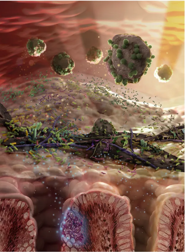
Consider a 3D animation, such asThe Hungry Microbiome, produced in 2014 by CSIRO and funded by a grant from Inspiring Australia, a strategy from the Australian Government to increase engagement with science (see figure 1.1). A superficial look at what goes into producing this visualisation shows that the animator needs to:
• Have an interesting subject, in this case, determined by a brief from the funding body and scientific stakeholders.
• Develop the scientific literacy required to understand the specific research relating to the sub-ject. The animator ofThe Hungry Microbiome, Chris Hammang, has prior experience studying medical science and cell biology in addition to animation.
• Discern what information from the research will be interesting to the intended audience. • Compose a script and storyboard to communicate the information.
• Use specialised skills, time and resources to develop the animation.
A project like this could take weeks, or even months to produce. It may require teams of people with specialised and diverse skills in a range of disciplines. Different visualisation methods, such as infographics, could be less time-consuming, or easier for the creative practitioner to understand. However, any visualisation requires some kind of resource investment. Even though decreasing video production costs may reduce the investment in resources, there is an abundance of high-quality video available to the user [59]. This ultimately means that the production quality must increase, in order to stand out among the competition. This ultimately may require increase the required investment of time and effort. The return on centralising that effort is that it allows many people to benefit from the understanding that the animator has to develop in order to produce the video. The right visual-isation can leverage the ubiquity and familiarity of social media and modern media consumption; a video can be shared thousands of times, and be available to the general public for years1. The total investment of resources for one animator is much less than an equivalent investment of thousands of potential viewers. To centralise the understanding of science and distribute it in an accessible way is to democratise scientific understanding. Rather than distributed workload, it distributes benefit; rather than isolating knowledge, it empowers with it.
Communicating science to the general public also benefits the scientific community. Effective science communication can encourage favourable attitudes towards publicly funded science research, supporting the scientific community [206]. Voters and policy makers will develop informed attitudes to not only the content of science, but the importance of funding. It has been suggested that a general public who is ignorant of science may resist investment in science, though no link has been shown. Informing the public about science is the reason for communicating science, not acquiring public funding [88]
The public is interested in, and can see the benefit of visualising scientific research. Of the many approaches possible to this challenge, this thesis addresses the following questions:
• What is the nature of this challenge: can, and should it be addressed by designers? • How do audiences compare different approaches that designers may take?
1At the time of writing,The Hungry Microbiomehad over 130,000 views on youtube. Available athttps://youtu.be/ NI3KtR3LoqM
1.2. WICKED PROBLEMS 17 If communicating science to non-scientists is an appropriate problem for the practice of design, it should be able to framed as aWicked Problem.
1.2 Wicked Problems
Nigel Cross, emeritus Professor of Design Studies at the Open University, UK, describes wicked prob-lems as
Fundamentally un-amenable to the techniques of science and engineering [50, 49].
Scientific method addressestameproblems. This is not to say that tame problems are simple problems; many tame problems are very complex. Likewise wicked problems may be simple, but the nature of the problem is different. If the challenge of designing visualisations for the general public is wicked, it should show the characteristics of wicked problems, rather than tame ones.
The term “wicked problems” was first used by Horst Rittel [166], he describes them as: Social system problems which are ill-formulated, where the information is confus-ing, where there are many clients and decision makers with conflicting values, and where the ramifications in the whole system are thoroughly confusing. [38, 21]
The term was expanded (and popularised) by Richard Buchanan in his seminal workWicked Problems in Design Thinking[21]. Buchanan reframed wicked problems from a description of planning issues to include design thinking: [21, p.16]
1. Wicked problems have no definitive formulation, but every formulation of a wicked problem corresponds to the formulation of a solution.
2. Wicked problems have no stopping rules.
3. Solutions to wicked problems cannot be true or false, only good or bad. 4. In solving wicked problems there is no exhaustive list of admissible operations.
5. For every wicked problem there is always more than one possible explanation, with explana-tions depending on the [intellectual perspective] of the designer.
6. Every wicked problem is a symptom of another ”higher level” problem. 7. No formulation and solution of a wicked problem has a definitive test.
8. Solving a wicked problem is a ”one shot” operation, with no room for trial and error. 9. Every wicked problem is unique.
This list was summarised by Jeff Conklin in [41, p.8] as:
1. You don’t understand the problem until you have developed a solution. 2. Wicked problems have no stopping rules.
3. Solutions to wicked problems are not right or wrong. 4. Every wicked problem is essentially unique and novel. 5. Every solution to a wicked problem is a one-shot operation. 6. Wicked problems have no given alternative solutions.
These outlines provide a guide for determining whether it is suitable to approach visualisation of science for non-scientists using design methods.
Every wicked problem is a symptom of another “higher level” problem
The high-level problem is often difficult to solve in the short-term, though its symptoms need to be addressed immediately.
The underlying issue is not how to best design visualisations for the general public, rather, it is that there is a need for a deeper understanding of science among the general public. Visualising scientific research will help increase the level of understanding for people who engage with the content, but it is not a solution to the higher problem.
You don’t understand the problem until you have developed a solution
The problem is ill-structured, or ill-defined. Proposed solutions expose new aspects of the problem, which requires adjustment of the solution. Problems require a solution in order to be understood.
Balancing the specific context of the audience and the constraints of the designer requires testing and iteration. Developing potential solutions into testable prototypes will allow the designer to gauge the response of the intended audience of the visualisation.
Wicked problems have no stopping rule
Since it is not possible to definitively state the problem, it is also difficult to definitively state the solution. Wicked problems are solved by solutions that areadequaterather thancorrect.
A visualisation aimed at the general population may be endlessly tweaked, refined and improved. It may be the case that the most adequate solution is selected when funds, time or energy run out. There is no definitive way of knowing when the final design has been reached. However, it is possible to find the best solution, within the problem space.
1.2. WICKED PROBLEMS 19
Solutions to wicked problems are not right or wrong
Just as the selected answer isadequaterather thancorrect, one answer may bebetterorworsethan another, instead ofrightorwrong,trueorfalse.
There are many ways to visualise information. Often one piece of information can be expressed by several different types of charts, which could be represented as an image, animation, or interactive presentation. Outside of a specific brief from a client, there may be little to guide the designer for choosing between these alternatives; except perhaps expertise, funds, time and energy. Therefore, a published visualisation may not becorrect, but abetterdesign, given the considerations that the designer has to make.
Every wicked problem is essentially unique and novel
With the constraints, considerations, requirements of a client, as well as the expertise of the designer, among many other conditions of the intended audience, the problem that faces the designer is that every wicked problem is essentially different. Experience can guide a designer, but, as Conklin states: “one is always a beginner in the specifics of a new wicked problem” [41, p.8].
There are many tools that a designer can use to create visualisations for the general public. One example is D3.js, a JavaScript library for creating data-driven websites (D3 stands for Data Driven Documents), including interactive data visualisations through manipulation of HTML, CSS and SVG elements based on data [17]. There is a large number of visualisation types that are predefined in D3.js, which allow the designer to experiment with different representations. When using a frame-work like D3.js, the designer leverages the experience of previous similar visualisation designs, and is able to focus their creative efforts on satisfying the unique details that are required by a particular client, with a particular set of information, for a particular audience.
Every solution to a wicked problem is a one-shot operation
Every solution to a wicked problem is expensive, has lasting consequences, and has the potential to expose a new set of wicked problems. As Rittel said “One cannot build a freeway to see how it works.”[166, p. 163]
Though it is unlikely that designing a visualisation is going to have the same impact as Rittel’s example, it is still expensive to develop solutions to a visualisation problem. The time and funding constraints of developing the best solution means that investigating dead-end solutions may have lasting effects on the quality of the solution ultimately published. Also, it is unlikely that new data sets can be simply uploaded to a visualisation that has been designed to show a specific dataset to a unique audience, with unique needs. Elements of visualisations are transferrable, but the particulars of any one visualisation for non-expert user audience are unique.
Wicked problems have no given alternative solutions
Conklin states that it requirescreativityandjudgementto solve a wicked problem [41, p.9]. There may be many potential solutions, or none. The formulation of solutions requires creativity, choosing which solution to develop requires judgement.
Tools, like D3.js, are a useful starting point for visualising information for the general public, but they are just building blocks, with which the designer constructs an entire experience for their audience. The creativity of the designer is central to the design process, and the final product [48].
If three designers are given one problem, they may each use the same process, and still come up with ten unique answers between them. Judgement on the part of the designer is required to choose which one of the answers is the best to be deployed to the audience.
Nigel Cross describes this as thedesignerlyways of knowing, thinking and acting [50]. The use of synthesis to solve problems, rather than analysis, is what makes designers suitable to address wicked problems [48]. Unlike wicked visualisation problems, tame visualisation problems can be addressed using automated and standardised methods, like those used for data visualisation for expert audiences.
1.3 Expert Visualisation
McGowan points out that the scientific community has been criticised for not doing enough to help the general population understand scientific research [134], but this may be unfair. If the nature of the problem is wicked, rather than tame, it is not a good fit for the practice that scientists usually employ. Of course this is not to say that scientists should not be involved, or that they are unable to develop new ways to communicate to an audience using designerly thinking and design methods. Rather, communicating with the non-scientific community is a good opportunity for collaboration between primary researchers (such as scientists) and creative practitioners (such as designers, artists and animators). Visualisation is a useful tool for science, and is not a novel concept for the scientific community. Scientific visualisation (sciVis) addresses the problem of gaining insight from the res-ults of numerical simulations, computations, measurements or other real-world processes. Scientific visualisation often involves series of complex data processing operations to eventually produce an image, plot or animated sequences. This approach answers a well-defined question, reveals a fact that was not known before, or aids cognition of data through reduction and the mapping of information to spatial variables [128]2.
Scientific visualisation focuses on 3-dimensional phenomena [78], describing the physical world through realistic renderings of features such as volumes, surfaces and light sources [198]. One ex-ample is a visualisation of bone lesions described in research by CSIRO [159] (see figure 1.2). The researchers were provided with CT scans of bone, affected by myeloma (a type of bone marrow cancer) and automated the process of quantifying bone lesions—holes in the bone—through the use of complex image processing algorithms. The research involved automating and optimising the visualisation, and producing an interactive interface for exploring the data.
2In [128] Manovich describes information visualisation (infoVis) in this way. However, the principle also applies to
1.3. EXPERT VISUALISATION 21
Figure 1.2: Real-time rendering of bone lesions caused by myeloma. [159]
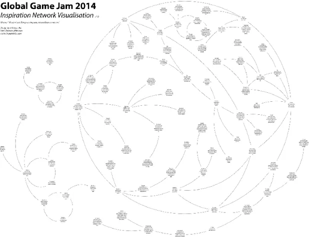
Phenomena of the physical world is the domain of sciVis, and data that does not have a spatial variable, but already has a structure, is the domain of information visualisation (infoVis). Data of this type includes relational graphs (such as networks), tables, time series, documents, personal data and much more [198]. Relational data, without only abstract or mathematical structure, can be understood with much less difficulty by visualising the data. One example from The University of Sydney is an inspiration network (see figure 1.3) of ideas or topics that inspired games developed at the Global Game Jam, 2014 which was produced by Xavier Ho [101]. This data has no spatial variables, but positions of the inspirations (nodes) are assigned to highlight relationships with other games’ inspirations.
Visualising abstract data requires that spatial arrangement (such as size and position of objects) be assigned to the most significant variables, with other variables being assigned to visual dimensions (such as colour) [128]. Visual analytics, a third visualisation field has emerged to leverage the prac-tices used in sciVis and infoVis with data-mining to support analytical reasoning for various fields, such as business, medicine and transport: any field where decision making can be supported by an understanding of data [198]. The “information overload” described by Daniel Keim in [111], one of the defining papers in the field, is an opportunity for automated systems to be designed which support analytical reasoning. This objective of visual analytics is what primarily differentiates it from infoVis. This is expressed in the way that infoVis used the “Visual Information-Seeking Mantra”
Overview first, Filter and zoom, Details on demand, [179] which was updated for a visual analytics approach:
1.4. NON-EXPERT VISUALISATION 23 Analyze first, Show the Important, Zoom, filter and analyse further, Details on de-mand. [111]
It is often stated that the objective of visualisation—sciVis, infoVis and visual analytics—is to provide “insight” [33, 221, 111, 161]. Some research argues that since “gaining insight” is difficult to define and measure (how much insight? how deep was the insight?), and is not always the objective of a visualisation, that the real, tangible benefit of visualisation is saving time [37]. In addition to the diffi-culty of testing what insight is achieved, it is also possible to argue that insight can be gained without any visualisation, but it would take more time. However, the current research environment generates unprecedented amounts of data, which is referred to as the data deluge [37, 46, 76], a data tsunami [14], information overload [111], or simply as “big data”. The downside of saying that visualisation is really about saving time is that with such large data sets, it may simply be beyond human cognitive abilities to ever gain insight from data without visualisation. Science uses visualisation to make big data an opportunity, and to remove the bottleneck in the scientific process caused my managing data that exponentially increases in volume. The rapidly expanding computational landscape has fuelled the need for visualisation algorithms to aid analysis of scientific data [14].
One other shared factor of these fields is that there is a focus on producing visualisations for a user group that already has an understanding of the domain of the data. Scientists visualise data from their own research, visual analytics practitioners visualise data to support expert decision-making in areas such as businesses or medicine. These are important research applications, but their ability to help the general public is limited.
1.4 Non-Expert Visualisation
The non-mathematician is seized by a mysterious shuddering when he hears of “four-dimensional” things, by a feeling not unlike that awakened by thoughts of the occult.
- Albert Einstein, inRelativity[66, p. 56]
Though tongue-in-cheek, Einstein’s comment is still relevant after a century. The mysteries of science and technology may still astound the layperson—which is not a fault. But, seemingly esoteric know-ledge can be made clear through visualisation if it is done effectively and affectively. By appealing to the emotional response to the non-expert user, data can be engaging, as well as enlightening.
Visualisation for domain experts is focused on data, and the optimal way to display it. However, when visualising science for the non-expert audience, there are a greater number of stakeholders, such that a single, unified theory of visualisation may be impossible [163]. Designing a visualisation for a broad, novice audience requires consideration about:
• How meaning is extracted from the visual stimuli (pyschophysics)[62]. • What people understand from the visualisation (cognition)[62]. • The relationship between images and meaning (semiotics)[62].
• The social and cultural context[62].
• The dynamic story underlying the data [173]. • Spectrum of experience in the population [161].
• Usage patterns (a momentary glance as part of a daily routine or contemplation of artistic re-imaginations of data) [161].
• Types of data used [161].
• Types of insight expected to be gained [161].
• The analytical power of a visualisation, or the capacity for a visualisation to communicate spe-cific information and provide insight, and how this is effected by the chosen format of the visualisation [143].
• The point of engagement with the visualisation. [151]
• The most useful methods to employ in order that engagement with the visualisation is sus-tained [151], such asgamification [54], social motivations [151], aesthetics [157] or artistic interpretations. [216]
• The way in which a user will disengage and can reengage with the visualisation [151]. The comparison produced for this thesis in table 1.1 outlines the elementary differences between domain-expert and non-expert approaches to visualisation. The literature review in the next chapter describes the nature of both the domain expert user visualisation, and non-expert user visualisation in detail. This table shows an overview of some the additional needs of the non-expert user. The differences between these two approaches are entirely dependent on the knowledge that the audience has of the domain of the data and the different goals that data professionals and the general public have when using a visualisation. An interactive exhibition, such as theDino Zoo (see figure 1.4) at Queensland University of Technology (QUT) [165] exemplifies these considerations and the differ-ences between domain expert and non-expert visualisation. For example, the types of data used may be similar if the same message was to be used in a scientific visualisation, but it is important to de-velop an engaging story to entice users to uncover the data—something which is not necessary with an interested party, such as a research scientist. Dino Zooalso attracted a broad spectrum of guests, particularly school children, with limited experience of dinosaurs and the science about them. The type of insight to be gained is also different,Dino Zoogives insight into process of removing a fossil from dig site, the way it is protected for transport, and then examined by the scientist. Obviously, this is not necessary for the scientists to be shown in a visualisation, but it informs the non-expert audience about the process and culture of science. The intuitive design ofDino Zoo is supported by high quality 3D scans using medical MRI technology, which are also used by scientists to investigate ancient dinosaur fossils [102, 99]. Exploring these data sets in a public context has to be natural
1.4. NON-EXPERT VISUALISATION 25
Table 1.1: A comparison of the attributes of domain expert and non-expert visualisation.
Domain-Expert Visualisation Non-Expert Visualisation
sciVis, infoVis, visual analytics. Science communication, museum installations, data art, infographics, animation (and more).
Free exploration of data through interactive displays.
Exploration of data requires some guidance into meaning and implication of data and how it relates to the user.
Cognitive aid: for creating insight about data and supporting analytical decision making.
Cognitive aid with an affective appeal: for creating insight and meaning to support function as a member of society.
Tame, well defined problems. Suitable for automation and predictable, repeatable processes.
Wicked, ill-defined problems. Suitable for iterative development using designerly approaches.
Primarily data-centric approach to representations.
Data-centred and user-centred considerations are equally important.
Figure 1.4: Dino Zoo. Digital installation at QUT Gardens Point Campus, Brisbane. Image by Tomasz Bednarz, used with permission.
and familiar, which also gives the user an understanding of what they are interacting with, and its social and physical affordances [20] and can be used as a site for collaborative learning [98]. A user visiting the installation at QUT will not have the same incentive to learn a complex interface, or sci-entific software, which may give extra information to a scientist specialising in this field. The aura of the large scale, interactive installation—the presence of huge virtual of dinosaurs in a digital, but unique here-and-now [13]—fits a usage pattern of a museum, rather than a tool for domain experts. Finally, visualising these data is a complex, wicked problem: it has no stopping rule; there is no right or wrong design; it is a unique and novel mix of context, content and technology; it is not easily adaptable to other displays or designs; and has no given solution, but requires collaboration between scientists and expert video game developers.
This chapter has described two approaches to visualisation. First, for the domain expert user through sciVis, infoVis, and visual analytics. These approaches address tame problems: well-defined challenges that can be understood at the start, and can be automated, producing predictable, consist-ent and reliable results. The second approach addresses a context where the audience has no specific knowledge of the domain of the data. Determining the most effective way to visualise data for the non-expert audience is difficult. If visualisation is to support the general population in decision mak-ing on important issues, climate change for example, it needs to address the cognitive and emotional response of the audience, as moods and emotions profoundly effect the way people make decisions [174]. These complex, wicked problems can be a good opportunity for collaboration. Combining intellectual and embodied experiences using multiple modalities, such as sight, sound and touch, creates new and accessible points of engagement with scientific research [103, 86]. Evocative
visu-1.4. NON-EXPERT VISUALISATION 27 alisation creates memorable experiences, and through transdisciplinary collaboration the uninitiated audience can engage with the complex and beautiful world of science. There is a lot more than just beautification and public outreach that creative practitioners, of all background, can offer art and sci-ence research [75]. Art, design and animation can have much to offer scientific visualisation, which will be discussed in this thesis.
The aim of thesis is to address two main questions through qualitative methods: what is the nature of NEUVis, and what are different approaches to NEUVis? Zimmerman’s theoretical model of research through design provided a framework for evaluation of a designed artefact [226]. This artefact, as described in detail in chapter 5, was evaluated using Zimmerman’s method, and also compared to other types of visualisation in two experiments, described in chapter 3. The experiments were conducted using qualitative methods of naturalistic inquiry [124]. The main contributions from this research are described in chapter 4. They are include: a description of the nature of collaboration between primary researchers and creative practitioners described in terms of boundary objects [27]; recommendations for engaging users with content in NEUVis contexts; and two design method tools for creating NEUVis. The thesis is organised such that a literature review, chapter 2 on page 29, follows this introduction, chapter 3 on page 61 describes the experiment and chapter 4 on page 73 describes the results from the experiments, and the main contributions listed above. Following these results, chapter 5 on page 89 describes the development of the designed artefact, and is listed after the contributions of the research, as the design tools developed after the experiment were applied to the final iteration of the design of the artefact. Finally, chapter 6 on page 113 includes a discussion of the results and conclusion.
Chapter 2
Literature Review
Preamble
This chapter is based on a peer-reviewed article I wrote forLeonardojournal, and accepted for public-ation in November 2014. It has been published on theLeonardo“just accepted” website before being assigned to a journal issue. The article has been substantially developed for inclusion in this chapter.
Gough, P. (Accepted November 2014). From the Analytical to Artistic: A Review of Literature on Information Visualization. Leonardo. doi:10.1162/LEON_a_00959
In section 2.3.3 are excerpts I contributed to a peer-reveiwed conference paper presented atVINCI 2014, which was also adapted into a journal article for theInternational Journal of Software and Informatics.
Gough, P., De Berigny Wall, C., & Bednarz, T. (2014). Affective and Effective Visualisation: Com-municating Science to Non-expert Users. In2014 IEEE Pacific Visualization Symposium(pp. 335– 339). Yokohama: IEEE. http://doi.org/10.1109/PacificVis.2014.39
Gough, P., Dunn, K., Bednarz, T., & Ho, X. (2015). Art and Chartjunk: A Guide for NEUVis.International Journal of Software and Informatics, 9(1), 61–72.
A book is made from a tree. It is an assemblage of flat, flexible parts (still called ‘leaves’) imprinted with dark pigmented squiggles. One glance at it and you hear the voice of another person - perhaps someone dead for thousands of years. Across the millennia, the author is speaking, clearly and silently, inside your head, directly to you. Writing is perhaps the greatest of human inventions, binding together people, citizens of distant epochs, who never knew one another. Books break the shackles of time, proof that humans can work magic.
—Carl Sagan inCosmos.
If I have seen further it is by standing on ye shoulders of Giants.
—Isaac Newton in a letter to Robert Hooke, February 1675.
2.1 Introduction
Visualisation is effective because of the powerful visual processing systems in the human brain [218]. To visualise something is to make it seeable, or to make a mental image. Visualisation can be meaning-ful and insightmeaning-ful if it helps the user create a metal image of data, its structure and the relationships between individual points of data [128]. Visualisation helps the user overcome the limitations of human working memory to achieve its primary functions: saving time and facilitating insight. Com-paring points of data on a graph requires much less mental agility than comCom-paring the numbers by themselves [23]. Anscombe’s Quartet is a good example of how visualisation does this: the four sets of numbers in table 2.1 are almost statistically identical, but their differences are obvious once visualised in figure 2.1.
Mathematicians, statisticians, journalists, designers, academics, science communicators, com-puter programmers, and many more, have published work about visualisation. This chapter will divide the body of literature into 4 sections and present some examples of visualisations which use artistic methods to communicate science to non-scientific audiences for a variety of purposes. 2.2 Visualisation Research focuses on academic investigations into visualisation.2.3Visualisation Practice will present literature that is aimed at the practice of creating visualisations. 2.4 Science Communica-tion discusses some of the literature from the field of science communicaCommunica-tion that can inform creative practice. Finally, 2.5 Artistic Visualisation will present artistic research and visualisation as art.
2.2 Visualisation Research
Much of the academic literature relating to visualisation is published within the fields of scientific visualisation (sciVis), information visualisation (infoVis) and visual analytics. There is very little research that has been conducted from a design perspective, but there are many books for designers that outline best visualisation practices. These practices draw on design knowledge, but also from fields as diverse as also perceptual psychology, statistical graphics and computer science. Within this literature there is a lot of information that can contribute to a design-led approach to NEUVis.
2.2. VISUALISATION RESEARCH 31
Table 2.1: Anscombe’s Quartet. Each set of numbers is almost statistically identical.
I II III IV x y x y x y x y 10.0 8.04 10.0 9.14 10.0 7.46 8.0 6.58 8.0 6.95 8.0 8.14 8.0 6.77 8.0 5.76 13.0 7.58 13.0 8.74 13.0 12.74 8.0 7.71 9.0 8.81 9.0 8.77 9.0 7.11 8.0 8.84 11.0 8.33 11.0 9.26 11.0 7.81 8.0 8.47 14.0 9.96 14.0 8.10 14.0 8.84 8.0 7.04 6.0 7.24 6.0 6.13 6.0 6.08 8.0 5.25 4.0 4.26 4.0 3.10 4.0 5.39 19.0 12.50 12.0 10.84 12.0 9.13 12.0 8.15 8.0 5.56 7.0 4.82 7.0 7.26 7.0 6.42 8.0 7.91 5.0 5.68 5.0 4.74 5.0 5.73 8.0 6.89
Figure 2.1: Anscombe’s Quartet: Points plotted with a line to show the linear regression for each graph. The differences between each set becomes obvious only when visualised.
2.2.1 Evaluating Visualisations
Four out of five papers on the theme of ’evaluation’ published at IEEE InfoVis 2014 conference [169] used two performance metrics to evaluate visualisation techniques: time and accuracy. Evaluation is a major question in infoVis, sciVis and visual analytics: how do we evaluate visualisations? Though IEEE InfoVis is not the only visualisation conference, [169] suggests that time spent reading a visualisation and accuracy is a major topic. Evaluation methods have been addressed many times by researchers [28, 106, 141, 169, 186, 160, 203], and is applicable to empirical research in the field of Human-Computer Interaction (HCI), perceptual psychology and cognitive research [28]. Evaluation is im-portant to visualisation, because it can expose faults and inefficient mapping of data to graphics, showing where the visualisation can be improved, or be more effective [186].
In 2004, Catherine Plaisant, Director of Research the University of Maryland Human-Computer Interaction Lab, published a paper which summarised the most common methods of evaluation in the maturing discipline of infoVis [160]. She includes the following:
1. Controlled experiments that compare design elements, such as a new interface element, or mapping between data and graphical elements.
2. Usability evaluation of a tool, often outlining problems which users encounter and how the designers resolved the issue.
3. Controlled experiments, evaluating two or more tools, which compare a novel design to the state-of-the art.
4. Case studies of visualisation tools in realistic situations.
Plaisant discusses how three implicit features of visualisation are not addressed by these research methods.
1. Insight, or discovery may not be instantaneous, and may require the user to look at the data from different perspectives over a long period of time.
2. Visualisation can answer questions you didn’t know you had. This is inherently difficult to evaluate.
3. The benefits of visualisation may not be traced back to the visualisation itself: visualisation may be one of tools that increase the productivity of a user in the real-world, daily work context. The benefit of visualisation may not always be in the big discovery.
Empirical research into visualisation also leaves little room for evaluating qualitative insights, partly from the nature of many empirical research methods [150]. These methods often give users specific tasks, which require simple, definitive answers to questions. Researchers use this approach to measure accuracy and precision. These may be pertinent issues for infoVis and sciVis, but specific accuracies are not as relevant to NEUVis. The message or implications of scientific research may be more important than pinpoint accuracy of specific datum.
2.2. VISUALISATION RESEARCH 33 Another approach to evaluating visualisations is an expert review, such as a heuristic evaluation1 [203]. Heuristic evaluations are common, particularly in HCI, and allow an expert to conduct an evaluation of a system against a predefined set of criteria [145], such as Jakob Nielsen’s Usability Heuristics [146]. Though they should not be the exclusive method for evaluation, heuristic and other expert reviews can provide quick insight into problems with usability of visualisations, and highlight different problems than those found in user testing [203]. Usability testing and heuristic evaluation is as useful for NEUVis as it is to infoVis, sciVis and visual analytics. Interactive NEUVis systems, particularly those which use video-game elements (a practice known as ’gamification’ [55]) should be evaluated using both expert evaluation and user testing. Interactive art and gamification may deliberately break the ’normal’ rules of interactivity to engage the user, but the user’s experience with NEUVis should be considered. Particularly if the goal is for users to gain some new knowledge or understanding of science.
Sheelagh Carpendale, director of the Innovations in Visualization Laboratory at the University of Calgary, published a review of research and evaluation methods for visualisation in 2008 [28]. This paper outlines challenges for quantitative methods in visualisation research. However, Carpendale adds:
Quantitative evaluation is naturally precision-oriented, but a shift from high precision to high fidelity may be made with the addition of qualitative evaluations. [28, p.40]
While Carpendale acknowledges the importance of qualitative research, she notes that these methods are generally under-used and under-reported in visualisation literature, going on to note a sign that was reported to hang in Albert Einstein’s office:
Everything that can be counted does not necessarily count; everything that counts cannot necessarily be counted. This is a salient point for NEUVis reserach. InfoVis and SciVis have not substantially invested in qualitative research methods, or developed similar qualitative evaluation models for visualisation.
More recent models of evaluating visualisations have included two approaches which may be useful for evaluating NEUVis. John Stasko, from the School of Interactive Computing at the Georgia Institute of Technology, published a value-driven model of evaluating visualisations in 2014 [186]. Stasko presents this evaluation of visualisation as a descriptive aid, rather than a prescriptive model. The sum of four elements create the value of visualisation:
The ability of the visualisation to answer a wide variety of questions about the data in the smallest amount of time. As discussed in section §1.3, saving time is a primary function of visualisation, but this description extends beyond most evaluations in visualisation research. Rather than asking specific questions and measuring narrow results, such as in HCI user studies, this approach specifies that visualisations should have more utility than is often measured in some studies.
1This is where an expert in interaction (such as a designer) evaluates the quality of a design according to a predefined
Figure 2.2:Ten Thousandby Randall Munroe on his webcomic xkcd. Published under a Creative Com-mons Attribution-NonCommercial 2.5 License. [140]
The ability of the visualisation to prompt or encourage insight, and insightful questions about the data. Taking away questions, and a deeper interest in the content is a valuable outcome for visualisations. This is particularly true for NEUVis, where a single, effective presentation has the potential to spark a lifelong passion with the audience, inspiring an excitement for science.
The ability of the visualisation to communicate not just specific data, but an overview, an es-sence, or take-away sense of data. An overview, or take-away message may be essential for some NEUVis. Exceptions to this may be argued, particularly for artistic data visualisations. But it should be considered that the overall message of the data be implicit to the design of NEUVis, and made explicit in its final presentation. This is important for many reasons. One of which is that any NEUVis for the general population will inevitably be accessible for someone who is hearing about domain of the information for the first time. This point is illustrated by Randall Munroe (see 2.2), a robotics expert (turned comic artist) who often uses his webcomic,xkcd,and several books to communicate science, mathematics and programming. He says in the title of this image on xkcd.com:
Saying “what kind of an idiot doesn’t know about the Yellowstone supervolcano” is so much more boring than telling someone about the Yellowstone supervolcano for the first time.
2.2. VISUALISATION RESEARCH 35
The ability of the visualisation to generate knowledge, as well as confidence and trust about the data, its domain and context. If a visualisation does not generate confidence in the data, within its broader domain and context, then what value can it have? If it minimised time to questions about the data, but does not make the user feel confident that the answer is reliable, then what value can the visualisation have? This may not be a significant issue for infoVis or sciVis, where the audience and the primary researchers may be the same people. However, in NEUVis, a context where the visualisation may be the only link between primary research and potential audience, it is not difficult to imagine that a visualisation which inspires no confidence or trust may easily have an effect opposite to what was intended. This may be an interesting area for further, specific research.
Instead of using accuracy and time as metrics for evaluation, a model presented at Eurographics 2015 uses enjoyment to validate a visualisation [169]. This model used the concept of flow, from renowned psychologist Mihaly Csikszentmihalyi, to augment an existing model of visualisation. Flow is a mental state that is brought about by engaging in any task that is challenging, but the user has a high skill level in the task2. It is an effortless, spontaneous feeling experienced by a user totally engaging with an activity, so that they completely lose themselves, and feel ecstasy [51, 52]. The paper connects this concept of flow to Munzner’s popular nested model of visualisation design and validation [142]. This nested model uses validation rather than evaluation, because the validation is used throughout the design process. It outlines 4 threats to validity that a visualisation developer must face3:
1. Addressing a problem that does not actually relate to users, 2. Showing the user the wrong thing, or using wrong abstractions,
3. Using the wrong encoding (mapping of data to visuals) or interaction, or 4. Using the wrong algorithm, their code being too slow.
A connection is made through comparing enjoyment factors of Csikszentmihalyi’s flow to the levels of Munzner’s model (see table 2.2).
Flow and enjoyment in visualisation is an area of research that can extend to NEUVis, particularly if it is possible to create an evaluation model that helps determine whether the user achieves a state of flow.
Though it has not yet been widely investigated, the concept of presence may benefit immersive scientific visualisation, infoVis or visual analytics, and also NEUVis. Presence relates to mediated experiences with technology: an experience with technology creates a sense of presence by being natural and real, giving the illusion that the experience with the technology is not mediated at all [126]. This aesthetic experience is relevant to immersive experiences such as Virtual Reality. As this technology becomes more ubiquitous, it will become more important for NEUVis to effectively
2Flow is what is also described as being “in the zone” by athletes, or in “the green room” by some musicians. 3It should be noted that Munzner uses the term “designer” rather than developer, which I have not done. Designers
address wicked problems, as outlined in Chapter 1, but Munzner’s descriptions of challenges do not fit with this way of thinking, so for clarity, I use “developer”.
Table 2.2: Saket’s connection between flow and a nested model for visualisation [169]. AnXindicates where the development interacts with enjoyment of the visualisation.
Enjoyment Factor Why?
problem or domain What? data How? encoding or interaction How fast? algorithm Challenge X X Focus X Clarity X X Feedback X Control X Immersion X
provide a sense of presence to the audience. It is easy to imagine how further research into presence has the potential to benefit novel NEUVis applications such as museum installations and virtual or augmented reality.
2.2.2 Comprehending Visualisation
Another topic of infoVis research is how users comprehend visualisation. This has been approached from different perspectives. Colin Ware, Director of the Data Visualization Research Lab at the Center for Coastal and Ocean Mapping at the University of New Hampshire, is a leading author in this area. He approaches visualisation with a focus on visual perception (perceptual psychology), outlining ways in which the visual processes of the human brain can be exploited [218]. His research has been extended to areas of visual analytics for business [68, Chapter 3] and information design [135]. Ware’s research is exceptionally useful to NEUVis, but he points out that:
For the visualization designer, training in art and design is at least as useful as training in perceptual psychology. [218, p. 17]
The understanding that creative practitioners have about the use of colour, form, mass and other visual design principles is valuable to visualisation. Perceptual psychology is useful, but not the only source of knowledge for effective visualisation.
Ambient visualisation is one approach that does not rely heavily on perceptual psychology4. There are three levels to comprehension in ambient visualisation: thatsomething has been visualised;what kind of information is being visualised;howthe information has been visualised [105]. Visualisation research usually begins with the 3rd step, but users must navigate through all three in order to actually 4According to [183], ambient visualisations reside in the user’s environment, rather than on a computer screen, much
like a painting. They can display dynamic information which a user in the space my need; much like a clock or a bus timetable.
2.2. VISUALISATION RESEARCH 37 use the visualisation. This is trivial in domain-expert visualisation, but, as outlined in [105], it is important to ambient visualisation. This understanding could also be significant for NEUVis.
Human visual perception is what allows visualisation to identify trends, patterns and unusual occurrences within datasets. Perception is what drives the user’s ability to gain insight. A paper from 2008, [221], presents previous research on how people achieve insight, as opposed to what insight is. This paper also asks if an understanding of insight can lead to insight-oriented visualisations. This would prove difficult, as ’insight’ is a concept that is now understood well. The authors adopt a definition of insight (from biology) as “an individual observation about the data by the participant, a unit of discovery,” which sparks a critical breakthrough, leading to discovery; seeing something previously unnoticed, bringing to light something familiar [221, p.1]. The authors also outline different types of insight. Complex insights are about large amounts of data in context, rather than the nature of individual points. Deepinsights develop over time, often developing further questions. Qualitativeinsights are subjective, rather than exact and have multiple levels of resolution. Unexpected, or unpredictable, serendipitous insights andrelevantinsights are the result of the context of the data and its presentation [221, p.2]. Coming to insight may be the end result of a number of different user experiences. Providing an overview of data and adjusting or filtering data may be useful in producing perspectives that lead to insight, particularly when something that was passed over is brought to light. Exposing something unnoticed can also be done by exposing patterns in the data. All of this can bring about insight by solidifying the user’s mental model of the data.
2.2.3 Other Approaches to Visualisation
Visualisation research shows a bias towards factors that are influenced by perceptual psychology. This is understandable, as it is easier to test than whether a visualisation can engage the user in a state of flow or whether the user has a qualitative insight. But, as visualisation, which uses colour and patterns to solve problems, begins to address increasingly complex problems, research must inform how visualisation should be designed to aid increasingly complex cognitive tasks. Caroline Ziemkiewicz, of Brown University Visualisation Research Lab, suggests that these fundamental principles address how people see, rather than how people think [224]. In order to fully understand how visualisations work, the way that the users think must also be understood. Visualisation uses visual processing to overcome the limitations of working memory in the human brain, but working memory varies between different people. So does spatial and verbal cognition, and all of these may effect the way a user can use a visualisation to perform a task. At this point, there is no usable decomposition of visualisation design that takes these factors into account[224].
Non-expert users represent a much broader group than domain-expert visualisation would ad-dress, making these differences greater. One important paper outlines four types of visualisation which is aimed at the non-expert audience: Ambient,Social,ArtisticandCasual infoVis [161]. The au-thors assert that these four areas of infoVis challenge two standard assumptions in infoVis. The first assumption is that users are only interested in rational processing of information. The second is that visualisation is for work. The four groups are outlined in the paper: AmbientinfoVis are abstract de-pictions of data that communicate from a peripheral location;SocialinfoVis represents networks and
social processes and situations;ArtisticinfoVis includes data-driven artworks;CasualinfoVis represents things that do not fit into the other categories:
We define: Casual InfoVis is the use of computer mediated tools to depict personally meaningful information in visual ways that support everyday users in both everyday work and non-work situations. [161, p.1149]
InfoVis is defined as providing computer-supported, interactive visualisations of abstract data to amp-lify cognition to a small but skilled population of knowledge workers [26, p.7]. The goal of casual infoVis is to provide opportunity for non-analytical insight into data that is personally relevant and meaningful to a wide audience in contexts inside and outside work [161]. However, it will always be on the ’edges’ of infoVis, as it doesn’t conform with the traditional assumptions of infoVis. NEUVis includes this approach, as well as the Artistic approach, and design approaches that could be used to build ambient and social infoVis. By comparing these different approaches, more commonalities can be found.
NEUVis would also include another approach, outlined in a paper in IEEE transactions on visual-ization and computer graphics, 2010, calledNarrativevisualisation [178]. Current visualisation tools do not adequately support storytelling through visualisation, though narrative is a compelling way of communicating data [220, 120, 72, 79]. The chain of causality that connects events in a narrative can be used as a metaphor in visualisation, which is common across different genres of narrative visualisation [178]. These visualisations also tend to use interactive checkpoints through the visual-isation, rather than being freely interactive, so that the narrative may progress. One excellent example of this techniqueThe Fallen of World War II(2015), an interactive documentary about war and peace, directed, coded and narrated by Neil Halloran [93]. This 15-minute interactive video uses narrative techniques and data to create a story around the devastating number casualties in World War II, and compare it to modern international conflict. The narrative is interspersed with interactive elements, where the user can explore the data that has been shown to them. The authors of [178] suggest that if it was established that users skim a narrative visualisation the same way that readers skim headlines and graphics in a newspaper, then it would provide a useful guide for narrative visualisation [178]. Grouping together these approaches under NEUVis allows the similarities to be observed without the implications of whether the visualisations are strictly infoVis, sciVis or visual analytics. One way that these approaches, as well as traditional approaches in infoVis, sciVis and visual analytics, have also been researched is according to their aesthetic value.
2.2.4 Information Aesthetics
Advances in computer graphics have helped visualisation mature, as we can see in figure 2.3. The first image, figure 2.3a, shows a state of the art visualisation from 1996, notably it uses dotted lines to al-low the user to differentiate between each of the lines. By 2002, computer graphics had advanced, as had visualisation, now including colour, as seen in figure 2.3b [196]. With the increasing flexibility provided by advancements in computer graphics, research started to focus on the quality of the visual construction in visualisation. A model for information aesthetics was proposed in 2007 by Andrea

![Figure 1.2: Real-time rendering of bone lesions caused by myeloma. [159]](https://thumb-us.123doks.com/thumbv2/123dok_us/11053985.2992395/21.892.112.717.192.493/figure-real-time-rendering-bone-lesions-caused-myeloma.webp)