METHODOLOGY
Evaluation of threshold selection
methods for adaptive kernel density estimation
in disease mapping
Warangkana Ruckthongsook
1, Chetan Tiwari
2*, Joseph R. Oppong
2and Prathiba Natesan
3Abstract
Background: Maps of disease rates produced without careful consideration of the underlying population distribu-tion may be unreliable due to the well-known small numbers problem. Smoothing methods such as Kernel Density Estimation (KDE) are employed to control the population basis of spatial support used to calculate each disease rate. The degree of smoothing is controlled by a user-defined parameter (bandwidth or threshold) which influences the resolution of the disease map and the reliability of the computed rates. Methods for automatically selecting a smoothing parameter such as normal scale, plug-in, and smoothed cross validation bandwidth selectors have been proposed for use with non-spatial data, but their relative utilities remain unknown. This study assesses the relative performance of these methods in terms of resolution and reliability for disease mapping.
Results: Using a simulated dataset of heart disease mortality among males aged 35 years and older in Texas, we assess methods for automatically selecting a smoothing parameter. Our results show that while all parameter choices accurately estimate the overall state rates, they vary in terms of the degree of spatial resolution. Further, parameter choices resulting in desirable characteristics for one sub group of the population (e.g., a specific age-group) may not necessarily be appropriate for other groups.
Conclusion: We show that the appropriate threshold value depends on the characteristics of the data, and that bandwidth selector algorithms can be used to guide such decisions about mapping parameters. An unguided choice may produce maps that distort the balance of resolution and statistical reliability.
Keywords: Kernel density estimation, Bandwidth selection, Threshold, Monte Carlo simulation, Disease mapping
© The Author(s) 2018. This article is distributed under the terms of the Creative Commons Attribution 4.0 International License (http://creat iveco mmons .org/licen ses/by/4.0/), which permits unrestricted use, distribution, and reproduction in any medium, provided you give appropriate credit to the original author(s) and the source, provide a link to the Creative Commons license, and indicate if changes were made. The Creative Commons Public Domain Dedication waiver (http://creat iveco mmons .org/ publi cdoma in/zero/1.0/) applies to the data made available in this article, unless otherwise stated.
Background
Disease maps, an essential component of epidemiological surveillance, are used to illustrate the geographic distri-bution of diseases. Disease outcomes are typically rep-resented as rates, which are computed by dividing the number of disease cases by the population contained within some geographic region such as a zip code or county. Rates that are computed without careful consid-eration of the underlying population distribution may be unreliable due to the well-known small numbers problem [1]. For example, areas with small populations are more
likely to produce unstable rate estimates compared to areas with larger population sizes. Smoothing methods including kernel density estimation are commonly used to address the problem of unstable rates [1–11].
Kernel Density Estimation (KDE) is a non-parametric method that can be used to explore the spatial density of point data [1]. In the context of disease mapping, KDE methods operate by computing rates within a moving spatial window or kernel (typically a circle) placed across the entire study area. A ratio of the density of events (i.e., cases) and the density of the background (i.e., the pop-ulation) is calculated within each kernel [12]. Another KDE method computes the rate by dividing the number of cases that fall inside a kernel by the population that is contained within the same kernel [4, 9].
Open Access
*Correspondence: [email protected]
2 Department of Geography and the Environment, University of North Texas, Denton, TX, USA
The size of the kernel, bandwidth, is a crucial param-eter that influences the degree of smoothing on the map in KDE [13–15]. The bandwidth can be either fixed or variable (adaptive). For the fixed bandwidth approach, the kernel has a fixed-size radius, and all kernels (cir-cles) have the same radii. In health studies, the fixed bandwidth approach may not be suitable since popula-tions are not evenly distributed across geographic space. Moreover, unstable rates may result if the circle falls in low population-density areas. Similarly, in the adaptive bandwidth approach, the kernel radius grows or shrinks to accommodate varying population sizes. The minimum population size that is used to define the kernel band-width, and consequently the degree of smoothing on a map, is a user-defined parameter. We will refer to this as the threshold value (h).
Figure 1 illustrates the spatial distribution of heart dis-ease mortality rates for males aged 65 years and older using data obtained from the Centers for Disease Con-trol and Prevention (CDC), National Center for Health Statistics (NCHS) [16]. We produced this map using the adaptive kernel density estimation method with differ-ent threshold values. As shown in Fig. 1a, when using the smallest threshold value (h= 50), the resulting map portrays high levels of geographic detail in the estimated rate. However, as the thresholds increase, the resulting maps show lower levels of geographic detail (Fig. 1b–d). Further, maps produced using small threshold values tend to display greater fluctuations in rate estimates (µ= 1330 per 100,000 population, σ= 639.9 at h= 50). In contrast, maps produced using larger threshold values tend to show lower levels of fluctuation (µ= 1209.5 per 100,000 population, σ= 268.4 at h= 1000). The trade-off between geographic detail and reliability depends on the choice of the threshold value. A value that is too small may result in under-smoothing, i.e., high levels of geo-graphic detail but greater fluctuation in rate estimates (Fig. 1a). Conversely, a value that is too large will result in over-smoothing, i.e., low levels of geographic detail but less fluctuation in rate estimates (Fig. 1d).
The problem of choosing an appropriate smoothing parameter—bandwidth or threshold—has been discussed in previous studies [1, 4–6, 9, 11–13, 17–20]. Silverman
[13] and Wand and Jones [20] recommend subjective
selection of the bandwidth parameter based on visual inspection. The process of visual evaluation of the band-width parameter begins with examining several plots of the data and selecting the density that is the “most pleas-ing” in some sense [20:58]. Although this approach has been used by others [12:654], the process can be time-consuming if many density estimates are required. In other cases, mapmakers may not utilize information
about the structure of the data to inform choice of threshold value.
Many bandwidth selectors available for use with non-spatial data could potentially be adapted for non-spatial data. However, their applicability for the purposes of creating disease maps has not been evaluated. Non-spatial band-width selectors may be grouped into two classes—(a) quick and simple, and (b) hi-tech bandwidth selectors [20]. Quick and simple bandwidth selectors aim to find a threshold value that is reasonable for a wide range of data distributions. One such method is the normal scale
bandwidth selector [20]. This method recommends a
bandwidth value which can be used as a starting point or a “first guess” [20]. The bandwidth is calculated by referencing a standard distribution that is derived from the data (see Silverman [13] and Wand and Jones [20] for details). In contrast, hi-tech bandwidth selectors, which are data-driven, seek to find an optimal bandwidth by minimizing the mean integrated square error (MISE) of the kernel density estimator [20, 21]. For example, plug-in [22] and smoothed cross-validation [23] bandwidth selectors estimate a pre-smoothing parameter based on the pairwise differences of the observations obtained using the pilot bandwidth value. The pre-smoothing parameter is then used to find the optimal bandwidth value [20, 25]. These two approaches are highly rated for bandwidth convergence and statistical performance [23, 24]. Additional information on the theoretical basis of these methods are available in Silverman [13], Wand and Jones [20], Chiu [21], Wand and Jones [22], Hall and Marron [23], Hall et al. [26].
In summary, while automatic bandwidth selections methods have been used to produce distributions of non-spatial data, their suitability for threshold selection in disease mapping remains unknown. In this study, we use a simulated dataset on heart disease mortality to exam-ine applicability of applying commonly used automated bandwidth selection methods to determine optimal threshold values with the objective of producing disease maps with high levels of geographic details and statistical reliability.
Methods
The methods used in this study are presented in two parts (Fig. 2). First, we examine the applicability of the visual and subjective methods for choosing a threshold value (Objective 1). Initially, since we assume that mapmakers will select threshold values based on arbitrary choices or some knowledge of the disease, we use values ranging from 50 to 10,000. Subsequently, we use bandwidth selec-tion methods—normal scale (hns), plug-in (hpi), smoothed
cross-validation (hscv), and median—for comparison. Our
for males in Texas obtained from the 2010 U.S. Census Bureau at the zip code level (Table 1) [27].
Second, we evaluate the relative performance of dif-ferent threshold values for disease maps using the same dataset (Objective 2). We first generated a Monte Carlo simulated dataset of age-specific heart disease mortal-ity rates among males aged 35 years and older in Texas (Table 1). Statewide rates for generating the simulated case counts in each age group were obtained from the
CDC NCHS [16]. Finally, maps produced using both
approaches (Objectives 1 and 2) are compared.
Methods for objective 1
the zip code level using median and three bandwidth selectors—the normal scale (hns), the plug-in (hpi), and
the smoothed cross-validation (hscv). The median
thresh-old was determined by computing the median popula-tion value across all zip codes. Threshold values from the three bandwidth selectors—hns, hpi, and hscv—were
computed using the ks-package in R [28]. Since these four thresholds were calculated based on data, their
values varied among the age groups. We selected desir-able threshold options using visual and subjective exami-nation of the data as suggested by Silverman [13]. This involved generating plots of estimated population density against the actual population density. For each age group, estimated population densities were computed using a kernel function with each of the ten thresholds. The actual population density was generated from the popu-lation data using a gamma distribution. We chose the gamma distribution for two reasons: it mimics the popu-lation of the region by age group as shown in Table 1 with maximum number of people in the age group 35–44 and decreasing gradually to the age group 65+. Secondly, the gamma distribution does not allow for negative values in the distribution unlike say, a normal distribution where all real values are probable. It consists of two positive
parameters—shape (k) and scale (θ) parameters. These
two parameters were calculated using mean and stand-ard deviation of the population data (Eqs. 1 and 2). This process was also performed in R using probability density function (Eq. 3).
Methods for Objective 1 Methods for Objective 2
Threshold choices (10 choices)
Arbitrary choices (user defined) (50, 100, 500, 1000, 5000, 10000)
Calculated choices (computed from population data)
(hns, hpi, hscv, median)
Plot estimated population density against actual population density
Examine desirable threshold choices using visual and subjective method (Silverman, 1986)
Step 2 Compute estimated rates
Average of estimated rates in the entire study area ( )
(estimated state rate) Estimated rates using adaptive KDE
(ZCTA level)
Measure the accuracy between estimated state rates and simulated baseline rates using RMSE
Step 3 Evaluate the threshold performance
Illustrate the consistency of estimated state rates using boxplot
Actual state rate
(simulated baseline rate)
Step 1 Generate simulated data
Generate a point pattern of population
Generate simulated case
data
Examine the consistency of the simulation and justify the
number of replications
(To examine the applicability of the visual and subjective
method for choosing a threshold value) (To evaluate the relative performance of threshold choices)
Stage 1 Stage 2
Stage 3
Pass Fail
(use for computing estimated rates in the
adaptive KDE
Process flow Data flow Note:
Fig. 2 Flow chart of methodology showing the steps using in this study
Table 1 Age-adjusted and age-specific heart disease
death rates for males in Texas by age group, 2009–2013
[16], and population distribution from the 2010 U.S.
Census Bureau [27]
Age Population Range of aggregated
population at the ZCTA level Rate (per 100,000)
35–44 1,722,904 [1, 7925] 33.87
45–54 1,702,639 [1, 7407] 115.15
55–64 1,256,976 [1, 4948] 297.36
65+ 1,135,517 [1, 4792] 1245.93
where k and θ are shape and scale parameters respec-tively, µ and σ are respectively the mean and the standard deviation of the population, Γ(k) is the gamma function, and f(x) is the probability density function.
Methods for objective 2
Step 1: Methods to generate simulated data
The aim of this step was to generate simulated case data. This step comprised of three stages:
1. Generate a point pattern of male populations by age at the ZCTA level
The data used in this process are (1) male popula-tion data stratified by age as shown in Table 1, and (2) a ZIP Code Tabulation Areas (ZCTAs) carto-graphic boundary file obtained from Topologically Integrated Geographic Encoding and Referencing (TIGER) [29]. Note that the ZCTAs are created by the U.S. Census Bureau and approximate the spa-tial boundaries of postal zip code service areas [30]. The age-stratified population data were joined to the ZCTA cartographic boundary file in ArcGIS 10.2. Then, the random point generation tool in ArcGIS 10.2 was used to create a point distribution, where each point (xi,s) represents a simulated individual in age group i residing in ZCTA s. The age group
i∈I where I ={35−44, 45−54, 55−64, 65+}. 2. Generate simulated cases from a point pattern of
male populations obtained from stage 1To classify a simulated individual as a case, a random number was assigned to each point in the random point pattern generated from stage 1. The random number was generated from a uniform distribution on the interval (0, 1) under the assumption that each person has an equal probability of being designated as a case. The probability that a simulated point, xi,s, would be clas-sified as a case (ci,s) was determined using observed age-specific heart disease mortality rates (Table 1). For example, the observed age-specific heart disease death rate for males aged 35–44 years old in Texas
(1) k= µ σ 2 (2)
θ = σ
2
µ
(3)
f(x)= 1
θkΓ (k)x k−1
e−x/θ
was 33.87 per 100,000 (0.0003387) (Table 1). If a ran-dom number generated was in the range 0.0000001 to 0.0003387, it was classified as a simulated case. This process was replicated 100 times to produce 100 different instances of the case distribution—i.e., a 100 simulated maps of heart disease mortality could be produced from this data. For each simulated dataset (l, where l = 1, 2, …, 100), state rates, called simulated baseline rates, were computed for each age group as well as for all-groups combined. The rate (yi,l) was computed using:
where Ci,l was the total number of simulated cases for age group i at the lth simulation, and Pi was the total population for age group i.
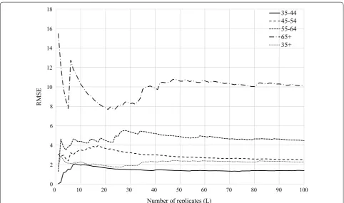
3 Examine the consistency of the simulation and justify the number of replications. For each age group, we examined the consistency of the simulated baseline rates ( yi,l ) and justified the number of replications
using a scatter plot of the running root mean squared error (RMSEM) against the total number of
replica-tions [31]. The RMSE is a function of the average difference between the simulated baseline rates and the true value, i.e., CDC’s heart disease mortality rate (Table 1) using the following formula:
where L was the total number of replications, yi,l was the simulated baseline rate of age group i at lth simu-lation, and Yi was the true rate of age group i. Fig-ure 3 illustrates that the magnitude of the difference between the simulated baseline rate and the true value (RMSE) stabilizes as L increases. In this study, when L > 50, the stable state was achieved for all age groups. In this study, we used 100 replications. Based on recommendations by Natesan [32], we also exam-ined (1) the coverage rate, and (2) bias of interval estimates (Table 2). Coverage rate is defined as the percentage of statistical estimate intervals that con-tain the true values. Bias of interval estimates is com-puted as the percentage of the statistical estimate intervals that overestimate and underestimate the true value [32]. While the coverage rates for the 95% interval estimates are typically expected to be around 95%, our results show that they were extremely low— less than 20% for all age groups (Table 2). However, as the percentages of over- and under-estimates are
(4)
yi,l =
Ci,l
Pi
(5)
RMSEiM,L= 1 L L
l=1
more-or-less equal, we can conclude that the simula-tion was unbiased.
Step 2 Methods to compute estimated rates
For each age group i at the lth simulation, estimated rates were computed using the KDE method with aggregated simulated cases as the numerators, and the population data as the denominators. The KDE method was applied to all ten threshold values. This process was performed using the Web-based Disease Mapping Analysis Program
(WebDMAP) [33] and custom code written in Python.
As a result, 100 estimated rates were produced for each threshold and for each age group i. These rates, which
were obtained at the ZCTA level, were aggregated to the state level (called estimated state rate, yi,l).
Step 3 Methods to evaluate threshold performance
To evaluate the relative performance of each thresh-old choice, the estimated state rates ( yi,l ) resulting from
different thresholds were compared to the simulated baseline rates in each age group i (yi,l from Eq. 4). The
root-mean-square-error (RMSE) was employed to meas-ure the accuracy of the estimated state rates in estimating the simulated baseline rates using the following formula:
where RMSEi,t was the RMSE of age group i and
thresh-old t, yi,t,l was the estimated state rate of age group i and
threshold t at the lth simulation, and yi,l was the
simu-lated baseline rate of age group i at the lth simulation. Further, to illustrate the consistency of the rates com-puted from each threshold ( yi,t,l ), a box-plot was
gener-ated to display the variation of 100 estimgener-ated state rates for each age group.
(6)
RMSEi,t =
1
100 100
l=1
yi,t,l−yi,l
2 0
2 4 6 8 10 12 14 16 18
0 10 20 30 40 50 60 70 80 90 100
RMSE
Number of replicates (L)
35-44 45-54 55-64 65+ 35+
Fig. 3 The running RMSE between the simulated baseline rates and the true value as a function of the number of replicates (L) for all age groups
Table 2 Summaries of characteristics of simulated
baseline rate distribution
Age group Mean SD Coverage
rate (%) Over-estimated (%)
Under-estimated (%)
35–44 33.92 1.40 17 50.6 49.4
45–54 115.17 2.52 11 49.4 50.6
55–64 297.60 4.49 20 56.2 43.8
65+ 1245.93 10.21 16 47.6 52.4
Results and discussion
The impact of threshold choice on population density estimates
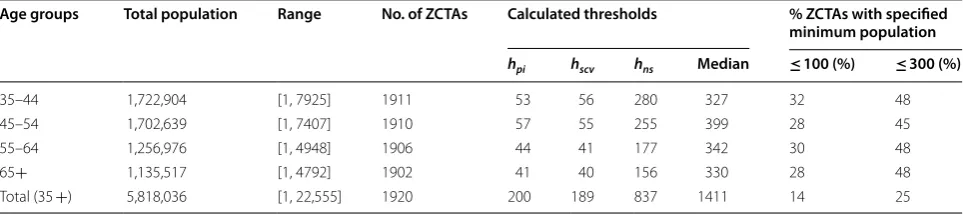
The calculated thresholds for the three selectors—plug-in (hpi), smoothed cross-validation (hscv), normal scale
(hns)—and median are shown in Table 3. The hpi and hscv
selectors result in the smallest threshold values. In con-trast, the hns and median selectors are approximately 4
and 8 times larger, respectively for the age groups 55–64, 65 years and older, and the overall population (aged 35 years and older). Further, the hns and median selectors
are also approximately 5 and 7 times larger for the two youngest groups—35 to 44 and 45 to 54. These results indicate that for the same data, different bandwidth selec-tors provide different threshold values. For this data, the
hpi and hscv recommendations produce maps that provide
greater geographic detail (lower levels of smoothing), but also larger fluctuations in estimated rates. Conversely, the other two bandwidth selectors produce greater levels of smoothing, but fewer fluctuations in rates.
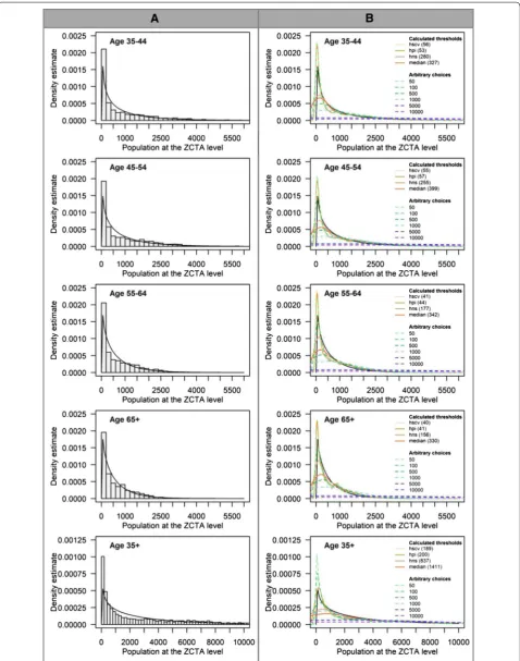
In Fig. 4, the density curves for populations obtained after applying each threshold (hpi, hscv, hns, median, and
six arbitrary choices—50, 100, 500, 1000, 5000, 10,000) are compared to the actual population distribution (see Methods—Objective 1). For each chart, the X-axis repre-sents population with a bin size of 200 and the Y-axis is the density of ZCTAs.
The actual population density (Fig. 4 column A) tends to follow a gamma distribution (the black line) for all age groups, which indicates that the population is not evenly distributed. Thus, many ZCTAs have low popula-tions, and the number of ZCTAs with large populations is small. This is indicated by a long tail to the right of the distribution. Figure 4 column B illustrates the population density estimates computed from all ten thresholds. For all age groups, the population density estimates com-puted from thresholds, h= 50, 100, hpi, and hscv, provide
similar density curve characteristics. The density esti-mates have a sharp peak and closely match the actual gamma distribution. The resulting density curves from these four thresholds contain fluctuations at the tail end
of the distribution. This suggests that these four thresh-olds may be too small for all age groups. For maps pro-duced using these threshold values, the Washington State
Department of Health guidelines [34] suggest extreme
caution with interpretation since the population (denom-inator) values are less than 100. In fact, the guidelines rec-ommend interpretation with caution for maps produced using populations less than 300. Thus, thresholds, h ≤ 100 may not be an appropriate choice to use. In this paper, we included values lower than 100 to evaluate the impact of choices that may be considered undesirable. This is also true of hpi and hscv for age specific groups in this study. In
contrast to these small thresholds, larger thresholds pro-vide more smoothed estimates and will not capture ade-quate geographic detail on a map. For example, h= 5000 and 10,000, may be too large for all age groups since the density curve estimates are almost flat (Fig. 4 column B).
While six thresholds result in similar density curve characteristics for all age groups and may be considered too small (h= 50, 100, hpi, and hscv) or too large (h= 5000
and 10,000), the remaining thresholds—hns, median, 500,
and 1000—provide slightly different density curve char-acteristics between age 35 years and older and other age groups. For the age groups 35–44, 45–54, 55–64, and 65 years and older, the population density estimates com-puted from h=hns, median, and 500 (arbitrary choice)
provide similar density curve characteristics. Thus, when h=hns, the density estimates are smoother and the
fluctuations in the tails cease to exist. When threshold values increase (h=median and 500), the density esti-mates retain the modal structure of h=hns but are more
smoothed. This density curve characteristic is the most desirable compared to the others as it offers a reasonable compromise between smoothing of the mode and tail.
The thresholds for age 35 years and older that fit this characteristic are h=hns, 500, and 1000. Although
thresh-olds h= 500 and hns fall in the most desirable
character-istic for all age groups, their density curve charactercharacter-istics between age 35 years and older and other age groups are slightly different. When h= 500, the density curve is smoother than h=hns for the age groups 35–44, 45–54,
Table 3 Descriptive results and calculated thresholds stratified by age group
Age groups Total population Range No. of ZCTAs Calculated thresholds % ZCTAs with specified minimum population
hpi hscv hns Median ≤ 100 (%) ≤ 300 (%)
35–44 1,722,904 [1, 7925] 1911 53 56 280 327 32 48
45–54 1,702,639 [1, 7407] 1910 57 55 255 399 28 45
55–64 1,256,976 [1, 4948] 1906 44 41 177 342 30 48
65+ 1,135,517 [1, 4792] 1902 41 40 156 330 28 48
55–64, and 65 years and older. In contrast, h=hns offers
a smoother density curve than h= 500 for age 35 years and older. Moreover, when h= 1000, the resulting density curve retains the same modal structure as h=hns and 500
(which may be considered as a desirable choice for age 35 years and older), but may be too large for other age groups since the density curves are even more smoother and almost flat. Differences in population size and dis-tribution between age 35 years and older and other age groups are probably the reason. This explanation also applies to h=median, which may be considered as one of desirable choices for age-specific groups but may be too large threshold for ages 35 years and older.
These findings suggest that thresholds that produce desirable characteristics for one group may not necessar-ily work for other groups possibly due to differences in population size and distribution. For producing disease maps that incorporate the population age structure, e.g., directly age-adjusted maps, the mapmaker must be care-ful not to choose different threshold values for each age strata as this could lead to the use of inconsistent spa-tial supports. Generally, spaspa-tial supports must be con-sistently applied across the entire map [35–37]. In such circumstances, the mapmakers may choose a threshold value that best fits a majority of the age groups.
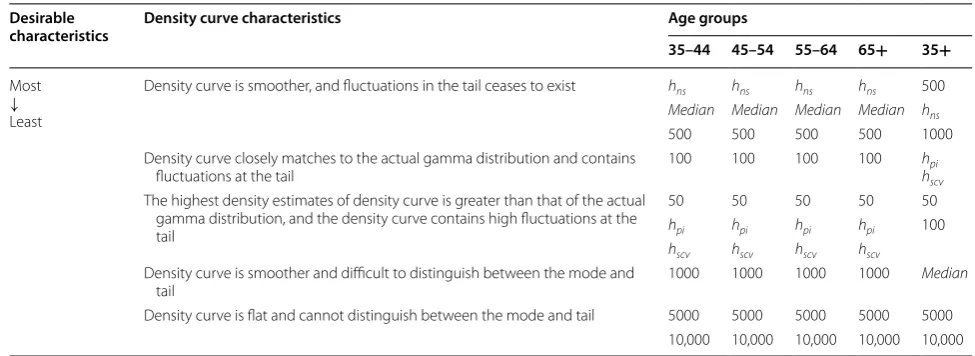
Table 4 summarizes the characteristics of density curve estimates from various thresholds by age groups. The thresholds that provide the most desirable density curve characteristics are h=hns, median and 500 for age groups
35–44, 45–54, 55–64, and 65 years and older and h=hns,
500, and 1000 for age 35 years and older. This is consist-ent with the recommendation of Silverman [13], to use values that best replicate the population distribution. Additional considerations may include a comparison of
the estimated rates, obtained from various threshold esti-mators, to the actual state rates.
Impact of threshold choice on the distribution of rate estimates
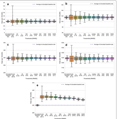
Figure 5 illustrates the distribution of the estimated state rates ( yi,l ) of each threshold from 100 repetitions. Since hpi and hscv provided almost identical values for all age
groups, only hpi was used in this study. For each chart,
the X-axis represents the thresholds that were used to compute the estimated rates ordered from the small-est to the largsmall-est, and the number in the bracket is the RMSE of each threshold (RMSEi,t from Eq. 6). The Y-axis
shows heart disease mortality rates (per 100,000 popula-tion) obtained from the simulated dataset, and each dot represents the estimated state rate for each simulation ( yi,l ). The simulated baseline rate (yi) and the crude rate
are also included in each chart for reference. A crude rate was computed as the average of the ratio of simulated cases to population for each individual ZCTA. Note that the scale of the Y-axis is different for each chart—this was done to account for the large differences in heart disease risk between age groups (e.g., the average heart disease death rates for age groups 35–44 and 65 years and older are 33.87 and 1245.93 per 100,000 population, respec-tively). Also, the crude rate (second boxplot in each panel in Fig. 5) shows greater variation in estimated rates compared to all other boxplots. Moreover, the results show that the variation in rates decreases as thresholds increase. The smaller box plots indicate that the esti-mated state rates for each map resulting from each simu-lation tends to be more consistent, and vice versa.
For the age group from 35 to 44 (Fig. 5a), the median rate (the middle line in the boxplot) obtained for each threshold is similar. However, the width of the boxes
Table 4 Characteristics of the population density curve estimates from various thresholds stratified by age groups
Desirable
characteristics Density curve characteristics Age groups
35–44 45–54 55–64 65+ 35+
Most
↓
Least
Density curve is smoother, and fluctuations in the tail ceases to exist hns hns hns hns 500
Median Median Median Median hns
500 500 500 500 1000
Density curve closely matches to the actual gamma distribution and contains
fluctuations at the tail 100 100 100 100 hhpiscv
The highest density estimates of density curve is greater than that of the actual gamma distribution, and the density curve contains high fluctuations at the tail
50 50 50 50 50
hpi hpi hpi hpi 100
hscv hscv hscv hscv
Density curve is smoother and difficult to distinguish between the mode and
tail 1000 1000 1000 1000
Median
shrinks towards the center in both the upper and lower quartiles when thresholds increase. This indicates that the estimated state rates are more consistent. Further, the boxplots tend to be similar in structure for thresh-olds greater than 300 (hns≥ h≥1000), in which
desir-able thresholds are included. The patterns of boxplots in Fig. 5b (45–54 age group), Fig. 5c (55–64 age group),
and Fig. 5d (65 years and older) follow similar trends while the boxplots for age group 35 years and older fol-low slightly different trends (Fig. 5e). Thus, although the overall width of each boxplot decreases with increasing threshold, the median values also decline as thresholds increase.
problem, specifically when h≤ 100. This is to be expected since the threshold values (h) used to compute the esti-mated rates in this study are the minimum population size (denominator). Using small threshold values can result in unstable and unreliable rate estimates in spatial units with small population sizes. These unstable rates can affect the estimated state rates since they are aggre-gated from the smaller spatial units—ZCTA in this study. These results also suggest that h≤ 100 may not be an appropriate choice to use.
Impact of threshold choice on disease maps
As indicated in Table 4, threshold values obtained using
hns, median, and h >500 provided the most desirable
density curve characteristics for the age stratifications used in this study. Further, h >500, hns, and h >1000
pro-vided the most desirable density curve characteristics for ages 35 years and older. For these cases, although the RMSE values are not noticeably different (indicated in the x-axis of Fig. 5), differences in boxplot widths, as well as their corresponding IQR, suggest different levels of consistency in average rate estimates (Fig. 5). This is
particularly true for the 35+ age group in Fig. 5e. When producing disease maps, there is a need to balance the amount of geographic detail portrayed on the map and accuracy of estimated rates. While the RMSE suggests similar degrees of accuracy between the maps pro-duced using the three desirable thresholds, the remain-ing key factor to consider in selectremain-ing an appropriate threshold is the degree of geographic variation. When the geographic variation is the highest priority, hns may
be the most desirable threshold choice for all age groups since it provides the greatest variation (more geographic detail) among the candidate thresholds, but still produces accurate rates (Fig. 6). Moreover, compared to arbitrary choices, the hns provides a consistent way to estimate the
appropriate threshold value.
Conclusion
Determining the appropriate threshold value is essen-tial for disease mapping because it affects the degree of smoothing that occurs on the map. While the utility of automatic bandwidth selection methods has been studied and discussed for use with non-spatial data, a discussion Fig. 6 Geographic distribution of age-specific heart disease mortality rates for males aged 35 years and older. Maps were created using the
of their application in disease mapping is limited. In this research, we compare methods for selecting threshold values using existing bandwidth selectors for a synthetic dataset on heart disease mortality among males aged 35 years and older in Texas. The results suggest that hns
is the most desirable threshold for all age-specific groups and the overall population because it provides greater spatial variation in maps while maintaining accuracy in estimated rates. While this is true only for the simulated case data used in this study, our findings underscore the importance of carefully choosing the threshold values to use in disease mapping. In this paper, we outline how a mapmaker may use automatic bandwidth selection meth-ods to inform decisions about threshold values.
Authors’ contributions
WR carried out all simulation studies and prepared the manuscript. CT pro-vided guidance on conducting analysis. JRO helped to draft the manuscript. PN provided guidance on simulation studies. All authors read and approved the final manuscript.
Author details
1 Department of Biological Sciences, University of North Texas, Denton, TX, USA. 2 Department of Geography and the Environment, University of North Texas, Denton, TX, USA. 3 Department of Educational Psychology, University of North Texas, Denton, TX, USA.
Acknowledgements
We thank our anonymous reviewers for their valuable comments and feedback.
Competing interests
The authors declare that they have no competing interests.
Availability of data and materials
The datasets generated and/or analyzed during the current study are available from the corresponding author on reasonable request.
Consent for publication
Not applicable.
Ethics approval and consent to participate
Not applicable.
Funding
Not applicable.
Publisher’s Note
Springer Nature remains neutral with regard to jurisdictional claims in pub-lished maps and institutional affiliations.
Received: 20 October 2017 Accepted: 26 March 2018
References
1. Cromley EK, McLafferty S. GIS and public health. 2nd ed. New York: The Guilford Press; 2012.
2. Clayton D, Kaldor J. Empirical Bayes estimates of age-standardized rela-tive risks for use in disease mapping. Biometrics. 1987;43:671–81. 3. Marshall RJ. Mapping disease and mortality rates using empirical Bayes
estimators. J Roy Stat Soc: Ser C (Appl Stat). 1991;40:283–94.
4. Rushton G, Lolonis P. Exploratory spatial analysis of birth defect rates in an urban population. Stat Med. 1996;15:717–26.
5. Bithell JF. A classification of disease mapping methods. Stat Med. 2000;19:2203–15.
6. Talbot TO, Kulldorff M, Forand SP, Haley VB. Evaluation of spatial filters to create smoothed maps of health data. Stat Med. 2000;19:2399–408. 7. MacNab YC, Farrell PJ, Gustafson P, Wen S. Estimation in Bayesian disease
mapping. Biometrics. 2004;60:865–73.
8. Best N, Richardson S, Thomson A. A comparison of Bayesian spatial mod-els for disease mapping. Stat Methods Med Res. 2005;14:35–59. 9. Tiwari C, Rushton G. Using spatially adaptive filters to map late stage
colorectal cancer incidence in Iowa. In: Fisher P, editor. Developments in spatial data handling. Berlin: Springer; 2005. p. 665–76.
10. Waller LA, Carlin B. Disease mapping. In: Gelfand AE, Diggle PJ, Fuentes M, Guttorp P, editors. Handbook of spatial statistics. Boca Raton: CRC Press; 2010. p. 217–43.
11. Beyer KMM, Tiwari C, Rushton G. Five essential properties of disease maps. Ann Assoc Am Geogr. 2012;12:1067–75.
12. Shi X. Selection of bandwidth type and adjustment side in kernel density estimation over in homogeneous backgrounds. Int J Geogr Inf Sci. 2010;24:643–60.
13. Silverman BW. Density estimation for statistics and data analysis. New York: Chapman and Hall; 1986.
14. Kelsall JE, Diggle PJ. Kernel estimation of relative risk. Bernoulli. 1995;l:3–16.
15. Waller L, Gotway C. Applied spatial statistics for public health data. Hobo-ken: Wiley; 2004.
16. Centers for Disease Control and Prevention, National Center for Health Statistics. Underlying cause of death—heart disease mortality data set, 2009 to 2013. In: CDC WONDER. 2015. https ://wonde r.cdc.gov/ucd-icd10 .html. Accessed 18 Aug 2016.
17. Carlos HA, Shi X, Sargent J, Tanski S, Berke EM. Density estimation and adaptive bandwidths: a primer for public health practitioners. Int J Health Geogr. 2010;9:39.
18. Chi W, Wang J, Li X, Zheng X, Liao Y. Application of GIS-based spatial filter-ing method for neural tube defects disease mappfilter-ing. Wuhan Univ J Nat Sci. 2007;12:1125–30.
19. Cai Q. Mapping disease risk using spatial filtering methods. 2007. http:// gradw orks.umi.com/33/01/33016 88.html. Accessed 30 Sept 2016. 20. Wand MP, Jones MC. Kernel smoothing. Boca Raton: Chapman & Hall/
CRC; 1995.
21. Chiu ST. An automatic bandwidth selector for kernel density estimation. Biometrika. 1992;79:771–82.
22. Wand MP, Jones MC. Multivariate plugin bandwidth selection. Comput Stat. 1994;9:97–116.
23. Hall P, Marron JS. Lower bounds for bandwidth selection in density estimation. Probab Theory Relat Fields. 1991;90:149–73.
24. Park BU, Turlach BA. Practical performance of serveral data-driven band-width selectors. Comput Stat. 1992;7:251–70.
25. Hall P, Sheather SJ, Jones MC, Marron JS. On optimal data-based band-width selection in kernel density estimation. Biometrika. 1991;78:263–9. 26. Hall P, Marron JS, Park BU. Smoothed cross-validation. Probab Theory
Relat Fields. 1992;92:1–20.
27. U.S. Census Bureau. Profile of general population and housing character-istics: 2010–2010 Census Summary File 1. In: AmericanFactFinder. 2010.
https ://factfi nder .censu s.gov/. Accessed 18 Aug 2016. 28. Duong T. Kernel smoothing. R package version 1.10.7. 2017.
29. U.S. Census Bereau. 2010 ZIP Code tabulation areas. In TIGER/Line Shape-files. 2016. https ://www.censu s.gov/cgi-bin/geo/shape files /index .php. Accessed 18 Aug 2016.
30. U.S. Census Bureau: ZIP Code tabulation areas (ZCTAs). 2015. https :// www.censu s.gov/geo/refer ence/zctas .html. Accessed 20 Sept 2016. 31. Koehler E, Brown E. Haneuse SJ-P. On the assessment of Monte Carlo error
in simulation-based statistical analyses. Am Stat. 2009;63:155–62. 32. Natesan P. Comparing interval estimates for small sample ordinal CFA
•fast, convenient online submission
•
thorough peer review by experienced researchers in your field
• rapid publication on acceptance
• support for research data, including large and complex data types
•
gold Open Access which fosters wider collaboration and increased citations maximum visibility for your research: over 100M website views per year
•
At BMC, research is always in progress.
Learn more biomedcentral.com/submissions
Ready to submit your research? Choose BMC and benefit from:
33. Tiwari C. A spatial analysis system for environmental health surveillance. 2007. http://gradw orks.umi.com/33/47/33472 51.html. Accessed 18 Aug 2016.
34. Washington State Department of Health. Guidelines for working with small mubers. 2012. http://www.doh.wa.gov/Porta ls/1/Docum ents/5500/ Small Numbe rs.pdf. Accessed 21 Sept 2016.
35. Haining R. Spatial data analysis: theory and practice. Cambridge: Cam-bridge University Press; 2003.
36. Gotway CA, Young LJ. Combining incompatible spatial data. J Am Stat Assoc. 2002;97:632–48.

![Table 1 Age-adjusted and age-specific heart disease death rates for males in Texas by age group, 2009–2013 Census Bureau [[16], and population distribution from the 2010 U.S](https://thumb-us.123doks.com/thumbv2/123dok_us/764883.2072546/4.595.60.542.99.434/table-adjusted-specific-disease-census-bureau-population-distribution.webp)