1 INTRODUCTION
Developments in spatial data handling have been considerable during the past few decades and it seems likely that this will continue. GIS have introduced the integration of spatial data from different kinds of sources, such as remote sensing, statistical databases, and recycled paper maps. Their functionality offers the ability to manipulate, analyse, and visualise the combined data. Their users can link application-based models to them and try to find answers to (spatial) questions. The purpose of most GIS is to function as decision support systems in the specific environment of an organisation.
Maps are important tools in this process. They are used to visualise spatial data, to reveal and understand spatial distributions and relations. However, maps are no longer the final products they used to be. Maps are now an integral part of the process of spatial data handling. The growth of GIS has changed their use, and as such has changed the world of those involved in cartography and those working with spatial data in general. This is caused by many factors which can be grouped in three main categories. First, technological developments in fields such as databases, computer graphics,
multimedia, and virtual reality have boosted interest in graphics and stimulated sophisticated (spatial) data presentation. From this perspective it appears that there are almost no barriers left. Second, user-oriented developments, often as an explicit reaction to technological developments, have stimulated scientific visualisation and exploratory data analysis (Anselin, Chapter 17). Also, the cartographic discipline has reacted to these changes. New concepts such as dynamic variables, digital landscape models, and digital cartographic models have been introduced. Map-based multimedia and cartographic animation, as well as the visualisation of quality aspects of spatial data, are core topics in contemporary cartographic research.
Tomorrow’s users of GIS will require a direct and interactive interface to the geographical and other (multimedia) data. This will allow them to search spatial patterns, steered by the knowledge of the phenomena and processes being represented by the interface. One of the reasons for this is the switch from a data-poor to a data-rich environment, but it is also because of the intensified link between GIS and application-based models. As a result, an increase in the demand for more advanced and sophisticated visualisation techniques can be seen.
157
11
Visualising spatial distributions
M-J KRAAKMaps are an integral part of the process of spatial data handling. They are used to visualise spatial data, to reveal and understand spatial distributions and relations. Recent
developments such as scientific visualisation and exploratory data analysis have had a great impact. In contemporary cartography three roles for visualisation can be recognised. First, visualisation may be used to present spatial information where one needs function to create well-designed maps. Second, visualisation may be used to analyse. Here functions are required to access individual map components to extract information, and functions to process, manipulate, or summarise that information. Third, visualisation may be used to explore. Functions are required to allow the user to explore the spatial data visually, for instance by animation or linked views.
The developments described here have led to cartographers redefining the word ‘visualisation’ (Taylor 1994; Wood 1994). In cartography, ‘to visualise’ used to mean just ‘to make visible’, and as such incorporated all cartographic products. According to the newly established Commission on Visualisation of the International Cartographic Association it reflects ‘. . . modern technology that offers the opportunity for real-time interactive visualisation’. The key concepts here are interaction and dynamics.
The main drive behind these changes has been the development in science and engineering of the field known as ‘visualisation in scientific computing’ (ViSC), also known as scientific visualisation. During the last decade this was stimulated by the availability of advanced hardware and software. In their prominent report McCormick et al (1987) describe it as the study of ‘those mechanisms in humans and computers which allow them in concert to perceive, use and communicate visual
information’. In GIS, especially when exploring data, users can work with the highly interactive tools and techniques from scientific visualisation. DiBiase (1990) was among the first to realise this. He introduced a model with two components: ‘private visual thinking’ and ‘public visual communication’. Private visual thinking refers to situations where Earth scientists explore their own data, for example. Cartographers and their well-designed maps provide an example of public visual communication. The first can be described as geographical or map-based scientific visualisation (Fisher et al 1993;
MacEachren and Monmonier 1992). In this
interactive ‘brainstorming’ environment the raw data can be georeferenced resulting in maps and
diagrams, while other data can result in images and text. By the publication of two books, Visualization in geographical information systems (Hearnshaw and Unwin 1994) and Visualization in modern
cartography (MacEachren and Taylor 1994) the spatial data handling community clearly
demonstrated their understanding of the impact and importance of scientific visualisation on their discipline. Both publications address many aspects of the relationships between the fields of
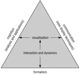
cartography and GIS on the one hand, and scientific visualisation on the other. According to Taylor (1994) this trend of visualisation should be seen as an independent development that will have a major influence on cartography. In his view the basic
aspects of cognition (analysis and applications), communication (new display techniques), and formalism (new computer technologies) are linked by interactive visualisation (Figure 1).
Three roles for visualisation may be recognised:
● First, visualisation may be used to present spatial
information. The results of spatial analysis operations can be displayed in well-designed maps easily understood by a wide audience. Questions such as ‘what is?’, or ‘where is?’, and ‘what belongs together?’ can be answered. The cartographic discipline offers design rules to help answer such questions through functions which create proper well-designed maps (Kraak and Ormeling 1996; MacEachren 1994a; Robinson et al 1994).
● Second, visualisation may be used to analyse, for
instance in order to manipulate known data. In a planning environment the nature of two separate datasets can be fully understood, but not their relationship. A spatial analysis operation, such as (visual) overlay, combines both datasets to determine their possible spatial relationship. Questions like ‘what is the best site?’ or ‘what is the shortest route?’ can be answered. What is required are functions to access individual map components to extract information and functions to process, manipulate, or summarise that information (Bonham-Carter 1994).
● Third, visualisation may be used to explore, for
instance in order to play with unknown and often
M-J Kraak
158
Fig 1. Cartographic visualisation (Taylor 1994). cog nitio n (an alys is a nd applicatio ns) com m un icatio n (n ew di splay tech niq ue s) visualisation interaction and dynamics formalism (new computer technologies)
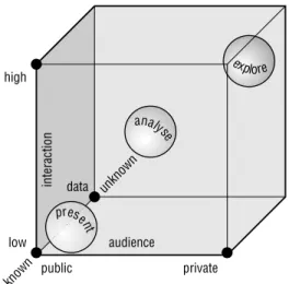
raw data. In several applications, such as those dealing with remote sensing data, there are abundant (temporal) data available. Questions like ‘what is the nature of the dataset?’, or ‘which of those datasets reveal patterns related to the current problem studied?’, and ‘what if . . .?’ have to be answered before the data can actually be used in a spatial analysis operation. Functions are required which allow the user to explore the spatial data visually (for instance by animation or by linked views – MacEachren 1995; Peterson 1995). These three strategies can be positioned in the map use cube defined by MacEachren (1994b). As shown in Figure 2, the axes of the cube represent the nature of the data (from known to unknown), the audience (from a wide audience to a private person) and the interactivity (from low to high). The spheres representing the visualisation strategies can be positioned along the diagonal from the lower left front corner (present: low interactivity, known data, and wide audience) to the upper right back corner (explore: high interactivity, unknown data, private person). Locating cartographic publications within the cube would reveal a concentration in the lower left front corner. However, colouring the dots to differentiate the publications according to their age would show many recent publications outside this corner and along the diagonal.
The functionality needed for these three strategies will shape this chapter. Each of them requires its own visualisation approach, described in turn in the
following three sections. The first section provides some map basics. It will briefly explain cartographic grammar, its rules and conventions. Depending on the nature of a spatial distribution, it will suggest
particular mapping solutions. This strategy has the most developed tools available to create effective maps to communicate the characteristics of spatial distributions. When discussing the second strategy, visualisations to support analysis, it will be demonstrated how the map can work in this environment, and how information critical for decision-making can be visualised. In a data
exploration environment, the third strategy, it is likely that the user is unfamiliar with the exact nature of the data. It is obvious that, compared to both other strategies, more appropriate visualisation methods will have to be applied. Specific visual exploration tools in close relation to ‘new’ mapping methods such as animation and hypermaps (multimedia) will be discussed. It is this strategy that will benefit most from developments in scientific visualisation.
2 PRESENTING SPATIAL DISTRIBUTIONS
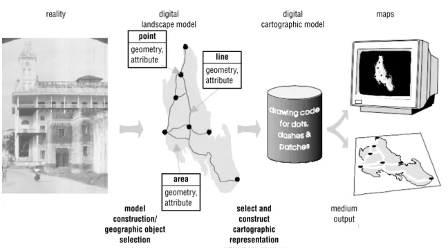
Maps are uniquely powerful tools for the transfer of spatial information. Using a map one can locate geographical objects, while the shapes and colours of its signs and symbols inform us about the characteristics of the objects represented. Maps reveal spatial relations and patterns, and offer the user insight into the distribution of particular phenomena. Board (1993) defines the map as ‘a representation or abstraction of geographical reality’ and ‘a tool for presenting geographical information in a way that is visual, digital or tactile’. Traditionally cartographers have concentrated most of their research efforts on enhancing the transfer of spatial data. This knowledge is very valuable, although some additional new concepts need to be introduced as illustrated in Figure 3. The traditional paper map functioned not only as an analogue database but also as an information transfer medium. Today a clear distinction is made between the database and presentation functions of the map, known respectively as the Digital Landscape Model (DLM) and Digital Cartographic Model (DCM). A DLM can be considered as a model of reality, based on a selection process. Depending on the purpose of the database, particular geographical objects have been selected from reality, and are represented in the
Visualising spatial distributions
159 Fig 2. The three visualisation strategies plotted in MacEachren’s
(1994) map use cube.
high low i n te r actio n audience public private know n data unk now n explore analy se prese nt
database by a data structure (see Dowman, Chapter 31; Martin, Chapter 6). Multiple DCMs can be generated from the same landscape model,
depending on the output medium or map design. To visualise data in the form of a paper map requires a different approach to an onscreen visualisation, and a road map for a vehicle navigation system will look different from a map designed for a casual tourist. Both, however, can be derived from the same DLM.
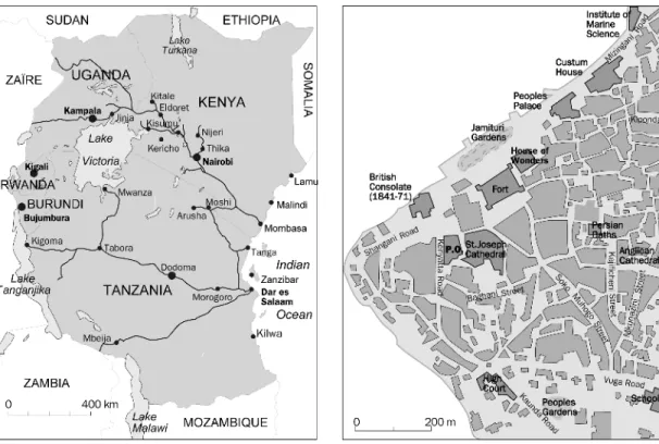
Next in importance to its contents, the usefulness of a map depends on its scale. For certain GIS applications one needs very detailed large-scale maps, while others require small-scale maps. Figure 4 shows a small-scale map (on the left) and a large-scale map. Traditionally maps have been divided into topographic and thematic types. Topographic maps portray the Earth’s surface as accurately as possible subject to the limitations of the map scale. Topographic maps may include such features as houses, roads, vegetation, relief,
geographical names, and a reference grid. Thematic maps represent the distribution of a particular phenomenon. In Plate 6 the upper map shows the topography of the peak of Mount Kilimanjaro in Africa. The lower thematic map shows the geology of the same area. As can be noted, the thematic map contains information also found in the topographic
map, since to be able to understand the theme represented one needs to be able to locate it as well. The amount of topographic information required depends on the map theme. A geological map will need more topographic data than a population density map, which normally only needs
administrative boundaries. The digital environment has diminished the distinction between the two map types. Often both the topographic and the thematic maps are stored in layers, and the user is able to switch layers on or off at will.
The design of topographic maps is mostly based on conventions, of which some date back to the nineteenth century. Examples are representing water in blue (see MacDevette et al, Chapter 65), forests in green, major roads in red, urban areas in black, etc. The design of thematic maps, however, is based on a set of cartographic rules, also called cartographic grammar. The application of the rules can be translated in the question ‘how do I say what to whom?’. ‘What’ refers to spatial data and its characteristics – for instance whether they are of a qualitative or quantitative nature. ‘Whom’ refers to the map audience and the purpose of the map – a map for scientists requires a different approach to a map on the same topic aimed at children. ‘How’ refers to the design rules themselves.
M-J Kraak
160
Fig 3. Spatial data characteristics: from reality to the map via a digital landscape model and a digital cartographic model. model construction/ geographic object selection select and construct cartographic representation medium output reality digital landscape model digital cartographic model
maps area geometry, attribute line geometry, attribute point geometry, attribute
To identify the proper symbology for a map one has to conduct cartographic data analysis. The objective of such analysis is to access the
characteristics of the data components in order to find out how they can be visualised. The first step in the analysis process is to find a common denominator for all of the data. This common denominator will then be used as the title of the map. Next the individual component(s) should be accessed and their nature described. This can be done by determining the measurement scale, which can be nominal, ordinal, interval, or ratio (see Martin 1996 for a discussion of geographical counterparts to these). Qualitative data such as land-use categories are measured on a nominal scale, while quantitative data are measured on the remaining scales. Qualitative data are classified according to disciplinary convention, such as a soil classification system, while quantitative data are grouped together by mathematical method.
When all the information is available the data components should be linked with the graphic sign
system. Bertin (1983) created the base of this system. He distinguished six graphical variables: size, value, texture (grain), colour, orientation, and shape (Plate 7). Together with the location of the symbols in use these are known as visual variables. Graphical variables stimulate a certain perceptual behaviour with the map user. Shape, orientation, and colour allow differentiation between qualitative data values. Size is a good variable to use when the purpose of the map is to show the distribution amounts, while value functions well in mapping data measured on an interval scale. The design process results in thematic maps that are instantly understandable (for example newspaper maps and simple maps such as the one in Figure 5), and maps which may take some time to study (for example road maps or topographic maps – Plate 6(a)). A final category includes maps which require additional
interpretative skills on the part of the user (for example geological or soil maps – Plate 6(b)).
Figure 6 presents an overview of some possible thematic maps. They represent different mapping
Visualising spatial distributions
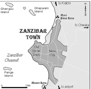
161 Fig 4. A small-scale map of East Africa, and a large-scale map of Stone Town (Zanzibar).
methods, many of which are found in the cartographic component of GIS software. In addition to the measurement scale, it is also important to take into account the distribution of the phenomenon, whether continuous or
discontinuous, whether boundaries are smooth or not, and whether the data refer to point, line, area, or volume objects. The maps in Figure 6 are ordered in a matrix with the (dis)continuous nature along one side and qualitative/quantitative nature along the other side. From the above it will be clear that each spatial distribution requires a unique mapping solution depending on its character (see also Elshaw Thrall and Thrall, Chapter 23).
However, if all rules are applied mechanically the result can still be quite sterile and uninteresting. There is an additional need for a design that is appealing as well. Figure 5 provides an example of good design. Here information is ordered according to importance and is translated into a visual hierarchy. The urban area of Zanzibar Town is the first item on the map that will catch the eye of the map user. The map also shows some other important ingredients needed, such as an indication of the map scale and its orientation. Placement and style of text can be seen to play a prominent role too. Text can be used to convey information additional to that represented by the symbols alone, and the graphical
font used for the wording of ‘Zanzibar Town’ has been chosen to express its oriental Arabic
atmosphere. However, to be effective the text must be placed in an appropriate position with respect to the relevant symbols.
3 VISUAL ANALYSIS OF SPATIAL
DISTRIBUTIONS
3.1 Introduction
Since one of a GIS’s major functions is to act as a decision support system, it seems logical that the map as such should play a prominent role. With the map in this role one can even speak of visual decision support. The maps provide a direct and interactive interface to GIS data. They can be used as visual indices to the individual objects represented in the map. Based on the map, users will get answers to more complex questions such as ‘what
relationship exists?’ This ability to work with maps and to analyse and interpret them correctly is one very important aspect of GIS use. However, to get the right answers the user should adhere to proper map use strategies.
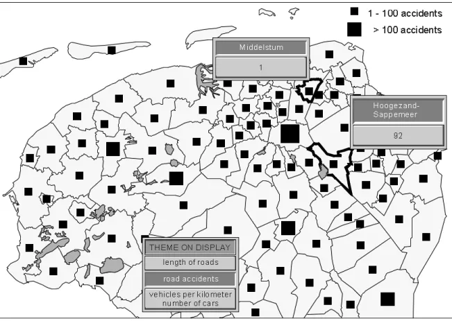
Figure 7 demonstrates that this is not easy at all. The map displayed shows the northern part of the Netherlands. It is a result of a GIS analysis executed by an insurance company which wanted to know if it would make sense to initiate a regional operation. A first look at the map, which shows the number of traffic accidents for each municipality, would indeed suggest so. The eastern region seems to have worse drivers than the western region. However, a closer look at the map should make one less sure. First, the geographical units in the western part are much larger than the average units in the east; because each unit has a symbol the map looks much denser in the east. Second, when looking at the legend it can be seen that the small squares can represent from 1 to 99 accidents; the map shows some small squares representing only one accident, while others represent over 92. The west could therefore still have far more accidents then the east. The example illustrates not only that care is required when interpreting maps, but also that access to the map’s single objects and the database behind the objects is a necessity. Additional relevant information such as the number of cars and the length of road should be available as well.
M-J Kraak
162
Fig 5. Zanzibar Town: appealing map design by visual hierarchy and the use of fonts.
How can map tools help with the visual analysis of spatial distributions (Armstrong et al 1992)? Little is known about how people make decisions on the basis of map study and analysis. Giffin (1983) found that the strategies followed by individuals vary widely in relation to map type and complexity as well as according to individual characteristics. From the example above, it becomes clear that the user needs to have access to the appropriate spatial data
in order to solve spatial tasks. Compared to the mapping activities in the previous section, the link between map and database (DCM and DLM) as well as access to the tools to describe and
manipulate the data are of major importance. A key word here is interaction.
In order to make justifiable decisions based on spatial information, its nature and its quality (or reliability) must be known (Beard and Buttenfield,
Visualising spatial distributions
163 Fig 6. A subdivision of thematic map types, based on the nature of the data (after Kraak and
Ormeling 1996).
qualitative quantitative
nominal ordinal/interval/ratio composite graphic variables variation of hue, orientation, form repetition variation of grain size, grey value variation of size, segmentation point data linear data a) lines b) vectors di s c r ete data areal data regular distribution
nominal point dot maps proportional symbol
point diagram
nominal line symbol maps
flowline maps line diagram
standard
vector maps graduated vector maps
vector diagram maps
R.S. landuse maps regular grid symbol maps
proportional symbol grid maps
grid choropleth
areal diagram grid
irregular boundaries volume data surface data chorochromatic mosaic maps
choropleth areal diagram
stepped statistical surface
isoline map filled in isoline map volume data smooth statistical surface co n ti nu a
Chapter 15; Fisher, Chapter 13; Heuvelink, Chapter 14; Veregin, Chapter 12; Buttenfield and Beard 1994). Whether the data are fit for use is a complex matter, especially where combinations of different datasets are used. Visual decision support tools can help the user to make sensible spatial decisions based on maps. This is the most efficient way of communicating information about spatial reliability. This requires formalisation which can be done by providing functionality for data integration, standardisation (e.g. exchange formats), documentation (e.g. metadata), and modelling (e.g. generalisation and classification). This will lead to insights into the quality of the data on which the user will base spatial decisions. This is necessary because GIS is very good at combining datasets;
notwithstanding the fact that these datasets might refer to different survey dates, different degrees of spatial resolution, or might even be conceptually unfit for combination: the software will not mind, but instead will happily combine them and present the results. The schema shown in Figure 8, and described extensively by Kraak et al (1995), summarises this approach.
M-J Kraak
164
Fig 7. Maps and decision-making: traffic accident in the Netherlands and insurance policy (from Kraak and Ormeling 1996).
Fig 8. Visual decision support for spatio-temporal data handling (from Kraak et al 1995). map use strategies user access visual decision map contents support quality i nte grati on docum en ta tion st an da rdi sat ion model ling formalisation
While working with spatial data in a GIS environment one commonly has to deal with ‘where?’, ‘what?’, and ‘when?’ queries. In a spatial analysis operation the queries will result in the manipulation of geometric, attribute, or temporal data components, separately or in combination. However, just looking at a map that displays the data already allows an evaluation of how certain phenomena vary in quantity or quality over the mapped area. Often one is not just interested in a single phenomenon but in multiple phenomena. For some aspects analytical operations are required, but sometimes a visual comparison will reveal
interesting patterns for further study. Spatial, thematic, and temporal comparisons can be distinguished (Kraak and Ormeling 1996).
3.2 Comparing spatial data’s geometric component Comparing two areas seems to be relatively easy while focusing on a single theme – for example, hydrology, relief, settlements, or road networks. However, to make a sensible comparison the maps under study should have been compiled according to the same methods. They should have the same scale and the same level of generalisation or adhere to the same classification methods. For instance, if one is comparing the hydrological patterns in two river basins the individual rivers should be represented at the same level of detail in respect to generalisation and order of branches.
Figure 9 shows a comparison of the islands of Zanzibar and Pemba. They have been isolated from their original location and positioned next to each other. The coastline, reefs, road network, and villages are displayed, all derived from the Digital Chart of the World. It can be seen that Pemba, the island on the right, has a typical north–south settlement pattern, while Zanzibar, slightly larger, has a more evenly spread settlement with a larger urban area on the west coast (see Openshaw and Alvanides, Chapter 18, for a discussion of the analysis of geographically averaged data).
3.3 Comparing the attribute components of spatial data
If two or more themes related to a particular area are mapped according to the same method, it is possible to compare the maps and judge similarities or differences. However, not all mapping methods
are easy to compare. Choropleth maps are the simplest to compare, at least as long as the administrative units are the same in both maps. Isoline maps can be compared by measuring values in each map at the same locations.
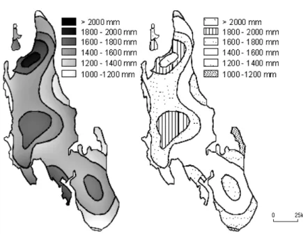
Figure 10 compares a chorochromatic map (a soil map, right) with an isoline map (precipitation, left). At first sight it appears that low precipitation corresponds with a soil type that dominates the eastern part of the island, and that high precipitation results in a wider diversity of soils. Those familiar with Earth science in general will know that there is no necessary link between the two topics, but the above visual map analysis could be
Visualising spatial distributions
165 Fig 9. Comparing location: Zanzibar (Unguja) and Pemba.
0 30km
Fig 10. Comparing attributes: precipitation and soils.
true. It shows that only the expert can do the real analytical work, but comparing or overlaying two datasets can be done by anybody – but whether the operation makes sense remains unanswered.
3.4 Comparing the temporal components of spatial data
Users of GIS are no longer satisfied with analysis of snapshot data but would like to understand and analyse whole processes. A common goal of this type of analysis is to identify typical patterns in space-time. Change can be visually represented in a single map. Understanding the temporal phenomena from a single map will depend on the cartographic skills of both the map maker and map user, since these maps tend to be relatively complex. An alternative is the use of a series of single maps each representing a moment in time. Comparing these maps will give the user an idea of change. The number of maps is limited since it is difficult to follow long series of images. Another, relatively new alternative is the use of dynamic displays or animation (Kraak and MacEachren 1994). Change in the display over time provides a more direct impression of change in the phenomenon represented.
Figure 11 visualises the growth of the population of Zanzibar. From the maps it becomes clear that there is growth, and that growth in the urban district is faster than in the other parts of the island.
4 VISUAL EXPLORATION OF
SPATIAL DISTRIBUTIONS
4.1 Introduction
Keller and Keller (1992) identify three steps in the visualisation process: first, to identify the visualisation goal; second, to remove mental roadblocks; and third, to design the display in detail. In cartography the first step is summarised by the phrase ‘how do I say what to whom?’, which was addressed in section 2. In the second step, the authors suggest removing oneself some distance from the discipline in order to reduce the effects of traditional constraints and conventional wisdom. Why not choose an alternative mapping method? For instance, one might use an animation instead of a set of single maps to display change over time; show a video of the landscape next to a topographic map; or change the dimension of the map from 2 dimensions to 3 dimensions. New, fresh, creative graphics could be the result, would probably have a greater and longer lasting impact than traditional mapping methods, and might also offer different insight. During the third step, which is particularly applicable in an exploratory environment, one has to decide between mapping data or
visualising phenomena. An example of the mapping of the amount of rainfall may be used to clarify this distinction (Figure 12). Experts exploring rainfall patterns would like to distinguish between different
M-J Kraak
166
Fig 11. Comparing time: population growth.
precipitation classes, by using different colours for each class, such as blue, red, yellow, and green. A wider television audience might prefer a map showing areas with high and low precipitation. This can be realised using one colour, for instance blue, in different tints for all classes. Making dark tints correspond with high rainfall and light tints with low rainfall would result in an instantly understandable map. When exploring, data visualisation might be favoured; while presenting, phenomena visualisation may be preferred.
This approach to visualisation requires that a flexible and extensive functionality be available. The keywords ‘interaction’ and ‘dynamics’ were
mentioned before. Compared with the presentation and analytical visualisation strategies these are clearly the extras. However, options to visualise the third dimension as well as temporal datasets should also be available. When exploring their data, users can work with the highly interactive tools and techniques from scientific visualisation. How are those tools implemented in a geographical exploratory visualisation environment?
Work is currently underway to develop tools for this exploratory environment (DiBiase et al 1992; Fisher et al 1993; Kraak 1994; Monmonier 1992; Slocum et al 1994). In 1990 Monmonier introduced the term‘brushing’, as illustrated in Figure 13. It is
about the direct relationship between the map and other graphics related to the mapped phenomenon, like diagrams and scatter plots. The selection of an object in the map will automatically highlight the corresponding elements in the other graphics. Depending on the view in which the object is selected, the options are with geographical brushing (clicking in the map), attribute brushing (clicking in the diagram), and temporal brushing (clicking on the time line). Similar experiments on classification of choropleth maps have been made by Egbert and Slocum (1992). MacDougall (1992) followed a similar approach, while Haslett et al (1990) developed the Regard package as an interactive graphic approach to visualising
statistical data. Other applications are discussed by DiBiase et al (1992), and Anselin (Chapter 17). Dykes (1995) has built a prototype of what he calls a cartographic data visualiser (CDV) which has much exploratory functionality. The system consists of a set of linked widgets, such as slide bars, buttons, and labels.
The illustrations in Figure 14 show some of the important functions that should be available to execute an exploratory visualisation strategy. The following functions are discussed in the works referred to above:
Visualising spatial distributions
167 Fig 12. Visualising the classification: phenomena (left) or data (right).
● Query: an elementary function, that should
always be available whatever the strategy. The user can query the map by clicking a symbol, which will activate the database. Electronic atlases incorporate this functionality (Figure 14(a): see also Elshaw Thrall and Thrall, Chapter 23).
● Re-expression: this function allows the same data,
or part of the data, to be visualised in different ways. A time series of earthquakes could be reordered by the Richter scale instead, which could reveal interesting spatial patterns; or the
classification method followed could be changed and the grey tints inverted as well – as can be seen in Figure 14(b).
● Multiple views: this approach could be described
as interactive cartography. The same data could be displayed according to different mapping methods. Population statistics could be visualised as a dot map, a proportional circle map or a diagram map as shown in Figure 14(c).
● Linked views: this option is related to
Monmonier’s brushing principle. Selecting a
geographical object in one map will automatically highlight the same object in other views. For instance clicking a geographical unit in a cartogram would change the colour of the same unit in a geometrically correct map. In Figure 14(d), clicking the diagram showing clove production reveals a photograph of a clove plant and a map with the distribution of clove
plantations in that particular year. This type of functionality allows one to introduce the multimedia components which will be discussed later in this section.
● Animation: the dynamic display of (temporal) processes is best done by animation. As will be explained in the next section interaction is a necessary add-on to animation (Figure 14(e)).
● Dimensionality: to view 3-dimensional spatial data one should be able to position the map in 3-dimensional space with respect to the map’s purpose and the phenomena mapped (see
Hutchinson and Gallant, Chapter 19). This means that all kinds of interactive geometric
transformation functions to scale, translate, rotate, and zoom should be available, because it may be that the features of interest are located behind other features in the image (Figure 15). 4.2 Animation
Maps often represent complex processes which can be explained expressively by animation. To present the structure of a city, for example, animations can be used to show subsequent map layers which explain the logic of this structure (first relief, followed by hydrography,
infrastructure, and land-use, etc.). Animation is also an excellent way to introduce the temporal component of spatial data, as in the evolution of a river delta, the history of the Dutch coastline, or the weather conditions of last week. An interesting example is ClockWork’s Centennia (previously Millennium: ClockWork 1995; http://www.clockwk. com), a historical electronic atlas which presents an interactive animation of Europe’s boundary changes between the years 1000 and 1995. This type of product can be used to explore or analyse the history of Europe.
The need in the GIS environment to deal with processes as a whole, and no longer with single time-slices, also influences visualisation. It is no longer
M-J Kraak
168
Fig 13. Geographic, attribute, and temporal brushing (Monmonier 1990). Metropolitan population Per capita income ($) Cable penetration Scatterplot brush Temporal brush Geographic brush 1985 1973 1989
Visualising spatial distributions
169 Fig 14. Data exploration: (a) query; (b) re-expression; (c) multiple views; (d) linked views; (e) animation (overleaf).
query
(a) (b)
efficient to visualise models or planning operations using static paper maps. However, the onscreen map does offer opportunities to work with moving and blinking symbols, and is very suitable for animation. Such maps provide a strong method of visual
communication, especially as they can incorporate real data, as well as abstract and conceptual data. Animations not only tell a story or explain a process, but also have the capability to reveal patterns or relationships which would not be evident if one looked at individual maps.
Attempts to apply animation to visualise spatial distributions date from the 1960s (see, for example, Thrower 1961; Tobler 1970) although only non-digital cartoons were possible initially. During the 1980s technological developments gave a second impulse to cartographic animation (see Moellering 1980). A third wave of interest in animation has developed, driven by interest in GIS (DiBiase et al 1992; Langran 1992; Monmonier 1990; Weber and Buttenfield 1993). Historic overviews are given by Campbell and Egbert (1990) and Peterson (1995). The field of (cartographic) animation is about to change. Peterson (1995) expresses this as ‘what happens between each frame is more important then what exists on each frame’. This should worry cartographers since their tools were developed mainly for the design of static maps. How can we deal with this new phenomenon? Is it possible to provide the producers of cartographic animation with sets of tools and rules to create ‘good’ animation, in the form ‘If your data are . . ., and your aim is . . ., then use the variables . . .’? To be able to do so, and to take advantage of knowledge of computer graphics developments and the ‘Hollywood’ scene, the nature and characteristics of cartographic animations have to be understood. However, the problem is that ‘understanding’ animations alone will not be of much help, since the environment where they are used, the purpose of their use, and the users themselves will greatly influence ‘performance’.
How can an animation be designed to make sure the viewer indeed understands the trend or
phenomenon? The traditional graphic variables, as explained earlier, are used to represent the spatial data in each individual frame. Bertin, the first to write on graphic variables, had a negative approach to dynamic maps. He stated in his work (1967): ‘. . . however, movement only introduces one additional variable, it will be dominant, it will distract all attention from the other (graphic) variables’. Recent research, however, has demonstrated that this is not the case. Here we should remember that
technological opportunities offered at the end of the 1960s were limited compared with those of today. Koussoulakou and Kraak (1992) found that the viewer of an animation would not necessarily get a
M-J Kraak
170
Fig 15. Working with the third dimension (from Kraak and Ormeling 1996).
Fig 14. (cont.)
(d)
better or worse understanding of the contents of the animation when compared with static maps. DiBiase et al (1992) found that movement would give the traditional variable new energy.
In this context DiBiase introduced three so-called dynamic variables: duration, order, and rate of change. MacEachren (1994b) added frequency, display time and synchronisation to the list:
● Display time – the time at which some display
change is initiated.
● Duration – the length of time during which
nothing in the display changes.
● Frequency – the same as duration: either can be defined in terms of the other.
● Order – the sequence of frames or scenes. ● Rate of change – the difference in magnitude of
change per unit time for each of a sequence of frames or scenes.
● Synchronisation – (phase correspondence) refers
to the temporal correspondence of two or more time series.
In the animation literature the so-called animation variables have surfaced (Hayward, 1984). They include size, position, orientation, speed of scene, colour, texture, perspective (viewpoint), shot (distance), and sound. The last of these is not considered here but can have an important impact (see Krygier 1994). These variables are shown in Figure 16 in relation to the graphic and dynamic variables. From this figure it can be seen that Bertin’s graphic variables each have a match with one of the animation variables. From the dynamic variables only order and duration have a match, but they are the strongest in telling a story. Research is currently under way to validate and elaborate the new dynamic variables.
4.3 Maps and multimedia components
This section presents a cartographic perspective on multimedia. The relationship between the map and the individual multimedia components in relation to visual exploration, analysis, and presentation will be discussed (see Plate 8).
Maps supported with sound to present spatial information are often less interactive than those created to analyse or explore. In some electronic atlases pointing to a country on a world map plays the national anthem of the country (Electronic World Atlas; Electromap 1994). In this category one can also find the application of sound as background music to enhance a
mapped phenomenon, such as industry, infrastructure, or history. Experiments with maps in relation to sound are known on topics such as noise nuisance and map accuracy (Fisher 1994; Krygier 1994). In both cases the location of a pointing device in the map defines the volume of the noise. Moving the pointer to a less accurate region increases the noise level. The same approach could be used to explore a country’s language – moving the mouse would start a short sentence in a region’s dialect.
GIS is probably the best representation of the link between a map and text (the GIS database). As shown in Plate 8 the user can point to a
geographical unit to reveal the data behind the map. Electronic atlases often have various kinds of encyclopaedic information linked to the map as a whole or to individual map elements. It is possible to analyse or explore this information. Country statistics can be compared. However, multimedia has more to offer. Now scanned text documents, such as those that describe the ownership of parcels,
Visualising spatial distributions
171 Fig 16. Cartographic animation and variable types.
animation variables (Hayward 1984) • size • value • texture • colour • orientation • shape • scene •speed • order • duration • display date • frequency • rate of change • sychronisation • perspective (viewpoint) • shot (distance) dynamic variables (DiBiase et al 1992 MacEachren 1994) display time • size • value • texture • colour • orientation • shape graphical variables (Bertin, 1967) T L A change where? when? what? when? where? what?
can be included. Text in the format of hypertext can be used as a lead to other textual information or other multimedia components.
Maps are models of reality. Linking video or photographs to the map will offer the user a different perspective on reality. Topographic maps present the landscape, but it is also possible to present, next to this map, a non-interpreted satellite image or aerial photograph to help the user in his or her understanding of the landscape. The analysis of a geological map can be enhanced by showing landscape views (video or photographs) from characteristic spots in the area. A real estate agent could use the map as an index to explore all houses for sale on company file. Pointing at a specific house would show a photograph of the house, the
construction drawings, and a video would start showing the house’s interior. New opportunities in the framework are offered by the application of virtual reality in GIS.
References
Armstrong M P, Densham P J, Lolonis P, Rushton G 1992 Cartographic displays to support locational decision making. Cartography and Geographic Information Systems 19: 154–64 Bertin J 1983 Semiology of graphics. Madison, University of
Wisconsin Press (original in French, 1967)
Board C 1993 Spatial processes. In Kanakubo T (ed.) The selected main theoretical issues facing cartography: report of the ICA Working Group to Define the Main Theoretical Issues in Cartography. Cologne, International Cartographic Association: 21–4
Bonham-Carter G F 1994 Geographical information systems for geo-scientists: modelling with GIS. New York, Pergamon Press
Buttenfield B P, Beard M K 1994 Graphical and geographical components of data quality. In Hearnshaw H, Unwin D J (eds) Visualisation in geographic information systems. Chichester, John Wiley & Sons: 150–7
Campbell C S, Egbert S L 1990 Animated cartography: thirty years of scratching the surface. Cartographica 27: 24–46 ClockWork Software 1995 Centennia. PO Box 148036,
Chicago 60614, USA
DiBiase D 1990 Visualization in earth sciences. Earth and Mineral Sciences, Bulletin of the College of Earth and Mineral Sciences, Pennsylvania State University 59: 13–18 DiBiase D, MacEachren A M, Krygier J B, Reeves C 1992
Animation and the role of map design in scientific visualisation. Cartography and Geographic Information Systems 19: 201–14
Dykes J 1995 Cartographic visualisation for spatial analysis. Proceedings, Seventeenth International Cartographic Conference, Barcelona: 1365–70
Egbert S L, Slocum T A 1992 EXPLOREMAP: an exploration system for choropleth maps. Annals of the Association of American Geographers 82: 275–88 Fisher P F 1994a Randomization and sound for the
visualization of uncertain spatial information. In Hearnshaw H, Unwin D J (eds) Visualization in geographic information systems. Chichester, John Wiley & Sons: 181–5
Fisher P, Dykes J, Wood J 1993 Map design and visualisation. The Cartographic Journal 30: 136–42
Giffin T L C 1983 Problem-solving on maps – the importance of user strategies. The Cartographic Journal 20: 101–109 Haslett J, Willis G, Unwin A 1990 SPIDER: an interactive
statistical tool for the analysis of spatially distributed data. International Journal of Geographical Information Systems 4: 285–96
Hayward S 1984 Computers for animation. Norwich, Page Bros
Hearnshaw H M, Unwin D J (eds) 1994 Visualization in geographical information systems. Chichester, John Wiley & Sons
Keller P R, Keller M M 1992 Visual cues, practical data visualization. Piscataway, IEEE Press
Koussoulakou A, Kraak M J 1992 Spatio-temporal maps and cartographic communication. The Cartographic Journal 29:101–8
Kraak M J 1994 Interactive modelling environment for 3-D maps, functionality and interface issues. In MacEachren A M, Taylor D R F (eds) Visualization in modern cartography. Oxford, Pergamon: 269–86
Kraak M J, MacEachren A M 1994b Visualization of spatial data’s temporal component. In Waugh T C, Healey R G (eds) Advances in GIS research – Proceedings Fifth Spatial Data Handling Conference. London, Taylor and Francis: 391–409
Kraak M-J, Ormeling F J 1996 Cartography, visualization of spatial data. Harrow, Longman
Kraak M-J, Ormeling F J, Müller J-C 1995 GIS-cartography: visual decision support for spatio-temporal data handling. International Journal of Geographical Information Systems 9: 637–45
Krygier J 1994 Sound and cartographic visualization. In MacEachren A M, Taylor D R F (eds) Visualization in modern cartography. Oxford, Pergamon: 149–66 Langran G 1992 Time in geographical information systems.
London, Taylor and Francis
MacDougall E B 1992 Exploratory analysis, dynamic statistical visualization, and geographic information systems. Cartography and Geographic Information Systems 19: 237–46 MacEachren A M 1994a Some truth with maps: a primer on
design and symbolization. Washington DC, Association of American Geographers
MacEachren A M 1994b Visualization in modern cartography: setting the agenda. In MacEachren A M, Taylor D R F (eds) Visualization in modern cartography. Oxford, Pergamon: 1–12
M-J Kraak
MacEachren A M 1995 How maps work. New York, Guilford Press
MacEachren A M, Monmonier M 1992 Geographic visualization: introduction. Cartography and Geographic Information Systems 19: 197–200
MacEachren A M, Taylor D R F (eds) 1994 Visualization in modern cartography. Oxford, Pergamon
Martin D J 1996 Geographic information systems: socioeconomic applications. London, Routledge
McCormick B, DeFanti T A, Brown M D 1987 Visualization in scientific computing. ACM SIGGRAPH Computer Graphics 21 special issue.
Moellering H 1980 The real-time animation of 3-dimensional maps. The American Cartographer 7: 67–75
Monmonier M 1990 Strategies for the visualization of geographic time-series data. Cartographica 27: 30–45 Monmonier M 1992 Authoring graphic scripts: experiences
and principles. Cartography and Geographic Information Systems 19: 247–60
Peterson M P 1995 Interactive and animated cartography. Englewood Cliffs, Prentice-Hall
Robinson A H, Morrison J L, Muehrcke P C, Kimerling A J, Guptill S C 1994 Elements of cartography, 6th edition. New York, John Wiley & Sons Inc.
Slocum T A , Egbert S, Weber C, Bishop I, Dungan J, Armstrong M, Ruggles A, Demetrius-Kleanthis D, Rhyne T, Knapp L, Carron J, Okazaki D 1994 Visualization software tools. In MacEachren A M, Taylor D R F (eds) Visualization in modern cartography. Oxford, Pergamon: 91–122
Taylor D R F 1994 Perspectives on visualization and modern cartography. In MacEachren A M, Taylor D R F (eds) Visualization in modern cartography. Oxford, Pergamon: 333–42 Thrower N 1961 Animated cartography in the United States.
International Yearbook of Cartography: 20–8
Tobler W R 1970 A computer movie: simulation of population change in the Detroit region. Economic Geography 46: 234–40 Weber R, Buttenfield B P 1993 A cartographic animation of
average yearly surface temperatures for the 48 contiguous United States: 1897–1986. Cartography and Geographic Information Systems 20: 141–50
Wood M 1994 Visualization in a historical context. In MacEachren A M, Taylor D R F (eds) Visualization in modern cartography. Oxford, Pergamon: 13–26
Visualising spatial distributions