Temperature reconstruction methods
J. D. Vlok
School of Engineering
College of Sciences and Engineering
29 April 2019
Last update: 15 May 2019 http://eprints.utas.edu.au/29788/
[email protected] ©2019 UTAS
Executive Summary
The surface air temperature of Earth is historically measured at a collection of indi-vidual weather stations. Deriving regional averages and long-term trends from these point sources require sophisticated mathematical analysis and algorithm develop-ment. To understand historical temperature, non-climatic artefacts written into the record must first be identified and removed. These artefacts include everything not attributable to the true climate, including changes in the environment surrounding weather stations, and changes in measuring methods and instrumentation. Data quality also varies and in some cases temperature measurements are missing or in-correct.
The historical temperature record must hence be reconstructed from a collection of individual time series. Reconstruction involves quality control to remove suspi-cious data, infilling to recover missing data, and spatial interpolation to estimate temperature series for locations where no measurements were ever taken. From the reconstructed record, averages and trends can be determined for individual loca-tions and larger regions.
This report describes temperature measurement and reconstruction with a focus on Australia over 1910 to 2018. The official homogenised reconstruction of the Bu-reau of Meteorology is considered, and two alternative methods are presented with some comparisons. The alternative methods include nearest-neighbour infilling and an approach based on artificial neural networks. An overview of existing spatial interpolation techniques is also given, aiming to identify suitable benchmarks for evaluating alternative reconstruction techniques.
The nearest-neighbour technique was used to infill all raw monthly mean temper-ature data available for Australia. Average anomalies were calculated from the infilled record, which show a good match with the official reconstruction of the Bu-reau, especially for an area where stations are distributed approximately uniformly.
The neural network method is illustrated conceptually in this report, with results indicating improved performance compared with existing benchmark methods, when using the technique to estimate temperature data for unsampled locations. Further development of the neural network method is required to improve performance and to estimate trends and averages of larger regions.
Contents
Abbreviations 11
1 Introduction 13
1.1 Analysing historical temperature . . . 13
1.2 Potential drivers of temperature . . . 14
1.3 Reconstructing historical temperature records . . . 16
1.4 Instrumental temperature record of Australia . . . 18
2 Changes in the sensor network and environment 20 2.1 From liquid-in-glass to electronic thermometers . . . 20
2.2 Urban heat islands and land modification . . . 22
2.3 Other effects . . . 23
3 Homogenisation and the official reconstruction 25 3.1 Homogenisation overview . . . 25
3.1.1 Objective and subjective homogenisation . . . 26
3.1.2 Absolute and relative methods . . . 26
3.2 The official Australian reconstruction . . . 27
3.2.1 Homogenisation of individual series . . . 28
3.2.2 Calculation of regional averages and trends . . . 29
4 Spatial interpolation techniques 32
4.1 Inverse distance methods . . . 32
4.2 Geostatistical techniques . . . 33
4.3 Graphical techniques . . . 34
4.4 Polynomial techniques . . . 35
4.5 Optimal interpolation . . . 36
4.6 Lapse rate methods . . . 36
4.7 Machine learning . . . 37
5 Quality control 38 5.1 Control charts . . . 39
5.1.1 Range control chart . . . 40
5.1.2 X-bar or mean control chart . . . 41
5.1.3 Individuals control chart . . . 43
5.1.4 Moving range control chart . . . 44
5.1.5 Standard deviation control chart . . . 45
5.1.6 I-MR-S control chart summary . . . 48
5.1.7 Further examples of I-MR-S control charts . . . 51
5.2 Quality control through nearest neighbours . . . 53
5.2.1 Finding the nearest neighbours . . . 53
5.2.2 Testing potential outliers against neighbours . . . 53
6 Nearest neighbour reconstruction 59
6.1 Infilling algorithm . . . 60
6.1.1 Preprocessing . . . 60
6.1.2 Searching for the appropriate neighbour . . . 60
6.1.3 Infilling . . . 61
6.2 An interpolation example . . . 61
6.2.1 Temperature series . . . 62
6.2.2 Interpolation algorithm . . . 63
6.3 Nearest neighbour algorithm performance . . . 67
6.3.1 LOOCV results of single series . . . 68
6.3.2 LOOCV statistics for all CDO temperature data . . . 69
6.3.3 LOOCV statistics for all CDO temperature data after QC . . . 70
6.3.4 Infilling the Australian record . . . 71
6.3.5 Comparison with ACORN-SAT . . . 71
7 Artificial intelligence introduction 77 7.1 Artificial neural networks . . . 78
7.2 Data selection and preprocessing . . . 79
7.3 ANN structure . . . 80
7.4 ANN training . . . 81
7.4.1 Training, validation and testing data . . . 82
7.4.3 Batch and incremental training . . . 83
7.4.4 Numerical optimisation . . . 84
7.4.5 More advanced learning rules . . . 85
7.4.6 Function approximation example . . . 87
7.4.7 Generalisation and regularisation . . . 89
7.4.8 Training hyperparameters . . . 91
7.5 Developing an AI solution . . . 91
8 AI temperature reconstruction 93 8.1 Deniliquin case study . . . 93
8.1.1 Infilling existing time series . . . 96
8.1.2 Estimating time series at unsampled sites . . . 97
8.2 Estimation techniques . . . 98
8.2.1 Neural network temperature estimation . . . 98
8.2.2 Inverse distance weighting . . . 99
8.3 Performance evaluation . . . 100
8.3.1 Performance of plain and modified IDW . . . 101
8.3.2 Quality control performance gains for IDW . . . 102
8.3.3 Optimal IDW parameters . . . 104
8.3.4 Performance of ANN . . . 104
8.3.5 Comparative results . . . 106
10 Future work 108
11 Acknowledgements 109
A Mathematical derivations for online ANN training 110
A.1 Forward propagation . . . 110
A.2 Backpropagation . . . 111
A.2.1 Stage 2 derivation . . . 112
A.2.2 Stage 2 matrix summary . . . 114
A.2.3 Stage 1 derivation . . . 115
A.2.4 Stage 1 matrix summary . . . 116
A.3 Numerical example . . . 117
A.3.1 Forward propagation . . . 117
A.3.2 Backpropagation . . . 118
List of Figures
1 Global mean temperature series with reference period 1951–1980, from [8]. 13 2 Schematic diagram of historical temperature variation. . . 143 Atmospheric carbon dioxide reconstruction, from [22–24]. . . 15
4 Solar activity including irradiance [27] and sunspot number [28,29]. . . 16
5 Locations of all SAT-measuring stations across Australia between 1840 and 2018. . . 18
7 Evolution of changing temperature sensors across Australia. . . 21
8 Maximum and minimum temperature series to illustrate the UHI effect. . . 22
9 Locations of 112 ACORN-SAT sites across Australia. . . 27
10 ACORN-SAT daily minimum and maximum series for Rutherglen. . . 29
11 Official temperature anomaly series for Australia. . . 30
12 Diagram to illustrate spatial interpolation with distance-weighting formulas. 32 13 Illustration of drawing a Voronoi polygon around an observational point. . 35
14 Mean and range control charts for Rutherglen (82039). . . 42
15 Individual and moving range control charts for Rutherglen (82039). . . 44
16 Mean and standard deviation control charts for Rutherglen (82039). . . 47
17 I-MR-S control chart for Rutherglen (82039). . . 50
18 I-MR-S control chart for Hay (75031). . . 51
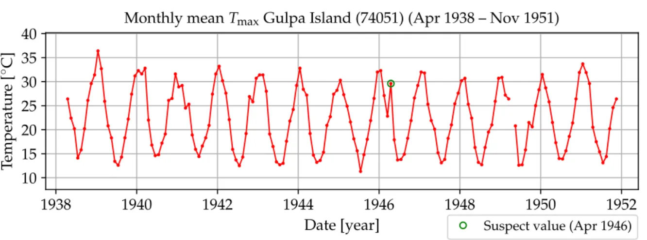
19 I-MR-S control chart for Gulpa Island (74051). . . 52
20 Locations of all SAT-measuring stations active 1910–2018 within 160 km radius from Gulpa Island. The 10 longestTmax records are shown in green with the station ID. . . 54
21 Test series used to evaluate QC method with one suspect value indicated. . 54
22 April 1946 Tmax value for Gulpa Island and its 20 nearest neighbours. . . . 55
23 Calculation of relative neighbour values. . . 56
24 April 1946 Tmax value for Gulpa Island and its 20 nearest neighbours (in-cluding adjusted neighbouring values). . . 57
25 Evaluation of Gulpa Island series using 20 nearest raw neighbour values. . 57
27 Depiction of all monthly mean maximum temperature data (1910-2018). . 59
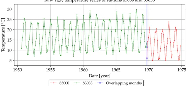
28 Map of historical weather station locations around Aberfeldy in Victoria, illustrating the ten nearest stations. . . 62
29 Monthly mean minimum and maximum temperature series of Aberfeldy (ID 85000), each containing 61 values. . . 63
30 Comparison between the central station and first neighbour, showing no overlap. . . 63
31 Comparison between the central station (61 values) and the second nearest neighbour (230 values), showing a single-month overlap. . . 64
32 Concatenated record for the central station containing 290 monthly values, consisting of records 85000 and 83033 adjusted 5.4 ◦C downwards. . . 64
33 Comparison between the central station (concatenation of 85000 and 83033) and the nearest neighbour (85291), still showing no overlap. . . 65
34 Extended central station and the third neighbour, showing a 147-month overlap. . . 65
35 Concatenated record for the central station, consisting of records 85000, 83033 (adjusted 5.4◦C downwards) and 85079 (adjusted 4.05◦C downwards). 66
36 Complete record for Aberfeldy including data contributions from 18 neigh-bours. . . 67
37 LOOCV results for Tmax and Tmin of Aberfeldy (85000). . . 68
38 LOOCV time series and distribution for 1895 CDO Tmax records. . . 69
39 LOOCV time series and distribution for 1895 CDO Tmax records after QC. 70
40 Depiction of all monthly mean maximum temperature data (1910–2018) after nearest-neighbour infilling. . . 72
41 Average anomalies of nearest-neighbour reconstruction vs. ACORN-SAT with reference period 1961–1990. . . 73
42 Average anomalies with trends indicated. . . 74
43 Average anomalies of nearest-neighbour reconstruction vs. ACORN-SAT for Victoria with reference period 1961–1990. . . 76
44 Biological and artificial neuron, which is the basic element of ANNs. . . 78
45 A 3-3-1 ANN structure and its simplified representation. . . 79
46 Three activation or transfer functions used in ANNs. . . 81
47 An illustrative error surface for a two-weight neural network. . . 84
48 Trained ANN output for various scenarios. . . 88
49 Area surrounding the town of Deniliquin (NSW) used as case study. . . 94
50 Monthly mean maximum temperature series of all 71 locations. . . 96
51 Monthly mean maximum temperature series of Deniliquin (74128). . . 97
52 Map containing 561 virtual weather stations (spaced at 0.125◦ in both dimensions) forming a regular grid. . . 98
53 Neural network structure to estimate temperature data at a given location. 99 54 Estimation results for Deniliquin using plain IDW. . . 101
55 Estimation results for Deniliquin using the modified IDW method. . . 102
56 Estimation results for Deniliquin using the modified IDW method with QC. 103 57 Heatmap grid search results to find optimal (N, p) parameters for Deniliquin.105 58 Estimation results for Deniliquin using plain ANN. . . 105
59 MAE results for the three estimation techniques. . . 106
60 2-2-2 ANN with initial weights, input and target values of one training example. . . 110
62 Error behaviour during training when using the single training data example.120
List of Tables
1 Number of samples before and after performing QC. . . 58
2 Ranked years according to descending temperature anomaly (10 hottest years). . . 75
3 Station record details for all 71 locations in the Deniliquin area. . . 95
4 MAE results for IDW (N = 10, p = 2) and ANN for Deniliquin (74128) Tmax. . . 104
Acronyms
ACORN-SAT Australian Climate Observations Reference Network - Surface Air Temperature
ADAM Australian data archive for meteorology AI artificial intelligence
ANN artificial neural network AWS automatic weather station
BoM Bureau of Meteorology
CDO climate data online
CI confidence interval
CO2 carbon dioxide
GISS Goddard Institute for Space Studies GSL Gnu Scientific Library
IDS inverse distance squared IDW inverse distance weighting IEW inverse exponentially weighting
IPCC International Panel on Climate Change
LCL lower control limit
LiG liquid-in-glass
LOOCV leave-one-out cross-validation
MA moving average
MAE mean absolute error
ML machine learning
MR moving range
MSE mean square error
NASA National Aeronautics and Space Administra-tion
NCEI National Centers for Environmental Informa-tion
NOAA National Oceanic and Atmospheric Adminis-tration
OCR optical character recognition
PDF probability density function
PM percentile-matching
PRT platinum resistance thermometer
QC quality control
RTD resistance temperature detector
RV random variable
SAT surface air temperature SGD stochastic gradient descent SPC statistical process control
TIN triangular irregular network
TPS thin plate splines
TSA trend surface analysis
UCL upper control limit
1
Introduction
1.1
Analysing historical temperature
It is believed that Galileo constructed the first thermoscope, a device to detect air tem-perature change, in the early 1590s. About 130 years later, Fahrenheit invented the mercury thermometer with a standardised scale, although a theoretical understanding of temperature was still undeveloped [1].
The widespread measurement of the earth’s surface air temperature (SAT) using networks of weather stations commenced in the 1850s, although the single longest record dates back to 1659 [2]. In most countries, weather observation networks were developed mainly to support weather forecasting. Monitoring long-term climate change has only become a priority since the early 1990s [3], after which several research groups have created datasets to describe variations in the global average temperature over time.
Such historical reconstructions include the NASA GISS1, HadCRUT2, NOAA NCEI3, and Berkeley Earth4 datasets. The NASA annual global mean SAT reconstruction over 1880–2018 is shown as an example in Fig. 1 below, with data obtained from [8].
1880 1890 1900 1910 1920 1930 1940 1950 1960 1970 1980 1990 2000 2010 2020 Date [Year] −0.5 0.0 0.5 1.0 Temperatur e anomaly [ ◦C]
NASA GISS global mean SAT (land and ocean) reconstruction (1880–2018) Annual mean
5-year smoothing
Figure 1: Global mean temperature series with reference period 1951–1980, from [8].
1The National Aeronautics and Space Administration (NASA) Goddard Institute for Space Studies
(GISS) temperature series starts in 1880 [4].
2A dataset formed by the UK Met Office (Hadley Centre) and the University of East Anglia (Climatic
Research Unit) starting in 1850 [5].
3The US National Oceanic and Atmospheric Administration (NOAA) National Centers for
Environ-mental Information (NCEI) dataset starts in 1880 [6].
To understand past climate before the instrumental record, several studies have been conducted using proxy data from sources such as tree rings, fossil pollen, ice cores, ocean sediments, corals, etc. [9]. Fig. 2 shows a conceptual diagram of warm and cold periods reconstructed from proxy data and the instrumental record, based on timelines and graphs provided in e.g. [10–12]. The instrumental record is indicated by the relatively warm current warm period (CWP) after 1850 in Fig. 2.
250 BC 0 400 950 1300 1850 2020
Year
Cold
W
arm Roman warm period
Dark ages cold period
Medieval warm period
Little ice age
CWP
Figure 2: Schematic diagram of historical temperature variation.
The historical reconstruction illustrated in Fig. 2 can only be considered global after 1850 (generally with increased accuracy and quality as time progresses), as temperature has only been recorded widely over the earth’s surface from this date. To calculate a true global average, data from sensors worldwide must be processed using sophisticated mathematical techniques, including spatial estimation and interpolation methods.
To reconstruct a global picture before 1850 is more challenging as disparate proxy data must be combined. Although several studies focused on different isolated locations in-dicate similar historical temperature patterns as depicted in Fig. 2, the local or global extent of climate before the instrumental record remains less clear (see for example [13]).
1.2
Potential drivers of temperature
James Watt patented the steam engine in 1769, marking the start of the industrial revolu-tion and a sudden and enduring increase in atmospheric carbon dioxide (CO2) levels [14], as indicated in Fig. 3. Although the natural flow of CO2 into the atmosphere is larger than the contribution due to humans burning fossil fuels, the natural flow of CO2 out of the atmosphere into the biosphere and the oceans is believed to approximately balance the natural inflow. The conclusion is then that rising atmospheric CO2 levels are mainly caused by human activity [14].
By comparing the instrumental global mean temperature record (Fig. 1) and the associ-ated atmospheric CO2level (Fig. 3), the correlation is undeniable – both temperature and CO2 increase together.5 Although correlation does not necessarily imply causation [15], the rising atmospheric CO2 level has widely been accepted as the principal driver of increasing temperatures. This argument is supported by studies showing that rising tem-perature is preceded by increasing CO2 levels (see e.g. [16]), and the physical process explanation offered by the greenhouse effect [17,18]. Alternative explanations have how-ever also been put forward, where changes in temperature and CO2 are hypothesised to be part of a natural process, largely independent of human industrial activity [19–21].
0 250 500 750 1000 1250 1500 1750 2000 Date [Year] 250 300 350 400 CO 2 concentration [ppm] 1769 Industrial revolution
Scripps atmospheric CO2levels from ice-core and in-situ measurements (1–2018)
Figure 3: Atmospheric carbon dioxide reconstruction, from [22–24].
Whereas the International Panel on Climate Change (IPCC) predicts that global warming will likely reach 1.5 ◦C above pre-industrial levels between 2030 and 2052 [25], one study predicts a solar grand minimum will occur over this same period (solar cycles 26–27) due to the behaviour of the sun’s magnetic fields [26], resulting in much cooler temperatures. As indicated in Fig. 4, reduced solar activity (e.g. the Maunder minimum spanning 1645–1715) is historically an indicator of cooler periods (e.g. the Little Ice Age illustrated in Fig. 2).
Volcanism offers an alternative (or parallel) explanation of historically cooler periods to a reduction in solar activity. A Berkeley Earth study argues cooler periods can be associated with volcanic sulfate emissions, without considering fluctuations in solar activity (where the period after 1750 was studied). Including solar activity in addition to CO2 and vol-canic eruptions to describe the earth’s historical temperature record did not significantly improve their model [7].
5A close match can be obtained by applying mathematical transformations, e.g. the natural logarithm
1600 1650 1700 1750 1800 1850 1900 1950 2000 Date [Year] 1363 1364 1365 1366 1367 Solar irradiance (11 y MA) W / m 2 Maunder min Dalton min Modern max 1 2 3 4 5 6 7 8 9 10 11 12 13 14 15 16 17 18 19 20 21 22 23 24 0 100 200 300 Sunspot number (annual average)
Solar activity in terms of irradiance and sunspot number (1610–2018)
Figure 4: Solar activity including irradiance [27] and sunspot number [28,29].
There are many other drivers and factors influencing climate in varying degrees over time that form an intricate feedback system, including other greenhouse gases such as water vapor [30] and methane [31], the behaviour of other bodies in the solar system including Jupiter [32] and the moon [33], ocean currents, plate tectonics, changes in the cover and usage of the earth’s surface, the earth’s tilt and wobble, etc. [34].
Central to the debate of climate change and the main drivers thereof, is the historical tem-perature record. Understanding temtem-perature measurement and reconstruction methods is essential before relationships with other environmental variables can be analysed.
1.3
Reconstructing historical temperature records
The reconstruction of historical temperature involves creating new data records from avail-able temperature observations, and/or other observations where a relevant relationship with temperature is known. The new record should be more complete or improved, or should describe temperature characteristics that are not readily apparent or accessible in the original data.
Reconstruction may involve creating continuous records for single locations, larger ar-eas or regions, entire countries or continents, oceans, or the entire earth. An example is estimating global average temperature over time using several individual records as mentioned in Section 1.1 above. Reconstructing temperature data may also involve the following processes.
• Recovering missing data within individual records
• Performing quality control (QC) and correcting erroneous data values
• Establishing or uncovering relationships between temperature and other variables, which may be utilised in performing the above tasks
• Calculating average values or other statistics, such as confidence levels of estimates Apart from the potential climate drivers mentioned in Section 1.2 above (including atmo-spheric CO2, solar activity and volcanic sulfate emissions), local temperature is largely determined by the following factors.
• Location (latitude, longitude, altitude), which is essential in estimating missing data and performing spatial interpolation (see Section 4). Temperature generally decreases with increasing distance from the equator and with increasing altitude6.
• Morphology of the area and surrounding landscape, which define how regional cli-matic elements (e.g. wind, cloud cover, rain) affect the location.
• Regional factors, e.g. land use and proximity to water bodies, arid land, forest, etc.
• Atmospheric conditions, including presence of aerosols such as dust, smoke, water vapor, etc.
Location data are typically readily available, often packaged with temperature data. Data related to the other above-mentioned factors are not that easily obtainable and often change over time. For example, the distance to water bodies is subject to change as rivers flood and dry. Local land use and morphology can also change with construction and developments.
Some of these data elements can however be extracted from e.g. geographical maps and historical news archives and may then be utilised in temperature reconstruction. Nevertheless, such data are also inherently encapsulated within temperature observations, and can be used indirectly if the correct reconstruction approach is followed. These themes are further considered in Sections 2 and 3.
One motivation for reconstructing historical temperature is to understand past climate and the relationships with other environmental variables, in order to predict what future temperature (and climate in general) might look like.
The focus of this report is to reconstruct historical temperature from the raw instrumental record of Australia using a number of interpolation techniques and to make comparisons with official results.
1.4
Instrumental temperature record of Australia
Daily manual measurement of minimum and maximum temperatures across Australia commenced in the 1840s with the number of weather stations gradually increasing there-after. Since 1910 the Australian Bureau of Meteorology (BoM) established standardised equipment to measure SAT through the widespread employment of the Stevenson screen, and the application of certain specifications to ensure measurements are taken in similar conditions across the continent [35].
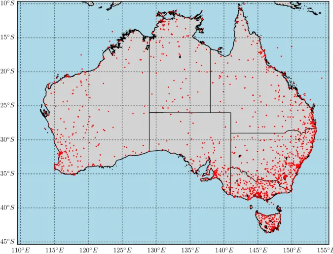
There are nearly 2000 locations across Australia where temperatures have been measured and recorded in the Australian data archive for meteorology (ADAM), publicly available through the BoM climate data online (CDO) portal. The locations are shown in Fig. 5, although the measurement network and environment constantly changed over history. Many stations were closed or relocated, new stations were opened, buildings were devel-oped around stations, and measurement technology changed. Furthermore, stations are roughly distributed according to population density, creating a long data history around south eastern Australia, but leaving a relatively sparse record for remote areas.
110◦E 115◦E 120◦E 125◦E 130◦E 135◦E 140◦E 145◦E 150◦E 155◦E 10◦S 15◦S 20◦S 25◦S 30◦S 35◦S 40◦S 45◦S
There are 1895 stations shown in Fig. 5 that contributed monthly mean maximum (Tmax) data to the ADAM database7. The individual station records are illustrated as twelve-month moving averages (MAs) in Fig. 6a, with the average in black. The number of measurements for any given month is shown in Fig. 6b. Considering all stations shown in Fig. 5 over 1841–2018, the record shown in Fig. 6a can be said to be only 18.9% complete. If the early record is not considered, this value improves to 29.2% over 1910–2018.
Figure 6: Depiction of all monthly mean maximum temperature data (1841–2018).
The black line in Fig. 6a depicts the station mean over time, clearly containing bias due to the varying number of active stations. The bias also inherently contains a geographical component as the mix of stations, representing a set of locations, varies over time. The station mean itself is therefore not an accurate representation of long-term variability, and an improved estimation of the average trend can be obtained by removing the geographical and temporal bias, which may be achieved by
• infilling or interpolating all missing data of individual records, such that all records are complete over the desired period (e.g. 1910–2018), and
• estimating temperature data for unsampled locations
which form part of the reconstruction process as mentioned in Section 1.3. The tempera-ture history of locations where no weather station ever existed can then also be described, and a geographically-representative or area-weighted average could be calculated over time to derive long-term trends.
2
Changes in the sensor network and environment
The earliest monthly mean temperature record available in ADAM is that of the Hobart Botanical Gardens (ID 94030). The Tmax record for this station runs from January 1841 to December 1854 (with a few additional values in 1880), and is the only series shown for this period in Fig. 6.Around 1860 the number of weather stations started to increase gradually, although it was only in 1910 that temperature measurement was standardised - shortly after the BoM started operating as a Commonwealth agency on 1 January 1908. Before 1910, SAT was measured using various configurations, including thermometers housed in beer crates on outback verandas [35].
The aim of standardisation of equipment is to maximise consistency over space and time in monitoring weather variables. Measures taken by the BoM include housing thermometers in a protective enclosure known as a Stevenson screen, 1.2 m above ground level on a natural surface separated from nearby structures such as buildings or plant growth. Also, measurements are taken traditionally at 9h00 and 15h00 every day and recorded in field logbooks by trained observers [37].
Although standards and specifications were put in place to minimise the variance in weather observations, technological advances and expansion of the sensor network, coupled with changes in the environment surrounding weather stations introduced new challenges with non-climatic artefacts encapsulated in the record. Some of these contributing factors are subsequently discussed.
2.1
From liquid-in-glass to electronic thermometers
The classical instrument for temperature measurement is the liquid-in-glass (LiG) ther-mometer, including mercury-in-glass for measuring maximum temperature and alcohol-in-glass for minimum temperature8. Daily minimum and maximum temperatures can be measured using registering LiG thermometers where an index marker is moved by the liquid in the glass tube to capture the daily extremes, before being manually reset [38].
Whereas LiG thermometers rely on the principle of thermal expansion of liquids to mea-8The temperature range of operation between the melting/freezing and boiling points of mercury is
sure temperature, greater accuracy can be achieved by exploiting the relationship between temperature and the resistance of electrical conductors. The resistance temperature de-tector (RTD) has become a popular alternative in measuring temperature, and also offers a wider range of measurement and improved safety.
The platinum resistance thermometer (PRT) is one type of RTD and has a very stable and linear resistance-temperature characteristic over a wide range of temperatures (−200 to 650◦C, although some types can reach 800◦C) for various industrial applications [39]. The BoM introduced custom-designed9 PRTs into the Australian temperature sensor network in 1992, commencing the era of automatic measurement and logging of SAT [40].
Since 1992 temperature has therefore been measured using two technologies - the classical LiG thermometers and the newer electronic PRT probes. As shown in Fig. 7, the number of stations using LiG thermometers was reduced to around 200 at the end of 2018, while automatic weather stations (AWSs) - which utilise PRTs - increased steadily10.
1841 1850 1860 1870 1880 1890 1900 1910 1920 1930 1940 1950 1960 1970 1980 1990 2000 2010 2019 Date [Year] 0 100 200 300 400 500 600 700 Number of active stations
Approximate number of active SAT stations based on public data PRT
LiG
Change-over: 1 Nov 1996
Figure 7: Evolution of changing temperature sensors across Australia.
There are however a number of weather stations still employing both technologies. From 1 November 1996, the PRT became the official measuring instrument, and human operators were no longer allowed to overwrite PRT values with LiG measurements [40], indicating that there may be differences between the two sensors. Furthermore, an initial analysis into a limited set of parallel data suggests that the two sensors are not producing statis-tically equivalent data, which may be ascribed to a difference in time constants and/or the method used to average measurements [41].
9The BoM designed the platinum probes to approximate the time constant of mercury thermometers
within±5 seconds, by changing the dimensions of the protective metal sheath [40].
10At the end of 2017 there were 563 AWSs measuring SAT and 212 stations still utilising only LiG
thermometers (BoM, pers. comm. 2017). The numbers differ from those shown in Fig. 7 as public data were used to create the graphs in the figure - some stations may have been inactive, or not publicly accessible.
Note that the ADAM database does not include any parallel recordings - a single time series is available for every weather station consisting of LiG measurements up to the date the sensor was replaced by a PRT, followed by measurements obtained only by this new electronic sensor. These transition dates are available collectively at [42,43] (last updated June 2012) and individually in the online “basic site summary” climatological station metadata [44].
2.2
Urban heat islands and land modification
The urban heat island (UHI) effect is a phenomenon where urban SAT is higher than surrounding non-urban regions due to differences in areal thermodynamics, caused by urbanisation including an increase in building developments, concrete and asphalt roads. Fig. 8 displays temperature data for an urban area (Melbourne Regional Office, which was located in the city) in comparison with a regional area (Echuca airport) separated by 200 km. Although the two locations had similar minimum temperatures between 1880 and 1950, a clear departure in this pattern started around 1950. Note that the two maximum temperature series do not exhibit this bifurcation.
1860 1880 1900 1920 1940 1960 1980 2000 2020 20 22 24 Tmax [ ◦C]
Twelve-month moving average of CDO monthly mean maximum and minimum temperature data
1860 1880 1900 1920 1940 1960 1980 2000 2020 Date [year] 8 10 12 Tmin [ ◦C]
86071 (Melbourne Regional Office) 80015 (Echuca Aerodrome)
This pattern could be explained by the fact that buildings and asphalt heat up during the day and radiate the heat back when the surrounding air cools down, effectively raising the minimum temperature.
To analyse trends in more detail, knowledge regarding changes in land use over time (e.g. building development and progress timelines) should also be utilised, although such information is not always documented. Furthermore, any modification of land surface may affect the temperature. For example, vegetation growth and agricultural development such as construction of irrigation systems, rivers and dams will most likely change the regional temperature profile [45].
Temperature data originating from UHIs (or any area with significant change in land use) will adversely affect estimates of global climatic change. One study found that non-climatic factors including land surface modification contributed around 50% to the global warming trend over 1980 to 2002 [46]. To improve estimates of long-term temperature change, a number of approaches to isolate and remove or correct UHI-contaminated data have been suggested, including analysing weather station metadata, thermal infrared images and nightlight data from satellite images [47].
2.3
Other effects
To accurately monitor air temperature of a given location over an extended period of time, there should ideally be no change in the sensor, the weather station configuration or the surrounding area. Any change in measurement method or the surroundings will introduce non-climatic artefacts into the record and limit the ability of the sensor to detect changes in the climate, and to draw conclusions regarding long-term changes in temperature.
Apart from changes in measurement technology and the UHI effect discussed above, the following factors may also introduce non-climate artefacts into the temperature record.
1. Changes in weather station location
Moving a sensor to a new location is similar to changing the area surrounding a static sensor as discussed in Section 2.2, as in both cases the environment being sampled changes. A common trend worldwide is the relocation of weather stations from town centres to often cooler airports, which should induce an artificial cooling trend if not corrected [48].
2. Isolated local effects
Incidents such as wildfires, affecting only the local temperature around one or more sites may not necessarily reflect the regional atmospheric conditions accurately. De-pending on the application of weather data, these local measurement may need to be excluded, e.g. when calculating regional temperature trends.
3. Changes and maintenance of weather station equipment
Apart from upgrading LiG thermometers to electronic probes (see Section 2.1), weather station equipment needs to be maintained. For example, replacing a broken thermometer or repainting a Stevenson screen may affect the historical record.
4. Use of different types of Stevenson screens
Although the BoM standardised their weather stations in 1910, different Steven-son screen sizes have been used, which may impact temperature measurement [49]. However, records of screen type in use over history are available from the BoM [40].
5. Measurement accuracy
Temperatures are currently measured to 0.1 ◦C accuracy in Australia. In the past, observations were rounded differently and ◦F was more popular. Furthermore, the process of measuring, reading and transmitting temperature data is subject to error at each phase, caused by a combination of faulty equipment and human error [50].
6. Time of observation
In Australia temperatures were traditionally recorded at 9h00 and 15h00 local time at most stations, with a difference of periods over which minimum and maximum daily values are determined [3]. Time zones and daylight saving may therefore impact measurements. Furthermore, the newer AWS allows near-continuous mea-surement and reporting of the weather.
7. Algorithms used to calculate average values
The mean daily temperature was defined traditionally as the average of the minimum and maximum daily values. However, with advances in technology, mean daily temperature can be estimated more accurately as measurements can easily be taken more frequently [48]. Also, changes in the calculation of mean monthly temperatures can substantially influence trends [51].
Some factors influence single stations in isolation at various times, while other factors influence many stations collectively, such as when observation practices are changed over large areas. The possible impact of all these factors should be considered when analysing historical climate data, especially when deriving long-term trends.
3
Homogenisation and the official reconstruction
All irregularities or inhomogeneities contained in climate records should be removed, be-fore using these records to describe the climate history11. These inhomogeneities include all contributions not describing climate, caused by changes in e.g. weather station loca-tion, the environment surrounding each weather staloca-tion, measurement equipment, and observation practises [52].This section will consider some methods that are used to detect and remove such non-climatic artefacts present in the historical temperature record. The official historical temperature reconstruction developed by the Australian BoM will also be discussed.
3.1
Homogenisation overview
The process of detecting and removing non-climatic effects from climate data is known as homogenisation. The aim is to correct artificial changes (typically by adjusting raw measured data) to create a homogeneous record, which is presumably more consistent over time and that more accurately reflects the true climate history. Such a record can then be used to draw conclusions regarding long-term climate patterns.
The process of homogenising climate data relies on one or more of the following [53].
1. Statistical and graphical methods to identify and correct abrupt changes or break points in data series [54].
2. Documentary records or station history metadata, which contain dates and other information regarding changes to a weather station and its equipment.
3. Parallel data records, or similar weather measurements taken at neighbouring weather stations over the same time period. The methods mentioned in point 1 are typically used on these parallel records in combination with the data to be homogenised from the candidate station.
Several homogenisation techniques have been developed and differ in how much emphasis is given to each of the above components. Two further classifications are considered below [53].
11Some factors, e.g. the UHI effect, are undesirable when studying long-term atmospheric
tempera-ture trends, whereas the same factors could be important for other studies, such as evaluating the temperature trends in developing cities.
3.1.1 Objective and subjective homogenisation
Objective homogenisation techniques detect changes and adjust the data automatically according to some algorithm. The advantage of these techniques is their reproducibility and ease of processing large datasets [53]. However, there may be different ways of imple-menting automatic techniques in software and human intervention may still be required in a small subset of the data (there may be a few border cases that need special attention). Attaining full objectiveness and exact reproducibility may therefore be difficult.
Subjective homogenisation techniques mostly rely on judgments made by climate ex-perts [53]. Subjective assessment is especially needed when dealing with incomplete his-torical measurements and metadata where large uncertainty is present, e.g. where records are inconclusive or contradictory, or where a variety of sources is used (e.g. newspaper archives documenting changes in weather station locations). Using subjective methods could further be justified based on the unique circumstances and history of each individual weather station [35,55,56].
Homogenisation techniques can also consist of both objective (manual) and subjective (automatic) elements, creating semi-automatic methods.
3.1.2 Absolute and relative methods
Absolute homogenisation methods only consider individual station records in isolation, including measurements and metadata for each station. These methods are therefore limited to applying statistical tests on single time series, and cannot distinguish between natural and artificial causes of discontinuities, except if supported by station metadata. The capability of detecting true climate signals from single station records is therefore also limited [57].
Relative homogenisation methods compare data from the candidate station (to be ho-mogenised) with neighbouring or reference stations. For example, the difference time se-ries between the candidate and reference stations can be used to detect inhomogeneities, assuming nearby stations are sufficiently synchronous (as they are exposed to approxi-mately the same climate signal). The performance of relative methods can be improved by selecting reference stations according to some criteria, such as ensuring that each ref-erence station is homogeneous over a specified time period and that it is highly correlated with the candidate station [58].
3.2
The official Australian reconstruction
The BoM created a long-term temperature record known as the Australian Climate Ob-servations Reference Network - Surface Air Temperature (ACORN-SAT) to monitor cli-mate variability and change in Australia [35]. The dataset contains homogenised daily records for 112 locations on the main Australian continent (including Tasmania) shown on the map in Fig. 9, and monthly records for 8 remote locations (remote islands and Antarctica) [59]. ACORN-SAT only includes data after and including 1910, as climate observations prior to 1910 were limited and standard observation methods were not yet specified [60].
110°E
115°E 120°E
125°E 130°E
135°E 140°E
145°E 150°E
155°E
10°S
15°S
20°S
25°S
30°S
35°S
40°S
45°S
Adelaide Albany Alice Springs Amberley Barcaldine Bathurst Birdsville Boulia Bourke Bridgetown Brisbane Broome Bundaberg Burketown Butlers Gorge Cabramurra Cairns Camooweal Canberra Cape Borda Cape Bruny Cape Leeuwin Cape Moreton Cape Otway Carnarvon Ceduna Charleville Charters Towers Cobar Coffs Harbour Cunderdin Dalwallinu Darwin Deniliquin Dubbo Esperance Eucla Forrest Gabo Island Gayndah Georgetown Geraldton Giles Grove Gunnedah Halls Creek Hobart Horn Island Inverell Kalgoorlie-Boulder Kalumburu Katanning Kerang KyancuttaLarapuna (Eddystone Point) Launceston Laverton RAAF Learmonth Longreach Low Head Mackay Marble Bar Marree Meekatharra Melbourne Merredin Mildura Miles Morawa Moree Moruya Heads Mount Gambier Nhill Normanton Nowra Nuriootpa Oodnadatta Orbost Palmerville Perth Point Perpendicular Port Hedland Port Lincoln Port Macquarie Rabbit Flat Richmond (NSW) Richmond (Qld) Robe Rockhampton Rutherglen Sale Scone Snowtown St George Sydney Tarcoola Tennant Creek Thargomindah Tibooburra Townsville Victoria River Downs
Wagga Wagga Walgett Wandering Weipa Wilcannia Williamtown Wilsons Promontory Wittenoom Woomera Wyalong Yamba
Urban sites
Non-urban sites
Figure 9: Locations of 112 ACORN-SAT sites across Australia.
The ACORN-SAT dataset incorporates temperature records obtained from weather sta-tions located at the 112 sites shown on the map, and an additional 86 records from nearby stations [61]. Also, the 112 locations include 8 urban sites as indicated, which are excluded in the calculation of regional averages to reduce the UHI effect.
3.2.1 Homogenisation of individual series
To create individual homogenised series, the BoM uses statistical methods in combination with metadata. Relative methods are applied when sufficient neighbouring data records exists, which is the case for most of the 112 locations shown in Fig. 9. For the remote islands and Antarctica dataset, nearby reference stations typically do not exist and ho-mogenisation relies mostly on performing statistical tests on single series in consultation with metadata [60].
The ACORN-SAT homogenisation process for stations with sufficient neighbours consists of the two stages summarised below, after removing daily measurements that failed QC checking [3].
1. Detection of inhomogeneities
Potential break points in the candidate time series are identified through pairwise comparison with a number of reference stations using different time scales [62]. Reference stations are chosen by first identifying the nearest 150 neighbours, and then selecting 40 stations from this pool that have the highest correlation with the candidate station. The candidate station must also have at least 7 reference sites for each year, otherwise stations with smaller correlation values are used instead of the top 40. Finally, the time series containing the inhomogeneity (either the candidate or reference series) is identified and consolidated with metadata.
2. Removing inhomogeneities through data adjustment
After breakpoints have been identified, the data is adjusted and/or merged by apply-ing a non-linear transfer function to correct the frequency distribution of daily values caused by the breakpoint, as it was found that inhomogeneities typically affect tem-perature values non-linearly. For example, lower temtem-perature values could change more than higher values after a site move, requiring a non-linear correction [35]. The transfer function is calculated using one of the percentile-matching (PM) algorithm variations [52], depending on the amount of overlap between neighbouring stations.
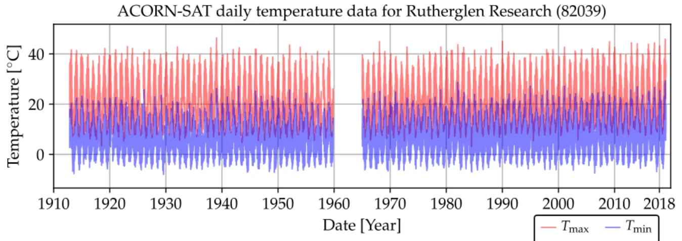
Fig. 10 shows the homogenised ACORN-SAT series for Rutherglen, including daily Tmin obtained from [63] and daily Tmax obtained from [64]. Each series starts on 8 November 1912 and ends on 28 February 2019, with all values over 1960–1964 missing. Counting from 1910, nearly 10% of each series is therefore missing. In total for the 112 sites shown in Fig. 9, approximately 18% of the data are missing over the period of standardised measurements.
1910 1920 1930 1940 1950 1960 1970 1980 1990 2000 2010 2018 Date [Year] 0 20 40 Temperatur e [ ◦ C]
ACORN-SAT daily temperature data for Rutherglen Research (82039)
Tmax Tmin
Figure 10: ACORN-SAT daily minimum and maximum series for Rutherglen.
3.2.2 Calculation of regional averages and trends
To calculate average temperatures for large regions (e.g. Australia as a whole, entire states or other areas of interest such as the Murray Darling Basin), a regular grid with 25 km resolution (approximately 0.25◦ × 0.25◦) is used as area-weighting mechanism. The contribution of each temperature measurement in the average is thus proportionally scaled according to each station footprint or land area being represented. The calculation of average temperatures is performed as follows [65].
1. Monthly averages are calculated using the homogenised daily series for each ACORN-SAT site, allowing a maximum of 10 days missing per month.
2. The monthly normal or reference value, which is the average over the 1961–1990 reference window, is calculated for each station.
3. The temperature anomaly series is calculated for each station, which is the differ-ence between monthly values and the referdiffer-ence value, indicating the departure (or anomaly) from the reference period for each month.
4. The station anomalies are interpolated to the regular grid using the Barnes succes-sive correction algorithm [66], while excluding UHI-contaminated stations shown in Fig. 9.
5. Regional average anomalies are calculated from these interpolated grid-point values, which are effectively area-weighted values obtained from the homogenised data.
Some results calculated by the BoM using the above process are displayed in Fig. 11, including the Tmax, Tmin and Tmean anomaly series for the Australian continent [67].
1910 1920 1930 1940 1950 1960 1970 1980 1990 2000 2010 2018 −1.5 −1.0 −0.5 0.0 0.5 1.0 1.5 Tmax anomaly [ ◦C]
Temperature anomalies for Australia
1910 1920 1930 1940 1950 1960 1970 1980 1990 2000 2010 2018 −1.5 −1.0 −0.5 0.0 0.5 1.0 1.5 Tmin anomaly [ ◦ C] 1910 1920 1930 1940 1950 1960 1970 1980 1990 2000 2010 2018 Date [Year] −1.5 −1.0 −0.5 0.0 0.5 1.0 1.5 Tmean anomaly [ ◦C]
3.2.3 Historical development of Australian reconstructions
Three major homogenised temperature datasets have historically been developed for Aus-tralia, including the following [52]:
1. An annual mean maximum and minimum temperature dataset consisting of 224 stations, developed by Torok & Nicholls [68]. This dataset was then updated and improved by Della-Marta et al. [69] by re-examining the original set and reducing the number of stations to 133.
2. A daily temperature dataset including 103 stations focusing on the period 1957– 1996, developed by Trewin [70].
3. The current ACORN-SAT dataset, consisting of 112 daily records as discussed above, also developed by Trewin [52].
ACORN-SAT has been updated to version 2 at the end of 2018, with reconstruction methods used similar to version 1 [71]. Version 2 incorporates more data, including new measurements and recently-digitised historical records, and also includes further technical updates [72]. Version 2 does however indicate a 23% stronger warming trend than version 1.12 Comparisons between the raw CDO data and both ACORN-SAT versions were made available for each of the 112 sites at [73].
12The mean annual rate of warming for Australia over 1910–2016 is 0.1 ◦C per decade in version 1,
4
Spatial interpolation techniques
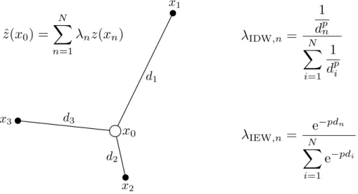
Spatial interpolation is the estimation of attribute values at unsampled locations from measurements made at control points in the same area [74]. The concept is illustrated in Fig. 12, where the value ˆz at unsampled location x0 is to be estimated from neigh-bouring valuesz(xn). Following this approach, several techniques have been developed to
reconstruct historical temperature [75], and other environmental variables [76].
Figure 12: Diagram to illustrate spatial interpolation with distance-weighting formulas.
Spatial interpolation can be performed by calculating the weighted average of neighbour-ing values, usneighbour-ing the general formula [76]
ˆ z(x0) = N X n=1 λnz(xn) (1)
with ˆz the estimated value of a variable located at x0, z the observed or measured value at locationxn withλn the associated weight value, andN the number of neighbours from
which samples are taken to perform the estimation. Two example equations to calculate the weight values are shown in Fig. 12. These and other methods are subsequently considered.
4.1
Inverse distance methods
The first law of geography or Tobler’s law is “everything is related to everything else, but near things are more related than distant things” [77], under the assumption of positive spatial autocorrelation. This law forms the basis of a number of spatial interpolation
techniques, especially inverse distance weighting (IDW). The IDW technique performs estimation using a linear combination of neighbouring sample values to the point that needs to be estimated. The weights can be calculated using
λn = 1 dpn N X i=1 1 dpi = d −p n N X i=1 d−i p (2)
with dthe distance between locationx0 and xn, and pa power parameter controlling how
much emphasis is given to nearby locations. When p = 0, all N neighbours considered are weighted equally (ˆz would then simply be the mean of all neighbouring values). As p increases, closer locations contribute more to ˆz. The power parameter is often chosen as p = 2, with IDW then referred to as inverse distance squared (IDS). It may also be possible to find an optimal value forp, for example when calculating the theoretical IDW performance limit over a range of p-values. In such cases the technique may be referred to as optimal IDW.
By replacing the inverse distance powers in (2) with inverse exponentials, the alternative formulation λn = e−pdn N X i=1 e−pdi (3)
or inverse exponentially weighting (IEW) is obtained [74].
4.2
Geostatistical techniques
Geostatistics is a branch of applied mathematics that has its origins in agronomy, meteo-rology and mining [76], though it has been applied to various problems where spatially or temporally correlated data is concerned, including real estate valuation [78], temperature estimation [79], and other earth science fields [80].
Danie Krige, a South African mining engineer, developed statistical techniques to estimate the spatial structure of gold ore reserves in the 1950s [81]. The family of geostatistical techniques based on his work was named Kriging, consisting of generalised least-squares regression methods. Kriging can be used to interpolate spatially-correlated variables, using the following process [82,83]:
calcu-lated using the expression known as the experimental semi-variogram γ(h) = 1 2M M X i=1 [z(xi)−z(xi+h)]2 (4)
where M pairs of data samples are considered. Each pair consists of measurements z(xi) and z(xi +h), taken respectively at locations xi and xi +h. Although the
distance between observation points h may consist of a set of predefined values (e.g. when analysing ore reserves in a controlled study where samples are taken at regularly spaced locations), many applications involve non-uniformly scattered data points. In such casesh may be unique for every data pair considered, and values of h should then be combined through binning.
2. A mathematical model is fitted to the experimental semi-variogram, which can be performed graphically by choosing the model that best fits the γ(h) vs. h graph. Commonly-used mathematical models include the spherical, exponential, linear, cir-cular and Gaussian expressions.
3. Attribute values at unsampled locations are estimated using the formula given in (1), where the weights λnare calculated by solving a system of linear equations (the
Kriging system) containing the mathematical semi-variance model.
Several approaches have been developed based on the above description including ordi-nary Kriging, simple Kriging, universal Kriging, co-Kriging, Kriging with a trend, block Kriging, factorial Kriging, dual Kriging, etc. [76].
4.3
Graphical techniques
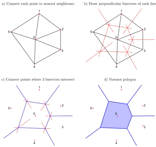
Spatial interpolation can be performed by partitioning the areas around observation lo-cations graphically, and then assigning values at unsampled lolo-cations according to the partition. An example of graphic partitioning is Voronoi (also known as Thiessen or Dirichlet) polygons [84], illustrated in Fig. 13, where a region is divided up with one observation point per cell.
All points within each Voronoi cell is closer to the central value (or observation point contained in the cell) than any other observation point. For example, all points within the shaded cell of Fig. 13d are closer to observation point 0 than any other. The simplest graphical interpolation is probably the nearest-neighbour method, where all points within each cell are assigned the central value.
Other graphical or geometric techniques include triangular irregular networks (TINs) and natural neighbours [76]. 1 2 3 4 5 0 1 2 3 4 5 0 1 2 3 4 5 0 1 2 3 4 5 0
Figure 13: Illustration of drawing a Voronoi polygon around an observational point.
4.4
Polynomial techniques
There are several methods where multivariate mathematical expressions are used to de-scribe spatially-distributed or irregularly-scattered data. Like all spatial interpolation techniques, these methods can either be exact or inexact depending on whether the mathe-matical expression will reproduce the original sampled data exactly or not. These methods include the following:
• Polynomial regression, e.g. where temperature is assumed to be a third-order poly-nomial function of the coordinates (x, y) and elevation (z) of the observation site [75]:
Such models are used in trend surface analysis (TSA) where global data trends are described through a regression surface. The parameters of the regression model can be estimated numerically by minimising the residuals using a technique such as least squares.
• Spline interpolation, which can be used to fit curves or surfaces to data points using piece-wise mathematical functions, i.e. a set of polynomial functions is used to describe the area of interest where each function describes a subset of the area with smooth transitions between the different functions [84]. One example of two-dimensional spline interpolation is thin plate splines (TPS), which is a generalisation of one-dimensional cubic splines [85].
4.5
Optimal interpolation
Optimal or statistical interpolation performs estimation of a field using a linear combi-nation of the available data, while minimising the error variance [86]. The formula used is [87] ˆ z(x0) = zf(x0) + N X n=1 λn[zo(xn)−zf(xn)] (6)
withzf andzo the first guess and observed attribute values respectively. Therefore zf(x0) is the first guess value at the unobserved location x0, and zo(xn) is the observed value
at a neighbouring site located at xn. The first guess could for example be a
correspond-ing value from the closest neighbour or the neighbour with the highest correlation with the candidate station. The weight coefficients λn are calculated by solving a system of
equations describing the spatial autocorrelation between all participating stations [87].
4.6
Lapse rate methods
The rate of SAT change in stationary air with increasing elevation is known as the lapse rate, which can be classified as follows [75]:
• Positive lapse rate: Temperature decreases with increasing elevation.
• Zero lapse rate (temperature is isothermal): Temperature remains constant with increasing elevation.
• Negative lapse rate (temperature inversion): Temperature increases with increasing elevation.
Historical temperature data may be estimated for unsampled locations using the lapse rate as follows [75]:
• Calculate the lapse rate using data observed at locations with different elevations in the region of interest.
• Calculate the elevation difference between the unsampled location and the nearest observation site.
• Estimate the unsampled temperature value using the nearest value and the two parameters calculated above.
4.7
Machine learning
Machine learning can be used to perform spatial interpolation by first training artificial neural networks (ANNs) to find a mapping between geographical features and observed attribute values, and then predicting values for unobserved locations using known features of these locations.
Examples of such studies include interpolation of monthly SAT at Mount Kilimanjaro [88] and daily temperature data from the UK [89]. In the UK study an ANN was trained using 34 terrain variables (distances to water bodies, elevation, local roughness, percentage of land cover, urbanisation index, etc.), weather type and temperature observations of 6 neighbouring stations. Temperature surfaces over a 100 km ×100 km region in Yorkshire were also generated using the trained ANN structure.
An ANN estimation method applied to temperature reconstruction is also presented in Section 8 of this report.
5
Quality control
During the process of measuring and recording weather data, errors may be introduced such that the actual weather is incorrectly represented in the records. Errors may be caused by the following factors [90].
• Equipment failure: weather sensors may fail or malfunction due to aging compo-nents, extreme weather conditions, electrical or communication faults, etc.
• Human error: instruments that are manually operated by human observers may be misread, recorded incorrectly in logbooks or typed incorrectly into electronic databases. Measured values may be recorded at the wrong date or the values them-selves may be recorded incorrectly.
• External influences: changes in the sensor network and environment discussed in Section 2 could also introduce errors in the data. For example, local phenomena such as bushfire may affect a limited number of weather stations, resulting in an incorrect representation of the regional atmospheric conditions. Other factors, e.g. the UHI effect or vegetation growth near a weather station, could also introduce errors into the data.
Data errors can be identified and removed (or corrected) through a QC process. A number of automatic QC checks can be performed as a first step to identify these errors. QC checks may include the following [90,91]:
• Climatology checks, which determine whether an observation is within physical lim-its (e.g. air temperature within -80 and 60 ◦C) and also test the plausibility of the observation at the given time of the year.
• Internal checks, which compare an observation of a given station with other obser-vations within the same time frame to ensure consistency over time.
• Checking consistency with neighbouring or closest surrounding stations.
The BoM approach to dealing with data values that failed one or more of the above tests, is to place these values on a priority list for a skilled QC operator to investigate further [90]. Information from other sources (e.g. type of measuring equipment used, site location, satellite and radar images, weather charts, etc.) is then used to decide what the relative quality of these potentially wrong observations is. If sufficient evidence exists that
an observation is indeed wrong, it will either be removed or amended, with an appropriate QC flag added.
To address problems in the data caused by changes in the sensor network (e.g. site moves), the BoM applies homogenisation techniques as described in Section 3. Concerns regarding the homogenisation process and how it is being implemented have however been raised. See for example [45], where alternatives are also considered.
5.1
Control charts
An alternative method to performing QC on temperature data using control charts has been presented in [45,92]. Control charting is a statistical process control (SPC) method commonly used in manufacturing industries, which evaluates whether a process is in a state of statistical control, i.e. behaving in a stable and predictable manner within natural limits of variation. These limits (the upper and lower control limits) describe the usual range of variation due to background noise (also known as common or chance causes) in the process. Exceeding the limits provides evidence that the process is out of control, indicating that an unusual signal (also known as a special or assignable cause) may be present in the process [93].
A common approach to monitor the quality of manufactured products is to takeM batches or groups, each containing N samples of the product at a given time instance from the assembly line, and to then subject these samples to statistical testing. To determine whether the process is in control, a quality parameter is calculated from the sample set and displayed on a graph with the parameter mean µand control limits, typicallyµ±3σ with σ the standard deviation of the quality parameter. Typically, the values for µ and σ are unknown, and must be estimated when the process is believed to be in control.
The choice of 3σ to establish the control limits originates from the approach in statistics where three standard deviations from the mean is often chosen to define the confidence interval (CI) for a random variable (RV). The 3σ CI is the theoretical interval which will contain 99.73% of the probability mass of a normally-distributed RV, since
Z µ+3σ µ−3σ 1 √ 2πσ2e −(x−µ)2 2σ2 dx= 0.997300 (7)
Although the 99.73% figure only holds under the normal assumption, the Chebyshev in-equality states that for a wide class of distributions, at least 100 1− k12
% of observations will fall within the kσ CI [94]. Hence, at least 88.89% will fall within 3σ from the mean
and the closer the distribution is to being normal, the closer this CI will approach 99.73% of all observations.
A number of control (or Shewhart) chart types is subsequently discussed. Typically, a combination of control charts will be used concurrently to monitor a number of parameters describing the quality of the outputs of a process, e.g. mean value and variability.
5.1.1 Range control chart
Process variability can be monitored using the control chart for range or the R control chart [93]. In QC applications the standard deviation is often estimated using the range method, with the range of the ith sample group of quality parameters given by
Ri = max (xi)−min (xi) (8)
which is simply the difference between the largest and smallest samples per group. The average range is then
µR = 1 M M X i=1 Ri (9)
There exists a well-known relationship between the range and standard deviation of sam-ples from the normal distribution, which has been developed using the relative range defined as [93]
W = R
σ (10)
which can be used to estimate the standard deviation as
ˆ σ = R E[W] = R d2 (11)
with d2 the expected value of W. Tabulated values for d2 (and other parameters of W, such as the standard deviationd3) are available in statistics text books for different values of the sample size N (see for example p. 702 of [93]). ForM > 1, (11) can be written as
ˆ σ = µR
d2
(12)
with µR given in (9) [93]. To calculate the control limits of the R-chart, the standard
deviation of the range σR needs to be estimated. Starting again from the relative range
defined in (10) and using (12), it is clear that
R=W σ (13) ∴σR=σWσ (14) ∴σˆR =d3 µR d2 (15)
with the standard deviation of W a known constant; σW = d3, which can be read from statistics tables as mentioned above. Finally, the R-chart control limits can be developed as µR±3ˆσR =µR±3 d3 d2 µR (16) =µR 1±3d3 d2 (17)
and by defining the following constants
D3 = 1−3 d3 d2 (18) D4 = 1 + 3 d3 d2 (19)
which are also tabulated in statistics text books [93], the upper control limit (UCL) and lower control limit (LCL) can be expressed as
UCLR =D4µR (20)
LCLR =D3µR (21)
Fig. 14 shows mean and range control charts using the monthly minimum temperature data of Rutherglen. The sample size is N = 12 months for every year (data for years with one or more missing values are excluded). For the range control chart, the constant values areD3 = 0.283 andD4 = 1.717 (read from the table on p. 702 of [93]). The control limits are hence
UCLR =D4µR = 1.717×13.595 = 23.343 (22)
LCLR =D3µR = 0.283×13.595 = 3.847 (23)
as indicated in the bottom graph of Fig. 14.
5.1.2 X-bar or mean control chart
Control of the process average or mean quality level is usually performed using the ¯x control chart. If M groups of samples are available, each containing N observations of the quality variable, the process average can be estimated as
µ= 1 M M X i=1 ¯ xi (24)
1913 1920 1930 1940 1950 1960 1970 1980 1990 2000 2010 2018 5.0 7.5 10.0 Annual mean [ ◦C] µ= 7.305 UCL = 10.921 LCL = 3.688 ¯
x-R control chart usingTmindata for Rutherglen Research (82039) (1913 – 2018)
1913 1920 1930 1940 1950 1960 1970 1980 1990 2000 2010 2018 Date [year] 10 20 Range [ ◦C] µ= 13.595 UCL = 23.343 LCL = 3.847
Figure 14: Mean and range control charts for Rutherglen (82039).
with ¯xi the sample mean of the ith group of parameter values. In this case, the sample
mean is the variable being subjected to statistical analysis, and the standard deviation of the sample mean σµ is therefore required to calculate the control limits. As the mean of
each group is calculated overN samples, the standard deviation can be shown to be [95]
σµ =
σ √
N (25)
withσthe standard deviation of the individual samples within each group (withσassumed to be identical over all groups as the process is assumed to be in control). The standard deviation σ can be estimated from the average range µR as discussed in Section 5.1.1,
such that σµ= σ √ N = µR d2 √ N (26)
The control limits can then be calculated as
µ±3σµ=µ±3
µR d2
√
N (27)
and by defining the constant (which can be read from statistics tables)
A2 = 3 d2
√
N (28)
the control limits can be written as