Musical Exploratory Data Analysis
Rachael Fountain
Westfield State University
December 19, 2014
Abstract
Founded by John Tukey, the most influential statistician of the sec-ond half of the twentieth century, exploratory data analysis (EDA) is the process of creating new and original methods of analyzing data through visual graphics. As part of my research I used EDA techniques to create two visual graphics which I call will variability graphs and contour graphs. The purpose of these graphs was to explore the connection between music and mathematics. The graphs created allow for important characteristics of musical data pitches, keys, and distances between notes to be exam-ined quickly and easily.This paper discusses the creation and evolution of the EDA tools I used. In addition, the results I discovered by apply-ing exploratory data anlysis, statistics, an and real analysis techniques to investigate musical data are included in this paper.
1
Definition of the Problem
It is clear that music is more than the notes, pitches, and beats that can be heard when one hears; in fact there are many connections that can be found between music and mathematics. My goal was to explore some of these connec-tions and use mathematics as a way of explaining musical behavior. Perhaps there is some underlying mathematical structure that unifies different genres and styles together or perhaps music really is as diverse and unique as it may seem.
2
Musical Variability
It is important to first discuss some music theory and musical knowledge that will become important in order to understand later research. Throughout my research, my focus was on analyzing musical sequences. A musical sequence can be thought of as phrase in a piece of music that can stand alone. Usually, this refers to a line in a verse or chorus. Because we will be looking at individual notes as well as sequences, we must reference the sheet music of any particular musical piece we are interested in.
Once we have a musical sequence, we can then begin to discuss the musical variability of that sequence. It is important to note that we must consider a complete musical sequence when finding variability, as stopping in the middle of a sequence can alter the variability. In statistics, variability refers to how spread
out or close together the observations in a set of data are. For our purposes, we will define musical variability as how far apart or close the notes adjacent to each other are in a musical sequence. It can also be thought of as the average amount of pitch variation throughout a musical sequence. Thus, variability is measured by the average distance between adjacent notes.
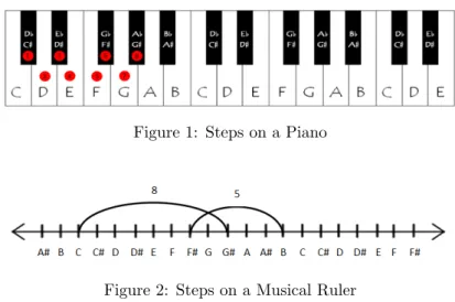
The distance between notes can measured in various ways. We first started measuring these distances by the number of keys, or “steps”, needed to get from one note on a piano to the next note. In music, a “step” usually refers to the distance between two notes in a major/minor scale but for our purposes, our “step” is really a half-step; that is when we refer to a step we really mean the distance between notes in the chromatic scale. We can also count these same steps using a “musical ruler”. This musical ruler is essentially a number line with notes of the chromatic scale in place of the traditional numbers. To find the distance between two notes on the musical ruler, we count the tick marks between two notes just as we would to find the distance between two integers on a traditional number line. Also like a traditional number line, the notes on the musical ruler increase in pitch when moving to the right and decrease in pitch when moving to the left. Eventually, the musical rulers get programmed into Microsoft Excel so that we will no longer have to manually compute individual distances, but more on that later.
Figure 1: Steps on a Piano
Figure 2: Steps on a Musical Ruler
Additionally, there are some important musical notations we have to take into consideration before we actually calculate musical variability. The first of these is ties. In music, a tie is joins two notes of the same pitch. These notes are to be played as one note and thus when we will consider them as such when calculating distances. Slurs are similar to ties except for the fact that they join notes of different pitches; for our purposes, these notes will be counted as individual notes. We also have to be cautious of accidentals. Accidentals are notes whose pitches are not in the key signature. Throughout the sheet music, these notes will have a sharp, flat, or natural symbol, signifying that they are accidentals. We also have to be certain that we are calculating accurate distances, as the distance between notes can change depending on whether one is going from a high pitch to a low pitch or a low pitch to a high pitch. For example, Consider the distance between the notes D and A. The distance from
D going up to the nearest A in will be seven, but the distance from D going down to the nearest A will be five. This is due to the musical structure of octaves.
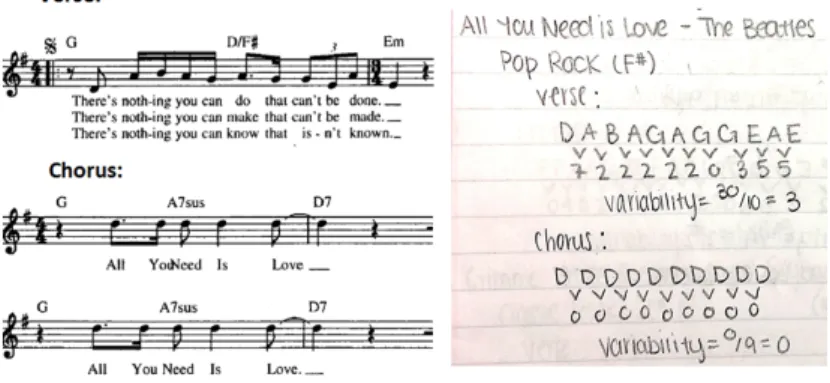
Once the distances between the individual notes in a musical sequence are found, we then can actually determine musical variability. To do this, we simply add up the total distances between notes in the musical sequence, and divide by the total number of notes in the sequence. As stated previously, this is exactly the same as computing the average distance between adjacent notes. The left portion of Figure 3 represents two musical sequences from the song “All You Need is Love” by the Beatles and the right portion shows my hand calculations of the variability for each sequence.
Figure 3: Hand Calculations
3
Exploratory Data Analysis
In statistics, Exploratory Data Analysis (EDA) is all about creating new and original ways to analyze and view sets of data. Pioneered by John Tukey, the most prominent statistician of the second half of the 20th century, EDA helps to summarize and analyze data when other statistical models are not helpful. Unlike other types of data analysis, where one forms a hypothesis and then checks to see if the data fits or models said hypothesis, no prior hypothesis is needed for EDA. As Tukey himself said, “The greatest value of a picture is that it forces us to notice what we never expected to see.” (Tukey, p.vi). EDA can make hidden patterns or trends more visible; allows the data to speak for itself, often in a visual or graphical way.
In my research, I used EDA techniques to create two types of graphical data analysis tools: variability graphs and contour graphs. Both of these graphs were created using Microsoft Excel which allowed me to input and analyze new data easily. Excel also allowed for alterations of the tools as my research evolved, so did the two EDA tools. As I realized new problems or wanted to analyze new aspects of the data, several modifications were made to the graphs before I arrived upon the final product.
The data I worked with consisted of 70 songs, each with a verse and cho-rus. It is important to note that these songs were chosen with no particular characteristics in mind. The data set includes songs in both major and minor
keys, various key signatures, and a multitude of scales. They also came from various genres such as Pop, Classic Rock, Acoustic Rock, the 80’s, and more. Since my focus was on trying to see if there was an underlying structure that tied all types of music together, I purposely chose songs with a wide range of characteristics.
3.1
Contour Graphs
The first EDA tool I created was what I call a contour graph. Like its name suggests, the goal of the contour graphs was to visualize the underlying contour, or shape, of a musical sequence.The process of creating the contour graphs was perhaps the most difficult and time-consuming part of my entire research process. When I first started my project I was working with a hand-drawn, simplified template of the finalized version I have today.
Figure 4: Original Contour Graph Themplate
The original graphs were similar to today’s graphs in that they both had the same basic elements. One of the key features of the contour graph is the vertical gridlines that correspond to the steps in a scale. All of the solid gridlines represent notes in key signature of the major or minor scale and the dotted gridlines represent any accidentals, or notes not in the key signature of the major or minor scale. In the original template I had an empty box, next to each gridline along with its corresponding solf`ege (do, re, mi, etc.). For each song I would physically write in the notes of the scale the particular musical sequence was in and then I would plot the actual notes of the sequence on the corresponding gridlines. Since each song had two musical sequences I was interested in (a verse and chorus) and each musical sequence had anywhere from 7-15 notes, I knew this process would be impossible to replicate for a large sample of songs.
At this point in the research process, I chose to create the same template in Microsoft Excel. This proved to be a much more difficult task than I had originally thought as it required tons of formatting and maneuvering of objects to get the results I wanted. My first task was to create the gridlines on a scatter plot. One of the downfalls of Excel is that it only allows for the gridlines to be the same type of formatting, meaning I could not make some gridlines solid while also having some dotted gridlines. To compensate for this, I created an individual series for each dotted gridline. Also, my original graphs only included
one or two notes before the first note in the scale and none above the last note in the scale. In my new graphs, I extended this to include 3 full notes below the tonic and two full notes above the higher tonic. This allowed me to easily deal with songs that had a wide range of notes. I then focused on creating similar boxes to the ones included in my original graphs. After working through several strategies, I ended up manually creating text boxes. In these boxes, I would type notes solf`ege for the major skill in bold followed by its minor solf`ege in regular font. I also wrote in the actual note of the scale itself. Because major and minor scales have the same pattern of wholes and half-steps, just shifted over, I was able to create graphs that worked for each major scale and its relative minor scale.
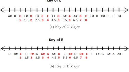
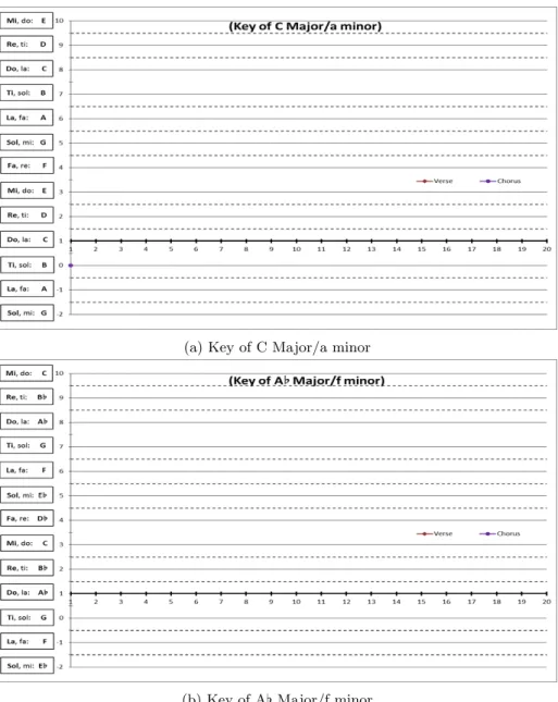
The next step in the process was to find a way to plot individual notes in a musical sequence. To do this, I assigned each note in a scale with a number. The tonic of the scale, which corresponds with do, was always assigned a 1. From there, notes in the major scale would increase in denomination by 1. Each accidental, or note not in the major scale, was given a decimal value corresponding to a specific dotted gridline. Although the first note is always assigned a 1, it is important to remember that the first note changes with each major scale. Thus, depending on the key, notes of the same letter would be assigned different numbers. To represent this, I had to create individual “musical rulers” for each key. Just like the musical rulers discussed previously, these rulers were basically number lines with note values instead of numbers. The distances between each “tick” or note in the scale is based on the pattern/structure of steps in a scale. Figure 5 below shows a musical ruler for two different keys. The notes in red are the notes of the major scale that would be assigned whole number values and the notes in black are any “in-between” notes that would be assigned decimal values.
(a) Key of C Major
(b) Key of E Major
Figure 5: Two Musical Rulers
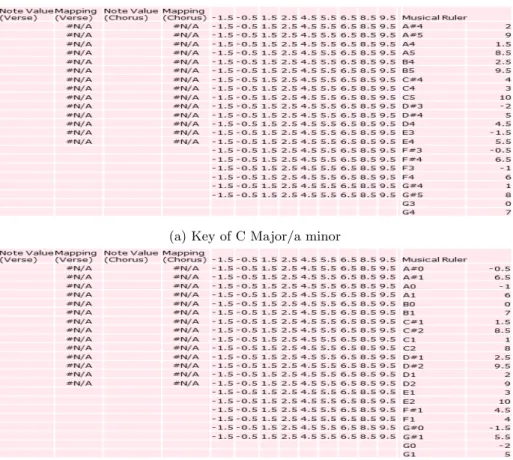
Once the numbering system was created for each key, I then created a contour graph template for each key. From there, I inputted the number lines and created “mapping” columns for two sequences, a verse and a chorus. I then
programmed the columns to reference any actual musical data (i.e. the notes of an actual sequence) inputted with the musical rulers using the lookup function. There were several other tedious formatting issues I had to overcome but the basics of the contour graphs were now programmed in excel and a contour graph template was created for each key. Figures 6 shows the finalized contour graph templates for two different keys and Figures 7 shows their corresponding Excel spreadsheets.
(a) Key of C Major/a minor
(b) Key of A[Major/f minor
(a) Key of C Major/a minor
(b) Key of A[Major/f minor
Figure 7: Corresponding Excel Template Data
Now, to create an actual graph for a particular song all I had to do was type in the note value. From there Excel would reference the musical ruler and plot the note on the correct gridline. By creating contour graph templates for each key in Excel, I streamlined the graphing process and made any future data collecting much easier. I no longer had to manually plot each note in a musical sequence and I no longer had to create hand-drawn graphs. Figures 8 and 9 are completed contour graphs for two different songs in my data set.
There are several other benefits of creating the contour graphs as well. In addition to visualizing the shape of a musical sequences, they allow for quick assessments of distances between individual notes. In addition, they allow for quick assessments of distances. With contour graphs, there is no longer a need to break out the “musical ruler”, count the steps on the piano as discussed earlier. One can simply look at two adjacent notes and count the number of lines between them to figure out the distance. For an even faster (and more visual) assessment, one can see the lengths of the lines connecting adjacent points and compare them to the lengths of other lines in the sequence. Additionally, these graphs are all standardized for “do”. The box corresponding with the horizontal axis will always be the first note in the scale a musical sequence uses. Because of this, the standard template will work for any scale or key, including major and
minor keys and each major/minor key has its own specialized template. Also, by replacing the notes in the boxes along the vertical axis, one can transpose a musical sequence quickly. Furthermore, since verses and choruses can be represented in a single graph, the contour graphs allow the two sequences to be compared easily. One can also shrink the graphs to a smaller size, print them out, and compare multiple songs at once.
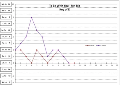
Figure 8: Contour Graph: To Be With You
3.2
Variability Graphs
Although still time-consuming and challenging, creating the variability graph template proved to be a much faster process. Again, as the name implies, vari-ability graphs are used to see how average varivari-ability changes as a musical sequence progresses. To create the variability graph template I had to input a “musical ruler” into Excel similarly to the way I did it for the contour graphs. Unlike the contour graphs where the musical ruler changed for each key, this musical ruler remains the same for every key. Furthermore, with the contour graphs each note in the major scale was assigned a whole number value, how-ever, in this circumstance each note in the chromatic scale was assigned a whole number; there are no notes that are assigned decimal values.
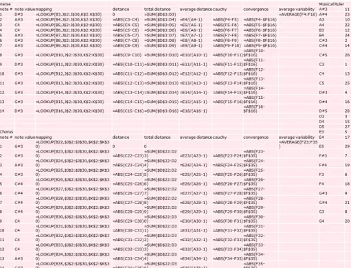
Next, I created a mapping column which used the lookup function to match a note’s letter value with its corresponding numerical value from the musical ruler. Referencing these numerical values, I added in formulas to compute var-ious distances and find average variability. For these particular graphs, the x-coordinate of a point represents how far one is in the sequence (i.e the first note in, second note in, etc.) and the y-coordinate is the average variability of the sequence up to that particular point. Figure 10 shows the Excel formulas I used to create the variability template.
Figure 10: Variability Template Excel Data
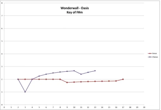
Once this template was created, I then just had to input the individual pitches for each sequence and I would have a completed variability graph. An example of a completed variability graph can be seen in Figure 11. Like the contour graphs, these graphs provide a visual representation of characteristics
of the data, which in this case was average variability. Also like the contour graphs, multiple sequences can be visualized on a single graph and if the graphs are printed they can be used as manipulatives in which to compare multiple songs at once.
Figure 11: Completed Variability Graph
3.3
Analyzing the Data
The next step in the research process was to actually analyze the data using the two EDA tools I created. Once all the musical sequences were inputted for all 70 songs in both graphs, I began to look for trends or anything interesting. Initially, I went through and simply counted the number of songs that shared a particular characteristic. Some of the key features I looked at were the number of times a verse and chorus intersected, whether the sequence ended, started, or reached the tonic, and whether the sequence hit its end variability in the middle of the sequence.
3.3.1 The “Beatles Rule”
As I was looking at different characteristics of the data, I noticed that there was an interesting connection concerning varibailities between the verses and choruses of several Beatles’ songs. This connection developed into the “Beatles Rule”.
Definition 1: A song is said to follow the“Beatles Rule”if the chorus has higher variability than the verse or the verse has higher variability than the chorus.
Typically, when we are looking at the differences in variabilities, we are looking for significant differences. In most of the Beatles’ songs I analyzed, this seemed to be the case. This result may provide an explanation as to why The Beatles are considered to be one of the most popular bands in history.
In general, the “Beatles Rule” makes a song more interesting and pleasing to listen to. If a song had high variability throughout both the verse and chorus, the distances between consecutive notes would be large. This would not only make a piece difficult for a musician to play, but it may also be too complex for the listener to enjoy. On the other hand, if a song had consistently low variability, the distances between adjacent notes would be small and the song may seem to be too simple or boring for the average musician or listener. Songs that follow the “Beatles Rule” strike a balance between the interesting, complex nature of sequences with high variability and the simple, clean nature of sequences with low variability and thus are more pleasing to the average listener. What’s more is that most of the Beatles’ songs that followed the “Beatles Rule” where some of their most popular songs. Figure 12 shows several examples of this.
Figure 12: Beatles’ Songs that Follow the “Beatles Rule”
3.3.2 Beginning Vs. End Variability
Shortly after discovering the “Beatles Rule”, I decided to look at the average variability for each half of a sequence separately. In doing this I noticed that a significant amount of the variability associated with each sequences lies in the beginning of the sequence. In each case, the variability associated with the first half of the sequence was much higher than the variability associated with the second half of the sequence. This was often the case with verses and choruses alike. Figure 13 below shows some examples of this.
For the listener, this means that the music may have a lot of “jumps” or fluctuating of notes in the beginning of a phrase, but as the phrase progresses those jumps level out. Most musical sequences exhibited this behavior and most seemed to resolve by the end of that particular sequence; this may be and underlying structure of all or most musical sequences.
Figure 13: Beginning Vs. End Variability
3.3.3 Settling Behavior and Points
This resolution demonstrated by comparing beginning and end variability gave rise to the idea of settling behavior and settling points. As I was comparing beginning and end variabilities, I noticed that that the resolution of the data resulted in the points on the variability graphs “settling”. Settling occurs when the variabilities at the end of a sequence become close in value. For example, a musical sequence that settled would have several points at the end of a sequence that have similar y-coordinates. These y-coordinates, or variabilities, fall within some settling range. I also noticed that each sequence seemed to settle around the same point in the sequence, about halfway through.
I first tried to define a “settling range” in which all or most of the endpoints sharing similar variabilities would fall between. This settling range could then be used to find a “settling point”, or the note number in the sequence where all or most of the points were within the settling range. This actually proved to be far more difficult than I anticipated. Initially, standard deviation of end variability was used to define the settling ranges. I tried several different ratios of standard deviation but there were still several problems. First of all, no one particular ratio of standard deviation seemed to fit a majority of the data; a range that would fit for one musical sequence would be far too wide or narrow for several other sequences. In Figure 14 we can see a that a range of 0.25 standard deviations appears to work for the top two sequences, but is far too narrow for the bottom two sequences.
Next I tried creating a settling range based on a particular percentage of the end variability. Although percentages where much easier to calculate and work with, the “Goldilock’s effect” that I was experienced when using standard deviations persisted. ±15% of end variability seemed to be the best fit, however, the range was far too narrow for songs with lower variability. On the left Figure 15 shows settling range of±15% that correctly identifies settling points and on the right is shows an incorrect settling range for the same sequence. After testing a ±15% I then tried a range ±40% of end variability. I found that this range worked for songs with lower variability but seemed to inaccurately determine settle points. Too many or too few of the points sharing similar variabilities would fall within that±40% range.
The recurring problem was that no one range I tried seemed to fit with graphs that were clearly settled. The settling behavior can be easily seen on a variability graph, yet I could not develop a mathematical way to define an exact settling range or point. In the spirit of Exploratory Data Analysis, it is right for each of us to try many things that do not work” (Tukey, p. vii). Although
I could not find a proper explanation or way to define this settling behavior, it is clear from the variability graphs that it does in fact exist.
Figure 14: Settling Range of 0.25 Standard Deviations
Figure 15: Correct and Incorrect Settling Ranges
3.3.4 Monotonicity
In addition to the “Beatles Rule” and settling I also noticed that several se-quences seemed to be exhibiting signs of what is known as monotone behavior. A monotone function, is defined as a function that is entirely non-increasing or entirely non-decreasing. For a function to be entirely non-increasing, ∀ a and b such that a ≤ b, f(a) ≥ f(b). Similarly, for a function to be entirely non-decreasing, ∀ a and b such that a ≥ b, f(a) ≤f(b). Another way to de-scribe monotone functions is based on their derivatives. The derivative of a
monotone function never changes sign. For our purposes, we defined strictly monotone sequences as sequences whose derivatives never changed sign, and approximately monotone sequences as sequences whose derivative changed sign only once. Using these guidelines, I found that 8 verses and 9 choruses are strictly monotone and 9 verses and 7 choruses are approximately monotone. While these may seem like small numbers, when we begin to consider sequences whose derivative changes sign only twice, these numbers greatly increase. There are several instances where large subsets of sequences exhibit strictly or approxi-mately monotone behavior. In Figure 16 below, sections of sequences the exhibit monotone sequences are circled in green.
Figure 16: Monotonic Behavior
3.3.5 Applying Calculus and Real Analysis Ideas
At this point, I wanted to see if any Calculus or Real Analysis ideas would fit the data. As we know, Calculus is the study of change and Real Analysis is essentially just the Calculus of the real numbers. I figured these topics might be useful in determining any patterns or rules for how a musical sequence typically changes and evolves. The problem with using Calculus and Real Analysis tech-niques is that both areas apply only to infinite, and often continuous, data sets. The data I was working with was quite finite, having between 7-15 data points in a set, and also discrete. This means that any Calculus or Real Analysis ideas have to be modified to fit the situation.
One such idea was loosely based off of the idea of convergent sequences. Typically, convergence is concerned with proving there is some value of epsilon such that distance between each subsequent term in the sequence and the limit is less than that epsilon. From here I came up with a set of sequences that
follow a similar principal; I termed these sequences “epsilon sequences” .
Definition 2: Let an = | xn - v | where xn is the nth point in the sequence
and v is the end variability. A sequence is anepsilon sequenceif as xn
approaches v, (and eventually equals v),|xn - v| ≥ |xn+1 - v|and thus
an ≥an+1
Essentially, a sequence is an epsilon sequence if the distance between each point in the sequence and the sequences end variability decreases as the sequence progresses. It also important to note that these “points” refer to the points of a particular sequence’s variability graph. A visual representation of this can be seen in Figures 17 and 18 below. Also, using conditional formatting in Excel, these distances can be seen directly in the coding for the graph (see Figure 18). Unlike the definition for convergence in Calculus and Real Analysis, the distances in epsilon sequence do not have to decrease for an infinite number of terms. However, the distances must decrease until the end variability is reached. In this sense, the end variability is similar to a limit in Calculus.
Figure 18: Another Epsilon Sequence
Several of the sequences I worked with were epsilon sequences. In fact, every strictly monotone sequence is an epsilon sequence. Also, particular subsets of approximately monotone sequences were epsilon sequences as well.
Stemming from this idea, I developed a modified version of Cauchy se-quences. Typically, a Cauchy sequences is a sequences whose terms become arbitrarily close to one another as the sequences progresses. For the typical Cauchy sequence, one can find a small positive distance, epsilon, such that distance between adjacent points is epsilon. For our purposes I modified the definition a Cauchy sequences as follows:
Definition 3: Let an =|xn - xn+1 |where xnis the nthpoint in the sequence.
A sequence is an Cauchy sequence if as xn increases, |xn - xn+1 | ≥
|xn+1 - xn+2 |and thus an ≥an+1
In other words, for a sequence to be a Cauchy sequence, the distance between consecutive points in the sequence must decrease as the sequence progresses. Again these “points” refer to points on a particular sequence’s variability graph Unlike the Calculus and Real Analysis definition of Cauchy sequences, this dis-tance does not have to be some arbitrarily small disdis-tance.
These sequences are also easier to visualize than epsilon sequences. One can simply look at the variability graphs and judge the distance between adjacent points. Because consecutive points are closer to each other than a point and then end variability, this distance between them is easier to estimate. Further-more, the graphs of Cauchy sequences often make a “funnel shape” (See Figure 19) which is easy to spot as well. Also, monotone sequences are often Cauchy sequences as well (See Figure 20). There was also a large amount of subsets of
sequences that were Cauchy sequences, as was the case with epsilon sequences.
Figure 19: Cauchy Sequence
Figure 20: Funnel-Shaped Cauchy Sequence
3.3.6 Comparing the EDA Tools
Finally, I chose to analyze and compare the same musical sequence using each type of graph. I realized that the two EDA tools really work well together. For example, the distance between two consecutive notes on the contour graphs influences the slope of the variability graph. While this may seem interesting, there is a very simple rationale behind it. Consider the average of a data set. If an element greater than the average is added to the data set, the average will increase. Conversely, if an element less than the average is added to the data set, the average will decrease. Thus, as new notes of the sequence are added on and graphed, the variabilities will change. Since these variabilities are the points plotted on the variability graphs, the change is seen as the slope of the lines connecting them.
If we look at Figure 21 below we can get a better sense of this. We can see from the contour graph that the distance between the first two notes is 7. Notice that this is the height of the first point in the variability graph. Looking again at the contour graph, we can see the distance between the second and third notes is 2. This would change our average variability from 7 to 4.5. Since
the distance we just added (2) was clearly less than the original average (7), the overall average will decrease. Looking at the variability graph, we can see that the next height is 4.5, creating a negatively sloped line connecting points 1 and 2.
Figure 21: 3 AM: Two Different Graphs
Next I used contour and ending variability to compare songs and sequences. I noticed that several sequences from different songs had the same ending variabil-ity as one another, but their corresponding contour graphs looked very different (Figure 21). Also, in some cases, two sequences within the same song had the same ending variability but again with different contours. This was the case for “Faithfully” by Journey, as shown in Figure 24. Although one sequence may end the same way as another, their beginnings or path to get there can be quite different.
Figure 22: Same End Variability, Different Contour
3.4
Future Directions
There are many aspects of this research that could be explored further. For example, more time could be spent finding a better or more accurate way of determining settling ranges or points. Pre-settling shapes can potentially be analyzed as well. These ideas may provide insight as to whether all musical sequences eventually settle and if so at what point this settling occurs.
Also, there is an unlimited amount of musical data available so one direction would be to increase the sample size of data. This could be done in a nonchalant way as was done originally, or songs added to the sample can be picked accord-ing to certain characteristics or attributes. These characteristics might include artists, tempos, country of origin, time period, etc. It might also be useful to consider including randomly generate musical sequences pieces of music that do not have any vocals such as classical music or jazz. Including some of these genres might help to see if the above ideas apply to music as a whole or only to particular subsets.
As far as EDA is concerned, new tools to analyze musical data could poten-tially be created or used as well. One pre-existing Exploratory Data Analysis tool that might be useful is Chernoff faces. These are graphs incorporate sev-eral statistical characteristics into a single “face”. Since humans are naturally good at recognizing subtle differences in facial features, Chernoff faces might shed light on other connections and correlations that exist between musical se-quences.
In addition to further analyzing musical data, many of the ideas uncovered throughout this project can be used in a high school classroom as part of an Inquiry Based or hands-on learning experience. Music is a fun way to engage students and make them invested in their learning. Because of this students will be more likely to understand and remember statistical and analytic con-cepts if they are being explained through music. The contour and variability graph templates can be printed out for students to work with and from there the teacher can then choose which direction to go in. Students can be given pre-made graphs, they may be asked to create their own by hand, or they may be asked to create their own graphs on the computer to strengthen their skills in Excel. Once the students have a set of graphs to work with, they can then be shrunken down and used as manipulatives. Students can group the graphs ac-cording to certain patterns, draw on them, or move them around as they please. In this way, students can explore averages, variability, standard deviation, per-centiles, data distribution shapes, graphical analysis, and more in a hands-one, interactive way.
References
[1] Chambers, John M.Graphical Methods for Data Analysis. Bel-mont: Wadsworth International Group, 1983. Print.
[2] DuToit, Stephen H. C, A. G. W Steyn, and Rolf H. Stumpf.
Graphical Exploratory Data Analysis. New York: Springer, 1986.
Print.
[3] Judge, John. ”Beatles Regression Analysis.” N.d.
[4] Tukey, John Wilder.Exploratory Data Analysis. 16th ed. Read-ing: Addison-Wesley, 1992. Print.
[5] William, Henry. ”Piano Keys.” Henry Williams Wee-bly. Weebly, n.d. Web. 19 Dec. 2014. < http://henry-william.weebly.com/piano-keys.html>.