Universitat Polit`
ecnica de Catalunya
Facultat d’Inform`atica de Barcelona Master in Innovation and Research in Informatics
Data Science specialization
Improving interpretability
of complex predictive models
Ekaterina Bastrakova
Supervisor: Ricard Gavald´a Universitat Polit`ecnica de Catalunya,
Abstract
This work is a part of a collaboration of LARCA Research Group with the Hospital de Sant Pau i
de la Santa Creu, which kindly agreed to provide us with the real clinical data of its patients. In this
work we will make an attempt to build the interpretation for several datasets and in general try to
implement a system that helps explaining results of the machine learning algorithm to people with no
special knowledge of the subject. Using the best from the current approaches and trying to avoid their
negative sides, we made an attempt to construct the explanation system for decision support, that
improves the existing solutions. This was reached by adding multiple thresholds instead of a single one
to the numerical values to enhance their interpretation, adding the possible trajectories with frequent
itemset predictions and adding the possibility to explain the whole data set in an intelligent way by
Acknowledgements
This work would not be possible without my supervisor - Prof. Ricard Gavald´a, who I would like to thank for his guidance, support and enormous amount of patience. Special thank you to the Hospital de Sant Pau i de la Santa Creu, for providing the clinical data and sincere participation. I also want to thank to Universit´e Lumi`ere Lyon 2, Universitat Polit`ecnica de Catalunya and all the people involved in the DMKM program. My sincere gratitude to the French Government and the Embassy of France in Moscow for their trust and financial support.
Special thanks to Marco T´ulio Ribeiro for patience answering my questions about LIME and Alexandra Elbakyan for her contribution in the search of knowledge throughout my studies. To my friends: Thank you for making this experience even more fun. Thank you for motivating me to grow and be as great as you are.
Contents
1 Introduction 6
2 State of the art 7
2.1 Machine learning in medical sciences . . . 7
2.2 Model interpretation . . . 8
2.3 Regression models . . . 9
2.3.1 Critics . . . 10
2.4 Decision trees . . . 10
2.5 Random Forest . . . 11
3 Motivation and previous work 13 3.1 Previous work and description of the data . . . 13
3.2 The data . . . 14
3.3 Other data sets used . . . 14
4 Methodology 16 4.1 Local Interpretable Model-agnostic Explanations (LIME) . . . 16
4.1.1 Drawbacks . . . 17
4.2 Tree interpreter . . . 18
4.2.1 Drawbacks . . . 19
5 Development of the proposal 20 5.1 Feature contribution . . . 20
5.2 Continuous feature visualization . . . 20
5.3 Continuous feature discretization . . . 21
5.3.1 Random Forest cut . . . 22
5.3.2 Simple intuitive methods . . . 23
5.3.3 Multi-Interval Discretization of Continuous-Valued Attributes for Classification Learning 24 5.4 Frequent itemsets . . . 25
5.5 Instances to explain . . . 26
6 Correlation and causality 29
8 Conclusions and future work 32
8.1 Future work . . . 32
References 34
1
Introduction
Nowadays machine learning is a popular trend which is well settled in many areas of our life, sometimes in research and sometimes in our day-to-day life. The slowest to give up to the new technologies are the fields with the high level of risk in the decision making - like medicine.
At this point no one debates the benefits of machine learning, but its huge drawback is that the state-of-the-art, complex and most accurate methods like neural networks basically work as a magical black box producing answers by unknown reasoning. Which is why it is now really important to focus on model interpretation.
It is crucial for the end user to be able to understand and trust the model he is working with, its predictions and decision paths. But there are also some other, not so obvious reasons. It can also be used for the data discovery - maybe it is possible to generate some new insights using model interpretation: if we can see, how exactly the system is classifying the patients, we can assume correlations between some of the factors. And lastly, interpretation can also be extremely helpful for model comparison and diagnostics,1
when you can see all the potentially misleading errors, like using a wrong variable type and compare the prediction of the two models.
This work is a part of a collaboration of LARCA Research Group2 with the Hospital de Sant Pau i de la Santa Creu,3 which agreed to provide us with the real clinical data of its patients. One of the previous projects was aimed at the prediction of the risk group of patients, that have the most probability of hospital readmission in the next 30 days.4 One of the desired improvements for the previous work was to try to
explain the predictions of the model. In this work we will make an attempt to build the interpretation for the readmission model as well as other datasets and in general try to implement a system that helps explaining results of the machine learning algorithm to people with no special knowledge of the subject.
2
State of the art
2.1
Machine learning in medical sciences
Machine learning and data analysis in medical field requires the patients’ medical information is digitally stored. Electronic health records (EHR) are the very base of the opportunity of such studies. This immedi-ately arises some problems: not all of the countries have them (e.g. Russia), and even if they do, there most probably exist some legal or ethical restrictions connected.5 But overall, EHR allow scientists to exploit
the data and extract more information, which helps to improve the efficiency in the management of the health system, for both its clinical and administrative fields. Data analysis in medicine has many diverse applications, for example: new treatment development, medical diagnosis, personal medicine, etc.
There are of course many studies in knowledge extraction from electronic health records. One can mention the paper of Jensen et al.6(2012), that outlines the general discussion, applications and drawbacks
of mining health records.
The paper by Zamora et al.7 studies chronic and polymedicated patients whose treatment is usually very expensive and has some associated risks. They have developed tools for discovering, analyzing, and visualizing the co-occurrence of diagnostics, interventions, and medication prescriptions in a large patient database.
Personal medicine is also using machine learning techniques: Moon et al.8 applied it to genomic data
on lymphoma and lung cancer patients to distinguish disease subtypes for optimal treatment. They also used the same idea to classify the patients into those who are most likely to benefit from chemotherapy after surgery.
Some works also address the topic of hospital readmissions within 30 days (Caruana et al.9). They
achieve very good results, e.g. in terms of accuracy, but they have access to exhaustive information of the patient (lab tests, detailed pharmacy, past history, and many others). This exhaustive information can only be obtained after integrating the many databases that compose a hospital’s IT system, which is known to be a long, complex, and expensive process not available to many hospitals. One goal of the project with Sant Pau is to investigate whether one can obtain worse, but still useful and actionable results, with the limited information that the admission department or the hospital direction are already using in their day-to-day use.
Some other works are also proposing how to deal with patients with high risk of quick readmission (Bradley et al.10) - e.g. they propose to have more intensive communication with patients that are likely to
As already mentioned, a paper on 30 day readmission by Evelyn Rovira L´opez4 served as a base to this work. It will be further discussed in Section 3.1.
2.2
Model interpretation
In modern data science it became really important to be able to trust and understand the prediction models as well as the results it produces. That is generally true for all fields, but is more crucial in legal sense for some than the others, like banking, insurance or medicine. People working in these industries simply have to have a proper understanding and trust for the models they are using. The lack of transparency can also sometimes lead to potentially wrong or misleading algorithms - there exist a whole debate about algorithm accountability.11 That is exactly why for decades the first thing to use in predictive modeling were linear
models, even though they are not as accurate as more modern algorithms.
Many startups and companies are now deploying machine learning techniques for predictive modeling tasks, but lack of interpretation is still a huge drawback for the widespread, practical use of machine learning algorithms.12
There is a lot of discussion around the use of machine learning in medicine. Of course, in such an important field doctors cannot just blindly agree to the result of the prediction algorithm. Even though it is mainly used not as an automatic, but as a decision support system for the expert, doctors need to understand the logic behind the algorithm and more importantly, see why it predicts what it predicts.13
Even if you are not a medical professional, you are more likely to trust a model, that explains its predictions, rather than a black box that produces answers by magic. For example, the MoleMapper application,14 that
by the picture of your mole can say what are the chances of it being cancer. If a person gets a prediction of 30% cancer and some insights why - the color, if the hair grows on it, the shape - which he can search in the web and confirm, he will trust this model more.
Other articles, on the other hand, say that lack of transparency will not be an obstacle in deployment of the machine learning algorithms in medicine, if they show good results. They say it is the same as the fact that benefits of some drugs have unknown origins: for example, the mechanism of aspirin has been discovered 70 years later the start of its use, or even now lithium is used for treating bipolar disorder, even though the scientists have only began to understand its mechanisms in 2011.15
A very exhaustive and up-to-date survey/discussion is paper on model interpretation was written by Hall et al.12. It presents some modern methods of interpretation and plots for visualizing data and
under-standing machine learning models and results. Among other it is dedicated to the methods of complex model interpretation, such as Surrogate models (as LIME,16 will be mentioned later in this section), Maximum
activation analysis (for neural networks), Sensitivity analysis and others. The Tree interpreter algorithm (see section 4.2)17 we use in this paper is also mentioned.
A famous paper of Ribeiro et al.16 proposes to build explanations that are locally true: build a small
interpretable local classifier on top of the complex model predictions. This method is described in details in the Section 4.1.
Krause et al.1 presents a very interesting idea that for model interpretation it is not always necessary to
explain per-se what happens in the model, but rather leave it as a black box and instead demonstrate how the change of the inputs are affecting the output.
Some of this methods will also be further used in our work.
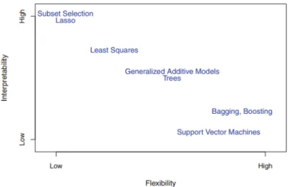
Model interpretation is generally quite straightforward for simple models, like regression or decision trees, where you visually see feature contributions or can follow the tree path. In general, as the flexibility of the algorithm increases, its interpretability decreases (Figure 1).18
Figure 1: A trade-off between flexibility and interpretability in different machine learning algorithms.18
2.3
Regression models
An equation generated by regression analysis describes the statistical relationship between one or several predictors and the response variable.19The output shows how significant are the predictors in the statistical
sense, as well as the regression coefficients, which can also be interpreted. Let’s take a look at a simple example of linear regression on housing prices.
number of rooms (numerical), does the house have a garage (binary) and is the house known as a haunted house (binary). Equation 1 expresses the possible relation between these predictors and the target variable.
y=β0+β1(N umber of rooms) +β2(Garage) +β3(Haunted) + (1)
Say we found the following regression coefficients (Equation 2):
y= 1000 + 150(N umber of rooms) + 200(Garage)−300(Haunted) + (2)
The intercept, i.e. the base price for the house is 1000 eur. Coefficients for numeric variables represent the change in the target due to a unit change in the variable: for each of the rooms in the house an additional 150 eur is added to the price. The other two features are binary, so basically if the house has a garage, it adds another 200 eur, and if the house is believed to be haunted, the final price drops by 300 euro.
A similar logic is used, when interpreting the logistic regression coefficients, only instead of the final value we are getting log odds of a class:
log( p
1−p) =β0+β1x1+β2x2+...+βkxk (3) 2.3.1 Critics
Some works20 are skeptical about the true interpretability of the regression models. They claim, that in the
case of large number of features the evidence for the prediction is often spread out among all the features. As well as in the case of heavily-engineered features, when we sometimes cannot assign an intuitive meaning to them, which makes the explanation useless. However, if the features are intuitively understandable, the high-dimension problem can be solved by methods like Lasso, that aim to minimize the number of non-zero coefficients.
Another criticism of the linear models and another reason for using Lasso is the case when the variables are strongly related linearly. Then there will be many sets of coefficients that fit y equally well, by simply moving weight among the coefficients of these variables. This means that in the presence of colinear variables, their individual weights do not really indicate importance.
2.4
Decision trees
A decision tree survey paper by Loh21 states that the first mention of this algorithm was made in 1963 by Morgan and Sonquist22; they proposed a new method of analyzing the survey data, which was mainly
categorical or could be categorized - a tree.
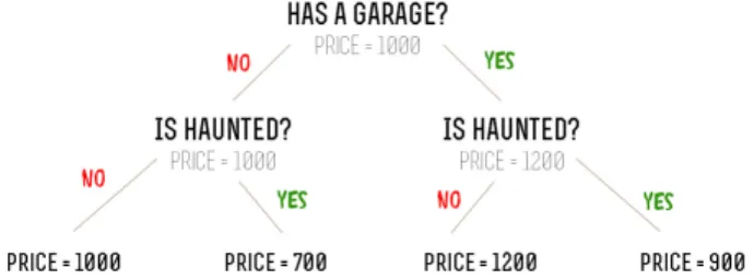
A decision tree is a structure that contains a root node, internal nodes (attribute test), branches (outcome of a test), and terminal nodes (class label). They go from what we have observed in the item (the branches) to conclusions about its target value (the terminal nodes). Decision trees can also be used both for classification and regression. The example of a regression tree is represented in the Figure 2.
Figure 2: An example of a decision tree with a house data - if a house has a garage, the price goes up, if a house is said to be haunted, the price goes down.
There are many well-known tree-based algorithms, such as CART,23 ID3,24C4.525 (extension of ID3),
etc.
A decision tree has great interpretation properties: first, we can actually print a tree and take a look at the model itself, and second - for each of the decision made by the model, there is a traceable decision path, which can also be a lot of help explaining the predictions. The least we can say at the stage of the tree is which features are present and which are absent that contributed to the decision made.
But with all that, there are also some problems with trees: their accuracy sometimes is not that great. Especially deep trees tend to overfit by learning highly irregular patterns. Random Forest algorithm can be used to solve this problem.
2.5
Random Forest
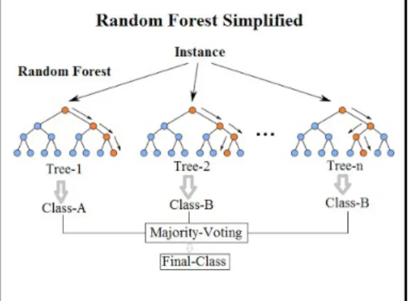
Random forest is an ensemble learning method for classification and regression tasksproposed by Breiman26
in 2001 (Figure 3).
It is one of the machine learning algorithms that is biased more towards accuracy than the interpretability, and is often still treated as a black box. Random Forest tries to reduce the variance by averaging multiple deep decision trees, trained on different random parts of one training set. This noticeably increases the performance of the model compared to the single tree, but also worsens its interpretation properties. Indeed, even for one single decision tree, as it grows, it becomes harder to visualize it (as in Figure 2) for the expert to process and see how the features change the final value, and Random forest almost always contains more than 1000 of simple decision trees. This makes it impossible to visualize and process 1000 different decision
Figure 3: Visual explanation of the Random Forest Algorithm27
paths for each instance by humans in a standard way.
In our work we will be using the Random Forest algorithm and among many ideas of the properties of interpretable model, we will try to follow the one described by Lipton20 in a following way:
1. Transparency (transparency at the level of the entire model, individual components and the level of the training algorithm)
3
Motivation and previous work
It has been said a lot about the importance of the model interpretation. We wanted to participate and develop a project, that can prove the efficiency of our previous and future collaborations with Hospital de Sant Pau and enhance the trust in our predictions.
What we were trying to get was an extensive explanation of the existing model, that is easily comprehen-sible by the people with no special knowledge in computer science or data mining. As well as the numerical there had to be graphical representation and maybe some clues of what can happen next (Figure 4).
Figure 4: The draft of the proposal
3.1
Previous work and description of the data
As already mentioned, there exist other projects with Hospital de Sant Pau i de la Santa Creu, such as frequent pattern mining7 and learning the disease trajectories to see and predict how the patient is going to
develop his condition and what to expect in the future.
The following work is based on one of the previous studies of Evelyn Rovira L´opez4, which addressed the problem of predicting hospital readmissions within 30 days. This is an important problem for both patients and the hospital. The early readmission has a huge psychological impact on the patient, possibly worsening his/her health condition. Moreover, for the hospital early readmission can mean poor quality of the medical care: e.g. may be the adequate care on the earlier admission was not provided, or maybe the patient was released prematurely, or the follow-up after release was inadequate. Not to mention, that readmission (that potentially can be prevented) will cost additional money to the health care system.
Therefore, readmission rates are one of the internationally recognized indicators for indicating attention quality, with the rate within 30 days being a standard. Of course, the hospital wants to lower the readmission rates, as if they could know which patients are at risk to come back, they could follow some steps to prevent the readmission. So the machine learning algorithm that can predict this can possibly help to improve health care quality and reduce the hospital expenses.
3.2
The data
The main data set used in this work was the one used in the previous work. It is a data set of patients diagnosed with heart failure admitted to the Hospital de Sant Pau in the period from 2008 to 2014. It contains 21042 records for 12028 distinct patients. The data set was highly unbalanced, with 88.6% of the records had no readmission in 30 days and 11.4%, on the contrary, did.
The features used in prediction include dates of admission and discharge, a binary variable of was it a planned or emergency admission and a set of patient diagnostics coded in ICD9 system with the average of 9 diagnostics per patient. Some features, that then actually proved to be the most important in the prediction, were constructed, e.g. the number of days the patient spent at the hospital, the current number of patient’s hospital admissions or the number of days since the last admission.
To improve the performance of the classifier, several techniques were used, such as adding or removing the most frequent diagnostics, over or undersampling of the classes and adding feature combinations as new attributes. The results of the study had the best accuracy of the Random Forest model over 0.8.
Model interpretation was not the main topic of the research, so nothing more than listing variables by importance was done. But since the transparency of the model is very important for the experts to be able to trust it (as mentioned in Section 2.2), so in this work we are trying to address this problem.
3.3
Other data sets used
Among the other data sets used for this work we chose the following:
• Dermatology Data Set28 - 33 attributes, 366 instances. Classification problem of 5 classes: diagnosis of erythemato-squamous diseases.
• Breast Cancer Wisconsin (Original) Data Set29 - 10 features, 699 observations. Classification task of predicting if the patient has benign or malignant cancer type. Binary prediction.
• Adult Data Set30- 14 features, 48842 instances. Classical data set with a task of predicting whether
a person makes over 50K a year or not. Binary classification.
• Student Survey Data31 - 12 features, 237 observations. Questions related to the fact of which hand
is a student’s writing hand. Binary prediction.
The reason for choosing these data sets is that the two of the first data sets are related to medicine, and two of the last ones contain data that does not require special knowledge to understand, which is important in the evaluation phase.
Three of the chosen data sets have two classes, and one is multiclass. All the datasets contain both numerical and categorical features, which is important, because we will be working with both (binarizing the categorical and discretizing the numerical).
4
Methodology
First we made a small research and tried the most popular existing methods on the Random Forest model we had.
4.1
Local Interpretable Model-agnostic Explanations (LIME)
One of the most recent and promising works in the field of model interpretation is already mentioned 2016 paper by Ribeiro et al.16 - ”Why Should I Trust You?”: Explaining the Predictions of Any Classifier.
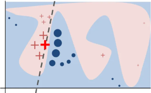
The idea behind this paper is fairly simple, yet very smart: however complex the prediction space is (Figure 5), in order to explain the prediction of one particular point, the authors propose to take the local neighbor points and build a separate small classifier on top of them. This smaller classifier is either a regression or a decision tree classifier, something that can be used later in the interpretation.
Figure 5 from this paper represents the toy example with the unknown complex decision function. Marked by the red cross is the observation to explain, blue background shows the space of the negative class, pink background shows the space of the positive class. The algorithm samples the instances, generates their predictions, weighs them by distance from the initial point (the closer the point, the more important it is). Later this sample is used to train a simple classifier which is locally true (dashed line).
The algorithm is said to be model-agnostic, i.e. it treats the original model as a black box and can work with any possible algorithm.
Figure 5: LIME explanation method16
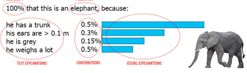
The example that the authors of the paper provide demonstrate the following results (Figure 6) - class probabilities are shown and then the features that contributed to the prediction. E.g. in this example of the Adult revenue data set we can see that the person in question earns less than 50K/year, because his capital gain is 0, because he is younger than 28 and because he works only 30 hours per week:
Figure 6: LIME explanation on Adult revenue data set16
4.1.1 Drawbacks
After the attempt to apply LIME on the San Pau hospital data, the results were very poor. The represen-tation was extraordinary, but the explanations were clearly not correct: predicted one of the classes, all the contributing features were indicating the opposite (Figure 7).
Figure 7: Intractable example of LIME explanation of the Hospital de Sant Pau readmission data
This could happen due to any (or a mixture) of the following reasons:
1. Most likely, the intercept is highly shifted towards one of the classes (“will NOT be back” in this case). This can happen if there is a lot of label imbalance - i.e. “no evidence” is strong enough evidence for a patient to be predicted not to return to the hospital within the next 30 days. The interpretation here is that there are certain strong features that are indicative of the other class (that he will return) but still not enough evidence to counter the huge bias towards “will NOT be back”. The visualization provided is bad in this case, as the intercept is not shown - the authors of the original paper say that they are aware of this problem, but thought that adding the intercept would bring its own set of problems.
The data set indeed has a huge bias, but balancing the data did not change the results we were getting, so we figured out this is not the cause of the problem.
2. There also could be something wrong with the distance function, or with the kernel width (more likely) - if the kernel width is too small, the intercept usually dominates everything else and the explanation is meaningless. The kernel width determines how much to weight perturbed samples according to how far they are from the original instance. The kernel width is a parameter that is chosen internally based on the data, so we don’t have the access to it. Nevertheless, if a kernel width is set such that it is too low, the explanation will only focus on getting the original prediction right (which is too easy, you just set the intercept to the prediction and weight every feature as 0). If the kernel width is too large, then examples close to the prediction and examples far from the prediction have basically the same weight, and thus the
explanation tries to approximate the model globally. This usually means the explanations are not very good.
4.2
Tree interpreter
Another interesting concept was developed by Saabas17- it is the Tree interpreter algorithm. It is specialized
specifically on the Random Forest prediction interpretations. The idea is to trace and process the decision paths of a forest. We know, that for each specific instance we can trace the decision path in a single decision tree. This path allows us to collect contributions of the features used for the particular prediction.
Recalling the idea of the trees, we can say that we know the train set mean on each node of the tree. Then if we calculate how the train set mean is changing when following the prediction path, we can derive the contribution of each feature. In the end we can say, that the prediction is the sum of the train set mean (value at the root node) and all the contributions of the features following its decision path.
f(x) =Cf ull+ K
X
k=1
(contribj(x, k)),17 (4)
where K = the number of features, Cfull - the value at the root of the tree and contrib(x,k) = the contribution from the k-th feature in the feature vector x17
Figure 8: Simple example of a decision tree interpretation
Let’s take a look at the example on the Figure 8. Say we have a house that has a garage and is never said to be haunted. The value in the root of the tree (1000 euro), drawing a parallel to the regression models, can be said to be a bias or the train set mean. Then we are walking down the prediction path and record the contribution of each feature:
• Bias = 1000
• Has a garage = +200
This then can easily be transfered to the Random Forest, we just need to average the contribution vectors for all the trees in the forest:
F(x) = 1 J J X j=1 fj(x),17 (5)
where J = number of trees in the forest. Then the full equation is of the following form:
F(x) = 1 J J X j=1 Cj full+ K X k=1 (1 J J X j=1 (contribj(x, k)))17 (6) 4.2.1 Drawbacks
We applied the described method on the readmission data. One of the obvious drawbacks of this method is its narrow focus. It can only be used for interpreting tree-based algorithms like decision trees or Random Forest. This is good for our case, but can be significant drawback for the cases where Random Forest does not preform well.
Also, as it records the contribution of each attribute, it does not distinguish between the categorical and numerical features. The output of the tree interpreter as-is (Table 1) is not very tractable, as for the categorical features we can actually see if it is present in the observation, for the numerical features at this point we can only say something like “The price of the house (1000) contributes by 0.1 to the probability of the predicted class”. It would be more understandable, if there was some kind of threshold to say - this feature is lower than the threshold, that is why this class is predicted.
Table 1: Example of the tree interpreter output
Feature Contribution
Has a garage -0.02
Price (numerical) 0.1 Number of rooms (numerical) 0.03
5
Development of the proposal
After analyzing strengths and drawbacks of the existing methods, we are ready to try to do the same with some improvements.
5.1
Feature contribution
What we need first is to get is the actual feature contributions that we can demonstrate to the user. The most obvious decision is to use the feature importance that the actual Random Forest produces.
There are several problems related to it. First, Gini index used in the Random Forest feature selection has a strong preference towards attributes with more categories.32 Second, when there are two or more
correlated features, as usual the problem arises. From the point of view of the model, these features are equally good predictor variables and once one of them is used, the other one(s) add no value. Therefore, they will not have contribution as big as they normally would.33 This is not a problem if we are trying to
reduce overfitting, as in that case we are allowed to remove “duplicate features”. But when we want to interpret the prediction, this could lead to false conclusions of superior importance of one of the attributes, when actually they are very close. The random selection of features in Random Forest algorithm helps to slightly reduce this effect, but does not remove it completely.
Also, using these feature importances would give the same contribution values on the same features every time. This is why instead we are going to use the contributions produced by Tree Interpreter.
5.2
Continuous feature visualization
One of the problems that we saw earlier was the fact that we are not dealing with the continuous features. To simplify the work with them, we have made a decision to visualize them. Basically what we did here is re-invent the partial dependence plots. For simplicity reasons we first worked withbinary classification
data sets. Since here we only have two classes (say, 0/1), the visualization is quite simple:
1. Take one instance of class 1 and one instance of class 0.
2. For the numerical feature in question, get all the possible values from the train set. If the set of values is too large, reduce to chosen number (e.g. 100).
3. For the two instances get the prediction of the classifier for all possible values of the attribute, average them and plot.
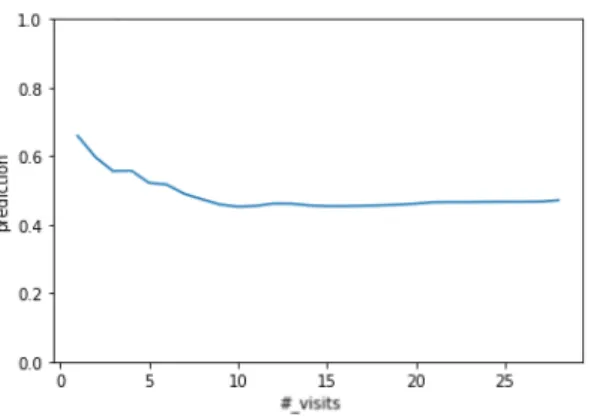
Figure 9: Example of continuous feature visualization for binary case
As we can see in Figure 9, feature “number of visits of a patient” in the readmission data set changes the following way: it is more leaned towards class 1 (will return within 30 days) with a small number of visits. But as the patient reaches 10 visits, afterwards the feature doesn’t really change much. In order to get the predictions less biased towards one specific instance, we were later taking N instances of both class and averaging them.
The case, where there aremultiple classes is harder, since we cannot generalize the data into “Class 1” and all other classes, as the feature might behave really different in each of them. To solve this problem, we did the same thing as in binary case, but for each pair of the classes. Recall, that random forest predicts the probability of each class, we then can extract the top two most possible classes and use the appropriate representation.
All this of course can be precomputed and will not take any of the user waiting time.
Also, should be mentioned that maybe this idea in multiclass classification would be more adequate if we had a classification of a healthy person. Because in a sense, healthy person can be counterposed to most of the multiclass classification problems in medicine (e.g. the one we have - predict a dermatology diagnosis, or predict a type of cancer). For now we leave this to future work.
5.3
Continuous feature discretization
Classification learning algorithms typically use heuristics to guide their search through the large space of possible relations between combinations of attribute values and classes. One such heuristics uses the notion of selecting attributes locally minimizing the information entropy of the classes in a data set (e.g. ID3 algorithm34 and its extensions, like CART23 and others). The attributes in a learning problem may be categorical or numerical (continuous). The mentioned attribute selection process assumes all attributes to be categorical, so numerical values should be discretized prior to selection.
A continuous attribute is typically discretized during decision tree generation by partitioning its range into two intervals. A threshold value, T is determined for continuous feature A and the test A ≥ T is assigned to the left branch, whileA > T is assigned to the right branch. For every node of the tree, the best threshold point T is selected by evaluating all the possible candidates for T from its range of values (all the possible midpoints between the two successive points). For each candidate, the data is partitioned in two sets and the class entropy is computed.
At this point all we have is the contribution of the continuous feature, but don’t have any kind of threshold. Here are some possible methods to obtain it.
5.3.1 Random Forest cut
Recalling the original idea by Saabas17, to get the contribution of features for the specific individual, we are
averaging the contributions of the features in each of the decision trees in the Random Forest. One of the intuitive solutions that comes to mind when speaking of continuous feature discretization is to do the same: for each of the decision trees trace the paths and record the average threshold for each of the continuous features.
There are some obvious advantages and disadvantages of this method. On the plus side it is fairly simple and takes the actual threshold values used by the Random Forest algorithm. Therefore, we can take the feature contribution values straight from the tree interpreter algorithm, only adding the threshold, to make the explanation more meaningful: instead of “Height, contribution = 0.3” we can have something like “Height<1.6m, contribution = 0.3”. Now we are able to see that not only the existence of the feature “Height” contributed to the prediction, but actually the fact that the height of this person is lower than 1.6 meters.
Speaking of the disadvantages, the feature thresholds can significantly vary among the trees. For example, we divide people into age groups: one tree can say that people aged under 6 are children, and the other one say people under 18 are children. The proposed method will have the average, i.e. 12 years old as a threshold for the feature “age”.
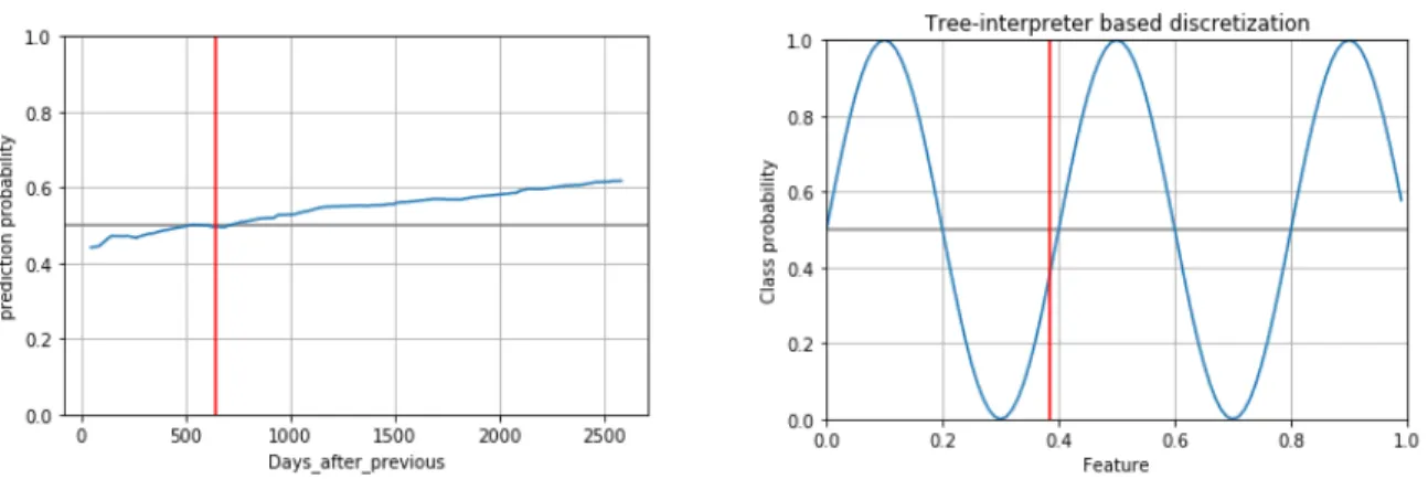
This method only outputs one threshold per feature, as demonstrated in Figure 10 (More examples can be found in the Figure 16 in the Appendix):
As can be seen in the figure above, the method works pretty well if the feature has more or less linear behavior or is at least monotonic (Figure 10 on the left). In all the other cases obviously one cut is not enough (Figure 10 on the right).
Figure 10: Example of a Random Forest based cut.
“Days after previous admission” feature of the real hospital data (on the left), artificial data (on the right)
5.3.2 Simple intuitive methods
When speaking of continuous features discretization, it is necessary to mention some simple methods, such as partitioning into K equal lengths/width (equal intervals) or partitioning into K% of the total data (equal frequencies quartile cut).35
Figure 11: Equal-width bins (on the left) in a contrast with equal-frequency bins (or quartile cut, on the right)
Also on the negative side, the first method requires user defined number of partitions. The second method in the Figure 11 (on the right) seems to be capturing the crossing of 0.5 threshold, but this is actually a coincidence - in this case there is by chance the same amount of patients in the hospital that were admitted to the hospital 1-2 times and of people who were admitted 2-30 times.
contribRn=mean(Rn)−0.5, (7)
Figure 12: Calculating contributions in the equal intervals and equal frequencies quartile cuts
Nevertheless, this methods can be useful due to their simplicity. In this case we can derive feature contributions straight from the data (Formula 7 and Figure 12 below) and then recalculate the contributions in such a way that they add up to the class probability.
This method produces even more tractable explanation, such as “Number of visits is > 7 and < 14, contribution = -0.5” (Figure 7, second region).
More examples of this methods are presented in the Figures 17 and 18 in the Appendix.
5.3.3 Multi-Interval Discretization of Continuous-Valued Attributes for Classification Learn-ing
Nevertheless, the results produced by all the mentioned methods are not very satisfactory. Random Forest cut captures only one of the change points (Figure 13, on the left), when the two other cuts don’t at all capture the actual points of changes in the data, they just divide it into several intervals (Figure 11).
Figure 13: Example of a feature, that is not easy to discretisize. Random Forest cut on the left, MDLP cut on the right.
Research in the existing continuous features discretization methods led us to Multi-Interval Discretization of Continuous-Valued Attributes for Classification Learning (MDLP) paper by Fayyad and Irani36. The idea of the paper is rather than examining N-1 cut points of the numerical feature, we should only be examining
several “boundary points”, defined as a value between two consecutive points that are of a different class. This way we can see considerable efficiency increase and several cut points as an output, instead of classical one.
The contributions are then derived as in the previous method (Figure 12). We have decided that this method is the best for our purposes.
More graphs of MDLP cut can be found in Figure 19 in the Appendix.
5.4
Frequent itemsets
Another idea implemented was based on the concept of Krause et al.1 that it is not obligatory to explain the
model itself, it is sometimes enough to show how the change of the inputs affects the prediction. In our case, we will both explain the model and show the possible difference in the output. We wanted to use frequent itemsets to estimate possible future changes in the observation (person, patient, etc.) and how will these changes affect the prediction. The initial idea was to be able to say something like: ”This person does not have diabetes because his blood tests are alright. He doesn’t smoke, but people with similar profiles tend to smoke. If he starts to smoke, the risk of him getting a diabetes will rise by N%.”
The frequent itemsets with corresponding support were calculated using Formula 8.
supp({X, Y}) = |{o∈D;{X∪Y} ⊆o}|
D , (8)
where o = observation, D = data, X and Y = items.
Let’s look at the toy example based on the tables 2 and 3. Frequent itemsets were derived from the data, and the following can be said about the observation in Table 3:
Table 2: Frequent itemsets Itemset Support A, B, C 0.8 D, F 0.6 E, X 0.4
Table 3: Observation example
A B C D E F X
observation 1 1 0 0 1 1 0
• A and B are present but C is not, so by itemset 1 there is 80% chance that C is also going to be present in the future;
• E is present, so by itemset 3 there is 40% chance that X is also going to be present;
• F is present, so by itemset 2 there is 60% chance that D is also going to be present (see Table 4).
But not only we are saying what feature the person is most likely going to develop in the future, we are also predicting the change in class probabilities. Say for our example we predicted Class 2. Then (see Table 4), if C is present, we are even more sure, that its Class 2 (its probability is going up by 1%, and the other ones are dropping). Whereas, if X or D is present, the predicted probability of Class 2 is going down slightly, with the probabilities of Class 1 and Class 2 respectively, going up (second and third rows).
This technique is developed by me and can be used as an additional interpretation for any kind of model and for any number of classes.
Table 4: Effect on prediction
Is present Support Likely to have Class 1 Class 2 Class3
1 A, B 0.8 C -0.05 +0.01 -0.02
2 E 0.4 X +0.04 -0.02 -0.03
3 F 0.6 D -0.02 -0.05 +0.02
Separately should be mentioned, that classical frequent itemset algorithms only take into account cate-gorical features of the data. But after continuous feature discretization described in Section 5.3, we are able to take into account and describe complex itemsets, that contain categorical features, such as for example “80% of the time Men, Age between 60 and 75 and over 10 hospital admissions appear together”.
In this work for simplicity reasons we are not deriving the association rules, we are only using the frequent itemsets themselves, treating them as a whole set that appears together in N% of the data. This is not the best solution, because we are only using support and not taking into account confidence. The association rules can be added in the future work.
5.5
Instances to explain
The idea of the explanation system is to be able to interpret a particular instance the expert is interested in - e.g. one customer at a time for a manager in the bank, one patient at a time for a doctor in the hospital. In this case we don’t have to worry about picking the observations - the user is doing it by him/herself.
But there is also a case when we need more or less to evaluate and assess trust in the predictive model as a whole, for example during the model construction (to see if the prediction is making sense) or when you want to demonstrate the predictive system to a new expert, etc.
To give a global understanding of the model we want to interpret a set of individual instances. In this case arises the question of how to pick them. There are several ways to approach this problem.
1. Select randomly. The simplest method, picks at random N instances for the expert to observe. N is set manually to be an adequate number for the expert to process. Is the most useful when the number of classes is 10 and therefore we cannot use any of the other selection methods. Can be used both in classification and regression methods.
2. Select one instance of each class. An intuitive solution, to pick one instance of each of the prediction classes. In order to see the usefulness of the interpretation, instances with the highest probability should be chosen. This method can only be used in classification, and works best when the number of classes is small (because the expert should be able to read through all the explanations).
3. Select based on distance. One of the interesting idea was a simplified version of the submodular pick (Figure 14), proposed in the paper of Ribeiro et al.16. The original idea uses a greedy optimization algorithm that selects instances which cover all the features (both continuous and categorical) and makes sure that the most important feature is different, as shown in the Figure below.
Figure 14: Submodular pick for model explanation.16
Features are binary, the most important feature is highlighted by a dashed line. Two instances in red are the ones to be picked for the explanation.
The original idea was simplified by only taking into account categorical values. This is possible due to the nature of our data - in the data set of San Pau hospital the majority of features are categorical, therefore can be binarized. Then we are calculating a distance matrix for all the observations (Jaccard coefficient can be used due to binary features) and selecting any two individuals that have the maximum distance between them.
Unfortunately, our simplified version can be used only for binary classification. It is possible to find two instances that have the maximum distance between them, but as the number of classes grows, it becomes harder as you need to find 3 or more instances that are on the equal distance from each other and cover each different set of features.
Table 5 shows all the selection methods and the cases they are appropriate to be used in. In this work all of the methods were used depending on the data set in question.
Table 5: Instance selection methods
Randomly One of each class Based on distance
Regression l l
Classification l l l
More than 2 classes l l
More than 10 classes l
The examples of the results we got, since they are quite large, with extensive explanations provided are presented in the Appendix in Figures 20 to 22.
6
Correlation and causality
One of the things that have to be mentioned is the difference between correlation and causality. It has been discussed a lot and a lot of examples have been made to demonstrate this two things as not at all the same (Figure 15).
Of course, this is an example of a correlation occurring purely by chance. More tricky are correlations between two things A and B that make sense, but neither A is cause of B nor B is cause of A. For example, having yellow fingers and having lung cancer are correlated, but neither is the cause of the other. A third variable, heavy smoking, is a cause of both.
Figure 15: Example of a correlation that is not causality.37 Data sources: U.S. Office of
Management38and Budget and Centers for Disease Control & Prevention39
There are two basic kinds of medical studies that provide evidence of correlation - observational and experimental. Observational studies are the ones where the large population is being observed, but no intervention is made in the variables. In the experimental studies (for example new treatment tests), on the other hand, there are usually fewer people to observe but there is a possibility to control the variables -e.g. give the real medicine to one group of people and placebo to the control group. Observational studies usually give more evidence, as they are based on the large groups of people, but in the experimental studies there can (but not necessarily will) actually be assumed causality.
In our case, the readmission data of the Hospital de Sant Pau i de la Santa Creu can only be considered observational. There are some patient data and recorded medical test results. Generally, it is not possible for obvious reasons to get the data like this with controlled variables - we cannot on purpose do something for one person to be readmitted and for the other one not, or treat one condition and not the others. Therefore, all the analysis in this study imply correlation and not causality.
Therefore, the associations that machine learning algorithms produce are not guaranteed to be causal. There could also always be some variables we are not observing, that are in fact responsible for both associated variables. Nevertheless, after a large number of discussions40 41we can say that currently in medical sciences
field correlations remain very useful to suggest causal relations, as they are actually the evidence for causal relations.42 Using found correlations we may hope to generate a hypothesis that could then be somehow
tested and proved.
There also exists a whole field called causal discovery.43 44 It is very active and could be an avenue for
7
Evaluation
One of the crucial drawbacks of the work on the model interpretation is the difficulty of its evaluation. There is no possible way of examining the quality of the explanations, rather than by human reading through the obtained interpretations. Even that can be challenging if the accuracy of the initial model is rather low, as in our case with the data of San Pau hospital.
The results of our work were presented to the doctors of the San Pau hospital. We demonstrated the work of the system on the readmission data set as well as on the dermatology data set (that was predicting one of the 5 diagnosis on the base of patient’s symptoms). They found the results very interesting and applicable to their work processes. Some of the conclusions of the meeting were:
• The most interesting part, unexpectedly, was the part of the interpretation, where we show the absence of features that contributes to the prediction. It was said that they know pretty well the features that contribute to the prediction, as they are usually the symptoms of the disease, but would like to know more about what is absent that contributes to the diagnosis.
• The whole visualization, including visualization of the continuous features, was found very under-standable by people who are not specialized in computer science.
• The frequent itemset part was also found very impressive, and said to be very applicable in the field of getting the common disease trajectories, also a hot research topic, as it shows what the patient is likely to get next and with what percentage.
• One of the main improvement that was requested by the client was instead of using the ICD9 codes, which are used mainly for the administrative purposes and not by the actual doctors (in fact, some codes are identical from the medical point of view), use some other classification, which is more used in medical practice and where similar codes are clustered into groups. According to them, that would immediately make all results more interpretable clinically.
8
Conclusions and future work
In this work we recalled the notion of model transparency, analyzed the existing methods of model inter-pretation and pointed out their drawbacks. Then, using the best from the current approaches and trying to avoid their negative sides, we made an attempt to construct the explanation system for decision support, that improves the existing solutions. This was reached by adding multiple thresholds instead of a single one to the numerical values to enhance their interpretation, adding the possible trajectories with frequent itemset predictions and adding the possibility to explain the whole data set in an intelligent way by several methods of selecting the explanation instances.
We managed to follow more or less all the conditions of interpretable model of Lipton20 mentioned in Section 2.2: the model is transparent on all levels and is well interpreted by text and visualizations.
As mentioned in the Introduction, Krause et al.1 lists all the reasons for model interpretability, but
mentions that it is not always necessary, giving the example of a face recognition task. I disagree, I think at least the model diagnostics is crucial for any type of system. During this work I realized how easy it is to make mistakes and how nice it is to be able to spot them almost instantly - at least to see that the accuracy is around 0.99 just because the strongest predictor variable is the class itself, or to see that the patient ID is treated as a numerical value - of course, these are the type of mistakes that are not too bad and will be found eventually, but here you can actually visually see them. And to give a face recognition system as an example of a task that does not need interpretation in my opinion is a bit wrong since the article was written a year after the famous Google Photos tagging mistake.45
8.1
Future work
• The most important: invent a way of evaluating the accuracy or at least relevancy of the interpre-tation. Authors of the LIME paper16 were hiring people from Amazon Mechanical Turk to rate the explanation of several interpreters. We don’t have the resources to do that, especially with the specialization in medicine.
• If we have a way to evaluate the performance, we can try to change the way the explaining system works. For example, Random Forest algorithm in Sci Kit learn has a built in feature importances function. Will the performance improve, if we weigh the contributions by the feature importances?
• May be we will be able to get a characteristics of a healthy person. Is the healthy person the one, that doesn’t have any of the conditons diagnosed? If we get the understanding of this, we will be able to visualize the multiclass numerical features more correctly.
• Also we can try to add a simplified idea of Krause et al.1 - to visualize a numerical feature as a slider with a possibility for the expert to change its value and show how it is going to affect the prediction. Obviously, the feature that we are able to affect in real life - not the age, but something like hours of sleep.
• Instead of partial dependence plots for feature visualization try Individual Conditional Expectation (ICE) plots by Goldstein et al.46, that work much better when there are strong relationships between
many input variables.
• Apply the same principle to other tree algorithms, like xgboost. We recently found an existing very recent implementation of the similar method on xgboost,47maybe it can also be improved.
The datascience.com also recently (May 2017) presented the Skater library,48 that is based on LIME
and is basically also a library for black box models interpretation. The fact of growing number of relevant recent works proves model interpretation as a hot topic and confirms its relevance in the modern research.
References
(1) Krause, J.; Perer, A.; Bertini, E. Using Visual Analytics to Interpret Predictive Machine Learning Models.CoRR 2016,http://arxiv.org/abs/1606.05685.
(2) Catalunya, U. U. P. d. Laboratory for Relational Algorithmics, Complexity and Learning. LARCA UPC. Universitat Politcnica de Catalunya. 2016;https://recerca.upc.edu/larca/en.
(3) Hospital de la Santa Creu i Sant Pau.http://www.santpau.cat/en/.
(4) Rovira L´opez, E. Prediccin de reingresos de pacientes hospitalarios. Trabajo de Fin de Grado, 2016.
(5) Taylor, P. Personal Genomes: When consent gets in the way.Nature 2008,456, 32–33.
(6) Jensen, P.; Jensen, L.; Brunak, S. Mining electronic health records: towards better research applications and clinical care. Nature Reviews. Genetics 2012, 13, 395–405.
(7) Zamora, M.; Baradad, M.; Amado, E.; Cordomi, S.; Limon, E.; Ribera, J.; Arias, M.; Gavald`a, R. Characterizing chronic disease and polymedication prescription patterns from electronic health records. 2015 IEEE International Conference on Data Science and Advanced Analytics, DSAA 2015, Campus des Cordeliers, Paris, France, October 19-21, 2015. 2015; pp 1–9.
(8) Moon, H.; Ahn, H.; Kodell, R. L.; Baek, S.; Lin, C.-J.; Chen, J. J. Ensemble methods for classification of patients for personalized medicine with high-dimensional data. Artificial Intelligence in Medicine
2007,41, 197–207.
(9) Caruana, R.; Lou, Y.; Gehrke, J.; Koch, P.; Sturm, M.; Elhadad, N. Intelligible Models for HealthCare: Predicting Pneumonia Risk and Hospital 30-day Readmission. Proceedings of the 21th ACM SIGKDD International Conference on Knowledge Discovery and Data Mining. New York, NY, USA, 2015; pp 1721–1730.
(10) Bradley, E. H.; Curry, L.; Horwitz, L. I.; Sipsma, H.; Wang, Y.; Walsh, M. N.; Goldmann, D.; White, N.; Pina, I. L.; Krumholz, H. M. Hospital Strategies Associated With 30-Day Readmission Rates for Patients With Heart Failure. Circulation: Cardiovascular Quality and Outcomes 2013,6, 444–450.
(11) Dickey, M. R. Algorithmic accountability. 2017; https://techcrunch.com/2017/04/30/ algorithmic-accountability/.
(12) Hall, P.; Phan, W.; Ambati, S. Ideas on interpreting machine learning. 2017;https://www.oreilly. com/ideas/ideas-on-interpreting-machine-learning.
(13) Deo, R. C. Machine Learning in Medicine.Circulation 2015,132, 1920–1930.
(14) Mole Mapper. https://www.ohsu.edu/xd/health/services/dermatology/war-on-melanoma/ mole-mapper.cfm.
(15) Brouillette, M. AI diagnostics are coming. 2017; https://www.technologyreview.com/s/604271/ deep-learning-is-a-black-box-but-health-care-wont-mind/.
(16) Ribeiro, M. T.; Singh, S.; Guestrin, C. ”Why Should I Trust You?”: Explaining the Predictions of Any Classifier. CoRR2016,http://arxiv.org/abs/1602.04938.
(17) Saabas, A. Interpreting random forests. 2014; http://blog.datadive.net/ interpreting-random-forests/.
(18) James, G.; Witten, D.; Hastie, T.; Tibshirani, R.An introduction to statistical learning: with applica-tions in R; Springer, 2013.
(19) Frost, J. How to Interpret Regression Analysis Results: P-values and Co-efficients. 2013; http://blog.minitab.com/blog/adventures-in-statistics-2/ how-to-interpret-regression-analysis-results-p-values-and-coefficients.
(20) Lipton, Z. C. The Mythos of Model Interpretability.CoRR2016,http://arxiv.org/abs/1606.03490.
(21) Loh, W.-Y. Fifty Years of Classification and Regression Trees. International Statistical Review 2014, 82, 329–348.
(22) Morgan, J. N.; Sonquist, J. A. Problems in the analysis of survey data, and a proposal.Journal of the American Statistical Association 1963,58, 415–434.
(23) Breiman, L.; Friedman, J.; Olshen, R.; Stone, C.Classification and Regression Trees; Wadsworth and Brooks: Monterey, CA, 1984.
(24) Quinlan, J. R. Induction of Decision Trees.Mach. Learn.1986,1, 81–106.
(25) Quinlan, J. R.C4.5: Programs for Machine Learning; Morgan Kaufmann Publishers Inc.: San Fran-cisco, CA, USA, 1993.
(26) Breiman, L. Random Forests.Mach. Learn.2001,45, 5–32.
(27) Random Forests. 2017; https://sainsfilteknologi.wordpress.com/2017/03/01/ random-forests/.
(28) UCI Machine Learning Repository: Dermatology Data Set. http://archive.ics.uci.edu/ml/ datasets/dermatology.
(29) UCI Machine Learning Repository: Breast Cancer Wisconsin (Original) Data Set.http://archive. ics.uci.edu/ml/datasets/BreastCancerWisconsin%28Original%29.
(30) UCI Machine Learning Repository: Adult Data Set. https://archive.ics.uci.edu/ml/datasets/ adult.
(31) Rdatasets: Student Survey Data. https://vincentarelbundock.github.io/Rdatasets/doc/MASS/ survey.html.
(32) Strobl, C.; Boulesteix, A.-L.; Zeileis, A.; Hothorn, T.BMC Bioinformatics 2007,8, 25.
(33) Gregorutti, B.; Michel, B.; Saint-Pierre, P. Correlation and variable importance in random forests. Statistics and Computing 2016,27, 659–678.
(34) Quinlan, J. R. Induction of Decision Trees.Mach. Learn.1986,1, 81–106.
(35) Clarke, E. J.; Barton, B. A. Entropy and MDL discretization of continuous variables for Bayesian belief networks.International Journal of Intelligent Systems 2000,15, 61–92.
(36) Fayyad, U. M.; Irani, K. B. Multi-Interval Discretization of Continuous-Valued Attributes for Classifi-cation Learning. IJCAI. 1993; pp 1022–1029.
(37) 15 Insane Things That Correlate With Each Other. http://www.tylervigen.com/ spurious-correlations.
(38) Survey of State Research and Development Expenditures.https://www.census.gov/econ/overview/ go3400.html.
(39) CDC - Centers for Disease Control and Prevention.https://wonder.cdc.gov/.
(40) Pearl, J.Causality: Models, Reasoning and Inference, 2nd ed.; Cambridge University Press: New York, NY, USA, 2009.
(41) Evidence in Medicine: Correlation and Causation. 2009; https://sciencebasedmedicine.org/ evidence-in-medicine-correlation-and-causation/.
(42) Russo, F. Causation and Correlation in Medical Science: Theoretical Problems. Handbook of the Philosophy of Medicine2017, 839849,https://link.springer.com/referenceworkentry/10.1007/ 978-94-017-8706-2_46-1.
(43) Spirtes, P.; Zhang, K. Causal discovery and inference: concepts and recent methodological advances. Applied Informatics 2016,3.
(44) Spirtes, P. Introduction to Causal Inference.J. Mach. Learn. Res.2010,11, 1643–1662.
(45) Zhang, M. Google Photos Tags Two African-Americans As Gorillas Through Fa-cial Recognition Software. 2015; https://www.forbes.com/sites/mzhang/2015/07/01/ google-photos-tags-two-african-americans-as-gorillas-through-facial-recognition-software/ #1d604b81713d.
(46) Goldstein, A.; Kapelner, A.; Bleich, J.; Pitkin, E. Peeking Inside the Black Box: Visualizing Statistical Learning With Plots of Individual Conditional Expectation. Journal of Computational and Graphical Statistics 2015,24, 4465.
(47) Explaining XGBoost predictions on the Titanic dataset. 2017; http://eli5.readthedocs.io/en/ latest/tutorials/xgboost-titanic.html.
(48) DataScience, Data Science Tools — Skater Model Interpretation Python Library. 2017;https://www. datascience.com/resources/tools/skater.
Appendix
Figure 16: Continuous features discretization using Random Forest
Figure 18: Equal frequencies quartile cut