Dimensionality Reduction for Data Visualization
Samuel Kaski and Jaakko Peltonen
Dimensionality reduction is one of the basic operations in the toolbox of data-analysts and de-signers of machine learning and pattern recognition systems. Given a large set of measured variables but few observations, an obvious idea is to reduce the degrees of freedom in the measurements by representing them with a smaller set of more “condensed” variables. Another reason for reducing the dimensionality is to reduce computational load in further processing. A third reason is visual-ization. “Looking at the data” is a central ingredient ofexploratory data analysis, the first stage of data analysis where the goal is to make sense of the data before proceeding with more goal-directed modeling and analyses. It has turned out that although these different tasks seem alike their solution needs different tools. In this article we show that dimensionality reduction to data visualization can be represented as an information retrieval task, where the quality of visualization can be measured by precision and recall measures and their smoothed extensions, and that visualization can be optimized to directly maximize the quality for any desired tradeoff between precision and recall, yielding very well-performing visualization methods.
HISTORY
Each multivariate observation xi = [xi1, ...xin]T is a point in an n-dimensional space. A key idea
in dimensionality reduction is that if the data lies in a d-dimensional (d <n) subspace of the n -dimensional space, and if we can identify the subspace, then there exists a transformation which loses no information and allows the data to be represented in a d-dimensional space. If the data lies in a (linear) subspace then the transformation is linear, and more generally the data may lie in a
d-dimensional (curved) manifold and the transformation is non-linear.
Among the earliest methods are so-called Multidimensional Scaling (MDS) methods [1] which try to position data points into ad-dimensional space such that their pairwise distances are preserved as well as possible. If all pairwise distances are preserved, it can be argued that the data manifold has been identified (up to some transformations). In practice, data of course are noisy and the solution is found by minimizing a cost function such as the squared loss between the pairwise distances,
EMDS=∑i,j(d(xi,xj)−d(x′i,x′j))2, where thed(xi,xj)are the original distances between the pointsxi
andxj, and thed(x′i,x′j)are the distances between their representationsx′iandx′jin thed-dimensional
space.
MDS comes in several flavors that differ in their specific form of cost function and additional con-straints on the mapping, and some of the choices give familiar methods such as Principal Components Analysis or Sammon’s mapping as special cases.
Neural computing methods are other widely used families of manifold embedding methods. So-called Autoencoder Networks (see, e.g., [2]) pass the data vector through a lower-dimensional bot-tleneck layer in a neural network which aims to reproduce the original vector. The activities of the
neurons in the bottleneck layer give the coordinates on the data manifold. Self-Organizing Maps (see [3]), on the other hand, directly learn a discrete representation of a low-dimensional manifold by positioning weight vectors of neurons along the manifold; the result is a discrete approximation to principal curves or manifolds, a non-linear generalization of principal components [4].
In 2000 a new manifold learning boom was begun after publication of two papers in Science show-ing how to learn nonlinear data manifolds. Locally Linear Embeddshow-ing [5] made, as the name reveals, locally linear approximations to the nonlinear manifold. The other, called Isomap [6], is essentially MDS tuned to work along the data manifold. After the manifold has been learned, distances will be computed along the manifold. But plain MDS tries to approximate distances of the data space which do not follow the manifold, and hence plain MDS will not work in general. That is why Isomap starts by computing distances along the data manifold, approximated by a graph connecting neighbor points. Since only neighbors are connected, the connections are likely to be on the same part of the manifold instead of jumping across gaps to different brances; distances along the neighborhood graph are thus decent approximations of distances along the data manifold known as “geodesic distances”.
A large number of other approaches have been introduced for learning of manifolds during the past ten years, including methods based on spectral graph theory and based on simultaneous variance maximization and distance preservation.
CONTROVERSY
Manifold learning research has been criticized for lack of clear goals. Many papers introduce a new method and only show its performance by nice images of how it learns a toy manifold. A famous example is the “Swiss roll,” a two-dimensional data sheet curved in three dimensions into a Swiss roll shape. Many methods have been shown capable of unrolling the Swiss roll but few have been shown to have real applications, success stories, or even to quantitatively outperform alternative methods.
One reason why quantitative comparisons are rare is that the goal of manifold embedding has not always been clearly defined. In fact, manifold learning may have several alternative goals depending on how the learned manifold will be used. We focus on one specific goal, data visualization, intended for helping analysts to look at the data and find related observations during exploratory data analysis. Data visualization is traditionally not a well-defined task either. But it is easy to observe empiri-cally [7] that many of the manifold learning methods are not good for data visualization. The reason is that they have been designed to find ad-dimensional manifold if the inherent dimensionality of data isd. For visualization, the display needs to haved=2 ord=3; that is, the dimensionality may need to be reduced beyond the inherent dimensionality of data.
NEW PRINCIPLE
It is well-known that a high-dimensional data set cannot in general be faithfully represented in a lower-dimensional space, such as the plane withd=2. Hence a visualization method needs to choose what kinds of errors to make. The choice naturally should depend on the visualization goal; it turns out that under a specific but general goal the choice can be expressed as an interesting tradeoff, as we will describe below.
When the task is to visualize which data points are similar, the visualization can have two kinds of errors (Figure 1): it can miss some similarities (i.e. it can place similar points far apart as false negatives) or it can bring dissimilar data points close together as false positives. If we know the
false positives Input space
miss
Output space (visualization)
*
*
*
i iQ
P
x
y
i i*
*
*
Figure 1: A visualization can have two kinds of errors (from [9]). When a neighborhood Pi in the
high-dimensional input space is compared to a neighborhoodQi in the visualization, false positives
are points that appear to be neighbors in the visualization but are not in the original space; misses
(which could also be called false negatives) are points that are neighbors in the original space but not in the visualization.
cost of each type of error, the visualization can be optimized to minimize the total cost. Hence, once the user gives the relative cost of misses and false positives, it fixes visualization to be a well-defined optimization task. It turns out [8, 9] that under simplifying assumptions the two costs turn into
precisionandrecall, standard measures between which a user-defined tradeoff is made in information retrieval.
Hence, the task of visualizing which points are similar can be formalized as a task of visual information retrieval, that is, retrieval of similar points based on the visualization. The visualization can be optimized to maximize information retrieval performance, involving as an unavoidable element a trade-off between precision and recall. In summary, visualization can be made into a rigorous modeling task, under the assumption that the goal is to visualize which data points are similar.
When the simplifying assumptions are removed the neighborhoods are allowed to be continuous-valued probability distributions pi j of point j being a neighbor of pointi. Then it can be shown that suitable analogues of precision and recall are distances between the neighborhood distributions pin the input space and q on the display. More specifically, the Kullback-Leibler divergence D(pi,qi)
reduces under simplifying assumptions to recall andD(qi,pi)to precision. The total cost is then
E=λ
∑
i
D(pi,qi) + (1−λ)
∑
jD(qi,pi), (1)
whereλ is the relative cost of misses and false positives. The display coordinates of all data points are then optimized to minimize this total cost; several nonlinear optimization approaches could be used, we have simply used conjugate gradient descent. This method has been called NeRV for Neighbor Retrieval Visualizer [8, 9]. Whenλ =1 the method reduces to Stochastic Neighbor Embedding [10], an earlier method which we now see maximizes recall.
Figure 2: Tradeoff between precision and recall in visualizing a sphere (from [9]). Left: the three-dimensional location of points on the three-three-dimensional sphere is encoded into colors and glyph shapes. Center: two-dimensional visualization that maximizes recall by squashing the sphere flat. All original neighbors remain close-by but false positives (false neighbors) from opposite sides of the sphere also become close-by. Right: visualization that maximizes precision by peeling the sphere surface open. No false positives are introduced but some original neighbors are missed across the edges of the tear.
Visualization of a simple data distribution makes the meaning of the tradeoff between precision and recall more concrete. When visualizing the surface of a three-dimensional sphere in two dimen-sions, maximizing recall squashes the sphere flat (Figure 2) whereas maximizing precision “peels” the surface open. Both solutions are good, but have different kinds of errors.
Both nonlinear and linear visualizations can be optimized by minimizing (1). The remaining prob-lem is how to define the neighborhoods p; in the absence of more knowledge, symmetric Gaussians or more heavy-tailed distributions are justifiable choices. An even better alternative is to derive the neighborhood distributions from probabilistic models that encode our knowledge of the data, both prior knowledge and what was learned from data.
Deriving input similarities from a probabilistic model has recently been done in Fisher Informa-tion Nonparametric Embedding [11], where the similarities (distances) approximate Fisher informa-tion distances (geodesic distances where the local metric is defined by a Fisher informainforma-tion matrix) derived from nonparametric probabilistic models. In related earlier work [12, 13], approximated geodesic distances were computed in a ‘learning metric’ derived using Fisher information matrices for a conditional class probability model. In all these works, though, the distances were given to standard visualization methods, which have not been designed for a clear task of visual information retrieval. In contrast, we will combine the model-based input similarities to the rigorous precision-recall approach to visualization. Then the whole procedure corresponds to a well-defined modeling task where the goal is to visualize which data points are similar. We will next discuss this in more detail in two concrete applications.
APPLICATION 1: VISUALIZATION OF GENE EXPRESSION COMPENDIA
FOR RETRIEVING RELEVANT EXPERIMENTS
In the study of molecular biological systems, behavior of the system can seldom be inferred from first principles either because such principles are not known yet or because each system is different. The study needs to be data-driven. Moreover, in order to make research cumulative, new experiments need to be placed in the context of earlier knowledge. In the case of data-driven research, a key part of that isretrieval of relevant experiments. An earlier experiment, a set of measurements, is relevant if some of the same biological processes are active in it, either intentionally or as side effects.
In molecular biology it has become standard practice to store experimental data in repositories such as ArrayExpress of the European Bioinformatics Institute EBI. Traditionally, experiments are sought from the repository based on metadata annotations only, which works well when searching for experiments that involve well-annotated and well-known biological phenomena. In the interesting case of studying and modeling new findings, more data-driven approaches are needed, and informa-tion retrieval and visualizainforma-tion based onlatent variable modelsare promising tools [14].
Let’s assume that in experimentidatagihave been measured; in the concrete case belowgi will
be a differential gene expression vector, wheregi j is expression level of gene or gene set jcompared to a control measurement. Now if we fit to the compendium a model that generates a probability distribution over the experiments, p(gi,zi|θ), where the θ are parameters of the model which we
will omit below and z are latent variables, this model can be used for retrieval and visualization as explained below. This modeling approach makes sense in particular if the model is constructed such that the latent variables have an interpretation as activities of latent or “underlying” biological processes which are manifested indirectly as the differential gene expression.
Given the model, relevance can be defined in a natural way as follows: Likelihood of experimenti
being relevant for an earlier experiment jis p(gi|gj) =R p(gi|z)p(z|gj)dz. That is, the experiment is
relevant if it is likely that the measurements have arisen as products of the same unknown biological processesz. This definition of relevance can now be used for retrieving the most relevant experiments and, moreover, the definition can be used as the natural probability distribution pin (1) to construct a visual information retrieval interface (Figure 3); in this case the data are 105 microarray experiments from the Array Express database, comparing pathological samples such as cancer tissues to healthy samples.
Above the visual information retrieval idea was explained in abstract concepts, applicable to many data sources. In the gene expression retrieval case of Figure 3, the data were expressions of a priori defined gene sets, quantized into counts, and the probabilistic model was the Discrete Principal Com-ponent Analysis model, also called Latent Dirichlet Allocation, and in the context of texts called a topic model. The resulting relevances can directly be given as inputs to the Neighbor Retrieval Visualizer (NeRV); in Figure 3 a slightly modified variant of the relevances was used, details in [14]. In summary, fitting a probabilistic latent variable model to the data produces a natural relevance measure which can then be plugged as a similarity measure into the visualization framework. Every-thing from start to finish is then based on rigorous choices.
APPLICATION 2: VISUALIZATION OF GRAPHS
Graphs are a natural representation of data in several fields where visualizations are helpful: social net-works analysis, interaction netnet-works in molecular biology, citation netnet-works, etc. In a sense, graphs
bladder carcinoma prostate cancer chrohn’s disease B
A
B
oxidative phosphorylation purine metabolism atp synthesis glycolysisC
Figure 3: A visual information retrieval interface to a collection of microarray experiments visualized as glyphs on a plane (from [14]). A: Glyph locations have been optimized by the Neighbor Retrieval Visualizer so that relevant experiments are close-by. For this experiment data, relevance is defined by the same data-driven biological processes being active, as modeled by a latent variable model (component model). B: Enlarged view with annotations; each color bar corresponds to a biological component or process, and the width tells the activity of the component. These experiments are retrieved as relevant for the melanoma experiment shown in the center. C: The biological components (nodes in the middle) link the experiments (left) to sets of genes (right) activated in them.
A
B
C
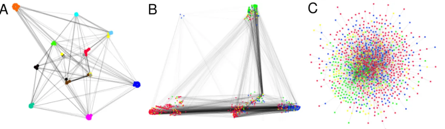
Figure 4: Visualizations of graphs. A: US college football teams (nodes) and who they played against (edges). The visual groups of teams match the 12 conferences arranged for yearly play (shown with different colors). B-C: word adjacencies in the works of Jane Austen. The nodes are words, and edges mean the words appeared next to each other in the text. The NeRV visualization in Bshows visual groups which reveal syntactic word categories: adjectives, nouns and verbs shown in blue, red, and green. The edge bundles reveal disassortative structure which matches intuition, for example, verbs are adjacent in text to nouns or adjectives and not to other verbs. Earlier graph layout methods (Walshaw’s algorithm shown inC) fail to reveal the structure. Figure from [17], cACM, 2010. are high-dimensional structured data where nodes are points and all other nodes are dimensions; the value of the dimension is the type or strength of the link.
There exist lots of graph drawing algorithms, including string analogy-based methods such as Walshaw’s algorithm [15] and spectral methods [16]. Most of them focus explicitly or implicitly on local properties of graphs, drawing nodes linked by an edge close together but avoiding overlap. That works well for simple graphs but for large and complicated ones additional principles are needed to avoid the famous “hairball” visualizations.
A promising direction forward is to learn a probabilistic latent variable model of the graph, in the hope of capturing its central properties, and then focus on visualizing those properties. In the case of graphs, the data to be modeled is which other nodes a node links to. But as the observed links in a network may be stochastic (noisy) measurements such as gene interaction measurements, it makes sense to assume that the links are a sample from an underlying link distribution, and learn a probabilistic latent variable model to model the distributions. The similarity of two nodes is then naturally evaluated as similarity of their link distributions. The rest of the visualization can proceed as in the previous section, with experiments replaced by graph nodes.
Figure 4 shows sample graphs visualized based on a variant of Discrete Principal Components Analysis or Latent Dirichlet Allocation suitable for graphs. With this link distribution-based approach, the Neighbor Retrieval Visualizer places nodes close-by on the display if they link to similar other nodes, with similarity defined as similarity of link distributions. This has the nice side-result that links form bundles where all start nodes are similar and all end nodes are similar.
In summary, the idea is to use any prior knowledge in choosing a suitable model for the graph, and after that all steps of the visualization follow naturally and rigorously from start to finish. In the absence of prior knowledge flexible machine learning models such as the Discrete Principal Compo-nents Analysis above can be learned from data.
CONCLUSIONS
We have discussed dimensionality reduction for a specific goal, data visualization, which has been so far defined mostly only heuristically. Recently it has been suggested that a specific kind of data visualization task, that is, visualization of similarities of data points, could be formulated as a visual information retrieval task, with a well-defined cost function to be optimized. The information retrieval connection further reveals that a tradeoff between misses and false positives needs to be made in visualization as in all other information retrieval. Moreover, the visualization task can be turned into a well-defined modeling problem by inferring the similarities using probabilistic models that are learned to fit the data.
A free software package that solves nonlinear dimensionality reduction as visual information re-trieval, with a method called NeRV for Neighbor Retrieval Visualizer, is available at http://www.cis.hut.fi/projects/mi/software/dredviz/.
AUTHORS
Samuel Kaski([email protected]) is a Professor of Computer Science in Aalto University and Di-rector of Helsinki Institute for Information Technology HIIT, a joint research institute of Aalto Uni-versity and UniUni-versity of Helsinki. He studies machine learning, in particular multi-source machine learning, with applications in bioinformatics, neuroinformatics and proactive interfaces.
Jaakko Peltonen([email protected]) is a postdoctoral researcher and docent at Aalto Univer-sity, Department of Information and Computer Science. He received the D.Sc. degree from Helsinki University of Technology in 2004. He is an associate editor of Neural Processing Letters and has served in program committees of eleven conferences. He studies generative and information theoretic machine learning especially for exploratory data analysis, visualization, and multi-source learning.
References
[1] I. Borg and P. Groenen,Modern Multidimensional Scaling. New York: Springer, 1997.
[2] G. Hinton, “Connectionist learning procedures,” Artificial Intelligence, vol. 40, pp. 185–234, 1989.
[3] T. Kohonen,Self-Organizing Maps. Berlin: Springer, 3rd ed., 2001.
[4] F. Mulier and V. Cherkassky, “Self-organization as an iterative kernel smoothing process,” Neu-ral Computation, vol. 7, pp. 1165–1177, 1995.
[5] S. T. Roweis and L. K. Saul, “Nonlinear dimensionality reduction by locally linear embedding,”
Science, vol. 290, pp. 2323–2326, 2000.
[6] J. B. Tenenbaum, V. de Silva, and J. C. Langford, “A global geometric framework for nonlinear dimensionality reduction,”Science, vol. 290, pp. 2319–2323, 2000.
[7] J. Venna and S. Kaski, “Comparison of visualization methods for an atlas of gene expression data sets,”Information Visualization, vol. 6, pp. 139–154, 2007.
[8] J. Venna and S. Kaski, “Nonlinear dimensionality reduction as information retrieval,” in Pro-ceedings of AISTATS*07, the 11th International Conference on Artificial Intelligence and Statis-tics (JMLR Workshop and Conference Proceedings Volume 2) (M. Meila and X. Shen, eds.), pp. 572–579, 2007.
[9] J. Venna, J. Peltonen, K. Nybo, H. Aidos, and S. Kaski, “Information retrieval perspective to nonlinear dimensionality reduction for data visualization,” Journal of Machine Learning Re-search, vol. 11, pp. 451–490, 2010.
[10] G. Hinton and S. T. Roweis, “Stochastic neighbor embedding,” inAdvances in Neural Informa-tion Processing Systems 14(T. Dietterich, S. Becker, and Z. Ghahramani, eds.), pp. 833–840, Cambridge, MA: MIT Press, 2002.
[11] K. M. Carter, R. Raich, W. G. Finn, and A. O. Hero III, “FINE: Fisher information nonparametric embedding,”IEEE Transactions on Pattern Analysis and Machine Intelligence, vol. 31, no. 11, pp. 2093–2098, 2009.
[12] S. Kaski, J. Sinkkonen, and J. Peltonen, “Bankruptcy analysis with self-organizing maps in learning metrics,”IEEE Transactions on Neural Networks, vol. 12, pp. 936–947, 2001.
[13] J. Peltonen, A. Klami, and S. Kaski, “Improved learning of Riemannian metrics for exploratory analysis,”Neural Networks, vol. 17, pp. 1087–1100, 2004.
[14] J. Caldas, N. Gehlenborg, A. Faisal, A. Brazma, and S. Kaski, “Probabilistic retrieval and vi-sualization of biologically relevant microarray experiments,” Bioinformatics, vol. 25, no. 12, pp. i145–i153, 2009.
[15] C. Walshaw, “A multilevel algorithm for force-directed graph drawing,” inGD ’00: Proceedings of the 8th International Symposium on Graph Drawing, (London, UK), pp. 171–182, Springer-Verlag, 2001.
[16] K. M. Hall, “An r-dimensional quadratic placement algorithm,” Management Science, vol. 17, no. 3, pp. 219–229, 1970.
[17] J. Parkkinen, K. Nybo, J. Peltonen, and S. Kaski, “Graph visualization with latent variable models,” in Proceedings of MLG-2010, the Eighth Workshop on Mining and
Learning with Graphs, (New York, NY, USA), pp. 94–101, ACM, 2010. DOI:
![Figure 1: A visualization can have two kinds of errors (from [9]). When a neighborhood P i in the high-dimensional input space is compared to a neighborhood Q i in the visualization, false positives are points that appear to be neighbors in the visualizati](https://thumb-us.123doks.com/thumbv2/123dok_us/1382551.2685189/3.918.204.717.106.425/visualization-neighborhood-dimensional-neighborhood-visualization-positives-neighbors-visualizati.webp)
![Figure 2: Tradeoff between precision and recall in visualizing a sphere (from [9]). Left: the three- three-dimensional location of points on the three-three-dimensional sphere is encoded into colors and glyph shapes](https://thumb-us.123doks.com/thumbv2/123dok_us/1382551.2685189/4.918.123.803.105.341/figure-tradeoff-precision-visualizing-dimensional-location-dimensional-encoded.webp)
![Figure 3: A visual information retrieval interface to a collection of microarray experiments visualized as glyphs on a plane (from [14])](https://thumb-us.123doks.com/thumbv2/123dok_us/1382551.2685189/6.918.159.766.306.689/figure-information-retrieval-interface-collection-microarray-experiments-visualized.webp)