International Refereed Research Journal www.researchersworld.com Vol.– II, Issue –3, July 2011 [77]
STANDARD FEATURES OF E-COMMERCE USER INTERFACE
FOR THE WEB
Yenny Purwati,
Faculty of Economics and Business Satya Wacana Christian University
Indonesia
ABSTRACT
The web interface becomes a major success factor since customers interface with sellers in cyberspace through the seller’s website. There were many of consumer reports frustrations with the lack of interface standard features within e-commerce websites. This phenomenon makes e-commerce sites lose up to 50% of potential online sales because users cannot find what they want.
In order to explore issue of user interface, this study identifies and analyzes features of user interfaces and common location of e-commerce function on e-commerce web sites. Design elements that are being researched are site navigation, home link, search, view cart, get help, manage account, catalogue, and personalization functions.
The content analysis was performed toward 120 companies’ furniture web sites in U.S, China, German, and Indonesia, aiming to identify the most common features used on e-commerce websites. The results show that none of design practices among those examined in this study met Nielsen’s criteria for de-facto standard. This study also aims to explore web design practices across-national border. Hypothesis was formulated to empirically test the use of web features and functions across countries. The chi-square analysis revealed that there was a difference in the use of e-commerce features and functions of four countries.
Introduction:
Web is one of the most revolutionary technologies that changes the business environment and has dramatic impact on the electronic commerce (e-commerce). E-commerce is defined as buying and selling of product, services, or information via computer network, mainly the internet (Wen et al., 2001).
As the fastest growing facet of the internet and other information technologies, e-commerce offers speed, convenience, and often cost effectiveness for today’s busy shoppers, but many e-commerce sites are still too hard to use and fall short on consumer expectations (Cho and Park, 2001). About a third of the time, users fail to purchase products from an e-commerce site because of “lost in hyperspace” (Nielsen, 1998). This problem may be attributed to engineering problems such as poor design of e-commerce sites (Liu et al., 2003). Shneiderman (2000: 85 as cited in Bentley et al., 2003) argues:
"Designing for experienced frequent users is difficult enough, but designing for a broad audience of unskilled users is a far greater challenge"
Furthermore he reports that there is a high level of frustration amongst users of computing systems and concludes that interface and information design breakthroughs are necessary to achieve higher levels of success.
In e-commerce, the website is the firm’s interface with the customer, and its usability is crucial to the success of the venture (Turban and Gehrke 2000). The web is the primary infrastructure for e-commerce and offers some advantages. First, a web site enhances the corporation’s image and improves communications with other corporations, thus improving efficiency in business process and reducing cost (Alper, 1999; Zona Research, Inc., 2000). Second, customer interface with sellers in cyberspace through the sellers’ web site, therefore a well-constructed web site can determine the user’s willingness to stay in a site, revisit it, and buy on the net. Whereas a poorly constructed web site can lead to lost revenues and negative effect on corporate image (Zona Research, Inc., 2000).
Although there have been many studies focusing on the importance of web site design features (Huang et al., 2006; Kim et al., 2003; Tarafdar and Zhang, 2006; Turban and Gehrke, 2000), there have been few studies that have sought to identify the standard features of user interface in e-commerce web sites.
There are many individuals and organizations have published their own sets of guidelines. Entering the keywords “web design guidelines” into an internet search engine returns about 7,860,000 hits. The objective of these guidelines is to help designers make a better design decision that will result in a more usable or useful design. However, many of those guidelines are abstract and open to broad interpretation. Determining what kind of empirical support is available for web design guidelines is particularly challenging. Jacob Nielsen in his September 13, 2004 Alert box column (www.useit.com/alertbox/20040913.html) states:
“Users expect 77% of the simpler Web design elements to behave in a certain way”. Several design elements are common enough that users expect them to work in a certain way. Here's my definition of three different standardization levels:
• Standard: 80% or more of websites use the same design approach. Users strongly expect
standard elements to work a certain way when they visit a new site because that's how things always work.
• Convention: 50-79% of websites use the same design approach. With a convention, users
expect elements to work a certain way when they visit a new site because that's how things usually work.
International Refereed Research Journal www.researchersworld.com Vol.– II, Issue –3, July 2011 [79]
• Confusion: with these elements, no single design approach dominates, and even the most
popular approach is used by at most 49% of websites. For such design elements, users don't know what to expect when they visit a new site.
A standard is important for web site design because people will not waste their time in a site. If that site is deviant from other sites, people will assume that the web site does not fulfill their needs. Although not everything can be standardized, but it is important to think there is a commonality to user behavior across sites.
This study attempts to explore the heart of the issue that of standard features of e-commerce user interfaces for the web. Specifically, the author conducted a content analysis of 120 companies’ furniture web sites in U.S, China, German, and Indonesia. The U.S, China, and German were selected for those countries are recorded as the highest internet usage in America, Asia and Europe regions in 2007 (www.internetstat.com). The author also includes Indonesia in this study, which may help Indonesian designers to improve their design ability for global e-commerce web site. Furniture industry was chosen in this study since there are many returns obtained if one entering “furniture company” keyword into an internet search engine.
For this study, the author posed two main research questions: (1) What types of standard features can be identified on e-commerce web sites; (2) Do common design practices differ across countries? To narrow the scope of my efforts, the author focused on two main aspect of e-commerce site design, namely: The interface for browsing products.
Review of The Theory:
E-Commerce User Interface on Web Sites:
Designing the user interface for an e-commerce site is very challenging. E-commerce sites must accommodate nearly all users; include a significant amount of user interactivity, and still be easy to use. Various researches investigating the major determinant features of an effective web site have been done before. Some of them are explained below.
Coopee et al. (2000) suggested that web site designers should include some essential features into any commercial web site they design, as follows: catalog development, users tracking, payment processing, online fulfillment, web site security, privacy, business-business sales models, and business-customer sales models.
Cell (2000) provided some guidelines for creating customer friendly web site: make company easy to find online, keep site navigation simple and clear, give customers a reason to visit the site, make site visually appealing, offer a menu of communications options, and answer e-mail promptly and professionally.
Najjar (2001) stated that designing the user interface for an e-commerce site is very challenging. The major sections to design include the overall page format, navigation, catalog, registration, personalization, checkout, and customer service. In page format, he considers download speed, the use of graphics, scrolling, and highlighted that a web designer should format the page to make it easy for users to interact with the web site by put user interface elements in familiar locations. He also noted search, contact us, and shopping carts as an important features in an e-commerce site. In navigation, he emphasized to provide “breadcrumb” navigation that shows the page titles users came through to get the current page.
Cyr et al. (2004) addressed differences in preferences and perception of web site design across culture. They considered menu layout, access to product info, professional design, logical info presentation, screen design, navigation, sequencing, product attributes, and product availability as an important web site features.
Tarafdar and Zhang (2006) had summarized a number of characteristic that can be used to describe web sites from various researches. There were five features involved: the content of information on the web site, navigation characteristics, usability, personalization characteristics and the capability to cater to customized information requirements of specific groups of customers, and the technical properties of the web sites.
Standardized User Interface:
Standards in web developments are of increasing importance as programmers strive to make their components work across all browsers and accessible by the broadest set of customers (Clary, 2003). A standard ensures users can understand the individual interface elements in an e-commerce site and that customers know where to look for what features. Jakob’s law of the web user experience (Nielsen, 1999) stated that users spend most of their time on other sites. Thus, anything that is convention and used on the majority of other sites will be burned into the users’ brains and deviate from it creates major usability problems.
Liu et al., (2003) studied about standard user interface in e-commerce site found that the lack of a standard user interface that can assist users to navigate different e-commerce sites would influence the individual’s decision to accept site for online shopping purpose. The results also show a strong relationship between users’ perceptions of usefulness and ease of use toward standard user interface. Web Design Practices across Countries:
As global competition increases, companies are faced with the challenge of offering their products or services to a wider global audience. While e-commerce and advanced information technology have made it easier to distribute information electronically for a global audience, the challenge remains because consumer behavior is influenced by culture (Hofstede, 1998). Most studies of web-based communication presume that websites across countries are different because of culture differences. Ess and Sudweeks (1998) find four general assumptions in the many predictions of a future world reshaped by the Internet. Among these assumptions, one says that the technologies of the Internet and Web—’the computer codes, interfaces, etc are homogenize across national border. This will make communication transparent and make web based communication universally understandable.
Yoon and Corp (1999) found that the sites design structures between South Korean and American national product websites did not differ significantly. They use the same graphics, animated content, and hyperlinks. They differed in one way only; the South Korean sites typically offered a link to digitized video of products’ television commercials, a feature that none of the American sites offered. Likewise, Oh et al. (1999) found a single, substantial difference between the American and South Korean brand product websites they studied. Ju Pak (1999) also found that there was only one country specific design difference between the 310 Ju Pak sampled.
Based on past studies above, presumably, the design and content characteristics of website across countries should be much the same. Therefore, the author proposed the following hypothesis: H1: There is no difference in the design characteristics of U.S., China, German, and Indonesia e-commerce websites
Research Methods:
As the research methodology, this study employed content analysis. Sampling method in this research was random sampling. The reason for this random choice was to acquire data in various companies without giving any restrictions. The 120 furniture companies’ web sites chosen for this study consist of 30 from US, 30 from China, 30 from German and 30 from Indonesia. In determine
International Refereed Research Journal www.researchersworld.com Vol.– II, Issue –3, July 2011 [81] the sample size for each country, the author have followed the rule of thumb as mentioned by Roscoe in 1975 (Sekaran, 2003).
A total of 120 web sites were content analysis for the purpose of this study. In order to find site related with furniture in each country, the author used Google search engine and entering the same keyword by changing the country’s name. These sites were limited to a web site that sell product; can be company itself site, wholesale or galleries and exclude portal site, directory site and under reconstruction site.
The unit analysis was the company’s site. The author examined sites by browsing for a specific item, beginning at the home page and navigating to a product page. In total, 468 e-commerce web pages were examined with an average of 4 pages per site, depending on the number of pages it took to reach the product page for a target item.
Chi-square analyses were performed to test significant differences in frequency distribution based on each category item on checklist sheet between countries.
Findings:
All of total 120 sites sampled (100%) provided a set of global link to the site’s first-level pages. Global links to the first level were most positioned at the top of pages (78%), presented as navigation bar (40%), and tabs (23%) as shown below.
Table 1. Global navigation to the first level - grouping style and location Plain List Navigation bar Tabs Total Top 4 (3%) 48 (40%) 41 (34%) 93 (78%) Left 9 (8%) 18 (15%) - 27 (23%0 Total 13 (11%) 66 (55 %) 41 (34%) 120 (100%)
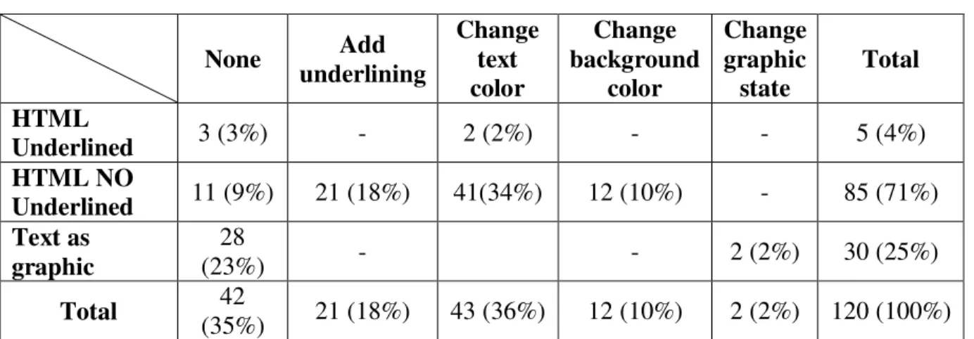
Global links were most commonly HTML no underlined (71%). Another common practice was text graphics (25%), which give designer greater control over the font type, size, and weight of the text. Table 2 below summarizes results for the style and rollover behavior of global links.
Table 2. Global links to first level-link style and rollover behavior
None Add underlining Change text color Change background color Change graphic state Total HTML Underlined 3 (3%) - 2 (2%) - - 5 (4%) HTML NO Underlined 11 (9%) 21 (18%) 41(34%) 12 (10%) - 85 (71%) Text as graphic 28 (23%) - - 2 (2%) 30 (25%) Total 42 (35%) 21 (18%) 43 (36%) 12 (10%) 2 (2%) 120 (100%) The analysis of local navigation involved links to pages occurring at the site’s second level and deeper. Table 3 summarize the frequency with which the various types of local navigation occurred on pages.
Table 3. Frequency of local navigation types
No. of pages meeting conditions
Down to child 341
Across to sibling 48
Up to parent 44
Like global links, local links were also primarily HTML text. The use of HTML text was consistent across all types of local links. Table 4 summarize link style and rollover behavior for local links.
Table 4. Local links – link style and rollover behaviour
None Add underlining Change text color Change background color Change graphic state Total HTML Underlined 14(3%) - 37 (8%) - - 51 (12%) HTML NO Underlined 33 (7%) 68 (15%) 183 (41%) 29 (7%) - 313 (71%) Text as graphic 51 (12%) - - - 28 (6%) 79 (18%) Total 98 (22%) 68 (15%) 220 (50%) 29 (7%) 28 (6%) 443 (100%)
One hundred seventy-six pages displayed some type of breadcrumb navigation. All pages with breadcrumbs oriented them horizontally on the page. The most common breadcrumb separator was some type of right arrow character, as shown in the following table.
Table 5. Presentation of Breadcrumb Navigation Right
arrow Pipe Colon
Horizon
tal line Slash
Text treatm ent Total Horizontal 117 (68%) 4 (2%) 13 (8%) 11 (6%) 21 (12%) 5 (3%) 171 (100%) Total 117 (68%) 4 (2%) 13 (8%) 11 (6%) 21 (12%) 5 (3%) 171(100 %)
From 120 sites sample, one hundred and six sites (88%) provided return to home function. As shown in table 6 below, 93 sites (78%) provided an explicit link to home. This link mainly positioned at the top of the page (81 sites, 68%) and left side of the page (30 sites, 25%); including implicit home link.
Table 6. Label for an Explicit Link to Home
No. of sites % of sites displaying
an explicit home link % of total sample
Home 85 91% 71%
Welcome 8 9% 7%
International Refereed Research Journal www.researchersworld.com Vol.– II, Issue –3, July 2011 [83] Thirteen sites (11%) only provide company logo as a link to homepage. Nearly all company logo located in the top left corner of the page, only 3 sites that located its logo in the top right corner of the page. Whereas, 14 sites (12%) did not provide an explicit homepage
View cart function provides information about items that have placed in the shopping cart by user. Only 25 sites from total sample that provide view cart function. The placement of this function varied, with the greatest number of sites placing it at the top right of main content area (13 sites, 46%) and on the left side (8 sites, 29%).
Manage account function enable user access information such as their email preferences, billing address, and shipping address. Nineteen sites (16%) provide manage account function. The placement of the page varied, but tended towards the top right area of the page (63%) or on the left side. Common labels used to represent this function were account and login. There were 13 sites used login (68%), whereas the rest sites used account as label.
Get help function provides answer to questions that frequently or may ask by user when they purchase items online. The objective is to help users without having to contact the merchant. This function (including contact us link) was most commonly located at the top of the page on the right side or on the left side.
The search function allows users to enter keyword into a test field and find information that matches the keyword entered. Forty-three sites (36%) provided a search function. Search function primarily found at the top of the page (51%) or on the left side of the page (37%). The rest sites positioned the search function at the main content area and on the right side. None of those sites presented this function with an icon.
Search function commonly presented as a text field labeled “Search” (68%), “Product search” (14%), “Product Find” (5%), and “Keyword Search” (12%). Most sites provided the search function as a text field and button (68%).
Catalogue function makes it easy for users to see products. Seventy-two sites (60%) provided catalogue function. Catalogue function usually found at the top of main content area (72%) and on the left side (28%). This function most commonly labeled “Products”; other label includes catalogue, gallery, and collection.
Personalization Function rarely provided by the 120 sites sample. Only 29 sites (24%) provided personalization function. Personalization function primarily found on the left side (59%). There were varied label used to representing this function
This research’s results do not give support to the research hypothesis in this study. There is a difference between Indonesia, U.S.A, China, and Germany in web site design practices, especially in the grouping style of down to child links.
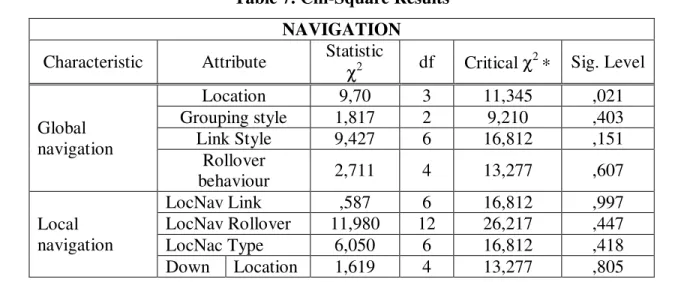
Table 7. Chi-Square Results NAVIGATION Characteristic Attribute Statistic
χ2 df Critical χ 2 ∗ Sig. Level Global navigation Location 9,70 3 11,345 ,021 Grouping style 1,817 2 9,210 ,403 Link Style 9,427 6 16,812 ,151 Rollover behaviour 2,711 4 13,277 ,607 Local navigation LocNav Link ,587 6 16,812 ,997 LocNav Rollover 11,980 12 26,217 ,447 LocNac Type 6,050 6 16,812 ,418 Down Location 1,619 4 13,277 ,805
to child Groupin g style 22,849 3 11,345 ,000 Across to Siblin g Location 10,311 12 26,217 ,589 Groupin g style 1,159 3 11,345 ,768 Up to parent Location ,015 2 9,210 ,993 Groupin g style 4,904 3 11,345 ,179 Breadcrumb navigation Presentation ,860 3 11,345 ,835 Separator type 7,965 5 15,086 ,158 HTML link color Link 26,023 9 21,666 ,002 E-COMMERCE FUNCTION Home Link Function Label/Icon ,037 1 6,635 ,847 Presentation 5,574 3 11,345 ,134 Location 10,202 6 16,812 ,116 View cart function Label/Icon 1,224 1 6,635 ,268 Location ,887 1 6,635 ,346 Presentation ,244 2 9,210 ,885 Manage account function Location ,090 1 6,365 ,764 Icon ,714 1 6,365 ,398 Presentation 1,310 1 6,365 ,252 Get help function Location 6,496 3 11,345 ,090 Label/Icon 2,222 2 9,210 ,329 Presentation 7,915 3 11,345 ,048 Search Function Location 1,421 3 11,345 .701 Presentation ,191 3 11,345 .979 Catalogue Function Location 3,829 1 6,365 .050 Presentation 6,269 3 11,345 .099 Personalization Location ,024 1 6,365 .876 Presentation 5,750 2 9,210 .056 ∗ Significant at α=0.01
In order to know which countries implement different web design practice, the author conduct a post hoc multiple comparison procedure – Marascuilo procedure. From marascuilo table can be found source of differences in website design practices among these four countries, which is the use of plain list as down to child grouping style. Using a 0.01 overall level of significance, there are differences among China – USA and China – Germany in the use of plain list as down to child link grouping style, since its absolute differences greater than its critical value.
Tabel 8. Marascuilo Result of down to child link grouping style Marascuilo Table
Absolute differences Critical Range SIG/NO
|country 1- country 2| 0,12642791 0,257246034 NO |country 1- country 3| 0,109970047 0,174801316 NO |country 1- country 4| 0,140428677 0,270871075 NO
International Refereed Research Journal www.researchersworld.com Vol.– II, Issue –3, July 2011 [85] |country 2- country 3| 0,236397957 0,229473473 SIG
|country 2- country 4| 0,014000767 0,280063673 NO |country 3- country 4| 0,250398724 0,244650142 SIG Discussion:
Designing an excellent user interface for one language in one country offers many challenges. Designing a user interface that can be successfully implemented for several language and several countries is even more difficult. A company may wonder if it’s even possible to design a single user interface that, when implemented, will provide an excellent user experience for the majority of the world’s Internet users. Can a company give worldwide users the impression that it know their language and country very well and have designed the interface just for them? Maybe it can.
This study shows, that e-commerce web sites seem to provide global links to first-level pages, as a standard. This design practices consume a significant amount of screen on web page for links that maybe not as relevant to users particularly at page specific content or lower levels of the hierarchy. Top navigation bars and navigation tabs- the two most frequent design approaches to global navigation. Pop-up menus increasingly becomes common design practices on the web, occurred 14% in the site sampled (17 sites).
Down to child links were used frequently, these links were primarily found in the main content area of the page or on the left side of the page. This study shows that there were no sites use down to grandchild links. A design challenge with providing Down to Grandchild links is that the number of Grandchild links for a given page can be very high. Therefore, the presence of the links is less obvious to users.
The HTML no underlined link style design practices may be choose by most of e-commerce web in this study because it gives an overall cleaner look to page that has many links. This link style apllied for global and local navigation. It found that all sites with breadcrumbs oriented them horizontally. The occurrence of a feature was more likely to be standard than the characteristics of its presentation.
Test of hypothesis were conducted to examine is there any differences design preferences across countries. This study provides statistically significant differences design preferences across countries. Through marascuilo procedure, it found there were differences in plain list design practices especially the implementation of down to child links grouping style between China – USA and China – Germany. These differences may happen because there are skill and cultural challenges.
However, it remains an interesting questions to what extent web design should be complies with interface standards within different skill and cultural challenges. Following design standards simply ensures that users know what a company is talking about. User interface standards have become the object of increasingly intense activities in recent years [Abernethy 1988; Holdaway and Bevan 1989]. These activities are part of a general current interest in information processing standards [Berg and Schumny 1990]. Eliminate the confusing design elements and move as far as possible into the realm of design conventions will ensure users know what features to expect, know how these features will look in the interface, know where to find these features on the site and on the page, know how to operate each feature to achieve their goal, don't have to ponder the meaning of unknown design elements, don't miss important features because they overlook a non-standard design element, and don't get nasty surprises when something doesn't work as expected.
Conclusion And Suggestions:
The frequency data shows that only one design practices among those examined in this study met Nielsen’s criteria for de-facto standard (occurring in 80% or more sites). Most of this result findings same with Adkisson’s study in 2002, except for down to grandchild link. In this study, there
was no down to grandchild link found in e-commerce web sites sample. The lack of consistency among sites in this study has implication for designers. There was lack of meaningful standards means that design decision can be difficult and time consuming.
In sum, this research provides statistically significant differences design preferences across countries especially down to child links grouping style between China – USA and China – Germany. Therefore, this study fail to support Ess and Sudweeks (1998) assumption about homogenize web interface across national border.
The research results imply various avenues for further research. Given the study was relatively small, there is merit in conducting larger scale studies that consider more web design features and functions in a larger sample, across a greater selection of country location. Therefore, the requirement of de-facto standard (occurring in 80% or more sites) can be found for e-commerce user interface and the requirement of chi-square method can be fulfill.
References:
[1] Adkisson, H. (2002), “Identifying De-Facto Standards for E-commerce Web Sites”, Retrieved May 8, 2008 from www.hpadkisson.com/papers/ hpa_thesis_final2.pdf.
[2] Alper, P. (1999), “Satisfaction with a Web Site: Its Measurement, Factors and Correlates”, Retrieved March, 15, 2008, from http://www2.widener.edu/ Wolfgram-Memorial Libray/Webevaluation/Webevel.htm.
[3] Bentley, J., Julie F., and A. Craig. (2003), “The Importance of Information Design for Small Business Web Sites”, A paper for the small enterprise association of Australian and New Zealand 16th annual conference.
[4] Cell,B. (2000), “Web Site Design: What Do I Need to Know?”, Pennsylvania CPA Journal, Vol.71, No.1, pp. 15 -19.
[5] Cho, N and Sanghyuk Park. (2001), “Development of Electronic Commerce User-Consumer Satisfaction Index (ECUSI) for Internet Shopping”, Industrial Management and Data Systems, Vol. 101, No. 8, pp. 400-6.
[6] Clary, B. (2003), “Browser Detection and Cross Browser Support”, Retrieved May 5, 2008 from http://developer.mozilla.org/en/docs/Browser_Detection_and_Cross_ Browser_Support. [7] Coopee,T., Mitchell, L., MacDonald, T. and Steinacher, S. (2000), “Catching Net Customers”,
Info World, Vol.22, No. 14, pp. 54-5.
[8] Cyr, D. and Haizley Trevor-Smith. (2004), “Localization of Web Design: An Empirical Comparison of German, Japanese, and US Web site Characteristics”, Journal of the American Society for Information Science and Technology, Vol.55, No.13, pp.1199-1208.
[9] Ess, C and Sudweeks, F. (1998), “Computer-mediated Communication or Culturally mediated computing?”, Electronic Journal of Communication. Retrieved May 8, 2008 from http://www.cios.org/www/ejcmain.htm.
[10] Huang, W., Taowen Le., X. Li., and S. Gandha. (2006), “Categorizing Web Features and Functions to Evaluate Commercial Web Sites”, Industrial Management and Data Systems, Vol.106, No.4, pp.523-539.
[11] Internetstat.com. (2007), “World Internet Usage Statistic News and Population Stats”, Retrieved March 21, 2008 from http://www.internetstats.com.
[12] Ju-Pak, K-H. (1999). “Content Dimensions of Web Advertising: A Cross-National Comparison”,International Journal of Advertising, No. 18, Vol. 2, pp. 207-31.
[13] Kim,S-E., Shaw, T. and Schneider, H. (2003), “Web Site Design Benchmarking within Industry Group” Internet Research: Electronic Networking Application and Policy, Vol.13, No.1, pp. 17-26.
International Refereed Research Journal www.researchersworld.com Vol.– II, Issue –3, July 2011 [87] Interface in E-commerce Sites”,Industrial Management and Data Systems, 103/8, pp. 600 – 610.
[15] Najjar, L.J. (2001), “E-commerce user interface design for the Web”, Retrieved May 8, 2008 from http://www.lawrence-ajjar.com/papers/Ecommerce_user_interface_ designfor_ the_ Web.html.
[16] Nielsen, J. (1999), “Web Research: Believe the Data” Retrieved May 10, 2008 from http://www.useit.com/alertbox/990711.html.
[17] Nielsen, J. (2004), “The Need of Web Design Standard”, Retrieved March 15, 2008 from http://www.useit.com/alertbox/20040913.html.
[18] Oh, K-W., C-H Cho, and, J.D. Leckenby. (1999), “A Comparative Analysis of Korean and US Web Advertising”, Proceeding of the 1999 Conference of the American Academy of Advertising, pp. 89-96.
[19] Sekaran, U. (2003), “Research Methods for Business”, 4th edition. John Wiley and Sons. USA.
[20] Tarafdar, M and Jie Zhang. (2006), “Analysis of Critical Website Characteristics: A Cross Category Study of Successful Websites”, Journal of Computer Information System, pp. 16-2. [21] Turban, E. and Gehrke, D. (2000), “Determinants of E-commerce Website”, Human System
Management 19, pp. 111-120.
[22] Wen, J.H., Houn-Gee, C., and Hsin-Ginn, H. (2001), “E-commerce Web Site Design: Strategies and Model”,Information Management and Computer Security, Vol. 9, No.1, pp. 5-12.
[23] Yoon, D., and F. Cropp. (1999), “Cultural Differences in Internet Advertising: A Content Analysis of Internet Advertising between United States and Korea”, Proceeding of the 1999 Conference of the American Academy of Advertising, pp. 89-96.
[24] Zona Research, Inc. (2000), “Inside, Outside or Upside Down? Measuring and Ensuring the Efficiency of Web-Enabled Business Technologies”, Zona Market Report, No.38, available at: http://zonaresearch.com/reports/index.htm.