5338
SYSTEMATIC LITERATURE REVIEW FOR MALWARE
VISUALIZATION TECHNIQUES
1PRITHEEGA MAGALINGAM, 1GANTHAN NARAYANA SAMY, 2WAFA MOHD
KHAIRUDIN, 2MOHD FIRHAM EFENDY MD SENAN, 2ASWAMI FADILLAH BIN MOHD
ARIFFIN, 2ZAHRI HJ YUNOS
1Advanced Informatics School, Universiti Teknologi Malaysia (UTM AIS), Malaysia
2Cyber Security Malaysia (CSM), Malaysia
E-mail: 1[email protected], 1[email protected], 2[email protected], 2[email protected], 2[email protected], 2[email protected]
ABSTRACT
Analyzing the activities or the behaviors of malicious scripts highly depends on extracted features. It is also significant to know which features are more effective for certain visualization types. Similarly, selecting an appropriate visualization technique plays a key role for analytical descriptive, diagnostic, predictive and prescriptive. Thus, the visualization technique should provide understandable information about the malicious code activities. This paper followed systematic literature review method in order to review the extracted features that are used to identify the malware, different types of visualization techniques and guidelines to select the right visualization techniques. An advanced search has been performed in most relevant digital libraries to obtain potentially relevant articles. The results demonstrate significant resources and types of features that are important to analyze malware activities and common visualization techniques that are currently used and methods to choose the right visualization technique in order to analyze the security events effectively.
Keywords: Visualization Technique, Malware, Features, Analytics, Security Event
1. INTRODUCTION
Malware, or short for "malicious software," refers to a type of computer program designed to infect a legitimate user's computer and inflict harm on it in multiple ways [1]. Malware visualization is a field that focuses on detecting, classifying and representing malware features in a form of visual representation that can be used to convey more information about a particular malware [2]. Recently, visualization techniques are applied to detect and visualize the behavior of the malware [3]. Analyzing malware activities or the behaviors of malicious scripts are highly depended on the extracted features. These features play a significant role for visualization analytical technique [4].
Visualization of data analysis helps to perceive patterns, trends, structures, and exceptions in the
most complex data. Although visualization techniques are recently gaining wide attention, there are also a few issues with this technique that need to be considered. Firstly, the quality of data influences the output of the visualization [5]. Irrelevant and abnormal data have to be filtered out and only meaningful information is included in the display. Secondly is the size of the data. Too many information visualized in a single graph can result in poor image quality and users may not understand the interpretation of the graph [5]. Therefore, data should be aggregated into individual events so that it is visually readable and understandable.
5339 studies, malware data are becoming large in quantity [9], unstructured and more dynamic [10] that makes it difficult to differentiate the valuable and irrelevant data for malware analysis.
The scope of this paper focused on identifying resources for feature extraction, reviewing the most appropriate visualization techniques and selecting the best visualization technique in order to study the behavior of malware. Finally, based on the reviewed articles an effective malware visualization technique that can perform a visualization for descriptive, prescriptive, diagnostic and predictive analytic is developed. However, this paper does not cover one or multiple features with several visualization tools to visualize the results.
2. SYSTEMATIC LITERATURE REVIEW (SLR) METHODOLOGY
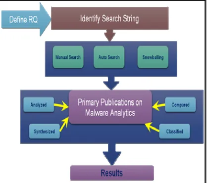
[image:2.612.89.298.377.562.2]We investigated the resources that can be used to identify malware activities and explored different types of visualization techniques for malware analysis. There are four phases involved in this SLR method as shown in Figure 1 below.
Figure 1: Systematic Literature Review Methodology
At the first phase, appropriate digital resource are identified and research questions are formulated using recent criteria called Population, Intervention, Comparison, Outcome, and Context (PICOC) used by Kitchenham and Charters [11]. Next at the second phase, primary studies are searched from various databases and the selected articles are evaluated based on its relevance and quality. The results are then synthesized, analyzed and reported in the third phase.
At the final phase, the results are discussed and interpreted. The studied articles were selected based on the following two metrics namely relevance to data visualization technique and tools and contribution of system and visual techniques. The first metric focuses specifically on visualization systems, visualizations of code security, binary files, or visual cryptanalysis. While for the second metric, the authors studied several visualization tools and function present the related work to achieve the objectives of this work.
2.1 Formulating Research Questions
Research questions (RQ) are formulated in order to review about malware visualization techniques:
1) Which resources are significant for extracting useful features for malware visualization analysis?
2) What are the visualization techniques that have been in use recently for visualizing security events?
3) How to select the right visualization technique?
The first RQ is aimed to show the source of features to feed the visualization system. Next, RQ2 is aimed to review types of visualization techniques used in recent researches. The final RQ is aimed to identify the proper method to select the right visualization technique.
3. AN OVERVIEW OF RECENT
MALWARE DETECTION TECHNIQUES
5340
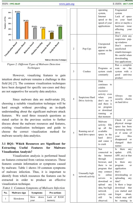
Figure 2: Different Types of Malware Detection Techniques
However, visualizing features to gain intuition about malware remains a challenge in this field [6] [7]. The common visualization techniques have been designed for specific use-cases and they are not supportive for security data analytics.
Since malware data are multivariate [8], choosing a suitable visualization technique will be hard enough without providing an in-depth understanding about the significant malware attack features. We used three research questions as stated earlier in the previous section to further discuss about the malware resources and features, existing visualization techniques and guide to choose the correct visualization method for malware security data analytics.
3.1 RQ1: Which Resources are Significant for Extracting Useful Features for Malware Visualization Analysis?
Visualization analysis is performed based on features extracted from various resources. These features contain information or symptoms caused by malware. Table 1 shows 10 common symptoms of malware infection. Thus, it is important to identify from which resources the features can be extracted in order to produce an effective visualization technique.
TABLE 1: Common Symptoms of Malware Infection
No. Malware sign Symptoms Pre-actions
1 Slowdown Slow down your
Lack of RAM memory
operating system, Internet speed or the speed of your applications
Fragmented system Lack of space on your hard drive or maybe a hardware issue affecting your drive
2 Pop-Ups
Unexpected pop-ups appear on the system
Don’t click any suspicious pop-up windows Don’t answer unsolicited emails/messages Be careful when downloading free applications
3 Crashes
Programs or system crash constantly
Run a complete scan on the system with a good antivirus product
4 Suspicious Hard Drive Activity
Disk continues to exhibit excessive activity even when you don’t use it and there is no program or download running at that moment
Always run security checks on hard drive
5 Running out of hard drive space
Malware activity fills up all the available space in the hard drive and cause it to crash
Check if your physical storage space has been increasing lately or if some of your files disappeared or changed their names
6 Unusually high network activity
Not connected to the Internet through browser, and there is no program that may connect to online servers to download or upload any data, but high network activity can still be observed.
Is there any update (OS, APP, etc) at that moment? Is there any program or application that’s
downloading or uploading any data?
[image:3.612.84.520.66.740.2]5341 the background? 7 New Browser Homepage, New Toolbars And/Or unwanted websites accessed without your input Happens when visit a website and accidentally click a link or a pop-up window
Run a complete scan with your security solution as soon as possible 8 Unusual messages or programs that start automatically Warning signs Programs opening and closing automatically Windows operating system shutting down or restarted without reason Strange windows in the booting process or if windows informs you that you’ve lost access to some of your drives
Back up all the important files and run antivirus check 9 Your security solution is disabled Antivirus solution doesn’t seem to work anymore or if the update module seems to be disabled
Contact the antivirus manufacturer and notify them the problem.
10
Friends informing that they are getting strange messages from you
Friends telling you that they received suspicious emails from you or instant messages from your social media account, which often include attachments or links
Verify whether those emails or messages were sent from one of your accounts. Make sure you logged out from all your accounts Set strong passwords for your accounts
There are several resources that can be considered for malware visualization analysis. Hence, these resources play significant role to analyze specific information about malware based on the features extracted from the resources. Examples of features extracted from the resources are shown in Table 2.
TABLE 2: Example of Extracted Features
Resource Features Authors
Network traffic
Packets features: Tcpdump: Pcap: Timestamp
Ethernet: SRC MAC, DST MAC
IP: SRC IP, DST IP, type
TCP: SRC port, DST port, Flag
ICMP: type, code UDP: SRC port, DST port
Goldring [20], Pearlman and Rheingans [21], Mansman et al.[22] CPU
CPU Sessions features: process ID
Running file name: netscape, outlook, winword, ieplore, explorer, msaccess, powerpnt, excel, acrord32, winzip32 cpuUser, cpuIdle, cpuSystem, cpuOther iostat:Reports input/output statistics for CPUs and disks.
lsof: Outputs a list of all open file descriptors and the processes using them.
Goldring[20], Dini et al. [23], Amos et al. [24], Ham and Choi [25], Ucci et al. [26]
Memory
Free memory Used memory
vmstat: Reports memory statistics
Dini et al. [23], Amos et al.[24] Ucci et al. [26]
Bluetooth and Wi-Fi status WiFi on WiFi off Consumption
Dini et al. [23], Ham and Choi [25]
API
Sequence events
Shows a list of running processes along with process statistics.
Ucci et al. [26]
Strings
Author signatures File names Code fragments
System resource information
Ham and Choi [25], Ucci et al. [26]
File system accesses Number of created/modified/deleted files
Size of created files Number of hidden files
5342 Registry
Number of
created/modified/deleted registry keys
Dini et al. [23], Ucci et al. [26]
Based on our reviews on the literatures above, there is a need to map the features to display the real-time cybersecurity status using interactive tools for example the charts, tables or graphs. Appropriate visualization technique is important to show the network progress and problems in real-time.
According to [10] features are classified into four main categories, namely, static, dynamic, hybrid and applications’ metadata that can be used for the visualization. However, the current literatures only mention a specific category, for instance, static features to visualize security incidents. Therefore, the limitations of this paper are not discussing the combination of four categories together rather discussing them in a separate manner.
3.2 RQ2: What Are The Visualization Techniques That Have Been Recently Used for Visualizing Security Events?
We reviewed articles and books and the results showed that several visualization techniques such as line, pie, column and histogram graphs have been widely used for visualizing security events. [5] stated in their recent article that one of the main advantages of using visualization techniques is that it provides good decision making. There are several visualization techniques have been used for visualizing security events. Table 3 describes different types of visualization techniques used for security purposes.
TABLE 3: Types of Visualization Techniques
Visualization
Techniques Usefulness Authors
Histogram and bar chart
To show the distribution of data. To compare values or before and after specific events. To show the comparison across the incident category.
Marty [27], Lindholm [28], Zhou [29], Pampalk et al. [30]
Link graph
Suitable for analysis using snapshots over time.
To visualize data hierarchical.
Kanazaki et al. [31], Cota et al. [5]
Treemap To represent a Seo et al. [32],
hierarchical data. To visualize network traffic.
Can visualize many types of data.
Marty [27], Cota et al. [5]
Scatter plots
Suitable for comparison. Useful to discover outliers and anomalies. Suitable for continuous or ordinal data type.
Kanazaki et al.[31]
Trend lines
To make a prediction. Suitable for small continuous and discrete data.
Muelder et al. [33], Cota et al. [5]
Pie chart
To visualize distribution of quantities.
Suitable for categorical variables data type.
Lindholm et al. [28], Kotera et al. [34], Stauffer et al. [35]
Muhammad et al. [36]
Maps
Used to display spatial or physical distribution in two-dimensional space.
Spakov et al. [37], Marty [27]
Line chart
Suitable for ordinal variables.
Suitable for small continuous and discrete data. Commonly used in business data mining
Schwabish [38], Jamil et al. [39]
Timetable
Suitable for time-series visualization to analyze and identify three scenarios: (1) Gaps in activities, (2) Periodicity of activities and (3) Temporal
relationships
Marty [27], Cota et al.[5]
3.3 RQ3: How to Select the Right Visualization Technique?
5343 two methods are further discussed in the following subsections.
3.3.1 Flowchart
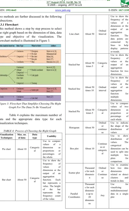
This method shows a step by step process to select the right graph based on the dimension of data, data type and objective of the visualization. The flowchart method is illustrated in Figure 3.
[image:6.612.96.521.45.741.2]Figure 3: Flowchart That Simplifies Choosing The Right Graph For The Data To Be Visualized
Table 4 explains the maximum number of data and the appropriate data type for each visualization techniques.
TABLE 4: Process of Choosing the Right Graph
Visualization Techniques
Max. no. of data
Data
type Usability
Pie chart About 10 Categoric al
Use to compare values of a dimension as proportions or percentages of the whole.
Bar chart About 50 Categoric al
Use to show the frequency of values of dimension or the output of an aggregation function. Each bar represents a value. The height of the bar represents the frequency count of the value.
Line chart About 50
Ordinal Interval
Use to show the frequency of the values of a dimension or the output of an aggregation function. The data points are connected by lines to help display patterns or trends.
Stacked bar About 50 times 5
Categoric al
Use to show the frequency of values or the output of an aggregation function for two dimensions.
Stacked line About 50 times 10
Ordinal interval
Use to show the frequency of values or the output of an aggregation function for multiple dimensions.
Stacked Pie About 50 times 5
Categoric al
Use to compare values of two dimension as proportion or percentage of each whole
Histogram About 50
Ordinal or continuo
us
Use to indicate the shape of the distribution of values
Box plot About 10
Continuo us or categoric
al
Use to show distribution of values. The categorical dimension can be used to split into multiple box plots for comparison.
Scatter plot
Thousand s for each
dimensio n
Ordinal or Continuo
us
Use to examine how two data dimensions related or detect clusters and trends in data
Parallel Coordinates
Thousand s for each
dimensio n up to
20 dimensio
ns
Any
Use for
5344 Link Graph
Without aggregati on: 1000
Any
Use for
visualizing relationships among values of one dimension and across multiple dimensions
Map 100 Coordina tes
Use to display data relative to a geographical location
Treemap 10000 Categoric al
Use to visualize hierarchical structures in data. Enable
comparison of multiple dimensions at once.
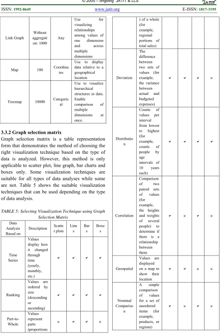
3.3.2 Graph selection matrix
[image:7.612.88.529.60.733.2]Graph selection matrix is a table representation form that demonstrates the method of choosing the right visualization technique based on the type of data is analyzed. However, this method is only applicable to scatter plot, line graph, bar charts and boxes only. Some visualization techniques are suitable for all types of data analyses while some are not. Table 5 shows the suitable visualization techniques that can be used depending on the type of data analysis.
TABLE 5: Selecting Visualization Technique using Graph Selection Matrix
Data Analysis Based on
Description Scatte r plots
Line s
Bar s
Boxe s
Time Series
Values display how it changed through time (yearly, monthly, etc.)
Ranking
Values are ordered by size (descending or ascending)
Part-to-Whole
Values represent parts (proportions
) of a whole (for example, regional portions of total sales)
Deviation The difference between two sets of values (for example, the variance between actual and budgeted expenses)
Distributio n
Counts of values per interval from lowest to highest (for example, counts of people by age intervals of 10 years each)
Correlation
Comparison of two paired sets of values (for example, the heights and weights of several people) to determine if there is a relationship between them
Geospatial
Values are displayed on a map to show their location
Nominal Compariso
n
A simple comparison of values for a set of unordered items (for example, products, or regions)
5345
3.3.3 Guidelines before selecting appropriate graphs
[image:8.612.312.530.142.351.2]In short, the goal of selecting the right visualization technique is to ensure the output is delivered in a readable and understandable manner. It also helps in making better decisions. Therefore, understanding the objectives of the data analysis and the type of data used are essential. For the first and second method, it is important to ask five major questions before choosing the graph. The five questions are listed in Table 6.
TABLE 6: Questions To Ask Before Selecting A Graph
No Question Explanation
1 Do you want to compare values?
Charts are perfect for comparing one or many value sets, and they can easily show the low and high values in the data sets. 2 Do you want to show
the composition of something?
Use this type of chart to show how individual parts make up the whole of something,
3 Do you want to understand the distribution of your data?
Distribution charts help you to understand outliers, the normal tendency, and the range of information in your values.
4 Are you interested in analyzing trends in your data set?
To know more information about how a data set performed during a specific time
5 Do you want to better understand the relationship between value sets?
Relationship charts are suited to showing how one variable relates to one or numerous different variables. You could use this to show how something positively effects, has no effect, or negatively effects another variable.
4. DISCUSSION
This paper has discussed the most common resources to extract features for visualizing security events, the types of visualization techniques and the methods to choose the right visualization techniques based on the type of data. Based on the methods to choose the suitable visualization techniques that have been described in this paper, we have categorized type of visualization into four categories in order to analyze
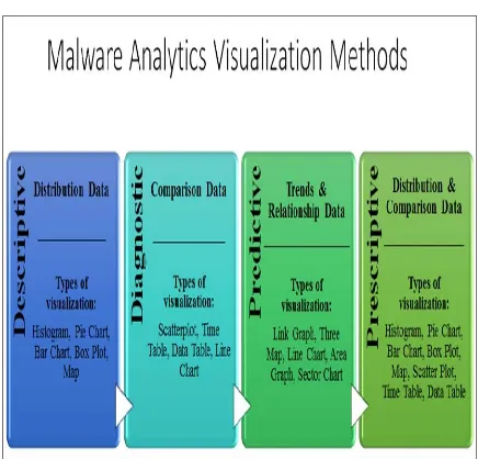
malware activities. They are descriptive, diagnostic, predictive and prescriptive. Figure 4 shows the proposed malware analytics visualization methods.
Figure 4: Proposed Malware Analytics Visualization Methods
For descriptive malware visualization, the type of data that can be used is distribution data. Distribution data is used for historical analysis of malware activities and the type of visualization is histogram, pie chart, bar chart, box plot and map. In order to display the malware activities diagnostic results, comparison data is used to identify the root cause, key patterns and unseen patterns. The type of visualization for this method is scatterplot, time table, data table and line chart.
On the other hand, predictive method is suitable for trends and relationship data. This type of data analyzes patterns in malware activities to establish trends, quantity probabilities and reduce uncertainties. The right type of visualization for this method is link graph, tree map, line chart, area chart and sector chart.
[image:8.612.87.299.267.598.2]5346 According to [27] visualization of data is not always a straight forward process. Therefore, it is important to identify the motive of the selected visualization types in order to achieve the predefined objective. On the other hand, [36] stated that visualization technique is mainly guided by the problem statement, type of dataset and objective of presenting the visualization technique. Based on [36] also, it is crucial that the generated visualization or graph able to achieve the stated objective correctly otherwise the presented visualization technique will be meaningless.
The provided visualization tools [27, 40] should be able to answer the following questions in order to measure the effectiveness of the chosen tool.
1) When was the attack happened?
2) How the attack was happened? (It can be through effected malware from network, memory, disk, or CPU)
3) What type of attack? (It can be viruses, Trojan or spyware)
4) What is the differences or uniqueness with developed visualization tool with existing tools.
Moreover, [36] also stated that most of data driven frameworks might not achieve the preferred goals of visualization. This is because providing a single graph per data set or one visual graph is not always the best solution in order to achieve the desired output by the end user or decision maker. In addition, flexible approach when developing an effective software is always a desirable need, for instance, adopting an Artificial Neural Network (ANN) method is a new and effective method for choosing not only a single graph per dataset, but selecting the three best graph per dataset as mentioned in [36]. Basically, by providing several graphs definitely will give a huge picture while exploring the data set from multiple perspectives that will help correlate data and allow end user to mentally shift between visualizations smoothly in order to make effective decision [40].
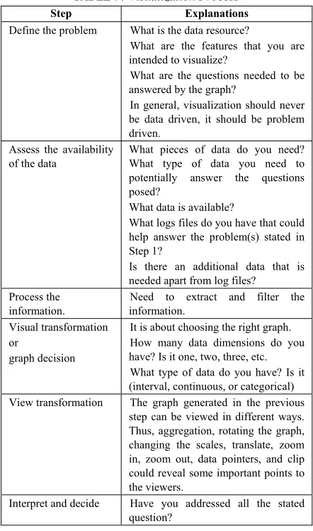
[image:9.612.307.528.144.518.2]Therefore, [27] explained the steps involved in information visualization process as shown in Table 7.
TABLE 7: Visualization Process
Step Explanations
Define the problem What is the data resource?
What are the features that you are intended to visualize?
What are the questions needed to be answered by the graph?
In general, visualization should never be data driven, it should be problem driven.
Assess the availability of the data
What pieces of data do you need? What type of data you need to potentially answer the questions posed?
What data is available?
What logs files do you have that could help answer the problem(s) stated in Step 1?
Is there an additional data that is needed apart from log files?
Process the information.
Need to extract and filter the information.
Visual transformation or
graph decision
It is about choosing the right graph. How many data dimensions do you have? Is it one, two, three, etc. What type of data do you have? Is it (interval, continuous, or categorical) View transformation The graph generated in the previous
step can be viewed in different ways. Thus, aggregation, rotating the graph, changing the scales, translate, zoom in, zoom out, data pointers, and clip could reveal some important points to the viewers.
Interpret and decide Have you addressed all the stated question?
5347
5. CONCLUSION AND FUTURE WORK
The main objective of this paper is to identify the appropriate malware visualization techniques based on systematic literature review methodology. Thus, we reviewed several articles in order to systematically answer three research questions.
The existing visualization techniques weren’t able to precisely cater the need for analyzing malware dataset that are in large amount, dynamic and unstructured. We managed to identify significant resources, diverse malware features and explored methods that are suitable for selecting the right visualization technique in order to analyze the security events effectively.
Finally, we found a solution and proposed malware analytics visualization method that comprised of descriptive, diagnostic, predictive and prescriptive. The application of proposed malware analytics visualization method is currently under development stage and in future we plan to implement the application and optimize the existing method to allow for greater productivity on fewer resources with better accuracy. This study is significant and the proposed visualization method will be able to effectively perform the malware pattern analysis and predict future attacks.
Funding
This work was supported by the Cyber Security Malaysia, an agency under Ministry of Science Technology and Innovation (MOSTI) [grant
number: R.K130000.7338.4B260 and
R.K130000.7338.4B266 ].
REFERENCES:
[1] Niemela, J., et al., Method and apparatus for
anti-virus scanning of file system. 2018,
Google Patents.
[2] Shaid, S.Z.M. and M.A. Maarof. Malware behavior image for malware variant
identification. in Biometrics and Security
Technologies (ISBAST), 2014 International
Symposium on. 2014. IEEE.
[3] Han, K., J.H. Lim, and E.G. Im. Malware analysis method using visualization of binary
files. in Proceedings of the 2013 Research in
Adaptive and Convergent Systems. 2013.
ACM.
[4] Imran, M., M.T. Afzal, and M.A. Qadir, A comparison of feature extraction techniques
for malware analysis. Turkish Journal of
Electrical Engineering & Computer Sciences, 2017. 25(2): p. 1173-1183.
[5] Cota, M., et al., Analysis of Current Visualization Techniques and Main Challenges
for the Future. Journal of Information Systems
Engineering & Management, 2017. 2(3): p. 19. [6] Shiravi, H., A. Shiravi, and A.A. Ghorbani, A
survey of visualization systems for network
security. IEEE Trans Vis Comput Graph, 2012.
18(8): p. 1313-29.
[7] Zeiler, M.D. and R. Fergus. Visualizing and
understanding convolutional networks. in
European conference on computer vision.
2014. Springer.
[8] Edem, E.I., et al. Analysis of Malware Behaviour: Using Data Mining Clustering
Techniques to Support Forensics Investigation.
in Cybercrime and Trustworthy Computing
Conference (CTC), 2014 Fifth. 2014. IEEE.
[9] Yan, W. CAS: A framework of online detecting advance malware families for cloud-based
security. in Communications in China (ICCC),
2012 1st IEEE International Conference on.
2012. IEEE.
[10]Feizollah, A., et al., A review on feature
selection in mobile malware detection. Digital
Investigation, 2015. 13: p. 22-37.
[11]Kitchenham, B., Guidelines for performing Systematic Literature Reviews in Software Engineering. EBSE Technical Report. Keele University & Department of Computer Science
University of Durham. 2007.
[12]Dzemyda, G., V. Marcinkevičius, and V. Medvedev, Web application for large-scale multidimensional data visualization. Mathematical Modelling and Analysis, 2011.
16(2): p. 273-285.
[13]Shabtai, A., et al., Monitoring, analysis, and filtering system for purifying network traffic of known and unknown malicious content. Security and Communication Networks, 2011.
4(8): p. 947-965.
[14]Chen, Z., et al., Malware characteristics and
threats on the internet ecosystem. Journal of
5348 [15]Czejdo, B.D., et al., Network intrusion
detection and visualization using aggregations in a cyber security data warehouse. International Journal of Communications, Network and System Sciences, 2012. 5(09): p. 593.
[16]Liao, Q., et al., Managing networks through context: Graph visualization and exploration. Computer Networks, 2010. 54(16): p. 2809-2824.
[17]Han, K., B. Kang, and E.G. Im, Malware
analysis using visualized image matrices. The
Scientific World Journal, 2014. 2014.
[18]Han, K.S., et al., Malware analysis using visualized images and entropy graphs. International Journal of Information Security, 2015. 14(1): p. 1-14.
[19]Blank, D., A. Henrich, and S. Kufer, Using Summaries to Search and Visualize Distributed Resources Addressing Spatial and Multimedia
Features. Datenbank-Spektrum, 2016. 16(1): p.
67-76.
[20]Goldring, T. Scatter (and other) plots for visualizing user profiling data and network
traffic. in Proceedings of the 2004 ACM
workshop on Visualization and data mining for
computer security. 2004. ACM.
[21]Pearlman, J. and P. Rheingans, Visualizing network security events using compound glyphs
from a service-oriented perspective, in VizSEC
2007. 2008, Springer. p. 131-146.
[22]Mansman, F., L. Meier, and D.A. Keim, Visualization of host behavior for network
security, in VizSEC 2007. 2008, Springer. p.
187-202.
[23]Dini, G., et al. MADAM: a multi-level anomaly
detector for android malware. in International
Conference on Mathematical Methods, Models, and Architectures for Computer Network
Security. 2012. Springer.
[24]Amos, B., H. Turner, and J. White. Applying machine learning classifiers to dynamic
android malware detection at scale. in
Wireless communications and mobile computing conference (iwcmc), 2013 9th
international. 2013. IEEE.
[25]Ham, H.-S. and M.-J. Choi. Analysis of android malware detection performance using
machine learning classifiers. in ICT
Convergence (ICTC), 2013 International
Conference on. 2013. IEEE.
[26]Ucci, D., L. Aniello, and R. Baldoni, Survey on the Usage of Machine Learning Techniques for
Malware Analysis. arXiv preprint
arXiv:1710.08189, 2017.
[27]Marty, R., Applied security visualization. 2009: Addison-Wesley Upper Saddle River.
[28]Lindholm, S., et al. Hybrid data visualization
based on depth complexity histogram analysis.
in Computer Graphics Forum. 2015. Wiley
Online Library.
[29]Zhou, M., et al. Decoding brain cancer dynamics: a quantitative histogram-based
approach using temporal MRI. in Medical
Imaging 2015: Computer-Aided Diagnosis.
2015. International Society for Optics and Photonics.
[30]Pampalk, E., A. Rauber, and D. Merkl. Using smoothed data histograms for cluster
visualization in self-organizing maps. in
International Conference on Artificial Neural
Networks. 2002. Springer.
[31]Kanazaki, M., et al. Wind tunnel evaluation based design of lift creating cylinder using
plasma actuators. in Proceedings of the 18th
Asia Pacific Symposium on Intelligent and
Evolutionary Systems, Volume 1. 2015.
Springer.
[32]Seo, I., H. Lee, and S.C. Han, Cylindrical coordinates security visualization for multiple domain command and control botnet detection. computers & security, 2014. 46: p. 141-153. [33]Muelder, C., K.-L. Ma, and T. Bartoletti.
Interactive visualization for network and port
scan detection. in International Workshop on
Recent Advances in Intrusion Detection. 2005.
Springer.
[34]Kotera, M., et al., KEGG and GenomeNet, new
developments, metagenomic analysis, in
Encyclopedia of Metagenomics. 2015,
Springer. p. 329-339.
[35]Stauffer, W.R., et al., Economic choices reveal probability distortion in macaque monkeys. Journal of Neuroscience, 2015. 35(7): p. 3146-3154.
[36]Muhammad, T. and Z. Halim, Employing artificial neural networks for constructing metadata-based model to automatically select an appropriate data visualization technique. Applied Soft Computing, 2016. 49: p. 365-384. [37]Špakov, O. and D. Miniotas, Visualization of
eye gaze data using heat maps. Elektronika ir
elektrotechnika, 2007. 74(2): p. 55-58.
[38]Schwabish, J.A., An economist's guide to
visualizing data. Journal of Economic
5349 [39]Jamil, S., et al. Weighted muse for frequent
sub-graph pattern finding in uncertain dblp data. in Internet Technology and Applications
(iTAP), 2011 International Conference on.
2011. IEEE.
[40]Attipoe, A.E., et al., Visualization tools for
network security. Electronic Imaging, 2016.