Software Visualization in
Co-located Environments
by
Craig Anslow
A thesis
submitted to the Victoria University of Wellington in fulfilment of the requirements for the degree of
Doctor of Philosophy in Software Engineering.
Victoria University of Wellington 2013
Most software visualization systems and tools are designed from a single-user perspective and are bound to the desktop and IDEs. These design decisions do not allow users to analyse software collaboratively or to easily interact and navigate visualizations within a co-located environment at the same time. This thesis presents an exploratory study of collaborative software visualization using multi-touch tables in a co-located environment. The thesis contributes a richer understanding of how pairs of developers make use of shared visualizations on large multi-touch tables to gain insight into the design of software systems.
We designed a collaborative software visualization application, called Source-Vis, that contained a suite of 13 visualization techniques adapted for multi-touch interaction. We built two large multi-touch tables (28 and 48 inches) following existing hardware designs, to explore and evaluate SourceVis. We then conducted both qualitative and quantitative user studies, culminating in a study of 44 profes-sional software developers working in pairs.
We found that pairs preferred joint group work, used a variety of coupling styles, and made many transitions between coupling and arrangement styles. For collaborative group work we recommend designing for joint group work over parallel individual work, supporting a flexible variety of coupling styles, and supporting fluid transitions between coupling and arrangement styles.
We found that the preferred style for joint group work was closely coupled and arranged side by side. We found some global functionally was not easily accessible. We found some of the user interactions and visual interface elements were not designed consistently. For the design of collaborative software visualizations we recommend designing visualizations for closely coupled arrangements with rotation features, providing functionality in the appropriate locality, and providing consistent user interactions and visual interface design.
We found sometimes visualization windows overlapped each other and text was hard to read in windows. We found when pairs were performing joint group work the size of the table was appropriate but not for parallel individual. We found that because the table could not differentiate between different simultaneous users that some pair interactions were limited. For the design of multi-touch tables we recommend providing a high resolution workspace, providing appropriate table space, and differentiating between simultaneous user interactions.
Thanks to my supervisors Professor James Noble and Dr. Stuart Marshall, without either of them I could not see how I could have finished this mammoth task. Especially when times were very tough. Your persistence and encouragement were immensely appreciated. Thanks to Professor Robert Biddle for providing sound advice from further afield, it was much appreciated. Thanks to Associate Professor Ewan Tempero for providing advice throughout the thesis. Special thanks to Roman Klapaukh for proof reading the entire thesis and offering useful technical suggestions.
Thanks to all the professional software developers and computer science stu-dents for participating in my user studies. Without them I simply could not have made the research findings and completed this thesis.
Special thanks to Petra Isenberg whose work this thesis builds upon. I am grateful to Petra for the time she spent discussing with me about her thesis and words of advice she provided.
Thanks to my examiners for examining the thesis and providing valuable feedback: T.C. Nicholas Graham, Stuart Charters, and Taehyun Rhee.
Thanks to the wonderful people in the Elvis - Software Design Research Group, fellow students, and colleagues who have made graduate school an enjoyable experience: Alex Potanin, David Pearce, Ian Welch, Radu Muschevici, Rashina Hoda, Siva Dorairaj, Pippin Barr, Rilla Khaled, Angela Martin, Keith Cassell, Adam Clarke, Nicholas Cameron, Stephen Nelson, Vipul Delwadia, Roman Klapaukh, Paley Li, Jan Larres, Frank Schmager, Hugh Davenport, Jennifer Ferreira, Matthew Duignan, Michael Waterman, Stephen Nelson, Kyle Chard, Siva Dorairaj, Diane Strode, Michael Homer, Tim Jones, Kourosh Nesthatian, Achim Gadke, Ben Palmer, Urvesh Bhowan, Rohitash Chandra, Van Lam Le, Hui Ma, Pavle Mogin, Thomas Kuehne, Marco Servetto, Peter Andreae.
Thanks to the following other students whom I helped with their project but I also gained valuable insight which helped me with my project: Jeremy Shipman, Esther Ng, Joshua Lindsay, Nick Vause, Hien Tran, Haowei Ruan, Yi-Jing Chung, Daniel Cope, Matthew Crisp, Marco Costantini, and Fahmi Abdulhamid.
Thanks to the programming, technical, and administration teams within the School of Engineering and Computer Science who have always been very generous and helpful: Roger Cliffe, Mark Davies, Royce Brown, Duncan McEwan, Ray Brownrigg, Kevin Buckley, Monique Damitio, Christo Muller, Tim Exley, Jason Edwards, Sean Anderson, Sue Hall, Amanda Holdaway, Prema Ram, Kelsey Firmin, and Ginny Whatarau. Thanks to staff from ITS: Laureen Jones, Sue Creese, Raymond Hutchinson, Fletcher Hanscomb, Michael Hikuroa, and Johny Flutey.
Thanks to the help of various people throughout the local computer science community in New Zealand who have helped in different aspects: Jens Dietrich, John Hosking, John Grundy, Jevon Wright, Graham Jenson, Rachel Blagojevic, Beryl Plimmer, Paul Schmeider, Carl Schultz, Alyona Medelyen, Andreas Loew, Paul Hunkin, Jason Alexander, Neville Churcher, Warwick Irwin, Tim Bell, Ian Witten, Craig Schock, and Robert Amor.
Along the journey I have met some interesting people who have helped me with my research at different stages: Shane Markstrum, Emerson Murphy-Hill, Keith Andrews, Peter Eades, Don Brutzman, James Hill, Donna Malayeri, Ciera Jaspan, Yoav Zibin, Wes Kendall, Fernanda Viegas, John Stasko, Chris Weaver, Jason Dykes, Jeff Heer, Michele Lanza, Stephan Diehl, Carsten Georg, Fabian Beck, Alex Telea, Tobias Isenberg, Neal Glew, Matthias Hauswirth, Josh Bloch, Dirk Riehle, Raimund Dachselt, Matthias Frisch, Adrian Kuhn, Richard Wettel, Kevin Andressend, Gordon MacDonald, John Newton, Ignas Kukenys, Alain Forget, Sonia Chiasson, Stevenson Gossage, Jeff Wilson, Miguel Nacenta, Nicolai Mar-quardt, Marian Doerk, Uta Hinrichs, Christopher Collins, Melanie Tory, Jennifer Baldwin, Philippe Kruchten, Michael Wybrow, Luc Vlaming, Andrew Clayphan, Christopher Ackad, Dominikus Baur, Victor Pascual, Michael Sedlmair, Andreas Butz, Peter Kinnaird, Mary-Beth Rosson, Steve Tanimoto, Susan Wiedenbeck, Judith Good, Martin Erwig, Sriram Subramanian, Hrvoje Benko, Patrick Baudisch, Kevin Groke, and Heidi Esplin.
Thanks to all the people in the NUI Community Group who have helped me: Jordan Hochenbaum, Owen Vallis, Memo Akten, Nolan Ramseyer, Jim Lyst, Seth Sandler, Chris Rasmussen (Fraunhofer and MT4j), and Bill Evans.
This work is supported by the New Zealand Foundation for Research Science and Technology (now called the Ministry of Business, Innovation, and Employ-ment) for the Software Process and Product Improvement (SPPI) project, a Telstra Clear Post-Graduate Scholarship, and a Victoria University of Wellington PhD Submission Scholarship.
Finally, thanks to my family and friends for supporting me throughout this degree: Mum, Dad, Kate, Cherie, Brigitte, Brett, Rob, Raelene, Amber-Rose, Ruby-Anne, Ralphie, Toby, Frank, and James.
Materials, ideas, tables, and figures in this thesis have appeared previously in the publications below.
Peer Reviewed Conference Papers
• Craig Anslow, Stuart Marshall, James Noble, Robert Biddle. SourceVis: Collaborative Software Visualization for Co-located Environments. InProceedings of the IEEE Working Conference on Software Visualization (VISSOFT), Eindhoven, Netherlands, 2013.
• Keith Cassell,Craig Anslow, Lindsay Groves, Peter Andreae. Visualizing the Refactoring of Classes via Clustering. InProceedings of the Australasian Computer Science Conference (ACSC), Perth, Australia, 2011.
• Craig Anslow, James Noble, Stuart Marshall, Ewan Tempero, and Robert Biddle. User Evaluation of Polymetric Views Using a Large Visualization Wall. InProceedings of the ACM Symposium on Software Visualization (SoftVis), Salt Lake City, UT, USA, 2010.
• Haowei Ruan,Craig Anslow, Stuart Marshall, and James Noble. Exploring the Inventor’s Paradox: Applying Jigsaw to Software Visualization. InProceedings of the ACM Symposium on Software Visualization (SoftVis), Salt Lake City, UT, USA, 2010.
• Ewan Tempero,Craig Anslow, Jens Dietrich, Ted Han, Jing Li, Markus Lumpe, Hayden Melton, and James Noble. Qualitas Corpus: A Curated Collection of Java Code for Empirical Studies. InProceedings of the Asia Pacific Software Engineering Conference (APSEC), Sydney, Australia, 2010.
Peer Reviewed Workshop Papers
• Craig Anslow, Stuart Marshall, James Noble, Robert Biddle. Exploring Collaborative Software Visualization with Multi-touch Tables. InProceedings of the Workshop on Collaboration meets Interactive Surfaces: Walls, Tables, Tablets, and Phones at the at the ACM International Conference on Interactive Tabletops and Surfaces (ITS), St Andrews, Scotland, 2013.
• Craig Anslow, Stuart Marshall, James Noble, and Robert Biddle. Interactive Multi-touch Surfaces for Software Visualization. InProceedings of the Workshop on Data Exploration for Interactive Surfaces (DEXIS) at the ACM International Conference on Interactive Tabletops and Surfaces (ITS), Kobe, Japan, 2011.
• Craig Anslow, Stuart Marshall, James Noble, and Robert Biddle. Co-located Collabora-tive Software Visualization. InProceedings of the Workshop on Human Aspects of Software Engineering (HAoSE2010)at SPLASH, Reno/Tahoe, Nevada, USA, 2010.
Peer Reviewed Posters
• Craig Anslow, Stuart Marshall, James Noble, and Robert Biddle. SourceVis: A Tool for Multi-touch Software Visualization. InProceedings of the International Conference on Interactive Tabletops and Surfaces (ITS), Kobe, Japan, 2011.
• Craig Anslow, James Noble, Stuart Marshall, and Ewan Tempero. Visualizing the Word Structure of Java Class Names. InCompanion to the ACM SIGPLAN International Conference on Object-Oriented Programming, Systems, Languages, and Applications (OOPLSA), Nashville, Tennessee, USA, 2008.
• Craig Anslow, James Noble, Stuart Marshall, and Robert Biddle. Web Software Visualiza-tion Using Extensible 3D (X3D) Graphics. InProceedings of the ACM Symposium on Software Visualization (SoftVis), Herrsching am Ammersee, Germany, 2008.
• Bennett Thompson, David Pearce, Gary Haggard, andCraig Anslow. Visualizing the Computation Tree of the Tutte Polynomial. InProceedings of the ACM Symposium on Software Visualization (SoftVis), Herrsching am Ammersee, Germany, 2008.
Doctoral Symposiums
• Craig Anslow. Multi-touch Table User Interfaces for Co-located Collaborative Software Visualization. InProceedings of the Doctoral Symposium at the ACM International Conference on Interactive Tabletops and Surfaces (ITS), Saarbrucken, Germany, 2010.
• Craig Anslow, James Noble, Stuart Marshall, and Ewan Tempero. Towards Visual Soft-ware Analytics. InProceedings of the Australasian Computing Doctoral Consortium (ACDC), Wellington, New Zealand, 2009.
• Craig Anslow, James Noble, Stuart Marshall, and Ewan Tempero. Towards End-User Web Software Visualization. InProceedings of the Graduate Consortium at the IEEE Symposium on Visual Languages and Human Centric Computing (VLHCC), Herrsching am Ammersee, Germany, 2008.
Other
• Hien Tran,Craig Anslow, Stuart Marshall, Alex Potanin, Mairead De Roiste. Lessons Learnt from Collaboratively Creating Maps on a Touch Table. InProceedings of the ACM New Zealand Conference on Computer-Human Interaction (CHINZ), Hamilton, New Zealand, 2011. (short paper)
• Craig Anslow, James Noble, Stuart Marshall, and Ewan Tempero. Visualizing the Size of the Java Standard API. InProceedings of the New Zealand Computer Science Research Student Conference (NZCSRSC), Wellington, New Zealand, 2010.
• Craig Anslow, James Noble, Stuart Marshall, and Ewan Tempero. Web Software Visual-ization Via Google’s VisualVisual-ization API. InProceedings of the New Zealand Computer Science Research Student Conference (NZCSRSC), Auckland, New Zealand, 2009. (short paper)
I
Introduction and Background
1
1 Introduction 2 1.1 Research Context . . . 4 1.2 Research Scope . . . 5 1.3 Research Goals . . . 6 1.4 Research Approach . . . 7 1.5 Research Contributions . . . 7 1.6 Key Findings . . . 91.6.1 Collaborative Group Work . . . 9
1.6.2 Designing Collaborative Software Visualizations . . . 9
1.6.3 Designing Multi-touch Tables . . . 10
1.7 Thesis Structure . . . 11
2 Background 12 2.1 Information Visualization . . . 13
2.1.1 Collaborative Information Visualization . . . 15
2.1.2 Evaluation of Information Visualization . . . 17
2.2 Software Visualization . . . 18
2.2.1 Structure Visualization . . . 19
2.2.2 Behaviour Visualization . . . 22
2.2.3 Evolution Visualization . . . 24
2.2.4 Collaborative Software Development and Visualization . . . 26
2.2.5 Evaluation of Software Visualization . . . 27
2.3 Multi-Touch Technologies . . . 28
2.3.1 Multi-Touch Commercial Systems . . . 28
2.3.2 Multi-touch Research Projects . . . 29
2.3.3 Evaluation of Multi-touch Technologies . . . 31
2.3.4 Multi-touch Hardware Approaches . . . 32
2.4 Optical Based Multi-touch Tables . . . 34
2.4.1 Surface Lighting Techniques . . . 34 v
2.4.2 Infrared Light Sources . . . 37
2.4.3 Cameras . . . 39
2.4.4 Display Sources . . . 40
2.4.5 Multi-Touch Detection Software . . . 40
2.4.6 Multi-Touch Application Software . . . 44
2.5 Summary . . . 45
II
Hardware and Software Infrastructure
46
3 Large Interactive Multi-touch Tables 47 3.1 Multi-Touch Prototypes . . . 483.1.1 MT Mini . . . 48
3.1.2 MT Biggie . . . 48
3.2 Black Multi-touch Table . . . 51
3.2.1 Physical Table Frame . . . 51
3.2.2 Surface Lighting Technique . . . 51
3.2.3 Infrared Lighting Source . . . 51
3.2.4 Camera and Lens . . . 53
3.2.5 Display Source . . . 53
3.2.6 Computer Hardware . . . 54
3.3 Blue Multi-touch Table . . . 54
3.3.1 Physical Table Frame . . . 54
3.3.2 Surface Lighting Technique . . . 54
3.3.3 Infrared Lighting Source . . . 56
3.3.4 Camera and Lens . . . 56
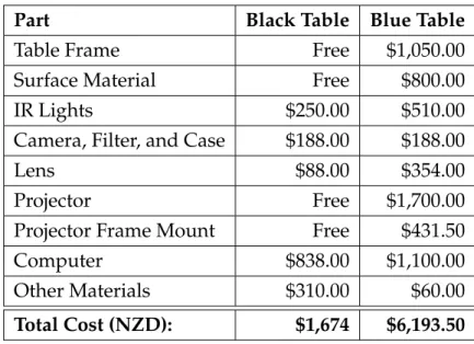
3.3.5 Display Source . . . 56 3.3.6 Computer Hardware . . . 56 3.4 Discussion . . . 57 3.4.1 Display Size . . . 57 3.4.2 Display Resolution . . . 57 3.4.3 Display Configuration . . . 57 3.4.4 Input Type . . . 58 3.4.5 Portability . . . 58 3.4.6 Performance . . . 59 3.4.7 Cost . . . 59 3.5 Summary . . . 60
4 SourceVis: A Collaborative Software Visualization Application 61 4.1 Overview . . . 62 4.1.1 Design . . . 64 4.1.2 Visualizations . . . 64 4.1.3 Interaction . . . 65 4.1.4 Architecture . . . 68 4.1.5 Implementation . . . 70 4.2 Exploration Visualizations . . . 72 4.2.1 System Explorer . . . 72 4.2.2 Metrics Explorer . . . 73 4.2.3 Vocabulary . . . 74 4.2.4 Toxicity Chart . . . 75 4.3 Structure Visualizations . . . 76
4.3.1 System Hotspots View . . . 76
4.3.2 System Dependency View . . . 77
4.3.3 Class Dependency View . . . 78
4.3.4 Class Blueprint View . . . 79
4.4 Evolution Visualizations . . . 80
4.4.1 System Evolution View . . . 80
4.4.2 System Package Evolution View . . . 80
4.4.3 Package Evolution View . . . 81
4.4.4 System Class Evolution View . . . 82
4.4.5 Class Evolution View . . . 82
4.5 Discussion . . . 83
4.6 Summary . . . 84
III
User Studies
85
5 Preliminary User Studies 86 5.1 Preliminary User Study 1 - Early Feedback . . . 875.1.1 Participants . . . 87
5.1.2 Procedure . . . 88
5.1.3 User Tasks . . . 89
5.1.4 Findings . . . 89
5.1.5 Discussion . . . 94
5.2 Preliminary User Study 2 - Effectiveness and Coupling Style . . . . 96
5.2.1 Participants . . . 96
5.2.3 User Tasks . . . 98
5.2.4 Qualitative Findings . . . 99
5.2.5 Quantitative Findings . . . 107
5.3 Preliminary User Study 3 - Group vs. Individual Work . . . 113
5.3.1 Participants . . . 113 5.3.2 Procedure . . . 114 5.3.3 User Tasks . . . 114 5.3.4 Findings . . . 115 5.4 Limitations . . . 116 5.5 Summary . . . 117
6 Professional User Study 118 6.1 User Study Design . . . 119
6.1.1 Study Condition Combinations . . . 119
6.1.2 Collaborative Coupling Style . . . 120
6.1.3 Physical Arrangement Style . . . 120
6.1.4 Participant Qualitative Feedback . . . 122
6.1.5 Research Questions . . . 122
6.2 Participants . . . 123
6.2.1 Recruitment . . . 123
6.2.2 Demographics . . . 123
6.2.3 Human Ethics Approval . . . 128
6.3 Procedure . . . 128
6.3.1 Pre-Study . . . 129
6.3.2 User Study Setup . . . 131
6.3.3 User Tasks . . . 132
6.3.4 Post Study . . . 134
6.3.5 Data Collection, Coding, and Analysis . . . 135
IV
Research Findings
137
7 Professional User Study — Qualitative Findings 138 7.1 Strengths . . . 139 7.1.1 Multi-touch Table . . . 139 7.1.2 Visualizations . . . 142 7.1.3 Interaction . . . 145 7.1.4 Data . . . 146 7.1.5 User Interface . . . 154 7.2 Weaknesses . . . 1567.2.1 Multi-touch Table . . . 156 7.2.2 Visualizations . . . 159 7.2.3 Interaction . . . 163 7.2.4 Data . . . 172 7.2.5 User Interface . . . 173 7.3 Improvements . . . 176 7.3.1 Multi-touch Table . . . 177 7.3.2 Visualizations . . . 178 7.3.3 Interaction . . . 181 7.3.4 Data . . . 184 7.3.5 User Interface . . . 187 7.4 Team Collaboration . . . 195 7.4.1 Multi-touch Interaction . . . 195 7.4.2 Team Work . . . 196 7.4.3 Communication . . . 197 7.4.4 Different Roles . . . 198 7.4.5 Coordination . . . 198 7.4.6 Awareness . . . 199 7.5 Summary . . . 200 7.5.1 Multi-touch Table . . . 200 7.5.2 Strengths . . . 200 7.5.3 Weaknesses . . . 201 7.5.4 Improvements . . . 202 7.5.5 Team Collaboration . . . 203
8 Professional User Study — Quantitative Findings 205 8.1 Study Condition Combination . . . 206
8.2 Collaborative Coupling Categories . . . 206
8.2.1 Frequency of Coupling Categories . . . 207
8.2.2 Time Spent in Coupling Categories . . . 208
8.2.3 Temporal Sequence of Coupling Categories . . . 208
8.3 Collaborative Coupling Styles . . . 210
8.3.1 Frequency of Coupling Styles . . . 210
8.3.2 Time Spent in Coupling Styles . . . 213
8.3.3 Temporal Sequence of Coupling Styles . . . 216
8.3.4 Frequency vs. Time Spent in Coupling Styles . . . 218
8.4 Physical Arrangement Style . . . 219
8.4.1 Frequency of Arrangement Styles . . . 219
8.4.3 Temporal Sequence of Arrangement Styles . . . 225
8.4.4 Frequency vs. Time Spent in Arrangement Styles . . . 227
8.4.5 Collaborative Coupling and Physical Arrangement Styles . 228 8.5 Perceived Effectiveness of Techniques . . . 229
8.6 Summary . . . 231
V
Conclusions
233
9 Conclusions 234 9.1 Research Contributions . . . 2359.1.1 Designing Collaborative Software Visualizations . . . 235
9.1.2 SourceVis: Software Visualization Application . . . 235
9.1.3 Evaluation of Collaborative Software Visualization . . . 236
9.2 Key Findings . . . 237
9.2.1 Collaborative Group Work . . . 237
9.2.2 Designing Collaborative Software Visualizations . . . 239
9.2.3 Designing Multi-touch Tables . . . 241
9.3 Limitations . . . 243
9.3.1 Participants . . . 243
9.3.2 Procedure . . . 243
9.3.3 Apparatus . . . 244
9.4 Future Work . . . 245
9.4.1 New Software Visualizations . . . 245
9.4.2 Apply Visual Information Analysis Framework . . . 246
9.4.3 Evaluation of Collaborative Software Visualization . . . 246
9.5 Summary . . . 247
VI
Appendices
248
A Human Ethics Approval 249
B User Study Information and Consent Forms 257 C User Study Recruitment Email 261
D User Study Questionnaires 263
E Preliminary User Study 1 Questions 273 F Preliminary User Study 2 Questions 274
G Professional User Study Participant Demographics 276 H Professional User Study Questions 282
H.1 Group Questions . . . 282 H.2 Individual A Questions . . . 284 H.3 Individual B Questions . . . 287
Introduction and Background
Introduction
“People who are really serious about software should make their own hard-ware.”
Alan Kay. 1982 Software systems are becoming increasingly complex to design and support. Software maintenance is reported to be about 70% of the total cost of a software product [52, 307]. Understanding what causes these costs is an ongoing research problem in software engineering. Developers face the task of understanding soft-ware when they want to maintain, reuse, reverse engineer, or re-engineer a piece of software. Visualizing the source code and run-time of software can give a greater insight into the structure, behaviour, and evolution of software, to aid developers in software understanding [77]. This thesis addresses exploring collaborative software visualization on multi-touch tables for co-located software development teams.
Software maintenance is often a social activity and involves developers work-ing within co-located environments (same room and time). Developers quite often work in pairs within a larger team. These pairs carry out tasks including: programming, code reviews, refactoring, and visualization of work flow. Some of these activities use digital (e.g. code) and physical (e.g. post-it notes) artifacts. Most software development tools and applications that support these activities often involve analysis and visualization features.
Most development tools and applications are designed from a single-user perspective such as Integrated Development Environments (IDEs) (e.g. Eclipse, Microsoft Visual Studio). These tools make it hard for developers to analyse and interact with software artifacts collaboratively using the same tool. For example, in pair programming there is only one keyboard and mouse for input which is controlled by the driver [22, 363]. When the observer wants to interact they have to either swap positions or obtain the keyboard and mouse from the driver.
Most software analysis applications contain a small range of visualization techniques. If applications supported multiple visualizations this would allow developers to visualize aspects of systems from different perspectives and reduce the overhead of installing multiple applications. For example, in code reviews developers often have to use multiple applications to explore different aspects of software including test coverage, class dependencies, and class diagrams.
Most computer applications are viewed on displays that are oriented vertically. The displays are usually only designed to support vertical orientation as opposed to horizontal. Developers quite often have dual vertical displays with a large number of pixels. When working in co-located teams it is hard to interact and collaborate with information across multiple digital and physical devices. For example, in visualizing work flows many development teams use physical de-vices like white boards and physical artifacts like post-it notes. Visualizing work flow is commonly referred to in the Agile software development community as “information radiators” [67], “visible big charts” [147], and “KanBan boards” [123].
As post-it notes are physical, manipulating and transferring this information into a digital context can be cumbersome.
Most computer user interfaces are designed for single-users and traditionally have keyboard and mouse input. The advent of new technologies like touch sensing and digital pens has enabled computers to have multimodal input for devices including smart phones, tablets, and touch screens. These devices are targeted towards single-users and are too small for a multi-user co-located envi-ronment. Large multi-user and multi-input devices that are potentially suitable for co-located collaborative software development teams include interactive surfaces like horizontal or vertical touch displays or multi-touch tables and high resolution visualization display walls.
Existing software visualization research has primarily focused on Graphical User Interfaces (GUI) and Virtual Reality [77]. To date there has been limited research on how tools support collaborative software maintenance [170, 214], and even less has explored how visualizations can support collaborative software maintenance. Storey et al. propose that collaborative software visualization can improve team software maintenance [316]. Little research has been conducted on how collaborative devices such as multi-touch tables and visualization walls help support development teams with software development and analysis tasks.
This thesis addresses exploring collaborative software visualization on multi-touch tables for co-located software development teams. We built our own large multi-touch tables and developed a collaborative software visualization applica-tion to run on the tables. We conducted user studies with professional software developers using our multi-touch table and software visualization application.
1.1
Research Context
We adopt a general definition for information visualization from Card et al. [56]. “Information visualization is the use of computer-supported, inter-active, visual representations of abstract data to amplify cognition” [56].
Software visualization is a field that is derived from information visualization and is defined as follows.
“The use of the craft of typography, graphic design, animation, and cinematography with modern human computer interaction and com-puter graphics technology to facilitate both the human understanding and effective use of computer software” [312].
“Software visualization is the application of information visualization in software engineering and can show the structure of software, run-time behaviour, and representation of source code” [77].
None of these above definitions take into consideration collaboration or multi-ple users. Isenberg et al. [137, 139] defines collaborative information visualization based upon the general definition for information visualization [56].
“Collaborative visualization is the shared use of computer-supported, (interactive) visual representations of data by more than one person with the common goal of contribution to joint information processing activities” [137, 139].
We build upon these definitions for software visualization and collaborative information visualization and use the termcollaborative software visualization
to define our research context in the following way:
“Collaborative software visualization is the shared use of computer-supported interactive visual representations of data to understand the structure, behaviour, and evolution of software by more than one person with the common goal of contribution to joint information processing activities.”
1.2
Research Scope
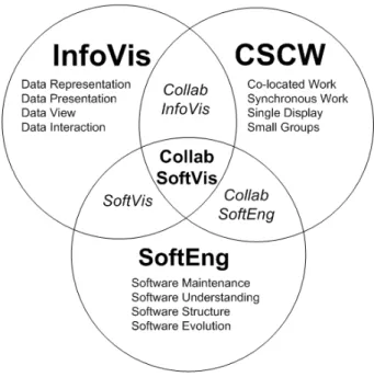
The research topic of this thesis lies at the intersection of three main computer science research fields as illustrated in Figure 1.1: Software Engineering (SoftEng), Information Visualization (InfoVis), and Computer Support Cooperative Work (CSCW). The research scope of this thesis is a subset of collaborative software visualization aspects:
Software Engineering (SoftEng):
• Software maintenance with the goal to analyze and understand existing software systems focusing on the structure and evolution.
• Identification of possible refactoring opportunities in a software system.
• We deem other software maintenance tasks such as debugging, adding new features to a code base, and performing actual refactorings out of scope of this thesis.
Information Visualization (InfoVis):
• Representing different aspects of the software systems focusing on software metrics for structure and evolution [96].
• Presenting multiple visualizations of the software systems (e.g. using diagrams, charts, Polymetric Views [185]).
• Viewing the aspects of the software systems from different view points and orientations.
• Interacting and exploring the aspects of the software systems in the visualizations.
Computer Supported Cooperative Work (CSCW):
• Co-located environments, where several software developers work for the same organisation and in the same team.
• Developers who work together, where collaborative software under-standing and programming occurs at the same time.
• Developers who share a single workspace for meetings and discussion such as a white board, interactive table, or wall display.
Figure 1.1: The research topic of this thesis lies at the intersection of Software Engineering, InfoVis, and CSCW. Diagram adapted from [137, 316].
1.3
Research Goals
Our research goal is to investigate how pairs from a co-located software develop-ment team might use a collaborative software visualization application on a large multi-touch table to understand existing software systems. We examine how pairs work at the same time either as a group or as individuals in parallel. In particular we wanted to address the following research questions:
Q1 What are the strengths of the visualizations and the multi-touch table?
Q2 What are the weaknesses of the visualizations and the multi-touch table?
Q3 What improvements could be made for the visualizations and the multi-touch table?
Q4 Does the multi-touch table help with team collaboration, and if so how?
Q5 Did the pairs favour working as a group or as individuals in parallel?
Q6 Which coupling categories did the participants use when interacting?
Q7 Which coupling style strategies did the participants use?
Q8 Which physical arrangement styles did the participants use with the table?
Q9 Which visualization techniques did the participants perceive to be the most effective?
1.4
Research Approach
Our research approach has been to first look at the background literature within our research scope. Based on the literature we used an existing set of design considerations for collaborative information visualization [137, 138] and applied them for designing co-located collaborative software visualizations.
Following an iterative design process we built two multi-touch tables to val-idate the design considerations for a physical collaborative environment. We designed a collaborative software visualization application for multi-touch tables to validate the design considerations for collaborative information visualization. To evaluate our software visualization application we followed a qualitative grounded evaluation of information visualization process during the develop-ment lifecycle [144]. This process used mixed methods and is suited for giving an overview of a situation and to examine how and why users behave in certain envi-ronments [71]. Other researchers have adopted a similar approach to understand how groups of participants collaboratively use a multi-touch table in a co-located environment [137, 141, 291].
Our evaluation process involved conducting preliminary user studies with computer science students working in pairs during different stages of the develop-ment life-cycle of the application. We then conducted a much larger study with professional software developers. The aim of the user studies was to determine how groups and individuals use our multi-touch table and software visualization application and to assess the perceived effectiveness of the visualizations.
We used the following techniques as part of the evaluation process: obser-vational studies, video recordings, interviews, and questionnaires. We asked participants to think aloud during our studies so that we could capture their thoughts about their actions, perceptions, and expectations regarding the appli-cation’s interface and functionality [224]. Getting participants to talk about their actions and thoughts enabled us to gain insight into how each user views the computer system, identify their misconceptions, and determine which parts of the interface cause problems.
1.5
Research Contributions
The thesis contributes a richer understanding of how pairs of software develop-ers make use of shared software visualizations on large interactive multi-touch tables to gain insight into how existing software systems are structured and how they have evolved over different versions. Specifically this thesis makes three contributions.
Designing Collaborative Software Visualizations. We built two multi-touch tables (28 and 48 inches) (§3). We conducted preliminary user studies with 18 computer science students (§5) using the 48 inch multi-touch table and prototypes of our software visualization application. The user studies led to a protocol which we used for the professional user study.
SourceVis: Software Visualization Application. We designed a collaborative software visualization application, called SourceVis, for use on large multi-touch tables (§4). SourceVis allows multiple users to interact simultaneously or separately with the table either as a group or as individuals.
Evaluation of Collaborative Software Visualization. To evaluate the large multi-touch table and SourceVis we conducted a user study (§6) with 44 software developers working in pairs performing software understanding tasks. We wanted to find out if participants preferred to work as a group or as individuals. We observed what collaborative coupling categories, coupling styles, and physical arrangement styles participants used and how much time was spent in these styles. We asked participants to provide feedback on what the strengths, weaknesses, and improvements of SourceVis and the multi-touch table were. We asked participants how the multi-touch ta-ble helped with team collaboration and what visualization techniques they perceived to be the most effective. We obtained both qualitative (§7) and quantitive findings (§8).
1.6
Key Findings
Our research revealed key findings for collaborative group work, designing col-laborative software visualizations, and designing multi-touch tables.
1.6.1
Collaborative Group Work
Design for joint group work over parallel individual work. We found that all pairs preferred joint group work over parallel individual work and chose to do Section 3 of the user tasks as a group.
Support a flexible variety of coupling styles.We found that pairs used a variety of coupling styles during both joint group work and parallel individual work, but used more coupling styles when they were closely coupled. We found that pairs spent more time in closely coupled styles.
Support fluid transitions between coupling and arrangement styles. We found that when pairs were closely coupled they were more closely arranged, and when they were loosely coupled they were loosely arranged. We found that pairs regularly transitioned between many closely coupled styles and closely arranged styles, but transitioned less between loosely coupled and loosely arranged styles.
1.6.2
Designing Collaborative Software Visualizations
Design visualizations for closely coupled arrangements with rotation features.
We found that visualizations were primarily viewed from the long side of the table where both participants were closely arranged next to each other. When visualizations needed to be viewed from different view points (such as in parallel individual work) participants used lightweight features for rotating visualization windows to face different directions.
Provide functionality in the appropriate locality. We found that when pairs were displaying a visualization at full screen and wanted to launch a new overview visualization they they had to navigate to the start up screen rather than having a menu on hand. Pairs, however, could launch new detailed visualizations through the pie menu on elements in a visualization. When a visualization was at full screen and a participant were on one side of the table and wanted to select an option from a menu on the other side of the table they had to ask their colleague to perform the action.
Provide consistent user interactions and visual interface design. We found that the navigation gestures behaved differently across the 13 visualization techniques in SourceVis. Some participants found manipulating visualiza-tion windows difficult. We found at times some menus were displayed at different zoom levels and occasionally displayed half off the screen. We found participants having difficulty entering text using the virtual keyboard. We found that some participants occasionally lost context of what visualiza-tion they were currently looking at and could not always remember what the visual encodings meant.
1.6.3
Designing Multi-touch Tables
Provide high resolution workspace. We found that visualization windows often overlapped each other which caused interference. We found that text was readable when visualizations were at full screen, but reading text when displayed in visualization windows was difficult as the visualization was reduced in size. Providing a high resolution workspace would reduce win-dows overlapping and make text easier to read.
Provide appropriate table space. We found that when pairs were performing joint group work the size of the table was appropriate. We found that when pairs were performing parallel individual work the size of the table was not appropriate as the table forced them to primarily be physically arranged at opposite ends of the table and visualization windows had to be reduced in size. Depending on the task and number of users interacting there should be appropriate table space.
Differentiate between simultaneous user interactions. We found that when participants performed simultaneous navigation gestures on the canvas of a visualization or manipulated the same element within a visualization the system was confused as to what action to perform. The system should differentiate between simultaneous user interactions.
1.7
Thesis Structure
The remainder of this thesis is structured as follows.
Chapter 2: Background.We present background literature to our research includ-ing information visualization, software visualization, collaborative software visualization, and multi-touch technologies.
Chapter 3: Large Interactive Multi-touch Tables.We present our large interac-tive portable multi-touch tables for co-located collaborainterac-tive environments. We describe our experience at designing and building our initial early proto-types to our proof of concept working protoproto-types.
Chapter 4: SourceVis: A Collaborative Software Visualization Application.
We present our collaborative multi-touch software visualization application, SourceVis. We describe the design, implementation, interaction features, and illustrate the individual visualizations.
Chapter 5: Preliminary User Studies. We present three preliminary user studies of computer science students using SourceVis at different stages of the devel-opment life-cycle. We present qualitative and quantitive findings from the studies. The studies led us to develop a protocol which we used for a study with professional software developers.
Chapter 6: Professional User Study. We present our user study of professional software developers using our multi-touch table and SourceVis. We describe the design, participants, procedure and limitations of our user study.
Chapter 7: Professional User Study — Qualitative Findings. We present the qualitative findings from the user study with professional software develop-ers.
Chapter 8: Professional User Study — Quantitative Findings. We present the quantitative findings from the user study with professional software devel-opers.
Chapter 9: Conclusions.We conclude by presenting the contributions of this the-sis. We then present the key findings from this thethe-sis. We discuss limitations of our research. Finally, we suggest directions in which our research could be extended in future.
Background
Contents
2.1 Information Visualization . . . 13
2.1.1 Collaborative Information Visualization . . . 15 2.1.2 Evaluation of Information Visualization . . . 17
2.2 Software Visualization . . . 18
2.2.1 Structure Visualization . . . 19 2.2.2 Behaviour Visualization . . . 22 2.2.3 Evolution Visualization . . . 24 2.2.4 Collaborative Software Development and Visualization . . 26 2.2.5 Evaluation of Software Visualization . . . 27
2.3 Multi-Touch Technologies . . . 28
2.3.1 Multi-Touch Commercial Systems . . . 28 2.3.2 Multi-touch Research Projects . . . 29 2.3.3 Evaluation of Multi-touch Technologies . . . 31 2.3.4 Multi-touch Hardware Approaches . . . 32
2.4 Optical Based Multi-touch Tables . . . 34
2.4.1 Surface Lighting Techniques . . . 34 2.4.2 Infrared Light Sources . . . 37 2.4.3 Cameras . . . 39 2.4.4 Display Sources . . . 40 2.4.5 Multi-Touch Detection Software . . . 40 2.4.6 Multi-Touch Application Software . . . 44
2.5 Summary . . . 45
In this chapter we present the background literature. We begin with an overview of information visualization (§2.1). We describe the different areas of software visualization (§2.2). We describe multi-touch hardware technologies (§2.3). We describe optical based multi-touch tables (§2.4).
2.1
Information Visualization
Card et. al [56] define information visualization as:
“Information visualization is the use of computer-supported, interac-tive, visual representations of abstract data to amplify cognition.”
After producing a visual representation, the following issues must be ad-dressed: exploration, navigation, and interpolation of the data [57]. Several overviews on information visualization exist [25, 56, 62, 119, 309, 352].
The theory of the visual display of quantitative information [337] consists of principles that generate design options and that guide choices among the design options. Tufte [337] describes graphical excellence of quantitative information, as the well designed presentation of interesting data – a matter of substance, of statis-tics, and of design. Graphical excellence consists of complex ideas communicated with clarity, precision, and efficiency. This results in a visualization displaying the greatest number of ideas, in the shortest time and in the smallest space possible.
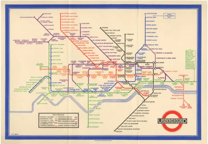
An early example of graphical excellence is the original London Underground map designed by Harry Beck in 1933 (see Figure 2.1(a)). Most people will use the map as a visualization tool for planning a journey from one station to another. People may memorise their route by colour or the direction of the lines involved, which is known as a cognitive map [309]. Beck based the map on electrical circuit diagrams which does not reflect the geography of the city above.
Ben Shneiderman [301] created a visual design guideline called the visual information seeking mantrawhich says show an overview of the data first, then zoom and filter, and finally show details-on-demand. He then proposed a task by data type taxonomy which has seven data types (1-, 2-, 3-dimensional data, temporal and multi-dimensional data, and tree and network data) and seven tasks which a user can perform (overview, zoom, filter, details-on-demand, relate, history, and extract). This visual information seeking mantra is one of the very few methodical guidelines for designing information visualizations and it is the most widely cited [70]. There are other user task heuristics but they are not as useful for evaluating usability, focus on low level tasks, or are domain specific [5, 6, 189, 340, 379, 380].
(a) Harry Beck’s 1933 original London Underground map, reproduced by kind permission of London’s Transport Museum cTransport for London [105].
(b) Many Eyes, Barrack Obama’s inaugural speech [343]. Figure 2.1: Information Visualization Examples.
2.1.1
Collaborative Information Visualization
Collaborative information visualization can occur in many scenarios. Using a space and time matrix, collaborative information visualization can be broadly categorized according to where the visualizations occur in space (distributed vs. co-located) and time (synchronous vs. asynchronous) [80, 137] (see Table 2.1). Collaborative visualization may occur on different levels of engagement with the visualizations including how users: view the information, interact or explore within a visualization, and share discoveries about the visualizations [139]. Table 2.1: Time and space matrix [80] and adapted to collaborative information visualization [137].
Same Place Different Place
(Co-Located) (Distributed)
Same Time Face-to Face Conversation Video conference
(Synchronous) Meeting room
Different Time Sticky Email, web based,
(Asynchronous) Shift work revision control systems
For distributed collaborative information visualization tools the Web is a com-mon platform for sharing visualizations. Toolkits such as D3 [44] make deploying visualizations over the web an easy process. Many Eyes [73, 342, 343] is a web site provided by IBM research that has collaborative visualization services, see Figure 2.1(b). The web site allows users to upload ASCII data sets, visualize them, comment on each other’s visualizations, and then discuss their discoveries with other people. Other similar information visualization web tools include Swivel1,
Data3602, and DataPlace3.
Isenberg [137, 138] suggest aspects to consider for designing co-located collab-orative information visualization. For the collabcollab-orative environment the size of the display should be an appropriate for the number of users. The display config-uration should accommodate groups’ work practices, task, and goals. The type of input will impact the possible interactions. The resolution size needs to be consid-ered for both the input and display. The collaborative information visualizations should support different communication strategies such as awareness cues when data changes across different views. The visualizations should support coordinat-ing between different roles with features for sharcoordinat-ing and rotatcoordinat-ing data views. For
1http://www.swivel.com 2http://www.data360.org 3http://www.dataplace.org
designing collaborative information visualizations multiple representation types should be supported to allow integrated reasoning and sensemaking. Data should be presented to allow for group access, copies of the same data, accommodation of input methods, and compensations for the display resolution. Data should be interpreted from multiple viewpoints and orientations. The visualizations should support simultaneous actions by users for interacting and data manipulation.
For co-located collaborative information visualization multi-touch tables have been explored. Cambiera [140, 141] is a system for information foraging activi-ties on a multi-touch tabletop display (see Figure 2.2(a)). Group members can individually search for documents, browse through search results, and read doc-uments. Cambiera includes a number of features (collaborative brushing and linking) that highlight where collaborators have found or read similar documents. Lark [330] is a system that facilitates the coordination of interactions with in-formation visualizations on multi-touch tabletop displays using an inin-formation visualization pipeline (see Figure 2.2(b)). Hugin [164] is a graphical framework for mixed-presence synchronous collaborative visualization over multi-touch tabletop displays. Branch-Merge-Explore [209] propose a new collaboration protocol for explicitly supporting varying degrees of coupling styles in co-located collaborative visualization. They use a multi-touch tabletop display for a public view of the data and tablets for private views.
For co-located collaborative information visualization multi-display environ-ments have been explored. Yost et al. [374] conducted an evaluation to explore the effect of using large visualization walls for information visualization. Their results showed that performance on most tasks was more efficient and sometimes more accurate because of the additional data that could be displayed, despite the physi-cal navigation. Andrews et al. [7] conducted a study which demonstrated how large displays support sensemaking. Ball et al. [14] identified that physical naviga-tion helped improve user performance with large displays. Bi et al. [32] discuss how interior bezels affect user behaviours, and suggest guidelines for effectively using tiled-monitor large displays and designing user interfaces suited to them. Other researchers have investigated large displays for daily desktop computing tasks [33] such as navigation tasks [319] and window and task management [280].
(a) Cambiera [140, 141].
(b) Lark [330].
Figure 2.2: Co-located Collaborative Information Visualization with Tabletop Displays Examples.
2.1.2
Evaluation of Information Visualization
Researchers have largely focused on evaluating information visualizations using quantitative approaches which focus on performance evaluations. This style of ap-proach makes use of evaluation metrics such as task time completion and number
of errors made. These evaluations of information visualization commonly occur in controlled lab environments. These methods appear insufficient to quantify the quality of an information visualization system since users are far removed from their actual workplaces [144].
A workshop4 aims to explore novel information visualization evaluation meth-ods beyond time and errors, and to structure the knowledge on evaluation in information visualization around a schema, where researchers can easily identify unsolved problems and research gaps.
Plaisant [248] argues there is a need to try and ensure that the evaluations are grounded in the context in which they strive to assist users. Isenberg et al. [144] propose a grounded evaluation of information visualization as a pro-cess. They advocate for increased attention to the field of qualitative inquiry early in the information visualization development life-cycle, as it tries to achieve a richer understanding by using a more holistic approach considering the interplay between factors that influence visualizations, their development, and their use. There are several papers that propose for more qualitative evaluations and com-plementary qualitative and quantitative approaches for evaluating information visualizations [93, 208, 332].
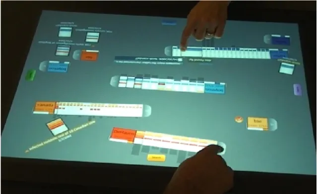
2.2
Software Visualization
Diehl [77] defines software visualization as:
“Software visualization is the application of information visualization in software engineering and can show the structure of software, run-time behaviour, and representation of source code.”
The goal of software visualization is to help users comprehend software sys-tems and to improve the productivity of the software development process [77]. Software visualization is essentially situated at the intersection of information visualization, software engineering, human computer interaction, graphics, and cognitive psychology [201]. Several overviews on software visualization ex-ist [76, 77, 312, 378].
We give an overview of some of the tools that have been used to investigate the three aspects of software including structure, behaviour, and evolution. We then present systems that have explored collaborative software development and visualization, and some approaches to evaluation of software visualization.
4BEyond time and errors: novel evaLuation methods for Information Visualization
2.2.1
Structure Visualization
Structure refers to the static parts and relations of software. In this section we present source code and static structure, software metrics, 3D, and UML.
Source Code and Static Structure
Many systems have looked at visualizing the source code and the static structure of software. SolidFX [322, 324] is an IDE for reverse engineering of C/C++ programs and provides many advanced visualization techniques to explore attributes of a code base such as call graphs, metrics, and UML diagrams. J3Browser [1, 2, 3] explores Java class relations and their other tool VisMOOS [102, 103] is an Eclipse plug-in. Hierarchical Net [15, 16] visualizes the structure of large software systems as software landscapes. VizzAnalyzer [195] is a framework designed for reverse engineering. VizzAnalyzer has a built-in tool Vizz3D [233], which can be used for visualizing class and package interaction, program evolution, and program quality. NosePrints [235, 236] visualizes code smells. Enhance [297] provides information about exception handling constructs and exceptions’ flow from the quantitative, the flow, and the contextual perspectives. Telea et al. [323] provide an open toolkit for visualizing telecommunications software for the purposes of reverse engineering. Clack [358] visualizes the structure of network routers. Barrio [78] visualizes class dependencies using clustering techniques.
Software Metrics
A software metric measures some property of a piece of software such as the number of lines of code [96]. Applying software metrics can help determine the quality of software [187]. Chidamber and Kemerer [64] provide the most widely cited suite of metrics. These include WMC (Weighted Methods per Class), DIT (Depth of Inheritance Tree), NOC (Number of Children), CBO (Coupling Between Objects), RFC (Response for a Class), and LCOM (Lack of Cohesion in Methods). Code Crawler [184, 186] is a language independent reverse engineering tool which combines metrics and software visualization techniques and was the first tool to use Polymetric Views [185], see Figure 2.3(a). CodeCity [360] a tool that stems from Code Crawler and Polymetric Views uses a 3D city metaphor to display additional kinds of metric information (see Figure 2.3(b)). A further study [361] extended CodeCity to focus on disharmony maps to look at the quality of the system design by focusing on design flaws. The Mondrian toolkit [213] aims to bring the Polymetric Views closer to the code by extending existing programming languages to use embedded scripts in their programs to create
(a) Code Crawler - Metrics Visualization [187].
(b) Code City - Metrics Visualization [360].
Figure 2.3: Software Structure Visualization Examples.
the visualizations as opposed to using another tool to generate the visualizations. Bergel et al. [27] extended the Mondrian toolkit by displaying dynamic information about CPU consumption in Class Blueprints. Softwarenaut [196, 197] also uses Polymetric Views but focuses on the dependencies between modules. Lagrein
is a tool that supports a number of Polymetric Views and augments them with software requirements and change history information [148, 149, 150].
Churcher et al. [66, 162] visualize object-oriented metrics with a focus on inheritance structures with cone trees, inheritance structures with metrics, hier-archies with tree maps [151, 300], web sites [120], class cohesion [65], and class clusters [136]. Various other systems and research groups have also looked at visualizing object-oriented metrics including CrocCosmos [192, 193], MetaViz [277, 278, 279], and CocoViz [37, 38, 39, 40].
3D Software Visualization
Teyseyre and Campo [326] provide an overview of 3D software visualization. Koike et al. [171, 172, 173, 175] described the significance of visualizing software information in three dimensional space and the problems of 2D visualization. This work also introduced the concept of a 3D class library browser to show method inheritance. The class hierarchy was represented as a tree in the X-Y plane and methods of each class were shown in the Z axis with the same X-Y coordinates.
Other early research has been done in 3D for visualizing Lisp programs [194], different features of a program [255, 256, 257], the layout and structuring of object oriented software in three dimensions as directed graphs (GraphVisualizer3D [97, 353, 354] and NestedVision3D [234]), SELF programs [82, 83, 122], call graphs [375], design patterns [55], and software architectures [95].
Some researchers have even explored different 3D visualization metaphors for source code comprehension. These metaphors include 3D cities (Software World [167, 168, 169], Component City [61], 3D City [232], Verso [181, 182], and CodeCity [360]), a 3D solar system metaphor [111], 3D self organizing maps [47], 3D file maps (sv3D [201, 202, 203]), and 3D computer game engines (Quake3 [178]).
UML Diagrams
Many systems have looked to reverse engineer systems in order to generate UML diagrams of large software systems [77]. Recent systems have taken a similar approach but given that software is more complex these days the software visualization research has been aimed at improving the understanding of UML diagrams by augmenting the UML diagrams with new features including areas of interest [53], textures [54], automatic layout of UML use case diagrams [91], semantic zooming [99], and digital pens and paper to create UML diagrams which can then be transferred to tabletop displays [72]. Sharif and Maletic [298] have also studied the effect of layout on the comprehension of UML class diagrams.
Visualizations of various UML diagrams such as class, object, sequence, and collaboration diagrams have been explored in 3D [75, 86, 107, 108, 210, 211, 253, 376]. Rather than representing strict UML diagrams in 3D, some research has been conducted that represents UML diagrams as 3D geon diagrams [58, 133, 134, 135]. The geon diagrams are made from 3D primitives such as cones, spheres, cylinders, and boxes. Another related area is visualizing CRC cards in 3D [285].
2.2.2
Behaviour Visualization
Behaviour refers to the execution of the program with real and abstract data. Behaviour data is collected at run time by instrumenting the code, debugger interfaces, byte code injection or extending virtual machines. In this section we cover algorithm animation and execution trace visualizations.
Algorithm Animation and Program Visualization
Algorithm animation and program visualization are useful for education and research into the design and analysis of algorithms and programs [312].Sorting Out Sorting[11, 12] was the first teaching film on algorithm animation and described nine sorting algorithms.
There are various algorithm animation and program visualization systems that have been produced and some early examples include: Balsa [48, 51] (the first real-time interactive algorithm animation system), Zeus [49] (follow up to Balsa), Tango [311, 310], Polka [313] (a follow up system to Tango), Pavane [282], Tarraing´ım [225, 226, 227] (a tool for visualizing Self programs).
Some more recent examples include Blumenkrants et al. [36] which look at narrative algorithm visualizations, Alspaugh et al. [4] explain algorithms using scenario visualizations, SIV [118] visualizes inter-dependencies between scenarios, Lumi`ere [28] for visualizing scheduling based algorithms, visualization of the computation tree of the Tutte Polynomial algorithm [328], and HDPV [318] for visualizing C/C++ and Java programs to understand recursion and the effect of programming errors such as buffer overflow. Python Tutor [114] visualizes the execution of Python programs online.
Stasko and Wehrli [314] identified the need for 3D in program visualization. They list the basic requirements for 3D computation visualization, define three categories for characterising visualizations, and discuss their system for support-ing 3D animation development by programmers. Other systems have explored the use of 3D graphics for program visualization. Some of these systems include Pavane [69, 282], Polka3D [314], Zeus3D [50], 3D-AAPE [110], JCAT [220, 221], and Alice [74].
Execution Trace Visualization
Jinsight [239, 240, 241, 242, 244, 245, 296], which stems from a wide range of work from IBM, is a tool for visualizing and analysing the execution of Java programs and is useful for performance analysis, memory leak diagnosis, debugging, or any task in which a user needs to better understand what a Java program is really doing. Figure 2.4(a) shows a brief overview of some of the visualizations produced by Jinsight. Follow up systems have looked at visualizing the execution patterns of web services [243] and streaming applications [238].
BLOOM [258, 259, 260, 261, 270, 271, 272] is a framework for understanding software through visualization (see Figure 2.4(b)). BLOOM provides facilities for static and dynamic data collection and offers a wide range of data analysis. The system includes a visual query language for specifying what information should be visualized. All these are used in conjunction with a back end that supports a variety of 2D and 3D visualization strategies. Other systems include JIVE [262, 263] for visualizing Java programs in action and JOVE [273] which provides slightly more detailed information about where execution is occurring. A follow up system focuses on more specific user abstractions [264]. Another system [303] focuses on virtual machine code (IBM’s Jikes RVM) and how to optimise it as opposed to user code. DYPER [265, 266, 267] does controlled performance analysis of Java systems and can obtain a variety of performance metrics including CPU usage, IO, sockets, heap utilization, memory allocations, phase analysis, and reaction analysis. DYMEM [268, 269] provides a visualization of object ownership from the memory of a running process.
Some researchers have explored using 3D for visualizing execution traces. TraceCrawler [112, 113] and CCJUN [373] explore visualizing feature traces in 3D of object instantiations and method sends to find which classes and objects are most active during the execution of a feature, what are the patterns of activity that are common in feature behaviour and which are specific to one feature. Bohnet et al. [42, 43, 344] also do dynamic analysis to look for features in C/C++ programs. Koike et al. [171, 172, 173, 175] has looked at visualizing large trace files in 3D of computer processes from a number of computers running in parallel and com-municating with each other. Storer et al. [315] have developed a tool for teaching object-oriented programming concepts to introductory level computer science courses. The tool provides Java3D visualizations of the execution of Java programs including representation of classes, objects, references, and method execution. The Rube [130, 166] framework uses VRML to produce finite state machines of programs. We previously created VARE-3D [8, 9] to create visualizations from execution traces using X3D and deployed over the web.
(a) Jinsight - Debugging Visualization [239]. (b) BLOOM, Spiral views of the stack (sampled during execution) [259].
Figure 2.4: Software Behaviour Visualization Examples.
2.2.3
Evolution Visualization
Evolution refers to the process of developing software and focuses on the changes of the program code over time to improve the software and eliminate bugs. In this section we cover visualizing software archives.
SeeSoft [92] and SeeSys [13] visualize various textual features of evolving large and complex software systems using the space filling technique which tries to convey as much information as possible with as few pixels as possible. The features include software metrics, number and scope of modifications, number and types of bugs, and dynamic program slices (see Figure 2.5(a)). The tools support a number of different views including line, pixel, file summary, and hierarchical representations.
Code Swarm [229] organically visualizes the commit history of open source projects using animations programmed in Processing [104, 254] and displayed as videos. Figure 2.5(b) shows a snapshot in time of visualizing the Eclipse IDE project. The developers and files of a project are represented as moving elements. Files are coloured differently for source code and documentation. Non-active files or developers eventually fade away. A bar chart at the bottom left is a reminder of the history of events. Another similar more recent system is Gource [59] which uses a forced directed graph layout.
(a) SeeSoft visualizing [92].
(b) Code Swarm visualizing the revision history of Eclipse [229]. Figure 2.5: Software Evolution Visualization Examples.
describe a suite of tools CVSGrab and CVSscan for mining software artifacts which display various artifacts using some advanced visualization techniques. CCVisu [29, 30, 31] use a method for computing clustering layouts of software systems for which the change history is available. WhiteCoats [212] visualizes the evolution of software from CVS repositories. VRCS [174] visualizes software revision histories using the Z axis as a time axis to represent the different revisions of each file. Panas [231] visualizes the evolution of the signatures of software binaries to find malicious code. Theron et al. [327] visualize the evolution of baselines and revisions of artifacts from software repositories. Verso [183] uses different views and animation to show structural and control version metrics of evolving software. Other evolutionary work has included the evolution of UML diagrams such as class diagrams [154, 155, 339] and model transformations [349].
2.2.4
Collaborative Software Development and Visualization
Ko et al. [170] explored how tools support collaborative software understanding for co-located software development teams but did not focus on software visualization per se. Of particular interest to us are software visualization tools and applications that support co-located collaboration.
Storey et al. [316] propose that collaborative software visualization can improve team software maintenance. They reviewed a number of existing software visual-ization tools and found that most of them rarely support any form of collaborative authoring and sharing of views. They recommend that designers of software visualization tools for software maintenance consider the social and collaborative aspects when building tools to help improve collaboration and usability, and adopt Computer Supported Cooperative Work (CSCW) [368] methodologies for evaluating collaborative visualizations.
Some prototypes have explored using different interactive devices to support collaborative software development. FastDash [35] is an ambient visualization system displayed on a projector for providing awareness about developer activities in software teams. IMPROMPTU [34] is a framework for sharing artifacts in a multi-display environment and a study was conducted with software development teams. CodeSpace [46] uses shared touch screens, mobile touch devices, and Kinect sensors to share information during developer meetings. CodePad [237] uses peripheral interactive devices ranging from portable tablets to tables to support developers in maintaining their concentration. CoffeeTable [117] is a visual system that uses digital pens and Wii Remotes for interaction to assist with software development processes such as what developers are working on, a summary of the architecture, and work flow activities. CREWW [45] is an interactive CRC card
system that uses Wii Remotes for collaborative requirements engineering.
Some prototypes have explored using multi-touch tables to support collab-orative software development. MasePlanner [215], DAP [216], and Agile Plan-ner [106, 350, 351] have explored planning software projects using horizontal touch tables for Agile software teams. SmellTagger [218] uses a small multi-touch table for code reviews to identify code smells in software with lightweight visualizations and software metrics. Mueller et al. [219] use a small multi-touch table to explore software modelling with CRC cards. Boccuzzo and Gall adapted their 3D software exploration tool, CocoViz [40], to multi-touch tables [41]. Soro et al. [308] compared observations of user behaviour in pair programming performed at a traditional desktop computer versus a multi-touch table. MT-CollabUML [17, 18, 19, 20] is a UML tool for multi-touch tables and a user study was conducted between the tool on a multi-touch table and desktop computer.
These multi-touch table prototypes are focused on exploration, modeling, and architecture of systems and use small tables. Any evaluation of these tables was done with non professional software developers. Our research focuses on bringing software visualization techniques such as visualizing the structure and internals of software systems to large multi-touch tables. We also exclusively evaluate our software visualization designs with professional software developers.
2.2.5
Evaluation of Software Visualization
There is no perfect method for evaluating software visualizations [121] nor any benchmarks [198] to determine how effective a software visualization is. There are various information visualization and software visualization design guide-lines [223, 301], taxonomies [161, 230, 250, 249, 251, 281], and frameworks [8, 9, 84, 85, 199, 317] that can be used to evaluate algorithm animations, software visualizations, and software visualization tools.
In a survey [176, 177] based on questionnaires completed by 111 researchers from software maintenance, re-engineering and reverse engineering, 40% found software visualization absolutely necessary for their work and another 42% found it important but not critical. 7% think that software visualization is at least relevant and 6% that they can do without it but it is nice to have. Only 1% believe software visualization is not an issue at all. Finally, 4% did not answer the question. From the same survey relatively few people consider software visualization their pri-mary research (11%) or at least a substantial part of their research (18%). Many people are doing software visualization research every now and then (20%), how-ever most people are primarily using or integrating existing software visualization tools developed by others (33%).
![Figure 2.9: TUIO Architecture [158].](https://thumb-us.123doks.com/thumbv2/123dok_us/9958875.2488393/54.892.192.748.124.430/figure-tuio-architecture.webp)
![Figure 2.10: Echtler and Klinker [89] multi-touch software architecture.](https://thumb-us.123doks.com/thumbv2/123dok_us/9958875.2488393/55.892.272.699.107.762/figure-echtler-klinker-multi-touch-software-architecture.webp)