Theses and Dissertations
2014
COSTUME DESIGN: A VISION FROM PAPER
TO REALITY
Caitlin Joye Moraska
University of South Carolina - Columbia
Follow this and additional works at:https://scholarcommons.sc.edu/etd
Part of theTheatre and Performance Studies Commons
This Open Access Thesis is brought to you by Scholar Commons. It has been accepted for inclusion in Theses and Dissertations by an authorized administrator of Scholar Commons. For more information, please [email protected].
Recommended Citation
by
Caitlin Joye Moraska
Bachelor of Fine Arts
Savannah College of Art and Design, 2011
Submitted in Partial Fulfillment of the Requirements For the Degree of Master of Fine Arts in
Theatre
College of Arts and Sciences
University of South Carolina
2014
Accepted by:
Lisa Martin-Stuart, Director of Thesis
Jim Hunter, Reader
Amy Lehman, Reader
© Copyright by Caitlin Joye Moraska, 2014
DEDICATION
To my friends and family who have helped me to achieve my goals and who have supported and pushed me to succeed. Without them and my many, mentors who have
ACKNOWLEDGEMENTS
ABSTRACT
What is art? Thomas Merton said, “Art enables us to find ourselves and lose ourselves at the same time.”1 This thesis is a detailed reflection of my process as a designer and how I have grown not only as a person but also, as an artist during my three years at the University of South Carolina. It describes my process and effort to refine my skills as a costume designer and to create the indelible world; that captures a plays mood, its characters, genre and time period. Magdelena Abakanowicz stated that, “Art will remain the most astonishing activity of mankind born out of struggle between wisdom and madness, between dream and reality in our mind.”2 I believe this is evident in my documented experience of the productions of Lady of Larkspur Lotion, This Property is
Condemned, Macbeth, Boeing Boeing and The 39 Steps, as well as in my internship at
TABLE OF CONTENTS
DEDICATION...iii
ACKNOWLEDGEMENTS...iv
ABSTRACT...v
LIST OF FIGURES...vi
INTRODUCTION:THE COSTUME DESIGNER:CREATING CHARACTER……… ....1
CHAPTER 1:TENNESE WILLIAMS ONE ACTS:TRAGIC TALES OF DELUSION………...4
1.1LADY OF LARKSPUR LOTION...5
1.2THIS PROPERTY IS CONDEMNED...8
CHAPTER 2:MACBETH:WALKING SHADOWS………...15
2.1RESEARCH AND ANALYSIS...17
2.2CONCEPT AND PRODUCTION...23
CHAPTER 3:BOEING BOEING:AFLIGHT RISK...30
3.1DEFINING THE 1960’S ...32
3.2CREATING AFARCE ...41
CHAPTER 4:INTERNSHIP:WORKING AT THE BARTER THEATRE...45
CHAPTER 5:THE 39STEPS:ONTHE RUN...50
5.1DEVELOPING CHARACTERS...54
5.2PUTTING EVERYTHING TOGETHER...62
LIST OF FIGURES
Figure 1.1 A Beggar Woman by Hughes Merle...1
Figure 1.2 New Orleans French Quarter Inspiration ...4
Figure 1.3 Lady of Larkspur Lotion Production Photo #1 ...6
Figure 1.4 Lady of Larkspur Lotion Production Photo #2 ...6
Figure 1.5 Railroad Track Research Image ...7
Figure 1.6 Tennessee Williams Portrait...10
Figure 1.7 Blue Velvet Scene……… ……….11
Figure 1.8 Kung Fu Hustle Landlady Image……… ……….…11
Figure 1.9 The Writer Rendering...12
Figure 1.10 Willie Rendering ...12
Figure 1.11 This Property is Condemned Production Photo #1 ...14
Figure 1.12 This Property is Condemned Production Photo #2 ...14
Figure 2.1 Lady Macbeth and Macbeth as King and Queen ...15
Figure 2.2 Three Witches Production Photo...16
Figure 2.3 Gustav Klimt Hygieia...18
Figure 2.4 Goya Saturn Devouring his Son ...18
Figure 2.5 Alexander McQueen Wrap Dress...19
Figure 2.9 Macbeth Rendering ...23
Figure 2.10 Hecate Rendering ...23
Figure 2.11 Witch 1 Rendering...25
Figure 2.12 Lady Macbeth “Suicide Scene” Rendering ...25
Figure 2.13 Witch 2 Rendering...25
Figure 2.14 Lady Macbeth Suicide Production Photo……… ..….29
Figure 2.15 Hecate Production Photo ...………..29
Figure 3.1 USC Boeing Boeing Poster...30
Figure 3.2 Boeing Boeing Publicity Photo...31
Figure 3.3 Yves Saint Laurent Mondrian Dress...32
Figure 3.4 Alitalia Stewardess Ad ...33
Figure 3.5 1960’s Uniform Research...33
Figure 3.6 Mary Quant...34
Figure 3.7 Mary Quant 1960’s Research ...34
Figure 3.8 1960’s Menswear Research Bernard ...35
Figure 3.9 1960’s Menswear Research Robert ...35
Figure 3.10 1960’s Women’s Sleepwear ...36
Figure 3.11 Prints and Pattern Research……… ...……….36
Figure 3.12 Robert and Gloria ...37
Figure 3.13 Bernard and Gabriella ...38
Figure 3.14 Gretchen and Berthe ...39
Figure 3.16 Robert Rendering ...41
Figure 3.17 Berthe Rendering...41
Figure 3.18 Barbie Fashion Illustrations………...….42
Figure 3.19 Gloria Rendering ...………..42
Figure 3.20 Gabriella Rendering ...42
Figure 3.21 Gretchen Rendering...42
Figure 3.22 Boeing Boeing Final Scene “Good Night” ...44
Figure 4.1 Barter Theater...45
Figure 4.2 Little House on the Prairie Research ...47
Figure 4.3 Laura Rendering ...47
Figure 4.4 Laura, Mary and Pa ...47
Figure 4.5 Mother Goose Color Pallet...48
Figure 4.6 Mother Goose Rendering ...48
Figure 4.7 Mother Goose the Musical Production Photo ...48
Figure 4.8 ‘Twas the Night Concept Research……… ..…………49
Figure 4.9 Reindeer Headpiece Sketch...49
Figure 4.10 ‘Twas the Night Before Christmas “Reindeer Scene”...49
Figure 5.1 The 39 Steps Color Research...50
Figure 5.2 Alfred Hitchcock Portrait……… ...….51
Figure 5.3 The 39 Steps Mood Board ...………..53
Figure 5.4 The 39 Steps Production Research ...53
Figure 5.7 Annabella Research #1 ...56
Figure 5.8 Annabella Research #2 ...56
Figure 5.9 Pamela Research #1...57
Figure 5.10 Pamela Research #2...57
Figure 5.11 Margaret Research...58
Figure 5.12 Margaret Rendering...58
Figure 5.13 Clowns Research #1 ...60
Figure 5.14 Clowns Research #2……… ...…………60
Figure 5.15 The McGarrigle’s ...61
Figure 5.16 The Jordan’s ...61
Figure 5.17 Annabella Rendering ...63
Figure 5.18 Annabella and Hannay ...63
Figure 5.19 Pamela Rendering...64
Figure 5.20 Pamela and Hannay ...64
Figure 5.21 Highlander Rendering ...65
INTRODUCTION
THE COSTUME DESIGNER: CREATING CHARACTER
“See. That man is playing the part of a beggar…. When we look at him we recall, not any particular beggar, but all beggars we have ever seen or read about…. He is dressed, not like a real beggar, but like a painting of a beggar. No, that’s not quite it, but as he stands
there or moves about we are continually reminded of great paintings.”
—Robert Edmond Jones
Figure 1.1 A Beggar Woman By Hughes Merle
sees him as a downtrodden man beaten down by the world. An idealized personification of what a beggar ought to look like. The beggar is romanticized through the arts and the emotional heartstrings of sympathy one feels just by looking at him. Jones describes the beggar as a painting and its ability to compositionally depict a mood and character of a beggar without words. In this sense it reflects the movement and dynamic quality of the person depicted.
The beggar, who in reality we ignore and pass by on the street, becomes a focal point and an interest of the artist. As a viewer we are drawn to him and feel his strife and desperation. What is it about him that speaks in such a way that merits interest? In a theatre production the beggar is no mere man but everyman. The beggar’s movement and dress define him and reveal his story. An audience can visually identify him. Jones suggests that, as a designer one must capture the mundane things of everyday life such as the clothing of a homeless man by creating an impression of his essence. Then by freeing oneself from a realistic viewpoint, in favor of imagination, a designer can achieve a level of artistic merit. Robert Edmund Jones’s ideas are essential in establishing specific characters in a play, their functionality and background.
ideas, research and a concept to a director and to a costume shop so that the design process and pre-production goes as smoothly as possible.
Through my class training I have had the opportunity to focus not only on the history and time period of garments but, also their construction and understructure. This helped me to accurately draw and represent the silhouette of a time period and to distinguish how a garment will flow and move onstage. Classes in crafts, hair and makeup then completed the “look” and silhouette of each time period; making it possible to enhance a character in different ways. I also experienced the design process from a set and lighting perspective. In these classes I learned how to identify the specific tools and elements needed to create the world of a play. Thus, bringing my costumes and characters to life by unifying all of the dramatic elements.
CHAPTER 1
TENNESSEE WILLIAMS ONE ACTS: TRAGIC TALES OF DELUSION
DIRECTED BY AMY HOLTCAMP &DAVID BRITT
SCENIC DESIGN:BRAD COZBY
LIGHTING DESIGN:CHRISTINE JACKY
Figure 1.2 New Orleans French Quarter Inspiration
forward. This can be seen in two of William’s short one act plays Lady of Larkspur
Lotion and This Property is Condemned. In these productions and in my designs I sought
to bring these “Tennessee Williams qualities” to life, by representing the characters in each play as the broken people they depict while, still giving an allusion of what they wish to be. In this sense I exposed their vulnerability and naivety. They are represented in a blurry, disconnected, sepia-toned world, but are relatable enough so that the audience can understand their plight.
1.1 LADY OF LARKSPUR LOTION
I found the The Lady of Larkspur Lotion a depressing description of a tragic circumstance. Each character has his or her own version of the unpleasant situation. It is hopeful “A world of pitiful fiction” from which they cannot escape. The play opens on a small cramped room in New Orleans’s French Quarter mid 1940’s. The environment is filthy, musty, sad and dismal, with a peculiar infestation of “flying cockroaches.” This day for Mrs. Hardwicke-Moore is unlike any other because it is the day she cannot escape who and what she is. It is the day Mrs. Wire gives her the ultimatum to “pay or get out.”
Figure 1.3 Lady of Larkspur Lotion Production Photo #1
The writer I pictured as a slovenly, dirty, “starving artist” type. He is wrinkled, living and sleeping in the only suit he has. His robe is tattered and stained with ink, sweat and years of wear. His colors are also dim hints of color and hope; as for Mrs. Hardwicke-Moore, I used blues and grays and green. I wanted the writer to have a more gritty wool texture, which, can be seen in his paisley terry-cloth robe and his knit cap. For this character I also, wanted to depict him as an attempt to look like his “ideal” Anton Chekov by having him wear rounded glasses and have a beard.
2.1 THIS PROPERTY IS CONDEMNED
Tennessee William’s This Property is Condemned is a sad reflection of tainted innocence. It is a melancholy, existence of a child forced to grow up too soon, vs. a carefree young boy who unknowingly wants to take advantage of her. I was drawn to Tennessee William’s gothic description of the characters and the point of view of the story, told through the eyes of children. Each character has a significant prop, a doll and a kite, symbolic of their childishness and personality. The “crazy doll” is a mirror of the young girl’s destiny to be a prostitute like her sister. The red kite shows a boy’s flighty tendencies pushed aside in the favor a young girl. Yet for all their silly, naive banter, both prove wiser than their years in a perverted, juvenile manner.
The two characters in This Property is Condemned, Willie, a girl of thirteen and Tom, a boy of fifteen, are described in great length by Tennessee Williams. Willie is pictured in her sister’s old torn dress that is obviously too big for her, wearing cheap costume jewelry and covered in soot. In the script the dress is blue velvet but in designing and speaking with the director we decided we wanted something brighter to show her loss of innocence. I decided to put her in a deep, burgundy satin evening gown. She is a living replica of her doll. Her fabrics and details are light and feathery like her flakiness, weighed down by dirt and a tainted childhood.
Figure 1.6 Tennessee Williams Portrait
To begin my renderings for The Lady of Larkspur Lotion and This Property is
Condemned, I started looking at the playwright, Tennessee Williams’, biography and
period research for each play. From this point I was able to create a color pallete and story of emotions that I wanted the costumes to evoke visually. I also, did some additional research by watching films for inspiration including, This Property is
Condemned with Robert Redford, Paper Moon, Camille and Blue Velvet and for Mrs.
Figure 1.7 Blue Velvet Scene
For each play I wanted a separate feeling and rendering style. In order to accomplish this I chose different media and color scheme for theatricality and to support the characters of each one act. For my renderings for Lady of Larkspur Lotion I used watercolor and a mixture of colored pencil and chalk-pastel. This created a soft faded appearance, and for my background I sponged sepia paint to create an old photograph mood. In contrast my renderings for This Property is Condemned are darker with more shadows created by using charcoal and Prisma markers, to create a child-like storybook quality. I then scanned and put all of my renderings in Photoshop to enhance the color and tints. After I printed these I then redrew on top of my renderings, to add texture.
To produce these two one acts for stage I pulled mostly from stock and period garments in the costume shop. For these costumes I mostly altered, distressed and re-dyed them. Mrs. Hardwicke-Moore’s slip was altered and bleached out then re-re-dyed several times to acquire a worn, faded look which I then smeared with some grease and makeup to make it feel like a “dirty prostitute” had been living in it for years. The pants for the writer we did not even hang up but wet them and crumpled them in a pile to make them appear as messy as possible. For This Property is Condemned I bought a vintage 1980’s dress and manipulated the fabric so it appeared more 1930’s-40’s. To complete the dress we distressed it with paint and frayed the material. I also, lace painted the hem by spray painting through lace to get an uneven splotchy texture.
Although these two shows were just one acts, it gave me the opportunity to focus on the process of designing a show. The Lady of Larkspur Lotion and This Property is
Condemned are two separate stories with different styles and looks however they have
CHAPTER 2
M
ACBETH: WALKING SHADOWS
ADAPTED AND DIRECTED BY:ROBERT RICHMOND
SCENIC DESIGN:HEATHER ABRAHAM
LIGHTIGN DESIGN:BRAD COZBY
HAIR/WIG/MAKEUP DESIGN:VALERIE PRUETT
Figure 2.1 Lady Macbeth and Macbeth as King and Queen
seduced, by both his wife’s vanity and the witches’ prediction of higher status; transforming him into a paranoid schizophrenic. Macbeth kills the King Duncan while he sleeps, and also all those that impede his quest for the Scottish throne. This leaves the notorious, couple guilt ridden, as their sanity slowly erodes away, revealing the evidence of their malicious crime. Proud Macbeth over-estimates foretold, invincibility, foretold by the witches and is defeated by MacDuff. MacDuff avenges his family’s murder and returns Scotland and the throne to the rightful heir, Duncan’s eldest son Malcolm.
Figure 2.2 Three Witches Production Photo
particularly had an odd fear and fascination of evil, including King James. Disease or suffering was attributed to Satan and one’s sin, according to the Protestant religion. This can be seen in the retribution or “just rewards” of Macbeth and his wife.
A burdensome, single or elderly woman in society was targeted as a scapegoat, named as a witch and “consort” of the devil.3 The witch’s leader was called Hecate and could be found at the crossroads. During this time in history witch trials were prevalent. Both young and old women alike were hung, burned, drowned and tortured. King James was said to have had an encounter with a witch, and he wrote a few books on the subject. In Macbeth the witches are antagonists for our ill-begot hero, Macbeth. The witches use riddles and apparitions to push and deceive him, causing him to act out of character, leading him to his “destiny” and final demise.
2.1 RESEARCH AND ANALYSIS
Goya paintings for their vivid color and grotesque horror and used these artists to help create a representation of the war faring world of Macbeth.
Figure 2.3 Gustav Klimt Hygieia Figure 2.4 Goya Saturn Devouring his Son
McQueen. I was partial to their use of bold beauty and elegant form. I studied the drapery and line of the fabrics as well as their texture, color and the way they reacted to light and shadow. To me they represented the fantastical and wild nature I wanted to attribute to the witches and Lady Macbeth.
Figure 2.5 Alexander McQueen Wrap Dress
Figure 2.6 Alexander McQueen Wool Dress
other, I related through color and style. Essentially, I had a generic foundation garment and elaborated on it for each character to unify everyone in the cast. I imagined the characters as broad shouldered, with high chainmail necklines, heavy boots, wild hair and braids.
Once I had a basic silhouette for everyone in the cast and unifying color scheme, I supported most of my design details and choices with my character analysis. Analyzing the main characters of a play is crucial in order to understand their traits, motivations, personalities and how these contribute to the actions in the plot. By defining these qualities I can then link specific archetypes to a character. These then can be brought out in a person’s appearance and emotional color pallet. Within the script there can also be textual evidence and dialogue that indicates the look and persona of a character.
Figure 2.7 Feast at Macbeth’s Castel with Duncan Production Photo
inheritance. These three characters visually had to convey the idea of royalty. In order to do this I chose rich fabrics such as silk and velvet in colors such as burgundy, plum and gold, combined with fur pieces and metalwork to embellish their clothing and set them apart from the other characters. Macbeth, in comparison, is a general in the Scottish army, Thane of Glamis and cousin to the king, who will in fact kill for the chance to be king. He is easily swayed and we see him progress from a solider, to a king, and finally to a mad man. It was vital to have several different costumes to help represent Macbeth’s change of status and the diminishment of his mind. Lady Macbeth, his wife, was married previously in Shakespeare’s text and lost a child. She is cold, calculating and craves prestige and a higher rank in society. I wanted her costumes to be evocative, bold and form-fitted with masculine touches, such as her corselet armor piece. Her clothes complement her husband’s in color scheme and richness, and their costumes progress with their characters.
Banquo is a loyal subject and of the same rank as Macbeth. It is foretold that Banquo’s sons will be kings and his murdered ghost haunts Macbeth for having him murdered. This brought about the question of how to represent a ghost in this world and if the actor would have the ability to change before he reentered as a ghost. In the end we decided Banquo’s ghost was just a dead, bloody corpse, slowly driving Macbeth crazy.
flees the country for help leaving her and their children alone without protection; they are murdered in his absence. She, in comparison to Lady Macbeth must appear loving, matronly and pure. For Lady Macduff I chose a distinctive conservative, medieval silhouette.
Figure 2.8 Macbeth Fighting MacDuff Production Photo
The porter in Macbeth is the comic relief and clown. He is a bawdy, drunken, peasant who guards the gate to Macbeth’s castle on the night of the King Duncan’s murder. At a glance the porter has to appear like a lowly, grungy servant who is filthy and drinks often. To achieve this look the porter wore distressed, muddy rags and was covered in soot. I designed a pudgy gut and made his face ruddy and red from drinking.
movement. Finally, I began sketching with a grittier media of charcoal and at a larger scale. My drawings became more gestural and I was finally able to capture that missing element that helped to define the show.
Figure 2.9 Macbeth Rendering Figure 2.10 Hecate Rendering
2.2 CONCEPT AND PRODUCTION
masculine and strong willed and unfeigned by blood and death and their sense of loyalty to their king.
I wanted to represent this attitude and lifestyle texturally, by incorporating layers of fur, wool, suede and leather with homespun and quilted fabrics and silks. It is also a society at war and constantly fighting for survival, so armor and metalwork was needed to create this sturdy, silhouette and form. For this show I was lucky to pull several looks and pieces from previous shows for most of the ensemble members. However, they did have to fit and match within the world. To make these garments cohesive we altered and embellished items with trim and metal studs, and dyed or distressed the over layers.
Figure 2.11Witch 1 Rendering
Unique to our production was the portrayal of Fleance, Banquo’s young son who is predicted to be King of Scotland one day. Shakespeare links King James to Fleance as he is a descendent and rightful king. Fleance represents the innocence and virtue of good and loyal men. The director wanted Fleance to be ever present, like the witches watching scenes unfold from a tree. To develop this character we transformed a teenage girl into a young boy. We achieved this by giving her a loose, boxy figure with layers and a yoke over-collar to square her shoulders.
Building costumes for Macbeth required problem solving and essentially, trial and error using various non-traditional materials. Some challenges were creating light flexible armor and chainmail and rigging gauntlets, and designing headpieces for quick changes. For example we knitted collars to be chainmail out of rope and then pressed silver leafing onto them to have a reflective, metal quality.
I was also confronted with the quandary of how to create a physical representation of the three witches and Hecate. Like in Jones’s quote I was searching for a way to evoke power, fear and the embodiment of their spirit. The witches have evil natures and seductive allure over Macbeth’s fate. I found it challenging to illustrate a unique version of a witch without making them stereotypical. I needed something to make them conceptually stand on their own in a remarkable way, to set them apart from other witches. They each had a primitive, feral quality and sense of evil beauty. I designed skin that was gritty and textural creating a unitard out of stretch, crushed fabric and painting in shadows and color. Then by using knit and woven layers of fabric we were able to create a bark-like, cracked skin for the witches and scales for Hecate.
Each of these characters also, had their own distinctive color pallete. The witches had a mixture of muted blues, grays, purples and brown in contrast with Hecate’s earthy browns, reds, tans and gold. They also, had mossy, wild and unkempt hair and fabrics that draped and clung to their body. This helped to reinforce the witches’ relationship to the woods and made them appear dirty and ragged yet young and seductive in physique. Hecate evoked as if she were shedding and molting her lizard-skin.
These creatures did evoke an element of corruption and decay in the world, by metaphorically sucking the life out of Scotland. Although I think they would have been more visually dynamic if I had enhanced or stylized their silhouettes in some way, I do not think that they detracted from the world of the play. I could have made stronger design choices but I believe they did help develop the world and bring it to life.
Macbeth was my first full cast design experience that was realized and carried
Figure 2.14 Lady Macbeth Suicide Production Photo
CHAPTER 3
BOEING BOEING: A FLIGHT RISK
DIRECTED BY:RICHARD JENNINGS
SCENIC DESIGN:MEREDITH PAYSINGER
LIGHTING DESIGN:ROBERT EUBANKS
HAIR/WIG/MAKEUP DESIGN:VALERIE PRUETT
Figure 3.1 USC Boeing Boeing Poster
Airport. Today is unlike any other in the world of our main character Bernard, for he loses control of his detailed schedule. Everything is off-kilter, due to the recent acquisition of the new Super Boeing Jet that his three fiancés work on. His usual plans fall through with the arrival of an old friend and his three fiancé all in one day. He is left to suffer the consequences of his actions. For the audience however, it is a bumpy and wild ride.
3.1 DEFINING THE 1960’S
Figure 3.3 Yves Saint Laurent Mondrian Dress
Figure 3.4 Alitalia Stewardess Ad Figure 3.5 1960’s Uniform Research
wear. Along with the re-emergence of “Dandy’s” in menswear fashions including tailored suits with eccentric patterns, frilly floral silk ties, slim fitted pants and turtlenecks.
Figure 3.6 Mary Quant Figure 3.7 Mary Quant 1960’s Research
Bernard is a confident American playboy living in Paris. He is orderly and schedule based. Over the course of the show he becomes frazzled and more and more disheveled. I based his suave personality off the MAD Men character, Don Draper with the style and wit of James Bond. I wanted his suit to be two-tone with his pants darker than his jacket, so they he appeared more formal and like the mod fashion. For his color pallete I decided to use blue, navy and black because they would complement all of the stewardess colors and look sharp and sophisticated.
Figure 3.8 1960’s Menswear Research Bernard
Figure 3.9 1960’s Menswear Research Robert
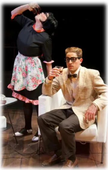
to Bernard’s was more frumpy and textural. Robert’s color pallete was neutral using browns and yellows so that standing in Bernard’s snazzy flat he appeared lost and out-of-place.
I chose the blue and gray suit tones to complement their female counterpart’s color pallete. For example Robert’s beige and yellow suit jacket helps to link his character with Gretchen, who is in yellow as well. It also helps to allude to their romantic feelings for one another later in the second act of the production. Robert wears a dark navy suit, which connects him to Bernard, as he seems to emulate Bernard and transforms into a more confident “playboy” type.
Figure 3.10 1960’s Women’s Sleepwear Figure 3.11 Prints and Pattern Research
Boeing Boeing embraces the freedom of women at the beginning of the sexual
Each female character in the show has her own unique color pallete and style, personified by her country of origin; American, Italian, German and French. The cut, line and fit of each costume was also designed to accentuate each actress and give them a feminine appearance and walk. This can be seen in the short A-line Mary Quant styled dresses and the sheer lingerie and undergarments worn throughout the show, to draw attention to the actress’s silhouette and physique.
Figure 3.12 Robert and Gloria
contrast with her Auburn wig. Designing Gloria’s uniform I researched the traditional TWA uniform and found it plain. Then I began looking at various vintage patterns decided to combine stylistic elements of the period into something that echoed the fashion icon, Jackie Kennedy. I did this by adding a rounded boat-collar, ¾ length sleeves, and a fitted A-line skirt, matching shoes and pillbox hat and some pearls.
Figure 3.13 Bernard and Gabriella
sleeves, and narrowed the hem so it was no-longer loose but, hugged her hips and created an hour-glass shape.
Figure 3.14 Gretchen and Berthe
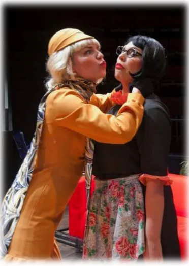
For the three stewardess uniforms we ended up using the same polyester fabric in different hues of scarlet red, royal blue and mustard gold. This fabric was durable and stayed neat. It also, resembled a wool or gabardine that they would have been made of in the 1960’s. I then selected a contrast color for each uniform that matched their country of origin for example, Italy red and green, America blue and white, Germany gold and black. I then used these color schemes to design a bag to match their style with their airline logo.
Figure 3.15 Berthe and Robert
traditional black and white French maid. Her uniform was simple with ¾ length sleeves and pink ruffle detail on the hem and a high, ruffle collar. She needed to have comfortable shoes due to the fact that she was running up and down stairs in each scene. I decided to get black and white saddle shoes because; they matched her uniform, and I added some chevron tights for flare. I wanted it to appear that Bernard had chosen a fashionable and youthful housekeeping uniform for her.
3.2 CREATING A FARCE
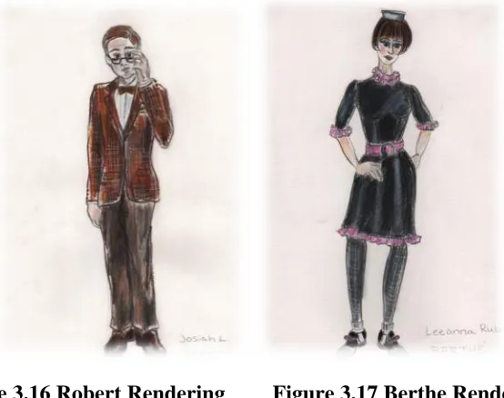
Figure 3.16 Robert Rendering Figure 3.17 Berthe Rendering
glamorous and visually, evocative. The line and shape of the figures helped to tell more of a story. I also, changed the media in which I rendered my sketches from watercolor to bright, Prisma-color markers. This helped create the high-fashion sketchy quality I desired with bold use of color. I felt these new drawings were much more successful in conveying the characters in Boeing Boeing as well as their identity and beauty of their costumes.
Figure 3.18 Barbie Fashion Illustrations
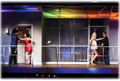
The production of Boeing Boeing supported the themes of constant motion and sexuality, with characters running from room to room and the blatant sexual innuendos. The set met the necessary requirements for the script and had a sense of color and style mirrored in the lighting and costume. I believe the design team underestimated the physical blocking of the production and the director’s highly comedic interpretation of the script. Knowing this I wish I had made my designs in a more heightened, exaggerated style. Overall, I would say the design team worked together to create the given world the director wanted, I believe the audience found the show amusing and responded well. I think the use of sound and music added to the quality of the show as well and gave it eccentricity, setting the tone for the show’s time period. There was also a curtain speech by a stewardess that established the setting and created a complete sensory experience for the audience with sights, sounds and emotion.
As a designer I believe this show helped me to establish a specific design process that is more efficient and easier to convey to a director and shop staff. For example,
Boeing Boeing seemed to come together quickly and I was able to manage my time
without being too overwhelmed. I was more decisive and had a clear vision based on my research and breakdown of each character. Previously, I had a hard time condensing all of my research, which made it difficult to communicate my designs.
Boeing Boeing gave me more confidence and a personal step-by-step design
helped me to discover the most effective media to finish my renderings quickly and in good quality. This show was a turning point as a designer. I gained more experience speaking with a director and the drapers building the costumes. I felt this made a better collaborative process and successful product. I was very happy with the outcome visually; it was what I hoped to create for the world of the play and the costumes truly brought its characters to life.
CHAPTER 4
INTERNSHIP: WORKING AT THE BARTER THEATRE
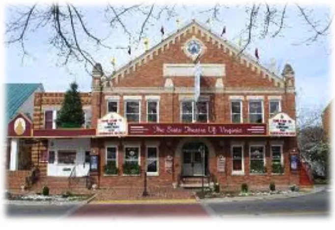
Figure 4.1 Barter Theater
To gain hands-on professional work experience I took an internship at the Barter Repertory Theatre in Abingdon, Virginia. Although it is a smaller company I felt it was an advantage because I was able to work in all areas involving the costume process, from working in the shop and assisting designers, to backstage with the wardrobe crew, running the show and doing maintenance on costumes.
large show. You can never have too many lists or charts. I also learned how to maintain a budget, and fitting room etiquette and preparation.
I was also faced with new challenges such as working with Equity actors, making a pre-set and run list, and maintaining a show quickly and efficiently. Before working at Barter I had not previously worked with many Equity actors so I had to learn some of the rules involving dry cleaning, laundry, pre-sets and half hour rules. Mainly this meant that in-between shows we had to finish laundry, steaming, wig maintenance and notes before half hour. This forced me to learn the best and quickest way to accomplish these tasks. I began to understand how to track and set pieces from one scene to the next and the best way to carry out a quick change.
During my time at the Barter Theatre I was given the chance to design three shows with the junior company, The Barter Players. All of these productions were for a young audience and generally were only an hour long without an intermission. This was new to me as a designer due to the fact that I was faced with creating multiple characters with a small cast, on a low budget and small shop assistance.
These shows were taxing and required a lot of additional work but I was glad to have the opportunity to work on some original scripts and with some talented actors and passionate designers and directors. I was very inspired by each production; they were all unique re-tellings of classic stories. This gave me a lot of design freedom as far as creating a concept and artistically crafted world with a child-like perspective but with an underlying deeper message at heart.
costume design and theatre. I think I came away with more confidence, real-world experience and some networking opportunities that will better prepare me for my future career. My training at USC contributed to my success at the Barter and prepared me for a professional work environment. It also made me appreciate the experimental and unique production styles and dedication of my mentors and fellow students. In-turn giving me a new outlook and better preparing me for my final show at USC.
Figure 4.5 Mother Goose Color Pallet
Figure 4.6 Mother Goose Rendering
Figure 4.8 ‘Twas the Night Concept Research
Figure 4.9 Reindeer Headpiece Sketch
CHAPTER 5
THE 39 STEPS: ON THE RUN
DIRECTED BY:JIM HELSINGER AND BRAD DELPLANCHE
SCENIC DESIGN:XUEMEI CAO
LIGHTING DESIGN:ASHLEY PITTMAN
HAIR/WIGS/MAKEUP DESIGN:VALERIE PRUETT
Figure 5.1 The 39 Steps Color Research
references, style, and a visual homage to his cinematic genius. The play consists of a cast of four players who play everyone in the show. It is set in 1935 London, pre-World War II, where a bored and lonely bachelor longs for some excitement after being abroad. The protagonist Richard Hannay soon gets more than he bargained for as he becomes exposed to a world of espionage and deception. The show follows him and the variety of people he meets, from all walks of life along the way. 39 Steps is reminiscent of Film Noir and detective thrillers as Hannay uncovers the meaning of the 39 Steps. This show proves that anything can happen during a performance and feeds off of the many, comedic hiccups of the cast. The audience is rolling-on the floor with laughter, and left with a sense of a contrived, Hollywood happy ending of comedic bliss.
Figure 5.2 Alfred Hitchcock Portrait
Hitchcock’s classic films such as Psycho, The Birds, Vertigo, Strangers on a Train, To
Catch a Thief and Dial M for Murder. These films show themes of murder and duplicity,
and the idea of an innocent man on the run. Hitchcock had a talent for blurring the lines between right and wrong, reality and fiction and a unique way to develop a plot and story. Everything is nondescript gray and you are left wondering what the outcome of this journey will be. This is true also for his film The 39 Steps. The stage production of the show however, is more light-hearted and builds off known Hitchcock scenes and characters. They have been carefully put together throughout the script in such a way that it becomes a visual salute to Hitchcock and his fans. Like his films The 39 Steps stage adaption focuses on the psychological development of the main character and how he becomes transformed by his journey of self-discovery.
Men’s wear during this time is fuller and more relaxed “drape cut” with wide pleated trousers, loose cuffs, broad slopping shoulders and three button or double-breasted suits. Famous icons also influenced men’s fashion like Fred Astaire and Edward the VIII for evening wear coat and tails and athletic travelling attire. Ties were are also wider and became textural and colorful like men’s suits. Men’s fashion emulated film noir mobsters and detectives with trench coats and snap-brim Fedoras in the same way that women’s wear copied famous actresses.
Figure 5.3 The 39 Steps Mood Board
5.1DEVELOPINGCHARACTERS
As a whole The 39 Steps is formula-driven as far as the conceptual world and plot. It is the variety of characters that forward the dramatic action. To begin my research for this production I created a mood board with imagery from the script and things that I felt defined the show. I then started looking at other productions to see how other designers depicted these definite characters. It was necessary to simplify these stereotypical characters so that each costume immediately identified that character to the audience. To break down the multitude of characters I identified what made characters unique by making a pieces list. This included hats, wigs, accessories and any other garments a character might need. By doing this I was able to make a “pull and shop” list based on articles of clothing and a style that defined each character or occupation: for instance, a uniform hat, whistle and jacket for a police bobby or a white jacket and white, brimmed hat for a milkman.
Figure 5.5 Hannay Research Figure 5.6 Hannay Rendering
The script describes Hannay as “approximately thirty-seven five-foot ten, good looking, with wavy hair, light brown hazel eyes and an attractive pencil mustache.”4 I decided Hannay needed to reflect a British sporting gentleman. Since he only plays one character throughout the show, unlike the rest of the cast we decided he would grow his own mustache for the role because it was crucial to create the character. For his costume I selected a wool suit and vest in a brown hues with sienna accents and a matching print tie. To complete his look I found a tan overcoat, brown fedora and reddish-brown dress shoes. I felt that this represented the typical 1930’s men’s silhouette and the prints and color pallete screamed boring, middle class British society. This is where Hannay finds himself at the beginning of the play, bored with life, longing for adventure and change of scenery.
This show gave me the opportunity as a costume designer to show off the variety of style and dress of the 1930’s for both men and women in different classes. This can be seen in the three female character roles that are drastically different in personality, which is reflected in their style. The same actress plays these women so I wanted each costume to have a unique silhouette, fabric and drape.
Figure 5.7 Annabella Research #1
Figure 5.8 Annabella Research #2
support a knife rig that could quickly be set in and taken out which in part defined the design and construction of the garment. To account for the knife placement there needed to be an understructure to support the knife. We ended up using a merry widow with boning and shaping to attach the knife to securely. To complete Annabella’s allure we decided to put her in a short spit curl bob with a black hat and veil, T-strap heels, a feather stole and beaded clutch to hold her gun.
Figure 5.9 Pamela Research #1 Figure 5.10 Pamela Research #2
wrist with a narrow ankle-length hem. To complete her silhouette I added a matching clutch and oxford heels, a straw feather hat and white gloves. She also had pearl details in her jewelry and her buttons to complement her wispy white collar. I chose green as her color because it was striking against her platinum blonde wig; it was also a period color and fit the color scheme of the rest of the production. It was important for Pamela’s dress to be slipped on and off easily and for her to be able to remove her stockings on stage. To account for this I added triangular panel details or gussets in the skirt to create fullness at the hem. This allowed the dress to be fitted through the hips and slightly flare out to create an elegant line and period walk. We did have to alter the blousy tucks on her dress because the director preferred a more fitted silhouette. I believe this took away some of the period style of the dress but I was happy with the way the dress turned out with her demure collar it reflected the 1930’s fashion figures.
Figure 5.13 Clowns Research #1 Figure 5.14 Clowns Research #2
5.2PUTTINGEVERYTHINGTOGETHER
In my work on The 39 Steps I confronted some issues that I had not previously encountered. One being that the characters are so set and visually specific that it left little room for creative interpretation. As a designer the process seemed cut and dry. I felt I was just replicating what other productions had done. However, I did take some artistic license in developing some of characters in the play and owning them in a way.
Another obstacle that I had never had to address was creating reverse gender characters in a short amount of time. This can be seen for Mrs. Jordan and Mrs. McGarrigle and Mrs. Higgins. In order to accommodate for the quick change and imply that a man is an older woman we ended up developing a padded chest unit built and rigged into a skirt set for these characters. It was also interesting fitting and buying heels to fit men. In theory the size difference between men and women’s shoe sizes is about two sizes up but you can never be sure unless you fit them.
Figure 5.17 Annabella Rendering
Figure 5.19 Pamela Rendering
Figure 5.21 Highlander Rendering
CONCLUSION
BECOMING A CONFIDENT DESIGNER
“Style is a way to say who you are without having to speak.”-Rachel Zoe5
I believe as a designer this is a very true statement. It is what a costumer does in theatre. We reveal the hidden character and personality through dress much like an artist paints a portrait. This thesis is an accumulation of my experiences and journey as a designer from indecision to assuredness. I will begin my career with the ability to visualize a show from paper to reality.
I believe this exploration of self and skill has made me a more confident designer and better equipped me for my future. I have learned to value my creativity and dedication. I can meet a show head-on with my refined, personal design process and have the ability to carry out my visions. By defining a play’s mood, conceptual world and characters through research, with good communication, organization and preparation anything is possible. A costume designer creates ideas by visually linking texture, line, color, silhouette and period style to sense memory. She creates an experience that is limitless without saying a word the costume speaks for itself. When a character is made material it is breathtaking and thrilling. Theatre is a way to transcend time by
5 https://shine.yahoo.com/photos/quotes-fashion-week-prada-chanel-marcjacobs
W
ORKSC
ITEDBloom, Harold. Shakespeare Through the Ages: Literary Criticism. Macbeth (516-545). New York, 2008.
Buchan, John. The 39 Steps. Adapted by Patrick Barlow. Samuel French. NY, NY. 2009.
Camoletti, Marc. Boeing Boeing. Translated by Beverly Cross and Francis Evans. New York: Samuel French, 1962.
Hennessy, Kathryn. Ed. Fashion: The Definitive History of Costume and Style. New York: Dorling Kindersley, 2012.
Kott, Jan. Shakespeare Our Contemporary. “Shakespeare-Cruel and True.” (345-353) New York: W.W. Norton and Company Inc., 1964.
Jones, Robert Edmond. The Dramatic Imagination: Reflections and Speculations on the Art of the Theatre. New York: Theatre Arts Books, 1941.