National Technical University of Athens
School of Applied Mathematical and Physical Sciences Postgraduate Master's Programme in Applied Mathematical Sciences
University of Seville
Department of Statistics and Operational Research
Classical and Modern Approaches to
Classication and Dimensionality Reduction
Techniques
Dorothea Barmpakou
Master Thesis
Supervisors:Professor C. Caroni (National Technical University of Athens, Greece) Professor I. BarrancoChamorro (University of Seville, Spain)
Examinor:
Jose María Fernández Ponce (Profesor Titular de Universidad de Sevilla)
This work was carried out with the support of the Erasmus Programme under an InterInstitutional Agreement of Higher Education Student and Sta Mobility between the
University of Seville and the National Technical University of Athens.
Εθνικό Μετσόβιο Πολυτεχνείο Σχολή Εφαρμορμένων Μαθηματικών και Φυσικών Επιστημών Δ.Π.Μ.Σ στις Εφαρμοσμένες Μαθηματικές Επιστήμες Πανεπιστήμιο Σεβίλλης Τμήμα Στατιστικής και Επιχειρησιακής ΄Ερευνας
Κλασικές και Σύγχρονες Μέθοδοι για την
Κατηγοριοποίηση και Μείωση Διαστάσεων
Δωροθέα Μπαρμπάκου
Διπλωματική εργασία
Επιβλέπουσες Καθηγήτριες: Χ. Καρώνη (Εθνικό Μετσόβιο Πολυτεχνείο, Ελλάδα) I. BarrancoChamorro (Πανεπιστήμιο Σεβίλλης,Ισπανία) Εξεταστής:Jose María Fernández Ponce (Καθηγητής Πανεπιστημίου Σεβίλλης)
Η εργασία αυτή πραγματοποιήθηκε με την υποστήριξη του προγράμματος Erasmus στο πλαίσιο Κινητικότητας Φοιτητών και Προσωπικού μέσω της Διμερούς Συμφωνίας μεταξύ του
Πανεπιστημίου της Σεβίλλης και του Εθνικού Μετσόβιου Πολυτεχνείου.
Acknowledgements
Throughout the accomplishment of this master thesis I have received a great deal of support.
First of all, I would like to express my very great appreciation to my supervisors Professor C. Caroni of the School of Applied Mathematical and Physical Sciences at the National Technical University of Athens and Professor I. BarrancoChamorro of the Department of Statistics and Operational Research at the University of Seville. Their valuable contribution encouraged our mutual and harmonious cooperation.
Then, I would like to acknowledge all of my professors from the Postgraduate Master's Programme, as well as those from my Undergraduate Degree that played an important role in my education.
Finally, I would like to thank my family for their support all of these years, nancial and moral, and my friends for their help and encouragement.
Abstract
In this thesis, we focus on techniques for dimensionality reduction and classication problems, which facilitate the statistical analysis and interpretation of complex data.
In Chapter 1, we present Principal Components Analysis (PCA): a dimensionality reduction technique. We introduce its aim and the theoretical basis, we dene the properties of Principal Components and their correlation structure. The loadings, component scores and correlation circle are analysed. Meth-ods for extracting the appropriate number of Principal Components are included. Furthermore, we carry out a classical and a modern application of PCA to two dierent datasets. Specically, we de-scribe and inspect the Irish dataset, in which the number of variables is lower than the number of the individuals (classical application), and the Chicken dataset which includes far fewer individuals than variables (modern application).
In Chapter 2, Classication is introduced and some of the most important parametric classiers are analysed. Firstly, we introduce Logistic Regression Analysis, the interpretation and estimation of its coecients and the ROC Curve and we apply it to the Irish dataset. Then, Linear Discriminant Analysis is introduced, its method and application to the Irish data. Lastly, the theoretical basis of Quadratic Discriminant Analysis is presented and its application to the Irish dataset as well.
In Chapter 3, we introduce KNearest Neighbors nonparametric method for classication, its method and application to the Irish dataset and to a more complex one: Khan dataset. We extract important insights.
Chapter 4 is devoted to methods based on Trees. More precisely, Classication Trees and Regression Trees methods are analysed. Regarding the Classication Trees, we introduce the method, present the building procedure of a classication tree, the tree pruning and some advantages of Classication Trees method, and we apply it to the Irish dataset. Regarding the Regression Trees, we introduce the method and the pruning procedure, and we apply it to the Boston dataset.
Finally, Chapter 5 includes important remarks and conclusions, taking into account all of the methods applied to the Irish data.
Resumen
En este Trabajo Fin de Máster, nos centramos en técnicas para reducción de la dimensionalidad y clasicación, que facilitan el análisis estadístico e interpretación de datos más complejos.
En el primer capítulo del trabajo, se presenta el Análisis de Componentes Principales (ACP o PCA), una técnica útil para reducción de dimensionalidad. Introducimos sus objetivos y su base teórica, denimos las propiedades de las Componentes Principales y su estructura de correlaciones. Se anal-izan las cargas (loadings), scores y el círculo de correlación. Así mismo se incluyen métodos para escoger las Componentes Principales signicativas. Además, realizamos una aplicación de ACP clásica y una moderna, a dos diferentes conjuntos de datos. Más concretamente, estudiamos el conjunto Irish data, en el que el número de variables es menor que el número de individuos (aplicación clásica), y el conjunto Chicken data, que incluye mucho menos individuos que variables (aplicación moderna). Se obtienen conclusiones para estos conjuntos de datos.
En el segundo capítulo, se introduce la clasicación y se analizan algunos de los clasicadores más importantes. Tratamos en primer lugar, el Análisis de Regresión Logística, la interpretación y esti-mación de sus coecientes, la Curva ROC, y aplicamos este método al conjunto Irish data. En segundo lugar, se introduce el Análisis Discriminante Lineal (ADL o LDA), el método y aplicación al conjunto de datos Irish data. Finalmente, se analiza la base teórica del Análisis Discriminante Quadrático (ADQ o QDA) y su aplicación a Irish dataset también.
En el tercer capítulo, vemos el método de K vecinos más cercanos o K-Nearest Neighbors (KNN), un clasicador no paramétrico. Se detallan su método, su aplicación al conjunto de datos Irish data y además a un conjunto de datos más complejo: Khan dataset. Extraemos conclusiones importantes. El cuarto capítulo trata sobre métodos basadas en Árboles. Más precisamente, se explican los Ár-boles de Clasicación y Regresión. En cuanto a los ÁrÁr-boles de Clasicación, introducimos el método, presentamos el proceso de construir un Árbol de Clasicación y de podarlo, citamos algunas ventajas de este clasicador y lo aplicamos al Irish dataset. En cuanto a los Árboles de Regresión, también introducimos el método, la poda y aplicamos un Árbol de Regresión al conjunto de datos Boston data. Para nalizar, el quinto capítulo incluye algunas conclusiones y observaciones, teniendo en cuenta todos los métodos aplicados al conjunto de datos Irish dataset.
Περίληψη
Στο πλαίσιο της παρούσας διπλωματικής εργασίας, εστιάζουμε σε τεχνικές μείωσης διαστάσεων και σε προβλήματα κατηγοριοποίησης/ταξινόμησης (classication), που διευκολύνουν την στατιστική ανάλυση και τη γνώση και κατανόηση σύνθετων δεδομένων. Στο Κεφάλαιο1παρουσιάζουμε τη Μέθοδο Κύριων Συνιστωσών(PCA),μια τεχνική μείωσης διαστάσεων. Εισάγουμε τον σκοπό της μεθόδου και το θεωρητικό της υπόβαθρο, ορίζουμε τις ιδιότητες των Κύριων Συνιστωσών και τη δομή συσχέτισης τους. Τα φορτία(loadings), οι τιμές (scores) των Κύριων Συνιστ-ωσών και ο κύκλος συσχέτισης αναλύονται. Μέθοδοι για επιλογή του κατάλληλου αριθμού Κύριων Συνιστωσών που πρέπει να χρησιμοποιηθούν στην ανάλυση περιέχονται. Ακολούθως, πραγματοποιούμε μια κλασική και μια σύγχρονη εφαρμογή της Μεθόδου Κύριων Συνιστωσών σε δύο διαφορετικά σετ δε-δομένων. Πιο συγκεκριμένα,εξετάζουμε τοIrish dataset,κατά το οποίο το πλήθος των μεταβλητών είναι μικρότερο από αυτό των παρατηρήσεων(κλασική εφαρμογή)και τοChicken data,το οποίο περιέχει πολύ λιγότερες παρατηρήσεις σε σχέση με τις μεταβλητές (σύγχρονη εφαρμογή). Στο δεύτερο κεφάλαιο, εισάγεται ο όρος της κατηγοριοποίησης/ταξινόμησης και κάποιοι από τους πιο σημαντικούς παραμετρικούς ταξινομητές αναλύονται. Πρώτα,εισάγουμε την Ανάλυση Λογιστικής Παλιν-δρόμησης(Logistic Regression), την ερμηνεία και εκτίμηση των παραμέτρων της,την Καμπύλη ROCκαι εφαρμόζουμε την τεχνική αυτή στο σύνολο δεδομένων Irish data. ΄Επειτα, εισάγεται η Γραμμική Δι-ακριτική Ανάλυση (LDA), η μέθοδος της και η εφαρμογή της στο Irish dataset. Τέλος, αναλύεται το θεωρητικό/μαθηματικό υπόβαθρο της Τετραγωνικής Διακριτικής Ανάλυσης(QDA) και η εφαρμογή της στο Irish dataset,επίσης.Στο τρίτο κεφάλαιο,εισάγουμε τη μέθοδο των Κ Κοντινότερων Γειτόνων(K Nearest Neighbors, KNN): έναν μη παραμετρικό ταξινομητή. Παραθέτουμε τη μέθοδο του ΚΝΝ και την εφαρμογή αυτού στο Irish dataset,καθώς και σε ένα πιο σύνθετο: το σύνολο δεδομένωνKhan. Aντλούμε σημαντικά συμπεράσματα. Το Κεφάλαιο4εξειδικεύεται σε μεθόδους βασισμένες σε Δέντρα Αποφάσεων. Ειδικότερα,αναλύονται τα Δέντρα Κατηγοριοποίησης/Ταξινόμησης (Classication Trees) και τα Δέντρα Παλινδρόμησης (Regres-sion Trees). ΄Οσον αφορά τα Δέντρα Ταξινόμησης, εισάγουμε τη μέθοδο, παρουσιάζουμε τη διαδικασία κατασκευής ενός Δέντρου Ταξινόμησης, καθώς κι ενός Κλαδεμένου Δέντρου (Tree Pruning), παραθέ-τουμε κάποια βασικά πλεονεκτήματα της τεχνικής αυτής και την εφαρμόζουμε στο Irish dataset. ΄Οσον αφορά τα Δέντρα Παλινδρόμησης,εισάγουμε τη μέθοδο,τη διαδικασία Κλαδέματος του Δέντρου και την εφαρμόζουμε στο σύνολο δεδομένωνBoston data. Κλείνοντας, το πέμπτο κεφάλαιο περιέχει σημαντικά συμπεράσματα και επισημάνσεις, λαμβάνοντας υπ-όψιν όλες τις εφαρμογές των μεθόδων που χρησιμοποιήθηκαν πάνω στο σύνολο δεδομένων Irish data.
Contents
1 Principal Component Analysis 8
1.1 Introduction . . . 8
1.2 Denition and Properties of Principal Components . . . 9
1.3 Analytical approach of PCA . . . 11
1.4 Irish Dataset . . . 14 1.4.1 Presentation . . . 14 1.4.2 Statistical Analysis . . . 17 1.5 Chicken Dataset . . . 46 1.5.1 Presentation . . . 46 1.5.2 Statistical Analysis . . . 47
2 Classication: Parametric Techniques 53 2.1 Introduction to Classication . . . 53
2.2 Logistic Regression . . . 57
2.2.1 Introduction . . . 57
2.2.2 Interpretation and Estimation of the Coecients . . . 58
2.2.3 ROC Curve . . . 59
2.2.4 Application to Irish data . . . 61
2.3 Linear Discriminant Analysis . . . 75
2.3.1 Introduction . . . 75
2.3.2 Method . . . 76
2.3.3 Application to Irish data . . . 78
2.4 Quadratic Discriminant Analysis . . . 82
2.4.1 Method . . . 82
2.4.2 Application to Irish data . . . 83
3 K-Nearest Neighbors: A NonParametric Classier 86 3.1 Introduction . . . 86
3.2 Method . . . 86
3.3 Application to Irish data . . . 88
3.4 Application to Khan data . . . 93
3.4.1 Description of the Khan data . . . 93
3.4.2 Statistical Analysis of the Khan data . . . 93
4 Methods Based on Trees 98 4.1 Classication Trees . . . 98
4.1.1 Introduction . . . 98
4.1.2 Building Classication Trees . . . 99
4.2 Regression Trees . . . 109
4.2.1 Introduction . . . 109
4.2.2 Method . . . 109
4.2.3 Pruning the Regression Tree . . . 110
4.2.4 Application to Boston Data . . . 111
Chapter 1
Principal Component Analysis
1.1 Introduction
PCA: An Unsupervised Learning Method
Principal Components Analysis (PCA) is a technique of unsupervised learning, which refers to a set of statistical tools intended for the setting in which we have only a set of featuresx1, x2, . . . , xp measured
onnobservations. We are not interested in prediction, because we do not have an associated response
variabley. Rather, the goal is to discover interesting things about the measurements onx1, x2, . . . , xp. In unsupervised learning the exercise tends to be more subjective, and there is no simple goal for the analysis, such as prediction of a response. Unsupervised learning is often performed as part of an exploratory data analysis. Furthermore, it can be hard to assess the results obtained from unsupervised learning methods, since there is no universally accepted mechanism for performing cross validation or computing validating results on an independent data set. The reason for this dierence is simple. If we t a predictive model using a supervised learning technique, then it is possible to check our work by seeing how well our model predicts the response y on observations not used in tting the model. However, in unsupervised learning, there is no way to check our work because we do not know the true answerthe problem is unsupervised. [14, 11]
Aim of PCA
Principal components analysis, which was developed by Hotelling in 1933 [12] after its origin by Karl Pearson in 1901 [31], is a technique for forming new variables which are linear composites of the original variables. If there are n observations with p variables, where n > p, then the maximum number of
new variables that can be formed is equal to the number of original variables and the new variables are uncorrelated among themselves. In the case wheren < p, this number is equal ton−1. These few
linear combinations can be used to summarize the data, losing in the process as little information as possible. This attempt to reduce dimensionality can be described as parsimonious summarization of the data. This greatly simplies the task of understanding the structure of the data since it is much easier to interpret two or three uncorrelated variables than20or30that have a complicated pattern of
interrelationships. The central idea is based on the concept of the proportion of the total variance (the sum of the variances of theporiginal variables) that is accounted for by each of the new variables. PCA
transforms the set of correlated variablesx1, x2, . . . , xp to a set of uncorrelated variables y1, y2, . . . , yp called principal components, in such a way thaty1explains the maximum possible of the total variance,
y2 the maximum possible of the remaining variance, and so on. The full set ofpprincipal components fully explains the total variance:
However, if it turns out that the rst few principal components account for a large enough part of the total variance, most of the variation in the xs being explained by the rst few ys, then the
remaining principal components can be discarded without too great a loss of information. It is usual to standardize thexs to unit variance before carrying out PCA so that eachx-variable makes the same
contribution to the total variance, and thus:
p
X
i=1
var(xi) =p.
It is clear that there have to be some constraints on the coecients/weights of each component. Otherwise, we could make the variance of anyy as large as we pleased simply by making the compo-nents large enough. Hence, the PCs are dened in such a way that each succeeding principal component has the highest variance possible under the constraint that it must be orthogonal to all the preceding components. In this way, the resulting PCs form an uncorrelated orthogonal basis.
Additionally, another use of Principal Components Analysis is that it also serves as a tool for data visualization (visualization of the observations or visualization of the variables) and data preprocessing before supervised techniques are applied. [3, 35, 24, 14]
1.2 Denition and Properties of Principal Components
Denition 1.2.1. Ifx is a random vector with meanµ and covariance matrix Σ, then the principal component transformation is the transformation
x→y=Γ0(x−µ),
where Γ is orthogonal, Γ0ΣΓ =Λ is diagonal and λ1 ≥ λ2 ≥ · · · ≥ λp ≥ 0. The strict positivity of the eigenvalues λi is guaranteed if Σ is positive denite. This representation of Σ follows from the
Spectral Decomposition Theorem (Theorem 1.2.1). Theith principal component ofx may be dened as theith element of the vectory, namely as:
yi =γi0(x−µ)
Here,γ
(i)is the ith column ofΓ, and may be called theith vector of principal component loadings. The functionyp may be called the last principal component ofx.
Theorem 1.2.1 (Spectral Decomposition Theorem). Any symmetric matrix A(p×p) can be written
as:
A=ΓΛΓ0 =Xλiγ(i)γ(i)0,
where Λ is a diagonal matrix of eigenvalues of A, andΓ an orthogonal matrix whose columns are standardized eigenvectors of A.
In our case, Σ is the symmetric matrixA.
Theorem 1.2.2. Ifx∼(µ,Σ) and y is as dened in Denition 1.2.1 then: (a) E(yi) = 0
(b) V(yi) =λi (c) Cov(yi, yj) = 0 , i6=j. (d) V(y1)≥V(y2)≥. . .≥V(yp)≥0 (e) Pp i=1V(yi) =trΣ (f) Qp i=1V(yi) =|Σ|
In practice, the PC technique should be applied by replacing the population features, described above, by the samplebased counterparts of them. That is, µshould be replaced by the vector of the
sample means, ΣbyS, which is the sample covariance matrix ofx, and so on.
Further Properties
I From part (e) of Theorem 1.2.2 we make the following remarks:
i The proportion of the variability in the data, explained by the kth principal component is: λk
Pp
i=1λi
ii The proportion of the total variation in the data, explained by the rstkprincipal components
is:
Pk
i=1λi Pp
i=1λi
iii The proportion of the variability in the data, not explained by the rstkprincipal components
is: Pp
i=k+1λi
Pp
i=1λi
II The principal components of a random vector are not scaleinvariant. Algebraically, the lack of scale invariance can be explained as follows. Let S be the sample covariance matrix. Then if the ith variable is divided by di, the covariance matrix of the new variables is DSD, where
D= diag(di−1). However, ifx is an eigenvector ofS, thenD−1xis not an eigenvector of DSD. In other words, the eigenvectors are not scale invariant. The lack of scaleinvariance illustrated above implies a certain sensitivity to the way scales are chosen. Two ways out of this dilemma are possible. First, one may seek so-called natural units, by ensuring that all variables measured are of the same type (for instance, all heights or all weights). Alternatively, one can standardize all variables so that they have unit variance, and nd the principal components of the correlation matrix rather than the covariance matrix. The second option is the one most commonly employed. Thus, we choose to work with the standardized data, where the matrix containing them, given a random sample of sizenof xon pvariables is the n×p matrix:
Xs= x11−x1 s1 . . . x1p−xp sp .. . ... xn1−x1 s1 . . . xnp−xp sp . Correlation Structure
E(xy0) = E(xx0Γ) =ΣΓ=ΓΛΓ0Γ=ΓΛ
Therefore the covariance between xi and yj is γijλj. Now xi and yj, have variances σii and λj
respectively, so if their correlation isρij, then: ρij = γijλj (σiiλj)12 =γij p λj √ σii
When Σis a correlation matrixσii= 1, so:
ρij =γijpλj
The proportion of variation of xi explained by yj is ρ2ij. Then, since the elements of y are uncorrelated, any set Gof components explains a proportion:
ρ2iG =X i∈G ρ2ij = 1 σii X i∈G λjγij2 of the variation of xi.
If all the components are included, then:
p X j=1 ρ2ij = Pp j=1λjγij2 σii = σii σii = 1
This is rational, as in the case where all the components are taken, the whole variability of the data is explained. [24, 27, 3]
1.3 Analytical approach of PCA
Now that we presented the mathematical base of principal components, we can formally state the ob-jective of principal components analysis. We highlight, here, that the solution to principal components analysis is obtained by computing the eigenvalues and eigenvectors of the covariance (or correlation) matrix. The eigenvectors give the weights/coecients that can be used to form the new variables and the eigenvalues give the variances of the new variables. Thus, assuming that there are pvariables, we
are interested in forming the following plinear combinations:
y1 = w11x1+w12x2+. . .+w1pxp y2 = w21x1+w22x2+· · ·+w2pxp
.. .
yp = wp1x1+wp2x2+. . .+wppxp
wherey1, y2, . . . , yp are thepprincipal components andwij is the weight of thejth variable for the ith principal component. Here, instead ofγij, which was used before, we usewij. The weightswij are
estimated such that:
1. The rst principal component, y1, accounts for the maximum variance in the data, the second
principal component,y2, accounts for the maximum variance that has not been accounted for by the rst principal component and so on.
2. w2i1+w2i2+. . .+w2ip= 1,i= 1,2, . . . , p.
Loadings
The simple correlations between the original and the new variables are called loadings. They give an indication of the extent to which the original variables are inuential or important in forming new variables. That is, the higher the loading the more inuential the variable is in forming the principal components score and vice versa. Furthermore, the loadings can be used to interpret the meaning of the principal components or the new variables. So, above, we had seen that the correlation between
xi and yj is: ρij =γij p λj √ σii
As we dened the loading as the correlation between the two variables, wherelij is the loading of the jth variable (xj) for theith principal component (yi), we get:
lij =wij
√
λi sj
Here,sj is the standard deviation of the jth variable.
Component scores
An individual's score on a particular component from the PCA of the data is the value of the new variableyi and it is called principal components score.
Correlation circle
This plot is useful to visualize relationships between the original variables and the PCs. Since, if PCs are based on the correlation matrix, then the sample linear correlation coecient between the jth
original variable,xj and theith PC, yi,rij is
rij =γij
p
λi
This is the basis of the correlation circle, useful to identify the original variables more correlated to rst and second PCs. The correlation circle is a plot of r1j versus r2j. This plot shows which of
the original variables are most strongly correlated with the PCs, namely those that are close to the perimeter of the circle of radius1. (It can be applied to any pair of PCs, not necessarily y1 and y2). Number of PCs to extract
Once it has been decided that performing principal components analysis is appropriate the next obvious issue is determining the number of principal components that should be retained. Following are some of the suggested rules:
1. In the case of standardized data, retain only those components whose eigenvalues are greater than one. This is referred to as the eigenvaluegreaterthanone rule. The logic behind this rule of thumb is that a component with an eigenvalue of1 explains the same amount of variation as
one of the original xs. However, Jollie in 1972 [15], suggests that retaining components with
eigenvalues greater than 0.7 is better than the cuto at 1. In the case of unstardardized data,
exclude those principal components whose eigenvalues are less than the average. (Kaiser) 2. Examine a scree plot. This is a plot of the eigenvalues versus the component number, or similarly
a plot of the percent of variance accounted for by each principal component. The idea is to look for the elbow which corresponds to the point after which the eigenvalues decrease more slowly. Adding components after this point explains relatively little more of the variance.
Interpretation
The weight given to variableion componentj iswij. The relative sizes of thewijs reect the relative
contributions made by each variable to the component. To interpret a component, we examine the pattern in thewij values for that component. Since the principal components are linear combinations of
the original variables, it is often necessary to interpret or provide a meaning to the linear combination. As mentioned earlier, one can use the loadings for interpreting the principal components. The higher the loading of a variable, the more inuence it has in the formation of the principal component score and vice versa. Therefore, one can use the loadings to determine which variables are inuential in the formation of principal components, and one can then assign a meaning or label to the principal component. But what do we mean by inuential? How high should the loading be before we can say that a given variable is inuential in the formation of a principal component score? Unfortunately, there are no guidelines to help us in establishing how high is high. Traditionally, researchers have used a loading of 0.5 or above as the cuto point. In many instances the retained principal components
cannot be meaningfully interpreted. In such cases researchers have typically resorted to a rotation of the principal components. [35, 17]
Rotation is one of the main ideas of factor analysis, borrowed for PCA, without any implication that a factor model is being assumed. Once PCA has been used to nd an mdimensional subspace
which contains most of the variation in the original p variables, it is possible to redene, by rotation,
the axes (or variables) which form a basis for this subspace. The rotated variables will together account for the same amount of variation as the rst few PCs, but will no longer successively account for the maximum possible variation. Furthermore, the rotated PCs, when expressed in terms of the original variables, may be easier to interpret than the PCs, because their coecients will typically have a simpler structure. In addition, rotated PCs oer advantages compared to unrotated PCs in some types of analysis based on PC. Lastly, rotation can provide additional insight into the inuence of individual (outlying) observations. [16, 18, 17]
The scores resulting from the principal components can also be used as input variables for further analyzing the data using other multivariate techniques such as cluster analysis, regression and discrim-inant analysis. The advantage of using principal components scores is that the new variables are not correlated and the problem of multicollinearity is avoided. It should be noted, however, that although we may have solved the multicollinearity problem, a new problem can arise due to the inability to meaningfully interpret the principal components.[35]
1.4 Irish Dataset
The problem with which we will deal in this section, has rstly been approached by a team from the University of Ireland [19], and the conducted survey was realized on Irish population. The Irish dataset is presented as detailed below.
1.4.1 Presentation
The Business Model Canvas (BMC)
Firstly, we have to dene the widely known, among entrepreneurs, method BMC. The business model canvas (BMC) is a rmlevel concept of business model [28, 30, 29]. It involves nine related elements of knowledge, which represent the content (what) of doing business. These elements are represented in Table 1.1.
ELEMENTS DESCRIPTIONS
Customer segments A rm serves its value proposition(s) to one or more customer segments
Value propositions A rm oers a mix of products/services to create value for each customer segment Channels A rm communicates and delivers its value
proposition to each customer segment via various channels
Customer relationships A rm establishes and maintains relation-ships with each customer segment
Revenue streams A rm generates revenue streams from the delivery of value to each customer segment Key resources A rm requires resources (e.g., people) to create and deliver the business model ele-ments
Key activities A rm performs a set of activities to create and deliver the business model elements Key partners A rm may outsource some activities to
its network of suppliers/partners
Cost structure Each element of a rm's business model has a cost component
Table 1.1: The BMC elements and their descriptions
Twodimensional tabular framework
In the sense described above, Bandura's guidelines [1] suggest that each of the nine BMC elements should be operationalised by a set of activities representing a range of diculty. An interpretation of Krathwohl's approach [21] to describing objectives/activities implies that each element could be represented as a function of a number of cognitive processes, which could be ordered on a scale from simple (e.g., identify) to complex (e.g., create). Krathwohl notes that such a scale is a hierarchy of judged complexity. Notwithstanding this empirical question, the idea of adding a cognitive process dimension to the BMC is consistent with Bandura's assertion that selfecacy is a mechanism by which knowledge and skills are turned into action, and is consistent with Zott et al.[40] in that business
Thus, consistent with the idea that selfecacy builds on a dual system of knowledge and cognitive skills (e.g., Bandura [1]), each of the nine BMC elements was represented as a function of six cognitive processes, and this twodimensional tabular framework (see Figure 1.1) was used to generate a set of activities for each element.
Figure 1.1: Two-dimensional tabular framework.
Scale Construction
A selfecacy scale was constructed [19] to measure the54 activities dened by Figure 1.1. Following
Bandura's guidelines, each item was phrased as a judgement of capability. All items were scored on a
7point Likert scale (1 =strongly disagree,7 =strongly agree). As a consequence, the nine subscale
scores were created by calculating a total score from the six respective 7point items. Each of these
interval variables has a value from6to42, and one can thus treat them as quantitative for data analysis
purposes.
Data Description
Based on the above analysis,108entrepreneurs and 63managers completed a survey. So, their scores
according to the aforementioned scale construction on the nine variables of BMC are gathered on a dataframe, which consists of 171 rows and 10 columns. Additionally, apart from the 9 columns,
which correspond to the9factors of BMC, one more column, indicating the status of the observations
(entrepreneurs or managers), is included. More specically, value 2 represents an entrepreneur and
value1 a manager.
Aim of our analysis
Our goal regarding the data is to nd out whether the nine variables of BMC could be represented by a much smaller number of dimensions without much loss of information and also to examine if the content of these mental representations dier between entrepreneurs and managers.
By using selfecacy to investigate how entrepreneurs and managers represent the nine business model elements, this study provides an empirical foundation for extending the reach of the BMC to the indi-vidual level, and it also extends the empirical evidence on selfecacy dierences between entrepreneurs and managers.
on the business model [39, 23, 26, 36]. This is because while there is no one best business model for everyone, some type of business model is surfacing as a mechanism used by entrepreneurs and by managers [8, 38]. So when attempting to model the role of the BMC in either entrepreneurial or man-agerial processes, a researcher would generally like to replace the nine elements by a smaller number of independent variables. Indeed, researchers would typically prefer to work in lower dimensions for ease of interpretability, visualisation, understanding of the main underlying features, removing extraneous information, and so on.
The structure underlying the BMC is an important issue for those interested in the study of cognition, as it relates to how people represent nine content aspects of doing business how they connect the dots so to speak [2, 9, 22, 37]. In entrepreneurial cognition research, it is usually assumed that such mental representations not only underlie thought (e.g., selfecacy) and action (e.g., rm creation), but they also distinguish entrepreneurs from managers. For example, Brannback and Carsrud in 2009 posit that sensemaking tools such as the BMC are a valid way of examining entrepreneurs' mental models and also of understanding dierences in mental representations between entrepreneurs and managers [4]. However, they concluded that this area of research has yet to be fully explored. While it creates a cognitive map of nine elements of rm activities, the BMC has hitherto not been used to either study how entrepreneurs think or to compare how they dier from managers in their thinking.
1.4.2 Statistical Analysis
Exploratory Analysis First of all, we carry out an exploratory analysis in which:
• Status column from the dataframe is excluded.
• The data is divided into two groups: entrepreneurs and managers. • Calculate the descriptives statistics.
• Inspect correlation between the variables.
• Detect the outliers according to Rosner' s Test and replace them with the median.
The Rpackages dplyr, Hmisc, corrplot, grDevices, EnvStats, naniar and imputeTS are used for the above procedures, as it is next illustrated.
Firstly, we take a view of the data.
> class(keane) [1] "data.frame" > dim(keane) [1] 171 10 > head(keane)
Status C_Seg V_Prop Chan C_Rel Rev_Str Key_Res Key_Act Key_Part Cost_Str 1 2 33 34 33 34 35 34 34 34 32 2 2 30 33 35 35 30 30 30 30 32 3 2 30 31 30 32 33 31 33 32 36 4 2 31 35 37 40 29 33 39 39 35 5 2 31 29 30 36 35 35 36 36 33 6 2 37 27 33 35 33 33 33 32 36
As we see, our data are structured in a dataframe, which consists of 171 observations and 10
variables. As we said in Section 1.4.1, we want to examine separately the two groups: entrepreneurs and managers. Furthermore, we do not need the Status column in our analysis. For this reason, using the following command in R:
> entrepreneurs <- keane %>% filter(Status==2)%>% select(C_Seg:Cost_Str)
we extract only the entrepreneurs from the whole of our data, with the nine variables of BMC (For this, dplyr Rpackage was loaded, which facilitates the data manipulation). To check this out:
> dim(entrepreneurs) [1] 108 9
Likewise, for the managers we get:
> managers<- keane %>% filter(Status==1)%>% select(C_Seg:Cost_Str) > dim(managers)
Now that we have our data, we present some descriptive statistics for these two groups. In Table 1.2, the mean and the standard deviation of each of the nine variables on the two groups are provided.
Entrepreneurs Managers
Variable Mean St.Dev Mean St.Dev
Customer Segments 35.27 3. 81 30.62 4. 45 Value Propositions 35. 9 3. 56 31.75 4. 17 Channels 34.04 4. 5 31.32 5. 22 Customer Relationships 36.89 3. 15 34.75 4. 23 Revenue Streams 34.05 4. 71 28.54 5. 86 Key Resources 33.55 4. 92 29.98 5. 05 Key activities 34.18 4. 27 30.41 5. 58 Key Partners 35.31 4. 98 32.22 5. 47 Cost Structure 35.05 5. 15 28.79 7. 36
Table 1.2: Descriptive statistics for the variables.
As a rst notice, we observe from the Table 1.2 that entrepreneurs' scale scores are higher than these of managers. That means that a dierent mental representation between the two groups is quite reasonable.
Let us, now, inspect the correlation coecients and the pvalue of the correlation for all possi-ble pairs of columns in each of the datasets: both entrepreneurs and managers, entrepreneurs and managers, separately. For this purpose, the Rpackage Hmisc is needed.
Figure 1.3: Correlation Matrix for entrepreneurs.
Figure 1.4: Correlation Matrix for managers.
Then, using the corrplot package in R, we visualize the correlation matrix between the variables on both entrepreneurs and managers (Figure 1.5).
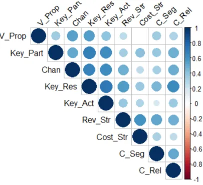
Figure 1.5: Correlation between the variables for the whole of the data.
A similar image is taken, if we look separately for the correlations between the variables in the two groups. Figure 1.6 visualizes the correlations regarding the entrepreneurs' scores, whereas Figure 1.7 visualizes the correlations regarding the managers' scores.
Figure 1.7: Correlation between the variables for the managers.
From all of the three gures (Figure 1.5, Figure 1.6, Figure 1.7), what we understand is that there is a strong correlation between the9variables. For this reason, Principal Components Analysis seems
indispensable, so that uncorrelated variables would be created.
Continuing, we look for outliers. Firstly, let us explain how we dene the outliers: Suppose we have a sample of observations. We rst determine the rst quartile (Q1) and the third quartile (Q3) and
the interquartile range (IQR =Q3−Q1) based on the values of the sample observations. Now the values outside the [(Q1−1.5∗IQR),(Q3+ 1.5∗IQR)] are considered as outliers. The values outside the range [(Q1−3∗IQR),(Q3+ 3∗IQR)] are known as extreme outliers and the values outside the range[(Q1−1.5∗IQR),(Q3+ 1.5∗IQR)]but inside the range [(Q1−3∗IQR),(Q3+ 3∗IQR)]are called mild outliers. This procedure is equivalent to the boxplot construction. In order to detect the outliers, we use the Rpackages grDevices and the EnvStats, where the latter enables us to do a Rosner's Test. Via the boxplot.stats(x)$out function of the grDevices package we get the outliers
from the boxplot. Moving on, we examine which of these possible outliers are truly outliers, according to Rosner's Test. So, following the above procedure in R for each of the9 variables separately on the
entrepreneurs and managers, we get that:
In the entrepreneurs' dataset there are 4outliers.
• For the variable Channels, there is one outlier in the102position with value 18.
• For the variable Revenue Streams, there is one outlier in the95 position with value17.
• For the variable Key Partners, there are two outliers: one in the87position with value 16 and
another one in the97 position with value17.
In the managers' dataset there are4 outliers, too:
• For the variable Revenue Streams, there is one outlier in the54 position with value6.
• For the variable Key Resources, there is one outlier in the17 position with value12.
• For the variable Key Activities, there is one outlier in the 17position with value 12.
We cite the R code for the case where we examine the outliers for the entrepreneurs on the Chan-nel variable. The procedure is exactly the same for the rest of them.
> entrepreneurs$Chan[which(entrepreneurs$Chan %in% boxplot.stats(entrepreneurs$Chan)$out)] [1] 23 18
> rosnerTest(entrepreneurs$Chan, k = 4, warn = F) Results of Outlier Test
---Test Method: Rosner's Test for Outliers Hypothesized Distribution: Normal
Data: entrepreneurs$Chan Sample Size: 108 Test Statistics: R.1 = 3.566172 R.2 = 2.639368 R.3 = 2.501242 R.4 = 2.592180
Test Statistic Parameter: k = 4
Alternative Hypothesis: Up to 4 observations are not from the same Distribution.
Type I Error: 5% Number of Outliers Detected: 1
i Mean.i SD.i Value Obs.Num R.i+1 lambda.i+1 Outlier 1 0 34.03704 4.496989 18 102 3.566172 3.410133 TRUE 2 1 34.18692 4.238482 23 62 2.639368 3.407006 FALSE 3 2 34.29245 4.114937 24 44 2.501242 3.403844 FALSE 4 3 34.39048 4.008393 24 81 2.592180 3.400645 FALSE
Then, dealing with the outliers, we chose not to omit these observations, but replace them with the median in each case. This is because median is robust to outliers, contrary to mean and in this way we do not risk to lose information. (At this point, we needed naniar and imputeTS packages from R). The R code is as follows:
• For entrepreneurs:
[1] 4
> entrepreneurs <- na.mean(entrepreneurs,option = "median")
• For managers: > managers[12, 4] <- NA > managers[54, 5] <- NA > managers[17,6] <- NA > managers[17, 7] <- NA > sum(is.na(managers)) [1] 4
> managers <- na.mean(managers,option = "median")
PCA Application After this procedure, we go on applying Principal Components Analysis with the contribution of the Rpackage FactoMineR for our analysis and factoextra package for the in-terpretation of PCA and visualization. Furthermore, the psych Rpackage was used.
Applying PCA to entrepreneurs dataset [13, 6]
The code is as follows:
> pca1 <- PCA(entrepreneurs, scale.unit = T, graph = F)
After applying PCA, we can extract information for the data.
• Variances of the principal components
As we mentioned in Section 1.3, eigenvalues of the correlation matrix correspond to variances of the principal components. So, computing the eigenvalues in R as it is shown below,
> eig1 <- get_eigenvalue(pca1)
we get the results:
> eig1
eigenvalue variance.percent cumulative.variance.percent Dim.1 4.6168831 51.298701 51.29870 Dim.2 1.1683793 12.981992 64.28069 Dim.3 0.6694271 7.438079 71.71877 Dim.4 0.6383342 7.092602 78.81137 Dim.5 0.5464243 6.071381 84.88275 Dim.6 0.5059367 5.621519 90.50427 Dim.7 0.3384333 3.760370 94.26464 Dim.8 0.2649976 2.944417 97.20906 Dim.9 0.2511846 2.790940 100.00000
What we see from these results is that the rst principal component explains approximately
51.3%of the variance in the data, the second one explains almost13%and so on. Together, the
rst two principal components explain nearly the64.3%of the data, which is an acceptably large
percentage of the variation. We note here that after the third principal component, a signicant improvement in this proportion is not achieved. This, will be discussed better when we will present the scree plot.
Another criterion for choosing which principal components to retain, is to check which PCs have an eigenvalue greater than 1. Such a thing indicates that this PC accounts for more variance
than accounted by one of the original variables in standardized data. Thus, in our case we see that only the rst two principal components are greater than one, whereas the rest ones are quite smaller than one, so it is probable that keeping the rst two principal components is an appropriate choice.
An alternative method to determine the number of principal components is to look at the scree plot. We get the scree plot (Figure 1.8), which is the plot of the percent of variance accounted for by each principal component, through the command:
> fviz_eig(pca1, addlabels = TRUE, ylim = c(0, 60), ggtheme = theme_bw())
Eyeballing the scree plot, and looking for a point at which the proportion of variance explained by each subsequent principal component drops o, make us choose the smallest number of principal components that are required in order to explain a sizable amount of the variation in the data. This is often referred to as an elbow in the scree plot. Inspecting Figure 1.8 we conclude that a fair amount of variance is explained by the rst two principal components, and that there is an elbow after the second component. After all, the third principal component explains less than
7.5% of the variance in the data and so is essentially worthless, and also beyond the second
• Variables
Using the following commands, we get the coordinates/loadings of the variables:
> variable<- get_pca_var(pca1) > variable$coord
Dim.1 Dim.2 Dim.3 Dim.4 Dim.5
C_Seg 0.7773302 0.25127380 -0.24748822 0.25823439 -0.10234605 V_Prop 0.6516228 0.49599232 0.14076101 0.03509079 -0.49450972 Chan 0.6301532 0.49294574 -0.27779827 0.16826052 0.33363642 C_Rel 0.7209100 0.26158534 0.18473314 -0.25899954 0.31287556 Rev_Str 0.7628346 -0.35378872 -0.19599877 -0.28723757 0.06635240 Key_Res 0.7850108 -0.37822316 -0.06557736 -0.10890732 -0.24022851 Key_Act 0.7991856 -0.07526561 -0.03077001 -0.33669279 -0.02246202 Key_Part 0.6685162 -0.10766647 0.64968455 0.20076168 0.12639445 Cost_Str 0.6224581 -0.51218534 -0.10635839 0.47643669 0.06010682
As we are interested in keeping only the rst two principal components, we look at Dim.1 and Dim.2. Because of the diculty we encountered to interpret the two components, varimax rota-tion is a usual method in order to improve interpretability.
Let us move on, then, by applying varimax rotation in our data. For this, we needed psych package from R. The code follows:
> pca_rotated <- principal(entrepreneurs, rotate="varimax", nfactors=2, scores=TRUE) > pca_rotated
Principal Components Analysis
Call: principal(r = entrepreneurs, nfactors = 2, rotate = "varimax", scores = TRUE)
Standardized loadings (pattern matrix) based upon correlation matrix RC1 RC2 h2 u2 com C_Seg 0.40 0.71 0.67 0.33 1.6 V_Prop 0.14 0.81 0.67 0.33 1.1 Chan 0.12 0.79 0.64 0.36 1.0 C_Rel 0.35 0.68 0.59 0.41 1.5 Rev_Str 0.80 0.26 0.71 0.29 1.2 Key_Res 0.83 0.26 0.76 0.24 1.2 Key_Act 0.64 0.49 0.64 0.36 1.9 Key_Part 0.56 0.38 0.46 0.54 1.8 Cost_Str 0.80 0.05 0.65 0.35 1.0 RC1 RC2 SS loadings 3.01 2.78 Proportion Var 0.33 0.31 Cumulative Var 0.33 0.64 Proportion Explained 0.52 0.48 Cumulative Proportion 0.52 1.00 Mean item complexity = 1.4
Test of the hypothesis that 2 components are sufficient. The root mean square of the residuals (RMSR) is 0.08 with the empirical chi square 47.18 with prob < 0.00034 Fit based upon off diagonal values = 0.97
In Table 1.3 the coordinates of the unrotated and rotated principal components 1 and 2 are
presented. It is obvious that in the rotated case, we can come to some conclusions much easier than in the unrotated case.
Unrotated Rotated Variable PC1 PC2 PC1 PC2 Customer Segments 0.77733 0 .25127 0. 4 0.71 Value Propositions 0.65162 0 .49599 0.14 0.81 Channels 0.63015 0 .49295 0.12 0.79 Customer Relationships 0.72091 0 .26159 0.35 0.68 Revenue Streams 0.76283 -0. 3538 0. 8 0.26 Key Resources 0.78501 -0. 3782 0.83 0.26 Key activities 0.79919 -0. 0753 0.64 0.49 Key Partners 0.66852 -0. 1077 0.56 0.38 Cost Structure 0.62246 -0. 5122 0. 8 0.05 Table 1.3: Coecients of components 1 and 2: entrepreneurs data
More specically, rotated PC1 gave relatively high weights to the variables Revenue streams, Key resources, Key Activities, Key Partners and Cost Structure. On the other hand, PC2 had some high weights associated with Customer Segments, Value Propositions, Channels, Customer Relationships and relatively high weight to Key Activities.
It is noticeable that all of the 9 variables seem to play an important role to our analysis, and
each of them is signicant to one and only one of the two Principal Components, except for the variable Key Activities, which is highlyweighted in both PCs.
Inspecting the content of these variables, we note that the rst Principal Component has to do with the company's nances and operations, while the second Principal Component is related to serving products to new and existing customers.
In other words, through the rotation method, we managed to make some inference about our data, which was impossible if we looked our initial results on PCs.
Now, we will carry on examining our data via some graphs. During this procedure, we will compare our conclusions with the ones described above, through the rotation method.
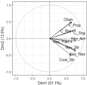
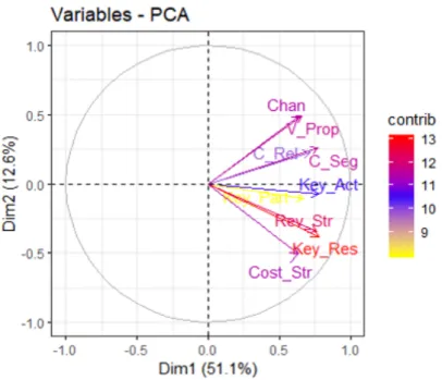
First of all, let us plot the variables. The variable plot (Figure 1.9) shows the relationships between the variables. Since positively correlated variables are grouped together, it seems that Channels, Value Propositions, Customer Segments and Customer Relationships consist one group and Cost Structure, Key Resources, Revenue Streams, Key Partners and Key Activities consist another one.
Figure 1.9: Variable Plot: entrepreneurs data.
The distance between variables and the origin measures the quality of the variables on the factor map (var.cos2 =var.coord∗var.coord). Variables that are away from the origin are well
represented on the factor map. Hence, Channels, Value Propositions, Customer Segments, Cost Structure, Key Resources and Revenue Streams seem to be well represented, contrary to the rest of them.
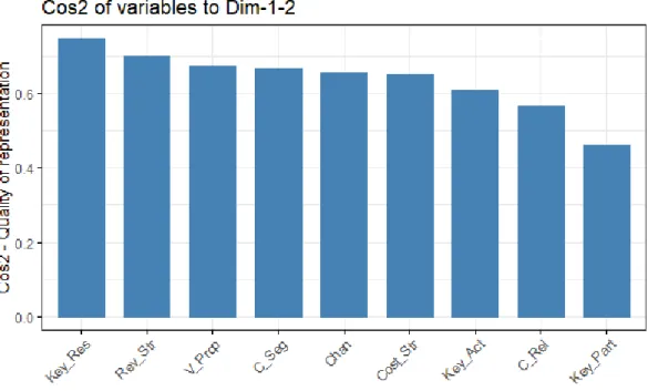
Next, we will examine the quality of representation of the variables (cos2) on the factor map. In Figure 1.10, we visualize the cos2 of the variables in the rst ve dimensions. In Figure 1.11, an alternative way is applied, creating a bar plot of variables cos2.
Generally, high cos2 indicates a good representation of the variable on the principal component. In this case the variable is positioned close to the circumference of the correlation circle (Figure 1.9). On the other hand, a low cos2 indicates that the variable is not perfectly represented by the PCs. In this case the variable is close to the center of the circle.
Observing Figure 1.10 and Figure 1.11, our conclusions coincide with those which we came to, in Figure 1.9.
Figure 1.10: Cos2 of the variables: entrepreneurs data
Figure 1.11: Barplot of the cos2 of the variables: entrepreneurs data
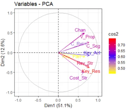
For a more clear view, Figure 1.12 helps us understand better all the above. For example, Key Resources and Revenue Streams are high, so are important to be included in the representation of the components, whereas Key Partners' cos2 is low, which means that its quality of representation on the factor map is less important.
Figure 1.12: Variable Plot over the cos2: entrepreneurs data
Then, we analyse the variables based on their contribution in each dimension. Figure 1.13 presents these contributions.
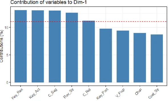
Figure 1.13: Contribution of the variables: entrepreneurs data
Unfortunately this gure does not help us understand the importancy of the variables. For this reason, Figure 1.14 , Figure 1.15 and Figure 1.16 are made, which help us in our inference.
Figure 1.14: Barplot of the contribution of the variables on the rst dimension: entrepreneurs data
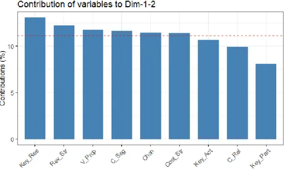
Figure 1.16: Barplot of the contribution of the variables on the rst 2 dimensions: entrepreneurs data
The red dashed line on Figure 1.14, Figure 1.15 and Figure 1.16 indicates the expected average contribution. If the contribution of the variables were uniform, the expected value would be10%.
For a given component, a variable with a contribution larger than this cuto could be considered as important in contributing to the component.
In other words, from Figure 1.14, we can see that the variables contributing most to the rst com-ponent are: Key Resources, Key Activities, Customer Segments, Revenue Streams and Customer Relationships. Figure 1.15 shows us that the variables contributing most in the second princi-pal component are: Cost Structure, Channels, Value Propositions, Key Resources and Revenue Streams. Summing up, we conclude that all the variables except for Key Activities, Customer Relationships and Key Partners contribute to both Principal Components.
Now, highlighting the variables contributing most on the correlation plot we get Figure 1.17, which gives the same results as described above. Namely, Key Resources and Revenue Streams are contributing highly, so they are important in explaining the variability in the data, while Key Partners is not contributing, which means that we may remove it, so that the overall analysis would get simpler. We have to notice here that the same variables were signicant regarding the cos2.
Figure 1.17: Variable Plot over the contribution: entrepreneurs data
• Individuals
Using the following commands, we get the coordinates of the rst individuals, just to take a look of their structure:
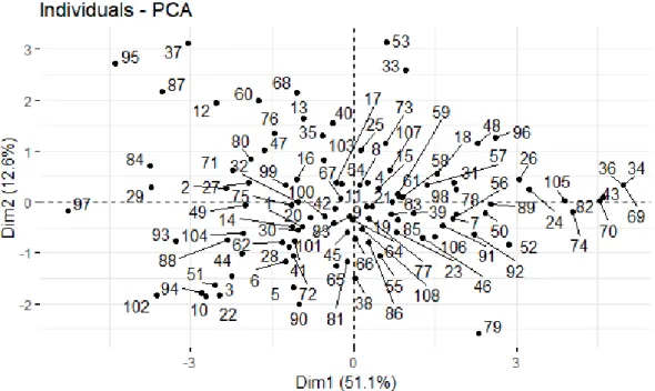
> ind <- get_pca_ind(pca1) > head(ind$coord)
Dim.1 Dim.2 Dim.3 Dim.4 Dim.5
1 -0.9318841 -0.4754595 -0.36163089 -0.43637967 -0.3682712 2 -2.3371652 0.2614375 -0.41844837 0.06540382 0.3640769 3 -2.2506998 -1.4633712 -0.39664180 0.06734092 -0.3083011 4 0.2610744 0.3810159 0.89492205 -0.67707924 0.5147132 5 -1.1131951 -1.6667657 0.02663858 -1.02062965 0.6028385 6 -1.2583783 -1.1671340 -1.03782881 0.71719053 1.0624936
Figure 1.18: Individuals Plot: entrepreneurs data
In a similar way with this of the variables, we can plot the individuals with respect to their quality of representation, cos2 (see Figure 1.19).
Figure 1.19: Individuals Plot: entrepreneurs data
bigger is the point and its color ranges from red (when we have a high cos2) to yellow (when we have low cos2), as is shown it Figure 1.19.
Lastly, we represent both the principal component scores and the loading vectors in a single biplot display (Figure 1.20). This gure shows us the behaviour of each of the entrepreneurs regarding the rst Principal Component, which has to do with the company's nances and operations, and the second Principal Component, which is related to serving products to new and existing customers.
Figure 1.20: Biplot: entrepreneurs data
Applying PCA to managers dataset
The code is as follows:
> pca2 <- PCA(managers,scale.unit = T, graph = F)
After applying PCA to managers dataset, we keep on with the same procedure that we followed in entrepreneurs dataset.
• Variances of the principal components
And we get the results:
eigenvalue variance.percent cumulative.variance.percent Dim.1 4.4353217 49.281352 49.28135 Dim.2 1.3667369 15.185965 64.46732 Dim.3 0.9059678 10.066309 74.53363 Dim.4 0.7113650 7.904055 82.43768 Dim.5 0.5167366 5.741518 88.17920 Dim.6 0.4107330 4.563700 92.74290 Dim.7 0.2984126 3.315695 96.05859 Dim.8 0.1904989 2.116655 98.17525 Dim.9 0.1642275 1.824751 100.00000
Here, we see that the rst principal component explains about49.3%of the variance in the data,
the second one explains 15.2%and so on. Together, the rst two principal components explain
nearly64.5%of the data, which is an acceptably large percentage of the variation.
Now looking at the eigenvalues, we see that, indeed, the eigenvalues which correspond to the rst two principal components are the only ones that are greater than 1. However, we need to
mention that the third eigenvalue is very close to1(0.91), which raises doubts about the number
of components that is appropriate to be used. For reasons of interpretability and in order to compare the results of entrepreneurs and managers, we choose to keep the rst two Principal Components.
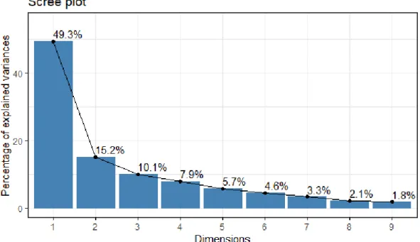
Finally, the scree plot (Figure 1.21) veries the uncertainty about the number of components to be retained, which was commented previously. In this scree plot, it is not so clear which is the point in which we determine an elbow. Additionally, we see that the third principal com-ponent explains more than 10% of the variation in the data, not so trivial percentage to omit.
Nevertheless, as we analysed above, we will keep the rst two Principal Components in further investigation of the data.
• Variables
The coordinates of the variables are given below:
Dim.1 Dim.2 Dim.3 Dim.4 Dim.5
C_Seg 0.6115452 0.3723525 0.532820749 -0.04772280 0.26713258 V_Prop 0.6245799 -0.4173899 0.368690809 0.39357559 0.15934628 Chan 0.7788908 -0.3821339 0.002031817 0.21071742 -0.08640856 C_Rel 0.6667110 0.2264419 0.302099065 -0.47581380 -0.31476516 Rev_Str 0.6851754 0.4956123 -0.048918481 0.32416090 -0.30863213 Key_Res 0.9034951 -0.1283870 -0.054360635 -0.06435301 -0.06422116 Key_Act 0.7336309 -0.3622181 -0.402388262 -0.06511751 -0.14646275 Key_Part 0.7640635 -0.1143080 -0.256413545 -0.35821682 0.38528938 Cost_Str 0.4607424 0.6709626 -0.402314167 0.20397049 0.21015382
Now, we will apply varimax rotation, for the same reasons we discussed in enterpreneurs' case.
Principal Components Analysis
Call: principal(r = managers, nfactors = 2, rotate = "varimax", scores = TRUE) Standardized loadings (pattern matrix) based upon correlation matrix
RC1 RC2 h2 u2 com C_Seg 0.26 0.67 0.51 0.49 1.3 V_Prop 0.75 0.05 0.56 0.44 1.0 Chan 0.85 0.17 0.75 0.25 1.1 C_Rel 0.39 0.58 0.50 0.50 1.8 Rev_Str 0.25 0.81 0.72 0.28 1.2 Key_Res 0.80 0.44 0.83 0.17 1.6 Key_Act 0.80 0.16 0.67 0.33 1.1 Key_Part 0.68 0.37 0.60 0.40 1.6 Cost_Str -0.04 0.81 0.66 0.34 1.0 RC1 RC2 SS loadings 3.31 2.49 Proportion Var 0.37 0.28 Cumulative Var 0.37 0.64 Proportion Explained 0.57 0.43 Cumulative Proportion 0.57 1.00 Mean item complexity = 1.3
Test of the hypothesis that 2 components are sufficient. The root mean square of the residuals (RMSR) is 0.1 with the empirical chi square 42.67 with prob < 0.0014 Fit based upon off diagonal values = 0.95
In Table 1.4 the coordinates of the unrotated and rotated rst Principal Components are pre-sented.
Unrotated Rotated Variable PC1 PC2 PC1 PC2 Customer Segments 0.6115452 0 .3723525 0 .26 0.67 Value Propositions 0.6245799 -0.4173899 0 .75 0.05 Channels 0.7788908 -0.3821339 0 .85 0.17 Customer Relationships 0.6667110 0 .2264419 0 .39 0.58 Revenue Streams 0.6851754 0 .4956123 0 .25 0.81 Key Resources 0.9034951 -0.1283870 0 .80 0.44 Key activities 0.7336309 -0.3622181 0 .80 0.16 Key Partners 0.7640635 -0.1143080 0 .68 0.37 Cost Structure 0.4607424 0 .6709626 -0.04 0.81 Table 1.4: Coecients of components 1 and 2: managers data
As we know, the higher the loading of a variable, the more inuence it has in the formation of the principal component score and vice versa. Thus, inspecting the Table 1.4, we understand that in the formation of PC1, inuential are the following variables: Value Propositions, Channels, Key Resources, Key Activities and Key Partners. For PC2, inuential variables are: Customer Segments, Revenue Streams and Cost Structure. Therefore, we observe that PC1 is associated with making products and serving them to existing customers, where on the other hand, PC2 seems to be associated with a rm's nances. In the managers' case, we see that Customer Relationships does not play an inuential role.
Continuing with the graphical examination of our data we will check if this coincide with the above conclusions.
Firstly, we plot the variables. The variable plot (Figure 1.22) shows that Customer Segments, Revenue Streams, Cost Structure and Customer Relationships form one group and Value Propo-sitions, Channels, Key Resources, Key Activities and Key Partners constitute another one. Furthermore, it is observed that Channels, Value Propositions, Cost Structure, Key Resources and Revenue Streams seem to be well represented, in contrast to the rest of them.
Figure 1.22: Variable Plot: managers data
Next, examining the quality of representation of the variables (cos2) on the factor map (Figure 1.23), we visualize the cos2 of the variables in all the dimensions. In Figure 1.24, an alternative way is applied, creating a bar plot of variables cos2.
Observing the Figure 1.23 and Figure 1.24, we come to the same conclusions as in variable plot (Figure 1.22).
Figure 1.24: Barplot of the cos2 of the variables: managers data
Next, Figure 1.25, visualises in an alternative way all we just discussed. For example, Key Resources, Channels and Revenue Streams have a high quality of representation, so are important to be included in it, whereas Customer Relationships' cos2 is low, which means that it is not so important for the representation of the components in the factor map.
Figure 1.25: Variable Plot over cos2: managers data
Figure 1.26 presents these contributions, but it is not so informative contrary to Figure 1.27, Figure 1.28 and Figure 1.29, which are quite helpful for our analysis.
Figure 1.26: Contribution of the variables: managers data
Figure 1.28: Barplot of the contribution of the variables on the second dimension: managers data
Figure 1.29: Barplot of the contribution of the variables on the rst 2 dimensions: managers data
From Figure 1.27, we can see that the variables contributing most to the rst component are: Key Resources, Channels, Key Partners and Key Activities. Figure 1.28 shows us that the variables contributing most in the second principal component are: Cost Structure, Revenue Streams and Value Propositions. For both Principal Components, we conclude that Key Resources, Channels, Revenue Streams, Key Activities and Cost Structure are contributing the most.
Alternatively, we graph the variables contributing most on the correlation plot (Figure 1.30). In the same way, we get that Key Resources, Channels and Revenue Streams are highly
con-tributing, so they are important in explaining the variability in the data, whereas Customer Relationships and Customer Segments are not contributing, which means that we may remove them.
Figure 1.30: Variable Plot over contribution: managers data
• Individuals
Figure 1.31: Individuals Plot: managers data
In a similar way with this of the variables, we can plot the individuals with respect to their quality of representation, cos2 (see Figure 1.32).
Figure 1.32: Individuals Plot over cos2: managers data
Lastly, Figure 1.33 shows the biplot, in which both scores and loadings are represented. More specically, each of the managers appears in the graph according to his attitude towards making
products and serving them to existing customers (rst Principal Component), and his attitude on rm's nances (second Principal Component).
Figure 1.33: Biplot: managers data
Conclusions After all this discussion, it seems that a twodimensional representation of Irish data is achievable. More specically, we concluded that both entrepreneurs and managers may represent the nine BMC elements by two factors.
Figure 1.34: Biplot for both entrepreneurs and managers
However, the two groups represent the elements in a dierent way, since, as far as entrepreneurs are concerned, the rst PC corresponds to Finance and Operations and the second one to Serving Products to New and Existing Customers, while regarding the managers, rst PC has to do with Making Products and Serving them to Existing Customers and the second one refers to Costs and Revenues. This dierence between the two groups is visible in Figure 1.34, where both entrepreneurs and managers are included but they are distinguished by dierent colors. [6]
1.5 Chicken Dataset
In this section, we will examine the modern application of Principal Components Analysis, in which the number of the observations is much smaller than the number of the variables. In other words, we have the casenp.
1.5.1 Presentation
Due to the outstanding technological development in our days, and more specically in the eld of Biology and Medicine, huge amounts of data are being generated and the consequential need to anal-yse and explore such datasets is more than essential. For this purpose, the application of multivariate projection techniques to reduce dimensionality is vital [25].
Such a dataset is the one we will present in this subsection. It is formed by the observations on 43
chickens and 4306 genes. These chickens have an additional factor that distinguish them: their diet.
Thus, our factors are4307if we consider this information, where the last variable is a qualitative one,
which includes6 dierent diet types [13].
Data Description
The chicken data pertains to the gene expression levels of chickens and is gathered in a dataframe consisting of4306 rows and 43 columns. The rows correspond to the genes, while the columns
corre-spond to the chickens. As we have already mentioned, we will include in our analysis the qualitative variable, diet, which the chickens followed. This categorical variable contains 6 diets based on its
distinct conditions: normal diet (N), fasting for 16 hours (F16), fasting for 16 hours then refed for 5
hours (F16R5), fasting for 16 hours then refed for16 hours (F16R16), fasting for 48 hours (F48) and
fasting for 48 hours then refed for24 hours (F16R5).
Aim of our analysis
The purpose of our analysis on this dataset is to detect whether the dierence between the6 types of
diets, that the 43chickens follow, aects the gene expression. More precisely, it may be interesting to
see how long the chicken needs to be refed after fasting before it returns to a normal state, i.e., a state comparable to a state of a chicken with a normal diet [13]. This problem, which is known as batch eect problem is among the most popular when dealing with this kind of data and PCA is often used as an exploratory tool to visualize data and carry out tests [25].
1.5.2 Statistical Analysis
Exploratory Analysis First of all, we carry out an exploratory analysis in which:
• The matrix is transposed.
• The supplementary variable Diet is created.
The Rpackage dplyr is loaded.
Firstly, as we have mentioned earlier and as we see above, the data is structured in a dataframe of 7406rows and43 columns.
> class(chicken) [1] "data.frame" > dim(chicken) [1] 7406 43
However, given that in a dataframe rows correspond to the observations and the columns to the variables, we have to transpose the matrix, as follows:
> chicken <- as.data.frame(t(chicken)) > dim(chicken)
[1] 43 7406
Next, we need to create the supplementary variable Diet, which includes the 6 dierent diets of
the chickens. For this, we used the Rpackage dplyr, which is really useful in such manipulation matters. As we see below, we concluded in the desired matrix.
> chicken <- mutate(chicken,
+ Diet = as.factor(c(rep("N",6),rep("J16",5),rep("J16R5",8),
+ rep("J16R16",9),rep("J48",6),rep("J48R24",9)))) > dim(chicken)
[1] 43 7407
Applying PCA Now that we xed the form of our dataframe, we move on applying Principal Components Analysis on the chicken data. For this procedure we used the Rpackage FactoMineR. The command is given below:
> pca <- PCA(chicken,quali.sup=7407,scale.unit = T, graph = F)
We have to point out that the command needs the qualitative/supplementary variable to be men-tioned.
Continuing, using the factoextra Rpackage, we get the eigenvalues, which correspond to the vari-ances of the principal components. We notice, here, that the number of Principal Components is 42,
in other wordsn−1, which was expected as we are in the case wheren < p.
> eig <- get_eigenvalue(pca) > head(eig)
eigenvalue variance.percent cumulative.variance.percent Dim.1 1453.5724 19.626957 19.62696 Dim.2 692.7879 9.354413 28.98137 Dim.3 536.2080 7.240183 36.22155 Dim.4 434.4534 5.866235 42.08779 Dim.5 374.6216 5.058352 47.14614 Dim.6 324.0825 4.375945 51.52209
From the above results we take the percentages of the variance explained by each Principal Com-ponent, and the cumulative percentages of them. For example, the rst PC explains approximately
19.63%of the variance, the second PC9.35% and both of them together explain29%of the variation.
Carrying on, we look at the individuals.
Firstly, we calculate the distances of the rst individuals from their categories.
> head(ind$dist)
1 2 3 4 5 6
72.88762 69.63425 70.81357 80.13850 71.00282 76.83545
Then, we take their contributions in the determination of the rst ve PCs.
> head(round(ind$contrib,3)) Dim.1 Dim.2 Dim.3 Dim.4 Dim.5 1 0.061 1.011 9.590 0.957 0.003 2 0.383 0.692 5.951 0.677 0.034 3 0.460 0.709 7.619 0.273 0.223 4 0.371 1.191 5.514 0.010 0.002 5 0.203 0.006 3.118 0.148 0.743 6 0.617 0.635 1.172 0.068 0.035
Also, we can see their quality of representation in the rst ve PCs.
> head(round(ind$cos2,3)) Dim.1 Dim.2 Dim.3 Dim.4 Dim.5 1 0.007 0.057 0.416 0.034 0.000 2 0.049 0.042 0.283 0.026 0.001 3 0.057 0.042 0.350 0.010 0.007 4 0.036 0.055 0.198 0.000 0.000 5 0.025 0.000 0.143 0.005 0.024 6 0.065 0.032 0.046 0.002 0.001
As far as the variables are concerned, now, we take a look at the rst ones, as the inspection of all of them is dicult and meaningless because of their large number.
Firstly, we calculate the coordinates/loadings of the rst variables for the rst ve PCs:
A4GNT -0.124 0.217 0.228 -0.183 0.274 AACS 0.332 0.036 0.019 0.127 0.042 AADACL1 0.253 0.284 -0.339 0.141 0.059 AADACL2 0.510 -0.486 0.178 -0.314 0.100 AADACL3 0.314 0.237 -0.268 0.157 0.164
Then, we see their contribution in the formation of the rst ve PCs:
> head(round(variable$contrib, 3)) Dim.1 Dim.2 Dim.3 Dim.4 Dim.5
A4GALT 0.019 0.001 0.004 0.002 0.003 A4GNT 0.001 0.007 0.010 0.008 0.020 AACS 0.008 0.000 0.000 0.004 0.000 AADACL1 0.004 0.012 0.021 0.005 0.001 AADACL2 0.018 0.034 0.006 0.023 0.003 AADACL3 0.007 0.008 0.013 0.006 0.007
At last, we take the quality of representation of these variables on the factor map:
> head(round(variable$cos2, 3)) Dim.1 Dim.2 Dim.3 Dim.4 Dim.5
A4GALT 0.276 0.004 0.019 0.007 0.010 A4GNT 0.015 0.047 0.052 0.034 0.075 AACS 0.110 0.001 0.000 0.016 0.002 AADACL1 0.064 0.081 0.115 0.020 0.003 AADACL2 0.260 0.236 0.032 0.098 0.010 AADACL3 0.098 0.056 0.072 0.025 0.027
Moving on by displaying the variable plot for those variables whose correlation is greater than
0.8 (this is because of the large number of variables in the dataset), we will get an image for the
relationships between them. This variable plot, which is given in Figure 1.35, shows which of the variables are highly, positively correlated between them (variables that appear close to each other), which are signicantly, negatively correlated (variables that are on opposite sides of the graph), and we see that there are no uncorrelated variables (those which are orthogonal in the graph).