Volume 5, No. 5, May-June 2014
International Journal of Advanced Research in Computer Science
RESEARCH PAPER
Available Online at www.ijarcs.info
ISSN No. 0976-5697
A Multi-dimensional Data Plotting Model Using Hybrid Parallel Coordinates Based
Visualization
1
Ketan Khandelwal, 2Prakriti Trivedi 1,2
Department of Computer Science & Engineering
Govt. Engg. College, Ajmer/Rajasthan Technical University Kota (Rajasthan), India
Abstract: Graphics based visualization system had shown ever expanding growth in terms of their applications and devices supportability. Aim is towards effective plotting of information. But if the information is increase with limiting plotting ranges it requires another types of geometric projection scheme termed as parallel coordinates. These are used for representing multidimensional data on to a single graphs or image. Traditionally these systems are using various plotting and transformation mechanism which defines shapes and its boundaries such as lines, poly-lines, planes, hyper planes, curves etc. These approaches are normally stuck into problems related to local minima,cross over plotting, outliers and dimensionality reductions, by which plotting of multiple information on single points make the visualization disrupt with unidentified noises signal. To overcome the above issues this work suggested some refinements and improvements strategies. The paper proposes a novel hybrid parallel coordinate based multidimensional data plotting. The systematic working with improved curve based plotting remaining problems in existing works can be easily resolved. Apart from basic functionality, the future implementation of tools supports data plotting from huge data sets with some more mechanism like filtering, brushing, specialized curves, colouring etc. At the analytical level of results evaluation, approach is showing its strong presence.
Index Terms: Visualization System, Geometric Projection, Parallel Coordinates (PC), Filtering, Curves, Brushing, Colouring, Hybrid Approach;
I. INTRODUCTION
In today’s world visualization importance has shown there tremendous growth with ever-expanding applications in healthcares, education, science, multimedia, engineering etc. Normally it comes under the applications of computer graphics which can be used for creation of any image, diagram or animated films for communication of messages. It can be further used to communicate effectively with thoughts which can be seen abstractly. For performing visualization, the data is required which is affected from multivariate problem of representing information on n space and multidimensional diagrams. Visualization is also used to support the plotting of exploratory data analysis in which the image is keep changing with data. Some of the designing paradigm of visualization is given by [1] as:
a. Visualization design and interaction tools are well suited for solving a specific problem such as graphs and charts.
b. The problem and solution must be domain independent for any visualization tool by which several other things can be visualized by applying the graphics based techniques.
Bothe the paradigm is important for developing an effective visualization tool which is capable of solving the problems of various domains. This involves the explicit representation of knowledge about data, types of graphics involved and the applicability. The first paradigm is used for better match visual characteristics and second is used for expert systems.
Visualization tool must be capable of communication based on some non-visualize data by using visual transforms. By applying this, traditional photography and image processing is not as much required. The tool must generate an image based on the input data. Also the prime aim is to make the communications based on this visuals and the other elementary requirement gives support to this medium.
The visualized image results must be readable and recognizable by which user is able to learn something about the data. Any transformation of non-trivial data into an image will leave out information, but there must be at least some relevant aspects of the data that can be read.
All the above techniques and basic characteristics is used for better visualization of data onto a image that shows information for futuristic directions and hence termed as visual data mining. Normally, visual data mining tools can be used for two different situations: First, it is used for data explorations by representing the data graphically on which some relations and useful patterns can be identified. Second, is the visualization can only be applicable after applying the traditional mining approach and later on generating graphs. This information is represented by patterns or models obtained after performing a data mining task such as clustering, classification, estimation, dependency analysis, etc.
The prime focus of applying visualization schemes or tools is to show meaning based pictures for users to gain insight into it. The visualization is plied by using the parallel coordinate’s representation of multi dimensions information of data. In this the, each domain is allotted with a equal number of parallel axes on screen as a visual element of data. Each line contains the several objects which are mapped from the data set as a series of points on per axes and each point are related with the data provided. The points are then joined together by line segments from one axis to its immediate neighbour, forming a poly-line across the set of axes [2]. This method is then repetitive for each object in the information set. Parallel Coordinates allows analogous objects to be seen as having similar shapes and the fundamental technique is modified with some additional features.
towards improvements over the existing mechanism as some of the issues and problems remains unaddressed in existing literatures.
II. BACKGROUND
Visualization is an effective technique used for representing the data visually through various tools guided by different generation rules. Among the various applying theorems and methods of such visual data mining, parallel coordinates are the most famous techniques for representing multidimensional data. Parallel Coordinates is a well-known geometric projection visualization technique [3] that is very efficient for identification of one-dimensional characteristics of data with marginal densities, and two-dimensional characteristics with the correlation among attributes. This process assigns one vertical axis to each object and distributes these evenly in the horizontal spaces which is a contrast method of traditional Cartesian coordinate system with all axes been perpendicular. By parallel representing the axes more dimensionally accurate plotting can be formed. Each object variable is plotted to its own axes, and the values of variable on adjacent axis connected by a straight line. Thus, a point in an n-dimensional space becomes a polygonal line laid out across the n parallel axes with n-1 line segments connecting the n data values. Many such data points (in Euclidean space) will map too many of these polygonal lines in a parallel coordinate representation. Viewed as a whole, these many lines might well exhibit coherent patterns which could be associated with inherent correlation of the data points involved. In this way, the search for relations among the variables is transformed into a 2-D pattern recognition problem, and the variables become amenable to visualization.
The parallel coordinates allows the multidimensional clusters and hyper planes for representing the information is the most suitable manner. As similar to other visualization techniques it also suffers from excessive visual crowding with the data sets with thousands of records or even more. There are some options such as filtering and selection gets some control over such problems but still exploration of data leads to some uncertain and unrecognizable state of visual data. Statistical information like data density and data frequency based evaluation for area wise highlighted operations for visualizations is applied by many authors. One important aspect of this visualization scheme is that it provides opportunities for human pattern recognition: by using colour to distinguish lines, and by supporting various forms of interaction with the parallel coordinates system, patterns can be picked up in the given database of multidimensional data.
The number of dimensions that can be visualized using this scheme is fairly large, limited only by the horizontal resolution of the screen. However, as the number of dimensions increases, the axes come closer to each other, making it more difficult to perceive patterns. It is also important to note the flexibility of the parallel coordinates approach in that each coordinate can be individually scaled -- some may be linear with different bounds, while others may be logarithmic. While this prevents us from observing the exact relationships between various parameters, it may aid in identifying direct, inverse, and one-to-one relationships between the parameters. Scaling an individual parameter has another advantage in that it helps us in
zooming into or zooming out of a subset of a data set represented, effectively brushing out or eliminating (undesirable) portions of the data set.
This system must be applied for interactive data analysis tool rather than just a graphic based system. For assessing the generated results quality various kinds of interactive displays are used such as parallel coordinate plots. This system is customizable according to the user requirements for achieving the actual representations. Some of the desired options used for effective visualizations are: a. Order of attribute axes should be changeable and
removable at any point of time
b. Data filtering should be available with constraints on value range and should be removed if not required c. Object classification based on attribute values and
intervals should be classified and plotted
d. Links to other object and axes is used for connected fields and coloring schemes to differentiate the data should be applied.
e. Scaling should be given to make the clear view of represented fields.
Thus it looks that without any special solution, the use of parallel coordinates is limited to few thousands of data items per views [4]. While dealing with such big numbers of records the existing parallel coordinates systems gets over plotted and is of no use for information descriptive purpose. To deal with challenge of large data set plotting through parallel coordinates, this work going to present a brief study on existing methods. Also the work aims towards improvements over some of the problems which are unsolved.
III.LITERATURESURVEY
During the last few years various studies over parallel coordinates had been suggested to further improve its representation of data in multidimensional views. Mainly the approaches are related to descretizations of data and identifying the useful patterns by visual data mining. In this section few of the studies by is presented by which the direction is given to this work.
In 2008, the paper [5] works on multivariate visual clustering techniques for effective data representation. However the effectiveness of this technique depends upon the reduction of larger data by edge clutter or clusters. Thus the paper suggests a novel framework to reduce edge clutter for visual clustering improvements. The paper identifies the curved edges and optimizes their visual arrangements by reducing the curvature and maximizing the parallel representation of neighbouring edges. The approach also keeps the records of overall reduction and their relative order with optimization principles through linear programming. The overall visual clustering is achieved by geometrically bundling lines and forming patterns. The experiments on several representative datasets demonstrate the effectiveness of our approach.
opacity-based hints to show cluster density; opacity and shading effects to illustrate local line density on the parallel axes; and silhouettes, shadows and halos to help the eye distinguish between overlapping clusters. Thus by combining the above approaches into a unique solution various problems related to parallel coordinates are resolved and the data representation size and clarity is also improved. In the paper [7], the limitations with traditional solution of parallel coordinates using polygonal lines are resolved. The problems are of continuity which causes cross over and for large clusters the lines become clutters. Thus the paper gives a novel solution using model for curve bundles in parallel-coordinates. The curve is having supported hierarchies of data representation with effective visual separations between data clusters. The approach reduces the visual clutter and shows a clear visualization of large datasets. Result evaluation with comparison factors shows the effectiveness o the suggested approach. Some of the improvements over the same brazier based curves are given with more papers also. According to that for some datasets curve bundling allows the colour perceptual channel to be applied to other data attributes, while for complex cluster patterns, bundling and colour can represent clustering far more clearly than either alone [10].
In 2009, a novel parallel coordinated design integrated with point is suggested using Scattering Points in Parallel Coordinates (SPPC) is given [8]. The approach uses both coordinates and scatterplots approach for solving the multiple view visualization problems. The approach is feasible of showing the multidimensional scaling by converting the plots to single view. In the suggested work a series of interaction tools has been developed. Uniform brushing functionality, GPU accelerated Dimensional Incremental Multidimensional Scaling (DIMDS) etc is more efficient than existing tools.
In 2011, the paper [9] proposes a Continuous Parallel Coordinates (CPC) which is a contemporary visualization technique. It is a well formed combination of several scalar fields to facilitate a continuous view for parallel coordinates. The approach uses feature curves to extract and classify the visualization information. In particular, the approach shows that these feature curves are related to discontinuities in Continuous Scatterplots (CSP). The options are evaluated by exploiting a curve-curve duality between parallel and Cartesian coordinates, which is a generalization of the well-known point-line duality. At the result phases the approach is showing great improvements over some of the existing mechanism
In 2012, the paper [11] surveyed the various data visualization techniques on various factors for identifying the best one among them. Here the paper describes each technique by specifying the means of interaction between the coordinates systems for effective visualizations. The techniques presented for multivariate dimensional representations are: Parallel coordinates, Star Glyph, Scatterplot Matrix, Table lens, Pixel oriented, Dimensional Stacking and Hybrid Techniques. The approaches are compared by their extracted data values and information visualization with clearly separated boundaries. The study is used to develop the multi-coordinated view of visual information mining.
In the paper [12], uses of parallel coordinates for high dimensional data are presented with large data size with
several attributes represented individually on different axis. These are polylines where more than one data elements are plotted at the same locations. However, some data attributes are more naturally represented with a spherical coordinate system. Here the paper suggested a novel coupling of parallel coordinates with spherical coordinates, enabling the visualization of vector and multi-dimensional data. The spherical plot is integrated as if it is an axis in the parallel coordinate visualization. This hybrid visualization benefits from enhanced visual perception, representing vector data in a more natural spatial domain and also reducing the number of parallel axes within the parallel coordinates plot. In order to evaluate the optimal representation of the suggested behaviour, the acceleration vector is reconstructed in spherical coordinates and visualized alongside with the other data attributes to enable exploration, analysis and presentation of marine wildlife behaviour.
In 2013, the paper proposed novel multivariate data visualization and exploration based on the integrated use of regression analysis and advanced parallel coordinates visualization. Traditional parallel-coordinates visualization of raw multivariate data on a 2D screen suffers from a variety of problems when applied to massively high-dimensional datasets. The suggested system handles these issues through the combined use of regression analysis and a variety of enhancements to traditional parallel-coordinates display capabilities, including new techniques to handle visual clutter, and intuitive solutions for selecting, ordering, and grouping dimensions [13]. The result evaluation is made effective by two real time case studies.
IV.PROBLEMSTATEMENT
Visualization is normally used to represent the data effectively in exploratory manner to derive the interesting paper for forecasted mining. The results are used for understanding the behaviour of the data generation entities and by which some later strategies are developed to handle the uncertain changes. Many techniques are studied to identify some of the problems by which further improvements are affected and taken as a base of this work. These are:
a. Problem 1: Traditional techniques adopt techniques
for mapping of single data item one at a time. This single one-to-one plotting has limited usefulness in case of varying dimensionality. It also overlaps the data and makes the feasibility of clearly visualization disturbed.
b. Problem 2: Existing techniques are unable to plot
causing visual disorder and hampering visual exploratory analysis tasks. It is based on relevancy of information between the various attributes and showing them into the clusters. To support this task cluster identification with reduced visual clutter is required which is not used by any techniques implicitly.
c. Problem 3: If two objects share the same value in a
d. Problem 4: Isolated records not belonging to any cluster should be hidden from display during the exploration task and identifications.
In order to achieve the solution of above presented problems the cluster formation process along with the visualization needs to be improved using frequency and density of information to single points and can be represented by parallel coordinates. The approach must also be capable of handling the multidimensionality of information with support to interactive nature and dynamic changes to improve visual cluster formation and information extractions.
V. PROPOSEDHYBRIDPCAPPROACH
This paper proposes a novel method of applying parallel coordinates using curves. As the parallel coordinates is a geometric projection schemes used for multidimensional data plotting and visualizations in multivariate environment. Thus by using high number of dimensions data oriented parallel coordinates can be visualized. The paper also shows the static method for solving the problems of liens which shares common points on the axes and termed as cross over problems.
Thus, two objects that had the same values on two adjacent axes and would overlay exactly when using straight lines, would now diverge slightly in the middle of this section if they had different values on the directly preceding axis. This can be viewed as either a useful or distracting effect, depending on circumstance; distracting in that it increases the number of perceived objects on screen, but useful in that it gives a more realistic presentation of the amount of data that is present.
A. Description:
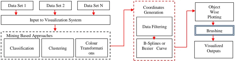
The approach starts with fetching of data set elements according to their respective fields. These fields are the columns or the attributes on the basis of which records are placed into same or different data sets. Now the visualization system starts its operation by merging these data from different data sets to some defined or required filed on which visualization is desired. Now for extracting the knowledge from the data some mining techniques are applied. These techniques first let the data classified into several classes.
Through classification and latter on the other elements are placed into these classes according to their similarity.
The curve must follow some principles of continuations which gradually applies curves with parallel coordinates.
The aim is to put simple curves over the plots for data representation instead of simply zigzagging lines. Such curves help the traditional system to deal with multivalve points. For further smoothing of the results, brushing is used which is a kind of resizable slider on each dimensions. After brushing the work uses dimensionality reordering as an add-on facility to the user with some cadd-onfigurable dimensiadd-ons inputs and runtime changes.
The process of forming the parallel coordinates reflects to some properties of clearly separated data representation. Also the data before transforming needs to be arranged according to the specific characteristics. These common characteristics generate same curve line. For next record another curve is used. Now for identifying the points on the curve basic mining based techniques are applied. Among the traditional mining techniques few are used as here such as classification, clustering etc. Any spatial variables with, curvature can be used in conjunction with any of the existing filtering or brushing techniques which distinguishes the lines and colours. One other feature of using curved sections in parallel co-ordinates is an apparent increase in the number of objects displayed in the visualization.
Thus placing the element according to their similar characteristics is termed as clustering. The distance measure is also used here with the clustering, data element having higher degree of similarity will be placed near the central head of the cluster. Intuitively, variables in the same group have similar properties so they tend to be placed more closely. Thus, spacing of axes in a same group is given narrower. As the distance is increased from cluster head, the similarity is decreased. Now to effectively visualize the clustered elements, these variables attribute of cluster is represented by different colour through a transformation process. Colours can be very effective for conveying information. It can encode a variety of information in the appearance of lines or axes by using different colouring schemes. Originally, the options are limited with only mono-colour lines in between coordinates; however, various saturated colours can encode the degree of correlation of two neighbouring variables. This work uses the most saturated blue and red colours to represent correlations of positive and negative one respectively. The saturation of the colour decreases as the absolute correlation decreases. Dark or black colours imply that the two adjacent variables are not correlated. As human eye is sensitive to colour, HSV model can be used here for representing thousands of colour because it supports more than 18000 colour range. It means
Object Wise Plotting
Brushing
Visualized Outputs Data Set 1 Data Set 2 Data Set N
Input to Visualization System
Mining Based Approaches
Classification Clustering
Colour Transformati
ons
Data Filtering
B-Splines or Bezier Curve
[image:4.595.54.547.334.461.2]Coordinates Generation
this much of different data attributes are represented evenly is the visualize graphs.
Now after logical extraction of data through mining approaches these values are passed for parallel coordinates mapping. With traditional parallel coordinates, lines are used which is having higher intersection area. While compressing more information into groups with less spacing, lines between axes tend to become more cluttered and unclear. Flipping axes may alleviate this problem but it is not sufficiently effective in all situations. Therefore, curves are used to reduce the distance of line deviances in the group and visualizing the results. It reduces the interaction surface. For that purposes the work is using B-Splines or Beziers curves. The curves are located within the convex hall of the control points, which are the values of variables in the record, and they show the trend of the lines. Degrading dramatically crossing lines into smooth curves alleviates unwanted crowding effects in narrower regions.
After the identification and curve definition the coordinates are plotted to graph. But this graph is not clearly separated and some outlier is measured, thus to remove this filtering and smoothing technique is applied by the brushing process. By step wise applying the entire above process final outcome is smoothed logic driven parallel coordinates of data elements with clearly separated boundary.
B. The Basic Algorithm:
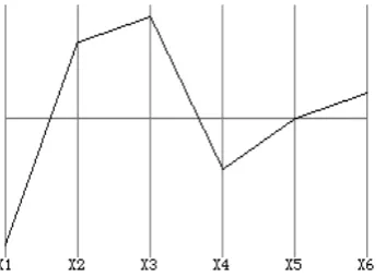
Enter into parallel coordinates. With PCs, you do not even try to map your n-dimensional problem into 2- or 3-dimensional orthogonal space. Instead, the entire coordinate axes xn of you problem are arranged parallel along the
[image:5.595.322.551.146.267.2]x-axis of (regular) 2d-space. A single point in Cartesian space is then represented by a profile of lines connecting all the coordinates of the point in PC space.
Figure 2: Pc Representation Of The Six Dimensional Point (-5, 3-4,-2, 0, 1)
If we map these points to PC space, we get the figure 2 plot. The main advantages of PC visualization are that the number of dimensions is only limited by horizontal screen space and that correlations of variables can be easily spotted.
Figure 3: grid points of the line in figure 1 mapped to pc space.
[image:5.595.323.553.299.430.2] [image:5.595.72.249.450.577.2]The display of complex datasets in PC space gives an intuitive overview of properties of the dataset that might not be obvious or not visible at all in other visualizations. Complex queries can be formulated graphically by selecting regions or locations on the coordinate axes, possibly combining single operations to complex queries (see below for a discussion of some extensions to interactively query and manipulate the display.)
[image:5.595.43.271.651.752.2]Figure 4: visualization of a complex dataset in pc space with some records highlighted.
Figure 4: visualization of a complex dataset in pc space with some records highlighted.
The basic plotting algorithm might provide good visual insight into some high-dimensional data mining & analysis problems. In addition, several extensions and improvements have been proposed to enhance a PC plot. The multiple capabilities provided by suggested tool can significantly enhance parallel coordinate’s plots in near future of implementations. The tool will have integrated additional techniques such as axis navigation, axis flip, axis spacing, curves, line and axis colors, frequency indicators, and brush regions to assist users in gaining insights into features of high-dimensional data.
VI. EXPECTEDBENEFITS
This work successfully combines the various techniques for improving the effectiveness of parallel coordinates representation for visualization of data elements. Sample information is passed to understand the basic approach of applying the parallel coordinates with some improvements using knowledge based data plotting. Also the suggested approach given several other benefits apart from solving the problem mentioned in the paper. Thus, the benefits counts can be given as:
b. Color coding improves the clear seperability of the data elements with wide range of applicability. As the colors are easily distinguishable the changes in data plotting can be easily identified.
c. Curves are having less complexity for outlier analysis and by which the data logic which are out of the approach is easily identifiable.
d. Important variables that enter the model earlier come first in the parallel coordinates plot. Our tool supports an ordering of axes in which the more significant variables are visualized earlier than the rest.
e. Specific curves with brushing, filtering and color range will further improve the results.
VII. CONCLUSION
Parallel coordinates are well known visualization system used in geometric projections with multiple data plots into a single graphs or any image element. In the last few years various other techniques along with the above parallel coordinates are suggested but they are not been able to completely satisfy the user’s needs. This work proposes a novel parallel coordinates model with some improved features and extraction functionalities form which logics can be derived out with visualizing the plotting of multivariate data. Also the existing parallel coordinates are affected by various problems such as cross over point, multidimensional representation, outlier values, etc. Thus the work also aims towards removing of such problems with some newly added functionalities and color based curve types. At the analytical evaluations level the work is representing its strong presence with its competitors and in near future the practical implementation of the tools will proves its efficiency and effectiveness.
VIII. FUTUREWORK
Some of the goals of the proposed approach that will achieve in the future are related to optimal resource utilization by which minimization of the number and size of the data structures required to implement the algorithms. The work also tries to make the parallel coordinate calculation more time efficient and accurate in case of thousands of multidimensional data and outlier’s reduction with clearly separated boundaries.
IX.ACKNOWLEDGEMENT
The authors wish to acknowledge Government Engineering College, Ajmer administration for their support & motivation during this research. The authors would also like to thank the anonymous referees for their many helpful comments, which have strengthened the paper. They also like to give thanks to Mr.Arjun Singh Parihar, for discussion regarding the curve based parallel coordinate’s geometric projection and visualization & for producing the approach adapted for this paper.
X. REFERENCES
[1] Gennady Andrienko and Natalia Andrienko, “Constructing
Parallel Coordinates Plot for Problem Solving”, in ACM Conference on Smart Graphics, doi: 1-58113-000-0/00/0000, 2001
[2] Martin Graham and Jessie Kennedy, “Using Curves to
Enhance Parallel Coordinate Visualizations”, School of Computing, Napier University, Edinburgh.
[3] Almir Olivette Artero, Maria Cristina Ferreira de Oliveira and Haim Levkowitz, “Uncovering Clusters in Crowded Parallel Coordinates Visualizations”, in IEEE Symposium on Information Visualization, doi:0-7803-8779-1/04, 2004.
[4] Matej Novotny and Helwig Hauser, “Outlier-preserving
Focus and Context Visualization in Parallel Coordinates”, in IEEE Transaction on Visualization and Computer Graphics, doi: 1077-2626/06/, Vol. 12, No. 5, Sep 2006
[5] Hong Zhou, Xiaoru Yuan, Huamin Qu, Weiwei Cui and
Baoquan Chen, “Visual Clustering in Parallel Coordinates”, in Euro graphics/ IEEE-VGTC Symposium on Visualization, Vol. 27, No. 3, 2008.
[6] K. T. McDonnell and K. Mueller, “Illustrative Parallel
Coordinates”, in Euro graphics/ IEEE-VGTC Symposium on Visualization, Vol. 27, No. 3, 2008.
[7] Yuan Luo, Daniel Weiskopf, Hao Zhang and Arthur E.
Kirkpatrick, “Cluster Visualization in Parallel Coordinates Using Curve Bundles”, in IEEE Transaction on Visualization and Computer Graphics, 2008
[8] Xiaoru Yuan, Peihong Guo, He Xiao, Hong Zhou, and
Huamin Qu, “Scattering Points in Parallel Coordinates”, in IEEE Transaction on Visualization and Computer Graphics, doi: 1077-2626/09/, Vol. 15, No. 6, Dec 2009.
[9] Dirk J. Lehmann and Holger Theisel, “Features in
Continuous Parallel Coordinates”, in Supported Work by German Science Foundation (DFG), project DFG TH692/6-1.
[10] Julian Heinrich, Yuan Luo, Arthur E. Kirkpatrick, Hao
Zhang and Daniel Weiskopf, “Evaluation of a Bundling Technique for Parallel Coordinates”, in NSERC Discovery Grant of Zhang and a MITACS research, Sep 2011.
[11] Maalej Abdelaziz, Rodriguez Nancy and Strauss Olivier, “ Survey of Multidimensional Visualization Techniques”, in the proceedings of Computer Graphics, Visualization, Computer Vision and Image Processing (CGVCVIP'12:), Lisbon Portugal, 2012.
[12] J. Walker, Z. Geng, M. W. Jones, and R. S. Laramee,
“Visualization of Large, Time-Dependent, Abstract Data with Integrated Spherical and Parallel Coordinates”, in Euro graphics Conference on Visualization (EuroVis), doi: 10.2312/PE/EuroVisShort/EuroVisShort2012/043-047, 2012.
[13] Shengwen Wang, Yi Yang , Jih-Sheng Chang and
Fang-Pang Lin, “Using Penalized Regression with Parallel Coordinates for Visualization of Significance in High Dimensional Data”, in International Journal of Advanced Computer Science and Applications (IJACSA), Vol. 4, No. 10, 2013.
Short Bio Data for the Author