City, University of London Institutional Repository
Citation
:
Andrienko, G., Andrienko, N. and Bartling, U. (2008). Visual analytics approach to user-controlled evacuation scheduling. Information Visualization, 7(1), pp. 89-103. doi: 10.1057/palgrave.ivs.9500174This is the unspecified version of the paper.
This version of the publication may differ from the final published
version.
Permanent repository link: http://openaccess.city.ac.uk/2848/
Link to published version
:
http://dx.doi.org/10.1057/palgrave.ivs.9500174Copyright and reuse:
City Research Online aims to make research
outputs of City, University of London available to a wider audience.
Copyright and Moral Rights remain with the author(s) and/or copyright
holders. URLs from City Research Online may be freely distributed and
linked to.
City Research Online: http://openaccess.city.ac.uk/ [email protected]
Visual Analytics Approach to User-Controlled Evacuation Scheduling
Gennady Andrienko, Natalia Andrienko, Ulrich Bartling
Fraunhofer Institute for Intelligent Analysis and Information Systems (IAIS)
Schloss Birlinghoven, 53754 Sankt Augustin, Germany
http://geoanalytics.net/and
This paper (or a similar version) is not currently under review by a journal or conference, nor will
it be submitted to such within the next three months
This paper extends our paper presented at the IEEE VAST 2007 conference
The manuscript contains more than 5 color figures. Some of them can be reproduced in black and
white and reduced in size without loss of content. We keep them in color for reviewers’
convenience. In the case of acceptance of the paper, we shall convert the excessive color figures
to black and white.
Acknowledgements
This research is conducted within the integrated EU-funded project OASIS – Open Advanced
System for Improved Crisis Management (IST-2003-004677, 2004-2008). The project as a whole
aims at defining a generic crisis management system to support the response and rescue
operations in case of large-scale disasters; more information is available at
http://www.oasis-fp6.org/.
We are grateful to Ahmet Ocakli for the integration of the visual analytics and optimization
ABSTRACT
Application of the ideas of visual analytics is a promising approach to supporting decision
making, in particular, where the problems have geographic (or spatial) and temporal aspects.
Visual analytics may be especially helpful in time-critical applications, which pose hard
challenges to decision support. We have designed a suite of tools to support
transportation-planning tasks such as emergency evacuation of people from a disaster-affected area. The suite
combines a tool for automated scheduling based on a genetic algorithm with visual analytics
techniques allowing the user to evaluate tool results and direct its work. A transportation
schedule, which is generated by the tool, is a complex construct involving geographical space,
time, and heterogeneous objects (people and vehicles) with states and positions varying in time.
We apply task-analytical approach to design techniques that could effectively support a human
planner in the analysis of this complex information.
CR Categories and Subject Descriptors: H.1.2 [User/Machine Systems]: Human information
processing – Visual Analytics; I.6.9 [Visualization]: information visualization.
Additional Keywords: Geovisualization, transportation planning, vehicle scheduling,
task-centered design, coordinated multiple views.
1 INTRODUCTION
Real-world problems involving spatial and temporal data and information are often ill-defined
and cannot be fully converted into a form suitable for automatic processing. However, the sizes
and complexity of the problems call for computational methods, which are especially needed in
time-critical applications. A sound approach is complementing the power and efficiency of
which often involves intangible preferences and intuition. An effective way to provide material
for human’s analysis and reasoning and to enable human’s guidance of the operation of
computational tools is by means of visualization and interactive visual interfaces [1].
In this paper, we consider the problem of planning the evacuation of people from a
disaster-affected area, which often needs to be solved in time-critical conditions. An efficient tool capable
of automated generation of evacuation plans can save precious time and, as a consequence,
people’s lives and health. Algorithms for transportation scheduling are devised in the area of
Operations Research (generic methods need to be adapted to the specifics of the evacuation
problem). However, such an algorithm cannot account for all relevant information and criteria,
especially for what is specific to the geographic area of the disaster and its neighborhood. One
reason is that some types of information, such as spatial and spatio-temporal relationships and
semantics of spatial objects and locations, cannot be adequately encoded (yet) in a
computer-interpretable form. Besides, an attempt to encode all relevant local information would take too
much time, which would nullify the value of the automated tool.
A solution is to involve a human expert in the process of planning. The idea is that the automated
tool produces a “draft” schedule. The expert (henceforth called “planner”) evaluates this
schedule, identifies parts needing improvement, and directs the further work of the automatic tool
for revising the schedule.
Our goal has been to design and implement a tool or a combination of tools that would allow a
planner to efficiently assess the acceptability of a schedule, detect possible problems, understand
their reasons, and find appropriate ways to solve or alleviate them. The complex structure of the
data (hundreds of transportation orders) demands computational analysis and summarization of
information.
The objective of this paper is to demonstrate a problem-oriented design of visual analytics tools
for schedule examination and improvement. The discussion of the schedule generation algorithm
requires a dedicated paper, which we plan to write soon. Here, we only describe the inputs and
outputs (section 3). In section 4, we present our analysis of the problem and the design
considerations derived from it. Thereby, we substantiate our choice of visual and computational
tools. It should be noted that inventing highly innovative and original visualization and
interaction techniques has not been our goal. On the opposite, we intentionally strived to apply
common techniques, expectedly familiar to the user. The rationale is to decrease the time
required for the planner to recognize the meaning of a display and learn how to use it.
Section 5 is intended to demonstrate that the choice of the techniques is adequate to the purpose.
We do not describe any of the techniques in detail since the techniques per se are not the focus of
the paper. Instead, we show how they may help the user to detect problems in a schedule and
investigate into possible reasons.
Prior to the presentation of our work, we briefly review the related literature.
2
RELATED WORK
The research agenda of Geovisual Analytics for Spatial Decision Support [1] sets the support to
time-critical decision making as one of the priority directions. It also points to the need to find
appropriate ways to visualize and analyze complex spatio-temporal constructs, such as scenarios
The problem of transportation scheduling is considered in the area of Operations Research, where
it is ascribed to a generic class of Vehicle Routing Problems [2]. For this class of optimization
problems, deterministic mathematical techniques do not work sufficiently well while heuristic
methods, such as Genetic Algorithms [3], offer a powerful alternative [4,5,6]. As we have noted,
the problem usually cannot be solved fully automatically and requires the involvement of a
human analyst with his/her domain expertise and knowledge of the geographic area. Existing
software systems for automated transportation planning typically include visualizations to
presents the results of schedule computation and optimization to the user and allow the user to
modify the schedule [7,8,9,10]. Commonly used types of display are table and Gantt chart (a
horizontal bar chart representing the duration of tasks against the progression of time). As these
displays do not contain geographic information, they are often combined with maps showing the
geographic locations involved [7]. Sometimes, planned shipments and vehicle moves are also
represented on a map as directed lines (vectors) connecting source and destination locations [9].
A disadvantage is that the spatial and temporal aspects of a schedule are shown separately, and it
is not easy for the user to establish links between them. To alleviate this problem, the user is
offered a chart where the horizontal dimension represents time and the vertical dimension
provides positions for the names of the locations [8,10]. In this chart, diagonal lines represent
movements of vehicles from place to place and horizontal lines or bars indicate their staying in a
location. Movements of several vehicles are shown by lines differing in color.
A shortcoming of these approaches to schedule visualization is their lack of scalability. Thus, a
table or Gantt chart representing hundreds of orders can hardly facilitate schedule analysis, and a
In [11], the authors present a solution based on the micro/macro display concept advocated by
E.Tufte [12]: the macro features (overall shape) of a graph capture dispersion and trend
information about the entire data set while micro encoding represents individual data items. This
idea has been used for the visualization of data concerning planned transportation of injured and
sick people to medical treatment facilities. Tiny symbols representing individual patients are
positioned according to the planned departure times or readiness times while the color and shape
of a symbol can encode attributes of the patient. The symbols for scheduled and unscheduled
patients are stacked on two sides of the time axis. In the result, the macro features of the display
show the total number of the patients and the distribution of the planned vs. unplanned patients
over time. This visualization, however, does not present information about the transportation
means (vehicles), source and destination locations, and durations of the trips. It does not seem
that the micro/macro display concept can be straightforwardly applied also to these types of
information. Another approach is representing data in an aggregated way. In [13], temporal,
geographic and categorical aggregations are used to visualize data about multiple events
distributed in space and time. These ideas can be adapted to the visualization of transportation
orders taking into account the differences in the data structure.
3
SCHEDULER OUTPUT AND RELEVANT SOURCE
DATA
An evacuation (or, more generally, transportation) schedule is a collection of transportation
orders assigned to available vehicles, where a transportation order specifies one trip of a vehicle:
source and destination locations, start and end times, and people (more generally, items) to be
people from multiple sources (original locations) to multiple destinations. The number of people
to evacuate may be quite large. An evacuation planner does not deal with each person
individually and even does not have data at the level of individuals but only data about the
(estimated) number of people in each location. The task is to assign groups of people to suitable
destinations, find appropriate vehicles to deliver them, and set the times for the trips of the
vehicles. There may be diverse categories of people such as general public, disabled people, and
critically sick or injured persons. These categories need to be handled differently, which includes
the selection of proper destinations and proper types of vehicles as well as proper timing of the
transportation.
The problem of evacuation planning differs from standard vehicle scheduling problems solved in
business applications, where an input for a scheduling algorithm usually consists of
transportation requests (incomplete transportation orders) specifying the types and numbers of
items to be delivered and their sources and destinations. The task of an algorithm is to associate
each request with an appropriate vehicle and a time interval when this vehicle will fulfill the
delivery.
In evacuation planning, the input information includes (1) the places where there are people to
evacuate, (2) the numbers and categories of these people, (3) the latest allowed departure times
per place and category; (4) possible destinations, i.e. safe places to which people can be moved,
and their capacities, by people categories. The user has no time for the formulation of
transportation requests. According to the specifics of the problem, we have devised a specialized
scheduling algorithm (by adapting the Breeder Genetic Algorithm described in [5]), which, in
into groups fitting in available vehicles and choose an appropriate destination for each group.
Similarly to other scheduling algorithms, our algorithm also requires the following data:
• Fleet description, which defines the types of vehicles and the initial distribution of available
vehicles over the various locations. For each vehicle type, the capacity is specified, separately
for each category of people it can be used for.
• Distance (time) matrix, which contains the estimated travel times between each pair of
locations.
It should be noted that defining the routes of the vehicles is not the task of the scheduler but can
be done by one of the existing routing tools, which can also provide the estimated travel times for
the time matrix.
An important property of the algorithm is that a valid solution exists at any moment while the
quality is progressively improved as the algorithm continues its work. In a case of emergency, the
user does not need to wait until the algorithm finishes its work but can get a reasonably good
(although not necessarily optimal) solution within affordable time limits. Thus, for our example
data with 14 source locations containing in total 4692 people of 6 different categories, 105
vehicles of 7 different types, and 25 destinations, we could have quite good schedules already
after one minute of running the tool. The tool is designed so that the user may specify a time limit
and is notified when this time limit has been reached or the algorithm has finished its work,
whatever comes first. In case of reaching the time limit, the user may load the current version of
the schedule for the visual inspection and either stop the algorithm or allow it to continue the
optimization process while the current schedule is under review. The process finishes when
like any other heuristic methods, do not guarantee arriving at an optimal solution. They do,
however, produce near-optimum solutions when properly designed.
4
PROBLEM ANALYSIS AND DESIGN CONSIDERATIONS
The visualizations discussed in Section 2 are designed to represent detailed information about
individual transportation orders so that the user could review the orders and, if needed, modify
some of them. However, a schedule for the transportation of a large number of people from
multiple source locations to multiple destinations is inevitably large. Thus, in our experiments,
the number of orders in the automatically produced schedules varied around 400 (the variation
results from the non-deterministic character of the algorithm). An evacuation planner usually has
no time for a detailed inspection of all orders; hence, a different approach is required.
Besides being more time-critical, the emergency evacuation problem is also more complex than
typical business transportation problems. The additional complexities, which have been noted in
the previous section, do not only affect the scheduling algorithm but also complicate the
planner’s work on schedule evaluation and increase the amount and diversity of information to be
analyzed (thus, the planner additionally needs to assess the choice of the destinations and
vehicles).
Essentially, evaluation of a schedule means finding answers to three questions:
1. Does it achieve the goal, i.e. are all people timely delivered to appropriate destination
places by appropriate vehicles?
2. Is it feasible?
In case of detecting problems such as undelivered people or late deliveries, they need to be
explored in order to understand the reasons (e.g. deficient transportation resources) and find
suitable corrective measures. Here is a list of possible problems:
1) Problems in attaining the goal (effectiveness problems):
a) Undelivered people;
b) Late deliveries with respect to the time constraints;
c) Use of improper vehicles;
d) Delivery to improper places.
2) Feasibility problems:
a) Use of more resources than available, i.e. exceeding the capacities of the vehicles or
destinations;
b) Multiple vehicles loading or unloading simultaneously in the same place (there may be
not enough space or not enough personnel for this).
3) Rationality problems:
a) Time gaps between transportation orders when vehicles are idle;
b) Distant trips that can be avoided by choosing other destinations;
c) Low use of vehicle capacities;
d) Unjustified use of very expensive vehicles.
These problems clearly differ in importance. Thus, under time-critical conditions, the planner
would not spend time for building a perfectly rational plan but rather use any feasible plan that
and feasibility problems could be immediately visible and, in case of presence of such problems,
the reasons were also immediately seen or easy to find out. The planner should also be able to
spot and explore rationality problems when time permits but immediate detection is not so much
required.
According to the design of the scheduling algorithm, effectiveness problems can only arise due to
resource deficiency. Hence, it is reasonable to construct the visualization so that it simultaneously
exposes the presence or absence of effectiveness problems and shows the availability and use of
resources, specifically, vehicles and destination locations. The display of resource use can also
demonstrate the absence of overuse of resources (it is guaranteed by the algorithm but
nevertheless needs to be shown to the planner).
The potential feasibility problems with multiple vehicles coming to the same place at the same
time are place-dependent. Thus, there will be no problem in such a place as a shopping centre or
industrial enterprise having a big parking lot. In such a place, simultaneous arrival of multiple
vehicles may be advantageous rather than problematic. Therefore, it is unreasonable to preclude
such situations completely through algorithm design. On the other hand, it is hardly possible to
supply all relevant location-related knowledge to the automatic scheduler in advance for taking it
into account in schedule building; besides, there is no time for this in an emergency situation. It is
therefore necessary to design the visualization so that the human planner could easily detect
potentially problematic situations and involve his/her domain knowledge to decide whether the
problems really exist.
Because of the time pressure and the size of the data, the planner needs summarized information.
However, highly summarized information such as the total number of undelivered people and
insufficient for the exploration into their reasons. A degree of summarization adequate for both
purposes is highly desirable. In this respect, it is productive to show the temporal progress of the
transportation according to the schedule using data aggregated by small time intervals. This will
allow the planner not only to note the existence of a problem (e.g. late delivery) but also the time
when it occurs and immediately explore the status of the transportation resources and destinations
around this time. A useful general guideline is given in the Visual Analytics Mantra put forward
by D.Keim [14]: the data are computationally processed (‘Analyze First’) to provide an overview
and expose problems (‘Show the Important’), which may be examined through querying and
further computations and visualizations (‘Zoom, Filter and Analyze Further’) while the original
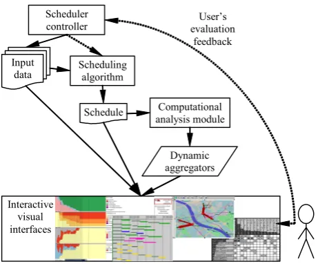
data are always accessible (‘Details on Demand’). As may be seen from Fig.1, our approach
corresponds to this principle.
<Figure 1>
Another design consideration is that the planner should be able to focus on the parts of the
schedule relevant to different people categories. One reason is simplification of the display and
the information to be perceived from it. Another reason is that the planner can apply some
priority order in reviewing the parts of the schedule, for instance, start with critically sick and
injured people who need urgent help. Then, if the planner is satisfied with the scheduling for this
category, he/she can launch the execution of this part even before the rest of the schedule is
reviewed.
What should be done when the planner is not satisfied with some part of the schedule? Manual
correction of individual transportation orders is time-consuming and therefore not appropriate in
emergency situations. A good approach is to utilize the scheduling algorithm not only for the
designed objective function directs the algorithm towards generating effective, feasible, and
rational schedules. If the algorithm has been stopped early in the optimization process, allowing
additional computation time may in some cases be sufficient for making the schedule acceptable.
It is reasonable to apply additional optimization only to the part of the schedule that requires
improvement. For this purpose, the algorithm is devised in such a way that some transportation
orders may be marked as fixed (non-modifiable); the further optimization is then applied only to
the remaining orders. The corresponding user interface should enable the planner to divide the set
of orders into fixed and modifiable without the need to view and mark individual orders. The
following division criteria are appropriate:
• people category: the user selects one or more categories, and the system fixes the respective
orders including the empty trips of vehicles to the source locations of these people;
• time: the user selects a time moment, and the system fixes the orders that will have been
fulfilled before it or will be under execution at this time moment;
• source location: the user selects a subset of source locations, and the system fixes the orders
for in- and outgoing trips.
However, the helpfulness of additional optimization is quite limited: it can eliminate or decrease
delays in a schedule (when the transportation resources permit) and improve its rationality. As
noted earlier, effectiveness problems mostly arise in case of insufficient resources. Thus, the only
possible reason for some people being not evacuated is the lack of suitable destinations and/or
vehicles or insufficient capacity of the destinations. The same applies to the use of improper
places and/or vehicles (there is a parameter determining whether the algorithm is allowed to use
resources cause delays that cannot be eliminated through optimization. Such problems require the
planner to undertake certain actions or make decisions such as:
• seek additional resources (meanwhile, the acceptable subset of the schedule may be taken for
execution);
• set priorities between people groups according to their categories and/or source locations and
permit delays for less prioritized groups;
• conclude that the problems (in particular, delays) are not critical and the schedule may be
accepted.
As we have discussed, simultaneous presence of multiple vehicles in the same place may or may
not be a problem. If the planner detects an undesirable coincidence in a particular place, he/she
should be able to shift some of the transportation orders forward in time, mark them as fixed and
let the scheduling algorithm appropriately modify the further orders assigned to the same
vehicles. If these modifications introduce delays, the planner may require the algorithm to
optimize the subset of the schedule comprising the orders that start after the latest shifted order.
Besides the possibility of correction, it is also necessary that the scheduling algorithm could
adjust the schedule to changes in the situation such as appearance of additional people to be
evacuated, deviations of the real travel times from the estimated ones, some resources becoming
unavailable or new resources being added. For this purpose, the planner can apply the time-based
division for marking the past and currently executed orders as fixed. Then, after appropriate
changes of the input data, the planner re-runs the algorithm to obtain an adapted version of the
A general requirement to the user interface of the system is the maximum possible simplicity and
ease of use. This poses significant challenges: the complex structure of the information, which
involves geographical space, time, and heterogeneous objects (people and vehicles) with states
and positions varying in time, necessitates the use of several coordinated views representing
different components and aspects. In this situation, it is desirable to avoid additional windows or
panels with controls for user interaction and give preference to direct manipulation techniques. It
is also appropriate to utilize representation methods familiar to the users.
In the next section, we present the visual and computational techniques we have chosen on the
basis of the task analysis and demonstrate their use for schedule assessment.
5
VISUALLY SUPPORTED SCHEDULE ASSESSMENT
5.1 Dynamic
aggregators
In the previous section, we have reasoned that the planner needs a summarized representation of
the data together with the ability to focus on various subsets. To meet this need, we combine
interactive filtering of the data with dynamic aggregation. According to our design, the user may
set one or more data filters of different types: by people category, by time interval, by source,
and/or by destination. The aggregation is applied to the portion of the data that have passed
through the filters and immediately re-applied when the filters change. For this purpose, the
computational analysis module of the system generates so-called dynamic aggregators (Fig.1). A
dynamic aggregator is a special object linked (i.e. having references) to a number of data records
and able to check which records satisfy current filters and to derive certain statistical summaries
from such records. The aggregators are responsible for the representation of the summaries on
Several kinds of dynamic aggregators are used, as described below. Some aggregators are applied
directly to the output of the scheduling algorithm while the others are linked to certain secondary
data produced by the computational analysis module, such as a table describing groups of people
with “common fate”, i.e. being originally in the same place and transported together to the same
destination or staying together in the source. For each group, the table specifies the category and
number of people, the source and destination, the departure and arrival times, the delay, and the
vehicle used for the transportation (some of the fields may be empty if the schedule contains no
appropriate transportation orders). Another derived dataset contains records about the source
locations of the vehicles and their visits to different places. For each place, the arrival and
departure times are specified.
Trip aggregator. This kind of aggregator summarizes data about trips having a common source
and a common destination. It is linked to the transportation orders (i.e. records of the
transportation schedule) with this source and this destination and computes the total number of
the trips, the numbers of trips with and without people, the total number of people transported,
and the number of different vehicles involved.
Source-related people counter. This kind of aggregator is constructed for each source location
and is linked to the records describing people groups originally present in this location. From
these records, the aggregator computes how many people will be present in the location by the
end of the time interval selected through the temporal filter and how many of them will stay there
too long, i.e. after the time limit being reached. When the temporal filer is not set, the aggregator
computes the maximum number of people simultaneously present in the place (usually this is the
Destination-related people counter is similar to the source-related people aggregator. It
computes how many people will have been transported to a destination. Additionally, it “knows”
the capacities of the destination for different people categories (this information is retrieved from
the scheduler’s input) and computes the remaining capacities.
Place-related vehicle counter. This kind of aggregator is created for each source of vehicles and
for each place ever visited by at least one vehicle. A vehicle counter is linked to the appropriate
records of the derived table describing the locations of the vehicles at different times. It
determines which vehicles will be present in the place by the end of the currently selected time
interval and computes the number of these vehicles. When the time filter is not set, the aggregator
computes the total number of vehicles that will visit this place.
People-by-states aggregator. It uses the derived dataset about the people groups to compute for
different time intervals how many people in total will be in each of the following states: staying
in their source locations while the time limits are not yet exceeded; staying in the source locations
after the time limits have been exceeded; being on the way to designated destinations in suitable
vehicles; being transported in unsuitable vehicles; being in suitable destinations; being in
unsuitable destinations. The time intervals result from dividing the whole time span of the
schedule execution by the moments when changes in people states occur, i.e. some trips start or
end.
Destinations use calculator. Similarly to the destination-related people counter, it calculates the
used and free capacities in the destinations but does this for all existing destinations and for time
intervals defined according to the moments of changes. The destination use counter counts
separately the number of people that will be delivered to unsuitable destinations, if any. It can
Fleet use calculator counts for different time intervals how many vehicles will be idle, moving
without load (to pick up people), and moving with load. It also computes the total, used, and free
capacities in the vehicles. Separately, it computes the used capacities in unsuitable vehicles, if
any. This aggregator can also detect and summarize overused capacities in the vehicles.
The former four kinds of aggregators, which are related to particular locations or pairs of
locations, are sensitive to all filters. The latter three aggregators summarize the data over all
locations, people, and vehicles. They are sensitive only to the filter by people category. When
some category is selected, the people-by-states aggregator counts only people of this category.
The destination use calculator summarizes the data over the destinations suitable for this people
category. However, if some people of this category are planned to be moved to unsuitable
destinations, those destinations will also be involved in the computations. Analogously, the fleet
use calculator performs its computations only with the vehicles either suitable for the selected
people category or planned to be used for transporting people of this category.
Aggregators by themselves have no visual appearance but the data they produce are used in
various visual displays, which will be introduced in the following subsections.
5.2 Overview of the transportation progress
When a schedule is loaded in the system, the system immediately generates a display providing
an overview of the transportation progress over time (Fig.2). This visualization is designed so as
to expose major problems, specifically, undelivered people, delays, and use of unsuitable vehicles
and destinations, or to demonstrate the absence of these problems. The horizontal dimension of
the display represents the time of the schedule execution. In the vertical dimension, it is divided
people-by-states aggregator (upper section), destinations use calculator (second section from top), and
fleet use calculator (two lower sections representing the use of capacities in the vehicles and the
activities of the vehicles, respectively).
<Figure 2>
As described in the previous subsection, the overall aggregators summarize data by time intervals
with the bounds determined by the moments of changes. The respective sections of the schedule
summary display are composed from segmented bars where each bar corresponds to a time
interval and has the width proportional to the length of the interval. Since each aggregator defines
the time intervals independently of the others, the widths of the bars differ between the sections.
The leftmost bar in each section corresponds to the time before the transportation will start. The
rightmost bar in each section corresponds to the time after the transportation will be finished.
These special bars have fixed widths. In the vertical dimension, the bars in all sections are
divided into colored segments representing various summaries computed by the respective
aggregators for these time intervals.
In the upper section, the segments of the bars represent the numbers of people in different states:
in sources, delayed in sources, on the way to destinations, in destinations, in unsuitable vehicles,
and in unsuitable destinations (normally, the latter two states do not occur). The full height of the
bars represents the total number of people, which is shown in the legend on the right.
The next section contains a destination use chart where the bar segments represent summarized
capacities in the destinations: free capacities in unused destinations, free capacities in partly used
destinations, filled capacities in partly used destinations, and filled capacities in fully used
destinations. Besides, overused capacities and used capacities in unsuitable destinations will be
destinations, i.e. how many people they can accommodate all together. The figure is shown in the
legend and can be easily compared with the total number of people to be evacuated.
A fleet use chart in the third section from top shows the free and used capacities in the available
vehicles. Analogously to the destination use chart, the fleet use chart is able to expose overloads
of vehicles and the use of unsuitable vehicles. Grey-colored segments correspond to the
capacities in the vehicles moving without load to pick up people. The full height of the bars
corresponds to the total capacity of all vehicles.
The lower section contains a chart of fleet activities, where the bar segments show the numbers of
the vehicles in each of the three states: idle, moving with load, and moving without load. The full
height of the bars corresponds to the number of available vehicles.
At the bottom of the display, there is a choice control allowing the user to select different
categories of people. The aggregators react to this by re-computing the summary data, and the
display is updated to portray only the information relevant to the selected category. Thus, Fig.2
shows the transportation progress summary for the category ‘critically sick or injured people’.
One of the choice options is “All categories”. When it is selected, the filtering by people category
is cancelled, and the aggregators compute their summaries from all data.
The display also serves as an interface for the selection of time intervals, i.e. setting the temporal
filter. Clicking on a bar in any chart selects the corresponding time interval, and a double-click in
any bar cancels the selection. In this way, we avoid introducing additional UI elements for
controlling the temporal filter. As the overall aggregators ignore the time filter and do not modify
their outputs when the filter changes, the only change in the appearance of the schedule summary
display is the indication of the selected interval in each section by a black frame. Thus, in Fig.2,
The colors for the display have been chosen in such a way that more prominent colors signify
problems. Thus, dark red segments in the upper panel represent groups of people staying in their
source locations after the time limits having been exceeded. The schedule presented in Figure 2 is
quite good; there is only a small delay (from 1 to 2 minutes) for several people. Figure 3
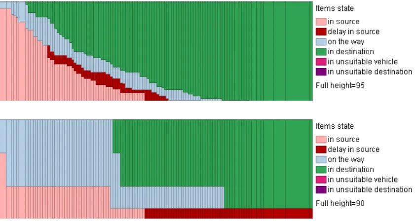
demonstrates how longer delays and undelivered people are exposed on the display.
<Figure 3>
When the schedule progress summary display exposes a problem, the reasons are often clear from
the same display. Thus, some people may be undelivered or delivered to unsuitable destinations
because of the lack of capacity in suitable destinations. This will be easily detectable on the
destination use display: either it will be empty, which means that no suitable destinations exist at
all, or it will show that all suitable destinations are full at the end. The investigation into the
reasons for delays or the use of unsuitable vehicles is, however, less straightforward and requires
involving additional displays, in particular, the map display.
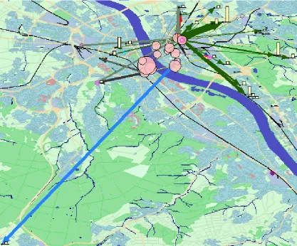
5.3 Map
display
The background of the map display shows the geography of the territory where the evacuation is
supposed to take place. On top of this, the information coming from the place-related dynamic
aggregators is displayed (Fig.4):
• the source locations and the number of people in them;
• the destination locations and the used and remaining capacities in these locations;
• the trips between pairs of locations;
The screenshot of the map display in Fig.4 contains no labels as they have been intentionally
removed for obtaining a clearer view.
<Figure 4>
The pink-colored circles of varying sizes represent the source locations, the sizes being
proportional to the numbers of people in them. When a location contains people that have not
been timely removed, the proportion of these people in the total number is shown as a red
segment in the circle. If the transportation of all people in a location is delayed, the whole circle
will be red.
The bar charts are positioned at the destination locations and represent the used and remaining
capacities in the destinations by the sizes of the orange and light yellow bars, respectively (the
colors are the same as in the destination use chart in the schedule summary display).
The vectors (arrows) of varying colors and widths represent summarized trips between pairs of
locations, i.e. the outcomes of the trip aggregators. The widths of the vectors are proportional to
the numbers of the aggregated trips. They can also represent other summaries computed for the
aggregated trips, e.g. the total number of people transported or the number of different vehicles,
according to user’s choice. The colors of the vectors indicate the categories of people transported;
the meanings of the colors are explained in the map legend. In Fig.4, green means ‘general people
or children’; red is used for ‘critically sick or injured people’, light blue for ‘prisoners’, and gray
for empty trips. Dark gray arrows represent mixed trips, when people of two or more categories
are transported between two locations.
The locations of the vehicles that do not move are indicated by small circles colored in shades of
Since all place-related aggregators are sensitive to all kinds of filters, the map display shows only
the data that pass through the filters. Thus, the map in Fig.4 shows the situation on the time
interval from the 15th to 16th minute of the schedule execution for all categories of people. The
map fragment in Fig.5 corresponds to the same selection of the time interval; additionally, the
people category ‘critically sick or injured people’ has been chosen. As a result, the map display
shows only the source locations where critically sick or injured people are expected to remain by
the 16th minute, the destinations and capacities suitable for this category of people, and the trips
and locations of the vehicles suitable for such people.
<Figure 5>
This state of the map display corresponds to the state of the schedule summary display shown in
Fig.2, where the category ‘critically sick or injured people’ and the time interval from minute 15
to minute 16 are selected. On this interval, there is a delay in removing the people from the
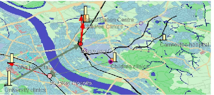
source locations. The map shows that the delay occurs in a single source location ‘Braun and
Co’; the corresponding circle is colored in red. At this time, several empty vehicles will be on the
way to ‘Braun and Co’ from ‘University clinics’ (south-west) and from ‘Children clinics’ (north).
The exact number of the vehicles can be seen in a popup window after putting the mouse cursor
on a vector.
The delay with transporting the critically sick or injured people is rather minor. Most probably,
the planner would judge it as acceptable. However, a long delay (over 30 minutes) is expected for
a group of ten people of the category ‘prisoners’ (Fig.6 top). To understand the reason, we click
on the bar in the people states chart at the beginning of the period of delay. The map display
(Fig.6 bottom) shows us the location where the delay will occur (‘Prison’) and the only
distant from the source. By putting the mouse cursor on the vector connecting these two
locations, we find out that a trip between them takes 47 minutes. From all suitable vehicles, one
will be on the way from ‘Jailhouse’ to ‘Prison’ while all the others will be located at ‘Jailhouse’.
From the fleet activities chart, we can learn that the earliest moment when some vehicles suitable
for prisoners become free is by the end of minute 47 of schedule execution. By clicking on the
corresponding bar and looking at the map, we can see that all these vehicles will be at this time
near ‘Jailhouse’. Hence, the earliest time when the remaining prisoners can be removed from
‘Prison’ is when some free vehicle gets back to ‘Prison’ from ‘Jailhouse’, i.e. by about 1hour and
34 minutes from the start of the schedule execution.
<Figure 6>
To solve the problem, the planner would need to find an additional suitable vehicle located not
far from ‘Prison’ or an additional (temporary) destination out of the danger zone. The planner
may also decide that the delay is not very dangerous and may be accepted.
5.4 Checking
the
feasibility
One kind of feasibility problems that can be expected is overuse of resources, i.e. capacities in the
available destinations and/or vehicles. The schedule summary display described in section 5.2 is
designed so as to expose such situations if they occur. Another kind of problem may potentially
arise when multiple vehicles come to the same place at the same time. As discussed in section 4,
such situations are not always problematic but may also be beneficial. Therefore, each situation
needs to be examined separately by a human expert with the involvement of local knowledge or
information from external sources. Potentially problematic situations can be detected with the
demonstrated in [16], this is an effective tool for the exploration of interactions and movements
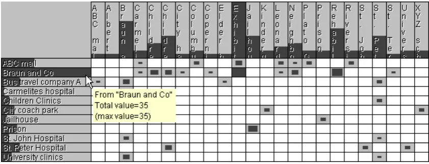
between spatial locations. The rows and columns of the matrix correspond to the sources and
destinations, respectively. In Fig.7, they are ordered alphabetically. The user can choose another
ordering method from several predefined variants, e.g. according to the numbers of trips from/to
the corresponding locations. The symbols in the cells and the shading of the captions of the rows
and columns can encode different aggregated characteristics, depending on the user’s choice. In
Fig.7, the sizes (areas) of the rectangular symbols are proportional to the numbers of trips
between the respective locations, and the sizes of the dark grey segments in the captions represent
the total numbers of trips from/to the corresponding locations. Other possibilities are: number of
empty trips, number of non-empty trips, number of people, number of different vehicles, and
special symbols encoding simultaneously the number of transported people and the distance
between the locations, as will be demonstrated later. All these data come from the trip
aggregators described in section 5.1. As the aggregators are sensitive to all kinds of data filters,
the matrix display shows the data satisfying the current filter conditions. This feature can be
exploited for the detection of multiple trips simultaneously starting from or ending at one
location.
<Figure 7>
When we look at the people states chart in the schedule summary display showing the
transportation of the people of all categories, we can notice that a sharp increase in the number of
transported people occurs at some moment (Figure 8), more precisely, on the 11th minute of the
schedule execution. Clicking on the corresponding bar selects the time interval from minute 11 to
minute 12. The screenshot of the matrix display in Fig.7 corresponds to this interval. It shows us
necessarily mean that all these trips will start simultaneously. More details about the trips can be
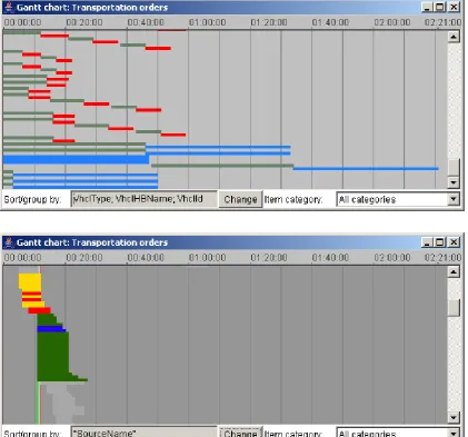
learned from the Gantt chart display (this type of display is commonly used in planning).
<Figure 8>
<Figure 9>
The upper screenshot in Fig.9 represents the Gantt chart display in its original state when no data
filters are set. It looks just like a usual display of this kind. The lower screenshot corresponds to
the selection of the time interval from minute 11 to minute 12. Additionally to this, filtering by
trip source, specifically, ‘Braun and Co’, have been applied. For this purpose, we have clicked on
the corresponding row of the source-destination matrix (to cancel the selection, the user needs to
click on an empty space in the display or double-click in any place of it). As a result, the bars
representing the trips from ‘Braun and Co’ have been grouped together. Only the bars
corresponding to the trips that will be in progress on the selected time intervals are colored; the
remaining bars are shown in gray indicating their inactive state (these bars do not react to
mouse-over events). The colors correspond to different categories of people: ‘invalids who cannot sit’
(yellow), ‘critically sick or injured people’ (red), ‘general people or children’ (green), and
‘invalids who can sit’ (blue). These are the same colors as are used in the map display for
coloring the vectors representing aggregated trips.
It is easy to see from the Gantt chart display that many trips (9) will simultaneously end at ‘Braun
and Co’ and yet more trips (22) will simultaneously start at this site. In this situation, the planner
should involve his/her background knowledge and/or additional information to assess the
feasibility of this plan. In our scenario, ‘Braun and Co’ is a big chemical enterprise, which has a
big parking lot. The planner may know this or call to ‘Braun and Co’ to find this out. If the size
vehicles to the site is an advantage: according to the scenario, the evacuation is caused by a fire
and release of a toxic substance at ‘Braun and Co’, and the workers of this plant need to be
evacuated among the first. While the vehicles are on the way to the plant, the workers can leave
the buildings and come to the parking place. However, it may be a problem that the vehicles for
general people (buses) come shortly after the arrival of the ambulance cars, which are supposed
to take injured people. The mass movement of people to the buses may hinder the loading of the
injured people in the ambulance cars and departure of the cars. Therefore, it may be reasonable to
move the orders for the buses by a few minutes forward in time (while regarding the time limit of
20 minutes).
In this section, we have mentioned the filtering of data by a source location. This filtering affects
not only the Gantt chart but also the map, which shows only the number of people in the selected
location and the trips starting at this location. Similarly to this, filtering by a destination is done.
For this purpose, the user clicks on the corresponding column of the source-destination matrix.
Clicking on a cell of the matrix sets the filters by the corresponding source and the corresponding
destination.
5.5 Assessing the rationality
From the possible rationality problems, the under-use of vehicle capacities, if occurs, will be
indicated in the fleet use chart (the third section of the display in Fig.2) by the presence of
orange-colored bar segments. The fleet activities chart (bottom of Fig.2) is suitable for detecting
time gaps in vehicle use. In a rational plan, the number of idle vehicles is minimal at the
beginning and then monotonously increases as the number of undelivered people decreases.
Hence, the height of the yellow bar segments representing idle vehicles should increase from left
and then used again. Such cases may be noticed in Fig.2. However, the widths of the bars
preceding the shorter segments show that the time gaps in vehicle use are very short. By means of
mouse-over querying, the planner can learn the exact duration, which is 1-2 minutes.
In our example data, there is no information about the costs of using different types of vehicles.
In case of availability of this information, it could be visualized on a segmented bar chart with the
bars divided according to the numbers of vehicles of different types and the segments colored
according to the costs of these types. This would allow the user to see whether expensive vehicles
are used without a real need for this.
The planner should also be able to detect unreasonable choice of distant destinations. When the
number of source and destination locations is small, a map display can provide an adequate
support for this. Thus, the map in Figure 10 presents summarized transportation orders relevant to
the evacuation of critically sick and injured people. People from two source locations are
transported to five out of six suitable destinations. The thickness of the arrow symbols encodes
the total number of people delivered from the corresponding source to the corresponding
destination. Thin gray lines correspond to empty trips. Figure 10 demonstrates a good choice of
the destinations: people are transported to the nearest suitable places. However, with increasing
the number of locations and trips between them, the map display loses its effectiveness due to
symbol overlapping. In such cases, the source-destination matrix may be a better alternative.
<Figure 10>
Fig.11 shows the matrix display in the mode of portraying the numbers of trips with load and the
distances to the destinations for all people categories. The numbers of the trips are represented by
the heights of the vertical lines and the distances by the lengths of the horizontal lines. The lines
symbols with long horizontal lines representing distant trips are easily detectable in the matrix. It
is especially undesirable if they also have long vertical lines.
<Figure 11>
In our case, the planner notes that people from some locations (‘Albert College’, ‘Beethoven
Gymnasium’, and one of the kindergartens) are supposed to be moved on quite long distances.
By selecting these locations in the matrix display and looking at the map, the planner detects that
these sites are located on the left side of the river. On this side, there are too few places suitable
for general people or children; therefore, people are transported to rather distant destinations on
the other side of the river. The problem may be solved by finding additional destinations on the
left side.
6 CONCLUSION
This paper demonstrates a task-oriented design of visual analytics tools for assessment and
improvement of evacuation schedules. The design bases on a detailed examination of the
schedule assessment task taking into account the time-critical character of the situation in which
it is accomplished. The size and complexity of the information to be reviewed and the need to
analyze it in the shortest possible time call for a synergy of visual and computational methods as
stated in the ‘Visual Analytics Mantra’ [14], which we have adhered in our design.
By an example scenario of schedule inspection, the paper shows how the tools we have designed
help the user to detect various types of problems in a schedule, understand their reasons, and find
appropriate corrective measures. Since the tools allow the user to detect all possible types of
problems, which are listed in section 4, we may conclude that the design is adequate to the task;
professionals are needed rather than students or colleagues playing the role of emergency
evacuation planners.
This research is conducted within a project aiming at defining and developing a generic crisis
management system to support the response and rescue operations in case of large-scale disasters.
Trials of the overall system with representative users from civil protection services (fire, police,
and ambulance) will be conducted next year in several European countries. These trials will give
us a possibility to get the necessary feedback from relevant professionals, who will try to use our
system. Recently, we have had a meeting with the people who will participate in the trials. We
have presented them the system and received a very positive reaction. The representative users
believe that the tool will be very helpful for them. They like the visual displays and find the
system quite user-friendly. This makes us hope that the testing of our system in the course of the
trials will be successful.
REFERENCES
1. Andrienko, G., Andrienko, N., Jankowski, P., Keim, D., Kraak, M.-J., MacEachren, A., and
Wrobel, S.: Geovisual Analytics for Spatial Decision Support: Setting the Research Agenda,
International Journal Geographical Information Science, Vol. 21, No.8, 2007, pp.839-857.
2. Golden, B.L., and Assad, A.A. (editors): Vehicle Routing: Methods and Studies (Studies in
Management Science and Systems, Volume 16), Elsevier, Amsterdam, The Netherlands,
1988
3. Reeves, C.R., and Rowe, J.E.: Genetic Algorithms - Principles and Perspectives: A Guide to
GA Theory, Operations Research / Computer Science Interfaces Series, Vol. 20, Springer
4. Goldberg, D.E.: Genetic Algorithms in Search, Optimization, and Machine Learning,
Addison-Wesley Pub. Co., Reading, MA, 1989
5. Bartling, U., and Mühlenbein, H.: Optimization of large scale parcel distribution systems by
the Breeder Genetic Algorithm (BGA). In T. Bäck (Ed.), Proceedings of the 7th International
Conference on Genetic Algorithms, 1997, pp. 473-480. San Francisco: Morgan Kaufman.
6. Pankratz, G.: Dynamic Vehicle Routing by Means of a Genetic Algorithm. International
Journal of Physical Distribution and Logistics Management (IJPDLM), Vol. 35 No.5, pp.
362-383.
7. Fagerholt, K.: A computer-based decision support system for vessel fleet scheduling -
experience and future research, Decision Support Systems, Vol. 37, Issue 1, 2004, pp. 35– 47
8. Smith, S.F., Hildum, D.W., and Crimm, D.R: Comirem: An Intelligent Form for Resource
Management, IEEE Intelligent Systems, Vol. 20, No.2, March-April 2005, pp. 16-24
9. ILOG Transport PowerOps, available at URL:
http://www.ilog.com/products/transportpowerops/, last accessed: 20 March 2007
10.TurboRouter software. Schedule visualization, available at URL:
http://www.marintek.sintef.no/TurboRouter/visualisations.htm, last accessed: 20 March 2007
11.Potter, S.S., Ball, R.W., and Elm, W.C.: Supporting aeromedical evacuation planning through
information visualization, Proceedings of the 3rd Symposium on Human Interaction with
Complex Systems (HICS '96), August 25 - 27, 1996, Dayton, Ohio, USA, publisher: IEEE
Computer Society, Washington, DC, USA, 1996
13.Fredrikson, A., North C., Plaisant, C., and Shneiderman, B.: Temporal, geographic and
categorical aggregations viewed through coordinated displays: a case study with highway
incident data, Proceedings of Workshop on New Paradigms in Information Visualization and
Manipulation (NPIVM’99), New York: ACM Press, 1999, pp.26-34.
14.Keim, D. A.: Scaling visual analytics to very large data sets, presentation at the Workshop on
Visual Analytics, June 4th, 2005, Darmstadt, Germany,
http://infovis.uni-konstanz.de/index.php?region=events&event=VisAnalyticsWs05
15.Bertin, J.: Semiology of Graphics. Diagrams, Networks, Maps. The University of Wisconsin
Press, Madison, 1967/1983
16.Guo, D.: Visual Analytics of Spatial Interaction Patterns for Pandemic Decision Support,
Input
data Scheduling algorithm
Schedule Computational analysis module
Dynamic aggregators
Interactive visual interfaces
Scheduler
[image:34.595.68.299.134.325.2]controller evaluation User’s feedback
Figure 1. The architecture and information and control flows of the evacuation planning
Figure 2. The summary display of the transportation progress presents the part of the
Figure 3. Top: long delays appear as red segments occurring in multiple consecutive bars.
Bottom: when some people are not delivered, the display contains a red stripe stretching to its
Figure 5. The map display shows information relevant to a selected people category
Figure 6. The people states chart (top) exposes a long delay for a group of people of the
category ‘prisoners’. The map display (bottom) shows the location where the delay occurs and
Figure 7. The source-destination matrix display corresponds to the time interval from
Figure 8. The people states chart exposes a sharp increase in the number of transported
Figure 9. The upper screenshot represents the Gantt chart display in its original
(non-filtered) state. The lower screenshot represents the result of filtering by a time interval and a trip
Figure 10. The map view shows aggregated transportations of critically sick and injured
Figure 11. The matrix shows how many trips with people and how far have been made from