Degree in Telecommunication Technologies Engineering
Academic Year 2018-2019
Bachelor Thesis
“Modified Band Depth Based
Initialization of K-Means for Functional
Data Clustering”
Javier Albert Smet
Tutor
Aurora Torrente Orihuela
Leganés, 2019
This work is subject to the Creative Commons license
Attribution –
NonCommercial – NoDerivatives
III
SUMMARY
K-Means is a well-known clustering algorithm that produces optimal results with a correct initialization. Modified Band Depth rises as a reliable alternative to one of the most widespread initialization methods: K-Means Plus Plus. Through the B-Spline approximation of the observations of interest, multivariate outcomes can be interpreted as functional data to produce a better grouping than via direct clustering. Several models and real data are used to determine if the method proposed produces favorable results in a consistent manner. We find that our method works well and outperforms the alternatives in most of the situations, specially achieving better clustering accuracy. This project is the continuation of the research work done in the Statistics Department of UC3M on Modified Band Depth.
Keywords
V
ACKNOWLEDGEMENTS
I would like to express my gratitude to my advisor, Prof. Aurora Torrente, for trusting and supporting me throughout my undergraduate years, and for her motivation and guidance in this project. I cannot conceive a better tutor than the one I have had, especially centered in my learning and personal growth.
Besides my advisor, I would like to thank my father, for his time and perpetual patience, my mother, for her reliable advice, and my brother, for his inexorable energy.
So far, my entire academic career has been made possible thanks to all the teachers and professors that have believed in my talent and competence. Their guiding knowledge will always shine in my path.
To the International Relations and Cooperation Department of UC3M, for making the world smaller and taking me to Georgia Tech and UNSW, giving me the chance to broaden my mind and expand my heart in the best universities in the world.
VII
TABLE OF CONTENTS
TABLE OF CONTENTS ... VII LIST OF ACRONYMS ... X FIGURE INDEX ... XI TABLE INDEX ... XIV EQUATION INDEX ... XVII
1. INTRODUCTION ... 1 PROBLEM DEFINITION ... 1 MOTIVATION... 1 STATE OF THE ART ... 1 GOALS ... 2 2. PLANNING ... 3 INITIAL PLANNING ... 3 REGULATORY FRAMEWORK ... 4
CHOICE OF PROGRAMMING LANGUAGE (R) AND SOFTWARE (R-STUDIO) ... 4
3. METHODS ... 5
LITERATURE REVIEW ... 6
3.1.1 Multivariate and Functional Data ... 6
3.1.2 Function Approximation Methods ... 8
3.1.3 Clustering and Clustering Algorithms ... 15
3.1.4 Clustering Evaluation Techniques ... 18
3.1.5 Bootstrapping ... 21
3.1.6 Modified Band Depth (MBD) ... 23
TECHNIQUES USED ... 26
3.2.1 B-Splines for Function Approximation ... 26
3.2.2 MBD as a Solution to K-Means Initialization Problem ... 27
3.2.3 Clustering Evaluation Techniques Used ... 28
3.2.4 Summary ... 29
MODELS FOR TESTING ... 30
COEFFICIENT CLUSTERING ... 35
MISSING DATA... 35
OTHER LIMITATIONS ... 37
REAL DATA ... 41
PROPOSED METHOD AS AN RPACKAGE ... 43
4. RESULTS ... 44
MODEL ONE ... 46
4.1.1 Five-Way Comparison... 46
4.1.2 Coefficient Clustering ... 48
VIII MODEL TWO ... 51 4.2.1 Five-Way Comparison... 51 4.2.2 Coefficient Clustering ... 53 4.2.3 Missing Data ... 54 MODEL THREE ... 55 4.3.1 Five-Way Comparison... 55 4.3.2 Coefficient Clustering ... 57 4.3.3 Missing Data ... 58 MODEL FOUR ... 59 4.4.1 Five-Way Comparison... 59 4.4.2 Coefficient Clustering ... 61 4.4.3 Missing Data ... 62 REAL DATA ... 63 QUALITATIVE SUMMARY ... 68 5. CONCLUSIONS ... 69
6. SOCIAL AND ECONOMIC IMPACT ... 71
SOCIAL AND ECONOMIC IMPLICATIONS OF THE PROJECT ... 71
RELATIONSHIP WITH TELECOM ENGINEERING ... 71
BUDGET ... 71
7. DISCUSION AND FUTURE STUDIES ... 73
LIMITATIONS ... 73
PROPOSED METHOD AS AN RPACKAGE ... 73
FUTURE RESEARCH LINES... 73
8. REFERENCES ... 74 APPENDIX
X
LIST OF ACRONYMS
ARI Adjusted Rand Index
AWGN Additive White Gaussian Noise CoPADIT Correctness, Purity, ARI, Distortion,
Iterations and Time
DF Degrees of Freedom
EM Expectation Maximization
Eq. Equation
FDA Functional Data Analysis
Fig. Figure
FMBD Functional Modified Band Depth FKMPP Functional K-Means Plus Plus
KM K-Means
KMPP K-Mean Plus Plus
MBD Modified Band Depth
MVMBD Multivariate Modified Band Depth
OSF Oversampling Factor
PAM Partitioning Around the Medoids PERT Program Evaluation and Review
XI
FIGURE INDEX
Fig. 2.1. PERT diagram describing the tasks carried out in this project ... 3
Fig. 3.1. The algorithm as a system ... 5
Fig. 3.2. Function sampling. ... 6
Fig. 3.3. A functional datum as a collection of points on the plane ... 6
Fig. 3.4. Multivariate data representing different features of an individual ... 7
Fig. 3.5. Reordered multivariate data ... 8
Fig. 3.6. Model fitting ... 9
Fig. 3.7. Fourier series approximation of a square wave. ... 10
Fig. 3.8.Example of a quadratic spline with one internal knot. ... 11
Fig. 3.9. Recursive construction of B-Splines of order 2 ... 11
Fig. 3.10. B-splines to span splines with three knots ... 12
Fig. 3.11. Hierarchical clustering ... 15
Fig. 3.12. Centroid based clustering ... 15
Fig. 3.13. EM algorithm with a mixture of Gaussians model ... 16
Fig. 3.14. Random initialization of K-Means ... 16
Fig. 3.15. K-Means convergence ... 17
Fig. 3.16. Label vector as output of clustering and 2D-graphical visualization of labels as colors ... 18
Fig. 3.17. N-dimensional vectors of observations from continuous functions and correct assignment of clusters, coded by color ... 19
Fig. 3.18. Bootstrapping procedure ... 21
Fig. 3.19. Resampling with replacement ... 22
Fig. 3.20. Repeating resampling ... 22
Fig. 3.21. Depth notion for functional data ... 23
Fig. 3.22. Band depth notion ... 24
Fig. 3.23. Band inclusion and exclusion ... 25
Fig. 3.24. Band defined by three curves as the gray region ... 25
Fig. 3.25. Steps in B-spline approximation ... 27
Fig. 3.26. MBD as a Solution to K-Means initialization problem... 27
Fig. 3.27. K-Means initialization diagram ... 28
Fig. 3.28. Overall picture of the method... 29
Fig. 3.29. Noisy 2D representation of clusters ... 31
Fig. 3.30. High noise scenario ... 31
Fig. 3.31. Model 1, noiseless and noisy ... 32
Fig. 3.32. Mean temperature in Leganés ... 33
Fig. 3.33. Graphical representation of model 2. ... 33
Fig. 3.34. Graphical representation of model 3 ... 34
Fig. 3.35. Graphical representation of model 4 ... 35
Fig. 3.36. Missing data ... 36
Fig. 3.37. Different sampling frequencies ... 37
Fig. 3.38. Function approximation for different sampling rates ... 38
XII
Fig. 3.40. Truncated observation interval and approximation for a quadratic function . 40
Fig. 3.41. Higher sampling rate on a truncated observation interval... 40
Fig. 3.42. Missing last sample on a B-Spline approximation of a quadratic function ... 41
Fig. 3.43. Approximate regions for climate data collection ... 42
Fig. 4.1. Model 1, 5-way distribution of CoPADIT measures for sigma = 1 ... 47
Fig. 4.2. Model 1, 3-way distribution of CoPADIT measures for sigma = 1. ... 49
Fig. 4.3. Model 1, 5-way distribution of CoPADIT measures for sigma = 1 with 25% missing values. ... 50
Fig. 4.4. Model 2, 5-way distribution of CoPADIT measures for sigma = 1 ... 52
Fig. 4.5. Model 2, 3-way distribution of CoPADIT measures for sigma = 1 ... 53
Fig. 4.6. Model 2, 5-way distribution of CoPADIT measures for sigma = 1 with 25% missing values ... 54
Fig. 4.7. Model 3, 5-way distribution of CoPADIT measures for sigma = 1 ... 56
Fig. 4.8. Model 3, 3-way distribution of CoPADIT measures for sigma = 1 ... 57
Fig. 4.9. Model 3, 5-way distribution of CoPADIT measures for sigma = 1 with 25% missing values ... 58
Fig. 4.10. Model 4, 5-way distribution of CoPADIT measures for sigma = 1 ... 60
Fig. 4.11. Model 4, 3-way distribution of CoPADIT measures for sigma = 1 ... 61
Fig. 4.12. Model 4, 5-way distribution of CoPADIT measures for sigma = 1 with 25% missing values ... 62
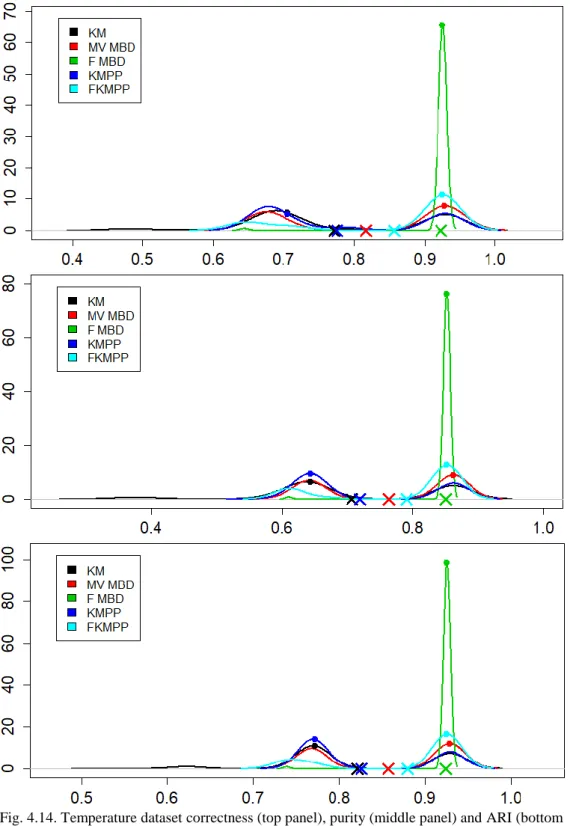
Fig. 4.13. Temperature data, 5-way distribution of CoPADIT measures ... 64
Fig. 4.14. Temperature dataset correctness, purity and ARI density plots ... 65
Fig. 4.15. Precipitation data, 5-way distribution of CoPADIT measures. ... 66
Fig. 4.16. Precipitation dataset correctness, purity and ARI density plots ... 67
XIV
TABLE INDEX
Table 3.1. Parts of the system. ... 5
Table 3.2. B-Spline weights. ... 12
Table 3.3. Implementation in R of B-Splines. ... 13
Table 3.4. Comparison of B-Splines and Fourier series. ... 13
Table 3.5. Implementation in R of linear least squares regression ... 14
Table 3.6. Implementation in R of K-Means, K-Medoids and K-Means++ ... 18
Table 3.7. Clustering evaluation techniques ... 20
Table 3.8. Implementation in R of bootstrapping ... 23
Table 3.9. Parameters defined by the user in the FMBD method ... 30
Table 3.10. Model 1 function definition. ... 32
Table 3.11. Model 2 function definition. ... 33
Table 3.12. Model 3 mean and spread parameters ... 34
Table 3.13. Missing value data matrix ... 36
Table 3.14. Interpolated values using the three approaches described ... 36
Table 3.15. Implementation of missing values in R ... 37
Table 3.16. Meteorological data by climate ... 42
Table 3.17. Köppen climate classification equivalence ... 43
Table 4.1. Parameters considered in the experiments ... 44
Table 4.2. Hardware and software specifications ... 45
Table 4.3. Model 1 optimal parameters. ... 46
Table 4.4. Model 1 summary statistics, 5-way CoPADIT for sigma = 1 ... 46
Table 4.5. Model 1 accuracy measures’ p-value of the paired t-test for sigma = 1... 47
Table 4.6. Model 1 FMBD accuracy measures’ p-value for the equality of medians test for sigma = 1 ... 48
Table 4.7. Model 1 summary statistics for coefficient clustering, 3-way CoPADIT for sigma = 1 ... 48
Table 4.8. Model 1 summary statistics for 25% of missing values, 5-way CoPADIT for sigma = 1 ... 50
Table 4.9. Model 2 optimal parameters ... 51
Table 4.10. Model 2 summary statistics, 5-way CoPADIT for sigma = 1 ... 51
XV
Table 4.12. Model 2 summary statistics for coefficient clustering, 3-way CoPADIT for
sigma = 1 ... 53
Table 4.13. Model 2, summary statistics, 25% of missing values, 5-way CoPADIT for sigma = 1 ... 54
Table 4.14. Model 3 optimal parameters ... 55
Table 4.15. Model 3 summary statistics, 5-way CoPADIT for sigma = 1 ... 55
Table 4.16. Model 3 accuracy measures’ p-value of the paired t-test for sigma = 1 ... 56
Table 4.17. Model 3 summary statistics for coefficient clustering, 3-way CoPADIT for sigma = 1 ... 57
Table 4.18. Model 3 summary statistics, 25% of missing values, 5-way CoPADIT for sigma = 1 ... 58
Table 4.19. Model 4 optimal parameters ... 59
Table 4.20. Model 4 summary statistics, 5-way CoPADIT for sigma = 1 ... 59
Table 4.21. Model 4 accuracy measures’ p-value of the paired t-test for sigma = 1 ... 60
Table 4.22. Model 4 summary statistics for coefficient clustering, 5-way CoPADIT for sigma = 1 ... 61
Table 4.23. Model 4 summary statistics, 25% of missing values, 3-way CoPADIT for sigma = 1 ... 62
Table 4.24. Real data clustering: parameters used ... 63
Table 4.25. Temperature data summary statistics, 5-way CoPADIT ... 64
Table 4.26. Precipitation data summary statistics, 5-way CoPADIT ... 66
Table 4.27. Qualitative summary of the median / mean /variance statistics of FMBD’s performance for the CoPADIT measures ... 68
XVII
EQUATION INDEX
Eq. 1.1 Fourier Series of a Square Wave. ... 9
Eq. 3.1 Error for Least Squares Regression... 14
Eq. 3.2. Band Depth Definition. ... 24
Eq. 3.3. Band Depth for Generic J. ... 26
1
1. INTRODUCTION
Problem Definition
The field of data analysis has become increasingly popular due to the ease of data collection allowed by current technology. Nowadays we can extract trends and statistics which can be analyzed and interpreted to reach meaningful conclusions in every research field.
Collected data can represent different phenomena and can be mined by using various tools like sensors or questionnaires. The latter ones are usually identified with discrete, multivariate data, while the former ones tend to provide continuous multivariate data or functional data.
To illustrate this, let us take the example of an athlete. Questionnaires about his/her health, like sleeping or eating habits, would provide us with some categorical data; his height, weight or his best performance in a 100m race are continuous variables that record continuous features that cannot be fit together into a function. However, if we measure the athlete’s blood pressure every half a minute of the race, we can figure out that the data collected are just observations of a function 30 seconds apart. This means that any value between two given observations exists (i.e.: the athlete has a specific blood pressure in between the time instants that we measure), but we just have not observed it.
Functional data analysis has multiple applications, such as monitoring patients at hospitals [1], statistically interpreting electromagnetic signals [2], or classifying children growth patterns [3].
Among the vast collection of methods to analyze data, clustering will be the focus of this work. Clustering is a form of unsupervised classification [4] that serves to infer groups of individuals or objects with similar characteristics and has a broad range of applications.
Motivation
The uses of clustering vary widely depending on the field [5]. Identifying diseases in medicine [6], [7], grouping clients by purchase habits in marketing [8], or noise removal in signal processing [9] are just some examples of it.
Improving the performance of a clustering algorithm translates into a more effective disease treatment, increased profit of an organization due to better customer targeting or more accurate signal processing results.
Generally speaking, this research project, although quite technical and specific, is relevant in the data analysis ecosystem, a field with many applications that can be life-changing through its uses in medicine, biology, market analysis or education amongst others.
State of the Art
Clustering algorithms have formally been in place since the mid-twentieth century. There are several approaches that have been developed up-to-date and will be described in detail in the Methods section. Amongst these, the most extended non-hierarchical clustering algorithm used for functional data analysis is K-Means [10].
It is known that K-Means converges quickly to a local optimum [11], but fails to provide consistent results when initialized randomly. The key for getting an optimal result is to carefully provide a set of initial centers as initialization parameters.
2
The finite dimensional version of the Modified Band Depth (MBD) [12], a concept that generalizes univariate medians to higher dimensions, is presented in Torrente and Romo [13] as a key element to obtain a solution to this initialization problem, providing better results than other used initialization algorithms for multivariate data. However, up to now, this algorithm has not been tested for functional data.
Goals
A Final Year Project can be understood as a double opportunity, both personal and scientific. It is a chance for the author to gain a thorough insight into a degree-related topic, and a chance to produce a meaningful research piece of work. From the research perspective, saving the more personal insight for the discussion section, the main purpose of this project is to assess whether an MBD-based initialization of K-Means is convenient for clustering of functional data. To achieve this, the fundamental lines of work can be broken down into:
1. Addressing the transformation of input multivariate data into functions for clustering analysis.
2. Assessing the clustering output results using a set of performance evaluation measures and comparing the proposed method to other initialization methods. 3. Determining whether MBD-based initialization is an advantageous solution for
K-Means clustering in the case of functional data.
Additionally, although the project involves many tests and calculations, we have made an effort to make the document clear, visually-attractive and as easy-to-read as possible, without sacrificing scientific correctness and conciseness.
3
2. PLANNING
Initial Planning
The project has an estimated duration of 34 weeks - or equivalently, 8 months - from start to finish. The tasks to be completed are summarized in Table 2.1.
TABLE 2.1.
TASK BREAKDOWN AND DURATION.
The following abbreviations are used: I = Introduction, D = Development, C = Closing
Note that the table has necessarily been updated with the specific details of the tasks that were not known exactly from the start. However, the main outline associated to the different letters of the reference column has remained unchanged, which is represented Fig. 2.1.
Fig. 2.1. PERT diagram describing the tasks carried out in this project.
The diagram presents only one path from start to finish as all the tasks to be done are sequential. In other words, there is no way in which we can perform two tasks at the same time. Hence, the critical path is the only one to follow, and all activities are therefore critical activities (i.e. they must be completed on time).
Reference Task Duration (weeks)
I1 Literature review and state of the art
familiarization 4 I2 Approach to the R language, adaptation to
R-Studio and selection of packages to be used 4 D1.1 B-Spline approximation implementation 3 D1.2 Application of K-Means after a B-Spline
approximation 1
D2.1 Definition of the models to be tested 3 D2.2 Parameter optimization for the models 3
D2.3 Model testing 3
D2.4 Study of missing data 2 D3.1 B-spline coefficient clustering 3 D4.1 Comparison with other initialization methods 2 C1 Future research line considerations 2 C2 Writing of the final document 4
TOTAL 34 I1 I2 D1 D2 D3 D4 C1 C2
4 Regulatory Framework
As it happens frequently in the Computer Science branch of Telecommunications, there is a lack of regulation in the matter. Considering that there is nothing physical to be built and algorithms cannot be patented as such [14], the regulatory framework is reduced to one main legal issue: privacy, the biggest legal concern when talking about Data Science. Particularly, the algorithm proposed has to be tested on real datasets. These have been obtained from sites that make them publicly available, and that are in compliance with the data privacy regulations established by the Regulation (EU) 2016/679 of the European Parliament [15].
Choice of Programming Language (R) and Software (R-Studio)
Having set up the backbone of what the project involves, it is important to explain the reasoning behind the choice of software in which it is developed. Why R? Why R-Studio? R is the most popular programming language amongst statisticians [16]. It is intuitive and flexible. Furthermore, it is open-source: there is a huge community of contributors, who provide code and documentation that can be imported as packages to ease the programming tasks.
R-Studio is a free integrated development environment similar to Visual Studio for C and C++, or Eclipse for Java. It provides the programmer with a graphical user interface that aids the visualization of the workspace: all the variables and functions that are in memory can be intuitively seen, as well as the console window. It is easy to write scripts and run them, and to debug the code line by line. R-Studio is used for research in top-class universities all around the world [17], [18].
5
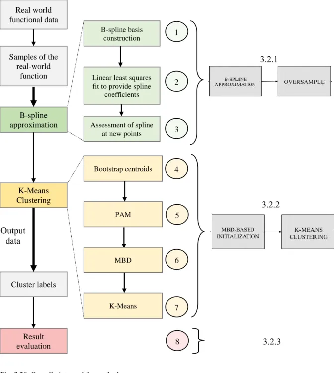
3. METHODS
In this section the research method is described. The whole picture can be better understood if it is thought of as being made up of three components:
1. A literature review (subsection 3.1) to cover the main concepts involved in clustering and functional data, and to understand why we are researching specifically in K-Means initialization.
2. A case study / research project (subsections 3.2 to 3.6) to assess if MBD-based initialization of K-Means is an accurate and reliable solution for centroid-based clustering.
3. The development of a computer program (subsection 3.7) that takes some input data and outputs the cluster each datapoint belongs to by using MBD-based initialization of K-Means.
Although every approach will be explained in more detail in the subsections mentioned, Fig. 3.1 presents the overall outline of what will be covered, understanding the initialization algorithm proposed as a system.
Fig. 3.1. The algorithm as a system. Input data is provided and transformed during the different steps of the method to render an appropriate output.
This is nothing but the classic picture of a system with an input, some processing and an output. It is handy to be familiar with this figure so we do not lose the grip on the goals of the project. It is important to note that the processing unit associated to “MBD-BASED INITIALIZATION” makes up the innovative block of the system. Table 3.1 presents a summary of the concepts used.
TABLE 3.1. PARTS OF THE SYSTEM.
Part of the system Role in the project
Input Datapoints that will be treated as functional data.
Process
Core of the research work; B-Spline function fitting and MBD-based
initialization of K-Means.
Output
A label for each input datapoint (function) indicating which cluster it
6
For simplicity, the whole processing block of the system is referred to as Functional Modified Band Depth, or FMBD, short for Functional data clustering based on Modified Band Depth initialization of K-Means.
Literature Review
The literature consulted in task I1 of the initial planning is summarized in this section. The theoretical foundations to understand the project in depth are laid here. The practical application of this theory is then explained in section 3.2 (Technique Review). A personal recommendation for the most experienced readers is to jump into the subsections that are unfamiliar to them.
3.1.1 Multivariate and Functional Data
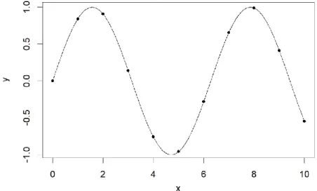
What is meant by functional data is best understood through an example.
Fig. 3.2. Function sampling. A continuous function (black line) is observed at discrete x values (dots).
The function y = sin(x) is plotted in Fig. 3.2. The black dots, drawn on top of the graph of the function, represent points on the plane, with x and y coordinates, which are obtained just by assessing the function at specific values of x. For example, for x=0, we have
y = sin(0) = 0, which is the first point in the graph. These dots are called observations or samples of the function, and the assembly of them is said to be a functional datum or
datapoint. Now let us consider the setup in Fig. 3.3:
7
The points on the plane are the same but now the relationship with the underlying function is not as obvious as before. It is even less clear if we reduce the number of observations we have. Therefore, the more points we observe, the easier it is to reconstruct the original function [19]. Having a large amount of observations in comparison to the duration of the function (i.e. the length of the interval in which the function is observed, 10 in this case) means that we have a high sampling rate.
Note that all of the concepts described here, like samples, observations and sampling rates are related to functions.
Another important aspect that characterizes a collection of data points as a functional datum is the fact that there is an ordering in the samples. That is, the observation at
x = 0, comes before the sample at x = 1, which comes before the one at x = 2, and so on. Furthermore, observations are considered to be in a continuum, so that we accept that any value between x = 0 and x = 1 exists, but we just have not observed it. In particular, the
x-axis is usually understood as the time axis.
Moreover, functional data analysis is very flexible, in the sense that functions can be observed at time points that are not equally spaced or that can vary across functions. Nevertheless, it is not unusual to find many functions observed for the same set of values of x, that is, observed at the same time points.
However, there is another type of data that, in general, does not originally come from a function. Instead, a datum is simply a vector of two or more variables or features. This is what we refer to as multivariate data.
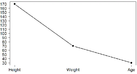
Fig. 3.4. Multivariate data representing different features of an individual.
In the example proposed in Fig 3.4, the information for a fictional person has been collected. His weight, height and age are plotted in the same graph. The weight is not measured in the same units as the height, nor the age, yet we can still plot this information in the same graph and join them with a line to get the corresponding parallel coordinates of the multivariate vector, like in Fig. 3.4.
In contrast to functional data, multivariate data are not sequential. This means that we can change the order of height and weight in the graph and still have the same information (it is permutation invariant). Similarly, we do not have any values between the points in the graph as we had with the functional data case. For example, there is no value between “weight” and “height” (but there were – unobserved – values between x = 0 and x = 1 in Fig. 3.3).
8
Fig. 3.5 shows an example of the re-ordered multivariate data, with the same information.
As one can envisage, the analysis of data arising from a function as multivariate data reduces the dimensionality of the problem but completely ignores crucial information such as smoothness of the curves or correlation of observations.
An important question arises when telling apart multivariate from functional data. In this project it is assumed that the captured data comes from a function and it is treated as such1.
The simulated models that we have chosen in this work, and that will be explained in section 3.3 (Models for Testing), are all made up of functional data. Also, in real life situations, we sometimes come across observed data that are derived from a function, representing a signal, a growth curve or other physical phenomena that can be thought of as functions.
3.1.2 Function Approximation Methods
Once we have our observations of a function, which we will consider our input data, we have to choose a function that is suitable to represent them. As we do not know the exact original function that the data comes from, we have to make a guess.
Of course, we have to define a more formal way of obtaining a function that represents the data than just “guessing”. The first idea that comes to mind to solve this problem is the use of models.
Model Selection
Imagine we have a set of functions from which we know the data has been observed. Typically, in the problem of model selection there is a collection of potential models. First, the observations have to be fit to each candidate model, often by estimating some parameters, and next the most appropriate one is selected. For an overview on model selection techniques, refer to Ding, Tarokh and Yang (2018) [20].
1 Actually, we can understand functional data as N-dimensional multivariate data, as we have N observations from a function collected into a vector, with one dimension for each sample.
Fig. 3.5. Reordered multivariate data. The information provided by the datapoint is permutation invariant.
9
The simplest situation is as shown in Fig. 3.6. The graph on the left represents a functional datum, and the one on the right displays a set of functions that it could come from. By visual inspection we can tell that the datum comes from the red model and not the green one. This approach is particularly useful when we know the set of functions that the data can come from. Nevertheless, this model set is not usually known, so a more flexible approach that allows us to find previously unknown functions for any kind of data has to be considered.
Fig. 3.6. Model fitting. Data points on the left panel are known to come from one of the functions on the right.
We now focus on two well-known techniques for representing and approximating functions: Fourier series and B-splines, which are of interest here because they are used for curve fitting.
I. Fourier Series
Without going into much detail, Fourier analysis provides us with some coefficients that allow representing any periodic function as a linear combination of sine and cosine terms. Fig. 3.7 illustrates the following example, in which the black function corresponds to the following equation:
f(x) = 0.5 + 0.6366·cos(π/2) - 0.2122·cos(3π/2) + 0.1273·cos(5π/2). (Eq. 1.1) We can see by visual inspection that f(x) approximates the square wave, our target, represented in red, but such an approximation can be drastically improved. The more
terms or coefficients we add the better the approximation will be. There are well-known closed formulas for each coefficient, namely given by:
𝑓(𝑥) = ∑ 𝐶𝑛 ∞ 𝑛=1 𝑒𝑗2𝜋·𝑛𝑇 ·𝑡, 𝐶𝑛 = 1 𝑇∫ 𝑓(𝑡) · 𝑒 −2𝜋𝑗𝑛𝑇𝑡𝑑𝑡 𝑇/2 −𝑇/2
For a deeper insight into Fourier series Oppenheim, Willsky and Nawab (2014) [21] is recommended.
10
Fig. 3.7. Fourier series approximation (black line) of a square wave (red line).
This example serves to illustrate how the red square wave function can be represented with a reasonably low number of coefficients. From an algebraic perspective, we can represent an approximation of the function with two vectors:
➢ The coefficients vector, [0.5, 0.6366, -0.2122, 0.1273],
➢ and the associated basis vector, [1, cos(π/2), cos(3π/2), cos(5π/2)]. Doing the dot product between both of them yields the function f(x) in Eq. 1.1.
This vector and matrix notation is useful for coding purposes, as R works with such objects.
The same philosophy behind the coefficient-basis notation for representing periodic functions described above applies to B-splines for non-periodic functions. As stated below, B-splines provide other advantages when considering derivatives or efficiency. All these characteristics will be summed up in Table 3.4 at the end of this section.
II. B-splines
Splines are polynomial curves defined piecewise. In each piece, or interval of the x axis, they have a specific degree. Algebraically, they can be thought of as elements of a vector space in an interval defined by:
➢ The degree of the polynomials in a piece, and
➢ The number of knots, or endpoints of the intervals (pieces).
Moreover, the dimension of the vector space is given by the degree + 1 + the number of knots. The degree + 1 is known as the order of the polynomial (the number of terms when all of them are present).
Fig. 3.8 shows an example of a quadratic polynomial defined in the interval [0, 1) and a linear polynomial in the interval [1, 2]. This is a spline of degree 2, with 1 knot plus the two extremes. The knot and the boundary knots are represented as red points. As explained before:
➢ Order = degree + 1 = 2 + 1 = 3.
11
Fig. 3.8.Example of a quadratic spline with one internal knot.
The dimension of a vector space states the number of linearly independent vectors to be in a basis for that space; in the case of splines these basis functions are splines of a specific, common order, and are referred to as B-splines. Because they form a basis, they span all the splines (vectors) of the vector space defined by a specified set of knots and a given order.
One possible, standard basis can be obtained by working recursively from order 1 B-splines, up to the desired order, by using the expression [22]:
(𝑚 − 1) · 𝐵𝑗,𝑚(𝑡) = (𝑡 − 𝑗) · 𝐵𝑗,𝑚−1(𝑡) + (𝑚 + 𝑗 − 𝑡) · 𝐵𝑗+1,𝑚−1(𝑡),
where 𝐵𝑗,𝑚(𝑡) is the spline basis function of order 𝑚 and j is the value of t where it first rises from zero. 𝐵0(𝑡) is the spline known as the mother basis spline, a square pulse in the interval [0, 1] with height of 1.
We display in Fig. 3.9 the process of constructing B-splines of order two (B2), starting from those of order zero (B0).
12
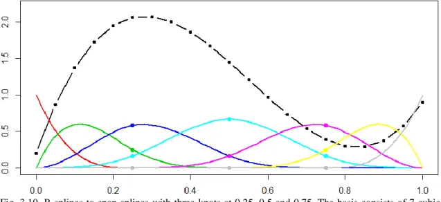
The term B-Spline is shorthand for Basis-Spline. This is because we can understand a B-spline as an element of a basis for the vector space of a certain collection of splines.
Fig. 3.10. B-splines to span splines with three knots at 0.25, 0.5 and 0.75. The basis consists of 7 cubic splines (colored lines).
Fig. 3.10 serves as an explanation for what a spline is (dash-dotted black curve), as an element of a 7-dimensional vector. The 7 B-Splines in the basis are illustrated as solid, colored lines. The three breakpoints are displayed as dots. The spline is then represented with respect to the given basis by the coefficients (or coordinates) reported in Table 3.2.
TABLE 3.2. B-SPLINE WEIGHTS.
1 2 3 4 5 6 7
0.2 1.4583 2.475 1.525 0.125 0.2417 0.9 Loosely speaking, breakpoint is another name for knot, and it refers to the endpoints of the subintervals in which the splines are defined.
Obviously, the dimension of the vector space, as calculated before, gives the number of coefficients we need to represent a whole spline using B-splines.
One major advantage of splines is that they can be used to approximate functions of any kind, not just polynomic functions. B-Splines offer a convenient representation of a function because of the following main characteristics:
✓ They have a simple vector representation of a function and its derivatives of any order.
✓ A fixed basis can be used for some given knots and order.
✓ Basis functions are continuous for any order and differentiable for orders higher than 1.
13
TABLE 3.3.
IMPLEMENTATION IN R OF B-SPLINES. Implementation in R
Splines can be constructed in R using the package splines or splines2
alternatively.
The way B-Splines are implemented in R is slightly different than the way they are defined in the proposed literature [22]. Instead, a modification known as periodic is used, which is characterized by using equispaced and not-open knots: the endpoints of the interval are considered as knots as many times as the degree of the spline. This shapes the basis functions differently, but essentially their functionality is the same. A different basis means that we have a different coefficient for each basis function. This leads to having different components of the vector that represents the spline in the vector space (that is, a change of coordinates). This is no big deal as the main characteristics stay the same and both methods are equivalent.
Table 3.4 summarizes the main characteristics of both methods considered above.
TABLE 3.4.
COMPARISON OF B-SPLINES AND FOURIER SERIES.
Property Fourier Series B-Splines
Periodic Functions Straightforward
representation Requires more complexity
Flexibility Low High
Derivative computation Moderate Very easy Memory use of vector
representation High for some functions Low
Note that, although the use of B-splines is convenient for any arbitrary function, other function approximations can also be used in different situations, as explained before. For example, electromagnetic waves can be simulated using sinusoids, which are periodic. These sinusoids can be modulated to transmit information. There are several types of modulations depending on which attribute of the wave is used to transmit the data. Amplitude Shift Keying (ASK), Phase Shift Keying (PSK) and Frequency Shift Keying (FSK) are three of the most popular techniques.
In this context, one would prefer to represent the function by using Fourier coefficients, provided that Nyquist’s theorem is satisfied [19], [23] (further information on the topic can be found in Oppenheim, Willsky and Nawab (2014) [21].
Hence, one must keep in mind that B-splines are not always the most optimal approximation method to use, and despite that this is the technique we consider all along the present work, our approach is applicable to any alternative curve fitting method.
14 Linear Least Squares Regression
If the function we want to represent is not a spline, we would find the spline that is closest
to it in order to represent the function. The same thing applies to Fourier series analogously.
The way of defining which spline is closest is through least squares. The least squares method is proposed to find a solution to systems in which there are more equations than variables. These are called overdetermined systems [24]. This is our case because there are normally lots of input data points compared to the number of coefficients that we use to represent the function.
As we have a linear model made up of all the coefficients of the B-splines that represent our function, we can call this linear least-squares regression.
In least squares we find solution that satisfies that the sum of the squared errors is minimum. That is,
where:
➢ yi are the observations, the measurements that we have obtained, that is, the original data.
➢ f(.) is the target function, the one that we will obtain. It is the closest match to the data that we have observed.
➢ ei is the error or difference between the observed data and the target function at the specific value of x. The vector of errors is represented by e=(e1,…, eN).
➢ xi is such a specific value of x: the x axis value at which yi was observed. For instance, it could be a time instant (e.g.: xi = 0.52ms) or a position in space (e.g.:
xi = 0.52mm).
➢ ai are the estimated coefficients, the parameters to be optimized by minimizing
||e||2. They are used to represent the function.
When we find a1, a2, … , an such that ||e||2is minimum we have the best expression for
f(xi) in the least squares sense. And once we have the function represented through the coefficients, we can use it for interpolation: following the reasoning behind functional data, this means that we can estimate samples at x positions (i.e. time instants) in which we had not observed the function originally.
TABLE 3.5.
IMPLEMENTATION IN R OF LINEAR LEAST SQUARES REGRESSION. Implementation in R
Least squares can be implemented in R through the lm(·) function. It provides the linear least squares regression solution to the system passed as an argument.
The system is formed, as shown in Eq. 3.1, by the input data, y, and the basis calculated using the splinespackage.
15
3.1.3 Clustering and Clustering Algorithms
Clustering is a form of unsupervised classification [25]. This means that input data will be grouped into a number K of classes, typically specified by the user, and that no training
or learning data is used (i.e. we do not have any data to train the algorithm with).
For example, a high school teacher may want to group her students into different classes based on their academic performance. Information about their grades from primary school up to high school may be used. Say that she chooses to make three groups according to their level: low, medium and high. Using a clustering algorithm would make this grouping automatic for the teacher. Groups are also called clusters or classes.
There is a massive amount of clustering techniques for multivariate data, but none has proven to work better than the others in every situation. Some of the most widely used types are discussed below.
▪ Hierarchical clustering is based on grouping data points as leaves of a tree, based on distance between these and the parent nodes. Points are grouped together if they are in proximity according to some distance criterium. As there are different ways of defining a “distance” between nodes, we find different algorithms according to those definitions. The hierarchical structure obtained can then be flattened by pruning the tree at certain heights.
Fig. 3.11. Hierarchical clustering of different orientations [26]. The y-axis measures proximity of data and clusters.
With respect to non-hierarchical clustering we have the following categorization:
▪ Centroid based clustering
characterizes classes with a center. The groups, and consequently the centers, are chosen in order to “globally” minimize the distance of objects in a group to their respective center. Unlike hierarchical clustering, centroid based clustering calculates distances to “centers”, which are not necessarily datapoints inside a cluster.
Fig. 3.12. Centroid based clustering. After selecting centroids for each cluster (top panel) each element is assigned to one of them (bottom panel).
16 ▪ Distribution-based clustering makes the assumption that there is a certain underlying distribution model, such as a Gaussian distribution, which is used to find the clusters. Typically, the parameters of the model are optimized in each iteration of the clustering algorithm. A classic example of this is the expectation-maximization (EM) algorithm [28], as shown in Fig. 3.13.
Fig. 3.13. EM algorithm with a mixture of Gaussians model [27]. The mean and standard deviation of the 2-dimensional Gaussians are adjusted in each iteration from left to right according to the expectation-maximization algorithm.
▪ Density-based clustering is similar to hierarchical clustering as the grouping is done according to distance between datapoints. The difference between them is that, in density-based clustering, points that are further away are labeled as noise, whereas in hierarchical clustering new clusters would be created for those outliers. How do we know which algorithm to use? The answer to this question is not simple; researchers tend to select a technique that has proven to provide good results for the kind of data under analysis, or at least for a wide collection of situations. In particular, we consider here the K-Means algorithm, probably the most popular clustering technique in place in numerous research fields.
K-Means and K-Medoids
Two important reasons that make K-Means so widespread are that it provides better results than other clustering techniques with little information and that it is simple to implement.
Fig. 3.14 and Fig. 3.15 illustrate how the algorithm works. Observed datapoints are plotted as black dots, whereas cluster centers or centroids are colored and circled. Step 1: Initialize the algorithm with “K” random points or elements from the dataset. These will be the initial centroids. In this case we have K = 3.
17
Step 2: Assign each data element to exactly one cluster (represented by a centroid). The data is grouped according to the distance to each of the possible cluster centers (green, red and blue) [29]. This is shown in Fig. 3.15 (top panel).
Fig. 3.15. K-Means convergence.
Step 3: Update the centroids of each cluster by calculating the component-wise mean of all the datapoints’ coordinates (hence the name K-Means), as shown in Fig. 3.15 (bottom panel).
Now, we repeat steps 2 and 3, reassigning the datapoints to new clusters with the new centroids and recomputing the centroids for each new cluster after that. By repeating this, the algorithm eventually converges (i.e. does not produce a different clustering output), or reaches a maximum number of iterations.
K-means is also known to yield a minimum2 of the so-called distortion: 𝐷 = ∑ ||𝑥 − 𝑐||2
𝑥∈𝑋 ,
where X is the dataset, and c is the nearest center to the datapoint x. More details on distortion will be discussed in subsection 3.2.3 (Clustering Evaluation Techniques). All in all, we see that the centroids move around and end up in a suitable, center-representative, position. Additionally, it can be seen from the way in which they are computedthat the centroids are not necessarily datapoints.
In contrast, an alternative algorithm known as K-Medoids [30] is based on the same principle as K-Means but choosing as a centroid a point that belongs to the cluster. The most popular variation of this method is the Partitioning Around Medoid (PAM) [31] algorithm, which eliminates the randomness when selecting the centroids [32].
2It is not guaranteed whether it is a local or global minimum of the distortion.
St
ep
2
S tep 2St
ep
3
S tep 218
It can be anticipated that there must be a more convenient way of initializing the K-Means algorithm than the random initialization introduced in Step 1. K-Means initialization is a whole new world by itself, and several techniques have been proposed up to date to address this problem. For a review, refer to Celebi, Kingravi, and Vela (2012) [10]. K-means++ is probably the most common option; it chooses a random initial point, but the choice of the second point is conditioned on the choice of the first one. In other words, there is a higher probability of choosing a point that is further away from the first one chosen. Points that are selected further away tend to provide better convergence and more accurate results.
TABLE 3.6.
IMPLEMENTATION IN R OF K-MEANS, K-MEDOIDS AND K-MEANS++. Implementation in R
K-means is implemented in R and can be accessed by calling the kmeans() function. The most common variation of K-Medoids is the PAM algorithm, implemented in R via the pam()function.
An implementation of K-Means++ is found in the LICORS package by calling
kmeanspp(). Additionally, other implementations can be found online but this package has been chosen due to its simplicity and good performance according to the original definition of K-Means++ by Arthur and Vassilvitskii (2006) [33].
The main goal of this project is to propose and test a new algorithm to initialize K-Means, using another principle to provide the initial centroids. This will be discussed in subsection 3.2.2 (MBD as a Solution to K-Means Initialization Problem).
3.1.4 Clustering Evaluation Techniques
How do we determine if a clustering result is better than another one? To quantify this idea of “being better” we must find a technical way for comparison.
If we input some data to any non-hierarchical clustering algorithm, a label vector that determines which data belong to which cluster is produced. A simple representation of this is presented in Fig. 3.16.
Fig. 3.16. Label vector as output of clustering (left). 2D-graphical visualization of labels as colors (right).
In this case we have considered K = 2 (number of clusters to be extracted), and input datapoints of dimension D = 2. Datapoint (Input) Cluster Centroid Label (Output) (-3,0) (-3,0) 1 (-4,0) (-3,0) 1 (2,0) (2.5,1) 2 (3,2) (2.5,1) 2 (-2,0) (-3,0) 1 )
19
It can be seen that the input data can have any number of dimensions and that in the case of functional data, it becomes infinite. As explained in footnote 1 in section 3.1.1 (Multivariate and Functional Data), functional data can be discretized to have a number of dimensions equal to the number of observations of the function that we have fitted. A more realistic example and of more use to the project would be taking two functions (i.e. K = 2) observed at the same time instants: a sine and a cosine, with some level of noise. Say we have observations of these sinusoids every 0.1 seconds. See Fig. 3.17.
Datapoint (Input) Label (Output) (-0.188,0.155,-0.052, 0.774, … ) 1 (0.013, -0.173, 0.246, 0.991, …) 1 (0.476, 0, -0.487, 1.045 … ) 1 (0.885, 1.49, 1.433, 0.98, … ) 2 (0.875, 0.882, 0.870, 0.867, …) 2 (1.48, 0.583, 0.905, 1.303, …) 2
Fig. 3.17. N-dimensional vectors of observations from continuous functions (left panel). Correct assignment of clusters, coded by color (right panel).
The cases depicted in Fig. 3.16 and Fig. 3.17 are examples of situations in which we could analyze the clustering output produced. Clustering evaluation techniques can be classified [34] into:
➢ Internal techniques, which are those that use the input data to evaluate clusters, and
➢ External techniques, which are the ones that use the output labels to evaluate clusters. In general, they compare two sets of (output) labels to assess the agreement between them.
Nevertheless, there is an important distinction to make between the computed labels and the real or original labels. In other words, there is a crucial difference between the groups that the algorithm makes and the real groups that the data come from.
For instance, taking the same example of sine and a cosine signals measured in the presence of noise proposed in Fig. 3.17, if the noise is sufficiently high, the distinction of the sine and the cosine is made harder and can mean that the classification is not done correctly. That is, what came from a sine signal is classified as a cosine, and vice versa. Typically, the true labels are not known in the clustering problem, but simulated data or certain a priori knowledge about real data can provide such labels. Accordingly, external cluster evaluation techniques are the ones that can be used to compare original labels with computed labels to determine clustering precision.
Additionally, one cluster alone can be evaluated using internal measures, but not external measures. Hence, both external and internal measures are needed to have an overall idea of the performance of a clustering method.
20
Once this difference is made clear, we can use the subsequent, commonly used, measures shown in Table 3.7 to evaluate the performance of our initialization method.
TABLE 3.7.
CLUSTERING EVALUATION TECHNIQUES.
Name Description Range Type
Purity
Each cluster is assigned to the class which is most frequent in the cluster, and then the accuracy of this assignment is measured by
counting the number of correctly assigned datapoints (with respect to the most frequent
class in the cluster) and dividing by N [34].
[0, 1]
(real) External
Rand index
Defined as the number of pairs of objects that are either in the same group or in different groups in both label sets divided by
the total number of pairs of objects. When two label sets agree perfectly, the Rand
index has a value of 1 [35].
[0, 1] (real) External Adjusted Rand Index (ARI)
A problem with the Rand Index is that the expected value of the Rand index between two random partitions is not a constant. This
problem is corrected by the Adjusted Rand Index that has an expected value of 0 in the
case of random clusters [35].
[0, 1]
(real) External
Distortion
For each cluster, the squared distances of each datapoint to the corresponding center
are summed.
[0, ∞)
(real) Internal
Iterations
The number of iterations until the K-Means clustering algorithm converges, once it has
been initialized.
{1,2,3 … }
(natural) Other
Execution time
The time it takes for the clustering algorithm to compute the output labels. It clearly depends on the specific implementation of
the methods.
[0, ∞)
(real) Other
Occasionally, these measures will not be enough to determine which clustering algorithm works better. We have defined a correctness3 index that returns the number of correctly
3 Computing the probability of error, P, is the same as computing the correctness, C. They are related through C = 1 – P.
21
classified datapoints as a percentage. To do so, all permutations of the original labels are computed, and the maximum percentage of correctly classified points of all permutations yields the correctness4. It is an external measure.
However, correctness is not used as frequently as purity or ARI because of the time it takes to be computed, especially if the number of clusters is large.
Note that whereas purity, ARI and correctness are bounded between 0 and 1, distortion, iterations and execution time can take any positive value.
Finally, it can be said that the higher the value (i.e. the closer to 1) of purity, ARI and correctness, and the lower the value (i.e. the closer to 0) of the distortion, the iterations and the execution time, the better the clustering algorithm will be.
3.1.5 Bootstrapping
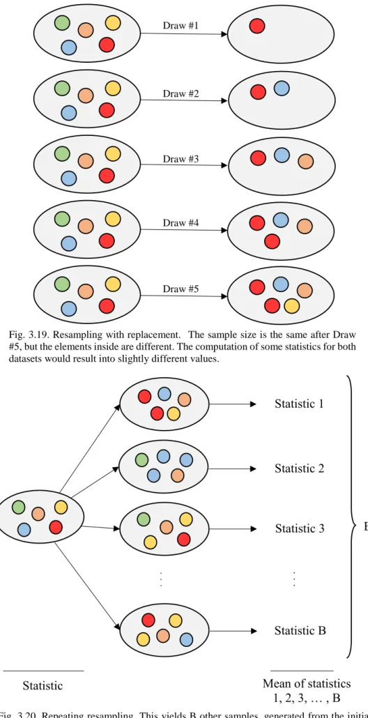
Bootstrapping, which has been mentioned before but not defined, is a technique based on estimating the sample distribution of a statistic by resampling from the available data [36] which are assumed to be samples from a certain population. The underlying idea is to consider these samples as a new population and to sample it again, in order to obtain the so-called bootstrap replicas [37], as pictured in Fig. 3.18.
Fig. 3.18. Bootstrapping procedure.
The sample size of the bootstrap replicas is the same as the initial sample size5. For example, if we have 5 input samples, we would have bootstrap replicas with 5 elements, which are drawn with replacement, leading to not necessarily identical sets. This is illustrated in the diagram in Fig. 3.19.
It can be shown that the mean of a statistic (i.e. adding all statistics and dividing by B, as depicted in Fig. 3.20) of the bootstrap replicas is a more accurate representation of the statistic of the actual population than that provided by the initial sample, which can be seen as a loose application of the law of large numbers [38].
Some examples of the statistics that can be calculated are standard deviations, means, covariances, and others that will be addressed in section 3.2 (Techniques Used).
4Another measure that is commonly used in statistics is the confusion matrix. It provides the correctness
value as well as which clusters are confused with which. For example, sines can be confused with cosines, exponentials with x2, and so on. This measure will not be used in the project because of its computational complexity and because it provides additional information that is not relevant to the goals of the project. 5 In fact, as long as the bootstrap sample size is big, the same theory holds.
Population Samples
Population Bootstrap Samples
=
Sampling
22 . . . B Statistic 1 Statistic 2 Statistic 3 Statistic B . . .
Statistic Mean of statistics 1, 2, 3, … , B Draw #1 Draw #2 Draw #3 Draw #4 Draw #5
Fig. 3.19. Resampling with replacement. The sample size is the same after Draw #5, but the elements inside are different. The computation of some statistics for both datasets would result into slightly different values.
Fig. 3.20. Repeating resampling. This yields B other samples, generated from the initial one on the left. In a way, this is like generating a larger sample from the original population with the knowledge of only a few samples.
23
TABLE 3.8.
IMPLEMENTATION IN R OF BOOTSTRAPPING. Implementation in R
A bootstrap implementation is found in the boot package in R. The boot() function requires specifying the initial data matrix, the statistic to be bootstrapped and the number of bootstrap replicas to generate the bootstrapped statistic of interest[39].
3.1.6 Modified Band Depth (MBD)
The notions of depth and band depth will be introduced in this subsection as a foundation for MBD, a concept that will also be detailed in this light.
Depth
The term depth in multivariate statistics refers to the degree of centrality of a datapoint, as a generalization of the univariate median. Accordingly, for a univariate dataset, the deepest point is a measure of the central tendency of the dataset. As we get further and further away from the central point, depth decreases [40].
This idea can be extended to functional data, in which the deepest curve can be informally thought of as “the one whose graph is located in the middle”. In Fig. 3.21 the central (i.e. deepest) curve is the black one.
Fig. 3.21. Depth notion for functional data. The black curve is the deepest one.
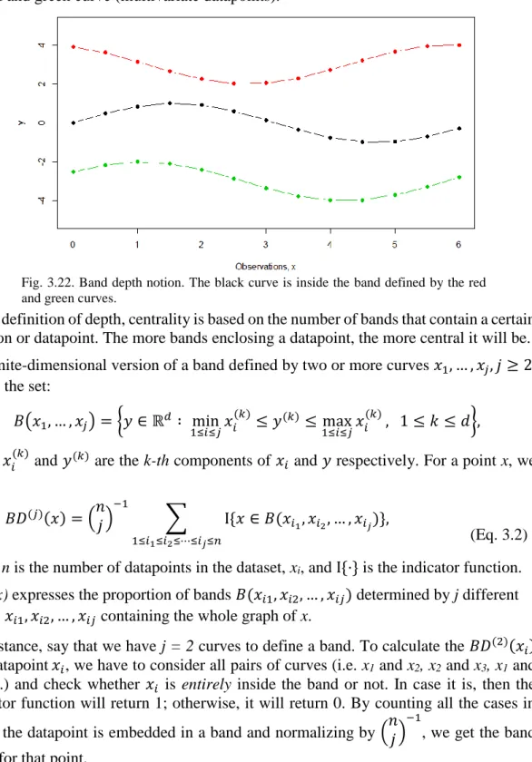
Unfortunately, as it happens frequently in statistics, the formal definition is not as simple as the non-technical one. Whereas it is easy to choose a central curve by inspection in these simple scenarios, we need a more formal definition for the more complicated cases. There are several ways of defining a suitable notion of depth as described in Cascos, López and Romo (2011) [40], where more specific details are given about depth functions. It is an outstanding reference for obtaining a deeper insight in the matter. For the context of this project, we briefly describe the Band Depth (BD) and the Modified Band Depth (MBD), introduced by López-Pintado and Romo (2009) [12]. MBD has become a very popular depth measure due to its low computational cost, in contrast to most alternatives found in the literature.
24 Band Depth (BD)
BD is defined for functions or multivariate data represented in parallel coordinates [41]. Fig. 3.22 shows the sampled, finite-dimensional, version of Fig. 3.21. It can be seen that the red and the green dotted curves surround the black dotted curve at all x instants. This is referred to as the black curve (multivariate datapoint) being inside the band defined by the red and green curve (multivariate datapoints).
In this definition of depth, centrality is based on the number of bands that contain a certain function or datapoint. The more bands enclosing a datapoint, the more central it will be. The finite-dimensional version of a band defined by two or more curves 𝑥1, … , 𝑥𝑗, 𝑗 ≥ 2,
[40] is the set: 𝐵(𝑥1, … , 𝑥𝑗) = {𝑦 ∈ ℝ𝑑 ∶ min 1≤𝑖≤𝑗𝑥𝑖 (𝑘) ≤ 𝑦(𝑘)≤ max 1≤𝑖≤𝑗𝑥𝑖 (𝑘) , 1 ≤ 𝑘 ≤ 𝑑},
where 𝑥𝑖(𝑘) and 𝑦(𝑘) are the k-th components of 𝑥𝑖 and 𝑦 respectively. For a point x, we define 𝐵𝐷(𝑗)(𝑥) = (𝑛 𝑗 ) −1 ∑ Ι {𝑥 ∈ 𝐵(𝑥𝑖1, 𝑥𝑖2, … , 𝑥𝑖𝑗)} 1≤𝑖1≤𝑖2≤⋯≤𝑖𝑗≤𝑛 , (Eq. 3.2) where n is the number of datapoints in the dataset, xi, and Ι {·} is the indicator function.
BD(j)(x) expresses the proportion of bands 𝐵(𝑥𝑖1, 𝑥𝑖2, … , 𝑥𝑖𝑗) determined by j different curves 𝑥𝑖1, 𝑥𝑖2, … , 𝑥𝑖𝑗 containing thewhole graph of x.
For instance, say that we have j = 2 curves to define a band. To calculate the 𝐵𝐷(2)(𝑥𝑖) of a datapoint 𝑥𝑖, we have to consider all pairs of curves (i.e. x1 and x2, x2and x3, x1and
x3, etc.) and check whether 𝑥𝑖 is entirely inside the band or not. In case it is, then the indicator function will return 1; otherwise, it will return 0. By counting all the cases in which the datapoint is embedded in a band and normalizing by (𝑛𝑗 )
−1
, we get the band depth for that point.
Fig. 3.22. Band depth notion. The black curve is inside the band defined by the red and green curves.
25
An example of two datapoints being inside and outside a band is depicted in Fig. 3.23:
y1 is inside the band defined by x1 and x2, and y2 is outside it most of the time. The contribution to the band depth given by the band defined by x1 and x2 is 1 for y1, and 0 for
y2.
Fig. 3.24 shows the band defined by more than two curves. It is the region of the plane determined by the most external curves at every coordinate/time instant.
Fig. 3.24. Band defined by three curves as the gray region [12].
Fig. 3.23. Band inclusion and exclusion [12]. y1 is entirely inside the band defined by x1 and x2, whereas y2 is not.
26
Finally, to define the BD, we choose the number of curves J ≥ 2 that will define the bands and calculate:
𝐵𝐷𝐽(𝑥) = ∑ 𝐵𝐷(𝑗)(𝑥).
𝐽
𝑗=2
(Eq. 3.3) Hence, the value of BD4 is an addition of the values BD(4) + BD(3) + BD(2). A J value of 2 or 3 is usually enough for all applications.
Band depth is used because it has a low computation complexity for high dimensional datasets, but has the disadvantage of allowing multiple ties in the depth values.
Modified Band Depth (MBD)
MBD is a less restrictive version of BD as the depth of a curve does not depend on the whole curve being inside a certain band. Instead, the finite dimensional version of MBD is based on computing the mean number of coordinates that are inside a band; d is the number of coordinates, and x(k) the k-th components of datapoint x.
𝑀𝐵𝐷(𝑗)(𝑥) = (𝑛𝑗 )−1 ∑ 1 𝑑∑ Ι {𝑥 (𝑘) ∈ 𝐵(𝑥 𝑖1, 𝑥𝑖2, … , 𝑥𝑖𝑗) 𝑘 } 1≤𝑖1≤𝑖2≤⋯≤𝑖𝑗≤𝑛 (Eq. 3.4)
The main advantage of MBD over band depth is that it is less computationally intensive.
Techniques Used
Now that the essential theoretical background has been summarized, a closer look at how all this theory helps to improve functional data clustering must be taken. This subsection corresponds to tasks D1.1 and D1.2 of Table 2.1 (Task Breakdown and Duration). From the perspective of the project as a case study, it is important to determine the techniques that will be used to obtain results and reach meaningful conclusions. It is crucial to perform both a quantitative and a qualitative analysis of the method.
A comparison between the different design techniques that have been mentioned before will be discussed, as well as the reasoning behind the choice of the final implementation of the solution.
3.2.1 B-Splines for Function Approximation
In the literature review section two alternatives for function approximation have been presented: Fourier series and B-Splines. Fourier series provide a useful representation for periodic functions, but are more computationally intensive to implement than B-Splines. From a qualitative perspective, B-Splines are more convenient than Fourier series for the following reasons, as described in Table 3.4 of section 3.1.2.
✓ Simple vector representation of a function and its derivatives. It is very easy to differentiate splines as it only involves computations on the basis. This provides fast access to additional information for clustering.
✓ Fixed finite basis for some given knots and order. If all input data has the same length, having a fixed basis reduces the computational complexity of the basis calculations.
27 ✓ Computational efficiency and simple implementation. There is an R package that implements B-splines efficiently and it is easy to use once the input data has been collected into a matrix.
Drawing all these points together, and for the reasons explained above, the function approximation technique used in this work is B-splines. Fig. 3.25 summarizes the process.
Fig. 3.25. Steps in B-spline approximation.
3.2.2 MBD as a Solution to K-Means Initialization Problem
As previously mentioned, K-Means is a clustering algorithm that relies on random initialization of centroids. A correct initialization of K-Means would improve the robustness and overall clustering results.
MBD is used here to derive a solution to this initialization problem. The best way to picture how we can benefit from MBD for functional data clustering is through the information flow diagram from input to output shown in Fig. 3.26.
Fig. 3.26. MBD as a Solution to K-Means initialization problem.
The input to this system is the output of Fig. 3.25, the new samples of the approximated function. These new samples are bootstrapped B times. For each of the B bootstrap samples, we run pure K-Means (with random initialization) to obtain some centroids. These centroids are collected into one dataset. In total we have K · B centroids, where K
is the number of clusters (i.e. we have K cluster centroids for each of the B replicas). Now we have a collection of points in space that correspond to the centers of the different clusters of the bootstrap replicas. These elements are estimators of the real cluster centers; the variability present in this collection of centroids comes from both the bootstrap step and the random initialization of K-means. They are expected to form tighter groups than the original dataset, hence being easier to cluster.
At this stage, we form groups of bootstrap centroids by using Partitioning Around Medoids (PAM) in order to reduce randomness and to get a more robust output, which does not depend on K-means initialization.
Finally, MBD is applied to find the deepest point inside each cluster formed by PAM. The deepest points are chosen to initialize K-Means. This is seen in Fig. 3.27.
Following this procedure, K initial points will be found, and clustering algorithms would have been run a total of B+2 times, counting PAM and K-Means’ final execution after
initialization.
This part of the method is the one being tested. The advantages and disadvantages of choosing MBD-based initialization of K-Means will be detailed in section 5 (Conclusions).
B-splines basis construction
Linear least squares fit to provide spline
coefficients
Resample new function
Bootstrap
28
Fig. 3.27. K-Means initialization diagram.
3.2.3 Clustering Evaluation Techniques Used
The quantitative measures used to evaluate clustering results are the following: 1. Correctness 2. Purity 3. ARI 4. Distortion 5. Iterations 6. Time (Execution)
A description of these can be found in section 3.1.4. This is what we will call the CoPADIT measures, an acronym formed by the first letter or letters of the names of the measures to be used.
➢ Correctness, purity and ARI are referred to as accuracy measures.
➢ Iterations is a convergence measure, that indicates how rapidly the K-Means algorithm reaches a stable set of centroids.
➢ Cluster dispersion measures, like distortion, assess the spread of the datapoints that belong to a cluster.
➢ A method’s execution time evaluates its computational cost.
In order to qualitatively check if the proposed method is worth using, the clustering result we obtain is to be compared with the ones yielded by other existing initialization methods. There are five methods to be compared, mentioned in the List of Acronyms in the introductory pages, and defined as:
1. KM: K-Means with random initialization.
2. MVMBD:K-Means initialized with MBD for multivariate data.
3. FMBD: K-Means initialized with MBD after B-splines function approximation and resampling.
4. KMPP: K-Means++.
5. FKMPP: K-Means++ after B-splines function approximation and resampling. We will refer as three-way comparison to comparing methods 1, 2 and 4, and as five-way comparison to comparing all five methods with one another.
![Fig. 3.11. Hierarchical clustering of different orientations [26]. The y-axis measures proximity of data and clusters](https://thumb-us.123doks.com/thumbv2/123dok_us/1444973.2693424/33.892.131.748.393.1123/fig-hierarchical-clustering-different-orientations-measures-proximity-clusters.webp)